Archiwum kategorii: Web Tools

How to Make a Take-Out Menu Template in InDesign

Post pobrano z: How to Make a Take-Out Menu Template in InDesign
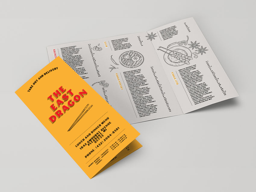
Final product image
What You’ll Be Creating

In this tutorial, we show you how to easily create a take-out menu template in InDesign.

Restaurants invest a great amount of their budget on printing and reprinting take-out menus. These menus can make or break what customers might order for their next night off. Selecting the right menu can make a difference to the customer experience your clients are providing. 

In this tutorial, we’ll show you how to easily create a food menu template. We’ll show you how to set up a trifold brochure menu template, complete with beautiful illustrations. You’ll learn how to successfully insert tables to add menu items—this will make your template super easy to edit!

In a hurry? We’ve got amazing InDesign templates and menu design templates over at Envato Elements and GraphicRiver. Go check them out! 

What You Will Need for Your Take-Out Menu InDesign Template

You’ll need access to Adobe InDesign and Adobe Illustrator. If you don’t have the software, you can download a trial from the Adobe website. You’ll also need these assets:

Download the assets and make sure the font is installed on your system before starting. When you are ready, we can dive in! 

1. Setting Up a Take-Out Menu InDesign Template

A common trifold dimension when open flat is letter size or A4. We will be using a letter size page for this tutorial, but feel free to use an A4 page if you prefer. As trifold brochure dimensions will vary depending on your needs, I’ve created an equation chart that you can follow below:

trifold brochure equation

Step 1

The take-out menu template size for this tutorial is a letter page. First, we need to divide the final width (279.4 mm) by 3 (93.13 mm). To this new width, we need to add a buffer for the fold (1 mm). The width of the two panels is 94.13 mm. 

Later on, we will modify the size of the shorter panel. We need to subtract 2 mm from the panel to accommodate the fold (91.13 mm).

In InDesign, go to File > New. Name the document Take Out Menu Template. Set the trifold dimensions to the following:

  • Width to 94.13 mm
  • Height to 215.9 mm 
  • Units to Millimetres
  • Orientation to Portrait
  • Uncheck Facing Pages
  • Pages to 6
  • Margins to 10 mm
  • Bleeds to 3 mm (although it’s best to seek your professional printer’s preference)

Click Create.

create a new document

Step 2

A trifold brochure has a flap that folds in; this is the shorter panel. We will create a second Master Page with this new size. 

Head over to the Pages panel. If you don’t have it active, head over to Windows > Pages. The top portion of the panel contains the Master Pages. 

Right-click on A-Master > New Master. In the New Master window, make sure Based on Master is set to [Master]. Set the Width to 91.13 mm (subtract 2 mm from the 93.13 mm). Click OK.

create a new master page

Step 3

On the Pages panel, right-click on the B-Master we just created and select Apply Master. In the Apply Master window, under To Pages, enter 1, 6 (this is to specify that we are changing Pages 1 and 6). Click OK.

In the Master Page Size Conflict window, click Use Master Page Size.

apply master pages

Step 4

Now that we have the page sizes set up, we can move the pages to set up the spreads. Pages 1-3 will be the outside spread, and Pages 4-6 will be the inside spreads. 

On the Main Menu of the Pages panel, make sure that Allow Document Pages to Shuffle is unchecked. Drag Page 2 towards Page 1 to combine them. Combine Pages 1-3 as one spread and Pages 4-6. Make sure that you have the BAA and AAB Master Pages configuration.

To exit Master Pages mode, double-click on the regular pages thumbnail.

merge the pages to form a trifold brochure

Step 5

For this take-out menu template tutorial, we will work with three layersThis will make it easier to update the template when it needs to be updated with new information. 

Bring up the Layers panel by going to Window > Layers. Double-click on Layer 1 and rename it Background. 

On the Layers panel main menu, select New Layer. Name it Illustrations, and click OK.

Add one last layer and name it Copy. Click OK.

create new layers

Step 6

Before we start with the design of this menu template, let’s add some color swatches. Head over to Window > Color > Swatches to expand the Swatches panel. Choose New Color Swatch button from the main menu. Add the following colors:

  • Light Yellow: C=0 M=35 Y=90 K=0. Click Add and OK.
  • Medium Yellow: C=0 M=35 Y=90 K=30. Click Add and OK.
  • Dark Yellow: C=0 M=35 Y=90 K=55. Click Add and OK.
  • Red: C=0 M=100 Y=100 K=0. Click Add and OK.
  • Grey: C=5 M=5 Y=5 K=0.

Click Add and OK after you input each of the color values. 

add color swatches

Step 7

Paragraph styles allow us to add formatting attributes to be applied to large amounts of text. This is useful if you want to maintain the same type settings throughout your menu template design. Therefore, the styles will keep your template flawless and cohesive. For this tutorial, we will create two styles: Section Title and Menu Items.

Head over to Window > Paragraph Styles. On the Paragraph Styles panel, select the New Paragraph Style option from the main menu. 

In the New Paragraph Style window option, select Basic Character Formats in the left menu. Set the Style Name to Section Title. Use the following settings for the Basic Paragraph Formats options:

  • Font Family: Carters
  • Font Style: Regular
  • Size: 16 pt

Click on Indents and Spacing from the left side menu. Set the Alignment to Right. 

Click OK. 

create paragraph styles

Create a new Paragraph Style and name it Menu Items. Use the following settings for the Basic Paragraph Formats options:

  • Font Family: Carters
  • Font Style: Regular
  • Size: 9 pt

Click OK. 

add a menu items style

2. How to Use Tables in Your Take-Out Menu InDesign Template

For this food menu template, we’ll start by designing the inside of the menu and finish the design with the cover. 

Step 1

Select the Background layer from the Layers panel.

Using the Rectangle Tool (M), create a rectangle that covers all three panels. Make sure the rectangle also covers the bleeds. 

On the Swatches panel, set the color to Grey. 

Lock the Background layer and select the Copy layer.

add a background using the rectangle tool

Step 2

Using the Text Tool (T) from the toolbar, create a small text frame. In it, add the title of the section—in my case, it is Our Specialties. 

On the Paragraph Styles panel, select the Section Title to style the text frame. While selecting the text frame, set the color to [Paper]. Press J to change the color of the text and select the red color. 

Select the Rotate Tool (R) from the toolbar. Rotate the text frame 90° and place it in the top left corner of the first panel. 

add a text frame to add a section title

Step 3

Using the Text Tool (T), create a text frame that measures 6 cm in Width and 9 cm in Height.

Double-click on the text frame. Head over to the menu bar and select Table > Insert Table. In the Insert Table option window, set the Body Rows to 24 and the Columns to 2.

insert a table

For the Table Style, select New Table Style. 

In the New Table Style option window, set the Style Name to Menu Table. 

Under Cell Styles, set the Body Rows to New Cell Style. 

create a new cell style on the body rows option

In the New Cell Style option window, set the Paragraph Style to Menu Items. 

Select the Text option from the left side menu. Set all the Cell Insets to 0.

Select the Stroke and Fills option from the left side menu. Set the Color to [None]. Click OK. 

create a new cell style

For the New Table Style, select the Table Setup option from the left side menu. Set the Table Border Color to [None]. Under Table Spacing, set the Space Before and After to 0 cm. Click OK.

Click OK in the Insert Table option window. 

set the table setup option

Step 4

Head over to Window > Type & Tables > Table. Using the Text Tool (T), select the table we just created to activate the options on the Table panel. 

On the Table panel, set the Row Height to At Least 0.36 cm. 

Select the first column only, and set the Column Width to 5 cm. Select the second column and set the Column Width to 1 cm. 

edit the table on the table panel

Step 5

Now you are ready to add content to the table on your InDesign menu template.

Using the Line Tool (/), create a stroke that extends from the top of the table to the last item. Head over to Window > Stroke and set the Stroke Weight to 0.5 pt. Place the stroke between the section title and the table. 

add a stroke between the section title and the menu items

Step 6

Duplicate the section title, stroke and table by selecting all three items. Press Option-Shift and drag to the lower section of the same panel. Leave a gap between the two sections; we will add an illustration in a later step. 

Using the Text Tool (T), select the section title to change the name. On the Swatches panel, change the color to light yellow. 

Using the Text Tool (T), select all of the duplicated table. Head over to the Table panel and set the Number of Body Rows to 20. This is how you’ll be able to lengthen and shorten tables. Using the Selection Tool (V), shorten the stroke to match the table. 

duplicate the three elements to place on the bottom portion of the panel

Step 7

You can add a special note by using the Text Tool (T). Create a text frame that matches the width of the table. Open the Text panel (Window > Type & Tables > Character) and set the Font to Carters, Size to 8 pt, and Leading to 8 pt. 

add a special note by creating a text frame

Step 8

Duplicate the section title, stroke and table to fill up the rest of the panels. Select all three items and press Shift-Option and drag. Use the Table panel to add or delete rows on the tables of the menu design template. 

duplicate the table and section title multiple times throughout the brochure

Step 9

To finish off the inside of the panel of the restaurant menu template, open the Hand Drawn Asian Restaurant Menu in Adobe Illustrator

Select the items and Ungroup them by pressing Shift-Command-G. If necessary, Ungroup the subgroups by using the same shortcut. 

Select any of the illustrations, press Command-C to Copy, and head over to the take-out menu template in InDesign. On the Layers panel, select the Illustrations layer. Press Command-V to Paste the illustrations

open the illustration on Illustrator and copy and paste items onto InDesign

3. Designing the Outside Panels of the Take-Out Menu InDesign Template

Step 1

Select the Background layer from the Layers panel of the food menu template.

Using the Rectangle Tool (M), create three rectangles that cover each panel. 

On the Swatches panel, set the color of the first and third rectangle to Yellow. Set the second rectangle to Grey.

Lock the Background layer and select the Copy layer of the Chinese take-out menu template.

On the outside panel add a background to each panel

Step 2

Duplicate the section title, stroke and table from the inside panels by pressing Shift-Option and dragging. Edit the table and section title as you need through the front panel of the Chinese take-out menu template.

duplicate the text frames from the inside panel to the outside

Step 3

Head over to Illustrator and select illustrations to Copy and Paste onto the outside panel of the Chinese take-out menu template. 

copy illustrations to the outside panel

4. Designing the Front Cover of the Take-Out Menu InDesign Template

Step 1

Select the Ellipse Tool (L) from the toolbar. Click on the food menu template document to open the Ellipse option window. Set the Width to 7.5 cm and the Height to 3.5 cm.  

Select the Type on a Path Tool from the toolbar and click on the ellipse.

I added text and opened the Character panel. Set the Font to Carters Regular and Size to 16 pt. 

On the Swatches panel, set the color to [Black]. 

create an ellipse and use the type on a path tool to add text

Step 2

Duplicate the ellipse by pressing Shift-Option and dragging downwards. Change the font on the text from the Character panel to Carters Shadow. On the Swatches panel, set the color to medium yellow. 

duplicate the frame multiple times and change the font family to create shadow

Step 3

Duplicate the ellipse once more by pressing Shift-Option and dragging downwards. Change the font on the text from the Character panel to Carters Black Shadow. On the Swatches panel, set the color to dark yellow. 

Select all three ellipses and open the Align panel by going to Window > Object & Layout > Align. Press the Align Vertical Center button to align all three ellipses. 

Press Command-G to Group all three ellipses. 

align the three ellipses by using the align panel

Step 4

Using the Text Tool (T), create a text frame that fits the width of the panel on the menu template. On the Character panel, set the Font to Carters Regular, Size to 55 pt, and Leading to 45 pt. 

On the Swatches panel, set the color to red.

create a text frame to add the name of the restaurant

Duplicate the text frame by pressing Shift-Option and dragging downwards. Change the font on the Character panel to Carters Shadow. On the Swatches panel, set the color to medium yellow. 

Duplicate the text frame once more by pressing Shift-Option and dragging downwards. Change the font from the Character panel to Carters Black Shadow. On the Swatches panel, set the color to dark yellow. 

Select all three text frames and head over to the Align panel. Select the Align Vertical Center button to align the frames. 

duplicate the text frame and change the font family to create a shadow

Step 5

From Illustrator, feel free to add an illustration below the title on the restaurant menu template. Press Command-C to Copy and Command-V to Paste.

Using the Line Tool (/), add a stroke that runs across the width of the panel. Set the Stroke Weight to 0.5 pt. 

copy an illustration to include under the name of the restaurant

Step 6

Using the Text Tool (T), add an address and phone number to the Chinese take-out menu. On the Character panel, set the Font to Carters, the Size to 16 pt, and the Leading to 12 pt. 

Using the Line Tool (/), add a stroke that runs across the width of the panel. Set the Stroke Weight to 0.5 pt. 

using the text tool add an address and phone number

Step 7

Duplicate one of the menu table items to the front cover of the take-out menu. Delete all the contents and open the Table panel. 

On the Table panel, set the Number of Rows to 3 and set the Row Height to At Least 0.3 cm.

Select the first column and set the Column Width to 1 cm. Set the second and third column Width to 3 cm. 

create a smaller table to add opening times

On the Character panel, set the Font to Carters and Size to 8 pt. 

Add ‘hours’ in the first column and days in the second column. In the third column, add times. 

add opening times

5. How to Export a File for Printing

Before exporting a file for printing, it’s useful to take a look around all the edges of the menu design template. This is to make sure all the images and vectors bleeding out are touching the bleeds. Press to go between Preview mode and Normal mode. 

Remember that each fold will be represented by a crop mark. Let your professional printer know to avoid confusion. It is also helpful to ask for a printer’s proof to make sure the project is printed correctly.

Step 1

To export the menu design template, go to File > Export. Name the file trifold brochure and choose Adobe PDF (Print) from the Format drop-down menu. Click Save. 

export the file for printing

Step 2

In the Export Adobe PDF window, set the Adobe PDF Preset to Press Quality. Under Pages, select Export As Spreads.

select press quality as PDF preset and Export As Spreads

On the left side of the panel, select Marks and Bleeds. Check All Printer’s Marks and Use Document Bleed Settings. Click Export. You will have a ready-to-print PDF file.

check all printers marks and use document bleed settings

Great Job! You’ve Finished This Tutorial!

In this tutorial, we learned how to make an InDesign menu template. We covered key tools that will help your users edit a template quickly and easily for their ever-changing menus. Today, we learned to:

  • set up a ready-to-print InDesign file
  • create multiple paragraph styles
  • add different color swatches
  • insert and edit tables
  • use a multi-layer font to create a shadow effect

If you are new to InDesign and need a take-out menu template or restaurant menu template right away, head over to Envato Elements and GraphicRiver. We’ve got many options to explore! 

If you liked this tutorial, you might like these:

How to Make a Take-Out Menu Template in InDesign

Post pobrano z: How to Make a Take-Out Menu Template in InDesign

Final product image
What You’ll Be Creating

In this tutorial, we show you how to easily create a take-out menu template in InDesign.

Restaurants invest a great amount of their budget on printing and reprinting take-out menus. These menus can make or break what customers might order for their next night off. Selecting the right menu can make a difference to the customer experience your clients are providing. 

In this tutorial, we’ll show you how to easily create a food menu template. We’ll show you how to set up a trifold brochure menu template, complete with beautiful illustrations. You’ll learn how to successfully insert tables to add menu items—this will make your template super easy to edit!

In a hurry? We’ve got amazing InDesign templates and menu design templates over at Envato Elements and GraphicRiver. Go check them out! 

What You Will Need for Your Take-Out Menu InDesign Template

You’ll need access to Adobe InDesign and Adobe Illustrator. If you don’t have the software, you can download a trial from the Adobe website. You’ll also need these assets:

Download the assets and make sure the font is installed on your system before starting. When you are ready, we can dive in! 

1. Setting Up a Take-Out Menu InDesign Template

A common trifold dimension when open flat is letter size or A4. We will be using a letter size page for this tutorial, but feel free to use an A4 page if you prefer. As trifold brochure dimensions will vary depending on your needs, I’ve created an equation chart that you can follow below:

trifold brochure equation

Step 1

The take-out menu template size for this tutorial is a letter page. First, we need to divide the final width (279.4 mm) by 3 (93.13 mm). To this new width, we need to add a buffer for the fold (1 mm). The width of the two panels is 94.13 mm. 

Later on, we will modify the size of the shorter panel. We need to subtract 2 mm from the panel to accommodate the fold (91.13 mm).

In InDesign, go to File > New. Name the document Take Out Menu Template. Set the trifold dimensions to the following:

  • Width to 94.13 mm
  • Height to 215.9 mm 
  • Units to Millimetres
  • Orientation to Portrait
  • Uncheck Facing Pages
  • Pages to 6
  • Margins to 10 mm
  • Bleeds to 3 mm (although it’s best to seek your professional printer’s preference)

Click Create.

create a new document

Step 2

A trifold brochure has a flap that folds in; this is the shorter panel. We will create a second Master Page with this new size. 

Head over to the Pages panel. If you don’t have it active, head over to Windows > Pages. The top portion of the panel contains the Master Pages. 

Right-click on A-Master > New Master. In the New Master window, make sure Based on Master is set to [Master]. Set the Width to 91.13 mm (subtract 2 mm from the 93.13 mm). Click OK.

create a new master page

Step 3

On the Pages panel, right-click on the B-Master we just created and select Apply Master. In the Apply Master window, under To Pages, enter 1, 6 (this is to specify that we are changing Pages 1 and 6). Click OK.

In the Master Page Size Conflict window, click Use Master Page Size.

apply master pages

Step 4

Now that we have the page sizes set up, we can move the pages to set up the spreads. Pages 1-3 will be the outside spread, and Pages 4-6 will be the inside spreads. 

On the Main Menu of the Pages panel, make sure that Allow Document Pages to Shuffle is unchecked. Drag Page 2 towards Page 1 to combine them. Combine Pages 1-3 as one spread and Pages 4-6. Make sure that you have the BAA and AAB Master Pages configuration.

To exit Master Pages mode, double-click on the regular pages thumbnail.

merge the pages to form a trifold brochure

Step 5

For this take-out menu template tutorial, we will work with three layersThis will make it easier to update the template when it needs to be updated with new information. 

Bring up the Layers panel by going to Window > Layers. Double-click on Layer 1 and rename it Background. 

On the Layers panel main menu, select New Layer. Name it Illustrations, and click OK.

Add one last layer and name it Copy. Click OK.

create new layers

Step 6

Before we start with the design of this menu template, let’s add some color swatches. Head over to Window > Color > Swatches to expand the Swatches panel. Choose New Color Swatch button from the main menu. Add the following colors:

  • Light Yellow: C=0 M=35 Y=90 K=0. Click Add and OK.
  • Medium Yellow: C=0 M=35 Y=90 K=30. Click Add and OK.
  • Dark Yellow: C=0 M=35 Y=90 K=55. Click Add and OK.
  • Red: C=0 M=100 Y=100 K=0. Click Add and OK.
  • Grey: C=5 M=5 Y=5 K=0.

Click Add and OK after you input each of the color values. 

add color swatches

Step 7

Paragraph styles allow us to add formatting attributes to be applied to large amounts of text. This is useful if you want to maintain the same type settings throughout your menu template design. Therefore, the styles will keep your template flawless and cohesive. For this tutorial, we will create two styles: Section Title and Menu Items.

Head over to Window > Paragraph Styles. On the Paragraph Styles panel, select the New Paragraph Style option from the main menu. 

In the New Paragraph Style window option, select Basic Character Formats in the left menu. Set the Style Name to Section Title. Use the following settings for the Basic Paragraph Formats options:

  • Font Family: Carters
  • Font Style: Regular
  • Size: 16 pt

Click on Indents and Spacing from the left side menu. Set the Alignment to Right. 

Click OK. 

create paragraph styles

Create a new Paragraph Style and name it Menu Items. Use the following settings for the Basic Paragraph Formats options:

  • Font Family: Carters
  • Font Style: Regular
  • Size: 9 pt

Click OK. 

add a menu items style

2. How to Use Tables in Your Take-Out Menu InDesign Template

For this food menu template, we’ll start by designing the inside of the menu and finish the design with the cover. 

Step 1

Select the Background layer from the Layers panel.

Using the Rectangle Tool (M), create a rectangle that covers all three panels. Make sure the rectangle also covers the bleeds. 

On the Swatches panel, set the color to Grey. 

Lock the Background layer and select the Copy layer.

add a background using the rectangle tool

Step 2

Using the Text Tool (T) from the toolbar, create a small text frame. In it, add the title of the section—in my case, it is Our Specialties. 

On the Paragraph Styles panel, select the Section Title to style the text frame. While selecting the text frame, set the color to [Paper]. Press J to change the color of the text and select the red color. 

Select the Rotate Tool (R) from the toolbar. Rotate the text frame 90° and place it in the top left corner of the first panel. 

add a text frame to add a section title

Step 3

Using the Text Tool (T), create a text frame that measures 6 cm in Width and 9 cm in Height.

Double-click on the text frame. Head over to the menu bar and select Table > Insert Table. In the Insert Table option window, set the Body Rows to 24 and the Columns to 2.

insert a table

For the Table Style, select New Table Style. 

In the New Table Style option window, set the Style Name to Menu Table. 

Under Cell Styles, set the Body Rows to New Cell Style. 

create a new cell style on the body rows option
In the New Cell Style option window, set the Paragraph Style to Menu Items. 

Select the Text option from the left side menu. Set all the Cell Insets to 0.

Select the Stroke and Fills option from the left side menu. Set the Color to [None]. Click OK. 

create a new cell style

For the New Table Style, select the Table Setup option from the left side menu. Set the Table Border Color to [None]. Under Table Spacing, set the Space Before and After to 0 cm. Click OK.

Click OK in the Insert Table option window. 

set the table setup option

Step 4

Head over to Window > Type & Tables > Table. Using the Text Tool (T), select the table we just created to activate the options on the Table panel. 

On the Table panel, set the Row Height to At Least 0.36 cm. 

Select the first column only, and set the Column Width to 5 cm. Select the second column and set the Column Width to 1 cm. 

edit the table on the table panel

Step 5

Now you are ready to add content to the table on your InDesign menu template.

Using the Line Tool (/), create a stroke that extends from the top of the table to the last item. Head over to Window > Stroke and set the Stroke Weight to 0.5 pt. Place the stroke between the section title and the table. 

add a stroke between the section title and the menu items

Step 6

Duplicate the section title, stroke and table by selecting all three items. Press Option-Shift and drag to the lower section of the same panel. Leave a gap between the two sections; we will add an illustration in a later step. 

Using the Text Tool (T), select the section title to change the name. On the Swatches panel, change the color to light yellow. 

Using the Text Tool (T), select all of the duplicated table. Head over to the Table panel and set the Number of Body Rows to 20. This is how you’ll be able to lengthen and shorten tables. Using the Selection Tool (V), shorten the stroke to match the table. 

duplicate the three elements to place on the bottom portion of the panel

Step 7

You can add a special note by using the Text Tool (T). Create a text frame that matches the width of the table. Open the Text panel (Window > Type & Tables > Character) and set the Font to Carters, Size to 8 pt, and Leading to 8 pt. 

add a special note by creating a text frame

Step 8

Duplicate the section title, stroke and table to fill up the rest of the panels. Select all three items and press Shift-Option and drag. Use the Table panel to add or delete rows on the tables of the menu design template. 

duplicate the table and section title multiple times throughout the brochure

Step 9

To finish off the inside of the panel of the restaurant menu template, open the Hand Drawn Asian Restaurant Menu in Adobe Illustrator

Select the items and Ungroup them by pressing Shift-Command-G. If necessary, Ungroup the subgroups by using the same shortcut. 

Select any of the illustrations, press Command-C to Copy, and head over to the take-out menu template in InDesign. On the Layers panel, select the Illustrations layer. Press Command-V to Paste the illustrations

open the illustration on Illustrator and copy and paste items onto InDesign

3. Designing the Outside Panels of the Take-Out Menu InDesign Template

Step 1

Select the Background layer from the Layers panel of the food menu template.

Using the Rectangle Tool (M), create three rectangles that cover each panel. 

On the Swatches panel, set the color of the first and third rectangle to Yellow. Set the second rectangle to Grey.

Lock the Background layer and select the Copy layer of the Chinese take-out menu template.

On the outside panel add a background to each panel

Step 2

Duplicate the section title, stroke and table from the inside panels by pressing Shift-Option and dragging. Edit the table and section title as you need through the front panel of the Chinese take-out menu template.

duplicate the text frames from the inside panel to the outside

Step 3

Head over to Illustrator and select illustrations to Copy and Paste onto the outside panel of the Chinese take-out menu template. 

copy illustrations to the outside panel

4. Designing the Front Cover of the Take-Out Menu InDesign Template

Step 1

Select the Ellipse Tool (L) from the toolbar. Click on the food menu template document to open the Ellipse option window. Set the Width to 7.5 cm and the Height to 3.5 cm.  

Select the Type on a Path Tool from the toolbar and click on the ellipse.

I added text and opened the Character panel. Set the Font to Carters Regular and Size to 16 pt. 

On the Swatches panel, set the color to [Black]. 

create an ellipse and use the type on a path tool to add text

Step 2

Duplicate the ellipse by pressing Shift-Option and dragging downwards. Change the font on the text from the Character panel to Carters Shadow. On the Swatches panel, set the color to medium yellow. 

duplicate the frame multiple times and change the font family to create shadow

Step 3

Duplicate the ellipse once more by pressing Shift-Option and dragging downwards. Change the font on the text from the Character panel to Carters Black Shadow. On the Swatches panel, set the color to dark yellow. 

Select all three ellipses and open the Align panel by going to Window > Object & Layout > Align. Press the Align Vertical Center button to align all three ellipses. 

Press Command-G to Group all three ellipses. 

align the three ellipses by using the align panel

Step 4

Using the Text Tool (T), create a text frame that fits the width of the panel on the menu template. On the Character panel, set the Font to Carters Regular, Size to 55 pt, and Leading to 45 pt. 

On the Swatches panel, set the color to red.

create a text frame to add the name of the restaurant

Duplicate the text frame by pressing Shift-Option and dragging downwards. Change the font on the Character panel to Carters Shadow. On the Swatches panel, set the color to medium yellow. 

Duplicate the text frame once more by pressing Shift-Option and dragging downwards. Change the font from the Character panel to Carters Black Shadow. On the Swatches panel, set the color to dark yellow. 

Select all three text frames and head over to the Align panel. Select the Align Vertical Center button to align the frames. 

duplicate the text frame and change the font family to create a shadow

Step 5

From Illustrator, feel free to add an illustration below the title on the restaurant menu template. Press Command-C to Copy and Command-V to Paste.

Using the Line Tool (/), add a stroke that runs across the width of the panel. Set the Stroke Weight to 0.5 pt. 

copy an illustration to include under the name of the restaurant

Step 6

Using the Text Tool (T), add an address and phone number to the Chinese take-out menu. On the Character panel, set the Font to Carters, the Size to 16 pt, and the Leading to 12 pt. 

Using the Line Tool (/), add a stroke that runs across the width of the panel. Set the Stroke Weight to 0.5 pt. 

using the text tool add an address and phone number

Step 7

Duplicate one of the menu table items to the front cover of the take-out menu. Delete all the contents and open the Table panel. 

On the Table panel, set the Number of Rows to 3 and set the Row Height to At Least 0.3 cm.

Select the first column and set the Column Width to 1 cm. Set the second and third column Width to 3 cm. 

create a smaller table to add opening times

On the Character panel, set the Font to Carters and Size to 8 pt. 

Add ‘hours’ in the first column and days in the second column. In the third column, add times. 

add opening times

5. How to Export a File for Printing

Before exporting a file for printing, it’s useful to take a look around all the edges of the menu design template. This is to make sure all the images and vectors bleeding out are touching the bleeds. Press to go between Preview mode and Normal mode. 

Remember that each fold will be represented by a crop mark. Let your professional printer know to avoid confusion. It is also helpful to ask for a printer’s proof to make sure the project is printed correctly.

Step 1

To export the menu design template, go to File > Export. Name the file trifold brochure and choose Adobe PDF (Print) from the Format drop-down menu. Click Save. 

export the file for printing

Step 2

In the Export Adobe PDF window, set the Adobe PDF Preset to Press Quality. Under Pages, select Export As Spreads.

select press quality as PDF preset and Export As Spreads

On the left side of the panel, select Marks and Bleeds. Check All Printer’s Marks and Use Document Bleed Settings. Click Export. You will have a ready-to-print PDF file.

check all printers marks and use document bleed settings

Great Job! You’ve Finished This Tutorial!

In this tutorial, we learned how to make an InDesign menu template. We covered key tools that will help your users edit a template quickly and easily for their ever-changing menus. Today, we learned to:

  • set up a ready-to-print InDesign file
  • create multiple paragraph styles
  • add different color swatches
  • insert and edit tables
  • use a multi-layer font to create a shadow effect

If you are new to InDesign and need a take-out menu template or restaurant menu template right away, head over to Envato Elements and GraphicRiver. We’ve got many options to explore! 

If you liked this tutorial, you might like these:

10 Essential Tips in Creating Print Design

Post pobrano z: 10 Essential Tips in Creating Print Design

Final product image
What You’ll Be Creating

Have you been wondering how you can take your print design materials to the next level? In this article, we give you ten great tips to take your design to print. 

What Is Print Design?

Print design is a branch of the graphic design industry focusing on printed materials. That includes magazines, book covers, packaging, business cards, flyers, brochures, and anything that ends in a tangible printed product.  

Before starting a project, make sure you have all the necessary information you need. Will you be working from a template or are you creating the design from zero? Are there brand guidelines you need to follow? Are the images provided optimal for printing? Are there any color limits? Double and triple-check the page size and ask what the final deliverables will be.

There are several basic key aspects to keep in mind when designing for print. Creating a file for printing has its own specific settings that, if not done properly, can have terrible consequences and result in wasted time and money. The basics are making sure that all print files have a CMYK format and are set at 300 DPI. Just as important is using appropriate bleeds and margins to ensure perfect printing. 

Having a good relationship with your professional printer is a bonus—they are knowledgeable especially when it comes to packaging and custom sizes. Keep in communication with them as they can help you out when you can’t find an answer to your problem. As you send files to press, you can ask printers for proofs. These are great to make sure the design, color, and format are what you need. Proofs give you one last chance to change anything that might look off and to check the spelling. If you are working with heavy copy, have a second set of eyes or, even better, a copy editor to proofread the project. 

Print design covers a wide range of printed pieces. If you are new to InDesign, this article covers some great tips you can follow to create some awesome projects. If you are just getting started with InDesign and can’t quite figure it out yet, don’t stress! We’ve got amazing InDesign brochure templates and InDesign flyer templates over at Envato Elements and GraphicRiver. Go check them out! 

1. Apply Grid Systems

Grid systems are one of the elements in design that go unnoticed because they are mostly behind the scenes. Whether you are designing one or hundreds of pages, a grid system is essential in developing a layout. Grids can help you position text and images so that the page will look polished and clean. 

The structure is made up of intersecting horizontal and vertical lines. It doesn’t end there—if you want to add complexity to your page, try adding angular or curved lines. There are no strict rules as to what is and what isn’t a grid. That’s the beauty of design—as a designer, you can create your own grid. As long as you follow it throughout a project, you will create clean pages. 

Take a look at the designs of Josef Müller-Brockmann for the ultimate inspiration. Or check out this template below. The designer created a four-column grid which they smartly used to lay out the elements on the poster.  

Nostalgia A0 Poster
Nostalgia A0 Poster

Many designers think that grids are a synonym for constraints. While lines can appear to be limits, it is up to your creativity to work around them. Grids are open to plenty of options for us to play with. 

For instance, let’s take a look at this InDesign template. The designer used the grid as if they were using multiple layers on the document. This superimposed playful layout creates depth while keeping the page clean and minimalist. 

Fashion Flyer
Fashion Flyer

Check out this Bauhaus poster tutorial in InDesign to create an awesome angular layout. If you’d like to learn more about creating InDesign layout templates, take a look at this article. We break down the essential elements to create your own templates.

2. Layer It Up

Gone are the days when layouts were simply flat. Print design has come a long way, and with the help of grids, we’ve started creating multi-layered layouts. We are not talking about the InDesign layers panel but the layered elements on a page. Images over colored backgrounds, type over images, graphics over type, etc. The juxtaposition of elements adds carefully measured playfulness. 

There are a few questions you need to ask yourself when creating a multi-layered document. If you happen to be working with heavy content, ask yourself if it’s legible. It all comes down to legibility, so if the copy is difficult to read, you might try choosing a lighter background like the one in the InDesign template below. 

Madelynn Magazine
Madelynn Magazine

Type over imagery is one of the easiest ways to apply multiple layers. Make sure the colors on the content and the colors of the image aren’t mixing to the point of illegibility. Ask yourself if it makes sense for the medium you are working in. If you are choosing to play with type over images, apply it throughout the design. Some people might think the decision was a mistake, so make it obvious.

INFUSION Lifestyle Magazine

Take a look at this InDesign catalog template, featuring type over images throughout the layout.

3. Back to Basics

Minimalism never goes out of style. You can’t go wrong with crisp, clean, and organized. This movement has influenced multiple fields, from print design to user interfaces, films, and architecture. Create visual harmony with a few elements—not just any, but the best you can find. Select high-quality fonts and images, a muted color palette, and a basic grid. Minimalism can seem stark due to the lack of color, but use the content and images as elements to add contrast. 

This magazine layout template uses the most essential elements to create an easygoing vibe on the pages. Use a mix of different font sizes to add visual interest to the page without creating clutter. 

Emily Pack
Emily Pack

This InDesign flyer template is another great example of using multiple font sizes. If carefully placed, they’ll add balance to the layout. Use high-quality photography and enlarge the star of the show for a dramatic touch.

Lightning Flyer
Lightning Flyer

Check out these tutorials, in which you’ll learn to create clean and minimalist layouts in InDesign.

4. Play With Borders

This decorative element on the edge of the paper is not just an adornment. Borders can help you reinforce the theme of your project by stylising them. They can frame the page and create a strong delivery. This vintage style border uses intricate lines. With that alone, this element can bring the quality of your design to a higher level.

Retro Indie Menu Trifold

Borders can also be colorful. This bold border helps unify the theme of the design by complementing it. Use the design of the page as inspiration to add a border. If it becomes too crowded, try using fewer colors and a simpler design.

Mexican Style Food Menu Template

Check out these InDesign template tutorials that feature some cool borders in the designs.

5. Use a Pattern

Patterns are extremely versatile and perfect for filling up empty space. If you’ve gone too far with minimalism and thought to yourself, „How can I make this special?”, patterns are the answer as they are flexible, functional, and visually effective. Not to mention that you can explore patterns for years—there are never two of the same. For some inspiration, check out the City of Melbourne branding by Landor Associates, which includes a plethora of geometric patterns.

As in the business card below, you can keep it monochromatic, minimal, and clean. This is a discreet way to add something special to the back of business cards. Keep a sleek palette if your pattern gets intricate.

Business Card
Business Card

It all depends on what feel you are going for. This book mockup has an organic, playful pattern in which each element has a different color. Work with a color palette that allows you to create visual harmony between the pattern and the background. 

Pattern Cover Book Mock Up
Pattern Cover Mock Up

Check out this easy tutorial on how to make a pastel neon flyer in InDesign with a subtle pattern. If you are more versed in Illustrator, learn how to create this pattern set in different styles.

6. Invert It

Colors evoke different feelings in design. While we see logos and printed materials in many different colors, black still holds strong. Black translates into high-end, luxury, and elegance. This mysterious color is the new 'white canvas.’ Paired with other colors, it brings out a contrast that can’t be compared to white. The play of light and dark lends a sharp contrast to the page. 

This InDesign template works beautifully with a black background. The subject’s clothing gets lost in the background, highlighting the subject herself. The white type acts as a middle ground between the black and yellow. The only yellow element is even more pronounced because of its color and how strongly it lights up against the black.

Book Cover
Book Cover

You can also use stronger colors over black. This business card template features a bright orange color. Due to the dark background, the color appears much brighter. A dark background mixed with a bright color can bring some visual interest to a minimalist design.

Corporative Business Card

Take a look at these InDesign template tutorials, which use dark blue backgrounds to highlight other elements on the page. 

7. Brand Consistency

Turning a logo into a complete brand identity can be daunting. A professionally designed brand identity needs to be visually attractive and fresh. Aside from marketing, consumers will be looking at your branding to make sure you have a credible company. 

An identity package consists of business cards, letterheads, invoices, envelopes, and creative folders. There are other materials that can be included, but these are the essentials. These elements need to work together cohesively. So if you are applying a pattern to a business card, this needs to extend to the rest of the stationery. This graphic translation will help you create a quality brand that will stand out from the crowd. The consistency doesn’t stop after printing—make sure that the brand identity is applied across multiple media.

If you are struggling to find something you like, check out this InDesign template. It is clean, minimal, and breathable. You only need a few elements, add a pattern and a tasteful royal blue color, and you are all set!

Stationery
Stationery

If you are looking for something, let’s say… loud—here’s this bright InDesign template. It is still neatly organized and features those multi-layer tips we were talking about before. You can’t go wrong with a highly typographic piece. 

Stationery
Stationery

If you interested in creating your own stationery set or looking for tips on creating professional letterheads, check out these awesome tutorials:

8. Change Directions

There are a number of ways you can add emphasis and movement to your project. Colors and shapes are a couple. Rotating text from horizontal to vertical is a different way of adding movement and direction in your design.

When applying this tip, think as if you were the audience. In this InDesign template, details are aligned on the y-axis and aren’t too overwhelming. Leaving the date on the fold is a bold move too—and it looks great! In this case, the trifold brochure contains the long copy from top to bottom—remember we still need legibility. Do practice this tip carefully; overdoing it can cause disharmony on the page. 

Nostalgia Trifold Invitation

Find other great examples that show different orientations and typography. We’ve got two tutorials on this topic that don’t compromise legibility at all and are visually stunning:

9. Basic Graphics Go a Long Way

There are some simple steps you can take to spice up a minimalist layout. One of them is using basic graphics that vary in size and color. These will add visual weight and help with direction by emphasizing content. If you open a brochure and you are not quite sure what to read first and how to follow the content, lean on basic graphics. 

This InDesign template is a great example of adding basic graphics. Each panel contains at least two graphic elements. Each either contains color or a photograph highlighting the content. The graphics are smaller and occupy what might have been empty spaces. 

Brochure - Digital Agency 4-Fold A5
Brochure – Digital Agency 4-Fold A5

Basic graphics can also make for great brand identity stationery. This InDesign template contains a pattern of multiple basic graphics arranged diagonally. The end result is a playful and dynamic identity that is ready to take on the world.

Colorful Shapes Stationery

Learn how to incorporate basic shapes in your design in these two tutorials. This InDesign flyer template successfully mixes graphics and photos. 

10. Use High-Quality Images

Last but not least, high-quality images. It is no secret that using full-page, bleed-to-bleed images creates a major impact. While it seems as if it would be easy, it really isn’t. First, you need to find high-quality images that you can enlarge to a full page. If you use low-quality images and carelessly stretch them over a page, you can run into some unpleasant problems. Pixelated images aren’t pretty to look at, and they can be a bad reflection on the brand. 

When you obtain an image, make sure you run it through Photoshop first. Make sure the resolution is set to 300 DPI before placing it in InDesign. Once you are in InDesign, use the image at 100% scale. You could go up to 120% in some cases, but always do a test print just to make sure you are in the clear. 

This InDesign menu template is great for highlighting some tasty food as an opener. It adds a great impact to your design.

Restaurant Menu

If you are having trouble finding high-quality images, make sure you check out Envato Elements. They have an ever-growing library of images, fonts, graphic templates, web templates, stock videos, and sound. You are sure to find some excellent assets for your next project.

Envato Elements
Envato Elements

Now It’s Your Turn!

In this article, we’ve covered a wide range of tips to help you take your print design elements to the next level. We know it can be daunting to create something that’s going to be put out into the world. Take these tips and see how they can be applied to your next project. 

If you are new to InDesign and aren’t sure of how to start, we’ve got some great templates that can help you out. We have everything from InDesign business cards to InDesign brochure templates and much more. Time savers! Head over to Envato Elements and GraphicRiver and take a look!

If you liked this tutorial, you might like these:

10 Essential Tips in Creating Print Design

Post pobrano z: 10 Essential Tips in Creating Print Design

Final product image
What You’ll Be Creating

Have you been wondering how you can take your print design materials to the next level? In this article, we give you ten great tips to take your design to print. 

What Is Print Design?

Print design is a branch of the graphic design industry focusing on printed materials. That includes magazines, book covers, packaging, business cards, flyers, brochures, and anything that ends in a tangible printed product.  

Before starting a project, make sure you have all the necessary information you need. Will you be working from a template or are you creating the design from zero? Are there brand guidelines you need to follow? Are the images provided optimal for printing? Are there any color limits? Double and triple-check the page size and ask what the final deliverables will be.

There are several basic key aspects to keep in mind when designing for print. Creating a file for printing has its own specific settings that, if not done properly, can have terrible consequences and result in wasted time and money. The basics are making sure that all print files have a CMYK format and are set at 300 DPI. Just as important is using appropriate bleeds and margins to ensure perfect printing. 

Having a good relationship with your professional printer is a bonus—they are knowledgeable especially when it comes to packaging and custom sizes. Keep in communication with them as they can help you out when you can’t find an answer to your problem. As you send files to press, you can ask printers for proofs. These are great to make sure the design, color, and format are what you need. Proofs give you one last chance to change anything that might look off and to check the spelling. If you are working with heavy copy, have a second set of eyes or, even better, a copy editor to proofread the project. 

Print design covers a wide range of printed pieces. If you are new to InDesign, this article covers some great tips you can follow to create some awesome projects. If you are just getting started with InDesign and can’t quite figure it out yet, don’t stress! We’ve got amazing InDesign brochure templates and InDesign flyer templates over at Envato Elements and GraphicRiver. Go check them out! 

1. Apply Grid Systems

Grid systems are one of the elements in design that go unnoticed because they are mostly behind the scenes. Whether you are designing one or hundreds of pages, a grid system is essential in developing a layout. Grids can help you position text and images so that the page will look polished and clean. 

The structure is made up of intersecting horizontal and vertical lines. It doesn’t end there—if you want to add complexity to your page, try adding angular or curved lines. There are no strict rules as to what is and what isn’t a grid. That’s the beauty of design—as a designer, you can create your own grid. As long as you follow it throughout a project, you will create clean pages. 

Take a look at the designs of Josef Müller-Brockmann for the ultimate inspiration. Or check out this template below. The designer created a four-column grid which they smartly used to lay out the elements on the poster.  

Nostalgia A0 Poster
Nostalgia A0 Poster

Many designers think that grids are a synonym for constraints. While lines can appear to be limits, it is up to your creativity to work around them. Grids are open to plenty of options for us to play with. 

For instance, let’s take a look at this InDesign template. The designer used the grid as if they were using multiple layers on the document. This superimposed playful layout creates depth while keeping the page clean and minimalist. 

Fashion Flyer
Fashion Flyer

Check out this Bauhaus poster tutorial in InDesign to create an awesome angular layout. If you’d like to learn more about creating InDesign layout templates, take a look at this article. We break down the essential elements to create your own templates.

2. Layer It Up

Gone are the days when layouts were simply flat. Print design has come a long way, and with the help of grids, we’ve started creating multi-layered layouts. We are not talking about the InDesign layers panel but the layered elements on a page. Images over colored backgrounds, type over images, graphics over type, etc. The juxtaposition of elements adds carefully measured playfulness. 

There are a few questions you need to ask yourself when creating a multi-layered document. If you happen to be working with heavy content, ask yourself if it’s legible. It all comes down to legibility, so if the copy is difficult to read, you might try choosing a lighter background like the one in the InDesign template below. 

Madelynn Magazine
Madelynn Magazine

Type over imagery is one of the easiest ways to apply multiple layers. Make sure the colors on the content and the colors of the image aren’t mixing to the point of illegibility. Ask yourself if it makes sense for the medium you are working in. If you are choosing to play with type over images, apply it throughout the design. Some people might think the decision was a mistake, so make it obvious.

INFUSION Lifestyle Magazine

Take a look at this InDesign catalog template, featuring type over images throughout the layout.

3. Back to Basics

Minimalism never goes out of style. You can’t go wrong with crisp, clean, and organized. This movement has influenced multiple fields, from print design to user interfaces, films, and architecture. Create visual harmony with a few elements—not just any, but the best you can find. Select high-quality fonts and images, a muted color palette, and a basic grid. Minimalism can seem stark due to the lack of color, but use the content and images as elements to add contrast. 

This magazine layout template uses the most essential elements to create an easygoing vibe on the pages. Use a mix of different font sizes to add visual interest to the page without creating clutter. 

Emily Pack
Emily Pack

This InDesign flyer template is another great example of using multiple font sizes. If carefully placed, they’ll add balance to the layout. Use high-quality photography and enlarge the star of the show for a dramatic touch.

Lightning Flyer
Lightning Flyer

Check out these tutorials, in which you’ll learn to create clean and minimalist layouts in InDesign.

4. Play With Borders

This decorative element on the edge of the paper is not just an adornment. Borders can help you reinforce the theme of your project by stylising them. They can frame the page and create a strong delivery. This vintage style border uses intricate lines. With that alone, this element can bring the quality of your design to a higher level.

Retro Indie Menu Trifold

Borders can also be colorful. This bold border helps unify the theme of the design by complementing it. Use the design of the page as inspiration to add a border. If it becomes too crowded, try using fewer colors and a simpler design.

Mexican Style Food Menu Template

Check out these InDesign template tutorials that feature some cool borders in the designs.

5. Use a Pattern

Patterns are extremely versatile and perfect for filling up empty space. If you’ve gone too far with minimalism and thought to yourself, „How can I make this special?”, patterns are the answer as they are flexible, functional, and visually effective. Not to mention that you can explore patterns for years—there are never two of the same. For some inspiration, check out the City of Melbourne branding by Landor Associates, which includes a plethora of geometric patterns.

As in the business card below, you can keep it monochromatic, minimal, and clean. This is a discreet way to add something special to the back of business cards. Keep a sleek palette if your pattern gets intricate.

Business Card
Business Card

It all depends on what feel you are going for. This book mockup has an organic, playful pattern in which each element has a different color. Work with a color palette that allows you to create visual harmony between the pattern and the background. 

Pattern Cover Book Mock Up
Pattern Cover Mock Up

Check out this easy tutorial on how to make a pastel neon flyer in InDesign with a subtle pattern. If you are more versed in Illustrator, learn how to create this pattern set in different styles.

6. Invert It

Colors evoke different feelings in design. While we see logos and printed materials in many different colors, black still holds strong. Black translates into high-end, luxury, and elegance. This mysterious color is the new 'white canvas.’ Paired with other colors, it brings out a contrast that can’t be compared to white. The play of light and dark lends a sharp contrast to the page. 

This InDesign template works beautifully with a black background. The subject’s clothing gets lost in the background, highlighting the subject herself. The white type acts as a middle ground between the black and yellow. The only yellow element is even more pronounced because of its color and how strongly it lights up against the black.

Book Cover
Book Cover

You can also use stronger colors over black. This business card template features a bright orange color. Due to the dark background, the color appears much brighter. A dark background mixed with a bright color can bring some visual interest to a minimalist design.

Corporative Business Card

Take a look at these InDesign template tutorials, which use dark blue backgrounds to highlight other elements on the page. 

7. Brand Consistency

Turning a logo into a complete brand identity can be daunting. A professionally designed brand identity needs to be visually attractive and fresh. Aside from marketing, consumers will be looking at your branding to make sure you have a credible company. 

An identity package consists of business cards, letterheads, invoices, envelopes, and creative folders. There are other materials that can be included, but these are the essentials. These elements need to work together cohesively. So if you are applying a pattern to a business card, this needs to extend to the rest of the stationery. This graphic translation will help you create a quality brand that will stand out from the crowd. The consistency doesn’t stop after printing—make sure that the brand identity is applied across multiple media.

If you are struggling to find something you like, check out this InDesign template. It is clean, minimal, and breathable. You only need a few elements, add a pattern and a tasteful royal blue color, and you are all set!

Stationery
Stationery

If you are looking for something, let’s say… loud—here’s this bright InDesign template. It is still neatly organized and features those multi-layer tips we were talking about before. You can’t go wrong with a highly typographic piece. 

Stationery
Stationery

If you interested in creating your own stationery set or looking for tips on creating professional letterheads, check out these awesome tutorials:

8. Change Directions

There are a number of ways you can add emphasis and movement to your project. Colors and shapes are a couple. Rotating text from horizontal to vertical is a different way of adding movement and direction in your design.

When applying this tip, think as if you were the audience. In this InDesign template, details are aligned on the y-axis and aren’t too overwhelming. Leaving the date on the fold is a bold move too—and it looks great! In this case, the trifold brochure contains the long copy from top to bottom—remember we still need legibility. Do practice this tip carefully; overdoing it can cause disharmony on the page. 

Nostalgia Trifold Invitation

Find other great examples that show different orientations and typography. We’ve got two tutorials on this topic that don’t compromise legibility at all and are visually stunning:

9. Basic Graphics Go a Long Way

There are some simple steps you can take to spice up a minimalist layout. One of them is using basic graphics that vary in size and color. These will add visual weight and help with direction by emphasizing content. If you open a brochure and you are not quite sure what to read first and how to follow the content, lean on basic graphics. 

This InDesign template is a great example of adding basic graphics. Each panel contains at least two graphic elements. Each either contains color or a photograph highlighting the content. The graphics are smaller and occupy what might have been empty spaces. 

Brochure - Digital Agency 4-Fold A5
Brochure – Digital Agency 4-Fold A5

Basic graphics can also make for great brand identity stationery. This InDesign template contains a pattern of multiple basic graphics arranged diagonally. The end result is a playful and dynamic identity that is ready to take on the world.

Colorful Shapes Stationery

Learn how to incorporate basic shapes in your design in these two tutorials. This InDesign flyer template successfully mixes graphics and photos. 

10. Use High-Quality Images

Last but not least, high-quality images. It is no secret that using full-page, bleed-to-bleed images creates a major impact. While it seems as if it would be easy, it really isn’t. First, you need to find high-quality images that you can enlarge to a full page. If you use low-quality images and carelessly stretch them over a page, you can run into some unpleasant problems. Pixelated images aren’t pretty to look at, and they can be a bad reflection on the brand. 

When you obtain an image, make sure you run it through Photoshop first. Make sure the resolution is set to 300 DPI before placing it in InDesign. Once you are in InDesign, use the image at 100% scale. You could go up to 120% in some cases, but always do a test print just to make sure you are in the clear. 

This InDesign menu template is great for highlighting some tasty food as an opener. It adds a great impact to your design.

Restaurant Menu

If you are having trouble finding high-quality images, make sure you check out Envato Elements. They have an ever-growing library of images, fonts, graphic templates, web templates, stock videos, and sound. You are sure to find some excellent assets for your next project.

Envato Elements
Envato Elements

Now It’s Your Turn!

In this article, we’ve covered a wide range of tips to help you take your print design elements to the next level. We know it can be daunting to create something that’s going to be put out into the world. Take these tips and see how they can be applied to your next project. 

If you are new to InDesign and aren’t sure of how to start, we’ve got some great templates that can help you out. We have everything from InDesign business cards to InDesign brochure templates and much more. Time savers! Head over to Envato Elements and GraphicRiver and take a look!

If you liked this tutorial, you might like these:

10 Essential Tips in Creating Print Design

Post pobrano z: 10 Essential Tips in Creating Print Design

Final product image
What You’ll Be Creating

Have you been wondering how you can take your print design materials to the next level? In this article, we give you ten great tips to take your design to print. 

What Is Print Design?

Print design is a branch of the graphic design industry focusing on printed materials. That includes magazines, book covers, packaging, business cards, flyers, brochures, and anything that ends in a tangible printed product.  

Before starting a project, make sure you have all the necessary information you need. Will you be working from a template or are you creating the design from zero? Are there brand guidelines you need to follow? Are the images provided optimal for printing? Are there any color limits? Double and triple-check the page size and ask what the final deliverables will be.

There are several basic key aspects to keep in mind when designing for print. Creating a file for printing has its own specific settings that, if not done properly, can have terrible consequences and result in wasted time and money. The basics are making sure that all print files have a CMYK format and are set at 300 DPI. Just as important is using appropriate bleeds and margins to ensure perfect printing. 

Having a good relationship with your professional printer is a bonus—they are knowledgeable especially when it comes to packaging and custom sizes. Keep in communication with them as they can help you out when you can’t find an answer to your problem. As you send files to press, you can ask printers for proofs. These are great to make sure the design, color, and format are what you need. Proofs give you one last chance to change anything that might look off and to check the spelling. If you are working with heavy copy, have a second set of eyes or, even better, a copy editor to proofread the project. 

Print design covers a wide range of printed pieces. If you are new to InDesign, this article covers some great tips you can follow to create some awesome projects. If you are just getting started with InDesign and can’t quite figure it out yet, don’t stress! We’ve got amazing InDesign brochure templates and InDesign flyer templates over at Envato Elements and GraphicRiver. Go check them out! 

1. Apply Grid Systems

Grid systems are one of the elements in design that go unnoticed because they are mostly behind the scenes. Whether you are designing one or hundreds of pages, a grid system is essential in developing a layout. Grids can help you position text and images so that the page will look polished and clean. 

The structure is made up of intersecting horizontal and vertical lines. It doesn’t end there—if you want to add complexity to your page, try adding angular or curved lines. There are no strict rules as to what is and what isn’t a grid. That’s the beauty of design—as a designer, you can create your own grid. As long as you follow it throughout a project, you will create clean pages. 

Take a look at the designs of Josef Müller-Brockmann for the ultimate inspiration. Or check out this template below. The designer created a four-column grid which they smartly used to lay out the elements on the poster.  

Nostalgia A0 Poster
Nostalgia A0 Poster

Many designers think that grids are a synonym for constraints. While lines can appear to be limits, it is up to your creativity to work around them. Grids are open to plenty of options for us to play with. 

For instance, let’s take a look at this InDesign template. The designer used the grid as if they were using multiple layers on the document. This superimposed playful layout creates depth while keeping the page clean and minimalist. 

Fashion Flyer
Fashion Flyer

Check out this Bauhaus poster tutorial in InDesign to create an awesome angular layout. If you’d like to learn more about creating InDesign layout templates, take a look at this article. We break down the essential elements to create your own templates.

2. Layer It Up

Gone are the days when layouts were simply flat. Print design has come a long way, and with the help of grids, we’ve started creating multi-layered layouts. We are not talking about the InDesign layers panel but the layered elements on a page. Images over colored backgrounds, type over images, graphics over type, etc. The juxtaposition of elements adds carefully measured playfulness. 

There are a few questions you need to ask yourself when creating a multi-layered document. If you happen to be working with heavy content, ask yourself if it’s legible. It all comes down to legibility, so if the copy is difficult to read, you might try choosing a lighter background like the one in the InDesign template below. 

Madelynn Magazine
Madelynn Magazine

Type over imagery is one of the easiest ways to apply multiple layers. Make sure the colors on the content and the colors of the image aren’t mixing to the point of illegibility. Ask yourself if it makes sense for the medium you are working in. If you are choosing to play with type over images, apply it throughout the design. Some people might think the decision was a mistake, so make it obvious.

INFUSION Lifestyle Magazine

Take a look at this InDesign catalog template, featuring type over images throughout the layout.

3. Back to Basics

Minimalism never goes out of style. You can’t go wrong with crisp, clean, and organized. This movement has influenced multiple fields, from print design to user interfaces, films, and architecture. Create visual harmony with a few elements—not just any, but the best you can find. Select high-quality fonts and images, a muted color palette, and a basic grid. Minimalism can seem stark due to the lack of color, but use the content and images as elements to add contrast. 

This magazine layout template uses the most essential elements to create an easygoing vibe on the pages. Use a mix of different font sizes to add visual interest to the page without creating clutter. 

Emily Pack
Emily Pack

This InDesign flyer template is another great example of using multiple font sizes. If carefully placed, they’ll add balance to the layout. Use high-quality photography and enlarge the star of the show for a dramatic touch.

Lightning Flyer
Lightning Flyer

Check out these tutorials, in which you’ll learn to create clean and minimalist layouts in InDesign.

4. Play With Borders

This decorative element on the edge of the paper is not just an adornment. Borders can help you reinforce the theme of your project by stylising them. They can frame the page and create a strong delivery. This vintage style border uses intricate lines. With that alone, this element can bring the quality of your design to a higher level.

Retro Indie Menu Trifold

Borders can also be colorful. This bold border helps unify the theme of the design by complementing it. Use the design of the page as inspiration to add a border. If it becomes too crowded, try using fewer colors and a simpler design.

Mexican Style Food Menu Template

Check out these InDesign template tutorials that feature some cool borders in the designs.

5. Use a Pattern

Patterns are extremely versatile and perfect for filling up empty space. If you’ve gone too far with minimalism and thought to yourself, „How can I make this special?”, patterns are the answer as they are flexible, functional, and visually effective. Not to mention that you can explore patterns for years—there are never two of the same. For some inspiration, check out the City of Melbourne branding by Landor Associates, which includes a plethora of geometric patterns.

As in the business card below, you can keep it monochromatic, minimal, and clean. This is a discreet way to add something special to the back of business cards. Keep a sleek palette if your pattern gets intricate.

Business Card
Business Card

It all depends on what feel you are going for. This book mockup has an organic, playful pattern in which each element has a different color. Work with a color palette that allows you to create visual harmony between the pattern and the background. 

Pattern Cover Book Mock Up
Pattern Cover Mock Up

Check out this easy tutorial on how to make a pastel neon flyer in InDesign with a subtle pattern. If you are more versed in Illustrator, learn how to create this pattern set in different styles.

6. Invert It

Colors evoke different feelings in design. While we see logos and printed materials in many different colors, black still holds strong. Black translates into high-end, luxury, and elegance. This mysterious color is the new 'white canvas.’ Paired with other colors, it brings out a contrast that can’t be compared to white. The play of light and dark lends a sharp contrast to the page. 

This InDesign template works beautifully with a black background. The subject’s clothing gets lost in the background, highlighting the subject herself. The white type acts as a middle ground between the black and yellow. The only yellow element is even more pronounced because of its color and how strongly it lights up against the black.

Book Cover
Book Cover

You can also use stronger colors over black. This business card template features a bright orange color. Due to the dark background, the color appears much brighter. A dark background mixed with a bright color can bring some visual interest to a minimalist design.

Corporative Business Card

Take a look at these InDesign template tutorials, which use dark blue backgrounds to highlight other elements on the page. 

7. Brand Consistency

Turning a logo into a complete brand identity can be daunting. A professionally designed brand identity needs to be visually attractive and fresh. Aside from marketing, consumers will be looking at your branding to make sure you have a credible company. 

An identity package consists of business cards, letterheads, invoices, envelopes, and creative folders. There are other materials that can be included, but these are the essentials. These elements need to work together cohesively. So if you are applying a pattern to a business card, this needs to extend to the rest of the stationery. This graphic translation will help you create a quality brand that will stand out from the crowd. The consistency doesn’t stop after printing—make sure that the brand identity is applied across multiple media.

If you are struggling to find something you like, check out this InDesign template. It is clean, minimal, and breathable. You only need a few elements, add a pattern and a tasteful royal blue color, and you are all set!

Stationery
Stationery

If you are looking for something, let’s say… loud—here’s this bright InDesign template. It is still neatly organized and features those multi-layer tips we were talking about before. You can’t go wrong with a highly typographic piece. 

Stationery
Stationery

If you interested in creating your own stationery set or looking for tips on creating professional letterheads, check out these awesome tutorials:

8. Change Directions

There are a number of ways you can add emphasis and movement to your project. Colors and shapes are a couple. Rotating text from horizontal to vertical is a different way of adding movement and direction in your design.

When applying this tip, think as if you were the audience. In this InDesign template, details are aligned on the y-axis and aren’t too overwhelming. Leaving the date on the fold is a bold move too—and it looks great! In this case, the trifold brochure contains the long copy from top to bottom—remember we still need legibility. Do practice this tip carefully; overdoing it can cause disharmony on the page. 

Nostalgia Trifold Invitation

Find other great examples that show different orientations and typography. We’ve got two tutorials on this topic that don’t compromise legibility at all and are visually stunning:

9. Basic Graphics Go a Long Way

There are some simple steps you can take to spice up a minimalist layout. One of them is using basic graphics that vary in size and color. These will add visual weight and help with direction by emphasizing content. If you open a brochure and you are not quite sure what to read first and how to follow the content, lean on basic graphics. 

This InDesign template is a great example of adding basic graphics. Each panel contains at least two graphic elements. Each either contains color or a photograph highlighting the content. The graphics are smaller and occupy what might have been empty spaces. 

Brochure - Digital Agency 4-Fold A5
Brochure – Digital Agency 4-Fold A5

Basic graphics can also make for great brand identity stationery. This InDesign template contains a pattern of multiple basic graphics arranged diagonally. The end result is a playful and dynamic identity that is ready to take on the world.

Colorful Shapes Stationery

Learn how to incorporate basic shapes in your design in these two tutorials. This InDesign flyer template successfully mixes graphics and photos. 

10. Use High-Quality Images

Last but not least, high-quality images. It is no secret that using full-page, bleed-to-bleed images creates a major impact. While it seems as if it would be easy, it really isn’t. First, you need to find high-quality images that you can enlarge to a full page. If you use low-quality images and carelessly stretch them over a page, you can run into some unpleasant problems. Pixelated images aren’t pretty to look at, and they can be a bad reflection on the brand. 

When you obtain an image, make sure you run it through Photoshop first. Make sure the resolution is set to 300 DPI before placing it in InDesign. Once you are in InDesign, use the image at 100% scale. You could go up to 120% in some cases, but always do a test print just to make sure you are in the clear. 

This InDesign menu template is great for highlighting some tasty food as an opener. It adds a great impact to your design.

Restaurant Menu

If you are having trouble finding high-quality images, make sure you check out Envato Elements. They have an ever-growing library of images, fonts, graphic templates, web templates, stock videos, and sound. You are sure to find some excellent assets for your next project.

Envato Elements
Envato Elements

Now It’s Your Turn!

In this article, we’ve covered a wide range of tips to help you take your print design elements to the next level. We know it can be daunting to create something that’s going to be put out into the world. Take these tips and see how they can be applied to your next project. 

If you are new to InDesign and aren’t sure of how to start, we’ve got some great templates that can help you out. We have everything from InDesign business cards to InDesign brochure templates and much more. Time savers! Head over to Envato Elements and GraphicRiver and take a look!

If you liked this tutorial, you might like these:

10 Essential Tips in Creating Print Design

Post pobrano z: 10 Essential Tips in Creating Print Design

Final product image
What You’ll Be Creating

Have you been wondering how you can take your print design materials to the next level? In this article, we give you ten great tips to take your design to print. 

What Is Print Design?

Print design is a branch of the graphic design industry focusing on printed materials. That includes magazines, book covers, packaging, business cards, flyers, brochures, and anything that ends in a tangible printed product.  

Before starting a project, make sure you have all the necessary information you need. Will you be working from a template or are you creating the design from zero? Are there brand guidelines you need to follow? Are the images provided optimal for printing? Are there any color limits? Double and triple-check the page size and ask what the final deliverables will be.

There are several basic key aspects to keep in mind when designing for print. Creating a file for printing has its own specific settings that, if not done properly, can have terrible consequences and result in wasted time and money. The basics are making sure that all print files have a CMYK format and are set at 300 DPI. Just as important is using appropriate bleeds and margins to ensure perfect printing. 

Having a good relationship with your professional printer is a bonus—they are knowledgeable especially when it comes to packaging and custom sizes. Keep in communication with them as they can help you out when you can’t find an answer to your problem. As you send files to press, you can ask printers for proofs. These are great to make sure the design, color, and format are what you need. Proofs give you one last chance to change anything that might look off and to check the spelling. If you are working with heavy copy, have a second set of eyes or, even better, a copy editor to proofread the project. 

Print design covers a wide range of printed pieces. If you are new to InDesign, this article covers some great tips you can follow to create some awesome projects. If you are just getting started with InDesign and can’t quite figure it out yet, don’t stress! We’ve got amazing InDesign brochure templates and InDesign flyer templates over at Envato Elements and GraphicRiver. Go check them out! 

1. Apply Grid Systems

Grid systems are one of the elements in design that go unnoticed because they are mostly behind the scenes. Whether you are designing one or hundreds of pages, a grid system is essential in developing a layout. Grids can help you position text and images so that the page will look polished and clean. 

The structure is made up of intersecting horizontal and vertical lines. It doesn’t end there—if you want to add complexity to your page, try adding angular or curved lines. There are no strict rules as to what is and what isn’t a grid. That’s the beauty of design—as a designer, you can create your own grid. As long as you follow it throughout a project, you will create clean pages. 

Take a look at the designs of Josef Müller-Brockmann for the ultimate inspiration. Or check out this template below. The designer created a four-column grid which they smartly used to lay out the elements on the poster.  

Nostalgia A0 Poster
Nostalgia A0 Poster

Many designers think that grids are a synonym for constraints. While lines can appear to be limits, it is up to your creativity to work around them. Grids are open to plenty of options for us to play with. 

For instance, let’s take a look at this InDesign template. The designer used the grid as if they were using multiple layers on the document. This superimposed playful layout creates depth while keeping the page clean and minimalist. 

Fashion Flyer
Fashion Flyer

Check out this Bauhaus poster tutorial in InDesign to create an awesome angular layout. If you’d like to learn more about creating InDesign layout templates, take a look at this article. We break down the essential elements to create your own templates.

2. Layer It Up

Gone are the days when layouts were simply flat. Print design has come a long way, and with the help of grids, we’ve started creating multi-layered layouts. We are not talking about the InDesign layers panel but the layered elements on a page. Images over colored backgrounds, type over images, graphics over type, etc. The juxtaposition of elements adds carefully measured playfulness. 

There are a few questions you need to ask yourself when creating a multi-layered document. If you happen to be working with heavy content, ask yourself if it’s legible. It all comes down to legibility, so if the copy is difficult to read, you might try choosing a lighter background like the one in the InDesign template below. 

Madelynn Magazine
Madelynn Magazine

Type over imagery is one of the easiest ways to apply multiple layers. Make sure the colors on the content and the colors of the image aren’t mixing to the point of illegibility. Ask yourself if it makes sense for the medium you are working in. If you are choosing to play with type over images, apply it throughout the design. Some people might think the decision was a mistake, so make it obvious.

INFUSION Lifestyle Magazine

Take a look at this InDesign catalog template, featuring type over images throughout the layout.

3. Back to Basics

Minimalism never goes out of style. You can’t go wrong with crisp, clean, and organized. This movement has influenced multiple fields, from print design to user interfaces, films, and architecture. Create visual harmony with a few elements—not just any, but the best you can find. Select high-quality fonts and images, a muted color palette, and a basic grid. Minimalism can seem stark due to the lack of color, but use the content and images as elements to add contrast. 

This magazine layout template uses the most essential elements to create an easygoing vibe on the pages. Use a mix of different font sizes to add visual interest to the page without creating clutter. 

Emily Pack
Emily Pack

This InDesign flyer template is another great example of using multiple font sizes. If carefully placed, they’ll add balance to the layout. Use high-quality photography and enlarge the star of the show for a dramatic touch.

Lightning Flyer
Lightning Flyer

Check out these tutorials, in which you’ll learn to create clean and minimalist layouts in InDesign.

4. Play With Borders

This decorative element on the edge of the paper is not just an adornment. Borders can help you reinforce the theme of your project by stylising them. They can frame the page and create a strong delivery. This vintage style border uses intricate lines. With that alone, this element can bring the quality of your design to a higher level.

Retro Indie Menu Trifold

Borders can also be colorful. This bold border helps unify the theme of the design by complementing it. Use the design of the page as inspiration to add a border. If it becomes too crowded, try using fewer colors and a simpler design.

Mexican Style Food Menu Template

Check out these InDesign template tutorials that feature some cool borders in the designs.

5. Use a Pattern

Patterns are extremely versatile and perfect for filling up empty space. If you’ve gone too far with minimalism and thought to yourself, „How can I make this special?”, patterns are the answer as they are flexible, functional, and visually effective. Not to mention that you can explore patterns for years—there are never two of the same. For some inspiration, check out the City of Melbourne branding by Landor Associates, which includes a plethora of geometric patterns.

As in the business card below, you can keep it monochromatic, minimal, and clean. This is a discreet way to add something special to the back of business cards. Keep a sleek palette if your pattern gets intricate.

Business Card
Business Card

It all depends on what feel you are going for. This book mockup has an organic, playful pattern in which each element has a different color. Work with a color palette that allows you to create visual harmony between the pattern and the background. 

Pattern Cover Book Mock Up
Pattern Cover Mock Up

Check out this easy tutorial on how to make a pastel neon flyer in InDesign with a subtle pattern. If you are more versed in Illustrator, learn how to create this pattern set in different styles.

6. Invert It

Colors evoke different feelings in design. While we see logos and printed materials in many different colors, black still holds strong. Black translates into high-end, luxury, and elegance. This mysterious color is the new 'white canvas.’ Paired with other colors, it brings out a contrast that can’t be compared to white. The play of light and dark lends a sharp contrast to the page. 

This InDesign template works beautifully with a black background. The subject’s clothing gets lost in the background, highlighting the subject herself. The white type acts as a middle ground between the black and yellow. The only yellow element is even more pronounced because of its color and how strongly it lights up against the black.

Book Cover
Book Cover

You can also use stronger colors over black. This business card template features a bright orange color. Due to the dark background, the color appears much brighter. A dark background mixed with a bright color can bring some visual interest to a minimalist design.

Corporative Business Card

Take a look at these InDesign template tutorials, which use dark blue backgrounds to highlight other elements on the page. 

7. Brand Consistency

Turning a logo into a complete brand identity can be daunting. A professionally designed brand identity needs to be visually attractive and fresh. Aside from marketing, consumers will be looking at your branding to make sure you have a credible company. 

An identity package consists of business cards, letterheads, invoices, envelopes, and creative folders. There are other materials that can be included, but these are the essentials. These elements need to work together cohesively. So if you are applying a pattern to a business card, this needs to extend to the rest of the stationery. This graphic translation will help you create a quality brand that will stand out from the crowd. The consistency doesn’t stop after printing—make sure that the brand identity is applied across multiple media.

If you are struggling to find something you like, check out this InDesign template. It is clean, minimal, and breathable. You only need a few elements, add a pattern and a tasteful royal blue color, and you are all set!

Stationery
Stationery

If you are looking for something, let’s say… loud—here’s this bright InDesign template. It is still neatly organized and features those multi-layer tips we were talking about before. You can’t go wrong with a highly typographic piece. 

Stationery
Stationery

If you interested in creating your own stationery set or looking for tips on creating professional letterheads, check out these awesome tutorials:

8. Change Directions

There are a number of ways you can add emphasis and movement to your project. Colors and shapes are a couple. Rotating text from horizontal to vertical is a different way of adding movement and direction in your design.

When applying this tip, think as if you were the audience. In this InDesign template, details are aligned on the y-axis and aren’t too overwhelming. Leaving the date on the fold is a bold move too—and it looks great! In this case, the trifold brochure contains the long copy from top to bottom—remember we still need legibility. Do practice this tip carefully; overdoing it can cause disharmony on the page. 

Nostalgia Trifold Invitation

Find other great examples that show different orientations and typography. We’ve got two tutorials on this topic that don’t compromise legibility at all and are visually stunning:

9. Basic Graphics Go a Long Way

There are some simple steps you can take to spice up a minimalist layout. One of them is using basic graphics that vary in size and color. These will add visual weight and help with direction by emphasizing content. If you open a brochure and you are not quite sure what to read first and how to follow the content, lean on basic graphics. 

This InDesign template is a great example of adding basic graphics. Each panel contains at least two graphic elements. Each either contains color or a photograph highlighting the content. The graphics are smaller and occupy what might have been empty spaces. 

Brochure - Digital Agency 4-Fold A5
Brochure – Digital Agency 4-Fold A5

Basic graphics can also make for great brand identity stationery. This InDesign template contains a pattern of multiple basic graphics arranged diagonally. The end result is a playful and dynamic identity that is ready to take on the world.

Colorful Shapes Stationery

Learn how to incorporate basic shapes in your design in these two tutorials. This InDesign flyer template successfully mixes graphics and photos. 

10. Use High-Quality Images

Last but not least, high-quality images. It is no secret that using full-page, bleed-to-bleed images creates a major impact. While it seems as if it would be easy, it really isn’t. First, you need to find high-quality images that you can enlarge to a full page. If you use low-quality images and carelessly stretch them over a page, you can run into some unpleasant problems. Pixelated images aren’t pretty to look at, and they can be a bad reflection on the brand. 

When you obtain an image, make sure you run it through Photoshop first. Make sure the resolution is set to 300 DPI before placing it in InDesign. Once you are in InDesign, use the image at 100% scale. You could go up to 120% in some cases, but always do a test print just to make sure you are in the clear. 

This InDesign menu template is great for highlighting some tasty food as an opener. It adds a great impact to your design.

Restaurant Menu

If you are having trouble finding high-quality images, make sure you check out Envato Elements. They have an ever-growing library of images, fonts, graphic templates, web templates, stock videos, and sound. You are sure to find some excellent assets for your next project.

Envato Elements
Envato Elements

Now It’s Your Turn!

In this article, we’ve covered a wide range of tips to help you take your print design elements to the next level. We know it can be daunting to create something that’s going to be put out into the world. Take these tips and see how they can be applied to your next project. 

If you are new to InDesign and aren’t sure of how to start, we’ve got some great templates that can help you out. We have everything from InDesign business cards to InDesign brochure templates and much more. Time savers! Head over to Envato Elements and GraphicRiver and take a look!

If you liked this tutorial, you might like these:

10 Essential Tips in Creating Print Design

Post pobrano z: 10 Essential Tips in Creating Print Design

Final product image
What You’ll Be Creating

Have you been wondering how you can take your print design materials to the next level? In this article, we give you ten great tips to take your design to print. 

What Is Print Design?

Print design is a branch of the graphic design industry focusing on printed materials. That includes magazines, book covers, packaging, business cards, flyers, brochures, and anything that ends in a tangible printed product.  

Before starting a project, make sure you have all the necessary information you need. Will you be working from a template or are you creating the design from zero? Are there brand guidelines you need to follow? Are the images provided optimal for printing? Are there any color limits? Double and triple-check the page size and ask what the final deliverables will be.

There are several basic key aspects to keep in mind when designing for print. Creating a file for printing has its own specific settings that, if not done properly, can have terrible consequences and result in wasted time and money. The basics are making sure that all print files have a CMYK format and are set at 300 DPI. Just as important is using appropriate bleeds and margins to ensure perfect printing. 

Having a good relationship with your professional printer is a bonus—they are knowledgeable especially when it comes to packaging and custom sizes. Keep in communication with them as they can help you out when you can’t find an answer to your problem. As you send files to press, you can ask printers for proofs. These are great to make sure the design, color, and format are what you need. Proofs give you one last chance to change anything that might look off and to check the spelling. If you are working with heavy copy, have a second set of eyes or, even better, a copy editor to proofread the project. 

Print design covers a wide range of printed pieces. If you are new to InDesign, this article covers some great tips you can follow to create some awesome projects. If you are just getting started with InDesign and can’t quite figure it out yet, don’t stress! We’ve got amazing InDesign brochure templates and InDesign flyer templates over at Envato Elements and GraphicRiver. Go check them out! 

1. Apply Grid Systems

Grid systems are one of the elements in design that go unnoticed because they are mostly behind the scenes. Whether you are designing one or hundreds of pages, a grid system is essential in developing a layout. Grids can help you position text and images so that the page will look polished and clean. 

The structure is made up of intersecting horizontal and vertical lines. It doesn’t end there—if you want to add complexity to your page, try adding angular or curved lines. There are no strict rules as to what is and what isn’t a grid. That’s the beauty of design—as a designer, you can create your own grid. As long as you follow it throughout a project, you will create clean pages. 

Take a look at the designs of Josef Müller-Brockmann for the ultimate inspiration. Or check out this template below. The designer created a four-column grid which they smartly used to lay out the elements on the poster.  

Nostalgia A0 Poster
Nostalgia A0 Poster

Many designers think that grids are a synonym for constraints. While lines can appear to be limits, it is up to your creativity to work around them. Grids are open to plenty of options for us to play with. 

For instance, let’s take a look at this InDesign template. The designer used the grid as if they were using multiple layers on the document. This superimposed playful layout creates depth while keeping the page clean and minimalist. 

Fashion Flyer
Fashion Flyer

Check out this Bauhaus poster tutorial in InDesign to create an awesome angular layout. If you’d like to learn more about creating InDesign layout templates, take a look at this article. We break down the essential elements to create your own templates.

2. Layer It Up

Gone are the days when layouts were simply flat. Print design has come a long way, and with the help of grids, we’ve started creating multi-layered layouts. We are not talking about the InDesign layers panel but the layered elements on a page. Images over colored backgrounds, type over images, graphics over type, etc. The juxtaposition of elements adds carefully measured playfulness. 

There are a few questions you need to ask yourself when creating a multi-layered document. If you happen to be working with heavy content, ask yourself if it’s legible. It all comes down to legibility, so if the copy is difficult to read, you might try choosing a lighter background like the one in the InDesign template below. 

Madelynn Magazine
Madelynn Magazine

Type over imagery is one of the easiest ways to apply multiple layers. Make sure the colors on the content and the colors of the image aren’t mixing to the point of illegibility. Ask yourself if it makes sense for the medium you are working in. If you are choosing to play with type over images, apply it throughout the design. Some people might think the decision was a mistake, so make it obvious.

INFUSION Lifestyle Magazine

Take a look at this InDesign catalog template, featuring type over images throughout the layout.

3. Back to Basics

Minimalism never goes out of style. You can’t go wrong with crisp, clean, and organized. This movement has influenced multiple fields, from print design to user interfaces, films, and architecture. Create visual harmony with a few elements—not just any, but the best you can find. Select high-quality fonts and images, a muted color palette, and a basic grid. Minimalism can seem stark due to the lack of color, but use the content and images as elements to add contrast. 

This magazine layout template uses the most essential elements to create an easygoing vibe on the pages. Use a mix of different font sizes to add visual interest to the page without creating clutter. 

Emily Pack
Emily Pack

This InDesign flyer template is another great example of using multiple font sizes. If carefully placed, they’ll add balance to the layout. Use high-quality photography and enlarge the star of the show for a dramatic touch.

Lightning Flyer
Lightning Flyer

Check out these tutorials, in which you’ll learn to create clean and minimalist layouts in InDesign.

4. Play With Borders

This decorative element on the edge of the paper is not just an adornment. Borders can help you reinforce the theme of your project by stylising them. They can frame the page and create a strong delivery. This vintage style border uses intricate lines. With that alone, this element can bring the quality of your design to a higher level.

Retro Indie Menu Trifold

Borders can also be colorful. This bold border helps unify the theme of the design by complementing it. Use the design of the page as inspiration to add a border. If it becomes too crowded, try using fewer colors and a simpler design.

Mexican Style Food Menu Template

Check out these InDesign template tutorials that feature some cool borders in the designs.

5. Use a Pattern

Patterns are extremely versatile and perfect for filling up empty space. If you’ve gone too far with minimalism and thought to yourself, „How can I make this special?”, patterns are the answer as they are flexible, functional, and visually effective. Not to mention that you can explore patterns for years—there are never two of the same. For some inspiration, check out the City of Melbourne branding by Landor Associates, which includes a plethora of geometric patterns.

As in the business card below, you can keep it monochromatic, minimal, and clean. This is a discreet way to add something special to the back of business cards. Keep a sleek palette if your pattern gets intricate.

Business Card
Business Card

It all depends on what feel you are going for. This book mockup has an organic, playful pattern in which each element has a different color. Work with a color palette that allows you to create visual harmony between the pattern and the background. 

Pattern Cover Book Mock Up
Pattern Cover Mock Up

Check out this easy tutorial on how to make a pastel neon flyer in InDesign with a subtle pattern. If you are more versed in Illustrator, learn how to create this pattern set in different styles.

6. Invert It

Colors evoke different feelings in design. While we see logos and printed materials in many different colors, black still holds strong. Black translates into high-end, luxury, and elegance. This mysterious color is the new 'white canvas.’ Paired with other colors, it brings out a contrast that can’t be compared to white. The play of light and dark lends a sharp contrast to the page. 

This InDesign template works beautifully with a black background. The subject’s clothing gets lost in the background, highlighting the subject herself. The white type acts as a middle ground between the black and yellow. The only yellow element is even more pronounced because of its color and how strongly it lights up against the black.

Book Cover
Book Cover

You can also use stronger colors over black. This business card template features a bright orange color. Due to the dark background, the color appears much brighter. A dark background mixed with a bright color can bring some visual interest to a minimalist design.

Corporative Business Card

Take a look at these InDesign template tutorials, which use dark blue backgrounds to highlight other elements on the page. 

7. Brand Consistency

Turning a logo into a complete brand identity can be daunting. A professionally designed brand identity needs to be visually attractive and fresh. Aside from marketing, consumers will be looking at your branding to make sure you have a credible company. 

An identity package consists of business cards, letterheads, invoices, envelopes, and creative folders. There are other materials that can be included, but these are the essentials. These elements need to work together cohesively. So if you are applying a pattern to a business card, this needs to extend to the rest of the stationery. This graphic translation will help you create a quality brand that will stand out from the crowd. The consistency doesn’t stop after printing—make sure that the brand identity is applied across multiple media.

If you are struggling to find something you like, check out this InDesign template. It is clean, minimal, and breathable. You only need a few elements, add a pattern and a tasteful royal blue color, and you are all set!

Stationery
Stationery

If you are looking for something, let’s say… loud—here’s this bright InDesign template. It is still neatly organized and features those multi-layer tips we were talking about before. You can’t go wrong with a highly typographic piece. 

Stationery
Stationery

If you interested in creating your own stationery set or looking for tips on creating professional letterheads, check out these awesome tutorials:

8. Change Directions

There are a number of ways you can add emphasis and movement to your project. Colors and shapes are a couple. Rotating text from horizontal to vertical is a different way of adding movement and direction in your design.

When applying this tip, think as if you were the audience. In this InDesign template, details are aligned on the y-axis and aren’t too overwhelming. Leaving the date on the fold is a bold move too—and it looks great! In this case, the trifold brochure contains the long copy from top to bottom—remember we still need legibility. Do practice this tip carefully; overdoing it can cause disharmony on the page. 

Nostalgia Trifold Invitation

Find other great examples that show different orientations and typography. We’ve got two tutorials on this topic that don’t compromise legibility at all and are visually stunning:

9. Basic Graphics Go a Long Way

There are some simple steps you can take to spice up a minimalist layout. One of them is using basic graphics that vary in size and color. These will add visual weight and help with direction by emphasizing content. If you open a brochure and you are not quite sure what to read first and how to follow the content, lean on basic graphics. 

This InDesign template is a great example of adding basic graphics. Each panel contains at least two graphic elements. Each either contains color or a photograph highlighting the content. The graphics are smaller and occupy what might have been empty spaces. 

Brochure - Digital Agency 4-Fold A5
Brochure – Digital Agency 4-Fold A5

Basic graphics can also make for great brand identity stationery. This InDesign template contains a pattern of multiple basic graphics arranged diagonally. The end result is a playful and dynamic identity that is ready to take on the world.

Colorful Shapes Stationery

Learn how to incorporate basic shapes in your design in these two tutorials. This InDesign flyer template successfully mixes graphics and photos. 

10. Use High-Quality Images

Last but not least, high-quality images. It is no secret that using full-page, bleed-to-bleed images creates a major impact. While it seems as if it would be easy, it really isn’t. First, you need to find high-quality images that you can enlarge to a full page. If you use low-quality images and carelessly stretch them over a page, you can run into some unpleasant problems. Pixelated images aren’t pretty to look at, and they can be a bad reflection on the brand. 

When you obtain an image, make sure you run it through Photoshop first. Make sure the resolution is set to 300 DPI before placing it in InDesign. Once you are in InDesign, use the image at 100% scale. You could go up to 120% in some cases, but always do a test print just to make sure you are in the clear. 

This InDesign menu template is great for highlighting some tasty food as an opener. It adds a great impact to your design.

Restaurant Menu

If you are having trouble finding high-quality images, make sure you check out Envato Elements. They have an ever-growing library of images, fonts, graphic templates, web templates, stock videos, and sound. You are sure to find some excellent assets for your next project.

Envato Elements
Envato Elements

Now It’s Your Turn!

In this article, we’ve covered a wide range of tips to help you take your print design elements to the next level. We know it can be daunting to create something that’s going to be put out into the world. Take these tips and see how they can be applied to your next project. 

If you are new to InDesign and aren’t sure of how to start, we’ve got some great templates that can help you out. We have everything from InDesign business cards to InDesign brochure templates and much more. Time savers! Head over to Envato Elements and GraphicRiver and take a look!

If you liked this tutorial, you might like these:

10 Essential Tips in Creating Print Design

Post pobrano z: 10 Essential Tips in Creating Print Design

Final product image
What You’ll Be Creating

Have you been wondering how you can take your print design materials to the next level? In this article, we give you ten great tips to take your design to print. 

What Is Print Design?

Print design is a branch of the graphic design industry focusing on printed materials. That includes magazines, book covers, packaging, business cards, flyers, brochures, and anything that ends in a tangible printed product.  

Before starting a project, make sure you have all the necessary information you need. Will you be working from a template or are you creating the design from zero? Are there brand guidelines you need to follow? Are the images provided optimal for printing? Are there any color limits? Double and triple-check the page size and ask what the final deliverables will be.

There are several basic key aspects to keep in mind when designing for print. Creating a file for printing has its own specific settings that, if not done properly, can have terrible consequences and result in wasted time and money. The basics are making sure that all print files have a CMYK format and are set at 300 DPI. Just as important is using appropriate bleeds and margins to ensure perfect printing. 

Having a good relationship with your professional printer is a bonus—they are knowledgeable especially when it comes to packaging and custom sizes. Keep in communication with them as they can help you out when you can’t find an answer to your problem. As you send files to press, you can ask printers for proofs. These are great to make sure the design, color, and format are what you need. Proofs give you one last chance to change anything that might look off and to check the spelling. If you are working with heavy copy, have a second set of eyes or, even better, a copy editor to proofread the project. 

Print design covers a wide range of printed pieces. If you are new to InDesign, this article covers some great tips you can follow to create some awesome projects. If you are just getting started with InDesign and can’t quite figure it out yet, don’t stress! We’ve got amazing InDesign brochure templates and InDesign flyer templates over at Envato Elements and GraphicRiver. Go check them out! 

1. Apply Grid Systems

Grid systems are one of the elements in design that go unnoticed because they are mostly behind the scenes. Whether you are designing one or hundreds of pages, a grid system is essential in developing a layout. Grids can help you position text and images so that the page will look polished and clean. 

The structure is made up of intersecting horizontal and vertical lines. It doesn’t end there—if you want to add complexity to your page, try adding angular or curved lines. There are no strict rules as to what is and what isn’t a grid. That’s the beauty of design—as a designer, you can create your own grid. As long as you follow it throughout a project, you will create clean pages. 

Take a look at the designs of Josef Müller-Brockmann for the ultimate inspiration. Or check out this template below. The designer created a four-column grid which they smartly used to lay out the elements on the poster.  

Nostalgia A0 Poster
Nostalgia A0 Poster

Many designers think that grids are a synonym for constraints. While lines can appear to be limits, it is up to your creativity to work around them. Grids are open to plenty of options for us to play with. 

For instance, let’s take a look at this InDesign template. The designer used the grid as if they were using multiple layers on the document. This superimposed playful layout creates depth while keeping the page clean and minimalist. 

Fashion Flyer
Fashion Flyer

Check out this Bauhaus poster tutorial in InDesign to create an awesome angular layout. If you’d like to learn more about creating InDesign layout templates, take a look at this article. We break down the essential elements to create your own templates.

2. Layer It Up

Gone are the days when layouts were simply flat. Print design has come a long way, and with the help of grids, we’ve started creating multi-layered layouts. We are not talking about the InDesign layers panel but the layered elements on a page. Images over colored backgrounds, type over images, graphics over type, etc. The juxtaposition of elements adds carefully measured playfulness. 

There are a few questions you need to ask yourself when creating a multi-layered document. If you happen to be working with heavy content, ask yourself if it’s legible. It all comes down to legibility, so if the copy is difficult to read, you might try choosing a lighter background like the one in the InDesign template below. 

Madelynn Magazine
Madelynn Magazine

Type over imagery is one of the easiest ways to apply multiple layers. Make sure the colors on the content and the colors of the image aren’t mixing to the point of illegibility. Ask yourself if it makes sense for the medium you are working in. If you are choosing to play with type over images, apply it throughout the design. Some people might think the decision was a mistake, so make it obvious.

INFUSION Lifestyle Magazine

Take a look at this InDesign catalog template, featuring type over images throughout the layout.

3. Back to Basics

Minimalism never goes out of style. You can’t go wrong with crisp, clean, and organized. This movement has influenced multiple fields, from print design to user interfaces, films, and architecture. Create visual harmony with a few elements—not just any, but the best you can find. Select high-quality fonts and images, a muted color palette, and a basic grid. Minimalism can seem stark due to the lack of color, but use the content and images as elements to add contrast. 

This magazine layout template uses the most essential elements to create an easygoing vibe on the pages. Use a mix of different font sizes to add visual interest to the page without creating clutter. 

Emily Pack
Emily Pack

This InDesign flyer template is another great example of using multiple font sizes. If carefully placed, they’ll add balance to the layout. Use high-quality photography and enlarge the star of the show for a dramatic touch.

Lightning Flyer
Lightning Flyer

Check out these tutorials, in which you’ll learn to create clean and minimalist layouts in InDesign.

4. Play With Borders

This decorative element on the edge of the paper is not just an adornment. Borders can help you reinforce the theme of your project by stylising them. They can frame the page and create a strong delivery. This vintage style border uses intricate lines. With that alone, this element can bring the quality of your design to a higher level.

Retro Indie Menu Trifold

Borders can also be colorful. This bold border helps unify the theme of the design by complementing it. Use the design of the page as inspiration to add a border. If it becomes too crowded, try using fewer colors and a simpler design.

Mexican Style Food Menu Template

Check out these InDesign template tutorials that feature some cool borders in the designs.

5. Use a Pattern

Patterns are extremely versatile and perfect for filling up empty space. If you’ve gone too far with minimalism and thought to yourself, „How can I make this special?”, patterns are the answer as they are flexible, functional, and visually effective. Not to mention that you can explore patterns for years—there are never two of the same. For some inspiration, check out the City of Melbourne branding by Landor Associates, which includes a plethora of geometric patterns.

As in the business card below, you can keep it monochromatic, minimal, and clean. This is a discreet way to add something special to the back of business cards. Keep a sleek palette if your pattern gets intricate.

Business Card
Business Card

It all depends on what feel you are going for. This book mockup has an organic, playful pattern in which each element has a different color. Work with a color palette that allows you to create visual harmony between the pattern and the background. 

Pattern Cover Book Mock Up
Pattern Cover Mock Up

Check out this easy tutorial on how to make a pastel neon flyer in InDesign with a subtle pattern. If you are more versed in Illustrator, learn how to create this pattern set in different styles.

6. Invert It

Colors evoke different feelings in design. While we see logos and printed materials in many different colors, black still holds strong. Black translates into high-end, luxury, and elegance. This mysterious color is the new 'white canvas.’ Paired with other colors, it brings out a contrast that can’t be compared to white. The play of light and dark lends a sharp contrast to the page. 

This InDesign template works beautifully with a black background. The subject’s clothing gets lost in the background, highlighting the subject herself. The white type acts as a middle ground between the black and yellow. The only yellow element is even more pronounced because of its color and how strongly it lights up against the black.

Book Cover
Book Cover

You can also use stronger colors over black. This business card template features a bright orange color. Due to the dark background, the color appears much brighter. A dark background mixed with a bright color can bring some visual interest to a minimalist design.

Corporative Business Card

Take a look at these InDesign template tutorials, which use dark blue backgrounds to highlight other elements on the page. 

7. Brand Consistency

Turning a logo into a complete brand identity can be daunting. A professionally designed brand identity needs to be visually attractive and fresh. Aside from marketing, consumers will be looking at your branding to make sure you have a credible company. 

An identity package consists of business cards, letterheads, invoices, envelopes, and creative folders. There are other materials that can be included, but these are the essentials. These elements need to work together cohesively. So if you are applying a pattern to a business card, this needs to extend to the rest of the stationery. This graphic translation will help you create a quality brand that will stand out from the crowd. The consistency doesn’t stop after printing—make sure that the brand identity is applied across multiple media.

If you are struggling to find something you like, check out this InDesign template. It is clean, minimal, and breathable. You only need a few elements, add a pattern and a tasteful royal blue color, and you are all set!

Stationery
Stationery

If you are looking for something, let’s say… loud—here’s this bright InDesign template. It is still neatly organized and features those multi-layer tips we were talking about before. You can’t go wrong with a highly typographic piece. 

Stationery
Stationery

If you interested in creating your own stationery set or looking for tips on creating professional letterheads, check out these awesome tutorials:

8. Change Directions

There are a number of ways you can add emphasis and movement to your project. Colors and shapes are a couple. Rotating text from horizontal to vertical is a different way of adding movement and direction in your design.

When applying this tip, think as if you were the audience. In this InDesign template, details are aligned on the y-axis and aren’t too overwhelming. Leaving the date on the fold is a bold move too—and it looks great! In this case, the trifold brochure contains the long copy from top to bottom—remember we still need legibility. Do practice this tip carefully; overdoing it can cause disharmony on the page. 

Nostalgia Trifold Invitation

Find other great examples that show different orientations and typography. We’ve got two tutorials on this topic that don’t compromise legibility at all and are visually stunning:

9. Basic Graphics Go a Long Way

There are some simple steps you can take to spice up a minimalist layout. One of them is using basic graphics that vary in size and color. These will add visual weight and help with direction by emphasizing content. If you open a brochure and you are not quite sure what to read first and how to follow the content, lean on basic graphics. 

This InDesign template is a great example of adding basic graphics. Each panel contains at least two graphic elements. Each either contains color or a photograph highlighting the content. The graphics are smaller and occupy what might have been empty spaces. 

Brochure - Digital Agency 4-Fold A5
Brochure – Digital Agency 4-Fold A5

Basic graphics can also make for great brand identity stationery. This InDesign template contains a pattern of multiple basic graphics arranged diagonally. The end result is a playful and dynamic identity that is ready to take on the world.

Colorful Shapes Stationery

Learn how to incorporate basic shapes in your design in these two tutorials. This InDesign flyer template successfully mixes graphics and photos. 

10. Use High-Quality Images

Last but not least, high-quality images. It is no secret that using full-page, bleed-to-bleed images creates a major impact. While it seems as if it would be easy, it really isn’t. First, you need to find high-quality images that you can enlarge to a full page. If you use low-quality images and carelessly stretch them over a page, you can run into some unpleasant problems. Pixelated images aren’t pretty to look at, and they can be a bad reflection on the brand. 

When you obtain an image, make sure you run it through Photoshop first. Make sure the resolution is set to 300 DPI before placing it in InDesign. Once you are in InDesign, use the image at 100% scale. You could go up to 120% in some cases, but always do a test print just to make sure you are in the clear. 

This InDesign menu template is great for highlighting some tasty food as an opener. It adds a great impact to your design.

Restaurant Menu

If you are having trouble finding high-quality images, make sure you check out Envato Elements. They have an ever-growing library of images, fonts, graphic templates, web templates, stock videos, and sound. You are sure to find some excellent assets for your next project.

Envato Elements
Envato Elements

Now It’s Your Turn!

In this article, we’ve covered a wide range of tips to help you take your print design elements to the next level. We know it can be daunting to create something that’s going to be put out into the world. Take these tips and see how they can be applied to your next project. 

If you are new to InDesign and aren’t sure of how to start, we’ve got some great templates that can help you out. We have everything from InDesign business cards to InDesign brochure templates and much more. Time savers! Head over to Envato Elements and GraphicRiver and take a look!

If you liked this tutorial, you might like these:

10 Essential Tips in Creating Print Design

Post pobrano z: 10 Essential Tips in Creating Print Design

Final product image
What You’ll Be Creating

Have you been wondering how you can take your print design materials to the next level? In this article, we give you ten great tips to take your design to print. 

What Is Print Design?

Print design is a branch of the graphic design industry focusing on printed materials. That includes magazines, book covers, packaging, business cards, flyers, brochures, and anything that ends in a tangible printed product.  

Before starting a project, make sure you have all the necessary information you need. Will you be working from a template or are you creating the design from zero? Are there brand guidelines you need to follow? Are the images provided optimal for printing? Are there any color limits? Double and triple-check the page size and ask what the final deliverables will be.

There are several basic key aspects to keep in mind when designing for print. Creating a file for printing has its own specific settings that, if not done properly, can have terrible consequences and result in wasted time and money. The basics are making sure that all print files have a CMYK format and are set at 300 DPI. Just as important is using appropriate bleeds and margins to ensure perfect printing. 

Having a good relationship with your professional printer is a bonus—they are knowledgeable especially when it comes to packaging and custom sizes. Keep in communication with them as they can help you out when you can’t find an answer to your problem. As you send files to press, you can ask printers for proofs. These are great to make sure the design, color, and format are what you need. Proofs give you one last chance to change anything that might look off and to check the spelling. If you are working with heavy copy, have a second set of eyes or, even better, a copy editor to proofread the project. 

Print design covers a wide range of printed pieces. If you are new to InDesign, this article covers some great tips you can follow to create some awesome projects. If you are just getting started with InDesign and can’t quite figure it out yet, don’t stress! We’ve got amazing InDesign brochure templates and InDesign flyer templates over at Envato Elements and GraphicRiver. Go check them out! 

1. Apply Grid Systems

Grid systems are one of the elements in design that go unnoticed because they are mostly behind the scenes. Whether you are designing one or hundreds of pages, a grid system is essential in developing a layout. Grids can help you position text and images so that the page will look polished and clean. 

The structure is made up of intersecting horizontal and vertical lines. It doesn’t end there—if you want to add complexity to your page, try adding angular or curved lines. There are no strict rules as to what is and what isn’t a grid. That’s the beauty of design—as a designer, you can create your own grid. As long as you follow it throughout a project, you will create clean pages. 

Take a look at the designs of Josef Müller-Brockmann for the ultimate inspiration. Or check out this template below. The designer created a four-column grid which they smartly used to lay out the elements on the poster.  

Nostalgia A0 Poster
Nostalgia A0 Poster

Many designers think that grids are a synonym for constraints. While lines can appear to be limits, it is up to your creativity to work around them. Grids are open to plenty of options for us to play with. 

For instance, let’s take a look at this InDesign template. The designer used the grid as if they were using multiple layers on the document. This superimposed playful layout creates depth while keeping the page clean and minimalist. 

Fashion Flyer
Fashion Flyer

Check out this Bauhaus poster tutorial in InDesign to create an awesome angular layout. If you’d like to learn more about creating InDesign layout templates, take a look at this article. We break down the essential elements to create your own templates.

2. Layer It Up

Gone are the days when layouts were simply flat. Print design has come a long way, and with the help of grids, we’ve started creating multi-layered layouts. We are not talking about the InDesign layers panel but the layered elements on a page. Images over colored backgrounds, type over images, graphics over type, etc. The juxtaposition of elements adds carefully measured playfulness. 

There are a few questions you need to ask yourself when creating a multi-layered document. If you happen to be working with heavy content, ask yourself if it’s legible. It all comes down to legibility, so if the copy is difficult to read, you might try choosing a lighter background like the one in the InDesign template below. 

Madelynn Magazine
Madelynn Magazine

Type over imagery is one of the easiest ways to apply multiple layers. Make sure the colors on the content and the colors of the image aren’t mixing to the point of illegibility. Ask yourself if it makes sense for the medium you are working in. If you are choosing to play with type over images, apply it throughout the design. Some people might think the decision was a mistake, so make it obvious.

INFUSION Lifestyle Magazine

Take a look at this InDesign catalog template, featuring type over images throughout the layout.

3. Back to Basics

Minimalism never goes out of style. You can’t go wrong with crisp, clean, and organized. This movement has influenced multiple fields, from print design to user interfaces, films, and architecture. Create visual harmony with a few elements—not just any, but the best you can find. Select high-quality fonts and images, a muted color palette, and a basic grid. Minimalism can seem stark due to the lack of color, but use the content and images as elements to add contrast. 

This magazine layout template uses the most essential elements to create an easygoing vibe on the pages. Use a mix of different font sizes to add visual interest to the page without creating clutter. 

Emily Pack
Emily Pack

This InDesign flyer template is another great example of using multiple font sizes. If carefully placed, they’ll add balance to the layout. Use high-quality photography and enlarge the star of the show for a dramatic touch.

Lightning Flyer
Lightning Flyer

Check out these tutorials, in which you’ll learn to create clean and minimalist layouts in InDesign.

4. Play With Borders

This decorative element on the edge of the paper is not just an adornment. Borders can help you reinforce the theme of your project by stylising them. They can frame the page and create a strong delivery. This vintage style border uses intricate lines. With that alone, this element can bring the quality of your design to a higher level.

Retro Indie Menu Trifold

Borders can also be colorful. This bold border helps unify the theme of the design by complementing it. Use the design of the page as inspiration to add a border. If it becomes too crowded, try using fewer colors and a simpler design.

Mexican Style Food Menu Template

Check out these InDesign template tutorials that feature some cool borders in the designs.

5. Use a Pattern

Patterns are extremely versatile and perfect for filling up empty space. If you’ve gone too far with minimalism and thought to yourself, „How can I make this special?”, patterns are the answer as they are flexible, functional, and visually effective. Not to mention that you can explore patterns for years—there are never two of the same. For some inspiration, check out the City of Melbourne branding by Landor Associates, which includes a plethora of geometric patterns.

As in the business card below, you can keep it monochromatic, minimal, and clean. This is a discreet way to add something special to the back of business cards. Keep a sleek palette if your pattern gets intricate.

Business Card
Business Card

It all depends on what feel you are going for. This book mockup has an organic, playful pattern in which each element has a different color. Work with a color palette that allows you to create visual harmony between the pattern and the background. 

Pattern Cover Book Mock Up
Pattern Cover Mock Up

Check out this easy tutorial on how to make a pastel neon flyer in InDesign with a subtle pattern. If you are more versed in Illustrator, learn how to create this pattern set in different styles.

6. Invert It

Colors evoke different feelings in design. While we see logos and printed materials in many different colors, black still holds strong. Black translates into high-end, luxury, and elegance. This mysterious color is the new 'white canvas.’ Paired with other colors, it brings out a contrast that can’t be compared to white. The play of light and dark lends a sharp contrast to the page. 

This InDesign template works beautifully with a black background. The subject’s clothing gets lost in the background, highlighting the subject herself. The white type acts as a middle ground between the black and yellow. The only yellow element is even more pronounced because of its color and how strongly it lights up against the black.

Book Cover
Book Cover

You can also use stronger colors over black. This business card template features a bright orange color. Due to the dark background, the color appears much brighter. A dark background mixed with a bright color can bring some visual interest to a minimalist design.

Corporative Business Card

Take a look at these InDesign template tutorials, which use dark blue backgrounds to highlight other elements on the page. 

7. Brand Consistency

Turning a logo into a complete brand identity can be daunting. A professionally designed brand identity needs to be visually attractive and fresh. Aside from marketing, consumers will be looking at your branding to make sure you have a credible company. 

An identity package consists of business cards, letterheads, invoices, envelopes, and creative folders. There are other materials that can be included, but these are the essentials. These elements need to work together cohesively. So if you are applying a pattern to a business card, this needs to extend to the rest of the stationery. This graphic translation will help you create a quality brand that will stand out from the crowd. The consistency doesn’t stop after printing—make sure that the brand identity is applied across multiple media.

If you are struggling to find something you like, check out this InDesign template. It is clean, minimal, and breathable. You only need a few elements, add a pattern and a tasteful royal blue color, and you are all set!

Stationery
Stationery

If you are looking for something, let’s say… loud—here’s this bright InDesign template. It is still neatly organized and features those multi-layer tips we were talking about before. You can’t go wrong with a highly typographic piece. 

Stationery
Stationery

If you interested in creating your own stationery set or looking for tips on creating professional letterheads, check out these awesome tutorials:

8. Change Directions

There are a number of ways you can add emphasis and movement to your project. Colors and shapes are a couple. Rotating text from horizontal to vertical is a different way of adding movement and direction in your design.

When applying this tip, think as if you were the audience. In this InDesign template, details are aligned on the y-axis and aren’t too overwhelming. Leaving the date on the fold is a bold move too—and it looks great! In this case, the trifold brochure contains the long copy from top to bottom—remember we still need legibility. Do practice this tip carefully; overdoing it can cause disharmony on the page. 

Nostalgia Trifold Invitation

Find other great examples that show different orientations and typography. We’ve got two tutorials on this topic that don’t compromise legibility at all and are visually stunning:

9. Basic Graphics Go a Long Way

There are some simple steps you can take to spice up a minimalist layout. One of them is using basic graphics that vary in size and color. These will add visual weight and help with direction by emphasizing content. If you open a brochure and you are not quite sure what to read first and how to follow the content, lean on basic graphics. 

This InDesign template is a great example of adding basic graphics. Each panel contains at least two graphic elements. Each either contains color or a photograph highlighting the content. The graphics are smaller and occupy what might have been empty spaces. 

Brochure - Digital Agency 4-Fold A5
Brochure – Digital Agency 4-Fold A5

Basic graphics can also make for great brand identity stationery. This InDesign template contains a pattern of multiple basic graphics arranged diagonally. The end result is a playful and dynamic identity that is ready to take on the world.

Colorful Shapes Stationery

Learn how to incorporate basic shapes in your design in these two tutorials. This InDesign flyer template successfully mixes graphics and photos. 

10. Use High-Quality Images

Last but not least, high-quality images. It is no secret that using full-page, bleed-to-bleed images creates a major impact. While it seems as if it would be easy, it really isn’t. First, you need to find high-quality images that you can enlarge to a full page. If you use low-quality images and carelessly stretch them over a page, you can run into some unpleasant problems. Pixelated images aren’t pretty to look at, and they can be a bad reflection on the brand. 

When you obtain an image, make sure you run it through Photoshop first. Make sure the resolution is set to 300 DPI before placing it in InDesign. Once you are in InDesign, use the image at 100% scale. You could go up to 120% in some cases, but always do a test print just to make sure you are in the clear. 

This InDesign menu template is great for highlighting some tasty food as an opener. It adds a great impact to your design.

Restaurant Menu

If you are having trouble finding high-quality images, make sure you check out Envato Elements. They have an ever-growing library of images, fonts, graphic templates, web templates, stock videos, and sound. You are sure to find some excellent assets for your next project.

Envato Elements
Envato Elements

Now It’s Your Turn!

In this article, we’ve covered a wide range of tips to help you take your print design elements to the next level. We know it can be daunting to create something that’s going to be put out into the world. Take these tips and see how they can be applied to your next project. 

If you are new to InDesign and aren’t sure of how to start, we’ve got some great templates that can help you out. We have everything from InDesign business cards to InDesign brochure templates and much more. Time savers! Head over to Envato Elements and GraphicRiver and take a look!

If you liked this tutorial, you might like these:

25 Divi Theme Examples to Jumpstart Your Creativity

Post pobrano z: 25 Divi Theme Examples to Jumpstart Your Creativity

Divi, brought to you by Elegant Themes, has proven to be one of the most revolutionary WordPress themes to hit the market. It’s famous for being a beginner-friendly, yet featured packed theme. It comes with a powerful visual design builder that’s meant to replace the default WordPress editor, even if you’re using Gutenberg.

And if you’re looking for beautiful web design, Divi has you covered.

With over 800 pre-made website layouts, 40+ websites elements, and responsive editing, you know your site will render seamlessly for all site visitors. And your site will look stunning too.

Not to mention, management of your website comes easy thanks to the intuitive Divi interface that lets you drag and drop your site design, view changes in real-time, and save your favorite work for later.

Because of all of this, and so much more, thousands of WordPress users choose Divi as their theme of choice.

If you’re thinking about using Divi as your WordPress theme, but need a little help with envisioning what’s possible, check out our roundup of the best Divi theme examples.

So, what are you waiting for? Take a look!

1. Funk Engine Music

funk engine music

Funk Engine Music is cool because it starts you off with some bold color schemes and a neat homepage image that takes up the entire screen. There’s also a small, animated button that once clicked, begins guiding you down the site’s homepage.

As you scroll, you’ll find a parallax background image, audio and video clips, and even a “Buy Now” CTA button. You’ll also notice the impressive image gallery that turns each thumbnail into a lightbox image. Plus, there’s an option to continue viewing images using the slider.

2. Mary and the Dot

mary and the dot

Mary and the Dot offers site visitors some immediate animation upon arrival. When paired with the seamless color scheme, you want to know more. Each content block has it’s own clear divide as you scroll down this one-page website. And as you keep scrolling, you’re provided with simple transition effects that again, make you want to see more.

Check out the testimonial section and get inspired for your own site’s social proof. Take note of how they link to previous projects in the portfolio section. And lastly, see how they cater to their global customers by offering a convenient language switcher both at the top and bottom of their website for immediate site translations.

3. Impulse Eve

impulse eve

Impulse Eve is a beautiful example of what creatives can do with Divi to create a stand out one-page website. Each image in the small slider section is easily enlarged for better viewing. And if you want to sample their music, before you click to buy, all you have to do is press play and listen on.

The colorful background image that scrolls with site visitors is the perfect backdrop to the black and white imagery overlapping it. And with a large contact form and easy to see social sharing icons, staying in touch with Impulse Eve is a breeze.

4. Devlin Photos

devlin photos

Devlin Photos is one of those Divi theme examples that any type of photographer can glean inspiration from. From the unique vertical navigational menu to the masonry grid of both images and video content, prospective customers get a real feel for what the photographers at Devlin Photos are capable of.

Not to mention, it really captures all the modules Divi has available for online business owners. There’s a blog, price request form, client section, awards page, portfolio, and even a products sections that highlights addons you can add to any photo package.

5. Mugs Café

mugs cafe

Mugs Café is all about making sure the hungry people eat a hearty and delicious breakfast. And they take advantage of all the things Divi has to offer site owners in the process. Each featured image on the homepage links to their menu. This way, you can see beforehand just what you’re getting yourself into. And if you need some contact information, it’s just a quick scroll to the footer section for an address, phone number, social share icons, and business hours.

If you want to order online, Mugs Café has you covered. With their convenient online ordering option, you can order ahead of time, hop on over to the café, and pick up your goodies. And thanks to the eCommerce support of Divi, paying online via Square is easy.

6. Cardinal Pro Painters

cardinal pro painters

Cardinal Pro Painters really takes advantage of Divi’s shape divider and animation effects on their homepage. And, so as to not disrupt the beautiful homepage image, Cardinal Pro Painters has a neat and tidy navigational menu tucked off to the side for those that want explore more.

Click the bold red CTA and submit a quote request. Scroll down the homepage and check out all of the services they provide in the services content block. And if you still aren’t sure about hiring them for the job, just read some of the lengthy (and convincing) reviews in the Divi testimonial module.

7. Veronica Ariel

veronica ariel

Veronica Ariel is an eCommerce shop and deserves a spot on this list of Divi theme examples because of its simplistic, yet stunning style. The homepage boasts a plain menu and large fullscreen image with a clear CTA to “Shop Now.” It also reveals a few images in varied sizes showcasing Veronica Ariel clothing in real life.

Clicking on the “Shop Now” button brings you to a clean and modern grid layout of all available items. And each product page has product variation dropdowns, reviews, related products, and more to boost sales. Lastly, you can easily book a fitting or consultation, complete with day, time, and confirmation.

8. RadAmBhf

radambhf

RadAmBhf offers people looking for a truly unique way to design their websites some great ideas. As a business that relies on reservations, know that Divi supports a booking module. This way, customers can reserve a room, appointment, or even a piece of equipment like a bike. And since their bike options are off to the right hand side of the site, it’s sure to catch people’s attention right away.

Scrolling through the homepage reveals a unique module we haven’t seen in this roundup of Divi theme examples yet: a map module. This is a great feature Divi gives local businesses trying to boost sales. Add in the brilliant color schemes, beautiful content block transitions, and built-in pages like FAQ and contact, we’d say they have a lot going for them right out of the gate.

9. Brave

brave

Brave is a browser trying to compete with the big guys, and its web design and functionality shows it. With a huge hero image displaying the company’s value proposition, CTA to download, and video content, Brave boasts big things from the start.

But its when you start scrolling through the homepage that you see Divi reveal itself in the design. Smooth, slide-in animations, blocked off whitespace, and a built-in subscribe box help set this site apart from others. And as you explore the comprehensive website, chock full of information that’s organized neatly into dropdown menu items, you may find yourself wondering whether this is the next browser for you.

10. GruffyGoat

gruffygoat

GruffyGoat takes on material design and surely understands the importance of a good color palette generator. But more than that, it knows that perfect typography pairings are a must when it comes to web design. And they should, seeing as they are a web development company.

Utilizing Divi’s about, services, and contact pages gives GruffyGoat an easy way to share their business with site visitors and generate new leads. Not to mention, the blogging section, with a stunning masonry layout, gives people a way to learn more about the team and what they can do. And let’s not forget the cute little goat with his wiggly ears that scream “hello” every time you land on their site.

11. Southern Bancorp

southern bancorp

Southern Bancorp is one of the only Divi theme examples that uses a fullscreen image slider at the top of their homepage. And the great thing about the image slider is that the images are interactive. For example, you can log in or register for their website services, learn more about their company, or get update information.

Connect with Southern Bancorp via social media, email, or physical location by accessing the content block with contact information. Click on any number of CTAs and get started with their company right away. And if you find yourself at the bottom of the webpage and want an easy way back up, use the handy “To Top” arrow and stay engaged.

12. Ane Riel

ane riel

Ane Riel gives site visitors an easy way to check out her homepage and explore her site. And she starts by enabling a sticky vertical sidebar, complete with menu items. This alone makes this website one of the more unique Divi theme website examples. There’s also a language switcher for reaching an international audience, multiple testimonial sections, and a blog for people to read.

Interestingly, Ane also has a dedicated calendar page so fans of her work can see when her new books will release and about upcoming appearances. Lastly, Ane includes a modge podge of personal photos, beautifully laid out in a masonry grid, so people can get to know her on a more personal level.

13. In-Joy

in-joy

In-Joy is a perfect addition to our Divi theme examples because it helps people piece together elegant websites that are full of color and express a certain message. As a holistic yoga company, In-Joy exudes a soft touch, which can be seen in the curly font styles used throughout the homepage. There’s also an easy way to register for classes, which is great for turning a small business into a thriving one.

You’ll enjoy the tiny details found throughout this Divi-based site. For example, the animations that pair with cute thumbnail images upon hover are great. And if you want to make sure people don’t spam your subscribe box, do what In-Joy does and enable the reCAPTCHA feature found in Divi’s built-in email marketing feature.

14. Brett Florens

brett florens

Brett Florens gives you an example of how to use the large fullscreen slider to showcase a certain feel. And the great thing is, the transitions are automatic so you don’t have to fumble with clicking. There’s also a clean and modern looking navigation menu that sticks to the header section and follows you as you move down the homepage.

If you prefer to see some of the work that Brett can do, just keep scrolling down the homepage to see the portfolio. Not only are there stunning images that display as slide-ins when the page loads, there are CTAs that take you to other webpages with a screen filler image slider. Lastly, read the blog, sign up for mentoring, or even shop in the online store for products and workshops.

15. Root of Life

root of life

Root of Life is on our list of Divi theme examples for many reasons. To start, they present a cool opt-in form upon arrival. With this form, found above the fold atop a large hero image, you have the choice of signing up for the newsletter or shopping the online store. If you prefer to look around, click the arrow pointing down to see what else this one-page website has to offer.

This simple website highlights new products, which is possible because Divi fully supports eCommerce functionality. And if you want to see what blog posts to read, scroll a little more to see a unique slider with blog posts, features images, and CTAs to read more.

16. Chasing Mumford

chasing mumford

Chasing Mumford is a great example of a black website that knows how to cram a lot of information into a small space, without overwhelming the site visitors. Thanks in some part to Divi’s ability to section off content, this cool website gives fans of Chasing Mumford everything they need to elevate themselves to super fans.

For instance, the header alone has social share icons, a navigational menu, and link to the online shop. And to really make sure you stay connected, those social icons are sticky. There’s also a large video module for those who want to see Chasing Mumford in action. And if you want to catch their next tour, click one of the image blocks and see where they’re headed next.

17. Sleeknote

sleeknote

Sleeknote is one of those business websites that know how to grab a person’s attention and get them to convert. And they do it without boring people to death. With lots of whitespace and pops of color, this Divi-based site displays a sticky header. Plus, it has a compelling CTA inviting you to start a free trial. And then there are the trust signals to establish authority with leads.

Though not part of Divi itself, it’s worth noting that Sleeknote leverages an interesting opt-in form. For those that need a little more help deciding whether Sleeknote is for them, simply click on the animated form, book a live demo, and await your one-on-one meeting. This is an exceptional way to turn hesitant leads into paying customers, and Divi supports it 100%.

18. Pierce Bivens

pierce bivens

Pierce Bivens, known for being a young musical prodigy, knows how to appeal to his fans. Upon arriving on the site, you don’t have access to a video content module. You do however, have access to a YouTube video that’s streaming. This not only directs visitors to another popular channel (which is good for SEO), it’s something different most other sites don’t do.

Adding to that, Pierce offer site visitors on-site audio clips, social share icons, an about section, and an opt-in form. Ultimately, this one-page website is all about spreading the music and getting people to follow him on other channels.

19. Saint Benevolence

saint benevolence

Saint Benevolence is an intricate website that wants everyone to drink to goodness, or so their tagline says. One non-traditional thing this website has, that Divi makes possible, is the parallax effect within one content block. As you scroll, you’ll notice one image seems to be a background image, but it’s not. It’s mesmerizing and helps you stay engaged, if even for a second.

There’s also good use of high-resolution imagery, font pairings, and color schemes, all of which bring together the whole message. Visit a nearby restaurant, shop online, and even create your very own drinks thanks to the dedicated recipes section.

20. Artfully Designed Creations

artfully designed creations

Artfully Designed Creations is one of the few girly Divi theme examples in this roundup. It has a sweet color scheme of pinks and blues, beautiful typography, and the perfect use of whitespace. And since Divi supports online shops, Artfully Designed Creations has links to recent products. Plus, there’s a filtering system of product categories and a sticky banner (footer style) with a discount on shipping.

There’s a clear testimonial module being used to help add social proof and boost sales. In addition, there are social share icons for liking and following. You can also run a quick site search if you’re looking for something in particular.  Lastly, if you want to set up an account with them, you can using the simple registration system.

21. Better Health by Heather

better health by heather

Better Health by Heather is another example of how adding an opt-in fomr above the fold is effective use of retail space. Not only is there an opt-in form above the fold on the homepage, it has a content upgrade too, which is just smart marketing.

Heather has a lot going on with her website. This means having advanced menus is necessary for improving the user experience. Sign up to work with Heather herself, read her blog, check out recipes, attend events, and so much more. All you have to do is follow the menu items. And if you need proof that what Heather does works, check out the testimonial slider of positive reviews and see for yourself.

22. Muze

muze

Muze is a one of the neatest Divi theme examples. It comes with smooth scrolling effects, beautiful imagery, and an easy to use CTA. The darker color scheme, which Divi helps with, gives the site an overall cool vibe. And with a simple navigational menu outlining things like the blog, available products, and contact page, getting through the site is easy.

There’s a simple search icon for exploring Muze and a back to top button. There are also social share icons near the bottom that help the user experience, keep the site organized and neat, and give people an easy way to stay connected.

23. Woodyfuel

woodyfuel

Woodyfuel makes things interesting the minute you arrive on their site. With a video background image showing you the type of work they do, you aren’t likely to turn away soon. Combine that with the CTA buttons that are placed front and center, and now you have lots of site engagement and leads coming your way.

Scrolling down the homepage reveals minimal animations and transitions as elements load. And when it comes to trust signals, Woodyfuel takes the cake. Not only do they display their signals on their homepage, they link to dedicated pages. On these pages, there’s information about each organization, lending extra credibility to the company.

24. Vet Plus

vet plus

Vet Plus tugs at your heartstrings from the beginning with the darkly toned puppy eyes. And it just so happens that Divi gives site owners complete control over color schemes, including gradients and background blends. Not to mention, Divi lets you save your colors to be used elsewhere on your site, as is seen here.

Notice the content blocks for the blog, testimonials, and service provided. Lastly, if you want to set up a consultation, just click the CTA and fill out their contact form.

25. BD’s Mongolian Grill

bds mongolian grill

BD’s Mongolian Grill is one of the Divi theme website examples that any restaurant can model their own site after. From the “Find a Location” functionality to the menu page, and the online ordering option to the dedicated rewards section, this site has it all.

To avoid making things too cluttered, BD’s Mongolian Grill uses a simple color scheme. Add in the yummy images of their best dishes and people are sure to want to come there and eat. And of course, there’s always the tiny details to notice. For example, social sharing, the ability to buy gift cards online, and a community news section help this restaurant’s success.

Wrapping Up

And there you have it! The very best Divi theme examples found on the internet today.

Once you have your Divi site up and running, you may want to start your marketing efforts right away. And while Divi offers pre-built form modules to help you build a bigger email list, you might need more than the theme can provide.

In fact, you’ll likely need an email list building plugin for WordPress, such as Bloom (which happens to come with an Elegant Themes Membership), so check out our detailed comparison and start growing your following or business today.

Have you ever used the Divi theme for your blog, online business, or eCommerce shop? We’d love to hear all about it in the comments below!


The post 25 Divi Theme Examples to Jumpstart Your Creativity appeared first on WebresourcesDepot.