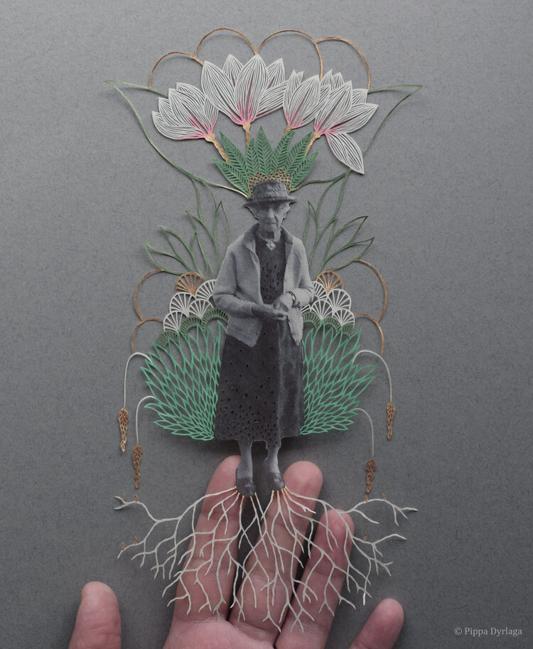
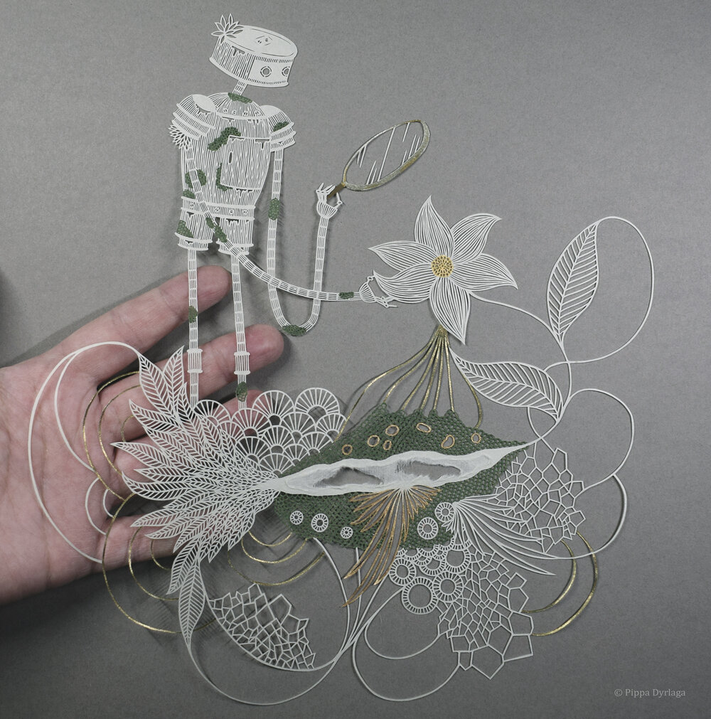
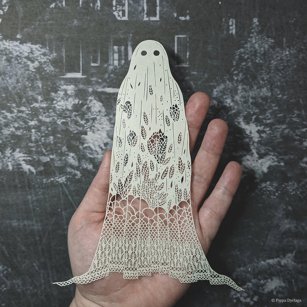
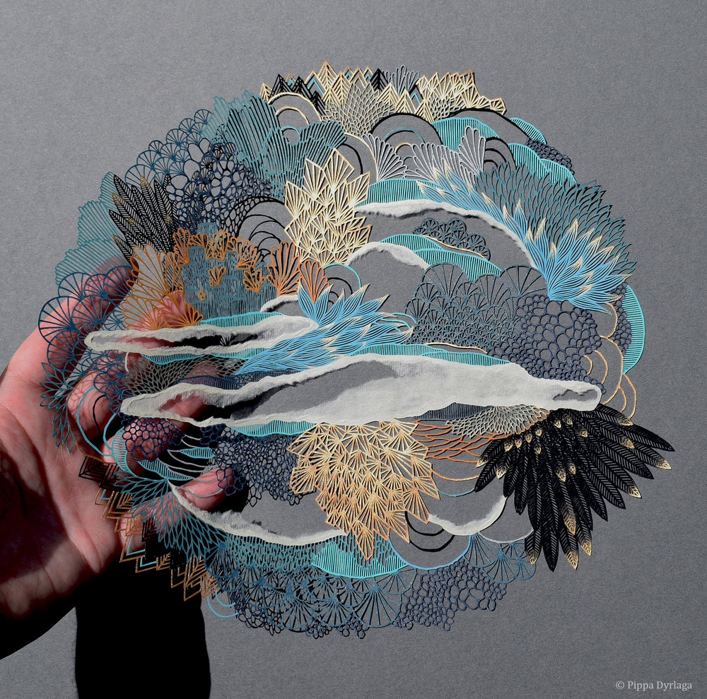
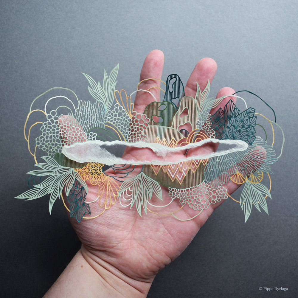
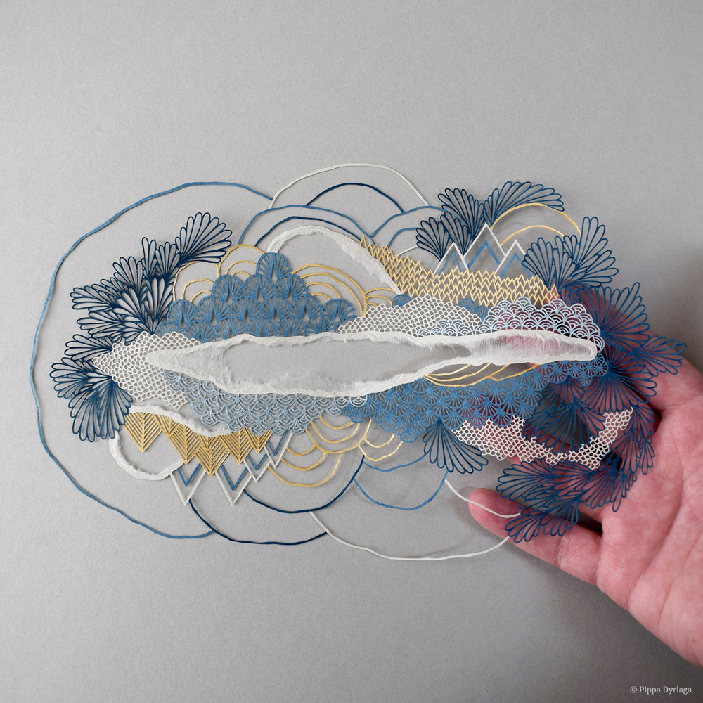
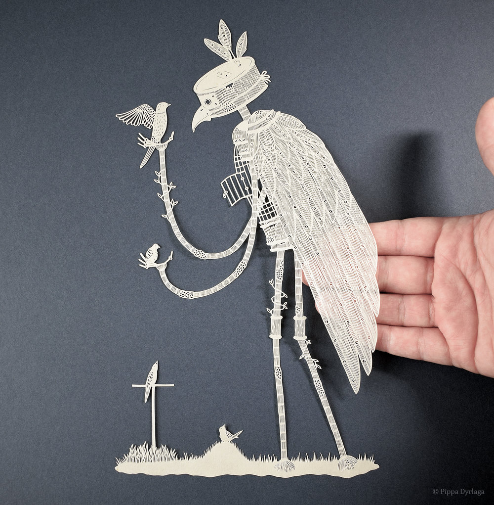
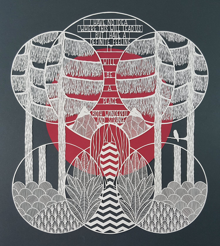
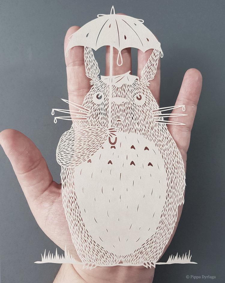
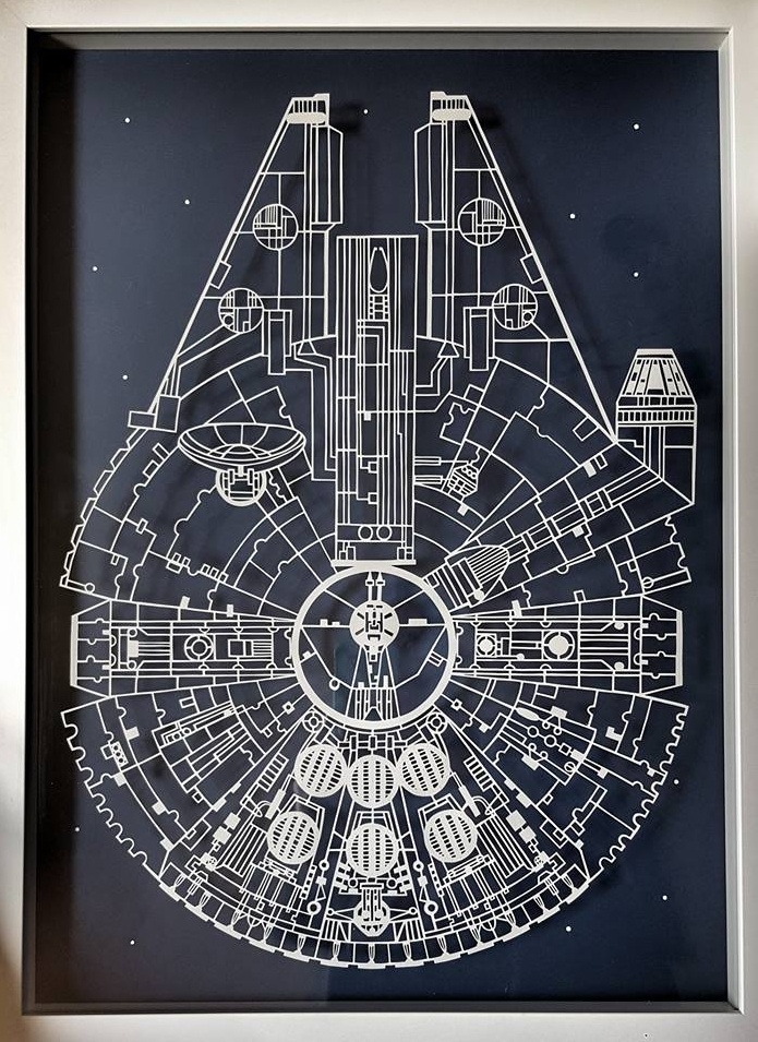
Based in Hebden Bridge, Yorkshire, Pippa Dyrlaga cuts each of her artworks in one sheet of paper. Her complex drawings transform a white page into a landscape filled with plants, animals, and strange characters.
The artist starts by drawing each piece upside-down before cutting it. She then turns it to paint the details.
Based in Hebden Bridge, Yorkshire, Pippa Dyrlaga cuts each of her artworks in one sheet of paper. Her complex drawings transform a white page into a landscape filled with plants, animals, and strange characters.
The artist starts by drawing each piece upside-down before cutting it. She then turns it to paint the details.
Based in Hebden Bridge, Yorkshire, Pippa Dyrlaga cuts each of her artworks in one sheet of paper. Her complex drawings transform a white page into a landscape filled with plants, animals, and strange characters.
The artist starts by drawing each piece upside-down before cutting it. She then turns it to paint the details.
Is it your dream to start a new publication? Get started with these creative magazine templates.
29 New Magazine Templates for 2020
The countdown to your business aspirations has begun. And there’s no better year than 2020 to begin a brand new creative journey.
Today we’ve got you covered with this stylish list of multipurpose magazine and article templates from Envato Market and Envato Elements.
Featuring premium Photoshop and InDesign templates for lifestyle, fashion, and business sectors, these fascinating pieces will pair well with your inspiring content.
Love design? Create your own magazine with this step-by-step guide from Grace Fussell.
With a clean, professional look, this template is a great fit for your stylish content. Add your own photos and content to these open, airy layouts; there are 14 custom pages that you can mix and match to make the perfect magazine for your project.
Let’s begin with this peachy and chic magazine. Update the cover with a beautiful portrait to make it truly shine. This template features 40 professionally designed pages available in Adobe InDesign formats. Best suited for versions CS4 and above. Check it out!
If you aspire to write for fashion magazines, then why not just create your own? This next stunning template helps you easily replace the cover photo below with any image you choose. Keep the theme centered around fashion or venture into sports, travel, and tech!
Are you the best at pairing stylish lookbooks? This magazine template is perfect for forward-thinking creatives. It features a cool pastel color scheme with all the elements you need for a professional magazine. Get access to free fonts and so much more!
We know how pre-designed Adobe InDesign templates make your life so much easier. And your work will fit the latest cool trends in this next magazine template. Print ready and fully editable, this template is a smart buy for any creative.
Wow your audience with bold visuals. This next multipurpose template is perfect for fashion and lifestyle themes. It features excellent use of white space concepts, along with attractive color schemes to make your work pop. Add it to your collection!
Become the next famous editor or writer to create their own mag! This exquisite magazine template features 20 full pages of class and style. Update the text details using well-organized and editable layers, and then swap out the cover photo for one of your own.
Develop your own brand with a clean magazine template. Featuring simple, minimalist details, this InDesign download includes multiple files for fabulous results. Well layered and print ready, this template is the perfect fit for bloggers, influencers, and much more.
New to magazine design? Don’t worry, there are many cool templates available for newbies to Photoshop and InDesign packages. And this sleek and brilliant design might be just the fit for your next creative project. Add it to your collection to explore 28 pages of incredible style.
Excited to start your own publication? Get pumped with an efficient magazine template. This print-ready design comes in both A4 and US letter sizes. It’s super easy to customize, and you can mix and match your favorite fonts for bold new looks.
Wouldn’t it be easier if someone else made the design for you? We share the same sentiment and recommend cutting your work in half with a professionally designed template. This special design comes with 32 unique pages and an editable cover.
Business Magazine Templates
Next up is our business section! Check out amazing, professional templates to help you close more creative deals.
This magazine template was designed with sports businesses in mind, but it could work for a variety of different professional focuses! If you’re looking for a design that’s clean, easy to customize, and perfect for showing off your photos, give this one a look.
If you’re a little familiar with Adobe InDesign, then you can definitely navigate this template with ease. This design features a clean and sophisticated cover that’s great for business, hobbies, and more. Try it out with your favorite photos and plug in some taglines on the cover.
Magazine bundles give you more phenomenal choices in only one download. This suite is dedicated to professional creatives who need a smart and stylish cover. All the elements can be customized easily, even if you want to change the text, images, or covers.
Explore new worlds with a trendy magazine template. Great for designers on the go, this template lets you drag and drop beautiful images for exciting results. Make it stand out even more by customizing it to fit your business or lifestyle brand.
Not sure where to begin? Then start with a solid multipurpose template. This magazine feature fully functional layers in well-organized Adobe InDesign files. Including 28 unique pages, this template will help you save more valuable time and energy.
Make your mark in the industry by celebrating your expertise. This universal magazine template can fit many businesses, from furniture to interior design and more. It includes 50 pages that are all fully editable to help you find the right vibe. Check it out!
Ready for more sports? Dive into a new career with this electric magazine template. Pump up the effect by adding an energy-packed image to the cover. Included inside are 25 amazing pages along with three unique covers. Add it to your collection!
Multipurpose Magazine Templates
Discover the right design to match your exclusive brand. Check out this next selection of fantastic multipurpose magazine templates.
Well designed and visually interesting, this template is plenty versatile. Change the colors, add your own callouts and content, swap in your own imagery, and this template could serve a number of different projects!
Do you have large, beautiful imagery and photographs to showcase in your magazine? Check out this template’s cover! The interior is lovely too, with 32 different pages to show off your written and visual content.
Looking for a clean, adaptable template that you can use for a wide variety of projects? This one might just be the perfect fit! It has plenty of room for large, beautiful photographs, as well as ample pages and space for your long-form content.
The pastel trend features beautiful, creamy colors that work well with a variety of topics. Now you can add a little magic to your covers with this magazine template. Available in several InDesign and Adobe formats, this template is fun and easy to customize.
Or you can easily refresh your brand with a lovely new color scheme. Check out this minimal design suitable for nearly any project. It features 36 professionally designed pages along with bleed marks, automatic page numbering, and more.
Your readers will love sitting at their desks with your magazine in hand. Give them something great to look at with this next magazine template. This download includes a modern and inspirational design with everything you need to get started. Check it out!
Are you inspired by photography or science? Then you’ll definitely love this mesmerizing photo magazine template. Perfectly drag and drop any science and research photos for a one-of-a-kind cover. Experiment with different photos for the best result!
Traveling the world can really open your mind to new experiences. Invoke that special sense of wonder with this modern template. This print-ready design features US letter and A4 sizes along with free fonts for more efficiency. Try it out!
Want to feel alive? Jump into a new business venture for a wild adventure. This next magazine template will help you achieve great success with a stunning and professional result. Get access to 40 beautiful pages and more for under $30!
Are you a creative looking to start your own magazine? Perhaps your art will look as intriguing as this lovely cover. Try out your own versions by downloading this massive magazine template packed with 52 pages. Add your sketches and illustrations to the cover for a magical result!
Our final magazine template lets you perfectly adjust the paragraphs, character styles, and more in only a matter of moments. Check out this nature-based template that can be easily updated with new photographs. Try it out with more landscape and nature photography for a stunning effect!
More Magazine Inspiration
Help your business out with a premium magazine template. I hope this list has inspired you to follow your potential by exploring new and creative options.
Learn more about magazine design. Check out these articles:
Tried any of these assets? Let us know! Tell us your favorites in the comments below.
This has been a selection of premium resources, perfect for the avid designer. For more magazine templates, check out Envato Market and Envato Elements, or enlist the help of our talented designers at Envato Studio. Happy creating!
Is it your dream to start a new publication? Get started with these creative magazine templates.
29 New Magazine Templates for 2020
The countdown to your business aspirations has begun. And there’s no better year than 2020 to begin a brand new creative journey.
Today we’ve got you covered with this stylish list of multipurpose magazine and article templates from Envato Market and Envato Elements.
Featuring premium Photoshop and InDesign templates for lifestyle, fashion, and business sectors, these fascinating pieces will pair well with your inspiring content.
Love design? Create your own magazine with this step-by-step guide from Grace Fussell.
With a clean, professional look, this template is a great fit for your stylish content. Add your own photos and content to these open, airy layouts; there are 14 custom pages that you can mix and match to make the perfect magazine for your project.
Let’s begin with this peachy and chic magazine. Update the cover with a beautiful portrait to make it truly shine. This template features 40 professionally designed pages available in Adobe InDesign formats. Best suited for versions CS4 and above. Check it out!
If you aspire to write for fashion magazines, then why not just create your own? This next stunning template helps you easily replace the cover photo below with any image you choose. Keep the theme centered around fashion or venture into sports, travel, and tech!
Are you the best at pairing stylish lookbooks? This magazine template is perfect for forward-thinking creatives. It features a cool pastel color scheme with all the elements you need for a professional magazine. Get access to free fonts and so much more!
We know how pre-designed Adobe InDesign templates make your life so much easier. And your work will fit the latest cool trends in this next magazine template. Print ready and fully editable, this template is a smart buy for any creative.
Wow your audience with bold visuals. This next multipurpose template is perfect for fashion and lifestyle themes. It features excellent use of white space concepts, along with attractive color schemes to make your work pop. Add it to your collection!
Become the next famous editor or writer to create their own mag! This exquisite magazine template features 20 full pages of class and style. Update the text details using well-organized and editable layers, and then swap out the cover photo for one of your own.
Develop your own brand with a clean magazine template. Featuring simple, minimalist details, this InDesign download includes multiple files for fabulous results. Well layered and print ready, this template is the perfect fit for bloggers, influencers, and much more.
New to magazine design? Don’t worry, there are many cool templates available for newbies to Photoshop and InDesign packages. And this sleek and brilliant design might be just the fit for your next creative project. Add it to your collection to explore 28 pages of incredible style.
Excited to start your own publication? Get pumped with an efficient magazine template. This print-ready design comes in both A4 and US letter sizes. It’s super easy to customize, and you can mix and match your favorite fonts for bold new looks.
Wouldn’t it be easier if someone else made the design for you? We share the same sentiment and recommend cutting your work in half with a professionally designed template. This special design comes with 32 unique pages and an editable cover.
Business Magazine Templates
Next up is our business section! Check out amazing, professional templates to help you close more creative deals.
This magazine template was designed with sports businesses in mind, but it could work for a variety of different professional focuses! If you’re looking for a design that’s clean, easy to customize, and perfect for showing off your photos, give this one a look.
If you’re a little familiar with Adobe InDesign, then you can definitely navigate this template with ease. This design features a clean and sophisticated cover that’s great for business, hobbies, and more. Try it out with your favorite photos and plug in some taglines on the cover.
Magazine bundles give you more phenomenal choices in only one download. This suite is dedicated to professional creatives who need a smart and stylish cover. All the elements can be customized easily, even if you want to change the text, images, or covers.
Explore new worlds with a trendy magazine template. Great for designers on the go, this template lets you drag and drop beautiful images for exciting results. Make it stand out even more by customizing it to fit your business or lifestyle brand.
Not sure where to begin? Then start with a solid multipurpose template. This magazine feature fully functional layers in well-organized Adobe InDesign files. Including 28 unique pages, this template will help you save more valuable time and energy.
Make your mark in the industry by celebrating your expertise. This universal magazine template can fit many businesses, from furniture to interior design and more. It includes 50 pages that are all fully editable to help you find the right vibe. Check it out!
Ready for more sports? Dive into a new career with this electric magazine template. Pump up the effect by adding an energy-packed image to the cover. Included inside are 25 amazing pages along with three unique covers. Add it to your collection!
Multipurpose Magazine Templates
Discover the right design to match your exclusive brand. Check out this next selection of fantastic multipurpose magazine templates.
Well designed and visually interesting, this template is plenty versatile. Change the colors, add your own callouts and content, swap in your own imagery, and this template could serve a number of different projects!
Do you have large, beautiful imagery and photographs to showcase in your magazine? Check out this template’s cover! The interior is lovely too, with 32 different pages to show off your written and visual content.
Looking for a clean, adaptable template that you can use for a wide variety of projects? This one might just be the perfect fit! It has plenty of room for large, beautiful photographs, as well as ample pages and space for your long-form content.
The pastel trend features beautiful, creamy colors that work well with a variety of topics. Now you can add a little magic to your covers with this magazine template. Available in several InDesign and Adobe formats, this template is fun and easy to customize.
Or you can easily refresh your brand with a lovely new color scheme. Check out this minimal design suitable for nearly any project. It features 36 professionally designed pages along with bleed marks, automatic page numbering, and more.
Your readers will love sitting at their desks with your magazine in hand. Give them something great to look at with this next magazine template. This download includes a modern and inspirational design with everything you need to get started. Check it out!
Are you inspired by photography or science? Then you’ll definitely love this mesmerizing photo magazine template. Perfectly drag and drop any science and research photos for a one-of-a-kind cover. Experiment with different photos for the best result!
Traveling the world can really open your mind to new experiences. Invoke that special sense of wonder with this modern template. This print-ready design features US letter and A4 sizes along with free fonts for more efficiency. Try it out!
Want to feel alive? Jump into a new business venture for a wild adventure. This next magazine template will help you achieve great success with a stunning and professional result. Get access to 40 beautiful pages and more for under $30!
Are you a creative looking to start your own magazine? Perhaps your art will look as intriguing as this lovely cover. Try out your own versions by downloading this massive magazine template packed with 52 pages. Add your sketches and illustrations to the cover for a magical result!
Our final magazine template lets you perfectly adjust the paragraphs, character styles, and more in only a matter of moments. Check out this nature-based template that can be easily updated with new photographs. Try it out with more landscape and nature photography for a stunning effect!
More Magazine Inspiration
Help your business out with a premium magazine template. I hope this list has inspired you to follow your potential by exploring new and creative options.
Learn more about magazine design. Check out these articles:
Tried any of these assets? Let us know! Tell us your favorites in the comments below.
This has been a selection of premium resources, perfect for the avid designer. For more magazine templates, check out Envato Market and Envato Elements, or enlist the help of our talented designers at Envato Studio. Happy creating!
Is it your dream to start a new publication? Get started with these creative magazine templates.
29 New Magazine Templates for 2020
The countdown to your business aspirations has begun. And there’s no better year than 2020 to begin a brand new creative journey.
Today we’ve got you covered with this stylish list of multipurpose magazine and article templates from Envato Market and Envato Elements.
Featuring premium Photoshop and InDesign templates for lifestyle, fashion, and business sectors, these fascinating pieces will pair well with your inspiring content.
Love design? Create your own magazine with this step-by-step guide from Grace Fussell.
With a clean, professional look, this template is a great fit for your stylish content. Add your own photos and content to these open, airy layouts; there are 14 custom pages that you can mix and match to make the perfect magazine for your project.
Let’s begin with this peachy and chic magazine. Update the cover with a beautiful portrait to make it truly shine. This template features 40 professionally designed pages available in Adobe InDesign formats. Best suited for versions CS4 and above. Check it out!
If you aspire to write for fashion magazines, then why not just create your own? This next stunning template helps you easily replace the cover photo below with any image you choose. Keep the theme centered around fashion or venture into sports, travel, and tech!
Are you the best at pairing stylish lookbooks? This magazine template is perfect for forward-thinking creatives. It features a cool pastel color scheme with all the elements you need for a professional magazine. Get access to free fonts and so much more!
We know how pre-designed Adobe InDesign templates make your life so much easier. And your work will fit the latest cool trends in this next magazine template. Print ready and fully editable, this template is a smart buy for any creative.
Wow your audience with bold visuals. This next multipurpose template is perfect for fashion and lifestyle themes. It features excellent use of white space concepts, along with attractive color schemes to make your work pop. Add it to your collection!
Become the next famous editor or writer to create their own mag! This exquisite magazine template features 20 full pages of class and style. Update the text details using well-organized and editable layers, and then swap out the cover photo for one of your own.
Develop your own brand with a clean magazine template. Featuring simple, minimalist details, this InDesign download includes multiple files for fabulous results. Well layered and print ready, this template is the perfect fit for bloggers, influencers, and much more.
New to magazine design? Don’t worry, there are many cool templates available for newbies to Photoshop and InDesign packages. And this sleek and brilliant design might be just the fit for your next creative project. Add it to your collection to explore 28 pages of incredible style.
Excited to start your own publication? Get pumped with an efficient magazine template. This print-ready design comes in both A4 and US letter sizes. It’s super easy to customize, and you can mix and match your favorite fonts for bold new looks.
Wouldn’t it be easier if someone else made the design for you? We share the same sentiment and recommend cutting your work in half with a professionally designed template. This special design comes with 32 unique pages and an editable cover.
Business Magazine Templates
Next up is our business section! Check out amazing, professional templates to help you close more creative deals.
This magazine template was designed with sports businesses in mind, but it could work for a variety of different professional focuses! If you’re looking for a design that’s clean, easy to customize, and perfect for showing off your photos, give this one a look.
If you’re a little familiar with Adobe InDesign, then you can definitely navigate this template with ease. This design features a clean and sophisticated cover that’s great for business, hobbies, and more. Try it out with your favorite photos and plug in some taglines on the cover.
Magazine bundles give you more phenomenal choices in only one download. This suite is dedicated to professional creatives who need a smart and stylish cover. All the elements can be customized easily, even if you want to change the text, images, or covers.
Explore new worlds with a trendy magazine template. Great for designers on the go, this template lets you drag and drop beautiful images for exciting results. Make it stand out even more by customizing it to fit your business or lifestyle brand.
Not sure where to begin? Then start with a solid multipurpose template. This magazine feature fully functional layers in well-organized Adobe InDesign files. Including 28 unique pages, this template will help you save more valuable time and energy.
Make your mark in the industry by celebrating your expertise. This universal magazine template can fit many businesses, from furniture to interior design and more. It includes 50 pages that are all fully editable to help you find the right vibe. Check it out!
Ready for more sports? Dive into a new career with this electric magazine template. Pump up the effect by adding an energy-packed image to the cover. Included inside are 25 amazing pages along with three unique covers. Add it to your collection!
Multipurpose Magazine Templates
Discover the right design to match your exclusive brand. Check out this next selection of fantastic multipurpose magazine templates.
Well designed and visually interesting, this template is plenty versatile. Change the colors, add your own callouts and content, swap in your own imagery, and this template could serve a number of different projects!
Do you have large, beautiful imagery and photographs to showcase in your magazine? Check out this template’s cover! The interior is lovely too, with 32 different pages to show off your written and visual content.
Looking for a clean, adaptable template that you can use for a wide variety of projects? This one might just be the perfect fit! It has plenty of room for large, beautiful photographs, as well as ample pages and space for your long-form content.
The pastel trend features beautiful, creamy colors that work well with a variety of topics. Now you can add a little magic to your covers with this magazine template. Available in several InDesign and Adobe formats, this template is fun and easy to customize.
Or you can easily refresh your brand with a lovely new color scheme. Check out this minimal design suitable for nearly any project. It features 36 professionally designed pages along with bleed marks, automatic page numbering, and more.
Your readers will love sitting at their desks with your magazine in hand. Give them something great to look at with this next magazine template. This download includes a modern and inspirational design with everything you need to get started. Check it out!
Are you inspired by photography or science? Then you’ll definitely love this mesmerizing photo magazine template. Perfectly drag and drop any science and research photos for a one-of-a-kind cover. Experiment with different photos for the best result!
Traveling the world can really open your mind to new experiences. Invoke that special sense of wonder with this modern template. This print-ready design features US letter and A4 sizes along with free fonts for more efficiency. Try it out!
Want to feel alive? Jump into a new business venture for a wild adventure. This next magazine template will help you achieve great success with a stunning and professional result. Get access to 40 beautiful pages and more for under $30!
Are you a creative looking to start your own magazine? Perhaps your art will look as intriguing as this lovely cover. Try out your own versions by downloading this massive magazine template packed with 52 pages. Add your sketches and illustrations to the cover for a magical result!
Our final magazine template lets you perfectly adjust the paragraphs, character styles, and more in only a matter of moments. Check out this nature-based template that can be easily updated with new photographs. Try it out with more landscape and nature photography for a stunning effect!
More Magazine Inspiration
Help your business out with a premium magazine template. I hope this list has inspired you to follow your potential by exploring new and creative options.
Learn more about magazine design. Check out these articles:
Tried any of these assets? Let us know! Tell us your favorites in the comments below.
This has been a selection of premium resources, perfect for the avid designer. For more magazine templates, check out Envato Market and Envato Elements, or enlist the help of our talented designers at Envato Studio. Happy creating!
Is it your dream to start a new publication? Get started with these creative magazine templates.
29 New Magazine Templates for 2020
The countdown to your business aspirations has begun. And there’s no better year than 2020 to begin a brand new creative journey.
Today we’ve got you covered with this stylish list of multipurpose magazine and article templates from Envato Market and Envato Elements.
Featuring premium Photoshop and InDesign templates for lifestyle, fashion, and business sectors, these fascinating pieces will pair well with your inspiring content.
Love design? Create your own magazine with this step-by-step guide from Grace Fussell.
With a clean, professional look, this template is a great fit for your stylish content. Add your own photos and content to these open, airy layouts; there are 14 custom pages that you can mix and match to make the perfect magazine for your project.
Let’s begin with this peachy and chic magazine. Update the cover with a beautiful portrait to make it truly shine. This template features 40 professionally designed pages available in Adobe InDesign formats. Best suited for versions CS4 and above. Check it out!
If you aspire to write for fashion magazines, then why not just create your own? This next stunning template helps you easily replace the cover photo below with any image you choose. Keep the theme centered around fashion or venture into sports, travel, and tech!
Are you the best at pairing stylish lookbooks? This magazine template is perfect for forward-thinking creatives. It features a cool pastel color scheme with all the elements you need for a professional magazine. Get access to free fonts and so much more!
We know how pre-designed Adobe InDesign templates make your life so much easier. And your work will fit the latest cool trends in this next magazine template. Print ready and fully editable, this template is a smart buy for any creative.
Wow your audience with bold visuals. This next multipurpose template is perfect for fashion and lifestyle themes. It features excellent use of white space concepts, along with attractive color schemes to make your work pop. Add it to your collection!
Become the next famous editor or writer to create their own mag! This exquisite magazine template features 20 full pages of class and style. Update the text details using well-organized and editable layers, and then swap out the cover photo for one of your own.
Develop your own brand with a clean magazine template. Featuring simple, minimalist details, this InDesign download includes multiple files for fabulous results. Well layered and print ready, this template is the perfect fit for bloggers, influencers, and much more.
New to magazine design? Don’t worry, there are many cool templates available for newbies to Photoshop and InDesign packages. And this sleek and brilliant design might be just the fit for your next creative project. Add it to your collection to explore 28 pages of incredible style.
Excited to start your own publication? Get pumped with an efficient magazine template. This print-ready design comes in both A4 and US letter sizes. It’s super easy to customize, and you can mix and match your favorite fonts for bold new looks.
Wouldn’t it be easier if someone else made the design for you? We share the same sentiment and recommend cutting your work in half with a professionally designed template. This special design comes with 32 unique pages and an editable cover.
Business Magazine Templates
Next up is our business section! Check out amazing, professional templates to help you close more creative deals.
This magazine template was designed with sports businesses in mind, but it could work for a variety of different professional focuses! If you’re looking for a design that’s clean, easy to customize, and perfect for showing off your photos, give this one a look.
If you’re a little familiar with Adobe InDesign, then you can definitely navigate this template with ease. This design features a clean and sophisticated cover that’s great for business, hobbies, and more. Try it out with your favorite photos and plug in some taglines on the cover.
Magazine bundles give you more phenomenal choices in only one download. This suite is dedicated to professional creatives who need a smart and stylish cover. All the elements can be customized easily, even if you want to change the text, images, or covers.
Explore new worlds with a trendy magazine template. Great for designers on the go, this template lets you drag and drop beautiful images for exciting results. Make it stand out even more by customizing it to fit your business or lifestyle brand.
Not sure where to begin? Then start with a solid multipurpose template. This magazine feature fully functional layers in well-organized Adobe InDesign files. Including 28 unique pages, this template will help you save more valuable time and energy.
Make your mark in the industry by celebrating your expertise. This universal magazine template can fit many businesses, from furniture to interior design and more. It includes 50 pages that are all fully editable to help you find the right vibe. Check it out!
Ready for more sports? Dive into a new career with this electric magazine template. Pump up the effect by adding an energy-packed image to the cover. Included inside are 25 amazing pages along with three unique covers. Add it to your collection!
Multipurpose Magazine Templates
Discover the right design to match your exclusive brand. Check out this next selection of fantastic multipurpose magazine templates.
Well designed and visually interesting, this template is plenty versatile. Change the colors, add your own callouts and content, swap in your own imagery, and this template could serve a number of different projects!
Do you have large, beautiful imagery and photographs to showcase in your magazine? Check out this template’s cover! The interior is lovely too, with 32 different pages to show off your written and visual content.
Looking for a clean, adaptable template that you can use for a wide variety of projects? This one might just be the perfect fit! It has plenty of room for large, beautiful photographs, as well as ample pages and space for your long-form content.
The pastel trend features beautiful, creamy colors that work well with a variety of topics. Now you can add a little magic to your covers with this magazine template. Available in several InDesign and Adobe formats, this template is fun and easy to customize.
Or you can easily refresh your brand with a lovely new color scheme. Check out this minimal design suitable for nearly any project. It features 36 professionally designed pages along with bleed marks, automatic page numbering, and more.
Your readers will love sitting at their desks with your magazine in hand. Give them something great to look at with this next magazine template. This download includes a modern and inspirational design with everything you need to get started. Check it out!
Are you inspired by photography or science? Then you’ll definitely love this mesmerizing photo magazine template. Perfectly drag and drop any science and research photos for a one-of-a-kind cover. Experiment with different photos for the best result!
Traveling the world can really open your mind to new experiences. Invoke that special sense of wonder with this modern template. This print-ready design features US letter and A4 sizes along with free fonts for more efficiency. Try it out!
Want to feel alive? Jump into a new business venture for a wild adventure. This next magazine template will help you achieve great success with a stunning and professional result. Get access to 40 beautiful pages and more for under $30!
Are you a creative looking to start your own magazine? Perhaps your art will look as intriguing as this lovely cover. Try out your own versions by downloading this massive magazine template packed with 52 pages. Add your sketches and illustrations to the cover for a magical result!
Our final magazine template lets you perfectly adjust the paragraphs, character styles, and more in only a matter of moments. Check out this nature-based template that can be easily updated with new photographs. Try it out with more landscape and nature photography for a stunning effect!
More Magazine Inspiration
Help your business out with a premium magazine template. I hope this list has inspired you to follow your potential by exploring new and creative options.
Learn more about magazine design. Check out these articles:
Tried any of these assets? Let us know! Tell us your favorites in the comments below.
This has been a selection of premium resources, perfect for the avid designer. For more magazine templates, check out Envato Market and Envato Elements, or enlist the help of our talented designers at Envato Studio. Happy creating!