Statistics show that 1 in 3 abused children are more likely to become abusers themselves in the future. To combat this cycle and create awareness we launched the #StopTheCycle campaign.
Statistics show that 1 in 3 abused children are more likely to become abusers themselves in the future. To combat this cycle and create awareness we launched the #StopTheCycle campaign.
Statistics show that 1 in 3 abused children are more likely to become abusers themselves in the future. To combat this cycle and create awareness we launched the #StopTheCycle campaign.
Banco Pichincha and MullenLowe Delta removed the midfield line during the Ecuadorean League´s All-Star Game, a match with the best players of the country, to show that there should be no divisions between fellow countrymen. In Ecuador, there are 2 main geographical regions dividing the country, the Coastal and the Andean regions. This rivalry dates back more than 200 years; since Quito and Guayaquil -the country´s biggest cities- both disputed to be the capital of Ecuador. These cultural confrontations also take place around soccer. Generating violence between fans of both regions. Banco Pichincha arranged a historic match (on June 22nd, 2019) between the most recognized players from clubs of both regions. Before the kick-off, the players from both sides removed the centerfield line to demonstrate to the world that there should be no divisions, nor in sports nor in life.
Banco Pichincha and MullenLowe Delta removed the midfield line during the Ecuadorean League´s All-Star Game, a match with the best players of the country, to show that there should be no divisions between fellow countrymen. In Ecuador, there are 2 main geographical regions dividing the country, the Coastal and the Andean regions. This rivalry dates back more than 200 years; since Quito and Guayaquil -the country´s biggest cities- both disputed to be the capital of Ecuador. These cultural confrontations also take place around soccer. Generating violence between fans of both regions. Banco Pichincha arranged a historic match (on June 22nd, 2019) between the most recognized players from clubs of both regions. Before the kick-off, the players from both sides removed the centerfield line to demonstrate to the world that there should be no divisions, nor in sports nor in life.
Since 1516, German breweries have to produce Pils beer according to the world’s oldest food law, the purity law – with hop, malt and water only. We wanted to challenge this and added a new ingredient without changing the recipe: the beer drinkers themselves! Beck’s involved its fans in the making of a new beer. With an interactive outdoor experience and by applying popular science (“plants grow better when you talk to them”) to hop. We installed loud speakers in the world’s biggest hop field, connecting them to a mobile recording booth that was placed in popular Berlin night out areas. In that way, people talked in an around-the-clock live-stunt to a Beck’s key ingredient. Together with malt and yeast, the harvested hop was then turned into a limited-edition with new taste – thanks to the many Berlin people who infused it with their stories, songs and laughs.
Since 1516, German breweries have to produce Pils beer according to the world’s oldest food law, the purity law – with hop, malt and water only. We wanted to challenge this and added a new ingredient without changing the recipe: the beer drinkers themselves! Beck’s involved its fans in the making of a new beer. With an interactive outdoor experience and by applying popular science (“plants grow better when you talk to them”) to hop. We installed loud speakers in the world’s biggest hop field, connecting them to a mobile recording booth that was placed in popular Berlin night out areas. In that way, people talked in an around-the-clock live-stunt to a Beck’s key ingredient. Together with malt and yeast, the harvested hop was then turned into a limited-edition with new taste – thanks to the many Berlin people who infused it with their stories, songs and laughs.
Every week, we’ll give you an overview of the best deals for designers, make sure you don’t miss any by subscribing to our deals feed. You can also follow the recently launched website Type Deals if you are looking for free fonts or font deals.
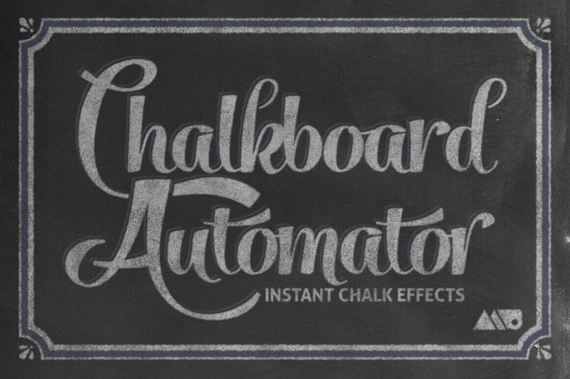
Instantly Create Realistic Chalk Effects with Chalkboard Automator
With Adobe Photoshop and the Chalkboard Automator tool, you can quickly and easily create professional looking chalk effects. Instantly build a chalk design with 15 unique chalk textures, 12 chalk backgrounds, 35 chalk stamp brushes, and 5 premade decorative frames. Detailed instructions and even a video walkthrough will teach you everything you need to know.
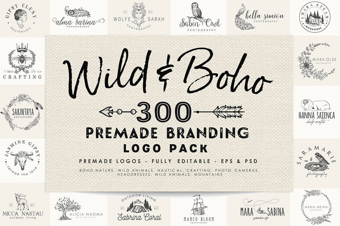
Capture a vintage feel with the Wild & Boho Premade Branding Logo Pack. This hand-drawn collection was made for you free spirits and sophisticated hearts. Covering 10 different themes from Boho to Nautical, you’ll get 300 professional premade logos. With the original EPS and PSD files, each of these logos are fully editable to help you create the perfect branding for your clients.
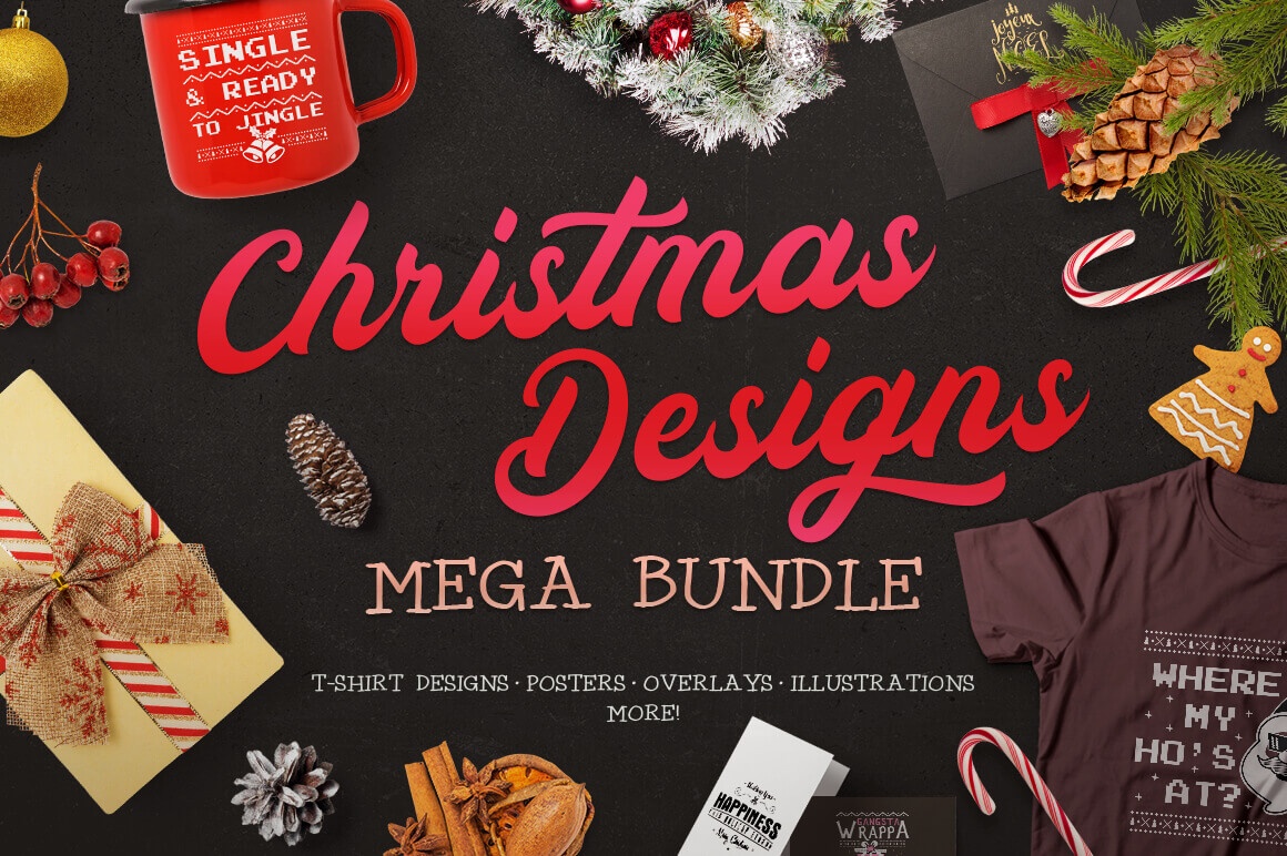
Ho-Ho-Ho! Holidays and Christmas are alomost here! No matter if you are a designer or hobbyist who is doing projects, home crafts or making special gifts for your family, you need a ton of Christmas graphics! Right? So feast your eyes on this Christmas Designs Mega Bundle and you’ll find everything you need to make your Holidays more cheerful.
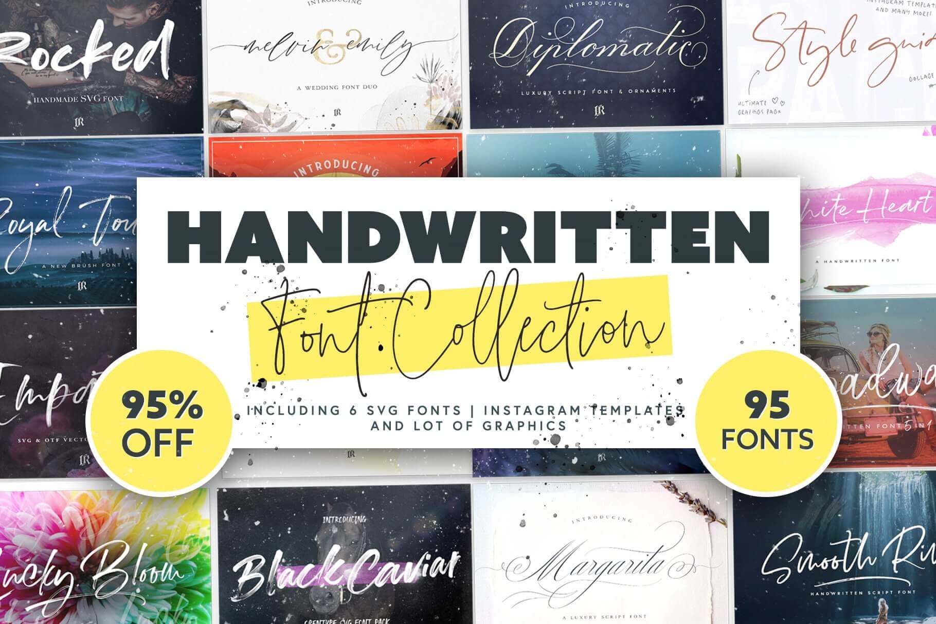
This Handwritten Font Collection is chock full of 95 different handwritten fonts in a wide range of styles from playful to elegant. Additionally, many typefaces include OpenType features like ligatures and alternates. You’ll also get 15 Instagram templates, 6 SVG fonts and various graphics to complete your designs.
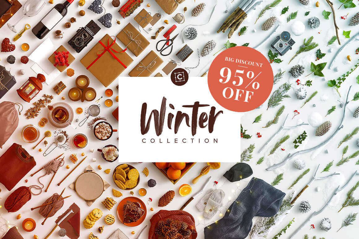
1,400+ Isolated Items, Winter Scene Creator Bundle
Easily and quickly build the perfect winter mockup with this Winter Scene Creator Bundle! Stuffed with more than 1,400 isolated objects from food to fashion to foliage, you can customize any of the 31 pre-made scenes using smart objects, or simply create your own with 30 different backgrounds to choose from.
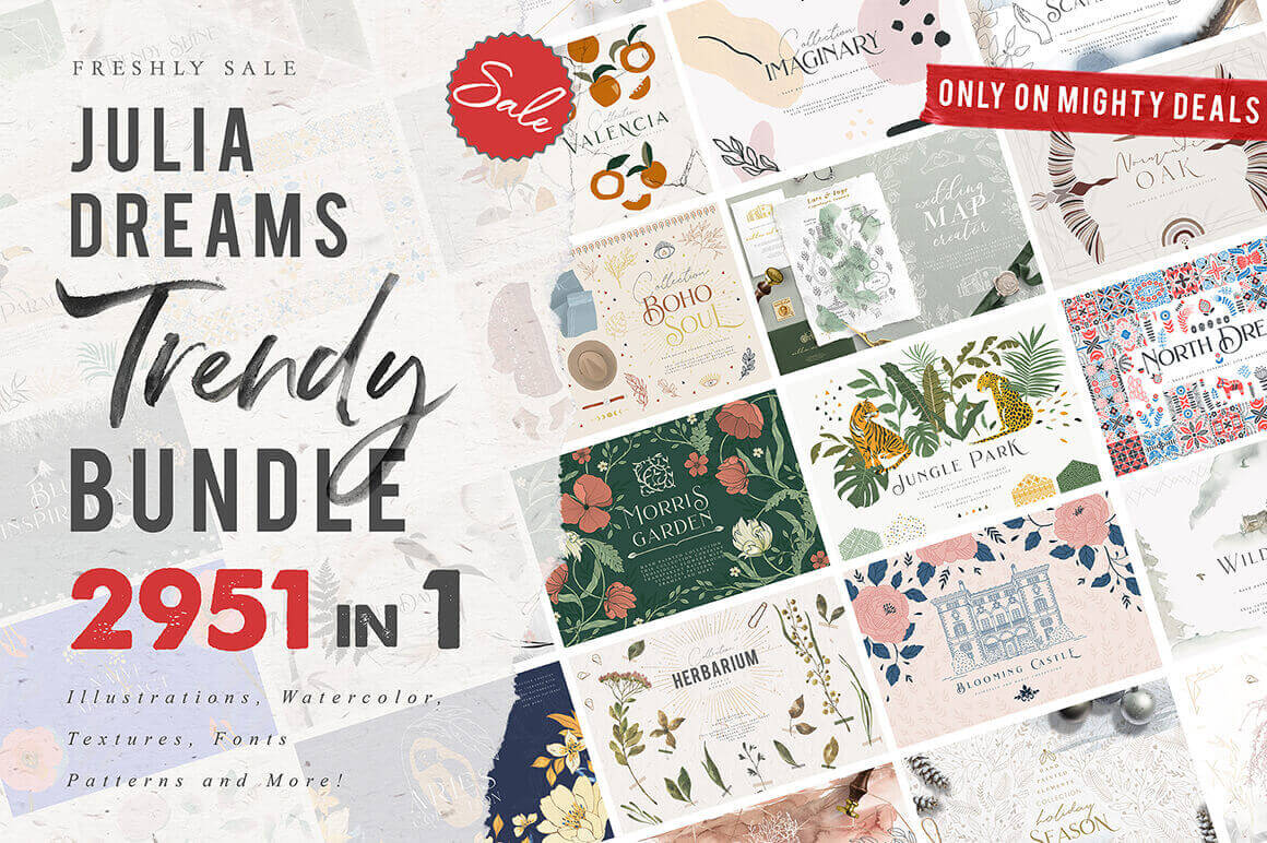
Sick of wasting time looking for that perfect something to improve your artwork? Look no further! This Mighty Deal from Julia Dreams features more than 2950 graphic design elements to help you push your projects to the next level! Made from 28 different collections, this deal covers a wide breadth of themes from wedding to frames to patterns. Make your designs sing for a ridiculously discounted price.
Every week, we’ll give you an overview of the best deals for designers, make sure you don’t miss any by subscribing to our deals feed. You can also follow the recently launched website Type Deals if you are looking for free fonts or font deals.
Instantly Create Realistic Chalk Effects with Chalkboard Automator
With Adobe Photoshop and the Chalkboard Automator tool, you can quickly and easily create professional looking chalk effects. Instantly build a chalk design with 15 unique chalk textures, 12 chalk backgrounds, 35 chalk stamp brushes, and 5 premade decorative frames. Detailed instructions and even a video walkthrough will teach you everything you need to know.
Capture a vintage feel with the Wild & Boho Premade Branding Logo Pack. This hand-drawn collection was made for you free spirits and sophisticated hearts. Covering 10 different themes from Boho to Nautical, you’ll get 300 professional premade logos. With the original EPS and PSD files, each of these logos are fully editable to help you create the perfect branding for your clients.
Ho-Ho-Ho! Holidays and Christmas are alomost here! No matter if you are a designer or hobbyist who is doing projects, home crafts or making special gifts for your family, you need a ton of Christmas graphics! Right? So feast your eyes on this Christmas Designs Mega Bundle and you’ll find everything you need to make your Holidays more cheerful.
This Handwritten Font Collection is chock full of 95 different handwritten fonts in a wide range of styles from playful to elegant. Additionally, many typefaces include OpenType features like ligatures and alternates. You’ll also get 15 Instagram templates, 6 SVG fonts and various graphics to complete your designs.
1,400+ Isolated Items, Winter Scene Creator Bundle
Easily and quickly build the perfect winter mockup with this Winter Scene Creator Bundle! Stuffed with more than 1,400 isolated objects from food to fashion to foliage, you can customize any of the 31 pre-made scenes using smart objects, or simply create your own with 30 different backgrounds to choose from.
Sick of wasting time looking for that perfect something to improve your artwork? Look no further! This Mighty Deal from Julia Dreams features more than 2950 graphic design elements to help you push your projects to the next level! Made from 28 different collections, this deal covers a wide breadth of themes from wedding to frames to patterns. Make your designs sing for a ridiculously discounted price.
Every week, we’ll give you an overview of the best deals for designers, make sure you don’t miss any by subscribing to our deals feed. You can also follow the recently launched website Type Deals if you are looking for free fonts or font deals.
Instantly Create Realistic Chalk Effects with Chalkboard Automator
With Adobe Photoshop and the Chalkboard Automator tool, you can quickly and easily create professional looking chalk effects. Instantly build a chalk design with 15 unique chalk textures, 12 chalk backgrounds, 35 chalk stamp brushes, and 5 premade decorative frames. Detailed instructions and even a video walkthrough will teach you everything you need to know.
Capture a vintage feel with the Wild & Boho Premade Branding Logo Pack. This hand-drawn collection was made for you free spirits and sophisticated hearts. Covering 10 different themes from Boho to Nautical, you’ll get 300 professional premade logos. With the original EPS and PSD files, each of these logos are fully editable to help you create the perfect branding for your clients.
Ho-Ho-Ho! Holidays and Christmas are alomost here! No matter if you are a designer or hobbyist who is doing projects, home crafts or making special gifts for your family, you need a ton of Christmas graphics! Right? So feast your eyes on this Christmas Designs Mega Bundle and you’ll find everything you need to make your Holidays more cheerful.
This Handwritten Font Collection is chock full of 95 different handwritten fonts in a wide range of styles from playful to elegant. Additionally, many typefaces include OpenType features like ligatures and alternates. You’ll also get 15 Instagram templates, 6 SVG fonts and various graphics to complete your designs.
1,400+ Isolated Items, Winter Scene Creator Bundle
Easily and quickly build the perfect winter mockup with this Winter Scene Creator Bundle! Stuffed with more than 1,400 isolated objects from food to fashion to foliage, you can customize any of the 31 pre-made scenes using smart objects, or simply create your own with 30 different backgrounds to choose from.
Sick of wasting time looking for that perfect something to improve your artwork? Look no further! This Mighty Deal from Julia Dreams features more than 2950 graphic design elements to help you push your projects to the next level! Made from 28 different collections, this deal covers a wide breadth of themes from wedding to frames to patterns. Make your designs sing for a ridiculously discounted price.