Regarding CSS’s Global Scope

Post pobrano z: Regarding CSS’s Global Scope

html {
  font-family: Roboto, sans-serif;
}

With the except of some form elements, you’ve just set a font on every bit of text on a site! Nice! That’s probably what you were trying to do, because of the probably hundreds of elements all over your site, setting that font-family every time would be tedious and error-prone.

CSS is global by nature. On purpose!

I like how David Khourshid put it:

You ever stop and think about why CSS has a global scope? Maybe we want to use consistent typography, colors, sizing, spacing, layout, transitions, etc. and have our websites & apps feel like one cohesive unit?

Love the cascade, the cascade is your friend.

And yet. The global nature of CSS is perhaps the most-pointed-at anti-feature of CSS. Some people really don’t like it. We all know it’s very easy to write a single CSS rule that has implications all over a site, breaking things you really didn’t want to break.

Two CSS properties walk into a bar.

A barstool in a completely different bar falls over.

— Thomas Fuchs 🎄🕹💾 (@thomasfuchs) July 28, 2014

There are whole new categories of testing to assist with these problems.

Scoped styles aren’t the only reason there is such interest and adoption in the landscape of tools that is CSS-in-JS, but it’s a big one. There are loads of sites that don’t directly author any CSS at all — even preprocessed styles — and go for a JavaScript library instead where styles are authored quite literally in JavaScript. There is a playground demonstrating the syntax of the various options. Here’s how styled-components works:

import React from 'react';
import styled from 'styled-components';

const Container = styled.main`
  display: flex;
  flex-direction: column;
  min-height: 100%;
  width: 100%;
  background-color: #f6f9fc;
`;

export default function Login() {
  return (
    <Container>
      ... Some stuff ....
    </Container>
  );
}

There are literally dozens of options, each doing things a bit differently while offering slightly different syntaxes and features. Vue even offers scoped CSS directly in .vue files:

<style scoped>
.example {
  color: red;
}
</style>

<template>
  <div class="example">hi</div>
</template>

Unfortunately, <style scoped> never quite made it as a native web platform feature. There is shadow DOM, though, where a style block can be injected in a template and those styles will be isolated from the rest of the page:

let myElement = document.querySelector('.my-element');

let shadow = myElement.attachShadow({
  mode: 'closed'
});
shadow.innerHTML = `
  <style>
    p { 
      color: red;
    }
  </style>

  <p>Element with Shadow DOM</p>
`;

No styles will leak into or out of that shadow DOM boundary. That’s pretty cool for people seeking this kind of isolation, but it could be tricky. You’d likely have to architect the CSS to have certain global styles that can be imported with the shadow DOM’d web component so it can achieve some styling cohesion in your site. Personally, I wish it was possible to make the shadow DOM one-way permeable: styles can leak in, but styles defined inside can’t leak out.

CSS-in-JS stuff is only one way to scope styles. There are actually two sides to the spectrum. You could call CSS-in-JS total isolation, whereas you could author CSS directly with total abstraction:

Total abstraction might come from a project, like Tachyons, that gives you a fixed set of class names to use for styling (Tailwind is like a configurable version of that), or a programmatic tool (like Atomizer) that turns specially named HTML class attributes into a stylesheet with exactly what it needs.

Even adhering 100% to BEM across your entire site could be considered total CSS isolation, solving the problems that the global scope may bring.

Personally, I’d like to see us move to this kind of future:

When we write styles, we will always make a choice. Is this a global style? Am I, on purpose, leaking this style across the entire site? Or, am I writing CSS that is specific to this component? CSS will be split in half between these two. Component-specific styles will be scoped and bundled with the component and used as needed.

Best of both worlds, that.

Anyway, it’s tricky.

The problem is not CSS in JS.

It is CSS's global scope.

Solve the global scope, and CSS in JS will follow.

(I don't know if "follow" means disappear, being fully accepted, or getting a major overhaul.)

(For that matter, I don't know what "solving the global scope" means.)

— ppk 🇪🇺 (@ppk) November 28, 2018

Maybe this will be the hottest CSS topic in 2019.

The post Regarding CSS’s Global Scope appeared first on CSS-Tricks.

Decorating your walls has never been so easy, thanks to Displate

Post pobrano z: Decorating your walls has never been so easy, thanks to Displate

Choosing what to hang on your walls for decoration can be tougher than it seems. Finding out how to hang it can also be problematic, as most art hanging techniques will damage your walls.

Enters Displate!

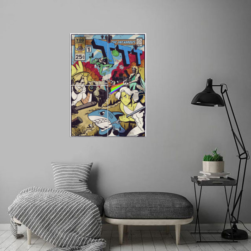
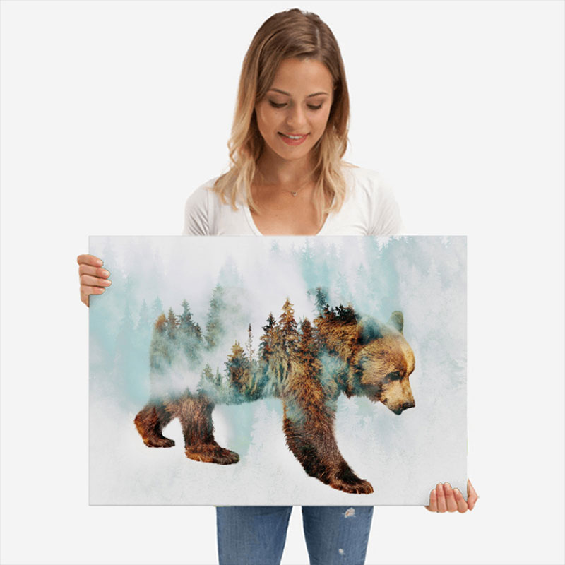
Displates are a new kind of wall art for your home. A Displate is a magnet-mounted metal print that will easily replace not-so-convenient paper posters or wall-destroying frames. 

As you can see on the following video, it takes only about 20 seconds to hang Displate art on your walls.

The best part? It doesn’t even hurt your walls! Each print comes with a magnetic system that fixes the thin metal sheet printed using high-end giclee printing techniques. Each print is quality checked, so you don’t have to worry about this either, as Displate produces in-house.

Finding the right art for your taste

Thanks to a well-designed and well-organized website, Displate makes art discovery incredibly easy. You can browse Displates by category, by artist, or by collection, which is my favorite way as it is a curated selection.

In the category section, you can even filter the art by color, orientation, or tag. On top of that, you can find good vibes in the Get Inspired section of the website.

Maps, spaceships, animals, and movies!

Going through the art collections, it took me very little time to find several awesome posters that I want to purchase right away.

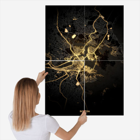
Maps: just check this illuminated city map! No need to be an urbanist to fall in love with it.

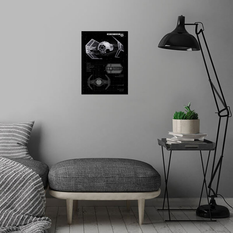
Spaceships: all geeks will go crazy with these spaceships posters.

Animals: a great selection for nature lovers.

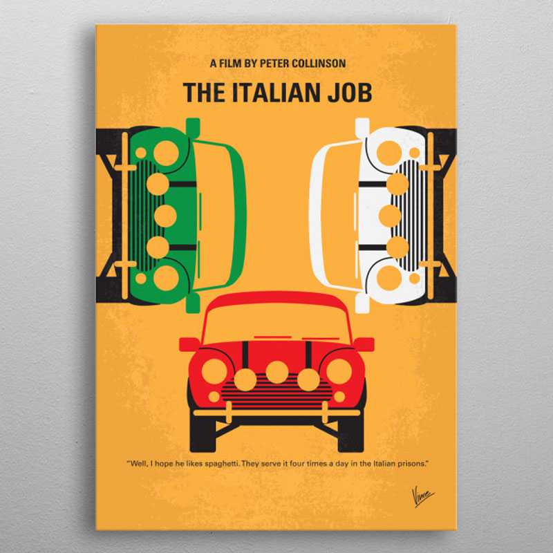
Movies: yep, movie geeks will also find the perfect art to show their passion on their walls.

Art is the perfect gift for creative people

Of course, it’s also a fine gift for not-so-creative people as well. It’s a shame that people don’t buy more art for each other, but it may very well change with Displate and their huge collection of art that can fit almost any taste.

Buy art, save the planet

As an environmentally conscious company, Displate makes a big contribution to reforestation. For each print sold, the company plants 10 trees not just in a random place, but where it is most needed.

The numbers are impressive, there were already 7,431,510 by the time of writing the current article, and there will probably be many more by the time you will be reading it. So buy your art with Displate and help saving the planet!

Regarding CSS’s Global Scope

Post pobrano z: Regarding CSS’s Global Scope

html {
  font-family: Roboto, sans-serif;
}

With the except of some form elements, you’ve just set a font on every bit of text on a site! Nice! That’s probably what you were trying to do, because of the probably hundreds of elements all over your site, setting that font-family every time would be tedious and error-prone.

CSS is global by nature. On purpose!

I like how David Khourshid put it:

You ever stop and think about why CSS has a global scope? Maybe we want to use consistent typography, colors, sizing, spacing, layout, transitions, etc. and have our websites & apps feel like one cohesive unit?

Love the cascade, the cascade is your friend.

And yet. The global nature of CSS is perhaps the most-pointed-at anti-feature of CSS. Some people really don’t like it. We all know it’s very easy to write a single CSS rule that has implications all over a site, breaking things you really didn’t want to break.

Two CSS properties walk into a bar.

A barstool in a completely different bar falls over.

— Thomas Fuchs 🎄🕹💾 (@thomasfuchs) July 28, 2014

There are whole new categories of testing to assist with these problems.

Scoped styles aren’t the only reason there is such interest and adoption in the landscape of tools that is CSS-in-JS, but it’s a big one. There are loads of sites that don’t directly author any CSS at all — even preprocessed styles — and go for a JavaScript library instead where styles are authored quite literally in JavaScript. There is a playground demonstrating the syntax of the various options. Here’s how styled-components works:

import React from 'react';
import styled from 'styled-components';

const Container = styled.main`
  display: flex;
  flex-direction: column;
  min-height: 100%;
  width: 100%;
  background-color: #f6f9fc;
`;

export default function Login() {
  return (
    <Container>
      ... Some stuff ....
    </Container>
  );
}

There are literally dozens of options, each doing things a bit differently while offering slightly different syntaxes and features. Vue even offers scoped CSS directly in .vue files:

<style scoped>
.example {
  color: red;
}
</style>

<template>
  <div class="example">hi</div>
</template>

Unfortunately, <style scoped> never quite made it as a native web platform feature. There is shadow DOM, though, where a style block can be injected in a template and those styles will be isolated from the rest of the page:

let myElement = document.querySelector('.my-element');

let shadow = myElement.attachShadow({
  mode: 'closed'
});
shadow.innerHTML = `
  <style>
    p { 
      color: red;
    }
  </style>

  <p>Element with Shadow DOM</p>
`;

No styles will leak into or out of that shadow DOM boundary. That’s pretty cool for people seeking this kind of isolation, but it could be tricky. You’d likely have to architect the CSS to have certain global styles that can be imported with the shadow DOM’d web component so it can achieve some styling cohesion in your site. Personally, I wish it was possible to make the shadow DOM one-way permeable: styles can leak in, but styles defined inside can’t leak out.

CSS-in-JS stuff is only one way to scope styles. There are actually two sides to the spectrum. You could call CSS-in-JS total isolation, whereas you could author CSS directly with total abstraction:

Total abstraction might come from a project, like Tachyons, that gives you a fixed set of class names to use for styling (Tailwind is like a configurable version of that), or a programmatic tool (like Atomizer) that turns specially named HTML class attributes into a stylesheet with exactly what it needs.

Even adhering 100% to BEM across your entire site could be considered total CSS isolation, solving the problems that the global scope may bring.

Personally, I’d like to see us move to this kind of future:

When we write styles, we will always make a choice. Is this a global style? Am I, on purpose, leaking this style across the entire site? Or, am I writing CSS that is specific to this component? CSS will be split in half between these two. Component-specific styles will be scoped and bundled with the component and used as needed.

Best of both worlds, that.

Anyway, it’s tricky.

The problem is not CSS in JS.

It is CSS's global scope.

Solve the global scope, and CSS in JS will follow.

(I don't know if "follow" means disappear, being fully accepted, or getting a major overhaul.)

(For that matter, I don't know what "solving the global scope" means.)

— ppk 🇪🇺 (@ppk) November 28, 2018

Maybe this will be the hottest CSS topic in 2019.

The post Regarding CSS’s Global Scope appeared first on CSS-Tricks.

The Fragmented, But Evolving State of CSS-in-JS

Post pobrano z: The Fragmented, But Evolving State of CSS-in-JS

TLDR: The CSS-in-JS community has converged on a consistent API.

Not so long ago, a Facebook engineer compiled a list of the available CSS-in-JS methodologies. It wasn’t short:

aphrodite, babel-plugin-css-in-js, babel-plugin-pre-style, bloody-react-styled, classy, csjs, css-constructor, css-light, css-loader, css-ns, cssobj, cssx-loader, cxs, electron-css, emotion, es-css-modules, freestyler, glamor, glamorous, hiccup-css, hyperstyles, i-css, j2c, jsxstyle, linaria, nano-css, pre-style, radium, react-css-builder, react-css-components, react-css-modules, react-cssom, react-fela, react-free-style, react-inline-css, react-inline-style, react-inline, react-jss, react-look, react-native-web, react-statics-styles, react-styl, react-style, react-styleable, react-stylematic, react-theme, react-vstyle, reactcss, restyles, scope-styles, smart-css, stile-react-media-queries, stilr, stylable, style-it, styled-components, styled-jsx, styletron-react, styling, superstyle, typestyle, uranium

Such a fragmented ecosystem was far from appealing. Which one should you pick, (if any)?

Contributing to Javascript fatigue — you need at most one. Also feel free to not learn any.

GitHub stars are one useful metric:

However, GitHub stars say nothing about a project’s trajectory — perhaps they were accumulated long ago and the repo has since fallen out of favor or is no longer maintained. Glamor has plenty of open issues, and hasn’t seen a commit in over a year. Its author advises:

…it mostly works, I’m not going to do any major changes… if you need something more modern, I’d recommend emotion, it mostly matches glamor’s api, and is actively maintained.

The similarly named Glamorous was recently deprecated with its author also recommending users switch to Emotion:

At the time, Emotion had some features that Styled Components didn’t. Since then, Styled Components has made some big announcements.

Styled Components sells itself as the CSS-in-JS library for people that *like* CSS. Styled Components gained popularity by utilizing tagged template literals — allowing developers to *just write CSS* in the same syntax they already know, but inside JavaScript files. While this has proven popular, some developers prefer to [write styles as JavaScript objects. Emotion offered flexibility — developers could choose how to write their styles. Styled Components eventually followed suit.

styled-components v3.3.0 is out with first-class object support! 😍

Lots of people have been asking for this, your wishes have been heard! Shoutout to @probablyup for taking care of this release.

👉 https://t.co/yOHWg78nF4 pic.twitter.com/Ic8fZdAFVs

— Max Stoiber (@mxstbr) May 25, 2018

Emotion also offers a css prop, which Styled Components didn’t have, until…

🎉 Announcing support for the css prop in styled-components! 🎉

This has been a long time coming, hope y'all enjoy! ✨

👉 https://t.co/DMdrG6uviZ

Huge shoutout to @satya164 for coming up with the ingenious implementation! 👏

— Max Stoiber (@mxstbr) November 26, 2018

The rival CSS-in-JS libraries have stolen from each other until landing upon the same feature set and the same syntax — Emotion and Styled Components have an almost identical API. What once felt like a total mess of competing methodologies and libraries now feels somewhat stable. Even if CSS-in-JS hasn’t standardized on a dependency, it now has standardized a way of doing things — they’re just implemented differently:

Internally, quite a bit. SC has a lot of complexity around organizing style tag order.
Re css prop: SC requires Babel plugin and uses the entire SC custom component creation. Emotion will skip the custom component if it can and just renders the element with the className directly

— Kye Hohenberger (@tkh44) December 7, 2018

Styled Components is by far the most popular CSS-in-JS library, but Emotion has seen a rapid increase in usage.

Both are used by some major companies. Styled Components are utilized by plenty of large companies, including Bloomberg, Atlassian, Reddit, Target, BBC News, The Huffington Post, Coinbase, Patreon, Vogue, Ticketmaster, Lego, InVision and Autodesk just to name a few.

Emotion boasts fewer recognizable names, but has been recently adopted by the New York Times.

Great article about the launch of our new Story designs on the NYT today. It mentions our Shared Components initiative – would have been impossible without Emotion / CSS-in-JS. Absolute game-changer. Living in the future. https://t.co/pZLDJjsbEr

— Scott Taylor (@wonderboymusic) May 8, 2018


While these libraries certainly do seem to be most popular amongst React users, they can be used with other frameworks. While they seem to have converged on the same features at last, it’s difficult to say whether this is the end point of CSS-in-JS, or whether we’ll see a continued evolution from here.

The post The Fragmented, But Evolving State of CSS-in-JS appeared first on CSS-Tricks.

The Fragmented, But Evolving State of CSS-in-JS

Post pobrano z: The Fragmented, But Evolving State of CSS-in-JS

TLDR: The CSS-in-JS community has converged on a consistent API.

Not so long ago, a Facebook engineer compiled a list of the available CSS-in-JS methodologies. It wasn’t short:

aphrodite, babel-plugin-css-in-js, babel-plugin-pre-style, bloody-react-styled, classy, csjs, css-constructor, css-light, css-loader, css-ns, cssobj, cssx-loader, cxs, electron-css, emotion, es-css-modules, freestyler, glamor, glamorous, hiccup-css, hyperstyles, i-css, j2c, jsxstyle, linaria, nano-css, pre-style, radium, react-css-builder, react-css-components, react-css-modules, react-cssom, react-fela, react-free-style, react-inline-css, react-inline-style, react-inline, react-jss, react-look, react-native-web, react-statics-styles, react-styl, react-style, react-styleable, react-stylematic, react-theme, react-vstyle, reactcss, restyles, scope-styles, smart-css, stile-react-media-queries, stilr, stylable, style-it, styled-components, styled-jsx, styletron-react, styling, superstyle, typestyle, uranium

Such a fragmented ecosystem was far from appealing. Which one should you pick, (if any)?

Contributing to Javascript fatigue — you need at most one. Also feel free to not learn any.

GitHub stars are one useful metric:

However, GitHub stars say nothing about a project’s trajectory — perhaps they were accumulated long ago and the repo has since fallen out of favor or is no longer maintained. Glamor has plenty of open issues, and hasn’t seen a commit in over a year. Its author advises:

…it mostly works, I’m not going to do any major changes… if you need something more modern, I’d recommend emotion, it mostly matches glamor’s api, and is actively maintained.

The similarly named Glamorous was recently deprecated with its author also recommending users switch to Emotion:

At the time, Emotion had some features that Styled Components didn’t. Since then, Styled Components has made some big announcements.

Styled Components sells itself as the CSS-in-JS library for people that *like* CSS. Styled Components gained popularity by utilizing tagged template literals — allowing developers to *just write CSS* in the same syntax they already know, but inside JavaScript files. While this has proven popular, some developers prefer to [write styles as JavaScript objects. Emotion offered flexibility — developers could choose how to write their styles. Styled Components eventually followed suit.

styled-components v3.3.0 is out with first-class object support! 😍

Lots of people have been asking for this, your wishes have been heard! Shoutout to @probablyup for taking care of this release.

👉 https://t.co/yOHWg78nF4 pic.twitter.com/Ic8fZdAFVs

— Max Stoiber (@mxstbr) May 25, 2018

Emotion also offers a css prop, which Styled Components didn’t have, until…

🎉 Announcing support for the css prop in styled-components! 🎉

This has been a long time coming, hope y'all enjoy! ✨

👉 https://t.co/DMdrG6uviZ

Huge shoutout to @satya164 for coming up with the ingenious implementation! 👏

— Max Stoiber (@mxstbr) November 26, 2018

The rival CSS-in-JS libraries have stolen from each other until landing upon the same feature set and the same syntax — Emotion and Styled Components have an almost identical API. What once felt like a total mess of competing methodologies and libraries now feels somewhat stable. Even if CSS-in-JS hasn’t standardized on a dependency, it now has standardized a way of doing things — they’re just implemented differently:

Internally, quite a bit. SC has a lot of complexity around organizing style tag order.
Re css prop: SC requires Babel plugin and uses the entire SC custom component creation. Emotion will skip the custom component if it can and just renders the element with the className directly

— Kye Hohenberger (@tkh44) December 7, 2018

Styled Components is by far the most popular CSS-in-JS library, but Emotion has seen a rapid increase in usage.

Both are used by some major companies. Styled Components are utilized by plenty of large companies, including Bloomberg, Atlassian, Reddit, Target, BBC News, The Huffington Post, Coinbase, Patreon, Vogue, Ticketmaster, Lego, InVision and Autodesk just to name a few.

Emotion boasts fewer recognizable names, but has been recently adopted by the New York Times.

Great article about the launch of our new Story designs on the NYT today. It mentions our Shared Components initiative – would have been impossible without Emotion / CSS-in-JS. Absolute game-changer. Living in the future. https://t.co/pZLDJjsbEr

— Scott Taylor (@wonderboymusic) May 8, 2018


While these libraries certainly do seem to be most popular amongst React users, they can be used with other frameworks. While they seem to have converged on the same features at last, it’s difficult to say whether this is the end point of CSS-in-JS, or whether we’ll see a continued evolution from here.

The post The Fragmented, But Evolving State of CSS-in-JS appeared first on CSS-Tricks.

WooCommerce

Post pobrano z: WooCommerce

(This is a sponsored post.)

I just read a nicely put together story about WooCommerce over on the CodeinWP blog. WooCommerce started life as WooThemes, sort of a „premium themes” business started by just a couple of fellas who had never even met in person. Two years and a few employees later they launch WooCommerce, and 2 years after that it hits a million downloads. A major success story, to be sure, but a collaborative and remote-work based one that wasn’t exactly overnight. Another 2 years and Automattic picks them up and the WooThemes part is spun down.

Now we’re 3-4 years into WooCommerce being an Automattic project and it’s looking at nearly 60 million downloads, 4 million of which are active. A number they are saying is about 30% of all eCommerce on the web. Daaaaang. I’ve used WooCommerce a number of times and it always does a great job for me.

Direct Link to ArticlePermalink

The post WooCommerce appeared first on CSS-Tricks.

3 Important Facts About Converting Video Formats

Post pobrano z: 3 Important Facts About Converting Video Formats

Being able to convert video formats has
become essential nowadays, especially if you’re managing lots of video files,
using different types of devices, or sharing and distributing videos in any
way. It is easier than ever to convert video formats as well nowadays, as there
are many user-friendly video converters as well as online converters that can
be used.

However before you start to convert your
videos between different formats, there are a few important facts that you
should be aware of:

Store the original video file in its original quality

As far as
possible you should always store the original video file in its original
quality. That is due to the fact that while it is possible to downscale the
video or lower its bitrate to optimize it for certain devices, upscaling or
increasing its bitrate won’t restore its original quality.

If the original
video file is an uncompressed or lossless
video file
that is too large for you to store, you should consider
compressing it once into a more accessible format with better compression (such
as MP4 with H.264). While not ideal, you can at least store that copy in as
close to the original quality as possible.

Of course if
storage space isn’t an issue, keeping a lossless copy of the video file is
ideal – and it is often what is done during professional video production.

Avoid transcoding a video file multiple times

Transcoding is
basically when you convert a video format from one codec to a different codec.
Because each codec uses different compression, some data from the original
video will be discarded.

If you were to
just transcode a video once that lost data won’t be that noticeable. However if
you transcode the same video multiple times (e.g. from H.264 to H.265 to H.264
again, and so on), eventually the data that is lost will start to add up and
affect the video quality.

That is why you
should always try to avoid transcoding any video file multiple times.
Additionally it is another reason why keeping the original video file is a good
policy – since you can transcode different versions of the video directly from
it and minimize the data loss.

Always check for hardware acceleration and not just software support

When you play a
video in any format on any device, it needs to be decoded from the compressed
video file before it can be displayed. That decoding can either be handled on a
software level (i.e. software support) or can be offloaded to the hardware.

As a rule it is
always best if the codec you use is supported by the hardware of the device it
is going to be played on. Software decoding is not only processor intensive,
but also consumes a lot of power – which can be an issue on devices with a
limited battery life.

In contrast
hardware decoding is more efficient and requires a fraction of the power,
making it certainly the preferable option. The only downside is that it takes
time for devices to have hardware support built-in.

Actually converting videos from one format
to another is the easy part, especially with a user-friendly movie converter. For example
you could try Movavi Video Converter if you need one with a wide range of
supported formats.

Regardless of the converter that you use each of these facts will help you to convert videos more effectively while preserving their quality. On your part, all you need to do is make it a point to keep them in mind the next time you need to convert a video.

Featured image by Wahid Khene

5 Reasons Your Computer Might Be Running Slow

Post pobrano z: 5 Reasons Your Computer Might Be Running Slow

Thanks to the growth of technology, it’s
now possible to work
at home
and find success. However, it can be hard to achieve that success
if your work computer is not running at peak performance. In fact, if your
tools of the trade are lagging, it can be crippling to your online business.

There are few instances more exasperating than a new laptop or PC which takes all day to run programs or execute tasks. While you may be tempted to pull your hair out and purchase a new machine, your slowdowns may be preventable. To that end, we will discuss several avenues you can pursue that very well may be the cause for your computer’s slow performance.

Your Hard
Disk Space is Full

As time goes on, you will inevitably
download programs, applications, photos, files, and other types of data to your
computer. These things take up memory, with some filling up more space than
others. If you are making your living in graphic
design
, you will no doubt use up more memory and hard disk space than would
someone who merely uses their computer for internet browsing. For this reason,
it is advised that you purchase an external
hard drive
.

Eventually, as more and more files are
saved, your central processing unit will inevitably run out of space or grow
dangerously close to that capacity. Memory is necessary for programs to run
smoothly and it’s recommended that you leave at least 15%-20% space of hard
disk available for your computer to be able to run at peak performance.
Consider downloading a program like WinDirStat
in order to view disk usage statistics and then use it to remove some
unnecessary files. If you wish to manually check your disk space, take the
following steps:

  • Hit Start
  • Open Windows File Explorer
  • Click on your PC
  • Look below the Windows (C:) to
    see the percentage of hard disk space available
  • If the hard disk is full,
    remove programs that take up space

Programs are Running in the Background

A common culprit for computer slowdowns is
background programs that automatically and continuously run without your
directive. Such programs like ESET are
necessary to protect you from malicious software but should be set to scan manually
by your command, rather than on a continuous loop. Continuous scans use up a
ton of space and processing power, which in turn lead to slower speeds. In
order to see background programs and the CPU percentage they require, take the
following steps: 

  • Open up Windows Task Manager
  • Go to Processes
  • Click on hidden and visible
    programs
  • Double click the programs you
    no longer want to run in the background
  • Hit “End Task”

Monitor Refresh Rate

The refresh rate of a monitor can have a
marked impact on input lag. For designers, such issues can seriously throw off
your ability to operate at peak levels. Your time
management
might be thrown entirely out of whack by this small but annoying
slowdown. Read up on your monitor
refresh rate
,
including what it is, how to view it, and ways to change it.

Stop Auto Launch

Many programs to try and launch
automatically every single time you turn on your PC. While our four
productivity apps
for students are fantastic, if they are set to
auto-launch, they can lead to lags by diverting memory and processing that
should be working elsewhere. If you wish to stop the auto launch, take the
following steps:

  • Open up Settings
  • Hit “Applications”
  • Click “Startup”
  • Uncheck apps you do not want
    set to autorun

Remove Browser Add-ons

Browser extensions
are fantastic tools that can improve your time on the internet. That said, they
may be responsible for slowdowns, especially if you have a lot of them running
at one time. Sometimes extensions crossfire and send out conflicting commands
that affects speed while browsing. By clicking on “manage extensions,” you can
see which add-ons you are running and how much space they take up.

Last Word

Computers are very sophisticated tools so there are several explanations for why they may be running at a snail’s pace. Carefully go through all of these suggestions to see if they are, in fact, the cause underlying your computer’s laggy performance before buying a new device.

Featured image by RawPixel

How to Create a Fun Felt Photoshop Text Effect

Post pobrano z: How to Create a Fun Felt Photoshop Text Effect

Final product image
What You’ll Be Creating

Learn how to create a stitched felt Photoshop text effect in just a few easy steps. This effect is great for the winter holidays.

This felt text effect is a part of the Felt Effect Photoshop Actions from my portfolio on Envato Market.

Felt Photoshop Action
Felt Effect Photoshop Action

The stitched felt effect action is also included in my new Christmas Photoshop Actions Bundle. The bundle contains 10 useful actions for the winter holidays.

Tutorial Assets

To create this Photoshop text effect, I will use the following assets:

1. How to Create the Felt Background

Step 1

Create a new document in Photoshop. The size of the canvas is 850 x 600px, resolution 72 dpi. If you use another canvas size, you have to adjust the layer styles.

Create new Photoshop document

Step 2

Add a new layer and call it Felt Background. Fill the layer with any color you like.

Fill Layer with Color

Step 3 

Add a Pattern Overlay layer style. Click on the arrow to Load Patterns and choose the felt-pattern.pat file. 

How to Load Patterns in Photoshop

Step 4

Add a Color Overlay (color #428fc7) to the Felt Background layer. 

Add Color Overlay in Photoshop

2. How to Create the Felt Photoshop Text Effect

Step 1

I will create the text in a new document. So make a new file and add your text. Set the size to 320 pt.

Add Text Layer in Photoshop

Step 2

Toggle the Character and Paragraph panels and set the tracking for the selected characters to around 200.  

Character and Paragraph Panels in Photoshop

Step 3

Press Control-J to make two copies of the text layer. 

Duplicate layers in Photoshop

Step 4

Add a Stroke layer style of 15 px to the Felt Text 1 layer. The color of the border is not important, so you can choose any color you want. 

Stroke Layer Style

Step 5

Add a Stroke layer style of 10 px to the Felt Text 2 layer. The color of the border is not important, so you can choose any color you want. 

Stroke Layer Style

Step 6

Set the Fill of the Felt Text 3 layer to 0%.

Add a Bevel and Emboss layer style (color #ffffff and #000000) to the Felt Text 3 layer.

Bevel and Emboss Layer Style

Step 7

Go to the Felt Text 1 layer, right-click and choose Convert to Smart Object. Do the same for the Felt Text 2 and Felt Text 3 layers.

Convert to Smart Object in Photoshop

Step 8

I will hide the Felt Text 2 and Felt Text 3 layers for now. 

Go to the Felt Text 1 smart object and add these layer styles:

  • Drop Shadow (color #000000)
  • Color Overlay (color #328f1f)
  • Pattern Overlay (felt-pattern)
  • Bevel and Emboss (color #ffffff and #000000)
Drop Shadow Layer Style
Color Overlay Layer Style
Pattern Overlay Layer Style
Bevel and Emboss Layer Style

Step 9

To expand the text, go to Filter > Other > Minimum and set the Radius to 10 px

Minimum Filter in Photoshop

Step 10

Go to the Felt Text 2 smart object and add these layer styles:

  • Drop Shadow (color #000000)
  • Color Overlay (color #c11a1a)
  • Pattern Overlay (felt-pattern)
  • Bevel and Emboss (color #ffffff and #000000)
Drop Shadow Layer Style
Color Overlay Layer Style
Pattern Overlay Layer Style
Bevel and Emboss Layer Style

Step 11

Go to the Felt Text 3 smart object and set the blend mode to Overlay

Blend Mode Overlay

Step 12

Go to Filter > Blur > Gaussian Blur and set the Radius to around 3.3 px

Gaussian Blur Photoshop Filter

Step 13

The felt text effect should now look like this. You can, of course, choose any colors you like for the felt pattern. 

Felt Text Effect in Photoshop

3. Create a Stitch Brush in Photoshop

Step 1

Let’s create a stitch brush for the felt Photoshop text effect.

Create a new PSD file, size 27 x 5 pxFill the canvas with color black. Go to Edit > Define Brush Preset. Set the brush name to „stitch” and click OK

Define Brush Preset in Photoshop

Step 2

Choose the Brush Tool and select the „stitch” brush from the Brush Preset Picker. Toggle the Brush panel and make the following settings: Spacing 750% and set the Angle Jitter to Direction.

Create Dashed Brush in Photoshop

Step 3

Click on the top right corner of the Brush panel and choose New Brush Preset. Name the new brush „stitch2”

Create Stitch Brush in Photoshop

You can now close the file in which you created the brush.

4. Add a Stitch Effect in Photoshop

Step 1

Press Shift-Control-N to create a new layer called Stitch Effect

Keep the Control key pressed and click on the thumbnail of the Felt Text 2 smart object to make a selection.

Make a Selection in Photoshop

Step 2

Go to Select > Modify > Contract and contract by 12 pixels.

Contract Selection in Photoshop

Step 3

Go to the Path tab and choose Make Work Path from the selection. 

Make Work Path in Photoshop

Step 4

Create a new layer above the Felt Text 3 layer and call it Stitch Effect

Pick the Brush Tool and select the stitch brush. 

Pick the Brush Tool

Step 5

Go to the Path tab and choose Stroke Work Path

Stroke Work Path
Stroke Work Path

Step 6

Press Delete to remove the work path.

Stitch Effect in Photoshop

Step 7

Add these layer styles to the Stitch Effect layer:

  • Drop Shadow (color #000000)
  • Color Overlay (color #e3dbc2)
  • Bevel and Emboss (color #ffffff and #000000)
Drop Shadow
Color Overlay
Bevel and Emboss

5. Create the Felt Letters

Step 1

Select all the layers and right-click to Convert to Smart Object

Select Layers and Convert to Smart Object

Step 2

Right-click on the Felt Text smart object and choose Duplicate Layer. For the Destination, choose the initial document, the one with the felt background.

Duplicate layer in Another Document

Step 3

Make a copy of the Felt Text smart object and hide it. That way, you have the original text intact.

Rasterize the Felt Text smart object. 

Rasterize a Smart Object in Photoshop

Step 4

Use the Rectangular Marquee Tool to select the letter F. Press Control-X and Control-V to cut and paste the letter F onto another layer.

Cut and Paste in Photoshop

Step 5

Do the same for all the letters. Now you have the felt text letters on separate layers.

Text to Letters in Photoshop

Step 6

Press Control-T to Rotate and Move the letters as you like.

Rotate Layers in Photoshop

6. How to Make a Shadow in Photoshop

Step 1

As you can see, the letters look a little flat and have the same shadow. So to make them look more realistic, add different Drop Shadow layer styles to each letter.

Start with the F layer. 

Drop Shadow Layer Style in Photoshop

Step 2

Add a Drop Shadow layer style to the E layer. 

Drop Shadow Layer Style in Photoshop

Step 3

Add a Drop Shadow layer style to the L layer. 

Drop Shadow Layer Style in Photoshop

Step 4

Add a Drop Shadow layer style to the T layer. 

Drop Shadow Layer Style in Photoshop

You can also add an Inner Shadow layer style to each layer. 

Inner Shadow Layer Style

7. Change the Color of the Felt Photoshop Text Effect

If you want to change the color of the felt letters, add a Hue/Saturation adjustment layer for the letter that you want to modify. If you want to change the red color, choose the Reds channel. 

Click the Clip to Layer button to add the adjustment only for that layer. 

HueSaturation Adjustment Layer

In the same way, you can change any letter you want.

Felt Photoshop Text Effect

8. Add Felt Ornaments

Step 1

Use the Pen Tool to add shapes like trees and clouds. 

Create Shapes Using the Pen Tool

Step 2

Click on the Add to Shape Area if you want to create multiple shapes on the same layer. 

I made two separate layers with tree shapes and one separate layer with cloud shapes. I did that because I want to add different colors to the shapes.

Step 3

For each layer, add these layer styles:

  • Drop Shadow (color #000000)
  • Color Overlay (choose the color that you like)
  • Pattern Overlay (felt-pattern)
  • Bevel and Emboss (color #ffffff and #000000)
Drop Shadow
Color Overlay
Pattern Overlay
Bevel and Emboss

Step 4

You can also create a new layer and use the Brush Tool to add some stitch effects using the stitch brush.

Photoshop Felt Text with Stitch Effects

9. Create Clothes Buttons in Photoshop

Step 1

To create the clothes button, I use the Ellipse Tool. Keep the Shift key pressed and draw to create a circle. 

Create a Circle in Photoshop

Step 2

Click on the Subtract from Shape Area button and add a circle inside the first circle to make a hole. Do this three more times.

Create a Circle in Photoshop

Step 3

Add these layer styles to the Clothes Button layer: 

  • Drop Shadow (color #000000)
  • Color Overlay (color #c8350d or choose the color that you like)
  • Bevel and Emboss (color #ffffff and #000000)
Drop Shadow
Bevel and Emboss
Color Overlay

Step 4

Create a new circle shape layer. Click on the Subtract from Shape Area button and add a large circle inside the first circle to make a hole. 

Subtract from Shape Area

Step 5

Go to the Clothes Button 1 layer, right-click and choose Copy Layer Style. Go to the Clothes Button 2 layer, right-click and choose Paste Layer Style.

Copy Layer Style in Photoshop

You can modify the layer style as you wish to create endless results. Change the Color Overlay, the Bevel and Emboss settings, etc.

Step 6

Create a new layer and call it Thread. Use the Brush Tool to create a thread.

Brush Tool

Create another layer and call it Thread. Use the Brush Tool to create another thread.

Brush Tool

Step 7

Add these layer styles to the Thread layers: 

  • Drop Shadow (color #000000)
  • Color Overlay (color #b9b9b9)
  • Inner Shadow (color #000000)
  • Bevel and Emboss (color #ffffff and #000000)
Drop Shadow
Color Overlay
Inner Shadow
Bevel and Emboss

Step 8

In the same way, you can create more buttons with different colors and sizes.  

Congratulations! You’re Done!

In this tutorial, you’ve learned how to create a felt text effect in Photoshop from scratch using brushes and patterns. Photoshop text effects are really useful, so I hope you’ve enjoyed this tutorial.  

Create a Felt Text Effect in Photoshop

This Photoshop text effect is a part of the Felt Photoshop Actions pack from my portfolio on Envato Market

The new Christmas Photoshop Actions Bundle contains 10 actions that you can use for the winter festive holidays. The stitched felt effect action is also included in the bundle.

Christmas Photoshop Actions Bundle

How to Create a Fun Felt Photoshop Text Effect

Post pobrano z: How to Create a Fun Felt Photoshop Text Effect

Final product image
What You’ll Be Creating

Learn how to create a stitched felt Photoshop text effect in just a few easy steps. This effect is great for the winter holidays.

This felt text effect is a part of the Felt Effect Photoshop Actions from my portfolio on Envato Market.

Felt Photoshop Action
Felt Effect Photoshop Action

The stitched felt effect action is also included in my new Christmas Photoshop Actions Bundle. The bundle contains 10 useful actions for the winter holidays.

Tutorial Assets

To create this Photoshop text effect, I will use the following assets:

1. How to Create the Felt Background

Step 1

Create a new document in Photoshop. The size of the canvas is 850 x 600px, resolution 72 dpi. If you use another canvas size, you have to adjust the layer styles.

Create new Photoshop document

Step 2

Add a new layer and call it Felt Background. Fill the layer with any color you like.

Fill Layer with Color

Step 3 

Add a Pattern Overlay layer style. Click on the arrow to Load Patterns and choose the felt-pattern.pat file. 

How to Load Patterns in Photoshop

Step 4

Add a Color Overlay (color #428fc7) to the Felt Background layer. 

Add Color Overlay in Photoshop

2. How to Create the Felt Photoshop Text Effect

Step 1

I will create the text in a new document. So make a new file and add your text. Set the size to 320 pt.

Add Text Layer in Photoshop

Step 2

Toggle the Character and Paragraph panels and set the tracking for the selected characters to around 200.  

Character and Paragraph Panels in Photoshop

Step 3

Press Control-J to make two copies of the text layer. 

Duplicate layers in Photoshop

Step 4

Add a Stroke layer style of 15 px to the Felt Text 1 layer. The color of the border is not important, so you can choose any color you want. 

Stroke Layer Style

Step 5

Add a Stroke layer style of 10 px to the Felt Text 2 layer. The color of the border is not important, so you can choose any color you want. 

Stroke Layer Style

Step 6

Set the Fill of the Felt Text 3 layer to 0%.

Add a Bevel and Emboss layer style (color #ffffff and #000000) to the Felt Text 3 layer.

Bevel and Emboss Layer Style

Step 7

Go to the Felt Text 1 layer, right-click and choose Convert to Smart Object. Do the same for the Felt Text 2 and Felt Text 3 layers.

Convert to Smart Object in Photoshop

Step 8

I will hide the Felt Text 2 and Felt Text 3 layers for now. 

Go to the Felt Text 1 smart object and add these layer styles:

  • Drop Shadow (color #000000)
  • Color Overlay (color #328f1f)
  • Pattern Overlay (felt-pattern)
  • Bevel and Emboss (color #ffffff and #000000)
Drop Shadow Layer Style
Color Overlay Layer Style
Pattern Overlay Layer Style
Bevel and Emboss Layer Style

Step 9

To expand the text, go to Filter > Other > Minimum and set the Radius to 10 px

Minimum Filter in Photoshop

Step 10

Go to the Felt Text 2 smart object and add these layer styles:

  • Drop Shadow (color #000000)
  • Color Overlay (color #c11a1a)
  • Pattern Overlay (felt-pattern)
  • Bevel and Emboss (color #ffffff and #000000)
Drop Shadow Layer Style
Color Overlay Layer Style
Pattern Overlay Layer Style
Bevel and Emboss Layer Style

Step 11

Go to the Felt Text 3 smart object and set the blend mode to Overlay

Blend Mode Overlay

Step 12

Go to Filter > Blur > Gaussian Blur and set the Radius to around 3.3 px

Gaussian Blur Photoshop Filter

Step 13

The felt text effect should now look like this. You can, of course, choose any colors you like for the felt pattern. 

Felt Text Effect in Photoshop

3. Create a Stitch Brush in Photoshop

Step 1

Let’s create a stitch brush for the felt Photoshop text effect.

Create a new PSD file, size 27 x 5 pxFill the canvas with color black. Go to Edit > Define Brush Preset. Set the brush name to „stitch” and click OK

Define Brush Preset in Photoshop

Step 2

Choose the Brush Tool and select the „stitch” brush from the Brush Preset Picker. Toggle the Brush panel and make the following settings: Spacing 750% and set the Angle Jitter to Direction.

Create Dashed Brush in Photoshop

Step 3

Click on the top right corner of the Brush panel and choose New Brush Preset. Name the new brush „stitch2”

Create Stitch Brush in Photoshop

You can now close the file in which you created the brush.

4. Add a Stitch Effect in Photoshop

Step 1

Press Shift-Control-N to create a new layer called Stitch Effect

Keep the Control key pressed and click on the thumbnail of the Felt Text 2 smart object to make a selection.

Make a Selection in Photoshop

Step 2

Go to Select > Modify > Contract and contract by 12 pixels.

Contract Selection in Photoshop

Step 3

Go to the Path tab and choose Make Work Path from the selection. 

Make Work Path in Photoshop

Step 4

Create a new layer above the Felt Text 3 layer and call it Stitch Effect

Pick the Brush Tool and select the stitch brush. 

Pick the Brush Tool

Step 5

Go to the Path tab and choose Stroke Work Path

Stroke Work Path
Stroke Work Path

Step 6

Press Delete to remove the work path.

Stitch Effect in Photoshop

Step 7

Add these layer styles to the Stitch Effect layer:

  • Drop Shadow (color #000000)
  • Color Overlay (color #e3dbc2)
  • Bevel and Emboss (color #ffffff and #000000)
Drop Shadow
Color Overlay
Bevel and Emboss

5. Create the Felt Letters

Step 1

Select all the layers and right-click to Convert to Smart Object

Select Layers and Convert to Smart Object

Step 2

Right-click on the Felt Text smart object and choose Duplicate Layer. For the Destination, choose the initial document, the one with the felt background.

Duplicate layer in Another Document

Step 3

Make a copy of the Felt Text smart object and hide it. That way, you have the original text intact.

Rasterize the Felt Text smart object. 

Rasterize a Smart Object in Photoshop

Step 4

Use the Rectangular Marquee Tool to select the letter F. Press Control-X and Control-V to cut and paste the letter F onto another layer.

Cut and Paste in Photoshop

Step 5

Do the same for all the letters. Now you have the felt text letters on separate layers.

Text to Letters in Photoshop

Step 6

Press Control-T to Rotate and Move the letters as you like.

Rotate Layers in Photoshop

6. How to Make a Shadow in Photoshop

Step 1

As you can see, the letters look a little flat and have the same shadow. So to make them look more realistic, add different Drop Shadow layer styles to each letter.

Start with the F layer. 

Drop Shadow Layer Style in Photoshop

Step 2

Add a Drop Shadow layer style to the E layer. 

Drop Shadow Layer Style in Photoshop

Step 3

Add a Drop Shadow layer style to the L layer. 

Drop Shadow Layer Style in Photoshop

Step 4

Add a Drop Shadow layer style to the T layer. 

Drop Shadow Layer Style in Photoshop

You can also add an Inner Shadow layer style to each layer. 

Inner Shadow Layer Style

7. Change the Color of the Felt Photoshop Text Effect

If you want to change the color of the felt letters, add a Hue/Saturation adjustment layer for the letter that you want to modify. If you want to change the red color, choose the Reds channel. 

Click the Clip to Layer button to add the adjustment only for that layer. 

HueSaturation Adjustment Layer

In the same way, you can change any letter you want.

Felt Photoshop Text Effect

8. Add Felt Ornaments

Step 1

Use the Pen Tool to add shapes like trees and clouds. 

Create Shapes Using the Pen Tool

Step 2

Click on the Add to Shape Area if you want to create multiple shapes on the same layer. 

I made two separate layers with tree shapes and one separate layer with cloud shapes. I did that because I want to add different colors to the shapes.

Step 3

For each layer, add these layer styles:

  • Drop Shadow (color #000000)
  • Color Overlay (choose the color that you like)
  • Pattern Overlay (felt-pattern)
  • Bevel and Emboss (color #ffffff and #000000)
Drop Shadow
Color Overlay
Pattern Overlay
Bevel and Emboss

Step 4

You can also create a new layer and use the Brush Tool to add some stitch effects using the stitch brush.

Photoshop Felt Text with Stitch Effects

9. Create Clothes Buttons in Photoshop

Step 1

To create the clothes button, I use the Ellipse Tool. Keep the Shift key pressed and draw to create a circle. 

Create a Circle in Photoshop

Step 2

Click on the Subtract from Shape Area button and add a circle inside the first circle to make a hole. Do this three more times.

Create a Circle in Photoshop

Step 3

Add these layer styles to the Clothes Button layer: 

  • Drop Shadow (color #000000)
  • Color Overlay (color #c8350d or choose the color that you like)
  • Bevel and Emboss (color #ffffff and #000000)
Drop Shadow
Bevel and Emboss
Color Overlay

Step 4

Create a new circle shape layer. Click on the Subtract from Shape Area button and add a large circle inside the first circle to make a hole. 

Subtract from Shape Area

Step 5

Go to the Clothes Button 1 layer, right-click and choose Copy Layer Style. Go to the Clothes Button 2 layer, right-click and choose Paste Layer Style.

Copy Layer Style in Photoshop

You can modify the layer style as you wish to create endless results. Change the Color Overlay, the Bevel and Emboss settings, etc.

Step 6

Create a new layer and call it Thread. Use the Brush Tool to create a thread.

Brush Tool

Create another layer and call it Thread. Use the Brush Tool to create another thread.

Brush Tool

Step 7

Add these layer styles to the Thread layers: 

  • Drop Shadow (color #000000)
  • Color Overlay (color #b9b9b9)
  • Inner Shadow (color #000000)
  • Bevel and Emboss (color #ffffff and #000000)
Drop Shadow
Color Overlay
Inner Shadow
Bevel and Emboss

Step 8

In the same way, you can create more buttons with different colors and sizes.  

Congratulations! You’re Done!

In this tutorial, you’ve learned how to create a felt text effect in Photoshop from scratch using brushes and patterns. Photoshop text effects are really useful, so I hope you’ve enjoyed this tutorial.  

Create a Felt Text Effect in Photoshop

This Photoshop text effect is a part of the Felt Photoshop Actions pack from my portfolio on Envato Market

The new Christmas Photoshop Actions Bundle contains 10 actions that you can use for the winter festive holidays. The stitched felt effect action is also included in the bundle.

Christmas Photoshop Actions Bundle

Agregator najlepszych postów o designie, webdesignie, cssie i Internecie