It’s a good feeling when a client is satisfied with your work. But there are times when you think that the client is just being nice. Perhaps, he or she doesn’t know the difference between a high-quality deliverable and a poor one.
You’d like the chance for a do-over, but it’s too late. The deadline was the priority item. Your problem might simply be that you’re more than capable of doing excellent work. But you aren’t always given the time to do so.
We’ve put together a checklist to help you improve your designs and quickly. You can do so by using pre-built websites. See for yourself how it can work for you.
Introducing Pre-built Websites & Their Number One Provider
Maybe pre-built websites aren’t for you because you prefer to do your own designs. That would make sense if they weren’t customizable. Also, if they didn’t keep pace with the latest trends or adhere to industry standards. Or, if they were nothing more than static yet attractive images.
If that were the case, all websites created using these design aides would be almost the same. Be Theme’s websites do oh so much more for you. They give you a solid base to build your designs on and they help you improve the quality of your designs.
BeTheme has more than 390 of them and counting; and all for a one-time fee of $59.
They’re nicely organized by industry, business niche, and content type. The library is constantly increasing in size to keep abreast of the latest design trends.
Checklist: 5 Ways Pre-Built Websites Can Enrich Your Designs
1. Am I in sync with this specific industry’s trends?
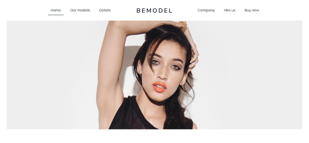
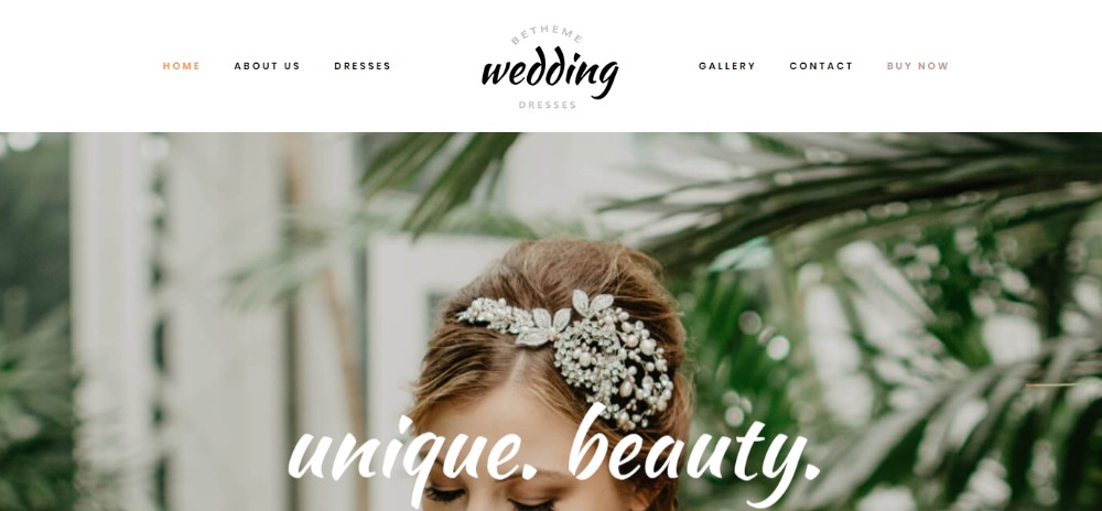
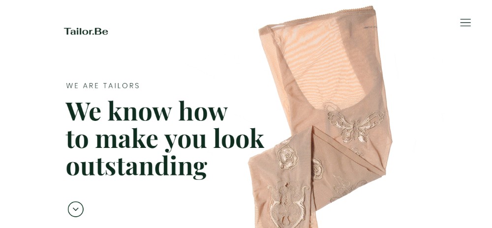
The fashion industry is an excellent example of how design trends can change. Luxurious images, rich textures, and colors were always a must-use here. In addition, closely-spaced bold visuals have been the norm forever. Suddenly in 2018, fashion sites have taken on a minimalist look. Bold visuals have been replaced with simple black and white sketches. Generous use of white space is the rule.
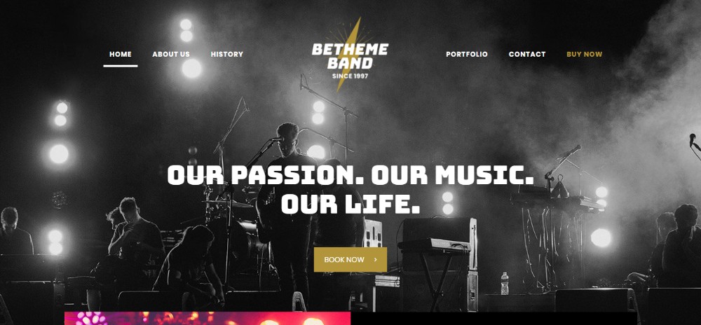
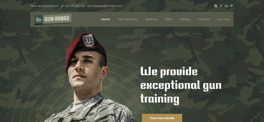
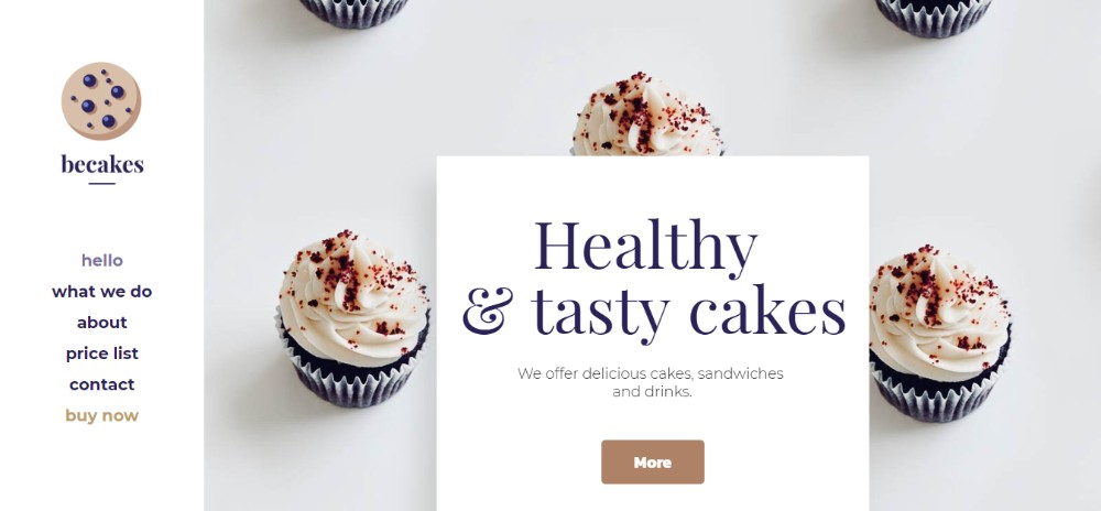
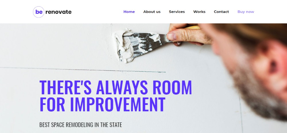
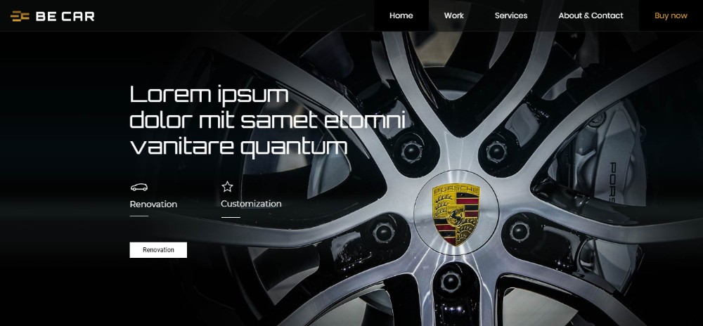
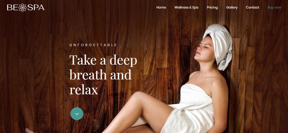
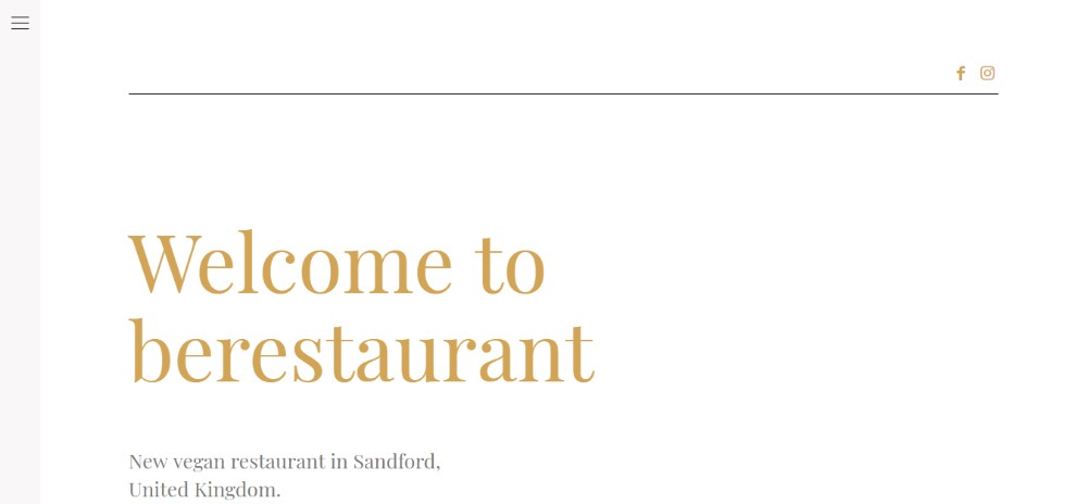
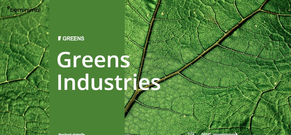
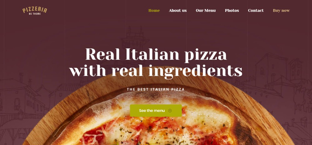
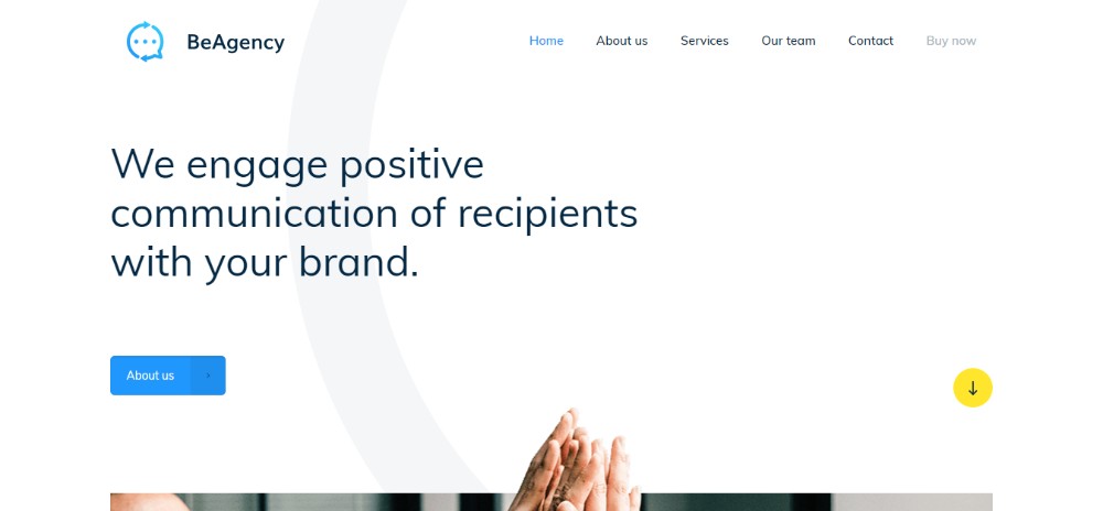
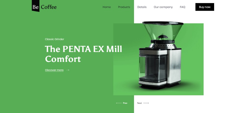
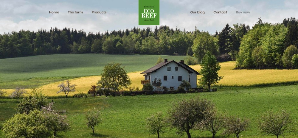
As you can see from the following examples, Be Theme has more than kept up with these changes.
2. How can I make sure I know what NEEDS to be on the Homepage?
This is always a tough one for designers. Not getting it right can make your best efforts less effective. They can get in effective enough to break your design and by extension your website. Trying to find the right mix of art and science when creating a design isn’t easy. You could wave a magic wand, but they’re in awfully short supply.
What you can do, is use a pre-built website to help your design effort along. You’ll have no trouble creating a tried and tested homepage designed to capture and engage users.
The secret? A structure that fits the industry, which is what users are looking for.
If you’re a man (or a woman) of action, you probably don’t cast yourself as a follower. In fact, risk-taking definitely has its rewards. There is just one problem with creating a disruptive (read “super innovative”) design. It is that there’s a set of clients it won’t play well with. This is a rather large set that includes corporations and large businesses. So is any small business that prefers to go with a safe or conservative marketing approach.
Pre-built websites give you a stable design base that will please almost any client. You can customize it with your own creative touch – as much as you like or dare.
4. Which of these 5 different ideas goes best with this project?
Having 5 great ideas might seem to be a good problem to have, but it’s not. Noone likes to discard a great idea. After all, would you ever get a chance to use it in the future?
So, you try to incorporate two or more great ideas into your design and you end up with an unholy mess. It happens almost every time.
A better approach:
Browse our comprehensive catalog of pre-built websites.
Search by content or industry type.
Pick a template that matches your design and/or your client’s needs.
Having done so, customize.
Do that, and you’re on the way to implement your creative vision on a tried and proven structure.
5. Is the client right or should I stick to my ideas?
Clients who don’t know quite what they want or need can at times be difficult to work with. Clients who use the “expert” argument to get what they want can be even more so. They may be 100% right because they know their business. They also know best how to market their product or service.
Or, they might not be. Anyway, a pre-built website that addresses your client’s industry is a sound option. By doing so, you’ll be in sync with the client who knows the business inside out. You’ll beable to convince uncertain clients that you’ve placed them on the right path.
Pre-built websites put you on the right track to improve your designs; from the get-go. They help you stay in sync with the latest design trends and industry website standards. And they help you deliver products that offer a pleasing UX; every time.
These cool design tools help you choose the best idea for a design. This is because of what they present. In addition, you can customize them to incorporate your ideas. They also help you deal with clients who can’t make up their minds or have made them up prematurely.
You want to deliver high-quality work every time. Otherwise, you wouldn’t be in this business. Why not give pre-built websites a try? 390+ of them are yours for only $59.
It’s a good feeling when a client is satisfied with your work. But there are times when you think that the client is just being nice. Perhaps, he or she doesn’t know the difference between a high-quality deliverable and a poor one.
You’d like the chance for a do-over, but it’s too late. The deadline was the priority item. Your problem might simply be that you’re more than capable of doing excellent work. But you aren’t always given the time to do so.
We’ve put together a checklist to help you improve your designs and quickly. You can do so by using pre-built websites. See for yourself how it can work for you.
Introducing Pre-built Websites & Their Number One Provider
Maybe pre-built websites aren’t for you because you prefer to do your own designs. That would make sense if they weren’t customizable. Also, if they didn’t keep pace with the latest trends or adhere to industry standards. Or, if they were nothing more than static yet attractive images.
If that were the case, all websites created using these design aides would be almost the same. Be Theme’s websites do oh so much more for you. They give you a solid base to build your designs on and they help you improve the quality of your designs.
BeTheme has more than 390 of them and counting; and all for a one-time fee of $59.
They’re nicely organized by industry, business niche, and content type. The library is constantly increasing in size to keep abreast of the latest design trends.
Checklist: 5 Ways Pre-Built Websites Can Enrich Your Designs
1. Am I in sync with this specific industry’s trends?
The fashion industry is an excellent example of how design trends can change. Luxurious images, rich textures, and colors were always a must-use here. In addition, closely-spaced bold visuals have been the norm forever. Suddenly in 2018, fashion sites have taken on a minimalist look. Bold visuals have been replaced with simple black and white sketches. Generous use of white space is the rule.
As you can see from the following examples, Be Theme has more than kept up with these changes.
2. How can I make sure I know what NEEDS to be on the Homepage?
This is always a tough one for designers. Not getting it right can make your best efforts less effective. They can get in effective enough to break your design and by extension your website. Trying to find the right mix of art and science when creating a design isn’t easy. You could wave a magic wand, but they’re in awfully short supply.
What you can do, is use a pre-built website to help your design effort along. You’ll have no trouble creating a tried and tested homepage designed to capture and engage users.
The secret? A structure that fits the industry, which is what users are looking for.
If you’re a man (or a woman) of action, you probably don’t cast yourself as a follower. In fact, risk-taking definitely has its rewards. There is just one problem with creating a disruptive (read “super innovative”) design. It is that there’s a set of clients it won’t play well with. This is a rather large set that includes corporations and large businesses. So is any small business that prefers to go with a safe or conservative marketing approach.
Pre-built websites give you a stable design base that will please almost any client. You can customize it with your own creative touch – as much as you like or dare.
4. Which of these 5 different ideas goes best with this project?
Having 5 great ideas might seem to be a good problem to have, but it’s not. Noone likes to discard a great idea. After all, would you ever get a chance to use it in the future?
So, you try to incorporate two or more great ideas into your design and you end up with an unholy mess. It happens almost every time.
A better approach:
Browse our comprehensive catalog of pre-built websites.
Search by content or industry type.
Pick a template that matches your design and/or your client’s needs.
Having done so, customize.
Do that, and you’re on the way to implement your creative vision on a tried and proven structure.
5. Is the client right or should I stick to my ideas?
Clients who don’t know quite what they want or need can at times be difficult to work with. Clients who use the “expert” argument to get what they want can be even more so. They may be 100% right because they know their business. They also know best how to market their product or service.
Or, they might not be. Anyway, a pre-built website that addresses your client’s industry is a sound option. By doing so, you’ll be in sync with the client who knows the business inside out. You’ll beable to convince uncertain clients that you’ve placed them on the right path.
Pre-built websites put you on the right track to improve your designs; from the get-go. They help you stay in sync with the latest design trends and industry website standards. And they help you deliver products that offer a pleasing UX; every time.
These cool design tools help you choose the best idea for a design. This is because of what they present. In addition, you can customize them to incorporate your ideas. They also help you deal with clients who can’t make up their minds or have made them up prematurely.
You want to deliver high-quality work every time. Otherwise, you wouldn’t be in this business. Why not give pre-built websites a try? 390+ of them are yours for only $59.
It’s a good feeling when a client is satisfied with your work. But there are times when you think that the client is just being nice. Perhaps, he or she doesn’t know the difference between a high-quality deliverable and a poor one.
You’d like the chance for a do-over, but it’s too late. The deadline was the priority item. Your problem might simply be that you’re more than capable of doing excellent work. But you aren’t always given the time to do so.
We’ve put together a checklist to help you improve your designs and quickly. You can do so by using pre-built websites. See for yourself how it can work for you.
Introducing Pre-built Websites & Their Number One Provider
Maybe pre-built websites aren’t for you because you prefer to do your own designs. That would make sense if they weren’t customizable. Also, if they didn’t keep pace with the latest trends or adhere to industry standards. Or, if they were nothing more than static yet attractive images.
If that were the case, all websites created using these design aides would be almost the same. Be Theme’s websites do oh so much more for you. They give you a solid base to build your designs on and they help you improve the quality of your designs.
BeTheme has more than 390 of them and counting; and all for a one-time fee of $59.
They’re nicely organized by industry, business niche, and content type. The library is constantly increasing in size to keep abreast of the latest design trends.
Checklist: 5 Ways Pre-Built Websites Can Enrich Your Designs
1. Am I in sync with this specific industry’s trends?
The fashion industry is an excellent example of how design trends can change. Luxurious images, rich textures, and colors were always a must-use here. In addition, closely-spaced bold visuals have been the norm forever. Suddenly in 2018, fashion sites have taken on a minimalist look. Bold visuals have been replaced with simple black and white sketches. Generous use of white space is the rule.
As you can see from the following examples, Be Theme has more than kept up with these changes.
2. How can I make sure I know what NEEDS to be on the Homepage?
This is always a tough one for designers. Not getting it right can make your best efforts less effective. They can get in effective enough to break your design and by extension your website. Trying to find the right mix of art and science when creating a design isn’t easy. You could wave a magic wand, but they’re in awfully short supply.
What you can do, is use a pre-built website to help your design effort along. You’ll have no trouble creating a tried and tested homepage designed to capture and engage users.
The secret? A structure that fits the industry, which is what users are looking for.
If you’re a man (or a woman) of action, you probably don’t cast yourself as a follower. In fact, risk-taking definitely has its rewards. There is just one problem with creating a disruptive (read “super innovative”) design. It is that there’s a set of clients it won’t play well with. This is a rather large set that includes corporations and large businesses. So is any small business that prefers to go with a safe or conservative marketing approach.
Pre-built websites give you a stable design base that will please almost any client. You can customize it with your own creative touch – as much as you like or dare.
4. Which of these 5 different ideas goes best with this project?
Having 5 great ideas might seem to be a good problem to have, but it’s not. Noone likes to discard a great idea. After all, would you ever get a chance to use it in the future?
So, you try to incorporate two or more great ideas into your design and you end up with an unholy mess. It happens almost every time.
A better approach:
Browse our comprehensive catalog of pre-built websites.
Search by content or industry type.
Pick a template that matches your design and/or your client’s needs.
Having done so, customize.
Do that, and you’re on the way to implement your creative vision on a tried and proven structure.
5. Is the client right or should I stick to my ideas?
Clients who don’t know quite what they want or need can at times be difficult to work with. Clients who use the “expert” argument to get what they want can be even more so. They may be 100% right because they know their business. They also know best how to market their product or service.
Or, they might not be. Anyway, a pre-built website that addresses your client’s industry is a sound option. By doing so, you’ll be in sync with the client who knows the business inside out. You’ll beable to convince uncertain clients that you’ve placed them on the right path.
Pre-built websites put you on the right track to improve your designs; from the get-go. They help you stay in sync with the latest design trends and industry website standards. And they help you deliver products that offer a pleasing UX; every time.
These cool design tools help you choose the best idea for a design. This is because of what they present. In addition, you can customize them to incorporate your ideas. They also help you deal with clients who can’t make up their minds or have made them up prematurely.
You want to deliver high-quality work every time. Otherwise, you wouldn’t be in this business. Why not give pre-built websites a try? 390+ of them are yours for only $59.
In this day and age, every business has a website that it
uses to enable it to sell products or services to customers in different
places. The problem is that most businesses rush into creating websites without
paying attention to various elements of web design. As a matter of fact, a
website is not one of those things that you invest in just for the sake of
flowing with the trend. It’s better to continue doing your business offline
than to have a website that doesn’t increase conversions. In fact, such a website
is a waste of time and resources. Here is a list of how a poorly designed
website can drag down your enterprise.
1. Increased Bounce
Rate
This one goes without saying. When your website has a poor
design, it becomes difficult for visitors to navigate through the various tabs.
Besides that, it loads at a speed of a snail. Such poor user experience causes
visitors to leave your portal without buying anything. Keep in mind that
internet users, especially the millennials are very mean with their time. They
actually prefer websites that load at lightning speeds because they usually
have busy schedules either at work or in school. If your website takes ages to
load, you will definitely lose customers to your competitors that have websites
that load at a much faster speed. If you want o experience an improvement in
conversions, you must work on the speed of your website and make it more user
friendly.
2. Poor Search Engine
Ranking
The websites that appear in the first pages of search engineresults usually contain content that has been optimized for SEO (Search EngineOptimization).This means that such content has phrases that are commonly usedby people while looking for information on the internet. Content that is highlyoptimized increases the visibility of your business. Lest you forget, customerstrust brands that appear in the first pages of search results. If your websiteis not optimized for SEO, it’s hard for your brand to be noticed, consideringthat a single search has millions of answers. This is because it will appear inthe last pages of search engine results. Most customers don’t bother to checkanything that’s beyond the first two pages. You must therefore hire a website design company that willoptimize the content that’s on your portal.
3. Device
Incompatibility
A few decades a go, people could only browse the internet
using a computer. Those who didn’t own a computer had to go to the nearest
cyber café. Things have now changed. Smartphones have made it easier for
everyone to access the internet. The good thing is that mobile devices enable
people to browse from anywhere even while on the go. In fact, there are very
few people that access the internet via computers. This means that businesses
have to create websites that are optimized for mobile devices. If your website
can’t be navigated using a mobile device, you will definitely experience a
decline in conversions.
4. Customers Lose
Confidence in your Brand
When the content on your website is not of high quality,
your business will rank poorly in the search engines. This is because search
engines consider the quality of content before allocating any spot position to
a website. Even if you use paid ads to drive traffic to your website, customers
will not have the confidence of buying anything from your business when they
find content that’s not based on true facts. High quality content will actually
continue to generate traffic for your business even while you sleep. This is
due to the fact that people will first see your website when they search for
information.
Agregator najlepszych postów o designie, webdesignie, cssie i Internecie