

MomAnitas Goods


LilyBee Honey

How to Create a Colourful Dasara Infographic in InDesign
Post pobrano z: How to Create a Colourful Dasara Infographic in InDesign

Vijayadashami, also known as Dasara, Dusshera, or Dussehra, is a major Hindu festival celebrated at the end of Navratri every year, which typically falls in the Gregorian months of September and October.
This colorful infographic is a tribute to the Dasara festival, during which processions and celebrations take place across many parts of the Indian subcontinent.
This is a great introduction to infographic design for beginners, and you can also share the completed design on social media. You can download the high-quality version of the infographic here.
If you want to create your own unique infographics, you can discover a massive range of icons and infographic templates on Envato Elements and GraphicRiver.
What You’ll Need to Create Your Infographic
We’ll put together the infographic artwork in Adobe InDesign, but you’ll also need to have access to vector software like Adobe Illustrator to edit the temple graphics and icons.
You’ll also need to download the following images and fonts from Envato Elements:
Install the fonts on your computer, and you’re ready to get started.
1. Create the Infographic Document in InDesign
Step 1
Open InDesign and go to File > New > Document.
Click on Web at the top of the window to set the intent of the document. Then set the Width of the page to 870 px and Height to 2600 px.
Uncheck Facing Pages. Add Margins of 44 px, and then click Create.

Step 2
Expand the Layers panel (Window > Layers) and double-click on Layer 1, renaming it Background.
Create two more new layers—first Graphics, and then Type at the top.

Lock both the Graphics and Type layers, and click on the Background layer to activate it.

Step 3
Expand the Swatches panel (Window > Color > Swatches) and choose New Color Swatch from the panel’s main menu (at top-right).
Set the levels to C=0 M=92 Y=15 K=0*. Click Add and Done.
Create three more new swatches with the following values:
- C=20 M=14 Y=97 K=2
- C=4 M=80 Y=89 K=0
- C=6 M=32 Y=91 K=0

* If you’re creating your infographic for print, you can set your swatches to CMYK. But even if you’re exporting your infographic to share online, you can still use CMYK swatches and simply export to an RGB color mode later on.
Step 4
Working on the Background layer, select the Rectangle Tool (M) from the Tools panel, and drag across the top of the page to create a small rectangle about 267 px in Height (visible from the top Controls panel).
From the Swatches panel, set the Stroke Color of the shape to [None] and Fill Color to your new yellow swatch, C=6 M=32 Y=91 K=0.

Step 5
Create a second shape 557 px in Height, positioning it below the first. Set the Fill to orange, C=4 M=80 Y=89 K=0.

Edit > Copy and Edit > Paste this shape, and position below, creating a sequence of shapes. Switch the Fill to green, C=20 M=14 Y=97 K=2.

Paste two more shapes below, setting the first to a pink Fill of C=0 M=92 Y=15 K=0, and the second to yellow, C=6 M=32 Y=91 K=0.

2. How to Add a Bold Header to Your Infographic
Step 1
Lock the Background layer and unlock the top layer, Type.
With the Rectangle Tool still selected, draw a shape inside the top yellow rectangle to create a border effect. From the Stroke panel (Window > Stroke), set the Weight of the shape’s stroke to 17 pt.

Switch the Stroke Color of the shape to green, C=20 M=14 Y=97 K=2.

Step 2
Take the Type Tool (T) and drag across the top of the page, inside the border you’ve just created.
Type in ‘DASARA’ and from either the top Controls panel or the Character panel (Window > Type & Tables > Character) set the Font to Garlic Salt Bold, Size 115 pt, and the Tracking to 60.

Set the Font Color to pink, C=0 M=92 Y=15 K=0.

You can also thicken the appearance of the text by adding the same swatch color to the Stroke Color of the text—simply click on the other ‘T’ symbol at the top of the Swatches panel.

Step 3
Create a second text frame above, writing in introductory text like ‘THE HINDU FESTIVAL OF’, and setting the Font to CornerOne Bold, Size 29 pt, Tracking 50, and the Font Color to [Paper].

3. How to Add Temple Graphics to Your Design
Step 1
Minimize your InDesign window; we’ll come back to it in a moment.
Open up the Surat skyline EPS file in Adobe Illustrator, or another vector program.
Right-Click > Ungroup the illustration.

Then select the temple in the center of the design, and Edit > Copy it.

Step 2
Head back over to your InDesign document and lock the Type layer. Unlock the Graphics layer below.
Edit > Paste the temple directly onto the page, and resize, holding Shift, positioning it on the right side of the orange section of the infographic, towards the top.

Step 3
Open the Patna skyline in Illustrator and repeat, by ungrouping the illustration and then selecting and copying the temple graphic in the center.

Paste it onto the InDesign layout, positioning it on the left side of the next colored section down.

Use the Visakhapatnam skyline to copy and paste over two temple illustrations, using them to fill the two final colored sections of the infographic.


4. How to Format Typography on Your Infographic
Step 1
Lock the Graphics layer and unlock the top layer, Type.
Use the Type Tool (T) to create a text frame to the left of the temple at the top of your layout.

Type in the first fact for your infographic, and set the Font to CornerOne Bold, Size 18 pt. Set the Font Color to [Paper] and pull out key items of text in a contrasting green swatch.

Step 2
Create a text frame to the right of the temple on the next section down. For statistics, you can pull out numbers in a larger font size. Try setting them in CornerOne Bold, Size 139 pt.

Group other text frames around the number, setting the Font to CornerOne Bold, Size 28 pt.

Use the body text frame from the section above as a template for populating the infographic with more text frames; simply Copy and Paste.

Step 3
Keep working your way down the infographic, populating each section with text. Set key sentences in a slightly larger 20 pt Font Size and All Caps.

Team these key sentences with the other pasted body text frames.


Step 4
You can add icons to your infographic to indicate the theme of each section. Open up the Diwali icons set in Illustrator, and isolate one icon before copying it.

Edit > Paste it onto the Graphics layer in InDesign, and position it alongside a piece of text.


5. How to Export Your Infographic for Sharing Online
Step 1
Your infographic’s finished—great job! All that’s left to do is to export your artwork, ready for sharing online on social media.
Go to File > Export. Choose JPEG from the Format drop-down menu, and hit Save.

Step 2
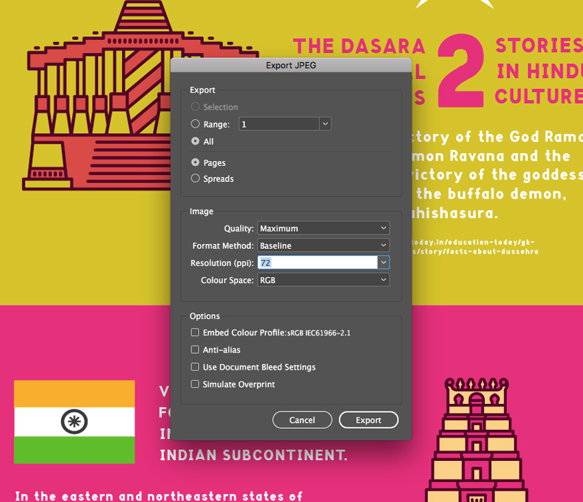
In the window that opens, set the Resolution to 72 ppi, and the Color Space to RGB.
Then click Export.
Conclusion: Your Finished Infographic
Your Dasara infographic is finished, and it’s looking awesome!
Make sure to share the infographic on Pinterest and Facebook to raise awareness about Dasara and celebrate the festival in style.
If you want to create more infographics, you can find a huge range of icons and infographic templates on Envato Elements and GraphicRiver.

Also, don’t miss out on these other cool infographic tutorials:
-

How to Create an Education Infographic in Adobe InDesign
This infographic looks at how organisations worldwide are battling to improve education for girls. Here we’ll learn how to put together the infographic in… -
How to Create a Space Travel Infographic in Adobe InDesign
It’s Science Week here at Envato Tuts+, and this fun infographic is a great way to celebrate! With a focus on the future of space travel, you’ll be able to… -

27 Creative Infographic Templates
Have an upcoming presentation? Make a great impression with this brilliant selection of creative infographic templates. -

What Is an Infographic? Design in 60 Seconds
In this quick video, instructor Melody Nieves will explain what an infographic is and show you how to customize a simple template.

How to Create a Colourful Dasara Infographic in InDesign
Post pobrano z: How to Create a Colourful Dasara Infographic in InDesign
Vijayadashami, also known as Dasara, Dusshera, or Dussehra, is a major Hindu festival celebrated at the end of Navratri every year, which typically falls in the Gregorian months of September and October.
This colorful infographic is a tribute to the Dasara festival, during which processions and celebrations take place across many parts of the Indian subcontinent.
This is a great introduction to infographic design for beginners, and you can also share the completed design on social media. You can download the high-quality version of the infographic here.
If you want to create your own unique infographics, you can discover a massive range of icons and infographic templates on Envato Elements and GraphicRiver.
What You’ll Need to Create Your Infographic
We’ll put together the infographic artwork in Adobe InDesign, but you’ll also need to have access to vector software like Adobe Illustrator to edit the temple graphics and icons.
You’ll also need to download the following images and fonts from Envato Elements:
Install the fonts on your computer, and you’re ready to get started.
1. Create the Infographic Document in InDesign
Step 1
Open InDesign and go to File > New > Document.
Click on Web at the top of the window to set the intent of the document. Then set the Width of the page to 870 px and Height to 2600 px.
Uncheck Facing Pages. Add Margins of 44 px, and then click Create.
Step 2
Expand the Layers panel (Window > Layers) and double-click on Layer 1, renaming it Background.
Create two more new layers—first Graphics, and then Type at the top.
Lock both the Graphics and Type layers, and click on the Background layer to activate it.
Step 3
Expand the Swatches panel (Window > Color > Swatches) and choose New Color Swatch from the panel’s main menu (at top-right).
Set the levels to C=0 M=92 Y=15 K=0*. Click Add and Done.
Create three more new swatches with the following values:
- C=20 M=14 Y=97 K=2
- C=4 M=80 Y=89 K=0
- C=6 M=32 Y=91 K=0
* If you’re creating your infographic for print, you can set your swatches to CMYK. But even if you’re exporting your infographic to share online, you can still use CMYK swatches and simply export to an RGB color mode later on.
Step 4
Working on the Background layer, select the Rectangle Tool (M) from the Tools panel, and drag across the top of the page to create a small rectangle about 267 px in Height (visible from the top Controls panel).
From the Swatches panel, set the Stroke Color of the shape to [None] and Fill Color to your new yellow swatch, C=6 M=32 Y=91 K=0.
Step 5
Create a second shape 557 px in Height, positioning it below the first. Set the Fill to orange, C=4 M=80 Y=89 K=0.
Edit > Copy and Edit > Paste this shape, and position below, creating a sequence of shapes. Switch the Fill to green, C=20 M=14 Y=97 K=2.
Paste two more shapes below, setting the first to a pink Fill of C=0 M=92 Y=15 K=0, and the second to yellow, C=6 M=32 Y=91 K=0.
2. How to Add a Bold Header to Your Infographic
Step 1
Lock the Background layer and unlock the top layer, Type.
With the Rectangle Tool still selected, draw a shape inside the top yellow rectangle to create a border effect. From the Stroke panel (Window > Stroke), set the Weight of the shape’s stroke to 17 pt.
Switch the Stroke Color of the shape to green, C=20 M=14 Y=97 K=2.
Step 2
Take the Type Tool (T) and drag across the top of the page, inside the border you’ve just created.
Type in ‘DASARA’ and from either the top Controls panel or the Character panel (Window > Type & Tables > Character) set the Font to Garlic Salt Bold, Size 115 pt, and the Tracking to 60.
Set the Font Color to pink, C=0 M=92 Y=15 K=0.
You can also thicken the appearance of the text by adding the same swatch color to the Stroke Color of the text—simply click on the other ‘T’ symbol at the top of the Swatches panel.
Step 3
Create a second text frame above, writing in introductory text like ‘THE HINDU FESTIVAL OF’, and setting the Font to CornerOne Bold, Size 29 pt, Tracking 50, and the Font Color to [Paper].
3. How to Add Temple Graphics to Your Design
Step 1
Minimize your InDesign window; we’ll come back to it in a moment.
Open up the Surat skyline EPS file in Adobe Illustrator, or another vector program.
Right-Click > Ungroup the illustration.
Then select the temple in the center of the design, and Edit > Copy it.
Step 2
Head back over to your InDesign document and lock the Type layer. Unlock the Graphics layer below.
Edit > Paste the temple directly onto the page, and resize, holding Shift, positioning it on the right side of the orange section of the infographic, towards the top.
Step 3
Open the Patna skyline in Illustrator and repeat, by ungrouping the illustration and then selecting and copying the temple graphic in the center.
Paste it onto the InDesign layout, positioning it on the left side of the next colored section down.
Use the Visakhapatnam skyline to copy and paste over two temple illustrations, using them to fill the two final colored sections of the infographic.
4. How to Format Typography on Your Infographic
Step 1
Lock the Graphics layer and unlock the top layer, Type.
Use the Type Tool (T) to create a text frame to the left of the temple at the top of your layout.
Type in the first fact for your infographic, and set the Font to CornerOne Bold, Size 18 pt. Set the Font Color to [Paper] and pull out key items of text in a contrasting green swatch.
Step 2
Create a text frame to the right of the temple on the next section down. For statistics, you can pull out numbers in a larger font size. Try setting them in CornerOne Bold, Size 139 pt.
Group other text frames around the number, setting the Font to CornerOne Bold, Size 28 pt.
Use the body text frame from the section above as a template for populating the infographic with more text frames; simply Copy and Paste.
Step 3
Keep working your way down the infographic, populating each section with text. Set key sentences in a slightly larger 20 pt Font Size and All Caps.
Team these key sentences with the other pasted body text frames.
Step 4
You can add icons to your infographic to indicate the theme of each section. Open up the Diwali icons set in Illustrator, and isolate one icon before copying it.
Edit > Paste it onto the Graphics layer in InDesign, and position it alongside a piece of text.
5. How to Export Your Infographic for Sharing Online
Step 1
Your infographic’s finished—great job! All that’s left to do is to export your artwork, ready for sharing online on social media.
Go to File > Export. Choose JPEG from the Format drop-down menu, and hit Save.
Step 2
In the window that opens, set the Resolution to 72 ppi, and the Color Space to RGB.
Then click Export.
Conclusion: Your Finished Infographic
Your Dasara infographic is finished, and it’s looking awesome!
Make sure to share the infographic on Pinterest and Facebook to raise awareness about Dasara and celebrate the festival in style.
If you want to create more infographics, you can find a huge range of icons and infographic templates on Envato Elements and GraphicRiver.
Also, don’t miss out on these other cool infographic tutorials:
-
How to Create an Education Infographic in Adobe InDesign
This infographic looks at how organisations worldwide are battling to improve education for girls. Here we’ll learn how to put together the infographic in… -
How to Create a Space Travel Infographic in Adobe InDesign
It’s Science Week here at Envato Tuts+, and this fun infographic is a great way to celebrate! With a focus on the future of space travel, you’ll be able to… -
27 Creative Infographic Templates
Have an upcoming presentation? Make a great impression with this brilliant selection of creative infographic templates. -
What Is an Infographic? Design in 60 Seconds
In this quick video, instructor Melody Nieves will explain what an infographic is and show you how to customize a simple template.
How to Create a Colourful Dasara Infographic in InDesign
Post pobrano z: How to Create a Colourful Dasara Infographic in InDesign
Vijayadashami, also known as Dasara, Dusshera, or Dussehra, is a major Hindu festival celebrated at the end of Navratri every year, which typically falls in the Gregorian months of September and October.
This colorful infographic is a tribute to the Dasara festival, during which processions and celebrations take place across many parts of the Indian subcontinent.
This is a great introduction to infographic design for beginners, and you can also share the completed design on social media. You can download the high-quality version of the infographic here.
If you want to create your own unique infographics, you can discover a massive range of icons and infographic templates on Envato Elements and GraphicRiver.
What You’ll Need to Create Your Infographic
We’ll put together the infographic artwork in Adobe InDesign, but you’ll also need to have access to vector software like Adobe Illustrator to edit the temple graphics and icons.
You’ll also need to download the following images and fonts from Envato Elements:
Install the fonts on your computer, and you’re ready to get started.
1. Create the Infographic Document in InDesign
Step 1
Open InDesign and go to File > New > Document.
Click on Web at the top of the window to set the intent of the document. Then set the Width of the page to 870 px and Height to 2600 px.
Uncheck Facing Pages. Add Margins of 44 px, and then click Create.
Step 2
Expand the Layers panel (Window > Layers) and double-click on Layer 1, renaming it Background.
Create two more new layers—first Graphics, and then Type at the top.
Lock both the Graphics and Type layers, and click on the Background layer to activate it.
Step 3
Expand the Swatches panel (Window > Color > Swatches) and choose New Color Swatch from the panel’s main menu (at top-right).
Set the levels to C=0 M=92 Y=15 K=0*. Click Add and Done.
Create three more new swatches with the following values:
- C=20 M=14 Y=97 K=2
- C=4 M=80 Y=89 K=0
- C=6 M=32 Y=91 K=0
* If you’re creating your infographic for print, you can set your swatches to CMYK. But even if you’re exporting your infographic to share online, you can still use CMYK swatches and simply export to an RGB color mode later on.
Step 4
Working on the Background layer, select the Rectangle Tool (M) from the Tools panel, and drag across the top of the page to create a small rectangle about 267 px in Height (visible from the top Controls panel).
From the Swatches panel, set the Stroke Color of the shape to [None] and Fill Color to your new yellow swatch, C=6 M=32 Y=91 K=0.
Step 5
Create a second shape 557 px in Height, positioning it below the first. Set the Fill to orange, C=4 M=80 Y=89 K=0.
Edit > Copy and Edit > Paste this shape, and position below, creating a sequence of shapes. Switch the Fill to green, C=20 M=14 Y=97 K=2.
Paste two more shapes below, setting the first to a pink Fill of C=0 M=92 Y=15 K=0, and the second to yellow, C=6 M=32 Y=91 K=0.
2. How to Add a Bold Header to Your Infographic
Step 1
Lock the Background layer and unlock the top layer, Type.
With the Rectangle Tool still selected, draw a shape inside the top yellow rectangle to create a border effect. From the Stroke panel (Window > Stroke), set the Weight of the shape’s stroke to 17 pt.
Switch the Stroke Color of the shape to green, C=20 M=14 Y=97 K=2.
Step 2
Take the Type Tool (T) and drag across the top of the page, inside the border you’ve just created.
Type in ‘DASARA’ and from either the top Controls panel or the Character panel (Window > Type & Tables > Character) set the Font to Garlic Salt Bold, Size 115 pt, and the Tracking to 60.
Set the Font Color to pink, C=0 M=92 Y=15 K=0.
You can also thicken the appearance of the text by adding the same swatch color to the Stroke Color of the text—simply click on the other ‘T’ symbol at the top of the Swatches panel.
Step 3
Create a second text frame above, writing in introductory text like ‘THE HINDU FESTIVAL OF’, and setting the Font to CornerOne Bold, Size 29 pt, Tracking 50, and the Font Color to [Paper].
3. How to Add Temple Graphics to Your Design
Step 1
Minimize your InDesign window; we’ll come back to it in a moment.
Open up the Surat skyline EPS file in Adobe Illustrator, or another vector program.
Right-Click > Ungroup the illustration.
Then select the temple in the center of the design, and Edit > Copy it.
Step 2
Head back over to your InDesign document and lock the Type layer. Unlock the Graphics layer below.
Edit > Paste the temple directly onto the page, and resize, holding Shift, positioning it on the right side of the orange section of the infographic, towards the top.
Step 3
Open the Patna skyline in Illustrator and repeat, by ungrouping the illustration and then selecting and copying the temple graphic in the center.
Paste it onto the InDesign layout, positioning it on the left side of the next colored section down.
Use the Visakhapatnam skyline to copy and paste over two temple illustrations, using them to fill the two final colored sections of the infographic.
4. How to Format Typography on Your Infographic
Step 1
Lock the Graphics layer and unlock the top layer, Type.
Use the Type Tool (T) to create a text frame to the left of the temple at the top of your layout.
Type in the first fact for your infographic, and set the Font to CornerOne Bold, Size 18 pt. Set the Font Color to [Paper] and pull out key items of text in a contrasting green swatch.
Step 2
Create a text frame to the right of the temple on the next section down. For statistics, you can pull out numbers in a larger font size. Try setting them in CornerOne Bold, Size 139 pt.
Group other text frames around the number, setting the Font to CornerOne Bold, Size 28 pt.
Use the body text frame from the section above as a template for populating the infographic with more text frames; simply Copy and Paste.
Step 3
Keep working your way down the infographic, populating each section with text. Set key sentences in a slightly larger 20 pt Font Size and All Caps.
Team these key sentences with the other pasted body text frames.
Step 4
You can add icons to your infographic to indicate the theme of each section. Open up the Diwali icons set in Illustrator, and isolate one icon before copying it.
Edit > Paste it onto the Graphics layer in InDesign, and position it alongside a piece of text.
5. How to Export Your Infographic for Sharing Online
Step 1
Your infographic’s finished—great job! All that’s left to do is to export your artwork, ready for sharing online on social media.
Go to File > Export. Choose JPEG from the Format drop-down menu, and hit Save.
Step 2
In the window that opens, set the Resolution to 72 ppi, and the Color Space to RGB.
Then click Export.
Conclusion: Your Finished Infographic
Your Dasara infographic is finished, and it’s looking awesome!
Make sure to share the infographic on Pinterest and Facebook to raise awareness about Dasara and celebrate the festival in style.
If you want to create more infographics, you can find a huge range of icons and infographic templates on Envato Elements and GraphicRiver.
Also, don’t miss out on these other cool infographic tutorials:
-
How to Create an Education Infographic in Adobe InDesign
This infographic looks at how organisations worldwide are battling to improve education for girls. Here we’ll learn how to put together the infographic in… -
How to Create a Space Travel Infographic in Adobe InDesign
It’s Science Week here at Envato Tuts+, and this fun infographic is a great way to celebrate! With a focus on the future of space travel, you’ll be able to… -
27 Creative Infographic Templates
Have an upcoming presentation? Make a great impression with this brilliant selection of creative infographic templates. -
What Is an Infographic? Design in 60 Seconds
In this quick video, instructor Melody Nieves will explain what an infographic is and show you how to customize a simple template.
How to Create a Colourful Dasara Infographic in InDesign
Post pobrano z: How to Create a Colourful Dasara Infographic in InDesign
Vijayadashami, also known as Dasara, Dusshera, or Dussehra, is a major Hindu festival celebrated at the end of Navratri every year, which typically falls in the Gregorian months of September and October.
This colorful infographic is a tribute to the Dasara festival, during which processions and celebrations take place across many parts of the Indian subcontinent.
This is a great introduction to infographic design for beginners, and you can also share the completed design on social media. You can download the high-quality version of the infographic here.
If you want to create your own unique infographics, you can discover a massive range of icons and infographic templates on Envato Elements and GraphicRiver.
What You’ll Need to Create Your Infographic
We’ll put together the infographic artwork in Adobe InDesign, but you’ll also need to have access to vector software like Adobe Illustrator to edit the temple graphics and icons.
You’ll also need to download the following images and fonts from Envato Elements:
Install the fonts on your computer, and you’re ready to get started.
1. Create the Infographic Document in InDesign
Step 1
Open InDesign and go to File > New > Document.
Click on Web at the top of the window to set the intent of the document. Then set the Width of the page to 870 px and Height to 2600 px.
Uncheck Facing Pages. Add Margins of 44 px, and then click Create.
Step 2
Expand the Layers panel (Window > Layers) and double-click on Layer 1, renaming it Background.
Create two more new layers—first Graphics, and then Type at the top.
Lock both the Graphics and Type layers, and click on the Background layer to activate it.
Step 3
Expand the Swatches panel (Window > Color > Swatches) and choose New Color Swatch from the panel’s main menu (at top-right).
Set the levels to C=0 M=92 Y=15 K=0*. Click Add and Done.
Create three more new swatches with the following values:
- C=20 M=14 Y=97 K=2
- C=4 M=80 Y=89 K=0
- C=6 M=32 Y=91 K=0
* If you’re creating your infographic for print, you can set your swatches to CMYK. But even if you’re exporting your infographic to share online, you can still use CMYK swatches and simply export to an RGB color mode later on.
Step 4
Working on the Background layer, select the Rectangle Tool (M) from the Tools panel, and drag across the top of the page to create a small rectangle about 267 px in Height (visible from the top Controls panel).
From the Swatches panel, set the Stroke Color of the shape to [None] and Fill Color to your new yellow swatch, C=6 M=32 Y=91 K=0.
Step 5
Create a second shape 557 px in Height, positioning it below the first. Set the Fill to orange, C=4 M=80 Y=89 K=0.
Edit > Copy and Edit > Paste this shape, and position below, creating a sequence of shapes. Switch the Fill to green, C=20 M=14 Y=97 K=2.
Paste two more shapes below, setting the first to a pink Fill of C=0 M=92 Y=15 K=0, and the second to yellow, C=6 M=32 Y=91 K=0.
2. How to Add a Bold Header to Your Infographic
Step 1
Lock the Background layer and unlock the top layer, Type.
With the Rectangle Tool still selected, draw a shape inside the top yellow rectangle to create a border effect. From the Stroke panel (Window > Stroke), set the Weight of the shape’s stroke to 17 pt.
Switch the Stroke Color of the shape to green, C=20 M=14 Y=97 K=2.
Step 2
Take the Type Tool (T) and drag across the top of the page, inside the border you’ve just created.
Type in ‘DASARA’ and from either the top Controls panel or the Character panel (Window > Type & Tables > Character) set the Font to Garlic Salt Bold, Size 115 pt, and the Tracking to 60.
Set the Font Color to pink, C=0 M=92 Y=15 K=0.
You can also thicken the appearance of the text by adding the same swatch color to the Stroke Color of the text—simply click on the other ‘T’ symbol at the top of the Swatches panel.
Step 3
Create a second text frame above, writing in introductory text like ‘THE HINDU FESTIVAL OF’, and setting the Font to CornerOne Bold, Size 29 pt, Tracking 50, and the Font Color to [Paper].
3. How to Add Temple Graphics to Your Design
Step 1
Minimize your InDesign window; we’ll come back to it in a moment.
Open up the Surat skyline EPS file in Adobe Illustrator, or another vector program.
Right-Click > Ungroup the illustration.
Then select the temple in the center of the design, and Edit > Copy it.
Step 2
Head back over to your InDesign document and lock the Type layer. Unlock the Graphics layer below.
Edit > Paste the temple directly onto the page, and resize, holding Shift, positioning it on the right side of the orange section of the infographic, towards the top.
Step 3
Open the Patna skyline in Illustrator and repeat, by ungrouping the illustration and then selecting and copying the temple graphic in the center.
Paste it onto the InDesign layout, positioning it on the left side of the next colored section down.
Use the Visakhapatnam skyline to copy and paste over two temple illustrations, using them to fill the two final colored sections of the infographic.
4. How to Format Typography on Your Infographic
Step 1
Lock the Graphics layer and unlock the top layer, Type.
Use the Type Tool (T) to create a text frame to the left of the temple at the top of your layout.
Type in the first fact for your infographic, and set the Font to CornerOne Bold, Size 18 pt. Set the Font Color to [Paper] and pull out key items of text in a contrasting green swatch.
Step 2
Create a text frame to the right of the temple on the next section down. For statistics, you can pull out numbers in a larger font size. Try setting them in CornerOne Bold, Size 139 pt.
Group other text frames around the number, setting the Font to CornerOne Bold, Size 28 pt.
Use the body text frame from the section above as a template for populating the infographic with more text frames; simply Copy and Paste.
Step 3
Keep working your way down the infographic, populating each section with text. Set key sentences in a slightly larger 20 pt Font Size and All Caps.
Team these key sentences with the other pasted body text frames.
Step 4
You can add icons to your infographic to indicate the theme of each section. Open up the Diwali icons set in Illustrator, and isolate one icon before copying it.
Edit > Paste it onto the Graphics layer in InDesign, and position it alongside a piece of text.
5. How to Export Your Infographic for Sharing Online
Step 1
Your infographic’s finished—great job! All that’s left to do is to export your artwork, ready for sharing online on social media.
Go to File > Export. Choose JPEG from the Format drop-down menu, and hit Save.
Step 2
In the window that opens, set the Resolution to 72 ppi, and the Color Space to RGB.
Then click Export.
Conclusion: Your Finished Infographic
Your Dasara infographic is finished, and it’s looking awesome!
Make sure to share the infographic on Pinterest and Facebook to raise awareness about Dasara and celebrate the festival in style.
If you want to create more infographics, you can find a huge range of icons and infographic templates on Envato Elements and GraphicRiver.
Also, don’t miss out on these other cool infographic tutorials:
-
How to Create an Education Infographic in Adobe InDesign
This infographic looks at how organisations worldwide are battling to improve education for girls. Here we’ll learn how to put together the infographic in… -
How to Create a Space Travel Infographic in Adobe InDesign
It’s Science Week here at Envato Tuts+, and this fun infographic is a great way to celebrate! With a focus on the future of space travel, you’ll be able to… -
27 Creative Infographic Templates
Have an upcoming presentation? Make a great impression with this brilliant selection of creative infographic templates. -
What Is an Infographic? Design in 60 Seconds
In this quick video, instructor Melody Nieves will explain what an infographic is and show you how to customize a simple template.
The other side of creativity / Pas si renversant que ça?
Post pobrano z: The other side of creativity / Pas si renversant que ça?
 |
 |
 |
 |
| THE ORIGINAL? Gossip News – 2010 Source : Coloribus Agency : Soul fast (Uruguay) |
LESS ORIGINAL HIMG – 2015 Source : Coloribus Agency : Team Red (Hungary) |
LESS ORIGINAL Mandevu – 2017 Cannes BRONZE LION Agency : Young &Rubicam (Kenya) |
LESS ORIGINAL Renault Duster – 2018 “Challenge gravity” Agency : DPZ & T (Brazil) |
The other side of creativity / Pas si renversant que ça?
Post pobrano z: The other side of creativity / Pas si renversant que ça?
|
|
|
|
| THE ORIGINAL? Gossip News – 2010 Source : Coloribus Agency : Soul fast (Uruguay) |
LESS ORIGINAL HIMG – 2015 Source : Coloribus Agency : Team Red (Hungary) |
LESS ORIGINAL Mandevu – 2017 Cannes BRONZE LION Agency : Young &Rubicam (Kenya) |
LESS ORIGINAL Renault Duster – 2018 “Challenge gravity” Agency : DPZ & T (Brazil) |
Elementary school of copycat / À l’école de la pompe?
Post pobrano z: Elementary school of copycat / À l’école de la pompe?
 |
 |
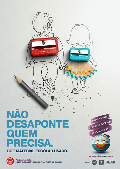
| THE ORIGINAL? Claro – Second hand school supplies – 2015 “Do not disappoint who needs it” Agency : 6P Marketing & Propaganda (Brazil) |
LESS ORIGINAL Anaya For President – 2018 “We have 3 priorities : education, education, education” Agency : Unknown ? (Mexico) |