You know you need a logo for your business today. After all, how else are you going to set yourself apart from the competition, and there is always competition no matter which industry yours belongs to. The question is- how do you create an ideal logo that looks professional and appealing but at the same time communicates your company’s vision and mission statements effortlessly?
There are many factors to consider when you want the perfect logo. These are:
1. Brand Fundamentals
Before you actually get to the design part, you must have a clear mission statement and the values you want to build your brand upon. This is because just creating a top-notch and beautiful logo won’t do much for your business unless there is a strong message backing it up.
The following are some of the most important questions you must ask yourself:
What problem is my company solving?
What is my target demographic (age range, gender, location, educational background, etc.)
What makes my company different than the others in the same industry?
What are my brand’s USPs?
2. The Perfect Logo Tool
Now that you know exactly what kind of brand you want to build, it’s time to pick a good logo designer software/platform.
There is a slew of logo designing software on the Internet. However, only a few are worthy of your time and investment. You must remember what is a logo used for and its significance in the success of your business. So, you may find many cheap or even free logo design software but if you want a professional design with some class, then you should choose a program like Tailor Brands which is powered by AI i.e. one of the most popular new-age technologies with a serious impact in the everyday lives of consumers.
Unlike other basic logo creators in the market which offer sub-par designs, Tailor Brands uses a proprietary algorithm that creates a unique logo design just for you. Since it’s based on several factors such as your brand’s name, industry, business description, etc. not only it’s apt for your needs, it’s different than every other logo out there. If that doesn’t convince you, it’s quite easy on the pockets too!
3. Simplicity
A company logo should be unique, there are no two ways to it. However, it doesn’t mean that you need to make it unnecessarily complicated just so it stands out. In fact, a professional logo is always simple yet effective.
The reason why simplicity is important in every logo is that only when there is less distraction in the design, the impact can be maximum. A simple logo can be identified by your target demographic quickly and it’s easy to put on your marketing entities (presentation slides, corporate gift items, business cards, pens, notepads, etc.)
4. Typography and Colors
When it comes to company logos, then typography alone can make a huge difference. There are many examples that you can check to understand why.
The thing is that typography represents the name of the brand so it’s often the highlight of the logo itself. In fact, you can greatly change the emotion of a logo by choosing a particular typography. Yep, you read it right- typography connote emotions!
The following are different emotions along with fonts that portray them best:
Feminine: Gigi, Kristen
Rude: Agency FB, Impact
Sad: Courier New, Impact
Happy: Comic Sans, Kristen
Similarly, the colors play a big role in logo designs too. Each color has a different impact. So, it’s important that you pick the fonts and colors wisely.
5. Timelessness
An ideal logo is “timeless”. So, your logo should look good today but then also after 10 years, and then 20 years, and so on. In other words, it should have that “classic” quality that makes it appealing irrespective of time and age. Popular examples to refer to for this include Coca-Cola, Google, Nike, etc.
Conclusion
If you want to take your company to the next level, then you must create a brand first. You can start by creating a professional logo for which the points above should help. Good luck!
There are now limited places in the world where a person can be without the internet. A bar, at the hospital, at church, at school. The internet is basically everywhere. It makes the world go round. And the world literally depends on the internet to function. Let’s try to think, can the world function without the internet?
For the younger generations, that’s so hard to imagine. For 21st century teens, the internet is life. Everything that they want is found on the internet. Look at the time that they spend on their cell phones. Their social life is now on social media networks like Facebook, Twitter, and the Gram. So, can they function without the internet…that’s most probably not likely.
Then again, the teens are not the only ones in the world. We also have the grandmothers and grandfathers. These people managed to survive way before the internet was here. So the question would be if they could do it, why can’t the teens of today do it too? Why can’t the youth remove the “media” and just be social? Have you notice that casinos depend on social media to advertise their table games and other exciting games.
Never Going to be the Same Again
The internet did make life a lot easier though. Its use brought with it internet banking, which means no more bank queues. Communicating with people around the world has been made easier because of the internet.
The internet came with easier shopping. Real money online casino games are a direct product of the internet.
The internet just made life easier, so easy that it makes it hard for the world to go round without the internet.
As much as the internet did make life easier, it also resulted in the need for new skills at a lot of jobs. The internet came with modernization and better equipment. Paving way machines. And machines make work faster and better. One machine could do the work of 15 men. Meaning more efficiency.
The internet also brought people closer together. Travelling was made simpler. Communication was made better.
So can the world function without the internet? Who knows…
Project management is tough, it requires to keep a clear overview of many parameters and tasks to do. It gets even tougher when teams are involved, as it makes it more complex and usually means that it’s a larger project. To handle this type of project and manage all the tasks pending, having the right team management tool will be a lifesaver.
There are countless project management tools, but they are often too complicated and involve a steep learning curve that means less productivity. Thus, simplicity is key to better team management, which is exactly what monday.com managed to achieve with their team management app. monday.com aims to make every user feel empowered and part of something bigger than their own individual tasks, and as a result, to boost collective productivity and transparency.
A visual approach to project management
All features are very important in a project management tool: timelines, communication, checklists,… but one thing can make or break your app: the user interface. If the interface is not properly designed, the features will not be used properly.
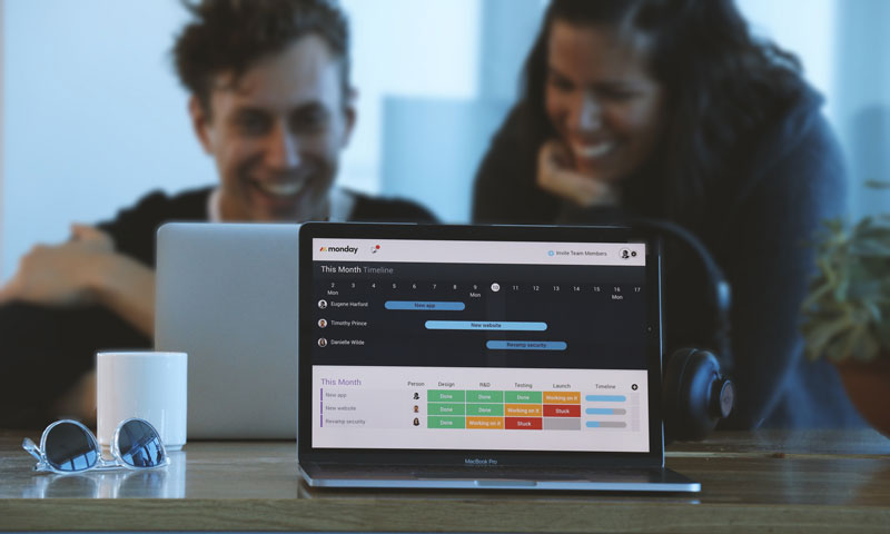
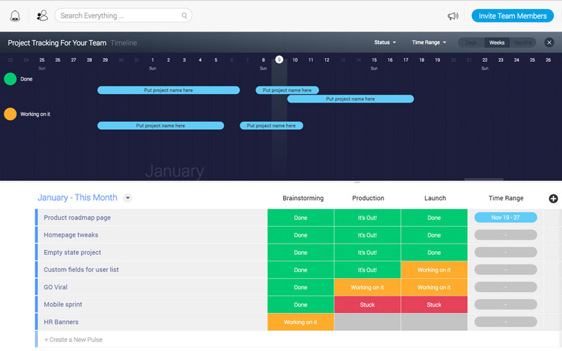
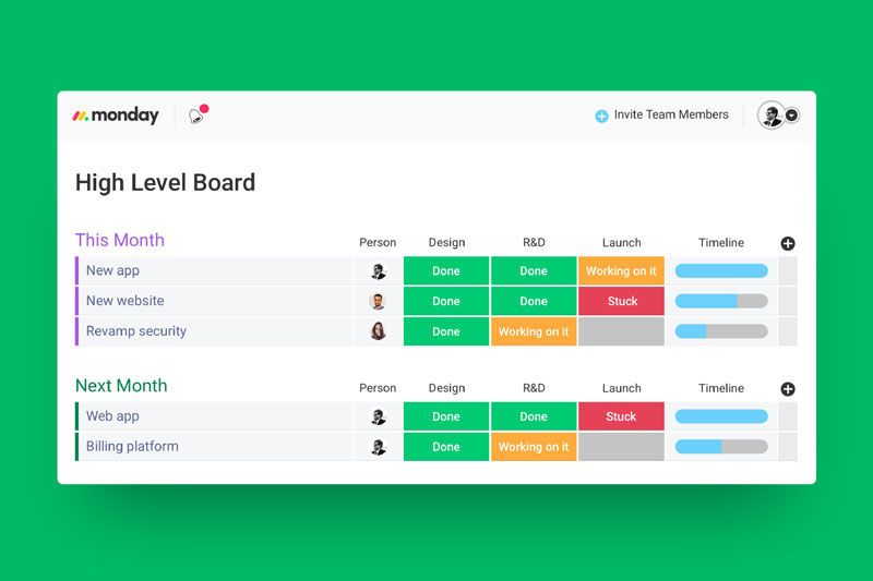
monday.com focused on good design and made a very user-friendly interface with a visual approach. It works very well and makes it quick to get started. A quick overview gives you an idea of what is going on in an intuitive way and directs you on the right path. Here are a couple of screenshots to give you an idea of the user interface.
Above: the timeline makes it simple to have a quick overview, while the to-do list is well-organized with a clever color scheme to know what is done and what is not.
A quick overview of current tasks and upcoming ones, organized by month.
Your project management hub
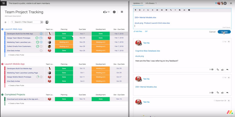
One common issue in projects is that some people can just not keep track of their emails or other messages. Using monday.com, this type of people has no excuses, all communication is centralized, which means that messages will not be lost.
Integration with Google Drive tools or Microsoft Excel also means that you can work with your favorite tools, it will be accessible from your interface. This feature gives your team great incentives to use this team management tool right away.
Easily add files from Dropbox or Google Drive.
On top of that, a powerful built-in search tool allows you to search everything, giving you a productivity boost from quick file access.
Manage your project from anywhere
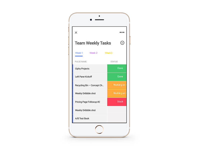
As it should for any flexible worker, you don’t have to stay at your desk to manage your team. The team management tool created by monday.com makes it easy to access all its features from your mobile. Who said you shouldn’t be productive on the road? Obviously, everything is cloud-based so you don’t have to worry about backups or using the right device to access the app.
The app’s user interface on a smartphone.
About monday.com
monday.com is a centralized platform for teams to manage every detail of their work, from high-level roadmap planning to the specifics of day-to-day tasks, while building a culture of transparency.
The platform they built is suitable for any team, no matter the size or nature of the team. It can help a few freelancers to work together or large teams to collaborate across the world, and it doesn’t require a high-level of technical skills. In fact, it is very popular amongst non-tech teams.
The popularity of monday.com is already largely established, with over 22000 teams working with it, from startups to Fortune 500 companies, including WeWork, Samsung, Discovery Channel, Wix, NBC, General Assembly, McDonald’s, Uber, Wix, AOL, and Adidas.
From time to time at Stackoverflow, the question pops up whether there is an equivalent to the stroke-dashoffset technique for animating the SVG stroke that works for the fill attribute. But upon closer inspection, what the questions are really trying to ask is something like this:
I have something that is sort of a line, but because it has varying brush widths, in SVG it is defined as the fill of a path.
How can this „brush” be animated?
In short: How do you animate calligraphy?
A mask path covers the calligraphic brush
The basic technique for this is relatively simple: draw a second (smooth) path on top of the calligraphy so that it follows the brush line and then choose the stroke width in such a way that it covers the calligraphy everywhere.
This path on top will be used as a mask for the one beneath it. Apply the stroke-dashoffset animation technique to the mask path. The result will look as if the lower path is being „written” directly on the screen in real-time.
The is a case for a mask, not a clip-path — that would not work. Clip-paths always reference the fill area of a path, but ignore the stroke.
The easiest variant is to set stroke: white for the path in the mask. Then everything outside the area painted white is hidden, and anything inside is shown without alteration.
At the intersection point, the mask reveals part of the crossing brush. Therefore, the calligraphy has to be cut into non-overlapping pieces. Stack them in drawing order and define separate mask paths for each one.
The cut on the mask path and the calligraphic brush must match
The most tricky part is to maintain the impression that the drawing is a single continuous stroke. If you cut a smooth path, ends will fit together as long as both path tangents have the same direction at their common point. The stroke ends are perpendicular to that, and it is essential that the cut in the calligraphic line aligns exactly. Take care all paths have consecutive directions. Animate them one after the other.
While many line animations can get by with rough math on the length for stroke-dasharray, this scenario requires accurate measurements (although small roundings shouldn’t hurt). As a reminder, you can get them in the DevTools console with:
The „one after the other” part is slightly awkward to write in CSS. The best pattern is probably to give all partial animations the same start time and total duration, then set intermediate keyframes between the stroke-dashoffset changes.
Something like this:
@keyframes brush1 {
  0% { stroke-dashoffset: 160; } /* leave static */
  12% { stroke-dashoffset: 160; } /* start of first brush */
  44% { stroke-dashoffset: 0; }   /* end of first brush equals start of second */
  100% { stroke-dashoffset: 0; }   /* leave static */
}

@keyframes brush2 {
  0% { stroke-dashoffset: 210; } /* leave static */
  44% { stroke-dashoffset: 210; } /* start of second brush equals end of first */
  86% { stroke-dashoffset: 0; }   /* end of second brush */
  100% { stroke-dashoffset: 0; }   /* leave static */
}
Further down, you’ll see how a SMIL animation enables a more fluent and expressive way to define timing. Keeping with CSS, computations done with Sass might be pretty helpful since it can handle some math.
The mask path (left) and its application (right)
A comparable problem appears if the curve radius of the mask path gets smaller than the stroke width. While the animation runs through that curve, it may happen that an intermediate state looks seriously crooked.
The solution is to move the mask path out of the calligraphic curve. You only need to take care its inner edge still covers the brush.
You can even cut the mask path and misalign the ends, as long as the cutting edges fit together.
The original design, the Tughra of Osmanic Sultan Mahmud II., is by an unknown 19th-century calligrapher. The vectorized version was done by Wikipedia illustrator Baba66. The animation is my attempt to visualize the position of the Arabic letters inside the drawing. It builds upon an earlier version by Baba66. Creative Commons Attribution-Share Alike 2.5.
The following code snippet shows the advanced method used to run the animations in order and in a repeatable fashion.
<mask id="mask1" maskUnits="userSpaceOnUse">
  <path stroke-dasharray="160 160" stroke-dashoffset="160" d="...">
    <!-- animation begins after document starts and repeats with a click
         on the "repeat" button -->
    <animate id="animate1" attributeName="stroke-dashoffset"
             from="160" to="0" begin="1s;repeat.click" dur="1.6s" />
  </path>
</mask>
<mask id="mask2" maskUnits="userSpaceOnUse">
  <path stroke-dasharray="350 350" stroke-dashoffset="350" d="...">
    <!-- animation begins at the end of the previous one -->
    <animate id="animate2" attributeName="stroke-dashoffset"
             from="350" to="0" begin="animate1.end" dur="3.5s" />
  </path>
</mask>
<!-- more masks... -->
<mask id="mask15" maskUnits="userSpaceOnUse">
  <path stroke-dasharray="230 230" stroke-dashoffset="230" d="...">
    <!-- insert an artificial pause between the animations, as if the
         brush had been lifted -->
    <animate id="animate15" attributeName="stroke-dashoffset"
             from="230" to="0" begin="animate14.end+0.5s" dur="2.3s" />
  </path>
</mask>

<g class="brush">
  <path id="brush1" d="...">
    <!-- The mask is only applied  after document starts/repeats and until
         the animation has run. This makes sure the brushes are visible in
         renderers that do not support SMIL -->
    <set attributeName="mask" to="url(#mask1)"
         begin="0s;repeat.click" end="animate1.end;indefinite" />
  </path>
  <path id="brush2" d="...">
    <set attributeName="mask" to="url(#mask2)"
         begin="0s;repeat.click" end="animate2.end;indefinite" />
  </path>
  <!-- more paths... -->
  <path id="brush15" d="...">
    <set attributeName="mask" to="url(#mask2)"
         begin="0s;repeat.click" end="animate15.end;indefinite" />
  </path>
</g>
In contrast to the other examples we’ve look at, this animation uses SMIL, which means it will not work in Internet Explorer and Edge.
Eric Bailey takes a hardline position on <input placeholder>.
You might be thinking, as I did: yeah, yeah I know the pitfalls. I’m capable of using placeholder responsibly. But when you look at all the negatives together:
Can’t be automatically translated;
Is oftentimes used in place of a label, locking out assistive technology;
Can hide important information when content is entered;
Can be too light-colored to be legible;
Has limited styling options;
May look like pre-filled information and be skipped over.
…and the fact that there are advantages to just moving whatever helper text you would want in there anyway outside the input to real markup…I’m fairly well convinced.
I first wrote this post four years ago. I put it on a blog that no longer exists. Funnily enough, I still refer to it myself, so I figured it might be best served in a place where other people can see it. I’ve made only a few minor tweaks to the original content. A lot about how I work has changed, but most of these pieces have not.
I work on many personal projects concurrently. I love doing this, as it keeps me in a constant mode of creation. At the same time, it can become a delicate balancing act. In order to keep everything moving forward, I have set up some guidelines for myself and I’m going to share them with you in this post. However, it’s more important to understand what works best for you and consider the sage words of Thich Nhat Hahn:
“Don’t follow someone else’s map.”
What works for me might not work for you. However, hearing about how other people set up their workflow might help you reconsider your own, so hopefully this is a useful mental exercise.
Organize
Every three months or so, I compile a list of all my projects. The projects that have time parameters go first in line (but do not always come first if my passion lies elsewhere). For each project, I break down the tasks I need to perform in order to get them done. I try to make each one as small and actionable as possible.
I actually write out the same list multiple ways — some digital, some paper. I find the repetition helps me reinforce and recall what my priorities are. I also find large gridded Moleskine sketchbooks useful for organizing myself. It’s important to me that they’re large enough to have enough space to write notes, draw terrible sketches, or generally spread out.
Unless they must be done in order, I often place the easiest and quickest tasks first so I can get them out of the way. I love the feeling of checking things off my list because it serves as positive re-enforcement. I make a schedule of due dates for items that have no due dates; having a specific deadline helps me push forward.
Only stop when you know what happens next
This a really simple and useful trick. If you stop when your plan is veering or meandering, then chances are that project will never see the light of day again. If you can help it, try to only stop working when you know what the next actionable item is. You will arrive back at the project with brighter eyes than before.
Of course, this one doesn’t work when you’ve smacked your head on a problem forever and ever. Sometimes you need a break and just leaving it for a little while or coming back to it the next day will help you solve it. Generally speaking though, you still still know what comes next even before you come to a solution. It’s more the feeling of malaise that I’m warning against. Stop while you still have a plan.
Even backwards work is forward progress
Photo by John Schnobrich, via Unsplash
Allow yourself to make mistakes. Seriously, make them. I used to tell my students that it takes two bad projects to make a good one. Never compare yourself to what others show you — their final output is often the result of many failed attempts. Make a lot and then edit down. Try not to get discouraged if you spend a day or two messing up. You’ll likely learn more from those mistakes than if you had done everything perfectly. Forge ahead.
Push outside of your comfort zone, but slowly
Work on a few things that you know and understand, and a few things you don’t. We should foster personal growth in our projects, but without some semblance of comfort, it’s easy to get discouraged. Let your projects push the limits of your boundaries, but don’t go overboard. Give yourself a foundation to spring off before floating into space.
Figure out your “studio commandments”
What do you need to work? Do you need music? Do you need water? Do you need isolation? Do you work better in a cafe? Maybe you need a certain monitor. Perhaps you concentrate better if you have scheduled breaks? Do you work better if you have a snack in your bag in case you get hungry? Study yourself. Write down 10 things you need in order to be productive and try to sort them out before you get going so that you give yourself fewer excuses to stop making progress. I wrote another post about this on SuperYesMore, posted here.
Make the time
I usually break up my time so that I have certain nights, like appointments, where I work on each project. There are times, however, where you should keep on going and not worry about other outstanding projects. Sometimes working 15 or more continuous hours will gain you traction in a way that you can’t if you break it up over several weeks. However…
Break your own rules
Do you have a consistent schedule and you can’t possibly do X because of Y? Double and triple check that you aren’t setting up guidelines for yourself that give you excuses ti not get things done. Something that worked last week might not work this week, so take the time to re-evaluate your own rules. In other words: be adaptive.
Do things for other people
Make one of your projects something that benefits others. This guideline might sound strange, but if you continuously work on things just for yourself, work starts to feel a little dreary. I’m not talking about your job, either. It needn’t be overkill. Even donating a few hours here or there to people who need it will help you think more broadly about the world around you.
Bonus: If you build a community and reach the point where you’re ready to launch that donated project, you might just have other people around you who to share the excitement of a job well done.
Research is productive time
Reading about what you find interesting or doing a little bit of digging about your interests can save you time in process. Find heroes in the field in which you are working and follow them. I have so many.
Poke around at other things. Reverse engineer something. I have a giant private collection on CodePen called „To reverse engineer.” When I’m bored at an airport, or sitting on hold, or have an hour to kill, I’m usually poking around in that folder: breaking things, changing things, finding the boundaries of how everything works.
Read a book, read some docs, watch some talks, do a workshop, watch some anime, go to a museum, listen to some music with your eyes closed, play a video game. Need a starting point? CodePen Challenges are good for that. There are all kinds of things that can feed your work. All of this spent time — while it won’t make your GitHub contribution graph greener — is important for development.
Make it fun
Photo by Hanny Naibaho, via Unsplash
Personal projects are fun because you want to do them, right? Enjoy yourself. I really like mimosas on the weekends so I enjoy one by my window every Saturday morning while writing code. It’s a very simple trick. It’s not drudgery; it’s pure enjoyment. I turn down other plans to do this because I love it. Find ways to make the work a reward in and of itself. Maybe you only get to listen to that one album you like while you work on a side project. Maybe you have a nice fuzzy blanket that you get to wrap yourself in while you read that programming book. Maybe you get to go to the park after you get that last component in. You know the difference between something that genuinely excites you to work or not — use this to your advantage.
I also imagine how I might feel when something is done. This particularly works when the only thing keeping me from finishing something is a bit of drudgery. I imagine it’s done and feel the little dopamine rush from accomplishing something and not letting it sit. Then I chase that feeling.
For one thing, it can manipulate documents. Take images. Perhaps you would like to offer some image manipulation for your users uploaded images, like cropping and rotation. That’s a common feature for apps that offer avatar uploading. With Filestack, you got it.
It’s great to be able to have that kind of functionality without having to build it yourself. You almost surely aren’t in the avatar cropping business, you’re in your own unique business that just happens to have users with avatars.
I’ve said it before:
But let’s up the ante a little bit here. What if you need to get an entirely different document format out of another document? How about the hardest document format at all, feared by web developers everywhere, the Microsoft Word document format! 😱
Filestack has you covered! Say you have an invoice document created in Word and you need it as a PDF. But a perfect PDF, not some hack job conversion. And you need to do it programmatically. That’s tricky stuff, and Filestack has solved it.
Of course, it isn’t just Microsoft Word document formats, they have a whole matrix of in’s and out’s.
Just about any file format conversion you need, they got. Personally, I’m impressed by the idea that conversion between PDF and SVG maintains the vectors in both directions.
Document security is a prime concern of course and is handled through policy and signature validation.
See their security docs for all things security related.
Need a way to show users files like PDFs? Browsers can view PDFs, but only as a whole, not embedded into regular web pages. Not a problem with the document viewer!