Over the past few years, the creative world has undergone a mass migration to the cloud, which has been spearheaded by companies like Adobe. The Californian computer software giants are now promoting their cloud-based services over desktop-based apps, and there are many benefits to using these online tools. This is a step in the right direction for the industry, as it is important to use the most up-to-date technology available. However, whenever anything is open to the public, there is always a risk. For that reason, some caution is advised for people who use cloud-based services.
The Creative Cloud from Adobe gives users the entire collection of Adobe Desktop and mobile apps all in one place. These can be used for graphic design, photography, web and UX design, animation and film editing, and communication and social. Having everything in the same place is a sign of the times, as the long-standing app craze appears to be fading. Now, with the advent of HTML5 for websites, there is no longer any need for companies to have separate apps for different things. Adobe has taken this idea and provided a platform that has everything creative-minded people need to thrive and develop their ideas.
According to Steven Warner, the vice president of digital video and audio at Adobe, “the demands and pace of video content creation are reaching levels we have never seen before. The time pressure on video professionals means the need for powerful and efficient creative tools has never been greater.” For this reason, Adobe have aimed to provide content creators with all the tools they need to produce high-quality videos and graphics in a shorter space of time.
The benefits of working with this new software are clear but there may also be some shortcomings, such as security concerns. When working on the cloud, users need to be aware that their information could be targeted by cybercriminals. For people and businesses working online, cloud security is imperative. It ensures that there are secure databases in the cloud, it safeguards applications, and it also supports hybrid deployments. The 2018 hack of Tesla’s Amazon Web Services account highlights the need for safeguarding when working on the cloud. In the breach, cybercriminals used the account to mine cryptocurrency and also exposed some of Tesla’s proprietary data.
Adobe is now looking to expand its reach and get budding young creators familiar with their services from a young age. The company now offers schools Creative Cloud licenses for $5 per year, in a move which could revolutionize interactivity within the classroom. This is set to attract even more users to the Adobe product and strengthen its hold on the industry.
In the fast-paced world of design and content creation, those in the industry must keep up-to-date with technological developments and move with the times. There are numerous benefits to using the cloud now, and, in time, it seems that everything will be done using services like the one from Adobe. Those using the cloud must remember to put proper security protocols in place though, as cyber-attacks are becoming more and more prevalent.
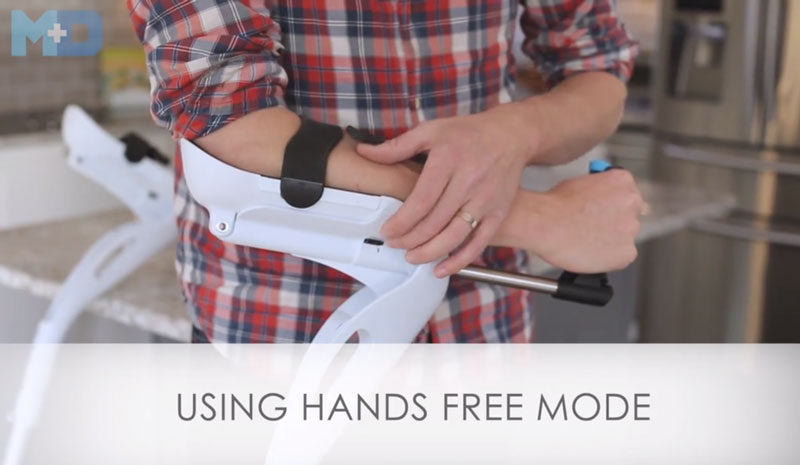
Some products seem to have been designed the same way forever. Take crutches for example, it seems that one guy buit it one way and everybody thought it couldn’t be improved and kept producing new crutches with the same designs over and over. Of course, there were some minor formal changes in terms of design, but the functionalities didn’t evolve much.
The people at Mobility Designed didn’t take crutch-assisted mobility for granted and decided to give it their own twist. The results are stunning, the M+D crutches allow for better mobility, hands-free usage, and other cool features that you can see in the video above.
Dropshipping is a business model where the seller runs the store and markets and sells the products while the manufacturer produces and stores said products and ships them to customers.
Print-on-demand is a form of dropshipping that allows you to create a unique design, print it on products (it can be anything from t-shirts to mugs), and sell those products to the customers through your online store.
T-shirt are the most popular print-on-demand item. After all, everyone needs them, and people love wearing apparel with cool designs! You can sell print on demand t-shirts with Printify.
Why should you launch your print-on-demand t-shirt business?
Okay, so now that you know what print-on-demand business is, the question is why should you start one?
Low-risk. There’s pretty much no risk involved in dropshipping because the product only gets made when the customer has paid for it. You only pay the fulfillment company a percentage from each product that you actually sell.
Low-investment. You only need a little bit of money to get started with print-on-demand t-shirts. You will have to pay for a domain name, for a Shopify account, and for Facebook ads, but that’s pretty much it (unless, of course, you are not artistically inclined and can’t create the designs yourself, because then you’ll also have to pay for design). You can get started with less than $100!
Work from anywhere. All you need to run a print-on-demand t-shirt business is a computer and an Internet connection. Yes, this means that you can work from home, but that’s not all! “Home” can be anywhere. Buenos Aires, Paris, Tokyo… You can travel the world while making money!
Set your own hours. Do you know that the standard 9-5 workday was meant for factory workers doing mindless repetitive work? It simply doesn’t work well for people who are in cognitively demanding occupations. Some of us produce our best work early in the morning, meanwhile some of us produce our best work late at night, so how does it make sense for everyone to work the same hours? It doesn’t! However, running your own business allows you to set your own schedule, and be much productive!
Make decent money! Yes, jobs might be less risky than running a business (although even that is highly questionable in the current economy), but they also have a salary ceiling that you won’t be able to surpass no matter what you do. Meanwhile, when you run your own business, you don’t have this problem, because you can grow your revenue as much as you want. Moreover, you can also sell your business for 20x-30x the monthly revenue, which is a lot of money. Can you imagine a life where you don’t have to worry about money anymore? Well, if you can manage to build a successful busines, it could become your reality!
So let’s recap. A print-on-demand t-shirt business is low-risk, low-investment opportunity that, if everything works out, could provide you with a life where you can travel the world, work wherever and whenever you want, and make a lot of money. The question is… What are you waiting for?
It’s great that you are excited about print-on-demand t-shirts, but keep in mind that this excitement will fade, and there will be times when you will want to quit. After all, it takes a lot of hard work to get a business off the ground, and you probably won’t be able to replace the income from your job in less than a year. Can you persevere for that long?
Are you okay with your 9-5 office job, 4 weeks vacation every year, and your current salary? If so, then there’s probably not much point launching your own business, because if you don’t want it badly enough you are not going to last.
However, if you are sick and tired of your current situation, then by all means, commit to entrepreneurship. No one can change your life but you!
Almost every time a new meme pops up in my Twitter feed, I think of a witty version to create. I’m not alone in this. Memes are often a way to acknowledge a shared experience or idea. In a variation of the „Is this a pigeon” meme that has been making the rounds online, a designer Daryl Ginn joked about the elementary nature of most applications that say they use artificial intelligence.
Several people replied to his tweet saying something along the lines of „replace this with this.” Daryl’s version got them thinking about other possible variations. Platforms like imgFlip exist to make meme generations fast and easy. However, there is only so much customization they can allow. For many memes, creating new versions can only be done by people with Photoshop knowledge. But it doesn’t have to be so! For some memes that require more than Impact for the font text on an image, a meme generator can be created using the HTML Canvas API. In this tutorial, we’re going to make a generator for the #saltbae meme.
But first…
Let’s look at some fun interactive meme examples!
The website pablo.life allows you to create your own Kanye West TLOP album cover by changing the text and image.
This is one of my favorites:
The digital agency R/GA created the Straight Outta Somewhere campaign where users „show the world where they’re from by uploading their own photo and filling in the blank after 'Straight Outta ____.'” Users can download and share the meme.
Now, the tutorial. In a popular version of the #saltbae meme, instead of salt, Salt Bae (whose name is Nusret Gökçe) sprinkles something other than salt.
Loading an image
The first thing we have to do is load the original image onto the canvas. You can load an image one of two ways: from a URL or from one that exists in the DOM using the <img> tag but is hidden.
Here’s how we do it with a hidden image tag:
<canvas id="canvas" width="1024" height="1024">
  Canvas requires a browser that supports HTML5.
</canvas>
<img crossOrigin="Anonymous" id="salt-bae" src="http://res.cloudinary.com/dlwnmz6lr/image/upload/v1520011253/170203-salt-bae-mn-1530_060e5898cdcf7b58f97126d3cfbfdf71.nbcnews-ux-2880-1000_kllh1d.jpg"/>
I’m hosting the image on Cloudinary and added the crossOrigin attribute so we don’t run into any CORS issues.
We’re using the canvas drawImage function to draw the image to the canvas. It can be used to draw videos or parts of an image as well. The method provides different ways to do this. We’re drawing the image by indicating the position and the width and height of the image.
ctx.drawImage(img, x, y, width, height);
Alternatively, we could load the image from a URL:
function loadAndDrawImage(src) {
  // Create an image object. (Not part of the dom)
  const image = new Image();

  // After the image has loaded, draw it to the canvas
  image.onload = () => {
    // draw image
  };

  // Then set the source of the image that we want to load
  image.src = src;
}
Now we load in an image to replace the sprinkles Salt Bae is throwing. First, we load the image using one of the techniques I mentioned earlier, then we draw it to the screen like we did with the Salt Bae base image.
function getRandomInt(min, max) {
  min = Math.ceil(min);
  max = Math.floor(max);
  return Math.floor(Math.random() * (max - min)) + min; //The maximum is exclusive and the minimum is inclusive
}

function drawBackgroundImage(canvas, ctx) {
  ctx.clearRect(0, 0, canvas.width, canvas.height);
  const img = document.getElementById('salt-bae');
  ctx.drawImage(img, 0, 0, canvas.width, canvas.height);
}

function getRandomImageSize(min, max, width, height) {
  const ratio = width / height;  // Used for aspect ratio
  width = getRandomInt(min, max);
  height = width / ratio;
  return { width, height };
}

function drawSalt(src, canvas, ctx) {
  // Create an image object. (Not part of the dom)
  const image = new Image();
  image.src = src;

  // After the image has loaded, draw it to the canvas
   image.onload = function() {
    for (let i = 0; i < 8; i++) {
      const randomX = getRandomInt(10, canvas.width/2);
      const randomY = getRandomInt(canvas.height-300, canvas.height);
      const dimensions = getRandomImageSize(20, 100, image.width, image.height);
      ctx.drawImage(image, randomX, randomY, dimensions.width, dimensions.height);
    }
  }
  return image;
}

onload = function() {
  const canvas = document.getElementById('canvas');
  const ctx = canvas.getContext('2d');
  drawBackgroundImage(canvas, ctx);
  const saltImage = drawSalt('http://res.cloudinary.com/dlwnmz6lr/image/upload/v1526005050/chadwick-boseman-inspired-workout-program-wide_phczey.webp', canvas, ctx);
};
Now we can let users sprinkle something other than sprinkles.
Uploading an image
We’re going to add a button that triggers an image upload and includes an event listener to listen for a change.
<input type="file" class="upload-image">`
function updateImage(file, img){
  img.src = URL.createObjectURL(file);
}

onload = function() {
  const canvas = document.getElementById('canvas');
  const ctx = canvas.getContext('2d');
  drawBackgroundImage(canvas, ctx);
  const saltImage = drawSalt('http://res.cloudinary.com/dlwnmz6lr/image/upload/v1526005050/chadwick-boseman-inspired-workout-program-wide_phczey.webp', canvas, ctx);
  const input = document.querySelector("input[type='file']");
  /*
   * Add event listener to the input to listen for changes to its selected
   * value, i.e when files are selected
   */
  input.addEventListener('change', function() {
    drawBackgroundImage(canvas, ctx); // clear canvas and re-draw
    updateImage(this.files[0], saltImage);
  });
};
URL.createObjectURL() creates a DOMString containing a URL representing the object given in the parameter which, in this case, is the uploaded file.
We can even up the game a little bit, like providing some default options. I’ve added a few emojis you can play around with as a starting point.
Downloading the final image
Once the new meme has been generated, we want users to be able to download and share it. The typical way of doing this is by opening the canvas in a new tab using the toDataURL method but the user would have to right click to save the image from that tab and that’s not very convenient.
So, instead, we can take advantage of the download attribute added to links in HTML5. We create a link that, on click, sets the download attribute to the result of canvas.toDataURL. The toDataURL() method „returns a data URI containing a representation of the image in the format specified.”
function addLink() {
  var link = document.createElement('a');
  link.innerHTML = 'Download!';
  link.addEventListener('click', function(e) {
    link.href = canvas.toDataURL();
    link.download = "salt-bae.png";
  }, false);
  link.className = "instruction";
  document.querySelectorAll('section')[1].appendChild(link);
}
Well that’s it! Our meme generator is done.
Some cool links
Darius Kazemi has been making a bunch of twitter bots that generate memes.
Vox Media has a meme generator called meme that’s open source.
I recently wrote a post — that was shared here on CSS-Tricks — where I looked at ways to use Unicode characters to create interesting (and random) patterns. Since then, I’ve continued to seek new characters to build new patterns. I even borrowed a book about Unicode from a local library.
(That’s a really thick book, by the way.)
It’s all up to your imagination to see the possible patterns a Unicode character can make. Although not all characters are good as patterns, the process is a good exercise for me.
And, aside from Unicode itself, the methods to build the patterns may not be so obvious. It usually takes a lot of inspiration and trial and error to come up with new ones.
More tiling
There are actually many ways to do tiling. Here’s one of my favorite tile patterns, which can be easily achieved using CSS grid:
.grid {
  /* using `dense` to fill gaps automatically. */
  grid-auto-flow: dense;
}

.cell {
  /* using `span` to change cell size */
  grid-column-end: span <num>;
  grid-row-end: span <num>;
}
Now, what I’m trying to do is put some Unicode characters into this grid. And most importantly, update the font-size value according to the span of its cell.
Pattern using characters \2f3c through \2f9f
I only tested with Chrome on Mac. Some of the examples may look awful on other browsers/platforms.
It’s a bit like the Tag Cloud effect, but with CSS. Lots of patterns can be made this way.
Pattern using characters \2686 through \2689Pattern using charaters \21b0, \21b1, \21b2 and \21b4
The span of the columns and rows don’t always have to be the same value. We can make small modifications by changing how many rows each cell spans:
.cell {
  /* only change the row span */
  grid-row-end: span <num>;
}
Since the font-size property scales up/down in both directions (vertically and horizontally), the scaleY() in the transform property will be used instead.
Many Unicode pairs share some kind of shape with different angles. For example, parentheses, brackets, and arrows with different that go in different directions. We can use this concept to combine the shapes and generate repeatable patterns.
This pattern uses less-than and greater-than signs for the base:
These are characters we use everyday. However, they give us a fresh look and feeling when they are arranged in a new way.
There’s another pair of characters, ᚛, and ᚜. Placing them in the grid and scaling to a proper value connect them together into a seamless pattern:
It’s like weaving with characters! We can even take it up a notch by rotating things:
Pattern using \169b and \169c
Rings
Last week, I joined a CodePen Challenge that challenged the group to make a design out of the sub and sup elements. As I experimented with them, I noticed that the two tags scaled down automatically when nested.
So, I tried to put them around a circle:
.first-level {
  /* Slice the circle into many segments. */
  transform: rotate(
    calc(360deg / var(--slice) * var(--n))
  );
}
Suddenly, I realized this method can be used to generate background patterns, too. The results are pretty nice.
Pattern using \003e
sub:after, sup:after {
  content: '\003e';
}
The interesting thing is that changing a single character can end up with very different results.
Combining \002e and \003e together to form a patternCombining \25c9 and \2234 creates a different effect in the same circular layout
Wrapping up
That’s all for now! The color palettes used in this article are from Color Hunt and Coolors.co.
The examples are generated with css-doodle, except for Ring examples in the last section. Everything here can be found in this CodePen collection.
There are a lot of tools that aim to help you remove „unused CSS” from your project. Never a week goes by that I don’t see a tool for this being shared or promoted. It must strike some kind of perfect chord for some developers. I care about performance, and I know that reducing file sizes is good for performance. Indeed, it is. I bet we have CSS that is unused in our stylesheets, if we removed that, that’s a performance win. Yep, it would be. We should automate that. Ehhhhhh, I’m not so sure.
There are major performance tooling players that play up this idea, like Lighthouse and how it gives you CSS and JS „Coverage”, which will surely tell you that you’re shipping code you don’t need to be.
The tools that claim to help you with unused CSS have to perform analysis to be able to tell you what is unused and what isn’t.
Here’s one way to do that analysis. Render a page of your site and get the complete DOM. Then get the complete CSSOM as well, which can give you an array of all the selectors in your CSS. Loop over those selectors and do a querySelector in the DOM and see if it matches anything. If it doesn’t, that CSS selector is unused.
Clever, right?!
I think so. But that analysis paints a rather limited picture.
Say that analysis runs two seconds after the page is complete, but there is some JavaScript that runs and injects a modal after five seconds (ughghk, I know). The analysis would have missed the HTML in that modal, which likely has styles, and thus would have incorrectly reported those styles as unused.
So, timing is one factor. Hopefully, this analysis tool has some way to configure multiple timings.
We’re also only looking at one page so far. Of course, a site might have tens, hundreds, or thousands of pages. To be entirely sure about unused styles, looking at all of them is the most sure-fire bet.
Multiple pages is another factor. Hopefully, an analysis tool has a way to look at as many pages as you tell it to. Perhaps it can look at a sitemap?
Remember the timing thing? We might think of timing as one generic form of state. There are countless other things that could be state related. Is the user logged in or not? What plan are they on? Is their credit card expired thus showing some kind of special message? Do situational things like time/date/geolocation change state? What about real-time data? Stuff from an API?
Application-level state is clearly a big factor. Hopefully, this analysis tool can trigger/set all possible combinations of state.
There is interactive state as well. What about modals that come up because something is clicked? What is the active tab? Is this menu open or closed? What scroll position are they at? There are infinite permutations of this. Imagine a warning bar that shows up seven seconds after the user logs in to warn user about their expired credit card which contains a custom styled select menu which can be in an open or closed state, but only on the user settings page.
It seems unlikely that this analysis tool can handle all those possibilities. Even with loads of configuration, mock state, and integration testing, it couldn’t cover the near-infinite possible permutations of all this.
And yet, I don’t think these tools are useless — they are just…tools. Their use can actually be a positive step toward better code. Their use says OK, I admit it, I’m a little afraid our CSS. You could use this tool to get a broad picture of what your unused CSS might be, then combine that with your own knowledge of your CSS code base to make more informed decisions. Or take another technological step and do something like add a background image to those unused selectors and check server logs to see if they get hit.
It should be said that this whole idea of unused CSS is a part of the CSS-in-JS saga that our industry is going through. If all your styles are written as part of components, there kinda is no unused CSS. Either the component gets used and the styles come with it, or it doesn’t. If you’re particularly sensitive about the danger of unused CSS, that alone might sway you toward a CSS-in-JS tool.
It also should be said that this DOM and CSSOM analysis technique is only one possible way of checking for unused styles. If you had some kind of fancy tooling that could analyze all of your templates, styles, and scripts, presumably that could determine unused styles as well. We talk about that in the recent ShopTalk Show episode with Chris Eppstein.
Experimental glitches are not only used to depict the 80s—nowadays they’re also used to convey a robotic, trendy feel. Here is a quick and easy way to create this trend in Adobe Photoshop!
In Photoshop, go to File > New. Name the document Glitch_Set. Set the Width to 1270 px and Height to 1600 px. Set the Resolution to 72 Pixels/Inch. Click OK.
Step 2
Using the Rectangle Tool (U), create a stripe at the top of the page. Head over to the Options bar and change the fill color to #ff0000. On the Layers panel, duplicate the Rectangle 1 layer by pressing Command-J. Change the color again, but this time to #00ff00. Place the rectangle under the first red rectangle. Duplicate the rectangle once more and set the color to #0000ff.
Step 3
Now we need to fill the page with the rectangles we created. Select the rectangle layers and, on the page, click on the elements and press Option-Shift and drag to duplicate. Do this until you’ve covered the whole page.
Select all the Rectangle layers and Right-click > Rasterize Layers. Now we can merge the layers—while selecting all the layers, Right-click > Merge Layers. Let’s rename the layer as Main. Now we have the basis to create our set of glitches.
2. Glitch A
Step 1
On the Layers panel, duplicate the Main layer by selecting the layer and pressing Command-J. Hide the original Main layer. While selecting the newly duplicated layer, head over to Filter > Distort > Wave. The Wave options window will pop up, and now we can experiment!
Let’s start by setting the Type: of wave to Sine. We will be able to see how the artwork changes through the small view window. I am setting the Number of Generators to 999, Wavelength to Min. 1 and Max. 21, Amplitude to Min. 1 and Max. 2, and Scale to 100%.
Step 2
Head over to Filter > Distort > Shear. To make the glitch look like a disrupted VHS tape, we need to create waves. Under Undefined Areas, select Wrap Around and add points on the grip—this is to create waves on the composition. I added various points, and I find it works better when the points are random and have sharp turns.
Step 3
We can leave this as is or change the color by adding a solid color or a Gradient layer over it. We can also create a black and white look by going to Adjustment Layer > Black & White on the Layers panel and tweaking the color separately. I will do the latter as it will come in handy to create Glitch C.
Let’s organize the first glitch by dragging the duplicated layer and the black and white layer into a folder at the bottom of the Layers panel. Let’s hide the visibility and move on to Glitch B.
3. Glitch B
Step 1
Duplicate the Main layer with the stripe by pressing Command-J when selecting it. Move the layer to the very top of the layers.
Step 2
Head over to Filter > Pixelate > Color Halftone. I am using the following settings: Max. Radius: 20, Channel 1: 108, Channel 2: 162, Channel 3: 90, and Channel 4: 45. Click OK. The reason we are doing this step is so that when we apply the Wave effect, the divisions will look rougher compared to Glitch A.
Step 3
Go to Filter > Distort > Wave. Let’s set the Type: of wave to Square. We will be able to see how the artwork changes through the small view window. I am setting the Number of Generators to 720, Wavelength to Min. 270 and Max. 365, Amplitude to Min. 1 and Max. 2, and Scale to 100%. Click OK.
Now we have our second glitch. As with Glitch A, go ahead and organize it in a folder.
4. Glitch C
Step 1
Duplicate the Main layer twice with the stripe by pressing Command-J when selecting it. Move the layer to the very top of the layers.
Step 2
Select one of them and go to Create a New Fill orAdjustment Layer > Black & White. Right click on the new layer and select Create Clipping Mask. This is to apply this new Adjustment layer only to the one after it.
Step 3
Select the layer after it and go to Filter > Distort > Wave. The Wave options window will pop up. Set the Type: of wave to Sine, and under Undefined Areas select Wrap Around. We will be able to see how the artwork changes through the small view window. I am setting the Number of Generators to 999, Wavelength to Min. 1 and Max. 999, Amplitude to Min. 999 and Max. 999, and Scale to 100%. Click OK. Apply this effect twice to get an even finer scratchy look.
Step 4
Click on the Black & White Adjustment layer and tweak the colors on the Properties panel. If you don’t have the panel, double click on the layer thumbnail. I changed the color Red to 300 and lowered the Green to -120.
Step 5
Let’s do the same with the second layer we duplicated in Step 1. We can repeat Step 3, but this time in color, without the Black & White Adjustment Layer.
On the toolbar, select the RectangularMarquee Tool (M). With this tool, we can select the parts that we want to delete to reveal the black and white layer behind it. Don’t be afraid to duplicate layers and experiment. You can get the best result by just playing with the layers and settings to create something that is yours!
Step 6
Don’t forget that this effect also works with text. Using the Text Tool (T), add any kind of text. I added the word TEST in Bw Nista International Black and color #0000ff. Try to fill the whole page. On the Layers panel, select the text layer and Right click > Rasterize Type. Once you have the text set, repeat the Wave effect by going to Filter > Distort > Wave. Feel free to play with the settings!
Awesome Work—You’re Done!
Congratulations! In this tutorial, you’ve learned to:
Use the Wave effect to create a unique glitch set from scratch.
Use the Color Halftone effect to your advantage.
Experiment! Scratchy and techno designs can be difficult to create because of the randomness, and experimenting with colors and various methods is the only way to achieve it!
As I explore, learn, and most importantly, play with Vue.js, I’ve been building different types of apps as a way to get practice with and improve my use of it. A few weeks ago, I was reading about the shut down of Digg’s RSS Reader and while great alternatives exist, I thought it would be fun to build my own with Vue. In this article, I’m going to explain how I put it together and also what’s wrong with it. I knew getting into this that I was going to make some compromises, so the plan is to follow up this version with a nicer one in a follow-up post.
Article Series:
Setup and first iteration (This Post)
Refinements and final version (Coming Soon!)
Let’s start by looking at the app and explaining the various components.
When opening the application, you’re presented with some basic instructions and a prompt to add a new RSS feed.
Clicking the button opens a modal letting you enter a feed:
Once you add the button, the blog entries for that feed will be displayed:
Notice the color. I set it up so that each feed would have a unique color, making it easier to tell one site’s content from another. For example, here is how it looks with more feeds added.
The panel on the left lets you filter by clicking on a feed. Unfortunately you can’t delete a feed yet so, if you need to remove something, you’ll need to open up your DevTools and edit the cached value.
Let’s go over the tech stack!
The Components
First and foremost is the Vue library itself. I’m *not* using webpack for this application — just a simple script include with no build process.
The UI is all Vuetify, a very nice material design framework that is easy to use. I’m still learning it, so you can be sure that my design could be better, though I’m really happy with how it looks now.
Persistence is done via localStorage. I store the feed metadata retrieved from the RSS feed. This typically includes things like the name of the site, the main URL, and a description. I do not store feed items which means every time you load the site, I re-fetch items. The next version will keep items locally using IndexedDB.
So, how do I load feed information? I could just make a network request to the URL, but most RSS feeds aren’t making use of CORS which means the browser would be blocked from loading it. To get around this, I wrote a quick serverless function with Webtask. It handles both creating a CORS-friendly endpoint as well as parsing the feeds’ XML into friendly JSON.
Now that I’ve covered the various parts of the application, let’s start looking at the code!
The Layout
Let’s start with the layout. As I said, I’m using Vuetify for the UI. I started off using the dark sample layout. This is what creates the header, footer, and left column used for the menu.
Application template
I used the card component for individual feed items. I’m not quite happy with the layout here. For example, I don’t have publication dates rendered yet because I had trouble finding a nice way to render it. I decided to simply punt and wait till the next version, which we’ll **see in Part 2 of this series.
Instead of dumping the entire source code on you at once, let’s look at the individual parts. First, here’s the introductory/help text before any feeds have been added:
<div v-if="showIntro">
  <p>
    Welcome to the RSS Reader, a simple way to manage RSS feeds and read content.  To begin using the RSS Reader, add your first feed by clicking the button below.
  </p>
  <p>
    <v-btn color="primary" large @click="addFeed">
      <v-icon>add</v-icon>
      Add Feed
    </v-btn>
  </p>
</div>
When you do have feeds, items are displayed as a list of cards:
<v-dialog v-model="addFeedDialog" max-width="500px">
  <v-card>
    <v-card-title>Add Feed</v-card-title>
    <v-card-text>
      Add the RSS URL for a feed below, or the URL for the site and I'll try to
      auto-discover the RSS feed.
      <v-text-field v-model="addURL" label="URL" :error="urlError"
      :rules="urlRules"></v-text-field>
    </v-card-text>
    <v-card-actions>
      <v-btn color="primary" @click.stop="addFeedAction">Add</v-btn>
      <v-btn color="primary" flat @click.stop="addFeedDialog=false">Close</v-btn>
    </v-card-actions>
  </v-card>
</v-dialog>
The Logic
Now for the fun part — JavaScript! As before, I’m not going to dump the entire file on you. Instead, let’s tackle it bit by bit.
On start up, I load any existing feeds that may have defined and then display the introduction text, if needed:
Note that this method handles assigning a color (which is a simple array) and then loading feed data.
Speaking of that, how do I handle loading RSS information? Currently there are two times where this happens. First is when you initially add the feed and second when you reload the application and the feed was already defined. In both cases, I call one URL — the serverless task defined with Webtask. This task will return everything — the metadata about the feed and the items itself. I only care about the metadata on the *first* call and, in theory, I could have made the code a bit quicker by removing the metadata at the server side and strip that out but it didn’t seem like it was worth the effort.
All I’m doing here is wrapping the npm package rss-parser and that handles all the converting for me. The if statements you see in the beginning handle looking for the url parameter. When calling my webtask, I can either pass a query string variable or send it as part of a HTTP body. Either way, I simply use the rss-parser module and return the result.
You’re welcome to try it out yourself. You can see this being used in the method handling adding a feed:
addFeedAction() {
  this.urlError = false;
  this.urlRules = [];
  //first, see if new
  if(this.feeds.findIndex((feed) => {
    return (feed.rsslink === this.addURL);
  }) >= 0) {
    this.urlError = true;
    this.urlRules = ["URL already exists."];
    return;
  } else {
    fetch(rssAPI+encodeURIComponent(this.addURL))
    .then(res => res.json())
    .then(res => {
      // ok for now, assume no error, cuz awesome
      this.addURL = '';

      //assign a color first
      res.feed.color = colors[this.feeds.length % (colors.length-1)];

      // ok, add the items (but we append the url as a fk so we can filter later)
      res.feed.items.forEach(item => {
        item.feedPk = this.addURL;
        item.feedColor = res.feed.color;
        this.allItems.push(item);
      });

      // delete items
      delete res.feed.items;

      // add the original rss link
      res.feed.rsslink = this.addURL;

      this.feeds.push(res.feed);
      this.addFeedDialog = false;

      //always hide intro
      this.showIntro = false;

      //persist the feed, but not the items
      this.storeFeeds();
    });
  }

},
This method first checks if a feed already exists and, if it doesn’t, it hits the serverless endpoint to get the details. I’ve got a bit of data duplication going on when I store items. I didn’t want to store items „under” a feed object and instead use a global Vue data value, allItems. Therefore, I copy the feed identifier and color into each item. The idea was to make it easier to do item display and filtering later. This feels „wrong” to me, but again, this is my first draft. I’m using a computed property for items and you can see that logic here:
Looking at it now, I could gather my items from each feed instead of storing one global array, though I could address this later, if I want. I love that Vue gives me options for how to solve things like this.
Where Next?
When I started this article, I explicitly thought *this* *is* a first draft. I’ve pointed out things here and there that I like and don’t like, but what exactly do I plan for the next version?
I want to move all the data access into Vuex. Vuex is described as a „state management pattern + library” for Vue. If that doesn’t make much sense to you, don’t worry. I had no idea what it meant at first either. To me, Vuex provides a way to handle more complex data in an encapsulated manner. This becomes even more important as you start building more components that need to share data.
Speaking of components, I should consider making „item” a proper Vue component. That’s an easy win.
I want to start storing feed items in IndexedDB so you’ll get content the second you open the application. This will make the application much more performant and provide basic offline support. Of course, you can’t read the full entries if you’re offline, but at least *something* could be provided.
…and anything you suggest! Take a look at the code and feel free to make suggestions and point out mistakes!
Welcome to our Illustrator in 60 Seconds series, in which you can learn an Illustrator skill, feature, or technique in just a minute!
Illustrator in 60 Seconds: The Asset Export Panel
The process of exporting multiple assets from Illustrator at the same time used to be a tedious task, but luckily for us Adobe has added a new tool that changes everything for the better.
If you want to learn more then you should definitely check out this short video, which comes with a couple of steps to help you.
The Asset Export Panel
Back in
the day, the process of exporting multiple assets at the same time used to be
really clunky, but luckily for us Adobe hasintroduced a new tool that allows you to
save as many items as you want, using just a couple of clicks.
By default, the tool is hidden, but you can find it underneath the Window menu, or within the Layers and Artboards group if you’re using the Essentials Classic workspace.
You start by selecting and then dragging the desired items within the
panel, which treats each group as its own asset.
Moving on, you have your Export Settings, which allow you to generate not one but multiple scales to which you can assign a custom suffix, and then choose from eight different file formats that can be individually set for each and every one of
them.
If you’re designing for iOS or Android you have a
set of dedicated buttons that will create all the required size variations, to
which you can add new ones or even remove those that are unnecessary.
Once you’re ready, all you have to do is press
the Export button, which will ask you
for a location to save the generated files.
Learn More With Our Awesome Tutorials!
Looking to expand your bag of Adobe Illustrator skills? Start right now by checking out these in-depth tutorials that will help you bring your art to the next level!
Today I have something special prepared for you. We are going to compare two essential Illustrator tools, the Layers panel and the Artboards one, and talk…
Today we’re going to take a look at the different ways of exporting icons using a tool that is often feared, but will take your productivity to another level…
As a beginner, creating digital artwork intended for web use can sometimes get a bit frustrating, especially when you put a lot of time into a piece (be it…
Need Awesome Resources? We’ve Got You Covered!
Whether you’re looking for brushes, textures or any other creative resource, we’ve put together an amazing library that’s forever increasing, which you can check out by heading over to Envato Elements.
That being said, I’ll see you in the next one!
Agregator najlepszych postów o designie, webdesignie, cssie i Internecie