Post pobrano z: A quick reflection on professionalism

In this article, Daniel Coutinho chats with some industry veterans about the meaning of professionalism and how it can impact your career.
Post pobrano z: A quick reflection on professionalism
In this article, Daniel Coutinho chats with some industry veterans about the meaning of professionalism and how it can impact your career.
Post pobrano z: How to Create an Ice-Cream Script Poster in Adobe InDesign

Looking for a summer fix? This pastel poster evokes long, hot days eating ice cream in the park. It’s also super simple to create in Adobe InDesign and is a great way of picking up some new techniques for creating print layouts.
Ready to bring the sunshine in? Let’s get started!
You’ll need access to Adobe InDesign to create the main layout of your poster. We’ll also dip into Adobe Illustrator to briefly edit some vector graphics. You can use alternative vector software, such as Inkscape or CorelDRAW, for this step.
You’ll also need to download the following image and font files from Elements:
Install the fonts on your computer, and you’re ready to start putting your poster together.
Open InDesign and go to File > New > Document.
Choose Print for the Intent from the top of the window, and select A3 for the Page Size. Add a Bleed of 5 mm to all edges of the document. Then click Create.

Expand the Layers panel (Window > Layers), and double-click on the Layer 1 name. Rename it as Background and click OK.
Choose New Layer from the panel’s drop-down menu, at top-right, and name it Type.
Create two more new layers: Sparks and then Texture at the top of the sequence.

Then lock all layers except Background, which we’ll work on first.

Expand the Swatches panel (Window > Color > Swatches), and choose New Color Swatch from the panel’s menu.
With the Color Type set to Process and Mode to CMYK, set the levels below to C=2 M=5 Y=29 K=0. Click Add and then OK.
Repeat the process to create a further six new CMYK swatches, with the following values:

Take the Rectangle Tool (M) and drag across the whole page, extending it up to the edge of the bleed on all sides.
From the Swatches panel, set the Fill Color of the shape to your new pink swatch, C=0 M=40 Y=9 K=0.

Lock the Background layer and unlock the Type layer above it.
Switch to the Line Tool (\), and drag to create a shallow diagonal line across the top-right section of the page, as shown below.

Select the Type on a Path Tool (Shift-T), and click once onto the left side of the line, to transform it into a text path.

Type in ‘Ice’. From either the top Controls panel or the Character panel (Window > Type & Tables > Character), set the Font to Author Type and the Font Size to around 260 pt.

Switch to the Selection Tool (V, Escape) to select the line, not the text sitting on it. From the Swatches panel, adjust the Stroke Color of the line to [None] to make it invisible.

Select the line and Edit > Copy, Edit > Paste it, moving it below the first text line.
Edit the text to read ‘Cream’, and reduce the Font Size to around 210 pt. Maneuver the text line into a snug position below ‘Ice’.

Edit > Paste the text line again, adjusting the text to read ‘always’. Change the Font Size to 220 pt, and maneuver the line into position below ‘Cream’.

Paste in three more text lines, setting the first to read ‘good’, the second to ‘idea’, and the final one to an exclamation mark. Move them into roughly the same position as shown below.

Paste another text line, moving it over to the left side of ‘always’. Type in ‘IS’ and set the Font to Burtons, 80 pt.
Copy and Paste this text line, moving the second to the left of ‘good’ and editing the text to ‘A’.

Select the top text line, ‘Ice’, and click on the ‘T’ icon at the top-left corner of the Swatches panel, to be able to edit the Font Color.
Switch the Font Color to your brown swatch, C=29 M=49 Y=65 K=7.

Set ‘Cream’ in C=2 M=5 Y=29 K=0.

Apply C=23 M=0 Y=25 K=0 to ‘always’.

Set ‘good’ in C=2 M=5 Y=29 K=0, ‘idea’ in C=29 M=49 Y=65 K=7, and the exclamation mark in C=23 M=0 Y=25 K=0. Finally set ‘IS’ and ‘A’ in the palest new swatch, C=2 M=0 Y=3 K=0.

Select all the text lines except the small ‘IS’ and ‘A’, and go to Object on the top main menu. Go to Effects > Drop Shadow.
Click on the colored square to the right of the Mode menu to open the Effect Color window. Choose the pink swatch, C=0 M=40 Y=9 K=0, and click OK.
Back in the Effects window, increase the Opacity of the shadow to 100%, Distance to 5 mm, Angle to around 140, Size to 1 mm, Spread to 100%, and Noise to about 30%.
Click OK to exit the window.

Select the two small text lines containing ‘IS’ and ‘A’, and go to Effects > Drop Shadow, as before.
Repeat the same settings as before (Opacity 100%, Distance 5 mm, Angle 140, Size 1 mm, Spread 100% and Noise 30%), but this time choose your yellow swatch, C=7 M=0 Y=43 K=0, for the Effect Color.

Open up the ribbon and design elements vector in Illustrator, or your vector software of choice.
Select the circular sparks illustration pictured below, and Edit > Copy it.
Minimize the Illustrator window and head back to your InDesign document.

Lock the Type layer and unlock the Sparks layer.

Edit > Paste the sparks vector directly onto the layer. Then Right-Click > Ungroup the vector.

Delete about two-thirds of the vector shape, and move the remaining third into position to the right of the ‘e’ in ‘Ice’.

Copy and Paste this shape, and move the second over the top of ‘C’.

Paste two more shapes, moving one next to the ‘i’ in ‘idea’ and the second to the bottom-right of the exclamation mark.

Adjust the Fill Color of the top shape to C=29 M=49 Y=65 K=7, to match the brown color of ‘Ice’.

Then adjust the colors of the other shapes to match the letters they are nearest to.

Lock the Sparks layer and unlock the top layer, Texture.

Use the Rectangle Frame Tool (F) to create an image frame across the whole page. Go to File > Place, and navigate to the vintage grit textures images you downloaded earlier.
Go into the PNG folder and choose the second texture, ‘Grit02-byGhostlyPixels.png’, before clicking Open, and allowing it to fill the image frame.

With the image frame selected, go to Object > Effects > Transparency. Choose Screen for the Mode, and bring the Opacity down to 70%.

Click OK to exit the window.

Your poster is finished—great job! If you want to share your poster online, you can simply go to File > Export and choose JPEG or PNG from the Format menu.
If you want to get your poster printed professionally, read on to find out how to make a press-ready file.
Go to File > Export. Choose Adobe PDF (Print) from the Format menu, name the file and click Save.
In the Export Adobe PDF window that opens, choose [Press Quality] from the Adobe PDF Preset menu at the top.

Click on Marks and Bleeds in the window’s left-hand menu. Check both All Printer’s Marks and Use Document Bleed Settings, before clicking Export.

And there we have it! Your poster is exported, and this PDF file is ready for sending straight off to be printed.
Your poster is finished—great job!
In this tutorial, we’ve covered several techniques for creating print designs in InDesign, including how to set up a flyer layout and format typography. We’ve also looked at how to use fonts, textures, and colors to bring a vintage, mid-century vibe to your design.
If you’re looking for more help with poster design, these easy-to-edit poster templates on GraphicRiver and Envato Elements will suit a wide range of occasions and look fantastic too!


Post pobrano z: Understanding the Almighty Reducer
I was recently mentoring someone who had trouble with the .reduce() method in JavaScript. Namely, how you get from this:
const nums = [1, 2, 3]
let value = 0

for (let i = 0; i < nums.length; i++) {
  value += nums[i]
}
…to this:
const nums = [1, 2, 3]
const value = nums.reduce((ac, next) => ac + next, 0)
They are functionally equivalent and they both sum up all the numbers in the array, but there is a bit of paradigm shift between them. Let’s explore reducers for a moment because they’re powerful, and important to have in your programming toolbox. There are literally hundreds of other articles on reducers out there, and I’ll link up some of my favorites at the end.
The first and most important thing to understand about a reducer is that it will always only return one value. The job of a reducer is to reduce. That one value can be a number, a string, an array or an object, but it will always only be one. Reducers are really great for a lot of things, but they’re especially useful for applying a bit of logic to a group of values and ending up with another single result.
That’s the other thing to mention: reducers will not, by their nature, mutate your initial value; rather they return something else. Let’s walk over that first example so you can see what’s happening here. The video below explains:
It might be helpful to watch the video to see how the progression occurs, but here’s the code we’re looking at:
const nums = [1, 2, 3]
let value = 0

for (let i = 0; i < nums.length; i++) {
  value += nums[i]
}
We have our array (1, 2, 3) and the first value each number in the array will be added to (0). We walk through the amount of the array and add them to the initial value.
Let’s try this a little differently:
const nums = [1, 2, 3]
const initialValue = 0

const reducer = function (acc, item) {
  return acc + item
}

const total = nums.reduce(reducer, initialValue)
Now we have the same array, but this time we’re not mutating that first value. Instead, we have an initialValue that will only be used at the start. Next, we can make a function that takes an accumulator
and an item. The accumulator is the collected value
returned in the last invocation that informs the function what the next value will be added to. In this case of addition, you can think of it as a snowball rolling down a mountain that eats up each value in its path as it grows in size by every eaten value.

We’ll use .reduce() to apply the function and start from that initial value. This can be shortened with an arrow function:
const nums = [1, 2, 3]
const initialValue = 0

const reducer = (acc, item) => {
  return acc + item
}

const total = nums.reduce(reducer, initialValue)
And then shortened some more! Implicit returns for the win!
const nums = [1, 2, 3]
const initialValue = 0

const reducer = (acc, item) => acc + item

const total = nums.reduce(reducer, initialValue)
Now we can apply the function right where we called it, and we can also plop that initial value directly in there!
const nums = [1, 2, 3]

const total = nums.reduce((acc, item) => acc + item,
An accumulator can be an intimidating term, so you can think of it like the current state of the array as we’re applying the logic on the callback’s invocations.
In case it’s not clear what’s happening, let’s log out what’s going on for each iteration. The reduce is using a callback function that will run for each item in the array. IThe following demo will help to make this more clear. I’ve also used a different array ([1, 3, 6]) because having the numbers be the same as the index could be confusing.
See the Pen showing acc, item, return by Sarah Drasner (@sdras) on CodePen.
When we run this, we’ll see this output in the console:
"Acc: 0, Item: 1, Return value: 1"
"Acc: 1, Item: 3, Return value: 4"
"Acc: 4, Item: 6, Return value: 10"
Here’s a more visual breakdown:
0 1 (0 + 1 = 1)1 becomes the accumulator on the next invocation1 as the accumulator and 3 is the item aince it is next in the array.4 (1 + 3 = 4)610 (4 + 6 = 10) and is our final value since 6 is the last number in the arrayNow that we’ve got that under our belt, let’s look at some common and useful things reducers can do.
Let’s say you have an array of numbers and you want to return an object that reports the number of times those numbers occur in the array. Note that this could just as easily apply to strings.
const nums = [3, 5, 6, 82, 1, 4, 3, 5, 82]

const result = nums.reduce((tally, amt) => {
  tally[amt] ? tally[amt]++ : tally[amt] = 1
  return tally
}, {})

console.log(result)
See the Pen simplified reduce by Sarah Drasner (@sdras) on CodePen.
Wait, what did we just do?
Initially, we have an array and the object we’re going to put its contents into. In our reducer, we ask: does this item exist? If so, let’s increment it. If not, add it and set it to 1. At the end, please return the tally count of each item. Then, we run the reduce function, passing in both the reducer and the initial value.
Let’s say we have an array and we want to create an object based on a set of conditions. Reduce can be great for this! Here, we want to create an object out of any instance of a number contained in the array and show both an odd and even version of this number. If the number is already even or odd, then that’s what we’ll have in the object.
const nums = [3, 5, 6, 82, 1, 4, 3, 5, 82]

// we're going to make an object from an even and odd
// version of each instance of a number
const result = nums.reduce((acc, item) => {
  acc[item] = {
    odd: item % 2 ? item : item - 1,
    even: item % 2 ? item + 1 : item
  }
  return acc
}, {})

console.log(result)
See the Pen simplified reduce by Sarah Drasner (@sdras) on CodePen.
This will shoot out the following output in the console:
1:{odd: 1, even: 2}
3:{odd: 3, even: 4}
4:{odd: 3, even: 4}
5:{odd: 5, even: 6}
6:{odd: 5, even: 6}
82:{odd: 81, even: 82}
OK, so what’s happening?
As we’re going through every item in the array, we create a property for even and odd, and based on an inline condition with a modulus operator, we’ll either store the number or increment it by 1. The modulus operator is really good for this because it can quickly check for even or odd — if it’s divisible by two, it’s even, if not, it’s odd.
At the top, I mentioned other posts out there that are handy resources to get more familiar with the role of reducers. Here are a few of my favorites:
The post Understanding the Almighty Reducer appeared first on CSS-Tricks.
Post pobrano z: How to Create an Animated Photo Reveal for Instagram in Adobe Photoshop
In this tutorial, we will use Adobe Photoshop to create an animated photo reveal effect for Instagram, which can be used with any image.
You can also check my Animated Geometric Color Reveal Action with different animated textures and effects, created the same way for my GraphicRiver portfolio.

Use Control-N to create a new document and use the following settings: 1080 x 1080 px; 300 dpi.

Go to File > Place and put your image inside the document.

Now we need to convert our image to a smart object. Right Click on the layer, and then select Convert to Smart Object.

After that, let’s create a duplicate of the smart object: Right Click > Duplicate layer.

Create four more duplicates of the smart object as we did before. After that, you can easily change the image in all the smart objects just by replacing the photo in the first smart object.

Now let’s create the shapes for our template. Hit U to create a Rectangle Shape and use the following settings: Width: 432; Height: 432.

After that, create the second shape with the following settings: Width: 594; Height: 594; No Fill; Stroke: 81 px.

Create the third shape with the following settings: Width: 756; Height: 756; No Fill; Stroke: 81 px.

Create the fourth shape with the following settings: Width: 918; Height: 918; No Fill; Stroke: 81 px.

For the last shape, let’s use these settings: Width: 1080; Height: 1080; No Fill; Stroke: 81 px.

Hit V and select all the shape layers, and then click Align Horizontal Center and Align Vertical Center.

Now we need to move each shape below each smart object.

Make the main smart object and the background layer invisible.

Now select the first smart object and Right Click > Create Clipping Mask.

Create a clipping mask for each smart object using the same method as before.

To make it easier for us to work with our layers, we need to create groups of layers. Select each smart object and shape and then hit the Make a Group icon.

To create a black and white filter, we will use a gradient map. Select the first smart object and go to Layer > New Adjustment Layer > Gradient Map.

After that, Right Click > Create Clipping Mask.

Now create another gradient map above, but use the following colors: #21382e; #3d3b6d; #fd605b.

Select the gradient map layer and create another clipping mask.

Create another gradient map with the clipping mask in the second group with the following colors: #31444b; #843332.

Now let’s create another gradient map with a clipping mask as we did before, but for the third group of the layers. For this one, let’s use the following colors: #16172b; #df7136.

For the next group of layers, use a gradient map with the following colors: #dd0a00; #fe7f32.

For the last group of layers, use a gradient map with the following colors: #5b673f; #a23c2d.

Now we need to make our image look a bit faded. Go to Layer > New Adjustment Layer > Exposure and use the following settings: Offset: +0.0200.

To start creating the animation, go to Window > Timeline and then hit Create Video Timeline.

Select the smart object in the first group of the layers, press Control-T, and rotate the image -180° while holding Shift.

Select the smart object in the second group of the layers, and then press Control-T and rotate the image -90° while holding Shift.

Select next smart object in and then press Control-T and rotate the image -180° while holding Shift.

Select the smart object in the fourth group of the layers, and then press Control-T and rotate the image 90° while holding Shift.

Select the last smart object, and then press Control-T and rotate the image -180° while holding Shift.

Open the first smart object in the Timeline panel and move the Time Indicator to 0:00:00:00. After that, click on the Timer icon near the Transform to create the first Keyframe.

Move the Time Indicator to 0:00:02:00, and then rotate the smart object 180° while holding Shift.

Open the second smart object in the Timeline panel and create the first Keyframe at 0:00:00:00. Move the Time Indicator to 0:00:02:00 and rotate the smart object 90° while holding Shift.

Open the next smart object in the Timeline panel and create the first Keyframe at 0:00:00:00. Move the Time Indicator to 0:00:02:00 and rotate the smart object 180° while holding Shift.

Open the fourth smart object in the Timeline panel and create the first Keyframe at 0:00:00:00. Move the Time Indicator to 0:00:02:00 and rotate the smart object -90° while holding Shift.

Open the last smart object in the Timeline panel and create the first Keyframe at 0:00:00:00. Move the Time Indicator to 0:00:02:00 and rotate the smart object 180° while holding Shift.

This is how the animation should look after the manipulations listed above.
Now we need to create an animation for the color effects. Open the black&white filter in the Timeline panel and move the Time Indicator to 0:00:00:00. After that, click on the Timer icon near the Opacity to create the first Keyframe.

Move the Time Indicator to 0:00:04:00 and change the Opacity of the layer to 0% in the Layers panel.

Duplicate this layer four times using Right Click > Duplicate and place each duplicate of the filter above each smart object. The animation of this layer is copied along with the layer.

Select the gradient map in the first group of layers and then move the Time Indicator to 0:00:00:00. After that, click on the Timer icon near the Opacity to create the first Keyframe.

Move the Time Indicator to 0:00:02:00 and change the Opacity of the layer to 0% in the Layers panel.

Now we need to copy the keyframes. Select two Keyframes while holding Control, and then hit Copy.

Open the gradient map in the next group of layers. After that, click the Timer icon near the Opacity in the Timeline panel, and Right Click > Paste.

Now let’s create copies of the keyframes for all gradient maps, as we did before.

To save your animation for Instagram, you need to click on the icon in the upper right corner and select Render Video.

Set the following settings in the Render Video panel: Format: H.264; Size: Document Size; Range: All Frames.

If you want to change the image used for your animation, Right Click > Edit Contents on the smart object which we created first.

Place your new image above the old one, press Alt-F4 to close the placeholder, and then select Save.

In this way, we can create an animated template in Adobe Photoshop using smart objects.
I hope you’ve enjoyed this tutorial, and feel free to contact me for any help with the tutorial. You can also check my Animated Geometric Color Reveal Action in my portfolio on GraphicRiver.

Post pobrano z: Your Brain on Front-End Development
Part of the job of being a front-end developer is applying different techniques and technologies to pull of the desired UI and UX. Perhaps you work with a design team and implement their designs. I know when I look at a design (heck, even if I know I’m not going to be building it), my front-end brain starts triggering all sorts of things I know will be related to the task.
Let’s take a look at what I mean.
Check out this lovely Dribbble shot for a Food Recipe Website from Riko Sapto Dimo.

It’s a very appealing design, and there is loads in there to think about from a front-end web design and development standpoint.
We’re going to mostly be talking about design pattern choices and HTML/CSS tech choices. There is much more to the job of front-end development. Accessibility! Performance! Semantics! Design systems! All important stuff as well.

Ah yes, that look where text has a background that follows the length of the lines of text. We’ve called that Multi-Line Padded Text in the past and looked at a number of ways to do it. The easiest and most modern way to handle it is with box-decoration-break.
See the Pen Multiline Padding with box-decoration-break by Chris Coyier (@chriscoyier) on CodePen.

That header area is just begging for flexbox. It’s a single-direction layout with elements of different sizes and different space between them. Expressing that in flexbox is going to be easier than any other method and not require any fixed sizing or magic numbers — not to mention flexible!

The overall page layout here could be expressed nicely with CSS grid. Remember that flexbox and grid are not at odds. An element placed in a grid cell can be flexbox! Like the header above, that makes perfect sense. The main content area and footer, as grid cells, could probably go either way.

Not the most obvious thing to pull off! Your best bet is using writing modes. Jen Simmons has written about this, and here’s a demo:
See the Pen Writing Mode Demo — Headline by Jen Simmons (@jensimmons) on CodePen.

Looks like we have some truncation going on here. General performance-wise, we’d probably be wanting the data being sent only be a few lines long. But the front end can help with this too, if it has to. Three lines of text are shown here with ellipsis at the end. Perhaps the design really needs the copy to always be a maximum of three lines. That’s called line clamping.
See the Pen Line Clampin’ by Chris Coyier (@chriscoyier) on CodePen.
Like most sites these days, this design is coated in custom web fonts. With a design this striking, I’d be very careful about my font loading technique. My gut tells me I’d be more into FOIT than FOUT here, and ideally I’d cache that font file as hard as I could so that we’d have neither as often as possible.

That text „Dinner Menu” is squarely over some busy photographic imagery below. It’s still readable though, largely because of the bright white of the text over a darkened image. We’ve covered thinking this through in the past in detail. White text over a darkened image is generally the way to go, and darkened enough such that just about any image will be OK. There are other options though, like gradients and blurring (which is also in use here in the footer)
See the Pen ByKwaq by Chris Coyier (@chriscoyier) on CodePen.

There are a number of simple, vector icons scattered around the design. Those are a sure-bet for an SVG icon system. This is my current recommendation for approaching an SVG icon system. Inline the SVG. Simple and powerful.
Those star ratings are probably SVG territory as well. Here’s a good collection of options. Progressively enhancing from radio buttons always seems like a smart way to go:
See the Pen CSS: Radio Input Stars by Jake Albaugh (@jakealbaugh) on CodePen.

It might seem a little superfluous on a large screen design like this, especially as there is navigation already visible. But hey, it’s hard to avoid these days and there is something to be said about training users where site navigation can happen regardless of where you’re looking at the site.
Here’s a collection of those type of menus.
See the Pen Hamburger menu flip with text change by Eric Grucza (@egrucza) on CodePen.
Anything else in the design I didn’t mention that your mind goes to right away?
The post Your Brain on Front-End Development appeared first on CSS-Tricks.
Post pobrano z: Visualizing archetypes: an infographic about heroes archetypes
As designers, we work mostly with form, color, and typography to express meanings and communicate ideas, messages, or concepts. Writers also have some core tools that they use for storytelling. Archetypes are one of these tools.
First described by Swiss psychologist Carl Jung, archetypes are symbolic images recognized in the collective unconscious of all people. Using archetype characters in storytelling is a more subtle way for writers to use symbols and expressing ideas without explicitly writing those ideas.
Published on Point Park University, a detailed infographic has been making the rounds on the Internet. It takes the most common characters a hero usually meets in an adventure and details it in a short text and a great illustration.
In the detailed presentation of the infographic, you can discover the illustrations one-by-one by hovering each archetype image. In a clever twist, each archetype is presented as a tarot character, making each illustration a tarot card. The cards are simple vector illustrations that use the world surrounding each character to represent each archetype. Each card’s color scheme was carefully studied to match the universe we could imagine for each archetype. The use of tarot card was very clever, as it is one of the best examples of archetype use in design.
The archetypes presented are the following: the Hero, the Herald, the Mentor, the Threshold Guardian, the Shapeshifter, the Ally, the Trickster, and the Shadow. Discover each archetype’s description in the infographic below or in this detailed article.

Post pobrano z: How to Draw a Sheep
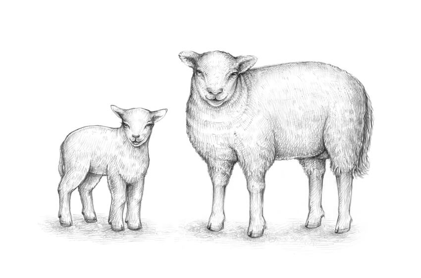
In this tutorial, you’ll learn to draw an adult sheep and a lamb, find out if all sheep have horns, and explore the distinctive appearance features that are typical for these animals. You don’t need any special knowledge of animal anatomy to complete the drawings!
Did you know that a sheep can not only recognize up to 50 other sheep faces and remember them for two years, but it also recognizes human faces? That’s truly incredible!
The sheep is a key animal in the history of farming; we can’t imagine our culture without this wonderful animal.
You may also be interested in these drawing tutorials:
You will need the following equipment to complete this project:

Let’s start with the general shape of the head; I outline it, using the HB pencil. Please be sure to leave enough space for the rest of the sheep’s body on the sheet of paper.

I add an oblong shape for the sheep’s body. Don’t overthink the process at this stage of drawing; we’ll make the refinements later.

Actually, it’s useful to see the shapes that we are drawing as something three-dimensional in their core essence. For example, the body can be presented as a shape that has a rounded foundation and a top plane.
You don’t have to draw these ovals as I did—this is just an illustration.

I add the framework of the limbs—this is a simple stylized version that captures just the main anatomical features. I use the small circles to mark the elbows, knees, and ankles of the forelimbs.
The structure of the hind legs is slightly different—the upper bones create a peculiar angle. One of the hind legs isn’t fully visible because of the foreshortening, so I’ll leave it without the upper round mark.
The feet have circles at the base to create an illusion that the animal is actually standing on the ground.

I add rough shapes to add some thickness to the legs, creating the bulk. We’ll refine the contours later.

I add the shapes of the ears to the head; their tips are slightly rounded.

I draw the neck. Imagine that this shape is three-dimensional; adding the subsidiary circles may help.
I also erase the lines of the limbs’ framework; they can be distracting, and we don’t need them anymore.

I draw the eyes. They are relatively small, located at a distance from each other, and have horizontal pupils.
I also add the inner openings of the ears.

Let’s add the details to the bottom part of the face.
I draw the nose and the mouth; sheep have divided upper lips, which makes them different from goats. Also, they don’t have a beard (and goats do).

Depending on the breed, domestic sheep may have no horns at all, or horns in both sexes, or in males only. The horns usually are quite large and often form a lateral spiral.
Let’s assume that the sheep we are drawing is hornless, but if you are interested in drawing a sheep with horns (or a ram, which is a male sheep), we have an in-depth tutorial on drawing the horns. Just add the shapes of the horns to the top of the animal’s head!

I refine the contours of the limbs, accenting the elbows and knees of the forelegs and the hocks of the hind legs. Sheep have cloven hooves and dew claws, so I add these features of the limbs’ bottom parts, too.

The foreshortening of this sheep doesn’t allow us to see its hocks fully; we can add just a hint at them. In the illustration below you can observe a sheep in a side view.
I recommend paying attention to the tail of the sheep; these animals have tails that hang down. Some breeds demonstrate short tails that don’t require docking (this is the name of the process when a tail is shortened); in other cases, the tail of a domestic sheep may be cut.
In the corner of the image, you’ll find a sample of the line that I used for drawing the wool. Such scrawl-like lines work perfectly and can also save you much time.

Let’s add the outer covering of the sheep’s body and refine it. I extend the contours; a sheep’s body usually creates a solid impression, partially because of a thick layer of wool, so feel free to make it really bulky.
I also add some folds in the neck area to emphasize the wool covering. Then I draw just a couple of other anatomical details: an udder and a tail.

Now we have a line sketch that actually resembles a sheep, but we can make it more realistic and interesting. With the 3B pencil, I add some graphite shading to the head of the sheep, accentuating its sides, and darken the folds of wool in the neck area.
It’s important to make the main facial features contrasting, so I emphasize the eyes, the nose, and the mouth.

I use the HB pencil to add hatches to the upper part of the sheep’s body.
If we stylize the shape of the body, the back will demonstrate a top plane—it is spotlit and should be slightly lighter than the sides of the body.

I work on the bottom part of the sheep’s body, including the limbs and tail. I darken the belly and the sides of the legs and body, using the 3B pencil.
As a finishing touch, I add soft graphite strokes to create a blurry drop shadow under the animal.

In this part of the tutorial, we’ll sketch a lamb—a younger sheep. We’ll also explore its distinctive features.
With the HB pencil, I draw the shape of the head; it is wider in the upper part.

I add the shapes of the ears, making them slightly asymmetrical on purpose.

I add the rough shape of the lamb’s body. It is quite small in relation to the head; this feature is common for baby animals.

I join the head and the body, drawing the cylindrical form of the neck between them.

I draw the framework of the limbs, using small circles and lines. Regarding the direction of the bones, a lamb is similar to an adult sheep, but its limbs are shorter and more slender.

I add the rough shapes of the legs’ parts. The simpler your drawing is at this stage, the better.

I draw the eyes of the lamb. The eyes of a baby animal are bigger than the eyes of an adult sheep; you can make them even bigger to add cuteness to your sketch.

I draw the nose and an open mouth; let’s imagine that this lamb is happy and wants to tell us something!

I refine the forelimbs of the lamb. They have more smoothed contour lines than the legs of an adult sheep, but the dew claws and knees should be observable.
It’s also a nice idea to add a covering of short wool in the breast area.

I refine the contours of the hind legs, accentuating the dew claws and the hocks.

I extend the contours of the lamb’s body just a little bit, using a wavy line that is imitating the wool covering. I also add the tail and the marks that split the hooves.

Let’s add some graphite shading. I mark the darker areas of the drawing (the sides of the head, body, and the limbs), using the HB pencil.

I increase the contrast by adding the darker 3B pencil hatches. I make sure that the facial features of the lamb attract the viewer’s attention, and the belly and the hooves are dark enough.
A soft drop shadow is a nice addition; if you are in the mood, you can draw some grass blades or another texture.
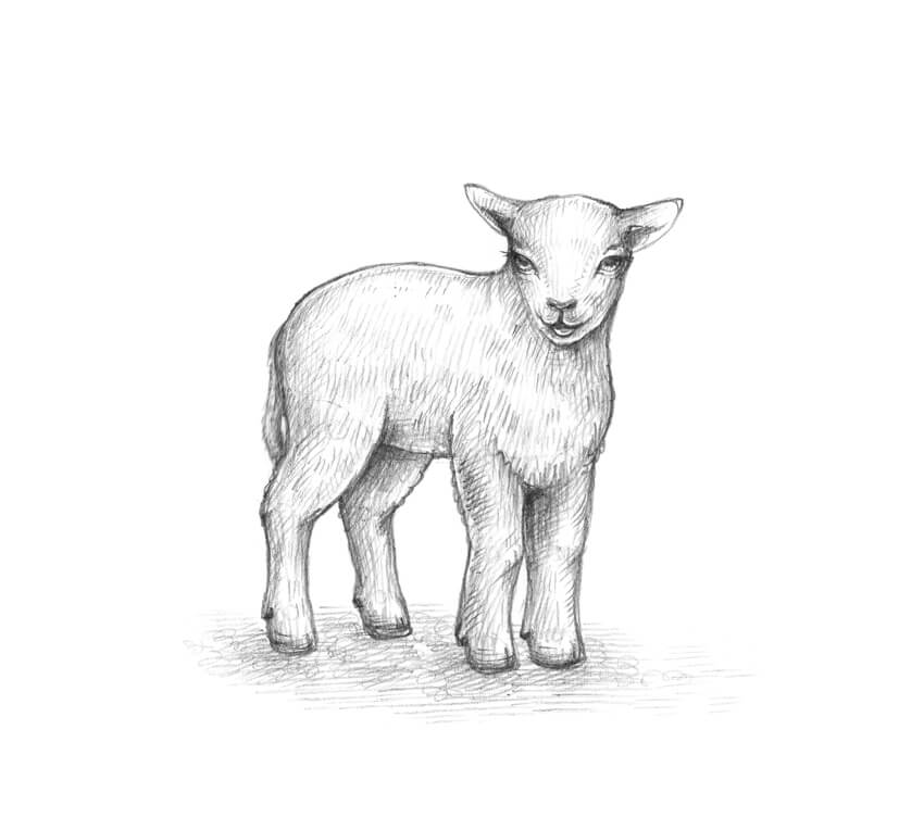
Congratulations! You’ve created two beautiful drawings of wonderful happy sheep. I hope you’ve enjoyed the process, and no animal seems too difficult to draw now!


Post pobrano z: Tron: The Future of Creative Content Sharing and Payments?
If you’re a creative type, making money on the internet has become markedly easier in the last two decades. Thanks to the power of the internet, those with an idea can turn it into an income if it captures the imagination of the masses. For example, if you design a WordPress template, you can sell it to others and earn some cash. If you’re a YouTuber, your content can reach one billion people every month.
However, as easy as it’s become to make money online, many creatives don’t get the compensation they deserve. There are even some internationally renowned recording artists that don’t feel as though they’re being paid in the right way. The most famous example of this is Taylor Swift. After disagreeing with Spotify’s payment scheme, Swift removed her content from the site. Although she’s since resolved her issues with the streaming service, the issue of content control and compensation is still one that looms large online.
 Blockchain Code by methodshop.com
Fortunately, as it often does, technology has stepped into the breach to offer a solution. With the emergence of bitcoin changing the game in 2009, developers are now finding clever ways to use blockchains. Essentially the underlying system that makes cryptocurrency transactions possible, blockchains have made it possible to store, process and track data in new ways.
What does this have to do with creative content, though? Well, thanks to a new altcoin known as Tron, individuals can cut out the middleman and have more control over their content. In simple terms, a user can join the peer to peer distribution platform known as Exodus. From here, they can share content using personal tokens. These tokens will be based on the Tron 20 system and basically allow people to track where their content is being used. Because the system is decentralized, only the individual creator has the power to earn revenue from their product. In other words, the tokens create a direct link between the creator and their audience, rather than a company like Google or Apple (or even a record company) standing in the middle of the process.
Although Tron is still in its early stages of development, it already has an exchange unit known as Tronix. With a tradeable coin in place, supporters of Tron can purchase credits and trade them like any other commodity. For example, by visiting Coinlist, a user can learn more about Tronix coins and about ways to invest in it using an exchange or a broker.
 TRON (TRX) Blockchain by Descryptive
On the one hand, Tronix coins have the ability to increase in value as the underlying technology becomes popular. Therefore, from an investment perspective, these coins can be a way to make some money. On the other hand, buying Tronix coins is a way of supporting the development of the Tron system. Indeed, if you’re a creative type that wants to see this technology proliferate and change the way people get paid, trading Tronix coins is a way to help.
At this stage, the future of Tron is far from certain. Revolutionizing how content is distributed and controlled online is no mean feat. However, if the technology can prove it works and people support it, Tron has the ability to give creative types more power over their creations which can only be a good thing.
Post pobrano z: A Quick Roundup of Recent React Chatter
Like many, many others, I’m in the pool of leveling up my JavaScript skills and learning how to put React to use. That’s why Brad Frost resonated with me when he posted My Struggle to Learn React.”
As Brad does, he clearly outlines his struggles point-by-point:
this-landIt seems that Brad’s struggles resonated with others as well, inspiring empathy and help from the community. For example, Kevin Ball touches on the second and third frustrations by supplying a distinction between React and ES6 and examples of the syntax and conventions of each:
For each feature, I show a couple examples of what it might look like, identify where it is coming from, give you a quick overview of what is called and what it does, and link off to some resources that can help you learn about it.
Super awesome!
Shortly following Brad’s post was this tweet from Sara Soueidan:
I’m just gonna throw this bomb here:
React is the new jQuery
There you go.
— Sara Soueidan (@SaraSoueidan) May 24, 2018
You know that lit up the Twitterverse. Yes, it’s provocative, but the sentiment is pretty clean cut as she clarified a little later:
I used to LOVE jQuery, but hated how it was overused even when it was completely unneeded and unnecessary and, dare I say, sometimes harmful.
I hope this clarifies my controversial tweet from this afternoon. 😉
— Sara Soueidan (@SaraSoueidan) May 24, 2018
Speaking of jQuery, Sarah Drasner had written a post a little while ago that showed how Vue can be used as a jQuery replacement and requires no build process at all. Well, the same can be true of React, despite the fact that both frameworks are predominantly used in complex app environments.
And, if all this talk about moving away from jQuery and into complex app environments sounds scary, then maybe this interview with Bruce Lawson will be reassuring to you. After all:
The end user doesn’t care whether your website is made with React or Angular or webpack or Broccoli or Grunt or whatever. They just want it to work in their damn browser.
But, still, there may be circumstances where React will be the right tool for the job and you’ll want it in your toolbox. For example, WordPress is using it as the basis for it’s upcoming Gutenberg editor meaning WordPress developers (and that’s a lot of us) will want to heed Matt Mullenweg’s advice to „learn JavaScript deeply.” Our guide on developing for Gutenberg might be a great place for you to start that journey.
All in a day’s work, right?!
The post A Quick Roundup of Recent React Chatter appeared first on CSS-Tricks.
Post pobrano z: How to Create a Summer Vacation Illustration in Adobe Illustrator

In this tutorial, you will learn how to create a summer vacation illustration in Adobe Illustrator. To be more exact, we will create an image of a woman sitting on a bunch of suitcases. We will use basic shapes, warp effects, and the Scissors Tool to create our illustration. This tutorial is broken down into clear, simple steps, making it suitable for beginners.
If you love vacation and travel and want to find tons of amazing images online, then go to GraphicRiver. They have an amazing selection of images there, including some vacation ones.
So, let’s get started!
After opening your Adobe Illustrator, let’s start to create the woman, beginning with her head. Take the Ellipse Tool (L) and draw an ellipse that is almost a circle. Delete the stroke color if you have one, and set the fill color shown below.
Then we want to give her a smiley mouth, so draw an ellipse again and set a white fill color. Add a new ellipse overlapping this one—it should cover just the top part of the previous ellipse. In the image below, you can see how the shapes need to overlap each other. They’re marked with a black stroke, which you don’t actually need in your illustration.
Select the two white ellipses, go to the Pathfinder panel (Window > Pathfinder), and click on the Minus Front button. You’ll end up with a crescent shape, which is the smiley mouth!

Sunglasses are a mandatory attribute of summer vacations, and we will start to create them by using the Rounded Rectangle Tool. Set a dark grey fill color and no stroke.
While keeping it selected, go to Effect > Warp > Bulge. A new dialogue window will pop up, where you want to enter the options presented below. Then press OK. The first lens of the sunglasses is ready.
Now we want to create another lens for the sunglasses. Select the first one and, while holding the Shift and Alt keys on your keyboard, move this shape to the right. Holding these two keys will help you to create a copy (Alt), which will be perfectly aligned horizontally (by the Shift button).
Now we want to create the bridge of the sunglasses. Press the Swap Fill and Stroke button on the Tools panel (Shift-X), and the fill color you had will transform into the stroke color. That’s exactly what we need. Hit the Arc Tool and draw a curve between the two glasses. Now the sunglasses are ready!

Give them to the woman, who looks more like an alien now!

We will create the woman’s hair from a few parts. First, draw an ellipse using the Ellipse Tool (L). Be sure you delete the stroke color and set the necessary fill color.
While keeping it selected, go to Effect > Warp > Arc and in the new dialogue window enter the options shown below. Then, press OK.
Finally, expand this shape (Object > Expand Appearance). As we will rotate this shape later on, we must expand it first in order not to deform it.

After this, place this shape on the woman’s head. Notice that it has to stay behind the glasses. After you’ve placed the left part of the hair on the woman’s face, select the glasses, cut (Control-X), and place them over the hair (Control-F).
So now we have the left part of the hair, and we want to create the right part. Select the left part and hit the Reflect Tool (O). Then, while keeping the Alt key pressed, click on the woman’s forehead. A new dialogue window will pop up, where you need to enter Axis Vertical, Angle 90 degrees, and then press Copy. You’ve just created a vertical copy of the left part to get the right part.
Finally, we want to create the hair at the back. Draw a darker ellipse behind the head using the Ellipse Tool (L). Remember, to place something behind everything, you need to cut it (Control-X), and then place it behind (Control-B).
The last effect we must apply to the back hair is the Inflate effect. While keeping the back hair selected, go to Effect > Warp > Inflate, and then enter the options shown in the image below.

After that, we are going to create the hat. Using the Ellipse Tool (L), draw a red ellipse on the woman’s forehead. Warp it (Effect > Warp > Arc), and enter the options shown below.
Finally, add a big red ellipse behind everything. The hat is done!

Let’s start to create the body from a circle. It doesn’t have to be an even circle. While keeping it selected, go to Effect > Warp > Inflate, and enter the necessary options. You don’t need to expand this shape, but you can if you want to (Object > Expand Appearance). If you do not want to expand, it means you can edit the options later in the Appearance panel (Window > Appearance).
Finally, add the neck using the Rectangle Tool (M), by creating a small rectangle under the head. You don’t actually need the stroke that is shown below.

To create the dress, we need a white fill color and the Rectangle Tool (M). The black stroke you see below is presented just for better visibility, and you don’t actually need it in your final illustration. So draw a rectangle and then apply the Bulge effect to this shape (Effect > Warp > Bulge).

Place the upper part of the dress on the woman’s body.
To add the first strap, draw a small rectangle using the Rectangle Tool (M) with white fill color and no stroke. Place the strap on the left shoulder and rotate it a little bit to the left.
Select the left strap and hit the Reflect Tool (O). Then, while keeping the Alt key pressed, click just under the woman’s neck. A new dialogue window will pop up, where you need to enter Axis Vertical, Angle 90 degrees, and then press Copy. Remember that the stroke is there only for better visibility. Now she has two dress straps.

Add a tiny ellipse where the hand should be. Then take the Direct Selection Tool (A), and select the top and bottom anchor points on the ellipse. Pressing the Up Arrow on your keyboard, move these anchor points up just a little. Remember, you don’t need the black stroke.
Now we want to create another hand. Hold down the Shift and Alt buttons together and move the hand to the right using the Selection Tool (V). You just created the hands!

After that, we are going to create the bottom part of the woman. Draw an ellipse which should overlap the upper part of the dress.
Using the Direct Selection Tool (A), select its left and right anchor points and move them down using the Down Arrow on your keyboard.
Select all of the dress parts (the two straps, as well as the upper and bottom parts) together (you should hold the Shift button to select two or more objects). Go to the Pathfinder panel (Window > Pathfinder) and press the Unite button. Now you should have one shape instead of four.

Let’s create the left leg. Draw an ellipse, place it where the leg starts, and then rotate it to the right.
Add a rectangle as shown in the image below. While keeping this rectangle selected, go to Effect > Warp > Arc Upper and enter the options shown below.
To finish off the leg, add four tiny ellipses as toes. And as before, make sure that you do not have the black stroke.

Select the whole leg and group it (right-click > Group) so you can move it later on.
Then create a vertical copy of the left leg to get the right one. By using the Reflect Tool (O), you can do this. Now the woman is ready!

Let’s create the first suitcase. First, draw a light blue rectangle.
Create a copy of it in front and shrink it down from the top and bottom until you get a very thin rectangle. Set the fill color shown for the new thin rectangle.
Hit the Rounded Rectangle Tool and draw a tiny yellow rounded rectangle on the left side of the thin rectangle. Add one more rounded rectangle over it, which should be darker.
Select the two yellow rounded rectangles and, while holding the Shift and Alt buttons, move the rounded rectangles to the right.
Then, add two blue circles as shown in the image below. If you want to have an even circle, hold down the Shift key while creating it.

Now we are going to create the handle of the suitcase. Delete the fill color and set the stroke color shown below. Draw a rounded rectangle.
Grab the Scissors Tool (C) and click on the marked places. You just cut off the upper part of the rounded rectangle. Delete the upper part because you don’t need it. This will be the handle.

Place the handle on the suitcase. Feel free to adjust the size of the handle.

Place the woman on the first suitcase.

Create another blue rectangle for the second suitcase. It has to be bigger than the first one.
Now you need to switch on the Smart Guides (View > Smart Guides). Set the yellow fill color shown below and hit the Ellipse Tool (L). After that, while holding down the Alt key, start to create a circle exactly on the corner of the rectangle. The Alt key will help you to draw it from the center of this circle, and the Smart Guides will help you to draw the circle exactly on the corner of the rectangle.
After you’ve created one circle, using the Selection Tool (L) and while holding down the Shift and Alt keys, move this circle to the right, on the right corner of the rectangle. Then, move them to the two bottom corners of the rectangle.
Now we will use the rectangle to cut off the unnecessary parts, which are the ones not touching the rectangle. So create a new copy of the rectangle in front (Control-C, Control-F). You now have two rectangles in front of each other, but we want the second rectangle to be in front of the circles. While keeping the second rectangle selected, cut it (Control-X), and place it in front of everything (Control-F). Select it with all four circles. While keeping the five shapes (rectangle and four circles) selected, press the Intersect button on the Pathfinder panel (Window > Pathfinder).

Using the same technique as for the handle of the first suitcase, create another handle for the second one using the Scissors Tool (C). Note the color and shape difference.

Make a thin, dark rectangle in front of the second suitcase as you did for the first one. Add two small yellow circles as shown below.
Delete the fill color and set a white stroke color. Take the Line Segment Tool (/) and draw two lines as shown in the image below.
Finally, place the handle you created for the second suitcase on it.

Add the second suitcase to the image.

Before we start to create the third suitcase, let’s create one little detail: a keyhole. Start with a yellow rectangle. You can use the Eyedropper Tool (I) to take the yellow color you used before in this tutorial.
Add another rectangle at the bottom of the first one. Select the two of them and press the Unite button on the Pathfinder panel. You’ve got one shape from two.
After that, take the Delete Anchor Point Tool (-) and delete the anchor points marked in the image below. You’ve got a trapeze shape.
Add a circle on top of the previous shape. And the keyhole is done!

Let’s start to create the third suitcase. Create two rectangles: one dark blue, and a second thin one in an even darker blue shade.
Add a rounded rectangle.
Add the keyhole on the rounded rectangle.
While holding down the Shift and Alt buttons, move the rounded rectangle and the keyhole to the right. Add two tiny circles for even more detail.
Create a copy of the previous handle and place it on the third suitcase. You do not need to change the color of this one. It’s done!

Place the third suitcase under the second one.

We are going to create the anchor. Delete the fill color and set the stroke color shown below. Draw a circle.
Add a vertical line using the Line Segment Tool (/). Add a small horizontal line to give your anchor more detail.
Make a copy of one of the previous suitcase handles and change its stroke color. Place it as shown below.

Draw a square. Just as you used the Shift button to create an even circle, you need to use it while creating a square too.
Rotate it 45 degrees. While the square is selected, hit the Selection Tool (V) and, while holding down the Shift button, start to rotate. The Shift helps you to rotate it exactly 45 degrees.
Using the Scissors Tool (C), cut off the upper part of the square to get a v-shape.

Place the v-shape on the bottom of the previously created shapes to get the anchor.
Make one more copy of the v-shape and place it as shown. Create another copy of the v-shape and place it on the other end, forming the anchor.

Create a copy of the anchor and change its color to red.

Place the anchors on the suitcases.

For the background, create a blue square with 850 px Width and Height, by using the Rectangle Tool (M). First, take the tool, and then click on your artboard and enter the necessary options.

Place the background behind (Control-X, Control-B) everything you created before, creating a summer-themed image.

To make this image even more appealing and summery, you can add some tropical leaves, which you can learn how to create in one of my previous tutorials.

Congratulations on finishing this tutorial and creating an image. And again, for more inspiration, art, ideas, and much more, check out GraphicRiver. They really have a river of images! I’m sure yours is ready to be presented to all the people!
Hopefully you enjoyed this tutorial and learned something new. As you can see, it is very easy to create images in Adobe Illustrator.
See you next time!


