Managing State in React With Unstated

Post pobrano z: Managing State in React With Unstated

As your application becomes more complex, the management of state can become tedious. A component’s state is meant to be self-contained, which makes sharing state across multiple components a headache. Redux is usually the go-to library to manage state in React, however, depending on how complex your application is, you might not need Redux.

Unstated is an alternative that provides you with the functionality to manage state across multiple components with a Container class and Provider and Subscribe components. Let’s see Unstated in action by creating a simple counter and then look at a more advanced to-do application.

Using Unstated to Create a Counter

The code for the counter we’re making is available on GitHub:

View Repo

You can add Unstated to your application with Yarn:

yarn add unstated

Container

The container extends Unstated’s Container class. It is to be used only for state management. This is where the initial state will be initialized and the call to setState() will happen.

import { Container } from 'unstated'

class CounterContainer extends Container {
  state = {
    count: 0
  }

  increment = () => {
    this.setState({ count: this.state.count + 1 })
  }

  decrement = () => {
    this.setState({ count: this.state.count - 1 })
  }
}

export default CounterContainer

So far, we’ve defined the Container (CounterContainer), set its starting state for count at the number zero and defined methods for adding and subtracting to the component’s state in increments and decrements of one.

You might be wondering why we haven’t imported React at this point. There is no need to import it into the Container since we will not be rendering JSX at all.

Events emitters will be used in order to call setState() and cause the components to re-render. The components that will make use of this container will have to subscribe to it.

Subscribe

The Subscribe component is used to plug the state into the components that need it. From here, we will be able to call the increment and decrement methods, which will update the state of the application and cause the subscribed component to re-render with the correct count. These methods will be triggered by a couple of buttons that contain events listeners to add or subtract to the count, respectively.

import React from 'react'
import { Subscribe } from 'unstated'

import CounterContainer from './containers/counter'

const Counter = () => {
  return (
    <Subscribe to={[CounterContainer]}>
      {counterContainer => (
        <div>
          <div>
            // The current count value
            Count: { counterContainer.state.count }
          </div>
          // This button will add to the count
          <button onClick={counterContainer.increment}>Increment</button>
          // This button will subtract from the count
          <button onClick={counterContainer.decrement}>Decrement</button>
        </div>
      )}
    </Subscribe>
  )
}

export default Counter

The Subscribe component is given the CounterContainer in the form of an array to its to prop. This means that the Subscribe component can subscribe to more than one container, and all of the containers are passed to the to prop of the Subscribe component in an array.

The counterContainer is a function that receives an instance of each container the Subscribe component subscribes to.

With that, we can now access the state and the methods made available in the container.

Provider

We’ll make use of the Provider component to store the container instances and allow the children to subscribe to it.

import React, { Component } from 'react';
import { Provider } from 'unstated'

import Counter from './Counter'

class App extends Component {
  render() {
    return (
      <Provider>
        <Counter />
      </Provider>
    );
  }
}

export default App;

With this, the Counter component can make use of our counterContainer.

Unstated allows you to make use of all the functionality that React’s setState() provides. For example, if we want to increment the previous state by one three times with one click, we can pass a function to setState() like this:

incrementBy3 = () => {
  this.setState((prevState) => ({ count: prevState.count + 1 }))
  this.setState((prevState) => ({ count: prevState.count + 1 }))
  this.setState((prevState) => ({ count: prevState.count + 1 }))
}

The idea is that the setState() still works like it does, but this time with the ability to keep the state contained in a Container class. It becomes easy to spread the state to only the components that need it.

Let’s Make a To-Do Application!

This is a slightly more advanced use of Unstated. Two components will subscribe to the container, which will manage all of the state, and the methods for updating the state. Again, the code is available on Github:

View Repo

The container will look like this:

import { Container } from 'unstated'

class TodoContainer extends Container {
  state = {
    todos: [
      'Mess around with unstated',
      'Start dance class'
    ],
    todo: ''
  };

  handleDeleteTodo = (todo) => {
    this.setState({
      todos: this.state.todos.filter(c => c !== todo)
    })
  }
 
  handleInputChange = (event) => {
    const todo = event.target.value
    this.setState({ todo });
  };

  handleAddTodo = (event) => {
    event.preventDefault()
    this.setState(({todos}) => ({
      todos: todos.concat(this.state.todo)
    }))
    this.setState({ todo: '' });
  }

}

export default TodoContainer

The container has an initial todos state which is an array with two items in it. To add to-do items, we have a todo state set to an empty string.

We’re going to need a CreateTodo component that will subscribe to the container. Each time a value is entered, the onChange event will trigger then fire the handleInputChange() method we have in the container. Clicking the submit button will trigger handleAddTodo(). The handleDeleteTodo() method receives a to-do and filters out the to-do that matches the one passed to it.

import React from 'react'
import { Subscribe } from 'unstated'

import TodoContainer from './containers/todoContainer'

const CreateTodo = () => {
  return (
    <div>
      <Subscribe to={[TodoContainer]}>
        {todos =>
          <div>
            <form onSubmit={todos.handleAddTodo}>
              <input
                type="text"
                value={todos.state.todo}
                onChange={todos.handleInputChange}
              />
              <button>Submit</button>
            </form>
          </div>
        }
      </Subscribe>
    </div>
  );
}

export default CreateTodo

When a new to-do is added, the todos state made available in the container is updated. The list of todos is pulled from the container to the Todos component, by subscribing the component to the container.

import React from 'react';
import { Subscribe } from 'unstated';

import TodoContainer from './containers/todoContainer'

const Todos = () => (
  <ul>
    <Subscribe to={[TodoContainer]}>
      {todos =>
        todos.state.todos.map(todo => (
          <li key={todo}>
            {todo} <button onClick={() => todos.handleDeleteTodo(todo)}>X</button>
          </li>
        ))
      }
    </Subscribe>
  </ul>
);

export default Todos

This component loops through the array of to-dos available in the container and renders them in a list.

Finally, we need to wrap the components that subscribe to the container in a provider like we did in the case of the counter. We do this in our App.js file exactly like we did in the counter example:

import React, { Component } from 'react';
import { Provider } from 'unstated'

import CreateTodo from './CreateTodo'
import Todos from './Todos'

class App extends Component {
  render() {
    return (
      <Provider>
        <CreateTodo />
        <Todos />
      </Provider>
    );
  }
}

export default App;

Wrapping Up

There are different ways of managing state in React depending on the complexity of your application and Unstated is a handy library that can make it easier. It’s worth reiterating the point that Redux, while awesome, is not always the best tool for the job, even though we often grab for it in these types of cases. Hopefully you now feel like you have a new tool in your belt.

The post Managing State in React With Unstated appeared first on CSS-Tricks.

​Build a realtime polling web app with Next.js

Post pobrano z: ​Build a realtime polling web app with Next.js

(This is a sponsored post.)

Learn to build a webapp that accepts user votes, using Next.js and Chart.js. Users can vote for their favorite pet, and the results are displayed in realtime on a graph in their browser using Pusher Channels.

Direct Link to ArticlePermalink

The post ​Build a realtime polling web app with Next.js appeared first on CSS-Tricks.

How to Create a Quick 3D Botanical Letter Effect in Adobe InDesign

Post pobrano z: How to Create a Quick 3D Botanical Letter Effect in Adobe InDesign

Final product image
What You’ll Be Creating

Often seen across advertising and poster artwork, this eye-catching effect gives an immersive, natural look to any letter. As well as being a quick tutorial, this is also a great introduction to some more advanced techniques in Adobe InDesign. 

If you’re on the hunt for more great fonts to use in your text effects, head on over to Envato Elements to browse a huge range of display typefaces.

Ready to get started? Awesome, let’s go!

What You’ll Need to Create Your Text Effect

For this tutorial, you’ll need access to both Adobe InDesign and Adobe Photoshop. You’ll also need to download the following images and font files:

1. How to Map Out Your Text Effect

Step 1

Open up Adobe InDesign and go to File > New > Document. You can set up your page to any size, but here I’ve set it up as Portrait A3. When you’re ready, click Create

Expand the Layers panel (Window > Layers) and double-click on Layer 1 to rename it as Background.

Create four new layers above this, in this order: Type, Leaves Inside, Shadow, and finally Elements in Front at the top. 

Then lock all layers except Background.

background layer

Step 2

Use the Rectangle Frame Tool (F) to create an image frame across the whole page. 

File > Place, navigate to the pink paper background image, and click Open, allowing it to fill the frame completely (without the gift box in the corner visible).

paper background

Step 3

Lock the Background layer and unlock the layer above, Type.

Create a large text frame on the page using the Type Tool (T), and type in a single letter*. From the Controls panel at the top of the workspace, set the Font to Nista International Bold, and make the Font Size nice and generous.

* Note that this effect works much better with completely angular letters, like ‘F’, ‘L’, and ‘T’, but is much trickier to achieve with letters with rounded elements like ‘O’ or ‘P’.

type tool

2. How to Edit and Add Leaves to Your Letter

Step 1

Minimize the InDesign window briefly and open up the green leaves image in Photoshop.

Duplicate the Background layer to preserve a copy of the original image, and switch off the visibility of the original layer. 

background copy

Go to Select > Color Range and click anywhere onto the white background of the image. In the Color Range window that opens, increase the Fuzziness slider until most of the white is selected. Then click OK.

color range

Click on the Refine Edge button on the top Controls panel, and check Smart Radius. Increase the Radius and Shift Edge sliders until you’re happy with the accuracy of the selection. 

refine edge

Then click OK and hit Delete on your keyboard to delete the white area.

delete area

Step 2

Use the Lasso Tool (L) to isolate one of the leaves on the image, and then Edit > Copy the selection.

lasso tool

Create a new Photoshop document, and Edit > Paste the leaf onto this new canvas. 

Switch off the visibility of the Background layer and then File > Save As the document as a Photoshop (PSD) file. Name it ‘Leaf1.psd’.

isolated leaf

Repeat the process for each leaf, looping it off, copying and pasting it onto a new document, switching off the Background layer, and saving it as an individual Photoshop file. Name each leaf image in a sequence, e.g. ‘Leaf2.psd’, ‘Leaf3.psd’, etc.

looped off leaf
isolated leaf

Step 3

When you’ve saved all the leaves as Photoshop files, head back over to your InDesign document. 

Lock the Type layer and unlock the Leaves Inside layer above.

Use the Rectangle Frame Tool (F) to create a small frame somewhere over the top of your letter. Go to File > Place, choose one of your leaf images, and Open.

leaf psd image

With the image frame selected, go to Object > Effects > Drop Shadow. Switch the Effect Color to a pink swatch (here, I’ve added a new CMYK swatch from the Swatches panel, C=13 M=60 Y=48 K=2, beforehand, to make a good match to the pink paper background), and adjust the options in the Effects window until you have created a subtle shadow for the leaf. 

effect color

Step 4

Select the leaf’s image frame and Edit > Copy, Edit > Paste, moving it over to cover another section of the letter. 

place image

With the copy selected, go to File > Place and choose a different leaf PSD image.

placed leaf image

By adding the leaves this way, you can preserve the drop shadow settings for the image frame.

drop shadow leaf

Continue to Paste new image frames onto the page, and File > Place to replace each frame with a different leaf image. Build the leaves up across the stem and arms of the letter.

leaves inside

Step 5

Once you’ve built up a dense range of leaves across the letter, unlock the top Elements in Front layer.

Then expand the Leaves Inside layer to view all the leaf PSD images sitting on that layer. Highlight the top four or five leaves.

leaves moved in layer

Then drag these up, dropping them onto the Elements in Front layer. 

expanded layer

Step 6

Lock the Leaves Inside layer, and switch off its visibility. Keep the Elements in Front layer unlocked and active. 

elements in front

Now we want to create blocks of pink texture on this top layer, to overlap some of the edges of the leaves and create the desired peekaboo effect. 

Use the Pen Tool (P) to mark off a section of the background, running the edges along the letter’s edge. Here, I want to disguise the top edge of the leaf pictured here, so that’s my focus for this block.

pen tool

Then unlock the Background layer and double-click inside the large image frame sitting on this layer, to directly select the pink paper image. Then Edit > Copy the image. 

copy image

Lock the Background layer and go back to the shape you created on the Elements in Front layer. From the Swatches panel (Window > Color > Swatches), make sure the Fill and Stroke Color of the shape is set to [None]. 

Then select the shape and Right-Click > Paste Into, dropping the pink paper image into the shape at the same scale as the background image.

paste into
pasted paper

Step 7

Repeat the process for another section of background. 

Use the Pen Tool (P) to loop off another area on the Elements in Front layer, before Right-Clicking > Paste Into the paper texture image into the shape, and then setting the Fill and Stroke of the shape to [None].

elements in front
paste into

Keep building up shapes around the perimeter of the letter, and pasting in copies of the paper image. Do each bit in small sections, until the whole page is covered around the edge of the letter. 

elements in front

Step 8

Now you can start to experiment with moving some paper-filled shapes in front of or behind the leaf shapes sitting on this layer. 

Expand the Elements in Front layer and try setting the group of leaves in the middle of two sections of paper shapes, allowing some of the tips of the leaves to poke out. 

layer expanded

This will take a bit of experimenting, so keep checking the result as you work. 

Eventually, you’ll end up with a 3D effect like this:

effect so far

3. How to Add Depth to Your Text Effect

Step 1

Lock the Elements in Front layer and unlock the Shadow layer. 

Use the Rectangle Tool (M) to create a rectangle shape over one edge of the letter, setting the Fill Color to [Black].

shadow layer

Step 2

With the black rectangle selected, go to Object > Effects > Transparency. Set the Mode to Multiply and bring the Opacity down to 75%.

transparency

Click on Gradient Feather at the bottom of the window’s left-hand menu. Keep the settings as they are, only reversing the gradient if needed, to allow the shadow to move from more opaque closer to the edge of the letter and more transparent towards the center of the letter.

gradient feather

Step 3

Select the rectangle shape and Edit > Copy, Edit > Paste it. You might need to Right-Click > Rotate it and resize it to position it along another edge of the letter.

transform rotate
rotate shadow

Continue to paste more rectangles along the edges of your letter, rotating and resizing each to fit. 

shadow rotated

Eventually, you’ll have a shadow running along each edge of the letter, adding depth and drama to the whole effect.

shadow shape

Your Finished Text Effect

And your text effect is finished! Awesome job!

final effect

You can now incorporate your text effect into other InDesign work, or go to File > Export to create a JPG, PNG, or PDF version of your effect. 

On the lookout for more great fonts to use in your text effects? Head on over to Envato Elements to browse a huge range of awesome display typefaces.

Looking for more quick InDesign text effects? Make sure to check these out:

Design deals for the week

Post pobrano z: Design deals for the week

Every week, we’ll give you an overview of the best deals for designers, make sure you don’t miss any by subscribing to our deals feed. You can also follow the recently launched website Type Deals if you are looking for free fonts or font deals.

10 Full Font Families and Bonus Design Extras

Give your voice a new look thanks to this epic typeface deal full of 10 full font families! You’ll get multiple styles, resulting in 18 unique fonts, along with OpenType Features including Stylistic and Contextual Alternates. Not to mention multilingual support, additional glyphs and all sorts of fabulous design extras from Vectors to doodles.

$9 instead of $147 – Get it now!

The Wonderful Graphics Bundle

This amazing bundle includes 40 of the most popular graphic packs from the Design Bundles marketplace, all bundled together in this one-time offer.

$15 instead of $148 – Get it now!

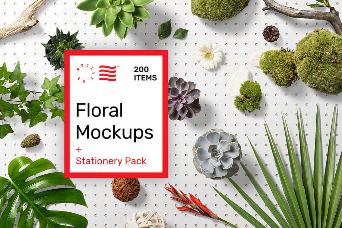
Create Gorgeous Scenes with Floral and Stationery Mockup Sets

Add some real zip to your latest designs by creating some gorgeous and realistic scenes. This Mighty Deal features 200 high-quality items through a pair of Floral and Stationery Mockups. Easy to customize and sort using smart objects and organized layers, you can arrange a variety of flowers, leaves and stems or paper, envelopes and office supplies to build the perfect scene to show off your designs.

$19 instead of $49 – Get it now!

The Amazing Craft Bundle

Including 16 fonts and dingbats, monograms, hundreds of SVG’s and more! It’s a Crafters Dream Bundle!

$24 instead of $285 – Get it now!

Celestial Typeface Offers Antique, Victorian Style

Step back into the early 19th century with the beautiful, hand lettered font, Celestial. A gorgeous mix of modern and classic styles, you can give your latest project a true Victorian tone. Packed with 300+ glyphs, tons of OpenType features, and a trio of bonus items, the past never looked so good.

$9 instead of $18 – Get it now!

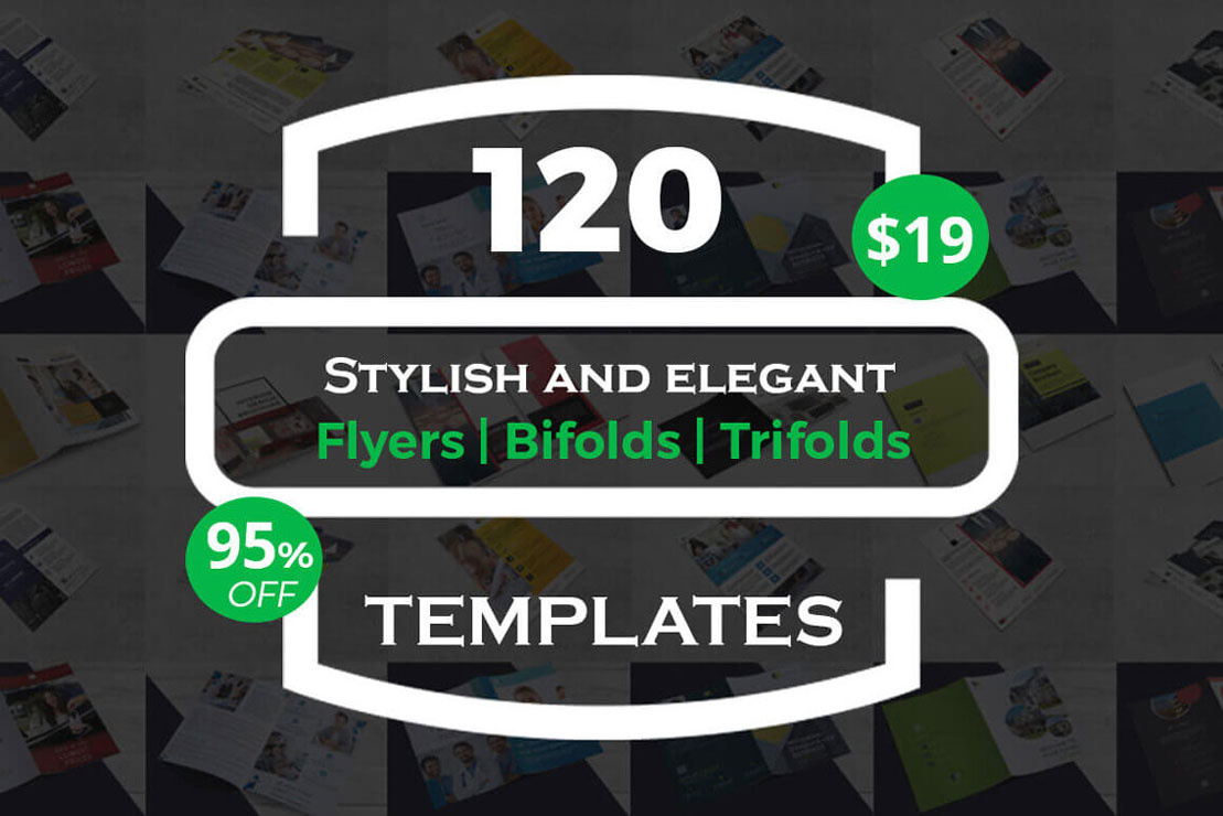
120 Stylish and Elegant Flyer Templates

Grab this stylish and clean Print Templates Bundle to showcase your business, products or services. Fully customizable, these hi-res files are ready to print and start sharing with the public. You can use the bundle for several activities: business, corporate, travel, mobile app, photography, menu, real estate, interior design, rent cars, etc.

$19 instead of $350 – Get it now!

Illustrator CC 2018 MasterClass Taught By One of the World’s Top Instructors

Always wanted to figure out how to use Adobe Illustrator? Now’s your chance! With Illustrator CC 2018 MasterClass, you’ll quickly learn everything there is to know about mastering Adobe Illustrator. From designing logos to using various brushes, these online tutorials feature hands-on exercises and quizzes to test your knowledge.

$17 instead of $97 – Get it now!


Yose-gi Stool by TAMEN

Post pobrano z: Yose-gi Stool by TAMEN

You may already have seen one of these videos showing how traditional houses are built without the need for nails. If you didn’t, I suggest you take a look at this article on the Interesting Engineering blog. The pieces used to build those houses without nails have their ending looking like puzzle pieces, they are assembled together and hold very good.

For his Yose-gi stool, Brooklyn-based Japanese product designer Yoshiaki Ito found his inspiration in these traditional elements. The founder of TAMEN, his design studio, made stools that can be assembled together in order to save space when the stools are not in use.

Adobe makes its prototyping tool XD CC free to download

Post pobrano z: Adobe makes its prototyping tool XD CC free to download

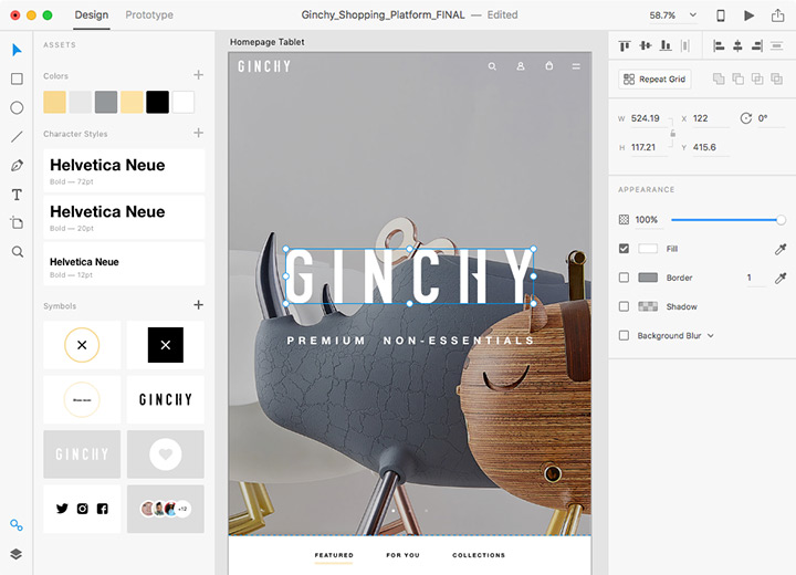
Dominant in the graphic design industry with tools like Photoshop, Illustrator, or InDesign, Adobe is not as successful with its web designing tools. Apps like Sketch or InVision are very popular among people who design for the web, which is not what Adobe wants. The company decided that its XD CC software wasn’t getting enough attention, so they changed their model to make it more accessible. It’s worth noting that you will still need to pay to get the full experience, as only the starter edition is free.

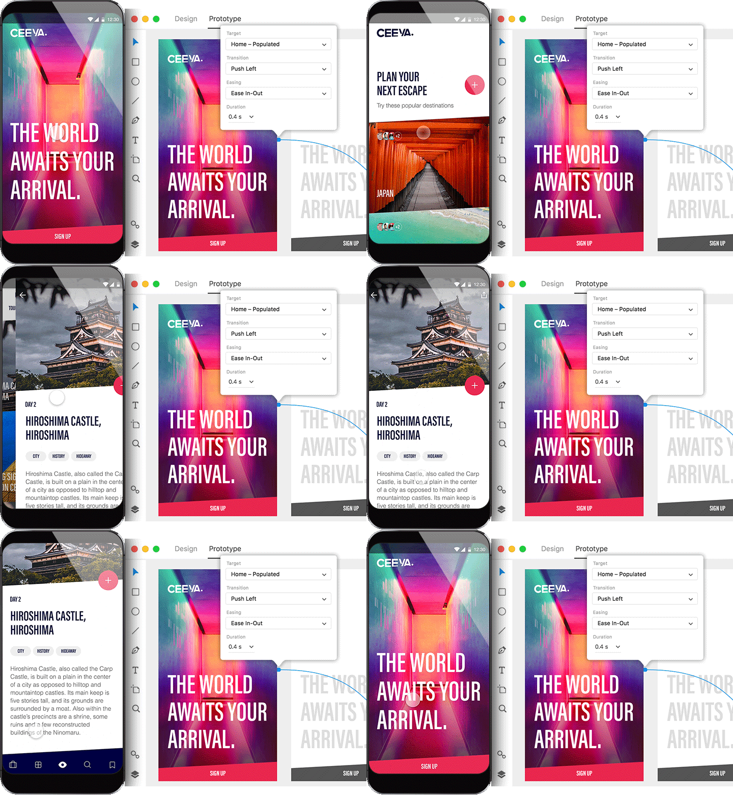
Adobe XD is a comprehensive solution for going to concept to a working prototype very quickly, the type of tool that all UX/UI designers need to be more productive. With the free version, you even get access to great icon sets you can use in your designs. Once ready, your designs can be previewed with Android or iOS transitions, then easily shared.

Are you a developer? Create plugins for XD. Adobe has even created a $10 million fund to invest in new features proposed by developers. This great announcement and the whole excitement around XD shows that Adobe is looking to make their UX/UI tool one of their flagship product. Scott Belsky, who is no less than the Chief Product Officer & Executive Vice President at Adobe, was quoted saying that XD may even become bigger than Photoshop.

Illegal copycat? / Une copie pareille, ça devrait être illégal

Post pobrano z: Illegal copycat? / Une copie pareille, ça devrait être illégal

THE ORIGINAL?
Chipotle Restaurants – 1990’s
“… when you roll something
this good, it’s illegal”
Agency : Unknown (UK)
LESS ORIGINAL
Tortilla Restaurant – 2014
“Things this well rolled are
usually illegal”
Agency : Unknown (UK)
LESS ORIGINAL
Los Tacos Restaurant – 2018
“Usually, when you roll something
this good, it’s illegal”
Agency : Unknown (Oslo, Norway)

Learning Gutenberg: Modern JavaScript Syntax

Post pobrano z: Learning Gutenberg: Modern JavaScript Syntax

One of the key changes that Gutenberg brings to the WordPress ecosystem is a heavy reliance on JavaScript. Helpfully, the WordPress team have really pushed their JavaScript framework into the present and future by leveraging the modern JavaScript stack, which is commonly referred to as ES6 in the community. It’s how we’ll refer to it as in this series too, to avoid confusion.

Let’s dig into this ES6 world a bit, as it’s ultimately going to help us understand how to structure and build a custom Gutenberg block.

Article Series:

  1. Series Introduction
  2. What is Gutenberg, Anyway?
  3. A Primer with create-guten-block
  4. Modern JavaScript Syntax (This Post)
  5. React 101 (Coming Soon!)
  6. Setting up a Custom webpack (Coming Soon!)
  7. A Custom „Card” Block (Coming Soon!)

What is ES6?

ES6 is short for “EcmaScript 6” which is the 6th edition of EcmaScript. It’s official name is ES2015, which you may have also seen around. EcmaScript has since gone through many iterations, but modern JavaScript is still often referred to as ES6. As you probably guessed, the iterations have continued ES2016, ES2017 and so-on. I actually asked a question on ShopTalk show about what we could name modern JavaScript, which I the conclusion was… ES6.

I’m going to run through some key features of ES6 that are useful in the context of Gutenberg.

Functions

Functions get a heck of an update with ES6. Two changes I want to focus on are Arrow Functions and Class Methods.

Inside a class you don’t actually need to write the word function anymore in ES6. This can be confusing, so check out this example:

class Foo { 
  // This is your 'bar' function
  bar() {
    return 'hello';
  }
}

You’d invoke bar() like this:

const fooInstance = new Foo();
const hi = fooInstance.bar();

This is commonplace in the land of modern JavaScript, so it’s good to clear it up.

Fun fact! ES6 Classes in JavaScript aren’t really “classes” in an object-oriented programming sense—under the hood, it’s the same old prototypical inheritance JavaScript has always had. Prior to ES6, the bar() method would be defined like so: Foo.prototype.bar = function() { ... }. React makes great use of ES6 classes, but it’s worth noting that ES6 classes are essentially syntactic sugar and hotly contested by some. If you’re interested in more details, checkout the MDN docs and this article on 2ality.

Right, let’s move on to arrow functions. 🚀

An arrow function gives us a compact syntax that is often used as a one-liner for expressions. It’s also used to maintain the value of this, as an arrow function won’t rebind this like setInterval or an event handler would usually do.

An example of an arrow function as an expression is as follows:

// Define an array of fruit objects
const fruit = [
  {
    name: 'Apple',
    color: 'red'
  },
  {
    name: 'Banana',
    color: 'yellow'
  },
  {
    name: 'Pear',
    color: 'green'
  }
];

// Select only red fruit from that collection
const redFruit = fruit.filter(fruitItem => fruitItem.color === 'red');

// Output should be something like Object { name: "Apple", color: "red" }
console.log(redFruit[0]);

As you can see above, because there was a single parameter and the function was being used as an expression, we can redact the brackets and parenthesis. This allows us to really compact our code and improve readability.

Let’s take a look at how we can use an arrow function as an event handler in our Foo class from before:

class Foo {
        
  // This is your 'bar' function
  bar() {
    let buttonInstance = document.querySelector('button');
    
    buttonInstance.addEventListener('click', evt => {
      console.log(this);
    });
  }
}

// Run the handler
const fooInstance = new Foo();
fooInstance.bar();

When the button is clicked, the output should be Foo { }, because this is the instance of Foo. If we were to replace that example with the following:

class Foo {
        
  // This is your 'bar' function
  bar() {
    let buttonInstance = document.querySelector('button');
    
    buttonInstance.addEventListener('click', function(evt) {
      console.log(this);
    });
  }
}

// Run the handler
const fooInstance = new Foo();
fooInstance.bar();

When the button is clicked, the output would be <button> because the function has bound this to be the <button> that was clicked.

You can read more about arrow functions with Wes Bos, who wrote an excellent article about them.

const, let, and var

You may have noticed that I’ve been using const and let in the above examples. These are also a part of ES6 and I’ll quickly explain what each one does.

If a value is absolutely constant and won’t change through re-assignment, or be re-declared, use a const. This would commonly be used when importing something or declaring non-changing properties such as a collection of DOM elements.

If you have a variable that you want to only be accessible in the block it was defined in, then use a let. This can be confusing to understand, so check out this little example:

function foo() {
  if (1 < 2) {
    let bar = 'always true';
    
    // Outputs: 'always true'
    console.log(bar);
  }
  
  // Outputs 'ReferenceError: bar is not defined'
  console.log(bar);
}

// Run the function so we can see our logs
foo();

This is a great way to keep control of your variables and make them disposable, in a sense.

Lastly, var is the same old friend we know and love so well. Unfortunately, between const and let, our friend is becoming more and more redundant as time goes on. Using var is totally acceptable though, so don’t be disheartened—you just won’t see it much in the rest of this tutorial!

Destructuring assignment

Destructuring allows you to extract object keys at the point where you assign them to your local variable. So, say you’ve got this object:

const foo = {
  people: [
    {
      name: 'Bar',
      age: 30
    },
    {
      name: 'Baz',
      age: 28
    }
  ],
  anotherKey: 'some stuff',
  heyAFunction() {
    return 'Watermelons are really refreshing in the summer' 
  }
};

Traditionally, you’d extract people with foo.people. With destructuring, you can do this:

let { people } = foo;

That pulls the people array out of the the foo object, so we can dump the foo. prefix and use it as it is: people. It also means that anotherKey and heyAFunction are ignored, because we don’t need them right now. This is great when you’re working with big complex objects where being able to selectively pick stuff out is really useful.

You can also make use of destructuring to break up an object into local variables to increase code readability. Let’s update the above snippet:

let { people } = foo;
let { heyAFunction } = foo;

Now we’ve got those two separate elements from the same object, while still ignoring anotherKey. If you ran console.log(people), it’d show itself an array and if you ran console.log(heyAFunction), you guessed it, it’d show itself as a function.

JSX

Most commonly found in React JS contexts: JSX is an XML-like extension to JavaScript that is designed to be compiled by preprocessors into normal JavaScript code. Essentially, it enables us to write HTML(ish) code within JavaScript, as long as we’re preprocessing it. It’s usually associated with a framework like React JS, but it’s also used for Gutenberg block development.

Let’s kick off with an example:

const hello = <h1 className="heading">Hello, Pal</h1>;

Pretty cool, huh? No templating system or escaping or concatenating required. As long as you return a single element, which can have many children, you’re all good. So let’s show something a touch more complex, with a React render function:

class MyComponent extends React.Component {
  /* Other parts redacted for brevity */
  
  render() {
    return (
      <article>
        <h2 className="heading">{ this.props.heading }</h2>
        <p className="lead">{ this.props.summary }</p>
      </article>
    );
  }
};

You can see above that we can drop expressions in wherever we want. This is also the case with element attributes, so we can have something like this:

<h2 className={ this.props.headingClass }> 
  { this.props.heading }
</h2> 

You might be thinking, “What are these random braces doing?”

The answer is that this is an expression, which you will see a ton of in JSX. Essentially, it’s a little inline execution of JavaScript that behaves very much like a PHP echo does.

You’ll also probably notice that it says className instead of class. Although it looks like HTML/XML, it’s still JavaScript, so reserved words naturally are avoided. Attributes are camel-cased too, so keep and eye out for that. Here’s a useful answer to why it’s like this.

JSX is really powerful as you’ll see while this series progresses. It’s a great tool in our stack and really useful to understand in general.

I like to think of JSX as made up-tag names that are actually just function calls. Pick out any of the made-up tags you see in Gutenberg, let’s use <InspectorControls /> for example, and do a „Find in Folder” for class InspectorControls and you’ll see something structured like Andy’s example here! If you don’t find it, then the JSX must be registered as functional component, and should turn up by searching for function InspectorControls.

Wrapping up

We’ve had a quick run through some of the useful features of ES6. There’s a ton more to learn, but I wanted to focus your attention on the stuff we’ll be using in this tutorial series. I’d strongly recommend your further your learning with Wes Bos’ courses, JavaScript 30 and ES6.io.

Next up, we’re going to build a mini React component!


Article Series:

  1. Series Introduction
  2. What is Gutenberg, Anyway?
  3. A Primer with create-guten-block
  4. Modern JavaScript Syntax (This Post)
  5. React 101 (Coming Soon!)
  6. Setting up a Custom webpack (Coming Soon!)
  7. A Custom „Card” Block (Coming Soon!)

The post Learning Gutenberg: Modern JavaScript Syntax appeared first on CSS-Tricks.

Agregator najlepszych postów o designie, webdesignie, cssie i Internecie