Drawing something from a reference is one thing, but if you want to draw from memory/imagination, you must really understand the topic beforehand. In this tutorial I will tell you everything you need to know about a human nose: how its anatomy can be simplified to forms and lines, and how to draw it in every view and style without a reference.
1. The Anatomy of a Human Nose
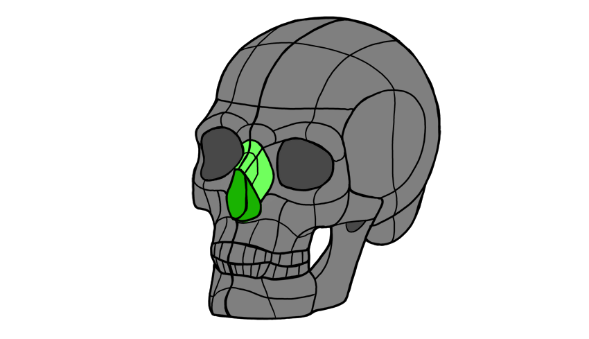
The nose consists of three parts: bone, cartilage, and connective tissue. Its upper half is all made of bone, an integral part of the skull:
The lower half is more complex and consists of:
Alar cartilage (the ball of the nose)
Lateral and septal cartilage
The ala (the wings of the nose made of connective tissue)
The nostrils (notice they’re made of two parts: the hole in the ball and in the wings)
The philtrum (the groove connecting the nose with the lips)
All these elements can be turned into a 3D form:
Once you understand what this form looks like, you can rotate it and reshape it to create a nose from imagination.
But it’s still not easy to remember! Let’s simplify it to something easier to draw:
The ball of the nose can be drawn as a sphere.
The wings can be drawn as two smaller spheres.
The septum can be drawn as a small sphere below the ball, behind it, and between the nostrils.
The bridge can be drawn in two parts, to symbolically separate the bone from the cartilage.
The tip of the nose is the upper part of the ball. You don’t always need to draw it, but it should be accentuated with shading. A great place to put some shine on!
The sides of the nose should blend with the rest of the face, but the shading should gently reveal their shape.
The root can be drawn as a „bent fan”.
2. Nose Shapes
This was a general „recipe” for a nose. But noses vary a lot among people! For example, we can talk about a „masculine” and a „feminine” nose. Traditionally, males are drawn with big, wide, roughly chiseled noses, and females with small, smooth, gentle ones.
However, this difference is mostly an artistic exaggeration (based on beauty standards and used to differentiate the „beautiful, feminine” characters from the „rough, masculine” ones) —both males and females can have various nose shapes that have nothing to do with their sex. It’s not unusual for a woman to have her father’s nose!
If you look at a nose in profile, there are lots of ways you can arrange the elements to create a nose. It can be pointing up or down, round or pointed, straight or humpy. There is not one perfect shape, „default” to all humans!
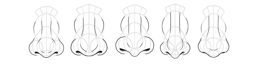
Noses can also differ in front view. Both the ball and the nostrils can have various sizes and proportions. Also, the nostrils can appear wide or tiny. Because the shape of a nose is mainly genetic, various ethnicities can have their own characteristic shape. Experimenting with the nose shape will therefore help you create unique characters, with a story hidden in their faces (you can make certain characters look related, or show their affiliation to a clan or tribe).
3. How to Draw a Nose in the Side View
Step 1
First, sketch the general shape of the nose as you imagine it. This will help you get an idea about the proportions of the elements you’ll need to draw later.
Step 2
Draw the ball in the front according to the shape you want to achieve.
Step 3
Draw the circle for the wing. Adjust its size to your vision.
Step 4
Draw the tiny circle for the septum. It should be placed slightly below the ball, at the back.
Step 5
Draw the nostril. Remember the two parts of it!
Step 6
Outline the bottom of the nose all the way down to the philtrum. „Cut” the upper part of the nose to create the root, and divide the rest roughly into halves.
Step 7
Outline the bridge and the tip.
Step 8
Draw the sides of the nose.
Step 9
Add the details.
Step 10
Draw the final lines and shade it, if you want to.
4. How to Draw a Nose in the Front View
Step 1
Sketch the general shape, adjusting the length and width of your imagined nose.
Step 2
Add the ball at the bottom.
Step 3
Sketch the circular wings.
Step 4
Add the small circle for the septum.
Step 5
Outline the nostrils. Remember that they’re 3D—they bend towards the front.
Step 6
„Cut off” the upper part of the nose to define the root. Mark the border between the two halves of the nose, too.
Step 7
Outline the bridge.
Step 8
Outline the sides.
Step 9
Add the details.
Step 10
Finish the drawing.
5. How to Draw a Nose in Perspective
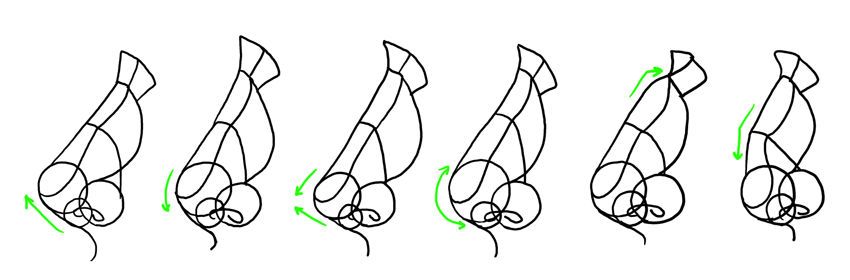
Although drawing in perspective is considered difficult, there’s actually one rule you need to remember here: rotation from side to front creates an intermediate state between them. So you need to draw all the elements as a transition between one state and the other.
Step 1
Sketch the general shape of the nose. It should be an intermediate shape between the side and the front, depending on the angle of rotation.
Step 2
Draw the ball. Notice it’s almost on the side, but not really.
Step 3
Draw the circular wings. In the side view, they would cover each other. In the front view, there would be a distance between them. Here we have a compromise between these two states.
Step 4
Add the septum. It still needs to be under the ball, behind it, and between the wings.
Step 5
Sketch the outline of the nostrils. Remember the 3D shape!
Step 6
Draw a line along the nose, accentuating its 3D form. „Cut off” the top to create the root, and mark the middle of the bridge.
Step 7
Draw the bridge.
Step 8
Draw the sides.
Step 9
Add the details.
Step 10
Finish the nose.
6. Nose Styles
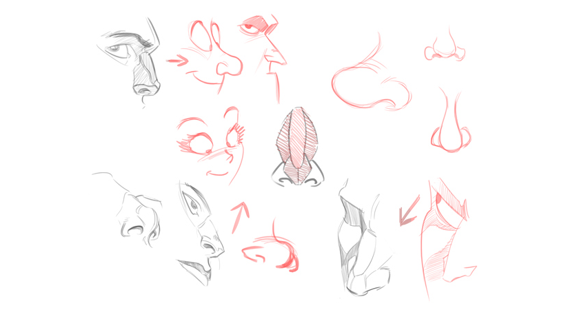
Drawing the nose in styles different than realism is pretty straightforward—you simply need to replace shading with lines. You can also ignore almost everything besides the ball, the wings, and the outline of the bridge. The simpler your style, the more elements you can safely ignore.
In cartoon styles, you can exaggerate visible elements of the nose. If the nose is pointed, you can make it almost sharp, if it’s small, you can make it tiny, and so on. This will let you accentuate the difference between the characters and will make drawing them easier.
In manga style, noses are almost non-existent, symbolic, which directly follows the simplification of other facial features (a detailed nose would bring attention to them being unrealistic). The simpler the variation of manga, the simpler the nose, with chibi being the extreme—no need to draw a nose at all!
Now you know how to draw a nose in any view and style you need! Do you want to learn more about drawing human characters? You may be interested in these tutorials, then:
If you live in Switzerland and read this blog, it’s about time we meet. On the 25th of April, there will be a good opportunity to meet at a talk I’ll be giving in Bern, at the Urbanfish coworking space.
For 45 minutes, I will give you an overview of the career paths that you can consider when working as a freelancer, followed by a short Q&A session. After that, drinks will be served and fun can start.
The talk
This is a talk you should attend if you are working as a freelancer or if you consider freelancing. I’ve been freelancing for 15 years now and I have experimented most ways to earn an income doing gigs, so I’ll be comparing freelancing careers and explain who should consider what path. For example, people who hate taking risks should not go full-time freelancer, but consider working part-time as an employee while freelancing on the side.
For each career path, I’ll be giving marketing advice. After all, the ultimate goal of freelancing is to make enough money to keep on going. Marketing yourself as a freelancer isn’t like marketing as a design studio, I will get into the differences to help you better focus on what works.
So if you are in Switzerland, don’t hesitate and attend the talk, I’ll be very happy to meet you there. You can register on the Swiss Tech Talks website.
Every week, we’ll give you an overview of the best deals for designers, make sure you don’t miss any by subscribing to our deals feed. You can also follow the recently launched website Type Deals if you are looking for free fonts or font deals.
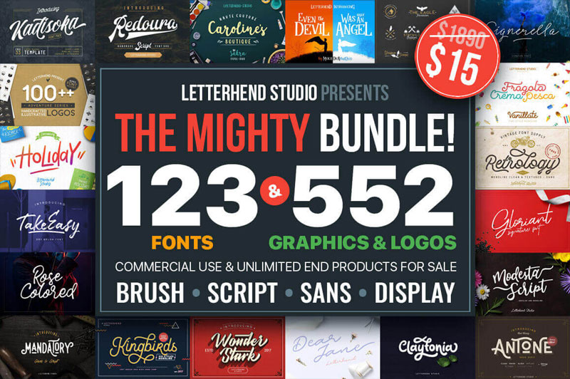
EXCLUSIVE: 123 Best-Selling Fonts & 552 Premium Graphics and Logos
A Mighty Deals Exclusive!!! You won’t find this designer’s dream of a deal anywhere else on the Web. Packed with pure professional pop, this Mighty Bundle is overflowing with more than 120 fabulous fonts and over 550 graphics and logo templates. From badges to ornaments to illustrations, and everything from modern script to watercolor brush style fonts, this collection is all you’ll need to whip up your latest projects.
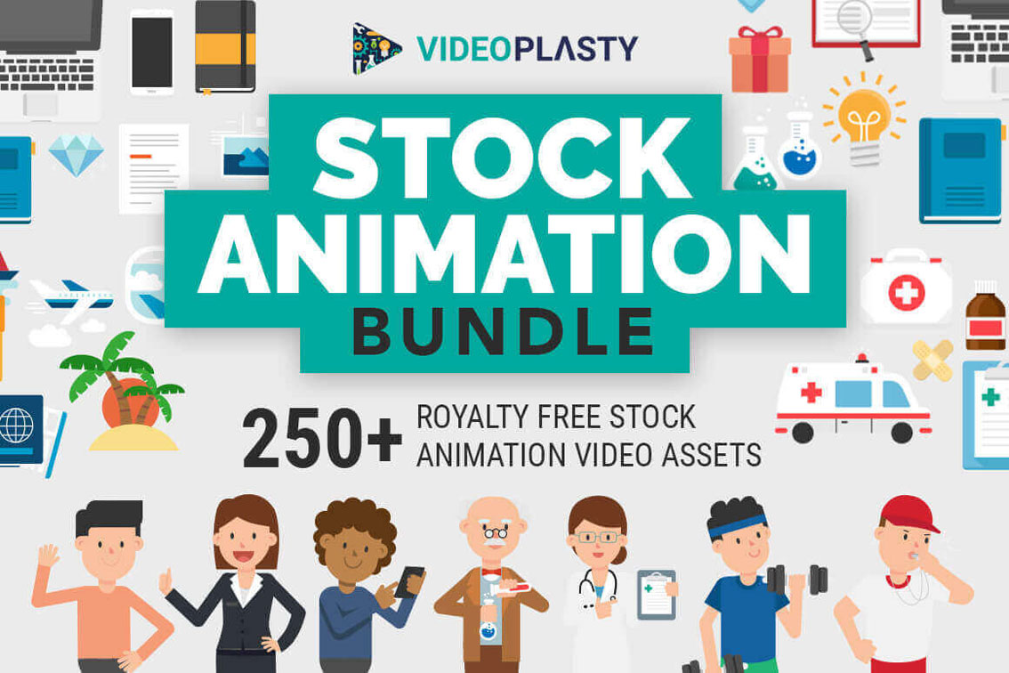
Create professional video animations in minutes with the VideoPlasty Stock Animation Bundle. With little to no experience required, with drag and drop simplicity! A huge library of more 250 premium quality stock animation video assets, basically our entire collection since launch!
The Love to Craft Bundle has arrived! It’s jam packed with popular Fonts, Monogram Frames, SVG’s cut files, Silhouettes, templates, digital papers and more.
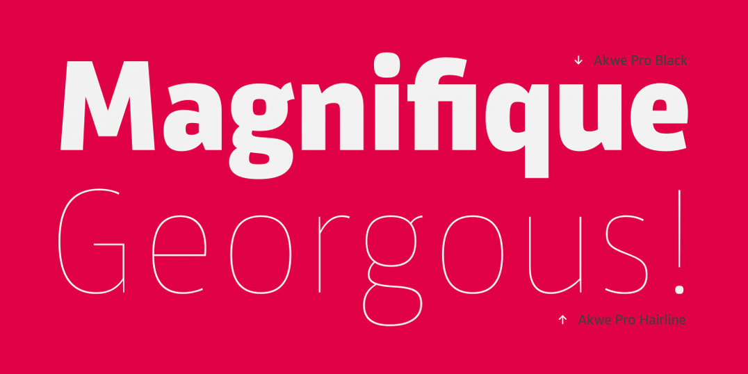
Professional. Versatile. Those are just two words to describe Akwe Pro. This professional, ultra versatile sans serif typeface sports a modern design with perfect legibility. Created for use in both short and long blocks of text, as well as headlines and user interfaces, this font family features more than 150 unique fonts that are just perfect for your latest branding challenge.
S&S Nickson Font Bundle of 15 Display, Script, Illustrations and More Typefaces
How would you like a collection of fonts that are strong enough to stand on their own, but creative enough to pair beautifully with one another? That’s exactly what you’ll get with the S&S Nickson Font Bundle Collection! Take home 15 different typefaces in a variety of creatively elegant styles including display fonts, script, illustrations, badges and more!
Let’s say I told you we can get the results below with just one HTML element and five CSS properties for each. No SVG, no images (save for the background on the root that’s there just to make clear that our one HTML element has some transparent parts), no JavaScript. What would you think that involves?
The desired results.
Well, this article is going to explain just how to do this and then also show how to make things fun by adding in some animation.
CSS-ing the Gradient Rays
The HTML is just one <div>.
<div class='rays'></div>
In the CSS, we need to set the dimensions of this element and we need to give it a background so that we can see it. We also make it circular using border-radius:
Here we keep the gaps in between rays equal to the rays (so that’s .5*$p for either a ray or a space), but we can make either of them wider or narrower. We want an abrupt change after the ending stop position of the opaque part (the ray), so the starting stop position for the transparent part (the gap) should be equal to or smaller than it. So if the ending stop position for the ray is .5*$p, then the starting stop position for the gap can’t be bigger. However, it can be smaller and that helps us keep things simple because it means we can simply zero it.
$nr: 20; // number of rays
$p: 100%/$nr; // percent of circle allocated to a ray and gap after

.rays {
  /* same as before */
  mask: repeating-conic-gradient(#000 0% .5*$p, transparent 0% $p);
}
Note that, unlike for linear and radial gradients, stop positions for conic gradients cannot be unitless. They need to be either percentages or angular values. This means using something like transparent 0 $p doesn’t work, we need transparent 0% $p (or 0deg instead of 0%, it doesn’t matter which we pick, it just can’t be unitless).
There are a few things to note here when it comes to support:
Edge doesn’t support masking on HTML elements at this point, though this is listed as In Development and a flag for it (that doesn’t do anything for now) has already shown up in about:flags. The Enable CSS Masking flag in Edge.
conic-gradient() is only supported natively by Blink browsers behind the Experimental Web Platform features flag (which can be enabled from chrome://flags or opera://flags). Support is coming to Safari as well, but, until that happens, Safari still relies on the polyfill, just like Firefox. The Experimental Web Platform features flag enabled in Chrome.
WebKit browsers still need the -webkit- prefix for mask properties on HTML elements. You’d think that’s no problem since we’re using the polyfill which relies on -prefix-free anyway, so, if we use the polyfill, we need to include -prefix-free before that anyway. Sadly, it’s a bit more complicated than that. That’s because -prefix-free works via feature detection, which fails in this case because all browsers do support mask unprefixed… on SVG elements! But we’re using mask on an HTML element here, so we’re in the situation where WebKit browsers need the -webkit- prefix, but -prefix-free won’t add it. So I guess that means we need to add it manually:
$nr: 20; // number of rays
$p: 100%/$nr; // percent of circle allocated to a ray and gap after
$m: repeating-conic-gradient(#000 0% .5*$p, transparent 0% $p); // mask

.rays {
  /* same as before */
  -webkit-mask: $m;
          mask: $m;
}
I guess we could also use Autoprefixer, even if we need to include -prefix-free anyway, but using both just for this feels a bit like using a shotgun to kill a fly.
Adding in Animation
One cool thing about conic-gradient() being supported natively in Blink browsers is that we can use CSS variables inside them (we cannot do that when using the polyfill). And CSS variables can now also be animated in Blink browsers with a bit of Houdini magic (we need the Experimental Web Platform features flag to be enabled for that, but we also need it enabled for native conic-gradient() support, so that shouldn’t be a problem).
In order to prepare our code for the animation, we change our masking gradient so that it uses variable alpha values:
And we animate it from the CSS using a keyframe animation:
.rays {
  /* same as before */
  animation: p .5s linear infinite alternate
}

@keyframes p { to { --p: #{$p} } }
The result is more interesting in this case:
Alternating ray size animation (live demo, only works in Blink browsers with the Experimental Web Platform features flag enabled).
But we can still spice it up a bit more by flipping the whole thing horizontally in between every iteration, so that it’s always flipped for the reverse ones. This means not flipped when --p goes from 0% to $p and flipped when --p goes back from $p to 0%.
The way we flip an element horizontally is by applying a transform: scalex(-1) to it. Since we want this flip to be applied at the end of the first iteration and then removed at the end of the second (reverse) one, we apply it in a keyframe animation as well—in one with a steps() timing function and double the animation-duration.
 $t: .5s;

.rays {
  /* same as before */
  animation: p $t linear infinite alternate,
    s 2*$t steps(1) infinite;
}

@keyframes p { to { --p: #{$p} } }

@keyframes s { 50% { transform: scalex(-1); } }
Now we finally have a result that actually looks pretty cool:
Alternating ray size animation with horizontal flip in between iterations (live demo, only works in Blink browsers with the Experimental Web Platform features flag enabled).
CSS-ing Gradient Rays and Ripples
To get the rays and ripples result, we need to add a second gradient to the mask, this time a repeating-radial-gradient().
$nr: 20;
$p: 100%/$nr;
$stop-list: #000 0% .5*$p, transparent 0% $p;
$m: repeating-conic-gradient($stop-list),
    repeating-radial-gradient(closest-side, $stop-list);

.rays-ripples {
  /* same as before */
  mask: $m;
}
Sadly, using multiple stop positions only works in Blink browsers with the same Experimental Web Platform features flag enabled. And while the conic-gradient() polyfill covers this for the repeating-conic-gradient() part in browsers supporting CSS masking on HTML elements, but not supporting conic gradients natively (Firefox, Safari, Blink browsers without the flag enabled), nothing fixes the problem for the repeating-radial-gradient() part in these browsers.
This means we’re forced to have some repetition in our code:
$nr: 20;
$p: 100%/$nr;
$stop-list: #000, #000 .5*$p, transparent 0%, transparent $p;
$m: repeating-conic-gradient($stop-list),
    repeating-radial-gradient(closest-side, $stop-list);

.rays-ripples {
  /* same as before */
  mask: $m;
}
We’re obviously getting closer, but we’re not quite there yet:
Intermediary result with the two mask layers (live demo, no Edge support).
To get the result we want, we need to use the mask-composite property and set it to exclude:
Note that mask-composite is only supported in Firefox 53+ for now, though Edge should join in when it finally supports CSS masking on HTML elements.
XOR rays and ripples (live demo, Firefox 53+ only).
If you think it looks like the rays and the gaps between the rays are not equal, you’re right. This is due to a polyfill issue.
Adding in Animation
Since mask-composite only works in Firefox for now and Firefox doesn’t yet support conic-gradient() natively, we cannot put CSS variables inside the repeating-conic-gradient() (because Firefox still falls back on the polyfill for it and the polyfill doesn’t support CSS variable usage). But we can put them inside the repeating-radial-gradient() and even if we cannot animate them with CSS keyframe animations, we can do so with JavaScript!
Because we’re now putting CSS variables inside the repeating-radial-gradient(), but not inside the repeating-conic-gradient() (as the XOR effect only works via mask-composite, which is only supported in Firefox for now and Firefox doesn’t support conic gradients natively, so it falls back on the polyfill, which doesn’t support CSS variable usage), we cannot use the same $stop-list for both gradient layers of our mask anymore.
But if we have to rewrite our mask without a common $stop-list anyway, we can take this opportunity to use different stop positions for the two gradients:
// for conic gradient
$nc: 20;
$pc: 100%/$nc;
// for radial gradient
$nr: 10;
$pr: 100%/$nr;
The CSS variable we animate is an alpha --a one, just like for the first animation in the rays case. We also introduce the --c0 and --c1 variables because here we cannot have multiple positions per stop and we want to avoid repetition as much as possible:
$m: repeating-conic-gradient(#000 .5*$pc, transparent 0% $pc) exclude,
    repeating-radial-gradient(closest-side,
        var(--c0), var(--c0) .5*$pr,
        var(--c1) 0, var(--c1) $pr);

body {
  --a: 0;
  /* layout, backgrounds and other irrelevant stuff */
}

.xor {
  /* same as before */
  --c0: #{rgba(#000, var(--a))};
  --c1: #{rgba(#000, calc(1 - var(--a)))};
  mask: $m;
}
The alpha variable --a is the one we animate back and forth (from 0 to 1 and then back to 0 again) with a little bit of vanilla JavaScript. We start by setting a total number of frames NF the animation happens over, a current frame index f and a current animation direction dir:
const NF = 50;

let f = 0, dir = 1;
Within an update() function, we update the current frame index f and then we set the current progress value (f/NF) to the current alpha --a. If f has reached either 0 of NF, we change the direction. Then the update() function gets called again on the next refresh.
(function update() {
  f += dir;

  document.body.style.setProperty('--a', (f/NF).toFixed(2));

  if(!(f%NF)) dir *= -1;

  requestAnimationFrame(update)
})();
And that’s all for the JavaScript! We now have an animated result:
Ripple alpha animation, linear (live demo, only works in Firefox 53+).
This is a linear animation, the alpha value --a being set to the progress f/NF. But we can change the timing function to something else, as explained in an earlier article I wrote on emulating CSS timing functions with JavaScript.
For example, if we want an ease-in kind of timing function, we set the alpha value to easeIn(f/NF) instead of just f/NF, where we have that easeIn() is:
function easeIn(k, e = 1.675) {
  return Math.pow(k, e)
}
The result when using an ease-in timing function can be seen in this Pen (working only in Firefox 53+). If you’re interested in how we got this function, it’s all explained in the previously linked article on timing functions.
The exact same approach works for easeOut() or easeInOut():
function easeOut(k, e = 1.675) {
  return 1 - Math.pow(1 - k, e)
};

function easeInOut(k) {
  return .5*(Math.sin((k - .5)*Math.PI) + 1)
}
Since we’re using JavaScript anyway, we can make the whole thing interactive, so that the animation only happens on click/tap, for example.
In order to do so, we add a request ID variable (rID), which is initially null, but then takes the value returned by requestAnimationFrame() in the update() function. This enables us to stop the animation with a stopAni() function whenever we want to:
 /* same as before */

let rID = null;

function stopAni() {
  cancelAnimationFrame(rID);
  rID = null
};

function update() {
  /* same as before */

  if(!(f%NF)) {
    stopAni();
    return
  }

  rID = requestAnimationFrame(update)
};
On click, we stop any animation that may be running, reverse the animation direction dir and call the update() function:
addEventListener('click', e => {
  if(rID) stopAni();
  dir *= -1;
  update()
}, false);
Since we start with the current frame index f being 0, we want to go in the positive direction, towards NF on the first click. And since we’re reversing the direction on every click, it results that the initial value for the direction must be -1 now so that it gets reversed to +1 on the first click.
The result of all the above can be seen in this interactive Pen (working only in Firefox 53+).
We could also use a different alpha variable for each stop, just like we did in the case of the rays:
In the update() function, the only difference from the first animated demo is that we don’t change the value of just one CSS variable—we now have four to take care of: --a0, --a1, --a2, --a3. We do this within a loop, using the ease-in function for the ones at even indices and the ease-out function for the others. For the first two, the progress is given by f/NF, while for the last two, the progress is given by 1 - f/NF. Putting all of this into one formula, we have:
(function update() {
  f += dir;

  for(var i = 0; i < 4; i++) {
    let j = ~~(i/2);

    document.body.style.setProperty(
      `--a${i}`,
      TFN[i%2 ? 'ease-out' : 'ease-in'](j + Math.pow(-1, j)*f/NF).toFixed(2)
    )
  }

  if(!(f%NF)) dir *= -1;

  requestAnimationFrame(update)
})();
The result can be seen below:
Multiple ripple alpha animations (live demo, only works in Firefox 53+).
Just like for conic gradients, we can also animate the stop position between the opaque and the transparent part of the masking radial gradient. To do so, we use a CSS variable --p for the progress of this stop position:
The JavaScript is almost identical to that for the first alpha animation, except we don’t update an alpha --a variable, but a stop progress --p variable and we use an ease-in-out kind of function:
/* same as before */

function easeInOut(k) {
  return .5*(Math.sin((k - .5)*Math.PI) + 1)
};

(function update() {
  f += dir;

  document.body.style.setProperty('--p', easeInOut(f/NF).toFixed(2));

  /* same as before */
})();
Alternating ripple size animation (live demo, only works in Firefox 53+).
We can make the effect more interesting if we add a transparent strip before the opaque one and we also animate the progress of the stop position --p0 where we go from this transparent strip to the opaque one:
In the JavaScript, we now need to animate two CSS variables: --p0 and --p1. We use an ease-in timing function for the first and an ease-out for the second one. We also don’t reverse the animation direction anymore:
const NF = 120,
      TFN = {
        'ease-in': function(k, e = 1.675) {
          return Math.pow(k, e)
        },
        'ease-out': function(k, e = 1.675) {
          return 1 - Math.pow(1 - k, e)
        }
      };

let f = 0;

(function update() {
  f = (f + 1)%NF;

  for(var i = 0; i < 2; i++)
    document.body.style.setProperty(`--p${i}`, TFN[i ? 'ease-out' : 'ease-in'](f/NF);

  requestAnimationFrame(update)
})();
This gives us a pretty interesting result:
Double ripple size animation (live demo, only works in Firefox 53+).
The team at Kapwing has collected a lot of images from the Internet Archive’s Wayback Machine and presented a history of how the homepage of popular websites like Google and the New York Times have changed over time. It’s super interesting.
I particularly love how Amazon has evolved from a super high information dense webpage that sort of looks like a blog to basically a giant carousel that takes over the whole screen.
Let’s check those steps one by one more thoroughly.
1. Mouse & Touch Events
To get the mouse or touch position, we first need to add event listeners on our SVG. We can use the Pointer Events to handle all kind of pointers (mouse/touch/stylus/…) but those events are not yet supported by all browsers. We will need to add some fallback to make sure all users will be able to drag the SVG.
// We select the SVG into the page
var svg = document.querySelector('svg');

// If browser supports pointer events
if (window.PointerEvent) {
  svg.addEventListener('pointerdown', onPointerDown); // Pointer is pressed
  svg.addEventListener('pointerup', onPointerUp); // Releasing the pointer
  svg.addEventListener('pointerleave', onPointerUp); // Pointer gets out of the SVG area
  svg.addEventListener('pointermove', onPointerMove); // Pointer is moving
} else {
  // Add all mouse events listeners fallback
  svg.addEventListener('mousedown', onPointerDown); // Pressing the mouse
  svg.addEventListener('mouseup', onPointerUp); // Releasing the mouse
  svg.addEventListener('mouseleave', onPointerUp); // Mouse gets out of the SVG area
  svg.addEventListener('mousemove', onPointerMove); // Mouse is moving

  // Add all touch events listeners fallback
  svg.addEventListener('touchstart', onPointerDown); // Finger is touching the screen
  svg.addEventListener('touchend', onPointerUp); // Finger is no longer touching the screen
  svg.addEventListener('touchmove', onPointerMove); // Finger is moving
}
Because we could have touch events and pointer events, we need to create a tiny function to returns to coordinates either from the first finger either from a pointer.
// This function returns an object with X & Y values from the pointer event
function getPointFromEvent (event) {
  var point = {x:0, y:0};
  // If event is triggered by a touch event, we get the position of the first finger
  if (event.targetTouches) {
    point.x = event.targetTouches[0].clientX;
    point.y = event.targetTouches[0].clientY;
  } else {
    point.x = event.clientX;
    point.y = event.clientY;
  }

  return point;
}
Once the page is ready and waiting for any user interactions, we can start handling the mousedown/touchstart events to save the original coordinates of the pointer and create a variable to let us know if the pointer is down or not.
// This variable will be used later for move events to check if pointer is down or not
var isPointerDown = false;

// This variable will contain the original coordinates when the user start pressing the mouse or touching the screen
var pointerOrigin = {
  x: 0,
  y: 0
};

// Function called by the event listeners when user start pressing/touching
function onPointerDown(event) {
  isPointerDown = true; // We set the pointer as down

  // We get the pointer position on click/touchdown so we can get the value once the user starts to drag
  var pointerPosition = getPointFromEvent(event);
  pointerOrigin.x = pointerPosition.x;
  pointerOrigin.y = pointerPosition.y;
}
2. Calculate Mouse Offsets
Now that we have the coordinates of the original position where the user started to drag inside the SVG, we can calculate the distance between the current pointer position and its origin. We do this for both the X and Y axis and we apply the calculated values on the viewBox.
// We save the original values from the viewBox
var viewBox = {
  x: 0,
  y: 0,
  width: 500,
  height: 500
};

// The distances calculated from the pointer will be stored here
var newViewBox = {
  x: 0,
  y: 0
};

// Function called by the event listeners when user start moving/dragging
function onPointerMove (event) {
  // Only run this function if the pointer is down
  if (!isPointerDown) {
    return;
  }
  // This prevent user to do a selection on the page
  event.preventDefault();

  // Get the pointer position
  var pointerPosition = getPointFromEvent(event);

  // We calculate the distance between the pointer origin and the current position
  // The viewBox x & y values must be calculated from the original values and the distances
  newViewBox.x = viewBox.x - (pointerPosition.x - pointerOrigin.x);
  newViewBox.y = viewBox.y - (pointerPosition.y - pointerOrigin.y);

  // We create a string with the new viewBox values
  // The X & Y values are equal to the current viewBox minus the calculated distances
  var viewBoxString = `${newViewBox.x} ${newViewBox.y} ${viewBox.width} ${viewBox.height}`;
  // We apply the new viewBox values onto the SVG
  svg.setAttribute('viewBox', viewBoxString);

  document.querySelector('.viewbox').innerHTML = viewBoxString;
}
If you don’t feel comfortable with the concept of viewBox, I would suggest you first read this great article by Sara Soueidan.
3. Save Updated viewBox
Now that the viewBox has been updated, we need to save its new values when the user stops dragging the SVG.
This step is important because otherwise we would always calculate the pointer offsets from the original viewBox values and the user will drag the SVG from the starting point every time.
function onPointerUp() {
  // The pointer is no longer considered as down
  isPointerDown = false;

  // We save the viewBox coordinates based on the last pointer offsets
  viewBox.x = newViewBox.x;
  viewBox.y = newViewBox.y;
}
4. Handle Dynamic Viewport
If we set a custom width on our SVG, you may notice while dragging on the demo below that the bird is moving either faster or slower than your pointer.
On the original demo, the SVG’s width is exactly matching its viewBox width. The actual size of your SVG may also be called viewport. In a perfect situation, when the user is moving their pointer by 1px, we want the viewBox to translate by 1px.
But, most of the time, the SVG has a responsive size and the viewBox will most likely not match the SVG viewport. If the SVG’s width is twice as big than the viewBox, when the user moves their pointer by 1px, the image inside the SVG will translate by 2px.
To fix this, we need to calculate the ratio between the viewBox and the viewport and apply this ratio while calculating the new viewBox. This ratio must also be updated whenever the SVG size may change.
// Calculate the ratio based on the viewBox width and the SVG width
var ratio = viewBox.width / svg.getBoundingClientRect().width;
window.addEventListener('resize', function() {
  ratio = viewBox.width / svg.getBoundingClientRect().width;
});
Once we know the ratio, we need to multiply the mouse offsets by the ratio to proportionally increase or reduce the offsets.
To make our code a bit shorter, there are two very useful concepts in SVG we could use.
SVG Points
The first concept is to use SVG Points instead of basic Javascript objects to save the pointer’s positions. After creating a new SVG Point variable, we can apply some Matrix Transformation on it to convert the position relative to the screen to a position relative to the current SVG user units.
Check the code below to see how the functions getPointFromEvent() and onPointerDown() have changed.
// Create an SVG point that contains x & y values
var point = svg.createSVGPoint();

function getPointFromEvent (event) {
  if (event.targetTouches) {
    point.x = event.targetTouches[0].clientX;
    point.y = event.targetTouches[0].clientY;
  } else {
    point.x = event.clientX;
    point.y = event.clientY;
  }

  // We get the current transformation matrix of the SVG and we inverse it
  var invertedSVGMatrix = svg.getScreenCTM().inverse();

  return point.matrixTransform(invertedSVGMatrix);
}

var pointerOrigin;
function onPointerDown(event) {
  isPointerDown = true; // We set the pointer as down

  // We get the pointer position on click/touchdown so we can get the value once the user starts to drag
  pointerOrigin = getPointFromEvent(event);
}
By using SVG Points, you don’t even have to handle transformations applied on your SVG! Compare the following two examples where the first is broken when a rotation is applied on the SVG and the second example uses SVG Points.
The second unknown concept in SVG we can use to shorten our code, is the usage of Animated Rect.
Because the viewBox is actually considered as an SVG Rectangle (x, y, width, height), we can create a variable from its base value that will automatically update the viewBox if we update this variable.
See how easier it is now to update the viewBox of our SVG!
// We save the original values from the viewBox
var viewBox = svg.viewBox.baseVal;

function onPointerMove (event) {
  if (!isPointerDown) {
    return;
  }
  event.preventDefault();

  // Get the pointer position as an SVG Point
  var pointerPosition = getPointFromEvent(event);

  // Update the viewBox variable with the distance from origin and current position
  // We don't need to take care of a ratio because this is handled in the getPointFromEvent function
  viewBox.x -= (pointerPosition.x - pointerOrigin.x);
  viewBox.y -= (pointerPosition.y - pointerOrigin.y);
}
And here is the final demo. See how much shorter the code is now? 😀
This solution is definitely not the only way to go to handle such behavior. If you are already using a library to deal with your SVGs, it may already have a built-in function to handle it.
I hope this article may help you to understand a bit more how powerful SVG can be! Feel free to contribute to the code by commenting with your ideas or alternatives to this solution.
We need to remove the background before using the flowers on the poster. To do this, on the Layers panel, Duplicate the Background layer by pressing Command-J and Hide the visibility of the original Background layer.
Step 3
While selecting the new layer on the Layers panel, click on the Vector Mask button to add a Layer Mask to Background copy.
Step 4
While selecting the new Layer Mask, use the Brush Tool (B). Reset the foreground/background colours by pressing D and X to switch between them. Use black as the foreground colorand paint over the image to erase the background.
Step 5
Once we have painted over with the Brush Tool, we can zoom in and work on the details. Tap the backslash key (\) to display a red overlay on the layer mask. This is useful to see if we are erasing the right parts on an image.
We should have something like this:
2. How to Set Up a New Document and Create Guides
Step 1
In Photoshop, go to File > New. Name the document Woman Up and set the Width to 1275 px and Height to 1650 px. I am using this composition as an online pamphlet, so I will be using 72 dpi. Click OK to create the document.
Step 2
Select the Background Layer and paint the layer using the Paint Bucket Tool (G) and black as the foreground colour.
Step 3
Activate the rulers by pressing Command-R. I am using inches—you can change this by going to Photoshop > Preferences > Units and Rulers.
Step 4
Click on the rulers and drag towards the page to create guidelines. I’ve set mine to 1 inch on each side. Hold Shift to drag the guideline to an even number.
3. How to Duplicate Layers
Step 1
We will duplicate the cleaned-up flower layer into the new file. To do so, select the layer Right Click > Duplicate Layer, under As: change the name to Flowers,and select Document > Woman Up. Click OK to continue.
Step 2
The flowers will appear larger than we need, so let’s resize by pressing Command-T while selecting the flowers layer. Head over to the options bar,on the Reference Point Location select the top left corner, and also select the Maintain Aspect Ratio icon. Change the Width to 30% and press Enter.
Step 3
Let’s centre the image on the poster by selecting the Background layer, pressing Shift, and clicking on the flowers layer. Head over to the options barand click on Align Vertical Centre. Then visually align the flowers layer to the poster.
4. How to Add Text Layers
Step 1
Bring up the Characters panelby going to Window > Character. Press T to add a new text layer. One the first layer, add a date, and on the second layer, add Woman Up.
Step 2
Select the text layers by holding Command and clicking on both. Let’s rotate these two layers vertically by pressing Command-T, head over to one of the corners until the rotation symbol appears, and hold down Shift to make an even rotation.
Step 3
We want to fill up the whole poster to create something with impact. Bring up the guides by pressing Command-;. Resize both text layers by pressing Command-T to fill the poster, vertically, from guide to guide. The goal is to have the title and date interact with the flower.
Step 4
Let’s add a website to balance the poster. I used Open Sans, at 25 pt, white in colour, and placed it in the top right corner, leaving about an inch margin. I used something different because Playfair Display is used, as its name suggests, for display settings and doesn’t read well in small sizes.
5. How to Add Mask Layers
Step 1
We want to create an illusion that the text is interwoven with the flowers. Let’s duplicate the flower layer by pressing Command-J and place it at the very top of our Layers panel.
Step 2
We want to work on the new flower layer and more specifically on the layer mask. Start by setting the Brush Tool (B) followed by Right-Click to a size of 30 px and Hardness of 100%.
You can interchange between black and white colours to hide or reveal parts of the image. Pressing X will interchange between these two colours, making it easier to work on the details.
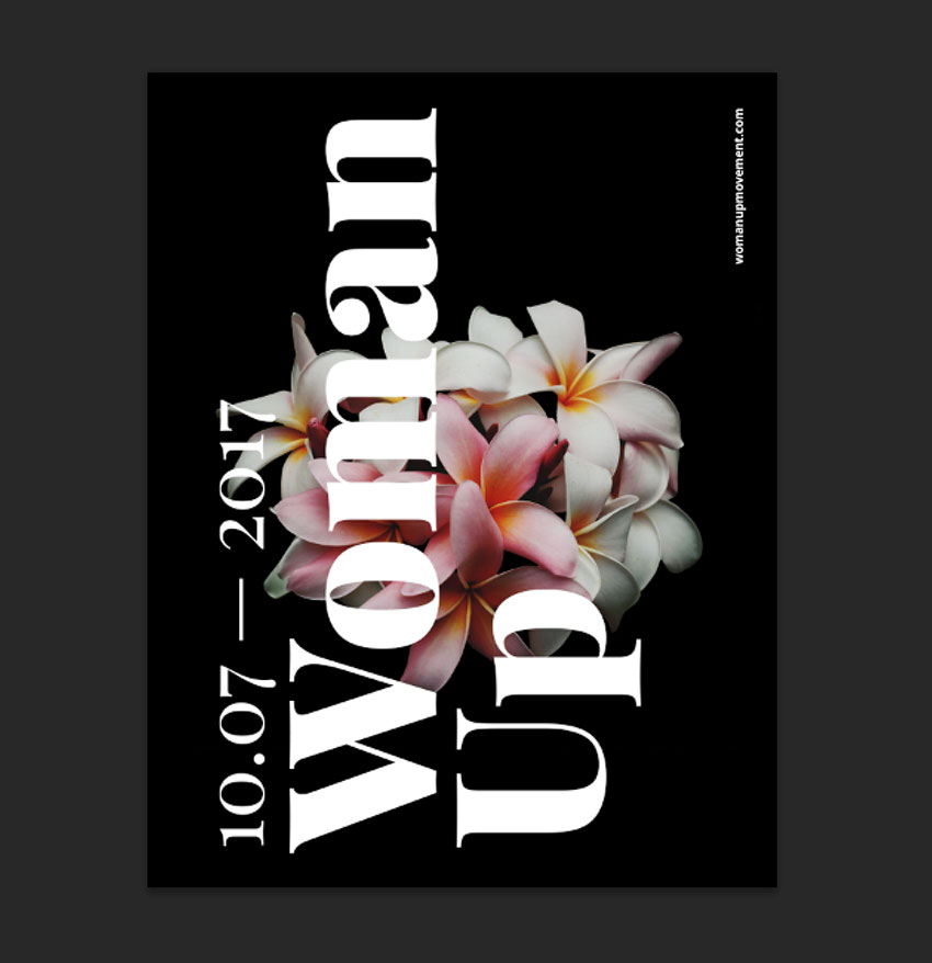
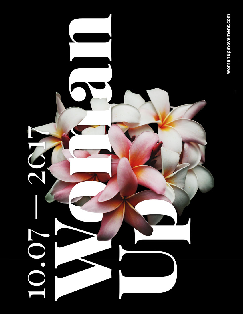
We also want to pay attention to the petals that are in the foreground and background for these to make sense in terms of what is covering the text and what is behind the text. The final file and layers should be looking like the image below:
Step 3
Do the same with the date on the very left.
6. How to Add Effects to a Text Layer
Step 1
To create a depth of field, we will add a Drop Shadow layer style to the main text. Select the Woman Up text layer on the Layers panel. Click on Effects > Drop Shadow.
Step 2
A Layer Style window will pop up, and you will notice that on our poster, the text will have a shadow. We want a softer look, so let’s change to the values in the image below and click OK.
Step 3
Our text layer now will have an “fx” symbol next to it. We want to copy the drop shadow effect onto the date text layer. Select the Woman Up text layer and Right click > Copy Layer Style. On the date text layer, Right click > Paste Layer Style. The layers and the image should be looking like the image below:
7. How to Add Adjustment Layers
Step 1
At the bottom of the Layers panel, click on Add Adjustment Layer > Brightness/Contrast.
Step 2
The Properties panel for this new layer will open. We want to add more contrast and some brightness to the image to make it stand out. I added the following values; Brightness:+15 and Contrast:+20.
8. How to Save the Poster as .PSD and for Web
Step 1
Click File > Save As to save the file as a .PSD to edit it later.
Step 2
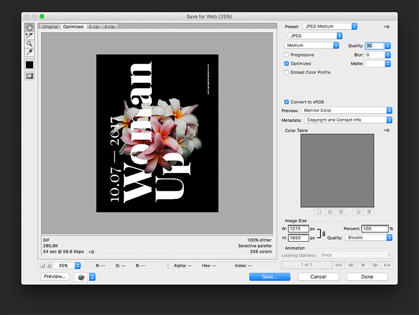
For a lower-resolution web jpeg and smaller file size, click File > Save for web (Shift-Option-Command-S). Here you can alter the quality of the image and the image size. Click on Save … and save the file.
Congratulations on Finishing This Tutorial!
We have covered an interesting skill for putting together typography poster that interacts with an image. Today we’ve learned to:
Use Layer Masks to hide and reveal parts of an image.
Use Adjustment Layers to add Brightness/Contrast to an image.
Format typography and use it in different directions to interact with the image.
Use the image’s levels of focus to our advantage to create a poster with depth.
Use Effects layers to add drop shadows to a text layer to create depth of field.
Want to warp some text? In this video from my course, 10 Essential Design Tips in Adobe Illustrator, you’ll learn all the ins and outs of distorting and warping text in Adobe Illustrator.
How to Warp Text in Adobe Illustrator
Prepare the Text for Warping
So we’re going to learn how to warp stuff. Let’s grab our Type Tool, left click anywhere on the artboard, and type some text. Let’s type „WARPED”. And we can go to the Character panel at the top, and we can pick a font—let’s go for Gotham Bold.
Then I’m going to go to the alignment options and select Align Center so that it’s in the middle. Now let’s create a couple of copies by holding Alt-Shift and dragging. So your screen should look like this:
Create a Bulge Effect
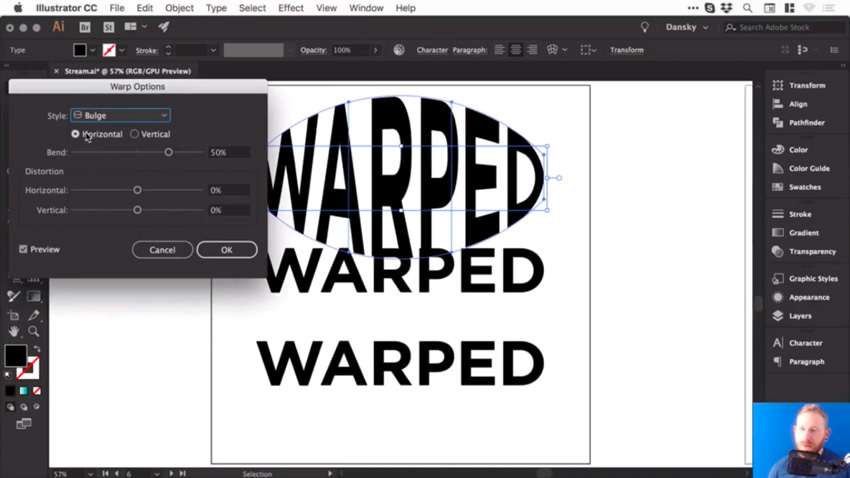
We’ll select the first piece of text, and go to Object > Envelope Distort > Make with Warp. We’ve got the Preview option checked, and we can choose the Style as well. There are lots of presets to choose from, so let’s go for Bulge, and see how that looks.
So at the moment, we are bulging this text horizontally, and we can adjust that Bend slider. So, of course, we can go up a few percent and you’ll see it starts to bulge outwards. Or we can go ever so slightly into the negatives and it will go inwards.
You could also bulge this vertically, so it’ll behave slightly differently. It really does depend what you’re going for.
Add Distortion
We could also distort this both horizontally and vertically, using the slider. So you could make one side appear larger by dragging the Horizontal Distortion slider to -100.
But let’s go for something more subtle. Choose the following values:
Horizontal Bend: -2%
Horizontal Distortion: -54%
Vertical Distortion: 25%
Then click OK, you can see that we’ve warped the text.
And if we click on it, we still have all of these options along the top, where you can change the preset and other values.
Adjust the Bulge Effect
Now, at the moment, if I press Command-Y to go into outline mode, you can see that it’s still got a box and lines around it, and I can’t change the fill color or anything.
So what I recommend is once you’ve done your warp, and you’re happy with your text, go to Object > Expand. Leave Object and Fill selected, click OK, and then we can switch into outline mode again, and you’ll be able to see your text.
Now remember, when you expand anything in Illustrator, essentially what you see becomes the paths of the shape. So this is now made up of lots of different anchor points, and we can go in and adjust these if we want to fine tune that warp.
But also, when we select it, it now has a fill color, and we can easily change it if we want to.
Create an Arc Effect
So let’s go and warp something else.
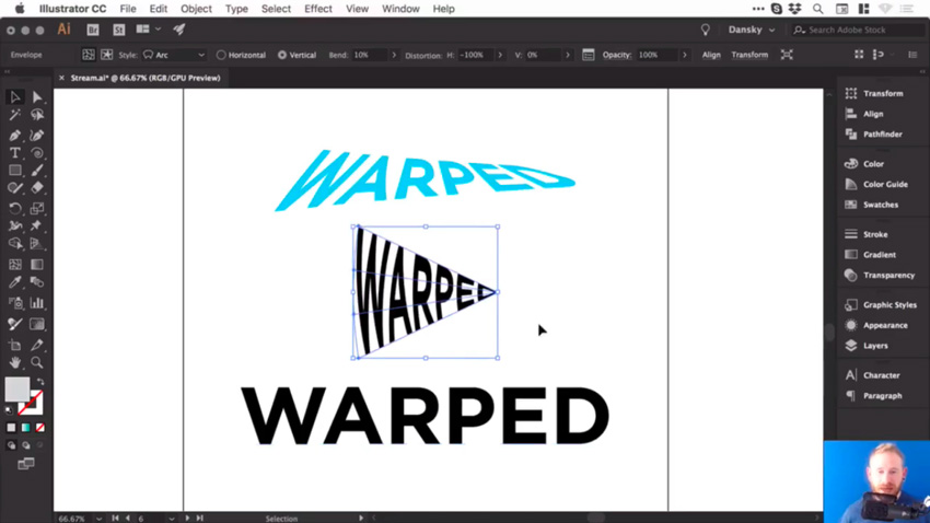
Click on the second piece of text and, as before, go to Object > Envelope Distort > Make with Warp. This time, for the Style, let’s choose Arc. So we’ll set the Distortion back to 0, and then we can bend this up or down, and of course, you can adjust the Bend to Vertical as well.
Let’s try these settings:
Vertical Bend: -72%
Horizontal Distortion: -100%
Vertical Distortion: 0%
And it should look like this:
Adjust the Arc Effect
Once you’re happy with your warp, and you’d like to start adding color to it, or possibly getting creative and adding some strokes or brushes, you can go to Object > Expand. Leave Object and Fill selected, click OK, and now we can get creative with this.
Let’s add some brushes. We’ll start by swapping the fill and the stroke, so we now have an outline. And from the Brushes panel, let’s choose a pencil brush with an orange color.
So those are a few ways to warp text in Illustrator, and now I’ll leave you to go and have a lot of fun experimenting with them.
Watch the Full Course
In the full course, 10 Essential Design Tips in Adobe Illustrator, you’ll learn about ten essential design tips to help you bring your creative ideas to life in Adobe Illustrator. You’ll master a variety of different techniques, helping you to boost your creativity and transfer your ideas to a digital canvas.
You can take this course straight away with a subscription to Envato Elements. For a single low monthly fee, you get access not only to this course, but also to our growing library of over 1,000 video courses and industry-leading eBooks on Envato Tuts+.
Plus you now get unlimited downloads from the huge Envato Elements library of 490,000+ creative assets. Create with unique fonts, photos, graphics and templates, and deliver better projects faster.
Agregator najlepszych postów o designie, webdesignie, cssie i Internecie










 DrawingHuman Anatomy Fundamentals: Basics of the FaceJoumana Medlej
 IllustrationHuman Anatomy Fundamentals: Advanced Facial FeaturesJoumana Medlej
 DrawingHuman Anatomy Fundamentals: Mastering Facial ExpressionsJoumana Medlej
 Human AnatomyHuman Anatomy Fundamentals: Drawing Characters ConsistentlyJoumana Medlej
 DrawingHow to DrawMonika Zagrobelna
 Drawing100 Easy Drawing Tutorials for Beginners and Beyond!Monika Zagrobelna