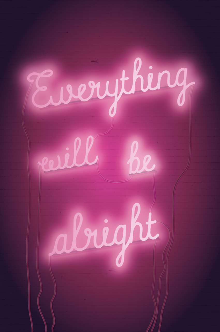
Everyone needs a bit of optimism in their lives, and this neon sign poster is the perfect pick-me-up. Pop it on the office noticeboard, set it as your phone background, or share it on social media to spread the good vibes.
We’ll create the poster layout in Adobe InDesign and prepare the design for either printing or online circulation. This is a great all-round introduction to graphic poster design for beginners.
1.How to Prepare Your InDesign Document for Designing
Step 1
Open InDesign and go to File > New > Document.
With the Intent set to Print, deselect Facing Pages.
Set the Width of the page to 24 in and Height to 36 in. Keep the Margins to their default width, and add a Bleed of 0.25 in to all edges of the page. Then click OK.
Step 2
Expand the Layers panel (Window > Layers). Double-click on Layer 1 to rename the layer Brick, and click OK.
Choose New Layer from the panel’s top-right menu. Name this second layer Wires and click OK. Create a further two new layers: Backs and then Neon.
Lock all layers except the bottom layer, Brick.
Step 3
Expand the Swatches panel (Window > Color > Swatches). Choose New Color Swatch from the panel’s top-right menu.
Name the swatch Deep Pink, and set the Color Type to Process and Color Mode to CMYK. Set the levels below to C=10 M=100 Y=0 K=16. Click Add, and then OK.
Repeat the process to create five more new CMYK swatches, with the following names and values:
Hot Pink: C=10 M=100 Y=0 K=0
Pale Pink: C=5 M=12 Y=0 K=0
Shadow: C=88 M=95 Y=50 K=74
Dark Pink: C=10 M=100 Y=0 K=38
Maroon: C=39 M=97 Y=40 K=55
2. How to Create a Brick Backdrop for Your Poster
Step 1
Working on the Brick layer, use the Rectangle Frame Tool (F) to create an image frame over the top half of the page, extending the edge up to the bleed.
Go to File > Place, navigate to the brick wall image you downloaded earlier, and Open.
Allow the brick texture to fill the frame completely.
Select the image frame and Edit > Copy, Edit > Paste. On the copy, Right-Click > Transform > Flip Vertical.
Move the copy below, covering the bottom half of the page and creating a solid brick texture across the whole page.
Step 2
In the Swatches panel, click on New Gradient Swatch in the panel’s drop-down menu.
Name the swatch Background Pink Gradient, set the Type to Radial, and choose Swatches from the Stop Color menu.
On the Gradient Ramp, set the left-hand stop to Deep Pink and the right-hand stop to Shadow. Click on the ramp to add a third stop in the center, setting this to Maroon.
Step 3
Use the Rectangle Tool (M) to create a shape across the whole page, setting the Fill (from the Swatches panel) to Background Pink Gradient.
With the rectangle selected, head up to Object on the main menu, and Effects > Transparency. Set the Mode to Multiply and reduce the Opacity to 90%, before clicking OK.
3. How to Create Neon Type on Your Layout
Step 1
Lock the Brick layer and unlock the top layer, Neon.
Use the Line Tool (\) to draw a slightly diagonal line across the top half of the page, as shown below.
Step 2
Select the Type on a Path Tool (Shift-T) and click once on the left side of the line, to transform it into a text path.
Type in ‘Everything’. Highlight the text and, from either the top Controls panel or the Character panel (Window > Type & Tables > Character), set the Font to Balham to Brooklyn and Font Size to 450 pt.
Step 3
Switch to the Selection Tool (V, Escape) and select the line. From the Swatches panel, set the Stroke Color to [None].
Switch back to the Type Tool (T), highlight the text, and set the Font Color to Hot Pink.
Step 4
With the line selected, head up to Object > Effects > Outer Glow.
Click on the colored square next to the Mode menu, and choose Hot Pink for the Effect Color.
Set the Opacity of the glow to 80% and Spread to around 40%, before clicking OK.
Step 5
Select the line and Edit > Copy, Edit > Paste, moving the copy below. Adjust the text to read ‘will’ and reduce the Font Size a little.
Edit > Paste the line again, editing this text to read ‘be’ and moving it over to the bottom-right of ‘will’, as shown below.
Paste again, moving this copy to the bottom of the group, and adjusting the text to read ‘alright’. Increase the Font Size a little.
Step 6
Select all four text lines and Right-Click > Group.
With the group selected, Edit > Copy and Edit > Paste in Place.
Adjust the Font Color of this pasted group to Pale Pink.
Step 7
With the pasted Pale Pink group selected, go to Object > Effects > Transparency. Set the Mode to Screen and Opacity to 70%.
Click on Drop Shadow in the menu’s left-hand menu. Set the Effect Color to Hot Pink and pull down the Opacity to around 40%.
Click on Outer Glow in the left-hand menu. Set the Effect Color to Pale Pink and bring the Opacity down to around 65%.
Finally, click on Gradient Feather at the bottom of the menu. Set the Type to Radial, and click OK to exit the window.
Step 8
Edit > Paste in Place to drop another group of text lines onto the page. We’ll use this copy as a highlight, to give the text effect some extra glow.
Set the Mode to Screen and bring the Opacity down to 50%.
Click on Outer Glow in the panel’s menu, and set the Effect Color to Pale Pink. Set the Opacity to around 55%, add about 10% Noise, and set the Spread to 40%.
Click OK to exit.
4. How to Add Wires and Backs to Your Neon Sign
To make your sign look more realistic, we can add trailing wires and ‘backs’ behind the words.
Step 1
Lock the Neon layer and unlock the Wires layer.
Use the Pencil Tool (N) to draw an imperfect line from the edge of the ‘a’ of ‘alright’ down past the bottom edge of the page.
Use the Smooth Tool to stroke over the line, smoothing out any jaunty edges to the line.
From the Stroke panel (Window > Stroke), set the Weight of the line to 12 pt.
Then adjust the Stroke Color of the line to Maroon.
Step 2
Use the Pencil Tool (N) to draw more lines leading from the outlying edges of each word, trailing down to the bottom of the page. Repeat the same Stroke Weight and Color as described in the step above.
Add a few looped lines between the words in the center of the layout, setting the Stroke Color to Dark Pink, to indicate the increased amount of light at the center of the poster.
Select all the pencil-drawn ‘wires’ on the poster, and go to Object > Effects > Drop Shadow.
Set the Effect Color to Hot Pink, bring the Opacity down to around 65%, and add about 20% Noise.
Click on Inner Glow, and set the Opacity to around 40%. Then click OK.
Step 3
Lock the Wires layer and unlock the Backs layer above.
Use the Line Tool (\) to create a line under the baseline of the top word, ‘Everything’. Set the Stroke Color of the line to Shadow and set the Weight (from the Stroke panel) to 11 pt.
Edit > Copy, Edit > Paste the line, shortening it to fit under ‘will’. Repeat two more times, placing copies of the line under ‘be’ and ‘alright’.
Step 4
Select all four lines sitting under the words, and go to Object > Effects > Drop Shadow.
Set the Effect Color to Dark Pink, Opacity to 75%, Spread to 27% and Noise to 15%.
Click OK to exit the window. Then step back and admire your hard work!
With your artwork now finished, you can export your poster to a print- or online-friendly format. Go to File > Export, and choose Adobe PDF (Print) from the Format menu for a press-ready file. To share your poster online, choose PNG, JPEG or Adobe PDF (Interactive) from the Format options.
Conclusion
Your neon sign poster is finished—great job!
In this tutorial we’ve covered a wide range of skills for creating poster work and special typographic effects. You now know how to:
Create a moody gradient backdrop for your posters.
Format advanced neon text effects by building up layers of type.
Create a ‘lit-up’ effect by adjusting glows, gradients, transparencies, and shadows.
Add extra photorealistic details, like wires and backs, using InDesign’s drawing tools.
If you’re on the hunt for more poster designs, a poster template is a quick and easy-to-edit alternative. You can find tons of fantastic event, infographic and motivational posters over on GraphicRiver and Envato Elements.
Looking for more poster tutorials? Make sure to check these out:
2018 marks a hundred years since women won the right to vote in Britain, due to the remarkable efforts of the suffragist movement. This poster design takes…
Tackle a fun photo manipulation inspired by old Western wanted posters. In this tutorial, I’ll show you how to create the poster design itself before nailing…
Whether you’re planning to host your own festival event or looking for inspiration to help with a design project, these top design tips will help you create…
When I saw Chris’ article on notched boxes, I remembered that I got a challenge a while ago to CSS a design like the one below in a cross-browser manner:
What the challenge looked like.
It looks pretty similar to the concept of notched boxes, except the corners are now scooped and we only have to worry about one corner per box. So let’s see how we can do it, how we can expand the technique to multiple corners, what issues we run into and how we can get around them with or without making browser support compromises.
The initial idea: box-shadow!
We start with a box element:
<div class='box'></div>
We can give this some dimensions or let its dimensions be decided by the content—it doesn’t really matter. For simplicity, we’re just setting a max-width and a min-height on it. We’re also giving it an outline so we can see its boundaries.
Next, we absolutely position a square ::before pseudo-element whose edge length is equal to the diameter (or twice the radius $r) of the scoop in the corner. We also give this pseudo-element a reddish box-shadow and a dummy background (that we’ll remove later) just so that we can see it better:
$r: 2em;

.box {
  position: relative;
  /* same styles as before */

  &:before {
    position: absolute;
    padding: $r;
    box-shadow: 0 0 7px #b53;
    background: #95a;
    content: ''
  }
}
Well, it doesn’t look too exciting… yet! So let’s move on and make this square a disc by setting border-radius: 50% on it and give it a negative margin equal to its radius $r, so that its central point coincides with the (0,0) point (top left corner) of its parent box. We also set overflow: hidden on the parent box, so that whatever of this pseudo-element is outside the .box gets cut out.
$r: 2em;

.box {
  overflow: hidden;
  /* same styles as before */

  &:before {
    /* same styles as before */
    margin: -$r;
    border-radius: 50%
  }
}
Now we’re starting to see the shape we’ve been aiming for:
But it’s still not quite what we want. In order to get there, we use the fourth length value for the box-shadow property: the spread radius. If you need a refresher on how box-shadow works with these four values, you can check out the interactive demo below:
You may have already guessed what we do next. We remove the dummy background, we zero the first three box-shadow values (the x and y offsets and the blur radius) and use a pretty big number for the last one (the spread radius):
box-shadow: 0 0 0 300px;
The interactive demo below shows how increasing the spread radius makes it cover up more and more of its parent .box:
So, the trick here is having a spread radius sufficiently large so that it covers the rest of the parent element. The cool thing about this is that we can make the box-shadow semi-transparent or have rounded corners on the parent .box:
.box {
  /* same styles as before */
  border-radius: 1em;

  &:before {
    /* same styles as before */
    box-shadow: 0 0 0 300px rgba(#95a, .75);
  }
}
Of course, just like Chris pointed out in the article on notched boxes, we can make the scoop radius a CSS variable and then easily modify that from the JavaScript. Then everything updates nicely, even with text content in our box:
:root { --r: 50px }

.box {
  /* same styles as before */
  padding: var(--r);

  &:before {
    /* same styles as before */
    margin: calc(-1*var(--r));
    padding: inherit;
}
Note that when we also have text content, we need to set a negative z-index on the ::before pseudo-element and explicitly position it in the corner as we now also have a padding on the .box to compensate for the scoop.
.box {
  /* same styles as before */

  &:before {
    /* same styles as before */
    z-index: -1;
    top: 0;
    left: 0
}
Now, let’s move further and see how we can apply this concept in order to reproduce the design I showed at the beginning. In this particular case, the central points of the pseudo-element discs don’t coincide with box corners, but are outside, in the middle of the space in between boxes.
The structure used is pretty straightforward, just a <header> element followed by four <article> elements I’ve generated in a Pug loop:
while n--
  article
    h3 #{data[n].name}
    section
      p #{data[n].quote}
      a(href='#') go
We use a wrapping flexbox layout on the <body> with the <header> really wide and with one or two <article> elements on each row, depending on how wide the viewport is.
Landscape (left) vs. portrait (right) mode.
If we have a single <article> on each row, we don’t have scooped corners, so their radius is 0px. Otherwise, we give this radius --r a non-zero value.
$min-w: 15rem; /* min width of an article element */
$m: 1rem; /* margin of such an element */

html { --r: 0px; }

article {
  margin: $m;
  min-width: $min-w;
  width: 21em;
}

@media (min-width: 2*($min-w + 2*$m) /* enough for 2 per row */) {
  html { --r: 4rem; }

  article { width: 40%; }
}
Let’s now consider just the situation when we have two <article> elements per row (and of course a scooped corner for each because that’s what’s of interest to us).
In the case of the first one, we start with the leftmost limit of the disc along the right edge of its parent. That’s left: 100% so far. To move the x coordinate of the disc’s central point on the right edge of its parent, we subtract the disc’s radius, which brings us to left: calc(100% - var(--r)). But we don’t want it on the right edge, we want it offset to the right by the <article> margin $m, which brings us to the final value:
Along the y axis, we start with the topmost limit of the disc along the bottom edge of its parent—that’s top: 100%. To put the disc’s central point on the bottom edge of the parent box, we move it up by one radius, which gives us top: calc(100% - var(--r)). Finally, we want this central point to be $m below the parent’s bottom edge, which gives us the final vertical offset of:
Horizontally however, we start with the disc’s left limit being along its parent’s left edge—that’s left: 0%. To put the disc’s central point on its parent’s left edge, we move it left by a radius --r, thus getting left: calc(0% - var(--r)). However, the final position is $m to the left of the parent’s left edge:
Vertically, we start with the disc’s top limit along the top edge of its parent—that’s top: 0%. To put the disc’s central point on the parent’s top edge, we move it up by a radius --r, thus getting top: calc(0% - var(--r)). But we want to have it $m above the parent’s top edge, so the final top offset is:
For the final one (second on the last row), we have the same horizontal offset as in the case of the one above it and the same vertical offset as for the one to its left on the same row.
This means the positions of the central points of the discs depend on the gap in between our <article> elements (this gap is twice the margin: $m we set on them), on the disc radius r and on a couple of horizontal and vertical multipliers (--i and --j respectively). Both these multipliers are initially -1.
For the first two <article> elements (on the first row of the 2x2 grid), we change the vertical multiplier --j to 1 because we want the y coordinate of the discs’ central points to be below the bottom edge, while for the odd ones (on the first column), we change the horizontal multiplier --i to 1 because we want the x coordinate to be to the right of the right edge.
html { --i: -1; --j: -1 } /* multipliers initially set to -1 */

h3, section {
  &:before {
    /* set generic offsets */
    top:  calc((1 + var(--j))*50% - var(--r) + var(--j)*#{$m});
    left: calc((1 + var(--i))*50% - var(--r) + var(--i)*#{$m});
  }
}

@media (min-width: 2*($min-w + 2*$m)) {
  article {
    /* change vertical multiplier for first two (on 1st row of 2x2 grid) */
    &:nth-of-type(-n + 2) { --j: 1 }

    /* change horizontal multiplier for odd ones (on 1st column) */
    &:nth-of-type(odd) { --i: 1 }
}
Note that we only have visible disc cutouts on the <section> element for the first two <article> elements and only on the <h3> for the last two. So for the first two <article> elements, the radius --r on the heading’s ::before pseudo-element is 0, while for the last two, this radius is 0 for the section’s ::before pseudo:
The above demo works in current versions of all major browsers and, if we can do with some repetition instead of using CSS variables, we can extend support all the way back to IE9.
Potential issues with the above method
While this was a quick and easy cross-browser way to get the desired result in this particular case, we may not always be so lucky with this approach.
First off, we need a pseudo-element for each scooped corner, so if we want this effect for all corners, we need to bring in an extra element. Sad panda.
Secondly, we may not always want a solid background. We may want a semi-transparent one (which becomes a pain to get if we want to have more than one scooped corner), a gradient one (while we can emulate some radial gradients with box-shadow, it’s a less than ideal solution) or even an image background (hardly doable with the only solution being to use mix-blend-mode which cuts out Edge support without an elegant fallback).
And how about really large boxes for which the spread we’ve set is not enough? Ugh.
So, let’s explore other, more reliable approaches with various degrees of browser support.
Flexibility and good browser support? SVG it!
This is probably no surprise, but the full SVG solution fares best if we want something flexible and reliably cross-browser today. It’s a solution that involves using an SVG element before the content of our box. This SVG contains a <circle> on which we’ve set a radius r attribute.
<div class='box'>
  <svg>
    <circle r='50'/>
  </svg>
  TEXT CONTENT OF BOX GOES HERE
</div>
We absolutely position this SVG within the box and size it such that it fully covers its parent:
Alright, but what we’ve done here is create circles in the corners and what we actually want is… the exact opposite! What we do next is put these circles within a <mask>, on top of a white, full-size (covering the whole SVG) rectangle and then we use this mask on another full size rectangle:
If we have text, we need to adapt the box padding to our corner radius, setting the it to the same value as we’ve set the radius of the SVG circle, using JavaScript to keep them in sync:
Of course, the fill of our background rectangle doesn’t need to be a solid one. It may well be semi-transparent (as it is in the demo above), or we can use an SVG gradient or pattern for it. The latter would also allow us to use one or more background images.
Well, glad you asked! There are a number of things we can do here to shift the weight of the masking method from SVG to CSS.
Sadly, none of these is cross-browser, but they simplify things and they’re definitely something to keep a watch for in the near or more distant future.
Use CSS masking on HTML elements instead
What we do here is remove everything outside the mask from the SVG. Then, from the CSS, we set a background (which can be semi-transparent, a CSS gradient, an image, a combination of multiple backgrounds… anything that CSS has to offer) and the mask property on the .box element:
.box {
  /* any kind of background we wish */
  mask: url(#m);
}
Note that setting an inline SVG mask on an HTML element only works in Firefox for now!
Version using CSS masking directly on our .box (live demo, Firefox only).
Set the circle radius from the CSS
This means removing the r attribute from our <circle> and setting it in the CSS to the same variable as the box padding:
This way, when we change the value of --r, both the scoop radius and the padding around the .box content get updated!
Note that setting geometry properties for SVG elements from the CSS only works in Blink browsers for now!
Version using a CSS variable for the <circle> radius (live demo, Blink only).
Combine the previous two methods
While this would be cool, it’s sadly not possible in practice in any browser at the moment. But the good news is we can do even better than that!
Use CSS gradients for masking
Note that CSS masking on HTML elements doesn’t work at all in Edge at this point, though it’s listed as „In Development” and a flag for it (that doesn’t do anything for now) has already shown up in about:flags.
We ditch the SVG part completely and start building our CSS gradient mask. We create the circles at the corners using radial gradients. The following CSS creates a circle of radius --r in the top left corner of a box:
.box {
  /* same as before */
  /* any CSS background we wish */
  mask: radial-gradient(circle at 0 0, #000 var(--r, 50px), transparent 0);
}
Note that WebKit browsers still need the -webkit- prefix for the mask properties.
We then add the circles at the other corners:
$grad-list: radial-gradient(circle at   0    0 , #000 var(--r, 50px), transparent 0),
            radial-gradient(circle at 100%   0 , #000 var(--r, 50px), transparent 0),
            radial-gradient(circle at   0  100%, #000 var(--r, 50px), transparent 0),
            radial-gradient(circle at 100% 100%, #000 var(--r, 50px), transparent 0);
.box {
  /* same as before */
  /* any CSS background we wish */
  mask: $grad-list
}
That’s insanely repetitive, either a lot of writing or a lot of copy-pasting, so let’s see what we can do about that.
First off, we use a CSS variable for the stop list. This eliminates repetition in the generated CSS.
$grad-list: radial-gradient(circle at   0    0 , var(--stop-list)),
            radial-gradient(circle at 100%   0 , var(--stop-list)),
            radial-gradient(circle at   0  100%, var(--stop-list)),
            radial-gradient(circle at 100% 100%, var(--stop-list));

.box {
  /* same as before */
  /* any CSS background we wish */
  --stop-list: #000 var(--r, 50px), transparent 0;
  mask: $grad-list;
}
But it’s still not much better, so let’s generate the corners within a loop:
$grad-list: ();

@for $i from 0 to 4 {
  $grad-list: $grad-list,
    radial-gradient(circle at ($i%2)*100% floor($i/2)*100%, var(--stop-list));
}

.box {
  /* same as before */
  /* any CSS background we wish */
  --stop-list: #000 var(--r, 50px), transparent 0;
  mask: $grad-list;
}
Much better as far as the code goes because now we don’t have to write anything multiple times and run the risk of not updating everywhere later. But the result so far isn’t what we were going for:
Result of the code above (live demo, no Edge support for now).
Here, we’re cutting out everything but the corners, which is the opposite of what we want.
One thing we can do is reverse the gradients, make the corner circles transparent and the rest black with:
--stop-list: transparent var(--r, 50px), #000 0;
This does the trick when we use just one gradient for just one corner:
Result when using just one gradient (live demo, no Edge support for now).
However, when we stack up all four of them (or just even two), we get a black rectangle the size of our box for the mask, which means nothing actually gets masked out anymore.
Layering mask gradients (live demo, no Edge support for now).
So, we restrict each of these gradients to a quarter of our box – 50% of the width and 50% of the height, thus getting 25% (a quarter) of the area for each:
This means we also need to set a mask-size of 50% 50%, a mask-repeat of no-repeat, and position each mask-image into the desired corner:
$grad-list: ();

@for $i from 0 to 4 {
  $x: ($i%2)*100%;
  $y: floor($i/2)*100%;
  $grad-list: $grad-list
              radial-gradient(circle at $x $y, var(--stop-list)) /* mask image */
              $x $y; /* mask position */
}

.box {
  /* same as before */
  /* any CSS background we wish */
  --stop-list: transparent var(--r, 50px), #000 0;
  mask: $grad-list;
  mask-size: 50% 50%;
  mask-repeat: no-repeat;
}
Note that WebKit browsers still need the -webkit- prefix for mask properties.
But the big problem here is… the problem with division and rounding in general—our four quarters put together don’t always manage to make up a whole again, so we end up with gaps in between them.
Sadly, we may get gaps in between the four quarters (live demo).
Oh well, it’s not like we can’t cover up those gaps with thin linear-gradient() strips or increase the mask-size to let’s say 51%:
Increasing the mask-size for each gradient layer fixes the problem of gaps (live demo).
But isn’t there a more elegant way?
Well, there’s a mask-composite property that can help us if we set it to intersect when reverting back to the full size gradient layers.
$grad-list: ();

@for $i from 0 to 4 {
  $grad-list: $grad-list,
              radial-gradient(circle at ($i%2)*100% floor($i/2)*100%, var(--stop-list));
}

.box {
  /* same as before */
  /* any CSS background we wish */
  --stop-list: transparent var(--r, 50px), #000 0;
  mask: $grad-list;
  mask-composite: exclude;
}
This is extremely cool because it’s a pure CSS, no SVG solution, but the not-so-good news is that support is limited to Firefox 53+ here.
Result using mask-composite: intersect (live demo).
However, it’s still better than support for the final option we have when it comes to scooped corners.
The corner-shape option
Lea Verou came up with this idea some five years ago and even created a preview page for it. Sadly, not only is it not implemented by any browser yet, but the spec hasn’t advanced much in the meanwhile. It’s still something to keep in mind for the future, as it offers a lot of flexibility with very little code – recreating our effect would only require the following:
There have long been multiple implementations of Sass. Most notably, the canonical Ruby version, now at 3.5.6. Then there is LibSass, the C++ version, which is at version 3.4 and…
Current LibSass 3.4 should be compatible with Sass 3.4.
LibSass is notable because it powers the majority of Sass ports. Over 30 of them, apparently, including the most popular one: node-sass, which provides Sass for the bajillion projects out there that wanna run an npm-y JavaScript-based dev environment and avoid the Ruby dependency.
It’s a little unfortunate LibSass isn’t up-to-date with current canonical Sass, but I think it’s on freeze as it’s been stated that LibSass will never be canonical Sass. Update: it’s not on freeze. It was actually Ruby Sass that was once on freeze with the intention of allowing LibSass to catch up. As I write, LibSass is at 3.5.2, so it’s close.
Dart Sass just went 1.0.0, and is now 100% compatible with Ruby Sass 3.5.6. They announced that Ruby Sass has now begun deprecation and—after March 26th, 2019—will no longer be maintained.
The future of Dart Sass looks pretty good:
Another big announcement: as of today, I'm working full-time on @SassCSS. This has been a goal for my entire career and I'm thrilled that it's finally happening
The Dart Sass compatibility is also great, because node-sass can now switch to Dart Sass bindings and become entirely up to date. Will it? I have no idea. The maintainer of LibSass and node-sass is the same person (Michael Mifsud), and with 30+ bindings to LibSass, I can’t imagine LibSass just going away. I guess we’ll just have to wait and see a while. I gotta imagine someone will jump on making a node version of Dart Sass one way or another.
I, for one, would love to see a Web Worker version.
In this course, Melody Nieves will show you how to create three separate double exposure effects using Adobe Photoshop. You’ll start off by learning essential tips for creating effective end results, before moving on to each project.
By the end, you’ll have three high-quality results featuring cityscape, duotone, and surreal-inspired concepts.
Watch the Introduction
Take the Course
You can take our new course straight away with a subscription to Envato Elements. For a single low monthly fee, you get access not only to this course, but also to our growing library of over 1,000 video courses and industry-leading eBooks on Envato Tuts+.
Plus you now get unlimited downloads from the huge Envato Elements library of 490,000+ creative assets. Create with unique fonts, photos, graphics and templates, and deliver better projects faster.