How to Create a Dark-Themed Fashion Image in Adobe Photoshop

Post pobrano z: How to Create a Dark-Themed Fashion Image in Adobe Photoshop
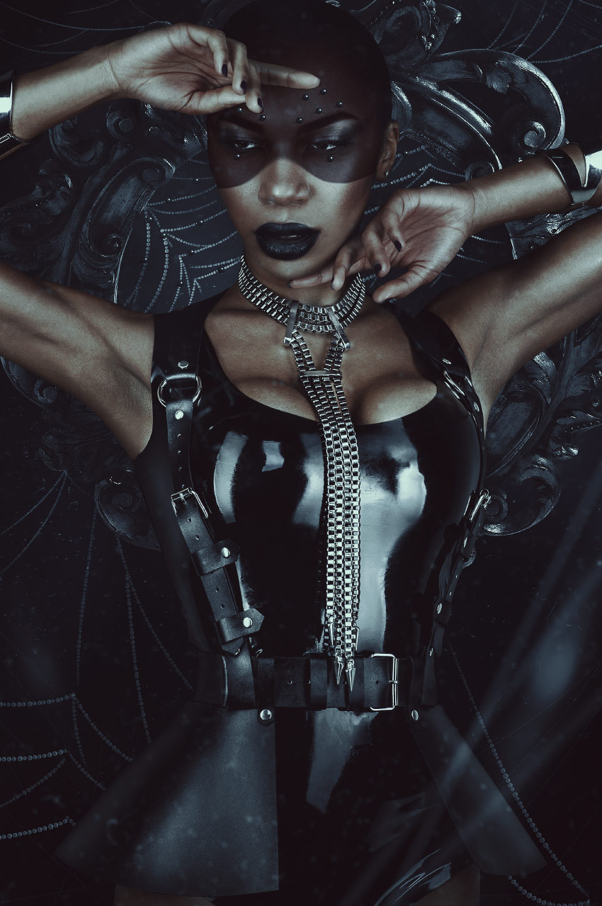
Final product image
What You’ll Be Creating

Today we will be exploring the darker side of fashion by creating a latex-clad spider woman! We will create our own spider-web brush using simple shapes, create our own bead detailing from scratch, and use textures to add both depth and detail. 

Hopefully, you aren’t afraid of spiders because here we go!   

Tutorial Assets

Here are the resources we will be using: 

Find more high-quality resources on Envato Elements!

1. How to Create a Dusty Background 

To start, we will be creating a background for our subject. A dark and dusty environment sounds fitting for a spider, don’t you think? 

Step 1

Let’s create a New 2287 x 3440 px Canvas.

Create a Color Fill Layer and fill it with a very dark blue #000308.

Place texture „07” from the Dust and Hair Particles texture pack so that it is flipped vertically and the exact size of our canvas. 

To increase the contrast, go to Image > Adjustments > Brightness/Contrast. Settings: Contrast: 63

Set the texture to Screen with a 73% Opacity. 

Add texture

Step 2

Create a New Layer and set it to Overlay. 

Using a very large, soft round Brush, paint black on both the bottom and the left side of the canvas.

Create another New Layer and, with the same brush as before, paint white on the middle and top portion of the canvas. 

Add lighting

Step 3

To finish up the background, we are going to add some simplified spider webs. These aren’t our main spider webs, just some extra background detail, so don’t overthink them!

Create a New Layer.

Using a hard 1-2 px Brush, paint white strings coming from all four corners of the canvas, painting in a large „swooping” motion.  

Group all of the background layers together, naming it „Background.”

Current layers

2. How to Add Our Subject to the Background

Next up, we are going to place our subject in its newly created environment! 

Step 1 

First, we are going to extract our subject, which is our Woman in Black Latex.

As the subject has no difficult cloth, clothing or hair to extract, feel free to use whichever method you prefer! I personally favor the Pen Tool. 

Resize and place the subject so that she is roughly in the same position as you see below, directly in the middle of our canvas.

Place model

Step 2

Add an Inner Shadow Layer Style to the subject. Settings:

Inner shadow settings

Step 3

Now, we will be changing our subject’s lipstick to a dark black color. 

Create and clip a Black to White Gradient Map Layer into our subject. Click on the Layer Mask and hit Control-I to invert it, turning it black. 

Using a medium, hard round Brush, paint white over the top of the lips to mask back in the black and white gradient map. 

Blacken lips

Step 4 

Create and clip a Brightness/Contrast Layer into the subject. Settings: Brightness -83 and Contrast 23.

Copy the gradient map’s layer mask onto the Brightness/Contrast Layer to darken the lips. 

Darken lips

Step 5

Now, let’s extract our Round Wood Mirror Frame. Again, use your preferred method! I used the Magic Wand Tool since the image is on a nice, crisp, white background.

Place the frame directly behind the subject.

Place wood frame

Step 6

Create and clip a Gradient Map into the wooden frame. Settings:  

Gradient map settings
  1. #000000
  2. #1b1b1b
  3. #2f2f2f
  4. #a7a7a7
  5. #ffffff

Step 7

Add an Inner Shadow Layer Style to the now black frame. Settings: 

Inner shadow settings

Step 8

Group all of the main subject and frame layers together, naming it „Model”. We will be using this group to help make our shadows. 

Duplicate the „Model” group and Right-Click > Merge Group. 

Go to Image > Adjustments > Hue/Saturation. Settings: Lightness -100.

Add some blur to the shadow by going to Filter > Blur > Gaussian Blur. Settings: 50 px. 

Move and morph the shadow up and to the left using the Warp Mode in the Free Transform Tool.

Current layers

3. How to Create a Moody, Dark Color Grading

Now on to the mood lighting! Usually, I would save this for the end, but the color change is so drastic in this image that I think it’s worth doing it sooner. 

Do note that this group of layers will always be above all other layers. All layers from here on out will be located under these five adjustment layers. 

1. Color Lookup Layer: (3dLUT) FoggyNight at 60% Opacity

2. Color Lookup Layer: (3dLUT) Moonlight at 47% Opacity. Blend If: Hold Alt to separate and move toggles.

Blend if settings
First set of adjustment layers

3. Color Lookup Layer: (3dLUT) Kodak 5205 at 70%

4. Selective Color: (Reds) Cyan -100, Magenta +56 and Yellow +63 

Second set of adjustment layers

5. Curves Layer:

Curves settings

Group all of the adjustment layers together and name the group „CC” or „Color Correction.”

Current layers

4. How to Create a Spider-Web Brush in Photoshop 

Now, there are plenty of premade spider-web brushes and textures; however, they are so fun to paint by hand! So we are going to create our very own brush from scratch. 

Step 1

For the base of our brush, we will be creating a water droplet shape. Create a New 300 x 300 px Document. Make sure the background is white. 

Using the Ellipse Tool, create a black 45 x 45 px circle with an 80% Opacity and a 40% Fill.

create a circle

Step 2

Add a black Inner Glow Layer Style. Settings:

Inner glow settings

Next, add a black Inner Shadow. Settings: 

Inner shadow settings
Brush base

Step 3

Create a New Layer above the circle. Using a small, soft round Brush, paint a crescent moon shape on the upper-left part of the circle. 

Merge the layers together and give the merged layer a very slight Filter > Blur > Gaussian Blur. Settings: Amount 1 px.

That was just so our brush isn’t too sharp. Very few things in the world have a hard, crisp edge, so don’t be afraid to blur things a bit!

Crop the canvas down so that it is the exact size of our droplet. 

Crop brush

Go to Edit > Define Brush Preset, naming the brush „droplet.”

Step 4

Now that we have our brush made, we need to set up its settings. Open up the Brush panel and select our new brush. 

Open up the Brush Settings panel. Settings:

  • Brush Tip Shape Spacing: 116%
  • Shape Dynamics Size Jitter: 25% Transfer: Checked
Brush settings

Hit the Create New Brush button in the lower right-hand corner of the Brush Settings panel in order to save a new brush with these settings.

If we didn’t do this, we would have to redo the brush settings every time we selected this brush. 

Step 5

Finally, we get to use our brush! Create a New Layer below our „Model” group.

Select our new brush and set the Size to 15 px. However, keep in mind we will be changing the size as we paint our webs. 

Paint strands of white web in a swooping motion. If your lines are shaky, try increasing the brush’s Smoothing to 30–50%. This will help keep your lines steady. Just paint slowly if you are using a mouse.

Make some strands slightly thicker than others, and use a large, soft round Brush to erase some of the edges of the strands to create a tapering effect. 

Paint spider webs

Step 6

Create a New Layer and paint smaller webs towards the bottom of the subject and top of the frame. Make these strands less prominent than the ones around the head of the subject. 

Paint lower spider webs

Duplicate the web layers to increase their brightness. Just erase any part of the webs you don’t want to be brightened.  

Group all of the web layers together, naming the group „Webs.”

Current layers

5. How to Design a Set of Abstract Spider Eyes

Next, we will be designing an abstract version of spider eyes with the use of self-made beads and a nifty face-painting technique that can be used in multiple different ways in any color you may need! 

Step 1

First, we will be adding a layer of face paint to our subject’s face. Create a New Group and add a Layer Mask to it. Name the group „Face Paint.”

Hit Control-I to Invert the mask.

Create a selection around the subject’s face similar to what you see below. I used the Pen Tool, but you can use whichever way you feel most comfortable with!

create selection

Step 2

Fill in the selection with white. Create a Black to White Gradient Map and place it into the group. The group’s mask will act as a layer mask for all adjustment layers that are placed within it. 

black and white gradient map

Step 3

Create a Brightness/Contrast Layer, also placing it into the group, above the gradient map. Settings: Brightness -116 and Contrast 65.

Create a Color Balance Layer, placing it above both the B/C and gradient map layers. Settings: Red +46, Green -25, Blue -34.

Using a soft round Brush, mask out the eyes, using the group mask. 

add two adjustment layers

Step 4

Now, we will be creating our „spider eye” beads. Create a black circle using the Ellipse Tool. 

create black circle

Step 5

Create a New Layer and clip it into the black circle. 

Using a small, soft round Brush with a 5% Flow, paint a white crescent moon shape onto the right side of the bead. 

Build up the white slowly and concentrate the white in the middle of the curve of the moon shape. 

Add a small white radial gradient shape, using a slightly bigger brush size, over the moon shape as well. 

create highlight

Step 6

Duplicate the black circle and smush it down horizontally, bringing it to the bottom of our bead. 

Bring the Opacity down to 30% to create the bead’s shadow. 

add shadow

Step 7

Group all three bead layers together into a group and name it „Bead.”

Duplicate the group and Right Click > Merge Group. 

Place the beads all over the upper face. You can do it similarly to how I have done it, or create your own pattern! 

create multiple beads

Step 8

Place beads behind our subject, onto the spider webs, as well. 

Group all of the copied bead layers, of which there will be quite a few, naming the group „Beads Copies.”

Create some highlights using either an Overlay Layer or a Curves Adjustment Layer. 

Final layers

6. Adding the Final Touches

We are in the final stretch! We just have a couple more dust and web details to add, bringing her dark and dusty environment to life. 

Step 1 

Place another copy of the „07” texture from the dust texture pack right below our „CC” group, again flipping it vertically.

Set the texture to Screen.

Step 2

Go to Filter > Blur > Shape Blur and set the settings to what you see below: 

Shape blur settings

Enlarge the texture so that the dust particles look closer and out of focus. 

Step 3

Using the Line Tool, create a few diagonal lines coming from the bottom-right corner of the canvas.

Make them slightly random, not perfectly side by side. 

Create white lines

Step 4

Add a Filter > Blur > Motion Blur. Settings: -72 Angle and 85 Distance. 

This will give the lines a nice out-of-focus effect. Experiment with different blur filters! I tend to prefer a shape or motion blur to make objects look out of focus rather than a Gaussian blur, for instance.  

Group these two new layers together, naming the group „Details.”

We’ve Done It! 

Sometimes making our own resources seems daunting, but it can be as easy as combining some simple shapes and stringing them together! Learning how to use basic tools, instead of solely relying on premade resources, gives you the ability to create without restriction. 

It’s not about how many resources you have, but instead how well you know your base set of tools with which you can create those resources yourself. 

And as always, share your art down below, along with any comments or questions! 

Finished result

Typography trends to look out for this year

Post pobrano z: Typography trends to look out for this year

The internet is constantly changing and evolving. As a result, it is important to stay dynamic.  As a graphic designer, you’ll know that trends change and what works well and converts for your clients one month will be different the next.  We need to be aware of the trends that are emerging, and those that are fading out.  This is especially true with typography because it often forms the basis of our projects.

It’s helpful to know that typography trends don’t simply emerge out of nowhere.  Instead, they slowly grow, flowing through the different design niches.  Eventually, as they become more and more popular, these trends reach the mainstream.  This is why in order to predict the big trends of 2018, it is helpful to look at the growing influences which shaped 2017.

Some of these trends are exciting and will bring changes into the design industry.  As we’ve become familiar with the trends of the past few years, something new can only bring vitality.

Let’s take a look at the trends emerging for this year!

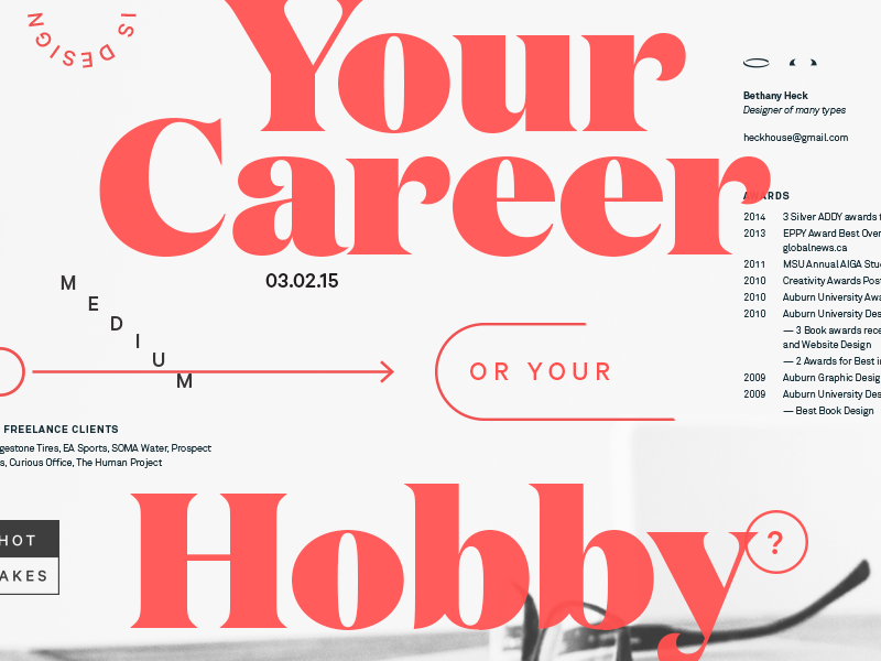
The return of the serif

After the cleanly lined minimalism of the past couple of years, it’s time for serifs!  Serifs are warm and retro, bringing up images of the 1970s.  This offers up an alternative to the commonly used Helvetica, which has dominated the digital design market.

Chaotic and creative

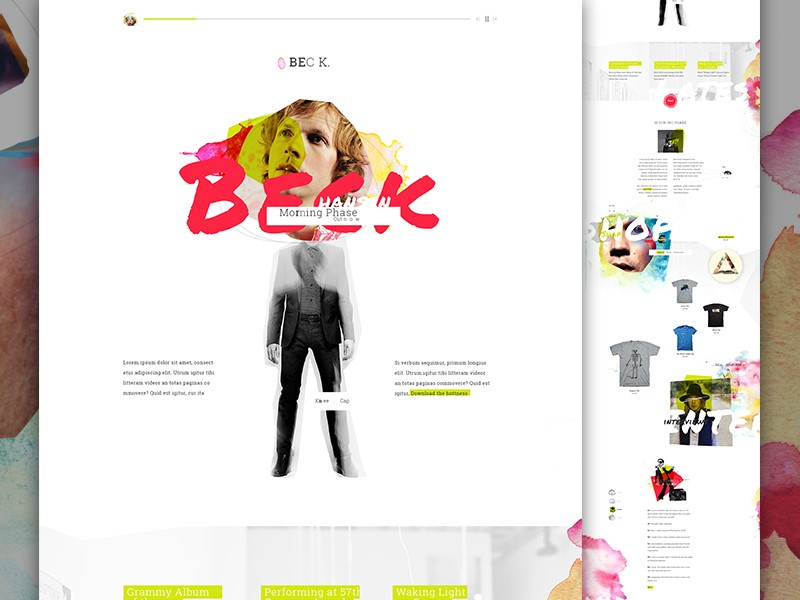
Minimalism has dominated the design field over the last couple of years.  However, the trend is moving to chaotic designs which offer broken elements and juxtapositions.  Although this may seem confusing or even overwhelming, it actually engages the viewer.

Using typography in this way offers a sense of creativity, creating interest for the viewer. Viewers often spend a great deal of time exploring these unconventional sites, which results in a higher conversion rate.

Overlays and cutouts

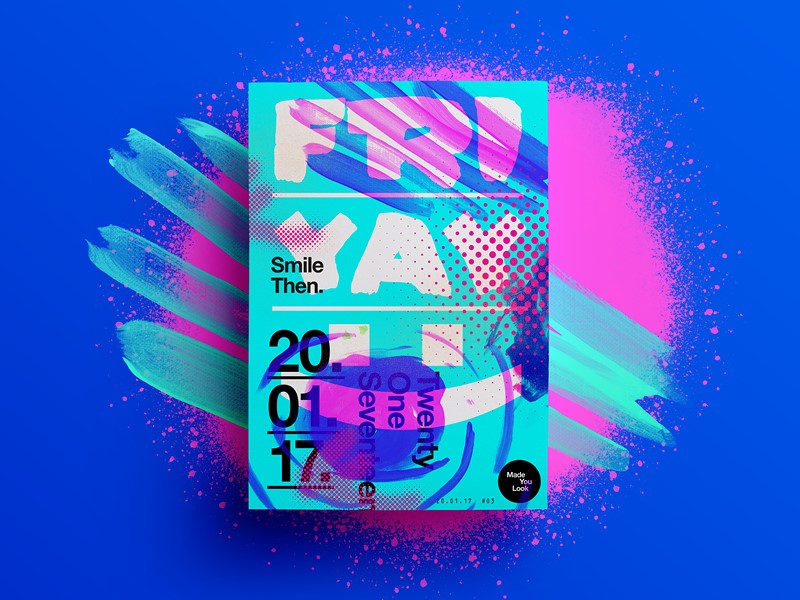
Overlays and cutouts are beginning to emerge as a new trend which hasn’t taken over 2018 yet.  These trends are bright and vibrant, offering a unique approach to web design.

Designers are using animation, striking photography or parallax backgrounds.  Sometimes these vivid images overlay the text.  Other times they are used in the background.  After the flat design trend of recent years, this new method of working brings the site alive.

Highlights

This new trend is reminiscent of the schoolroom.  Designers are using colored fonts or underlying specific words in order to draw attention to a message.  This technique is currently being used in both headlines and body text. Many sites are starting to use typography to catch viewer’s attention.

In the past, designers have often used striking illustrations to call attention to a message.  The new trend is to use different typographic techniques.  This new trick draws on a sense of nostalgia and is rapidly emerging as a popular choice.

Variable fonts

In the past, designers had a couple of choices when it came to fonts.  We could make our fonts bold or italic or keep them light.

Now though, there is a range of different options which enable us to add weight to a page.  Fonts can now be given different weights and axes.  This allows us to customize our pages, bringing a unique and creative edge to our designs.

Hand drawn lettering

The creative touch of hand-drawn lettering returns again and again to our web designs.  This unique approach to design is expanding from simple handwriting into hand-drawn letters.  Hand drawn fonts are being offered as a unique option for headers and logos.

When thinking of the popularity of Disney, Coca-Cola or the New York Times, it’s easy to see how a well-designed font can bring identity to a brand.  This one of a kind creation is shaping a new trend in typography.

This is especially relevant with all the Arabic fonts that you see in the media lately and their hand drawn style.

Gradients

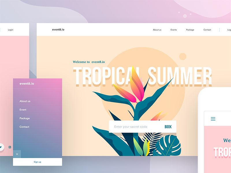
Gradients have been an emerging web trend in recent years.  This movement was made popular by Instagram, which incorporated a gradient into their logo background.  The design community cheered, and gradients became a new trend.

However, this trend is no longer limited to backgrounds.  Designers are beginning to use gradients within the lettering itself.  This is a new trend which is emerging for 2018.  Using gradient in lettering depends on the size of the font you use.  It can be used to create a 3D effect, or more simply add a sense of style or flair to typography.

Background gradients are changing too and moving towards color transitions rather than simple shading.  Combining gradients in background and typography will keep you on top of the trend for 2018.

Maximalism

This trend is all about creating a bold and attention-grabbing font which is large and shouts out to viewers.  This trend offers something new when compared to the subtle use of the font in recent years.

However, it still doesn’t turn its back on the minimalist trend.  The style is still clean-lined and the page remains uncluttered.  This trend is the new maximalist – minimalist step for webpage design.

Hiding content

This new trend can be very effective when done well.  It sounds counter-intuitive, but designers are now starting to hide some of their content, while still keeping the page legible and easy to read.  This trend is all about cutting out letters (or parts of letters) while ensuring your viewer can still read or scan the content.

This trend can be hard to master.  If used badly, it can prevent your viewer from reading your content.  It can also make your site look neglected and very unattractive.  However, when used well, it is a creative way to add interest to your site.  And it just works.

Off-kilter kerning

Kerning creates spaces between lettering that makes your page easy to read.  Traditionally, kerning makes the spacing between letters uniform and adds symmetry to your page.  However, new trends are shaking this up.  More space is being added between letters to create a clean and open feeling on the page.

This new technique widens the distance between letters in order to create an easy, relaxed feeling to your site.  As a result, viewers often remain engaged and spend a leisurely amount of time on your site.

Clean-lined and geometric typography

This is a new, modern typeface which is starting to emerge across the web.  Totally clean-lined and without serifs, geometric fonts are useful for sites which focus on science, technology, and engineering.  This font uses single lines and rounded circles to create a futuristic feel.

This font style adds sophistication to a website.  Legible and easy to digest, this is a popular choice for logos and headers.  It can also be used for business cards.  2018 presents the opportunity for geometric fonts to move into mainstream design.

Handwritten fonts

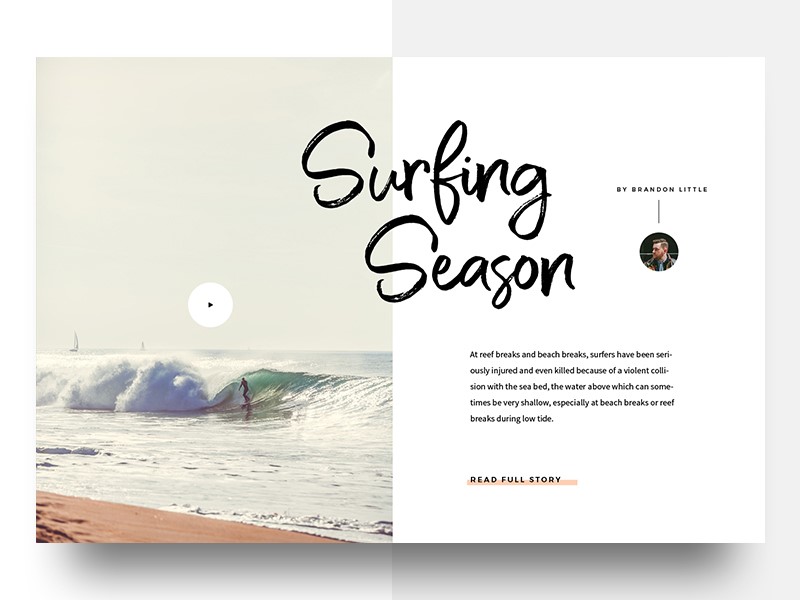
Handwritten fonts give a personal touch to a site.  These fonts are taking on new elements in 2018 however.  Instead of simply representing a handwritten script, they are now incorporating the appearance of brush strokes.  Although still personal and unique, these fonts evoke memories of sign writing.

Handwritten scripts range from offering feminine flourish to masculine scrawl.  We can see this trend feature strongly in 2018.  Movie posters, invitations, business cards and logo design will all incorporate this unique look

Watercolor

Watercolor has been emerging as a recent web trend.  Recently, however, it has been incorporated into the new movement towards handwritten fonts.  Typography now gives the appearance of being written using watercolor paint.

Although this font doesn’t bring an edge to your site, it does have feminine flourish.  Watercolor offers a unique and personal touch which brings sophistication to your designs.

Summary

The world of fonts is changing at such a rapid rate.  As designers, there is a wider range of fonts to choose from and multiple ways to bring them to life on a site.

By pushing the boundaries, designers are able to create new and interesting works of art which shape future choices.  As new trends emerge there are many new opportunities to explore and develop the typography we use and the way we incorporate it into our designs.

Freebie: inDesign template of a 10 pages corporate brochure

Post pobrano z: Freebie: inDesign template of a 10 pages corporate brochure

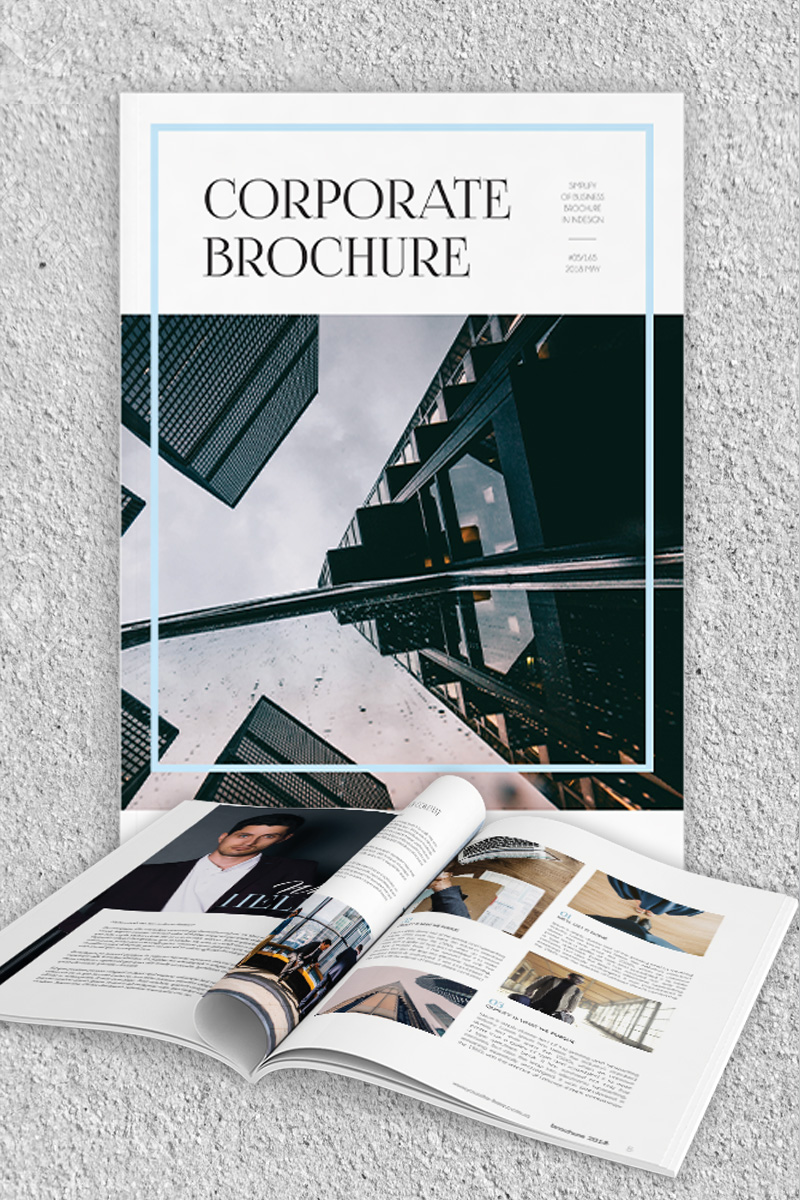
Thanks to the excellent work of the graphic designers at Elegantflyer.com, we are able to share with our readers a gorgeous inDesign template for a 10 pages corporate brochure. You can preview it on the above and below pictures, and download it on the button at the end of this article.

On top of being free, this InDesign brochure template has great features:

  • It’s very easy to customize texts and images (but images are not included).
  • It comes in both A4 and US letter formats.
  • It’s based on master pages.
  • It’s print-ready!

Make sure to get your copy by clicking on the button below!

Download InDesign brochure template

The most entertaining nutcracker you’ll ever see

Post pobrano z: The most entertaining nutcracker you’ll ever see

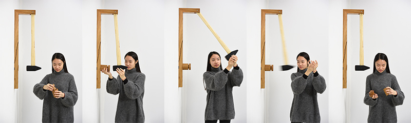
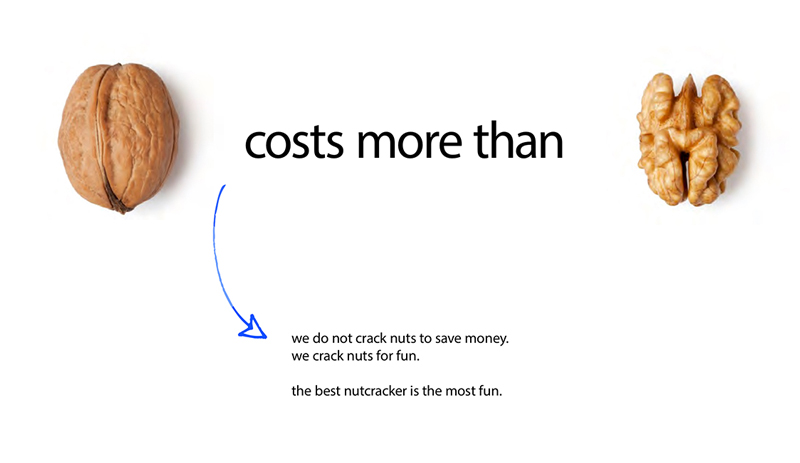
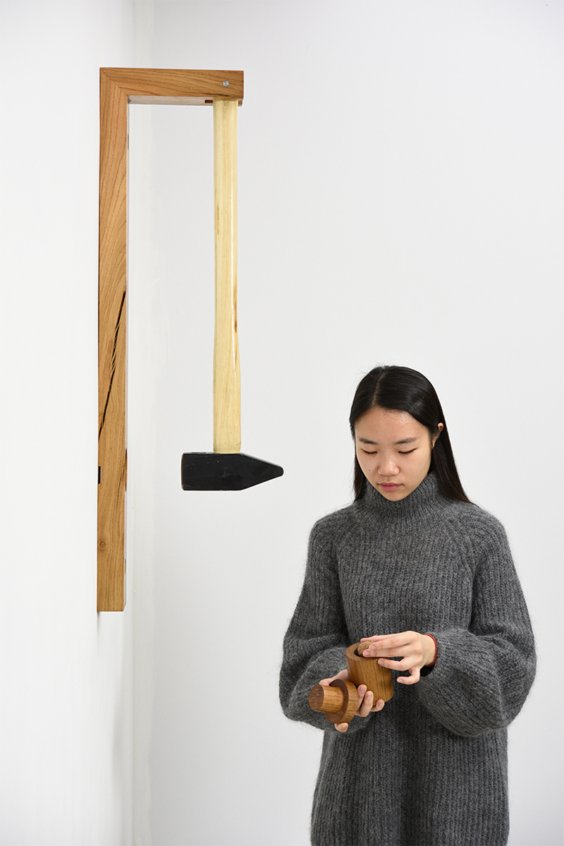
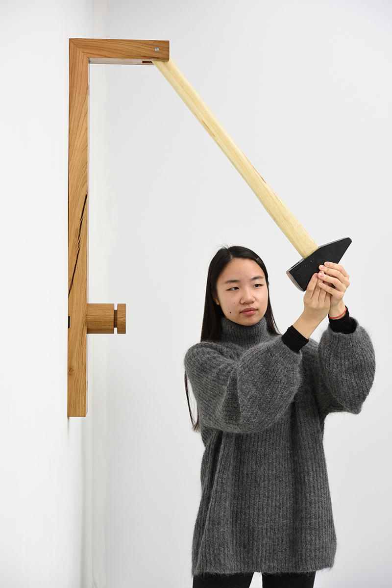
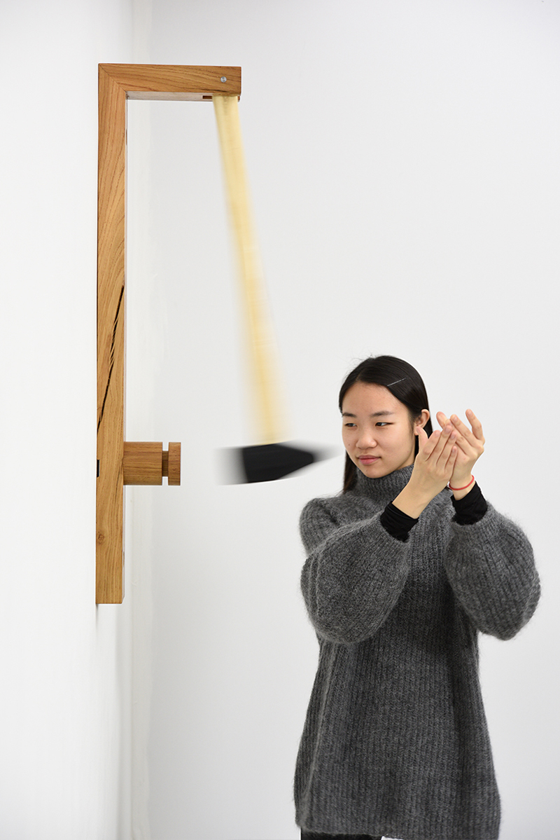
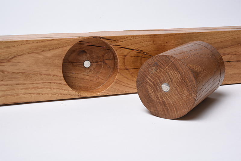
Looking at this Nutcracker, most designers would probably tell you that it’s oversized, not convenient or functional. In short, they may find it entertaining, but not well designed.

However, a design isn’t only about form and function, it’s also about fun. Thought and designed by Georg Kloeck, a designer based in Eindhoven, this Nutcracker is also an entertainment device that brings back the fun in a mostly tedious task.

Designing with retro colors: showcase and tips

Post pobrano z: Designing with retro colors: showcase and tips

Trends often emerge from a collective feeling or mood, which is captured by designers in different fields.  Retro color pallets, made popular through the emergence of photo filters, is an example of how old-world charm is being reborn into web design.

Designers have always kept an eye on the past, and every twenty or so years, trends return in updated form.

If you’re thinking of retro, imagine a mood board filled with a faded photo from your childhood, an image from a television program which takes you back in time, a vintage dress, architecture, an old album cover, and multiple other images from the last century.

Retro colors


Retro colors come in a variety of hues but tend to be more muted.  They don’t draw from primary colors, but range from neutrals such as creams, and yellowed browns, to blues, sage green, teal, and art deco style pastels such as peach or pale pink.

Color influences range from the 1920s to the 1980s.  As time passed, colors became brighter.  However, the large time range gives designers a huge variety of influences to draw from.

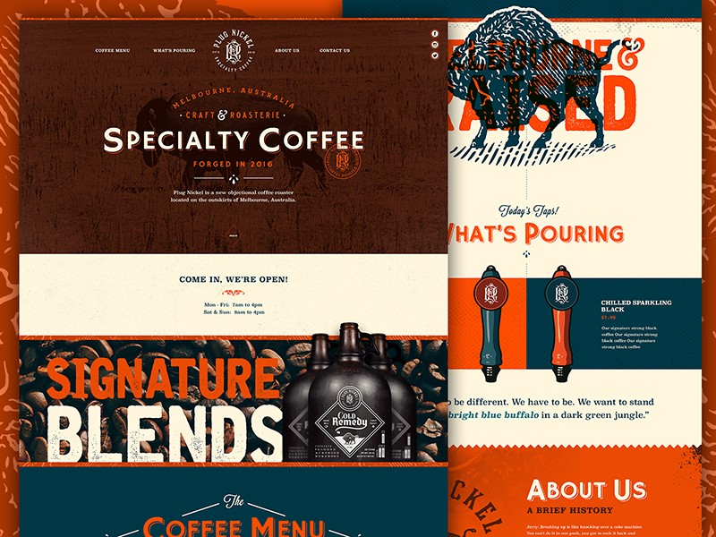
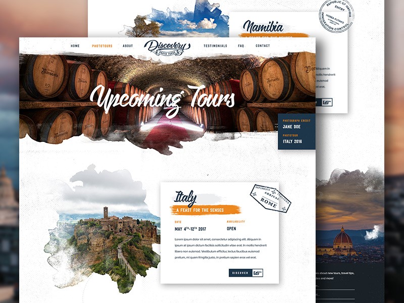
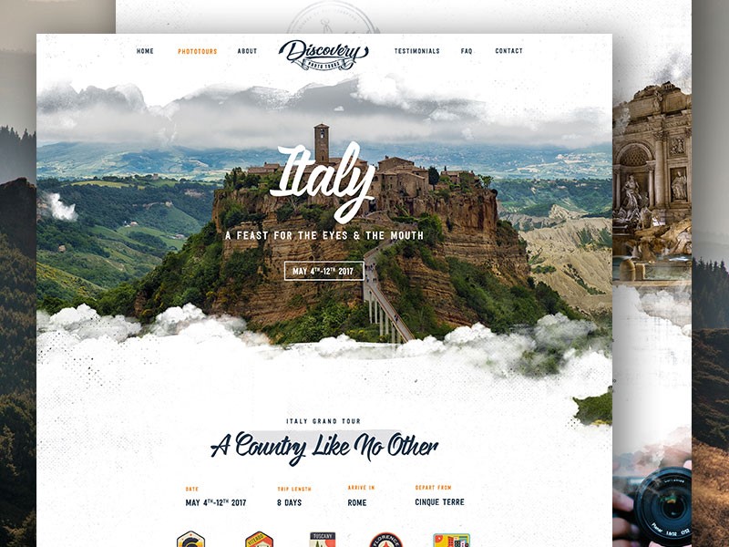
Retro templates are becoming increasingly popular in website design.  These templates are characterized by iconic imagery from a particular time period, vivid graphics, and muted colors.  This popular trend is emerging, not only in website design but in paintings, adverts and in fashion, home decor and color pallet choices.

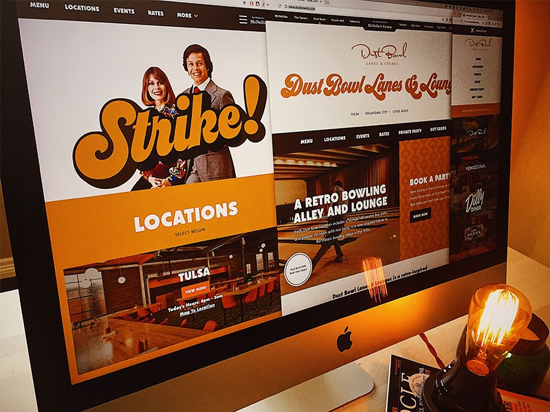
Retro is about giving space to the past, whether by using funky seventies psychedelics, the oversized light fixtures popular in the sixties, or mid-century style chairs, retro is back in a big way.  Texture is often used to provide a gritty feel, mimicking popular printing techniques of the time.

You can even see it in sites that use a style similar to the soviet propaganda, with the Russian fonts included, of course.

Why is Retro so popular?

A retro style creates unity, transcending age, taste, and culture.  A retro style website will be accepted by people from different countries.

This is because it focuses on iconic images or elements of pop culture that has loyal followers throughout the world.  Retro is an indication of globalization, and it presents in a playful way, with color schemes that are muted but never dull.

Retro tunes into nostalgia, and the belief that in times gone by, products were better quality.  Trying to extract the best out of the past, while leaving behind bad memories offers up a new appreciation of old style design.

Retro design is an attempt to bring this sense of nostalgia to life.  Creating the perception of value helps to bring visitors, while modern design elements create interest, encouraging customers to return.  In this way, retro design offers the best of both worlds, an old feel style with modern imagination.

Mixing old styles with new techniques

Retro style design encourages both the imagery and feelings associated with a world gone by.  Using color is a great easy way to make a design stand out.  It is often helpful to pick an era.  The muted colors of vintage design are often juxtaposed with a strong hue in order to add contrast and interest to your design.

Retro design is associated with the nostalgia of the past, a time when life was simple, hedges were green, wild spaces flourished and streets were safe.  The design aims to recreate these memories.

There are several different approaches or themes used to do this.  Some designers use images of old cars, well known or iconic products, or old photographs.  Early versions of electronic devices may also create a retro look.

Some might focus on the optimism of the 50’s, while others look at a celebration of 60s space travel, and the feeling of extended boundaries and new possibilities.

Elements used to create a retro design

Retro color schemes can be complicated to create as they use a lot of vintage or cream colors, which can be tricky to use in print.

On a website, however, they do stand out.  These colors are contrasted with brighter hues.  Background colors are normally desaturated.

Hues are muted, but often look as though they have been mixed with a touch of black, or grey when compared to the brightness of pastels.

Use shapes and illustrations

In times gone by, artists or designers often used simple shapes in order to create a big impact.  Retro design often focuses on these simple shapes.

Varying sizes of circles are often used.  Sometimes designers may also add floral patterns.  Bright colors are often used to draw attention to these images.

A worn-in look – using texture effectively

Texture is often used in vintage design to draw back to old printing techniques of a time gone by.  Textures often seem rigid, gritty, grainy or tough.  Imagine images of rough cardboard, gritty paper or a chalkboard.

Imagery might include faded areas, as though depicting a comfortable, worn-in item of clothing.  There may also be ‘rough’ patches, or an asymmetrical area within the texture, as though a background or figure has been handmade.  These effects often appear to be random, and ‘worn in’ rather than carefully designed.

While creating texture, consider color as well.  Many designers using background texture use a bold color so that contrasts are clear and noticeable rather than simply background noise.

When creating texture, the goal is to be subtle, so that the effect appears natural or genuine.  The goal is to create depth, without too much repetition, so that the background has the appearance of natural wear.

Using fonts for funky effects

Typography has always played a crucial role in creating a retro design.  It is not just choice of a font that will make a difference, but how this font is used.  Designers wishing to create a retro look might reposition a font, duplicating pixel strokes for added texture and a unique element to their designs.

Typography is just as important as color in creating a retro design.  Adding the correct font will create a coherent feel to your designs.  Retro color palettes look great with fonts which have an old-style feel, such as period lettering.

Alternatively, you could use a curvy font.  Choose a font which fits in with the era you are recreating.  This way, you can add a feel of age and even texture to your design. Think of the handmade poster style designs of the 80’s, or the lettering used in old movie posters.  Art Deco style fonts, or cursive inspired brush stroke lettering, or even laser styled neon writing.

Adding borders

Borders add an interesting touch to a vintage design and can be used for framing photos or images, highlighting content or may create focal areas.

They may be created out of ornamental designs or have matching colors. From art deco style borders to a border which takes the shape of worn paper, there are many options to choose from.

Vintage Touches

If you would like to create a vintage feel to your design without the full-blown effect of a retro template, this is possible too.

Add small elements of vintage style such as an iconic image, banners, fonts or borders.  Alternatively, you could focus on a font, taking the viewer back to a particular era.  You could also grab attention by focusing on using a vintage color palette for imagery or lettering.

Conclusion

Creating retro web designs is an attempt to bring back the nostalgia for a time gone by.  The designer uses tools or techniques from an era gone by and blends this with new services or modern touches in order to create a retro effect.

Retro designs, borders, textures, and colors add interest and fun to a project.  Experiment with a variety of color pallets, choosing those which are muted and less saturated, in order to create an authentic look.  Remember that typefaces should connect to the era that you are representing.  This will help you to achieve your overall look.

Retro design is a fun trend which adds interest, atmosphere, and emotion to projects.  While some of the styles may seem as though they would be a lot of work, the end result is a style which grabs your attention and brings an atmospheric element to a design.

When working on a retro design, remember to combine color, texture, and type, so that you end up with a project which takes you back in time.

A Better Sketch File, a Better Designer, a Better You

Post pobrano z: A Better Sketch File, a Better Designer, a Better You

I’ve been thinking about this post by Isabel Lee for the last couple of weeks — it’s all about how we should be more considerate when making designs in Sketch. They argue that we’re more likely to see real efficiency and organizational improvements in our work if we name our layers, artboards, and pages properly. Isabel writes:

Keeping a super organized Sketch file has helped me smooth out my design process and saved me time when I was trying to find a specific component or understand an archived design. For instance, I was looking for an icon that I used six months ago and it was (relatively) easy to find because all my artboards and layers were well-named and grouped reverse-chronologically. I was also able to cross-reference it with my meeting notes from around that time. If I hadn’t done any of that work (thanks Past Isabel!), I probably would’ve had to dig through all my old designs and look at each layer. Or worse — I would’ve had to recreate that icon.

Since I read this I’ve been doing the same thing and effectively making “daily commits” with the naming of my pages and it’s been genuinely helpful when looking back through work that I’ve forgotten about. But what I really like about this tidy-up process is how Isabel describes the way in which they could easily look back on their work, identify weaknesses in their design process, and how to become a better designer:

Aside from making it easier to find things, it’s also helped me cultivate good documentation habits when I want to analyze my old work and see where I could’ve made improvements. I revisited one of my old Sketch files and realized that I didn’t do enough research before diving into a million iterations for an initial idea I had.

Direct Link to ArticlePermalink

The post A Better Sketch File, a Better Designer, a Better You appeared first on CSS-Tricks.

Consistent Design Systems in Sketch With Atomic Design and the Auto-Layout Plugin

Post pobrano z: Consistent Design Systems in Sketch With Atomic Design and the Auto-Layout Plugin

Do you design digital products (or websites) and hand design files off to developers for implementation? If you answered yes, settle in! While the should-designers-code debate rages on, we’re going to look at how adding a methodology to your design workflow can make you faster, more consistent, and loved by all developers… even if you don’t code.

Let’s dig in!

Why a methodology?

In the development world, it seems like at least half of your career is about staying up to date with new tech and leveling up your skills. While the pace may not be quite as frantic in the design landscape as it is in development, there definitely has been a huge shift in tools over the past three years or so.

Tools like Sketch have made a lot of the old pain of working in design files a thing of the past. Smart combinations of text styles, object styles, symbols, and libraries now mean sweeping changes are just one click away. No more picking through 40 Photoshop layers to make a single color change.

Yet, sweeping color changes in a marketing landing page is no longer the biggest design challenge. Design and development teams are now expected to deliver complex interfaces loaded with interaction and conditional states… for every device available now and the next day. Working as both a designer and developer, I have seen the workflow friction from both sides.

Beyond tools, designers need an approach.

Thinking in terms of „components”

If you work in the tech space in any capacity, you have likely heard of development frameworks such as React, Angular, or Vue.

Um yeah, I’m a designer so that doesn’t really concern me, bye.

Kinda. But if you’re hoping to do design work for modern digital products, there is a pretty big chance that said products will be built using one of these frameworks. No one expects an architect to build the structures themselves, but they better have a high-level understanding of the what the tools are and how they will be used.

So here’s what you need to know about modern front-end frameworks:

They have brought on a paradigm shift for developers in which products are built by combining a series of smaller components into complex systems which can adapt to different contexts and devices. This makes the code easier to maintain, and the entire system more flexible.

For a variety of legitimate reasons, many designers have not caught on to this paradigm shift as quickly as developers. We are missing a mental model for creating the pieces that make up these interfaces independently from their environment/pages/screens/viewports etc.

One such approach is Atomic Design.

What is Atomic Design?

First coined by Brad Frost, Atomic Design is a methodology which tries to answer a simple question: if hundreds of device sizes mean we can no longer effectively design „pages,” then how do we even design?

The answer lies in breaking down everything that could make up a „page” or „view” into smaller and smaller pieces, creating a „system” of blocks which can then be recombined into an infinite number of variations for our project.

You can think of it like the ingredients in a recipe. Sure, you could make muffins, but you could just as easily make a cake with the same list of ingredients.

Brad decided to use the chemistry analogy, and so he proposes that our systems are made up of:

  • Atoms
  • Molecules
  • Organisms

For the sake of simplicity, let’s take a look at how we might apply this to a website.

Atoms

Atoms represent the smallest building blocks which make up our user interfaces. Imagine a form label, a form input, and a button. Each one of those represents an atom:

A header, text block, and link each serve as atoms.

Molecules

Molecules are simply groups of atoms combined to create something new. For our purposes, we can think of molecules as groups of disjointed UI pieces which are combined to create a meaningful component.

The atoms come together to form a „card” component.

Organisms

Organisms are made up of groups of molecules (or atoms or other organisms). These are the pieces of an interface which we might think of as a „section.” In an invoicing application, an organism could be a dashboard combining a „new invoice” button (atom), a search form (molecule), a „total open” card (molecule), and table listing overdue invoices. You get the idea.

Let’s look at what a „featured block” organism might look like in our simple website:

A header (atom), three cards (molecules), an image (atom), and a teaser (molecule) are combined to form one featured block organism.

Using stacks for consistency

So, now that we have a mental model for the „stuff,” how do we go about creating these building blocks? Sketch is great out of the box, but the plugins available for it provide huge performance tools… just like text editors for developers. We will be using Sketch’s built-in symbols tools, as well as the amazing Stacks” feature from Anima App’s Auto-Layout plugin.

Using these tools will bring some priceless benefits which I will point out as we go, but at the very least you can count on:

  • better design consistency and faster iteration
  • a sanity check from using consistent spacing multipliers
  • faster reordering of content
  • help identifying design problems quickly and early on

What exactly are stacks?

If you’ve ever heard developers excitedly talk about flexbox for building layouts in CSS, then you can think of stacks as the Sketch equivalent. Stacks (like flexbox) allow you to group a series of layers together and then define their spacing and alignment on a vertical or horizontal axis.

Here we group three items, align them through their center, and set 48px vertical space between each one:

A simple stacked folder aligning and distributing three items.

The layers will automatically be group into a blue folder with an icon of vertical or horizontal dots to show what kind of stack you have.

Look at that! You just learned flexbox without touching a line of code. 😂

Nested stacks

The real power of stacks comes from nesting stacks inside other stacks:

Stacks can be nested inside of each other to create complex spacing systems.]

Here, we can see a card component made up of multiple stacks:

  • card__cta link from the previous example.
  • card__copy stack which handles the alignment & space for the header and text.
  • card__content which controls the spacing and alignment between the card__cta and card__copy stacks.

A quick note about layer naming

I almost always use the BEM naming convention for my components. Developers appreciate the logic when I have to to hand off design files because it often aligns with the naming conventions they are using in code. In the case where I’m developing the project myself, it gives me a bit of a head start as I’ve started thinking about the markup at the design stage.

If that’s super confusing, don’t worry about it. Please just make your colleagues’ job a little easier by organizing your layers and giving them descriptive names.

Stacks shmacks, I have great attention to detail and can do all this manually!

You’re absolutely right! But what about when you have carefully laid out 10 items, all of varying sizes, and now they need extra space between them? Or, you need to add a line of text to one of those items? Or, you need to split content into three columns rather than four?

That never happens, right? 😱

One of two things usually happens at this stage:

  1. You start manually reorganizing all the things and someone’s paying for wasted time (whether it’s you or the client).
  2. You kinda fudge it… after all, the developer surely knows what your original intentions were before you left every margin off by a couple pixels in your layout. ¯\_(ツ)_/¯

Here’s what stacks get you:

  • You can change the alignment or spacing options as much as you like with a simple value adjustment and things will just magically update.
  • You can resize elements without having to pick at your artboard to rejig all the things.
  • You can reorder, add, or remove items from the stack folder and watch the items redistribute themselves according to your settings—just like code. 🎉

Notice how fast it is to edit content and experiment with different layouts all while maintaining consistency:

Stacks and symbols make experimentation cheap and consistent.

OK, so now we know why stacks are amazing, how do we actually use them?

Creating stacks

Creating a stack is a matter of selecting two (or more) layers and hitting the stacks folder icon in the inspector. From there, you can decide if you are stacking your layers horizontally or vertically, and set the distance between the items.

Here’s an example of how we’d create an atom component using stacks:

Creating a horizontal stack with 20px spacing between the text and icon.

And, now let’s apply the stacks concept to a more complex molecule component:

Creating a card molecule using nested stacks.

Creating symbols from stacks

We’ve talked about the many benefits of stacks, but we can make them even more efficient by applying Sketch’s symbol tool to them. The result we get is a stack that can be managed from one source instance and reused anywhere.

Creating an atom symbol

We can grab that call-to-action stack we just created and make it a symbol. Then, we can use overrides for the text and know that stacks will honor the spacing:

Creating a symbol from a stack is great for ensuring space consistency with overrides.

If I decide later that I want to change the space by a few pixels, I can just tweak the stack spacing on the symbol and have it update on every instance 🎉

Creating a molecule symbol

Similarly, I can group multiple stacked atoms into a component and make that into a symbol:

Creating a card symbol from our stacks and call-to-action symbol.

Symbols + stacks = 💪

Wouldn’t it be nice if we could maintain the spacial requirements we set regardless of the tweaks we might bring to them down the line? Yes!

Replacing one item with another inside a component

Let’s assume our card component now requires a button rather than a link as a call-to-action. As long as we place that button in the correct stack folder, all the pixel-nudging happens automagically:

Because our symbol uses stacks, the distance between the copy and the call-to-action will automatically be respected.

Editing molecules and organisms on the fly 🔥

You might be thinking that this isn’t a huge deal and that adjusting the tiny spacial issue from the previous example would have taken just a moment without stacks. And you wouldn’t be wrong. But let’s refer back to our notions about atomic design for a moment, and ask what happens when we have far more complex „organisms” (groups of atoms and molecules) to deal with?

Similar to our mobile example from the beginning, this is where the built-in power of stacks really shines:

Stacks and symbols makes experimentation cheap and consistent.

With a library of basic symbols (atoms) at our fingertips, and powerful spacing/alignment tools, we can experiment and create endless variations of components. The key is that we can do it quickly and without sacrificing design consistency.

Complex layouts and mega stacks

Keeping with the elements we have already designed, let’s see what a layer stack might look like for a simple marketing page:

An example of an expanded layer stack.

Don’t let the initial impression of complexity of those stacks scare you. A non-stacked version of this artboard would not look so different aside from the color of the folder icons.

However it’s those very folders that give us all the power:

Layout experimentation can be fast and cheap!

We may not need to code, but we have a responsibility to master our tools for efficiency and figure out new workflows with our developer colleagues.

This means moving away from thinking of design in the context of pages, and creating collections of components… modules… ingredients… legos… figure out a metaphor that works for you and then make sure the whole team shares the vocabulary.

Once we do this, issues around workflow and collaboration melt away:

Speed and Flexibility

Carefully building components with symbols and using automated and consistent spacing/alignment with stacks does require a bit of time investment upfront. However, the return of easy experimentation and ability to change course quickly and at low cost is well worth it.

Consistency and UX

Having to think about how elements work as combinations and in different contexts will catch UX-smells early and expose issues around consistency before you’re 13 screens in. Changing direction by adjusting a few variables/components/spacing units beats nudging elements around an artboard all day.

Responsibility and Governance

A single 1440px page view of the thing you are building simply does not provided a developer with enough context for multiple screens and interaction. At the same time, crafting multiple high fidelity comps one tiny element at a time is a budget buster (and this is particularly true of app designs). So, what tends to happen on small teams? The developer gets the one gorgeous 1440px view… aaaaand all the cognitive overhead of filling in the gaps for everything else.

Providing the details is our job.

Atomic design gave us speed, creative freedom, and flexibility. It changed everything.”

—From the forward of Atomic Design

If we work with developers on digital products, we should be excited about learning how the sausage is made and adapt our approach to design accordingly. Our tools may not evolve quite as quickly as JavaScript frameworks, but if you haven’t taken a peek under to hood of some of these apps in the last couple of years, this is a great time to dig in!

The post Consistent Design Systems in Sketch With Atomic Design and the Auto-Layout Plugin appeared first on CSS-Tricks.

How to Create a Minecraft Character in Affinity Designer

Post pobrano z: How to Create a Minecraft Character in Affinity Designer

Final product image
What You’ll Be Creating

In today’s
tutorial, we’re going to embark on a creative journey into the land of
Minecraft and learn how to create a cute little character using Affinity
Designer’s handy Isometric Grid.

So assuming you’re a fan of the game, quickly get a coffee refill and
let’s jump straight into it!

Also, don’t forget you can always expand the
project by heading over to GraphicRiver where you’ll find a great selection of
vector pixel art.

1. How to Set Up a
New Project File

Assuming you
already have Affinity up and running, let’s set up a New Document by going to File
> New
(or by using the Control-N
keyboard shortcut) which we will adjust as follows:

  • Type:
    Web
  • Document Units: Pixels
  • Create artboard:
    checked
  • Page Width:
    800 px
  • Page Height:
    600 px
  • DPI: 72
setting up a new document

2. How to Set Up
an Isometric Grid

As soon as we’ve
created our document, we’ll want to set up a custom isometric grid, which will
provide visual guidance when it comes to drawing the shapes of our character.

Step 1

To do this, simply
go to View > Grids and Axis Manager,
where we will first enable the Show grid
option, and then uncheck the Use
automatic grid
one so that we can set up a custom one as follows:

  • Grid type: Isometric
  • Spacing:
    16 px
  • Divisions: 4 px
setting up a custom grid

Step 2

Once the grid is all set up, we need to make sure that our shapes are
actually snapping to it, so go to View
> Snapping Manager
(or use the little Magnet icon) where we will make sure it’s enabled, and then uncheck
all the options except the Snap to grid
one.

Normally, we would have the Force pixel alignment option enabled, but due to the angles of the
grid’s lines, our shapes will end up having comma-delimited values, which as
you know can’t snap to the Pixel Grid.

adjusting the snapping options

Step 3

As you can see, the resulting grid is made out of multiple 16 px tall rhombi, which have 4 subdivisions along each of their
sides (16 in total), which become
clearly visible once you zoom in on them. We are going to rely on them in the
process of defining the size of each and every shape, using the outer edges of
the rhombus as a Width measuring
unit, and its inner vertical height as a Height
measuring one.

To keep things simple, I’m going to use some
simple annotation where R= one edge/height of the larger rhombus,
and a small r= one edge/height of the
smaller division
.

measuring units example

3. How to Create the Character’s Lower Body

As soon as we’ve created our custom isometric grid, we can start working on
the actual character, and we will do so by creating a blank version of its
entire body one section at a time.

Step 1

Using the Pen
Tool (P)
, draw the front section of the legs using a 6 x 4 R shape, which we will color using #596C7B and then position
as seen in the reference image.

creating and positioning the front section of the legs

Step 2

Add the side section of the legs using a 2 x 6 R shape, which we will color using #384C57 and then position
onto the right side of the previous one.

creating the side section of the legs

4. How to Create the Character’s Upper Body

Now that we have the main shapes of the legs, we can move up and start
working on the upper body, which we will create one shape at a time.

Step 1

Start by creating the torso using a copy (Control-C > Control-V) of the legs’ front section, which we will position above, making sure
to change its color to #E47145.

creating the front section of the torso

Step 2

With the torso in place, we can now start working on the character’s arms
and shoulders.

Create the main shape for the left arm using a 2 x 6 R rectangle, which we will color using #96693B and then position
next to the torso as seen in the reference image.

creating the front section of the left arm

Step 3

Add the front section of the right hand using a
copy (Control-C > Control-V) of
the one that we’ve just finished working on, which we will position on the
opposite side of the torso.

creating the front section of the right arm

Step 4

Create the side section using a copy (Control-C > Control-V) of the shape
that we’ve just created, which we will horizontally reflect (right click > Transform > Flip Horizontal),
and then position on its right side.

creating the side section of the right arm

Step 5

Add the shoulders and upper section of the torso
using a single shape, which we will color using #E58047 and then position as
seen in the reference image. Once you’re done, make sure you select and group (Control-G) all of the upper body’s
composing shapes together before moving on to the next section.

creating the shoulders and upper section of the torso

5. How to Create
the Character’s Head

Since at this
point we pretty much have all the sections of the character’s body, we can move
up and focus on creating the main shapes for its head.

Step 1

Start by drawing the front section using a 4 x 4 R shape, which we will color using #96693B and then position
on the body as seen in the reference image.

creating the front section of the head

Step 2

Add the side section using a copy (Control-C
> Control-V
) of the shape that we’ve just created, which we will color
using #3E2815 and then position on the right side, making sure to
horizontally reflect it (right click
> Transform > Flip Horizontal
).

creating the side section of the head

Step 3

Finish off the head by drawing a 4
x 4 R
shape which we will color using #6D4A2D and then position on top of
the two rectangles, as seen in the reference image. Once you’re done, select and
group all three shapes together using the Control-G
keyboard shortcut.

creating the upper section of the head

Quick tip: at this point, it would be a good idea to start
organizing our project by opening up the Layers
panel and naming the different sections that we’ve grouped, so that we can
more easily target and navigate the body parts of our character.

example of grouping and structuring the project

6. Adding Details
to the Character’s Head

Now that we have
the blank version of our character, we can begin adding details to it, and we
will do so from the head down.

Step 1

Draw the mouth using a 4 x 2 r shape,
which we will color using #BD9169 and then position towards the lower edge of
the head’s front section, as seen in the reference image.

creating the mouth

Step 2

Create the left eye using two 2 x
4 r
shapes (one colored using #FFFFFF and one using #3E2815), which we will
group (Control-G) and then position
on the upper-left section of the mouth, at a distance of just 1 r from its top edge.

creating the left eye

Step 3

Add the right eye using a copy of the one that we’ve just grouped, which
we will position on the
opposite side of the mouth, making sure to flip their colors.

creating the right eye

Step 4

With both eyes in place, we can quickly draw the hair segment (#4C341E)
using the reference image as our main guide. Take your time, and once you’re
done, move on to the next step.

adding the front hair segment to the head

Step 5

Finish detailing the current section by adding the little golden
earring using a 1 x 2 r shape, which
we will color using #E19B4F and then position on the side section of the
head, aligning it to the lower eye line. Once you’re done, select and group all
of the head’s details together (Control-G)
before moving on to the next section.

adding the side earring

7. Adding Details
to the Character’s Upper Body

Now that we’ve
finished working on the head, we can shift our focus over to the character’s
body, where we will gradually start adding details to it.

Step 1

Create the front section of the left sleeve using a copy (Control-C > Control-V) of the arm’s
main shape, which we will then adjust by first changing its color to #E47145 and then cutting its height in half.

creating the front section of the left sleeve

Step 2

Add the front section of the right sleeve using a copy (Control-C > Control-V) of the one
that we’ve just finished working on, which we will position on the opposite
side of the torso.

creating the front section of the right sleeve

Step 3

Draw the lower section of the sleeve using the reference image as your
main guide, making sure to select and group (Control-G) the two shapes together once you’re done.

adding the lower detail to the left sleeve

Step 4

Create the lower section of the right sleeve using the same
process used for the left one, making sure to select and group the resulting
shape and the front section together using the Control-G keyboard shortcut.

adding the lower detail to the right sleeve

Step 5

Create the right sleeve’s side section using a copy (Control-C > Control-V) of the arm,
which we will adjust by first setting its color to #C0512A and then shortening
its height from 6 R to 4 R.

adding the side section to the right sleeve

Step 6

Add the neck cutout using the reference image as your main guide, making
sure to color the resulting shape using #96693B.

adding the neck cutout to the shirt

Step 7

Separate the front section of the head from the neck using an 8 x 2 r block, which we will color using #784A27
and position onto the cutout.

adding the shadow to the neck cutout

Step 8

With the Fill color set to #4C341E,
draw the front hair segments using the reference image as your main guide. Take
your time, and once you’re done, move on to the next step.

adding the front hair segments to the shirt

Step 9

Add the shoulder hair segments using #4C341E for the front section and
#3E2815 for the top one, making sure to select and group the two together
afterwards using the Control-G
keyboard shortcut.

adding the side hair segment to the right shoulder

Step 10

Draw the belt using a 16 x 2 r shape,
which we color using #343E4C and then position at a distance of 2 r from the bottom edge of the shirt’s
front section.

adding the belt to the front of the shirt

Step 11

Add the shirt’s bottom front details using a copy (Control-C > Control-V) of the ones that we’ve just created for
the sleeves, which we will position as seen in the reference image.

adding the bottom details to the front of the shirt

Step 12

Finish the detailing process of the current part of the
illustration by adding the side section of the shirt’s bottom, which we will
color using #C0512A. Once you’re done, create individual groups (Control-G) of the different sections,
positioning them within the main shapes with the help of the Layers panel.

adding the side section of the shirt

8. Adding Details to the Character’s Lower Body

Now that we’ve finished adding the different details to the upper body,
we can shift our focus towards the legs and gradually add details to those as
well.

Step 1

Start by creating the side section of the boot,
using a copy (Control-C > Control-V)
of the underlying leg, which we will adjust by first setting its color to #152028 and then shortening its Height to
just 14 r.

adding the side section of the right boot

Step 2

With the color set to #343E4C, draw the main
shape for the front section of the right foot’s boot using the reference image
as your main guide.

adding the front section of the right boot

Step 3

Finish detailing the legs, and with them the illustration itself, by
adding the left boot using a copy (Control-C
> Control-V
) of the one that we’ve just finished working on, which we
will position on the left side of the legs. Once you’re done, select and
group all of the details together using the Control-G keyboard shortcut, before hitting that save button.

finishing off the illustration

9. A Little
Touching Up

At this point, you may have noticed that some of our
character’s neighboring shapes ended up having little white gaps between
them, which has to do with the way the software handles aliasing, which is a
problem that the people at Serif are aware of.

finished project preview with space gaps

The official method of fixing this annoying
issue is to add duplicates of the shapes where this happens, which I’ve tested
out and seems to work. It’s not a perfect method, but it’s all we have
until we get a software update.

example of fixing the resulting space gaps

Great Job!

There you have it, fellow Minecraft lovers, a cute little character created using Affinity’s
powerful isometric grid.

As always, I hope
you’ve managed to follow each and every step and most importantly learned
something new and useful along the way.

That being said, if you have any questions, feel free to post them
in the comments section and I’ll get back to you as soon as I can!

finished project preview

How to Create an Energy Effect Action in Adobe Photoshop

Post pobrano z: How to Create an Energy Effect Action in Adobe Photoshop

Final product image
What You’ll Be Creating

In this tutorial, you will learn how to create an amazing energy
effect. I will explain everything in so much detail that everyone can
create it, even those who have just opened Photoshop for the first time. 

The effect shown above is the one I will show you how to create
in this tutorial. If you would like to create the even more advanced
energy effects shown below, using just a single click and in only a few
minutes, then check out my Energy Photoshop Action.

Action final results

What You’ll Need

To recreate the design above, you will need the following resources:

1. Let’s Get Started

First, open the photo that you want to work with. To open your photo, go to File > Open, choose your photo, and click Open. Now, before we get started, just check a couple of things:

  1. Your photo should be in RGB Color mode, 8 Bits/Channel. To check this, go to Image > Mode.
  2. For best results, your photo size should be 2000–4000 px wide/high. To check this, go to Image > Image Size.
  3. Your photo should be the Background layer. If it is not, go to Layer > New > Background from Layer.
Checking image size and mode

2. How to Select the Subject

Step 1

In this section, we are going to make a selection of our subject and then copy the subject to a separate layer. Choose the Quick Selection Tool (W) and select the background of the photo. Use the Shift-Alt buttons on your keyboard to add or subtract areas from the selection. After you’ve made a perfect selection, press Control-Shift-I on your keyboard to invert the selection.

Making selection

Step 2

Now go to Select > Modify > Smooth and set the Sample Radius to 5 px. Then, go to Select > Modify > Contract and set Contract By to 2 px. After that, go to Select > Modify > Feather and set the Feather Radius to 2 px as shown below:

Modifying selection

Step 3

Press Control-J on your keyboard to create a new layer using the selection, and name this layer Subject.

Creating new layer using selection

3. How to Create the Background

Step 1

In this section we are going to create the background. Select the Background layer, go to Layer > New Fill Layer > Solid Color to create a new solid color fill layer, name it Background Color, and choose the color #000000 as shown below:

Creating new solid color fill layer

Step 2

Now go to Layer > New > Layer to create a new layer and name it Temp.

Creating new layer

Step 3

Press D on your keyboard to reset the swatches and go to Filter > Render > Clouds.

Adding clouds filter

Step 4

Now press Control-J on your keyboard to duplicate this layer. Then, go to Filter > Distort > Twirl and set the Angle to 50° as shown below:

Adding twirl filter

Step 5

Change the Blending Mode of this layer to Darken and press Control-J on your keyboard to duplicate this layer. Then, go to Edit > Transform > Flip Horizontal and then to Edit > Transform Flip Vertical to flip this layer both horizontally and vertically.

Duplicating layer

Step 6

Now Shift-click on the Temp layer to select all layers between and press Control-E on your keyboard to merge them into one layer. Then, press Control-J to duplicate this layer.

Duplicating layer

Step 7

Press Control-I on your keyboard to invert this layer. Then, press D to reset the swatches and go to Filter > Render > Difference Clouds.

Adding difference clouds

Step 8

Now press Control-I on your keyboard to invert this layer. Then, go to Filter > Distort > Twirl and set the Angle to 50° as shown below:

Adding twirl filter

Step 9

Change the Blending Mode of this layer to Multiply. Then, Control-click on the Temp copy 2 layer to select both layers at the same time and press Control-E on your keyboard to merge them into one layer.

Merging layers

Step 10

Now press Control-T on your keyboard to transform this layer and set the Width and Height to 200% as shown below:

Transforming layer

Step 11

Now go to Layer > Layer Mask > Hide All to add a layer mask that hides the whole layer. Then, set the foreground color to #ffffff, choose the Brush Tool (B), pick a soft brush, and brush where you want texture to appear. Feel free to change the Hardness of the brush.

Brushing into layer mask

Step 12

Name this layer Background_Texture_1. Then, select the Background Color layer, go to Layer > New > Layer to create a new layer, and name it Background_Texture_2.

Creating new layer

Step 13

Press D on your keyboard to reset the swatches, and go to Filter > Render > Clouds.

Adding clouds filter

Step 14

Now press Control-T on your keyboard to transform this layer and set the Width and Height to 200% as shown below:

Transforming layer

Step 15

Now go to Filter > Distort > Twirl and set the Angle to 50° as shown below:

Adding twirl filter

Step 16

Go to Image > Adjustments > Levels and enter the settings below:

Adjusting levels

Step 17

Now change the Opacity of this layer to 10%.

Changing opacity

Step 18

Select the Background_Texture_1 layer, go to Layer > New > Layer to create a new layer, and name it Temp.

Creating new layer

Step 19

Press D on your keyboard to reset the swatches and go to Filter > Render > Clouds.

Adding clouds filter

Step 20

Now press Control-T on your keyboard to transform this layer and set the Width and Height to 150% as shown below:

Transforming layer

Step 21

Press Control-J on your keyboard to duplicate this layer. Then, go to Filter > Distort > Twirl and set the Angle to 50°.

Adding twirl filter

Step 22

Now change the Blending Mode of this layer to Screen. Then, Control-click on the Temp copy 2 layer to select both layers at the same time and press Control-E on your keyboard to merge them into one layer.

Merging layers

Step 23

Now go to Layer > Layer Mask > Hide All to add a layer mask that hides the whole layer. Then, set the foreground color to #ffffff, choose the Brush Tool (B), pick a soft brush, and brush where you want texture to appear. Feel free to change the Hardness of the brush.

Brushing into layer mask

Step 24

Change the Blending Mode of this layer to Screen and set the Opacity to 50%. Then, name this layer Background Glow.

Changing blending mode and opacity

4. How to Blend the Subject

Step 1

In this section we are going to blend the subject more with the background. Select the Subject layer and Control-click on this layer thumbnail to make a selection of this layer. Then, go to Select > Modify > Contract and set the Contact By to 25 px. After that, go to Select > Modify > Feather and set the Feather Radius to 50 px as shown below:

Modifying selection

Step 2

Now go to Layer > Layer Mask > Reveal Selection to add a layer mask that reveals the selected area of the layer. Then, in the Properties panel, set the Density of the layer mask to 55% as shown below:

Adding layer mask

Step 3

Press Control-J on your keyboard to duplicate this layer. Then, press Control-Shift-U to desaturate this layer, go to Filter > Other > High Pass, and set the Radius to 30 px.

Adding high pass filter

Step 4

Now go to Image > Auto tone and then to Image > Auto Contrast to make auto-corrections of this layer tone and contrast. Then, go to Edit > Adjustments > Levels and enter the settings below:

Adjusting levels

Step 5

Change the Blending Mode of this layer to Overlay and set the Opacity to 50%. Then, name this layer Subject Details.

Changing blending mode and opacity

Step 6

Control-click on the Subject layer to select both layers at the same time. Then, go to Layer > New > Group from Layers to create a new group from the selected layers and name it Main Subject.

Creating new group from layers

Step 7

Now go to Layer > Layer Mask > Reveal All to add a layer mask that reveals the whole layer group. Then, set the foreground color to #000000, choose the Brush Tool (B), pick a soft brush, and brush over the areas that are left from the background.

Brushing into layer mask

5. How to Create the Subject Glow

Step 1

In this section we are going to create the subject glow. Control-click on the Subject layer thumbnail to make a selection of this layer. Then, Control-Alt-Shift-click on the layer mask of the Main Subject layer group to intersect the selection. After that, go to Select > Modify > Contract and set Contract By to 10 px.

Modifying selection

Step 2

Now press Control-Shift-I on your keyboard to invert the selection. Then, Control-Alt-Shift-click on the Subject layer thumbnail to intersect the selection. After that, Control-Alt-Shift-click on the layer mask of the Main Subject layer group to intersect the selection again.

Modifying selection

Step 3

Select the Background layer and press Control-J on your keyboard to create a new layer using the selection. Then, drag this layer to the top of the layers in the Layers panel.

Creating new layer using selection

Step 4

Now go to Filter > Blur > Gaussian Blur and set the Radius to 10 px as shown below:

Adding gaussian blur filter

Step 5

Change the Blending Mode of this layer to Linear Dodge (Add) and set the Opacity to 70%. Then, name this layer Subject_Glow_1.

Changing blending mode and opacity

Step 6

Now Control-click on the Subject layer thumbnail to make a selection of this layer. Then, Control-Alt-Shift-click on the layer mask of the Main Subject layer to intersect the selection. After that, go to Layer > New > Layer to create a new layer and name it Temp.

Creating new layer

Step 7

Set foreground color to #ffffff. Then, go to Edit > Fill and set Contents to Foreground Color, Mode to Normal, and Opacity to 100%.

Filling selection with foreground color

Step 8

Now press Control-D on your keyboard to deselect. Then, press Control-J to duplicate this layer. After that, go to Filter > Blur > Gaussian Blur and set the Radius to 100 px.

Adding gaussian blur filter

Step 9

Name this layer Subject_Glow_2 and drag it just below the Main Subject layers group in the Layers panel.

Arranging layers

Step 10

Now select the Temp layer, go to Filter > Blur > Gaussian Blur, and set the Radius to 100 px.

Adding gaussian blur filter

Step 11

Name this layer Subject_Glow_3 and drag it just below the Subject_Glow_2 layer in the Layers panel.

Arranging layers

6. How to Make the Final Adjustments

Step 1

In this section we are going to make final adjustments to the design. Select the Subject_Glow_1 layer, go to Layer > New Adjustment Layer > Color Balance to create a new color balance adjustment layer and name it Color_1.

Creating new color balance adjustment layer

Step 2

Now Double-click on this layer thumbnail and in the Properties panel enter the settings below:

Adjusting color balance

Step 3

Go to Layer > New Adjustment Layer > Curves to create a new curves adjustment layer and name it Color_2. Then, drag this layer just below the Color_1 layer in the Layers panel.

Creating new curves adjustment layer

Step 4

Now Double-click on this layer thumbnail and in the Properties panel enter the settings below:

Adjusting curves

Step 5

Press D on your keyboard to reset the swatches. Then, go to Layer > New Adjustment Layer > Gradient Map to create a new gradient map adjustment layer and name it Overall Contrast. After that, drag this layer to the top of the Layers panel.

Creating new gradient map adjustment layer

Step 6

Now change the Blending Mode of this layer to Soft Light and set the Opacity to 10%.

Changing blending mode and opacity

Step 7

Go to Layer > New Adjustment Layer > Hue/Saturation to create a new hue/saturation adjustment layer and name it Overall Saturation.

Creating new hue and saturation adjustment layer

Step 8

Now Double-click on this layer thumbnail and in the Properties panel set the Saturation to +7 as shown below:

Adjusting saturation

Step 9

Go to Layer > New Adjustment Layer > Levels to create a new levels adjustment layer and name it Overall Brightness.

Creating new levels adjustment layer

Step 10

Now Double-click on this layer thumbnail and in the Properties panel enter the settings below:

Adjusting levels-3

Step 11

Select the Subject layer, go to Layer > New Adjustment Layer > Hue/Saturation to create a new hue/saturation adjustment layer and name it Subject_Color_Correction.

Creating new hue and saturation adjustment layer

Step 12

Now press Control-Alt-G on your keyboard to create a clipping mask. Then, Double-click on this layer thumbnail and in the Properties panel, choose the Cyans preset color range, and set Hue to +55 and Saturation to -80 as shown below:

Adjusting hue and saturation

Step 13

Select the Overall Brightness layer, press Control-Alt-Shift-E on your keyboard to make a screenshot, and then press Control-Shift-U to desaturate this layer. Then, go to Filter > Other > High Pass and set the Radius to 2 px.

Adding high pass filter

Step 14

Name this layer Overall Sharpening and change the Blending Mode of this layer to Vivid Light.

Changing blending mode

You Made It!

Congratulations, you have succeeded! Here is our final result:

Final result

If you would like to create the even more advanced
energy effects shown below, using just a single click and in only a few
minutes, then check out my Energy Photoshop Action.

The action works so you simply fill in your subject with a color and
just play the action. The action will do everything for you,
giving you fully
layered and customizable results. The action will also create 30 preset color looks that you can choose
from, and there are 65 high-quality fractal brushes included with the
action that you can use to build the designs even further.

The action comes with a detailed video tutorial that demonstrates how to use the action and customize the results to get the most out of the effect.

Action final results

Agregator najlepszych postów o designie, webdesignie, cssie i Internecie