Cyberbullying is increasingly a major problem for our society, this film was created for the Young Lions Argentina 2017 festival and the goal was to create in 48 hours and just with an iPhone a piece that would raise awareness about the cause of cyberbullying to parents and relatives. It was silver at the contest.
A lot of people don’t know that the city of Toronto has free condoms for anyone, no questions asked. Toronto Public Health keeps the condoms in giant, self-serve bowls at sexual health clinics, community health centres, and colleges and universities across the city.
“Life in the bowl” is a series of short cartoons that treat the condoms as characters who live in those bowls. The condoms live their lives, waiting for the inevitable moment they’ll be chosen. They know they’ll be taken at some point—just not exactly when.
People in Russia talk and text on their phones while driving. We’re used to it, nothing strange.
Radio stations provoke this behavior. Every station has a call-in show where listeners are calling or texting to win presents or just to say hi to their friends.
Smartphone using is the second, after alcohol consumption, human factor causing car accidents. Despite a common opinion, hands-free devices offer no safety benefit when driving. Driving while talking on cell phones – handheld and hands-free – increases risk of crashes fourfold. The number is even bigger for texting and using apps. SM Polis Insurance is fighting against this dangerous habit with live radio broadcast of “car crashes”.
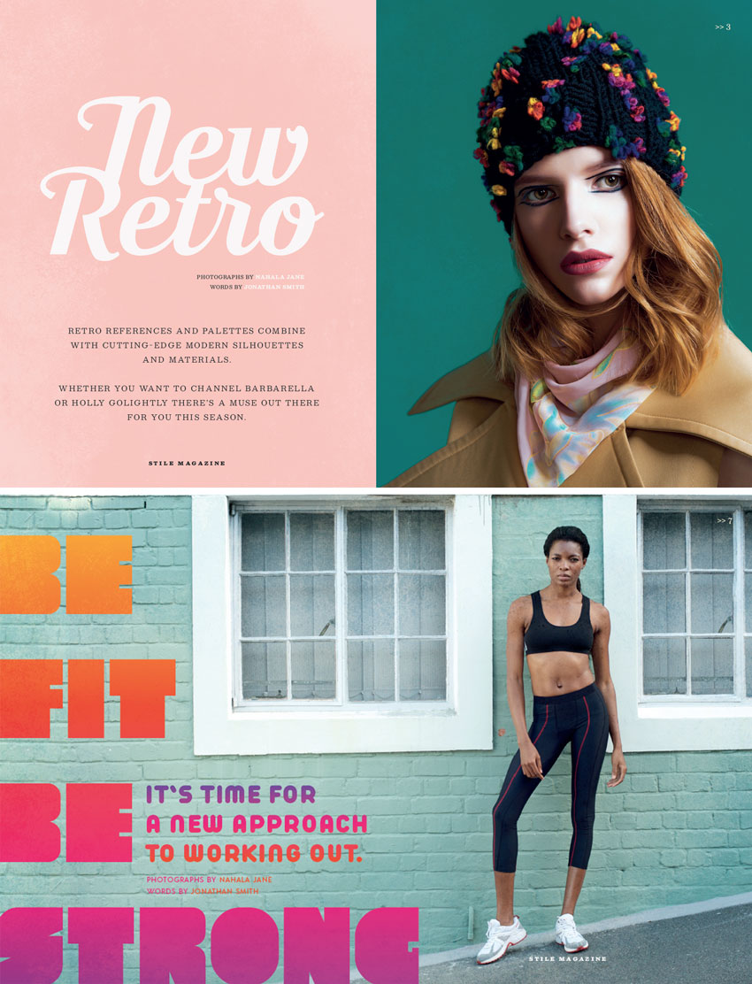
Our love affair for all things vintage isn’t waning anytime soon, but you can bring your designs bang up-to-date by balancing retro and contemporary elements in your layouts.
Here, we’ll put together a few spreads for a fashion and lifestyle magazine with a retro flavor. This is a great introduction to creating magazines in Adobe InDesign, as well as picking up tips on how to keep your layouts looking fresh and on-trend.
If you’re a relative beginner to InDesign, this will introduce you to essential print design techniques, as well as broadening your skillset.
We’ll use Adobe InDesign to create the magazine layout. To create the design pictured here, you’ll also need to download the following images and font files:
Once you’ve saved the images to a safe place and installed the fonts onto your computer, you’re ready to get started.
1. How to Set Up Your Magazine Document in InDesign
Step 1
Open up InDesign and go to File > New > Document.
Keep the Intent set to Print, and set the Number of Pages to 10*.
Set the Width of the page to 213 mm and Height to 276.5 mm, which is equivalent to a standard US magazine page size. If you want to adapt your layouts to a different page size, go ahead.
Set the Top and Outside Margins to 13 mm, Inside to 14 mm, and Bottom to 15 mm.
Add a Bleed of 5 mm, before clicking OK.
*Note: You can easily add more pages to your magazine later by clicking on the New Page button in the Pages panel (Window > Pages).
Step 2
Well-organised layers are key to keeping your sanity intact while you work on complex magazine spreads.
Expand the Layers panel (Window > Layers) and double-click on the Layer 1 name. Rename the layer Background Color and click OK.
Choose New Layer from the panel’s drop-down menu (at top-right). Name the layer Photos and click OK.
Create three more layers in this order: Typography, Texture and finally Master Elements.
Lock all layers except Master Elements, which we’ll work on first.
Step 3
Expand the Pages panel (Window > Pages) and click onto the A-Master page icons to bring up the master on screen.
Zoom into the top-right corner of the page and use the Type Tool (T) to create a small text frame against the margin line. Here will be your page number, and you can begin it with a ‘/’ or ‘>>’ as I’ve done here, if you like.
Use the main Controls panel or Character panel (Window > Type & Tables > Character) to set the frame’s Font to Besley.
With your type cursor sitting in the text frame, head up to Type > Insert Special Character > Markers > Current Page Number.
Step 4
Right-Click on the A-Master and click on Master Options.
Add ‘Light Background’ to the name of the master, and click OK.
Step 5
On the A-Master, Right-Click > Duplicate Master Spread, to create a copy below.
Rename this B-Master ‘Dark Background’.
From the Swatches panel, switch the Font Color of the page number text to [Paper]. When you set this over a darker colored background, this will ensure the page number will be visible.
2. How to Build Up Color and Photography on Your Magazine Spreads
Step 1
Return to the Layers panel and lock the Master Elements layer. Unlock the bottom layer, Background Color.
Click on New Color Swatch in the Swatches panel’s menu, and create a new CMYK swatch, C=0 M=27 Y=18 K=0. Click Add and then OK.
Head down to Page 2 and 3 of your InDesign document.
Use the Rectangle Tool (M) to create a shape across the whole of Page 2, extending it up to the bleed edge. Set the Fill to your new pink swatch.
Step 2
Lock the Background Color layer and unlock the layer above, Photos.
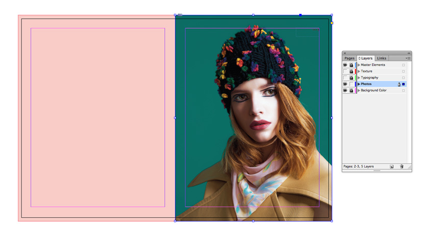
Use the Rectangle Frame Tool (F) to create an image frame across Page 3. File > Place, navigate to one of the model portrait images you downloaded earlier (or a photo of your choice) and Open, allowing it to fill the whole frame.
Because this photo has a dark background, I drag down the B-Master – Dark Background right-page icon onto the Page 3 icon, to apply it to this page.
3. How to Format Retro Typography for Your Magazine
Step 1
Lock the Photos layer and unlock Typography above it.
Take the Type Tool (T) and create a large text frame for a title over on Page 2 of your spread. Type in the first part of the article title, and set the Font to Moonface Script, around Size 180 pt.
Edit > Copy, Edit > Paste the text frame and type up the second part of your title. Move the text frame up to allow the words to join up.
Step 2
Add body text below your titling set in Bosley, and Uppercase.
You can stick to this one-font-for-title, another-for-body-text rule as you work on your magazine spreads.
4. How to Add Texture to Your Designs
Texture is an easy and effective way of injecting vintage style into your magazine designs.
Step 1
Lock the Typography layer and unlock the Texture layer above.
Use the Rectangle Frame Tool (F) to create an image frame across Page 2 of the spread, and File > Place.
Choose one of the texture PNG images inside the handmade vintage textures folder. Here, I’ve gone for Texture 14.
Copy and Paste the texture image frame, moving the copy over on top of Page 3.
Step 2
Select both texture image frames and go to Object > Effects > Transparency. Set the Mode to Color Dodge and bring the Opacity down to around 35%.
Want a moodier look? Set the Mode to Multiply.
5. And Repeat…
By layering background color, photo, type and texture, you can create a beautiful retro style for your magazine layouts. It’s easy to follow this same process with other layouts, like here, for the next spread of the magazine.
Here, I’ve set two different model portraits on Pages 4 and 5 of the document.
I Copy and Paste the texture image frames I used on the previous spread and increase the Opacity of the Color Dodge transparency, to bring through a little more texture onto this spread.
I’m also going to create another couple of spreads in the magazine, using the same layering process. Read on to see how I use the same technique to create a 1980s-inspired design.
Step 1
Move down to Pages 6 and 7 of your document, and set a large image, such as this one, on the Photos layer, spanning the whole spread.
Step 2
Use the Type Tool (T) to create a very large text frame across the left-hand page, and type in the article title. Set the Font to Cred Regular.
Step 3
Gradient swatches are great for adding a retro feel to typography on your magazine designs. First, it’s a good idea to create a range of swatches to use in your gradient.
Choose New Color Swatch from the Swatches panel’s main menu. Set the Type to Process and Mode to CMYK. Then adjust the CMYK values below. To create a sunset-style range of swatches, as used here, add the following swatches to the panel:
C=0 M=30 Y=93 K=0
C=0 M=84 Y=91 K=0
C=0 M=95 Y=18 K=0
C=65 M=85 Y=0 K=0
Step 4
Choose New Gradient Swatch from the panel’s main menu.
Name the swatch Sunset, set the Type to Linear and choose Swatches from the Stop Color menu.
Click on the left-hand stop on the Gradient Ramp at the bottom and set this to the yellow swatch.
Click on the right-hand stop and set this to the dark purple swatch.
Click onto the ramp twice to add two more stops, and set these to the orange and pink swatch, to create a gradual sunset effect. Then click OK.
Step 5
Select the title text frame and apply the Sunset gradient swatch to the text using the Swatches panel.
You can also create a subtitle set in Arista Pro Fat, and apply the Sunset swatch to this as well.
Step 6
Unlock the Texture layer, Copy and Edit > Paste in Place texture image frames down from the previous spread.
Go to Object > Effects > Transparency to play around with the transparency settings a little.
Step 7
For the final spread of this article, I’m going to add a color gradient across the whole image, to give it a retro look.
Place a photo on the Photos layer. If you want to introduce a larger section of body text to this spread, only allow the photo to cover some of the spread.
Use the Rectangle Frame Tool (F) to create a shape over the top of the image frame, and set the Fill of the shape to Sunset.
With the shape selected go to Object > Effects > Transparency and set the Mode to Multiply. Bring the Opacity down to around 80% and click OK.
Step 8
Scatter text frames set in Cred Regular across the layout, using some of the swatches you created earlier to add a contrasting pop of color.
You can set a text frame on the emptier section of your spread, setting body text in Acre.
You can increase the Drop Cap Number of Lines in the Paragraph panel to pull out the first letter of your article in a drop cap. Try setting it in a contrasting font, like Cred, and in the Sunset gradient swatch.
And this layout’s finished—awesome!
Once you’ve finished each spread of your magazine, make sure to head up to File > Save to keep an intact copy of all your hard work.
You can keep adding pages to your magazine using the Pages panel. Follow the sequence of layering—background color, photos, typography, and texture—to build up a consistent vintage-inspired look for your magazine.
Conclusion
In this tutorial, we’ve looked at how you can add vintage touches to your magazine layouts with color, typography, and texture. This modern-retro mix is a hot trend in print design for 2018, so start experimenting with vintage touches in your projects to keep your designs looking fresh and on-trend.
With CSS, you can control the background of elements. You can set a background-color to fill it with a solid color, a background-image to fill it with (you guessed it) an image, or even both:
body {
  background-color: red;
  background-image: url(pattern.png);
}
Here’s an example where I’m using an SVG image file as the background, embedded right in the CSS as a data URL.
That’s just a single image there, repeated, but we can actually set multiple background images if we want. We do that by separating the values with commas.
body {
  background-image:
    url(image-one.jpg),
    url(image-two.jpg);
}
If we leave it like that, image-one.jpg will repeat and entirely cover image-two.jpg. But we can control them individually as well, with other background properties.
body {
  background-image:
    url(image-one.jpg),
    url(image-two.jpg);
  background-position:
    top right, /* this positions the first image */
    bottom left; /* this positions the second image */
  background-repeat:
    no-repeat; /* this applies to both images */
}
See how background-positionalso has comma-separated values? Those will apply individually to each image respectively. And then how background-repeat has only one value? We could have done two values in the same way, but by using just one value, it applies to both.
Here’s an example using four separate images, one in each corner, offset by a smidge:
It’s too bad you can’t rotate or flip background images or else we could have used just one. We can rotate and flip entire elements (or psuedo elements) though, so in cases like that, we can get away with using a single image!
The stacking order of multiple background is „first is on top.”
Gradients are applied through background-image, so they can be used as part of all this. For example, you could set a transparent gradient over a raster image.
A white wall is not as dull as we are made to believe. It’s just plain and simple. And since it’s a color like any other, it can be customized to reflect your sense of style. As a matter of fact, white walls are very iconic because they stand out when mixed with other colors. Most people assume that white walls are only found in rental houses. There are actually homeowners that insist on painting some of their walls white. The advantage of such a color is that it can’t be neglected because it’s easy to spot patches of dust and dirt. Here are tips that can help you utilize a white wall.
1. Transform it into Dry Erase Board
If there are white walls in your house, you can convert a few of them into whiteboards. Such boards come in handy when kids are studying on their own. All you have to do is buy dry erase wall coating and apply it on top of the white wall. Since most kids prefer to study in isolation, you should consider creating the whiteboard in either of their bedrooms. This type of whiteboard is durable than the portable type because there are zero chances of breaking due to accidental falls. However, you have to give the coat at least 48 hours before it can be ready for use. These whiteboards have of late become popular because they don’t limit your space. They are also easy to maintain.
2. Bring in Colored Furniture
The worst mistake that you can make when you have white walls is to add furniture of the same color. Although the furniture will definitely blend with the white walls, the interior of the house will have a dull outlook. This is because the walls will capture all the focus. It’s therefore advisable you bring in furniture of a different color. This will help in creating a balance. You can even add throw pillows that have bright colors.
3. Add Wall Hangings
A plain white wall can seem idle when it’s not complemented by artwork. It’s therefore recommended you include wall hangings such as paintings, pictures, and mirrors. However, you should make sure that the wall hangings have frames that are either brown or black in color. Mirrors work well in the bathrooms while wall hangings are a preserve of living rooms. You should also consider spreading some rags on the floor just to divert attention away from the walls.
4. Blend with White Kitchen Furniture
If the walls of your kitchen have been painted white, you should consider blending them with white tiles, cabinets, and shelves. When a white finish is complemented with fittings of the same color, it creates a luxurious impression. You can also opt to add exposed patches of the brick wall to give your interior a countryside look.
5. Bring Natural Plants
Live plants do a great job in adding life to white walls. However, you have to put your plants close to the window so that they don’t die due to lack of sunlight. Besides that, you should not put more than two plants because too many of them will congest the living room.