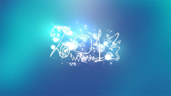
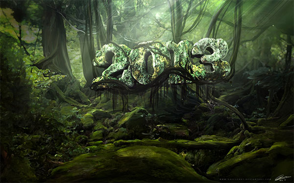
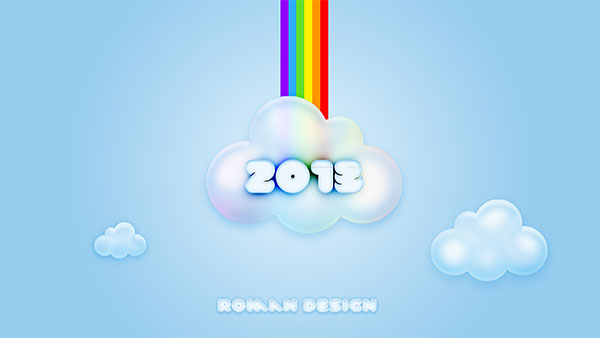
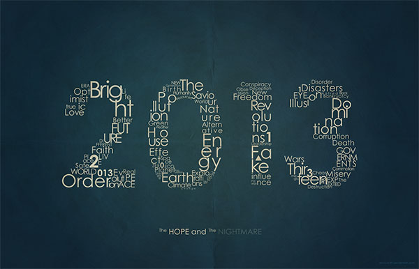
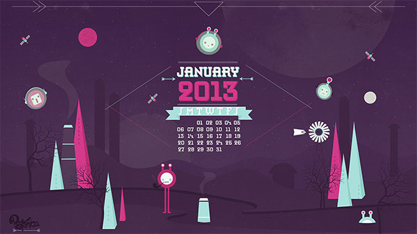
Welcome to 2013! To kick off another great year I’ve rounded up 13 of the best 2013 wallpapers. Start off the new year by making a plan to clean up your desktop. Once it’s clean, you’ll want to decorate with one of these great wallpaper designs. And if you’re looking for monthly calendars for January, head over to Smashing Magazine to see some really great January 2013 calendars. So find the wallpaper that fits your resolutions (pun intended) and here’s to a happy and productive New Years!
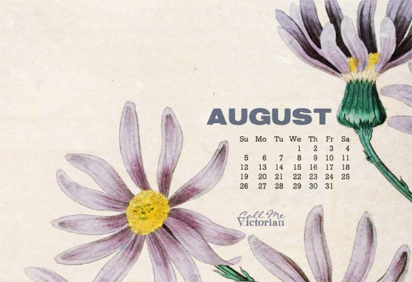
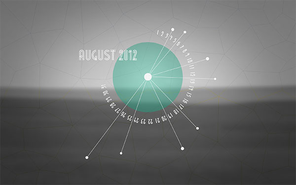
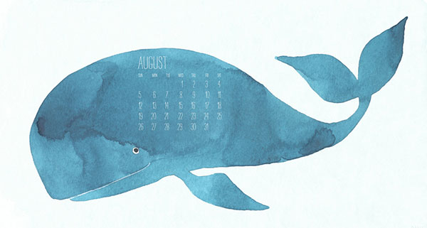
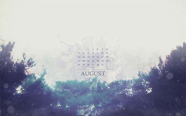
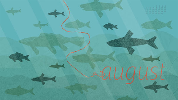
August desktop calendars just a couple days late. This collection of desktop calendar wallpapers will help keep your desktops fresh as we roll through the rest of the summer. As always, I’ve hand-picked wallpapers from talented artists and designers around the web. Feel free to share your favorites and check back next month for some great new desktop calendars. As always, if you’d like to include your own design in future roundups, let me know.
July desktop calendars are hot off the press. 2012 is halfway gone but these fun and inspiring calendar wallpapers will surely help you get through the dog-days of summer. These fine wallpapers have been hand-picked from talented artists and designers from around the web. Feel free to share your favorites and check back next month for some great new desktop calendars. As always, if you’d like to include your own design in future roundups, let me know.
Rainy days may be a title better served for the spring (depending on your location) but regardless, this illustrated desktop calendar provides some optimism for what is typically a scorchingly hot time of year.
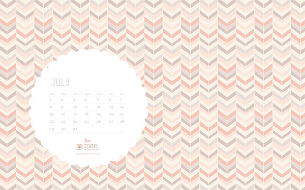
Studio of Mae has another nice patterned wallpaper ready for July. As always the fonts and minimal calendar go nicely with the lovely background. Enjoy!
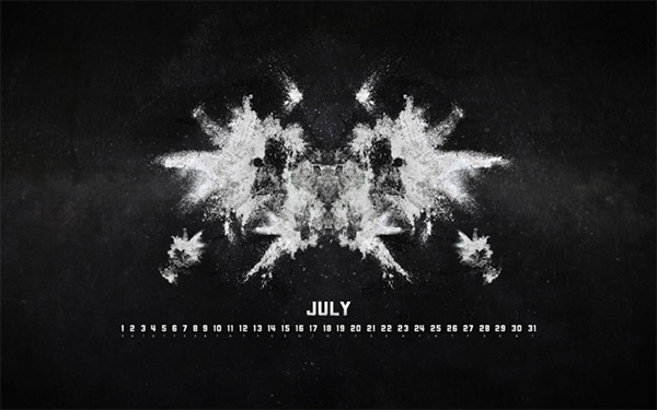
Abstract shapes bursting from an evening view of the shade tree on a farm. I absolutely love the color scheme. There’s also iPad and iPhone versions available.
That’s the roundup. Please let us know which calendar is your favorite by leaving a comment below.
The internet has made the dream of starting a business more attainable than ever. But staking a claim in the eCommerce landscape requires more than a name, a website, and some patience. Online sellers who want to survive for the long haul must build a brand from the ground up—one that resonates with shoppers and offers an optimal buying experience.
Studying existing eCommerce businesses is one helpful strategy. Consider these six things successful eCommerce brands have in common when you’re designing your company.
Unique Selling Proposition
Anyone with an internet connection and an idea can launch an eCommerce store these days, but it also means you’ll be entering a competitive market. How are you going to set your store apart? The quickest way is to identify your unique selling proposition (USP) and communicate it clearly to customers. If you have trouble summing up why shoppers should choose your company in one to two sentences, it’s time to clarify it.
Your USP can convey premium products, low prices, free shipping and returns, eco-friendliness, 24/7 customer service or any other service you prioritize for your customers. Thinking about what sets you apart from the pack is important to properly brand your store from the get-go.
Strategies for Social Media
Social media has moved beyond an optional perk in the eCommerce world. Customers expect brands to have a dedicated online presence across their favorite platforms. Social media can help deliver responsive customer service, promote useful content and drive traffic. Consider incorporating social marketing and social shopping into your strategy—the former entails engaging with customers, while the latter allows them to complete a transaction without leaving a social media platform.
Distinctive Branding
Before shoppers even have a chance to figure out your USP, they’re making snap judgments based on what they see. How strong is your visual branding? You’ll want to design a logo capable of sparking instant recognition. You’ll also want to carefully choose colors, fonts, and visuals in line with your overall brand image. If a picture’s worth a thousand words, an entire website is worth even more.
Secure, Trustworthy Website
Consumers want to complete transactions on websites they deem trustworthy. If your eCommerce store looks unprofessional, generic or sketchy, chances are customers will pass it up for a competitor. Your eCommerce store must offer a secure, PCI-compliant payment system. You can further boost trust by displaying site security seals, which improve perceived security in the mind of the customers.
Streamlined Checkout
The more steps you place between customers and checkout, the lower your conversion rates. Simplicity is always best. Avoid forcing users to register for an account before they can complete a transaction. While mandating more work may cause shoppers to bail before paying, allowing them to check out as a guest with the option to make an account later will help streamline their experience. Convenience is especially important, as more and more users make the jump to mobile shopping.
Timely Order Fulfillment
Delivery times have sped up in the last few years, and will likely continue to do so. eCommerce stores need to figure out how to offer affordable, timely shipping to satisfy their customer base. Before working with a third-party drop-shipper, make sure they’re equipped to send out packages fast enough to reflect well on your business. If you handle order fulfillment in-house, give customers the options they need to get their goods when and how they please.
These six things successful eCommerce brands have in common will help you build a strong foundation. After all, branding, marketing, cybersecurity and order fulfillment are always going to be important when it comes to launching and growing an online store.
It is hard to ignore the fact that it is becoming increasingly difficult to reach the target audience in today’s digital marketing landscape. It is an issue that everyone is facing. The reason behind this increase in challenges is simple; there are more businesses trying to win the attention of the audience, so you have to be willing to do more to stand out from the crowd.
For you and your business to stay ahead of the market, spotting new trends and integrating new strategies and marketing instruments are important, especially as we get closer to 2018. How will digital marketing evolve in 2018? That is what we are going to find out in this article.
Emotional Marketing
One of the biggest shifts that will be even more prominent in 2018 is the move towards emotional marketing. The most successful digital marketing campaigns in recent months are campaigns that won the heart of the audience, not those that target the audience’s reason and logic. This trend is shaping up to be very exciting too.
Campaigns that focus on compelling stories and emotions generate higher user engagement; emotional engagement on a deeper level. The audience are far more involved and marketers – and businesses – can take advantage of that involvement by delivering a series of messages packaged in a captivating story.
Digital marketing is no longer about transactions and bottom lines. It is more about interactions and building a stronger relationship with the audience. The business impacts of such campaigns will come later and the campaign will continue to produce results long after the relationship is established.
It’s a Content-Centric World
Good quality content will continue to dominate the digital marketing landscape in 2018. This is a rather unsurprising trend for two reasons. For starters, the audience is no longer attracted to short messages and cold calls to action. They are more interested in stories, delivered through articles, videos, and other visual elements.
The delivery of the content matters too. Short-form videos, dubbed snackables (meaning the video can be consumed in less than 60 seconds), will be very popular next year. On the other hand, articles are getting longer and are delivered in a more immersive way, with interactive elements and full-page visuals boosting their impacts.
“Content and social media marketing will be the highlights of 2018,” according to George Lee, CEO of Snap Agency, a leading creative agency with award-winning campaigns in its portfolio. “Crafting content that works for the medium is the way forward.”
Time to Personalize
That last remark by Lee about crafting content that suits the medium sums up the last trend to anticipate perfectly. Gone are the days of producing one content for all channels. It is much more important to tailor the content of your digital marketing campaigns to the delivery channels you want to use.
Producing vertical videos that work for Instagram Stories is far more effective than using a cropped 16:9 videos for the sake of convenience. The audience will pick up on the personalized content too; in fact, they will see badly produced or fitted content as signs of laziness in developing a relationship with them.
Prepare your business for these digital marketing trends of 2018, and you will be leading the market without hassle. There is no better time to start making fine adjustments to your digital marketing strategy than today.
A logo is incredibly important for branding. It simply needs to be perfect as it shows brand personality while conveying information about a company at the very first glance. A logo should never be hard to understand or there is no reason to have one. Logos tell brand stories in an instant, non-patronizing and in a completely clear way.
Much can be said about logo design but in many cases, the first thing should be to understand what you might do wrong. This is why we will mention some really common logo design mistakes you have to avoid.
Raster Graphics That Are Resolution-Dependent
As mobile content is much more important than it used to be, we should mention this mistake first. Logos need to always correctly scale based on host device. All images should appear at a quality that is consistent, all without pixelation. Because of this, using raster graphics is a really bad idea.
Professional designers now use scaling vector graphics. They will scale really well, without losing quality. Editing vector graphics is also much easier.
Blindly Following Trends, Fads And Gimmicks
There are always some brand new emerging design trends you want to consider. However, this does not mean you need to blindly follow them whenever designing a logo. As an example, one of the popular trends is using minimalistic and flat design. Is this something you want to use for everything? When you design for a business selling auto title loans, is minimalistic design enough? These are the types of questions you have to ask.
Always think about designing a logo that will stand the test of time. Also, think about the audience you want to reach with your logo. Does that audience appreciate minimalistic branding? You basically need to think about the future when you design your logo instead of what works now.
Improperly Using Typefaces
Most designers get excited as they work with fonts and this is completely normal. However, this can so easily lead towards a very big problem: improper pairing. This would make everything look really silly. Most logos are designed with an inappropriate font in relation to a brand persona. For instance, when you design a logo with the use of Comic Sans for an attorney, the result will be something that is fun and really light-hearted.
There is a pretty good possibility the client will not like this.
Everyone knows the logos of the big brands like Starbucks or McDonald’s. Because of this, some business owners decide to copy the logos. It is definitely a bad idea as it shows the brand is not creative and a lawsuit is also highly possible. For the designer, aping the successful brands leads to a logo that automatically stands out as lacking creativity. You do not want to be perceived as a designer that is not creative. Also, the result will be bad for the business as clients will recognize the copying attempt. All businessmen know how important it is to be unique for success to happen.
Though there are times in life where other people’s opinions of you and your abilities don’t matter, if you happen to be in business, opinions could be the difference between success and demise. As an artist or web designer, your work is essentially only as good as your clients say it is. When your work of art is not presented in a manner that your clients appreciate, their negative feedback can alter your chances of attracting new business.
Kind of sucks. However, it comes with the territory. Though you can’t please everyone, it is essentially your goal to do your best work so that your customers will share positive reviews. It is through these positive words, that you are able to build your brand and credibility in the creative industry and gain new traction.
How Reviews Affect Business
Today’s consumers are more informed decision makers. They don’t make purchases or go into business with brands without first finding out who they are and whether or not they’re good at what they do. Thanks to the internet, finding out about a company is just a few clicks away. Consumers commonly make and search for reviews on products and services they intend to purchase. Here are some stats on how online reviews impact businesses:
91% of consumers search online reviews before doing business
84% of consumers trust online reviews just as much as a personal reference
68% of consumers make a purchase decision after reading between 1-6 reviews.
So, one bad review from one dissatisfied customer will be read by thousands of online shoppers and will help them make an informed decision about your brand after reading it. For this reason, it is imperative for artists and designers to not only generate their best works but to encourage their satisfied customers to post positive reviews.
Finding Customer Reviews
So, how do you know where your art or design business stands in the eyes of the customers? You can easily find consumer reviews online. Though you may be aware of sites specifically designed for reviews like Angie’s List, The Better Business Bureau, and Yelp, there are other places you should look for reviews. Major sites like Mapquest.com provide a platform for consumers to place ratings and reviews on companies like Low Cost Interlock, Country Inn Suites Hotels, and more.
Making the Most of Online Reviews
Whether you find reviews of your company online or not, it is to your advantage to get on top of things before something does pop up. Below are a few tips to making the most of both positive and negative reviews found online:
Create accounts and/or profiles on some of the most popular review sites. This will allow you to verify your business, update the location, put business hours, and be alerted when reviews are added.
Provide feedback on both positive and negative reviews. Positive reviewers should be thanked for their word of mouth and encouraged to come back again. Negative reviews need to be responded to immediately with compassion. No matter how great you think your work was, apologize that they’re not pleased and offer a resolution. When it has been resolved, encourage them to go back and adjust their review and also provide your own follow-up so other readers are aware that you took care of the issue.
Encourage all of your customers to write reviews. The more positive feedback you have, the higher your chances are of getting more business.
Yes, when you work in the creative sector, your talent, skills, and abilities are what will help you bring in customers. However, it is the satisfaction and opinion of your initial customers that will determine whether you get new business. Though you can’t please everyone all the time, it is imperative to put your best foot forward with your performance and be active in the online community to let your customers know you hear them and appreciate their business. These steps will essentially help build integrity and credibility for your brand.
Everywhere we go, we engage with graphic design. Designs speak to us through advertising, billboards, restaurant menus and Christmas and anniversary cards. When we watch television or look up information online, designs speak to us and influence our moods.
As we engage with the world, we engage with the work of designers. Their work motivates us and has a subconscious impact on us every single day.
No matter where you are in your design career, you are probably constantly changing, evolving and seeking to improve. A good designer is always improving his or her skills. This guide assists you with tips to develop your talent. Use it and you’ll train both your eye and your aesthetic abilities in order to become a better graphic designer.
Take a reflexive approach to your recent work
Have a look at the projects you have completed in recent months. Even though you may have taken a critical eye while working on your project, you’ll still gain new insights. With a little time and distance, you’ll be able to see your work through new eyes.
Have a look at areas where you excelled. What skills are you happy with? Then consider what you would do differently next time, and where you think you would be able to improve. You can use these insights to develop your skills for new projects. This will assist you to learn and evolve as a designer.
And if you’re designing posters, release them online before selling them, and ask for feedback. If you can’t have an objective opinion about them, others will.
Seek feedback
Although you have your own critical eye and can reflect on your work, you will also gain a lot from the insights of others.
Seek feedback from clients, other designers, and product users. It isn’t always easy to incorporate (or hear) feedback, but if this feedback is constructive, it will assist you in developing your skills as a designer.
Explore the talent
Studying the work of talented designers may assist you with developing your own skills. Explore the decisions they have made in creating their projects, and the design techniques they have incorporated into their work.
How did they use layout, background space, harmony, hierarchy, contrast, colour, and typography? Considering their choices could give you inspiration for your own work.
If you already have designers that you admire, take some time to explore their work in detail. You can also find excellent work on sites such as Dribbble and Behance.
Take Tutorials to develop your skills
There are many different online that you can use to develop your talents. If you have spare time, you can follow a tutorial that will help you develop your talents or expand your skills.
Identify an area you would most like to learn about and follow an online guide. It is very likely that you will be able to find an online guide which will give you just what you need.
Make it personal
Making use of design in your own life will give you an opportunity to develop your skills. Whether you would like to design t-shirts, work on a blog, develop an e-commerce site or create illustrations or storyboards for a community theatre project, the possibilities are endless.
Personal projects allow you to develop your designs without any time limits. You will be able to experiment; make your own decisions and take the project in any direction you choose. You will be able to explore new knowledge along the way.
Personal projects can be both small or large, and your level of involvement will be up to you. You can spend as much or as little time on the project as you choose. If you develop a product, you will be able to use it to supplement your income. Many designers have used affiliate programs, products or advertising in order to create a significant income.
Take part in a challenge
Taking part in a challenge will assist you with developing your skills. One popular choice is to re-design the design materials for a company, charity or NGO.
While your design might not always will, you can assist the company in solving design problems by making decisions according to client needs.
The brand doesn’t have to be popular. You could even make the choice to re-design a site you think could do with improvement, simply for the fun of it. This will help you to gain helpful experience.
Take a class
Whether online or offered by a design school, there are a number of classes which will assist you with building skills or expanding your design repertoire.
Classes take time, and online courses often offer the opportunity at your own pace. Choose the skills which would be most valuable to your work and give yourself the opportunity to learn them.
Join a social media network
Social media networks like Twitter give you the opportunity to explore new designs, meet new designers and network. You can learn new information in short chunks, find inspiration and follow talented designers.
Make a mood board
Mood boards allow you to understand the colors, styles, and choices you are making at the moment, and what is informing your current aesthetic.
By creating a mood board, you will be able to see your current inspirations at a glance, allowing you to reflect on where you are currently and where you would like to be going as a designer.
Volunteer
Although you always want to get something back for your work, assisting a local charity or non-profit will help you to develop your design skills.
You can find a brand or charity that you resonate with and offer them the opportunity to update their look. You’ll learn new skills and feel altruistic at the same time.
Visit an art gallery or museum
Many designers find inspiration from work that is displayed online. However, by going to an art gallery or museum, you’ll be able to explore the work of talented artists. This might help you to find tips or ideas for your own work.
Viewing a range of art will enable you to expand your perspectives and bring new areas of creativity into your designs. Explore how the artist creates atmosphere, the line and flow within the paintings or drawings, and how the artist creates areas of interest. You can use some of these techniques in your own artwork.
Use colors with intention
When working with colors or color combinations, use them purposefully, in order to create a mood or a meaning for your audience.
Colors send a message. Greys may be associated with intellectual skills, while navy is often a corporate color, and pink is a color enjoyed by young girls. An accounting firm may suit navy blue branding, while a logo for unicorn parties may suit pinks or pastel colors.
Blues are often thought of as calming colors, while reds evoke images of passion. When creating a design, use color to send a message. When designers use colors with intention, it tells the reader that they have come to the right place. Careful color consideration is a part of good design.
Summary
Ask yourself what you have done as a designer to improve upon or expand your work? How have you chosen to move forward?
What aspects of your work are strongest, and where would you like to develop? These are questions designers ask to assess where they are coming from and where they might be going.
Just as design is constantly changing and evolving, so are the tools and techniques used in the industry.
Continued learning and experimentation assist you with learning new skills. This will keep your design practice new, fresh and up to date as you continue to learn and evolve as a graphic designer.
Uri Shaked has written about his journey in AR on the web from the very early days of Google’s Project Tango to the recent A-Frame experiments from Mozilla. Front-end devs might be interested in A-Frame because of how you work with it – it’s a declarative language like HTML! I particularly like this section where Uri describes how it felt to first play around with AR:
The ability to place virtual objects in the real space, and have them stick in place even when you move around, seemed to me like we were diving down the uncanny valley, where the boundaries between the physical world and the game were beginning to blur. This was the first time I experienced AR without the need for markers or special props — it just worked out of the box, everywhere.
I have been obsessed with User Interfaces (UI) for as long as I can remember. I remember marveling at the beauty that was Compaq TabWorks while I played „The Incredible Machine” and listened to „Tears For Fears—Greatest Hits” on the family computer.
Don’t judge me—I was listening to „Mad World” way before Donny Darko and that creepy rabbit. If none of those references landed with you, it’s probably because I’m super old. In the words of George Castanza, „It’s not you, it’s me.”
That’s another super old reference you might not get. You know what—forget all that, let’s move on.
I really got into UI when I bought my own computer. I had joined the Coast Guard and saved a bunch of money during boot camp (when you can’t go shopping—you know—because of push-ups and stuff). I wanted to buy a Chevy Cavalier (sadly, that’s not a joke), but my father encouraged me to invest in a computer instead, so I bought a Compaq from Office Depot that came with Windows 98. Also you can’t buy a Cavalier with 800 bucks.
Windows 98
I spent countless hours changing the themes in Windows 98. I was mesmerized by the way windows overlapped and how the icons and fonts would change; the shapes of buttons and the different colors. The slight drop shadow each window had to layer it in space. Each theme was better than the previous theme!
Oh, The depth of the blues! The glory of fish! BREATHTAKING.
If only I had known how much better things were going to get. If only I had known, about Windows XP.
Windows XP
Does love at first sight exist? No—don’t be ridiculous. Love is an extremely complex part of the human condition that can only manifest itself over time through long periods of struggling and the dark night of the soul.
„What is love? Baby don’t hurt me. Don’t hurt me. No more.”
But love’s fickle and cruel cousin, Infatuation, does exist and it is almost exclusively available at first sight. I was absolutely infatuated with Windows XP.
The curves on the start menu. The menu animations. I could just look at it for hours. And I did. Shocking fact—I wasn’t exactly in high social demand so I had a great deal of free time to do weird things like stare at an operating system.
For those who remember, Windows XP was extremely customizable. Virtually every part of the operating system could be skinned or themed. This spawned a lot of UI hacking communities and third party tools like Window Blinds from the fine folks at Stardock. I see you Stardock; the north remembers.
I Love UI
I could go on and on about my long, boring and slightly disturbing obsession with UI. Oddly enough, I am not a designer or an artist. I can build a decent UI, but you would not hire me to design your site. Or you would but your name would be „Burke’s Mom.”
Awww. Thanks, Mom. I can do 3 images.
I can however assemble great UI if I have the building blocks. I’ve been lucky enough to work on some great UI projects in my career, including being part of the Kendo UI project when it first launched. I love buttons, dropdown lists, and dialogue windows with over the top animation. And I can assemble those parts into an application like Thomas Kinkade. I am the UI assembler of light.
But as a user, one thought has been recurring for me during the past few years: the best user experience is really no user interface at all.
UI is a Necessary Evil
The only reason that a UI even exists is so that users can interact with our systems. It’s a middle-man. It’s an abstracted layer of communication and the conversation is pre-canned. The user and the UI can communicate, but only within the specifically defined boundaries of the interface. And this is how we end up with GLORIOUS UX fails like the one that falsely notified Hawaiian residents this past weekend of an incoming ballistic missile.
This is the screen that set off the ballistic missile alert on Saturday. The operator clicked the PACOM (CDW) State Only link. The drill link is the one that was supposed to be clicked. #Hawaiipic.twitter.com/lDVnqUmyHa
We have to anticipate how the user is going to think or react and everyone is different. Well designed systems can get us close to intuitive. I am still a fan of skeumorphic design and „sorry not sorry.” If a 4 year old can pick up and use and iPad with no instruction, that’s kind of a feat of UX genius.
That said, even a perfect UI would be less than ideal. The ideal is to have no middleman at all. No translation layer. Historically speaking, this hasn’t been possible because we can’t „speak” to computers.
Until now.
Natural-Language Processing
Natural-language processing (NLP) is the field of computing that deals with language interaction between humans and machines. The most recognizable example of this would be the Amazon Echo, Siri, Cortana or Google. Or „OK Google.” Or whatever the heck you call that thing.
I firmly believe that being able to communicate with an AI via spoken language is a better user interaction than a button—every time. To make this case, I would like to give you three examples of how NLP can completely replace a UI and the result is a far better user experience.
Exhibit A: Hey Siri, Remind Me To…
Siri is not a shining example of „a better user experience,” but one thing that it does fairly well and the thing I use it for almost every day, is creating reminders.
It is a far better user experience to say „Hey Siri, remind me to email my mom tomorrow morning 9 AM” than it is to do this…
Open the app
Tap a new line
Type out the reminder
Tap the „i”
Select the date
Tap “Done”
No matter how beautiful the Reminders app is, it will never match the UX of just telling Siri to do it.
Now this comes with the disclaimer of, „when it works.” Siri frequently just goes to lunch or cuts me off halfway through which results in a nonsensical reminder with no due date. When NLP goes wrong, it tends to go WAY wrong. It’s also incredibly annoying as anyone who as EVER used Siri can attest.
This is a simple example, and one that you might already be aware of or not that impressed with. Fair enough; here’s another: Home Automation.
Exhibit B: Home Automation
I have a bunch of the GE Z-Wave switches installed in my house. I tie them all together with a Vera Controller. If you aren’t big into home automation, just know that the switches connect to the controller and the controller exposes the interface with which to control them, allowing me to turn the lights on and off with my phone.
The Vera app for controlling lights is quite nice. It’s not perfect, but the UX is decent. For instance, if I wanted to turn on the office lights, this is how I would do it using the app.
I said it was „quite nice.” Not perfect. I’m just saying I’ve seen worse.
To be honest though, when I want to turn a light on or off, I don’t want to go hunting and pecking through an app on my phone to do it. That is not awesome. I want the light on and I want it on now. Turning lights on and off via your phone is a step backward in usability when compared to, I don’t know, A LIGHT SWITCH?
What is awesome, is telling my Echo to do it.
I can, for any switch in my house, say…
“Alexa, turn on/off the office lights”
Or the bedroom, or the dining room or what have you. Vera has an Alexa skill that allows Alexa to communicate directly with the controller and because Alexa uses NLP, I don’t have to say the phrase exactly right to get it to work. It just works.
Now, there is a slight delay between the time that I finish issuing the command and the time that Alexa responds. I assume this is the latency to go out to the server, execute the skill, call back into my controller, turn off the light, go back out to the skill in the cloud and then back down into my house.
I’m going to be honest and say that I sometimes get irritated that it takes a second or two to turn the lights on. Sure—blah blah blah technical reasons, but I don’t care. I want the lights on and I want them on NOW. Like Veruca Salt.
I also have Nest thermostats which I can control with the Echo and I gotta tell you, being able to adjust your thermostat without even getting out of bed is kind of, well, it’s kind of pathetic now that I’ve said it out loud. Never mind. I never ever do that.
NLP doesn’t have to be limited to the spoken word. It turns out that interfacing with computers via text is STILL better than buttons and sliders.
For that, I give you Exhibit C.
Exhibit C: Digit
Digit is a remarkable little service that I discovered via a Twitter ad. You’ve aways wondered who clicks on Twitter ads and now you know.
I wish more people knew about Digit. The basic premise behind the service is that they save money for you automatically each month by running machine learning on your spending habits to figure out where they can save money without sending you into the red.
The most remarkable thing about Digit is that you don’t interface with it via an app. Everything is done via text; and I love it.
Digit texts me every day to give me an update on my bank account balance. This is a nice daily heads up look at my current balance.
Yes, I blurred out my balance. It’s so you don’t get depressed on my behalf.
If I want to know how much Digit has saved for me, I just ask how much is in my savings. But again, because Digit is using NLP, I can ask it however I like. I can even just use the word „savings” and it still works. It’s almost like I’m interfacing with a real person.
Now if I want to transfer some of that back into savings because I want to buy more Lego and my wife says that Lego are a „want” not a „need” and that we should be saving for our kids „college,” I can just ask Digit to transfer some money. Again, I don’t have to know exactly what to say. I can interface with Digit until I get the right result. Even If I screw up mid-transaction, Digit can handle it. This is basically me filling out a form via text without the hell that is „filling out a form.”
After using Digit via text for so long, I now want to interface with everything via text. Sometimes it’s even better than having to talk out loud, especially if you are in a situation where you can’t just yell something out to a robot, or you can’t be bothered to speak. I have days like that too.
Is UX as We Know it Dead?
No. Emphatically no. NLP is not a substitution for all user interfaces. For instance, I wouldn’t want to text my camera to tell it to take a picture. Or scroll through photos with my voice. It is, however, a new way to think about how we design our user interfaces now that we have this powerful new form of input available.
So, before you design that next form or shopping cart, ask yourself: Do I really even need this UI? There’s a good chance that thanks to NLP and AI/ML, you don’t.
How to Get Started With NLP
NLP is far easier to create and develop than you might think. We’ve come a long way in terms of developer tooling. You can check out the LUIS project from Azure which provides a GUI tool for building and training NLP models.
It’s free and seriously easy.
Here’s a video of me building an AI that can understand when I ask it to turn lights on or off by picking the light state and room location out of an interaction.