
Maxican Man

James Blond


Cool comps

93′

25 years

SP Disegno

I am the future – Itau Bank
Post pobrano z: I am the future – Itau Bank
Brazilian bank Itaú Unibanco is running a commercial, “I Am The Future” (Eu sou o futuro), designed to inspire proactive engagement with the future. Narrated by Brazilian actress Fernanda Montenegro, the film discusses how people’s actions in the present can influence everyone’s future. Themes such as love, fear, uncertainty, truth, happiness, peace, differences and hope convey the contemplative tone of the message. “I am the future” is the third in a trilogy of films marking the end of the year and the beginning of a new year. The 2015 film talked about human relations with the world’s digitalization. In 2016 the focus was on how to enjoy the digital world’s wonders to live more and enjoy more each moment without pursuing lost time. In this last commercial the theme relates to giving too much thought about the future and neglecting the present. It shows that future is uncertain, it is scary, but we are the ones who can create our best destiny. If we want more love and happiness, we need to love more and be happier now because our future depends on us. “Nós não estamos nas mãos do futuro. O futuro é que está em nossas mãos.” (We are not in the hands of the future. The future is in our hands.) The film was shot in Uruguay, on location in Montevideo, Punta Ballena and Cabo Polônio.

Itau I Am The Future Credits
The I Am The Future campaign was developed at Africa by chief creative officer Sergio Gordilho, creative directors Otavio Schiavon and Jeferson Rocha, copywriter Everton Behenck, art director Edson Rosa, innovation and creative research team Andreia Rocha, Eduardo Berardinelli and Asaph Luccas, agency producers Rodrigo Ferrari, Tais Olhiara and Ian Inglez, account team Ana Hasegawa, Tariana Cruz, Bruna Motta and Rebeca Coelho, media team Luiz Fernando Vieira, Francisco Custodio, Beto Lima, Caroline Tanzillo, Gabriel Tardelli, Brunna Sa, Paula Rumachella and Jade Moura, planning team Rodrigo Maroni, Marina Pires, Rafael Camilo, Felipe Nogueira, Bruno Schwarzschild, and Leonardo Juhasz, working with Itau Bank marketing team Eduardo Tracanella, Thiago Cesar Silva, Leticia Banheti and Mariana Carvalho.
Filming was shot by director Vellas (Felipe Vellasco) via Saigon with director of photography Pierre Kerchove, executive producers Marcelo Altschuler and Carol Pessini, art director Marcelo Reginato, editor Beto Araujo, finishing artist Fabio Abreu
Post production was done at Nash with post production coordinator Virgini Fares.
Sound was produced at Antfood by sound producers Lou Schmidt, Pedro Botsaris, Wilson Brown and Vinicius Nunes. Music is the Forrest Gump feather theme, by Alan Silvestri.
Voice over was by Fernanda Montenegro.
How to impress by creating a website with great typography
Post pobrano z: How to impress by creating a website with great typography
When you are working on a website, you’re aware that great typography helps to create a message, keeps viewers engaged and adds to your design.
There are so many fonts available, that you might wonder how you create the perfect choice for your site. Here are some tips to help you:
Go back to the basics
Working with website design means looking at the foundations of a font.
Explore the divide: almost every font choice is based on the decision of serif or sans serif.
Use space: kerning means working on the space between letters, tracking means pulling blocks of text together by eliminating excessive space, and leading refers to the amount of space between text lines.
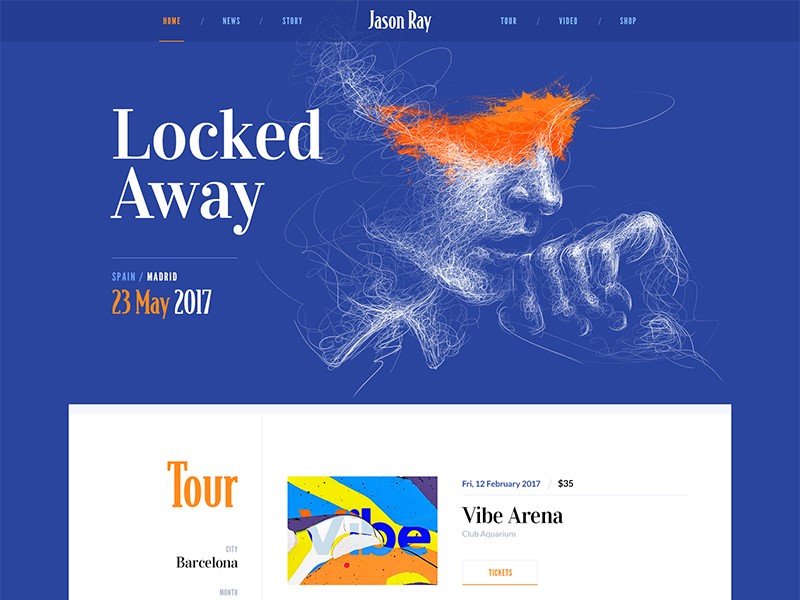
Legibility: ensure that your text is easy to read. Play with font size to ensure that your viewers will be able to read easily without impacting how sentences run across a page.
Remove hyphens and justification: this helps to keep your work looking organized and eliminates unnecessary spaces.
Limit choice: try to use only two or three fonts on a screen. This keeps your page from becoming chaotic or overwhelming.
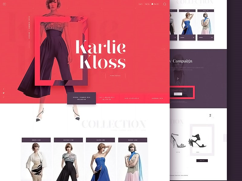
Remember to contrast: when you want to make a message pop out onto your screen, remember to use contrast.
Contrast is created by combining light and dark colors, but can also be used by contrasting color intensities such as vivid and muted colors.
Use browser friendly fonts
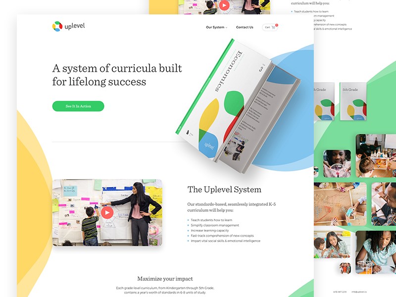
When you are shifting between browsers, make sure your texts are compatible. Text should also be compatible with different devices, such as mobile phones and laptop computers.
To do this, you could explore browser friendly fonts from Google Fonts, and ensure that you can read or use them on a smartphone or tablet.
How to create atmosphere or emotion using text
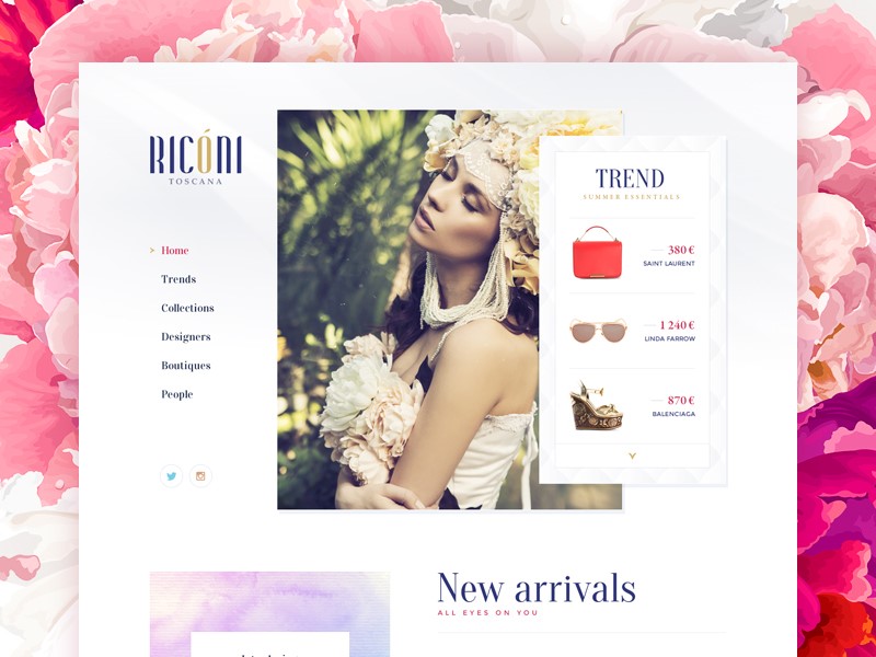
Words or sentences carry a message, but your viewer will take a first glance at your site and absorb meaning from your design, text, background, and color.
Your audience will not be able to relate to your site or text if the following four elements are not present:
- Type
- Color
- Texture
- Image
Adding these to your typography will enable you to create atmosphere, and to pass on a message to your viewers.
Working with color
When working with color, limit your choices. Many designers use a primary color, secondary color and accent color.
By using too many colours in your design, your website will be chaotic. If you’d like to create points of emphasis, use contrast instead of additional colour.
Be creative with your graphics
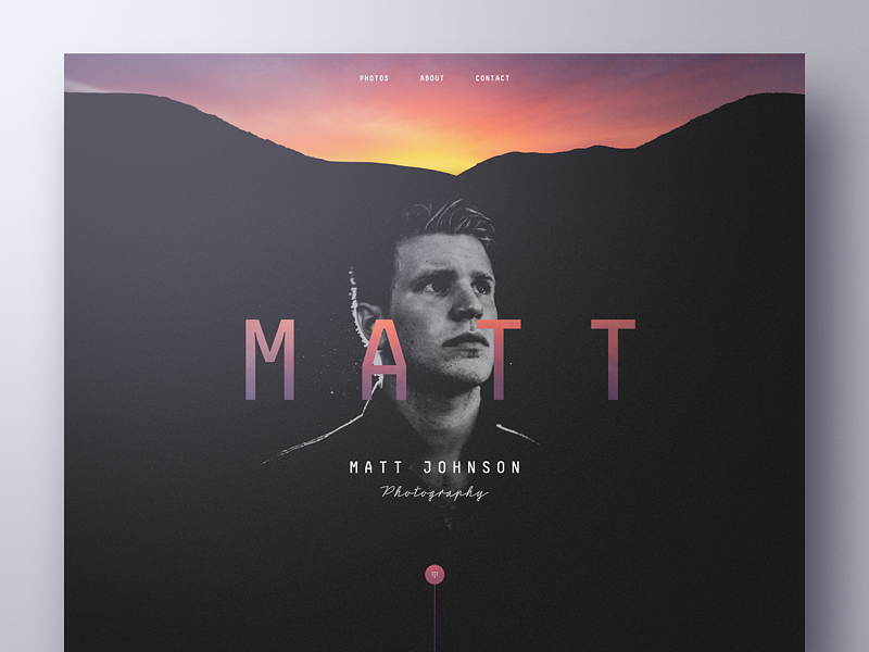
Surely, you want your site to be different than other websites in your niche. You can design a great header, footer or simply create a creative background.
That would be easy for a graphic designer, but if you’re a web designer that usually tackles simple graphics and code, it might be quite the challenge.
My advice is to start reading a few typography tutorials for Photoshop or Illustrator. Then, the sky is the limit when it comes to designing beautiful typography designs.
Working with content
When working with content, add hierarchy by working with paragraphs, headings, and subheadings.
While books are divided into chapters, sections, and paragraphs, websites use individual pages. The navigation bar represents a table of contents.
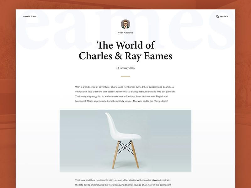
Websites have a clear distinction between titles, main paragraphs, and subsections of content. Subparagraphs often come with subheadings, so that users can take in information quickly.
Web users often want to be able to take in information quickly and get the general idea of a page. Page design is about making the reading process as quick and efficient as possible.
It is for the designer to lay out content according to importance. This means getting to know the content of your client’s pages so that you can organize it effectively.
Create mockups
If you’re working with small amounts of content, arrange the text according to headings, subheadings, and short paragraphs or bullet points.
However, if you are working with a great deal of text design a mock-up first. This will help you to work with chunks of text in a way which is both attractive and easy to read.
This way you can experiment with different combinations or page settings. Once you are happy with the mockups, you can incorporate other elements of your design.
Align your text
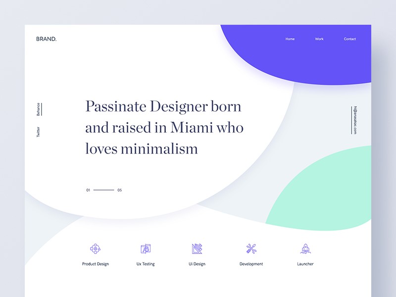
Alignment means placing text so that it can be read from left to right.
Aligning text from left to right prevents creating a chaotic feel to the website and makes it look professional. Only center large headlines on a website.
Preview the website
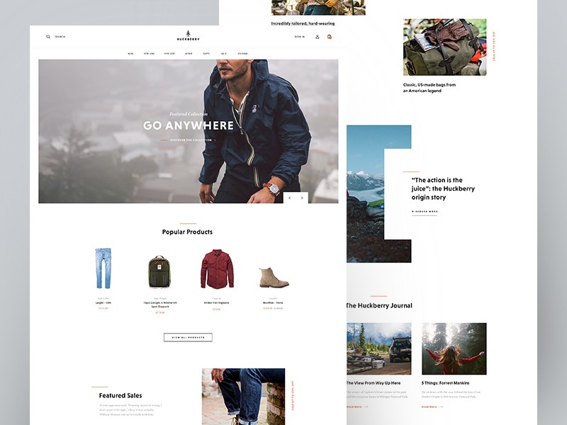
Once you have inserted your text into your page, take a look at how it fits within the page.
Look for text errors such as excess spacing, or sentences which fall out of balance. Examine the white space above and below your text. Without changing the content, make sure that the text gives an attractive and legible appearance to the page.
Create hierarchy
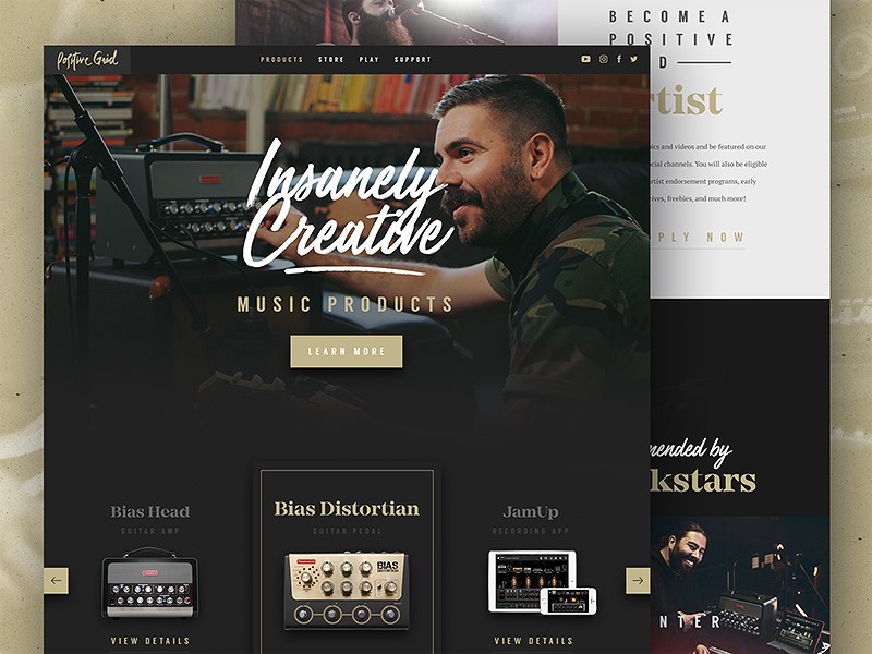
In the current society, website users are exposed to so much information on a daily basis that, were this not arranged effectively, it would feel chaotic.
As a designer, it is your role to structure this information so that it is easily digestible, arranged into a hierarchy of importance, and attractive to look at.
This relies on typography. From a design perspective, creating hierarchy is absolutely crucial in order to ensure users engage with a site.
Acknowledge the tone and message
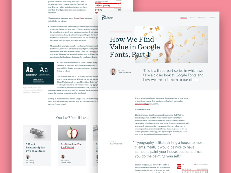
When selecting a font, consider the tone and message of your content or site. Pick a typeface which matches the project you are working on.
A typeface for a thrash metal band would be different to that of a vintage furniture and clothing shop. Corporate projects would be different to casual ones.
Ask whether your typeface should be formal or casual, sleek or elegant, large or small, bold or light, and how it will pair with the colors you will be using on the site. How will the mood of the letters match with the words being read? A focus on zen design, for example, would clash with a very elaborate font.
Ending thoughts
Website designers use text to tell a story using words, but to provoke emotion and atmosphere through design.
When the writer and designer are able to work together to produce quality content which can be effectively and legibly displayed, this creates an attractive and easily absorbable end result.
9 Easy Ways to Keep Your Website Visitors Longer
Post pobrano z: 9 Easy Ways to Keep Your Website Visitors Longer
Your website’s bounce rate, or the rate at which people leave shortly after arriving, is used by search engines as a measure of the fit of the site with the user’s query. If people leave the site quickly, search engines use that as a vote of no confidence in the content and downrank your site. Conversely, “sticky” sites that keep visitors longer are given higher rankings – and they’re more likely to convert visitors to customers. Here are 9 easy ways to keep your website visitors for longer.
Don’t Drive Them Away by Design
If your website takes too long to load, people will bounce away from it. And the patience of the average viewer is falling. You used to lose 10% of your potential visitors every second. You’ll now lose a fair percentage if the page isn’t starting to show results in three seconds.
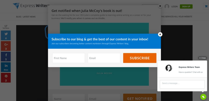
One way you drive away visitors as soon as they arrive is with pop-ups and interstitials. Think about landing on a webpage, and instead of the content you expect, there’s a pop-up ad. That drives visitors away. Another mistake is putting an interstitial or partial block on the page, whether asking them to sign up for your newsletter or promoting your newest product. Remove all obstacles between your visitors and your content and you’ll retain more of them.
Don’t Accidentally Tease Them
If your website is still using Adobe Flash, your site could play a few seconds of rich multimedia before erroring out. You’ve just guaranteed they’ll leave your site and never return. Don’t show up in search results for informational queries and then take them to a spammy landing page with too many ads. They’ll abandon the site again and avoid it forever.
Be an Open Book
Ensure that your text is readable on every screen size without visitors having to resize the text. Don’t forget to check the readability and usability of buttons and menus. And don’t use weird fonts that visitors have to download.
Adjust Your Search Engine Optimization
One common cause of bounces is the fact that your content isn’t a fit for the search. The solution here is to study the customer segment arriving on the site versus the focus of the content. One solution is to leave your page’s SEO as it is but tailor the content to better answer the question visitors are asking. Another is to alter the key terms on the page so that it ranks higher in the searches that your content answers.
Improve Your Answer
One reason people bounce away from websites is that the page isn’t answering the question. This is where a long introduction before answering the user’s question causes them to quit the page. The solution is to answer at least a partial answer like a yes or no before going into detail further down on the page. This at least keeps the reader on the page and reading a while longer.
Use Smart Formatting
Smart formatting makes it easy to read your content. This takes the form of bulleted lists, FAQ formats, suitable images, short paragraphs and frequent subheadings. The benefit of smart formatting is that it makes it easy for someone to skim the content to find what they want.
Lead Them On to Other Content
Another way to keep visitors on your pages is to embed links to related content on your website. For example, you’re showing the pros and cons of the Model A product. Provide a link on the same page to take them to the specifications for Model A or a comparison of Model A to its main rival. If people follow internal links to other content, search engines see this as an endorsement for your content. If someone is seeking advice on how to fix a problem with your product, give them your link to the repair kit you recommend instead of letting them look for it elsewhere.
Use Intuitive Navigation
Intuitive navigation is a navigation structure that users understand immediately. If you have an ecommerce page, design the product structure so that someone looking at a blue short sleeved sweater by brand B can tell how to see other sweaters by brand B or your other short sleeved sweaters. This keeps them on the site as they browse instead of abandoning your site for someone else’s. A web design company can help you implement this if it isn’t already set up on your website.
Be Mindful of Their Needs
One variation of this is creating targeted pages that are optimized to answer questions the users are asking, so they don’t have to hunt for answers. Another variation is using a few, high quality images that are directly relevant to the query but minimizing bandwidth demands, whether you use content delivery networks or have a lazy load of third party content.
Conclusion
Keeping your visitors on page is all about understanding their needs and improving their user experience. You also have to design your site for maximum readability and make the navigation as seamless as possible.