How to Create Vexel Art in Adobe Photoshop With an Action

Post pobrano z: How to Create Vexel Art in Adobe Photoshop With an Action

Final product image
What You’ll Be Creating

In this tutorial you will learn how to create an amazing vexel art effect. I will explain everything in so much detail that everyone can create it, even those who have just opened Photoshop for the first time.

The effect shown above is the one I will show you how to create in this tutorial. If you would like to create the even more advanced vexel art effect
shown below, using just a single click and in only a few minutes, then
check out my Vexel Photoshop Action.

Action final result

What You’ll Need

To recreate the design above, you will need the following photo:

1. Let’s Get Started

First, open the photo that you want to work with. To open your photo, go to File > Open, choose your photo, and click Open. Now, before we get started, just check a couple of things:

  1. Your photo should be in RGB Color mode, 8 Bits/Channel. To check this, go to Image > Mode.
  2. For best results, your photo size should be 1500–3500 px wide/high. To check this, go to Image > Image Size.
  3. Your photo should be the Background layer. If it is not, go to Layer > New > Background from Layer.
Checking image size and mode

2. How to Create the Vexel Art Style

Step 1

In this section, we are going to create the vexel art style. Press Control-J on your keyboard to duplicate the Background layer, go to Image > Adjustments > Shadows/Highlights, and enter the settings below:

Adjusting shadows and highlights

Step 2

Now go to Image > Adjustments > Shadows/Highlights again and enter the settings below:

Adjusting shadows and highlights

Step 3

Go to Image > Adjustments > Brightness/Contrast and set the Brightness to -20 as shown below:

Adjusting brightness

Step 4

Now go to Filter > Sharpen > Unsharp Mask, and set the Amount to 500%, Radius to 5.0 px, and Threshold to 0 levels as shown below:

Adding unsharp mask filter

Step 5

Go to Filter > Stylize > Diffuse and set the Mode to Anisotropic as shown below:

Adding diffuse filter

Step 6

Now go to Filter > Noise > Reduce Noise and use the settings below:

Adding reduce noise filter

Step 7

Go to Filter > Blur > Smart Blur, and set the Radius to 5.0, Threshold to 25, Quality to Low, and Mode to Normal.

Adding smart blur filter

Step 8

Now go to Filter > Sharpen > Unsharp Mask, and set the Amount to 500%, Radius to 1.0 px, and Threshold to 0 levels.

Adding unsharp mask filter

Step 9

Go to Filter > Stylize > Diffuse and set the Mode to Anisotropic.

Adding diffuse filter

Step 10

Now go to Filter > Stylize > Oil Paint, set the Stylization to 5.0 and Cleanliness to 2.0, and uncheck the Lighting.

Adding oil paint filter

Step 11

Go to Filter > Stylize > Oil Paint again, set the Stylization to 10.0 and Cleanliness to 10.0, and uncheck the Lighting.

Adding oil paint filter

Step 12

Now go to Filter > Blur > Surface Blur, and set the Radius to 5 px and Threshold to 15 levels as shown below:

Adding surface blur filter

Step 13

Go to Filter > Filter Gallery > Artistic > Cutout, and set the Number of Levels to 8, Edge Simplicity to 5 and Edge Fidelity to 3 as shown below:

Adding cutout filter

Step 14

Now go to Image > Auto Tone and then Image > Auto Contrast to make some auto-corrections to the photo’s tone and contrast.

Making auto corrections

Step 15

Go to Image > Adjustments > Brightness/Contrast and set the Contrast to 100 as shown below:

Adjusting contrast

Step 16

Now go to Filter > Sharpen > Unsharp Mask, and set the Amount to 50%, Radius to 5.0 px, and Threshold to 0 levels as shown below:

Adding unsharp mask filter

Step 17

Now name this layer Vexel Art.

Renaming the layer

3. How to Make the Final Adjustments

Step 1

In this section, we are going to make some final adjustments to the design. Press D on your keyboard to reset the swatches. Then, go to Image > Adjustments > Gradient Map to create a new gradient map adjustment layer and name it Overall Contrast.

Creating new gradient map adjustment layer

Step 2

Now change the Blending Mode of this layer to Luminosity and set the Opacity to 56%.

Changing blending mode and opacity

Step 3

Go to Layer > New Adjustment Layer > Levels to create a new levels adjustment layer and name it Overall Brightness.

Creating new levels adjustment layer

Step 4

Now Double-click on this layer thumbnail and in the Properties panel enter the settings below:

Adjusting levels

Step 5

Go to Layer > New > Gradient Map to create a new gradient map adjustment layer and name it Color Look.

Creating new gradient map adjustment layer

Step 6

Now Double-click on this layer thumbnail, and then in the Properties panel, click on the gradient to open up the Gradient Editor panel and enter the settings below:

Adjusting gradient map
The left color stop has color e000e0, and the right color stop has color 005161.

Step 7

Change the Blending Mode of this layer to Color.

Changing the blending mode

Step 8

Now go to Layer > New Adjustment Layer > Vibrance to create a new vibrance adjustment layer and name it Overall Vibrance/Saturation.

Creating new vibrance adjustment layer

Step 9

Double-click on this layer thumbnail and in the Properties panel set the Vibrance to +43 and Saturation to +22 as shown below:

Adjusting vibrance and saturation

Step 10

Now press Control-Alt-Shift-E on your keyboard to make a screenshot, and then press Control-Shift-U to desaturate this layer. Then, go to Filter > Other > High Pass and set the Radius to 2 px.

Adding high pass filter

Step 11

Name this layer Overall Sharpening and change the Blending Mode of this layer to Overlay.

Changing the blending mode

You Made It!

Congratulations, you have succeeded! Here is our final result:

Final result

If you would like to create the even more advanced vexel art effect shown below, using just a single click and in only a few minutes, then check out my Vexel Photoshop Action.

The action works so you simply fill in your subject with a color and just play the action. The action will do everything for you,
giving you fully
layered and customizable results. The action also creates 20 preset color looks that you can choose from.

The action comes with a detailed video tutorial that demonstrates how to use the action and customize the results to get the most out of the effect.

Action final result

Esso Reindeer Princess

Post pobrano z: Esso Reindeer Princess

ExxonMobil Europe is connecting into the Christmas season with “Esso Reindeer Princess”, an online film set in Norway. The commercial explores the story of Anne, a young woman who has found her place in the Sámi tradition of reindeer racing. Growing up in her local community she felt as though she didn’t fit. However she has gained acceptance after becoming the world’s number-one reindeer racer. Running online and on social media across European markets, the campaign aims to show the difference an Esso station can make in remote communities. Amid the snowscape, we see footage of an Esso service station providing a beacon of light and connection to the outside world for the people who live in this remote place. “The Reindeers saved me”.

Essen Reindeer Princess

Paul Cohen, Global Executive Creative Director on ExxonMobil, adam&eveDDB said: “This is a compelling and human story that shows the difference an Esso station can make to a remote community. Esso are proud to keep the Reindeer Princess racing and this seemed like the perfect time of year to bring this story to a wider audience.”

Essen Reindeer

Esso Reindeer Princess Credits

The Esso Reindeer Princess campaign was developed at Adam&Eve/DDB by chief creative officer Richard Brim, executive creative director Paul Cohen, creatives Natasha Lyons and Dan Lacey, agency producer Rebecca Holt, planners James Price and Philip Mattei, global business directors Katie Toller and Peter Lewis, business director Caroline Logan, account director Emily Hahn and senior account manager Adriane Bowes, working with ExxonMobile marketing communications manager EAME Retail Fuels Christophe Fay.

Media was handled at UM by media planner Jack Graham.

Filming was shot by directors Wilkins & Maguire via Stink Films with director of photography Tat Radcliffe, executive producer Jon Chads, and producer Paz Parasmand.

Editor was Peter Norrey at TVC Soho.

Post production was done at The Mill by post producer Alexandra Paton, colourists Seamus, Luddy and James Bamford.

Sound was produced at 750mph by Mark Hellaby.

Music was composed by Adam Ilhan.

Otto Feliz Navidad – Christmas Together

Post pobrano z: Otto Feliz Navidad – Christmas Together

Germany shopping chain OTTO is running “Together It’s Christmas”, an advertising campaign centred on the classic Christmas song “Feliz Navidad”. Set in the middle of the Bolivian mountains, the Together It’s Christmas commercial (Gemeinsam wird’s Weihnachten) shows a bus journey going awry after a landslide. With no help in sight, the passengers come to realise that they will not be celebrating the beginning of their Christmas holidays with their loved ones, but with strangers. Inspired by the young girl who starts singing ‘Feliz Navidad’, a classic Christmas song throughout the Spanish speaking world, the passengers come together to embrace the festive spirit in union. The “Together It’s Christmas” campaign is featured on a microsite: otto.de/gemeinsam

Otto Christmas Feliz Navidad

“With our Christmas campaign, we want to show that the essence of Christmas is coming together, sharing, and caring for one another. We want to remember these values, that are more important than ever today, and get us in the mood for the forthcoming Christmas season”, said Marc Opelt, OTTO-divisional marketing director and online-retail spokesman,

The newly interpreted Christmas song ‘Feliz Navidad’, which has been specially created for the campaign by MOKOH Music, can be downloaded for free otto.de/gemeinsam

Online Response

OTTO’s YouTube video attracted a range of comments, including from people concerned that a German television commercial featured a Hispanic cultural setting and that Christmas meanings and cultural traditions were being downplayed. The one “white” character is portrayed as an insensitive gringo. OTTO responded with the following note on their YouTube page:

“Our Christmas film tells a story about unity and the thought of coming together. The underlying values behind it should not be ruined by people who clearly have contradictory intentions and have no interest in living a harmonious life together with everyone. With great disappointment we read the kind of comments that were posted by a number of users. The film deliberately depicts a story about Christmas from different kinds of perspectives. For example from the point of view of a child, who won’t make it home on time for Christmas Eve. Or from the point of view of a bus driver, who would have rather taken the day off. Or of a tourist, who does not have the necessary language skills to communicate with the locals. Eventually, all these different individuals manage to make the most of each other and the situation, whilst being stuck in the Bolivian hills and together they celebrate Christmas. Beyond disagreements, beyond cultural differences, political dispute and religious orientation. A beautiful thought – especially in times like these – as we love diversity and cherish every human being. And this is the kind of appreciation we wish to anticipate here in the discussions on YouTube.”

Otto Feliz Navidad Credits

The Otto Feliz Navidad campaign was developed at Heimat Berlin by chief creative officer Guido Heffels, managing director Maik Richter, creative director Teresa Jung, senior creative Lisa Yvonne Heimgartner, creative Lima Shengelia, account director Vivien Ott, account manager Lena Lehmann and agency producer Meike Kornrumpf.

Filming was shot by director Daniel Mulloy via RSA Films and BigFish Film with director of photography Mátyás Erdély HSC, executive producer Kai-Lu Hsiung (RSA), executive producers Frank Siegl and Dagmar Garber (Bigfish), producers Ulrich Kreis and Ben Porter.

Editors were Julian Eguiguren and Jacob Ipsen.

Colourist was Oisin O’Driscoll at The Mill.

Post production was done at Candy Mountain (Bigfish).

Set photographer was Francisco Odriozola.

Sound design was by Jon Clarke at Factory London and Studio Funk Berlin.

Music, “Feliz Navidad” (1979 by José Feliciano) was newly interpreted by MOKOH Music Berlin

How to Create a Mountain Rescue Unit Badge in Adobe Illustrator

Post pobrano z: How to Create a Mountain Rescue Unit Badge in Adobe Illustrator

Final product image
What You’ll Be Creating

In the following steps you will learn how to create a mountain rescue unit vector badge in Adobe Illustrator. For starters you will learn how to set up a simple grid and how to create the main badge shape. Using basis vector shape building techniques and some warp effects, you will learn how to create the rest of the shapes. Moving on, you will learn how to add some subtle shading and a flat background. Finally, you will learn how to add text and how to easily bend it.

For more inspiration on how to adjust or improve your final badge, you can find plenty of resources at GraphicRiver.

1. How to Create a New Document and Set Up Grid

Hit Control-N to create a new document. Select Pixels from the Units drop-down menu, enter 850 in the width and height boxes, and then click that More Settings button. Select RGB for the Color Mode, set the Raster Effects to Screen (72 ppi), and then Create Document.

Enable the Grid (View > Show Grid) and the Snap to Grid (View > Snap to Grid). You will need a grid every 5 px, so simply go to Edit > Preferences > Guides & Grid, and enter 5 in the Gridline every box and 1 in the Subdivisions box. Try not to get discouraged by all that grid—it will make your work easier, and keep in mind that you can easily enable or disable it using the Control-„ keyboard shortcut.

You can learn more about Illustrator’s grid system in this short tutorial from Andrei Stefan: Understanding Adobe Illustrator’s Grid System.

You should also open the Info panel (Window > Info) for a live preview with the size and position of your shapes. Don’t forget to set the unit of measurement to pixels from Edit > Preferences > Units. All these options will significantly increase your work speed.

set up grid

2. How to Create the Main Shape

Step 1

Pick the Ellipse Tool (L) and focus on your Toolbar. Remove the color from the stroke and then select the fill and set its color to R=87 G=158 B=214.

Move to your artboard and simply create a 310 x 70 px shape—the grid and the Snap to Grid should make it easier.

ellipse tool

Step 2

Pick the Rectangle Tool (M), create a 310 x 255 px shape, and place it as shown in the first image. Make sure that it stays selected and go to Object > Path > Add Anchor Points.

Switch to the Direct Selection Tool (A), select the anchor point highlighted in the first image, and drag it 115 px down as shown in the second image.

add anchor point

Step 3

Select both shapes made so far, open the Pathfinder panel (Window > Pathfinder), and click the Unite button.

pathfinder

Step 4

Make sure that your shape is still selected and go to Effect > Stylize > Rounded Corners. Enter a 25 px Radius, click OK, and then go to Object > Expand Appearance.

rounded corners

3. How to Create the Smaller Shapes

Step 1

Make sure that your blue shape is still selected and go to Object > Path > Offset Path. Enter a 25 px Offset and click OK. Fill the resulting shape with red and don’t forget to send it to back with Shift-Control-[.

Reselect your blue shape and go again to Object > Path > Offset Path. This time, enter a -15 px Offset and click OK. Fill the resulting shape with yellow.

expand appearance

Step 2

Select your red and yellow shapes and click the Minus Front button from the Pathfinder panel.

offset path

Step 3

Using the Rectangle Tool (M), create a 200 x 100 px shape and place it as shown in the first image. Select this rectangle along with the red shape and click the Intersect button from the Pathfinder panel. Fill the resulting shape with R=246 G=40 B=17.

intersect

Step 4

Select your blue shape and go to Object > Path > Offset Path. Enter a -15 px Offset, click OK, and fill the resulting shape with R=32 G=43 B=63.

offset path

Step 5

Using the Rectangle Tool (M), create a 320 x 155 px shape and place it as shown in the first image. Select this new rectangle along with the darker blue shape and click the Intersect button from the Pathfinder panel. Make sure that the resulting shape is filled with R=32 G=43 B=63.

intersect

Step 6

Pick the Rectangle Tool (M) and create a 360 x 85 px shape. Fill it with R=246 G=40 B=17 and place it as shown in the following image.

red rectangle

4. How to Create the Mountains

Step 1

Using the Pen Tool (P), create a sharp mountain outline roughly as shown in the following image. Once you’re done, fill this shape with R=248 G=232 B=217.

mountain shape

Step 2

Pick the Ellipse Tool (L), create a 50 px circle and place it as shown in the first image. Select your mountain shape and go to Object > Path > Offset Path. Enter a 5 px Offset, click OK, and bring the resulting shape to front (Shift-Control-]).

Select both shapes made in this step and click the Minus Front button from the Pathfinder panel. Fill the resulting shape with R=248 G=232 B=217.

sun

Step 3

Using the Pen Tool (P), create several sharp shapes as shown in the first image. Fill them all with R=153 G=196 B=230.

pen tool

5. How to Create the Bent Shapes

Step 1

Select your red rectangle and go to Effect > Warp > Arch. Enter the attributes shown below, click OK, and then go to Object > Expand Appearance.

warp arch

Step 2

Pick the Rectangle Tool (M) and create a 360 x 85 px shape. Fill it with R=32 G=43 B=63, place it as shown in the first image, and then go to Effect > Warp > Arch. Enter the attributes shown below and click OK. Expand your selection (Object > Expand Appearance) and then send it to back (Shift-Control-[) .

warp arch

6. How to Add Strokes, Shading, and a Background

Step 1

Select your blue shape and focus on the Appearance panel (Window > Appearance). Select the stroke, set the color to R=248 G=232 B=217, and then open the Stroke fly-out panel. Increase the Weight to 15 px and check the Align Stroke to Inside button.

stroke

Step 2

Make sure that your blue shape is still selected and keep focusing on the Appearance panel. Add a second stroke using the Add New Stroke button and select it. Set the color to R=32 G=43 B=63 and the Weight to 10 px.

add new stroke

Step 3

Select all the shapes made so far and add copies in front (Control-C > Control-F). Make sure that only these copies are selected and click the Unite button from the Pathfinder panel.

Send the resulting shape to back (Shift-Control-[) and focus on the Appearance panel. Select the fill, set the color to R=32 G=43 B=63 and lower its Opacity to 15%, and then go to Effect > Path > Offset Path. Enter a -30 px Offset, click OK, and then go to Effect > Distort & Transform > Transform. Enter the attributes shown below, click OK, and then go to Effect > Blur > Gaussian Blur. Enter a 20 px Radius and click OK.

gaussian blur

Step 4

Pick the Rectangle Tool (M) and create an 860 px square. Fill it with R=248 G=232 B=217, make sure that it covers your entire artboard, and don’t forget to send it to back (Shift-Control-[).

background

7. How to Add Text

Step 1

Pick the Type Tool (T) and open the Character panel (Window > Type > Character). Select the Balatype font and set the size to 70 px.

Simply click on your artboard and add the „HIMALAYA” piece of text. Place it as shown in the following image and set the color to R=248 G=232 B=217.

character panel

Step 2

Make sure that your piece of text is still selected and go to Effect > Warp > Arch. Enter the attributes shown below and then click OK.

type tool

Step 3

Pick the Type Tool (T) and focus on the Character panel. Use the same font and set the size to 35 px.

Add the „RESCUE UNIT” text and set its color to R=248 G=232 B=217. Place this new piece of text as shown in the following image and go to Effect > Warp > Arch. Enter the attributes shown below and then click OK.

warp arch

Step 4

Pick the Type Tool (T), add the „EVEREST” piece of text, and set its color to R=248 G=232 B=217. Place this new piece of text as shown in the following image and go to Effect > Warp > Arch. Enter the attributes shown below and then click OK.

warp arch

Step 5

Pick the Type Tool (T) and focus on the Character panel. Use the same font and set the size to 100 px. Add a little „+„, set the color to R=248 G=232 B=217, and place it as shown in the first image.

Return to the Character panel and set the size to 30 px. Add the „19” and the „69” pieces of text and place them as shown in the last two images.

cross

8. How to Add Some Fir Trees

Finally, download the attachment from this tutorial: How to Create a Wintry, Snow Background in Adobe Illustrator. Open that christmas tree.ai document and copy the shape inside your badge document.

Change the fill color to R=32 G=43 B=63 and then create about seven copies. Spread these copies roughly as shown in the first image and then send them behind that red shape.

christmas tree

Congratulations! You’re Done!

Here is how it should look. I hope you’ve enjoyed this tutorial and can apply these techniques in your future projects. Don’t hesitate to share your final result in the comments section.

Feel free to adjust the final design and make it your own. You can find some great sources of inspiration at GraphicRiver, with interesting solutions to improve your design.

final product

How to Create a Power Scene Photo Manipulation With Adobe Photoshop

Post pobrano z: How to Create a Power Scene Photo Manipulation With Adobe Photoshop

Final product image
What You’ll Be Creating

In this tutorial I’ll show you how to use Adobe Photoshop to create a power scene using a variety of photo manipulation techniques. 

First, we’ll build the base environment using images of the sky and buildings. After that, we’ll add the flying rocks and lightning and blend them together using adjustment layers, masking, and brushes. Later, we’ll paint the light and particles. We’ll use several adjustment layers to complete the final effect.

Tutorial Assets

The following assets were used during the production of this tutorial:

1. How to Make the Base Environment

Step 1

Create a new 2000 x 1333 px document with the given settings:

new file

Step 2

Open the sky image. Use the Rectangular Marquee Tool (M) to select the
sky only and add it to the white canvas using the Move Tool (V).

add sky

Step 3

Go to Layer > New Adjustment Layer > Hue/Saturation and bring the Saturation value down to -100:

sky hue saturation

Step 4

Create a Curves adjustment layer to bring more light, especially the
top left of the sky where the main light will be located. On the layer
mask, activate the Brush Tool (B) to paint over the lower section to reduce the effect there.

sky curves

Step 5

Cut out the buildings and add them to the main document.

add buildings

Step 6

Use the Lasso Tool (L) to select the building on the top right and then
hit Control-J to paste the selected one into a new layer. Flip it
horizontally by choosing Edit > Transform > Flip Horizontal. Move
it to the top left to fill in this corner and resize it to be a bit
smaller.

select right towers
add to the left

Step 7

Copy the building in the lower right of the canvas and add it to the
top left corner where we’ve added a small building in the previous step.

add more tower

Step 8

The buildings look a bit darker than the sky. On each of the building
layers, create a new layer (set as Clipping Mask), change the mode to
Overlay 100%, and fill with 50% gray.

DB new file

Use
the Dodge Tool (O) with Highlight Range and Exposure about 50-60% and the
Burn Tool with Midtones Range to bring more light and details to the
buildings. You can see how I did it with Normal mode and the result with
Overlay mode.

DB normal mode
DB overlay mode

Step 9

Select all the building layers and Dodge/Burn ones and press Control-G
to create a group for them. Change this group’s mode to Normal 100% and
add a Hue/Saturation adjustment layer within the group. Bring the Cyans
value down to -51:

buildings hue saturation

Step 10

Create a Curves adjustment layer to brighten the buildings more. On
this layer mask, use a soft black brush to erase some corners of the
buildings as they shouldn’t get much light on there.

buildings curves 1

Step 11

Make a Levels adjustment layer to decrease the dark contrast in the
corners of the buildings. Paint on the rest of the buildings so that they won’t
be affected by this adjustment layer.

buildings levels

Step 12

Create a new layer and use a soft white brush to paint on the top of
the building to brighten these areas more. Change this layer mode to
Soft Light 100%.

building light
building light result

2. How to Add the Rocks

Step 1

Open the rock images pack. Browse the meteor10 folder and grab the one
you like and place it in the middle of the space between the buildings.
Use the Free Transform Tool (Control-T) to move the top of the rock towards the sky to fit the
angle of the buildings.

add big rock

Duplicate
this layer and move the bright side of the rock towards the light. Use
Control-T
with the Warp mode to bend it until you get a result like
the one below:

big rock duplicated

Step 2

Use a layer mask to blend this rock with the existing one.

rocks blending

Step 3

Add several rocks to both sides of the scene by duplicating this
layer or selecting others from the folders. Use the Warp Tool to tweak and
bend the rocks so they appear different.

add more rocks

Step 4

Add more rocks around the buildings and make them in different sizes using
Control-T with the Warp mode. Place some bigger ones on the edges of the
canvas. On each of these layers, go to Filter > Motion Blur and
apply similar settings to the ones below. Depending on the size, angle and
distance of the rock, you can change the settings to get
your desired result.

more rocks with motion blur settings 1
rocks with motion blur settings 2
rocks with motion blur settings 3

Step 5

Create a group for all the rock layers and add a Hue/Saturation adjustment
layer within the group. Bring the Saturation value down to the minimum.

rocks hue saturation

Step 6

Use a Curves adjustment layer to brighten the rocks. On the layer mask,
use a soft black brush to erase the shadow side of the rocks so they
won’t be affected by this adjustment layer.

rocks curves
rocks curves masking

3. How to Add the Lightning

Step 1

Open the lightning 1 image. Isolate the lightning using the Magic Wand
Tool (W)
and add it to the bottom of the biggest rock (middle one) so it
looks as if it’s coming down from the rock. Use Control-T to change its
perspective and make the top much smaller and the bottom much bigger.

add  lightning 1

Step 2

Select two details of the original image and add them to the big fork of lightning.

select two details from lightning 1
add more details to lightning 1

Step 3

Create a group for the lightning layers and use a Hue/Saturation adjustment layer to desaturate the effect’s color.

lightning 1 hue saturation

Step 4

Open the lightning 2 image. Use the Lasso Tool (L) to select the big fork and add it to the bottom of the middle rock. Use Control-T to make it connected to one of the falling rocks on
the right.

select lightning 2
add lightning 2

Change this layer mode to Screen 100% and use a layer mask to remove the edges around the fork.

lightning 2 screen mode

Step 5

Add other forks of lightning from the original image and connect them to three rocks on the left and the top sides.

add more rays from lightning 2

Step 6

Make a group for these layers and alter the group’s mode to Screen
100%
. Add a Hue/Saturation adjustment layer and reduce the Saturation
value to -100:

lightning 2 hue saturation

Step 7

Create a Levels adjustment layer to remove the white edges completely.

lightning 2 levels

4. How to Paint the Light and Particles

Step 1

Create a new layer on top of the layers and use a soft white brush to
spot on the area between the rock and the big fork of lightning to make a light hole.

paint light hole

Step 2

Make a new layer and change the mode to Overlay 100%. Use a soft white
brush with a lowered opacity (about 50%) to paint glow around the light hole and on the two forks below.

paint more light glow

Step 3

Make a new layer and turn the foreground to black. Press F5 to change the setting of this brush. After that, use this brush to paint tiny particles around the rocks area.

particles brush settings 1
particles brush settings 2
particles brush settings 3
particles brush settings 4
particles result

5. How to Make the Final Adjustments

Step 1

Create a Curves adjustment layer on top of the layers and decrease the
lightness. On this layer mask, use a soft black brush to paint on the
middle of the space between the buildings and the top of them to keep
their brightness.

whole scene curves 1
whole scene curves 1 masking
whole scene curves 1 masking result

Step 2

Make another Curves adjustment layer to bring more light to the space
between the buildings. Paint on the rest of the scene so it won’t be affected by this
adjustment layer.

whole scene curves 2

Step 3

Use a Color Balance adjustment layer to complete the final effect.

whole scene color balance

Congratulations, You’re Done!

I hope that you’ve enjoyed the tutorial and learned something new for
your own projects. Feel free to share your results or leave comments in
the box below. Enjoy Photoshopping!

final result

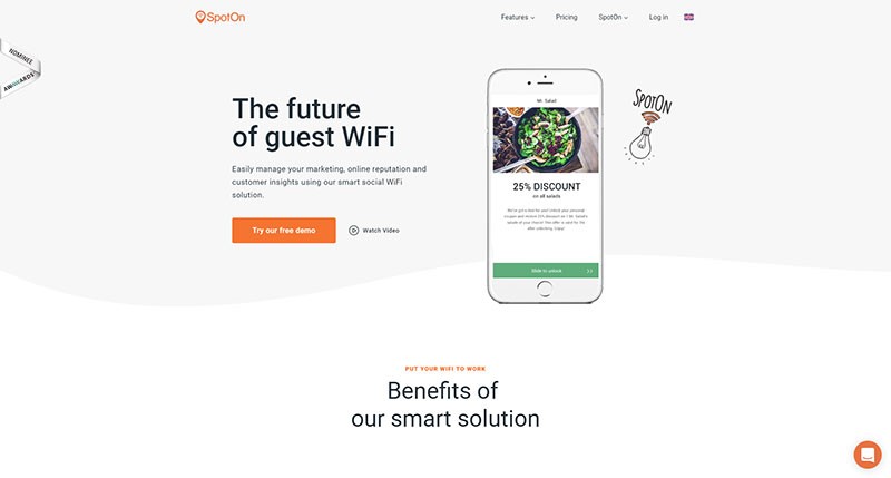
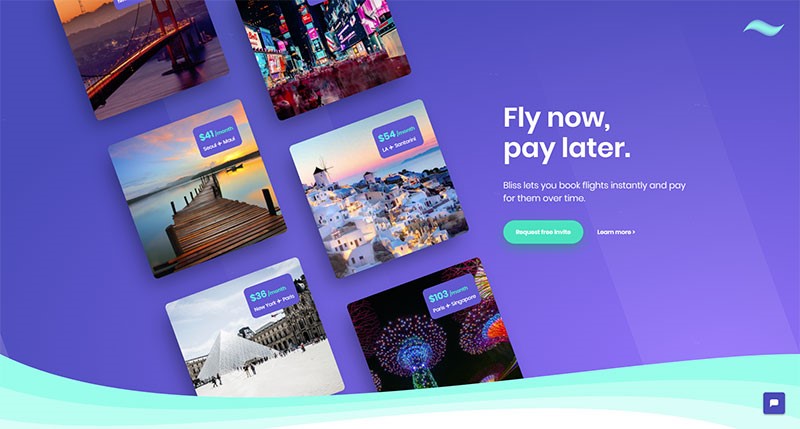
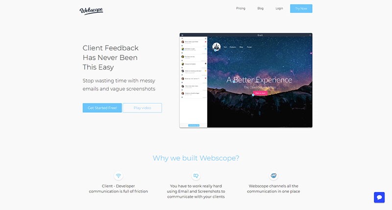
How to create a landing page that converts

Post pobrano z: How to create a landing page that converts

When you’ve got your website up and running, you’ve taken out the search engine and Facebook adverts you need, and you are getting lots of traffic, and people are landing on your page, what do you do when your viewers go no further?  In other words, they do not convert into clients or customers?

A good landing page is an essential aspect of web design.  This means that when viewers land on your site, they will take action.

A good landing page makes it easy.  But how do you create a landing page which converts?

You want your landing page to give an excellent first impression.  This impression is created in the blink of an eye.

Internet users are impatient, and won’t stay long on your site if it does not appeal.  You want your audience to linger long enough to convert from visitor to customer.

Decide on your specialty

What makes your site unique (your unique selling point or USP), or sets you apart from your competition?  Declare what you offer that your competition doesn’t have on your landing page.  Do so obviously, so that viewers are in no doubt.

In order to declare your USP you could use your headline, a subheader or a value proposition.  Make sure it POPS out at your reader.  If your viewers bounce off your page (go no further than a simple landing), rethink how your USP is being communicated.

Also, use a website layout that leads the user to your unique selling point and to the call to action.

Five ways to get your message across:

  1. Keep your language simple and concise. This will mean that your viewers understand exactly what you offer without confusing terms of difficult jargon.
  2. Use the word ‘free’ as a reward to encourage users to engage. This could mean a free trial or sign up period.  There could also be a ‘buy one, get one free’ deal, or a discount code or coupon to be used within a specified time period.
  3. Create a comparison to a well-known brand. Show how you stand up to your competition (make sure you can back it up).
  4. Share how your viewer will receive a return on investment. Will landscaping their garden improve the curb appeal of a home?  Share this so that your user understands the purpose or benefit of investing their money into a product.
  5. Show long-term or immediate benefits. This means showing your users how your product or service will assist them.  Will they be eligible for promotion by taking an online course?  Point this out.  Give references from past customers to back up your point.

Use a call to action

Your call to action is one of the most important aspects of your landing page because it asks users to engage further.  It should be a focus of your page.

Making your call to action seem appealing is crucial if you want to convert viewers into subscribers or clients.

The following prompts invite a call to action:

  • Sign up
  • Learn more
  • Free Download
  • Start your Free Trial
  • Create an Account

Evoke user imagination

By representing the brand visually, you aim to show your viewers what your product or service looks like, and how it will be of benefit.

A sportsman, crossing the finish line, arms raised in delight will show the benefit of a good pair of running shoes.

Your goal is to get your user to imagine himself in this situation.  You can use photos or videos to showcase your product, showing how it will bring benefit to your user’s everyday life.

Share the benefits

Your user won’t want to buy a product unless it offers benefit.  Speak directly to your customer, sharing what your product offers.  Go into detail.

Your headline and images may attract user attention, but by engaging further, you encourage your user to delve deeper.

Try to answer any questions which may arise.  Use bullet points for easy understanding.  Make your wording clear and concise so that your user understands what you are saying.

Offer Proof

Share research, customer testimonials and articles on your product.
Offer up proof from scientific studies.  Show reviews from people who have purchased the download and have found it helpful.

Explain clearly how your product provides an example of these services, and why users would benefit from making a purchase.

Tips for keeping it simple

Your landing page is there to invite a call to action.  Keep it simple.  You can add a link to a home page to share additional information later on.

Keep your product page separate.  Your goal is to keep your viewer from getting distracted or feeling lost.  You want your viewer to focus on the call to action.

Limit extra navigation, which could distract your viewer from the Call To Action.  You don’t want your viewer to move from the landing page too quickly.

Keep your objective clear and simple.  Don’t add too much information beyond sharing your brand, purpose and value.  Only add what is necessary to carry out this goal.  The call to action should be clear and visible.

Make sure the content is consistent with what your visitor has previously seen or heard about your brand.  Any feeling of disconnect will make your visitors feel lost or as though they are in the wrong place.

Your landing page must add something of value to your customer.  Your visitor has to be shown the benefits of engaging further.

Be flexible and engaging with your landing page.  Find out what appeals to your customers and offer it up.  Change your landing page when you offer new products.  This will give you the opportunity to convert internet traffic into new clients or customers.

Summary

Your landing page is the place where you showcase your brand or design, inviting visitors to become loyal customers.

A powerful landing page will bring business goals to fruition.  Showcase a brand, sharing the benefits and offering the opportunity to sign up.  Then stay flexible, improving and developing your page as needs arise.

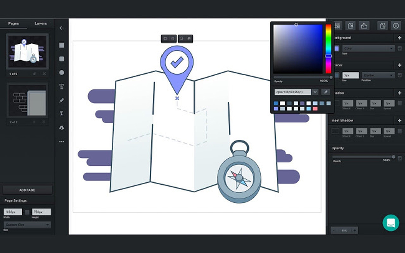
10 Useful Graphic Software for Beginners

Post pobrano z: 10 Useful Graphic Software for Beginners

“A picture is worth a thousand words.” This statement is justifiable through the graphic design technologies that are effective for both beginner and experienced graphic web designers. Through free and payable graphic design software, one can improve their graphics content to appeal to the market through high-quality visuals and materials.

Listed below are 10 effective graphic design software that every beginner should consider in coming up with attractive models, images, and texts for their websites.

1. Photoshop

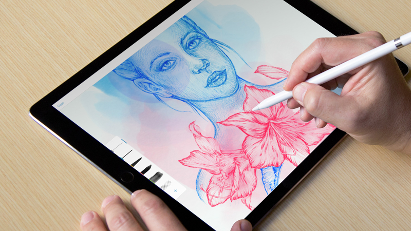
With its flexibility in the application of Windows and Mac devices, Photoshop is an effective photo-editing tool for beginners. It enables one to convert a simple photo to an intriguing masterpiece work of art. Photoshop is quite popular with the millennial as most viral photos on the internet are courtesy of its simple sharing platform that covers popular social media platforms like Facebook, twitter, and Instagram. The user is able to remove/crop out or add images and combine several images together. It has numerous filters with auto fix mode on elements such as color & enables photo rotation.

2. FILMORA

FILMORA possesses simple video editing tools enabling the user to crop, rotate, flip, merge videos among others. It provides over three hundred effects great for converting video into other file formats and readily applicable motion elements. It enables the creation of animated beautiful texts and titles for attractive headings, easy selection of music from the music library and sound effect to enhance specific scenes, and effective overlays and filters.

3. CANVA

A free online web design software with simple features for dragging and dropping. Its fonts and layouts selection is wide with numerous shapes, photos, and icons for achieving attractive images applicable in both social platforms and presentations.

4. VECTR

It is easily accessible through downloading on the desktop or website as an app with no charges. VECTR best suits beginners in vector graphics offering easily usable graphic design tools and editing options including filters and easily accessible platforms for sharing one’s work enhancing collaboration.

5. Adobe Premiere Pro

Through Adobe’s customer’s satisfaction aim, the software is equipped with effective video editing tools depending on the user’s specification that vary from movies to short commercial clips and even music videos.

6. Director Suite

It’s a flexible professional video editing software that focuses on photos, audio, color, and video enhancing one’s creativity. Its cost is reasonable compared to the vast array of services and specialization it possesses.

7. INKSCAPE

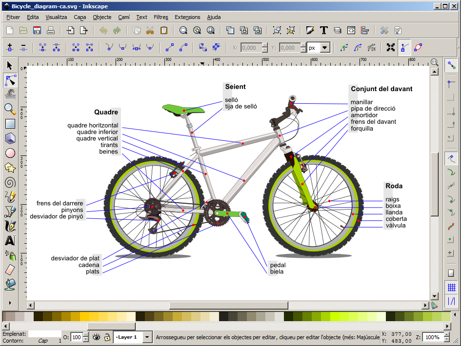
It enables flexibility in the application in Mac devices, Windows, Linux among others. Its free services are effective for web designers specializing in logo creation and branding services. INKSCAPE scalable vectors and drawings are flexible. It possesses a unique alphabet transparency feature.

8. PAINT.NET

It is available through windows enhancing the simple application of photo and image editing tools for effective designs. It enables adjustment of graphics layers acting as a substitute for Microsoft Photo editor among other software.

9. Adobe Indesign

Its application favors both mobile phone and desktop accessories. Its specialization is focused on the creation of layout designs. Adobe Indesign is effective for web designers specialized in the printing press for books and digital magazines. One can easily transfer and share work from both desktop and Smartphone enabling application of available phone and desktop apps for an effective outcome.

10. Xara Xtreme

An effective photo editing software specifically helpful to photographers in editing different features ranging from photo texture to color. One can easily resize an image by following the easily explained rules concerning its available image editing tools. A good example is its ability to correct errors caused by the lens.

In conclusion, there is various graphics software that can serve both beginner and advanced web designers. One should consider the cost value as some are free while others tend to have a fee payment requirement. Some of the useful graphic design software includes Photoshop, Filmora, CANVA, VECTR, Adobe Premiere Pro, \Director Suite, INKSCAPE, PAINT.NET, and Xara Xtreme. Listed above are ten efficient graphic designs that will improve one’s images, videos, and texts to high-quality, eye-catching graphic design products.

10 Best Graphic Design Tools For 2018

Post pobrano z: 10 Best Graphic Design Tools For 2018

The right kind of graphic design tools can easily modernize your workflow, assisting you to execute in a smart way and more proficiently. You are actually investing your time and energy in crafting wonderful, eye-catchy designs for your clients’ satisfaction and to the delight of your regular users. So the graphic designers though being busy; need to stay updated with the new design tools of 2018 that will help them become more fruitful and creative in the coming year, thus saving their time. Mentioned here are 10 brand new graphic design tools that can bring out the best in your projects!

1. Photoshop CC’s Curvature Pen Tool

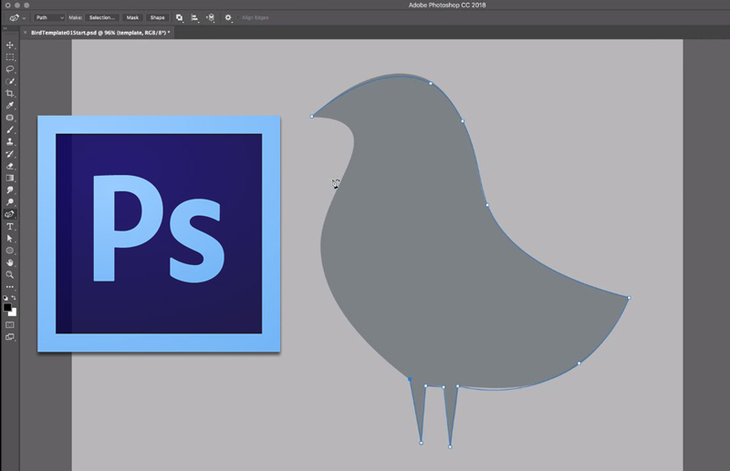
If you are having a Creative Cloud subscription, then a cool new pen tool is accessible in the Tools panel to create curved lines in Photoshop CC much simpler. With the help of this Curvature Pen tool, you can click to add points which will directly make drawing curves between them. The push and pull the segments of the curve purely to modify it for better.

2. Lightwell

Available for iPad, iPhone, and OS X, the Lightwell tool allows you to upload your 2D designs superbly and spin them into interactive storytelling apps. Currently free on Apple Store and reaching Google Play Store in 2018, this tool offers a prospective easy and quick method to bring all the stories and media to life.

3. Sketch

Sketch is a Bohemian Coding’s vector UI design tool that has small size documents and provides hundreds of plugins to makes the workflow smoother and simpler for a designer. The Sketch features a great built-in grid system and user-friendly and creates interface design much simpler.

4. Adobe XD

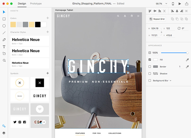
Adobe XD covers drawing tools that enable the designer to choose a device-precise art-board size to start a project and can also import a trendy UI kit like Google’s Material Design. XD is also a light interface along with multiple photos loaded in it, and good for mood-boards.

5. Canva

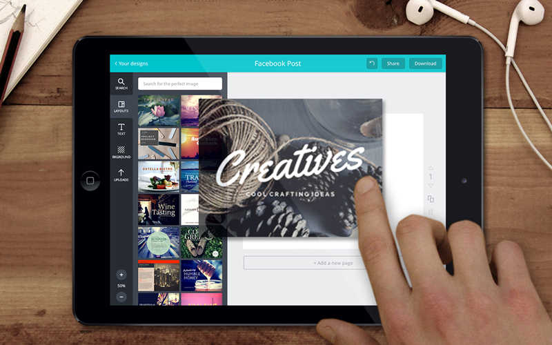
Canva is the most popular and free tool used for creating amazing designs, brochures, and logos. The graphic designers can easily utilize this browser-based tool to craft graphics for print as well as the web. Canva is just perfect for carving superb images for your website and social media. One can apply the drag-and-drop feature of Canva and specialized layouts to design striking graphics always.

6. Type Nugget

Type Nugget deals with CSS typography. This is known to be an online typesetting tool which offers you good control of typestyles. Type Nugget exhibits a wide range of text samples on the page that can be easily live-tweaked in a panel on the right side. Thus the panel allows the graphic designer to choose the font size, style, weight, letter spacing, text decoration, and much more for individual features of the page, like headings, global styles, links, paragraphs, and HTML lists.

7. Parallax SVG Animation Tools

SVG Animation Tools is available in the form of a Python script which is crafted by Gareth Battensby of Parallax. This tool helps in creating long or complex sequence SVG animations in a very easy way. The Parallax SVG Animation tools are ideal for the front-end developers who do the animation of SVG graphics along with GSAP or related animation libraries.

8. Figma

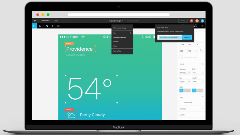
Accessible in the browser, or on Mac, Linux, or Windows, the Figma has free and paid versions which depend on what you apply it for. It is an interface design tool which allows numerous designers to team up in real-time.  One can get discount & coupons at Couponobox.com for premium tools. You can use Figma to craft a couple of icons for articles that you want to publish on your website as its workflow is exceptional.

9. Affinity Designer

Serif’s Affinity Designer has been amazingly well-designed and is a unique graphic design tool. You can enjoy using its features that include nondestructive, adjustable layers where you can easily adjust vectors or images sans smashing them.

10. Pattern Lab

Pattern Lab is a stunning pattern-driven design tool that is based on Atomic Design concept. It is a language-and-tool-agnostic and also a static site generator which sews up UI components together. Pattern Lab allows the designer to layer the UI patterns inside each other and even design along with dynamic data.   

Hence, save your budget, energy and time in your future webs design projects with these above new graphic design tools.

Agregator najlepszych postów o designie, webdesignie, cssie i Internecie