People often stay away from open source software because of the perceived risk that comes with code anyone can inspect. It’s a logical argument, but it’s not necessarily a good reason to not use open source. Open source coders are always looking for security flaws and finding ways to fix them so they can make a name for themselves in the world of coding. And coders flock to open source software because they can build upon an existing framework without having to deal with roadblocks thrown up by a major name developer. In fact, many major websites are built on open source software primarily due to the fact that there’s no need to get around trademarked code.
Drupal, WordPress, and Joomla are all major software platforms used by millions and are all created from open source code. In fact, WordPress is the most downloaded content management system on the market. WordPress became popular because it’s easy to use, has countless free plug-ins, and thousands of templates both free and paid. Joomla and Drupal are also content management systems and have features that are similar to WordPress.
All of these open source software systems are popular for various reasons; the least of which is that they’re free or almost free. They come with developer support to help users get past issues, are easy to use, and users can make the platforms fit their needs with little effort. Read on to the infographic below to learn more about these popular platforms and how they’re here to stay.
No matter if you are going to update the already launched web resource or bring a new project to the web, you are likely to be looking for trendy and stylish solutions that will help your resource shine. In the showcase that we share below, you can find the 15 most popular and trending flagship themes from TemplateMonster compatible with the latest versions of the world-known platforms. So, if you run a website on WordPress, Joomla, HTML5, Magento, OpenCart or PrestaShop, you are likely to find a design that matches your preferences.
The inventory of ready-made themes from TemplateMonster counts more than 26,000 for various purposes. More and more often you can notice multipurpose templates being added to the marketplace. The demand on such themes grows at a fast rate. Fit-it-all designs come loaded with every piece of functionality suited to enhance the visual appeal of a site and make it more powerful from the inside.
The themes that we will discuss here include various features and are suited for different purposes. However, all of them have special peculiarities in common. All of them are developed as per the latest web tendencies. All of them are well-documented and feature free 24/7support. You can personalize their layouts on your own or ask experts from TM Service Center for help.
Intense Multipurpose Website Template
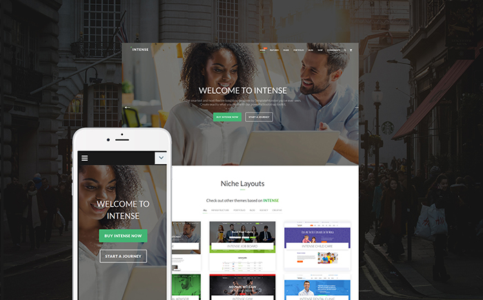
Intense is a powerful and feature-rich HTML5 theme intended to be used for a number of business projects. This is a fully responsive website template that includes a collection of 450+ HTML pages, multiple header and footer layout variations, pre-designed templates for blog/portfolio pages, reusable elements, various sidebar widgets, and a whole lot of other options. The theme includes a rich collection of child skins that are intended to be used for the web resources of different niches. The theme is eCommerce-ready, letting you get started with a full-fledged web store on its basis.
Starbis – Multipurpose Website Template For Business
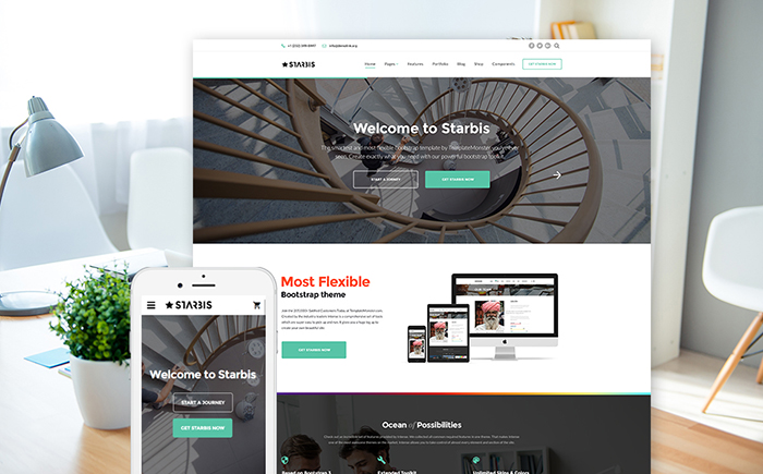
Starbis is a multipurpose HTML5 template suited to be used for both personal and business projects. It includes a growing collection of child skins, which are available to the theme owners at no cost. The theme is powered by the fully responsive Bootstrap framework, which is intended to adjust all components of the layout to all screen sizes. The theme includes collections of header and footer styles, which will help you bring the desired structure to the page layout in the shortest period of time. Starbis is an eCommerce-ready template, which comes loaded with every single element needed to build a web project by means of which you can start selling for profit.
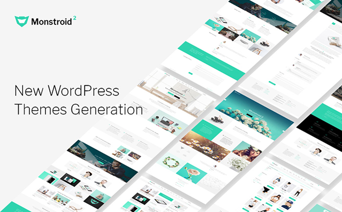
Monstroid Squared is a multifunctional and feature-rich WordPress template featuring a clean and minimalist design. The theme includes free lifetime updates and an ever-growing collection of child templates suited to be used for a number of business niches. The theme includes eCommerce integration, letting you launch a full-fledged web store on its basis. Collections of ready-made pages and pre-designed layouts are included to streamline the process of the theme customization. The theme runs on Cherry Framework 5 and includes a number of custom Cherry extensions. Premium-quality plugins are included for free use. Thanks to the integration of Jetimpex Dashboard, you can rest assured that the most valuable pieces of data and settings will be always backed up and protected from malware.
Woostroid WooCommerce template includes every single feature needed to build a full-fledged web story. It supports both WooCommerce and Ecwid plugins. Owing to the regular and free lifetime updates, you will always have the most innovative options for running a profitable online business. Woostroid includes a growing collection of demo themes, which are intended to be used for tools, jewelry, lingerie, and other topics. The number of the niche skins is set to grow with the release of every consecutive update. With the purpose to make it much quicker and effortless to personalize the pages of the theme, webmasters are provided with free access to the Power drag-and-drop page builder and a number of content modules. WordPress Live Customizer is included to reveal the results of the theme modification in real-time.
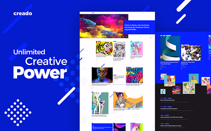
Creado WordPress theme will appeal to those users who are looking for a creative and functional starting point for art gallery websites. It is powered by the Grid CSS technology, which lets you organize different types of content in a non-standard style. WordPress Live customizer is added to reveal the results of the theme modification in real-time. 7 header styles, multiple custom widgets and content modules are included for free. The theme runs on Cherry Framework 5. A fully responsive Bootstrap-based framework makes every piece of content shared on the web page fully adaptive to the screens of all handheld devices.
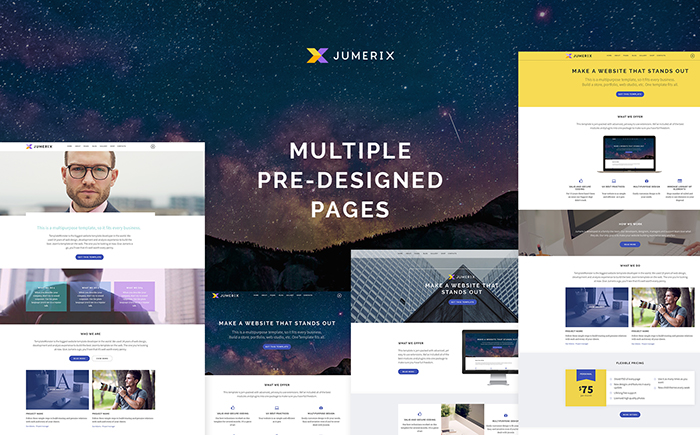
Jumerix is a multipurpose Joomla theme that can be used to match a number of business purposes. With it help, you can get a blog, business studio or online portfolio live in the shortest period of time imaginable. All elements of the theme’s design are fully responsive and 100% editable. A rich UI kit is included to let you save time on creating custom designs for different design elements of your site. The theme includes a collection of multiple homepage layouts and ready-made pages for you to choose from. Swiper slider and video integration are added to bring an eye-catching presentation to different pieces of content on your site.
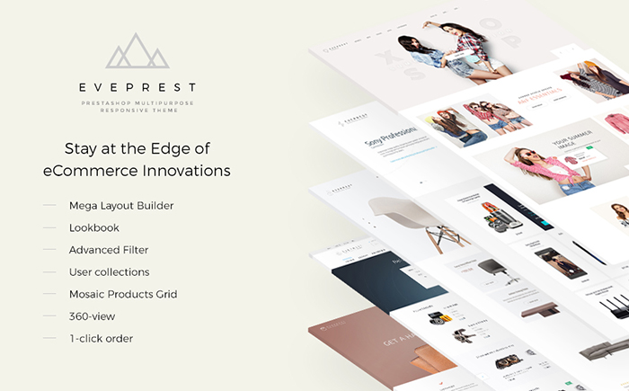
Eveprest PrestaShop web theme is a superb way to attract more attention to your business or personal project. This is a multipurpose ready-made design that will be suited for selling fashion, beauty, jewelry, electronics, furniture, and other items on the web. The template includes a collection of 10 niche skins for various purposes. Web site content will be really easy to read due to lots of negative space and clear structure. Personalizing the pages will be a child’s play owing to TM Mega Layout builder. This is the best solution that supplies quick and smooth web development. 10+ premium modules are added for free use. The theme is fully responsive, thus it will not be difficult for you to attract site visitors throughout the world. If you have any inquiries on the subject of template usage you can have a look at the rich documentation, also you receive 24/7 priority support helping to get rid of any issue.
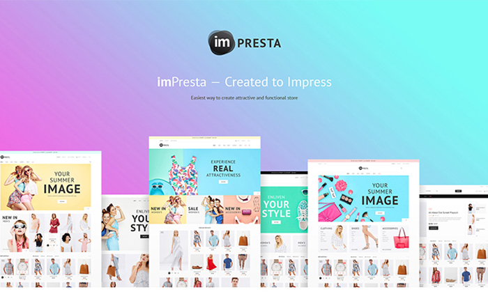
imPresta is a multipurpose PrestaShop theme that comes enhanced with a unique set of features suited for multiple purposes. Thanks to the integration of TM Mega Layout Builder and Mosaic Product module, you can tweak the pages of the site without touching a line of code. The theme includes a collection of exclusive premium modules, which you can use at no cost. 6 niche-specific skins are ready to be used for food, accessories, tools, cosmetics, toys, and bikes shops. There are also three pre-built product layouts for you to choose from. Advanced navigation and product sorting options are included alongside with a number of stunning product presentation options.
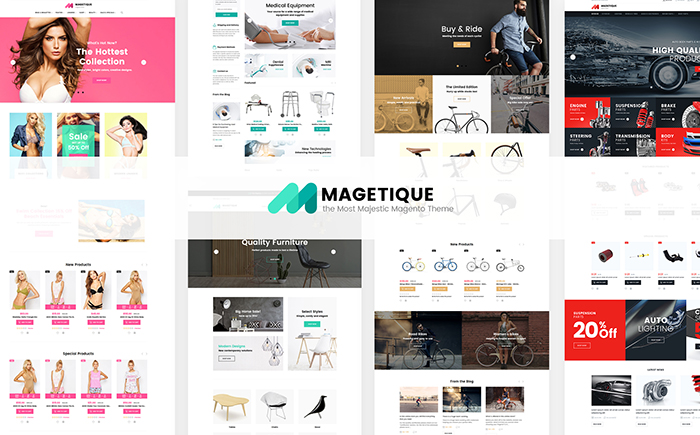
Magetique – The Most Comprehensive Multipurpose Magento 2 Theme
Magetique is a versatile eCommerce theme powered by Magento 2. This is a feature-rich solution that is enhanced with every single piece of functionality and extensions needed to get started with a conversion-oriented web store. The theme includes a collection of more than 20 premium extensions for free. 5 ready-made layouts are suited to be used for fashion, cars, electronics, and other purposes. All elements of the template are fully editable and can be tweaked by means of ready-made layout options and advanced customization tools just the way you want.
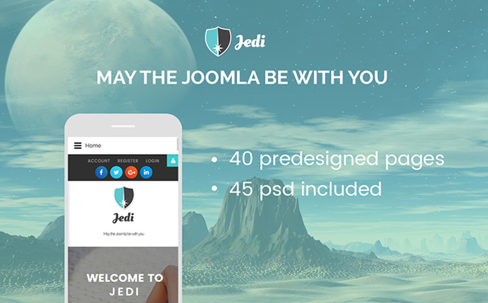
Jedi Joomla theme allows making a highly effective introduction to your business on the Internet and encourages people to explore more of your content. It is intended to become a rock-solid starting point of small to large-sized business web projects. Introducing extra style to the page’s visual appeal, this specific web template maintains equilibrium with well-positioned blocks that allow focusing on the content. This is a fully editable template containing 40 pre-designed pages and multiple header & footer variations. Thanks to its totally responsive layout, your web page will successfully adjust to the size of any display used to view it on. Neat, valid coding and comprehensive documentation will aid you in transforming this Joomla web design just how you need.
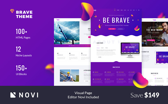
Brave multipurpose HTML5 theme is a fit-it-all solution that is intended to be applied to a number of business and personal web projects. The number of pre-designed pages and UI blocks simply impresses. Downloading the template you will be able to access all visual and functional elements needed to make your web resource an attention-grabber. Brave is integrated with Novi page builder. This is a revolutionary visual page builder that allows you to craft versatile web pages as you simply drag and drop multiple elements. The theme also includes multiple widgets suited to share different types of content on the pages of your site. Intended to be used by beginner and pro web developers equally well, the theme makes it possible to launch a powerful web resource without investing a fortune in premium features.
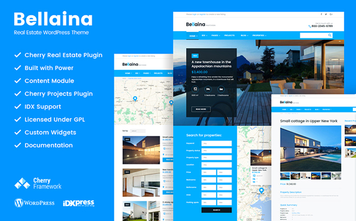
Bellaina is a full-fledged WordPress template intended to be used for property selling websites. It includes GPL license, which gives you the freedom of its modification in any way imaginable, as well as installation on as many web resources as you wish. The theme runs on Cherry Framework 5 and includes a number of a number of advanced Cherry options. It is also loaded with premium extensions, which you can use at no cost. For example, Cherry Real Estate plugin will bring advanced property search filters to your site. There is also an option to reveal search results on the integrate Google map and send property submissions to agents.
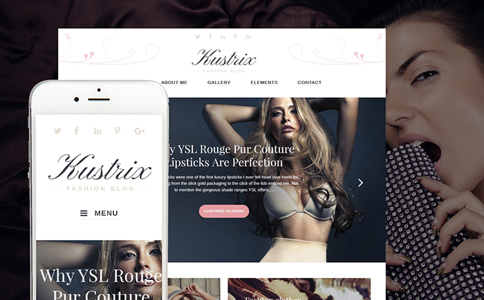
Kustrix theme is best suited to be used for fashion and beauty blogs. This is a functional WordPress template featuring GPL license. A clean and spacious layout of the template is intended to provide the web audience with the unparalleled UX. The theme is well suited to present content-heavy projects on the web. An easy and intuitive interface will be handled by the users of all skill levels perfectly well. Site visitors will definitely appreciate the pleasant user experience provided by easy-to-use navigation and smart arrangement of the layout. Responsive layout usually means that your web project will rapidly adapt to any device and any display dimensions. Richly documented and featuring cost-free round-the-clock assistance, this website template will help you get moving with your Internet project in no time.
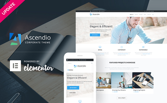
Ascendio is a ready-made WordPress theme that will help you build a powerful and full-fledged corporate web page. It is loaded with the revolutionary Elementor page builder, which allows you to tweak the theme’s layout without touching a line of code. The theme can be used for both corporate purposes and eCommerce web projects. A number of header and footer variations are included to bring a fresh and stylish look to your site. A number of custom extensions are included at no cost, letting you save extra cash on the promotion of your business. Thanks to the integration of WordPress Live Customizer, bringing changes to the theme’s layout won’t take you too much time.
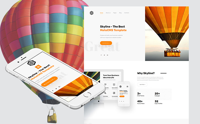
Skyline is a multipurpose Moto CMS 3 template that can be adjusted to any purpose of yours. It includes a collection of 5 homepage layouts for different niches, 3 child themes, and 2 variants of the main theme. The theme is built with an intuitive drag-and-drop page editor, which frees you from the necessity to tweak the source code whenever you want to bring changes to the layout. The theme includes regular updates, which will provide its owners with new fonts, more pages, and additional possibilities of White Label.
Starting a business has never been easy, let alone getting people to start buying from your store. It requires pumping in of time, money and resources. Effective marketing will also play a huge role to help you get around this problem. Luckily, the social media platform comes in to save the day especially for small businesses with low capital. You can choose to hire a SEO company that has multiple success stories managing other similar businesses. Social media marketing can help startups in the following ways:
Generation of quality leads
You will need a cot effective way through which you can sell your business. The social media platform offers you a large number of followers who are always searching for products or services on the platform. With your social media marketing campaign, you will be able to generate quality leads that may be converted into buying customers with ease.
Social engagement
It helps to increase engagement on social media. When Google is indexing websites, it also considers the social engagement aspect. What are people saying about your social media? How often do they talk about your business? All this will be considered when it comes to ranking and thus social media marketing is a must-have strategy when it comes to growing your startup.
Ability to build a community
A community for your business is as good as your customers. If you have a large following for your blogs or website, then you are in a better position to build a strong brand. This is what social media marketing gives you. With over 1 billion subscribers on Facebook only, you will have more to go around with. It only takes a reliable SEO company with experience on social media marketing to help you build that community for your business.
Help to drive traffic to your site
Traffic to your site is what you want if you want to increase sales. It helps you to attract the right people who are searching for the products or services you provide. When sharing content on social media, you also have to include quality SEO for better ranking on search engines. Outsource to a reputable SEO company to help you choose the right keywords to optimize into your content before you share it on social media for your followers.
Increases brand awareness
Your business brand is the heart of the success of your startup. If you execute it in the right way, you are bound to succeed. Social media marketing is the best way through which you can achieve brand loyalty among your followers. The more you engage with them own the social platform the more they will associate with your brand. This will increase awareness.
Increases press mentions
Once you get into the social scene you have a ready market to brand your business. All you need to do is to know how to tap into your market. The more your brand grows on social media, the high the possibility of getting press mentions. This will drive a lot of traffic to your site. You will however need to hire an expert in the same to help communicate your brand message to your target audience.face
Reboot, a collection of element-specific CSS changes in a single file, kickstart Bootstrap to provide an elegant, consistent, and simple baseline to build upon.
If you’re new to CSS development, the whole idea of a CSS reset is to deal with styling inconsistencies across browsers. For example, just now I popped a <button> onto a page with no other styling whatsoever. Chrome applies padding: 2px 6px 3px; – Firefox applies padding: 0 8px;. A CSS reset would apply newpadding to that element, so that all browsers are consistent about what they apply. There are loads of examples like that.
By way of a bit of history…
In 2007 Jeff Starr rounded up a bunch of different CSS resets. The oldest one dated is Tantek Çelik’s undohtml.css (that’s a direct link to the source). We can see that the purpose behind it was to strip away default styling.
/* undohtml.css */
/* (CC) 2004 Tantek Celik. Some Rights Reserved.             */
/*   http://creativecommons.org/licenses/by/2.0                   */
/* This style sheet is licensed under a Creative Commons License. */

/* Purpose: undo some of the default styling of common (X)HTML browsers */
By far, the most popular reset came shortly after: the Meyer reset. It has different stuff in it than Tantek’s did (it has even been updated with some HTML5 elements) but the spirit is the same: remove default styling. You’ll probably recognize this famous block of code, finding its way into your DevTools style panel everywhere:
Start with a reset like this (at the top of your production stylesheet) and the styles you write afterword will be on a steady foundation.
Years later, as HTML5 became more real, resets like Richard Clark’s HTML5 Reset gained popularity. It was still a modified version of the Meyer reset, and the retained that spirit.
Sprinkled all throughout this, there were plenty of developers who went minimal by just zapping margin and padding from everything and leaving it at that:
* {
  padding: 0;
  margin: 0;
}
Dumb trivia: the CSS-Tricks logo was inspired by the universal selector and that idea.
Along comes Normalize.css…
Normalize.css represents the first meaningful shift in spirit for what a CSS reset should do. This is what seemed so different about it to me:
It was a fresh evaluation of everything that could be styled different across browsers and it address all of it. Where older CSS resets were a handful of lines of code, the uncompressed and documented normalize is 447.
It didn’t remove any styling from elements that were already consistent across browsers (for the most part). For example, there isn’t anything in Normalize for h2-h6 elements, just a fix for a weird h1 thing. That means you aren’t zapping away header hierarchy, that default styling remains.
It was more accommodating to the idea of altering it, rather than just including it. For example, there is a section just for the <pre> tag and one line of that sets its font-family. You could change that to the font-family you want, and it would be just as effective of a reset.
The code is satisfying to read, as it explains what it’s doing without drowning in specifics:
/**
 * 1. Remove the bottom border in Chrome 57- and Firefox 39-.
 * 2. Add the correct text decoration in Chrome, Edge, IE, Opera, and Safari.
 */

abbr[title] {
  border-bottom: none; /* 1 */
  text-decoration: underline; /* 2 */
  text-decoration: underline dotted; /* 2 */
}
Today Normalize is at 7.0.0 and has going on 30,000 GitHub stars. It’s wicked popular.
So… resets can be opinionated?
We’ve seen lots of different takes on CSS resets and we’ve seen fundamental shifts in the approach, so I think it’s fair to say CSS resets can take an opinionated stance.
Let’s consider some ways…
Does the reset touch every single possible element? Or a subset of elements? How does it decide which elements to touch and which not to?
What properties are changed? Only ones with cross-browser differences? Or some other criteria, like the similarity to other elements that needed changes? Is it OK to apply properties to elements that don’t have cross-browser issues in the name of consistency and efficiency?
Do you try to preserve the spirit of the user agent stylesheet? Sensible defaults?
Do you apply any properties that don’t have cross-browser issues could be considered beneficial to „reset”, like typographic defaults or box-sizing?
Do you include „toolbox” classes for common needs? Or leave that for other projects to handle?
Are you concerned about the size of it?
Do you use a preprocessor or any other tooling?
Take a look at Vanilla CSS Un-Reset. Loads of opinions here, starting with the idea that it’s meant to re-style elements after you un-style then with a reset. It set’s the body font size in pt, set a very specific monospace font stack, includes a ol ol ol ol selector, a clearfix, and alignment helper classes. No judgment there. People make things to help with their own problems and I’m sure this was helpful to the creator. But we can see the opinions shine through there.
Now look at MiniReset.css. Very different! It does wipe out type styles „so that using semantic markup doesn’t affect the styling”, but leaves some defaults in place on purpose „so that buttons and inputs keep their default layout”, puts in some things that don’t have cross-browser problems but are useful globally (box-sizing), and adds some minor responsive design helpers.
Totally different set of opinions there.
Jonathan Neal created a reset called santize.css that is very clear about it’s opinions. Search for the word „opinionated” in the source code and you’ll see it 19 times. All these are choices that Jonathan made based on research and what seem to be modern best practices, and no doubt sprinkled with his own needs and desires for what should be in a reset.
/*
 * Remove the text shadow on text selections (opinionated).
 * 1. Restore the coloring undone by defining the text shadow (opinionated).
 */

::-moz-selection {
	background-color: #b3d4fc; /* 1 */
	color: #000000; /* 1 */
	text-shadow: none;
}

::selection {
	background-color: #b3d4fc; /* 1 */
	color: #000000; /* 1 */
	text-shadow: none;
}
The word „reset”
Personally, I think it’s useful to think of all of them under the same umbrella term and just be aware of the philosophical differences. But, Normalize intentionally separates itself:
A modern, HTML5-ready alternative to CSS resets
Sanitize calls itself a CSS library and doesn’t use the word „reset” anywhere except to cite the Meyer reset.
Reboot
Reboot is interesting as it’s perhaps the newest player in this world. It’s file history dates back to 2015, which is probably related to Bootstrap 4 taking a while to drop after Bootstrap 3. Reboot doesn’t have its own repo, it’s a part of Bootstrap. Here’s the direct file and the docs.
The way they think about it is interesting:
Reboot builds upon Normalize, providing many HTML elements with somewhat opinionated styles using only element selectors. Additional styling is done only with classes. For example, we reboot some <table> styles for a simpler baseline and later provide .table, .table-bordered, and more.
You can have a class that does styling, but if you use a reset, you don’t have to overload that class with reset styles that handle cross-browser consistency issues.
//
// Tables
//

table {
  border-collapse: collapse; // Prevent double borders
}

caption {
  padding-top: $table-cell-padding;
  padding-bottom: $table-cell-padding;
  color: $text-muted;
  text-align: left;
  caption-side: bottom;
}

th {
  // Matches default `<td>` alignment by inheriting from the `<body>`, or the
  // closest parent with a set `text-align`.
  text-align: inherit;
}
It’s definitely opinionated, but in a way that rolls with Bootstrap nicely. The fact that it’s buried within Bootstrap is pretty good signaling this is designed for that world, not as a drop-in for any project. That said, I did my best to compile a straight CSS version of it here.
Tailoring a reset based on browser support
So long as we’re talking about the past and future of resets, it’s worth mentioning Browserslist again, which is a standardized format for declaring what browsers/versions a project supports.
A reset could be built in a such a way that the things it includes know why they are there. Exactly what browser and version it is there to support. Then if browserslist configuration says that particular browser isn’t supported by this project anyway, that CSS could be removed.
It was awesome to hear Charlotte Dann on CodePen Radio the other day, who is Kickstarting a new jewelry business. The idea is that you draw your own jewelry (everything you draw looks awesome because it’s on this interesting hexagon grid) and then it gets actually made. This tying together of her passions sprang to life on CodePen.
Drop shadows. Web designers have loved them for a long time to the extent that we used to fake them with PNG images before CSS Level 3 formally introduced them to the spec as the box-shadow property. I still reach for drop shadows often in my work because they add a nice texture in some contexts, like working with largely flat designs.
Not too long after box-shadow was introduced, a working draft for CSS Filters surfaced and, with it, a method for drop-shadow() that looks a lot like box-shadow at first glance. However, the two are different and it’s worth comparing those differences.
For me, the primary difference came to light early on when I started working with box-shadow. Here’s a simple triangle not unlike the one I made back then.
It’s annoying, but makes sense. CSS uses a box model, where the element’s edges are bound in the shape of a rectangle. Even in cases where the shape of the element does not appear to be a box, the box is still there and that is was box-shadow is applied to. This was my „ah-ha moment” when understanding the box in box-shadow.
CSS Filter Drop Shadow
CSS Filters are pretty awesome. Take a gander at all the possibilities for adding visual filters on elements and marvel at how CSS suddenly starts doing a lot of things we used to have to mockup in Photoshop.
Filters are not bound to the box model. That means the outline of our triangle is recognized and the transparency around it is ignored so that the intended shape receives the shadow.
The answer is totally up to you. The simple example of a triangle above might make it seem that filter: drop-shadow() is better, but it’s not a fair comparison of the benefits or even the possibilities of both methods. It’s merely an illustration of their different behaviors in a specific context.
Like most things in development, the answer of which method to use depends. Here’s a side-by-side comparison to help distinguish the two and when it might be best to choose one over the other.
Hardware accelerated in browsers that support it. It’s a heavy lift without it.
Wrapping Up
The difference between box-shadow and filter: drop-shadow() really boils down to the CSS box model. One sees it and the other disregards it. There are other differences that distinguish the two in terms of browser support, performance and such, but the way the two treat the box model is the key difference.
Update: Amelia identified another key difference in the comments where the spread of the radius for drop-shadow() is calculated differently than box-shadow and even that of text-shadow. That means that the spread radius you might specify in box-shadow is not one-to-one with the default spread value for drop-shadow, so the two are not equal replacements of one another in some cases.
Every week, we’ll give you an overview of the best deals for designers, make sure you don’t miss any by subscribing to our deals feed. You can also follow the recently launched website Type Deals if you are looking for free fonts or font deals.
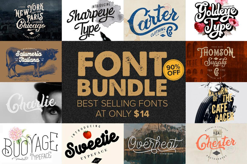
10+ Best-Selling Premium Fonts
Make room in your typeface toolbox! It’s time to grab this sweet deal full of more than 10 premium best-selling font families. From Charlie to Sweetie to Sharpeye Type, you’ll get a wonderful variety of fun, curvy fonts that will work perfectly with your latest designs. Use them on everything from T-shirts to logos.
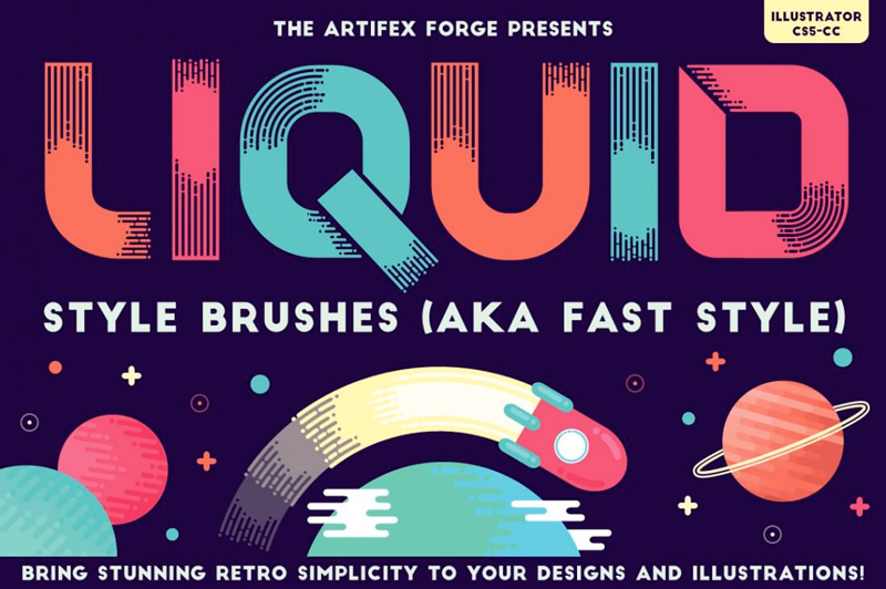
Want to add a bit of motion to your designs? Consider a Fast Style approach using this collection of 80 Liquid Style Brushes. These brushes feature a modern-yet-retro digital style that creates round-ended lines giving off an almost dripping appearance. Use the handy reference guide to quickly choose the right brush to whip up a clean illustration or icon.
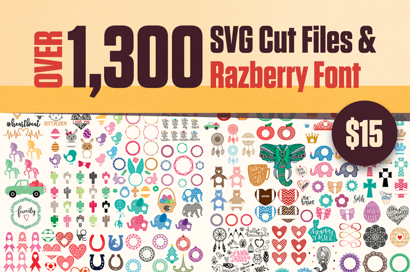
Looking to add some unique graphics or sayings to your latest design project? Then check out this huge giveaway from lovesvg.com! You’ll get over 1,300 scalable vector graphics full of everything from adorable owls to caffeine-fueled phrases. A bonus Razberry font full of 18 more SVGs is the perfect cherry on top of this super designer sundae.
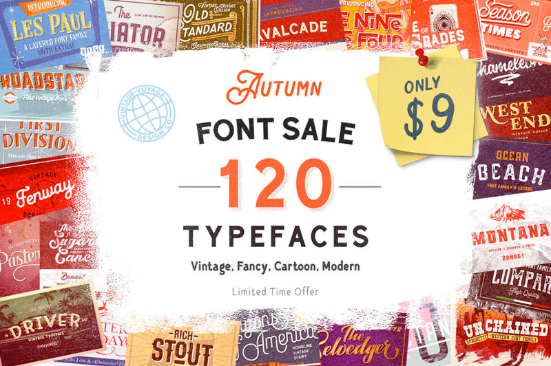
It’s time to fall into a fantastic font sale! This Autumn Font Sale is overloaded with more than 120 gorgeous typefaces, culled from 31 different font families. You’ll be privy to a wide variety of styles ranging from vintage to cartoony, not to mention a slew of extras like alternates. No matter your latest project, you’re bound to find the perfect font in this collection.
The moon has always attracted people, not only from a scientific point of view as an astronomical object, but also because it is believed to have some magical aspects which influence our lives. It can even be frightening and sometimes creepy!
If you’ve ever heard of selenophobia, you probably know what I mean. Selenophobia (from the Greek word seleno, meaning „moon”), also known as lunaphobia (from the Latin word luna, meaning „moon”) is the fear of the moon. Like many other phobias, selenophobia originates from painful experiences during childhood.
You may believe it or not, but as for now, let’s get some inspiration from this side of the moon’s nature and draw a mysterious illustration in Procreate. We’ll start with a very rough sketch, discovering all the basic features of this drawing application, and gradually moving to building shapes, colouring them, and adding textures up to the end result. Interested?
Oh, and by the way, you can get the Mystic Moon source file together with other file formats on Envato Elements. This file will allow you to see how everything was made and organised by going through the layers. You will also get a layered Adobe Photoshop file which is convenient to use for your personal or commercial work.
Let’s begin!
1. How to Draw a Moon in Procreate
Step 1
I’m using an iPad Pro and an Apple Pencil to create illustrations in Procreate. However, Procreate also supports other models of iPads (with iOS 10.0 and newer) which work with other styluses listed in Actions > Devices. The Apple Pencil itself is not on the list, though all its functions are fully supported by the app as well. While choosing your device or stylus, please keep in mind that Apple Pencil works only with iPad Pro, so always check the full information and compatibility of devices and apps before purchasing.
Step 2
Open the application, and let’s create a New Canvas by clicking the Create (+) icon in the top right corner. From there we can either select one of the canvases from the list or create a custom one. The number of layers in our file depends on its size. The higher the dimensions, the fewer layers you’ll be able to create.
Let’s make a 3500 x 3500 px canvas that will allow us to make up to 12 layers, which is more than enough for this project.
Step 3
I usually start my illustration with a rough sketch. Let’s open the Brushes tab and select an HB Pencil brush from the Sketching set.
We already have one empty layer by default, so I just pick the brush and start doodling. I can control the Size and Opacity of my brush by moving the two vertical sliders on the left side of the screen.
Step 4
Once I’m happy with the overall idea of my future illustration, I open the Layers panel and tap the layer to reveal a menu. Tap Rename and change the layer name to “Sketch”.
Step 5
Here is what I ended up with. It is pretty simple yet detailed, which will help me to focus on shapes and colours.
Step 6
As you may have noticed, we already have a “Background colour” layer in the Layers panel by default. It allows us to change the colour of the canvas by tapping and selecting the desired colour on the colour wheel. Let’s pick a nice tint of dark blue for the night sky.
Step 7
Now let’s tap the “+” icon in the top right corner of the Layers panel to make a New Layer. Then open the Brushes panel and pick the Ink Bleed brush in the Inking set.
Step 8
If we swipe to the left through all the brush sets, we can tap the “+” icon and create a New Set. Then we can drag and drop any existing brushes in this set for quick access.
Apart from that, we can edit the settings of any brush by tapping it. Let’s tap the Ink Bleed brush and edit the Stroke > Streamline parameter by setting it to 5%. This function allows us to smooth the line while drawing, which gives higher control over the strokes.
Then go to General > Size Limits and make sure that the Max slider is set to maximum.
Step 9
Now we can pick the pale yellow colour on the colour wheel (top right corner) and draw the outline of the moon, using our sketch as a reference. We can also pinch the canvas with two fingers, zoom it, and rotate for our convenience.
I also move the Size and Opacity sliders all the way up to make the line thick and solid.
Step 10
Once we’ve created a closed path, we can either scribble inside to fill it with colour or we can tap and hold the colour circle in the top right corner and drag and drop it right onto our shape.
Step 11
Let’s open the Layers panel and tap the N letter on the Sketch layer. From here, we can switch between the Blending Modes and change the Opacity of the layer. Set the Opacity to 45%, making the sketch semi-transparent.
Step 12
When using a textured brush, you may notice some empty spots or strokes after filling the shape. Use the Ink Bleed brush to paint inside the shape, eliminating the blank spaces.
Step 13
Now let’s Alpha Lock our moon layer by swiping to the right with two fingers. You will see the layer thumbnail background become checkered. Once you’ve Alpha Locked the layer, you’ll be painting inside the shape, without crossing its edges, which is very convenient for adding shadows, highlights, and textures.
Step 14
Now let’s add some texture to our moon. First of all, let’s select a darker colour. If you already have another colour selected, tap the square that’s located between the Size and Opacity sliders, and move the magnifying circle on top of the moon to pick its pale yellow colour.
Open the colour wheel and select a darker colour.
If you want to change the options of the colour picker, you can go to Actions > Advanced gesture control and switch between the settings of the Eyedropper.
Step 15
Let’s go to Brushes > Sketching and pick the Bonobo Chalk brush. Lower the Opacity and start painting over the moon, adding texture.
Step 16
Now lower the Size and draw along the edges of the moon to make it more three-dimensional.
Step 17
Now let’s create a New Layer, pick an orange colour, and choose the HB Pencil brush. Start scribbling over the darker areas, adding a realistic pencil texture. Make short parallel hatches, the same way as you do it on paper.
Step 18
Continue adding pencil strokes along the edges. Then pick a light-yellow colour and fill the center of the crescent as well.
Here you can see the layers that we’re using in this step.
Step 19
Let’s make a New Layer and take the Ink Bleed brush. Use a dark-orange colour to add short strokes for a cartoon effect.
Lower the Opacity of the layer to 60%, making the strokes semi-transparent.
Step 20
Now that our moon is finished, let’s Group all of its layers together. Select the top layer and swipe to the right all the layers beneath it with one finger. You will see a light-blue selection and a three-strokes icon appear in the top right corner of the Layers panel. Tap the icon to create a Layer Group. Now we can rename it and fold by tapping the arrow icon.
2. How to Draw a Star
Step 1
Let’s unlock the alpha on the Moon layer by swiping it to the right again with two fingers. You will see a solid background on the layer thumbnail, meaning that now you can paint anywhere on this layer.
Let’s use the Ink Bleed brush again to draw a star that we have on our sketch layer.
Step 2
I want to move the star a bit as I don’t like its current position. It looked fine on the sketch, but now the composition is quite unbalanced, so let’s see how we can center its top point with the top tip of the crescent.
Let’s tap the Freehand Selection in the top panel and make sure that Freehand option is selected in the bottom panel. Now we can draw a circle around our star, creating a selected area.
Step 3
After the selection is created, tap Transform and select Freeform in the panel below. Now that our selection around the star has changed to a square, we can move it around without affecting any other elements on the same layer.
Step 4
Use the Bonobo Chalk brush and switch to lighter and darker yellow colours, adding that texture touch to the star and making it more three-dimensional.
Step 5
Both main elements of our composition are ready, so let’s make them pop out of the background a bit more.
Create a New Layer right above the Background colour layer. You can reorder the layers by simply tapping and holding a layer and then dragging and dropping it to the desired position in the Layers panel.
Use the Bonobo Chalk brush and a dark blue colour (slightly lighter than the background) to create a subtle mist around the moon.
3. How to Draw Floral Elements and Herbs
Step 1
Now let’s unleash our imagination and draw out all those herbs and flowers from our sketch by adding more details and life to them.
Create a New Layer, take the Ink Bleed brush, and start drawing out the first branch growing from the bottom tip of the crescent. I’m using a dark-blue colour for this one, starting with a thin, arched stem and then adding rounded leaves along the stem.
Step 2
Continue using the same colour to add more elements around the moon. First of all, add a few floating leaves next to the first branch. Then draw a second branch growing from the bottom of the crescent. Place it right above the yellow surface, thus adding contrast.
Move on by adding other branches and leaves. I’m also using the Erase tool with the same Ink Bleed brush, cleaning some spots where I don’t want the leaves to overlap with the yellow shape of the moon.
Step 3
Once you’re happy with the dark blue plants (by the way, you’re always able to return to them later and add whatever details you want), create a New Layer and use a greyish-blue colour to add those leaves and flowing stems. Make the new grey plants partially overlap the dark-blue ones from the previous layer.
Try to maintain the balance in your composition by adding branches of more or less equal length on both sides of the moon. Don’t forget about the floating leaves—speckle them around the branches as well.
Step 4
Now it’s time to create the next New Layer. Pick a light-yellow colour and start adding bright strokes to our image in the spots where they are really needed.
Step 5
I have some plants here that consist of a grey stem and light-yellow flower bud. In order to add those buds, I simply create a New Layer and place it beneath all the other floral layers so that my additional yellow elements will always be partially hidden beneath the top layers of herbs.
Step 6
Once I’m happy with all the flowers and plants, I make sure that everything looks balanced enough and there are no empty spots or, on the contrary, areas overloaded with elements.
I’m using one of the yellow layers to speckle some stars around the moon by drawing dots of various sizes with the Ink Bleed brush.
Step 7
Now it is time to add a textured touch to all the floral elements! Don’t worry, you won’t have to draw a shadow on each leaf and flower manually.
First of all, let’s Alpha Lock each of the floral layers by swiping to the right with two fingers. If you do everything right, you will see a checkered background on the thumbnails.
Now take the Bonobo Chalk brush, and let’s start with the dark blue layer. Select a darker colour and go over the layer with wide strokes, adding grainy texture to all the dark-blue pieces. Then decrease the Size of the brush and go over the areas that need some more intense shadows, like the places where the leaves overlap or the spots where leaves grow from the stem, making the stem darker. This way we’ll visually separate the layers from each other, bringing more dimension to our image.
Step 8
Now let’s blend in some highlights. Pick a lighter yellow colour and draw over the tips of the leaves, adding a subtle silver glow to them.
Step 9
Work over all the dark blue layer and don’t forget to zoom out in order to check how the overall image looks at this stage.
Step 10
Now let’s switch to the grey layer and do the same for the greyish-blue plants. Start by adding those shadows and go on to the highlights, making all the tips slightly lighter.
Step 11
And finally, the yellow layers (both top and bottom ones)! This time, try to achieve a golden look by using orange for the shadows and light yellow (almost white) for the highlights.
Step 12
Once you’re happy with the floral elements, make a New Layer on top of all the floral layers, and let’s add some more mystic glow. Go to Brushes and select Airbrushing > Soft Airbrush. Pick a light-yellow colour.
Step 13
Decrease the Opacity and draw very light round spots around all the yellow-gold elements, making them really stand out and glow.
Step 14
We can add some more volume to our image if we create a New Layer in the Moon group of layers (Shadow layer) and use the Bonobo Chalk brush to make subtle shadows in the areas where leaves are placed on top of the moon. We can play with the layer options by setting it to Multiply mode and decreasing the Opacity to 80%, making it more subtle.
To the Moon & Back! Our Mystic Moon Image Is Finished!
Great work! Now our mystic moon illustration looks balanced and complete! I hope you’ve enjoyed following this tutorial and discovered new opportunities of using your iPad as a fully featured working device while creating beautiful pieces of art in Procreate.
By the way, once you’ve finished with your image, you can always share it and export in multiple formats, including the original Procreate file and a layered PSD file for Adobe Photoshop, which gives you even more flexibility and a wider range of opportunities!
You can get the Mystic Moon file in various formats on Envato Elements, to see how it was made and how the layers are organised. Apart from that, you’ll get a layered PSD file which is easy to use for your personal or commercial designs.
My last two projects hurled me into the JAMstack. SPAs, headless content management, static generation… you name it. More importantly, they gave me the opportunity to learn Vue.js. More than „Build a To-Do App” Vue.js, I got to ship real-life, production-ready Vue apps.
The agency behind Snipcart (Spektrum) wanted to start using decoupled JavaScript frameworks for small to medium sites. Before using them on client projects, however, they chose to experiment on themselves. After a few of my peers had unfruitful experiences with React, I was given the green light to prototype a few apps in Vue. This prototyping morphed into full-blown Vue apps for Spektrum connected to a headless CMS. First, I spent time figuring out how to model and render our data appropriately. Then I dove head first into Vue transformations to apply a much-needed layer of polish on our two projects.
This post digs into Vue.js and the tools it offers with its transition system. It is assumed that you are already comfortable with the basics of Vue.js and CSS transitions. For the sake of brevity and clarity, we won’t get into the „logic” used in the demo.
Handling Vue.js Transitions & Animations
Animations & transitions can bring your site to life and entice users to explore. Animations and transitions are an integral part of UX and UI design. They are, however, easy to get wrong. In complex situations like dealing with lists, they can be nearly impossible to reason about when relying on native JavaScript and CSS. Whenever I ask backend developers why they dislike front end so vehemently, their response is usually somewhere along the lines of „… animations„.
Even for those of us who are drawn to the field by an urge to create intricate micro-interactions and smooth page transitions, it’s not easy work. We often need to rely on CSS for performance reasons, even while working in a mostly JavaScript environment, and that break in the environment can be difficult to manage.
This is where frameworks like Vue.js step in, taking the guess-work and clumsy chains of setTimeout functions out of transitions.
The Difference Between Transitions and Animations
The terms transition and animation are often used interchangeably but are actually different things.
A transition is a change in the style properties on an element to be transitioned in a single step. They are often handled purely through CSS.
An animation is more complex. They are usually multi-step and sometimes run continuously. Animations will often call on JavaScript to pick up where CSS’ lack of logic drops off.
It can be confusing, as adding a class could be the trigger for a transition or an animation. Still, it is an important distinction when stepping into the world of Vue because both have very different approaches and toolboxes.
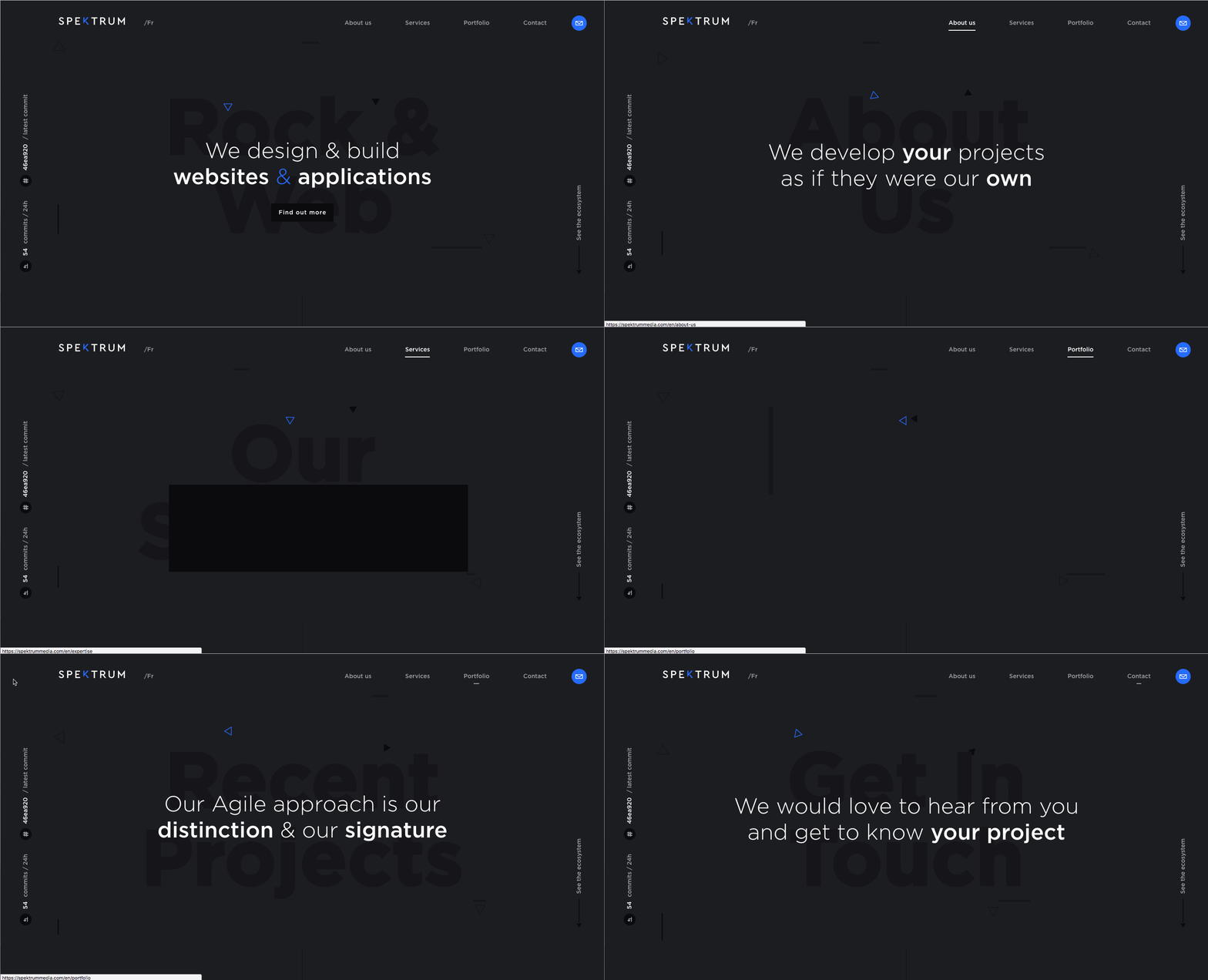
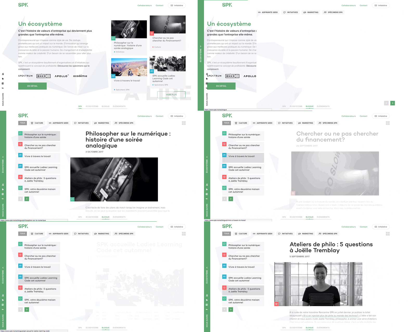
Here’s an example of transitions in use on Spektrum’s site:
Using Transitions
The simplest way to achieve transition effects on your page is through Vue’s <transition> component. It makes things so simple, it almost feels like cheating. Vue will detect if any CSS animations or transitions are being used and will automatically toggle classes on the transitioned content, allowing for a perfectly timed transition system and complete control.
First step is to identify our scope. We tell Vue to prepend the transition classes with modal, for example, by setting the component’s name attribute. Then to trigger a transition all you need to do is toggle the content’s visibility using the v-if or v-show attributes. Vue will add/remove the classes accordingly.
There are two „directions” for transitions: enter (for an element going from hidden to visible) and leave (for an element going from visble to hidden). Vue then provides 3 „hooks” that represent different timeframes in the transition:
.modal-enter-active / .modal-leave-active: These will be present throughout the entire transition and should be used to apply your CSS transition declaration. You can also declare styles that need to be applied from beginning to end.
.modal-enter / .modal-leave: Use these classes to define how your element looks before it starts the transition.
.modal-enter-to / .modal-leave-to: You’ve probably already guessed, these determine the styles you wish to transition towards, the „complete” state.
To visualize the whole process, take a look at this chart from Vue’s documentation:
How does this translate into code? Say we simply want to fade in and out, putting the pieces together would look like this:
This is likely the most basic implementation you will come across. Keep in mind that this transition system can also handle content changes. For example, you could react to a change in Vue’s dynamic <component>.
Things get interesting when we start dealing with lists. Be it some bullet points or a grid of blog posts, Vue gives you the <transition-group> component.
It is worth noting that while the <transition> component doesn’t actually render an element, <transition-group> does. The default behaviour is to use a <span> but you can override this by setting the tag attribute on the <transition-group>.
The other gotcha is that all list items need to have a unique key attribute. Vue can then keep track of each item individually and optimize its performance. In our demo, we’re looping over the list of companies, each of which has a unique ID. So we can set up our list like so:
The most impressive feature of transition-group is how Vue handles changes in the list’s order so seamlessly. For this, an additional transition class is available, .company-move (much like the active classes for entering and leaving), which will be applied to list items that are moving about but will remain visible.
In the demo, I broke it down a bit more to show how to leverage different states to get a cleaner end result. Here’s a simplified and uncluttered version of the styles:
/* base */
.company {
  backface-visibility: hidden;
  z-index: 1;
}

/* moving */
.company-move {
  transition: all 600ms ease-in-out 50ms;
}

/* appearing */
.company-enter-active {
  transition: all 300ms ease-out;
}

/* disappearing */
.company-leave-active {
  transition: all 200ms ease-in;
  position: absolute;
  z-index: 0;
}

/* appear at / disappear to */
.company-enter,
.company-leave-to {
  opacity: 0;
}
Using backface-visibility: hidden on an element, even in the absence of 3D transforms, will ensure silky 60fps transitions and avoid fuzzy text rendering during transformations by tricking the browser into leveraging hardware acceleration.
In the above snippet, I’ve set the base style to z-index: 1. This assures that elements staying on page will always appear above elements that are leaving. I also apply a absolute positioning to items that are leaving to remove them from the natural flow, triggering the move transition on the rest of the items.
That’s all we need! The result is, frankly, almost magic.
Using Animations
The possibilities and approaches for animation in Vue are virtually endless, so I’ve chosen one of my favourite techniques to showcase how you could animate your data.
We’re going to use GSAP’s TweenLite library to apply easing functions to our state’s changes and let Vue’s lightning fast reactivity reflect this on the DOM. Vue is just as comfortable working with inline SVG as it is with HTML.
We’ll be creating a line graph with 5 points, evenly spaced along the X-axis, whose Y-axis will represent a percentage. You can take a look here at the result.
new Vue({
  el: '#app',
  // this is the data-set that will be animated
  data() {
    return {
      points: { a: -1, b: -1, c: -1, d: -1, e: -1 }
    }
  },

  // this computed property builds an array of coordinates that
  // can be used as is in our path
  computed: {
    path() {
      return Object.keys(this.points)
        // we need to filter the array to remove any
        // properties TweenLite has added
        .filter(key => ~'abcde'.indexOf(key))
        // calculate X coordinate for 5 points evenly spread
        // then reverse the data-point, a higher % should
        // move up but Y coordinates increase downwards
        .map((key, i) => [i * 100, 100 - this.points[key]])
    }
  },

  methods: {
    // our randomly generated destination values
    // could be replaced by an array.unshift process
    setPoint(key) {
      let duration = this.random(3, 5)
      let destination = this.random(0, 100)
      this.animatePoint({ key, duration, destination })
    },
    // start the tween on this given object key and call setPoint
    // once complete to start over again, passing back the key
    animatePoint({ key, duration, destination }) {
      TweenLite.to(this.points, duration, {
        [key]: destination,
        ease: Sine.easeInOut,
        onComplete: this.setPoint,
        onCompleteParams: [key]
      })
    },
    random(min, max) {
      return ((Math.random() * (max - min)) + min).toFixed(2)
    }
  },

  // finally, trigger the whole process when ready
  mounted() {
    Object.keys(this.points).forEach(key => {
      this.setPoint(key)
    })
  }
});
Notice how we bind our path computed property to the path element’s d attribute. We do something similar with the text nodes that output the current value for that point. When TweenLite updates the data, Vue reacts instantly and keeps the DOM in sync.
That’s really all there is to it! Of course, additional styles were applied to make things pretty, which at this point you might realize is more work then the animation itself!
Live demos (CodePen) & GitHub repo
Go ahead, browse the live demos or analyze/re-use the code in our open source repo!
I’ve always been a fan of animations and transitions on the web, but I’m also a stickler for performance. As a result, I’m always very cautious when it comes to relying on JavaScript. However, combining Vue’s blazing fast and low-cost reactivity with its ability to manage pure CSS transitions, you would really have to go overboard to have performance issues.
It’s impressive that such a powerful framework can offer such a simple yet manageable API. The animation demo, including the styling, was built in only 45 minutes. And if you discount the time it took to set up the mock data used in the list-transition, it’s achievable in under 2 hours. I don’t even want to imagine the migraine-inducing process of building similar setups without Vue, much less how much time it would take!
Now get out there and get creative! The use cases go far beyond what we have seen in this post: the only true limitation is your imagination. Don’t forget to check out the transitions and animations section in Vue.js’ documentation for more information and inspiration.
This post originally appeared on Snipcart’s blog. Got comments, questions? Add them below!