Post pobrano z: MTV Indent

Post pobrano z: MTV Indent
Post pobrano z: The good and bad about life as an expat

We’ve all heard it before: if you want to do good work, move to NYC, LA or London. In this month’s Guest Post Bee Grandinetti speaks with people who did just that as she explores the good and bad about life as an expat.
Post pobrano z: Form Validation Part 2: The Constraint Validation API (JavaScript)
In my last article, I showed you how to use native browser form validation through a combination of semantic input types (for example, <input type="email">) and validation attributes (such as required and pattern).
While incredibly easy and super lightweight, this approach does have a few shortcomings.
:invalid pseudo-selector, but you can’t style the error messages themselves.User studies from Christian Holst and Luke Wroblewski (separately) found that displaying an error when the user leaves a field, and keeping that error persistent until the issue is fixed, provided the best and fastest user experience.
Unfortunately, none of the browsers natively behave this way. However, there is a way to get this behavior without depending on a large JavaScript form validation library.
In addition to HTML attributes, browser-native constraint validation also provides a JavaScript API we can use to customize our form validation behavior.
There are a few different methods the API exposes, but the most powerful, Validity State, allows us to use the browser’s own field validation algorithms in our scripts instead of writing our own.
In this article, I’m going to show you how to use Validity State to customize the behavior, appearance, and content of your form validation error messages.
The validity property provides a set of information about a form field, in the form of boolean (true/false) values.
var myField = document.querySelector('input[type="text"]');
var validityState = myField.validity;
The returned object contains the following properties:
valid – Is true when the field passes validation.valueMissing – Is true when the field is empty but required.typeMismatch – Is true when the field type is email or url but the entered value is not the correct type.tooShort – Is true when the field contains a minLength attribute and the entered value is shorter than that length.tooLong – Is true when the field contains a maxLength attribute and the entered value is longer than that length.patternMismatch – Is true when the field contains a pattern attribute and the entered value does not match the pattern.badInput – Is true when the input type is number and the entered value is not a number.stepMismatch – Is true when the field has a step attribute and the entered value does not adhere to the step values.rangeOverflow – Is true when the field has a max attribute and the entered number value is greater than the max.rangeUnderflow – Is true when the field has a min attribute and the entered number value is lower than the min.By using the validity property in conjunction with our input types and HTML validation attributes, we can build a robust form validation script that provides a great user experience with a relatively small amount of JavaScript.
Let’s get to it!
Since we’re writing our validation script, we want to disable the native browser validation by adding the novalidate attribute to our forms. We can still use the Constraint Validation API — we just want to prevent the native error messages from displaying.
As a best practice, we should add this attribute with JavaScript so that if our script has an error or fails to load, the native browser form validation will still work.
// Add the novalidate attribute when the JS loads
var forms = document.querySelectorAll('form');
for (var i = 0; i < forms.length; i++) {
    forms[i].setAttribute('novalidate', true);
}
There may be some forms that you don’t want to validate (for example, a search form that shows up on every page). Rather than apply our validation script to all forms, let’s apply it just to forms that have the .validate class.
// Add the novalidate attribute when the JS loads
var forms = document.querySelectorAll('.validate');
for (var i = 0; i < forms.length; i++) {
    forms[i].setAttribute('novalidate', true);
}
See the Pen Form Validation: Add `novalidate` programatically by Chris Ferdinandi (@cferdinandi) on CodePen.
Whenever a user leaves a field, we want to check if it’s valid. To do this, we’ll setup an event listener.
Rather than add a listener to every form field, we’ll use a technique called event bubbling (or event propagation) to listen for all blur events.
// Listen to all blur events
document.addEventListener('blur', function (event) {
    // Do something on blur...
}, true);
You’ll note that the last argument in addEventListener is set to true. This argument is called useCapture, and it’s normally set to false. The blur event doesn’t bubble the way events like click do. Setting this argument to true allows us to capture all blur events rather than only those that happen directly on the element we’re listening to.
Next, we want to make sure that the blurred element was a field in a form with the .validate class. We can get the blurred element using event.target, and get it’s parent form by calling event.target.form. Then we’ll use classList to check if the form has the validation class or not.
If it does, we can check the field validity.
// Listen to all blur events
document.addEventListener('blur', function (event) {

    // Only run if the field is in a form to be validated
    if (!event.target.form.classList.contains('validate')) return;

    // Validate the field
    var error = event.target.validity;
    console.log(error);

}, true);
If error.validity is true, the field is valid. Otherwise, there’s an error.
See the Pen Form Validation: Validate On Blur by Chris Ferdinandi (@cferdinandi) on CodePen.
Once we know there’s an error, it’s helpful to know what the error actually is. We can use the other Validity State properties to get that information.
Since we need to check each property, the code for this can get a bit long. Let’s setup a separate function for this and pass our field into it.
// Validate the field
var hasError = function (field) {
    // Get the error
};

// Listen to all blur events
document.addEventListner('blur', function (event) {

    // Only run if the field is in a form to be validated
    if (!event.target.form.classList.contains('validate')) return;

    // Validate the field
    var error = hasError(event.target);

}, true);
There are a few field types we want to ignore: fields that are disabled, file and reset inputs, and submit inputs and buttons. If a field isn’t one of those, let’s get it’s validity.
// Validate the field
var hasError = function (field) {

    // Don't validate submits, buttons, file and reset inputs, and disabled fields
    if (field.disabled || field.type === 'file' || field.type === 'reset' || field.type === 'submit' || field.type === 'button') return;

    // Get validity
    var validity = field.validity;

};
If there’s no error, we’ll return null. Otherwise, we’ll check each of the Validity State properties until we find the error.
When we find the match, we’ll return a string with the error. If none of the properties are true but validity is false, we’ll return a generic „catchall” error message (I can’t imagine a scenario where this happens, but it’s good to plan for the unexpected).
// Validate the field
var hasError = function (field) {

    // Don't validate submits, buttons, file and reset inputs, and disabled fields
    if (field.disabled || field.type === 'file' || field.type === 'reset' || field.type === 'submit' || field.type === 'button') return;

    // Get validity
    var validity = field.validity;

    // If valid, return null
    if (validity.valid) return;

    // If field is required and empty
    if (validity.valueMissing) return 'Please fill out this field.';

    // If not the right type
    if (validity.typeMismatch) return 'Please use the correct input type.';

    // If too short
    if (validity.tooShort) return 'Please lengthen this text.';

    // If too long
    if (validity.tooLong) return 'Please shorten this text.';

    // If number input isn't a number
    if (validity.badInput) return 'Please enter a number.';

    // If a number value doesn't match the step interval
    if (validity.stepMismatch) return 'Please select a valid value.';

    // If a number field is over the max
    if (validity.rangeOverflow) return 'Please select a smaller value.';

    // If a number field is below the min
    if (validity.rangeUnderflow) return 'Please select a larger value.';

    // If pattern doesn't match
    if (validity.patternMismatch) return 'Please match the requested format.';

    // If all else fails, return a generic catchall error
    return 'The value you entered for this field is invalid.';

};
This is a good start, but we can do some additional parsing to make a few of our errors more useful. For typeMismatch, we can check if it’s supposed to be an email or url and customize the error accordingly.
// If not the right type
if (validity.typeMismatch) {

    // Email
    if (field.type === 'email') return 'Please enter an email address.';

    // URL
    if (field.type === 'url') return 'Please enter a URL.';

}
If the field value is too long or too short, we can find out both how long or short it’s supposed to be and how long or short it actually is. We can then include that information in the error.
// If too short
if (validity.tooShort) return 'Please lengthen this text to ' + field.getAttribute('minLength') + ' characters or more. You are currently using ' + field.value.length + ' characters.';

// If too long
if (validity.tooLong) return 'Please short this text to no more than ' + field.getAttribute('maxLength') + ' characters. You are currently using ' + field.value.length + ' characters.';
If a number field is over or below the allowed range, we can include that minimum or maximum allowed value in our error.
// If a number field is over the max
if (validity.rangeOverflow) return 'Please select a value that is no more than ' + field.getAttribute('max') + '.';

// If a number field is below the min
if (validity.rangeUnderflow) return 'Please select a value that is no less than ' + field.getAttribute('min') + '.';
And if there is a pattern mismatch and the field has a title, we can use that as our error, just like the native browser behavior.
// If pattern doesn't match
if (validity.patternMismatch) {

    // If pattern info is included, return custom error
    if (field.hasAttribute('title')) return field.getAttribute('title');

    // Otherwise, generic error
    return 'Please match the requested format.';

}
Here’s the complete code for our hasError() function.
// Validate the field
var hasError = function (field) {

    // Don't validate submits, buttons, file and reset inputs, and disabled fields
    if (field.disabled || field.type === 'file' || field.type === 'reset' || field.type === 'submit' || field.type === 'button') return;

    // Get validity
    var validity = field.validity;

    // If valid, return null
    if (validity.valid) return;

    // If field is required and empty
    if (validity.valueMissing) return 'Please fill out this field.';

    // If not the right type
    if (validity.typeMismatch) {

        // Email
        if (field.type === 'email') return 'Please enter an email address.';

        // URL
        if (field.type === 'url') return 'Please enter a URL.';

    }

    // If too short
    if (validity.tooShort) return 'Please lengthen this text to ' + field.getAttribute('minLength') + ' characters or more. You are currently using ' + field.value.length + ' characters.';

    // If too long
    if (validity.tooLong) return 'Please shorten this text to no more than ' + field.getAttribute('maxLength') + ' characters. You are currently using ' + field.value.length + ' characters.';

    // If number input isn't a number
    if (validity.badInput) return 'Please enter a number.';

    // If a number value doesn't match the step interval
    if (validity.stepMismatch) return 'Please select a valid value.';

    // If a number field is over the max
    if (validity.rangeOverflow) return 'Please select a value that is no more than ' + field.getAttribute('max') + '.';

    // If a number field is below the min
    if (validity.rangeUnderflow) return 'Please select a value that is no less than ' + field.getAttribute('min') + '.';

    // If pattern doesn't match
    if (validity.patternMismatch) {

        // If pattern info is included, return custom error
        if (field.hasAttribute('title')) return field.getAttribute('title');

        // Otherwise, generic error
        return 'Please match the requested format.';

    }

    // If all else fails, return a generic catchall error
    return 'The value you entered for this field is invalid.';

};
Try it yourself in the pen below.
See the Pen Form Validation: Get the Error by Chris Ferdinandi (@cferdinandi) on CodePen.
Once we get our error, we can display it below the field. We’ll create a showError() function to handle this, and pass in our field and the error. Then, we’ll call it in our event listener.
// Show the error message
var showError = function (field, error) {
    // Show the error message...
};

// Listen to all blur events
document.addEventListener('blur', function (event) {

    // Only run if the field is in a form to be validated
    if (!event.target.form.classList.contains('validate')) return;

    // Validate the field
    var error = hasError(event.target);

    // If there's an error, show it
    if (error) {
        showError(event.target, error);
    }

}, true);
In our showError function, we’re going to do a few things:
We’ll also use the field ID to create a unique ID for the message so we can find it again later (falling back to the field name in case there’s no ID).
var showError = function (field, error) {

    // Add error class to field
    field.classList.add('error');

    // Get field id or name
    var id = field.id || field.name;
    if (!id) return;

    // Check if error message field already exists
    // If not, create one
    var message = field.form.querySelector('.error-message#error-for-' + id );
    if (!message) {
        message = document.createElement('div');
        message.className = 'error-message';
        message.id = 'error-for-' + id;
        field.parentNode.insertBefore( message, field.nextSibling );
    }

    // Update error message
    message.innerHTML = error;

    // Show error message
    message.style.display = 'block';
    message.style.visibility = 'visible';

};
To make sure that screen readers and other assistive technology know that our error message is associated with our field, we also need to add the aria-describedby role.
var showError = function (field, error) {

    // Add error class to field
    field.classList.add('error');

    // Get field id or name
    var id = field.id || field.name;
    if (!id) return;

    // Check if error message field already exists
    // If not, create one
    var message = field.form.querySelector('.error-message#error-for-' + id );
    if (!message) {
        message = document.createElement('div');
        message.className = 'error-message';
        message.id = 'error-for-' + id;
        field.parentNode.insertBefore( message, field.nextSibling );
    }

    // Add ARIA role to the field
    field.setAttribute('aria-describedby', 'error-for-' + id);

    // Update error message
    message.innerHTML = error;

    // Show error message
    message.style.display = 'block';
    message.style.visibility = 'visible';

};We can use the .error and .error-message classes to style our form field and error message.
As a simple example, you may want to display a red border around fields with an error, and make the error message red and italicized.
.error {
  border-color: red;
}

.error-message {
  color: red;
  font-style: italic;
}
See the Pen Form Validation: Display the Error by Chris Ferdinandi (@cferdinandi) on CodePen.
Once we show an error, your visitor will (hopefully) fix it. Once the field validates, we need to remove the error message. Let’s create another function, removeError(), and pass in the field. We’ll call this function from event listener as well.
// Remove the error message
var removeError = function (field) {
    // Remove the error message...
};

// Listen to all blur events
document.addEventListener('blur', function (event) {

    // Only run if the field is in a form to be validated
    if (!event.target.form.classList.contains('validate')) return;

    // Validate the field
    var error = event.target.validity;

    // If there's an error, show it
    if (error) {
        showError(event.target, error);
        return;
    }

    // Otherwise, remove any existing error message
    removeError(event.target);

}, true);
In removeError(), we want to:
aria-describedby role from the field.Because we could have multiple forms on a page, and there’s a chance those forms might have fields with the same name or ID (even though that’s invalid, it happens), we’re going to limit our search for the error message with querySelector the form our field is in rather than the entire document.
// Remove the error message
var removeError = function (field) {

    // Remove error class to field
    field.classList.remove('error');

    // Remove ARIA role from the field
    field.removeAttribute('aria-describedby');

    // Get field id or name
    var id = field.id || field.name;
    if (!id) return;

    // Check if an error message is in the DOM
    var message = field.form.querySelector('.error-message#error-for-' + id + '');
    if (!message) return;

    // If so, hide it
    message.innerHTML = '';
    message.style.display = 'none';
    message.style.visibility = 'hidden';

};
See the Pen Form Validation: Remove the Error After It’s Fixed by Chris Ferdinandi (@cferdinandi) on CodePen.
If the field is a radio button or checkbox, we need to change how we add our error message to the DOM.
The field label often comes after the field, or wraps it entirely, for these types of inputs. Additionally, if the radio button is part of a group, we want the error to appear after the group rather than just the radio button.
See the Pen Form Validation: Issues with Radio Buttons & Checkboxes by Chris Ferdinandi (@cferdinandi) on CodePen.
First, we need to modify our showError() method. If the field type is radio and it has a name, we want get all radio buttons with that same name (ie. all other radio buttons in the group) and reset our field variable to the last one in the group.
// Show the error message
var showError = function (field, error) {

    // Add error class to field
    field.classList.add('error');

    // If the field is a radio button and part of a group, error all and get the last item in the group
    if (field.type === 'radio' && field.name) {
        var group = document.getElementsByName(field.name);
        if (group.length > 0) {
            for (var i = 0; i < group.length; i++) {
                // Only check fields in current form
                if (group[i].form !== field.form) continue;
                group[i].classList.add('error');
            }
            field = group[group.length - 1];
        }
    }

    ...

};
When we go to inject our message into the DOM, we first want to check if the field type is radio or checkbox. If so, we want to get the field label and inject our message after it instead of after the field itself.
// Show the error message
var showError = function (field, error) {

    ...

    // Check if error message field already exists
    // If not, create one
    var message = field.form.querySelector('.error-message#error-for-' + id );
    if (!message) {
        message = document.createElement('div');
        message.className = 'error-message';
        message.id = 'error-for-' + id;

        // If the field is a radio button or checkbox, insert error after the label
        var label;
        if (field.type === 'radio' || field.type ==='checkbox') {
            label = field.form.querySelector('label[for="' + id + '"]') || field.parentNode;
            if (label) {
                label.parentNode.insertBefore( message, label.nextSibling );
            }
        }

        // Otherwise, insert it after the field
        if (!label) {
            field.parentNode.insertBefore( message, field.nextSibling );
        }
    }

    ...

};
When we go to remove the error, we similarly need to check if the field is a radio button that’s part of a group, and if so, use the last radio button in that group to get the ID of our error message.
// Remove the error message
var removeError = function (field) {

    // Remove error class to field
    field.classList.remove('error');

    // If the field is a radio button and part of a group, remove error from all and get the last item in the group
    if (field.type === 'radio' && field.name) {
        var group = document.getElementsByName(field.name);
        if (group.length > 0) {
            for (var i = 0; i < group.length; i++) {
                // Only check fields in current form
                if (group[i].form !== field.form) continue;
                group[i].classList.remove('error');
            }
            field = group[group.length - 1];
        }
    }

    ...

};
See the Pen Form Validation: Fixing Radio Buttons & Checkboxes by Chris Ferdinandi (@cferdinandi) on CodePen.
When a visitor submits our form, we should first validate every field in the form and display error messages on any invalid fields. We should also bring the first field with an error into focus so that the visitor can immediately take action to correct it.
We’ll do this by adding a listener for the submit event.
// Check all fields on submit
document.addEventListener('submit', function (event) {
    // Validate all fields...
}, false);
If the form has the .validate class, we’ll get every field, loop through each one, and check for errors. We’ll store the first invalid field we find to a variable and bring it into focus when we’re done. If no errors are found, the form can submit normally.
// Check all fields on submit
document.addEventListener('submit', function (event) {

    // Only run on forms flagged for validation
    if (!event.target.classList.contains('validate')) return;

    // Get all of the form elements
    var fields = event.target.elements;

    // Validate each field
    // Store the first field with an error to a variable so we can bring it into focus later
    var error, hasErrors;
    for (var i = 0; i < fields.length; i++) {
        error = hasError(fields[i]);
        if (error) {
            showError(fields[i], error);
            if (!hasErrors) {
                hasErrors = fields[i];
            }
        }
    }

    // If there are errrors, don't submit form and focus on first element with error
    if (hasErrors) {
        event.preventDefault();
        hasErrors.focus();
    }

    // Otherwise, let the form submit normally
    // You could also bolt in an Ajax form submit process here

}, false);
See the Pen Form Validation: Validate on Submit by Chris Ferdinandi (@cferdinandi) on CodePen.
Our finished script weight just 6kb (2.7kb minified). You can download a plugin version on GitHub.
It works in all modern browsers and provides support IE support back to IE10. But, there are some browser gotchas…
tooLong even though IE10+ supports it. Go figure.Here’s the good news: with a lightweight polyfill (5kb, 2.7kb minified) we can extend our browser support all the way back to IE9, and add missing properties to partially supporting browsers, without having to touch any of our core code.
There is one exception to the IE9 support: radio buttons. IE9 doesn’t support CSS3 selectors (like [name="' + field.name + '"]). We use that to make sure at least one radio button has been selected within a group. IE9 will always return an error.
I’ll show you how to create this polyfill in the next article.
Form Validation Part 2: The Constraint Validation API (JavaScript) is a post from CSS-Tricks
Post pobrano z: How to Create a Chalkboard BBQ Poster in Adobe InDesign
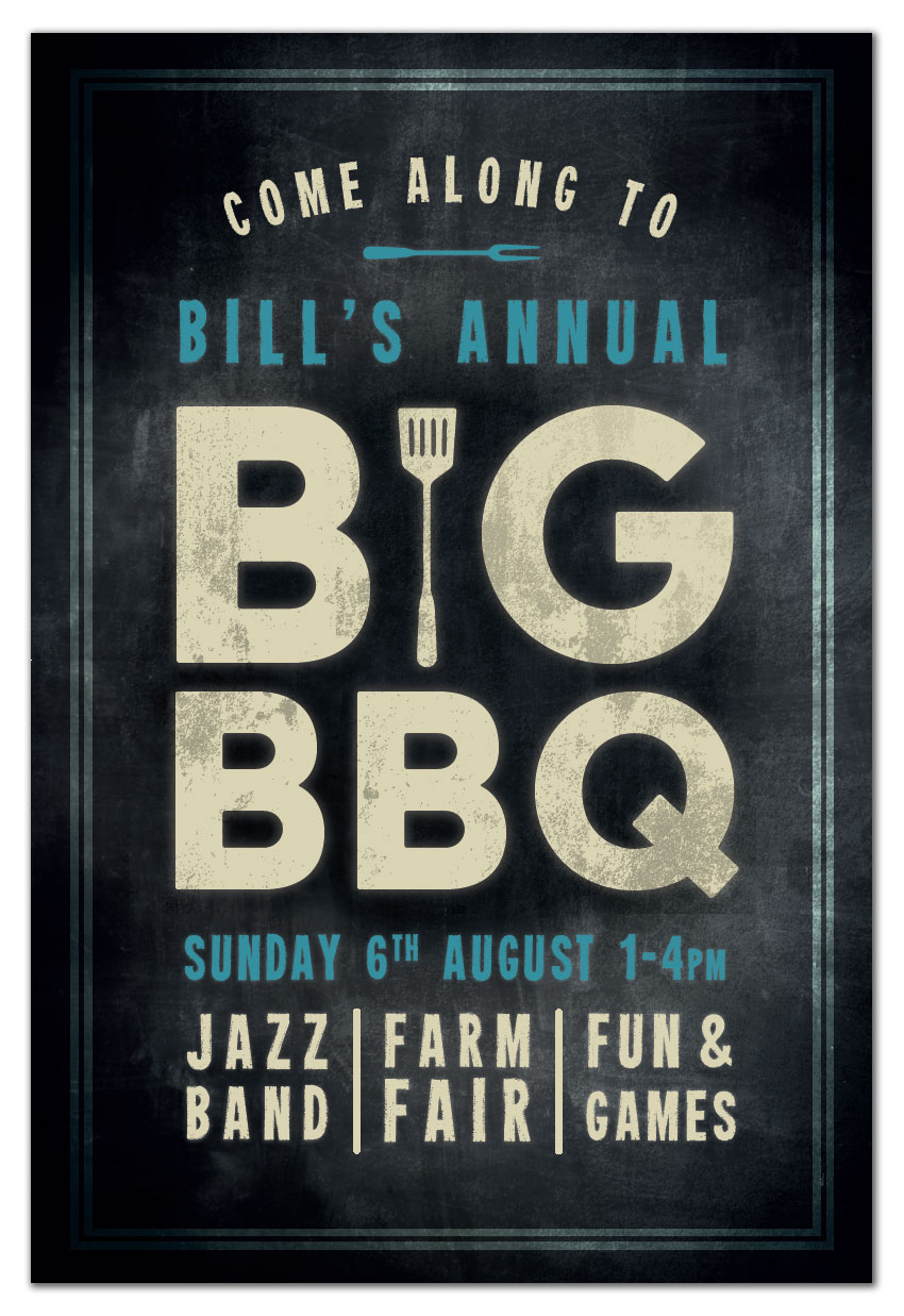
Summer is here, and with it come long, laid-back days flipping burgers on the BBQ. If you’re planning a big BBQ event over the coming months, you can promote it in style with this chalkboard poster.
Aimed at beginners to print design, this tutorial will focus on building up textures to create that authentic chalky look. You’ll need access to Adobe InDesign and Adobe Illustrator for this tutorial, and it’s super simple to adapt the design to your own event details.
Looking for a quick-to-edit event poster or flyer? Check out the selection of events templates on GraphicRiver.
Can you pick up that wonderful smoky smell in the air? Let’s dive right in…
You’ll need to have access to both InDesign and Illustrator for this tutorial. You can pick up a free trial of both apps from the Adobe website. You’ll also need to download the following images and fonts:
Once you’ve saved the images to the same folder and installed the fonts, you’re ready to get started with designing your poster. Let’s go!
Open up Adobe InDesign and go to File > New > Document.
Keep the Intent set to Print, Number of Pages to 1, and deselect Facing Pages, in order to create a single-page layout. Set the Width to 24 in and Height to 36 in, which will create a standard ‘Architectural D’ poster size.
Add Margins of 0.5 in and a Bleed of 1 in on all sides, before clicking OK.

Expand the Layers panel (Window > Layers) and double-click on the Layer 1 name to open up the Layer Options window. Rename the layer Background.

Use the Rectangle Frame Tool (F) to create an image frame that extends across the whole page, up to the edges of the bleed on all sides. Go to File > Place, choose the blackboard background image and Open. Allow the image to fill the whole frame (you can click on the Fill Frame Proportionally button in the Controls panel at the top of the workspace).

Expand the Swatches panel (Window > Color > Swatches) and click on New Color Swatch in the panel’s drop-down menu. Name the new swatch Board Black, setting the Type to Process and Mode to CMYK. Set the percentage levels to C=91 M=79 Y=62 K=97. Click Add, and then OK.

Take the Rectangle Tool (M), and drag across the page to create a shape to match the dimensions of the image frame below. From the Swatches panel, set the Fill to Board Black.

Select the Board Black rectangle and go to Object > Effects > Gradient Feather. Select Radial for the Type, and adjust the direction of the gradient so that the lighter area extends outwards from the center of the page.

Click OK to exit the Effects window. And there we have it—a chalkboard background with a subtle gradient effect, which is going to showcase your typography beautifully.

Lock the Background layer and click on the Create New Layer button at the bottom of the Layers panel. Rename this layer Black. We can add a slightly darker area to the central point of the page to allow the main text title to really stand out.
Take the Ellipse Tool (L) and drag onto the center of the page to create a rough circle. Set the Fill to Board Black and the Stroke Color to [None].

Go to Object > Effects > Transparency and choose a Multiply Mode. Bring the Opacity down to 70%.

Click on Gradient Feather at the bottom of the left-hand menu and create a Radial gradient, with the darkest part at the center of the shape. Click OK.

Open up the wall texture EPS file in Adobe Illustrator. Select the image and Right-Click > Ungroup.

Select the exclamation marks in the corner of the image and delete them, leaving just the plain texture behind.

Go to the Swatches panel (Window > Swatches) and create a New Swatch. Name it Cream, and set the CMYK levels to C=12 M=10 Y=31 K=0.

Apply the Cream swatch to the texture; then head up to File > Save As and save the texture as an EPS file, giving it the name ‘Texture Cream.eps’.

Return to your InDesign document and lock the Black layer. Create a new layer above, naming it Texture A.
Use the Rectangle Frame Tool (F) to create a frame across the whole page, and File > Place your Texture Cream.eps image, allowing it to fill the whole frame.

With the frame selected, go to Object > Effects > Transparency. Set the Mode to Overlay and the Opacity to 20%, before clicking OK.

With the rulers visible (View > Show Rulers), pull out a guide from the left-hand ruler to a central position on the page, 12 in.

Then pull out two more vertical guides to around 4 in and 20 in, splitting the layout into four columns.

Create a new CMYK swatch, C=15 M=11 Y=33 K=0, naming it Cream.

Take the Type Tool (T) and drag onto the page, just above the center, creating a rectangular text frame. Type in ‘B’ and ‘G’, with a space between the two letters.
From either the Character Formatting Controls panel running along the top of the workspace or the Character panel and Paragraph panel (Window > Type & Tables), set the Font to Charlevoix Pro Bold, Size 747 pt, and text to Align Center. Adjust the Font Color to Cream.
We want the letters to meet the guides on either side, so increase the Kerning (space between individual letters) if necessary.

Select the text frame and Edit > Copy, Edit > Paste it, positioning it below the first frame. Adjust the text to read ‘BBQ’ and reduce the Font Size to match up the alignment to the guides on either side, here 575 pt.

Select both text frames with your Selection Tool (V, Escape) cursor and head up to Object > Effects > Outer Glow. Adding a slight glow to your text will give it much more of an authentic chalky look, as if some of the chalk dust has extended past the edge of the text itself.
Adjust the Mode to Normal, and bring the Opacity down to around 43%. Click on the colored square to open the Effect Color window. From here, you can select Swatches and choose a matching Cream swatch for the glow effect. Click OK.
Back in the Effects window, set the Technique to Softer, Size to around 0.4 in, Noise to 12% and Spread to 17%. Click OK.

Open the barbecue silhouettes vector in Illustrator. Isolate the spatula, and Edit > Copy it.

Head straight back to your InDesign layout and Edit > Paste the vector directly onto the poster.
Position the spatula directly between the ‘B’ and ‘G’, scaling the image while holding Shift to match the height of the letters. Change the Fill Color to Cream, and apply a similar glow effect (Object > Effects > Outer Glow).

Create a new swatch, C=77 M=25 Y=30 K=0, and name it Blue.

Create a new text frame above the ‘BIG’ text frame, using the Type Tool (T). Type in an introduction to the main title, like ‘Bill’s Annual’, setting the Font to Heavyweight. Increase the Size and Tracking (space between all letters) until the text meets the guides on either side. Adjust the Font Color to Blue.

Go to Object > Effects > Outer Glow to add a glow effect to the text frame, selecting the Blue swatch for the Effect Color.

Copy and Paste the text frame, moving this below the ‘BBQ’ frame. Adjust the text to read the date and time of the event, and again alter the Font Size and Tracking to allow the text to stretch to meet the guides.

Use the Type Tool (T) to create three small text frames at the bottom of the layout, typing in individual snippets about the event in two-word pairs, set in Heavyweight. Adjust the Font Size and Tracking of each individual word to create a neat, square effect in each text frame. Change the Font Color to Cream.

Use the Line Tool (\) to create vertical dividers between the text frame, holding Shift to create a perfectly straight line. Set the Stroke Color to Cream. From the Stroke panel (Window > Stroke), change the Stroke Weight to 5 mm, and add a Round Cap to soften the ends of the lines.

Take the Ellipse Tool (L) and draw a rough oval towards the top of the layout. We’re going to use this as a basis for creating a curved text sub-heading.

From the Type Tool’s drop-down menu in the Tools panel, you’ll find the Type on a Path Tool (Shift-T). Click once towards the top-left corner of the oval to transform the shape into a text path. You can now type in your sub-heading (here, ‘Come along to’), and format the text as you would for any other text frame.
Set the Font to Heavyweight and Color to Cream, and move the vertical lines criss-crossing the oval to maneuver the position of the text. You want it to curve perfectly over the top of the other text frames.

Return to Illustrator and your barbecue silhouettes vector. Isolate the fork, and Edit > Copy it.

Return to InDesign and Edit > Paste it onto the page. Right-Click > Transform > Rotate 90 Degrees CW, and adjust the Fill to Blue. Go to Object > Effects > Outer Glow to add a glow effect. Position it just below the curved text frame, centrally on the page.

Our poster’s looking great so far, but we can just add a few more touches to make it feel more complete and give it more of a grungy, chalky texture.
Ensure that all the text on the page is sitting centrally on the page. If not, select all the frames with your cursor and use the arrows on your keyboard to shift the frames up or down a little. When you’re happy with the result, lock the Type layer.

Create a new layer and name it Border. Then take the Rectangle Tool (M) and drag onto the page, allowing it to sit against the margin line on all sides. Set the Stroke Color to Cream, and from the Stroke panel set the Weight to 15 mm. Adjust the Type to Thick – Thick.

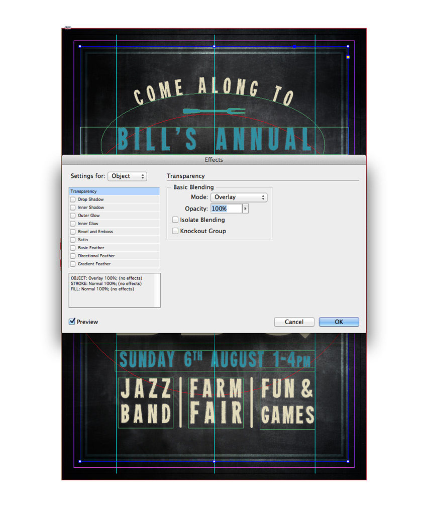
With the border selected, go to Object > Effects > Transparency and set the Mode to Overlay.
Lock the Border layer and create a final new layer above, calling it Texture B.
Return briefly to Illustrator, and to your Texture Cream EPS file. Add a new swatch, name it Board Black, and set the levels to C=91 M=79 Y=62 K=97. Apply this to the texture, before going to File > Save As and saving it as Texture Black.eps.

Return to your InDesign poster and create a new image frame across only the main title. File > Place and Open your Texture Black.eps image.

With the image frame selected, go to Object > Effects > Transparency, adjusting the Mode to Multiply and bringing the Opacity down to 20%.

To soften the effect further, you can also add a subtle Gradient Feather to the frame, setting the Type to Linear. Click OK to exit the Effects window.

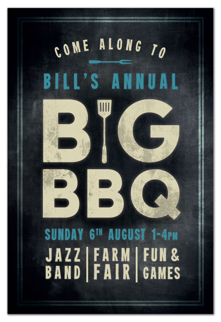
Congratulations, your poster artwork is finished! Make sure to head up to File > Save to keep all your hard work intact. If you’re printing your poster from home, you can simply head up to File > Print. If you’re sharing your poster online or via email, you can save your artwork as an Interactive PDF, JPEG or PNG by going to File > Export and choosing the file type you prefer from the Format drop-down menu.
If you’re sending your artwork off for professional printing, go to File > Export and choose Adobe PDF (Print) from the Format menu at the bottom of the window. Hit Save to open the Export Adobe PDF window. Choose [Press Quality] from the Preset menu at the top of the window.

Click on Marks and Bleeds in the window’s left-hand menu. Check All Printer’s Marks (optional, depending on your chosen printer’s preferences) and Use Document Bleed Settings.

Then hit OK to create your exported PDF. This is ready for sending straight off to the printers—great work!

You’ve finished your BBQ poster, and it’s looking fantastic. Awesome job! Before you get started on the other preparations for your event, take a moment to recap what skills and techniques you’ve picked up over the course of this tutorial. You should now feel more confident with:
Looking for more events posters and flyers? Check out the great selection of events templates on GraphicRiver here. Or why not browse more useful background and overlay textures?

Post pobrano z: This advertising campaign shows you the bottom half of famous portraits
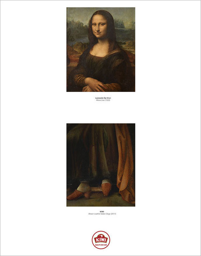
In these award-winning ads, Ogilvy Chicago created the bottom part of several famous art portraits. These complements to the artworks were designed to promote a shoes brand, Kiwi.