British photographer Jonathan Smith traveled to Patagonia and Iceland to take photos of the glaciers glaciers, revealing the beauty of the cold elements. A series that could have been titled “A song of water and ice”.
What’s it really like to go through an intensive „bootcamp” course online?
To find out, we asked School of Motion for one seat in their Design Bootcamp class, which we would award to a lucky student. In turn, that student would share an honest journal of their experience on Motionographer.
This tutorial will show you how to use Photoshop’s layer styles, filters, and layer masks to create a quick and easy digital glitch text effect. Let’s get started!
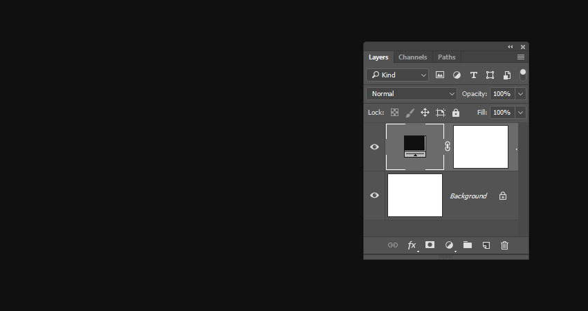
Create a 900 x 700 pxNew Document, click the Create new fill or adjustment layer icon at the bottom of the Layers panel, choose Solid Color, and use the Color#101010.
Step 2
Create the text in White using the font Pixel Digivolve, and set the Size to 170 pt.
Step 3
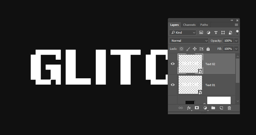
Rename the text layer to Text 01, right-click it, and choose Convert to Smart Object.
Step 4
Duplicate the Text 01 layer, and rename the copy to Text 02.
Step 5
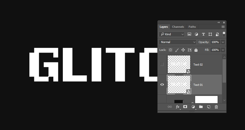
Hide the Text 02 layer by clicking the eye icon next to it.
2. How to Apply Layer Styles
Double-click the Text 01 layer to apply the following Layer Style:
Step 1
Under Blending Options go to Advanced Blending, and uncheck the G and BChannels’ boxes.
Step 2
Add an Outer Glow with these settings:
Opacity: 50%
Color: #ffffff
Size: 10
This will style the red part of the text.
Show the Text 02 layer, and double-click to apply the following Layer Style:
Step 3
Under Blending Options, go to Advanced Blending, and uncheck the R Channels box.
Step 4
Add an Outer Glow with these settings:
Opacity: 50%
Color: #ffffff
Size: 10
This will style the blue part, which will not be visible now, but we’ll work on it next.
3. How to Create a Basic Glitch Effect
Step 1
Pick the Move Tool, and use the Arrow Keys to slightly nudge the Text 01 and Text 02 layers in opposite directions to show the red and blue colors, and get a result you like.
Step 2
Duplicate both the Text 01 and Text 02 layers.
Step 3
Create a New Layer on top of all layers, name it Filters 01, and press the Option-Command-Shift-E keys to create a stamp of all the layers you have.
Right-click the Filters 01 layer, and choose Convert to Smart Object.
Step 4
Press-hold the Option key and click the Add layer mask icon at the bottom of the Layers panel to add an inverted layer mask.
Step 5
Duplicate the Filters 01 layer and rename the copy to Filters 02.
4. How to Work With Layer Masks
Step 1
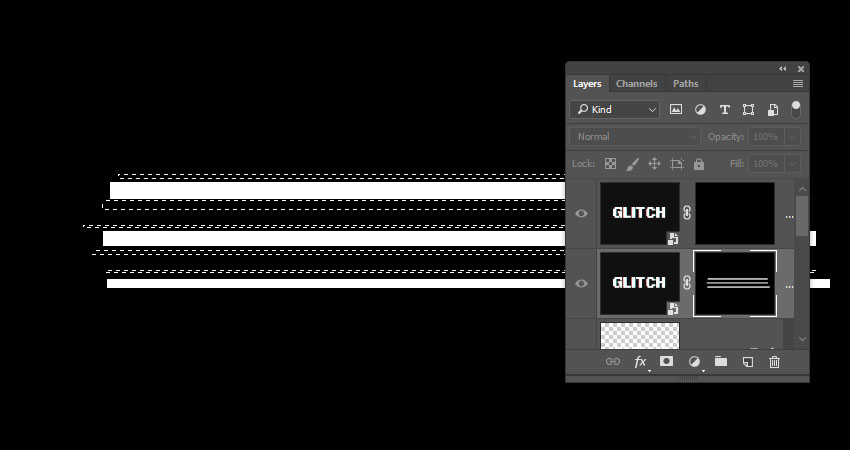
Pick the Rectangular Marquee Tool, create some random selections that cover parts of the text, and make sure to extend the selections to reach outside the left and right sides of the text.
Keep enough vertical space between the selections as we’re going to create some more selections between them.
Step 2
Select the Filters 01 layer mask’s thumbnail, and Fill the selection with White.
Press Command-D to Deselect.
Step 3
Press-hold the Option key and click the Filters 01 layer mask’s thumbnail to show it. We will use this as a reference to create the selections between the lines we already have.
Step 4
Use the Rectangular Marquee Tool again to create narrower lines between the ones you have, but keep some unselected areas as well.
Step 5
Press-hold the Option key and click the Filters 01 layer mask’s thumbnail again to get the original content, select the Filters 02 layer mask’s thumbnail, and Fill the new selection with White.
Deselect when you’re done.
5. How to Apply Glitch Effect Filters
Step 1
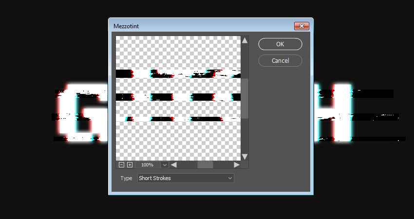
Select the Filters 01 layer, go to Filter > Pixelate > Mezzotint, and set the Type to Short Strokes.
Step 2
Select the Filters 02 layer, and go to Filter > Distort > Wave. This can be a tricky filter to apply, so you might need to try different values until you get a result you like.
The values used here are:
Number of Generators: 1
Wavelength:
Min. 1
Max. 106
Amplitude:
Min. 90
Max. 133
Scale:
Horiz. 6
Vert. 1
Type: Sine
Undefined Areas: Repeat Edges Pixels
Step 3
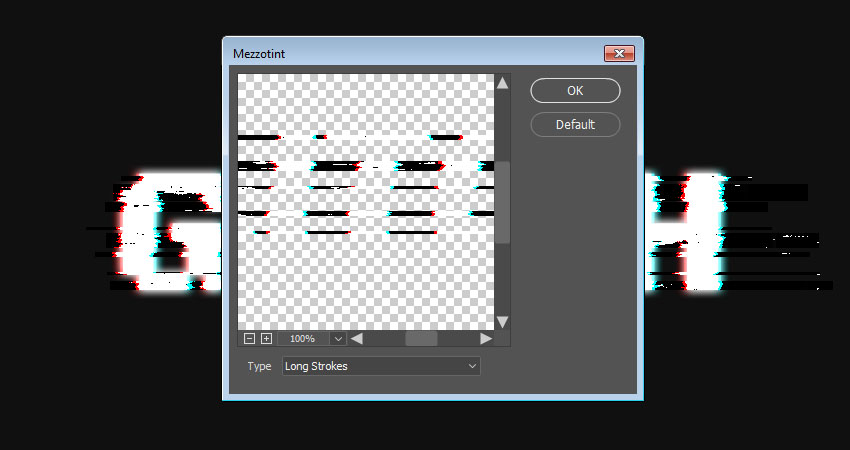
Go to Filter > Pixelate > Mezzotint, and set the Type to Long Strokes.
Step 4
Go to Filter > Stylize > Wind, set the Method to Wind, and the Direction to From the Right.
Step 5
If you need to remove any unwanted parts, select the layer mask’s thumbnail, pick the Brush Tool, and choose a soft round tip.
Set the Foreground Color to Black, and paint over the unwanted areas to hide them.
6. How to Add Scanlines
Step 1
Click the Create new fill or adjustment layer icon at the bottom of the Layers panel, and choose Color Lookup.
Choose the Fuji ETERNA 250D Fuji 3510 (by Adobe).cube table from the 3DLUT File menu.
Step 2
Create a New Layer on top of all layers, Fill it with White, name it Scanlines, and convert it to a Smart Object.
Make sure that the Foreground and Background Colors are set to Black and White.
Step 3
Go to Filter > Filter Gallery > Sketch > Halftone Pattern, and use these settings:
Size: 1
Contrast: 5
Pattern Type: Line
Step 4
Change the Scanlines layer’s Blend Mode to Soft Light and its Opacity to 50%.
Step 5
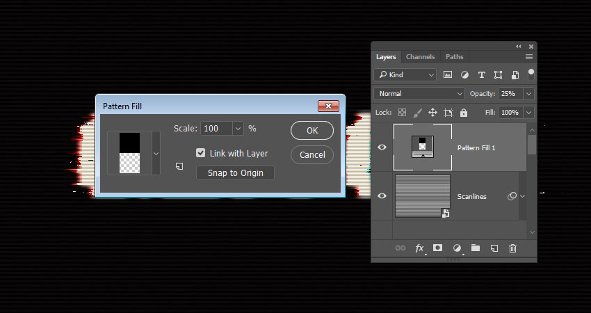
Click the Create new fill or adjustment layer icon at the bottom of the Layers panel, choose Pattern, and use the Pattern 1 Fill from the basic scanline patterns pack.
Change the layer’s Opacity to 25%.
7. How to Create a Noise Overlay
Step 1
Create a New Layer on top of all layers, fill it with Black, name it Noise, and convert it to a Smart Object.
Step 2
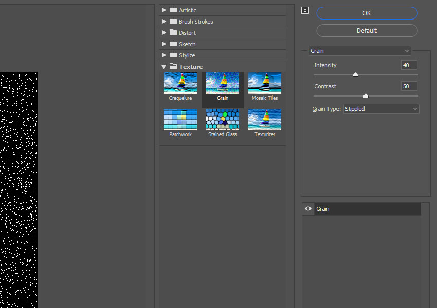
Go to Filter > Texture > Grain, and use these settings:
Intensity: 40
Contrast: 50
Grain Type: Stippled
Step 3
Click OK, and go again to Filter > Texture > Grain and use the same values as the previous step.
Step 4
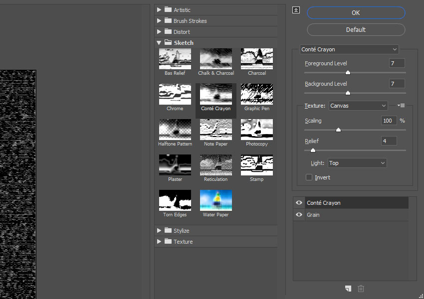
Click the New effect layer icon in the bottom right corner, go to Sketch > Conté Crayon, and use these settings:
Foreground Level: 7
Background Level: 7
Texture: Canvas
Scaling: 100%
Relief: 4
Light: Top
Step 5
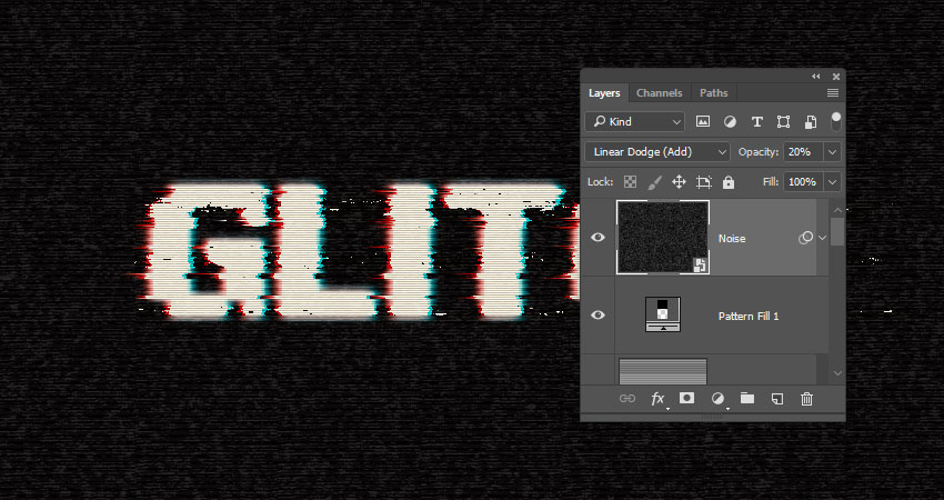
Change the Noise layer’s Blend Mode to Linear Dodge (Add), and its Opacity to 20%.
Step 6
Use the Rectangular Marquee Tool to create random selections all over the document, but try to avoid creating big selections over the text.
Step 7
Press Command-J to Duplicate the selection in a New Layer, rename it to Noise Lines, and change its Blend Mode to Color Dodge.
Congratulations! You’re Done
In this tutorial, we created a couple of text layer smart objects, and used blending options and layer styles to create the main glitch effect.
Then, we created filter layers, and adjusted their layer masks.
Finally, we used a bunch of filters to finish off the glitch effect, as well as added a quick noise overlay to make it more realistic.
Please feel free to leave your comments, suggestions, and outcomes below.
Are you thinking about setting up an eCommerce website? Are you familiar with WordPress? Do you want to be able to set up the website on your own? If your answer is yes to all these questions, then things just got a little less complicated for you. You want to know how to make a […]
Fearless Girl, a bronze sculpture on Wall Street commissioned by State Street Global Advisors, has won three Grand Prix awards at Cannes International Festival, for PR, Outdoor and Glass Lion categories. The Fearless Girl sculpture, fashioned by Kristen Visbal, depicts a Latina girl looking at the well-known Charging Bull statue in Bowling Green Park, in Manhattan. Fearless Girl was commissioned by investment firm State Street Global Advisors (SSgA) as an advertisement for an index fund which comprises gender-diverse companies that have a higher percentage of women among their senior leadership. The plaque below the statue states, “Know the power of women in leadership. SHE makes a difference,” with “SHE” being both a descriptive pronoun and the fund’s NASDAQ ticker symbol.
Fearless Girl Credits
The Fearless Girl campaign was developed at McCann New York by global creative chairman Rob Reilly, chief creative officer (North America) Eric Silver, chief creative officer Joyce King Thomas, managing director Devika Bulchandani, co-chief creative officers Tom Murphy and Sean Bryan, senior art director Lizzie Wilson, senior copywriter Tali Gumbiner, chief production officer Nathy Aviram, executive producer (innovation) Christine Lane, senior integrated producer Deb Archambault, design director George Katz, design director David Mashburn, head of communications strategy David Broad, director of social and mobile Gemma Craven, strategy director Kevin Kim, executive account director Peter Bracegirdle, account supervisor Molly Vossler, junior producer Doug Harrison, senior project manager Steven Marchione, chief communications officer Jeremy Miller, brand communications director Neena Koyen, senior editor Nathan Troester, content creators Brett Berman and Eric Perini, executive music producer Eric Johnson and music producer Dan Gross.
Artist was Kristen Visbal at Visbal Sculpture, Inc.
Production was by Traction Creative (Bryan Roberts) and SWP, New York, (Stuart Weissman).
Photography was by Federica Valabrega with retoucher Kris Chu at Swell.
Filming was by director of photography Jack Shanahan and assistant camera Jeff Clanet. Music was produced at Copilot Music + Sound by composer Naren Rauch and executive producer Jason Menkes.
I’ve been using Adobe software in earnest since they acquired Macromedia back in 2005, (I miss you Fireworks), and in that time I’ve done some awesome things with their software. During many periods I’ve relied on it to make a living, and it has served me well.
However, despite how familiar and comfortable virtually anyone in creative professions is with Adobe software, it’s always a good idea to know as much as possible about all the tools at your disposal. With a little exploration you might find there is a tool out there that is perfect for the specific tasks that form part of your daily workflows.
In this series we’ll be exploring the alternative software that occupies the same space as some of the most beloved Adobe applications. We’re keeping the focus on low or no cost applications so trying out some new toys won’t break the bank–everything will either be fully free, have a functional free version, or a price tag of less than $100. Because, let’s be honest, sometimes we’re just at a point in our careers where we need options that are going to be gentle on our hip pockets.
Your Work, Your Software
This is far from the first time someone has put together a list of alternatives to Adobe software, but in my experience a list alone is not helpful enough. For a given project you don’t just need any old application. You need an application with tools honed for the particular kind of work you need to do.
Welcome panel from Affinity Photo
The image editing tools you need when doing photo manipulation are different from those you need when doing digital painting or pixel art. The video editing tools you need for a quick video on your YouTube channel are different from those you need for your short film or your motion comic. What really matters is the specifics of where applications are strong, what they specialize in, and any unique features they may have.
As such we’re breaking this series into six specialty groups. They are:
Photo Editing
Digital Painting
Vector Art
Video Editing
Pixel Art
Animation
I have personally tried out every single application you’ll read about in this series, and I will endeavor to give you as much pertinent information on each as I can fit into the articles. As you go through this series you might find there’s an application you know to be great that isn’t in the list. If it’s under our series price cap of $100 and not included, it’s more than likely just because I haven’t personally tested it. As such, please do go ahead and shout out in the comments about programs you’ve discovered so other people can learn more about the options available to them.
Coming up..
Up first, alternatives to Photoshop for working with photo manipulation and raster-based design. Thanks for joining me, and I hope to connect you with some of your new favorite software!
In the front-end community, there is a lot of attention related to documenting JavaScript. That’s not so much the case with CSS. Often times I feel like lost when I join a project with minimal or no CSS documentation.
Even though CSS is relatively easy to write, it can be quite hard to maintain. The specificity, the global scope of everything, and the lack of guidance can easily lead to inconsistency, code duplication, and over-complication.
I’ve long been curious what a really well-documented CSS codebase looks like. Here, I’ll share my experience, along with the expectations I have towards my vision of well-documented stylesheets.
It surprises me where I hear people say that commenting CSS is not that important. I imagine none of them have had to deal with 10,000+ line stylesheets! Often I’ve struggled with what HTML results in what specific style. Without having a solid context about the development decisions taken, debugging efforts increase. WTFs per minute increase exponentially too.
Many times I’ve spent hours to figure out what the developer intended, why she didn’t do it the another way, why is this layout seemingly so complex. There is much pain buried in these „why” questions.
So, here we go! Let’s examine the 4 big signs of a well-documented CSS codebase.
1) CSS Tech Stack & Toolchain
There are likely things as part of our CSS code base like third-party libraries, mixins, or other tools. Looking in the package manager’s dependencies list doesn’t give a lot of context why the decisions were made to add these things, what they do exactly, and how we’re using them.
It would be good for everyone to know why a certain library or tool was introduced. Imagine, for example, that a third-party library was introduced only to solve what has become an obsolete CSS issue. If we had context like that, we could make more informed decisions.
There sometimes can be quite a few third-party libraries in a project. Have you ever spent a bunch of time on web searching each one figuring out what it even is? It can be quite a challenge to know or to keep track of what each exactly does.
A well-documented codebase would include a description for each dependency. Perhaps you could the comment tweet-length (140 characters) explaining why it is there. That would give anyone else in the code base a head start on why something is there.
I like adding these descriptions right in the place where I @import them.
2) CSS Conventions
Good coding conventions result in consistent, readable, and unambiguous source code. They standardize the structure and coding style of an application so that you and others can easily read and understand the code.
This brings up the larger issue of CSS style guides. A naming convention is just one choice as part of a complete styling strategy. Other parts might be:
All this makes up a complete CSS style guide. Having a shared vocabulary like this I’d consider a strong plus towards consistency.
3) CSS Architecture
Most scalable projects follow some type of architecture in terms of ordering styles. In a well-documented codebase, the fundamental principles that the project follows when structuring and sectioning styles should be mentioned.
CSS architecture seems to be somewhat in vogue right now. It’s something you’ve no doubt heard mentioned numerous times over the past year or so, and with good reason: UIs (and the teams that build them) are getting bigger and more complicated than ever before.
There are a number of aspects of CSS which make it troublesome. It’s declarative, meaning there is no logic or control flow to tell other developers much about the state or construction of the project. It operates in a global namespace, meaning we get collisions, leaking styles and inadvertent regressions. It utilizes inheritance, making everything somewhat interdependent and brittle. Finally, the unavoidable specificity model can cause problems when selectors fight each other for prominence.
Therefore, he introduces a concept for architecting CSS called ITCSS. If you are working on a project of reasonable scale, chances are someone already defined similar principles or ideas that aim to resolve these problems. So in a well-documented codebase, I would expect to see them written somewhere.
One could tell if the architecture is explained well enough if you can answer the following question: Where should new styles or stylesheets be added?
4) CSS Component Descriptions and Examples
A common pattern is to separate the logical modules into CSS components (or „blocks” according to BEM). Some of them might be re-usable, some may not, but the important thing is that they are the building blocks of our project. Therefore, describing what they are should be a top priority in a well-documented codebase.
Ideally, you should arrange and group them, name them, and establish rules between them to generate an overview of all components. A well-described CSS component doesn’t only include information about what the component does but also has other valuable intel like example HTML markup and the context in which it’s meant to be used. Going one step further brings up the issue of Pattern Libraries. A pattern library is a collection of reusable components that can be used together to create a website. With modular, component-based architecture becoming a trend, they can bring huge value.
The goal of a pattern library is to show what can be built with existing patterns (components). But let’s take a look at what additional information can be displayed alongside each pattern also. Vitaly Friedman shared a good summary on how taking the pattern library to the next level looks like. He states that focusing on components isn’t good enough:
One of the main problems with pattern libraries is that, while they provide an overview of components, they often leave a lot open to interpretation. Components can be combined in a variety of ways, consistently and inconsistently. It’s great to be able to see what button variants and iconography are available and what kinds of tables and pricing tags one may use, but what if you need to design or build an interface that contains all of these components at once — and perhaps another that doesn’t yet exist in the library?
A list of modules alone wouldn’t convey any context or any specifics on how the modules should (and should not) be used.
Based on Vitaly’s post and Brad Frost’s anatomy of a pattern in a pattern library, here are a few ideas I can imagine each of our patterns (components) could have, despite the usual unique name, code sample and a description of the component’s purpose. Basic (fundamental):
Tags or categories: The assigned tags or categories for the component. Developers could tag their components with „in use”, „needs refactoring” tags and etc.
Responsive preview: A real-life, resizable preview of the component, using the actual snippet of code being used in production. Alternatively, just a screenshot.
Versioning and legacy, team members involved or responsible: In a bigger team, the ownership of the (family of) components and which team members have been actively developing them could be really helpful for maintenance and further development.
… and here are a few more advanced:
Performance impact: Sometimes CSS could be heavy too. An indicator of performance or a „warning signs” section, outlining not only performance impact but also any common mishaps when the pattern is used incorrectly.
Accessibility implications: Indicator of accessibility requirements. Some components might require more work to maintain accessibility, especially if they interact with other components.
Related patterns: A quick overview of related components or the family of components that a given component belongs to. Could use an explanation of when to use a component, when not to, and why.
Fallback and print previews.
… the list goes on and on to whatever makes sense for your specific use-case.
Conclusion
A well-documented CSS codebase enforces consistency, boosts maintainability, and helps the team to build a shared vocabulary. It is a prerequisite for efficient CSS design and development. Moreover, based on my experience, it inevitably leads to better performance. I strongly believe that these are the signs of the professional execution of a project.
If you have thoughts, please feel free to add them in the comments below, so together we can come closer to better documentation practices.
Some fantastic behind-the-scenes stuff about Stripe’s design work by Benjamin De Cock. Absolutely everything is clever and using very modern techniques.
Using CSS grid for their iconic background stripes
Using the Web Animation API for event-triggered keyframe-like animations in JavaScript
Plus one I’d never seen before:
Connect’s landing page uses the new Intersection Observer API which provides a much more robust and performant way to detect the visibility of an element … The observeScroll helper simplifies our detection behavior (i.e. when an element is fully visible, the callback is triggered once) without executing anything on the main thread.