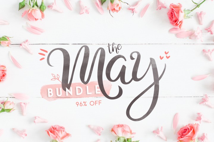
The month of May is coming to an end soon, and if you missed this impressive font bundle by our friends of The Hungry JPEG, it will be gone forever next month.
In the bundle, for just $29, you’ll find over 70 high-quality fonts of all styles, pretty much a full font library for a ridiculously low price. We’ve included a preview of a few fonts here, but to discover all the typefaces available in the bundle, you should check out this page.
Corporate culture permeates throughout an entire organisation. It can be your best advertisement or, if the culture and behavior are not in line with best practices and fair and competitive business operations, it can cause a company to lose its identity and focus and ultimately fail.
Committed to Customers
Shouldn’t businesses just focus on manufacturing or selling their product line? Why do they need to meld operations into business practices and push them across the entire workforce? It’s because a strong culture begets strong operations. Where they separate it can cause irreparable harm to the company.
Building a brand initially takes time and effort and then it must be maintained. It can’t just be a façade – there has to be meat behind it as well as legitimate and trustworthy actions. This trend toward corporate culture fine-tuning has increased during the last few years. Where companies are experiencing higher turnover rates it can often be attributed to either poor or completely absent (positive) corporate culture.
Workers Demand It
Workers already in and those about to enter the workforce desire a unified company and message. These elements are the foundation for a strong company culture – Employees want to buy into who they work for and what they’re selling as much as the customers the company targets.Take the biggest segment of individuals currently joining the professional world: Millennials. They look for a strong company culture in the jobs they go for and so companies that neglect the needs of one of their biggest sources of employees are bound to suffer from a lack of talent.
Constructive Corporate Culture Creation
A strong brand and a strong positive company culture, unfortunately, don’t develop overnight. They must be fostered and maintained. Not every company will or should have the same culture – it’s not that uniqueness is expected and there will always be similarities that exist between companies, but they must have an identity of their own.
Vision: Companies need mission statements. These overarching compelling statements at their heart guide every decision the company makes. Setting these vision or mission parameters at a top level will help direct employees to continue them down the chain.
Values: Embrace them. Values are merely empty words and phrases unless they are adopted by everyone within a company. A company’s mission statement is more of an idea, but values offer everyone involved clearer guidelines such as how to deal with clients, interactions colleagues, and how to manage situations. It is important that these are consistently upheld.
Practices: Show it, don’t Say it. Actions speak louder than words when it comes to developing a constructive corporate culture. Companies should ensure their set of values are practiced daily throughout the company, at all management levels. If certain staff is exempted from behaving in certain ways, there really is not a reason for others to continue to follow the policies.
People. Having the most eloquently written mission statement and strong values won’t be enough to maintain a corporate culture without people. Companies need individuals who strongly believe in what the company does and who want to be a part of the movement. They don’t just want to be controlled; rather, they want to active members of the organization who are guided by constructive principles. Developing these internal brand ambassadors for a company’s brand and values will ensure the positive culture continues to permeate throughout the company.
Is It Too Late?
Is there a deadline for developing a positive growth-promoting corporate culture? No, because the first step is realizing your company has a problem. Determine whether your mission statement is being followed through, or if the company values are embodied or simply being taken as suggestions. Is the mission statement actually clearly articulated? A vague directive yields vague action. How often do employees come into contact with the main values that should guide operations – if they are in the form of a handbook given to new hires and never referenced again, those points of advice are unlikely to be remembered later on down the line?
Lastly, corporate culture has to be indeed a culture, that lives and breathes in everything the company does. All levels, all the time must uphold it. Maintain these values and the business will be much more likely to remain competitive.
This tutorial will show you a very easy and useful tip to create colorful illuminated letters using Photoshop’s 3D material settings. Let’s get started!
Then create the text in All Caps using the font Primal, setting the Size to 90 pt and the Tracking value to 30.
Step 2
Go to 3D > New 3D Extrusion from Selected Layer. This will create a 3D mesh from the text layer.
To access the 3D mesh settings and properties, you’ll need to open two panels: the 3D panel and the Properties panel (both found under the Window menu).
The 3D panel has all the components of the 3D scene, and when you click the name of any of those, you’ll be able to access its settings in the Properties panel. So make sure to always select the tab of the element you want to modify in the 3D panel before you change its settings in the Properties panel.
Step 3
If you select the Move Tool, you’ll find a set of 3D Modes for it to the right of the Options bar.
When you choose one of those, you can then click and drag to perform changes (on the selected element in the 3D panel).
Use those modes to change the Current View to an angle you like.
2. How to Adjust the 3D Mesh and Cap Settings
Step 1
Select the 3D mesh tab in the 3D panel, and change its Extrusion Depth in the Properties panel to 15 px.
Step 2
Click the Cap icon at the top of the Properties panel, and change the Bevel Width to 1.
3. How to Modify the 3D Material Settings
Step 1
Select all the Material tabs except for the Extrusion Material’s, and use these settings (the color values used are in RGB):
Diffuse: 211, 211, 211
Specular: 180, 180, 180
Shine: 80%
Step 2
Select the Extrusion Material tab, and use these settings:
Diffuse: 121, 222, 209
Specular: 20, 41, 42
Shine: 80%
Step 3
Click the Illumination icon, and choose New Texture.
Step 4
Set the Width to 1300 px and the Height to 300 px, and click OK.
This should open the new file, but if it doesn’t, click the Illumination texture icon, and choose Edit Texture.
4. How to Create a Colorful Illuminated Texture
Step 1
Duplicate the Background layer you have in the new file.
Step 2
Double-click the copy layer to apply a Gradient Overlay effect with these settings:
Check the Dither box
Angle: 0
Use the SpectrumGradient Fill, or you can create your own colorful gradient fill that you like.
Step 3
Click the Create new fill or adjustment layer icon at the bottom of the Layers panel, and choose Levels.
Change the Levels layer’s Blend Mode to Luminosity, and change the Gamma value to 0.75.
Save and close the file.
This will create the colorful illumination material texture.
5. How to Add a 3D Shape Background
Step 1
Pick the Rectangle Tool, and click once anywhere inside the document to get the Create Rectangle box.
Set the Width to 1560 px and the Height to 1750 px, click OK, and make sure to set the rectangle’s Fill Color to White.
Step 2
Once the rectangle shape is created, go to 3D > New 3D Extrusion from Selected Path, and change the Extrusion Depth to 1.
Step 3
Click the Current View tab in the 3D panel, and choose the text’s 3D layer’s name from the View menu in the Properties panel.
Step 4
Select both 3D layers you have, and go to 3D > Merge 3D Layers.
Pick the Move Tool, select the rectangle mesh, and use the 3D Axis to move it behind the text.
The arrows at the ends of the axis move the mesh, the part below them is used for rotation, and the cubes are used for scaling. The cube in the center is used to scale the object uniformly. All you need to do is click and drag the part you want.
Step 5
Select the rectangle mesh’s Front Inflation Material tab, and change its Specular color to (51, 51, 51) and its Shine value to 90%.
6. How to Adjust a 3D Scene’s Lighting
Step 1
Select the Infinite Light 1 tab, and change both its Intensity and Shadow Softness values to 30%.
Step 2
Use the Move Tool to move the light so that it’s facing the text, and tilt it upwards a little bit.
You can also click the Coordinates icon at the top of the Properties panel to enter numerical values.
Step 3
Select the Environment tab, click the IBL texture icon, and choose Replace Texture to open the Building Interior image.
Step 4
Click the IBL texture icon and choose Edit Texture.
Add a Hue/SaturationAdjustment Layer, and change the Saturation to -60 and the Lightness to 15.
Save and close the file.
Step 5
Change the Intensity to 65%, and set the Ground Plane Shadows Opacity to 0.
Use the Move Tool to move the texture around to get a result you like.
Step 6
Use the Move Tool’s 3D Modes to change the Current View to an angle you like, and make sure that the rectangle mesh’s edges are not visible.
Step 7
Go to 3D > Render 3D Layer. The rendering might take a while, but you can stop it any time by pressing the Esc key.
You can also stop the rendering to adjust the lighting, the camera view, or anything else you think needs tweaking, and render again until you get a result you like.
Congratulations! You’re Done
In this tutorial, we created 3D meshes from text and shape layers, adjusted their material settings, and used a gradient fill for the illumination texture to create the colorful illuminating effect.
Then, we adjusted the lighting of the scene, as well as the camera view, to render the final result.
Please feel free to leave your comments, suggestions, and outcomes below.
React provides two standard ways to grab values from <form> elements. The first method is to implement what are called controlled components (see my blog post on the topic) and the second is to use React’s ref property.
Controlled components are heavy duty. The defining characteristic of a controlled component is the displayed value is bound to component state. To update the value, you execute a function attached to the onChange event handler on the form element. The onChange function updates the state property, which in turn updates the form element’s value.
(Before we get too far, if you just want to see the code samples for this article: here you go!)
The value of the input is this.state.fullName (lines 7 and 26). The onChange function is handleFullNameChange (lines 10 – 14, and line 27).
The main advantages of controlled components are:
You are set up to easily validate user input.
You can dynamically render other components based on the value of the controlled component. For example, the value a user selects from a dropdown (e.g. 'dog’ or 'cat’) can control which other form components (e.g. a checkbox set of breeds) are rendered in the form.
The downside to controlled components is the amount of code you have to write. You need a state property to pass to the form element as props, and you need a function to update the value of this property.
For one form element this isn’t an issue – but if you have a large, complex form (that doesn’t need dynamic rendering or real-time validation), you’ll find yourself writing a ton of code if you overuse controlled components.
An easier and less labor-intensive way to grab values from a form element is to use the ref property. Different form elements and component compositions require different strategies, so the rest of this post is divided into the following sections.
Text and number inputs provide the most straightforward example of using refs. In the ref attribute of the input, add an arrow function that takes the input as an argument. I tend to name the argument the same as the element itself as seen on line 3 below:
You then take the argument and assign it to a property attached to the class’s this keyword. The inputs (i.e. the DOM node) are now accessible as this.fullName and this.amount. The values of the inputs are accessible as this.fullName.value and this.amount.value.
The same strategy works for select elements (i.e. dropdowns).
The value selected is accessible as this.petType.value.
2. Passing props from child to parent
With a controlled component, getting the value from a child component to a parent is straightforward – the value already lives in the parent! It’s passed down to the child. An onChange function is also passed down and updates the value as the user interacts with the UI.
You can see this at work in the controlled component examples in my previous post.
While the value already lives in the parent’s state in controlled components, this is not so when using refs. With refs, the value resides in the DOM node itself, and must be communicated up to the parent.
To pass this value from child to parent, the parent needs to pass down a ’hook’, if you will, to the child. The child then attaches a node to the 'hook’ so the parent has access to it.
Let’s look at some code before discussing this further.
Above you see a form component RefForm, and an input component called CustomInput. Usually, the arrow function is on the input itself, but here it’s being passed down as a prop (see lines 15 and 27). Since the arrow function resides in the parent, the this of this.firstName lives in the parent.
The value of the child input is being assigned to the this.firstName property of the parent, so the child’s value is available to the parent. Now, in the parent, this.firstName refers to a DOM node in the child component (i.e. the input in CustomInput).
Not only can the DOM node of the input be accessed by the parent, but the value of the node can also be assigned from within the parent. This is demonstrated on line 7 above. Once the form is submitted, the value of the input is set to 'Got ya!’.
This pattern is a bit mind bending, so stare at it for a while and play around with the code until it sinks in.
You may be better off making radios and checkboxes controlled components, but if you really want to use refs the next two sections are for you.
3. Radio sets
Unlike text and number input elements, radios come in sets. Each element in a set has the same name attribute, like so:
There are three options in the „pet” radio set – „cat”, „dog”, and „ferret”.
Since the whole set is the object of our concern, setting a ref on each radio input is not ideal. And, unfortunately, there’s no DOM node that encapsulates a set of radios.
Retrieving the value of the radio set can be obtained through three steps:
Set a ref on the <form> tag (line 20 below).
Extract the set of radios from the form. In this case, it is the pet set (line 9 below).
A node list and a value is returned here. In this case, this node list includes three input nodes, and the value selected.
Keep in mind that a node list looks like an array but is not, and lacks array methods. There’s more on this topic in the next section.
Grab the value of the set using dot notation (line 13 below).
import React, { Component } from 'react';

class RefsForm extends Component {

  handleSubmit = (e) => {
    e.preventDefault();

    //  extract the node list from the form
    //  it looks like an array, but lacks array methods
    const { pet } = this.form;

    // a set of radios has value property
    // checkout out the log for proof
    console.log(pet, pet.value);
  }

  render() {
    return (
      <div>
        <form
          onSubmit={this.handleSubmit}
          ref={form => this.form = form}>
          <label>
            Cat
            <input type="radio" value="cat" name="pet" />
          </label>
          <label>
            Dog
            <input type="radio" value="dog" name="pet" />
          </label>
          <label>
            Ferret
            <input type="radio" value="ferret" name="pet" />
          </label>
          <input type="submit" value="Submit" />
        </form>
      </div>
    );
  }
}

export default RefsForm;
This works even if you are composing a form from children components. Although there’s more logic in the components, the technique for getting the value from the radio set remains the same.
import React, { Component } from 'react';

class RefsForm extends Component {
  handleSubmit = (e) => {
    e.preventDefault();

    //  extract the node list from the form
    //  it looks like an array, but lacks array methods
    const { pet } = this.form;

    // a set of radios has value property
    // checkout out the log for proof
    console.log(pet, pet.value);
  }

  render() {
    return (
      <div>
        <form
          onSubmit={this.handleSubmit}
          ref={form => this.form = form}>
          <RadioSet
            setName={'pet'}
            setOptions={['cat', 'dog', 'ferret']} />
          <input type="submit" value="Submit" />
        </form>
      </div>
    );
  }
}

function RadioSet(props) {
  return (
    <div>
      {props.setOptions.map(option => {
        return (
          <label
            key={option}
            style={{textTransform: 'capitalize'}}>
            {option}
            <input
              type="radio"
              value={option}
              name={props.setName} />
          </label>
        )
      })}
    </div>
  );
}

export default RefsForm;
4. Checkbox sets
Unlike a radio set, a checkbox set may have multiple values selected. This makes extracting these values a little more complicated than extracting the value of a radio set.
Retrieving the selected values of the checkbox set can be done through these five steps:
Set a ref on the <form> tag (line 27 below).
Extract the set of checkboxes from the form. In this case, it is the pet set (line 9).
A node list and a value is returned here.
Keep in mind that a node list looks like an array but is not, and lacks array methods, which takes us to the next step…
Convert the node list to an array, so array methods are available (checkboxArray on line 12).
Use Array.filter() to grab only the checked checkboxes (checkedCheckboxes on line 15).
Use Array.map() to keep only the values of the checked checkboxes (checkedCheckboxesValues on line 19).
import React, { Component } from 'react';

class RefsForm extends Component {
  handleSubmit = (e) => {
    e.preventDefault();

    //  extract the node list from the form
    //  it looks like an array, but lacks array methods
    const { pet } = this.form;

    // convert node list to an array
    const checkboxArray = Array.prototype.slice.call(pet);

    // extract only the checked checkboxes
    const checkedCheckboxes = checkboxArray.filter(input => input.checked);
    console.log('checked array:', checkedCheckboxes);

    // use .map() to extract the value from each checked checkbox
    const checkedCheckboxesValues = checkedCheckboxes.map(input => input.value);
    console.log('checked array values:', checkedCheckboxesValues);
  }

  render() {
    return (
      <div>
        <form
          onSubmit={this.handleSubmit}
          ref={form => this.form = form}>
          <label>
            Cat
            <input type="checkbox" value="cat" name="pet" />
          </label>
          <label>
            Dog
            <input type="checkbox" value="dog" name="pet" />
          </label>
          <label>
            Ferret
            <input type="checkbox" value="ferret" name="pet" />
          </label>
          <input type="submit" value="Submit" />
        </form>
      </div>
    );
  }
}

export default RefsForm;
Using a checkbox set child component works just like the radio set example in the previous section.
import React, { Component } from 'react';

class RefsForm extends Component {
  handleSubmit = (e) => {
    e.preventDefault();

    //  extract the node list from the form
    //  it looks like an array, but lacks array methods
    const { pet } = this.form;

    // convert node list to an array
    const checkboxArray = Array.prototype.slice.call(pet);

    // extract only the checked checkboxes
    const checkedCheckboxes = checkboxArray.filter(input => input.checked);
    console.log('checked array:', checkedCheckboxes);

    // use .map() to extract the value from each checked checkbox
    const checkedCheckboxesValues = checkedCheckboxes.map(input => input.value);
    console.log('checked array values:', checkedCheckboxesValues);
  }

  render() {
    return (
      <div>
        <form
          onSubmit={this.handleSubmit}
          ref={form => this.form = form}>
          <CheckboxSet
            setName={'pet'}
            setOptions={['cat', 'dog', 'ferret']} />
          <input type="submit" value="Submit" />
        </form>
      </div>
    );
  }
}

function CheckboxSet(props) {
  return (
    <div>
      {props.setOptions.map(option => {
        return (
          <label
            key={option}
            style={{textTransform: 'capitalize'}}>
            {option}
            <input
              type="checkbox"
              value={option}
              name={props.setName} />
          </label>
        )
      })}
    </div>
  );
}

export default RefsForm;
Conclusion
If you don’t need to:
monitor the value of a form element in real-time (e.g. in order to render subsequent components based on user input), or
perform custom validation in real-time,
then using refs to grab data from form elements is a good bet.
The primary value of using refs over controlled component is that, in most cases, you will write less code. The exceptional case is that of checkbox sets (and radios to a lesser degree). For checkbox sets, the amount of code you save by using refs is minimal, so it’s less clear whether to use a controlled component or refs.
The replies to Maciej’s tweet are interesting to read. They fall roughly into two camps:
Older/not front-end developers: because the web is shit!
Current front-end developers: because shit is hard!
As is often the case, both camps are correct! The web is a shitshow of wheel reinvention and bad APIs. It’s also a blizzard of innovation.
Expectations for what a website should be able to do have evolved enormously. Users expect snappy, desktop-like responsiveness and rich presentation in web apps. They also expect those same web apps to work equally well on mobile devices. And they expect these apps to load basically instantly.
Summer is here, and festival season is in full swing. If you’re promoting a festival event this year, you can give your publicity a vintage twist with this groovy flyer design. It’s simple to create and will make a fantastic summery statement.
We’ll be putting together the flyer layout in Adobe InDesign, and using Photoshop and Illustrator to do some colorful image editing. If you’re a relative beginner to Adobe software, this is a great all-round introduction to creating layouts for print or circulating online.
Need a festival flyer quickly? You’ll find an awesome selection of easy-to-customize flyer templates on GraphicRiver.
OK, are you ready for the best summer ever? Great! Let’s get started…
What You’ll Need to Create Your Flyer
To put together the flyer, you’ll need access to the classic trio of Adobe applications: InDesign, Photoshop and Illustrator. If you’re not quite ready to commit to a software purchase, you can get a free 30-day trial of all these apps over at adobe.com.
You’ll also need to download the following images and font files:
Make sure the font is installed on your system before starting the tutorial. When you’re ready, we can dive right in to setting up our layout.
1. How to Set Up Your Layout in InDesign
Step 1
Open up InDesign and go to File > New > Document.
In the window that opens, keep the Intent set to Print and Number of Pages to 1, and uncheck Facing Pages.
From the Page Size drop-down menu, choose Flyer 8.5×11 or manually type in a Width of 8.5 in and a Height of 11 in.
Add a Margin of 0.2756 in (7 mm) and a Bleed of 0.25 in around all the edges of the page. When you’ve done that, go ahead and click OK.
Step 2
Expand the Layers panel (Window > Layers) and double-click on the Layer 1 name. Rename it Paper and click OK.
Take the Rectangle Frame Tool (F) from the Tools panel and drag onto the page, creating a frame that extends up to the edge of the bleed on all sides. Go to File > Place, choose your paper texture image, and click Open.
Allow the image to fill the whole frame by scaling it, holding Shift while you do, and rotating (Right-Click > Transform > Rotate) if necessary.
3. How to Add a Sunset Background to Your Flyer
Step 1
Return to the Layers panel and click on the Create New Layer button at the bottom. Double-click the layer to open Layer Options. Rename the layer Background Color.
Lock the Paper layer below, activating the Background Color layer.
Step 2
Expand the Swatches panel (Window > Color > Swatches) and click on the New Swatch button at the bottom.
Double-click the swatch to open the Swatch Options window. Name the swatch Sunset, set the Type to Process and Mode to CMYK, and adjust the percentage levels to C=0 M=53 Y=55 K=0. Click OK.
Step 3
Select the Rectangle Tool (M) and create a shape that covers the bottom half of the page. Set the Fill to Sunset and Stroke to [None].
With the shape selected, head up to Object on the top menu and Effects > Gradient Feather.
Give the shape a 90 degree gradient, pulling the dark slider along to the right.
Step 4
Create a second New Swatch, naming it Sunrise. Set the levels to C=2 M=19 Y=83 K=0.
Use the Rectangle Tool (M) to create a new shape, extending it across the whole of the page, and pulling it down past the bottom edge of the page by about a quarter-page.
Go to Object > Effects > Gradient Feather, and apply a -90 degree Gradient. This will create a subtle sunset effect.
4. How to Create a Collage Effect for Your Design
Step 1
File > Save your InDesign document, and minimize the window for now. We’ll be coming back to it a bit later.
Open up your camper van image in Photoshop, and Duplicate and then Lock the background layer to keep a copy of the original image. We want to separate the van in the foreground from its background, but we can do this in a rough way which will add to the cut-out collage effect.
Use the Polygonal Lasso Tool (L) to trace around the edges of the van, looping off sections and clicking on the Refine Edge button at the top of the workspace.
Use the Shift Edge slider to make the selection as tight as possible, before hitting OK once you’re happy. Then Delete the selection.
Work your way around the whole van, including the shadow below, until you have isolated it. Then head up to File > Save As, and Save your image as a Photoshop (PSD) file.
Step 2
Minimize the Photoshop window and head back into InDesign.
Create a New Layer and name it Camper Van. Lock the two layers sitting below.
Use the Rectangle Frame Tool (F) to create a frame in the center of the page and File > Place, choosing your camper van Photoshop image. Center it nicely within the frame.
Step 3
Create a New Layer and name it Pen Tool. Drag this down to sit below the Camper Van layer and above Background Color.
Take the Pen Tool (P) and click around the edge of the van, leaving a little gap between the edge of the photo and the line.
Continue to trace your way around, joining the shape up at the first anchor point.
From the Swatches panel, change the Fill of the shape to [Paper] (white) and the Stroke to [None].
This creates a great little cut-out collage effect.
Step 4
Create a New Swatch, name it Cherry, and set the levels to C=0 M=130 Y=94 K=0.
Create a New Layer at the top of the layer sequence and name it Color. Lock the other layers below.
Use the Pen Tool (P) to pull out a part of the van in your Cherry swatch. Here, I’ve traced the central door, but you could try a window if you like.
Step 5
Minimize the InDesign window for a minute. You can also create playful colored elements for your collage using Illustrator.
Open up Illustrator, and File > Place your camper van image. Lock this onto its own layer, creating a New Layer above to work on.
Select the Paintbrush Tool (B) and click on the Brush Definition drop-down menu at the top of the workspace. Click on the Brush Libraries Menu and choose Artistic > Artistic_ChalkCharcoalPencil.
Select Chalk – Blunt from the brush window that opens. Draw around the VW logo, tracing the outside edge.
Then trace the inside details too.
Step 6
You can trace other elements too, like the nice V-shaped swoop across the front of the van…
… and the wheels as well.
Don’t worry about perfecting color here—I’ve just used a bright yellow to show you the shapes clearly. For now, select the VW shape only and Edit > Copy, before minimizing the Illustrator window.
Step 7
Head back to your InDesign document and create a New CMYK Swatch. Name it Turquoise, and set it as C=79 M=11 Y=48 K=1.
Edit > Paste your VW vector shape onto the page, and scale using Shift to match the proportions of the image below. Adjust the Fill to Turquoise.
Return to Illustrator, select the V swoop, and Edit > Copy; head back to InDesign and Edit > Paste. Set the Fill to Sunset.
Finally, Copy and Paste over your wheel shapes. Set the Fill of these to Sunrise.
Great work so far—your camper van’s looking groovy!
5. How to Create Letterpress-Style Typography
Step 1
Create a New Layer. Name it Typography and sit it above the Background Color layer and below Pen Tool.
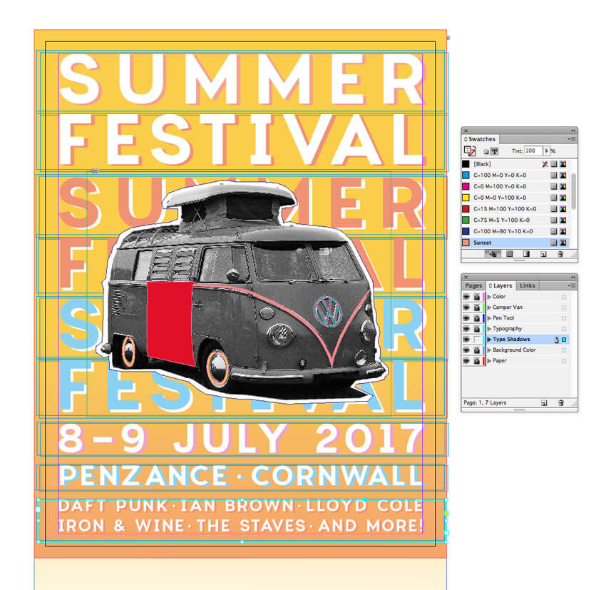
Use the Type Tool (T) to create a text frame at the top of the page. Type in ‘SUMMER’ and from either the top Controls panel or the Character panel (Window > Type & Tables > Character) set the Font to Charlevoix Pro SemiBold, Size 110 pt, Tracking 160. Set the text to Align Center from the Controls panel, and adjust the Font Color to [Paper].
Edit > Copy, Edit > Paste the text frame, moving the copy below the first. Adjust the text to read ‘FESTIVAL’ and adjust the Tracking to line up the far edges of the text with the text above.
Step 2
Select both text frames, and Copy and Paste below, adjusting the Font Color to Sunset.
Repeat the paste, this time creating a New Swatch, called Sky Blue, C=49 M=0 Y=2 K=0, and move below.
Step 3
Use the Type Tool (T) to create a series of text frames at the bottom of the page. Here you can put details like the date, location and what’s on at your event. Set all the text in Charlevoix Pro SemiBold and a [Paper] Font Color.
You can use the Glyphs panel (Window > Type & Tables > Glyphs) to insert bullets between acts.
Step 4
Make sure that you’re happy with the final layout and content of the text. We’ll be duplicating all the text to create a shadow effect, so it needs to be kept the same to look right. This is the time to do a spell check!
Head over to the Layers panel and right-click on the Typography layer. Select Duplicate Layer “Typography”.
Then drag the duplicate layer down to sit below Typography. Rename this layer Type Shadows. Lock the Typography layer above.
Step 5
Drag your mouse across the whole page to select all the text frames on the Type Shadows layer, and press the arrow keys to move the text a little to the right and down.
Select each pair of ‘SUMMER FESTIVAL’ text frames and adjust the Font Color to a contrasting shade, creating a cool letterpress-style shadow effect.
Work your way down the page, adding a [Paper] color to some text, or your custom swatch colors to others.
Eventually you’ll end up with a very nice letterpress effect, which looks great paired with your camper van collage.
6. How to Export Your Flyer for Circulation
Exporting Your Flyer for Online Circulation
If you want to circulate your flyer as an email attachment or get it ready for web upload, you’ve got a couple of options.
Head up to File > Export. Choose Adobe PDF (Interactive) from the Format menu if you want to attach the flyer to an email.
Alternatively, choose JPEG or PNG if you’d like to prep an image for uploading online.
Exporting Your Flyer for Printing
If you’re planning to get your flyer printed professionally at a print shop, you’ll need to make sure to include your bleed in the final export.
Go to File > Export, and choose Adobe PDF (Print) from the Format menu. Click Save.
In the window that opens, choose [Press Quality] from the Preset menu at the top.
Click on the Marks and Bleeds option in the left-hand menu, and check All Printer’s Marks and Use Document Bleed Settings. Then hit Export to create your print-ready PDF—you can send this straight off to the printers!
Conclusion: You’ve Created One Groovy Flyer
Congratulations, your festival flyer is finished! Now all you need to do is sit back and watch the ticket sales roll in.
Before you chill out with some awesome live music, let’s take a quick recap of some of the key skills you’ve picked up in this tutorial, which you can apply to other flyer design projects. You now know how to:
Set up a standard flyer layout in Adobe InDesign.
Create a professional backdrop of color and texture to your layout.
Edit collage-style images in Photoshop and add vector details using Illustrator.
Format letterpress-style typography to a high standard, adding an on-trend look to your design.
Export your flyer for circulating online or in print format.
That’s a lot of work—great job! If you want to explore even more festival flyer ideas, you can find a range of easy-to-customize flyer templates over on GraphicRiver. Check it out!
Agregator najlepszych postów o designie, webdesignie, cssie i Internecie