Until now, I refrained from purchasing a 3D printer primarily for one reason: all you could print was plastic. Of course, I’m talking about consumer 3D printers, it’s been possible to print on metal or ceramics for a while already, but purchasing one of these printers was out of budget.
ClayXYZ is the first 3D printer for clay and ceramics that you can purchase at an affordable price. There is still a Kickstarter campaign running for it, but it has been largely financed already.
The device is as simple as any printer should be. Get your 3D model ready, load some clay, and print. It’s natural material, so you can add some extra finishes and touch it up by hand, but that’s not mandatory. For designers, this is a whole new field that opens up, and no need to use ugly plastic for 3D printers anymore.
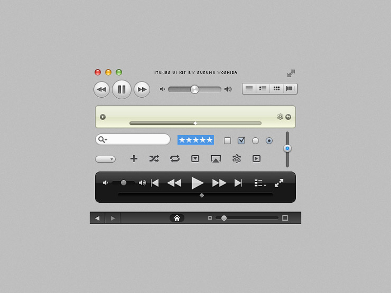
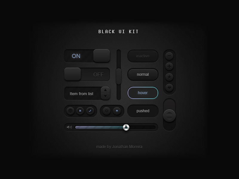
A round-up of recent useful freebies for graphic and web designers.
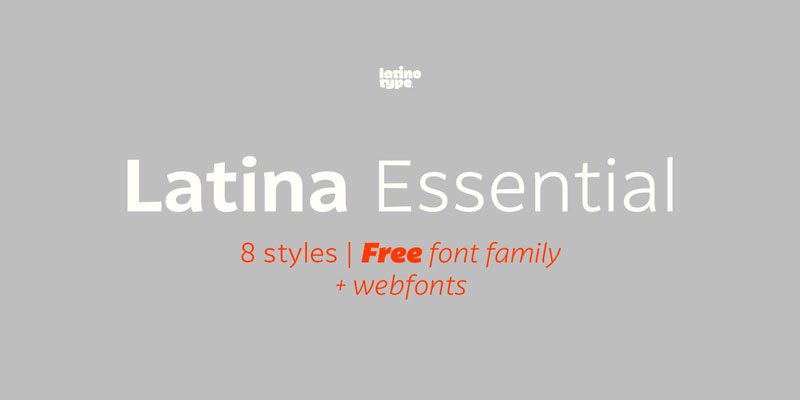
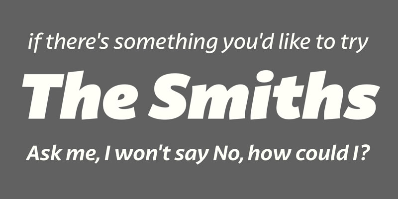
1. Latina Essential, Free font family by Latinotype
This font is based on calligraphy, but calligraphic features have been changed in order to make Latina a more neutral font. This prevents readers from losing their focus when reading a continuous text. On the other hand, these same features get highlighted when using the font for headlines or display text. Latina is the perfect choice for publishing design (books and magazines), branding and advertising.
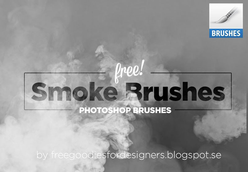
2. Free Smoke Brushes for Photoshop
For many things that you may need to include in a Photoshop composition, all you need is often to take a quick photo. For smoke, you’d have a hard time to do it quickly, so these free smoke brushes for Photoshop come in very handy.
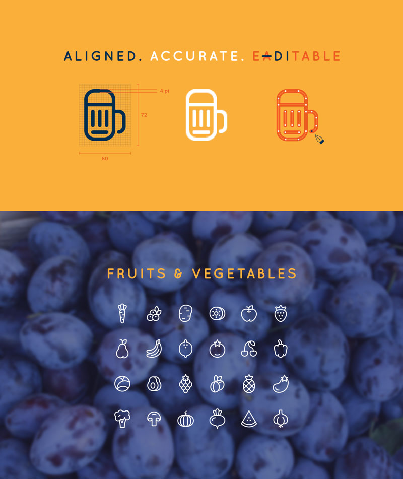
3. 96 Cooking Icons
A large set of gorgeous line icons created by Ekaterina Sosedova. Deserts, fruits, first and second courses, you’ll find all icons to be aligned, accurate and editable.
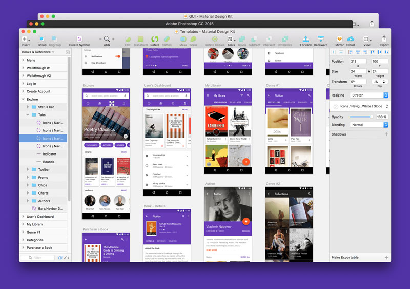
4. Material Design UI Kit
Material Design Kit is the ultimate library of UI elements, app templates, and style guides combined into high-quality source files for Sketch & Photoshop. Everything you need for a faster workflow and better results when design for Android.
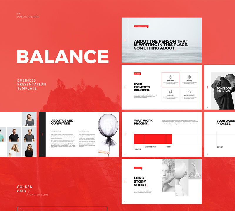
5. Minimal Powerpoint & Keynote Template
If you are like me and try to attend events that are not directly design related, you surely have seen plenty of horrible Power Point presentations. This free Power Point and Keynote template was presented by Dublin Design to help you create beautiful presentation quickly.
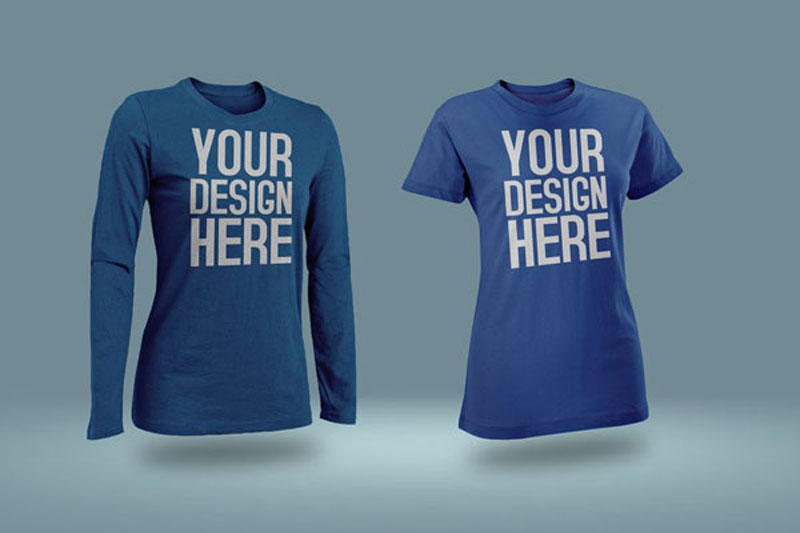
6. Photoshop T-Shirt mockups
A collection of all kind of T-shirt mockups collected by Design Freebies. You’ll find various style and designs of shirts to present your designs.
7. Material Components
Beautiful and customizable components to create material designs for iOS, Android, or the Web.
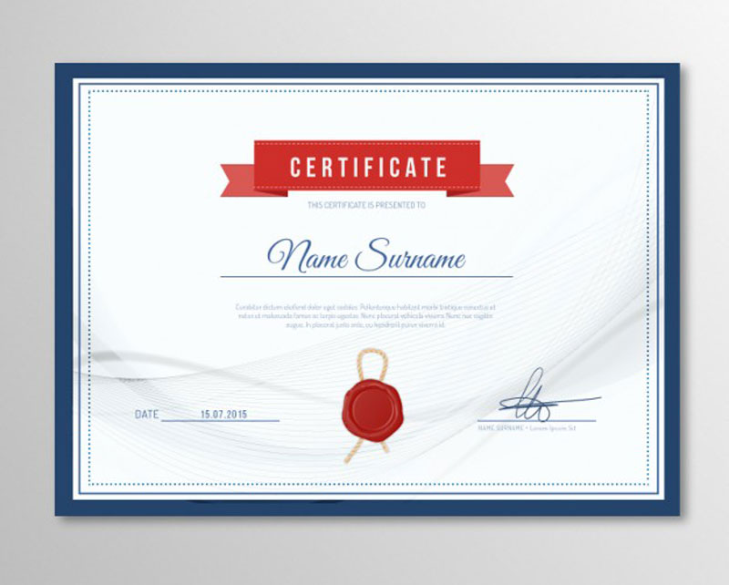
8. Elegant certificate template
An elegant template, in case you deliver certificates or diploma and want to make it look good.
Webpack is so hot right now! Webpack is great when it comes to module bundling and working with frameworks like Vue or React, but it is a bit more awkward when handling static assets (like CSS). You might be more used to handling your static assets with something like Gulp, and there are some pretty good reasons for that.
Still, the amount of JavaScript in our static projects is growing, so to compensate, let’s make use of Webpack, while remaining in Gulp. In this article, specifically, Gulp 4. We’ll use modern techniques to build an easily maintainable workflow, including the powerful and useful Hot Module Reloading (HMR).
You May Want To Start Here
This article isn’t quite for beginners. If you are new to Webpack or Gulp, perhaps start with these tutorials.
As of Node v7.9.0, ES6modules are not supported, that is why we install Babel to make use of import statements and other cutting edge JS features in our tasks.
If you don’t need HMR, feel free to leave Hot Middleware out of the packages listed above. The Dev Middleware does not depend on it.
Starting Points
Let’s get started! Create a tasks folder in your project root with three files: index.js, webpack.js and server.js. We have less clutter in our project root since the index file acts like gulpfile.js and the webpack file as webpack.config.js .
The babel-register command processes the import statements and the --gulpfile flag defines the path to gulpfile.js or, in our case, index.js . We only need to reference the tasks folder because like in HTML the file named index marks the entry point.
Set up a basic Webpack config
In `webpack.js`:
import path from 'path'
import webpack from 'webpack'

let config = {
    entry: './main.js',
    output: {
        filename: './bundle.js',
        path: path.resolve(__dirname, '../site')
    },
    context: path.resolve(__dirname, '../site')
}

function scripts() {

    return new Promise(resolve => webpack(config, (err, stats) => {

        if (err) console.log('Webpack', err)

        console.log(stats.toString({ /* stats options */ }))

        resolve()
    }))
}

module.exports = { config, scripts }
Notice how we don’t export the object directly like many tutorials show but put it into a variable first. This is necessary so we can use the configuration in the Gulp task scripts below as well as in the server middleware in the next step.
Context
The config.context setup is necessary to set all paths relative to our site folder. Otherwise they would start from the tasks folder which could lead to confusion down the road.
Separate config and task
If you have a very long Webpack config, you can also split it and the task into two files.
// webpack.js
export let config = { /* ... */ }
// scripts.js
import { config } from './webpack'
export function scripts() { /* ... */ }
Hot Module Reloading
Here’s how to make HMR work. Change the entry and plugins:
Make sure to disable the extra entries and the HMR plugin for production. The package Webpack Merge helps setting up different environments for development and production.
BrowserSync
Now a BrowserSync task setup:
import gulp from 'gulp'
import Browser from 'browser-sync'
import webpack from 'webpack'
import webpackDevMiddleware from 'webpack-dev-middleware'
import webpackHotMiddleware from 'webpack-hot-middleware'

import { config as webpackConfig } from './webpack'

const browser = Browser.create()
const bundler = webpack(webpackConfig)

export function server() {

    let config = {
        server: 'site',
        middleware: [
            webpackDevMiddleware(bundler, { /* options */ }),
            webpackHotMiddleware(bundler)
        ],
    }

    browser.init(config)

    gulp.watch('site/*.js').on('change', () => browser.reload())
}
The Dev Middleware enables BrowserSync to process what was defined as entry in webpack.js. To give it this information we import the config module. Hot Middlware on the other hand checks for changes in app components like `.vue` files for Vue.js to inject.
Since we cannot hot reload files like main.js, we watch them and reload the window on change. Again, if you don’t need HMR, remove webpackHotMiddleware.
Import all Tasks
The `index.js` file includes all tasks:
import gulp from 'gulp'

import { scripts } from './webpack'
import { server }  from './server'

export const dev   = gulp.series( server )
export const build = gulp.series( scripts )

export default dev
The exported variables define what tasks to run under which command. The default export runs with gulp.
If you separate development and production environments for Webpack, you might want to run a gulp build task which makes use of production options. For that, we import the scripts tasks on its own since we don’t need to start the server here.
During development, Webpack is run by BrowserSync so putting the scripts task in the dev command is not necessary.
Running Tasks
To start developing you cannot just run gulp or gulp build since it will look for a gulpfile.js in the project root. We have to run the npm commands npm run dev and npm run build to make use of the defined flags.
Expanding
Now you can imagine how easy it is to expand and write more tasks. Export a task in one file and import it in `index.js`. Clean and easy to maintain!
To give you an idea of how to set up your project folder, here is my personal setup:
Gulp can handle static assets better than Webpack. The Copy Webpack Plugin can also copy files from your source to your build folder but when it comes to watching file deletion or changes like overriding an image, gulp.watch is a safer bet.
Server Environment
Webpack also comes with a local server environment via Webpack Dev Server but using BrowserSync has some features you might not want to miss:
CSS/HTML/image injection for non-app projects
multiple device testing out of the box
includes an admin panel for more control
bandwidth throttling for speed and loading tests
Compilation Time
As seen in this post on GitHub Sass gets processed by node-sass much quicker than by Webpack’s combination of sass-loader, css-loader and extract-text-webpack-plugin.
Convenience
In Webpack, you have to import your CSS and SVG files for instance into JavaScript to process them which can be quite tricky and confusing sometimes. With Gulp, you don’t need to adjust your workflow.
I am a huge fan of Sublime text editor and whenever I go and try other text editors I come back to Sublime crying: „Forgive me I’ll never, ever, leave you again!” But I’m not here to praise Sublime. In this post I’m rather going to share some of the Sublime plugins I’ve been using a lot and which are really helpful and fun to work with. You may find them for your favorite text editor as well.
Let’s dive into the first one.
1) Text Pastry
How many times have you had a markup and all you wanted to do was to add incremental numbers to it? For example if you have a list with a heavy content, of course you can’t use Emmet or similar tools to add those incremental numbers because the markup is already there, unless you use some tricks. However there is a faster way to get there.
With Text Pastry plugin we can extend the power of multiple selections in Sublime and do lots of awesome things.
Here is the basic usage of this plugin:
Sometimes you even have a range of numbers in mind and, as you can see in the video, you will be able to put numbers in a specific range and you can even specify the steps.
Pretty cool, huh?
This plugin can do more than what I have just shown you. You can find more information and examples on GitHub.
If you are using Atom you can find the Text Pastry plugin here.
2) Super Calculator
Once I needed a component, but since I didn’t have much time, writing it from scratch was not ideal. Fortunately I could find that component on the web; however the developer used pxs for all the properties and sizes. So for making that component responsive I was supposed to change all the pxs to em or rem, and, as you know, doing that is just a pain in the ass. I used Cmd/Ctrl+D to see all the pxs units and then I stared at the screen wishing I had a magic wand to turn all those pxs units into a relative unit.
It turned out that magic existed and I did find it after 5 minutes of Googling.
Super Calculator is just amazing, all you have to do is press Alt+C and Super Calculator will select the mathematical expression closest to the cursor position so that you can review what is going to be calculated. If you press Alt+C for a second time, it will calculate the result and insert it into your code right away, or if you select a mathematical expression and hit Alt+C, the magic will happen all the same.
3) InstaGoogling
I think I found this one on Twitter and it’s just brilliant.
When we code we usually love to make our text editor fullscreen so that we can concentrate at our best. But sometimes we get to this point where we need to find something on the web, maybe a piece of code or maybe a wired syntax, hence we have to get out of that fullscreen mode.
InstaGoogling plugin will help you to Google something without losing the full-screen mode. All you have to do is hit f1 and you will have a nice Google window popping up on your screen.
As you can see from the video, I’m going through my search result by using the tab key, I hit enter for opening the page and I use Ctrl+W to close the window, so that I don’t have to move my hands away from the keyboard.
Another great feature of InstaGoogling is that you can select a piece of code, then hit f1 and the plugin will search that on Google automatically and it will insert the language at the end of that piece in order to have a better result.
Unfortunately there isn’t yet a version of plugin for Mac, but I hope it will come out soon, as it seems to be in the making.
4) Open-Include
To me this plugin is the most handy one.
Usually in a project you have a lot of files and you wanna be able to easily move back and forth from one file to another. Imagine you are looking at your Sass index file and you see a lot of imports and paths. if you want to open one of them you can move the cursor on that path and just simply hit Alt+D and boom, you will be in that file.
What I love about Open-Include is that it doesn’t matter what that path is and where it goes, Open-Include will just open it for you. You can be dealing with a JavaScript module or a file on a CDN or an image, this plugin will do its job in any case.
Unfortunately this plugin was removed from packagecontrol.io. As a consequence, you can’t install it as you normally would, but you can go to its Github page, download the entire set of files and install the plugin manually by pasting all files in your package folder.
5) Console Wrap
I have a colleague who, from time to time, comes to me bad mouthing another colleague of ours: „Why does he never remove his console.log lines?”
Console Wrap can help us removing those lines my colleague hates so much:
To be honest when I discussed with Chris the possibility of writing this post I only had four plugins in my mind, so I said to myself: 'I’m not gonna write this post with a title like „4 Plugins…” that is so lame!’ So I went to packagecontrol.io, to the trending section in the hope of finding something useful, and I immediately spotted Console Wrap plugin shining there and it turned out I really needed this plugin.
So, from time to time do go to this page. You may find something you didn’t know you needed which will make your life so much easier!
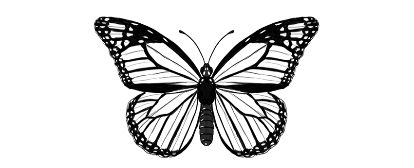
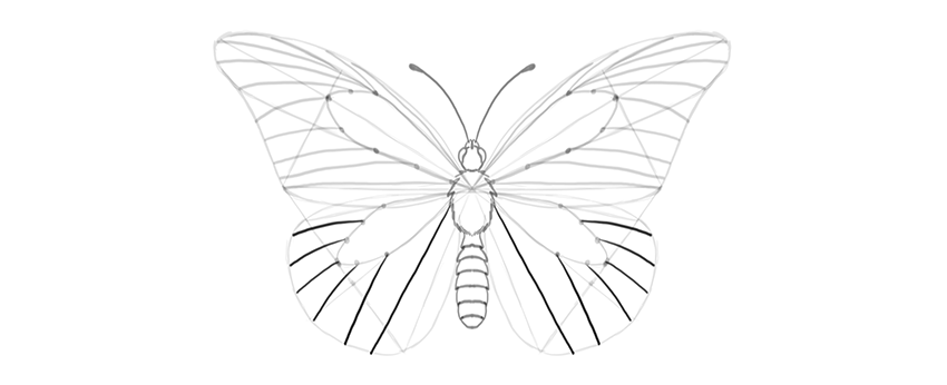
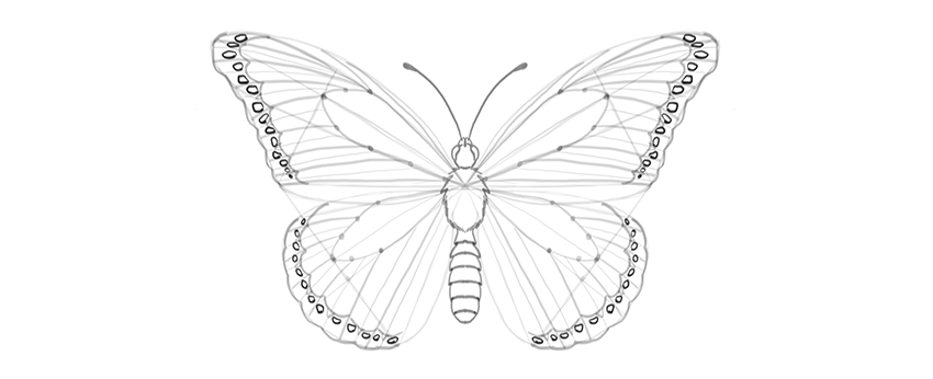
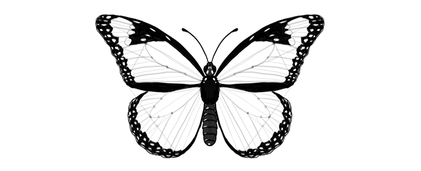
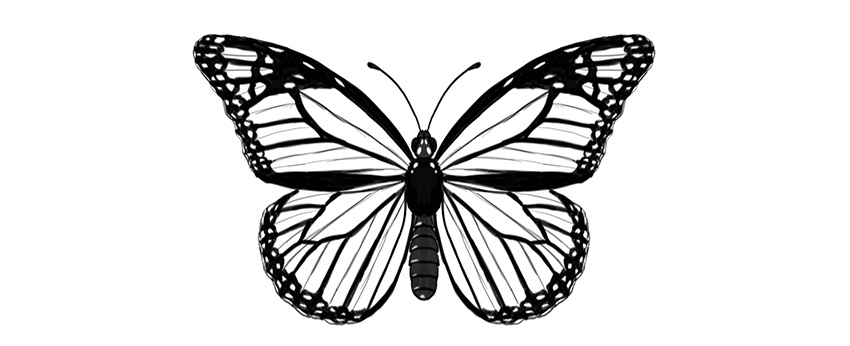
Butterflies are a wonderful drawing subject—their wings have a certain pattern that can be reduced to a few rules. Once you know the rules, you can draw a realistic-looking butterfly without any special drawing skills.
In this tutorial I will show you how to draw a monarch butterfly step by step, right from scratch. You can also modify my method to draw any other butterfly!
Before You Start
But what is it, this monarch butterfly? Let’s take a look before we start drawing:
Cross the torso in half with a vertical line. This will be the length of the body.
Step 3
Draw a longer oval below; this will be the abdomen.
Step 4
Connect the abdomen to the torso with a slim waist.
Step 5
Draw a circle on top of the body—this will be the head.
Step 6
Add two ovals on the sides of the head.
Step 7
Add two tiny ovals on the front of the head. These will be the short, furry antennae called palpi.
Step 8
Draw a pair of curves for the big antennae.
Step 9
End each antenna with tiny „beans.”
Step 10
You can now outline the body and add all the necessary details. The torso is fluffy, and the abdomen is segmented.
2. How to Draw Butterfly Wings
Step 1
Mark a dot in the upper part of the torso. This will be our point of reference for placing the wings.
Step 2
Draw a horizontal line across the point. Each half should be roughly as long as the whole body (antennae excluded).
Step 3
Draw two longer lines about 30 degrees over the previous line. You don’t need to measure anything—just eyeball it.
Step 4
Draw elongated teardrop shapes around these lines, as if it were a dragonfly.
Step 5
Draw a line from the end of the horizontal line to about 60% of length of that „dragonfly wing.”
Step 6
Gently outline the shape of the upper wing.
Step 7
The lower wing can be created in a similar way. Draw two lines down from the point, slightly below the abdomen.
Step 8
Draw a line between each end of the lines and the upper wings.
Step 9
Draw a line from the torso point to close the triangular shape of the wing right under the upper wing.
Step 10
Mark a point in the center of the farthest line of the triangle.
Step 11
Cross each point with a line coming from the torso.
Step 12
Outline the shape of the lower wing.
3. How to Draw the Cells of Butterfly Wings
Step 1
Now we’re going to divide each wing area into smaller areas called „cells.” First, mark three points in the area shown below.
Step 2
Draw an elongated cell through these marks.
Step 3
Use the same trick to draw a similar cell in the lower wing.
Step 4
There will be more cells starting here. Mark their starting points.
Step 5
Draw gentle curves from these points to the edge of the wing. Have them slightly falling down.
Step 6
The uppermost cell is divided into more cells:
Step 7
The lower wing has similar cells, going out radially from the middle:
Step 8
Each cell has a subtle „wrinkle” in the center, and it will be a useful guideline for us. Mark it subtly, to make it distinguishable from the veins.
4. How to Draw Patterns on Butterfly Wings
Step 1
Now we have plain butterfly wings, but it’s their pattern that makes them so beautiful! Let’s add a pattern specific for the monarch butterfly.
Create a margin for each wing, drawing curves between the veins.
Step 2
Mark the area where the wrinkle is—this place will be slightly less dark.
Step 3
Outline the edges of the wings, making them „bumpy” around the ends of the veins.
Step 4
There is a pattern of bright dots in the margin. Outline them.
Step 5
The edges of the wings may look slightly ragged because of white lines placed between the veins and the wrinkles. This is a subtle effect, but it will add to the realism of the wings.
Step 6
Draw some markings in the upper part of the upper wings.
Step 7
The pattern is created not by lines only, but mostly by contrast. So we need to darken certain parts to achieve realistic results. First, darken the body. It may have some pattern on it as well!
Step 8
Darken the side margins, leaving brightness where the markings are.
Step 9
Darken the margins, moving carefully around the little markings.
Step 10
Darken the area around the markings in the upper wing.
Step 11
The veins have a dark outline, so mark it. You can also subtly mark the wrinkles to make the drawing more detailed.
Beautiful!
Good job, you have drawn a beautiful butterfly! If you want to learn more about butterflies, their anatomy, and other species, make sure you check this tutorial as well:
I believe that there’s a sneakerhead in all of us. For some people, it might just be a simple love for sandals and for others a love of all sneakers; from Yeezy’s to New Balance. I myself am definitely a sneaker guy, having just bought a fresh new pair of Asics Gel-Lytes. Complex came up with the top 30 most influential sneakers of all time. The top 10 are:
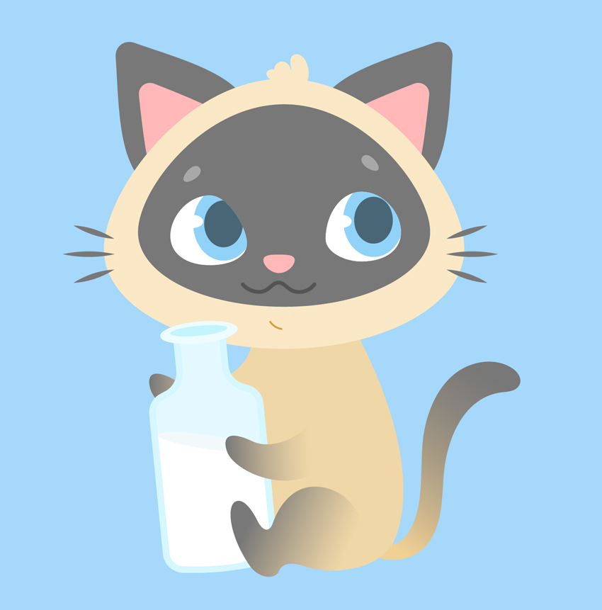
Ever wanted to illustrate a kid’s book or learn to design cute cartoon characters? This tutorial might be interesting for you! We’ll go through a fun and easy process of creating a cute Siamese kitten in Adobe Illustrator, using simple shapes, Warp Effects and the Pencil Tool with a bit of freehand drawing. Ready to begin?
By the end of this tutorial, you’ll have discovered new tips and tricks that you can apply to your future works, creating more characters like these Cute Cartoon Animals from GraphicRiver.
1. How to Draw the Cat’s Head
Step 1
Let’s start by creating a New Document of 600 x 600 px size and RGB Color Mode. Use the Rectangle Tool (M) to make a rectangle of the same size and Fill it with a light blue color for the background.
Step 2
We’ll start with the base of the head. Use the Ellipse Tool (L) to make a 285 x 215 px light beige oval. Selects its side anchor points with the Direct Selection Tool (A) and drag them a few pixels down, making the bottom of the shape somewhat flatter. You can move them by holding down Shift and either clicking and dragging with your mouse or by using the Down Arrow key of your keyboard.
Copy (Control-C) the shape and Paste in Place (Shift-Control-V). Hold down Alt-Shift and make the copy smaller. Change its color to pale grey.
Step 3
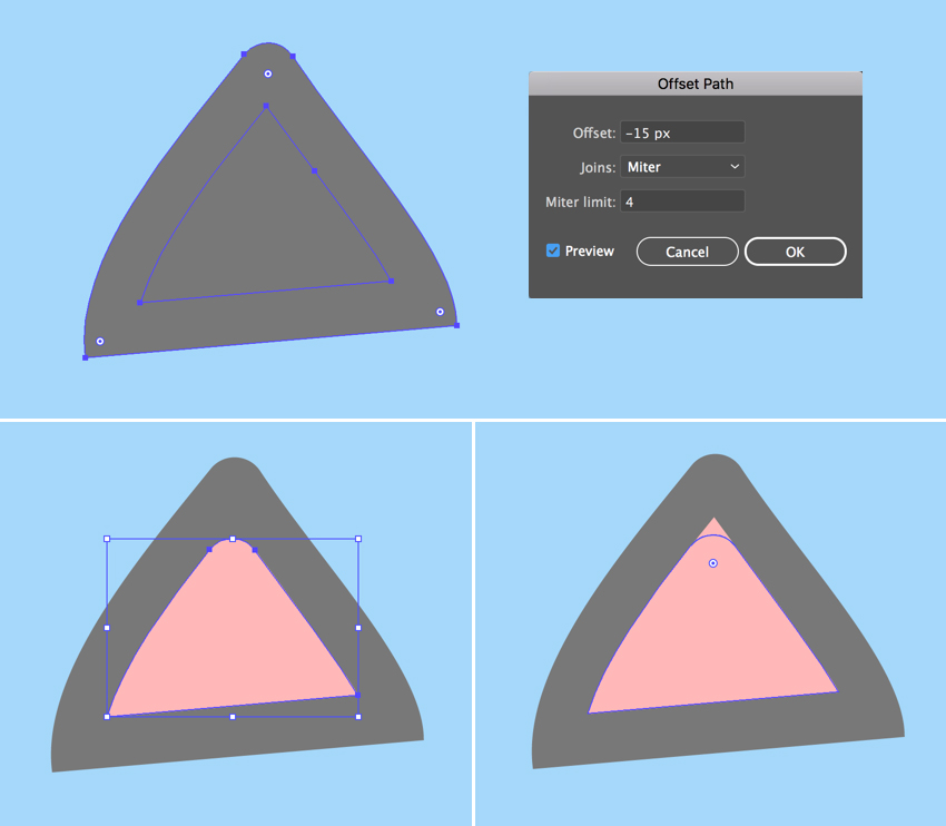
Let’s attach a couple of ears to the kitten’s head. Firstly, take the Polygon Tool (it is located in the same drop-down menu as the Rectangle Tool (M)) and single click anywhere on the Artboard to open the Options menu.
Set the Sides value to 3 and create a triangle of the same pale grey shape as we have for the face. You can use the Eyedropper Tool (I) to pick and apply the color if it isn’t selected in the Colors panel.
Now let’s transform the shape to make it look more like an ear. Keeping it selected, go to Effect > Warp > Bulge and set the Vertical Bend value to 40%;Horizontal Distortion to -10%. In this way, we’re bulging our shape and bending it to the left.
Object > Expand Appearance to apply the effect. Select its top anchor point with the Direct Selection Tool (A) and drag the circle marker of the Live Corners down, making the top of the shape rounded. We can also adjust the Corner Radius from the control panel on top, if needed.
Step 4
Keeping the shape selected, go to Object > Path > Offset Path and set the Offset value to -15 px, leaving all other options as Default. Click OK to create a smaller triangle and Fill it with rose pink color, thus creating the inner part of the ear.
Make the top of the pink shape rounded as well, using the Direct Selection Tool (A) and the Live Corners feature.
Step 5
Group (Control-G) both elements of the ear and attach them to the head, Rotating and resizing the ear to make it fit the head.
Double-click the Reflect Tool (O), select the Vertical Axis and click Copy to make a mirrored copy of the ear. Attach it to the opposite part of the head.
Step 6
Let’s go on and draw the face of our character. Use the Ellipse Tool (L) to make a 65 x 55 px white ellipse for the eyeball. Use the Direct Selection Tool (A) to shorten the right handle of the top anchor point and the top handle of the right anchor point, making the right edge of the eye more slanted.
Now add a 50 x 60 px light blue oval for the iris and a 30 x 37 px dark blue ellipse for the pupil. Place the shapes as shown in the screenshot below, covering the right half of the eyeball.
Step 7
Add a tiny white ellipse for the highlight, and let’s see how we can hide the unneeded parts of the iris.
Copy (Control-C) the white eyeball, Paste in Front (Control-F) and Bring to Front (Shift-Control-]). Now select all the elements of the eye, click the right mouse button, and Make Clipping Mask, thus placing everything inside the top copy, which serves as an imaginary container. All the shapes inside this container are still editable. You can find the Clip Group in the Layers panel, unfold it, and move, edit and rearrange the objects.
Step 8
Use the Reflect Tool (O) to Flip the eye over the Vertical Axis and make a Copy. Move the iris and its elements inside the Clipping Mask to fix the kitten’s gaze.
Step 9
Now let’s draw the nose. Make a 25 x 15 px light pink ellipse and reshape it a bit with the Direct Selection Tool (A), moving its top and bottom anchor points down to make it look more like a rounded upside-down triangle.
Make another ellipse of 13 x 12 px for the brow, Fill it with light grey color, and reshape it slightly. Rotate the brow and use the Reflect Tool (O) to add a second one.
Step 10
Let’s move on and depict a mouth. Use the Line Segment Tool (\) while holding down Shift to draw a straight horizontal line. Apply a dark gray Stroke color from the Color panel. Adjust the thickness of the line either from the control panel on top or from the Stroke panel (Window > Stroke) by setting the Weight to 3 pt and Cap to Round Cap.
Go to Effect > Distort & Transform > Zig Zag. From here, set the Size to 4 px, Ridges per segment to 3, and Points to Smooth. Adjust the Ridges per segment value if your result differs from the one presented in the image below.
Step 11
Object > Expand Appearance to apply the effect. Now we can edit the tips of the line using the Direct Selection Tool (A). Rotate the anchor handles down to make the corners of the mouth rounded.
Step 12
Let’s draw the whiskers using the Ellipse Tool (L). Make a 40 x 3 px dark-grey circle, select its side anchor points with the Direct Selection Tool (A), and Convert selected anchor points to corner from the control panel on top, making the tips of the ellipse sharp.
Duplicate (Control-C > Control-F) the shape a few times, making the copies smaller and Rotating them to add more whiskers.
Step 13
Finish off the kitten’s head by adding a funny tuft of hair on top, using the Pencil Tool (N). You can adjust the tool’s settings by double-clicking it to open the Pencil Tool Options window. From here, move the Fidelity slider further right if you want to make the lines smoother or further left if you’re using a graphic tablet and have a firm hand.
2. How to Draw the Kitten’s Body With the Pencil Tool
Step 1
Let’s start making the body with an ellipse. Create a 160 x 210 px ellipse of dark beige color. Use the Direct Selection Tool (A) to select both side anchor points and drag them down, making the shape look more like an egg.
Send the ellipse to Back (Shift-Control-[), beneath the head.
Step 2
Now grab the Pencil Tool (N) and let’s practice our hand drawing a bit. Draw a front right paw and attach it to the body, as shown below.
Let’s apply a simple Linear Gradient to the paw, making the kitten look more like a Siamese one. Use the Gradient panel (Window > Gradient) to apply a dark-grey color to the left slider and the Gradient Tool (G) to adjust the direction of the gradient, so that it blends nicely with the body.
Duplicate the paw and place the copy as shown in the screenshot below.
Step 3
Now let’s add the back paws. Use the Pencil Tool (N) to draw the desired shape of the paw, Send to Back (Shift-Control-[), and make it slightly darker than the body in order to separate the elements from each other. You can either apply the same gradient to this paw or not, because it will be hidden behind the bottle. In case you want to animate your character or change some of its details later, make sure you’ve applied the same gradient to all the paws. Just select the paws and use the Eyedropper Tool (I) to pick and apply the appearance.
Finish up with the body parts by adding a funny curled tail using the Pencil Tool (N), and Fill it with the same Linear Gradient.
Great! Looks like our kitten is ready! Let’s add a final detail to it.
3. How to Draw a Bottle of Milk
Step 1
As you might already know, cats are actually lactose intolerant and, hence, indifferent to milk. However, as we’re creating a kid’s illustration with an imaginary character, we can draw anything we want, whether it’s a milkshake or a green smoothie or a can of soda, depending on the purpose of the image. In our case, let’s make our kitten a milkshake lover!
So let’s start building our bottle from a 90 x 150 px light blue rectangle. Add a 40 x 65 px rectangle and place it over the top of the first one, forming a bottleneck.
You can Align both shapes either to the Artboard or to the Key Object, using the Align panel (Window > Align). Select both shapes and click Horizontal Align Center to Align to Artboard. If you want to align to one of the objects, click both shapes and click one of them once again. You will see a thicker selection around it, indicating that this is the Key Object.
Once you’re happy with the result, select both shapes and Unite them in the Pathfinder panel, merging them into one silhouette.
Step 2
Let’s select the corners of the bottle with the Direct Selection Tool (A) and make them rounded by pulling the circle marker of the Live Corners. Select the inner corners between the body of the bottle and the bottleneck, and smooth them out as well. You can adjust the Corner Radius from the control panel on top if you like round numbers, or you may leave it as it is if it looks good.
Grab the Curvature Tool (Shift-‘) and make the bottom of the bottle slightly rounded by bending its edge down.
Step 3
Go to Object > Path > Offset Path and set the Offset value to -5 px, creating a smaller silhouette inside. Fill it with the lighter blue color to make the glass edges of the bottle thick. Duplicate (Control-C > Control-F) the new shape and Fill the copy with white for the milk.
Step 4
Let’s make the bottle half-empty! Create an ellipse, Rotate it, and resize it, making it fit the inner part of the bottle. Select both the ellipse and the milk shape. Now grab the Shape Builder Tool (Shift-M), hold down Alt and, as soon as you see a tiny minus sign next to your mouse cursor, hover it over the top half of the milk shape. Once it becomes gray, single click it in order to Delete this piece. Great! Half of the milk is gone!
Step 5
Let’s form the top of the bottleneck. Make a 60 x 20 px ellipse and Fill it with a blue color slightly lighter than the body of the bottle. Create a smaller ellipse inside the first one to form a hole, either making it manually or using the Offset Path function.
Step 6
Now that the bottle is finished, let’s Group (Control-G) all of its elements and place it in the kitty’s paws. We can do it by positioning the bottle in the desired place and then either Sending it Backward (Control-[) a few times or dragging it down manually in the Layers panel.
Step 7
Let’s add a straw, making the image more detailed. Use the Pen Tool (P) to draw a polyline. Apply pink color for the Stroke in the Colors panel. Then open the Stroke panel and set the Weight to 4 pt, making the straw thicker.
As with geometric shapes, we can use the Live Corners function for the polylines. Just select the corner anchor point with the Direct Selection Tool (A) and make it slightly rounded.
Once you’re happy with how it looks, Object > Expand the line to turn it into a shape.
Step 8
Since the bottom part of the straw is located inside the bottle, its color should differ from the top part, as it is dimmed behind the glass.
Let’s see how we can achieve this effect. Select the straw and the inner ellipse of the bottleneck. Take the Shape Builder Tool (Shift-M) and single-click the bottom part of the straw once it becomes gray. Notice that this time we’re not holding down Alt or any other key because we want to divide the shape, slicing the straw into two parts.
Fill the bottom part with lighter pink color and Send Backward (Control-[) a few times, partially hiding it beneath the bottleneck.
Step 9
This is how it looks now all together. Don’t forget to Bring the mouth shape to Front (Shift-Control-]), covering the tip of the straw.
Step 10
Let’s finish our illustration by adding any minor details to our liking. For example, here I’ve speckled a group of dark blue ellipses, placing a shadow beneath the kitten.
Meow! Our Cute Kitten Illustration Is Finished!
And there we have it! Great job!
If you want the check out the source file to see all the details, or if you need the whole set of fancy characters for your designs, you can grab these Cute Cartoon Animals on GraphicRiver.
I hope you enjoyed following this tutorial and learned some simple tips and tricks that will help you speed up your work to create more fancy cartoon character illustrations!
I know there are a ton of pure CSS cube tutorials out there. I’ve done a few myself. But for mid-2017, when CSS Custom Properties are supported in all major desktop browsers, they all feel… outdated and very WET. I thought I should do something to fix this problem, so this article was born. It’s going to show you the most efficient path towards building a CSS cube that’s possible today, while also explaining what common, but less than ideal cube coding patterns you should steer clear of. So let’s get started!
HTML structure
The HTML structure is the following: a .cube element with .cube__face children (6 of them). We’re using Haml so that we write the least amount of code possible:
.cube
  - 6.times do
    .cube__face
We’re not using .front, .back and classes like that. They’re not useful because they bloat the code and make it less logical. Instead, we’ll use :nth-child() to target the faces. We don’t need to worry about browser support for that, since we’re building something with 3D transforms here, which assumes much newer browser support!
Basic styles
All these elements are absolutely positioned:
[class*='cube'] { position: absolute }
The .cube is the child of a scene element which is the body in our case because we want to keep things as simple as possible. If we had multiple 3D shapes within the scene and we wanted them to interact in a 3D manner, then our cube would have been a child of that assembly and the assembly would have been a child of the scene.
We make the body cover the entire viewport and set a perspective on it so that whatever is closer looks bigger and whatever is further away looks smaller.
body {
  height: 100vh;
  perspective: 25em
}
Something else that I often like to do when the full-height body is the scene is to set the font-size on the .cube such that it depends on the minimum viewport dimension. This makes our whole cube scale nicely with the viewport if I then set the cube dimensions in em units.
.cube { font-size: 8vmin }
The reason why I’m not setting the cube dimensions directly in vmin units is an Edge bug.
We then give the .cube element a transform-style of preserve-3d so that its cube children don’t get flattened into its plane in case we decide to animate it and we put it in the middle of the scene using top and left offsets. This is the initial positioning of the cube and it’s best to use offsets, not a translate() transform for this. I’ve seen that sometimes people get confused about this because they’ve heard that, for performance reasons, it’s better to use transforms, not offsets… that’s true, but it applies for animating the position, not for the initial positioning. The very simple rule here is: use offsets or margins, whichever is more convenient at that point for initial positioning, use transforms from animating the position starting from that initial position.
We then pick a cube edge length and set it as the width and height of the cube faces. We also give the faces a negative margin of minus half the cube edge so that they’re dead in the middle. Again, this is related to the initial positioning the cube faces. We also give them a box-shadow just so that we can see them.
I often see code where transform-style: preserve-3d has been set on everything. That’s unnecessary and a misunderstanding of how preserve-3d works. It’s only necessary to set it on something that’s going to have a 3D transform applied (right away, following user interaction, via an auto-running animation… doesn’t matter how) and has 3D transformed children. In our particular case, that’s just the .cube element. The scene doesn’t get transformed in 3D and the .cube__face elements don’t have children.
Another unnecessary thing I see is setting explicit dimensions on the .cube element. This element isn’t visible. We don’t have any text directly in it, we’re not setting and backgrounds, borders or shadows on it. Its only purpose here is to serve as a container whose position we can animate in order to easily move all its face children at once, in the same way. Not setting any dimensions on this absolutely positioned .cube element means that its dimensions are computed to 0x0, so it’s also pointless to set any %-value offsets on its face children. top: 0 is the exact same thing as top: 50% or as any other percent value for an element whose parent has 0x0 dimensions. The same is valid for all the other offsets (right, bottom, left).
I’ve been asked why not set top and left for the .cube to calc(50% - #{.5*$cube-edge}) and remove the margin from the .cube__face altogether if I care about compacting code so much. Well, that’s because the two don’t really produce the same result, even though the .cube__face elements do end up in the middle of the screen in both cases. To illustrate this, let’s give our .cube element a red box-shadow just so that we can see it and check out the two cases side by side:
In the above demo, our .cube element is positioned differently in the two cases. When using the calc() value for its offsets and skipping the margin on its children, its position doesn’t coincide with the middle of the scene anymore, but with the top left corner of its face children. So what? It’s not going to be visible in our actual demo anyway…
While that’s true, a different position also means a different transform-origin. And that changes things if we decide to rotate or scale our .cube (and that’s something we decided we’d do). So consider the following keyframe animation for our cube:
@keyframes rot { to { transform: rotateY(1turn) } }
This is a rotation around the cube’s y axis. The result is not the same for the two cases:
In both cases, the faces rotate around the y axis of their parent cube, but the position of this y axis relative to the faces is different. It coincides with the faces’ y axes in the initial case, and with the faces’ left edges in the second case. This is the reason why I’m not bringing the negative margin of the cube faces into the offsets of the parent cube: it would impact animating the cube in 3D.
Building the cube with transforms
What we have in the demos above isn’t a cube yet. In order to do that, we need to position the faces in 3D. There are multiple transform combinations that achieve the same effect, but the most efficient and logical one is to start by rotating the first four faces in increments of 90° around one of the axes in their plane (x or y) and the remaining two faces by ±90° around the other axis in the same plane. Then we chain a translation of half the cube edge length along the axis that’s perpendicular onto their plane (their z) axis.
A very detailed explanation of how translations and rotations work as well as how we get the transform chains for creating a cuboid can be found in this older article. The case of a cube is a simplified version where all dimensions along the three axes are equal.
Considering we choose to rotate the first four faces around their y axes, our transform chains look as follows:
Now we replace the rotateY(ay) and rotateX(ax) components with their rotate3d(i, j, k, a) equivalents. The i, j and k in the rotate3d() function are the components of the unit vector of the rotation axis along the x, y and z axes of coordinates, while a is the rotation angle around that rotation axis.
Since the rotation axis in the case of a rotateY() is the y axis, the components of the unit vector along the other two axes (i along the x axis and k along the z axis) are 0, while the component along the y axis (j) is 1. Also, a is ay in this case.
Similarly, in the case of a rotateX(), we have that i is 1, j and k are 0 and a is ax. So our equivalent chains using rotate3d would be:
We notice a few things in the code above. First of all, the k component is always 0. Then, the i component is 0 for the first four faces and 1 for the remaining two, while the j component is 1 for the first four faces and 0 for the last two. Finally, the angle value can always be written as a multiplier times 90°.
This means we can introduce CSS variables into our code so we don’t have to repeat those transform functions:
Since both --i and --j each keep the same value for the first four faces and get a different one only for the last two, we can set their defaults to be 0 and 1 respectively and then switch them to 1 and 0 respectively for faces 5 and 6. These two faces can be selected by :nth-child(n + 5). Also, we can set the default for --m to be 0 and thus completely eliminate the need for the :nth-child(1) rule.
Pushing things a bit further, we notice that, whether it’s 1 or 0, --j can be replaced with calc(1 - var(--i)) and that --m is either the face index for the first four faces or -1 raised to the face index for the last two faces. This allows us to eliminate the --j variable and set the multiplier --m within a loop:
Those of you not using a WebKit browser may have noticed that the above demos don’t work. This is because, currently, Firefox and Edge don’t support using calc() values in place of much else other than length values. This includes the unitless and angle values within rotate3d(). A way to make things cross-browser would be not to replace --j with the calc(1 - var(--i)) equivalent and use an angle --a custom property instead of the calc(var(--m)*90deg):
After this, there’s one more itch to scratch: what about not having the cube auto-animated using CSS keyframes, but instead rotated on drag? Let’s see how we can do that!
We start by selecting our .cube element and we establish what happens during the stages of the drag. On mousedown/ touchstart, we lock everything into place for the cube rotation. This means setting a drag flag to true and reading the coordinates of the point where this happens, which are also the coordinates where the first movement detected by mousemove/ touchmove is going to start. On mousemove/ touchmove, if the drag flag is true, we rotate our cube. On mouseup/ touchend and again, only if the drag flag is true, we perform a release-like action: we set the drag flag to false again and we clear the initial coordinates.
const _C = document.querySelector('.cube');

let drag = false, x0 = null, y0 = null;

/* helper function to handle both mouse and touch */
function getE(ev) { return ev.touches ? ev.touches[0] : ev };

function lock(ev) {
  let e = getE(ev);
      drag = true;
      x0 = e.clientX;
      y0 = e.clientY;
};

function rotate(ev) {
  if(drag) { /* rotation happens here */ }
};

function release(ev) {
  if(drag) {
    drag = false;
    x0 = y0 = null;
  }
};

addEventListener('mousedown', lock, false);
addEventListener('touchstart', lock, false);

addEventListener('mousemove', rotate, false);
addEventListener('touchmove', rotate, false);

addEventListener('mouseup', release, false);
addEventListener('touchend', release, false);
Now all that’s left to do is fill up the contents of the rotate() function!
For every little movement caught by the mousemove/ touchmove listeners, we have a start point and an end point. The coordinates of the end point (x,y) are those we read via clientX and clientY every time the mousemove/ touchmove fires. The coordinates of the start point (x0,y0) are either the same as those of the end point of the previous little movement or, if there was no previous movement, those of the point where mousedown/ touchstart fired. This means that, after doing everything else we need to do within the rotate() function, we set x0 to x and y0 to y:
function rotate(ev) {
  if(drag) {
    let e = getE(ev),
        x = e.clientX, y = e.clientY;

    /* rotation code here */

    x0 = x;
    y0 = y;
  }
};
Next, we compute the coordinate differences between the end point and the start point of the current little movement along the two axes (dx and dy), as well as diagonally (d). If d is 0, then we haven’t really moved (and maybe nothing should fire, but just in case), so we just exit the function without doing anything else, not even setting x0 and y0 to x and y respectively – they’re the same in this case anyway.
function rotate(ev) {
  if(drag) {
    let e = getE(ev),
        x = e.clientX, y = e.clientY,
        dx = x - x0, dy = y - y0,
        d = Math.hypot(dx, dy);

    if(d) {
      /* actual rotation happens here */

      x0 = x;
      y0 = y;
    }
  }
};
The way we handle rotation on drag starting from the previous state which may be transformed in some way is the following: we chain a rotate3d() corresponding to the current little movement to the computed transform value of our cube at the start of the current little movement. That is, unless the computed transform value is none, in which case we chain it to nothing. We could write this whole transform chain into a stylesheet or as an inline style or… we could again use CSS variables!
In the CSS, we set the transform property of the .cube element to a rotate3d(var(--i), var(--j), 0, var(--a)) chained to a previous value of the transform chain var(--p). In order to simplify things, we keep the component of the unit vector of the axis of rotation along the z axis fixed to 0.
Because we’ve done the above and CSS variables are inherited, we now need to explicitly set --i and --j for the .cube__face elements to 0 and 1 respectively. Otherwise, the values inherited from the .cube element get applied, not the defaults specified within var().
Going back to the JavaScript, we read the computed transform value and set it to the --p variable. The angle of rotation depends on the distance d between the start and end points of our current little movement and a constant A. We limit this result to two decimals. For a direction of motion towards the top, in the negative direction of the y axis, we rotate the cube clockwise around the x axis. This means we take the --i component to be -dy. For a direction of motion towards the right, in the positive direction of the x axis, we rotate the cube clockwise around the y axis, which means we take the --j component to be dx.
const A = .2;

function rotate(ev) {
  if(drag) {
    let e = getE(ev),
        x = e.clientX, y = e.clientY,
        dx = x - x0, dy = y - y0,
        d = Math.hypot(dx, dy);

    if(d) {
      _C.style.setProperty('--p', getComputedStyle(_C).transform.replace('none', ''));
      _C.style.setProperty('--a', `${+(A*d).toFixed(2)}deg`);
      _C.style.setProperty('--i', +(-dy).toFixed(2));
      _C.style.setProperty('--j', +(dx).toFixed(2));

      x0 = x;
      y0 = y;
    }
  }
};
Finally, we can set some arbitrary defaults for these custom properties such that the initial position of our cube makes it look a bit more 3D than viewing it right from the front would.
The unquote(' ') value is due to using Sass. While an empty space is a perfectly valid value for a CSS custom property in plain CSS, Sass throws an error when seeing stuff like var(--p, ), so we need to introduce that „no value” default using unquote().
The result of all the above is a cube we can drag using both mouse and touch: