Post pobrano z: Carry Illinois “Electric Charm”

Post pobrano z: Carry Illinois “Electric Charm”
Post pobrano z: Likely the most ridiculous explainer video you’ve seen [NSFW]

Post pobrano z: RRRRRAAAAAMMMMM

Post pobrano z: 3 Winners. 6 Premium WordPress and HTML Themes. 1 Week Only
Do you enjoy web design as much as we do? Do you appreciate building websites on the basis of ready-made website templates? How many of them do you already have in your collection? And now imagine that you can download a premium WordPress or HTML template of the last generation at absolutely no cost! Sounds […]
The post 3 Winners. 6 Premium WordPress and HTML Themes. 1 Week Only appeared first on Web Resources Depot.
Post pobrano z: How to Create a Summer Picnic Community Event Flyer in Adobe InDesign
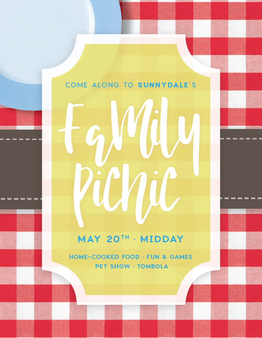
Planning a town fair, family picnic or summer BBQ? This summery flyer is super simple to put together and would be a great fit for any family foodie event. Suitable for beginners to Adobe InDesign, this tutorial will show you how to set up a single-page layout which is ready to print or circulate online.
Find even more cool flyer templates for summer events on GraphicRiver, to ensure your next event draws in the crowds.
Ready for summer? Fantastic, let’s go…
You’ll need access to Adobe InDesign to put together your flyer design. If you don’t have an InDesign subscription, that’s no problem—you can download a 30-day free trial of the software from Adobe.
If you’d like to add optional items to your tablecloth, like the plate shown here, you will also need to have access to Adobe Photoshop, for removing the backgrounds of your images. This is a completely optional step, so you can still create the flyer without adding objects to your tablecloth.
You’ll also need to download the following images and fonts:
Save the images to a folder you can easily find, and install the font files.
We’ll be setting up the flyer to a standard size, 8.5 by 11 inches. If you want to design to a different size you can either tweak the proportions of elements as we go, or export the final design as an image and scale it up or down.
Open InDesign and go to File > New > Document. Keep the Intent set to Print, Number of Pages to 1, and uncheck Facing Pages.
Under Page Size, choose Flyer 8.5×11 from the list of presaved sizes, or type in 8.5 in (or 215.9 mm) for the Width and 11 in (or 279.4 mm) for the Height.

Set the Top and Bottom Margins to 26 mm and the Left and Right Margins to 33 mm.
Add a Bleed of 5 mm to all edges of the page if you’re intending to send the flyer to print; if not, you can leave the bleed set to 0. Then head up and click OK.

Expand the Layers panel (Window > Layers) and double-click on the default Layer 1 name in the layers list.
Rename the layer Tablecloth and click OK.

Take the Rectangle Frame Tool (F) from the Tools panel and drag across the page, extending the frame up to the edge of the bleed on all sides.
Go to File > Place, navigate to your tablecloth image, and click Open. Double-click inside the image frame to directly select the image. Hold down Shift and drag to enlarge the image, until the checks are large and generous.

Expand the Swatches panel (Window > Color > Swatches) and click on the New Swatch button at the bottom of the panel.
Name the swatch Lemon, and set the Type to Process and Mode to CMYK. Set the percentage levels to C=7 M=1 Y=68 K=3, click Add, and then click OK to exit the window.

Return to the Layers panel and lock the Tablecloth layer. Click on the Create New Layer button at the bottom of the panel, and rename this new layer Border.

Select the Rectangle Tool (M) and drag onto the page to create a shape that extends up to the margin line.
From the Swatches panel, set the Fill of the shape to your new Lemon swatch, and the Stroke of the rectangle to [Paper] (white).

Expand the Stroke panel (Window > Stroke) and increase the Weight of the shape’s stroke to 23 pt. From the Align Stroke options, choose the central option, Align Stroke to Inside.

With the shape still selected, head up to Object on the top menu and choose Corner Options. In the window that opens, set the Size of all corners to 29 mm, and the Shape to Inverse Rounded.

With the rectangle selected, go to Object > Effects > Transparency. Decrease the Opacity to around 93% to bring through some of the gingham pattern below.

Then click on Drop Shadow in the left-hand menu of the panel. Set the Mode to Multiply, Opacity to around 22%, Distance to 2 mm, Angle to 65 Degrees, and Size to 7 mm. Click OK to apply the effects and exit the window.


Back in the Layers panel, lock the Border layer and create a new layer above, calling it Typography.

Take the Type Tool (T) and drag onto the yellow border to create a text frame. Here we’re going to type in the name of the event, so here ‘Family’.
From either the Character panel (Window > Type & Tables > Character) or the Character Formatting Controls panel running along the top of the workspace, adjust the Font to Nicoline, Size 160 pt, and Align Center.
From the Swatches panel, adjust the Font Color to [Paper].

Select the text frame and Edit > Copy, Edit > Paste it, moving it below the original text frame. Adjust the text to read the second part of your event title, here ‘Picnic’.

Select both text frames and go to Object > Effects > Outer Glow. Next to the Mode drop-down menu, click on the colored square to open the Effect Color window. Choose the red swatch in the list of default swatches, and click OK.

Bring down the Opacity to 7%, and set the Technique to Softer and the Size to around 2.5 mm. Set Noise to 30% and Spread to 38%, before clicking OK.

Create a new CMYK color swatch from the Swatches panel, naming it Sky and setting the levels to C=70 M=14 Y=0 K=0.

Zoom into the top half of the yellow border. Create a new text frame using the Type Tool (T) and type in an introductory sentence, like ‘Come along to Sunnydale’s’.
Set the Font to Charlevoix Pro Medium, Size 16.5 pt, Tracking 90 and Align Center. You might want to pull out a key detail like the place in Charlevoix Pro Semibold.

Select the text frame and Edit > Copy, Edit > Paste. Drag it down to the bottom of the border, and adjust the text to read the date and time of the event. Increase the Font Size to 22 pt, and set the Weight to Semibold.
From the Glyphs panel (Window > Type & Tables > Glyphs) you can insert a bullet to separate the information by double-clicking on the glyph in the panel.

Edit > Paste the text frame again, moving it below the date and time frame. Adjust the text to list some of the things people can expect on the day. You could also put info about ticket pricing and release dates.
Bring the Font Size down to around 14 pt.

Head back to the Swatches panel and create a new CMYK swatch. Name it Brown and set the levels to C=79 M=78 Y=81 K=0.

Create a new layer called Ribbon, and place this below the Border layer and above the bottom layer, Tablecloth. Lock all the other layers while you work on Ribbon.
Create a small rectangle using the Rectangle Tool (M) which bridges the gap between the left edge of the yellow border and the edge of the bleed on the left side of the page.

Select the brown shape and head up to Object > Effects > Drop Shadow. Add a Multiply shadow, adjusting the Opacity and other options until you’ve created a subtle wash of shadow beneath the ribbon.

Take the Line Tool (\) and, holding Shift, drag to create a short horizontal line along the top part of the brown shape. From the Swatches panel, set the Stroke Color to [Paper]. From the Stroke panel, set the Weight to 3 pt and Type to Dashed (3 and 2).

With the dashed line selected go to Object > Effects > Transparency and bring the Opacity down to 65%, before clicking OK.

Copy and Paste the line, dragging the copy down into a mirrored position along the bottom edge of the brown shape.

With your mouse, select the brown shape and both dashed lines, before Right-Clicking > Group.

Select the group, Edit > Copy and Edit > Paste. Maneuver this pasted group over to the right side of the flyer, so it appears as if a ribbon is wrapping around the layout.

This is a completely optional step of the tutorial. If you’d like to add items like plates, cutlery or anything else to the top of your tablecloth, you will need access to Photoshop and a selection of photos of items with a white background.
Open the plate with a blue rim image in Photoshop.
Select the Elliptical Marquee Tool from the Tools panel and, holding Shift, drag to create a perfect circle on the page, matching the dimensions of the plate as best you can. Use the arrow keys to shuffle the position of the marquee.

Then click on the Refine Edge button at the top of the workspace. Adjust the sliders until the marquee has a tight selection around the edge of the plate, and then click OK.

Edit > Copy, Edit > Paste the selection, moving it onto a new layer above. Switch off the visibility of the original layer.

As well as removing the background of your photo, you can also adjust the color levels to better suit the scheme used on your flyer design.
Add a new Color Balance Adjustment layer from the bottom of the Layers panel. Here I’ve tweaked the Cyan and Blue sliders to give the plate a more vivid sky blue hue.

When you’ve finished editing your image, go to File > Save As, saving the image as a Photoshop (PSD) file.
Return to your InDesign flyer document and create a new layer (here called Plates) above the Ribbon layer and below the Border layer.

Use the Rectangle Frame Tool (F) to create a new image frame in one corner of the page. File > Place your object image and adjust the scale to create a flat-lay effect.
You can also add a shadow for more realism by going to Object > Effects > Drop Shadow.


Your flyer artwork is finished—awesome job! If you want to circulate your flyer online, you can head up to File > Export and choose Adobe PDF (Interactive), JPEG or PNG from the Format drop-down menu. If you’re planning to send off your flyer for professional printing, read on to find out how best to export your design…
First up, File > Save your flyer artwork.
Then head back to the File menu and choose Export. From the Format drop-down menu in the window that opens, choose Adobe PDF (Print), and click Save.
In the Export window that opens, choose Press Quality from the Preset menu at the top of the window. Check the box that reads View PDF after Exporting.

Click on Marks and Bleeds in the window’s left-hand menu. Check All Printer’s Marks and Use Document Bleed Settings.

Then click Export to create your print-ready PDF file.

Congratulations, your flyer is finished and is ready for circulating. You’ve picked up lots of great techniques for creating layouts for print in InDesign, so let’s recap a few of the main skills you can take forward to other projects. You now know how to:
You can find even more great flyer templates for summer events over on GraphicRiver, so make sure to check them out!


Post pobrano z: Free style copycat? / C’est free… alors ils se sont servis?
 |
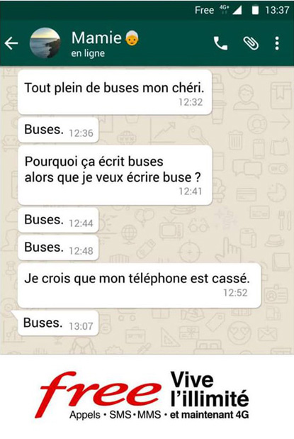 |
| THE ORIGINAL? Book “Avec Maman” (Pocket éditions) – 2014 Source : Avec Maman / Amazon.fr Author : Alban Orsini (France) |
LESS ORIGINAL Free Mobile “unlimited package” – 2017 Source : La Réclame Agency : DDB Paris (France) |
Post pobrano z: Pollupets vs Pollutoys / Toujours peluche de coïncidences?
 |
 |
| THE ORIGINAL? World Earth Day “Pollupets” – 2015 Plush toys designed to raise awareness on pollution and climate change effects. Source : CRÉA Grand-Prix Agency : Sid Lee (Canada) |
LESS ORIGINAL Sea Shepherd “Pollutoys” – 2017 Plush toys designed to raise awareness on plastic ingestion by marine animals. Source : Coloribus Agency : Fred & Farid Shanghaï (China) |
Post pobrano z: Marketing 101: 3 Benefits of Making Print and Digital Media Work Together
While it is true that more people now conduct searches for products and brands online than they do from print media, it is also true that a huge percentage of people searching for those very same products and brands were directed there from some form of print media. If you are looking for a well-rounded marketing strategy for your business, it pays to understand the benefits of making print and digital media work together to broaden your reach. Here are just three of those benefits.
If you are currently in the process of devising a marketing strategy, one thing you might want to be aware of is the fact that many people still prefer print communications over their digital counterpart. In a recent article posted by the Printing Industries Alliance, it was noted that greater numbers of people responded to direct mailings than advertisements of the same product online. Is it because their screen is constantly bombarded with so many popups that they simply close them off without taking a moment to read them?
It isn’t yet clear why this is happening but the PIA states that more people will respond to direct mail than online ads, even though online ads have the potential to reach a larger audience quicker. Now with the ability to use an online printing site when creating your own marketing mailers, you can save a ton of money with custom print jobs. Doesn’t it make sense to add direct mailing to your advertising campaign that will correspond directly to what you are using in digital form online? This way you capture a broader market share!
While there are those who will spend hours reading content online, and these are the people you are marketing to with digital media, there are those who will read something in a journal or newspaper in its entirety but merely glance at its digital counterpart. Again, it isn’t yet understood why this phenomenon is happening but the reality is that if you have something to say, it is more likely that a reader will stick it through to the end in print form.
However, if you are using short bits of advertising with custom graphics or photos, you will almost certainly get a higher response online. The trick is to grab the reader’s attention within just a few seconds. Learning to use both print and digital media in your marketing strategies will ensure that you reach those who want more information as well as those whose interest is sparked with an image or a short sentence or two. It pays to cater to both long and short attentions spans!
As mentioned above, overall, there is a positive response to print advertising. However, this comes about in a rather odd way! Print media will lead the reader to your website where they can get further information and browse your site for products or services mentioned in your print ads. Studies have shown that print ads that give a website URL will often prompt the reader to seek more information on your site. Of course, you need to pay special attention to the layout and content of that print advertisement, but when formatted well, you can significantly grow your audience with just a simple mention on a postcard, flyer or other forms of print media.
Learning to use both together is both an art and a science. However, don’t ever be led to believe that one is superior to the other. Both have their place in your marketing strategies and by learning how to make them work together, you will reach the widest audience possible. Isn’t that what marketing is all about anyway? Give it a try!
Featured Image by Carlos Muza
Post pobrano z: 5 Reasons why People use their Phones for Business more than their Computer
Many experienced professionals would agree that in order to establish and maintain a successful business, one must take advantage of online platforms to reach out to their customers and future potential clients. While setting up a website for your business is effective in building connections with a larger audience, a business must also be able to keep in step with the ever-changing trends in technology. The best example would be the evident increase in the demand for smartphones and tablets over desktop and laptop computers in the past few years.
Thus, in order to maintain a constant connection with the consumers, businesses must be able to adapt by developing user-friendly websites specifically designed for mobile devices. For starters and even business owners who have been in the industry for years, developing a web page for mobile devices will definitely boost the online presence of your brand. Choose Melbourne Website Design by GMG, the leading digital advertising agency in Australia, to take your business to the next level.
If you are still undecided on whether you really need to market your brand through mobile web pages then read more about the 5 reasons why people use their phones for business more than their computers.
For the first time in internet history, mobile web browsing has surpassed that of desktop computers last year. StatCounter, a Dublin-based research company specializing in web traffic analytics, reported in late October 2016 that 51.3% of web pages were loaded on mobile devices while 48.7% of web pages were accessed through desktop computers. In other parts of the world, there hasn’t been any transition between the two platforms as there are fewer people who own desktop computers compared to mobile devices.
Whether it is a new client asking about a particular product or an employee needing to relay urgent information to his or her co-workers or even potential clients, having the ability to constantly communicate through the mobile phone can help resolve issues more quickly before they even become a bigger problem. By acting quickly to customer issues, you can guarantee better feedback too.
With the majority of smartphones having a GPS (global positioning system) capability, you may be able to determine the approximate location of your clients. Using this information, your marketing team can tailor content and advertisements based on the customer’s geographic location.
Mobile devices are no doubt easier and more convenient to use compared to laptop and desktop computers. Reading daily news, checking your social media accounts, watching videos, and browsing photos are just some of the things that mobile device owners do while going to work or during their break. More than a quarter of the total web pages were browsed using mobile phones by billions of users worldwide. This should be a convincing reason why you should invest in mobile marketing.
Unlike other forms, mobile marketing and web design is cost efficient and is capable of generating faster returns on your investment. A successful mobile campaign relies on creativity, strategic planning, and systematic execution. In order to drive web traffic and sales, it is important to effectively convey your message to your target audience and to determine what products and services are patronized by your clients.
Featured image by Aaron Burden
Post pobrano z: Design deals for the week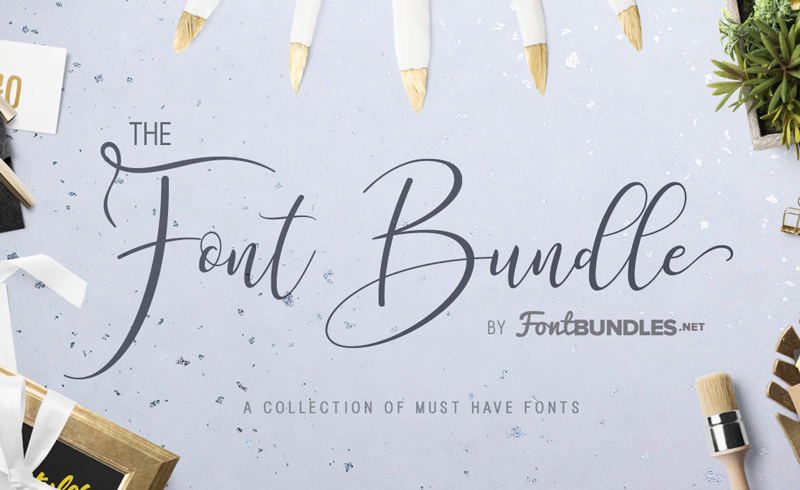
Every week, we’ll give you an overview of the best deals for designers, make sure you don’t miss any by subscribing to our deals feed. You can also follow the recently launched website Type Deals if you are looking for free fonts or font deals.
The Fontbundles.net Font Bundle – A special opportunity for you to get your hands on all our essential in-house font releases from 2016 and 2017.
$19 instead of $481 – Get it now!
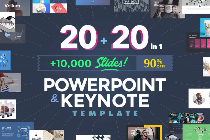
You’ll get an impressive collection of 20 PowerPoint and 20 Keynote templates that are simple to customize to any topic you’re working on. Besides more than 500 fonts to work with, you’ll also get to play with 10,000 slides as you build out the perfect presentation with ease.
$27 instead of $271 – Get it now!
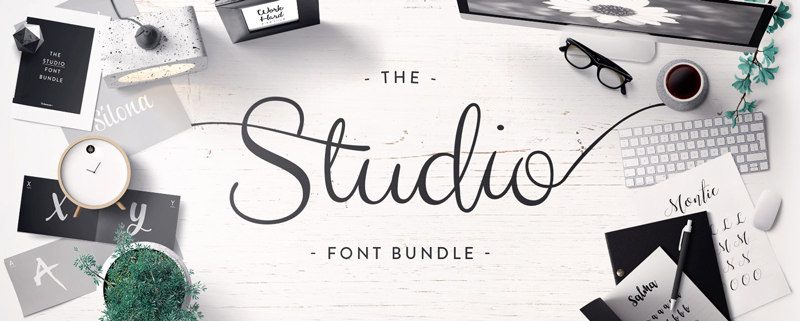
This selection of fonts will give you many more options when it comes to creating a brand new design.
$14 instead of $319 – Get it now!
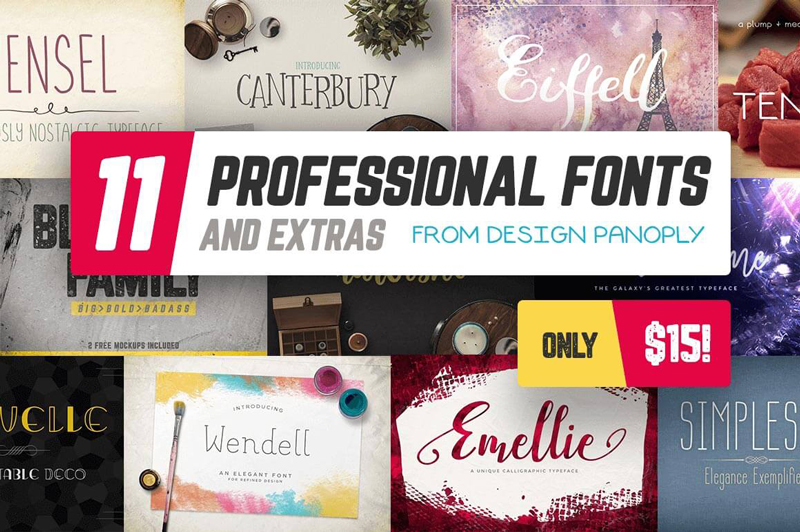
11 premium font families for 1 super low price. That’s a wide variety of gorgeous font styles, usable for loads of different projects, either personal or professional. You’ll also get loads of OpenType features and design extras to make your life loads easier.
$15 instead of $147 – Get it now!
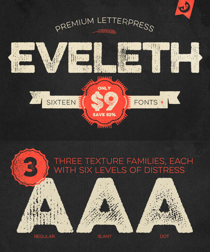
Get yourself 16 charming vintage fonts to work with. Additional weights, shadow layers and entertaining icons, shapes and emblems are just a few of the extras that come along for the ride. And if you act now, you can save yourself 82% off the regular price!
$9 instead of $49 – Get it now!