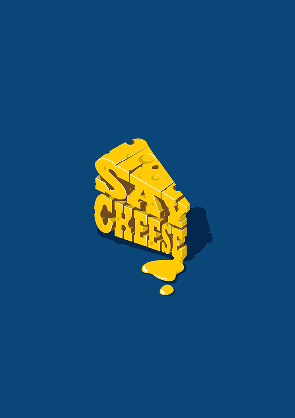
I’ve put together a collection of 24 delicious dairy designs for this week’s graphic design roundup. But first, here’s 10 quick facts about dairy courtesy of America’s Dairyland:
Per capita ice cream consumption in the U.S. is about 19 pounds per year.
The average milk production per cow in the United States is 22,393 pounds per year (2,604 gallons).
Americans eat about 350 slices of pizza per second. That’s enough to cover more than 90 football fields a day.
Cheese helps prevent tooth decay. Firm cheeses, such as Cheddar, are most effective.
Cheese is the number one food craving, even beating out chocolate! When respondents were asked which food gift they would like to receive, 19% of Americans said they want cheese – and only 13% said candy.
It takes ten pounds of milk to make one pound of cheese.
On average, each American eats about 34 pounds of cheese every year. That adds up to more than a ton of cheese during a lifetime.
At over 33 pounds per capita, the United States ranks far behind many European countries for per capita consumption of cheese. Residents of Greece, Iceland and France all eat an average of more than 50 pounds of cheese per year.
According to the NPD Group’s National Eating Trends In-Home Database, the top five ice cream flavors are vanilla, chocolate, strawberry, chocolate chip, and butter pecan.
Approximately 6 billion half-pints of milk are served through federal school lunch, breakfast and special milk programs every year.
Enjoy!
Credit to respective artists.
credit:Robot Food
credit:Holly Broome
credit:Jonathan Whelan
credit:Robot Food
credit:Ermolaev Bureau
credit:Jamal Akbarov
credit:twomatch! design studio
credit:Curious Design & Monique Robins
credit:Francisco Malvar & Savvy Agency
credit:peng chong & Pesign Design
credit:Džiugas Valan?auskas
credit:Amanda Day
credit:Yan Magpantay
credit:Iman Alshamy
credit:Nathan McCown
credit:Eszter Nyari
credit:Caroline Blanchette & Jimmy Berthelet
credit:USSO Design
credit:Melinda Makar
credit:Katie Wylie
credit:Maricruz Meza
credit:Lesly González
credit:Tej Dhadialla
credit:Corinna Weigl
Conclusion
I hope that you enjoyed this week’s graphic design roundup! Thanks for stopping by!
We live in the age of the internet, and the internet is essentially a huge free encyclopedia of knowledge. This knowledge is provided in a variety of different ways, all of which come under the umbrella term of “content”. Content marketing is a hugely successful way of developing websites and attracting visitors to that site. This is because those who access the content feel as if it is about them, and not about the business that has created it. In essence, it is about imparting free knowledge, instead of pushing a sale.
The Definition of Content Marketing
So what is the definition of content marketing? It is defined as being a form of marketing through which online materials (social media, blogs, videos, articles, etc.) are promoted, without explicitly promoting a brand or product at the same time. The content has been created in an effort to make people interested in a business and its services and products.
How Does Content Marketing Work?
Because we live in a digital age, it is very important that content is created consistently. But this content also has to be relevant, and of very high quality. Without those attributes, prospective clients will lose interest very quickly, and businesses will struggle to build authority and trust and, thereby, safe. Everybody knows that high-quality content is hugely important. The statement “content is king”, for instance, is heard over and over again. Yet, for all this awareness, entrepreneurs struggle to actually live by that. This is in part due to the fact that creating content is not their area of expertise, but also because they simply do not have the time.
This has created a recognized need for experts to work together with various businesses in order to create and distribute high-quality, relevant content. Their work is fully aligned with the company’s overall business goal, essentially working in a form of partnership. To do this, they must create a comprehensive marketing plan, which includes:
A full understanding of the business’ goals and objectives.
A definition of the target audience.
The needs and desires in relation to the published content and information.
Determining which type of media is most effective in reaching the target audience.
Developing distribution plans, which includes blogs, social media channels, forums, news outlets, and more, thereby ensuring the content is found.
Setting parameters to measure success. Common parameters include number of shares, downloads, leads, and views.
Once all of this has been put in place, relevant content can be created, and the results thereof measured.
Why Working Together with a Professional Agency Is so Beneficial
Working with professionals offers a number of other benefits, including:
That they can focus on your search engine optimization (SEO), which means that the content that is created can easily be found by people using Google, Bing, Yahoo!, or other such sources.
That they can add important elements such as pay per click advertising in order to benefit even more from the content.
That they can build social relationships for you through various social media channels.
Society has never been more environmentally conscious then it is today in 2017. Many companies, organizations and individuals are putting in serious efforts to ‘go green’ and take strides to reduce environmental footprints. Sustainability and conservation is absolutely crucial if we want to preserve the earth for future generations. Interested in learning more? Here are 8 quick facts about the environment courtesy of Huffington Post:
The amount of water on Earth is constant, and continually recycled over time: some of the water you drink will have passed through a dinosaur.
40 percent of all bottled water sold in the world is bottled tap water.
27,000 trees are felled each day for toilet paper.
Paper can be recycled only six times. After that, the fibers are too weak to hold together.
Humans and elephants are the only animals with chins.
Beavers have transparent eyelids so they can see underwater with their eyes shut.
The 100,000 trillion ants in the world weigh about the same as all human beings.
As soon as tiger shark embryos develop teeth they attack and eat each other in the womb.
I’ve compiled a collection of 28 clean n’ green environmental designs for your inspiration. Enjoy!
Credit to respective artists.
credit:Eszter Laki
credit:Eszter Laki
credit:Sergey Ryadovoy & TypeType foundry
credit:Yevheniia Hlova
credit:Yevheniia Hlova
credit:Lorenzo Fischetti
credit:i Manipulate
credit:Bo-Wei Wang
credit:Unformal Studio
credit:Unformal Studio
credit:Hachetresele Studio
credit:lg2boutique & Marie-Pier Gilbert
credit:lg2boutique & Marie-Pier Gilbert
credit:bibat studio
credit:Lila Theodoros
credit:Lila Theodoros
credit:Emi Sato
credit:Emi Sato
credit:Riccardo Vicentelli
credit:Riccardo Vicentelli
credit:Lila Theodoros
credit:Boris Garic
credit:Vonni van Niekerk
credit:Vladimir Andreev
credit:Vladimir Andreev
credit:Anton Egorov
credit:Alex Celaire
credit:Nusky Hariff
Conclusion
Few things are more important than environmental conservation. I hope that this collection has inspired you for your next environmental design project!
Union of the Baltic Cities Safe Cities Commission has produced three short animation movies about safety at home. As the Union of the Baltic Cities includes around 100 cities from the Baltic Sea Region, these animation movies were made without an actual word spoken, so that they can be clear for everyone.
As designers and artists working with digital technology, it’s easy to get caught into overusing technology and special effect. Actually, art and design is probably more about creative ideas, not about technique only. Obviously, good and creative ideas that are well executed are the best.
Rich McCor, a London-based paper cutting artist, had a simple yet brilliant idea: adding life to photos with paper cutouts that are just presented by hand, no Photoshop involved. The resuts: funny and expressive photos that you’ll love.
Every week, we’ll give you an overview of the best deals for designers, make sure you don’t miss any by subscribing to our deals feed. You can also follow the recently launched website Type Deals if you are looking for free fonts or font deals.
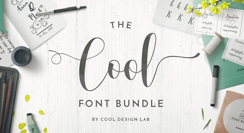
The Cool Font Bundle
How do you name a font bundle packed with cool fonts? Easy, you name it the cool font bundle.
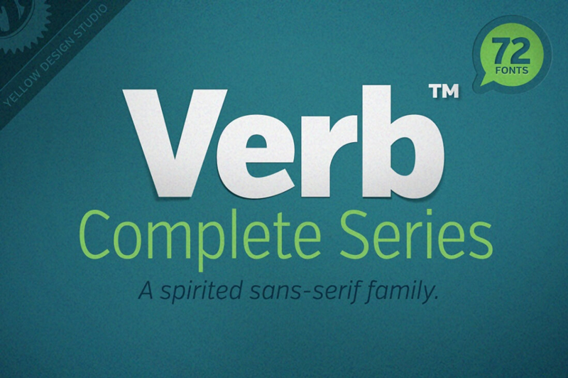
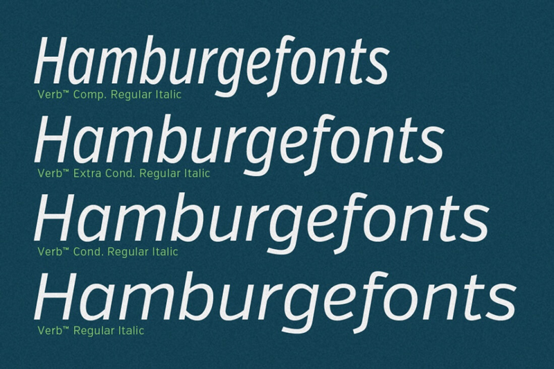
When artists create a new masterpiece, they have one goal in mind: to move you. Well, why shouldn’t the same go with Web designers? There’s no better way to get your next project moving than with the awesomely active (and actively awesome!) Verb font family!
Spring Font Bundle – 35+ Beautiful Fonts from 6 Designers
Looking for a slew of new, exciting fonts? This Spring Font Bundle is bursting with more than 35 professional handdrawn, script and brush fonts. Culled from 6 different designers, you’re sure to get yourself a wide variety of typeface styles perfect for everything from invitations to logos.
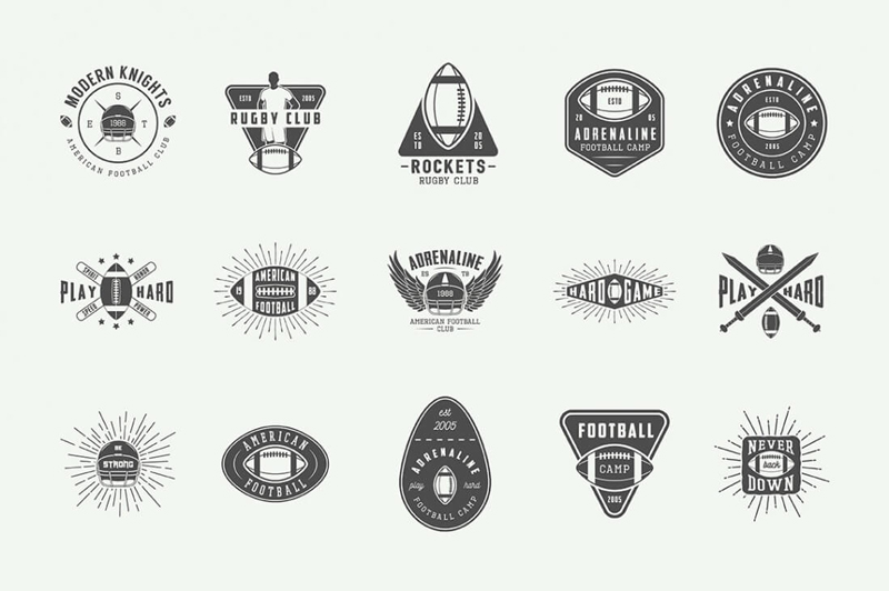
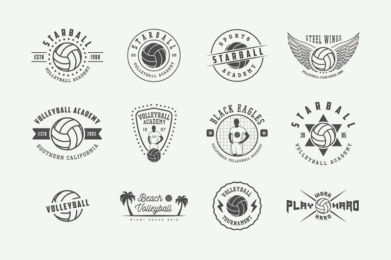
This Sports Emblems Mega Bundle comes over-stuffed with more than 300 total items to help you hit your next project out of the park! You’ll get hundreds of sports emblems, 75+ unique design elements and even a set of sports-themed poster templates.
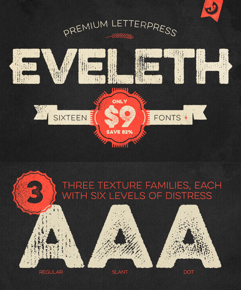
You’ll get yourself 16 charming vintage fonts to work with. Additional weights, shadow layers and entertaining icons, shapes and emblems are just a few of the extras that come along for the ride. And if you act now, you can save yourself 82% off the regular price!
Let’s take a look at what it takes to build a grid overlay with CSS. It will be responsive, easily customizable and make heavy use of CSS variables (known more accurately as „CSS custom properties”). If you aren’t familiar with custom properties, I’d highly recommend reading What is the difference between CSS variables and preprocessor variables? and watching Lea Verou’s enlighting talk on using them.
This grid overlay that we’re building will consider a developer tool, as in, a tool just for us, not really our users. So, let’s not worry too much about browser support (If you do care, check out caniuse… data on custom properties). While it’s impossible to preprocess custom properties to behave exactly the same as native support, if you use them just like you would preprocessor variables, tools like the postCSS plugin cssnext can transform them into CSS compliant with older browsers.
Preface
A couple of weeks ago, at work, I simplified the media queries on one of our projects and added a layout component based on the same principles as Flexbox Grid. Some of my fellow designers didn’t fully understand the responsiveness and fluidity of it, so I created a toggleable grid overlay to help them visualize it.
My hope is that this can be a tool to aid layout-related conversations on our teams and make sure we don’t use too many bespoke widths, paddings etc.
Terminology
Working as a front end designer I want all developers and designers to speak the same language (as much as possible) so I’ve chosen a terminology for the CSS variables that digital designers are also familiar with:
Columns: The vertical divisions of the page.
Gutter: The space between the columns.
Offset: The space between the sides of the viewport.
Baseline: The vertical rhythm used for text.
Making the Grid
1) „Box”
Let’s use a pseudo-element on the element to display the grid on top of all of our content. We want the overlay to work with a fluid layout, so we give the element a width off `100% – (2 * offset)` and also a max-width so the grid overlay doesn’t grow wider than our layout.
If you look at the grid you will notice that the repeating pattern is column+gutter pairs. We’re using repeating linear gradients as a background-image. We’ll set the size of the background-image to 100% + gutter making the repeating pattern 100% / columns wide and the actual column (100% / columns) – gutter wide.
As a side note, I also tried using regular linear gradients with background-repeat to get the lines more pixel perfect. It didn’t work because pixel rounding resulted in imperfect total width whenever the layout width wasn’t dividable by the number of columns.
3) Baseline
We also draw the baseline using repeating linear gradients but it’s slightly simpler since we don’t add horizontal gutters and we want it to be just a line instead of a block.
Let’s also add a baseline-shift variable that allows us to shift the baseline slightly upwards or downwards. We apply the baseline shift by simply adjusting the background-position.
Now that we have our basic setup, let’s introduce some media queries. If you look back at the math that we’ve used so far, you can see that none of it is tied up to any specific number of columns, gutter width, etc.
We use a mobile first approach and only include variables in the media queries when we want to change them. To make it clear for everyone using the overlay that we’ve passed a new breakpoint we also change the color at every breakpoint.
I recommend opening the Pen in a new tab and see how it behaves when you change different variable values and when you resize the viewport.
If you made a mental note in step 1 saying “but what if I want specific layout widths at specific breakpoints?” then now is when you can easily introduce that logic by setting --max_width for each media query.
5) Help Text
Designers like to think about mockups for different devices — which is generally a good thing as it’s critical that a website looks awesome on those different devices — but sometimes they forget that the layout on an iPad should work all the way up and/or down to the next breakpoint.
Breakpoints aren’t normally called „iPhone”, „Galaxy Note 🔥”, „iPad” etc. for many reasons including the above. A breakpoint denotes where a new range starts and it’s not device specific.
To make it more obvious what our breakpoints are called, we can add the names to our grid overlay.
I have a dream that one day a designer doesn’t come back to a developer and say: „we need to adjust how it looks on iPad” but instead says „we need to adjust how it looks on medium”.
Go Further
What about lines for the columns and gutters too? Easy, it’s just CSS. What about adding more breakpoints? Easy, it’s just CSS. What if I want different colors? Easy… you get it. 😄