Computer Science Distilled, Chapter 2: Complexity

Post pobrano z: Computer Science Distilled, Chapter 2: Complexity

This is a full chapter excerpt from Wladston Viana Ferreira Filho’s brand new book Computer Science Distilled which he has graciously allowed for us to publish here.

In almost every computation, a variety of arrangements for the processes is possible. It is essential to choose that arrangement which shall tend to minimize the time necessary for the calculation.

—Ada Lovelace

How much time does it take to sort 26 shuffled cards? If instead, you had 52 cards, would it take twice as long? How much longer would it take for a thousand decks of cards? The answer is intrinsic to the method used to sort the cards.

A method is a list of unambiguous instructions for achieving a goal. A method that always requires a finite series of operations is called an algorithm. For instance, a card-sorting algorithm is a method that will always specify some operations to sort a deck of 26 cards per suit and per rank.

Less operations need less computing power. We like fast solutions, so we monitor the number of operations in our algorithms. Many algorithms require a fast-growing number of operations when the input grows in size. For example, our card-sorting algorithm could take few operations to sort 26 cards, but four times more operations to sort 52 cards!

To avoid bad surprises when our problem size grows, we find the algorithm’s time complexity. In this chapter, you’ll learn to:

  • Count and interpret time complexities
  • Express their growth with fancy Big-O’s
  • Run away from exponential algorithms
  • Make sure you have enough computer memory.

But first, how do we define time complexity?

Time complexity is written T⁢(n). It gives the number of operations the algorithm performs when processing an input of size n. We also refer to an algorithm’s T⁢(n) as its running cost. If our card-sorting algorithm follows T⁢(n)=n2, we can predict how much longer it takes to sort a deck once we double its size: T⁢(2⁢n)T⁢(n)=4.

Hope for the best, prepare for the worst

Isn’t it faster to sort a pile of cards that’s almost sorted already?

Input size isn’t the only characteristic that impacts the number of operations required by an algorithm. When an algorithm can have different values of T⁢(n) for the same value of n, we resort to cases:

  • Best Case: when the input requires the minimum number of operations for any input of that size. In sorting, it happens when the input is already sorted.
  • Worst Case: when the input requires the maximum number of operations for any input of that size. In many sorting algorithms, that’s when the input was given in reverse order.
  • Average Case: refers to the average number of operations required for typical inputs of that size. For sorting, an input in random order is usually considered.

In general, the most important is the worst case. From there, you get a guaranteed baseline you can always count on. When nothing is said about the scenario, the worst case is assumed. Next, we’ll see how to analyze a worst case scenario, hands on.

Figure 2.1: “Estimating Time”, courtesy of xkcd.com.

2.1 Counting Time

We find the time complexity of an algorithm by counting the number of basic operations it requires for a hypothetical input of size n. We’ll demonstrate it with Selection Sort, a sorting algorithm that uses a nested loop. An outer for loop updates the current position being sorted, and an inner for loop selects the item that goes in the current position1:

function selection_sort(list)
    for current ← 1 … list.length - 1
        smallest ← current
        for i ← current + 1 … list.length
            if list[i] < list[smallest]
                smallest ← i
        list.swap_items(current, smallest)

Let’s see what happens with a list of n items, assuming
the worst case. The outer loop runs n-1 times and does two
operations per run (one assignment and one swap) totaling 2⁢n-2 operations. The inner loop first runs n-1 times, then n-2 times, n-3 times, and so on. We know how to sum these types of sequences2:

number of inner loop runs= n-1   +   n-2 + ⋯+2+1⏞n-1⁢total runs of the outer loop.
= ∑i=1n-1i=(n-1)⁢(n)2=n2-n2.

In the worst case, the if condition is always met. This means the inner loop does one comparison and one assignment (n2-n)/2 times, hence n2-n operations. In total, the algorithm costs 2⁢n-2 operations for the outer loop, plus n2-n operations for the inner loop. We thus get the time complexity:

T⁢(n)=n2+n-2.

Now what? If our list size was n=8 and we double it, the
sorting time will be multiplied by:

T⁢(16)T⁢(8)=162+16-282+8-2≈3.86.

If we double it again we will multiply time by 3.90. Double it over and over and find 3.94, 3.97, 3.98. Notice how this gets closer and closer to 4? This means it would take four times as long to sort two million items than to sort one million items.

2.1.1 Understanding Growth

Say the input size of an algorithm is very large, and we increase it even more. To predict how the execution time will grow, we don’t need to know all terms of T⁢(n). We can approximate T⁢(n) by its fastest-growing term, called the dominant term.

The Index Card Problem: Yesterday, you knocked over one box of index cards. It took you two hours of Selection Sort to fix it. Today, you spilled ten boxes. How much time will you need to arrange the cards back in?

We’ve seen Selection Sort follows T⁢(n)=n2+n-2. The fastest-growing term is n2,
therefore we can write T⁢(n)≈n2. Assuming there are n cards per box, we find:

T⁢(10⁢n)T⁢(n)≈(10⁢n)2n2=100.

It will take you approximately (100×2)⁢hours=200 hours! What if we had used a different sorting method? For example, there’s one called „Bubble Sort” whose time complexity is T⁢(n)=0.5⁢n2+0.5⁢n. The fastest-growing term then gives T⁢(n)≈0.5⁢n2, hence:

T⁢(10⁢n)T⁢(n)≈0.5×(10⁢n)20.5×n2=100.

Figure 2.2: Zooming out n2,  n2+n-2,  and
 0.5⁢n2+0.5⁢n,  as n gets larger and larger.

The 0.5 coefficient cancels itself out! The idea that n2-n-2 and 0.5⁢n2+0.5⁢n both grow like n2 isn’t easy to get. How does the fastest-growing term of a function ignore all other numbers and dominate growth? Let’s try to visually understand this.

In Figure 2.2, the two time complexities we’ve seen are compared to n2 at different zoom levels. As we plot them for larger and larger values of n, their curves seem to get closer and closer. Actually, you can plug any numbers into the bullets of T⁢(n)=∙⁢n2+∙⁢n+∙, and it will still grow like n2.

Remember, this effect of curves getting closer works if the fastest-growing term is the same. The plot of a function with a linear growth (n) never gets closer and closer to one with a quadratic growth (n2), which in turn never gets closer and closer to one having a cubic growth (n3).

That’s why with very big inputs, algorithms with a quadratically growing cost perform a lot worse than algorithms with a linear cost. However, they perform a lot better than those with a cubic cost. If you’ve understood this, the next section will be easy: we will just learn the fancy notation coders use to express this.

2.2 The Big-O Notation

There’s a special notation to refer to classes of growth: the Big-O notation. A function with a fastest-growing term of 2n or weaker is O⁢(2n); one with a quadratic or weaker growth is O⁢(n2); growing linearly or less, O⁢(n), and so on. The notation is used for expressing the dominant term of algorithms’ cost functions in the worst case—that’s the standard way of expressing time complexity3.

Figure 2.3: Different orders of growth often seen inside O.

Both Selection Sort and Bubble Sort are O⁢(n2), but we’ll soon discover O⁢(n⁢log⁡n) algorithms that do the same job. With our O⁢(n2) algorithms, 10× the input size resulted in 100× the running cost. Using a O⁢(n⁢log⁡n) algorithm, 10× the input size results in only 10⁢log⁡10≈34⁢× the running cost.

When n is a million, n2 is a trillion, whereas n⁢log⁡n is just a few million. Years running a quadratic algorithm on a large input could be equivalent to minutes if a O⁢(n⁢log⁡n) algorithm was used. That’s why you need time complexity analysis when you design systems that handle very large inputs.

When designing a computational system, it’s important to anticipate the most frequent operations. Then you can compare the Big-O costs of different algorithms that do these operations4. Also, most algorithms only work with specific input structures. If you choose your algorithms in advance, you can structure your input data accordingly.

Some algorithms always run for a constant duration regardless of input size—they’re O⁢(1). For example, checking if a number is odd or even: we see if its last digit is odd and boom, problem
solved. No matter how big the number. We’ll see more O⁢(1) algorithms in the next chapters. They’re amazing, but first let’s see which algorithms are not amazing.

2.3 Exponentials

We say O⁢(2n) algorithms are exponential time. From the graph of growth orders (Figure 2.3), it doesn’t seem the quadratic n2 and the exponential 2n are much different. Zooming out the graph, it’s obvious the exponential growth brutally dominates the quadratic one:

Figure 2.4: Different orders of growth, zoomed out. The linear and logarithmic curves grow so little they aren’t visible anymore.

Exponential time grows so much, we consider these algorithms „not runnable”. They run for very few input types, and require huge amounts of computing power if inputs aren’t tiny. Optimizing every aspect of the code or using supercomputers doesn’t help. The crushing exponential always dominates growth and keeps these algorithms unviable.

To illustrate the explosiveness of exponential growth, let’s zoom out the graph even more and change the numbers (Figure 2.5). The exponential was reduced in power (from 2 to 1.5) and had its growth divided by a thousand. The polynomial had its exponent increased (from 2 to 3) and its growth multiplied by a thousand.

Figure 2.5: No exponential can be beaten by a polynomial. At this zoom level, even the n⁢log⁡n curve grows too little to be visible.

Some algorithms are even worse than exponential time algorithms. It’s the case of factorial time algorithms, whose time complexities are O⁢(n!). Exponential and factorial time algorithms are horrible, but we need them for the hardest computational problems: the famous NP-complete problems. We will see important examples of NP-complete problems in the next chapter. For now, remember this: the first person to find a non-exponential algorithm to a NP-complete problem gets a million dollars5 from the Clay Mathematics Institute.

It’s important to recognize the class of problem you’re dealing with. If it’s known to be NP-complete, trying to find an optimal solution is fighting the impossible. Unless you’re shooting for that million dollars.

2.4 Counting Memory

Even if we could perform operations infinitely fast, there would still be a limit to our computing power. During execution, algorithms need working storage to keep track of their ongoing calculations. This consumes computer memory, which is not infinite.

The measure for the working storage an algorithm needs is called space complexity. Space complexity analysis is similar to time complexity analysis. The difference is that we count computer memory, and not computing operations. We observe how space complexity evolves when the algorithm’s input size grows, just as we do for time complexity.

For example, Selection Sort just needs working storage for a fixed set of variables. The number of variables does not depend on the input size. Therefore, we say Selection Sort’s space complexity is O⁢(1): no matter what the input size, it requires the same amount of computer memory for working storage.

However, many other algorithms need working storage that grows with input size. Sometimes, it’s impossible to meet an algorithm’s memory requirements. You won’t find an appropriate sorting algorithm with O⁢(n⁢log⁡n) time complexity and O⁢(1) space complexity. Computer memory limitations sometimes force a tradeoff. With low memory, you’ll probably need an algorithm with slow O⁢(n2) time complexity because it has O⁢(1)
space complexity.

Conclusion

In this chapter, we learned algorithms can have different types of voracity for consuming computing time and computer memory. We’ve seen how to assess it with time and space complexity analysis. We learned to calculate time complexity by finding the exact T⁢(n) function, the number of operations performed by an algorithm.

We’ve seen how to express time complexity using the Big-O notation (O). Throughout this book, we’ll perform simple time complexity analysis of algorithms using this notation. Many times, calculating T⁢(n) is not necessary for inferring the Big-O complexity of an algorithm.

We’ve seen the cost of running exponential algorithms explode in a way that makes these algorithms not runnable for big inputs. And we learned how to answer these questions:

  • Given different algorithms, do they have a significant difference in terms of operations required to run?
  • Multiplying the input size by a constant, what happens with the time an algorithm takes to run?
  • Would an algorithm perform a reasonable number of operations once the size of the input grows?
  • If an algorithm is too slow for running on an input of a given size, would optimizing the algorithm, or using a supercomputer help?

1: To understand an new algorithm, run it on paper with a small sample input.

2: In the previous chapter, we showed ∑i=1ni=n⁢(n+1)/2.

3: We say ’oh’, e.g., „that sorting algorithm is oh-n-squared„.

4: For the Big-O complexities of most algorithms that do common tasks, see http://code.energy/bigo

5: It has been proven a non-exponential algorithm for any NP-complete problem could be generalized to all NP-complete problems. Since we don’t know if such an algorithm exists, you also get a million dollars if you prove an NP-complete problem cannot be solved by non-exponential algorithms!


Computer Science Distilled: Learn the Art of Solving Computational Problems by Wladston Viana Ferreira Filho is available on Amazon now.


Computer Science Distilled, Chapter 2: Complexity is a post from CSS-Tricks

Websites to Generate SVG Patterns

Post pobrano z: Websites to Generate SVG Patterns

These aren’t particularly hard to web search for, but just in case you didn’t know they existed I figured I’d drop them here. I’ve used all three of these in the past and I think they do a good job of driving home how cool of patterns you can make in SVG with such little code.

Hero Patterns

A collection of repeatable SVG background patterns for you to use on your web projects.

SVG Patterns Gallery

SVG images are typically smaller than bitmap images and remain sharp on high-dpi screens. Unlike CSS3 gradients, SVG images are supported on IE9.

SVGeneration

Scalable Vector Graphics are crisp and clear and can be rendered in all modern browsers.


Websites to Generate SVG Patterns is a post from CSS-Tricks

Scaling SVG Clipping Paths for CSS Use

Post pobrano z: Scaling SVG Clipping Paths for CSS Use

A legit CSS trick documented by Eric Meyer!

So there is polygon() in CSS and <polygon> in SVG. They are closely related, but there are all kinds of weirdnesses. For example, you can use path() in CSS to update the d attribute of a <path>, but you can’t do the same with polygon() and <polygon>.

Part of the problem is that polygon() in CSS only accepts numbers with units, like px, %, em, or whatever.

.clip-me {
  /* Works! */
  clip-path: polygon(50% 0, 100% 25%, 100% 75%, 50% 100%, 0 75%, 0 25%);

  /* Does NOT work */
  clip-path: polygon(50 0, 100 25, 100 75, 50 100, 0 75, 0 25);
}

Which is exactly the opposite in SVG:

<svg>
  /* Works! */
  <polygon points="50 0, 100 25, 100 75, 50 100, 0 75, 0 25"></polygon>

  /* Does NOT work */
  <polygon points="50px 0px, 100px 25px, 100px 75px, 50px 100px, 0px 75px, 0px 25px"></polygon>
  <polygon points="50% 0%, 100% 25%, 100% 75%, 50% 100%, 0px 75%, 0% 25%"></polygon>
</svg>

The trick is that you can force the SVG coordinates to behave like percentage coordinates (even with weird viewBoxes) with some light math, a transform attribute, and a special clipPathUnits attribute.

<svg viewBox="0 0 329.6667 86">
  <clipPath id="cloud02" clipPathUnits="objectBoundingBox"
   transform="scale(0.003033 0.0116279)">
    <path d="…(coordinates go here)…"/>
  </clipPath>
</svg>

Those two values are 1/329.6667 and 1/86, respectively, and they effectively scale every point in the d attribute to fit into the needed 0–1 range. Thus we have an SVG clipping path that scales with the element and fits to its dimensions!

Direct Link to ArticlePermalink


Scaling SVG Clipping Paths for CSS Use is a post from CSS-Tricks

How to Create a Computer Peripherals Icon Set in Adobe Illustrator

Post pobrano z: How to Create a Computer Peripherals Icon Set in Adobe Illustrator

Final product image
What You’ll Be Creating

In today’s
tutorial we’re going to learn how to create a set of four computer peripherals,
using the same body as the central structure to which we will add all the key features that make each object stand out. As always, we’re
going to rely on the use of some basic geometric shapes, combined with the
power of the Align panel.

That being said, grab that old coffee mug, and let’s get started!

Oh, and before I forget, you can always expand the project by checking
out GraphicRiver where you can find
tons of computer-themed icons.

1. How to Set Up a New Document

Since I’m hoping that you already have
Illustrator up and running in the background, bring it up and let’s set up a New Document (File > New or Control-N)
using the following settings:

  • Number
    of Artboards:
    1
  • Width:
    800
    px
  • Height:
    600
    px
  • Units:
    Pixels

And from the Advanced tab:

  • Color
    Mode:
    RGB
  • Raster
    Effects:
    Screen (72ppi)
  • Preview Mode: Default
setting up a new document

Quick
tip:
some of you might have noticed that the Align New Objects to Pixel Grid option
is missing. That’s because I’m running the new CC 2017 version of the
software, where great changes have been made to the way Illustrator handles the way shapes snap to the underlying Pixel Grid.

2. How to Set Up a Custom Grid

Since we’re going to be creating the icons
using a pixel-perfect workflow, we’ll want to set up a nice little grid so that we can have full control
over our shapes—that is if we’re running the older version of the software.

Step 1

Go to the Edit > Preferences > Guides & Grid submenu, and adjust
the following settings:

  • Gridline
    every:
    1 px
  • Subdivisions: 1
setting up a custom grid

Quick
tip:
you can learn more about grids by reading this
in-depth piece on how Illustrator’s Grid System works.

Step 2

Once we’ve set up our custom grid, all we
need to do in order to make sure our shapes look crisp is enable the Snap to Grid option found under the View menu, which will transform into Snap to Pixel each time you enter Pixel Preview mode.

Now, if you’re new to
the whole “pixel-perfect workflow”, I strongly recommend you go through my how
to create pixel-perfect artwork
tutorial, which will help you widen your
technical skills in no time.

3. How to Set Up the Layers

With the new document created, it would be
a good idea to structure our project using a couple of layers, since this way
we can maintain a steady workflow by focusing on one icon at a time.

That being said, bring up the Layers panel, and create a total of five
layers, which we will rename as follows:

  • layer 1: reference grids
  • layer 2: tablet
  • layer 3: mouse
  • layer 4: keyboard
  • layer 5: midi
    controller
setting up the layers

4. How to Create the Reference Grids

The
Reference Grids
(or Base Grids)
are a set of precisely delimited reference surfaces, which allow us to build
our icons by focusing on size and consistency.

Usually, the size of the grids determines
the size of the actual icons, and they should always be the first decision you
make when you start a new project, since you’ll always want to start from the
smallest possible size and build on that.

Now, in our case, we’re going to be
creating the icon pack using just one size, more exactly 128 x 128 px, which is a fairly large one.

Step 1

Start by locking all
but the reference grid layer, and then grab the Rectangle Tool (M) and create a 128 x 128 px orange (#F15A24) square, which will help define the
overall size of our icons.

creating the main shape for the reference grid

Step 2

Add a smaller 120 x 120 px one (#FFFFFF) which will
act as our active drawing area, thus giving us an all-around 4 px padding.

creating the main shape for the active drawing area

Step 3

Group the two squares composing the
reference grid using the Control-G keyboard
shortcut, and then create three copies at a distance of 40 px from one another, making sure to align them to the center of
the Artboard.

Once you’re done,
lock the current layer and move on to the next one where we’ll start working on
our first icon.

creating and positioning the remaining reference grids

5. How to Create the Repeating Body

As I’ve already pointed out, we’re going
to create all four icons using the same body, onto which we will
gradually add the key features that give them their “identity”. That
being said, make sure you’re on the right layer (that would be the second one)
and then zoom in the first reference grid so that we can have a better view of the shapes.

Step 1

Start by creating a 112 x 100 px rounded rectangle with an 8 px Corner Radius, which we will
color using #60677C, and then center align to the underlying active drawing
area, at a distance of 4 px from its
bottom edge.

creating and positioning the repeating bodys main shape

Step 2

Give the shape that
we’ve just created an outline using the Stroke
method, by creating a copy of it (Control-C
> Control-F
) which we will adjust by first changing its color to #2B3249,
and then flipping its Fill with its Stroke (Shift-X), making sure to set its Weight to 8 px afterwards.

adding the outline to the repeating bodys main shape

Step 3

Using the Pen Tool (P) draw a 16 px tall 8 px thick Stroke line
(#2B3249) starting from the center of the outline’s top edge, and going all the
way to the outer limit of the active drawing area. Once you’re done, you
can select and group all three shapes together using the Control-G keyboard shortcut.

adding the little cable segment to the repeating bodys main shape

Step 4

Now that we have our repeating body, all
we have to do is create three copies of it (Control-C > Control-F three times), and position one onto each
of the empty reference grids.

Once you have them
all in place, you can start locking the layers so that you can keep your focus
on the first icon.

creating and positioning the repeating body copies onto the empty reference grids

6. How to Create
the Tablet Icon

The first icon
that we’re going to tackle is the little graphics tablet, so make sure you’re
on the right layer (that would be the second one) and then zoom in on its
reference grid so that we can get started.

Step 1 

Create the tablet’s display using an 80 x 60 px rectangle, which we will color using white (#FFFFFF) and
then center align to the repeating body, at a distance of 12 px from its top edge.

creating and positioning the main shape for the tablet icons display

Step 2

Give the shape that we’ve just created an 8 px thick
outline (#2B3249) using the Stroke
method, selecting and grouping the two together afterwards using the Control-G keyboard shortcut.

adding the outline to the tablet icons display

Step 3

Using the Pen
Tool (P)
, draw three 8 px thick
diagonal Stroke lines (#2B3249),
which we will adjust by lowering their Opacity
to just 20%. Once you’re done, select and group them together (Control-G) center aligning them to the underlying display afterwards.

adding the reflection lines to the tablet icons display

Step 4

Start working on the tablet’s first button, by creating a 16 x 16 px square (#BAC0CE) with an 8 px thick outline (#2B3249) which we
will group (Control-G) and then
position onto the left side of the display, at a distance of 16 px from the larger outline’s top
edge.

creating and positioning the main shapes for the tablet icons top-left button

Step 5

Create the second left-sided button using a copy (Control-C > Control-F) of the one that we’ve just made, which we
will position underneath, making sure to change the fill shape’s color to white
(#FFFFFF) once we have it in place. Once you have both buttons, group them (Control-G) since we’ll be using them to
create the right-sided ones.

creating and positioning the tablet icons second left-sided button

Step 6

Create the right-sided buttons using a copy (Control-C > Control-F) of the ones
that we’ve just grouped, which we will position onto the opposite side of the
tablet’s display.

creating and positioning the tablets right-sided buttons

Step 7

Finish off the icon by adding the little pen,
which we will create using a 40 px wide
8 px thick Stroke line (#2B3249) with a Round
Cap
, which we will center align to the tablet’s lower section. Once you’re
done, don’t forget to select and group all of the icon’s composing shapes
together using the Control-G
keyboard shortcut.

finishing off the tablet icon

7. How to Create the
Mouse Icon

Assuming you’ve already moved on up to the next layer (that would be the
third one) and locked the previous one, zoom in on the second reference grid and
let’s start working on the mouse icon.

Step 1

Create the mouse’s main body using a 44 x 68 px rectangle, which we will
color using white (#FFFFFF) and then center align to the underlying repeating
body’s main fill shape.

creating and positioning the mouse icons main shape

Step 2

Adjust the shape that we’ve just created by
setting the Radius of its top Corners to 4 px and its bottom ones to 22
px
from within the Transform panel’s
Rectangle Properties.

adjusting the corner radius of the mouse icons main shape

Step 3

Create the left-click button using a 22 x 20 px rectangle, which we will
color using #BAC0CE and then align to the larger shape’s top-left corner.

creating and positioning the main shape for the mouse icons left button

Step 4

Give the mouse an 8 px thick outline (#2B3249) using the Stroke method, making sure to position it on top of its two fill
shapes (right click > Arrange >
Bring to Front
).

adding the outline to the mouse icons main shape

Step 5

Add the bottom button delimiter line using a 44 px wide 8 px thick Stroke (#2B3249) which we will center align to the mouse’s body, positioning it at a
distance of 12 px from the outline’s
top edge.

creating and positioning the main shape for the mouse icons bottom button delimiter

Step 6

Finish off the icon by adding the vertical
detail line separating the mouse’s two buttons, which
we will create using a 36 px tall 8 px thick Stroke line (#2B3249). Once you’re done, group (Control-G) all of the mouse’s composing
shapes together, doing the same for all of the icon’s sections afterwards.

finishing off the mouse icon

8. How to Create
the Keyboard Icon

I’m guessing that
by now you already know the drill, so make sure you’re on the right layer (that
would be the fourth one) and zoom in on the third reference grid so that we can
get started.

Step 1

Start working on the top row’s first key by creating a 14 x 14 px square (#FFFFFF) with an 8 px thick outline (#2B3249) which we
will group (Control-G) and then
position towards the repeating body’s top-left corner, at a distance of 6 px from the larger outline.

creating and positioning the main shapes for the keyboard icons first key

Step 2

Create the top row’s remaining keys by selecting the one that we’ve
just made and then dragging it to the right side while holding down the Alt (to create the copy) and
Shift keys (to drag in a perfect
straight line), to create the first instance. 

Make sure that the duplicate’s outline overlaps the original one’s, and then simply press Control-D four times, which will repeat the last action and thus create the remaining duplicates,
grouping (Control-G) all the row’s
buttons together afterwards.

adding the remaining keys to the keyboard icons top row

Step 3

Create the second row of keys using the same Alt-Shift-Drag method, only this time repeat
the process by pulling down on the mouse until the copy overlaps the original’s outline.

adding the keyboard icons second row of keys

Step 4

Start working on the third row’s first key by creating a 20 x 14 px rectangle (#FFFFFF) with an 8 px thick outline (#2B3249) which we
will group (Control-G) and then
position underneath the shapes from the previous step, left aligning it to
them.

creating and positioning the main shapes for the keyboard icons third row key

Step 5

Create the spacebar using a 44 x
14 px
rectangle (#FFFFFF) with an 8
px
thick outline (#2B3249), which we will group (Control-G) and then position onto the
right side of the previously created button.

creating and positioning the main shapes for the keyboard icons spacebar

Step 6

Add the third row’s last button using a copy (Control-C > Control-F) of its first one, which we will position
onto the opposite side of the spacebar. Once you’re done, group (Control-G) all of the row’s shapes
together, doing the same for all the buttons afterwards.

finishing off the keyboard icons third row of keys

Step 7

Create the trackpad using a 28 x 20 px rectangle (#BAC0CE) with an 8 px thick outline (#2B3249), which we will group (Control-G) and then center align to the
lower section of the keyboard, positioning it at a distance of 12 px from the smaller buttons that we’ve just grouped.

creating and positioning the main shapes for the keyboard icons trackpad

Step 8

Finish off the icon, by adding the little
fingerprint reader using a 12 px wide
8 px thick Stroke line (#2B3249) which we will position onto the repeating
body’s bottom-right corner, at a distance of 20 px from the trackpad. Once you’re
done, select and group all of the icon’s composing shapes together using the Control-G keyboard shortcut.

finishing off the keyboard icon

9. How to Create the Midi Controller Icon

We are now down to our fourth and last icon, so make sure you’re on the
right layer (that would be the fifth one) and let’s wrap things up!

Step 1

Create the first out of the three adjustment
knobs, using an 8 x 8 px circle
which we will color using #2B3249, and then position onto the repeating body’s
top-left corner, at a distance of 8 px from
its left side and 6 px from its
top.

creating and positioning the main shape for the midi controller icons first adjustment knob

Step 2

Create the remaining knobs using two 8 x 8 px circles (#2B3249) which we
will vertically stack on the one from the previous step, distributing them at a
distance of 6 px from one another.
Then, once you’re done, don’t forget to select and group them
together using the Control-G keyboard
shortcut.

adding the remaining adjustment knobs to the midi controller icon

Step 3

Create the volume slider using a 12
x 28 px
rectangle (#FFFFFF) with an 8
px
thick Stroke (#2B3249) on top
of which we will add a 12 px wide 8 px thick state indicator line (#2B3249),
which we will position in its bottom section. Group (Control-G) all three shapes together and then position them onto
the right side of the adjustment knobs, at a distance of 8 px.

creating and positioning the main shapes for the midi controller icons volume slider

Step 4

Start working on the little D-pad buttons by
creating a 14 x 14 px square (#BAC0CE)
with an 8 px thick outline (#2B3249)
which we will group (Control-G) and
then position onto the right side of the volume slider, at a distance of 14 px.

creating and positioning the main shapes for the midi controller icons first d pad button

Step 5

Finish off the first row of D-pads by adding two
copies of the one that we’ve just made, using the Alt-Shift-Drag method, making sure to select and group (Control-G) all three of them
afterwards.

adding the first row of d pads to the midi controller icon

Step 6

Create the second row of pads using a copy (Control-C > Control-F) of the one
that we’ve just finished working on, which we will position just underneath,
selecting and grouping (Control-G)
them both together afterwards.

adding the second row of d pads to the midi controller icon

Step 7

Start working on the controller’s keys by creating a 16 x 44 px rectangle (#FFFFFF) with an 8 px thick outline (#2B3249), which we
will group (Control-G) and then
align to the bottom edge of the repeating body, at a distance of 8 px from its left edge.

creating and positioning the main shapes for the midi controller icons first key

Step 8

Create the remaining keys using four copies (Control-C > Control-F four times) of the one that we’ve just
made, which we will distribute along its right side.

adding the midi controller icons remaining keys

Step 9

Finish off the keyboard, and with it the icon itself, by adding a 16 x 22 px rectangle (#2B3249) to the
center of the first two set of keys, selecting and grouping all of them
together afterwards. Then, once you’re done, don’t forget to select and group (Control-G) all of the icon’s composing
shapes as well.

finishing off the midi controller icon

Awesome Work, You’re Done!

There you have it—a nice and easy tutorial on how to create your
very own computer peripherals using nothing more than some simple shapes and
tools. I hope you’ve managed to keep up with each and every step and most
importantly learned something new along the way.

finished project preview

Design deals for the week

Post pobrano z: Design deals for the week
first image of the post
Every week, we’ll give you an overview of the best deals for designers, make sure you don’t miss any by subscribing to our deals feed. You can also follow the recently launched website Type Deals if you are looking for free fonts or font deals. TT Octas Family of 10 Octagonal Fonts Built on the principle of octagonal forms, […]

Tips for Creating the Ultimate Creative Space

Post pobrano z: Tips for Creating the Ultimate Creative Space

Some might be happy with a couch and a laptop. Others, meanwhile, want something else to fuel their creativity.

Unfortunately, home creative spaces aren’t the easiest thing in the world to conjure up. Sure, take to any creative design agency and your mind will be blitzed with inspiration – but all of this comes at a price. A big price.

There are certainly some elements of a home creative space that are more important than others and the following shows a breakdown of the most important aspects.

Bookshelf speakers

If you’re like 99% of creative minds out there – you need just one thing to fuel your work. This comes in the form of music.

While phones may have become hugely capable in terms of their music-playing ability – they just don’t cut it for day-to-day use. Instead, you need a more specific solution, something along the lines of bookshelf speakers from Q Acoustics.

Let there be light

While the first suggestion looked at a type of product, the next is going to look at the light factor in more detail. In other words, you simply have to find a way to let more light creep into your room – it’s the bread and butter of creativity.

You might find the odd person who gets a spark from a blacked out room but on the whole, these people are few and far between. Instead, natural light is key and if you can’t get this, try and invest the bulk of your budget into decent overhead and task lighting which will just make your deals so much easier.

Just roll with it

This next suggestion isn’t going to appeal to every reader, but rolling carts can be an absolute godsend for anyone working in the creative industry at home. Particularly if your home is small, and you are sharing with the rest of the family, the ability to wheel in your supplies at will can be second to none.

It means that your work can travel with you around the house and in relation to families again, this can be key.

The display factor

It doesn’t matter how big your space is, you need somewhere within there to show off your best work. Just like natural light can fuel your creativity, so can your past creations.

It doesn’t matter whether you are a web designer or an artist – have somewhere to display your best work. The best suggestions tend to come in the form of magnetic rails, or maybe picture wires for artists, which can allow you to chop and change your display at a whim.

Accept that it might take baby steps

Unless you are awash with money, you aren’t going to get your dream studio straight away. Instead, you will have to chip away and build it gradually.

As such, you need to hold onto your dream. Keep taking small steps to keep your workspace alive, and keep working towards the end goal. Again, by sticking to such a philosophy, you can fuel your inspiration even more.

22 Illustrator Tutorials for Creating Isometric Illustrations

Post pobrano z: 22 Illustrator Tutorials for Creating Isometric Illustrations

We’re all looking to improve our vector illustration skills, and if your focus is on learning illustration or icon design, then getting familiar with how to use Adobe Illustrator to create isometric drawings will improve your technical illustration skills greatly. Learning how to use Illustrator to create isometric diagrams, set up isometric grids, and design isometric cubes are fundamental skills that you can build upon.

We’ve assembled a collection of tutorials that will teach you the basics of creating isometric illustrations in Illustrator, as well as intermediate tutorials that teach you how to create complex technical illustrations, and then a few tutorials that show you how to get creative with isometric in Illustrator (such as building isometric retro illustrations and vibrant pattern-based isometric cityscapes). Get ready to take your skills with vector drawing at an angle to the next level.

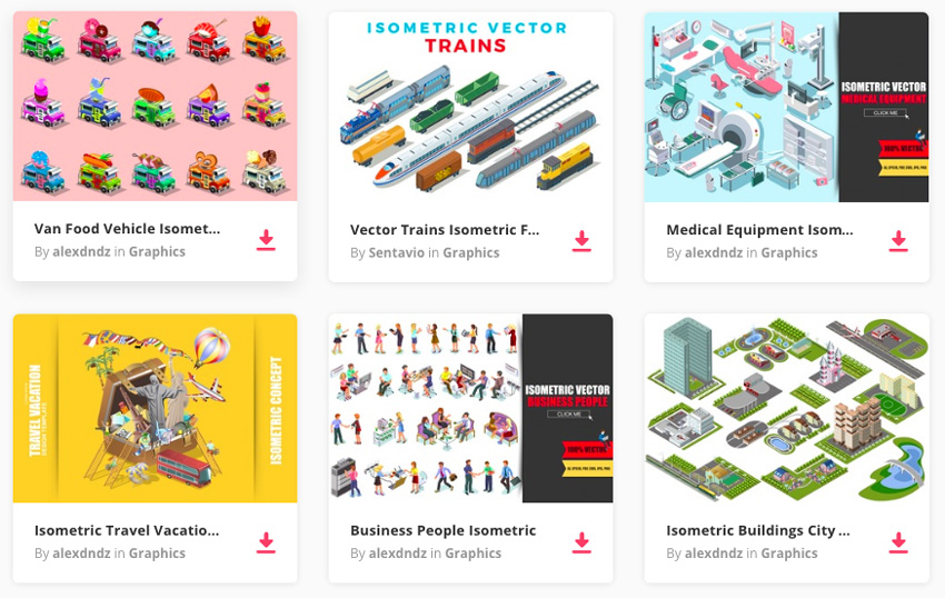
If you’re looking for some great-looking assets to add to your designs, you can find a fantastic selection of isometric vectors over on Envato Elements. 

isometric vectors over on Envato Elements
Isometric vectors on Envato Elements

Bump Up Your Technical Illustrator Skills With These Isometric Tutorials

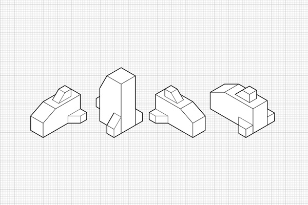
Working with Orthographic Projections and Basic Isometrics

This is the first in a series of tutorials Cody Walker wrote for us here on Vectortuts+ on isometric illustration. Isometric projects allow artists to quickly draw objects accurately without having to use perspective. They are often used in technical illustrations. Learn how to get started with isometric in illustrator by creating some simple objects on an isometric grid that demonstrate technical illustration techniques.

Orthographic Projections and Basic Isometrics

How to Create Advanced Isometric Illustrations Using the SSR Method

This is the second in a series of tutorials Cody Walker wrote for us here on Vectortuts+ on isometric illustration. The method demonstrated here is more advanced and shows how to build complex objects that are curved without the need for an isometric grid. Learn how to use the method scale, shear, rotate, or SSR. This tutorial follows a solid technical illustration process and demonstrates how to create a detailed, exploded diagram of an electric guitar in Adobe Illustrator.

Create Advanced Isometric Illustrations

How to Create Exploded Isometrics

This is the final post in a series of tutorials Cody Walker wrote for us here on Vectortuts+ on isometric illustration. Learn how to create exploded isometrics, which are referred to more commonly as assembly drawings. This type of vector drawing is often used in manuals to show how parts of complex objects fit together. This is an advanced technical illustration tutorial for creating complex, isometric diagrams in Illustrator.

Create Exploded Isometrics

Illustrator Tutorial: Design Retro Isometric Illustrations

Mark Oliver shows us how to create retro illustrations on isometric planes. This work is gorgeous. Learn how he works from sketch through vector in Illustrator, and then adds a worn image for the final vintage graphic touch. In this tutorial you’ll take a creative drawing and work it through an isometric grid in Illustrator, as well as vector build techniques, to create this stylized isometric illustration.

Design Retro Isometric Illustrations

Isometric Vector Art Made Easy

Aaron Miller shows us how to use Illustrator’s 3D tools to make a character-based scene that is full of happiness and creativity. Learn to bring dimension to flat imagery. Using this technique makes creating isometric illustrations easy. He shows how you can create isometric characters and scenes in Illustrator that are full of life. Learn to plan the scene, build the vector shapes, map art to the 3D shapes, and more.

Isometric Vector Art Made Easy

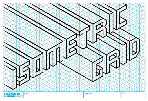
How to Create an Isometric Grid in Adobe Illustrator

This tutorial over on TechnicalIllustrators.org is great for beginners. It shows how to quickly set up an isometric grid in Illustrator. This allows you to print out and sketch isometric illustrations on them, using them directly in Illustrator or even another vector program. Sample grids are available for free download as well.

Create an Isometric Grid in Adobe Illustrator

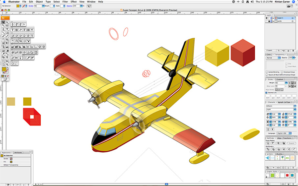
Complex Isometric Illustration Process of an Aircraft in Adobe Illustrator

Ninian Carter shares his processes for producing a complex isometric illustration of a water-bomber aircraft in Adobe Illustrator. This advanced Illustrator tutorial demonstrates a professional technical illustration workflow. Learn to skew graphics on an isometric plane, and build up the details of the vector work step by step.

Complex Isometric Illustration Process

Create Isometric Grid-Based 3D Lettering

Learn how to use Adobe Illustrator to create a custom 3D typeface based on an isometric grid. Isometric-based letters are the perfect way to reflect structure in a display typeface, as Steven Bonner discovered with a commission for a magazine feature on contemporary architecture. He shows you how to draw, color and light your letters to create a three-dimensional architectural scene. This tutorial is an excellent blend of technical illustration and creative techniques.

Create Isometric Grid-Based 3D Lettering

Photoshop & Illustrator Tutorial: Build a Vibrant, Pattern-Based Isometric Cityscape

The design agency 2xanadu shows us how to create a complex repeating pattern that combines an interesting mix of technical illustration, isometric Illustrator methods, and creative ingenuity. It’s made up of modern cityscape elements, as well as anime style characters strewn about. The process covers working with an isometric grid, starting with a sketch, creating the linework in Illustrator, and finishing by coloring vibrantly in Photoshop.

 Build a Vibrant Pattern-Based Isometric Cityscape

Illustrator Tutorial: Lego Bricks Typeface

Mac Krebernik shows us how to use a slightly modified isometric grid in Illustrator to compose a small lego brick. You’ll then learn how to create a typeface by snapping the bricks together, much like when you were a kid playing with the real blocks themselves.

Illustrator Tutorial Lego Bricks Typeface

Creating 3D Maps Using Isometric Projection in Illustrator CS5

In this video tutorial from Digitaltutors.com, learn how to create an isometric grid and draw objects based on it. This is a great Illustrator tutorial for beginners to get started with the basics of technical illustration skills utilizing isometric Illustrator techniques.

Creating 3D Maps Using Isometric Projection

Illustrator CS4 – Isometric Cube

Learn how to create an isometric cube in Illustrator without the help of 3D tools. You’ll learn how to use basic shapes and the Pathfinder to make more complex structures, such as tables and bookcases. No need for advanced understanding of isometric projection or technical illustration skills. You can get started now with this beginner Illustrator video tutorial on isometric cube construction.

Illustrator CS4 - Isometric Cube

More Isometric Tutorials From Envato Tuts+

Can’t get enough? Check out more tutorials from the Design & Illustration section here on Envato Tuts+ dedicated to teaching you about the incredible world of isometric art. Or check out our series on creating Isometric Pixel Art in Adobe Photoshop.

Additional Illustrator Tutorial Collections Here on Envato Tuts+

Jump into more comprehensive roundups on various type of Illustrator tutorials. Learn how to advance your self-promotional work, Illustrator brush work, poster design skills, master InDesign tools, and boost your artistic skills.

5 Isometric Sets From Envato Elements

Need a faster solution? Browse our amazing selection of Isometric Elements and Generators available through Envato Elements. Create awesome maps and infographics quickly and check out some of our favorites listed below!

Isometric Map Generator

Create insane 3D worlds with just a few short clicks. This incredible isometric map generator features realistic buildings, roads, and other design elements to create your own amazing maps. Download this package to explore the vast library of real-world add-ons.

Isometric Map Generator

Modern Isometric City Template

If you prefer a city with a more modern design then check out this isometric city template instead. This pack features colorful houses, cars, and trees with a sleek, minimalist design. Use these graphics for websites, infographics, or games, and enjoy customizing these well-organized vector files.

Modern Isometric City Template

Flat 3D Isometric Icon Set

Need a few icons to jazz up your designs? Then check out this super cool set of 100% vector isometric icons. These icons feature 15 different realistic icons you can use for your websites, social media accounts, and so much more!

Flat 3D Isometric Icon Set

Flat 3D Isometric Business Concept

Step up your game with this awesome package of seven different business-themed isometric designs. These designs feature several business concepts you can use for your presentations, infographics, and more. Create exciting presentations for school or work and impress your coworkers with these incredible graphics.

Flat 3D Isometric Business Concept

2D Isometric Game Asset – City Build Vol 1

Build the city of your dreams for your awesome games with this cool isometric set. This package features 25 icons with all the buildings, landmarks, and shops you need to make your environment shine. It’s suitable for games and more, and you’ll want to take advantage of this set right away!

2D Isometric Game Asset - City Build Vol 1

How to Design Your Website for Success

Post pobrano z: How to Design Your Website for Success

Whether you are launching a business, starting a blog or building an online portfolio, the design of your website will largely determine the success of your project. A solid online presence is crucial, and the best websites make sure that visitors are happy to stick around.

However, it’s not just a case of looking good. The devil is in the detail, and a first-class website is both extremely eye-catching and technically sound. For maximum success when launching your online endeavor, make sure your website ticks all the following boxes.

Make it fast

Creating a winning website is all about ensuring a user-friendly experience. Nothing hinders this more than a painfully slow load time – in fact, research shows a direct link between slow page response and website abandonment. It doesn’t matter how beautiful your website is, or how fancy the graphics are; if it doesn’t load quickly, no one will stick around long enough to see it. Elements that affect website speed include things like image size, how “clean” your code is and even how many different types of fonts you use. Free website checker tools like this one from 1&1 can help you to check the speed of your website, and also provide pointers for areas of improvement.

Keep navigation simple

Visitors to your site will quickly get frustrated if it’s difficult to navigate. Too many menus and submenus, excessive scrolling and elusive contact details are all major culprits when it comes to confusing navigation, so aim to keep it simple. Try to categorize all sections as logically as possible, in a way that makes them easy to find, and keep menu headings clear and visible. It is also a good idea to include a search function – that way, visitors to your site can instantly find exactly what they’re looking for.

Optimize for visibility

It is not just the user you need to impress; your website also needs to be a hit with Google. This means getting to grips with SEO – incorporating relevant keywords, embedding the right meta tags into your code and building up social signals by making it easy to share your content via Facebook and Twitter. Ultimately, a few SEO-based tweaks can help to improve your website’s ranking in the Google search results – which is of course, crucial for catching the attention of potential visitors.

Cater to mobile

The mobile web is here to stay, and optimization for mobile devices is an absolute must. If your site doesn’t load properly on mobile devices, you will instantly limit your appeal – especially as a growing number of internet users surf exclusively on their phones. Mobile-friendly sites can also expect preferential treatment from Google, whose algorithms have been adapted to favor mobile-optimized search results. Responsive web design is one way to ensure that the layout of your site adapts to different screen sizes, be it a smartphone, tablet or desktop. Fortunately, many pre-made web design templates are automatically optimized for mobile, so ensuring high performance across all devices should not be too tricky.

Tighten up security

Another crucial factor when it comes to online success is security. Regardless of whether or not you are trying to sell anything, security is paramount to gaining trust and creating a professional image. One way to secure your site is through an SSL layer – or Secure Sockets Layer – which ensures the secure transmission of data between your server and your website visitor’s browser. It also confirms that you are the legitimate owner of the website, and the “https” prefix to your URL provides an instantly recognizable marker of security. As internet users become increasingly savvy in matters of security, distinguishing your site as legitimate and trustworthy is more important than ever.

Be unique

Last but not least, your website design should be unique. Of course, it’s important to have all the technicalities in place, but the overall aesthetic should reflect everything that your website is about. Use images, font, and color to create something unique and appeal to your target audience. Whether your message is fun and lighthearted or a little more corporate, the design of your site can be used to express this.

IX White Square Ad Festival Announces the Jury

Post pobrano z: IX White Square Ad Festival Announces the Jury
first image of the post
IX International Advertising Festival «White Square», one of the leading creative events in communications industry of Eastern Europe, will take place in Minsk on April 27-29. The image of a boxing ring has become the key idea of Festival’s corporate identity this year. The tagline of IX White Square Festival is «Creativity Wins». In late […]

Agregator najlepszych postów o designie, webdesignie, cssie i Internecie