How to Draw Stone and Rock Textures

Post pobrano z: How to Draw Stone and Rock Textures

Final product image
What You’ll Be Creating

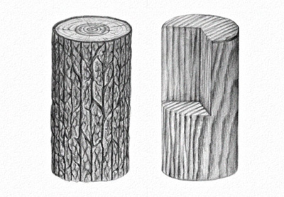
The texture of rock is deceptively simple, but it gets quite complicated when you try to get it right. In this tutorial I will show you how to draw a texture of a single rock or stone, and a texture of a structure made of stones, like a road or the wall of a medieval castle.

What You Will Need

  • HB pencil
  • 2B pencil
  • 4B pencil
  • 6B pencil
  • Pencil sharpener
  • Kneaded (or normal) eraser
  • Blending stump (optional)
drawing tools

It’s very hard to draw a rock texture from imagination. You may do better if you take a look at some photo references first, for example:

1. How to Draw a Rock

Step 1

Draw a top of the rock using the HB pencil. It should be roughly an oval, but not round at all.

drawing rock first step

Step 2

Add a side of the rock by drawing the bottom and connecting both parts.

rock basic form

Step 3

Gently sketch the edge of the rock to make it blunter. The wider these edge, the rounder the rock. You can even go all the way to the top, to create a dome shape.

rock 3d form blunt edge

Step 4

Add more guide lines to see the 3D form of the rock before you start shading. Use the eraser to make them barely visible.

rock sketch

Step 5

Slightly tilt your pencil and shade a side of the rock. Don’t cover the guide lines completely—leave a suggestion of them by pressing harder.

rock shaded side

Step 6

Take the 2B pencil and shade the part of the rock that won’t be directly illuminated. This time, don’t tilt your pencil so much, but try to draw little details: shadows between the „layers” of the rocks. You can create a very convincing texture just by drawing long, horizontal X shapes.

rock more shades

Step 7

Take the HB pencil again, tilt it, and draw rough „waves” on top of the rock. A rock surface is never smooth, and this will help us show this.

rock top texture

rock pencil texture

Step 8

Add more details to both the top and the side using the 2B pencil. The texture of rock is all about chaos that can’t be planned, so you need to be really creative with your strokes here.

rock side details
rock top details

Step 9

Take the eraser and brighten the illuminated edge with it. A bright edge is a great way to accentuate the shape of the rock.

rock bright edge

Step 10

Take the 4B pencil and use it to draw fine crevices and scratches. Think about this part of the drawing as negative space—you don’t want to draw dark lines, you want to accentuate the bright parts.

rock crevices
rock scratches

Step 11

Use the 2B pencil for the details on top. This is the illuminated side, and we don’t want too much contrast here.

draw rock details

Step 12

Look at your drawing from a distance and try to see what else can be improved by seeing the whole rock, not a set of strokes. Good shading does wonders, but don’t use too many details—they may drag attention from the rock as a whole.

how to draw a realistic rock

2. How to Draw a Stone Wall/Road

Step 1

Just like with the rock, draw the top of the structure first. Since it’s man-made, it should have a rather regular shape. Feel free to use a ruler for this, and draw using the HB pencil.

start drawing a wall

Draw the height of the structure…

draw a stone road

… and connect it with the bottom.

draw a stone structure

Step 2

Divide the height into as many parts as you need. The height of each part will be the height of a stone.

how to draw stone bricks

Step 3

Draw the rows on every side. The stones in this structure will not be as neatly placed as bricks, but they still should follow this rhythm as well as possible.

how to divide stone

Step 4

Imagine the stones are already on the side. Draw the width of their top.

stone wall how it works

Step 5

Sketch the rhythm of the stones. Again, they won’t be as regular as bricks, but a regular placement is required for durability of the structure.

bricks made of stone

Step 6

Luckily, such regularity is not required within the first row. First, sketch a chaotic rhythm on top…

castle wall structure

… then draw the outline of the rocks inside. Here they don’t need to be as regular. Instead, try to place them very tight, with small rocks between the big ones.

castle wall structure detail

Step 7

Time to add some form to each stone. Follow the perspective of the whole structure to decide which sides of the stone should be visible. Also, don’t forget to make the edge blunt—this will make it more primitive in look.

stone wall sketch

Step 8

Fill the spaces between the stones by pressing harder. Don’t make it too regular, but rather use it to „cut” some parts of the stones for a more natural look.

filling between stones

Step 9

Take the 2B pencil (sharpen it well) to make the filling between the stones less uniform.

shading of the filling

Step 10

Take the HB pencil again, tilt it, and shade the top of the stones. Don’t fill the sides by accident!

stone wall top shading

Step 11

Shade the sides of the construction, keeping the edges white.

stone wall side shading

Step 12

Take the 2B pencil and make the shadowed sides darker, both of the whole structure…

how to shade stone structure

… and of each stone on top.

how to shade stones

Step 13

Take the 4B pencil to darken the sides even more and accentuate the details during the process.

how to make stone structure

Step 14

Take the 6B pencil and shade the stones on the shadowed side with more detail. Pay attention to the crevices that have no way to be illuminated.

how to draw crevices in stones

Step 15

Shade the side of each top stone with the same pencil. This will increase the contrast of the whole structure.

how to shade road stones

Step 16

The illuminated side must stay light, but not without any details. Use the 2B pencil to add some.

how to draw details of castle wall

Step 17

Finally, take two steps back and look at the drawing as a whole. How can it be improved? In my case, I’ve used the blending stump to remove any trace of whiteness on the shadowed side, brightened the front with the eraser, and darkened the back of the top.
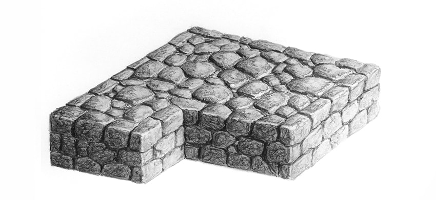
how to draw realistic stone castle wall with pencil

Good Job!

You did it! If you enjoyed learning this way, check out other tutorials from this series:

  • How to Draw Fur

    Fur can be very simple to draw, if you just learn one secret of it! In this tutorial I will show you how to draw long and short fur, but you can use these…
  • How to Draw Glass

    Transparent glass is incredibly hard to draw from imagination. That’s because we know it’s "invisible", so what is there to draw? But the correct…
how to draw realistic stone rock texture with pencils

How to Create a Brazil-Inspired Text Effect in Adobe Photoshop

Post pobrano z: How to Create a Brazil-Inspired Text Effect in Adobe Photoshop

Final product image
What You’ll Be Creating

In this tutorial I will show you how to create a Brazil-inspired text effect in Photoshop, using a layer style with a pattern that we will create. In the process, you will learn basic things about the Pen Tool and Convert Point Tool, and some keyboard shortcuts that I use every day.

If you’d like to skip this tutorial but still wish to buy the style, you can head over to GraphicRiver and buy Countries Styles.

Promo Image
Countries Styles

Tutorial Asset

The following font was used during this tutorial:

1. How to Create the Pattern

Step 1

Download the zip that is attached to this tutorial and open the Draft Pattern in Photoshop. If you already know how to use the Pen Tool and want to skip some steps, you can use this draft to continue with the tutorial. Just open it in Photoshop and then skip to step 12.

A draft of the pattern

Step 2

Press Control-Shift-N to create a new layer, and name it Shape 1. Then pick the Pen Tool (P) to start drawing.

Pen tool and a new layer

Step 3

Zoom in on the image to make it easier to work with it. You can do that by pressing Control-Space-Click (to zoom out press Alt-Space-Click). 

There are many ways to use the Shape Tool. I’m going to show you how to make one shape using a very simple technique, and then you can use the same technique for the other shapes. 

In order to better see what we are drawing, we need to change the color of the shape. So with the Pen Tool selected, change the color of the Fill to blue #130eef. Then select the layer Shape 1 and change its Opacity to 50%.

Changing the color of the fill

Step 4

Start clicking on the edges of the shape with the Pen Tool (don’t drag the mouse, just click). This will create anchor points. We have to place them on every sharp corner and where there is a curve. Keep doing that until you close the shape.

Drawing a shape

Step 5

Now pick the Convert Point Tool and click and drag on every anchor point that is on a curve, but don’t touch on the ones that are on sharp corners. It doesn’t have to be 100% like the original shape because it is an abstract thing, but try to do it as in the original image.

Here are some tips for this step.

  • If you need to move an anchor point, you need to hold Space while you are clicking on the anchor point, and then move it where you think it will fit better.
  • To remove an unnecessary anchor point, you have to click on it with the Pen Tool (P). To add a new one, just click with the Pen Tool where you need it. 
  • To select an anchor point with the Convert Point Tool, hold Control and click on it. Same thing for the Pen Tool (P).
  • When you select an anchor point, two handlers appear. You can hold Alt and click and drag to change only one handler.
Refining the shape with the Convert Point Tool

Step 6

After all shapes are completed, change the Opacity of every layer to 100%.

Changing the opacity of the layers to 100

Step 7

Create a new layer and name it BG. Then place it below the shapes. 

Creating a new background

Step 8

Change the Foreground color to #e2e2e2 and press Alt-Backspace to fill the layer BG with that color.

Changing the foreground color and applying it to the image

Step 9

Now pick the Pen Tool (P) again to change the color of the shapes to the correct color. You can use the original image and the Eyedropper Tool to pick the colors, or copy from the image below. Select the layer of the shape for which you want to change the color, and change the color just like in step 3.

Colors of the shapes

Step 10

Select all the layers except the Background layer, and then press Control-G to group them. 

Selecting all layers and grouping them

Step 11

Select the Group layer and press Control-Alt-Shift-E to merge everything into a new layer. Then rename this new layer to Base Pattern and hide the other layers by clicking on the eye icon.

Merging the layers

Step 12

Go to Image > Canvas Size and change the Width to 512 px.

Changing the canvas size

Step 13

Pick the Move Tool (V) and move the layer Base Pattern 128 px to the left.

Moving the layer

Step 14

Duplicate the layer Base Pattern by pressing Control-J. Then press Control-T to activate the Free Transform. Then move the layer 256 px to the right. After that, right-click the image and choose Flip Horizontal and press Enter.

Duplicating a layer and moving the copy

Step 15

Select the layers Base Pattern and Base Pattern copy, and press Control-E to merge them. Then rename this layer to Base.

Selecting the layers and merging them

Step 16

Go to Image > Canvas size and change the Height to 994 px.

Changing canvas size again

Step 17

Move the layer Base down by 249 px. Then make a copy of the layer Base and press Control-T to activate Free Transform again. Then right-click on the image and choose Flip Vertical. After that, move the layer Base copy up by 497 px and left by 256 px, and press Enter.

Moving the layer and flipping it

Step 18

Now make a copy of the layer Base copy and move it 512 px to the right.

Moving a copy of the layer

Step 19

Go to Edit > Define Pattern… and name it Abstract – Brazil Pattern, and then press OK. After that, save and close the document.

Saving the pattern

2. How to Create the Layer Style

Step 1

Go to File > Open... and open the background image that is in the zip.

Background image

Step 2

Pick the Type Tool (T) and write BRAZIL using the font Ash

Background image with BRAZIL written on it

Step 3

Right-click the text layer and choose Blending Options to create the Layer Style.

Let’s start with Bevel & Emboss:

  • Style: Inner Bevel
  • Technique: Smooth
  • Depth: 1000%
  • Direction: Down
  • Size: 250 px
  • Soften: 0 px
  • Use Global Light: Unchecked
  • Angle: 90º
  • Altitude: 50º
  • Gloss Contour: Choose the Brazil Contour (zip file)
  • Anti-aliased: Unchecked
  • Highlight Mode: Screen
  • Highlight Mode Color: #ffffff
  • Highlight Mode Opacity: 93%
  • Shadow Mode: Multiply
  • Shadow Mode Color: #0084ff
  • Shadow Mode Opacity: 100%
Bevel and Emboss settings

Step 4

Now add a Stroke:

  • Size: 1 px
  • Position: Inside
  • Blend Mode: Normal
  • Opacity: 100%
  • Overprint: Unchecked
  • Fill Type: Gradient
  • Style: Linear
  • Reverse: Unchecked
  • Align with Layer: Checked
  • Angle: -90º
  • Dither: Unchecked
  • Scale: 100%

Now click on the gradient bar and add a gradient with these settings:

  • First Stop Color: #106a00
  • First Stop Position: 0%
  • Second Stop Color: #7cdc00
  • Second Stop Position: 49%
  • Third Stop Color: #ffffff
  • Third Stop Position: 100%
Stroke settings

Step 5

Add an Inner Shadow:

  • Blend Mode: Overlay
  • Color: #000000
  • Opacity: 88%
  • Use Global Light: Unchecked
  • Angle: 90º
  • Distance: 0 px
  • Choke: 12%
  • Size: 21 px
  • Contour: Linear
  • Anti-aliased: Unchecked
  • Noise: 0%
Inner Shadow settings

Step 6

Add an Inner Glow:

  • Blend Mode: Linear Dodge (Add)
  • Opacity: 48%
  • Noise: 0%
  • Color: #ffffbe
  • Technique: Softer
  • Source: Edge
  • Choke: 0%
  • Size: 5 px
  • Contour: Linear
  • Anti-aliased: Unchecked
  • Range: 50%
  • Jitter: 0%
Inner Glow settings

Step 7

Add a Gradient Overlay:

  • Blend Mode: Vivid Light
  • Dither: Unchecked
  • Opacity: 100%
  • Reverse: Unchecked
  • Style: Linear
  • Align with Layer: Checked
  • Angle: 90º
  • Scale: 100%

Now click on the gradient bar and add a gradient with these settings:

  • First Stop Color: #00688e
  • First Stop Position: 0%
  • Second Stop Color: #ffde00
  • Second Stop Position: 51%
  • Third Stop Color: #53ba00
  • Third Stop Position: 100%
Gradient Overlay settings

Step 8

Add a Pattern Overlay:

  • Blend Mode: Normal
  • Opacity: 100%
  • Pattern: Choose the pattern that we created (Abstract – Brazil Pattern)
  • Scale: 25%
  • Link with Layer: Checked

At this point, you can move the Layer Style window to the side and left-click on the image and drag the mouse to move the pattern.

Pattern Overlay settings

Step 9

Add a Drop Shadow:

  • Blend Mode: Normal
  • Color: #00233a
  • Use Global Light: Checked
  • Angle: 90º
  • Distance: 4 px
  • Spread: 52%
  • Size: 3 px
  • Contour: Linear
  • Anti-aliased: Unchecked
  • Noise: 0%
  • Layer Knocks Out Drop Shadow: Checked
Drop Shadow settings

Step 10

Click on New Style… to save the layer style. Name it Brazil Layer Style and check the Include Layer Style Effect and Include Layer Blending Options boxes. After that, click OK to close the Layer Style window.

Saving the layer style

Congratulations, You’re Now Done!

In this tutorial, you learned how to create an abstract pattern and use it in a layer style in Adobe Photoshop. We started out by creating the pattern, and then we created a layer style.

I hope you have enjoyed this tutorial, and feel free to leave your comments below.

Result of the tutorial

This text effect that we just created is part of Countries Styles.

Promo image
Countries Styles

21 Frozen Lake Photos

Post pobrano z: 21 Frozen Lake Photos

One of my coolest frozen lake experiences was in Invermere British Columbia, Canada a few winters ago. Lake Invermere is fairly big, 8.43 km² to be exact, but that wasn’t the interesting part. What blew my mind was when I chucked a rock onto the ice, the lake made a crazy laser gun sound. It’s hard to describe if you haven’t experienced it for yourself, but I suggest you watch this video of something similar.

Anyways, not only can a frozen lake sound cool, they can also look spectacular. Take a scroll through the collection below. Case in point.

Credit to respective artists.


credit:Rajdip Mukherjee

credit:Kristian Sekse

credit:chris-1

credit:Karl Dyer

credit:Louise Milburn

credit:Cory Disbrow

credit:Cristian

credit:Andrew Smith

credit:Sienna62

credit:Ken

credit:Frédéric Le Duigou

credit:Roger Harrison

credit:Nathaniel Reinhart

credit:Dambe Dei

credit:Konstantin Voronov

credit:Elizabeth Sallee Bauer

credit:Carol Anne

credit:Noxi.

credit:Stephanie MJ

credit:Carlo

credit:Al Fed


Conclusion

Next time you come across a frozen lake, I recommend throwing a rock over the ice. If you can’t, then just sit back and enjoy the view! You won’t be disappointed either way.

I hope that you enjoyed this week’s photography roundup! Thanks for stopping by!


25 Melting Designs for your Inspiration

Post pobrano z: 25 Melting Designs for your Inspiration

What do you think of when you see something melting? Like a melting ice cream cone, or a melting snowman? I personally think a melting snowman looks very depressing and sad, but a melting ice cream cone can look amazing. In the same way, designs that use the melting effect can promote different feelings and emotions. Pay special attention to the Marvel designs; my personal favorites. Enjoy!

Credit to respective artists.


melt-1

melt-2
melt-3
melt-4
melt-5
melt-6
melt-7
melt-8
melt-9
melt-10
melt-11
melt-12
melt-13
melt-14
melt-15
melt-16
melt-17
melt-18
melt-19
melt-20
melt-21
melt-22
melt-23
melt-24

melt-25


Conclusion

Which design was your favorite? The purpose of this roundup is to serve as inspiration for your next project. I hope it has done just that! Thanks for stopping by!


24 Color Based Designs: Yellow

Post pobrano z: 24 Color Based Designs: Yellow

I personally associate the color yellow with taxis, lemons, and the sun; but yellow can trigger and evoke different emotions and feelings that can benefit your project. Here’s a short excerpt from 99designs.com:

Yellow is perhaps the most energetic of the warm colors. It is associated with laughter, hope and sunshine. Accents of yellow help give your design energy and will make the viewer feel optimistic and cheerful. However, yellow tends to reflect more light and can irritate a person’s eyes. Too much yellow can be overwhelming and should be used sparingly. In design, it is often used to grab attention in an energetic and comforting way.

To prove this point, here are 24 yellow designs for your inspiration. Enjoy!

Credit to respective arists.


credit: Scott Kirkman & Amanda Kirkman

credit: seoa jeong

credit: Javier Ormaechea

credit: Victoria Malko

credit: Constantin Bolimond & Dmitry Patsukevich

credit: Kirill Kodochigov

credit: Snask & Jens Nilsson

credit: Manu Berlanga

credit: Anna Kuts & Yaroslav Kononov

credit: ????? ?????????

credit: Feel Factory | Design studio & Danil Kartashev & Pasha Marin & Ilya Levit & Alina Stebletsova

credit: Plau Design & Lucas Campoi & Rodrigo Saiani & Kako & macula

credit: Igor Mitin

credit: Parámetro Studio

credit: Piëtke Visser & Kuudes Kerros

credit: Marco Vincit

credit: Sophia Georgopoulou

credit: Gerg? Gilicze

credit: Alex Voropaev

credit: Futura .

credit: nuket güner çorlan

credit: Rodrigo Bernardes

credit: Eduardo Roz

credit: Forma & Co


Conclusion

If you’re looking to evoke the feeling of laughter, hope, energy, and optimism, yellow is definitely the color to focus on. But be careful, yellow can attract too much attention and can irritate the eyes.

I hope that you’ve enjoyed this design roundup! Thanks for stopping by!


Designing for SEO: How to Get Started

Post pobrano z: Designing for SEO: How to Get Started

With the majority of today’s internet traffic coming from search engines, SEO is still considered the number one internet marketing instrument to use. For a website to appear in search results and attract the maximum amount of traffic, every element of the site needs to be optimized for SEO.

Many site owners and designers focus on their articles and keyword placement when optimizing a site for SEO. What many don’t realize is that design elements have the potential to boost SEO performance when implemented correctly. So, how do we design for SEO? Here are some getting-started tips you can follow right away.

HTML and CSS Elements

There is a reason why websites that look great tend to have low SEO performance: the design elements are not always geared for SEO purposes. Sure, you can use vector images and other design elements – including animations, photos, and videos– to create a site that truly shines, but there is no point in doing so if the site will lose SEO traffic.

We’re seeing a lot of interesting advancements from the HTML and CSS languages. It is now possible to create animated elements using nothing but HTML5 and CSS3. You can also substitute a lot of the design elements using HTML and CSS.

This approach can be applied to more than just blank spaces and solid elements. CSS now supports shadows, gradients, and even transparent elements. It is not difficult to replace design elements with the combination of CSS and HTML codes, along with things such as Canvas elements and web fonts. The combination will be even friendlier for SEO purposes, simply because crawlers can read through them effectively.

Images and Videos

Another common problem still found in many top websites is the lack of optimization on images and videos. It is a particularly sad issue to come across, especially since these elements are very easy to optimize.

It is important to remember that search engine crawlers can’t really understand the content of images and videos. They need descriptions and tags to help them index these elements properly. All you need to do is add the right tag to the elements you embed and the images and videos on your page will be SEO-friendly.

The same approach can be applied to other embedded elements, too. When you use Twitter or Instagram embed, for instance, it is actually easy to optimize them for better SEO performance.

Focus on User Experience

Last, but certainly not least, don’t forget to optimize user experience on both desktop and mobile devices. According to experts from Power Digital an SEO agency, search engines now prioritize user experience more than ever. The time required to load a page, along with metrics such as time on site and bounce rate, are used to measure how satisfied users are with the page.

Review these tips we just covered in this article and you will quickly realize how much good, SEO-friendly design can help boost a site’s SEO performance. It is indeed more than just about articles and content; the design you make to deliver those content matters just as much.

Featured image by Igor Miske

A’ Design Awards & Competition – Last Call for Entries

Post pobrano z: A’ Design Awards & Competition – Last Call for Entries
first image of the post
If you didn’t yet, it’s the last moment to register for A’ Design Awards. The competition, based in the beautiful city of Como in Italia, is an excellent opportunity for all kinds of designers to get exposure and recognition for their work. If you happen to win, then you’d get even more benefits, such as award […]

Grateful Dead tribute, psychedelic designs by The Collected Works

Post pobrano z: Grateful Dead tribute, psychedelic designs by The Collected Works
first image of the post
Most of Designer Daily’s readers probably already heard of The Grateful Dead, but in case you don’t know, it was a band from California who was a real precursor for psychedelic music. To get more information, just check their Wikipedia page, it’s a pretty good start. Recently, a compilation album, “Day of the Dead“, was […]

Agregator najlepszych postów o designie, webdesignie, cssie i Internecie