
Behance-dribbble

Kolore

NEBBENES

MTV Awards 2016
Post pobrano z: MTV Awards 2016

How to Create a Super Easy Liquid Metal Text Effect in Adobe Photoshop
Post pobrano z: How to Create a Super Easy Liquid Metal Text Effect in Adobe Photoshop

This tutorial will show you a very quick and easy way of creating a liquid metal text effect, using a couple of textures, patterns, and layer styles. Let’s get started!
This text effect was inspired by the many Layer Styles available on GraphicRiver.
Tutorial Assets
The following assets were used during the production of this tutorial:
- Skyoval font
- Metal scales seamless texture 1 by jojo-ojoj
- Texture 555 by Sirius-sdz
- Free Pack 6000 photoshop gradients by Supertuts007 (Load the CSP True Sky Gradients.grd, METALS.grd, and CHROMES.grd files.)
1. How to Add Default Patterns
Step 1
Go to Edit > Presets > Preset Manager, and choose Patterns from the Preset Type drop-down menu.
Then, click the little arrow to the right of the Preset Type drop-down menu, and click the Nature Patterns set. When the dialog box appears after that, just click Append.

Step 2
Open the Metal scales seamless texture 1 image in Photoshop, go to Edit > Define Pattern, name the pattern Metal Scales, and click OK.

2. How to Create a Textured Background
Step 1
Create a new 1000 x 600 px document. Then click the Create new fill or adjustment layer icon at the bottom of the Layers panel and choose Gradient.

Step 2
Create the gradient fill using the colors #301e14 to the left and #0d0909 to the right.
Set the Style to Radial and the Scale to 250.

Step 3
Place the Texture 555 image on top of the Gradient layer, and rename its layer to BG Texture.
Change the BG Texture layer’s Blend Mode to Soft Light, and resize it as needed.

Step 4
Add a Gradient Map adjustment layer, and clip it to the BG Texture layer. Use the gradient fill below, and check the Dither box. Then, change the Gradient Map layer’s Blend Mode to Color and its Opacity to 75%.

3. How to Create Text Layers
Step 1
Create the text using the font Skyoval. Set the Color to #7f7b78 and the Size to 350 pt.

Step 2
Duplicate the text layer and change the copy’s Fill value to 0.

Step 3
Duplicate the copy text layer.

4. How to Style the Original Text Layer
Double-click the original text layer to apply the following layer style:
Step 1
Add a Bevel and Emboss with these settings:
- Size: 18
- Uncheck the Use Global Light box
- Angle: 112
- Altitude: 32
- Gloss Contour: Cove – Deep
- Check the Anti-aliased box
- Highlight Mode: Linear Light
- Color:
#f3d6b7
- Color:
- Shadow Mode: Linear Burn
- Color:
#7a7a7a
- Color:

Step 2
Add a Contour with these settings:
- Contour: Half Round
- Check the Anti-aliased box.

Step 3
Add a Texture with these settings:
- Pattern: Clouds
- Scale: 25%
- Depth: 5%

Step 4
Add an Inner Shadow with these settings:
- Blend Mode: Screen
- Color:
#4e9d86 - Opacity: 50%
- Uncheck the Use Global Light box
- Angle: 90
- Distance: 8
- Size: 9
- Contour: Half Round

Step 5
Add an Inner Glow with these settings:
- Blend Mode: Difference
- Opacity: 35%
- Color: Use the Bronze Bz55 gradient fill
- Source: Center
- Size: 29

Step 6
Add a Satin effect with these settings:
- Blend Mode: Hard Light
- Color:
#deb7a7 - Opacity: 50%
- Angle: 90
- Distance: 13
- Size: 15
- Contour: Rolling Slope – Descending
- Check the Anti-aliased box
- Check the Invert box

Step 7
Add a Color Overlay with these settings:
- Color:
#653739 - Blend Mode: Color Burn

Step 8
Add a Drop Shadow with these settings:
- Color:
#010101 - Opacity: 85%
- Distance: 15
- Size: 10

This will style the first text layer.

5. How to Style the First Copy Text Layer
Double-click the first copy text layer to apply the following layer style:
Step 1
Add a Bevel and Emboss with these settings:
- Size: 10
- Uncheck the Use Global Light box
- Angle: 69
- Altitude: 42
- Gloss Contour: Cone – Inverted
- Check the Anti-aliased box
- Highlight Mode: Linear Light
- Color:
#f3d6b7
- Color:
- Shadow Mode:
- Opacity: 0%

Step 2
Add a Contour with these settings:
- Contour: Cone
- Check the Anti-aliased box.
- Range: 100%

Step 3
Add a Texture with these settings:
- Pattern: Blue Daisies
- Scale: 25%
- Depth: 5%

Step 4
Add an Inner Shadow with these settings:
- Blend Mode: Linear Burn
- Color:
#a5a7cb - Opacity: 50%
- Uncheck the Use Global Light box
- Angle: 90
- Distance: 5
- Choke: 10
- Size: 9

Step 5
Add an Inner Glow with these settings:
- Blend Mode: Overlay
- Opacity: 11%
- Color: Use the stove pipe 100 gradient fill
- Technique: Precise
- Source: Center
- Size: 18
- Contour: Cone – Inverted

This will style the second text layer.

6. How to Style the Second Copy Text Layer
Double-click the second copy text layer to apply the following layer style:
Step 1
Add a Bevel and Emboss with these settings:
- Size: 32
- Uncheck the Use Global Light box
- Angle: -30
- Altitude: 48
- Gloss Contour: Cone
- Check the Anti-aliased box
- Highlight Mode: Vivid Light

Step 2
Add a Contour with these settings:
- Contour: Ring – Double
- Check the Anti-aliased box.
- Range: 100%

Step 3
Add a Texture with these settings:
- Pattern: Metal Scales
- Scale: 50%

Step 4
Add an Inner Glow with these settings:
- Blend Mode: Linear Light
- Opacity: 35%
- Color:
#e5d2b2 - Size: 29
- Contour: Cone – Asymmetrical

Step 5
Add a Satin effect with these settings:
- Blend Mode: Linear Light
- Color:
#93c0f7 - Opacity: 50%
- Angle: 5
- Distance: 51
- Size: 65
- Contour:
- Check the Anti-aliased box
- Un-check the Invert box

Step 6
Add a Pattern Overlay with these settings:
- Blend Mode: Lighten
- Opacity: 35%
- Pattern: Metal Scales
- Scale: 50%

This will style the final text layer.

7. How to Adjust the Coloring
Add a Gradient Map adjustment layer on top of all layers, use the gradient fill below, and check the Dither box.
Then, change the Gradient Map layer’s Blend Mode to Soft Light and its Opacity to 20%.

Congratulations! You’re Done
In this tutorial, we created a background using a gradient fill and a texture. Then, we created a couple of text layers, and styled each one of them to achieve the liquid metal effect.
Please feel free to leave your comments, suggestions, and outcomes below.


New Short Course: How to Shade Animals in Perspective
Post pobrano z: New Short Course: How to Shade Animals in Perspective

Do you struggle to create convincing shading in your artwork? If you take our new course, How to Shade Animals in Perspective, you’ll learn some fantastic techniques for creating realistic-looking shading in all your future work.
What You’ll Learn
When you draw, you use lines. When you paint, you use light and shadow. To paint realistic, 3D looking forms, you need to understand how various shades create the illusion of depth.

The basic principles are easy—you can probably tell the difference between light, shadow, and reflected light. But the real question is: how do you predict the shape of the shadow? How do you guess whether the surface should be bright, dark, or somewhere in between?
To create convincing shading from imagination, you must be able to answer these questions. In this course, Monika Zagrobelna will teach you some rules you can use to predict shading accurately, and how to simplify them to shade animals quickly and intuitively.
Watch the Introduction
Take the Course
You can take our new course straight away with a free 10-day trial of our monthly subscription. If you decide to continue, it costs just $15 a month, and you’ll get unlimited access to our full library of hundreds of courses.
Build on your knowledge and learn how to draw animals in our course How to Draw Animals in Perspective.

A typeface dedicated to the dual personality of the city of Trieste
Post pobrano z: A typeface dedicated to the dual personality of the city of Trieste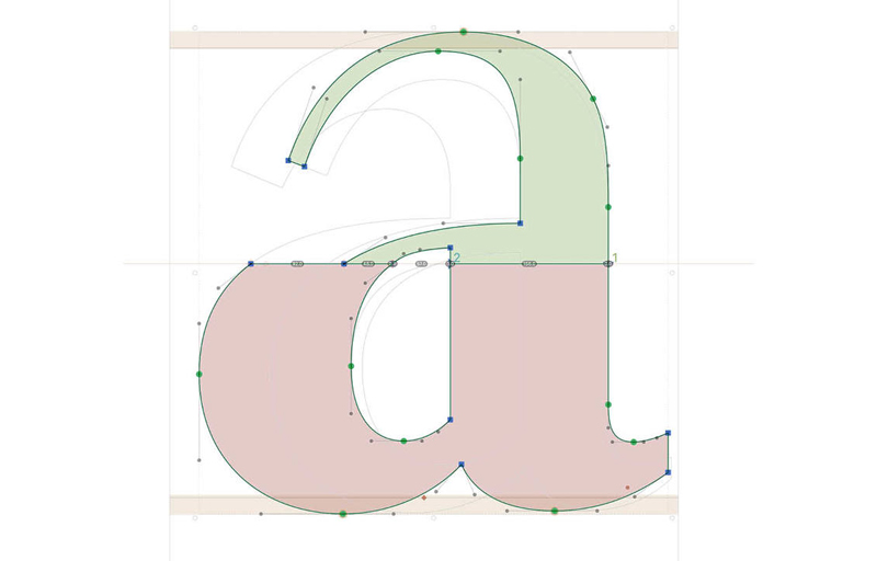
Astrid Stavro, the artistic director of Atlas Design, worked on a typeface about the city where she lives and works: Trieste. The Italian city has a dual personality, with architecture inspired by Austria (the closest neighbor) and a very Italian lifestyle. The designer worked on a typeface that reflects this and uses type features to […]
The Easiest Way to Find a New Job
Post pobrano z: The Easiest Way to Find a New Job
As a highly talented developer or designer, shouldn’t companies apply to you? On Hired the traditional process of finding a job is completely reversed. Hired expedites the job search process through an efficient system of:
- Companies competing for top talent with visibility into a candidate’s traction on Hired, driving rapid turnaround times from interview to final offer.
- Free personalized support on your job hunt. On Hired our Talent Advocates have your back, whether it’s negotiating compensation or preparing for interviews.
- Upfront salary, equity and bonus details in every interview request.
Direct Link to Article — Permalink
The Easiest Way to Find a New Job is a post from CSS-Tricks
The Simpsons “600”
Post pobrano z: The Simpsons “600”

Brilliant transitions from We Are Royale using pink liquid as a narrative through-line.