As an online professional, you no doubt spend a portion of your time working with photo content. Clients may provide some photo material, and some may come from stock photo resources. The quality may vary; but even when it’s good, you often wish it would be better, or have greater eye-catching appeal. The problem is, […]
2017 is already underway! So kick off the new year with amazing tutorials featuring the latest trends in graphic design and illustration. Tackle some new and exciting projects by checking out the following tutorials from across the web!
10 Amazing Tutorials From Across the Web
Drawing and Animating Horses: A Flipbook Tutorial
In this tutorial, our very own Monika Zagrobelna teaches you how to draw and animate horses using Sketchbook. Learn how to create your own amazing animal animations while getting a complete anatomy breakdown.
How to Create a Pair of Headphones in Adobe Illustrator
In this tutorial, our very own Envato Tuts+ instructor, Hector Heredia, breaks down the steps for creating a minimalist pair of headphones in Adobe Illustrator. Learn how to create this cool design using simple shapes and gradients.
Need a new calendar? In this tutorial, Jo Gulliver shows you how to create a 2017 calendar with charming minimalist elements in Adobe InDesign. Learn how to create the calendar from scratch before adding your own unique design.
You can make all sorts of animals using simple geometric shapes. And in this tutorial, Dorota Pankowska shows you how to make 13 different animals in Adobe Photoshop and Illustrator before finally editing them with cool animations in After Effects.
In this tutorial, Mike Harrison shows you how to blend multiple photos together for a powerful photo manipulation. Learn simple photo collage techniques, how to apply realistic lighting, and more in this thorough tutorial.
Change Colors to Match 2017’s Visual Trends in Photoshop
The bold theme for 2017 is to use bright, contrasting colors. And in this tutorial, Tigz Rice shows you how to transform the boring background of a photo into a clean, and vibrant color.
How to Create a Vintage Film Text Effect in Photoshop
Relive the classic film styles of the 30s and 40s with this fun project. In this tutorial, Chris Spooner shows you how to create a vintage themed text effect using Photoshop’s 3D tools.
How to Create a Winter Background in Adobe Illustrator
Snuggle up with a warm cup of hot chocolate and dig into this fun project. In this tutorial, Laura Martin walks you through the process of creating a simple winter-themed background in Adobe Illustrator.
How to Create an Intense Composite of a Stone Tiger With Blue Flames
In this tutorial, Moustafa Sharaf shows you how to create an incredible fantasy photo manipulation in Adobe Photoshop. Learn how to use basic adjustments, textures, and masks to create this intense tiger photo manipulation.
Nothing is more beautiful than a photo taken capturing a sunset. And you can create your own magical sunsets with this tutorial. Instructor James Paterson will show you how to create beautiful sunset scenes by stitching several photos together.
Top 5 Tutorials from Envato Tuts+ Design & Illustration
Our experts have provided you with many great tutorials this month! Here are five of our most tried and tested tutorials from the Design and Illustration section here at Envato Tuts+.
Be sure to check out this month’s Love Week, featuring tutorials dedicated to all things love and wedding related. And see entries from our latest Envato Tuts+ Community Challenge: Created By You, celebrating the incredible efforts of our talented community.
Before you go, be sure to pick up some amazing premium design assets from GraphicRiver and Envato Elements. Browse the incredible selections of design graphics, fonts, and so much more for high-quality design.
Create a stunning animated GIF with this incredible Photoshop action. This action allows you to apply billowing smoke onto your photos for a cool double exposure effect. Save the final result as a static image or enjoy the animation as a GIF in all its beautiful wonder.
Celebrate your love with this lovely Photoshop action. This action allows you to turn your photos into a sweet Valentine’s Day greeting card with one professional watercolor action. Download this action to enjoy 20 color presets and more!
Enjoy this incredible package of 25 abstract Photoshop brushes. This pack features incredible line wave designs that you can incorporate into any creative project. With high-resolution shapes, you’ll definitely want to add this set to your collection!
Or try your hand at our incredible digital painting tutorials with this huge Photoshop brush pack. Included in this set are 30 Photoshop brushes inspired by traditional art strokes. They’re suitable for any painting or decorative element, so have fun using these brushes for your designs.
Create amazing illustrations with this huge Adobe Illustrator brush set. Included in this set are over 50 Illustrator brushes to make your art stand out. Enjoy the calligraphic styles that are fully editable and 100% handmade.
Get out of the cold and create some stunning art with this brilliant Illustrator brush set. Inspired by natural snow and ice textures, this set features over 30 powerful brushes for a range of effects. Simply draw over your graphics to apply wintry effects instantly!
Create instant embroidered text effects with this amazing Photoshop action. This package features four different actions with three realistic materials and nine different styles. Enjoy this insanely realistic embroidery effect, and transform virtually any text or shape in no time!
Create your own video game-inspired text effects with this amazing package. This package features 12 different styles that are 100% vector and fully editable for easy customization. Download this package to enjoy the free vector backgrounds also included!
Enjoy the sleek design of this brilliant sans-serif font. Developed to inspire your inner epicness, this font features a futuristic stencil design that’s great for logos, headers, and more. Download this font to enjoy the multiple style options.
Handmade-styled graphics are a huge hit in the design industry. And this beautiful handlettering typeface features a stylish brush design perfect for apparel, posters, and more. Included in this package is a full set of letters, numbers, and additional style options.
Despite the fact that many people nowadays use their smartphones to check the time, the clock remains one of the most popular items of the interior. There is a huge
variety of shapes and colors and types of clock around us: kitchen timers, alarm
clocks, flip clocks, wall clocks, cabinet clocks, and many other kinds of clock.
In this
tutorial we’ll be creating three different types of clock in a trendy flat
style, applying solid colors and geometric shapes. We’ll learn to design the
clock face, working with the Rotate Tool
and using other handy tools and functions of Adobe Illustrator.
By the end
of this tutorial, you’ll be able to create any kind of flat objects, whether
those are flat clock icons or cooking icons or anything else. Make sure you’ve
browsed the vector section of GraphicRiver for more inspiration. And let’s
start!
1. How to
Design a Kitchen Timer
Step 1
We’ll start
by making the clock face. Use the Ellipse
Tool (L) to create a 95 x 95 px
light-beige circle.
Copy the circle and Paste in Back (Control-C > Control-B). Scale the copy up to 175 x 175 px, setting its new size either
in the control panel on top or in the Transform
panel. Make the Fill color a bit
darker.
Step 2
Let’s
depict the minute and second graduation marks of the clock face, starting from the top.
Grab the Line Segment Tool (\) or
the Pen Tool (P), hold Shift and make a short line with red Stroke color. Head to the Stroke panel and set the Weight to 2 pt and Cap to Round Cap, making the line thick enough
and rounded at the tips.
Step 3
Select the stroke with the Selection Tool (V), hold Alt-Shift and drag down to make a copy at the bottom of the clock face. Group (Control-G) the created strokes.
Make sure
that both strokes are centered perfectly. To do this, select the strokes together
with the circle and click the circle once again to make it a Key Object. Open the Align panel and click Horizontal Align Center.
Duplicate (Control-C > Control-F) our group of strokes and rotate the copy 90 degrees.
Step 4
Now we’ll
be adding minor graduations for 60 seconds. Duplicate
those vertical red strokes that we created earlier, change the Stroke color to brown, and set the Weight to 1 pt. You can make the red strokes invisible by clicking the eye icon in the Layers panel in order not to be distracted by them.
Step 5
Keeping our
group of strokes selected, double-click
the Rotate Tool (R) and set the Angle to 360/60 in order to calculate the value automatically. Click Copy to create a new pair of strokes.
Press Control-D to repeat the last
action and continue pressing Control-D
to add all 30 pairs of strokes.
Now we can make the red strokes visible again and Bring
them to Front (Shift-Control-]),
above the brown strokes.
Step 6
Now we’ll
move on to the body or the case of our timer. Take the Rectangle Tool (M) and make a 140 x 145
px red rectangle. Send it to Back (Shift-Control-[), beneath the clock face.
Select both the left and right top anchor points of the rectangle with the Direct Selection Tool (A) and pull the circle markers of the Live Corners to make the top of the
shape fully rounded.
Step 7
We can
also set the Corner Radius of the
top corners to 15 pt in the control
panel on top, while keeping them selected with the Direct Selection Tool (A).
Now we’ll
add some dimension to our shape, creating a rim around the clock case.
Select the case and go to Object >
Path > Offset Path and set the Offset
value to 5 px, leaving all other
options as default. Make the new shape a bit darker.
Step 8
Take the Rounded Rectangle Tool and let’s add a
small stand in the bottom of the case. Create a 115 x 15 px dark-red shape with 7.5
px Corners.
Step 9
Let’s add a
hand to our timer. Take the Ellipse
Tool (L) and make a 25 x 90 px red
oval. Pick the color from the case of the clock using the Eyedropper Tool (I).
Duplicate the oval and squash it to 9 x 88 px, making the top shape a bit
lighter.
Step 10
Switch to
the Rectangle Tool (M) and make a 33 x 55 px dark-red shape. Send it Backward, beneath the hand, by pressing Control-[ twice.
Make the
top corners of the shape slightly rounded, setting the Radius to 9 px.
Step 11
We need to
make the bottom of the shape slightly arched to make it fit the clock face.
Take the Curvature Tool (Shift-‘)
and pull the bottom edge down to bend it.
Step 12
Let’s add a
final detail to our timer: a gentle highlight over the plastic case. Use the Rectangle Tool (M) to make a 55 x 190 px shape of a slightly lighter
red color than we have for the case.
Select both
the case and the rectangle and take the Shape
Builder Tool (Shift-M). Hold Alt
and click the top piece of the rectangle to delete it.
Step 13
Delete the
bottom piece of the rectangle using the same method—and there we have it! Our
kitchen timer is finished!
Let’s move
on to the next clock.
2. How to
Create a Flip Clock
Step 1
We’ll start
designing our flip clock from its screen. Arm yourself with the Rounded Rectangle Tool and make a 170 x 85 px light-yellow shape with 8 px Corner Radius.
Keeping the
shape selected, go to Object > Path
> Offset Path and apply 10 px
Offset value. Fill the new shape with dark-green color.
Step 2
This time
either apply Offset Path once again
or just create a new rectangle of 210 x 130
px size beneath the previous two. Fill it with vivid turquoise color and
set the Corner Radius to 25 px, thus depicting a plastic clock case.
Add a
darker rim to the turquoise shape by either adding a 3 px Offset Path or by creating a 220 x 140 px rectangle with rounded corners.
Step 3
Create a 170 x 10 px dark-turquoise rounded
rectangle for the stand and Send it to Back (Shift-Control-[).
Let’s make
some buttons. Add another rounded rectangle of 120 x 25 px size on top of the clock, filling it with the same
dark-green color as we have for the edge of the screen. Place the button beneath the clock
case. Add another button on the right side of the clock, applying a
dark-turquoise color.
Step 4
Now it’s
time to add the figures! I’m using the Type
Tool (T) and Bebas free font to set the time to 19:30.
Object > Expand the text, turning it into editable curves.
Step 5
Move each
figure separately, if needed, so that the spacing between 9 and 3 is slightly
larger than the rest of the gaps.
Take the Rounded Rectangle Tool and let’s add 37 x 76 px dark-green shapes for the
flipping elements beneath each figure.
You can
create one rectangle on the left and then just drag it to the right while
holding Alt-Shift to create a copy.
Then press Control-D twice to
repeat your last action.
Use the Align panel to align the
rectangles to the Horizontal Center
of the figures.
Step 6
Use the Line Segment Tool (\) or the Pen Tool (P) to add a divider. Hold Shift and make a vertical dark-green
line across the center of clock face. Set the Weight to 2 pt in the Stroke panel.
And now
let’s split the figures apart as well. Take the Rectangle Tool (M) and make a narrow horizontal stripe across the
display (I filled it with red color to make it clearly visible).
Now select
only the figures and Object >
Compound Path > Make (Conrol-8), uniting separate elements into a
single object.
Step 7
Select the
compound path together with the red rectangle and apply the Minus Front function of
the Pathfinder to cut the stripe out, leaving a horizontal gap across all the
figures.
Step 8
There we
have it! Our flip clock is finished. Now we can move on to the next one!
3. How to
Make a Modern Wall Clock
Step 1
As previously,
we start by designing the clock face. Take the Rounded Rectangle Tool and make a 120 x 120 px light-beige square. Apply Object > Path > Offset Path with 5 px Offset value and make the new shape somewhat darker.
Step 2
Now either
use Offset Path again or create a
new 150 x 150 px rectangle with 13 px Corner Radius. Fill the new shape
with vivid orange color and Align it
to the clock face (as to the Key Object),
if needed, clicking Horizontal Align
Center and Vertical Align Center.
Apply a 5 px Offset Path to the orange shape
and make the rim slightly darker, adding dimension to the clock.
Step 3
Let’s start
adding the graduation marks to the clock face. Use the Ellipse Tool (L) and hold Shift
to make a 12 x 12 px orange circle on
top of the face. Hold Alt-Shift and
drag the circle down, creating a copy at the bottom of the face.
Group (Control-G) both circles and Align them to the clock face.
Step 4
Duplicate (Control-C > Control-F) our group of circles and rotate the
copy 90 degrees.
Duplicate the vertical group once again and let’s add
other type of graduation mark. Set the Fill
color of the copy to None and the Stroke color to dark-blue. Set the Weight to 2 pt in the Stroke
panel.
Step 5
Double-click the Rotate
Tool (R) and set the Angle value
to 30 degrees. Click Copy and continue by pressing Control-D multiple times to add all 12
circles to the clock face.
Step 6
Bring the orange circles of the graduation to Front (Control-]) to cover the
dark-blue circles.
Now let’s add the hands of the clock! Start by
making a red circle in the center and Align
it to the clock face.
Make a short vertical dark-blue stroke using
the Line Segment Tool (\), and set the Weight to 7 pt and the Cap to Round Cap, this way creating an hour
hand. Send it Backward (Control-[), beneath the red circle.
Step 7
Add a
minute hand, making it longer and decreasing the Stroke Weight to 4 pt.
Finally,
depict the second hand, changing the Stroke
color to red and the Weight to 3 pt.
Step 8
Let’s add
minor details to the clock face. Use the Ellipse
Tool (L) to create a large oval over the bottom half of the clock face. Now
select both the clock face and the oval, switch to the Shape Builder Tool (Shift-M), and single-click the top part of the clock face to split it apart. Make
the top part slightly darker, creating an overtone.
Step 9
Voila! Our
wall clock is completed!
Tick-Tock
on the Clock! Our Clock Icons Set Is Finished!
Great job! I hope you’ve enjoyed following this tutorial and discovered some useful new tips and tricks.
You can
continue expanding this set and create more clock icons, like those in the image
below.
Did you know that during the early 20th century, pizza was mainly only consumed by working class Italian immigrants, but quickly rose in popularity when WWII soldiers returned to their homeland with a craving for the cheesy dish? Or how about that the top 5 highest selling pizza days are the Super Bowl, Halloween, the day before Thanksgiving, New Year’s Eve, and New Year’s day.
It’s no surprise that pizza is a dish loved by many around the world, regardless of culture or region. For this reason, I’ve put together a collection of 28 pizza themes logos for your inspiration. Enjoy!
Credit to respective artists.
credit:Grace Winkler
credit:Arman
credit:Carl Foster
credit:Blin Varfi
credit:Anna Rowe
credit:Baktiyar Duisheev
credit:Brando Punk
credit:Bojan Viner
credit:Forrest Williams
credit:Tiberiu Sirbu
credit:AsbeenDesign
credit:Brett Garwood
credit:Vlad Markov
credit:Chris Ladwig
credit:Tom Deja
credit:Tom Deja
credit:last spark
credit:Jeremy Richie
credit:Alex Anderson
credit:Marco
credit:Jacob Johnson
credit:GELDY
credit:Luis Alvaro
credit:Grace Winkler
credit:Yuri Kartashev
credit:Igor Levin
credit:Sophie Harrington
credit:Andrey Gargul
Conclusion
I’ll be honest; I’m craving pizza right now… It’s definitely my go-to meal because it rarely ever disappoints. It’s safe to say that many other people agree with me.
Americans eat approximately 100 acres of pizza every day, or about 350 slices per second. That’s a lot of za!
I hope that you enjoyed this collection of fresh n’ delicious pizza logos. Thanks for stopping by!
There are a lot of things people want to convert their images into. Some want their images to become text files, and others want them to become other types of images. However, a frequent query people have is how they can convert an image file into a PDF file.
What are PDFs? PDFs are documents used for displaying multiple types of content under one file identity. Usually regarded as top format, PDF is definitely the way to go if you’re trying to edit text that’s laced with imagery. A clear example of such content is published issues of whatever type of text you want. Whether we’re talking about books, magazines or even newspapers, all are best suited for digitalization in PDF format. There’s no guarantee that this will always be the case, but until a superior format emerges, people will continue to use PDF documents to deliver their multimedia content in a high-quality package.
The topic of text images or images of text (such as the text in a magazine that instead of being written on a clean white canvas, is written on a patch of color or even an image) has been long debated. As far as text editing and manipulation goes, you definitely want to have your file in PDF format if you’re going to be able to do absolutely anything to it.
This is where most people struggle because their content is in another format. They think they need fancy editing tools that can cost a lot of money but in reality, they just need an image to pdf converter. The online versions are better because you don’t have to install any additional software to your system. If you’re the kind of person that enjoys a clean computer then this might be a perfect fit for you because online converting is all about keeping the PC clean.
The way this works is that you upload an image of your choice to the online tool and convert it in a matter of moments. Some might think it takes time but the way data processing works the entire thing is transmitted from one end to the other faster than you can blink. There are numerous such websites that offer image conversion so you are free to pick whichever you like. However, keep in mind that you can easily find an online converter that will swap your image format for PDF free of charge. If you stumble across an online tool that asks for money or a subscription, just try the next one because you don’t need to pay any money.
Post pobrano z: The Japanese toilet industry is working on standardizing… bidet icons! On the picture above, you can see a group of aged Japanese businessmen proudly carrying a board with the new icons they chose to represent complex bidet functionalities. The Japan Sanitary Equipment Industry Association met in order to standardize the icons used on complex bidets commonly used in Japan. This move is part of an […]
Post pobrano z: Design an innovative kitchen with different types of countertops Kitchen cabinets and countertops add a glamourous look to any kitchen. So, if you are a new homeowner, you can easily utilize the options of cabinets as well as other innovative items to make your kitchen look modern and different from others. In order to design and decorate your kitchen well, you need to know […]
TV2 in Denmark has launched “Alt Det Vi Deler” (All that we share), a commercial featuring 80 Danes from all walks of life, a challenge to growing attitudes of discrimination on the grounds of ethnicity in Denmark and across the world. The participants were given 40 questions to consider before filming. Throughout the shoot they were invited to cluster according to their responses. There was no requirement that they stick to their answers on the day of filming. The film was released on the same day that President Trump issued his executive order, “Protecting the Nation From Foreign Terrorist Entry Into The United States”. The commercial celebrates the concept of a tolerant and connected society in Denmark.
All that we share Transcript
It’s easy to put people in boxes. There’s us. And there’s them. The high earners. And those just getting by. Those we trust. And those we avoid. There’s the new Danes. And those who have always been here. The people from the countryside. And those who have never seen a cow. The religious. And the confident. There are those we share something with. And those we don’t share something with.
Welcome. I am going to ask you some questions today. Some might be a bit personal – but I hope you will answer them honestly. Who in this room was the class clown? Who are step parents? And then there’s suddenly us. We who believe in life after death. We who have seen a UFO. And all of us who love to dance. We who have been bullied. And we who have bullied others. And then there’s us who had sex this past week. We who are brokenhearted. We who are madly in love. We who feel lonely. We who are bisexual. And we who acknowledge the courage of others. We who have found the meaning of life. And those of us who have saved a life. And then there’s all of us who just love Denmark. So maybe there’s more that brings us together than we think. TV2Danmark All that we share.
All That We Share Credits
The TV2 All That We Share campaign was developed at &Co, Copenhagen.
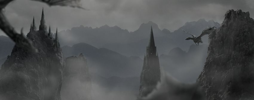
In this tutorial I’ll show you how to use Adobe Photoshop to create a mountainous landscape with flying dragons.
First we’ll build the misty background using three stock images. After that we’ll import the rocks and clone over them using the rock texture. Later we’ll add the towers and dragons and blend them together using adjustment layers, masking, dodge/burn, and brushes. We’ll also create a misty atmosphere using the sky image. Finally we’ll make several adjustment layers to complete the final effect.
Tutorial Assets
The following assets were used during the production of this tutorial:
Create a new 2000 x 798 px document in Adobe Photoshop with the given settings:
Step 2
Open the sky image. Drag this image into the white canvas using the Move Tool (V).
Step 3
Import the misty mountains image 1 and add it to the left of the canvas.
Click the second icon at the bottom of the Layers panel to add a mask to
this layer. Use a soft round brush with black color (soft black brush)
to remove the hard edges of the image.
Step 4
Duplicate
this layer and move it to the right edge of the canvas. Use a layer
mask with a soft black brush to blend it with the first layer.
Step 5
Select the mountain layers and press Control-G to make a group for them.
Change this group mode to Normal 100%. Go to Layer > New Adjustment
Layer > Curves and decrease the lightness.
Step 6
Use a Hue/Saturation adjustment layer and bring the Saturation value down to -82:
Step 7
Add the mountains 2 image and lower the Opacity to 30%:
Add a mask to this layer and use a soft black brush to remove the sky of this mountain image and make it blend more smoothly with the existing background.
Step 8
Create a Hue/Saturation adjustment layer and set it as Clipping Mask. Change the Saturation value to -85:
Step 9
Use
a Curves adjustment layer to darken the mountains a bit. These
mountains are nearer to the foreground so they should be hazier than the
ones farther away.
2. How to Add the Rocks
Step 1
Open the rocks 1 image and isolate the rocks from the background. Add two rocks to the left side and another to the middle. We’re aiming to create the light in the top middle, so arrange the rocks to fit this source.
Step 2
Create a new layer above the small rock on the left (behind the big
rock). Load the selection of the big rock on the left by clicking its
thumbnail layer while holding Control:
Press Control-C to copy the rock selection and then select the clipped
layer above the small rock one. Hit Control-V to paste the selection
into it. Now the small rock has similar textures to the big rock. Use a
layer mask with a lowered opacity brush to paint over the top so it appears slightly different from the original.
Step 3
Create a Color Fill layer for the small rock and pick the color #787a7a.
Lower the Opacity of this layer to 50%. We’re aiming to make this rock in the
mist area so it should be less visible.
Step 4
Create a new layer, change the mode to Overlay 100%, and fill it with 50% gray.
Select the Dodge and Burn Tool (O) with Midtones Range, Exposure about 15-20% to paint more details and enhance the light/shadow of the rock.
You can see how I did it with Normal mode and the result with Overlay
mode.
Step 5
Create a Curves adjustment layer above the middle rock to darken it,
especially the right. On this layer mask, use a soft black brush to
erase the left where it gets light from the sky.
Step 6
Make a group for all the rock layers. Create a Hue/Saturation adjustment layer and set the Saturation value to minimum (-100).
Step 7
Use a Color Balance adjustment layer and change the Midtones settings:
Step 8
Add a Curves adjustment layer and reduce the lightness. On this layer
mask, use a soft black brush to lower the effect of this adjustment
layer on the bright details of the rocks, especially the big rock and
the middle one.
Step 9
Open the rock 2 image. Select the bigger rock on the left and place it on the right side of our main canvas.
Step 10
Add the texture of the rock 1 to the rock 2 using the same techniques
as in step 2. Flip it horizontally by choosing Edit > Transform
> Flip Horizontal:
Step 11
Create a new layer and activate the Clone Tool (S) to fill the missing
areas of the rock 2 using the existing texture. Try to clone the
bright details over the front of the rock to fit the light source.
Step 12
Add a Hue/Saturation adjustment and bring the Saturation value down to -78:
Step 13
Use a Color Balance adjustment layer and change the Midtones values:
Step 14
Make a Curves adjustment layer to darken the rock. Paint on the bright details on the top of the rock to keep their lightness.
Step 15
Create a new layer, change the mode to Overlay 100% and fill with 50%
gray. Use the Dodge and Burn Tool to refine the light and shadow on the
rock.
3. How to Import the Towers
Step 1
Open the towers 1 image. Cut out the towers and place them above the big
rock on the left. You can duplicate and resize the towers and place them at different distances and positions.
Add a mask to each of these layers and use a soft black brush to blend their bottom with the top of the rock.
Step 2
Make a group for these towers and use a Hue/Saturation adjustment layer to desaturate them.
Step 3
Create a Color Balance adjustment layer and change the Midtones settings:
Step 4
Make a Curves adjustment layer to darken the hidden side of the towers (the left). Paint on the right to keep their lightness.
Step 5
Use another Curves adjustment layer to increase the light on the right
of the tower. The selected areas show where to paint on the layer mask.
Step 6
Place the tower 2 above the middle rock after isolating it from the
background and blend its bottom with the rock using a layer mask.
Step 7
Use a Hue/Saturation adjustment layer and reduce the Saturation value to -81:
Step 8
Make a Color Balance adjustment layer and alter the Midtones settings:
Step 9
Create a Curves adjustment layer and decrease the lightness. Paint on the left side, which is exposed under the light.
Step 10
Make a new layer, change the mode to Overlay 100% and fill with 50%
gray. Use the Dodge and Burn Tool to enhance the details, especially the
light/shadow of the tower.
Step 11
Use a Color Fill layer and pick the color #4b4c4c. Lower the Opacity of this layer to 40% to give it a hazy effect.
4. How to Add the Dragons
Step 1
Cut
out the dragons from the background and add the dragon 1 to the top
left and the second to the top of the right rock. Make the first much
bigger and the second much smaller.
Step 2
Select
the wing of the dragon 1 using the Lasso Tool (L) and place it in the
lower part of the space between the middle and the right rocks.
Step 3
To create some depth for the scene, on the dragon 1 layer, go to Filter > Blur > Gaussian Blur and set the Radius to 8 px:
Apply a Gaussian Blur of 12 px to the dragon’s wing as it’s nearer the foreground than the dragon 1.
Step 4
Create a new layer above the dragon 2 layer, change the mode to Overlay
100%, and fill with 50% gray. Use the Dodge and Burn Tool to refine the
details on this dragon.
Step 5
Make a group for the dragons and use a Hue/Saturation adjustment layer to desaturate the dragons’ color.
Step 6
Add a Color Balance adjustment layer and change the Midtones values:
Step 7
Create a Curves adjustment layer to darken the dragons. Paint on the outer details to keep them still bright.
Step 8
Use another Curves adjustment layer to increase the light on the outer details. Paint on the rest to keep them still in shade.
5. How to Create the Mist
Step 1
Duplicate the sky layer and move it on top of the layers. Use the Free
Transform Tool (Control-T) to reduce its size and place it between the
middle and the left rocks.
Use a layer mask to reduce the mist intensity and clear the hard edges.
Step 2
Duplicate the sky layer several times and move the copies around the space
between the rocks. Apply a layer mask to each of these layers. Don’t overdo it as it would look unnatural.
Step 3
Make a group for the sky layers and use a Curves adjustment layer to
decrease the visibility of the mist, making it appear more subtle.
6. How to Make the Final Adjustments
Step 1
Create a Photo Filter adjustment layer on top of the layers and pick the color #7da4fe.
Step 2
Make another Photo Filter adjustment layer and pick the color #00ecb7.
Step 3
Create a Curves adjustment layer and increase the lightness a bit. Paint
on the lower edges and sides to make the light visible only on the top
middle.
Step 4
Use another Curves adjustment layer to change the color and contrast of the whole scene.
Step 5
Make a Vibrance adjustment layer to enhance the final effect.
Congratulations, You’re Done!
I hope that you’ve enjoyed my tutorial and learned something new. Feel
free to share your ideas or comments in the box below—I’d love to see
them. Enjoy Photoshopping!
Agregator najlepszych postów o designie, webdesignie, cssie i Internecie