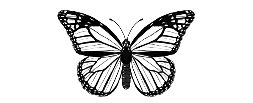
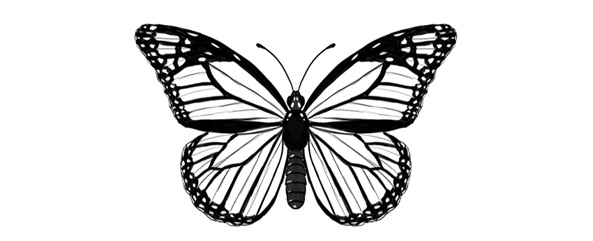
Butterflies are a wonderful drawing subject—their wings have a certain pattern that can be reduced to a few rules. Once you know the rules, you can draw a realistic-looking butterfly without any special drawing skills.
In this tutorial I will show you how to draw a monarch butterfly step by step, right from scratch. You can also modify my method to draw any other butterfly!
Before You Start
But what is it, this monarch butterfly? Let’s take a look before we start drawing:
Cross the torso in half with a vertical line. This will be the length of the body.
Step 3
Draw a longer oval below; this will be the abdomen.
Step 4
Connect the abdomen to the torso with a slim waist.
Step 5
Draw a circle on top of the body—this will be the head.
Step 6
Add two ovals on the sides of the head.
Step 7
Add two tiny ovals on the front of the head. These will be the short, furry antennae called palpi.
Step 8
Draw a pair of curves for the big antennae.
Step 9
End each antenna with tiny „beans.”
Step 10
You can now outline the body and add all the necessary details. The torso is fluffy, and the abdomen is segmented.
2. How to Draw Butterfly Wings
Step 1
Mark a dot in the upper part of the torso. This will be our point of reference for placing the wings.
Step 2
Draw a horizontal line across the point. Each half should be roughly as long as the whole body (antennae excluded).
Step 3
Draw two longer lines about 30 degrees over the previous line. You don’t need to measure anything—just eyeball it.
Step 4
Draw elongated teardrop shapes around these lines, as if it were a dragonfly.
Step 5
Draw a line from the end of the horizontal line to about 60% of length of that „dragonfly wing.”
Step 6
Gently outline the shape of the upper wing.
Step 7
The lower wing can be created in a similar way. Draw two lines down from the point, slightly below the abdomen.
Step 8
Draw a line between each end of the lines and the upper wings.
Step 9
Draw a line from the torso point to close the triangular shape of the wing right under the upper wing.
Step 10
Mark a point in the center of the farthest line of the triangle.
Step 11
Cross each point with a line coming from the torso.
Step 12
Outline the shape of the lower wing.
3. How to Draw the Cells of Butterfly Wings
Step 1
Now we’re going to divide each wing area into smaller areas called „cells.” First, mark three points in the area shown below.
Step 2
Draw an elongated cell through these marks.
Step 3
Use the same trick to draw a similar cell in the lower wing.
Step 4
There will be more cells starting here. Mark their starting points.
Step 5
Draw gentle curves from these points to the edge of the wing. Have them slightly falling down.
Step 6
The uppermost cell is divided into more cells:
Step 7
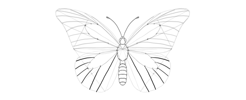
The lower wing has similar cells, going out radially from the middle:
Step 8
Each cell has a subtle „wrinkle” in the center, and it will be a useful guideline for us. Mark it subtly, to make it distinguishable from the veins.
4. How to Draw Patterns on Butterfly Wings
Step 1
Now we have plain butterfly wings, but it’s their pattern that makes them so beautiful! Let’s add a pattern specific for the monarch butterfly.
Create a margin for each wing, drawing curves between the veins.
Step 2
Mark the area where the wrinkle is—this place will be slightly less dark.
Step 3
Outline the edges of the wings, making them „bumpy” around the ends of the veins.
Step 4
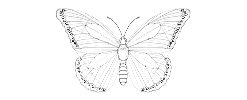
There is a pattern of bright dots in the margin. Outline them.
Step 5
The edges of the wings may look slightly ragged because of white lines placed between the veins and the wrinkles. This is a subtle effect, but it will add to the realism of the wings.
Step 6
Draw some markings in the upper part of the upper wings.
Step 7
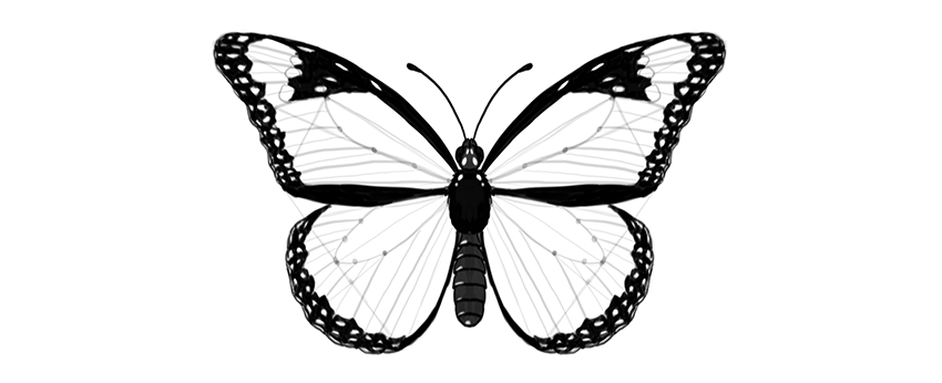
The pattern is created not by lines only, but mostly by contrast. So we need to darken certain parts to achieve realistic results. First, darken the body. It may have some pattern on it as well!
Step 8
Darken the side margins, leaving brightness where the markings are.
Step 9
Darken the margins, moving carefully around the little markings.
Step 10
Darken the area around the markings in the upper wing.
Step 11
The veins have a dark outline, so mark it. You can also subtly mark the wrinkles to make the drawing more detailed.
Beautiful!
Good job, you have drawn a beautiful butterfly! If you want to learn more about butterflies, their anatomy, and other species, make sure you check this tutorial as well:
I believe that there’s a sneakerhead in all of us. For some people, it might just be a simple love for sandals and for others a love of all sneakers; from Yeezy’s to New Balance. I myself am definitely a sneaker guy, having just bought a fresh new pair of Asics Gel-Lytes. Complex came up with the top 30 most influential sneakers of all time. The top 10 are:
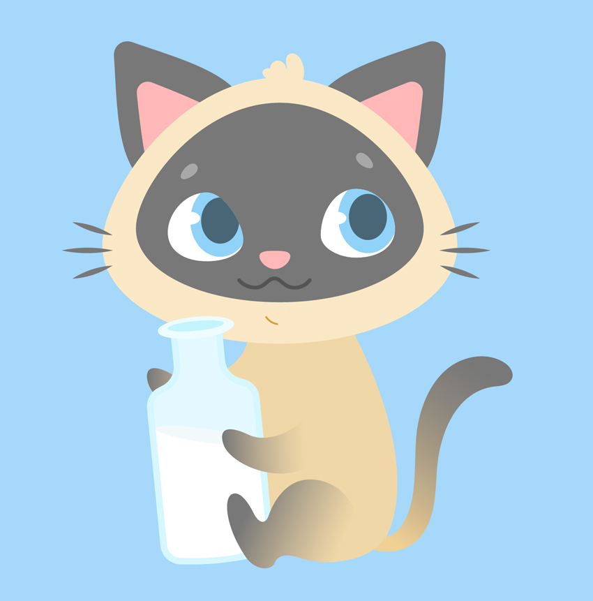
Ever wanted to illustrate a kid’s book or learn to design cute cartoon characters? This tutorial might be interesting for you! We’ll go through a fun and easy process of creating a cute Siamese kitten in Adobe Illustrator, using simple shapes, Warp Effects and the Pencil Tool with a bit of freehand drawing. Ready to begin?
By the end of this tutorial, you’ll have discovered new tips and tricks that you can apply to your future works, creating more characters like these Cute Cartoon Animals from GraphicRiver.
1. How to Draw the Cat’s Head
Step 1
Let’s start by creating a New Document of 600 x 600 px size and RGB Color Mode. Use the Rectangle Tool (M) to make a rectangle of the same size and Fill it with a light blue color for the background.
Step 2
We’ll start with the base of the head. Use the Ellipse Tool (L) to make a 285 x 215 px light beige oval. Selects its side anchor points with the Direct Selection Tool (A) and drag them a few pixels down, making the bottom of the shape somewhat flatter. You can move them by holding down Shift and either clicking and dragging with your mouse or by using the Down Arrow key of your keyboard.
Copy (Control-C) the shape and Paste in Place (Shift-Control-V). Hold down Alt-Shift and make the copy smaller. Change its color to pale grey.
Step 3
Let’s attach a couple of ears to the kitten’s head. Firstly, take the Polygon Tool (it is located in the same drop-down menu as the Rectangle Tool (M)) and single click anywhere on the Artboard to open the Options menu.
Set the Sides value to 3 and create a triangle of the same pale grey shape as we have for the face. You can use the Eyedropper Tool (I) to pick and apply the color if it isn’t selected in the Colors panel.
Now let’s transform the shape to make it look more like an ear. Keeping it selected, go to Effect > Warp > Bulge and set the Vertical Bend value to 40%;Horizontal Distortion to -10%. In this way, we’re bulging our shape and bending it to the left.
Object > Expand Appearance to apply the effect. Select its top anchor point with the Direct Selection Tool (A) and drag the circle marker of the Live Corners down, making the top of the shape rounded. We can also adjust the Corner Radius from the control panel on top, if needed.
Step 4
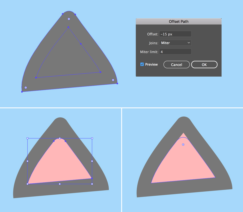
Keeping the shape selected, go to Object > Path > Offset Path and set the Offset value to -15 px, leaving all other options as Default. Click OK to create a smaller triangle and Fill it with rose pink color, thus creating the inner part of the ear.
Make the top of the pink shape rounded as well, using the Direct Selection Tool (A) and the Live Corners feature.
Step 5
Group (Control-G) both elements of the ear and attach them to the head, Rotating and resizing the ear to make it fit the head.
Double-click the Reflect Tool (O), select the Vertical Axis and click Copy to make a mirrored copy of the ear. Attach it to the opposite part of the head.
Step 6
Let’s go on and draw the face of our character. Use the Ellipse Tool (L) to make a 65 x 55 px white ellipse for the eyeball. Use the Direct Selection Tool (A) to shorten the right handle of the top anchor point and the top handle of the right anchor point, making the right edge of the eye more slanted.
Now add a 50 x 60 px light blue oval for the iris and a 30 x 37 px dark blue ellipse for the pupil. Place the shapes as shown in the screenshot below, covering the right half of the eyeball.
Step 7
Add a tiny white ellipse for the highlight, and let’s see how we can hide the unneeded parts of the iris.
Copy (Control-C) the white eyeball, Paste in Front (Control-F) and Bring to Front (Shift-Control-]). Now select all the elements of the eye, click the right mouse button, and Make Clipping Mask, thus placing everything inside the top copy, which serves as an imaginary container. All the shapes inside this container are still editable. You can find the Clip Group in the Layers panel, unfold it, and move, edit and rearrange the objects.
Step 8
Use the Reflect Tool (O) to Flip the eye over the Vertical Axis and make a Copy. Move the iris and its elements inside the Clipping Mask to fix the kitten’s gaze.
Step 9
Now let’s draw the nose. Make a 25 x 15 px light pink ellipse and reshape it a bit with the Direct Selection Tool (A), moving its top and bottom anchor points down to make it look more like a rounded upside-down triangle.
Make another ellipse of 13 x 12 px for the brow, Fill it with light grey color, and reshape it slightly. Rotate the brow and use the Reflect Tool (O) to add a second one.
Step 10
Let’s move on and depict a mouth. Use the Line Segment Tool (\) while holding down Shift to draw a straight horizontal line. Apply a dark gray Stroke color from the Color panel. Adjust the thickness of the line either from the control panel on top or from the Stroke panel (Window > Stroke) by setting the Weight to 3 pt and Cap to Round Cap.
Go to Effect > Distort & Transform > Zig Zag. From here, set the Size to 4 px, Ridges per segment to 3, and Points to Smooth. Adjust the Ridges per segment value if your result differs from the one presented in the image below.
Step 11
Object > Expand Appearance to apply the effect. Now we can edit the tips of the line using the Direct Selection Tool (A). Rotate the anchor handles down to make the corners of the mouth rounded.
Step 12
Let’s draw the whiskers using the Ellipse Tool (L). Make a 40 x 3 px dark-grey circle, select its side anchor points with the Direct Selection Tool (A), and Convert selected anchor points to corner from the control panel on top, making the tips of the ellipse sharp.
Duplicate (Control-C > Control-F) the shape a few times, making the copies smaller and Rotating them to add more whiskers.
Step 13
Finish off the kitten’s head by adding a funny tuft of hair on top, using the Pencil Tool (N). You can adjust the tool’s settings by double-clicking it to open the Pencil Tool Options window. From here, move the Fidelity slider further right if you want to make the lines smoother or further left if you’re using a graphic tablet and have a firm hand.
2. How to Draw the Kitten’s Body With the Pencil Tool
Step 1
Let’s start making the body with an ellipse. Create a 160 x 210 px ellipse of dark beige color. Use the Direct Selection Tool (A) to select both side anchor points and drag them down, making the shape look more like an egg.
Send the ellipse to Back (Shift-Control-[), beneath the head.
Step 2
Now grab the Pencil Tool (N) and let’s practice our hand drawing a bit. Draw a front right paw and attach it to the body, as shown below.
Let’s apply a simple Linear Gradient to the paw, making the kitten look more like a Siamese one. Use the Gradient panel (Window > Gradient) to apply a dark-grey color to the left slider and the Gradient Tool (G) to adjust the direction of the gradient, so that it blends nicely with the body.
Duplicate the paw and place the copy as shown in the screenshot below.
Step 3
Now let’s add the back paws. Use the Pencil Tool (N) to draw the desired shape of the paw, Send to Back (Shift-Control-[), and make it slightly darker than the body in order to separate the elements from each other. You can either apply the same gradient to this paw or not, because it will be hidden behind the bottle. In case you want to animate your character or change some of its details later, make sure you’ve applied the same gradient to all the paws. Just select the paws and use the Eyedropper Tool (I) to pick and apply the appearance.
Finish up with the body parts by adding a funny curled tail using the Pencil Tool (N), and Fill it with the same Linear Gradient.
Great! Looks like our kitten is ready! Let’s add a final detail to it.
3. How to Draw a Bottle of Milk
Step 1
As you might already know, cats are actually lactose intolerant and, hence, indifferent to milk. However, as we’re creating a kid’s illustration with an imaginary character, we can draw anything we want, whether it’s a milkshake or a green smoothie or a can of soda, depending on the purpose of the image. In our case, let’s make our kitten a milkshake lover!
So let’s start building our bottle from a 90 x 150 px light blue rectangle. Add a 40 x 65 px rectangle and place it over the top of the first one, forming a bottleneck.
You can Align both shapes either to the Artboard or to the Key Object, using the Align panel (Window > Align). Select both shapes and click Horizontal Align Center to Align to Artboard. If you want to align to one of the objects, click both shapes and click one of them once again. You will see a thicker selection around it, indicating that this is the Key Object.
Once you’re happy with the result, select both shapes and Unite them in the Pathfinder panel, merging them into one silhouette.
Step 2
Let’s select the corners of the bottle with the Direct Selection Tool (A) and make them rounded by pulling the circle marker of the Live Corners. Select the inner corners between the body of the bottle and the bottleneck, and smooth them out as well. You can adjust the Corner Radius from the control panel on top if you like round numbers, or you may leave it as it is if it looks good.
Grab the Curvature Tool (Shift-‘) and make the bottom of the bottle slightly rounded by bending its edge down.
Step 3
Go to Object > Path > Offset Path and set the Offset value to -5 px, creating a smaller silhouette inside. Fill it with the lighter blue color to make the glass edges of the bottle thick. Duplicate (Control-C > Control-F) the new shape and Fill the copy with white for the milk.
Step 4
Let’s make the bottle half-empty! Create an ellipse, Rotate it, and resize it, making it fit the inner part of the bottle. Select both the ellipse and the milk shape. Now grab the Shape Builder Tool (Shift-M), hold down Alt and, as soon as you see a tiny minus sign next to your mouse cursor, hover it over the top half of the milk shape. Once it becomes gray, single click it in order to Delete this piece. Great! Half of the milk is gone!
Step 5
Let’s form the top of the bottleneck. Make a 60 x 20 px ellipse and Fill it with a blue color slightly lighter than the body of the bottle. Create a smaller ellipse inside the first one to form a hole, either making it manually or using the Offset Path function.
Step 6
Now that the bottle is finished, let’s Group (Control-G) all of its elements and place it in the kitty’s paws. We can do it by positioning the bottle in the desired place and then either Sending it Backward (Control-[) a few times or dragging it down manually in the Layers panel.
Step 7
Let’s add a straw, making the image more detailed. Use the Pen Tool (P) to draw a polyline. Apply pink color for the Stroke in the Colors panel. Then open the Stroke panel and set the Weight to 4 pt, making the straw thicker.
As with geometric shapes, we can use the Live Corners function for the polylines. Just select the corner anchor point with the Direct Selection Tool (A) and make it slightly rounded.
Once you’re happy with how it looks, Object > Expand the line to turn it into a shape.
Step 8
Since the bottom part of the straw is located inside the bottle, its color should differ from the top part, as it is dimmed behind the glass.
Let’s see how we can achieve this effect. Select the straw and the inner ellipse of the bottleneck. Take the Shape Builder Tool (Shift-M) and single-click the bottom part of the straw once it becomes gray. Notice that this time we’re not holding down Alt or any other key because we want to divide the shape, slicing the straw into two parts.
Fill the bottom part with lighter pink color and Send Backward (Control-[) a few times, partially hiding it beneath the bottleneck.
Step 9
This is how it looks now all together. Don’t forget to Bring the mouth shape to Front (Shift-Control-]), covering the tip of the straw.
Step 10
Let’s finish our illustration by adding any minor details to our liking. For example, here I’ve speckled a group of dark blue ellipses, placing a shadow beneath the kitten.
Meow! Our Cute Kitten Illustration Is Finished!
And there we have it! Great job!
If you want the check out the source file to see all the details, or if you need the whole set of fancy characters for your designs, you can grab these Cute Cartoon Animals on GraphicRiver.
I hope you enjoyed following this tutorial and learned some simple tips and tricks that will help you speed up your work to create more fancy cartoon character illustrations!
I know there are a ton of pure CSS cube tutorials out there. I’ve done a few myself. But for mid-2017, when CSS Custom Properties are supported in all major desktop browsers, they all feel… outdated and very WET. I thought I should do something to fix this problem, so this article was born. It’s going to show you the most efficient path towards building a CSS cube that’s possible today, while also explaining what common, but less than ideal cube coding patterns you should steer clear of. So let’s get started!
HTML structure
The HTML structure is the following: a .cube element with .cube__face children (6 of them). We’re using Haml so that we write the least amount of code possible:
.cube
  - 6.times do
    .cube__face
We’re not using .front, .back and classes like that. They’re not useful because they bloat the code and make it less logical. Instead, we’ll use :nth-child() to target the faces. We don’t need to worry about browser support for that, since we’re building something with 3D transforms here, which assumes much newer browser support!
Basic styles
All these elements are absolutely positioned:
[class*='cube'] { position: absolute }
The .cube is the child of a scene element which is the body in our case because we want to keep things as simple as possible. If we had multiple 3D shapes within the scene and we wanted them to interact in a 3D manner, then our cube would have been a child of that assembly and the assembly would have been a child of the scene.
We make the body cover the entire viewport and set a perspective on it so that whatever is closer looks bigger and whatever is further away looks smaller.
body {
  height: 100vh;
  perspective: 25em
}
Something else that I often like to do when the full-height body is the scene is to set the font-size on the .cube such that it depends on the minimum viewport dimension. This makes our whole cube scale nicely with the viewport if I then set the cube dimensions in em units.
.cube { font-size: 8vmin }
The reason why I’m not setting the cube dimensions directly in vmin units is an Edge bug.
We then give the .cube element a transform-style of preserve-3d so that its cube children don’t get flattened into its plane in case we decide to animate it and we put it in the middle of the scene using top and left offsets. This is the initial positioning of the cube and it’s best to use offsets, not a translate() transform for this. I’ve seen that sometimes people get confused about this because they’ve heard that, for performance reasons, it’s better to use transforms, not offsets… that’s true, but it applies for animating the position, not for the initial positioning. The very simple rule here is: use offsets or margins, whichever is more convenient at that point for initial positioning, use transforms from animating the position starting from that initial position.
We then pick a cube edge length and set it as the width and height of the cube faces. We also give the faces a negative margin of minus half the cube edge so that they’re dead in the middle. Again, this is related to the initial positioning the cube faces. We also give them a box-shadow just so that we can see them.
I often see code where transform-style: preserve-3d has been set on everything. That’s unnecessary and a misunderstanding of how preserve-3d works. It’s only necessary to set it on something that’s going to have a 3D transform applied (right away, following user interaction, via an auto-running animation… doesn’t matter how) and has 3D transformed children. In our particular case, that’s just the .cube element. The scene doesn’t get transformed in 3D and the .cube__face elements don’t have children.
Another unnecessary thing I see is setting explicit dimensions on the .cube element. This element isn’t visible. We don’t have any text directly in it, we’re not setting and backgrounds, borders or shadows on it. Its only purpose here is to serve as a container whose position we can animate in order to easily move all its face children at once, in the same way. Not setting any dimensions on this absolutely positioned .cube element means that its dimensions are computed to 0x0, so it’s also pointless to set any %-value offsets on its face children. top: 0 is the exact same thing as top: 50% or as any other percent value for an element whose parent has 0x0 dimensions. The same is valid for all the other offsets (right, bottom, left).
I’ve been asked why not set top and left for the .cube to calc(50% - #{.5*$cube-edge}) and remove the margin from the .cube__face altogether if I care about compacting code so much. Well, that’s because the two don’t really produce the same result, even though the .cube__face elements do end up in the middle of the screen in both cases. To illustrate this, let’s give our .cube element a red box-shadow just so that we can see it and check out the two cases side by side:
In the above demo, our .cube element is positioned differently in the two cases. When using the calc() value for its offsets and skipping the margin on its children, its position doesn’t coincide with the middle of the scene anymore, but with the top left corner of its face children. So what? It’s not going to be visible in our actual demo anyway…
While that’s true, a different position also means a different transform-origin. And that changes things if we decide to rotate or scale our .cube (and that’s something we decided we’d do). So consider the following keyframe animation for our cube:
@keyframes rot { to { transform: rotateY(1turn) } }
This is a rotation around the cube’s y axis. The result is not the same for the two cases:
In both cases, the faces rotate around the y axis of their parent cube, but the position of this y axis relative to the faces is different. It coincides with the faces’ y axes in the initial case, and with the faces’ left edges in the second case. This is the reason why I’m not bringing the negative margin of the cube faces into the offsets of the parent cube: it would impact animating the cube in 3D.
Building the cube with transforms
What we have in the demos above isn’t a cube yet. In order to do that, we need to position the faces in 3D. There are multiple transform combinations that achieve the same effect, but the most efficient and logical one is to start by rotating the first four faces in increments of 90° around one of the axes in their plane (x or y) and the remaining two faces by ±90° around the other axis in the same plane. Then we chain a translation of half the cube edge length along the axis that’s perpendicular onto their plane (their z) axis.
A very detailed explanation of how translations and rotations work as well as how we get the transform chains for creating a cuboid can be found in this older article. The case of a cube is a simplified version where all dimensions along the three axes are equal.
Considering we choose to rotate the first four faces around their y axes, our transform chains look as follows:
Now we replace the rotateY(ay) and rotateX(ax) components with their rotate3d(i, j, k, a) equivalents. The i, j and k in the rotate3d() function are the components of the unit vector of the rotation axis along the x, y and z axes of coordinates, while a is the rotation angle around that rotation axis.
Since the rotation axis in the case of a rotateY() is the y axis, the components of the unit vector along the other two axes (i along the x axis and k along the z axis) are 0, while the component along the y axis (j) is 1. Also, a is ay in this case.
Similarly, in the case of a rotateX(), we have that i is 1, j and k are 0 and a is ax. So our equivalent chains using rotate3d would be:
We notice a few things in the code above. First of all, the k component is always 0. Then, the i component is 0 for the first four faces and 1 for the remaining two, while the j component is 1 for the first four faces and 0 for the last two. Finally, the angle value can always be written as a multiplier times 90°.
This means we can introduce CSS variables into our code so we don’t have to repeat those transform functions:
Since both --i and --j each keep the same value for the first four faces and get a different one only for the last two, we can set their defaults to be 0 and 1 respectively and then switch them to 1 and 0 respectively for faces 5 and 6. These two faces can be selected by :nth-child(n + 5). Also, we can set the default for --m to be 0 and thus completely eliminate the need for the :nth-child(1) rule.
Pushing things a bit further, we notice that, whether it’s 1 or 0, --j can be replaced with calc(1 - var(--i)) and that --m is either the face index for the first four faces or -1 raised to the face index for the last two faces. This allows us to eliminate the --j variable and set the multiplier --m within a loop:
Those of you not using a WebKit browser may have noticed that the above demos don’t work. This is because, currently, Firefox and Edge don’t support using calc() values in place of much else other than length values. This includes the unitless and angle values within rotate3d(). A way to make things cross-browser would be not to replace --j with the calc(1 - var(--i)) equivalent and use an angle --a custom property instead of the calc(var(--m)*90deg):
After this, there’s one more itch to scratch: what about not having the cube auto-animated using CSS keyframes, but instead rotated on drag? Let’s see how we can do that!
We start by selecting our .cube element and we establish what happens during the stages of the drag. On mousedown/ touchstart, we lock everything into place for the cube rotation. This means setting a drag flag to true and reading the coordinates of the point where this happens, which are also the coordinates where the first movement detected by mousemove/ touchmove is going to start. On mousemove/ touchmove, if the drag flag is true, we rotate our cube. On mouseup/ touchend and again, only if the drag flag is true, we perform a release-like action: we set the drag flag to false again and we clear the initial coordinates.
const _C = document.querySelector('.cube');

let drag = false, x0 = null, y0 = null;

/* helper function to handle both mouse and touch */
function getE(ev) { return ev.touches ? ev.touches[0] : ev };

function lock(ev) {
  let e = getE(ev);
      drag = true;
      x0 = e.clientX;
      y0 = e.clientY;
};

function rotate(ev) {
  if(drag) { /* rotation happens here */ }
};

function release(ev) {
  if(drag) {
    drag = false;
    x0 = y0 = null;
  }
};

addEventListener('mousedown', lock, false);
addEventListener('touchstart', lock, false);

addEventListener('mousemove', rotate, false);
addEventListener('touchmove', rotate, false);

addEventListener('mouseup', release, false);
addEventListener('touchend', release, false);
Now all that’s left to do is fill up the contents of the rotate() function!
For every little movement caught by the mousemove/ touchmove listeners, we have a start point and an end point. The coordinates of the end point (x,y) are those we read via clientX and clientY every time the mousemove/ touchmove fires. The coordinates of the start point (x0,y0) are either the same as those of the end point of the previous little movement or, if there was no previous movement, those of the point where mousedown/ touchstart fired. This means that, after doing everything else we need to do within the rotate() function, we set x0 to x and y0 to y:
function rotate(ev) {
  if(drag) {
    let e = getE(ev),
        x = e.clientX, y = e.clientY;

    /* rotation code here */

    x0 = x;
    y0 = y;
  }
};
Next, we compute the coordinate differences between the end point and the start point of the current little movement along the two axes (dx and dy), as well as diagonally (d). If d is 0, then we haven’t really moved (and maybe nothing should fire, but just in case), so we just exit the function without doing anything else, not even setting x0 and y0 to x and y respectively – they’re the same in this case anyway.
function rotate(ev) {
  if(drag) {
    let e = getE(ev),
        x = e.clientX, y = e.clientY,
        dx = x - x0, dy = y - y0,
        d = Math.hypot(dx, dy);

    if(d) {
      /* actual rotation happens here */

      x0 = x;
      y0 = y;
    }
  }
};
The way we handle rotation on drag starting from the previous state which may be transformed in some way is the following: we chain a rotate3d() corresponding to the current little movement to the computed transform value of our cube at the start of the current little movement. That is, unless the computed transform value is none, in which case we chain it to nothing. We could write this whole transform chain into a stylesheet or as an inline style or… we could again use CSS variables!
In the CSS, we set the transform property of the .cube element to a rotate3d(var(--i), var(--j), 0, var(--a)) chained to a previous value of the transform chain var(--p). In order to simplify things, we keep the component of the unit vector of the axis of rotation along the z axis fixed to 0.
Because we’ve done the above and CSS variables are inherited, we now need to explicitly set --i and --j for the .cube__face elements to 0 and 1 respectively. Otherwise, the values inherited from the .cube element get applied, not the defaults specified within var().
Going back to the JavaScript, we read the computed transform value and set it to the --p variable. The angle of rotation depends on the distance d between the start and end points of our current little movement and a constant A. We limit this result to two decimals. For a direction of motion towards the top, in the negative direction of the y axis, we rotate the cube clockwise around the x axis. This means we take the --i component to be -dy. For a direction of motion towards the right, in the positive direction of the x axis, we rotate the cube clockwise around the y axis, which means we take the --j component to be dx.
const A = .2;

function rotate(ev) {
  if(drag) {
    let e = getE(ev),
        x = e.clientX, y = e.clientY,
        dx = x - x0, dy = y - y0,
        d = Math.hypot(dx, dy);

    if(d) {
      _C.style.setProperty('--p', getComputedStyle(_C).transform.replace('none', ''));
      _C.style.setProperty('--a', `${+(A*d).toFixed(2)}deg`);
      _C.style.setProperty('--i', +(-dy).toFixed(2));
      _C.style.setProperty('--j', +(dx).toFixed(2));

      x0 = x;
      y0 = y;
    }
  }
};
Finally, we can set some arbitrary defaults for these custom properties such that the initial position of our cube makes it look a bit more 3D than viewing it right from the front would.
The unquote(' ') value is due to using Sass. While an empty space is a perfectly valid value for a CSS custom property in plain CSS, Sass throws an error when seeing stuff like var(--p, ), so we need to introduce that „no value” default using unquote().
The result of all the above is a cube we can drag using both mouse and touch:
I bet you have a style that you write CSS in, for the most part. You like 4-spaces, say. You always have a space after braces and colons. You always put a space after rulesets. You only ever put one declaration on a line, and the only declarations that can be multi-line are when they are big blocks like a gradient or a comma-separated box-shadow.
You might take this a little further and codify this. Perhaps you have a team meeting about it and decide on how you want to style code. You write up a guide and make it available for everybody on the team to see.
GitHub’s Primer contains „code guidelines” like this.
Clean code is important, you say. While style differences in code don’t actually matter in the final output (most of us have build processes in place that compress the code anyway), it matters for day to day work. A messy inconsistent codebase is hard to look at and hard to reason about. Jumping into clean code makes it quicker to stay in the right frame of mind and get to working on the problem at hand, not waste cycles being frustrated by the mess.
[Tidy code] seems like a very superficial thing to worry about, but to my mind, tidy code signals something more important: I would assume that a tidy developer has better attention to detail, is more likely to follow process, and is more likely to spot mistakes. Rightly or wrongly, I see it as a litmus test for more general approaches and attitudes.
Automated Style Checking/Warning
A step beyond just agreeing on standards is having your computer actually help you make sure you’re doing it right.
I’d wager this is a far more common thing for JavaScript or server-side language programmers. For example, ESLint is very popular. You configure it with loads of rules based on what your team decides is good syntax.
ESLint running in Sublime Text through SublimeLinter
ESLint goes a litttttle further than just style checking, in that, for example, it knows if you use a function or not, or try to use a variable that is undefined. Tools like Rubocop for Ruby code are simliar. You can use them for style checking, but do more.
Style checking doesn’t have to happen in code editor itself. It’s pretty useful if it is, so you can fix problems immediately as you are authoring, but it doesn’t have to be. It might be more practical for a large and technologically-diverse team to make style checking part of the task running / build process setup.
For example, ESlint can be integrated into Grunt or Gulp, so when JavaScript files are processed, you see error output:
So there are multiple ways to incorporate style checking:
Within a local IDE
As part of a local task runner setup
As part of automated testing
Some combination of these
And you can take it even further. For example, treating linting errors like failing tests and preventing git workflow stuff. Like you can’t complete a merge request until everything passes.
You could say that stylelint (and ESlint) are unopinionated. They are intentionally super flexible. You can incorporate whatever rules you want to (or leave out rules), and even when you add rules, they are designed to be flexible by either enforcing the rule one way or another and even allowing exceptions.
More importantly, I’d call them unopinionated because they aren’t exactly passing judgment on your code. But what if you want a tool to pass judgment on your code?
„Hey, you’re using too many floats!”
„Hey, that property isn’t particularly well supported!”
Example rules of CSS Lint, like disallowing ID and disallowing too many web fonts.
There is some crossover for sure. CSSLint, for example, can check for duplicate properties just like stylelint can.
Can you use them together? Probably. Certainly, at the command line / task runner level you can. I’m not entirely sure how it would work to integrate them both into an IDE linter at the same time. Try it!
Maybe a comparison is helpful to wrap this part up:
Can’t these things be actually automated? Like actually fix the problems for me?
This is what got me thinking about this stuff in the first place. I like IDE-level linting quite a bit, but I think I like the idea of the automated fixing of style even more.
We’re essentially talking about „prettifying” here (also known as „code tidying” or „beautifying”).
The new super popular kid on the block for JavaScript is Prettier, which I’d say is a good choice. But that doesn’t help us with CSS.
There is another one, JS Beautifier, that does work with CSS (and HTML!)
Example of CSS options for JS Beautify
CSS Comb is another tool right up this alley. It is has far fewer options than stylelint (your call if that’s good or bad), and has a cool config builder for setting those rules. CSS Comb looks quite popular and well done, but I’m not going to recommend it any further, as it looks like they have stepped away from the project:
The tool is no longer being developed though we may still fix parsing errors and critical bugs. That means that you should not expect any new features or options.
CSS is changing plenty fast these days, so I’d be nervous incorporating a tool that won’t be changed. Kind of a bummer, because CSS Comb can do some things that others can’t, like re-ordering properties how you want them, which is pretty cool (although as always, there are options).
There might be a better option than these two…
stylefmt
Since the best bet for CSS style checking is stylelint, why not use the exact stylelint config for actually fixing the CSS! (Well, almost exact.)
That’s what stylefmt does. And, like most of these other tools that we’ve talked about, it can be integrated at the on-demand IDE level, or as part of task runners / build processes.
Here’s an example of me in Sublime Text with a SCSS file that has stylelint errors, and them being fixed with stylefmt:
Niiice.
stylefmt isn’t the only option, there is also perfectionist.
In Closing
Style checking is pretty cool. Not only can it be done, it can be highly customized to your liking. It can be incorporated anyplace into your process that works best for you and your team. For CSS, you’ll do well with stylelint. You can even automatically fix problems with tools like stylefmt. You can get pretty good coverage across your entire codebase as well, with things like ESlint for JavaScript and Rubocop for Ruby.
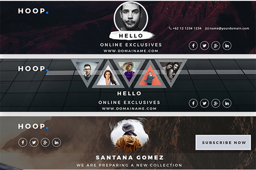
Every budding YouTube star needs a professional banner that matches their awesome channel. So explore these 41 creative premium templates to find the one that works for you!
41 YouTube Banner Templates
Want to be the next best YouTube sensation? Build your brand with an exciting banner that fits your unique style. Boost your social media game with a banner template that’s fun and easy to use!
In this collection of premium assets, we’re presenting you with 41 creative YouTube banner templates curated from GraphicRiver and Envato Elements.
Modify these templates yourself or enlist the help of a design professional from Envato Studio for all your social media needs.
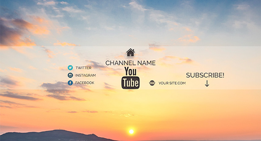
Make the most out of your social media presence with beautiful covers that show off your creative side! Suitable for any corporate, creative, or music business, this download features six amazing layouts that can be customized in Photoshop.
Stay on trend with elegant YouTube cover designs that are simply phenomenal. Offering you a range of designs to fit your personal needs, this pack features four Photoshop files with elements you can easily update. Set your own image as the main background to leave a lasting impression.
Launch your YouTube channel with a stunning modern design everyone will love! This package features four gorgeous designs with beautiful, fashionable elements. Enjoy the clean, minimalist theme to get the most out of your top banner.
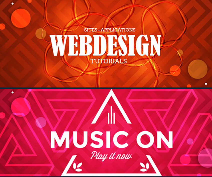
Create stunning cover art that matches your creative music. This design is great for any musician or DJ hoping to launch their brand on YouTube. Download this file to get access to three incredible layouts with fully editable layers and a simple instructional guide.
Stop your audience dead in their tracks with this brilliant YouTube cover art. This design features five amazing layouts to choose from, with a wide range of colors and themes. This template was created with a large 2120×1192 document size, so you’ll also get access to high-resolution images and amazing details.
Are you into fashion? Then you’ll want to take advantage of this stylish YouTube cover art. This template features a polished, modern design with minimalist elements to highlight your brand. Also included are detailed instructions to make your life a whole lot easier!
You’ll be destined for success with this stunning pack of Youtube channel covers. This pack features three exquisite designs with bold backgrounds and geometric elements. Switch out the main images for stocks you love for an out-of-this-world cover design!
From Justin Bieber to Tori Kelly, many incredible musicians get their start on YouTube. And you can achieve the look of a music professional with a modern banner template. This template features high-resolution images created at 300 dpi with multipurpose layouts to let your imagination run wild.
Keep up with the latest trends in banner design! Feature a YouTube cover that highlights your channel in a creative, professional way. This epic template, for instance, includes eight Photoshop files with free fonts and a polished layout. Customize this template with your own landscape photography for a pretty wicked upgrade.
Sit back and relax with a beautiful set of YouTube covers featuring sublime color schemes. The idea behind this template is to center your design around a gorgeous image with simplistic elements added for social media links and more. Subscribe to this design for an awesome layout today!
Multipurpose styles allow your brand to grow with your
channel. So check out this wicked template, featuring five professional
designs all created in Adobe Photoshop. Plug in your details and images
to get started with your new channel right away!
Change the YouTube game with impressive cover art that highlights your personality. This cool design comes complete with two different layouts, smart objects, and fully editable text layers. It’s a high-quality template that is sure to stand out, so download this cover art today!
Become an industry expert with a gorgeous YouTube
banner that matches your expertise! This incredible bundle features six
vibrant YouTube covers bursting with stylish colors and layouts.
They also include fully responsive designs that work with any device, and
free fonts you can download easily.
Step up your marketing game with this brilliant
business-themed banner package. This pack includes three high-quality
YouTube banner designs created in their own separate Photoshop files.
Use the handy smart objects to update your templates, and enjoy the
clean, fully responsive design.
Can’t get enough of these templates? Then feast your eyes on the next exciting design. This cover art is perfect for the avid photographer or any other expert creative. Included in this template are three bold color schemes with easy-to-use smart objects for your personal photos.
Teach
your viewers the latest tips and tricks in photography or gaming! This
wicked bundle features 27 amazing themes for two creative industries.
Whether you love shooting photos or conquering a wild adventure, you
can dive into these fun templates with fully editable layers and colors.
Create
a royal banner design that reflects your personal style. This unique
template features a vivid red and green color scheme with social media
icons and so much more! Enjoy the awesome minimalist background and
customize the center image with one of your own.
Upload a YouTube cover with a minimal and laid-back
design. With this simple template, you get access to three creative
layouts you can customize for more design options. Download the clean
design and enjoy the vibrant colors for your special channel.
Banner bundles are the perfect way for you to get many design options for one low price! And this pack features five elegant designs we’re sure you’ll love! They’re created as multipurpose layouts that work with a variety of industries, so download this pack today to get started!
Win over your viewers with a fun photo collage featuring your favorite moments! This collection of YouTube banners includes four colorful designs that will instantly uplift the appearance of your channel. Download this bundle today to get access to high-resolution elements and fully responsive designs.
Become the next big name in fitness! Upload a phenomenal YouTube cover design that is as intense as your workouts! This set features files that are 100% editable and fully responsive. Enjoy a beautiful design that looks great no matter which device you use.
Step out of the box with this minimalist design inspired by traditional brush strokes. This pack features two phenomenal YouTube cover styles with a light and dark version available for your convenience. Choose a stock that best complements the design, or switch it for one of your own for optimal impact!
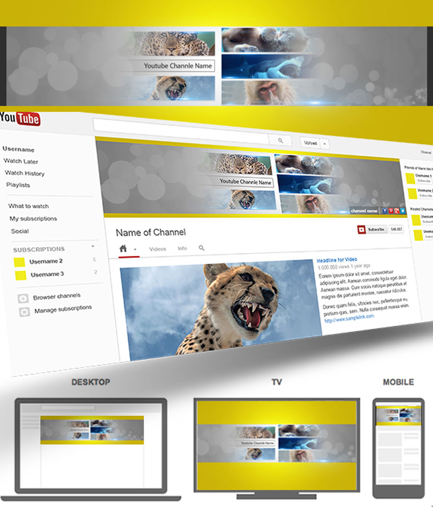
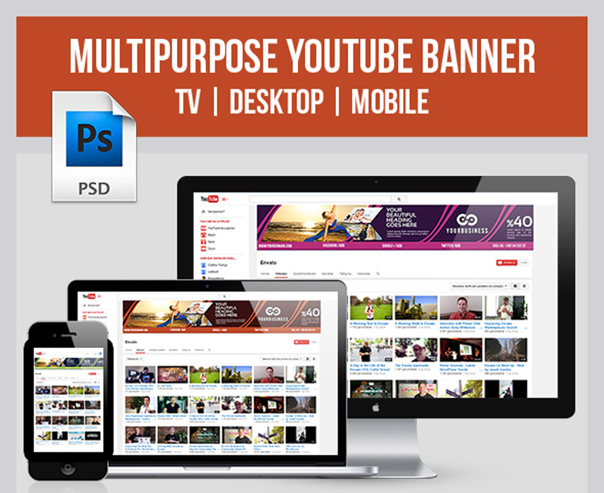
Still looking for the right cover? Then check out this ultimate YouTube banner. This banner features a fully responsive design with three color variations to choose from. Enjoy stunning banners that look great on your TV, desktop, or mobile devices.
Fill your banner with a brilliant photo collage with this amazing template! This design features organized smart objects that were created in an easy-to-use file that supports RGB mode. Though the preview images are not included, you can modify them yourself with all new stocks.
Create a minimalist YouTube banner inspired by your favorite video games! This download includes three incredible design variations with beautiful blurred backgrounds for more visual impact. Also included are free Google fonts and free icons to make your design experience so much better!
Kick off your gaming channel with an incredible background featuring your favorite video game art! This template features five striking designs with creative layouts that are sure to make you stand out. Download this pack today to get access to fully editable files and even free badges!
Or download 10 brilliant Youtube banners for one
affordable price! This bundle is packed with amazing designs featuring
multipurpose layouts, free icons, and so much more! Make the most of your
wallet with a banner bundle that is suitable for any industry!
Hungry for results? Step up your culinary game
with a YouTube channel banner that fits your brand. This tasty template
features two incredible styles created at a high resolution so that you
don’t miss out on any yummy details. Enjoy the free fonts included in
this ready-to-use file.
Get the most bang for your buck with this collection of 10 vintage-themed YouTube banners. Enjoy vivid colors that look attractive across many devices and fully editable files that are easy to use. Suitable for any business or personal channel, this pack will set you up with official cover art in no time at all!
A creative YouTube banner can turn you into an
instant professional. Try out this lovely red template, for instance,
which features a modern design you can easily edit. Simply drag and drop
your photo into the appropriate smart objects and edit the text layers
with your information.
Love the color red? Then check out this bold collection of three YouTube banners. This pack includes fully editable layers where you can modify the text or colors easily. Also included are social media icons to link to your personal profiles.
Upgrade your boring corporate YouTube covers with a clean, modern design. Set up links for direct contact to your services with this resourceful template. This template features an elegant blue theme with cool geometric lines for that added edge.
Make sure your banner works perfectly across all devices! This classic template features a professional design that is suitable for multiple Photoshop versions. Customize the main image with one of your own and update the text fast!
Set out on your next travel adventure inspired by
these banner designs. This template includes six retina-ready YouTube
banner covers with free fonts packaged into fully editable files. Update
your cover quickly in Photoshop or dive into the convenient help files
for more instruction.
Rock out with some of the best YouTube covers the market has to offer! This download includes 10 extraordinary layouts featuring beautiful colors and stylish elements. Replace the images with just one click to enjoy your template right away!
Branding is important, so make sure all your social
media profiles stand out with a clean, corporate layout. This
professional template features a fully editable file created in RGB mode
in Photoshop. Update the layers with facts about your business, and
enjoy this template in just a few short clicks!
Soccer, or football, is the world’s most popular
sport. And if you’re a die-hard fan then you’ll love to celebrate your
fandom with this incredible YouTube cover art. Get access to one modern
design with an amazing beehive design inspired by the classic soccer
ball.
Does your current banner miss the mark? Upgrade it with an awesome template that features three multipurpose layouts. This template also includes a set of vectorized elements and fully editable layers for one affordable package.
Explore wonderful, creative possibilities with this set of YouTube banners. This design is centered around a cool 3D city with six amazing color options to choose from. Use the original multi-colored version or choose a brilliant monochromatic palette instead.
One of the hottest trends in design today is the glitch effect. And you can get a cool tech-inspired YouTube banner with this amazing download. This template features one high-resolution banner design that incorporates geometric elements and vibrant colors. Keep the free font used or switch it out for one of your favorites.
Download a vibrant banner design that packs a powerful punch! This epic template features a colorful retro theme with three incredible designs to choose from. Also included are free fonts and photos so you know you’ll pay for exactly what you see!
Conclusion
This list features exciting resources for the avid designer
familiar with Adobe Photoshop. For additional help with all your social media needs, enlist the skills of a talented
professional by choosing one of the amazing designers from Envato Studio.
And with hundreds of YouTube banners available at your fingertips, chances are we’ve missed a few to add to your personal collection. Be sure to browse GraphicRiver and Envato Elements for more resources, and let us know your favorites in the comments below!
In the next part, Lewis Moorhead will show you how to finish the main composition by adjusting the landscape and sky elements. Then you’ll learn how to create the realistic lava effect by using a simple lava pattern.
How to Use Perspective Tools
In order for the lava to blend into the rock elements, we’ll need to adjust the perspective. Using the Free Transform Tool (Control-T), adjust the shape and position of the lava pattern with options like Distort, Warp, and Perspective.
How to Use Color Dodge
Brighten up the lava by using a New Layer set to Color Dodge. This will help make the lava pop for an incredible effect. Follow up this effect by creating the central rock element and covering it with more lava.
Want More?
Continue this manipulation in our next lesson, where we’ll add realistic cracks and smoke to the composition.
And for more amazing lessons, check out these articles:
Website launching is a thing that requires careful consideration and a great amount of professionalism. If you’re a layman in web design, you’ll have to order web design services from one of the professionals in the area. As getting a person work on creation of your website is pretty costly, you can just be smart and go for a website template.
Why are modern templates handy in website creation? The market of modern themes offers templates for different branches of industry, as well as multipurpose ones that let you create literally every website you need. The themes are pre-packed with rich sets of plugins that you get free and save you hundreds of dollars. You can tune up literally every pixel of your website with advanced customization options and simple-to-use WYSIWIG editors. Moreover, they have valid, well-structured code, and are SEO-optimized and well-tested in terms of responsiveness and cross-browser compatibility.
Today, you’ve got a great chance to get one of top-notch website templates of this year absolutely free! TemplateMonster, one of the well-established template provides, is giving away 1 of the 3 their flagship templates to you. Let’s see what are the prized that wait for the winner of this giveaway.
Monstroid2 is a real masterpiece in terms of design and functionality that took almost a year to be produced. This theme is a clean and smooth-functioning multipurpose website template with a great set of premium features. The template comes with 9 niche skins that serve as website templates for different branches of industry. There will be more skins coming soon and all the template owner will get them absolutely free. Monstroid2 is issued under GPLv3. This means that you can install the template as many times as you wish on an unlimited number of domains and modify its source code up to your wish. Make use of one of 20+ prebuilt plugins (e.g. BuddyPress, BbPress, MotoPress Menu, Cherry Projects, Booked Appointment, etc.) and edit the theme trouble-free with Power Builder and Live Customizer editors that provide for WYSIWYG template editing and live preview of the changes. Monstroid2 is WooCommerce-ready and lets you run an e-store based on one of Monstroid2 niche skin that best fits your needs.
Those of you, who always stay at the edge of e-commerce innovations, would just admire Eveprest theme that’s got all you can imagine and even more. This premium PrestaShop theme comes with 10 ready-made themes for different industries: clothes, interior design and furniture, electronics and gadgets, jewelry and accessories, lingerie, spare parts, etc. With the theme, you get a pack of premium modules that are actually worth $1357. Among them, you’ll find modules for creating collections of goods, lookbooks, 360 product views, advanced filters, product mosaics, layouts, etc. You can also change the color scheme of your theme in one click to foster the unique style of your e-store. Don’t miss your chance to take your e-commerce up a notch with this theme ad you’ll be exited at your skyrocketing revenues.
WooStroid is a feature-leaded premium WooCommerce template that reflects on top web design trends of 2017. Its design is user-centered: the template ensures good readability on different devices and provides for convenient shopping experience. Five skins of the theme are created for websites that sell clothes, jewelry, lingerie and tools. Woostroid has ultra-responsive design: you can upload images in 4K resolution and let shoppers-on-the-go see the finest details of the products that you offer. With WooStroid, you can run the shop not only on WooCommerce, but also on Ecwid, which is another comprehensive e-commerce solution for trouble-free e-store creation and management. The template lets your shoppers create wish lists and compare tables, use ajax product filters and navigate your website using MegaMenu. Moreover, the theme is SEO-optimized and will please you in terms of loading speed and smooth performance.
How to enter the giveaway?
The rules of the contest are very simple. You just need to leave a comment below, specifying which one of the three templates you would like to get. The deadline is the 26 of May, 2017. The winner will be selected randomly among those entrants, whose comments met the deadline and contained the name of the desired theme.
Don’t lose your time! Check out the templates’ Details and Live Demos using the links below the template screenshots and leave your Comment to don’t miss your chance to get one of these great templates free.
I wish you all good luck participating in the giveaway. If you have any questions concerning the rules of the contest or the themes presented above, do not hesitate to drop me a line in the Comments section below.