How to Create a 3D Colorful Illuminated Text Effect in Adobe Photoshop

Post pobrano z: How to Create a 3D Colorful Illuminated Text Effect in Adobe Photoshop

Final product image
What You’ll Be Creating

This tutorial will show you a very easy and useful tip to create colorful illuminated letters using Photoshop’s 3D material settings. Let’s get started!

This text effect was inspired by the many Layer Styles available on GraphicRiver.

Tutorial Assets

The following assets were used during the production of this tutorial:

1. How to Create 3D Text

Step 1

Create a New Document at 1300 x 1300 px.

Then create the text in All Caps using the font Primal, setting the Size to 90 pt and the Tracking value to 30.

Create the Text

Step 2

Go to 3D > New 3D Extrusion from Selected Layer. This will create a 3D mesh from the text layer.

To access the 3D mesh settings and properties, you’ll need to open two panels: the 3D panel and the Properties panel (both found under the Window menu).

The 3D panel has all the components of the 3D scene, and when you click the name of any of those, you’ll be able to access its settings in the Properties panel. So make sure to always select the tab of the element you want to modify in the 3D panel before you change its settings in the Properties panel.

Create the 3D Layer

Step 3

If you select the Move Tool, you’ll find a set of 3D Modes for it to the right of the Options bar.

When you choose one of those, you can then click and drag to perform changes (on the selected element in the 3D panel).

Use those modes to change the Current View to an angle you like.

Move Tool 3D Modes

2. How to Adjust the 3D Mesh and Cap Settings

Step 1

Select the 3D mesh tab in the 3D panel, and change its Extrusion Depth in the Properties panel to 15 px.

Extrusion Depth

Step 2

Click the Cap icon at the top of the Properties panel, and change the Bevel Width to 1.

Cap Settings

3. How to Modify the 3D Material Settings

Step 1

Select all the Material tabs except for the Extrusion Material’s, and use these settings (the color values used are in RGB):

  • Diffuse: 211, 211, 211
  • Specular: 180, 180, 180
  • Shine: 80%
Material Settings

Step 2

Select the Extrusion Material tab, and use these settings:

  • Diffuse: 121, 222, 209
  • Specular: 20, 41, 42
  • Shine: 80%
Extrusion Material Settings

Step 3

Click the Illumination icon, and choose New Texture.

New Texture

Step 4

Set the Width to 1300 px and the Height to 300 px, and click OK.

This should open the new file, but if it doesn’t, click the Illumination texture icon, and choose Edit Texture.

Edit Texture

4. How to Create a Colorful Illuminated Texture

Step 1

Duplicate the Background layer you have in the new file.

Duplicate the Background Layer

Step 2

Double-click the copy layer to apply a Gradient Overlay effect with these settings:

  • Check the Dither box
  • Angle: 0
  • Use the Spectrum Gradient Fill, or you can create your own colorful gradient fill that you like.
Gradient Overlay

Step 3

Click the Create new fill or adjustment layer icon at the bottom of the Layers panel, and choose Levels.

Change the Levels layer’s Blend Mode to Luminosity, and change the Gamma value to 0.75.

Save and close the file.

Levels Settings

This will create the colorful illumination material texture.

Illumination Texture

5. How to Add a 3D Shape Background

Step 1

Pick the Rectangle Tool, and click once anywhere inside the document to get the Create Rectangle box.

Set the Width to 1560 px and the Height to 1750 px, click OK, and make sure to set the rectangle’s Fill Color to White.

Create Rectangle

Step 2

Once the rectangle shape is created, go to 3D > New 3D Extrusion from Selected Path, and change the Extrusion Depth to 1.

Rectangle 3D Mesh

Step 3

Click the Current View tab in the 3D panel, and choose the text’s 3D layer’s name from the View menu in the Properties panel.

Change the Current View

Step 4

Select both 3D layers you have, and go to 3D > Merge 3D Layers.

Pick the Move Tool, select the rectangle mesh, and use the 3D Axis to move it behind the text.

The arrows at the ends of the axis move the mesh, the part below them is used for rotation, and the cubes are used for scaling. The cube in the center is used to scale the object uniformly. All you need to do is click and drag the part you want.

Merge and Move the 3D Meshes

Step 5

Select the rectangle mesh’s Front Inflation Material tab, and change its Specular color to (51, 51, 51) and its Shine value to 90%.

Front Inflation Material Settings

6. How to Adjust a 3D Scene’s Lighting

Step 1

Select the Infinite Light 1 tab, and change both its Intensity and Shadow Softness values to 30%.

Infinite Light 1 Settings

Step 2

Use the Move Tool to move the light so that it’s facing the text, and tilt it upwards a little bit.

You can also click the Coordinates icon at the top of the Properties panel to enter numerical values.

Move the Infinite Light

Step 3

Select the Environment tab, click the IBL texture icon, and choose Replace Texture to open the Building Interior image.

Replace the IBL Texture

Step 4

Click the IBL texture icon and choose Edit Texture.

Add a Hue/Saturation Adjustment Layer, and change the Saturation to -60 and the Lightness to 15.

Save and close the file.

Hue and Saturation Adjustment Layer

Step 5

Change the Intensity to 65%, and set the Ground Plane Shadows Opacity to 0.

Use the Move Tool to move the texture around to get a result you like.

Environment Settings

Step 6

Use the Move Tool’s 3D Modes to change the Current View to an angle you like, and make sure that the rectangle mesh’s edges are not visible.

Change the Camera View

Step 7

Go to 3D > Render 3D Layer. The rendering might take a while, but you can stop it any time by pressing the Esc key.

You can also stop the rendering to adjust the lighting, the camera view, or anything else you think needs tweaking, and render again until you get a result you like.

Render the Scene

Congratulations! You’re Done

In this tutorial, we created 3D meshes from text and shape layers, adjusted their material settings, and used a gradient fill for the illumination texture to create the colorful illuminating effect.

Then, we adjusted the lighting of the scene, as well as the camera view, to render the final result.

Please feel free to leave your comments, suggestions, and outcomes below.

3D Colorful Illuminating Text Effect Photoshop Tutorial

React Forms: Using Refs

Post pobrano z: React Forms: Using Refs

React provides two standard ways to grab values from <form> elements. The first method is to implement what are called controlled components (see my blog post on the topic) and the second is to use React’s ref property.

Controlled components are heavy duty. The defining characteristic of a controlled component is the displayed value is bound to component state. To update the value, you execute a function attached to the onChange event handler on the form element. The onChange function updates the state property, which in turn updates the form element’s value.

(Before we get too far, if you just want to see the code samples for this article: here you go!)

Here’s an example of a controlled component:

import React, { Component } from 'react';

class ControlledCompExample extends Component {
  constructor() {
    super();
    this.state = {
      fullName: ''
    }
  }
  handleFullNameChange = (e) => {
    this.setState({
      fullName: e.target.value
    })
  }
  handleSubmit = (e) => {
    e.preventDefault();
    console.log(this.state.fullName)
  }
  render() {
    return (
      <div>
        <form onSubmit={this.handleSubmit}>
          <label htmlFor="fullName">Full Name</label>
            <input
              type="text"
              value={this.state.fullName}
              onChange={this.handleFullNameChange}
              name="fullName" />
          <input type="submit" value="Submit" />
        </form>
      </div>
    );
  }
}

export default ControlledCompExample;

The value of the input is this.state.fullName (lines 7 and 26). The onChange function is handleFullNameChange (lines 10 – 14, and line 27).

The main advantages of controlled components are:

  1. You are set up to easily validate user input.
  2. You can dynamically render other components based on the value of the controlled component. For example, the value a user selects from a dropdown (e.g. 'dog’ or 'cat’) can control which other form components (e.g. a checkbox set of breeds) are rendered in the form.

The downside to controlled components is the amount of code you have to write. You need a state property to pass to the form element as props, and you need a function to update the value of this property.

For one form element this isn’t an issue – but if you have a large, complex form (that doesn’t need dynamic rendering or real-time validation), you’ll find yourself writing a ton of code if you overuse controlled components.

An easier and less labor-intensive way to grab values from a form element is to use the ref property. Different form elements and component compositions require different strategies, so the rest of this post is divided into the following sections.

  1. Text inputs, number inputs, and selects
  2. Passing props from child to parent
  3. Radio sets
  4. Checkbox sets

1. Text inputs, number inputs, and selects

Text and number inputs provide the most straightforward example of using refs. In the ref attribute of the input, add an arrow function that takes the input as an argument. I tend to name the argument the same as the element itself as seen on line 3 below:

<input
  type="text"
  ref={input => this.fullName = input} />

Since it’s an alias for the input element itself, you can name the argument whatever you’d like:

<input
  type="number"
  ref={cashMoney => this.amount = cashMoney} />

You then take the argument and assign it to a property attached to the class’s this keyword. The inputs (i.e. the DOM node) are now accessible as this.fullName and this.amount. The values of the inputs are accessible as this.fullName.value and this.amount.value.
The same strategy works for select elements (i.e. dropdowns).

<select
  ref={select => this.petType = select}
  name="petType">
  <option value="cat">Cat</option>
  <option value="dog">Dog</option>
  <option value="ferret">Ferret</option>
</select>

The value selected is accessible as this.petType.value.

2. Passing props from child to parent

With a controlled component, getting the value from a child component to a parent is straightforward – the value already lives in the parent! It’s passed down to the child. An onChange function is also passed down and updates the value as the user interacts with the UI.

You can see this at work in the controlled component examples in my previous post.

While the value already lives in the parent’s state in controlled components, this is not so when using refs. With refs, the value resides in the DOM node itself, and must be communicated up to the parent.

To pass this value from child to parent, the parent needs to pass down a ’hook’, if you will, to the child. The child then attaches a node to the 'hook’ so the parent has access to it.

Let’s look at some code before discussing this further.

import React, { Component } from 'react';

class RefsForm extends Component {
  handleSubmit = (e) => {
    e.preventDefault();
    console.log('first name:', this.firstName.value);
    this.firstName.value = 'Got ya!';
  }
  render() {
    return (
      <div>
        <form onSubmit={this.handleSubmit}>
          <CustomInput
            label={'Name'}
            firstName={input => this.firstName = input} />
          <input type="submit" value="Submit" />
        </form>
      </div>
    );
  }
}

function CustomInput(props) {
  return (
    <div>
      <label>{props.label}:</label>
      <input type="text" ref={props.firstName}/>
    </div>
  );
}

export default RefsForm;

Above you see a form component RefForm, and an input component called CustomInput. Usually, the arrow function is on the input itself, but here it’s being passed down as a prop (see lines 15 and 27). Since the arrow function resides in the parent, the this of this.firstName lives in the parent.

The value of the child input is being assigned to the this.firstName property of the parent, so the child’s value is available to the parent. Now, in the parent, this.firstName refers to a DOM node in the child component (i.e. the input in CustomInput).

Not only can the DOM node of the input be accessed by the parent, but the value of the node can also be assigned from within the parent. This is demonstrated on line 7 above. Once the form is submitted, the value of the input is set to 'Got ya!’.

This pattern is a bit mind bending, so stare at it for a while and play around with the code until it sinks in.

You may be better off making radios and checkboxes controlled components, but if you really want to use refs the next two sections are for you.

3. Radio sets

Unlike text and number input elements, radios come in sets. Each element in a set has the same name attribute, like so:

<form>
  <label>
    Cat
    <input type="radio" value="cat" name="pet" />
  </label>
  <label>
    Dog
    <input type="radio" value="dog" name="pet" />
  </label>
  <label>
    Ferret
    <input type="radio" value="ferret" name="pet" />
  </label>
  <input type="submit" value="Submit" />
</form>

There are three options in the „pet” radio set – „cat”, „dog”, and „ferret”.

Since the whole set is the object of our concern, setting a ref on each radio input is not ideal. And, unfortunately, there’s no DOM node that encapsulates a set of radios.

Retrieving the value of the radio set can be obtained through three steps:

  1. Set a ref on the <form> tag (line 20 below).
  2. Extract the set of radios from the form. In this case, it is the pet set (line 9 below).
    • A node list and a value is returned here. In this case, this node list includes three input nodes, and the value selected.
    • Keep in mind that a node list looks like an array but is not, and lacks array methods. There’s more on this topic in the next section.
  3. Grab the value of the set using dot notation (line 13 below).
import React, { Component } from 'react';

class RefsForm extends Component {

  handleSubmit = (e) => {
    e.preventDefault();

    //  extract the node list from the form
    //  it looks like an array, but lacks array methods
    const { pet } = this.form;

    // a set of radios has value property
    // checkout out the log for proof
    console.log(pet, pet.value);
  }

  render() {
    return (
      <div>
        <form
          onSubmit={this.handleSubmit}
          ref={form => this.form = form}>
          <label>
            Cat
            <input type="radio" value="cat" name="pet" />
          </label>
          <label>
            Dog
            <input type="radio" value="dog" name="pet" />
          </label>
          <label>
            Ferret
            <input type="radio" value="ferret" name="pet" />
          </label>
          <input type="submit" value="Submit" />
        </form>
      </div>
    );
  }
}

export default RefsForm;

This works even if you are composing a form from children components. Although there’s more logic in the components, the technique for getting the value from the radio set remains the same.

import React, { Component } from 'react';

class RefsForm extends Component {
  handleSubmit = (e) => {
    e.preventDefault();

    //  extract the node list from the form
    //  it looks like an array, but lacks array methods
    const { pet } = this.form;

    // a set of radios has value property
    // checkout out the log for proof
    console.log(pet, pet.value);
  }

  render() {
    return (
      <div>
        <form
          onSubmit={this.handleSubmit}
          ref={form => this.form = form}>
          <RadioSet
            setName={'pet'}
            setOptions={['cat', 'dog', 'ferret']} />
          <input type="submit" value="Submit" />
        </form>
      </div>
    );
  }
}

function RadioSet(props) {
  return (
    <div>
      {props.setOptions.map(option => {
        return (
          <label
            key={option}
            style={{textTransform: 'capitalize'}}>
            {option}
            <input
              type="radio"
              value={option}
              name={props.setName} />
          </label>
        )
      })}
    </div>
  );
}

export default RefsForm;

4. Checkbox sets

Unlike a radio set, a checkbox set may have multiple values selected. This makes extracting these values a little more complicated than extracting the value of a radio set.

Retrieving the selected values of the checkbox set can be done through these five steps:

  1. Set a ref on the <form> tag (line 27 below).
  2. Extract the set of checkboxes from the form. In this case, it is the pet set (line 9).
    • A node list and a value is returned here.
    • Keep in mind that a node list looks like an array but is not, and lacks array methods, which takes us to the next step…
  3. Convert the node list to an array, so array methods are available (checkboxArray on line 12).
  4. Use Array.filter() to grab only the checked checkboxes (checkedCheckboxes on line 15).
  5. Use Array.map() to keep only the values of the checked checkboxes (checkedCheckboxesValues on line 19).
import React, { Component } from 'react';

class RefsForm extends Component {
  handleSubmit = (e) => {
    e.preventDefault();

    //  extract the node list from the form
    //  it looks like an array, but lacks array methods
    const { pet } = this.form;

    // convert node list to an array
    const checkboxArray = Array.prototype.slice.call(pet);

    // extract only the checked checkboxes
    const checkedCheckboxes = checkboxArray.filter(input => input.checked);
    console.log('checked array:', checkedCheckboxes);

    // use .map() to extract the value from each checked checkbox
    const checkedCheckboxesValues = checkedCheckboxes.map(input => input.value);
    console.log('checked array values:', checkedCheckboxesValues);
  }

  render() {
    return (
      <div>
        <form
          onSubmit={this.handleSubmit}
          ref={form => this.form = form}>
          <label>
            Cat
            <input type="checkbox" value="cat" name="pet" />
          </label>
          <label>
            Dog
            <input type="checkbox" value="dog" name="pet" />
          </label>
          <label>
            Ferret
            <input type="checkbox" value="ferret" name="pet" />
          </label>
          <input type="submit" value="Submit" />
        </form>
      </div>
    );
  }
}

export default RefsForm;

Using a checkbox set child component works just like the radio set example in the previous section.

import React, { Component } from 'react';

class RefsForm extends Component {
  handleSubmit = (e) => {
    e.preventDefault();

    //  extract the node list from the form
    //  it looks like an array, but lacks array methods
    const { pet } = this.form;

    // convert node list to an array
    const checkboxArray = Array.prototype.slice.call(pet);

    // extract only the checked checkboxes
    const checkedCheckboxes = checkboxArray.filter(input => input.checked);
    console.log('checked array:', checkedCheckboxes);

    // use .map() to extract the value from each checked checkbox
    const checkedCheckboxesValues = checkedCheckboxes.map(input => input.value);
    console.log('checked array values:', checkedCheckboxesValues);
  }

  render() {
    return (
      <div>
        <form
          onSubmit={this.handleSubmit}
          ref={form => this.form = form}>
          <CheckboxSet
            setName={'pet'}
            setOptions={['cat', 'dog', 'ferret']} />
          <input type="submit" value="Submit" />
        </form>
      </div>
    );
  }
}

function CheckboxSet(props) {
  return (
    <div>
      {props.setOptions.map(option => {
        return (
          <label
            key={option}
            style={{textTransform: 'capitalize'}}>
            {option}
            <input
              type="checkbox"
              value={option}
              name={props.setName} />
          </label>
        )
      })}
    </div>
  );
}

export default RefsForm;

Conclusion

If you don’t need to:

  1. monitor the value of a form element in real-time (e.g. in order to render subsequent components based on user input), or
  2. perform custom validation in real-time,

then using refs to grab data from form elements is a good bet.

The primary value of using refs over controlled component is that, in most cases, you will write less code. The exceptional case is that of checkbox sets (and radios to a lesser degree). For checkbox sets, the amount of code you save by using refs is minimal, so it’s less clear whether to use a controlled component or refs.


React Forms: Using Refs is a post from CSS-Tricks

Are we making the web too complicated?

Post pobrano z: Are we making the web too complicated?

Exactly as I did the other week, Laurie Voss saw a tweet about the complication of front-end development and responded.

From the outside, front end development in 2017 looks pathologically overcomplicated. Is this a fair perception? If so, why is it happening?

— Pinboard (@Pinboard) May 21, 2017

The replies to Maciej’s tweet are interesting to read. They fall roughly into two camps:

  1. Older/not front-end developers: because the web is shit!
  2. Current front-end developers: because shit is hard!

As is often the case, both camps are correct! The web is a shitshow of wheel reinvention and bad APIs. It’s also a blizzard of innovation.

Expectations for what a website should be able to do have evolved enormously. Users expect snappy, desktop-like responsiveness and rich presentation in web apps. They also expect those same web apps to work equally well on mobile devices. And they expect these apps to load basically instantly.

Direct Link to ArticlePermalink


Are we making the web too complicated? is a post from CSS-Tricks

How to Create a Vintage Music Festival Flyer in Adobe InDesign

Post pobrano z: How to Create a Vintage Music Festival Flyer in Adobe InDesign

Final product image
What You’ll Be Creating

Summer is here, and festival season is in full swing. If you’re promoting a festival event this year, you can give your publicity a vintage twist with this groovy flyer design. It’s simple to create and will make a fantastic summery statement. 

We’ll be putting together the flyer layout in Adobe InDesign, and using Photoshop and Illustrator to do some colorful image editing. If you’re a relative beginner to Adobe software, this is a great all-round introduction to creating layouts for print or circulating online. 

Need a festival flyer quickly? You’ll find an awesome selection of easy-to-customize flyer templates on GraphicRiver

OK, are you ready for the best summer ever? Great! Let’s get started…

What You’ll Need to Create Your Flyer

To put together the flyer, you’ll need access to the classic trio of Adobe applications: InDesign, Photoshop and Illustrator. If you’re not quite ready to commit to a software purchase, you can get a free 30-day trial of all these apps over at adobe.com.

You’ll also need to download the following images and font files:

Make sure the font is installed on your system before starting the tutorial. When you’re ready, we can dive right in to setting up our layout.

1. How to Set Up Your Layout in InDesign

Step 1

Open up InDesign and go to File > New > Document.

In the window that opens, keep the Intent set to Print and Number of Pages to 1, and uncheck Facing Pages

From the Page Size drop-down menu, choose Flyer 8.5×11 or manually type in a Width of 8.5 in and a Height of 11 in. 

flyer size

Add a Margin of 0.2756 in (7 mm) and a Bleed of 0.25 in around all the edges of the page. When you’ve done that, go ahead and click OK.

new document
new flyer document

Step 2

Expand the Layers panel (Window > Layers) and double-click on the Layer 1 name. Rename it Paper and click OK

Take the Rectangle Frame Tool (F) from the Tools panel and drag onto the page, creating a frame that extends up to the edge of the bleed on all sides. Go to File > Place, choose your paper texture image, and click Open

paper texture

Allow the image to fill the whole frame by scaling it, holding Shift while you do, and rotating (Right-Click > Transform > Rotate) if necessary. 

paper on page

3. How to Add a Sunset Background to Your Flyer

Step 1

Return to the Layers panel and click on the Create New Layer button at the bottom. Double-click the layer to open Layer Options. Rename the layer Background Color

Lock the Paper layer below, activating the Background Color layer. 

background color

Step 2

Expand the Swatches panel (Window > Color > Swatches) and click on the New Swatch button at the bottom. 

Double-click the swatch to open the Swatch Options window. Name the swatch Sunset, set the Type to Process and Mode to CMYK, and adjust the percentage levels to C=0 M=53 Y=55 K=0. Click OK.

sunset swatch

Step 3

Select the Rectangle Tool (M) and create a shape that covers the bottom half of the page. Set the Fill to Sunset and Stroke to [None].

sunset rectangle

With the shape selected, head up to Object on the top menu and Effects > Gradient Feather.

Give the shape a 90 degree gradient, pulling the dark slider along to the right.

effects gradient

Step 4

Create a second New Swatch, naming it Sunrise. Set the levels to C=2 M=19 Y=83 K=0.

Use the Rectangle Tool (M) to create a new shape, extending it across the whole of the page, and pulling it down past the bottom edge of the page by about a quarter-page.

sunrise swatch

Go to Object > Effects > Gradient Feather, and apply a -90 degree Gradient. This will create a subtle sunset effect.

90 degree gradient

4. How to Create a Collage Effect for Your Design

Step 1

File > Save your InDesign document, and minimize the window for now. We’ll be coming back to it a bit later.

Open up your camper van image in Photoshop, and Duplicate and then Lock the background layer to keep a copy of the original image. We want to separate the van in the foreground from its background, but we can do this in a rough way which will add to the cut-out collage effect. 

Use the Polygonal Lasso Tool (L) to trace around the edges of the van, looping off sections and clicking on the Refine Edge button at the top of the workspace. 

trace with the lasso tool

Use the Shift Edge slider to make the selection as tight as possible, before hitting OK once you’re happy. Then Delete the selection. 

refine edge settings

Work your way around the whole van, including the shadow below, until you have isolated it. Then head up to File > Save As, and Save your image as a Photoshop (PSD) file. 

deleted area
refine edge of the selection

Step 2

Minimize the Photoshop window and head back into InDesign

Create a New Layer and name it Camper Van. Lock the two layers sitting below. 

Use the Rectangle Frame Tool (F) to create a frame in the center of the page and File > Place, choosing your camper van Photoshop image. Center it nicely within the frame. 

placed image

Step 3

Create a New Layer and name it Pen Tool. Drag this down to sit below the Camper Van layer and above Background Color.

create a pen tool layer

Take the Pen Tool (P) and click around the edge of the van, leaving a little gap between the edge of the photo and the line. 

Continue to trace your way around, joining the shape up at the first anchor point. 

pen tool trace

From the Swatches panel, change the Fill of the shape to [Paper] (white) and the Stroke to [None].

pen tool paper fill

This creates a great little cut-out collage effect.

collage effect result

Step 4

Create a New Swatch, name it Cherry, and set the levels to C=0 M=130 Y=94 K=0. 

cherry swatch

Create a New Layer at the top of the layer sequence and name it Color. Lock the other layers below.

Use the Pen Tool (P) to pull out a part of the van in your Cherry swatch. Here, I’ve traced the central door, but you could try a window if you like. 

door in red

Step 5

Minimize the InDesign window for a minute. You can also create playful colored elements for your collage using Illustrator. 

Open up Illustrator, and File > Place your camper van image. Lock this onto its own layer, creating a New Layer above to work on. 

Select the Paintbrush Tool (B) and click on the Brush Definition drop-down menu at the top of the workspace. Click on the Brush Libraries Menu and choose Artistic > Artistic_ChalkCharcoalPencil. 

Select Chalk – Blunt from the brush window that opens. Draw around the VW logo, tracing the outside edge. 

outside of logo

Then trace the inside details too. 

trace the inside logo

Step 6

You can trace other elements too, like the nice V-shaped swoop across the front of the van…

traced swoop result

… and the wheels as well. 

yellow color applied to wheels

Don’t worry about perfecting color here—I’ve just used a bright yellow to show you the shapes clearly. For now, select the VW shape only and Edit > Copy, before minimizing the Illustrator window.

Step 7

Head back to your InDesign document and create a New CMYK Swatch. Name it Turquoise, and set it as C=79 M=11 Y=48 K=1.

turquoise swatch

Edit > Paste your VW vector shape onto the page, and scale using Shift to match the proportions of the image below. Adjust the Fill to Turquoise.

adjust the logo fill

Return to Illustrator, select the V swoop, and Edit > Copy; head back to InDesign and Edit > Paste. Set the Fill to Sunset

swoop duplicated

Finally, Copy and Paste over your wheel shapes. Set the Fill of these to Sunrise.

wheels filled with sunrise color

Great work so far—your camper van’s looking groovy!

final collage design

5. How to Create Letterpress-Style Typography

Step 1

Create a New Layer. Name it Typography and sit it above the Background Color layer and below Pen Tool. 

layer options

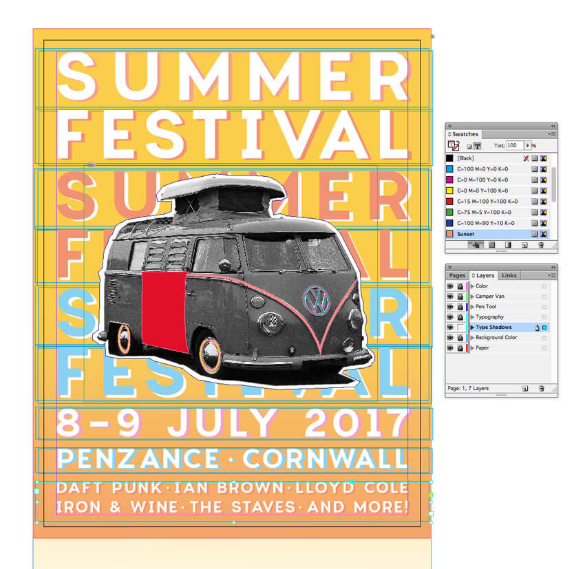
Use the Type Tool (T) to create a text frame at the top of the page. Type in ‘SUMMER’ and from either the top Controls panel or the Character panel (Window > Type & Tables > Character) set the Font to Charlevoix Pro SemiBold, Size 110 pt, Tracking 160. Set the text to Align Center from the Controls panel, and adjust the Font Color to [Paper]. 

controls panel edits

Edit > Copy, Edit > Paste the text frame, moving the copy below the first. Adjust the text to read ‘FESTIVAL’ and adjust the Tracking to line up the far edges of the text with the text above. 

adjust the tracking

Step 2

Select both text frames, and Copy and Paste below, adjusting the Font Color to Sunset

add sunset color

Repeat the paste, this time creating a New Swatch, called Sky Blue, C=49 M=0 Y=2 K=0, and move below.

create new swatch

Step 3

Use the Type Tool (T) to create a series of text frames at the bottom of the page. Here you can put details like the date, location and what’s on at your event. Set all the text in Charlevoix Pro SemiBold and a [Paper] Font Color

You can use the Glyphs panel (Window > Type & Tables > Glyphs) to insert bullets between acts.

glyphs panel to insert bullets

Step 4

Make sure that you’re happy with the final layout and content of the text. We’ll be duplicating all the text to create a shadow effect, so it needs to be kept the same to look right. This is the time to do a spell check!

Head over to the Layers panel and right-click on the Typography layer. Select Duplicate Layer “Typography”

duplicate layer

Then drag the duplicate layer down to sit below Typography. Rename this layer Type Shadows. Lock the Typography layer above.

rename type shadows

Step 5

Drag your mouse across the whole page to select all the text frames on the Type Shadows layer, and press the arrow keys to move the text a little to the right and down.

Select each pair of ‘SUMMER FESTIVAL’ text frames and adjust the Font Color to a contrasting shade, creating a cool letterpress-style shadow effect. 

font color contrast

Work your way down the page, adding a [Paper] color to some text, or your custom swatch colors to others. 

create text shadows

Eventually you’ll end up with a very nice letterpress effect, which looks great paired with your camper van collage.

final flyer design

6. How to Export Your Flyer for Circulation

Exporting Your Flyer for Online Circulation

If you want to circulate your flyer as an email attachment or get it ready for web upload, you’ve got a couple of options. 

Head up to File > Export. Choose Adobe PDF (Interactive) from the Format menu if you want to attach the flyer to an email. 

export pdf settings

Alternatively, choose JPEG or PNG if you’d like to prep an image for uploading online. 

Exporting Your Flyer for Printing

If you’re planning to get your flyer printed professionally at a print shop, you’ll need to make sure to include your bleed in the final export.

Go to File > Export, and choose Adobe PDF (Print) from the Format menu. Click Save.

In the window that opens, choose [Press Quality] from the Preset menu at the top. 

review press quality

Click on the Marks and Bleeds option in the left-hand menu, and check All Printer’s Marks and Use Document Bleed Settings. Then hit Export to create your print-ready PDF—you can send this straight off to the printers!

export pdf

Conclusion: You’ve Created One Groovy Flyer

Congratulations, your festival flyer is finished! Now all you need to do is sit back and watch the ticket sales roll in.

Before you chill out with some awesome live music, let’s take a quick recap of some of the key skills you’ve picked up in this tutorial, which you can apply to other flyer design projects. You now know how to:

  • Set up a standard flyer layout in Adobe InDesign.
  • Create a professional backdrop of color and texture to your layout.
  • Edit collage-style images in Photoshop and add vector details using Illustrator.
  • Format letterpress-style typography to a high standard, adding an on-trend look to your design.
  • Export your flyer for circulating online or in print format.

That’s a lot of work—great job! If you want to explore even more festival flyer ideas, you can find a range of easy-to-customize flyer templates over on GraphicRiver. Check it out!

Vintage Music Festival Flyer Adobe InDesign Tutorial

How to Create a Spring Meadow in Adobe Illustrator

Post pobrano z: How to Create a Spring Meadow in Adobe Illustrator

Final product image
What You’ll Be Creating

In this tutorial, you will learn how to use the Mesh Tool and the
Gradient Tool in Adobe Illustrator to create a spring background with a bright white fence!

If you want to skip the tutorial and just use this background, you can purchase the Nature Meadow Landscape with a Bicycle from GraphicRiver and also get a vector bike!

nature background with bike from graphicriver
Nature Meadow Landscape with a Bicycle

1. How to Create the Background

Step 1

Let’s start off by „painting” the background with the Mesh Tool (U).

Just create a rectangle, Fill it with a gray color #F5F3EA and, using the Mesh Tool, create a grid in the rectangle.

Continue by coloring the nodes, as indicated in the picture below.

Here are the colors you will need for each step:

  1. #F5F3EA
  2. #399F92
  3. #AAD2C9
  4. #52531A
  5. #D7D483
  6. #CCD8C1
  7. #E0E6C8
  8. #BFD9C7
paint the background with the mesh tool

Step 2

Let’s move on to creating the grassy hills! The process is very similar to Step 1, but in the end you will have to bend your hill with the Mesh Tool.

Just create a couple more nodes and make the shape wavy by dragging them!

Here are the colors you will need:

  1. #E7E3AB
  2. #C5CD60
  3. #95A542
  4. #5B6D1C
create the grassy hills

Step 3

Using the Mesh Tool again, similarly create another hill with the following colors:

  1. #DFDFA8
  2. #BAC569
  3. #6C8427
create another hill

Step 4

Place both hills on top of our previously created background. The smaller hill should be partly hidden under the bigger hill.

arrange the hills

Step 5

Now, create a rectangle with No Fill over the top of the background, „framing” the picture. Make sure every element you want to be visible is inside the rectangle.

Then, select all of the elements and after right-clicking, choose Make Clipping Mask.

We will be using this tool a couple more times in the tutorial, so don’t forget it!

create a clipping mask

Step 6

With the Clipping Mask created, our first part of the picture is done!

finished background result

2. How to Create the Fence

Step 1

Let’s begin by drawing the shape of the fence boards.

Grab the Pen Tool (P) and draw a half of a fence board. Once you’ve finished the outline, right-click on it and choose Transform > Reflect. Select the Vertical Axis and click Copy to create the second half of the shape.

draw the fence shapes

Step 2

Now, move the second half so it perfectly mirrors the original half (the colors below are just for illustration).

After you’ve managed it, select both parts and in the Pathfinder menu, choose Unite. This will create a full, symmetrical outline!

unite the paths

Step 3

Fill the shape with a grey color (it doesn’t matter which for now).

Grab the Lasso Tool (L) and select the two middle nodes on the bottom of the shape. Press Delete to get rid of them.

This will be very important later, so don’t skip this step!

delete the bottom nodes

Step 4

As there is now a gap at the bottom of the shape, use Object > Path > Join to unify it again.

Create a Copy of the outline and put it aside! We will need it later.

join the gaps together

Step 5

Let’s add some depth to our fence board! Go to Effect > 3D > Extrude and Bevel and fill in the following settings for the Rotation:

  • -7°
  • 19°
  • -2°

The Extrude Depth should be about 5 px.

extrude and bevel options

Step 6

After applying the effect to the shape, create paths out of it by going to Object > Expand Appearance.

Ungroup the result a couple of times until you get three separate paths.

ungroup the result

Step 7

Select the two paths forming the side of the fence post and Unite them in the Pathfinder panel.

unite the paths

Step 8

Color the front of the fence with #F1EBE1 and the side with #D8CFC2.

color the fence

Step 9

For this step, you will need a photo of a wooden plank with a texture.

I recommend using my own photo, which you can download as an attachment for this tutorial (texture.jpg).

Move the photo into the file with your spring background and open the Image Trace panel (Window > Image Trace).

After selecting the object with the texture, input the settings I chose into the panel (you might need to click Advanced to show the rest of the settings) and click Trace.

Image Trace Settings:

  • Mode: Black and White
  • Threshold: 164
  • Paths: 50%
  • Corners: 75%
  • Noises: 25px
  • Create: Fills
  • Ignore White: Checked
wooden plank texture

Step 10

Select the result of the trace and go to Object > Expand.

expand options

Step 11

In the Transparency panel, set the Opacity to 30% and the Transparency Mode to Overlay.

transparency options

Step 12

Grab the outline we created in Step 4 of this section and place it over the top of the texture. Make a Clipping Mask out of the two shapes.

Lay the result over our fence post.

how to apply the fence texture

Step 13

Drag the post a bit to the right while holding Shift and Alt, creating a Copy of it at a reasonable distance.

Continue by pressing Control-D to repeat your last action, effectively creating as many boards as you want. Stop at your preferred fence length.

create the fence

Step 14

Now let’s create a back board for our fence!

First, draw a rectangle a bit longer than your fence. Color it with #EEE7DE. Add another, much narrower rectangle on top and color it with #E2DCD2.

create the fence board

Step 15

In this step, we will be making shadows that are being cast by the fence posts.

Draw two vertical rectangles side by side, coloring them with #7B6F5B (the left one) and #DEDBD2 (the right one). The right rectangle should be a bit wider.

Next, set the right rectangle’s Opacity to 0% and continue to Object > Blend > Blend Options. Set the Spacing to Specified Steps and choose 30 for the amount.

Finally, select both rectangles and go to Object > Blend > Make.

creating the fence shadows

Step 16

Move the blend onto the board we created. Just like before, use Control-D to Duplicate the shadow across the whole board.

blending the shadows

Step 17

Move the board with the shadows behind the fence. Try to line up the shadows perfectly!

add the board to the fence

Step 18

Finally, we will create the screws that hold our fence in place.

Use the Mesh Tool (U) to recreate the likeness of a screw, following the steps below.

Here are the colors you will need:

  1. #D1D0C7
  2. #535044
  3. #AAA99F
  4. #B0AFA5
  5. #000000
create the screws

Step 19

Use two circles for the shadow. Create a smaller one inside the bigger one but slightly off center. Color the bigger circle with #D8D4C9 and the smaller one with #6C6557.

Set the light circle’s Opacity to 0%, and then proceed with Object > Blend > Make.

add shadows to the screws

Step 20

Place the Mesh on top of the shadow and turn it slightly. Our screw is done!

add mesh to screw

Step 21

Place the screw on top of the finished fence in the middle of each intersection.

Use Control-D to Duplicate the screws after moving one (while holding Alt and Shift).

add the screws to the fence

3. How to Create Clouds and Grass

Step 1

Now that our fence is done, the image needs just a couple of finishing touches!

If you wish to have clouds in the sky of our spring landscape, follow this tutorial: How to Create a Night Sky With Clouds Using Adobe Illustrator & Photoshop.

After you’ve done your clouds, come back to our background and place them onto the sky.

I suggest creating a few copies of the first one and combining them together to create interesting shapes!

add clouds to the background

Step 2

To make our sky even prettier, let’s create a sun!

Draw a circle and apply a Radial Gradient which goes from white to #95896A to black. Change the shape’s Transparency Mode to Screen.

create a sun

Step 3

Place our highlight somewhere onto the sky. Now we have a sun!

place the sun

Step 4

For the final step, we can create some grass. Learn how to make grass with this tutorial: How to Create a Grass Banner in Adobe Illustrator.

After you’ve finished your grass vector, return to the fence we made in the previous section. Place it over the top of your grass banner so that the bottom part of the fence is sticking out a bit.

Next, create a Copy of the grass and move it on top of the fence. Make sure to place it lower so that you can actually still see the fence!

add the grass to the fence

Step 5

All that’s left is to move the fence and the grass onto our background! Don’t forget to use a Clipping Mask to „crop” your image!

add the fence to the background

Awesome Work, You’re Now Done!

What now? You can try any of my other tutorials from my profile, or check out my portfolio on GraphicRiver, as well as the original nature image we recreated in this tutorial.

I hope you enjoyed the tutorial and will be extremely happy to see any results in the comments below!

Spring Grass Fence and Sky Background Adobe Illustrator Tutorial

Design Deals for the Week

Post pobrano z: Design Deals for the Week
first image of the post

Every week, we’ll give you an overview of the best deals for designers, make sure you don’t miss any by subscribing to our deals feed. You can also follow the recently launched website Type Deals if you are looking for free fonts or font deals.

1500+ Design Elements in 1 Huge Graphic Pack

Looking to give your latest projects a bit of a boost? This Huge Graphic Pack is sure to please with more than 1500 professional design elements! You’ll get a wide variety of tools including backgrounds, logos, badges, textures, vintage illustrations and more from a slew of different themes ranging from arcs to food to nature.

$8 instead of $750 – Get it now!

Bundle of 400+ High Quality Vector Textures from Ultrashock

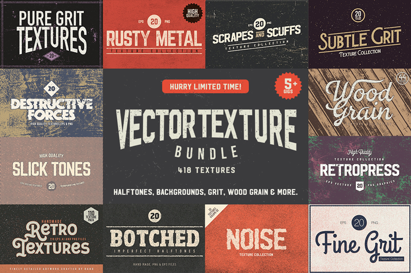
Stock up on a ton of creative items now with Ultrashock’s latest Creative Bundle which contains 418 brand new vector textures including Slick Tones (smooth halftone patterns with subtle gradients), Scratches and Scuffs, Retropress (distressed halftone scuffs), Subtle Grit Volume 01 and 02, Authentic Wood Grain, Noise Volume 01 and 02, Fine Grit, Retro Textures, Rusty Metal, Destructive Forces Backgrounds, Botched Imperfect Halftones, Granite Textures and more all with amazing value!

$24 instead of $674 – Get it now!

OZCodes Coupons

Find great deals on OZCodes with coupons for web hosting, WordPress plugins and themes, or design software, among many other things.

Verb: 72-Font Super Family

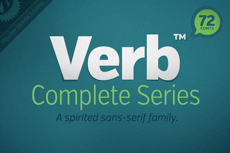
When artists create a new masterpiece, they have one goal in mind: to move you. Well, why shouldn’t the same go with Web designers? There’s no better way to get your next project moving than with the awesomely active (and actively awesome!) Verb font family!

$37 instead of $169 – Get it now!

Bourton Font Family of 34 Fonts & More

The Bourton Type Family is a massive layered and script typeface just bursting with variety. You’ll get more than 30 unique fonts in this family ranging from Base Layer to Drop Shadow Fonts, along with plenty of bonuses such as ornaments, frames, flags and even a set of customizable logos.

$17 instead of $99 – Get it now!