THE ORIGINAL?
SAAQ – Road Safety TV Commercial– 2012
“Before, we did not write messages while driving” Watch the TV Commercial Agency : LG2 Quebec City (Canada)
LESS ORIGINAL
City of Buenos Aires – Road Safety– 2017
“Texting and driving. Ridiculous since 1771”
Source : Coloribus
Agency : La Comunidad (Argentina)
What actually is an illusion? I’m sure you’ve spent a decent amount of time staring at an optical illusion at some point. Dictionary.com defines illusion as “something that deceives by producing a false or misleading impression of reality.”
Illusions aside, some imagery can just be straight trippy; not intending to deceive the senses but rather simply play with the mind and expand the horizons.
I watched Doctor Strange yesterday. If you’ve seen the movie you’ll understand why it inspired me to put together this collection of deceptive graphic design projects for your inspiration. Enjoy!
The UK creative industries contribute almost £90bn net to GDP, according to the Guardian. Whether you’re a designer, photographer or producer, your creative output is vital to the betterment of the wider UK. If you’re ever feeling a little bit stuck, or need some creative help, just remember that there’s an app for everything in 2017. With that in mind, we’ve put together this list of great creative apps that will help to get your juices flowing. If you’re feeling squeezed for mobile data, don’t worry, just order a SIM-only bundle from a provider like Asda Mobile and you can download to your heart’s content.
The act of preparing a meal is innately creative, taking advantage of the cook’s full array of senses to produce the desired dish. Now, Simmer helps you capture your creativity, enabling you to record short step by step videos of your preparatory process, helping other aspiring chefs learn from your instruction. Create, watch and share right from your very own kitchen.
If you’re not a full-time graphic designer, but you need to be able to sketch out a visual concept to a creative partner, an app like Assembly could be for you. It helps you to create beautiful vector imagery without having to master Illustrator. You can select from over 180 basic shapes that you can fit together to produce your own pieces of art, and place them over a plain backdrop or on top of a background image.
With a simple to use, yet innovative swipe-to-style formatting, Paper, lets you produce checklists and notes with ease. Capture and connect your notes, photos, and sketches in this brilliant designer-friendly digital wall. The original iPad version was crowned Apple’s App of the Year, and the new iPhone version is completely free, so there’s really no excuse to not own this brilliant inspiration provider.
This is a platform that should be in every creative’s toolbox. Both the website and the app are aimed at helping creative people get over their creative block through a range of instructional workshops, tricks, and techniques that help you in areas like, negative thinking, procrastination, and relationships. If you’re stuck and need help, you could definitely give this a go. Describing itself as an “in the moment digital coach”, Unstuck is your very own life coach in app form, and without the associated high costs.
If you believe that there’s no such thing as truly original art, then you should check out Behance. This is an online portfolio platform that’s specifically targeted at those working in the creative industries. If you’re a Photoshop pro, you can now push images directly to your own Behance portfolio, and if you’re browsing others portfolios, you can now share images straight to Pinterest – a new feature as of the 2.25 update. The phone app version of this platform is particularly slick, so give it a go.
These are only five of the plethora of apps out there designed to help creative do their jobs better. Give them a go and let us know what you think.
According to the GBrief, millennials (a person reaching young adulthood in the early 21st century) are forcing companies to offer a more personalized approach to shopping, or in other words “they want to know that a company is paying attention to their specific needs.” This is something that companies need to take note of if they want to stay in the game as millennials are set to become the largest group of consumers, having finally outnumbered the Baby Boomers in 2015.
However, it’s expensive for companies to customize product design, especially as so much could change along the way. Yet, creating variants on an item and giving the customer a choice is almost as good as a complete customization, this is mass customization (the ability to make variations of products in high volume). Such customization in the automobile industry is now routine, you can choose everything from the buttons on your steering wheel to the stitching in the leather of the seats.
A lot of the results from mass customization so far have been popular as well, because it helps companies gain insights from designs that they may not have thought of themselves. This keeps them one step ahead of the competition and maintains customer loyalty.
Looking back at the GBrief study, it also suggested that Millennials distrust faceless big businesses and want to be treated like a partner rather than a purchaser. Offering customization and plenty of variation give consumers the impression that they are involved in the whole process and mirrors the feel of being a partner. Even if the product is already being manufactured, the fact that the customer is in control makes the process feel a lot more personal.
With all of this in mind, it’s clear that product design will be successful with the use of customization, you will be achieving exactly what the consumer wants. Through this, you ensure that your company is remaining competitive and successful by keeping up with the consumer.
Whether you provide this personalization tool through face-to-face contact or over the Internet depends largely on the size of your business. For example, hospitals require a lot of different equipment and they may look for some supplies online, such as online castors, but meet with a supplier for the hospital bed itself, it just depends on the customers’ situation and the use of the product.
So, if you want to stay relevant as a business and keep on creating successful products, it‘s key that you offer some sort of flexibility and customization. The Raconteur has even gone so far as to say that the “new manufacturing revolution will be defined by speed, quality, flexibility, and customization,” so it’s definitely something your business needs to consider.
Only in Mexico City are registered more than 2,000 motorcycle accidents per year. How to solve this problem in a city where there is no road culture for cars and motorcycles to coexist? Archer Troy decided to stop talking to motorcyclists and better talk to the car drivers, because the safety of motorcyclist depends more on those who drive around, than on himself.”Naked”is an inspiring and visually striking campaign, as it shows the vulnerability of motorcyclists to another driver. The Print Ad titled Chopper was done by Revolver advertising agency for brand: Yamaha in Mexico. It was released in the May 2017.
There is a latent inequality between female and male athletes. ESPMW decided to bring this debate to websites, newspapers and sports fans, including athletes in a very visible way: in the courts. Having this in mind, we turned different sports courts into gender inequality graphics in sports. Making use of the natural divisions found in each sports court we painted them blue and a small space pink. In the corner of the courts, we placed the message highlighting gender inequality in sports. E.g.: tennis court: blue (the largest portion) – tournaments that pay bigger prizes to men. Pink (only a small square) – tournaments that pay equal prizes to men and women. The idea was executed electronically during ESPN’s broadcasting of women’s sports. In parallel, the project took place in real courts in parks, gymnasiums, and clubs. Then, the “Inequality Courts” were photographed and turned into posters and print ads.
Every week, we’ll give you an overview of the best deals for designers, make sure you don’t miss any by subscribing to our deals feed. You can also follow the recently launched website Type Deals if you are looking for free fonts or font deals.
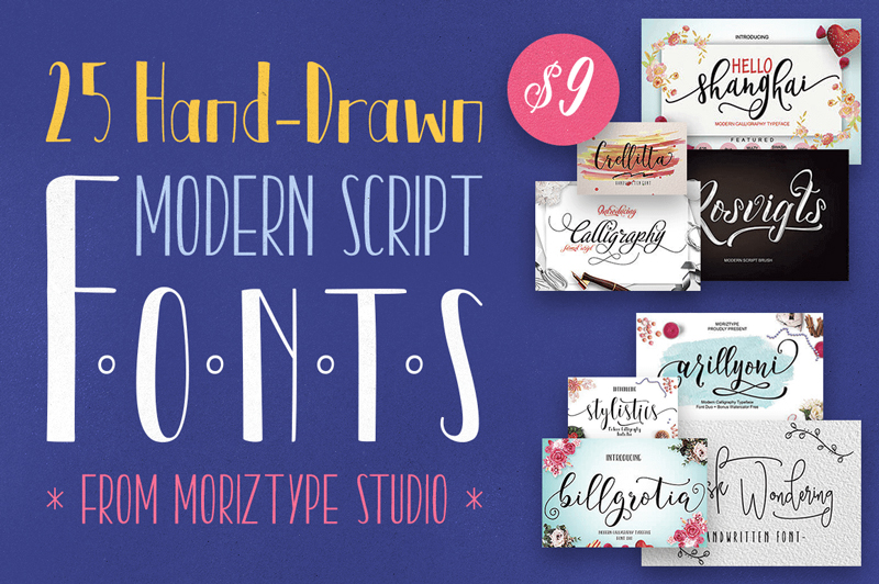
25 Hand-Drawn Modern Script Fonts
This amazing bundle from Moriztype Studio features a gorgeous set of 25 professional modern script fonts at one ginormous discount. With the included extended license, you can create as many invitations, signs or note cards as you like for yourself or your business.
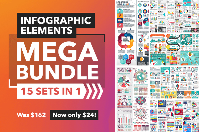
15 unique infographic sets in 1 low-priced mega bundle! You’ll have loads of infographic elements to play with including pie charts, arrows, maps, clocks and more, for just about any industry out there. These elements are all fully customizable too, so the sky’s the limit with what you can put together.
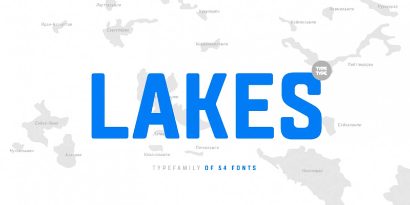
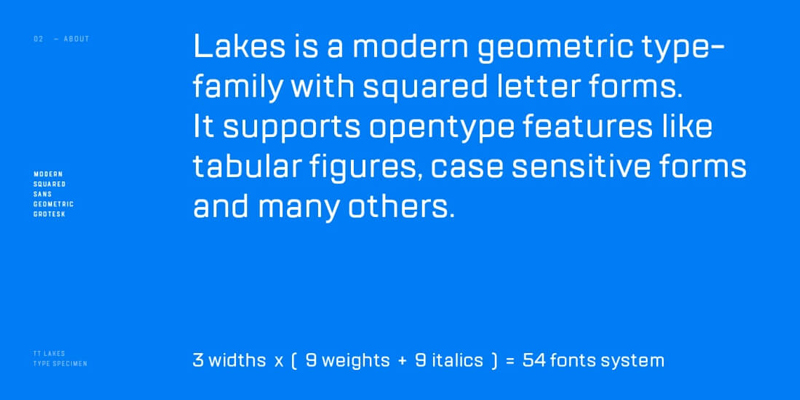
TT Lakes Font Family Bundle of 54 Unique Typefaces
Made up of 3 different families (Lakes, Lakes Condensed, Lakes Compressed), you’ll take home 54 unique typefaces chock full of features such as fractions, ordinals, numerals, superscripts, case sensitive forms and support of more than 70 languages.
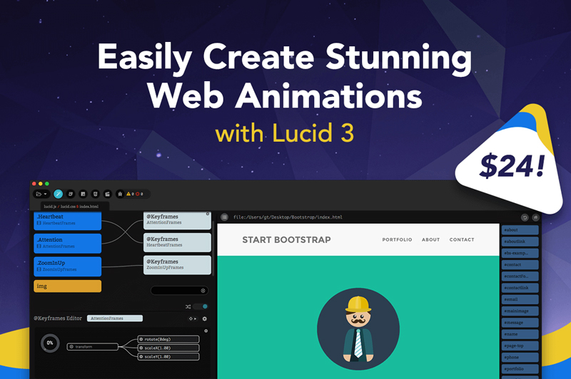
Easily Create Stunning Web Animations with Lucid 3
Creating animations is easier than you think! With The Escapers amazing Mac app Lucid 3, you can now whip up stunning CSS3 animations for your Web pages. Create your own or work with a number of pre-built animations, all of which are highly customizable and easy to use.
Taiwanese-American illustrator Maggie Chiang creates lovely illustrations of both real and less real places. You can discover her work on her website or Instagram, but also occasionaly in exhibitions and other shows.
With all the excitement around CSS Grid, I haven’t seen as much talk about the new fr CSS length unit (here’s the spec). And now that browser support is rapidly improving for this feature, I think this is the time to explore how it can be used in conjunction with our fancy new layout engine because there are a number of benefits when using it; more legible and maintainable code being the primary reasons for making the switch.
To get started, let’s take a look at how we’d typically think of building a grid in CSS. In the example below, we’re creating a four column grid where each column has an equal width:
If you’ve never seen that repeat() function after the grid-template-columns property then let me introduce you to one of the neatest features of CSS Grid! It’s a shorthand, essentially, allow us to more succinctly describe repeating values. We could have written grid-template-columns: 25% 25% 25% 25%; instead, but it’s cleaner using repeat(), particularly when you have more verbose widths (like a minmax() expression).
The syntax is essentially this:
repeat(number of columns/rows, the column width we want);
There are actually a couple of issues with what we’ve done so far, though.
First, in order to use this neat CSS function, we had to do a tiny bit of math. We had to think to ourselves what is the total width of the grid (100%) divided by the number of columns we want (4), which brings us to 25%. In this instance, the math is pretty darn easy so we don’t have to worry about it but in more complex examples we can completely avoid doing the math and let the browser figure that out for us. We do have calc() available to us, so we could have done repeat(4, calc(100% / 4), but even that’s a little weird, and there is another problem anyway…
The second issue is a problem with overflow. Because we’ve set each column to 25% and a grid-column-gap to 10px then that pushes grid element wider than 100%. It isn’t how you’d expect things to work from just looking at the code above but that’s how percentages work. What we’re really saying with the code above is „set each column to 25% the width of the viewport and have a 10px gap between them.” It’s a subtle difference, but it causes a big issue with layout.
We’ve inadvertently caused some horizontal scrolling here:
The fr unit (a „fraction”) can be used when defining grids like any other CSS length such as %, px or em. Let’s quickly refactor the code above to use this peculiar new value:
That will look just the same as the example above because in this instance we’re setting each of our four columns to one fraction (which happens to be 1/4 or 25%). But! There’s no overflow on the x-axis anymore because setting each column to 1fr takes that 10px into account automatically and subtracts it from the total width available for each column.
Why the heck should I learn how to use this fancy new CSS length if I can mostly stick to the units like percent or pixels, you wonder? Well, let’s dig into a more complex CSS Grid example to explain why fr is a better alternative. In a new example, let’s say we want our navigation on the left followed by a twelve column grid which should look like this:
This is a pretty typical scenario for a lot of UIs and so using the fr unit prevents us from either making a separate grid div or fumbling about with calc. Because if we didn’t use fr in the example above then we’d somehow have to figure out the following:
the width of each column = ((width of viewport - width of nav) / number of columns) * 1%
That’s possible for sure, it’s just awfully painful to read, and if we changed the width of the nav then we’d have to do that dumb calculation all over again. Instead, the fr unit tidies all of that up into a super readable line of code:
What we’re doing here is setting a fixed width in pixels for the first column and then creating twelve separate columns which are set at one „fraction of the free space” (literally how the spec phrases it). But there’s no crazy calculations or anything! It’s super readable and if the width of that left nav changes then the width of our columns on the right will adjust themselves automatically.
With just a little bit of legwork we’ve made our interface more maintainable for the future and we’ve ensured that our code is more legible for the next developers that are coming up behind us.
Information from other folks
Some of the fun and power of the fr unit comes from mixing it with other units. Imagine a fixed sidebar and main content area that takes up the rest of the space: grid-template-columns: 200px 1fr; easy!