I’m not sure if „data massaging” is a real thing, but that’s how I think of what I’m about to describe.
Dave and I were thinking about a bit of a redesign for ShopTalk Show. Fresh coat of paint kinda thing. Always nice to do that from time to time. But we wanted to start from the inside out this time. It didn’t sound very appealing to design around the data that we had. We wanted to work with cleaner data. We needed to massage the data that we had, so that it would open up more design possibilities.
We had fallen into the classic WordPress trap
Which is… just dumping everything into the default content area:
We used Markdown, which I think is smart, but still was a pile of rather unstructured content. An example:
If that content was structured entirely differently every time (like a blog post probably would be), that would be fine. But it wasn’t. Each show has that same structure.
It’s not WordPress’ fault
We just didn’t structure the data correctly. You can mess that up in any CMS.
To be fair, it probably took quite a while to fall into a steady structure. It’s hard to set up data from day one when you don’t know what that structure is going to be. Speaking of which…
The structure we needed
This is what one podcast episode needs as far as structured data:
Title of episode
Description of episode
Featured image of episode
MP3
URL
Running Time
Size in Bytes
A list of topics in the show with time stamps
A list of links
Optional: Guest(s)
Guest Name
Guest URL
Guest Twitter
Guest Bio
Guest Photo
Optional: Advertiser(s)
Advertiser Name
Advertiser URL
Advertiser Text
Advertiser Timestamp
Optional: Job Mention(s)
Job Company
Job Title
Job URL
Job Description
Optional: Transcript
Even that’s not perfect
For example: we hand-number the episodes as part of the title, which means when we need that number individually we’re doing string manipulation in the templates, which feels a bit janky.
Another example: guests aren’t a programmatic construct to themselves. A guest isn’t its own database record with an ID. Which means if a guest appears on multiple shows, that’s duplicated data. Plus, it doesn’t give us the ability to „display all shows with Rebecca Murphey” very easily, which is something we discussed wanting. There is probably some way to program out way out of this in the future, we’re thinking.
Fortunately, that structure is easy to express in Advanced Custom Fields
Once you know what you need, ACF makes it pretty easy to build that out and apply it to whatever kind of page type you need to.
I’m aware that other CMS’s encourage this kind of structuring by default. Cool. I think that’s smart. You should be very proud of yourself for choosing YourFavoriteCMS.
In ACF, our „Field Group” ended up like this:
We needed „Repeater” fields for data like guests, where there is a structure that needs to repeat any number of times. That’s a PRO feature of ACF, which seems like a genius move on their part.
Let the data massaging begin
Unfortunately, now that we had the correct structure, it doesn’t mean that all the old data just instantly popped into place. There are a couple of ways we could have gone about this…
We could have split the design of show pages by date. If it was an old show, dump out the content like we always have. If it’s a new show, use the nice data format. That feels like an even bigger mess than what we had, though.
We could have tried to program our way out of it. Perhaps some scripts we could run that would parse the old data, make intelligent guesses about what content should be ported to the new structure, and run it. Definitely, a non-trivial thing to write. Even if we could have written it, it may have taken more time than just moving the data by hand.
Or… we could move the data by hand. So that’s what we ended up doing. Or rather, we hired someone to move the data for us. Thanks Max! Max Kohler was our data massager.
Hand moving really seemed like the way to go. It’s essentially data entry work, but required a little thought and decision making (hence „massaging”), so it’s the perfect sort of job to either do yourself or find someone who could use some extra hours.
Design is a lot easier with clean and structured data
With all the data nicely cleaned up, I was able to spit it out in a much more consistent and structured way in the design itself:
This latest design of ShopTalk Show is no masterpiece, but now that all this structural work is done, the next design we should be able to focus more on aesthetics and, perhaps, the more fun parts of visual design.
All the latest happenings! As I like to do, I round up a bunch of things that have happened in the past few months around here on this site, over at CodePen and ShopTalk, and other sites where I got to be a guest or was involved somehow. There has been some big releases, some redesigns, and a bunch of guest podcasts.
The biggest release ever on CodePen is CodePen Projects. It hasn’t even been out three months yet! As opposed to Pens on CodePen, Projects gives you an editor that is more of a full-on IDE with your own file system.
I was a guest on Eric Siu’s podcast Growth Everywhere, Episode 196 where we talk numbers and growth stuff. (Fair warning on the link: it’s pretty pop-up heavy.)
I also had a lot of fun on the Email Design Podcast, Episode 60, where I got to chat with Kevin Mandeville and Jason Rodriguez specifically about email stuff. That’s not something I get to talk about much, but I actually find myself doing quite a bit lately with email, and it’s a very weird world that somehow feels completely different than „normal” front-end development.
I have moved back home to Milwaukee, after spending the last 7 months in Miami. Bittersweet! Farewell, friends old and new in Miami. Hello, friends old and new in Milwaukee.
We’re less than a month away from the 10 year anniversary of CSS-Tricks! We’ll definitely do something. No rooftop party or anything, but definitely come see what we got on July 4th.
I redesigned my personal site. It’s nothing special to look at, but I think it’s going to serve my needs very well. The new site needed to clearly show: this is who I am, this is what I do, this is where I exist other places on the web, and most importantly, these are the things I want you to do.
The most fun little bit is the radio buttons by the bio area, which allow you to customize the length, first person or third, and what format it’s in.
ShopTalk also has a brand new website. Also designed and implemented by me, so, brace yourselves for utilitarian. This one was driven by backend data. I think I’ll write about that soon.
We recently did a podcast called On Podcasting where I got to chat with Chris Enns about podcasting equipment. I figured it was about time to get some advice and update my gear. I bet if you factor in all the ShopTalk, CodePen Radio, guest appearances, and videos I’ve recorded, I’m around 1,000 episodes of stuff. Probably about time I have some decent gear. I pulled the trigger on the major upgrade. I’ll have to post about that soon as well.
My public speaking schedule for the rest of the year is:
If you like ethical homeware and value ecological projects, you should directly head to Folkk’s Kickstarter page and support them. Initiated by Nova Iskra, the project aims to connect craft artisans with designers to produce quality homeware that’s both modern and traditional.
Folkk is a design-driven project that goes with human values. It aims to empower artisans and create quality, long lasting products, not industrial plastic shit you’ll throw away a few weeks later. On the company’s website, you will find a presentation of the current designers and artisans, the goal of the Kickstarter campaign is to enable these artisans to keep on working and pass their knowledge, but also to start working with new artisans and designers.
You can see below a small selection of designs produced by Folkk’s designers and artisans, don’t forget you can obtain these by supporting the Kickstarter campaign.
This tutorial will show you how to use textures, layer styles, and brushes to create a colorful, delicious ice-cream scoop text effect. Let’s get started!
Create a 1000 x 800pxNew Document, click the Create new fill or adjustment layer icon at the bottom of the Layers panel, and choose Gradient.
Create the GradientFill using the Colors#7e4569 to the left, #5a1961 in the middle, and #311737 to the right.
Change the Style to Radial and the Scale to 150%, and check the Dither box.
Step 2
Create the text, each letter in a separate layer, in All Caps using the font Neretto Sans. Set the Size to 150 pt and the Color to White.
Step 3
For each letter you have, select its layer, and press Command-T to enter Free Transform Mode.
Rotate and move the letters slightly to create a dynamic result, and hit the Return key to accept the changes.
Step 4
In order to keep things organized, match each layer’s name with its letter, and add numbers for any repeated ones.
Step 5
For each letter’s layer you have, Duplicate it, and change the copy’s Fill value to 0.
2. How to Select and Add Texture Images
Step 1
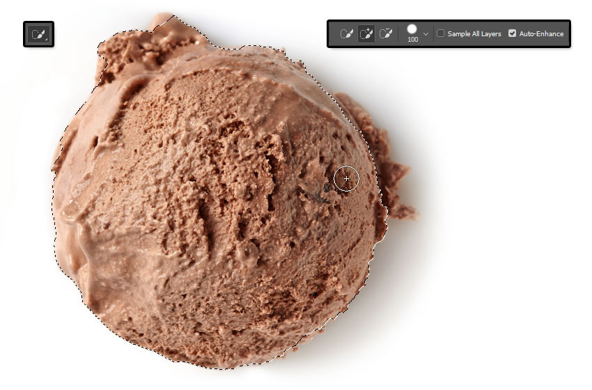
Open the Ice cream scoop images, and pick the Quick Selection Tool.
Click the Add to selection icon in the Options bar, and check the Auto-Enhance box if you want to get a precise selection, though this is optional as it might slow things down a little bit.
Click-drag to select a scoop image, and go to Edit > Copy.
Step 2
Back to the original document, go to Edit > Paste.
Right-click the pasted image’s layer and choose Convert to Smart Object.
Place the scoop image on top of the letter you want to add it to, right-click the scoop image’s layer again, and choose Create Clipping Mask to clip the image to the letter.
Step 3
Press Command-T, and Transform the scoop image until you like how it looks inside the letter.
Hit the Return key to accept the changes.
Step 4
Repeat the same steps to select the other scoop images and add them to the rest of the letters you have.
You can use the same image more than once, but Transform it to make it look different.
3. How to Style a Text Layer
Double-click the first letter’s original text layer to apply the following Layer Style:
Step 1
Add a Bevel and Emboss with these settings:
Size: 35
Check the Anti-aliased box
Highlight Mode:
Color: #ff988a
Shadow Mode: Color Burn
Color: #daaf98
Opacity: 35%
Step 2
Add a Contour with these settings:
Contour: Half Round
Check the Anti-aliased box.
Step 3
Add a Texture with these settings:
Pattern: Ant Farm
Step 4
Add an Inner Shadow with these settings:
Blend Mode: Linear Burn
Color: #b27a67
Opacity: 35%
Distance: 0
Choke: 13
Size: 24
Step 5
Right-click the styled layer, choose Copy Layer Style, select the remaining original text layers, right-click any of them, and choose Paste Layer Style.
Step 6
You might notice that the style doesn’t look good for all the different colors.
So you can double-click each letter’s layer, and adjust its Bevel and Emboss’s Highlight Mode and Shadow Mode Colors, as well as its Inner Shadow Color.
Match those colors to the letter’s texture colors, and you can even sample the colors from the texture itself. No specific values are needed, just whichever ones look good.
4. How to Add Dimension
Step 1
Double-click the first letter’s copy text layer to apply a Bevel and Emboss effect with these settings:
Size: 24
Uncheck the Use Global Light box
Angle: 164
Altitude: 53
Check the Anti-aliased box
Highlight Mode: Soft Light
Color: #ffe9e9
Shadow Mode:
Opacity: 0%
Step 2
Copy and Paste the Layer Style to the rest of the copy text layers you have.
Step 3
Place each letter’s layers in a Group with its name.
5. How to Create Stroke Layers
Step 1
Create a New Layer on top of all the first letter’s layers inside its group, and name it Stroke.
Step 2
Press-hold the Option key, and click-drag the letter’s scoop image to create a Copy and place it on top of the Stroke layer.
Step 3
Clip the copy scoop image’s layer to the Stroke layer.
Repeat the same steps to create the other letter’s Stroke layers.
6. How to Stroke a Work Path With a Modified Brush Tip
Step 1
Pick the Brush Tool, and open the Brush panel.
Choose a Hard Round Tip, and use these settings for the Brush Tip Shape and Shape Dynamics tabs.
Step 2
Right-click the first letter’s text layer, and choose Create Work Path.
Make sure to select the Stroke layer afterwards.
Step 3
With the Brush Tool active, hit the Return key once to Stroke the path.
Pick the Direct Selection Tool (A), and hit the Return key one more time to get rid of the work path.
Step 4
Repeat to create the rest of the letters’ strokes.
7. How to Style a Stroke Layer
Double-click the first letter’s Stroke layer to apply the following Layer Style:
Step 1
Add a Bevel and Emboss with these settings:
Size: 7
Uncheck the Use Global Light box
Angle: 167
Altitude: 21
Check the Anti-aliased box
Shadow Mode: Linear Burn
Color: #d5ccb9
Opacity: 65%
Step 2
Add a Drop Shadow with these settings:
Blend Mode: Linear Burn
Color: #6e6e6e
Opacity: 10%
Distance: 0
Size: 10
Step 3
Copy and Paste the Layer Style to all the Stroke layers.
8. How to Create a Sprinkles Brush Tip
Step 1
Create a 100 x 100pxNew Document with a WhiteBackground, pick the Rounded Rectangle Tool, and set the Radius in the Options bar to 15.
Click once anywhere in the document to get the Create Rectangle box, change the Width to 15 and the Height to 35, and click OK.
Make sure that the shape’s Fill Color is Black, and place it in the center of the document.
Step 2
Go to Edit > Define Brush Preset, change the Name to Sprinkles, and click OK.
Step 3
Go back to the original document, pick the Brush Tool and open the Brush panel.
Choose the Sprinkles tip and use these settings:
Brush Tip Shape
Shape Dynamics
Scattering
Color Dynamics
9. How to Use a Sprinkles Brush Tip
Step 1
Create a New Layer on top of all layers and call it Sprinkles.
Set the Foreground Color to #fe0000 and the Background Color to #1b9be6.
Click-drag slightly inside the text area to add the sprinkles.
You can change the color outcome by changing the Foreground and/or Background Colors.
Double-click the Sprinkles layer to apply the following Layer Style:
Step 2
Add a Bevel and Emboss with these settings:
Size: 1
Uncheck the Use Global Light box
Angle: 128
Altitude: 37
Check the Anti-aliased box
Highlight Mode: Vivid Light
Step 3
Add a Drop Shadow with these settings:
Blend Mode: Color Burn
Color: #010101
Opacity: 10%
Distance: 3
Size: 5
Step 4
Click the Add layer mask icon at the bottom of the Layers panel, and select the mask’s thumbnail.
10. How to Create a Mask’s Texture Fill
Step 1
Set the Foreground and Background Colors to Black and White, and go to Filter > Render > Clouds.
Step 2
Go to Filter > Filter Gallery > Sketch > Reticulation, and use these settings:
Density: 12
Foreground Level: 40
Background Level: 5
Step 3
Click the New effect layer icon in the bottom right corner, and apply the Photocopy filter with these settings:
Detail: 7
Darkness: 8
Step 4
Add another New effect layer, and apply the Bas Relief filter with these settings:
Detail: 13
Smoothness: 3
Light: Bottom
This will apply a Layer Mask that blends the sprinkles with the scoops to make the effect look more realistic.
11. How to Add More Sprinkles
Step 1
Create a New Layer on top of the Sprinkles layer, name it Sprinkles 2, and Copy and Paste the Sprinkles layer’s Layer Style to it.
Set the Foreground Color to #fe0000 and the Background Color to #01ffe5, and add some more sprinkles to the text.
Step 2
Add another New Layer on top of all layers, name it Sprinkles 3, Paste the same Layer Style to it, and add some more sprinkles around the text.
Step 3
Put all the sprinkle layers in a Sprinkles group.
12. How to Style a Drip Layer
Step 1
Create a New Layer on top of all the first letter’s layers, and name it Drip.
Press-hold the Option key to click-drag the letter’s scoop image on top of the Drip layer, and Clip it to it.
Right-click the scoop image and choose Convert to Smart Object.
Double-click the Drip layer to apply the following Layer Style:
Step 2
Add a Bevel and Emboss with these settings:
Size: 16
Soften: 1
Uncheck the Use Global Light box
Angle: 30
Altitude: 48
Gloss Contour: Cone
Check the Anti-aliased box
Shadow Mode: Vivid Light
Color: #a1a1a1
Step 3
Add a Contour with these settings:
Contour: Rounded Steps
Check the Anti-aliased box.
Step 4
Add an Inner Shadow with these settings:
Blend Mode: Color Burn
Opacity: 35%
Uncheck the Use Global Light box
Angle: 90
Distance: 3
Choke: 33
Size: 3
Step 5
Select the Drip layer’s scoop image, go to Filter > Noise > Median, and change the Radius to 5.
Step 6
Go to Filter > Blur > Gaussian Blur, and change the Radius to 2.
13. How to Paint Drips
Step 1
Pick the Brush Tool, use the same settings of the stroke brush tip, but change the Spacing value under the Brush Tip Shape tab to 1%.
Step 2
Select the Drip layer, and start painting the drips by slowly dragging the brush into the shape you like.
Step 3
Use the Eraser Tool to get rid of any areas you don’t like.
Step 4
Repeat all the steps to add drips to the rest of the letters you have.
14. How to Add Shadows and a Background Texture
Step 1
Double-click the first letter group you have to apply a Drop Shadow effect with these settings:
Blend Mode: Color Burn
Opacity: 7%
Distance: 45
Size: 20
Step 2
Copy and Paste the Layer Style to the rest of the letter groups.
Step 3
Place the MGrunge005 image on top of the Gradient Fill layer, resize it as needed, and change its layer’s Blend Mode to Soft Light and its Opacity to 25%.
15. How to Make Global Adjustments
Step 1
Create a New Layer on top of all layers, name it High Pass, and press the Shift-Option-Command-E keys to create a stamp layer.
Right-click the High Pass layer and choose Convert to Smart Object.
Step 2
Go to Filter > Other > High Pass, and change the Radius to 1.5.
Step 3
Change the High Pass layer’s Blend Mode to Soft Light and its Opacity to 50%.
Step 4
Add a Gradient Map layer on top of all layers, and create the Gradient Fill using the Colors#55456b to the left, #79566e in the middle, and #d4977c to the right.
Check the Dither box, and change the Gradient Map layer’s Blend Mode to Soft Light and its Opacity to 50%.
Congratulations! You’re Done
In this tutorial, we created a couple of text layers, and added ice-cream scoop textures to them.
Then, we used brushes and layer styles to style the textured letters and add strokes, drips, and sprinkles to them.
Finally, we used textures and adjustment layers to finish off the effect.
Please feel free to leave your comments, suggestions, and outcomes below.
If you needed a proof that doodling can be an art, any drawing by Visoth Kakvei should convince you. This Cambodian artist takes his doodle to a whole new level using symbols, details and perspective. You can follow more of his work on his Instagram account.
There is a native API for animation in JavaScript known as the Web Animations API. We’ll call it WAAPI in this post. MDN has good documentation on it, and Dan Wilson has a great article series.
In this article, we’ll compare WAAPI and animations done in CSS.
A note on browser support
WAAPI has a comprehensive and robust polyfill, making it usable in production today, even while browser support is limited.
As ever, you can check Can I Use for browser support data. However, that doesn’t provide very good info on support of all the sub features of WAAPI. Here’s a checker for that:
To experiment with all features without a polyfill, use Firefox Nightly.
The basics of WAAPI
If you’ve ever used jQuery’s .animate(), the basic syntax of WAAPI should look pretty familiar.
var element = document.querySelector('.animate-me');
element.animate(keyframes, 1000);
The animate method accepts two parameters: keyframes and duration. In contrast to jQuery, not only does it have the benefit of being built into the browser, it’s also more performant.
The first argument, the keyframes, should be an array of objects. Each object is a keyframe in our animation. Here’s a simple example:
The second argument, the duration, is how long we want the animation to last . In the example above it is 1000 milliseconds. Let’s look at a more exciting example.
Recreating an animista CSS animation with WAAPI
Here’s some CSS code I yanked from the awesome animista for something calling itself the „slide-in-blurred-top” entrance animation. It looks pretty sweet.
We’ve already seen how easy it is to apply the keyframes to whichever element we want to animate:
element.animate(keyframes, 700);
To keep the example simple, I’ve only specified the duration. However, we can use this second parameter to pass in far more options. At the very least, we should also specify an easing. Here’s the full list of available options with some example values:
Annoyingly, for those of us familiar with CSS animations, some of the terminologies varies from what we’re used to. Although on the plus side, things are a lot quicker to type!
It’s easing rather than animation-timing-function
Rather than animation-iteration-count it’s iterations. If we want the animation to repeat forever it’s Infinity rather than infinite. Somewhat confusingly, Infinity isn’t in quotes. Infinity is a JavaScript keyword, whereas the other values are strings.
We use milliseconds instead of seconds, which should be familiar to anyone who’s written much JavaScript before. (You can use milliseconds in CSS animations as well, but few people do.)
Let’s take a closer look at one of the options: iterationStart.
I was stumped when I first came across iterationStart. Why would you want to start on a specified iteration rather than just decreasing the number of iterations? This option is mostly useful when you use a decimal number. For example, you could set it to .5, and the animation would start half way through. It takes two halves to make a whole, so if your iteration count is set to one and your iterationStart is set to .5, the animation will play from halfway through until the end of the animation, then start at the beginning of the animation and end in the middle!
It is worth noting that you can also set the total number of iterations to less than one. For example:
var option = {
  iterations: .5,
  iterationStart: .5
}
This would play the animation from the middle until the end.
endDelay: endDelay is useful if you want to string multiple animations after each other, but want there to be a gap between the end of one animation and the start of any subsequent ones. Here’s a useful video to explain from Patrick Brosset.
Easing
Easing is one of the most important elements in any animation. WAAPI offers us two different ways to set easing — within our keyframes array or within our options object.
In CSS, if you applied animation-timing-function: ease-in-out you might assume that the start of your animation would ease in, and the end of your animation would ease out. In fact, the easing applies between keyframes, not over the entire animation. This can give fine-grained control over the feel of an animation. WAAPI also offers this ability.
It’s worth noting that in both CSS and WAAPI, you shouldn’t pass in an easing value for the last frame, as this will have no effect. This is a mistake a lot of people make.
Sometimes it’s a lot more intuitive to add easing over an entire animation. This is not possible with CSS, but can now be achieved with WAAPI.
var options = {
  duration: 1000,
  easing: 'ease-in-out',
}
You can see the difference between these two kinds of easing in this Pen:
It’s worth noting another difference between CSS animation and WAAPI: the default of CSS is ease, while the default of WAAPI is linear. Ease is actually a version of ease-in-out and is a pretty nice option if you’re feeling lazy. Meanwhile, linear is deadly dull and lifeless — a consistent speed that looks mechanical and unnatural. It was probably chosen as the default as it is the most neutral option. However, it makes it even more important to apply an easing when working with WAAPI than when working with CSS, lest your animation look tedious and robotic.
Performance
WAAPI provides the same performance improvements as CSS animations, although that doesn’t mean a smooth animation is inevitable.
I had hoped that the performance optimizations of this API would mean we could escape the use of will-change and the totally hacky translateZ — and eventually, it might. However, at least in the current browser implementations, these properties can still be helpful and necessary in dealing with jank issues.
However, at least if you have a delay on your animation, you don’t need to worry about using will-change. The primary author of the web animations spec had some interesting advice over on the Animation for Work Slack community, which hopefully he won’t mind me repeating here:
If you have a positive delay, you don’t need will-change since the browser will layerize at the start of the delay and when the animation starts it will be ready to go.
WAAPI Versus CSS Animations?
WAAPI gives us a syntax to do in JavaScript what we could already achieve in a stylesheet. Yet, they shouldn’t be seen as rivals. If we decide to stick to CSS for our animations and transitions, we can interact with those animations with WAAPI.
Animation Object
The .animate() method doesn’t just animate our element, it also returns something.
var myAnimation = element.animate(keyframes, options);
Animation object viewed in a console
If we take a look at the return value in the console, we’ll see its an animation object. This offers us all sorts of functionality, some of which is pretty self-explanatory, like myAnimation.pause(). We could already achieve a similar result with CSS animations by changing the animation-play-state property, but the WAAPI syntax is somewhat terser than element.style.animationPlayState = "paused". We also have the power to easily reverse our animation with myAnimation.reverse(), which again, is only a slight improvement over changing the animation-direction CSS property with our script.
However, up until now, manipulating @keyframes with JavaScript hasn’t been the easiest thing in the world. Even something as simple as restarting an animation takes a bit of know-how, as Chris Coyier has previously written about. Using WAAPI we can simply use myAnimation.play() to replay the animation from the beginning if it had previously completed, or to play it from mid-iteration if we had paused it.
We can even change the speed of an animation with complete ease.
myAnimation.playbackRate = 2; // speed it up
myAnimation.playbackRate = .4; // use a number less than one to slow it down
getAnimations()
This method will return an array of any animation objects for any animations we’ve defined with WAAPI, as well as for any CSS transitions or animations.
element.getAnimations() // returns any animations or transitions applied to our element using CSS or WAAPI
If you feel comfortable and content using CSS for defining and applying your animations, getAnimations() allows you to use the API in conjunction with @keyframes. It’s possible to continue to use CSS for the bulk of your animation work and still get the benefit of the API when you need it. Let’s see how easy that is.
Even if a DOM element only has one animation applied to it, getAnimations() will always return an array. Let’s grab that single animation object to work with.
var h2 = document.querySelector("h2");
var myCSSAnimation = h2.getAnimations()[0];
Now we can use the web animation API on our CSS animation 🙂
We already have a variety of events triggered by CSS that we can utilise in our JavaScript code : animationstart, animationend, animationiteration and transitionend. I often need to listen for the end of an animation or transition in order to then remove the element it was applied to from the DOM.
The equivalent of using animationend or transitionend for such a purpose in WAAPI would again make use of the animation object:
WAAPI offers us the choice of working with both events and promises. The .finished property of our animation object will return a promise that will resolve at the end of the animation. Here’s what the example above would look like using a promise:
myAnimation.finished.then(() =>
  element.remove())
Let’s look at a slightly more involved example yanked from the Mozilla Developer Network. Promise.all expects an array of promises and will only run our callback function once all of those promises have resolved. As we’ve already seen, element.getAnimations() returns an array of animation objects. We can map over all the animation objects in the array calling .finished on each of them, giving us the needed array of promises.
In this example, it’s only after all the animations on the page have finished that our function will run.
Promise.all(document.getAnimations().map(animation =>
  animation.finished)).then(function() {
    // do something cool
  })
The Future
The features mentioned in this article are just the beginning. The current spec and implementation look to be the start of something great.
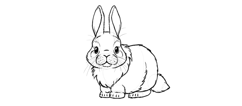
Do you want to draw something cute and simple? In this tutorial I
will show you how to draw a bunny from scratch, step by step. You don’t
need any reference and you can use any tools you want. This will be
simple and fun!
Before You Start
Let’s take a look at some
bunnies first, shall we? You may know what a bunny looks like, but it’s
always good to refresh your memory before you start drawing.
Draw
an oval—this will be the forehead. Draw it very lightly, because it’s
just a guide line for later. The smaller it is, the smaller the whole
drawing will be, and drawing small is a good way to keep the proportions
right! Also, you don’t need to draw the whole oval with one continuous
line—draw it with short, subtle lines, and then connect them.
Step 2
Draw a circle below. Keep sketching, and don’t press too hard!
Step 3
Cross the circle with a „smile”. This will help us place the cheeks properly.
Step 4
Draw two circles on the sides—these will be the fluffy cheeks.
Step 5
Draw a smaller circle inside the middle circle. This will help us with the chin.
Step 6
Draw two other circles on top. Can you see a bunny smile already?
Step 7
To give the eyes a cartoon cuteness, draw „butterfly wings” where the eyes will be.
Step 8
Draw two narrow ovals inside the „wings”.
Step 9
Outline the shape of the head going around the circles.
Step 10
Draw the cute mouth and nose.
2. How to Draw Bunny Ears
Step 1
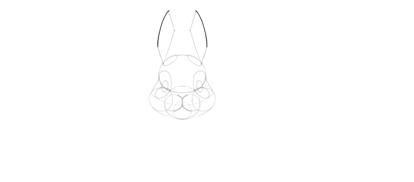
Draw two ovals on top of the bunny’s head. This will be the base of the ears.
Step 2
Draw two lines from the outer edge of the circles, going towards the central line of the head.
Step 3
Now turn outside with shorter lines.
Step 4
Draw a similar short line at the base of the ears.
Step 5
Close the shape with subtle curves.
Step 6
That’s not all! Draw small curves at the tips of the ears.
Step 7
Draw a line towards the inner side of the base circles.
3. How to Draw a Bunny Body
Step 1
Add
a body to the head. You can choose any shape and size you wish. I
decided to use a fat egg shape for a half-realistic, half-cartoon style.
Step 2
Draw the oval paws under the body.
Step 3
Draw horizontal lines under the paws.
Step 4
Draw curves around the paws to make their shape less basic.
Step 5
Draw ovals over the paws to create a part of the leg.
Step 6
Draw an oval behind the hind paw to create a foot.
Step 7
Draw a fluffy tail out of a few circles.
Step 8
You can a little fluffy ruff around the head to cover the neck.
Step 9
Additionally, you can draw a curve around the body to better see its 3D form.
4. How to Finish the Drawing of a Bunny
Step 1
Time
to finish the drawing! If you’ve been drawing digitally, create a new
layer for these final lines. If you’ve been drawing traditionally,
either take a darker tool to cover the lightly drawn sketch, or put a
new sheet of paper on top to draw the final lines here.
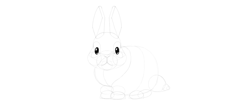
Outline the shape of the eyes.
Step 2
Outline the shine dots inside them.
Step 3
Draw smaller shine dots on the opposite side.
Step 4
Fill the eyes with dark shading.
Step 5
Subtly darken the smaller shine dots.
Step 6
Outline the mouth…
… and the fluffy muzzle.
Step 7
Don’t outline the whole shape around the eyes. Instead, sketch a suggestion of fur without closing the shape.
Step 8
Outline the ears with quick, short lines.
Step 9
Outline the whole head, but don’t close the shape entirely.
Step 10
Outline the rest of the fluff.
Step 11
Add the whiskers!
Step 12
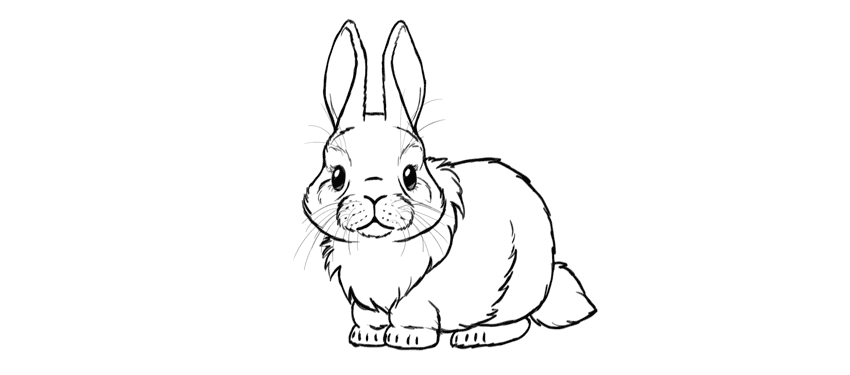
Finally, add a darker outline to the body and make some lines thicker for a more interesting look.
So Cute!
Congratulations!
You have learned how to draw a cute little bunny! If you want to learn
more about real rabbits and hares, don’t forget to check this tutorial:
The campaign promotes the New Outlander PHEV, the Mitsubishi’s Electric 4X4 car. This car model has a regular motor, like most cars, and a second electric motor. So the idea behind the ads was to mix the adventurous world of the Mitsubishi 4×4 and the electricity differential of the car.
Go Electric. New Outlander PHEV. The electric 4X4.