Post pobrano z: The Veggemo Story

Post pobrano z: The Veggemo Story
Post pobrano z: Creating Yin and Yang Loaders On the Web
I came across a couple such animations a while ago and this gave me the idea of creating my own versions with as little code as possible, no external libraries, using various methods, some of which take advantage of more recent features we can use these days, such as CSS variables. This article is going to guide you through the process of building these demos.
Before anything else, this is the animation we’re trying to achieve here:

No matter what method we choose to use to recreate the above animation, we always start from the static yin and yang shape which looks as illustrated below:

The structure of this starting shape is described by the following illustration:

First off, we have a big circle of diameter d. Inside this circle, we tightly fit two smaller circles, each one of them having a diameter that’s half the diameter of our initial big circle. This means that the diameter for each of these two smaller circles is equal to the big circle’s radius r (or .5*d). Inside each of these circles of diameter r we have an even smaller concentric circle. If we are to draw a diameter for the big circle that passes through all the central points of all these circles – the line segment AB in the illustration above, the intersections between it and the inner circles split it into 6 equal smaller segments. This means that the diameter of one of the smallest circles is r/3 (or d/6) and its radius is r/6.
Knowing all of this, let’s get started with the first method!
In this case, we can do it with one element and its two pseudo-elements. The how behind building the symbol is illustrated by the following animation (since the whole thing is going to rotate, it doesn’t matter if we switch axes):
See the Pen by thebabydino (@thebabydino) on CodePen.
The actual element is the big circle and it has a top to bottom gradient with a sharp transition right in the middle. The pseudo-elements are the smaller circles we place over it. The diameter of one of the smaller circles is half the diameter of the big circle. Both smaller circles are vertically middle-aligned with the big circle.
So let’s start writing the code that can achieve this!
First of all, we decide upon a diameter $d for the big circle. We use viewport units so that everything scales nicely on resize. We set this diameter value as its width and height, we make the element round with border-radius and we give it a top to bottom gradient background with a sharp transition from black to white in the middle.
$d: 80vmin;

.☯ {
  width: $d; height: $d;
  border-radius: 50%;
  background: linear-gradient(black 50%, white 0);
}
So far, so good:
See the Pen by thebabydino (@thebabydino) on CodePen.
Now let’s move on to the smaller circles which we create with pseudo-elements. We give our element display: flex and make its children (or pseudo-elements in our case) middle aligned with it vertically by setting align-items: center. We make these pseudo-elements have half the height (50%) of their parent element and make sure that, horizontally, they each cover half of the big circle. Finally, we make them round with border-radius, give them a dummy background and set the content property just so that we can see them:
.☯ {
  display: flex;
  align-items: center;
  /* same styles as before */

  &:before, &:after {
    flex: 1;
    height: 50%;
    border-radius: 50%;
    background: #f90;
    content: '';
  }
}
See the Pen by thebabydino (@thebabydino) on CodePen.
Next, we need to give them different backgrounds:
.☯ {
  /* same styles as before */

  &:before, &:after {
    /* same styles as before */
    background: black;
  }

  &:after { background: white }
}
Now we’re getting somewhere!
See the Pen by thebabydino (@thebabydino) on CodePen.
All that’s left to do before we get the static symbol is to give these two pseudo-elements borders. The black one should get a white border, while the white one should get a black border. These borders should be a third of the pseudo-element’s diameter, which is a third of half the diameter of the big circle – that gives us $d/6.
.☯ {
  /* same styles as before */

  &:before, &:after {
    /* same styles as before */
    border: solid $d/6 white;
  }

  &:after {
    /* same styles as before */
    border-color: black;
  }
}
However, the result doesn’t look quite right:
See the Pen by thebabydino (@thebabydino) on CodePen.
This is because, vertically, the border adds up to the height instead of being subtracted out of it. Horizontally, we haven’t set a width, so it gets subracted from the available space. We have two fixes possible here. One would be to set box-sizing: border-box on the pseudo-elements. The second one would be to change the height of the pseudo-elements to $d/6 – we’ll go with this one:
See the Pen by thebabydino (@thebabydino) on CodePen.
We now have the basic shape, so let’s move on to the animation! This animation involves going from the state where the first pseudo-element has shrunk to let’s say half its original size (which would mean a scaling factor $f of .5) while the second pseudo-element has expanded to take up all available space left – meaning to the diameter of the big circle (which is twice its original size) minus the diameter of the first circle (which is $f of its original size) to the state where the second pseudo-element has shrunk to $f of its original size and the first pseudo-element has expanded to 2 - $f of its original size. The first pseudo-element circle scales relative to its leftmost point (so we need to set a transform-origin of 0 50%), while the second one scales relative to its rightmost point (100% 50%).
$f: .5;
$t: 1s;

.☯ {
  /* same styles as before */

  &:before, &:after {
    /* same styles as before */
    transform-origin: 0 50%;
    transform: scale($f);
    animation: s $t ease-in-out infinite alternate;
  }

  &:after {
    /* same styles as before */
    transform-origin: 100% 50%;
    animation-delay: -$t;
  }
}

@keyframes s { to { transform: scale(2 - $f) } }
We now have the shape changing animation we’ve been after:
See the Pen by thebabydino (@thebabydino) on CodePen.
The last step is to make the whole symbol rotate:
$t: 1s;

.☯ {
  /* same styles as before */
  animation: r 2*$t linear infinite;
}

@keyframes r { to { transform: rotate(1turn) } }
And we got the final result!
However, there’s still one more thing we can do to make the compiled CSS more efficient: eliminate redundancy with CSS variables!
white can be written in HSL format as hsl(0, 0%, 100%). The hue and the saturation don’t matter, any value that has the lightness 100% is white, so we just set them both to 0 to make our life easier. Similarly, black can be written as hsl(0, 0%, 0%). Again, the hue and saturation don’t matter, any value that has the lightness 0% is black. Given this, our code becomes:
.☯ {
  /* same styles as before */

  &:before, &:after {
    /* same styles as before */
    border: solid $d/6 hsl(0, 0%, 100% /* = 1*100% = (1 - 0)*100% */);
    transform-origin: 0 /* = 0*100% */ 50%;
    background: hsl(0, 0%, 0% /* 0*100% */);
    animation: s $t ease-in-out infinite alternate;
    animation-delay: 0 /* = 0*-$t */;
  }

  &:after {
    /* same styles as before */
    border-color: hsl(0, 0%, 0% /* = 0*100% = (1 - 1)*100% */);
    transform-origin: 100% /* = 1*100% */ 50%;
    background: hsl(0, 0%, 100% /* = 1*100% */);
    animation-delay: -$t /* = 1*-$t */;
  }
}
From the above, it results that:
x component of our transform-origin is calc(0*100%) for the first pseudo-element and calc(1*100%) for the second oneborder-color is hsl(0, 0%, calc((1 - 0)*100%)) for the first pseudo-element and hsl(0, 0%, calc((1 - 1)*100%)) for the second onebackground is hsl(0, 0%, calc(0*100%)) for the first pseudo-element and hsl(0, 0%, calc(1*100%)) for the second oneanimation-delay is calc(0*#{-$t}) for the first pseudo-element and calc(1*#{-$t}) for the second oneThis means we can use a custom property that acts as a switch and is 0 for the first pseudo-element and 1 for the second:
.☯ {
  /* same styles as before */

  &:before, &:after {
    /* same styles as before */
    --i: 0;
    border: solid $d/6 hsl(0, 0%, calc((1 - var(--i))*100%));
    transform-origin: calc(var(--i)*100%) 50%;
    background: hsl(0, 0%, calc(var(--i)*100%));
    animation: s $t ease-in-out calc(var(--i)*#{-$t}) infinite alternate;
  }

  &:after { --i: 1 }
}
This eliminates the need for witing all these rules twice: all we need to do now is flip the switch! Sadly, this only works in WebKit browsers for now because Firefox and Edge don’t support using calc() as an animation-delay value and Firefox doesn’t support using it inside hsl() either.
While some people might think this method is overkill, I really like it because it requires about the same amount of code as the CSS one, it has good support and good performance.
We start with a canvas element and some basic styles just to put it in the middle of its container (which is the body element in our case) and make it visible. We also make it circular with border-radius so that we simplify our job when drawing on the canvas.
$d: 80vmin;

body {
  display: flex;
  justify-content: center;
  align-items: center;
  height: 100vh;
  background: lightslategray;
}

canvas {
  width: $d; height: $d;
  border-radius: 50%;
  background: white;
}
So far, so good – we have a white disc:
See the Pen by thebabydino (@thebabydino) on CodePen.
Alright, now let’s move on to the JavaScript part! Before anything else, we need to get the canvas element, the 2D context and set the canvas element’s width and height attributes (things we draw on the canvas would appear stretched otherwise). Then, we’re going to need to have a radius for our big circle. We get this radius to be half the computed size of the canvas element and, after we do that, we translate our context such that we bring the 0,0 point of our canvas dead in the middle (it’s originally in the top left corner). We make sure we recompute the radius and the width and height attributes on each resize because, in the CSS, we made the canvas dimensions depend on the viewport.
const _C = document.querySelector('canvas'),
      CT = _C.getContext('2d');

let r;

function size() {
  _C.width = _C.height = Math.round(_C.getBoundingClientRect().width);

  r = .5*_C.width;

  CT.translate(r, r);
};

size();

addEventListener('resize', size, false);
After we’ve done this, we can move on to drawing on the canvas. Draw what? Well, a shape made out of three arcs, as shown in the illustration below:

In order to draw an arc on a 2D canvas, we need to know a few things. First off, it’s the coordinates of the central point of the circle this arc belongs to. Then we need to know the radius of this circle and the angles (relative to the x axis of the local coordinate system of the circle) at which the start and end points of the arc are located. Finally, we need to know if we go from the start point to the end point clockwise or not (if we don’t specify this, the default is clockwise).
The first arc is on the big circle whose diameter is equal to the canvas dimensions and, since we’ve placed the 0,0 point of the canvas right in the middle of this circle, this means we know both the first set of coordinates (it’s 0,0) and the circle radius (it’s r). The start point of this arc is the leftmost point of this circle – this point is at -180° (or -π). The end point is the rightmost point of the circle, which is at 0° (also 0 in radians). If you need a refresher of angles on a circle, check out this helper demo.
This means we can create a path and add this arc to it and, in order to see what we have so far, we can close this path (which in this case means connecting the end point of our arc to the start point with a straight line) and fill it (using the default fill, which is black):
CT.beginPath();
CT.arc(0, 0, r, -Math.PI, 0);

CT.closePath();
CT.fill();
The result can be seen in the following Pen:
See the Pen by thebabydino (@thebabydino) on CodePen.
Now let’s move on to the second arc. The coordinates of the central point of the circle it’s on are .5*r,0 and its radius is .5*r (half the radius of the big circle). It goes from 0 to π, moving clockwise in doing so. So the arc we add to out path before closing it is:
CT.arc(.5*r, 0, .5*r, 0, Math.PI);After adding this arc, our shape becomes:
See the Pen by thebabydino (@thebabydino) on CodePen.
Now we have one more arc left to add. The radius is the same as for the previous one (.5*r) and the first set of coordinates is -.5*r,0. This arc goes from 0 to -π and it’s the first arc not to go clockwise, so we need to change that flag:
CT.arc(-.5*r, 0, .5*r, 0, -Math.PI, true);We now have the shape we wanted:
See the Pen by thebabydino (@thebabydino) on CodePen.
Next, we’re going to add the black circle to this path. We’re not going to create another path because the aim is to group all shapes with the same fill into the same path for better performance. Calling fill() is expensive, so we don’t want to do it more often than we really need to.
A circle is just an arc from 0° to 360° (or from 0 to 2*π). The central point of this circle coincides to that for the last arc we’ve drawn (-.5*r, 0) and its radius is a third of that of the previous two arcs.
CT.arc(-.5*r, 0, .5*r/3, 0, 2*Math.PI);Now we’re getting really close to having the full symbol:
See the Pen by thebabydino (@thebabydino) on CodePen.
All that’s left to do is create a white circle, symmetrical to the black one with respect to the y axis. This means need to switch to a white fill, start a new path and then add an arc to it using almost the same command we used to add the black circle shape – the only difference is that we reverse the sign of the x coordinate (this time, it’s +, not -). After that, we close that path and fill it.
CT.fillStyle = 'white';
CT.beginPath();
CT.arc(.5*r, 0, .5*r/3, 0, 2*Math.PI);
CT.closePath();
CT.fill();
We now have the static symbol!
See the Pen by thebabydino (@thebabydino) on CodePen.
For the animation, we want to go from the state where the first of the smaller arcs has shrunk to half is original radius (so we use a scaling factor F of .5) and the other one has expanded accordingly to the state where these initial radii are reversed.
In the initial state, given that the radius of the smaller arcs is initially .5*r, then the radius of the first of them after being scaled down by a factor F is r1 = F*.5*r. Since the radii of the smaller circles need to add up to the radius of the big circle r, we have that the radius of the second one of the smaller circles is r2 = r - r1 = r - F*.5*r.
In order to get the x coordinate of the origin of the first smaller arc for the initial state, we need to subtract its radius from the x coordinate of the point it starts at. This way, we get that this coordinate is r - r1 = r2. Similarly, in order to get the x coordinate of the origin of the second smaller arc, we need to add up its radius to the coordinate of the point it ends at. This way, we get that this coordinate is -r + r2 = -(r - r2) = -r1.

For the final state, the values of the two radii are reversed. The second one is F*.5*r, while the first one is r - F*.5*r.
With every frame of our animation, we increase the current radius of the first smaller arc from the minimum value (F*.5*r) to the maximum value (r - F*.5*r) and then we start decreasing it to the minimum value and then the cycle repeats while also scaling the radius of the other smaller arc accordingly.
In order to do this, we first set the minimum and maximum radius in the size() function:
const F = .5;

let rmin, rmax;

function size() {
  /* same as before */
  rmin = F*.5*r;
  rmax = r - rmin;
};
At any moment in time, the current radius of the first of the smaller arcs is k*rmin + (1 - k)*rmax, where this k factor keeps going from 1 to 0 and then back up to 1. This sounds similar to the cosine function on the [0, 360°] interval. At 0°, the value of the cosine is 1. Then it starts decreasing and it keeps doing so until it gets to 180°, when it reaches its minimum value of -1, after which the value of the function starts increasing again until it gets to 360°, where it’s again 1:
See the Pen by thebabydino (@thebabydino) on CodePen.
Alright, but the values of the cosine function are in the [-1, 1] interval and we need a function that gives us values in the [0, 1] interval. Well, if we add 1 to the cosine, then we shift the whole graph up and the values are now in the [0, 2] interval:
See the Pen by thebabydino (@thebabydino) on CodePen.
[0, 2] isn’t [0, 1], so what we still need to do here is divide the whole thing by 2 (or multiply it with .5, same thing). This squishes our graph to the desired interval.
See the Pen by thebabydino (@thebabydino) on CodePen.
Good, but what’s up with that angle? We don’t have an angle going from 0° to 360°. If we’re going to use requestAnimationFrame, we just have the number of the current frame, which starts at 0 and then keeps going up. Well, at the beginning, we set a total number of frames T for one animation cycle (the first arc going from the minimum radius value to the maximum radius value and then back again).
For every frame, we compute the ratio between the number of the current frame (t) and the total numeber of frames. For one cycle, this ratio goes from 0 to 1. If we multiply this ratio with 2*Math.PI (which is the same as 360°), then the result goes from 0 to 2*Math.PI over the course of a cycle. So this is going to be our angle.
const T = 120;

(function ani(t = 0) {
  let k = .5*(1 + Math.cos(t/T*2*Math.PI)),
      cr1 = k*rmin + (1 - k)*rmax, cr2 = r - cr1;

})();
The next step is to put inside this function the code that actually draws our symbol. The code for beginning, closing, filling paths, changing fills stays the same, as does the code needed for creating the big arc. The things that change are:
cr1 and cr2 respectivelyx coordinates of the central points for the smaller arcs – they’re at cr2 and -cr1 respectivelyblack and white circles – they’re cr2/3 and cr1/3 respectivelyx coordinates of the central points of these circles – they’re at -cr1 and cr2 respectivelySo our animation function becomes:
const T = 120;

(function ani(t = 0) {
  let k = .5*(1 + Math.cos(t/T*2*Math.PI)),
      cr1 = k*rmin + (1 - k)*rmax, cr2 = r - cr1;

  CT.beginPath();
  CT.arc(0, 0, r, -Math.PI, 0);
  CT.arc(cr2, 0, cr1, 0, Math.PI);
  CT.arc(-cr1, 0, cr2, 0, -Math.PI, true);
  CT.arc(-cr1, 0, cr2/3, 0, 2*Math.PI);
  CT.closePath();
  CT.fill();

  CT.fillStyle = 'white';
  CT.beginPath();
  CT.arc(cr2, 0, cr1/3, 0, 2*Math.PI);
  CT.closePath();
  CT.fill();
})();
This gives us the initial state of the animation:
See the Pen by thebabydino (@thebabydino) on CodePen.
Before we actually start animating the radii of the arcs, we still need to take care of a couple more things. First of all, if we start the animation right now, we’re just going to be drawing how the shape looks for each frame over what we’ve drawn for the previous frames, which is going to create one big mess. In order to avoid this, we need to clear the canvas for each frame, before drawing anything on it. What we clear is the visible part, which is inside the rectangle of canvas dimensions whose top left corner is at -r,-r:
CT.clearRect(-r, -r, _C.width, _C.width);The second little problem we need to fix is that we’re switching to a white fill, but at the start of the next frame, we need a black one. So we need to make this switch for each frame before the beginning of the first path:
CT.fillStyle = 'black';Now we can actually start the animation:
requestAnimationFrame(ani.bind(this, ++t));This gives us the morphing animation, but we still need to rotate the whole thing. Before tackling that, let’s look at the formula for k once more:
let k = .5*(1 + Math.cos(t/T*2*Math.PI))T and 2*Math.PI are constant throughout the animation, so we can just take that part out and store it as a constant angle A:
const T = 120, A = 2*Math.PI/T;

(function ani(t = 0) {
  let k = .5*(1 + Math.cos(t*A));

  /* same as before */
})();
Now for every frame, we can also rotate the context by A after clearing the canvas.
CT.rotate(A);This rotation keeps adding up with every frame and we now have the rotating and morphing animation we’ve been after.
We start with an SVG element and pretty much the same CSS as in the canvas case:
$d: 80vmin;

body {
  display: flex;
  justify-content: center;
  align-items: center;
  height: 100vh;
  background: lightslategray;
}

svg {
  width: $d; height: $d;
  border-radius: 50%;
  background: white;
}
This gives us a white disc:
See the Pen by thebabydino (@thebabydino) on CodePen.
Not too exciting, so let’s move on to drawing something on the SVG canvas. Just like in the canvas case, we’ll be drawing a path made up of the same three arcs (the big one with a radius that’s half the size of the SVG viewBox and the two smaller ones with a radius that’s half of that of the big arc in the static case) and two small circles (with a radius that’s a third of that of the smaller arc they share their central point with).
So we start by picking a radius r value and using it to set the viewBox on the svg element:
- var r = 1500;

svg(viewBox=[-r, -r, 2*r, 2*r].join(' '))
The next step is to add the path made up of the three arcs. Creating a path in SVG is a bit different from canvas. Here, the shape is described by the path data d attribute, which, in our case, is made up of:
M) command after which we specify the coordinates of the start point of our path (also the start point of the big arc in this case)A) command for each of our arcs after which we describe our arcs; each of these arcs starts from the end point of the previous arc or, in the case of the first arc, from the start point of our pathLet’s take a closer look at the components of an „arc to” (A) command:
x axis of its system of coordinates – this is equal to r in the case of the big arc and to .5*r in the case of the two smaller onesy axis of its system of coordinates – this is equal to the one along the x axis in the case of circular arcs as we have here (it’s only different for elliptical arcs, but that’s beyond the scope of this article)0 to simplify things for circular arcs1 if our arc is greater than half a circle and 0 otherwise; since our arcs are exactly half a circle, they’re not greater than haf a circle, so this is always 0 in our case1 if the arc goes clockwise between its start and its end point and 0 otherwise; in our case, the first two arcs go clockwise, while the third doesn’t, so the values we use for the three arcs are 1, 1 and 0x coordinate of the arc’s end point – this is something we need to determine for each arcy coordinate of the arc’s end point – also something we need to determine for each arcAt this point, we already know most of what we need. All we still have to figure out are the coordinates of the arcs’ endpoints. So let’s consider the following illustration:

From the illustration above we can see that the first arc (the big one) starts at (-r,0) and ends at (r,0), the second one ends at 0,0 and the third one ends at (-r,0) (also the start point of our path). Note that the y coordinates of all these points remain 0 even if the smaller arcs’ radii change, but the x coordinate of the second arc’s endpoint only happens to be 0 in this case when the radii of the smaller arcs are exactly half of the big one. In the general case, it’s r - 2*r1, where r1 is the radius of the second arc (the first of the smaller ones). This means we can now create our path:
- var r1 = .5*r, r2 = r - r1;

path(d=`M${-r} 0
        A${r} ${r} 0 0 1 ${r} 0
        A${r1} ${r1} 0 0 1 ${r - 2*r1} 0
        A${r2} ${r2} 0 0 0 ${-r} 0`)
This gives us the three arc shape we’ve been after:
See the Pen by thebabydino (@thebabydino) on CodePen.
Now let’s move on to the small circles. We already know the coordinates of their central points and their radii from the canvas method.
circle(r=r1/3 cx=r2)
circle(r=r2/3 cx=-r1)
By default, all these shapes have a black fill so we need to explicitly set a white one on the circle at (r2,0):
circle:nth-child(2) { fill: white }We now have the static shape!
See the Pen by thebabydino (@thebabydino) on CodePen.
Next, we’re going to animate the shape of our path and the size and position of our two small circles using JavaScript. This means that the first thing we do is get these elements, get the radius R of the big circle and set a scaling factor F that gives us the minimum radius (RMIN) down to which the arcs can be scaled. We also set a total number of frames (T) and a unit angle (A).
const _P = document.querySelector('path'),
      _C = document.querySelectorAll('circle'),
      _SVG = document.querySelector('svg'),
      R = -1*_SVG.getAttribute('viewBox').split(' ')[0],
      F = .25, RMIN = F*R, RMAX = R - RMIN,
      T = 120, A = 2*Math.PI/T;
The animation function is pretty much the same as in the canvas case. The only thing that’s different is the fact that now, in order to change the path shape, we change its d attribute and, in order to change the small circles’ radii and positions, we change their r and cx attributes. But everything else works exactly the same way:
(function ani(t = 0) {
  let k = .5*(1 + Math.cos(t*A)),
      cr1 = k*RMIN + (1 - k)*RMAX, cr2 = R - cr1;

  _P.setAttribute('d', `M${-R} 0
                        A${R} ${R} 0 0 1 ${R} 0
                        A${cr1} ${cr1} 0 0 1 ${R - 2*cr1} 0
                        A${cr2} ${cr2} 0 0 0 ${-R} 0`);
  _C[0].setAttribute('r', cr1/3);
  _C[0].setAttribute('cx', cr2);
  _C[1].setAttribute('r', cr2/3);
  _C[1].setAttribute('cx', -cr1);

  requestAnimationFrame(ani.bind(this, ++t));
})();
This gives us the morphing shape:
See the Pen by thebabydino (@thebabydino) on CodePen.
There’s just one more thing to take care of and that’s the rotation of the whole symbol, which we set on the _SVG element:
let ca = t*A;

_SVG.style.transform = `rotate(${+ca.toFixed(2)}rad)`;
And we now have the desired result with SVG and JavaScript as well!
There’s one more method of doing this, although it involves changing things like the path data from CSS, which is something only Blink browsers support at this point (and they’re not even matching the latest spec).
It’s also a bit breakable because we need to have the same radius value both in the SVG viewBox attribute and as a Sass variable.
- var r = 1500;

svg(viewBox=[-r, -r, 2*r, 2*r].join(' '))
  path
  circle
  circle
$d: 65vmin;
$r: 1500;
$r1: .5*$r;
$r2: $r - $r1;
$rmin: .25*$r;
$rmax: $r - $rmax;We could access the value of this radius from the CSS, but only as a custom property, if we were to do something like this:
- var r = 1500;

svg(viewBox=[-r, -r, 2*r, 2*r].join(' '))
  style :root { --r: #{r} }
However, while this may be very helpful in some cases, it is useless here, as we currently have no way of putting CSS variables into the path data string we build with Sass. So we’re stuck with having to set the same value both in the viewBox attribute and in the Sass code.
The basic styles are the same and we can create the path data with Sass in a way that’s similar to the Pug method:
$r: 1500;
$r1: .5*$r;
$r2: $r - $r1;

path {
  $data: 'M#{-$r} 0' +
         'A#{$r} #{$r} 0 0 1 #{$r} 0' +
         'A#{$r1} #{$r1} 0 0 1 #{$r - 2*$r1} 0' +
         'A#{$r2} #{$r2} 0 0 0 #{-$r} 0';
  d: path($data);
}
This gives us our three arcs shape:

For the two small circles, we set their radii and positions along the x axis. We also need to make sure one of them is white:
circle {
  r: $r1/3;
  cx: $r2;

  &:nth-child(2) { fill: white }

  &:nth-child(3) {
    r: $r2/3;
    cx: -$r1
  }
}
We now have the static shape:

In order to get the effect we’re after, we need the following animations:
animation of the path shape, where the radius of the first of the smaller arcs goes from the minimum possible radius ($rmin: .25*$r) to the maximum possible one ($rmax: $r - $rmin) and then back, while the radius of the last arc goes from $rmax to $rmin and back again; this can be done with a keyframe animation from one extreme to the other and then using the alternate value for animation-directionanimation that scales the radius of the first small circle from $rmin/3 up to $rmax/3 and then back down to $rmin/3 again; the second small circle uses the same animation only delayed by the value of a normal animation-durationwhite) small circle, it moves from $rmax down to $rmin; in the case of the second (black) circle, it goes from -$rmin down to -$rmax; what we can do here to unify them is use a CSS variable as a switch (it only works in WebKit browsers, but setting the path data or the circle radii or offsets from the CSS doesn’t have better support either)So let’s first see the morphing @keyframes. These are created by setting pretty much the same path data as before, only replacing $r1 with $rmin and $r2 with $rmax for the 0% keyframe and the other way around for the 100% one:
@keyframes m {
  0% {
    $data: 'M#{-$r} 0' +
           'A#{$r} #{$r} 0 0 1 #{$r} 0' +
           'A#{$rmin} #{$rmin} 0 0 1 #{$r - 2*$rmin} 0' +
           'A#{$rmax} #{$rmax} 0 0 0 #{-$r} 0';
    d: path($data);
  }
  100% {
    $data: 'M#{-$r} 0' +
           'A#{$r} #{$r} 0 0 1 #{$r} 0' +
           'A#{$rmax} #{$rmax} 0 0 1 #{$r - 2*$rmax} 0' +
           'A#{$rmin} #{$rmin} 0 0 0 #{-$r} 0';
    d: path($data);
  }
}
Now we just need to set this animation on the path element:
$t: 1s;

path { animation: m $t ease-in-out infinite alternate }
And the shape morphing part works!

Next step is to move on to scaling and moving the two small circles. The scaling @keyframes follow the same pattern as the morphing ones. The radius value is $rmin/3 at 0% and $rmax/3 at 100%:
@keyframes s {
    0% { r: $rmin/3 }
  100% { r: $rmax/3 }
}
We set this animation on the circle elements:
circle { animation: s $t ease-in-out infinite alternate }And now the radii of the two small circles are animated:

It’s a start, but we have a number of problems here. First of all, the second small circle should decrease in size when the first one is growing bigger and the other way around. We fix this by setting an animation-delay that depends on a CSS variable we initially set to 0 and then switch to 1 on the second small circle:
circle {
  --i: 0;
  animation: s $t ease-in-out calc(var(--i)*#{$t}) infinite alternate

  &:nth-child(3) { --i: 1 }
}
As mentioned before, using calc() as an animation-delay value only works in WebKit browsers, but setting r from the CSS has even poorer support, so the animation-delay is not the biggest problem we have here. The result can be seen below:

This is much better, but we still nedd to animate the positions of the small circles along the x axis. The way we do this is with a set of @keyframes that make cx go from $rmax to $rmin and back again for the first small circle and from -$rmin to -$rmax and back for the second one. In these two cases, we have both a different order and a different sign, so we need to come up with a keyframe animation that satisfies both.
Getting around the order problem is the easy part – we use the same animation-delay as we did for the scaling radii animation.
But what about the sign? Well, we use our custom property --i again. This is 0 for the first small circle and 1 for the second one, so we need a function that takes in --i and gives us 1 when this variable’s value is 0 and -1 for a value of 1. The simplest one that comes to mind is raising -1 to the power --i. Sadly, that’s not possible with CSS – we can only have arithmetic operations inside calc(). However, calc(1 - 2*var(--i)) is another solution that works and it’s not much more complicated. Using this, our code becomes:
circle {
  --i: 0;
  --j: calc(1 - 2*var(--i));
  animation: s $t ease-in-out calc(var(--i)*#{-$t}) infinite alternate;
  animation-name: s, x;

  &:nth-child(3) { --i: 1 }
}

@keyframes x {
    0% { cx: calc(var(--j)*#{$rmax}) }
  100% { cx: calc(var(--j)*#{$rmin}) }
}
The result can be seen below… and it’s not quite as expected:

What we have looks like a sudden flip at 50% in between the two end values, not a smooth animation. This is not what we wanted, so it looks like we need to abandon this tactic.
We have another option here though: combining cx with transform. The two small circles are always positioned such that the distance between their central points is $r. So what we can do is position the second of the small circles at -$r, then translate them both by a distance that’s between $rmax and $rmin:
circle {
  transform: translate($r2*1px);
  animation: s $t ease-in-out infinite alternate;
  animation-name: s, x;

  &:nth-child(3) {
    cx: -$r;
    animation-delay: -$t, 0s
  }
}

@keyframes x {
    0% { transform: translate($rmax*1px) }
  100% { transform: translate($rmin*1px) }
}
This finally behaves as we wanted it to!

One more thing we can do here to simplify the code is get rid of the initial $r1 and $r2 values and replace them with those in the 0% keyframe of each animation:
path {
  d: path('M#{-$r} 0A#{$r} #{$r} 0 0 1 #{$r} 0' +
          'A#{$rmin} #{$rmin} 0 0 1 #{$r - 2*$rmin} 0' +
          'A#{$rmax} #{$rmax} 0 0 0 #{-$r} 0');
  animation: m $t ease-in-out infinite alternate
}

circle {
  r: $rmin/3;
  transform: translate($rmax*1px);
  animation: s $t ease-in-out infinite alternate;
  animation-name: s, x;

  &:nth-child(3) {
    cx: -$r;
    animation-delay: -$t, 0s
  }
}

@keyframes m {
  to {
    d: path('M#{-$r} 0A#{$r} #{$r} 0 0 1 #{$r} 0' +
            'A#{$rmax} #{$rmax} 0 0 1 #{$r - 2*$rmax} 0' +
            'A#{$rmin} #{$rmin} 0 0 0 #{-$r} 0');
  }
}

@keyframes s { to { r: $rmax/3 } }

@keyframes x { to { transform: translate($rmin*1px) } }
The visual result is exactly the same, we just have less code.
The final step is to make the SVG element itself rotate infinitely:
svg { animation: r 2*$t linear infinite }

@keyframes r { to { transform: rotate(1turn) } }
The finished loading animation can be seen in this Pen.
So there you have it – one loading animation, four different methods of recreating it from scratch for the web. Not everything we’ve explored in here is usable in practice today. For example, the support for the last method is really poor and the performance is awful. However, exploring the limits of what’s becoming possible these days was a fun exercise and a great learning opportunity.
Creating Yin and Yang Loaders On the Web is a post from CSS-Tricks
Post pobrano z: Breaking Out with CSS Grid Explained
Tyler Sticka shared a slick technique for breaking out content in a CSS Grid layout, but Rachel Andrew goes the extra mile to explain why the technique works:
When you name lines, you can optionally name them as *-start and *-end and this gives you a little more grid magic. We get a named grid area of the main name used. Sounds odd? Take a look at the diagram below, it shows 4 named grid lines, main-start and main-end both for columns and rows. The area marked out by the intersection of these lines can now be referenced by the name main. If we had named the lines foo-start and foo-end then we would have a named area called foo.
Rachel’s post stood out to me for a number of reasons. First, I love blog posts as responses to other blog posts. Second, it’s an excellent reminder that sharing how a concept works is equally as important as showing that it works. Lastly, the concept of implicitly named grid areas based on named grid lines is as good a reason as any to roll up our sleeves and get cozy with the spec. In fact, following Rachel’s series on the CSS Grid spec is a good starting point.
As a side note, Tyler’s clever use of named Grid lines reminded me of Dave Rupert’s equally crafty use of :not to achieve a similar full bleed effect.
Direct Link to Article — Permalink
Breaking Out with CSS Grid Explained is a post from CSS-Tricks
Post pobrano z: How to Vector Hair With Brushes in Adobe Illustrator

Vectoring hair on portraits can be a time-consuming process and is sometimes difficult to master in a short space of time. A few years back, I wanted to help solve this issue by creating a set of brushes in Adobe Illustrator. Since then, they have become the third best-selling AI brush on GraphicRiver!
In this tutorial, I’m going to show you how to create one set of brushes (four individual brushes) and then how to create a free-flowing, detailed hairstyle with them. You can easily adapt this process to create further brushes and hairstyles. Alternatively, you can purchase the full set of vector Hair Brushes on GraphicRiver.

Let’s start by creating a basic tapered brush. This is the base shape for this set of brushes but also a handy brush for drawing individual hairs.
Using the Ellipse Tool (L), click once on your canvas, and in the popup, set the Width to 30 px and the Height to 2 px. Click on OK. Make sure your ellipse is filled black.

Using the Direct Selection Tool (A), select the rightmost point on the shape. Then click on the Convert selected anchor points to corner button to turn the curve into a point. This will give you one tapered point.
Repeat this with the leftmost point. This will complete your tapered shape.

With the shape selected, in the Brushes panel click on the button Create New Brush. Select Art Brush from the popup, and you’ll be presented with the Art Brush Options window.
The key setting you’ll need to change is the Colorization Method to Tints. As your shape is black, it means it will take on the 100% saturation of the colour you select. Therefore, whatever your stroke colour will be, your brush will take on this colour.
I’ve named this brush Tapered Brush and then I click on OK.

The hairline of any portrait is often neglected and often missing in vector portraits. This is mainly because it’s time-consuming and difficult to perfect. However, by creating a scatter brush, you can create a near realistic hairline effect. So instead of drawing one stroke per hair, you’re only creating one stroke for the entire hairline!
You should still have your tapered shape. So for now, Copy and Paste it and hide the original.
Select your duplicate and go to Object > Transform > Rotate. Let’s rotate the shape by 90 degrees and click on OK.

With the shape still selected, in the Brushes panel, click on Create New Brush and then select Scatter Brush.
The settings I want you to change are:
Then click on OK.

The hair shine brush can be used for multiple things, depending on how you tailor the brush. This specific version will help you create a textured shine on the hair. When layered at different Opacities, it can give a realistic touch to a silhouette design.
You should still have your vertical tapered shape. Copy and Paste this and, using the Selection Tool (V), move it to the side of the first. Repeat this until you’ve got five to eight shapes as shown below.

With the shapes selected, let’s create a New Art Brush. The main settings to pay attention to are:
Click on OK once you’re done.

This particular brush is useful for drawing multiple clumps of strands in one stroke. This is a great time-saving brush and can be useful for long or short styles of hair.
First, remove your vertical tapered shape, and let’s go back to the original horizontal shape.
Using the Rectangle Tool (M), draw over half of the shape. With Smart Guides (Control-U) enabled, you’ll be able to find the midpoint of the tapered shape more easily.
Select both shapes, and with the Pathfinder panel, select Minus Front. You’ll be left with half of the tapered shape.

Let’s start by Copying the tapered shape. Using the Direct Selection Tool (A), click on the rightmost point and drag it out.
Paste in Front (Control-F), and then drag out the rightmost point again but this time pulling it to the side.
Paste in Front, drag out the rightmost point again, and place it in a new location. Continue doing this until you’ve got a fanned-out collection of tapered shapes, with the two vertical points at the left remaining in place.

Select all of the fanned-out, tapered points, and create a New Art Brush. The settings to pay attention to are the Direction to be left to right (so your starting point is the root of the clump of hair) and the Colorization Method to Tints. Then click on OK.

Let’s look at the four brushes you’ve created. These are all the same Stroke Weight, apart from the clump of hair, which is 3 pt. They’ve been applied to a straight horizontal line.

For this exercise, I’m going to be using a blank head shape which is included in the Easy Hair Brushes pack so you can practice. However, you can apply these to any head base you wish!

This hairstyle is going to be in silhouette, with some added shine in greyscale. With the Pen Tool (P), draw a line which traces along the hairline. Don’t bring this completely to the bottom of the sideburns on a feminine face. You can, however, do this on a more masculine face to create trendy, 70s-style sideburns.

Using the tapered brush and the Paintbrush Tool (B), add some hairs to merge the sideburns into the hairline.

With the Pen Tool (P), draw an arched shape with a black fill for the mass of hair which covers the rest of the head. This completed hairstyle is an overall great base to practice further hairstyles on. So if you’re not keen on the free-flowing style that’s coming, you can go back to this point and start again.

Create a New Layer behind your portrait to add hair with the Hair Piece Brush with the Paintbrush Tool. The smaller the Stroke Weight, the more detailed the hair strokes will be.

My advice is to start with a larger stroke (such as 8 pt) to create the main structure of the hair, and then come down gradually to a 1 pt to add finer strands for a more realistic look.

With the original Tapered Brush, you can add smaller individual hairs which flow away from clumps of hair. This helps to break any patterns you may have created with the Hair Piece Brush.
It’s also great to have individual hairs overlapping onto the face or shoulder as that adds effortless detail.

With the Hair Shine Brush, draw long and short strokes within the mass of hair set to Blending Mode Normal, Opacity 10%, and with a white stroke.

Overlap the strokes to create more intense shines in the hair.
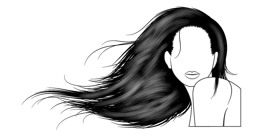
Finally, with the tapered brush by adding white strokes to add further realistic shines. Set these to Opacity 20% to stand out.

You’d be surprised how quickly you can create hairstyles with these brushes and how realistic you can make them. With practice, it will take you minutes rather than hours!
By creating several different brushes to fit different hair length, textures and styles, you can create many different looks.

If you’re interested in purchasing the whole Easy Hair Brushes for Adobe Illustrator set, they’re available only on GraphicRiver.

Post pobrano z: Sony Bravia Earth Rising on Earth
Sony is promoting the XBR-A1E OLED television screen with “Earth Rising”, a commercial presenting an other-worldly perspective on clarity. Filmed in the Atacama Desert in Chile, the Sony Bravia Earth Rising film presents the concept of the Earth Rising on Earth, a newly imagined horizon allowing the demonstration of contrast, deep blacks and life-like colour. At first we could be excused for thinking we’re on the moon as men, women and children drive through a desolate landscape to reach their dawn viewing spot. But we get a glimpse of a reptilian creature, and helmets are removed, and we’re let into the secret of the Earth Rising magic, a huge viewing screen wall in the desert. The super: “Experience a whole new world”.

Captured by various cameras such as the Sony F65 or the Alpha 7 Mark II in a perfect 8K resolution, the film delivers exactly the qualities that characterize the new Bravia series: a visual experience that shows the incredible, but almost the feeling of the human eye There is reality. The absolute black of the night desert paired with the impressive colors in which the earth rises, shows the contrast strength that is found on the Sony Bravia OLED.
Sony head of brand and product communication, Shuhei Sugihara, explains the creative thinking behind the campaign:
“The campaign is in the Sony Bravia tradition of delivering visually stunning films. At the same time, we are introducing more storytelling as a new element, opening up more possibilities for brand communication. This year’s campaign is different from what we have done in many years of great Bravia campaigns. I think ‘Earth Rising’ is one of the most impressive and technically sophisticated scenes we’ve ever filmed. With the launch of the OLED, we also wanted to communicate a message – this is the ‘dawn of a new era of television’. In this sense, the spot is the perfect creative translation of all that we want to say.”
Gabriel Mattar, executive creative director at DDB Berlin, says:
“Sony has taken to the stars in the development of the Bravia OLED. In our third international Bravia campaign, it has therefore been a natural step for us to reach for the stars too.”


The Sony Bravia Earth Rising campaign was developed at DDB Berlin by executive creative director Gabriel Mattar, creative director Hande Güler, managing creative director Myles Lord, art directors Mahmoud Fathy and Jacopo Biorcio, copywriter Andre Santa Cruz, agency producer (TV) Jens Mecking, print producer Petra Kraus, managing director Toby Pschorr, account manager Federica Sibilla, client service director David Barton working with Sony Pan European consumer marketing head Mikio Nakazawa, head of brand and product communication Shuhei Sugihara, brand and product communication manager Alessandra D’Avino, art directors Richard Small and Johan Andrews.
Filming was shot by director Ben Tricklebank via Soup Film with director of photography Sebastian Winterø, editor Benjamin Entrup. Local production in Chile was by La Casa Films.
Post Production and visual effects were produced at NHB Studios Berlin, by producer Fiddy Sigmund, VFX supervisor Nhat Quang Tran, 3D artists Tany Heider and Andreas Petri, lead online artist Tobias Horvath, nuke artist Sebastian Ludwig, and colourist Pana Argueta.
Music, Robot Koch and Savannah Jo Lack “Heart as a River” ft. Delhia de France, was supervised by Visions from the Roof.
Post pobrano z: Groupama Safest Route connected in France
Groupama, an insurance company in France, has launched Le Trajet Le Plus Sur, (The Safest Route), a free road safety platform based on government data relating to road accidents. Online at LeTrajetLePlusSur.fr and a mobile app, the Safest Route platform is able to generate and compare two itineraries in just a few clicks, providing the fastest route, traditionally suggested by GPSs and the safest route, one that is statistically the least dangerous. Drivers can see the difference in travel time between the two routes and choose one with full knowledge. For example, in Paris, to get to Gare de Lyon from the Eiffel Tower, the fastest route would take 19 minutes and accounts for 129 more accidents than the less dangerous route (24 minutes). The Safest Route project is being promoted with film, radio and print advertising, and dedicated digital terminals will become available at participating Groupama locations allowing members to test this new service.

Groupama CEO Thierry Martel says: “I am thrilled with the launch of the LeTrajetLePlusSur.fr platform. This innovative tool is a down to earth example of Groupama’s pioneer and mutualist spirit. We are constantly listening to our members, looking for solutions to make their daily lives easier. LeTrajetLePlusSur.fr is the answer to a road safety need that was identified. One of those everyday things that concerns many people! Now our ambition is to make this service available to all, members of Groupama and nonmembers alike, and hope that it can be recommended by road transport professionals, integrated into the future updates of leading GPS brands… to benefit road safety for all French people.”
In order for this service to be reliable and effective, official government data pertaining to traffic accidents for the past seven years have been mapped in with their precise geolocation. All accidents leading to personal injuries requiring both police and firemen intervention were included. Based on statistics, an algorithm was developed from this data, identifying the roads that are less likely to experience accidents as long as they do not add more than 20% additional driving time on average to daily trips. It is a collaborative website; each user is encouraged to save their trip and share it on various social media platforms. More drivers using the safest route will improve everyone’s safety.


The Safest Route campaign was developed at Marcel, Paris, by CEOs Charles Georges Picot and Pascal Nessim, creative chair Anne de Maupeou, chief creative officers Dimitri Guerassimov and Fabien Teichner, creative director Remy Aboukrat, copywriter Gaetan du Peloux, art director Youri Guerassimov, digital art director Eulalia Bartolomeu, managing partner & CSO Nicolas Levy, partner Blandine Mercier, project managers Valentin Moreau and Lucas Sengler, strategic planner Sarah Lemarie, PR officer Nathalie Roland, social media manager Nicolas Plasmondon, account director Alexandre Kobylko working with Groupama communication director Sylvain Burel, brand director Antoine Stattner and communication manager Perle Sun
Safest Route technology was developed at Marcel x ETO by CTO Louis Da Silva, UX director Vincent Mayol, front end developers Diono Corbel, Paul Vanlerberghe and Eric Beaufol, back end developers Charles Coulais and Edgar Lacouture, technical manager Maximilien Borne.
Filming was produced at Prodigious and Kuest Prod by director Manu G. Cuesta (Kuest Prod), editor Mikael Arslanyan (Prodigious), motion designer Mikael Arslanyan (Prodigious), sound producers Boris Nicou, Boris Jeanne, Thomas Corbel and Elodie Siliart (Prodigious), sound engineer Fabien Cornec (Prodigious). Voiceover on radio was Ombeline de la Teyssonière.
Print ads were produced at Prodigious by photographer Alain Cornu, art buyer Flore Silberfeld, producers Constance de Gourlet and Suzanne Pereira Dias, retouching team David Verduci, Quentin Le Roch, Mathieu Andrieu and Karine Villalon.
Post pobrano z: REPEAT [NSFW]

Post pobrano z: “Dam,” a new short from Animade

Directed and animated by Milo Targett, with sound by Sonica Studios and Milo Targett.
Post pobrano z: Vice UBS

Post pobrano z: “COCOON,” a short film about grief and loss

Working to the hauntingly beautiful voiceover of poet/performer Sh’maya, Sarah Beth Hulver and Tyler Morgan challenged themselves to create “Cocoon.” Both stretched out of their comfort zones for an intense collaboration that spanned 1.5 years of on-again, off-again work.


Dive deeper into the process on their project page.