Fun with Viewport Units

Post pobrano z: Fun with Viewport Units

Viewport units have been around for several years now, with near-perfect support in the major browsers, but I keep finding new and exciting ways to use them. I thought it would be fun to review the basics, and then round-up some of my favorite use-cases.

What are viewport units?

Four new „viewport-relative” units appeared in the CSS specifications between 2011 and 2015, as part of the W3C’s CSS Values and Units Module Level 3. The new units – vw, vh, vmin, and vmax – work similarly to existing length units like px or em, but represent a percentage of the current browser viewport.

  • Viewport Width (vw) – A percentage of the full viewport width. 10vw will resolve to 10% of the current viewport width, or 48px on a phone that is 480px wide. The difference between % and vw is most similar to the difference between em and rem. A % length is relative to local context (containing element) width, while a vw length is relative to the full width of the browser window.
  • Viewport Height (vh) – A percentage of the full viewport height. 10vh will resolve to 10% of the current viewport height.
  • Viewport Minimum (vmin) – A percentage of the viewport width or height, whichever is smaller10vmin will resolve to 10% of the current viewport width in portrait orientations, and 10% of the viewport height on landscape orientations.
  • Viewport Maximum (vmax) – A percentage of the viewport width or height, whichever is larger10vmin will resolve to 10% of the current viewport height in portrait orientations, and 10% of the viewport width on landscape orientations. Sadly, and strangely, vmax units are not yet available on Internet Explorer or Edge.

While these units are derived from viewport height or width, they can all be used everywhere lengths are accepted – from font-size to positioning, margins, padding, shadows, borders, and so on. Let’s see what we can do!

Responsive Typography

It’s become very popular to use viewport units for responsive typography – establishing font-sizes that grow and shrink depending on the current viewport size. Using simple viewport units for font-size has an interesting (dangerous) effect. As you can see, fonts scale very quickly – adjusting from unreadably small to extra large in a very small range.

This direct scaling is clearly too dramatic for daily use. We need something more subtle, with minimums and maximums, and more control of the growth rate. That’s where calc() becomes useful. We can combine a base size in more steady units (say 16px) with a smaller viewport-relative adjustment (0.5vw), and let the browser do the math: calc(16px + 0.5vw)

See the Pen partially-Responsive Type by Miriam Suzanne (@mirisuzanne) on CodePen.

By changing the relationship between your base-size and viewport-relative adjustment, you can change how dramatic the growth-rate is. Use higher viewport values on headings, and watch them grow more quickly than the surrounding text. This allows for a more dynamic typographic scale on larger screens, while keeping fonts constrained on a mobile device – no media-queries required. You can also apply this technique to your line-height, allowing you to adjust leading at a different rate than the font-size.

body {
  // font grows 1px for every 100px of viewport width
  font-size: calc(16px + 1vw);
  // leading grows along with font,
  // with an additional 0.1em + 0.5px per 100px of the viewport
  line-height: calc(1.1em + 0.5vw);
}

For me, this is enough complexity. If I need to constrain the top-end for rapid-growth headings, I can do that with one single media-query wherever the text becomes too large:

h1 {
  font-size: calc(1.2em + 3vw);
}

@media (min-width: 50em) {
  h1 {
    font-size: 50px;
  }
}

Suddenly I wish there was a max-font-size property.

Others have developed more complex calculations and Sass mixins to specify the exact text-size ranges at specific media-queries. There are several existing CSS-Tricks articles that explain the technique and provide snippets to help you get started:

I think that’s overkill in most cases, but your milage will absolutely vary.

Full-Height Layouts, Hero Images, and Sticky Footers

There are many variations on full-height (or height-constrained) layouts – from desktop-style interfaces to hero images, spacious designs, and sticky footers. Viewport-units can help with all of these.

In a desktop-style full-height interface, the page is often broken into sections that scroll individually – with elements like headers, footers, and sidebars that remains in place at any size. This is common practice for many web-apps these days, and vh units make it much simpler. Here’s an example using the new CSS Grid syntax:

See the Pen Full-height CSS Grid by Miriam Suzanne (@mirisuzanne) on CodePen.

A single declaration on the body element, height: 100vh, constrains your application to the height of the viewport. Make sure you apply overflow values on internal elements, so your content isn’t cut off. You can also achieve this layout using flexbox or floats.Note that full-height layouts can cause problems on some mobile browsers. There’s a clever fix for iOs Safari, that we use to handle one of the most noticeable edge-cases.

Sticky-footers can be created with a similar technique. Change your body height: 100vh to min-height: 100vh and the footer will stay in place at the bottom of your screen until it’s pushed down by content.

See the Pen Sticky-Footer with CSS Grid by Miriam Suzanne (@mirisuzanne) on CodePen.

Apply vh units to the height, min-height, or max-height of various elements to create full-screen sections, hero images, and more. In the new OddBird redesign, we constrained our hero images with max-height: 55vh so they never push headlines off the page. On my personal website, I went with max-height: 85vh for a more image-dominated look. On other sites, I’ve applied min-height: 90vh to sections.

Here’s an example showing both a max-height heroic kitten, and a min-height section. Combining all these tricks can give you some powerful control around how your content fills a browser window, and responds to different viewports.

Fluid Aspect Ratios

It can also be useful to constrain the height-to-width ratio of an element. This is especially useful for embeded content, like videos. Chris has written about this before. In the good-old-days, we would do that with %-based padding on a container element, and absolute positioning on the inner element. Now we can sometimes use viewport units to achieve that effect without the extra markup.

If we can count on the video being full-screen, we can set our height relative to the full viewport width:

/* full-width * aspect-ratio */
.full-width {
  width: 100vw;
  height: calc(100vw * (9/16));
}

That math doesn’t have to happen in the browser with calc. If you are using a pre-processor like Sass, it will work just as well to do the math there: height: 100vw * (9/16). If you need to constrain the max-width, you can constrain the max-height as well:

/* max-width * aspect-ratio */
.full-width {
  width: 100vw;
  max-width: 30em;
  height: calc(100vw * (9/16));
  max-height: calc(30em * (9/16));
}

Here’s a demonstration showing both options, with CSS custom properties (variables) to make the math more semantic. Play with the numbers to see how things move, keeping the proper ratio at all times:

See the Pen Fluid Ratios with Viewport Units by Miriam Suzanne (@mirisuzanne) on CodePen.

Chris takes this one step farther in his pre-viewport-units article, so we will too. What if we need actual HTML content to scale inside a set ratio – like presentation slides often do?

We can set all our internal fonts and sizes using the same viewport units as the container. In this case I used vmin for everything, so the content would scale with changes in both container height and width:

See the Pen Fluid Slide Ratios with Viewport Units by Miriam Suzanne (@mirisuzanne) on CodePen.

Breaking the Container

For years now, it’s been popular to mix constrained text with full-width backgrounds. Depending on your markup or CMS, that can become difficult. How do you break content outside of a restricted container, so that it fills the viewport exactly?

Again, viewport units can come in handy. This is another trick we’ve used on the new OddBird site, where a static-site generator sometimes limits our control of the markup. It only takes a few lines of code to make this work.

.full-width {
  margin-left: calc(50% - 50vw);
  margin-right: calc(50% - 50vw);
}

There are more in-depth articles about the technique, both at Cloud Four and here on CSS Tricks.

Getting Weird

Of course, there’s much more you can do with viewport units, if you start experimenting. Check out this pure CSS scroll-indicator (made by someone named Mike) using viewport units on a background image:

See the Pen CSS only scroll indicator by Mike (@MadeByMike) on CodePen.

What else have you seen, or done with viewport units? Get creative, and show us the results!


Fun with Viewport Units is a post from CSS-Tricks

29 Delicious Menu Templates for Restaurants & Cafes

Post pobrano z: 29 Delicious Menu Templates for Restaurants & Cafes

Hungry for more amazing templates? Check out this exciting collection of delicious menus perfect for any restaurant or cafe business.

29 Delicious Restaurant & Cafe Menus

Going out to eat is always a treat! And you can make your customers feel like royalty by displaying your menu items on delicious, professional designs.

Dive into this collection of 28 premium templates curated from Envato Elements. Get all the templates you need for one affordable monthly fee!

Use these menus for your restaurant business, or enlist the help of a talented professional from Envato Studio for all your creative needs.

Seafood Menu Template

Are you drooling yet? This delicious template will have you smelling the fresh scent of lobster and warm butter sitting on your plate. Created for both Photoshop and Illustrator lovers, this template features a high-quality design at 300 dpi, with free fonts also included.

Seafood Menu Template

Newspaper Menu

Extra! Extra! Read all about it! This clever menu features a wonderful newspaper theme. The front cover highlights your delicious dishes, with plenty of room on the back for official menu items. And with fully editable text, images, and colors, you’ll be able to customize it fast!

Newspaper Menu

Burger Factory Menu

Next
up is this mouthwatering burger menu design. This template includes two
Photoshop files with 100% vector elements and well-organized layers. Get the best of both worlds with vintage-inspired graphic elements on a modern menu template.

Burger Factory Menu

Brunch Menu Template

Did someone say brunch? Serve your customers a warm cup of Joe with this brilliant brunch and cafe menu. This design features a modern take on retro chalkboard illustrations with plenty of room for your menu items. Enjoy two color variations and completely free fonts in this awesome download.

Brunch Menu Template

Steak House Menu

Create a sizzling menu that matches your delicious steaks! This incredible template features an elegant and modern design that is 100% print ready. Showcase your menu in its best light with a minimalist design that is sure to impress customers.

Steak House Menu

Summer Drinks Menu

Sit back and relax with a gorgeous menu that will make you feel as if you’re on vacation! This exciting template features a beautiful island vibe, perfect for any beach restaurant, bar, or club. It also contains two Photoshop files that are print ready, with bleed lines and all!

Summer Drinks Menu

Fine Dining Restaurant – Menu Template

Enjoy the finer things in life with this sleek and sophisticated restaurant menu. This menu features a 100% customizable design with two elegant fonts to choose from. Compatible with Photoshop versions over CS3, this template can be customized fast to make it your own!

Fine Dining Restaurant - Menu Template

Modern Restaurant Food Menu

Download a modern menu for a clean and sophisticated feel. This premium menu template features one page cover with two back-page designs. A print-ready design, this template also includes premade bleed lines for your convenience. Download it today!

Modern Restaurant Food Menu

Mexican Style Food Menu Template

Reflect
the style of your restaurant with a menu template that highlights that
theme. Take this Mexican-style template, for instance. It’s created with
vibrant colors and a fun Spanish vibe, and you’ll get access to print-ready files and so much more!

Mexican Style Food Menu Template

Classy Food Menu 6 Template

Your
menu should look as sleek and sophisticated as your business. And with this
classy food menu, you’ll have just that! Enjoy six A4 pages with front
and back covers and alternative trifold styles. It also includes easily customizable layers so you can create infinite color variations to reflect
your amazing brand.

Classy Food Menu 6 Template

Pizza Factory Menu

Get a slice of delicious design with this clean, modern menu. Perfect for pizza businesses with that extra retro flair, this brilliant template features fully editable Photoshop files and so much more. Download it today to get access to more unique options.

Pizza Factory Menu

Restaurant/Fast Food – Menu Template

Become the next fast food giant with this delicious menu template. Great for featuring pictures of your favorite items, this template comes complete with fully editable files, organized layers, and even some helpful documentation for further instruction.

Restaurant Fast Food - Menu Template

Mexican Food Menu

Tackle your dreams of owning a brand new restaurant with this modern menu template. This template features a fun chalkboard-inspired design available in several industry formats. Also included is a convenient help file to walk you through the editing process.

Mexican Food Menu

Pizza Menu Trifold

Who can say „no” to pizza? Get your customers to praise your flaky crusts with this pizza-inspired trifold design. This template includes well-organized layers you can easily update with your own menu items. Just switch out the photos for pictures of your own food to enjoy this template fast!

Pizza Menu Trifold

Restaurant Menu Template

Less
is more. And some of the best food comes from small menus. Try out this
simple template, for instance. Available in A4 size, this template is
ready to print! It’s great for those familiar with either Adobe Photoshop or
Illustrator, and you can easily modify any text and add even more fancy
elements to customize your design.

Restaurant Menu Template

Burger Menu Template

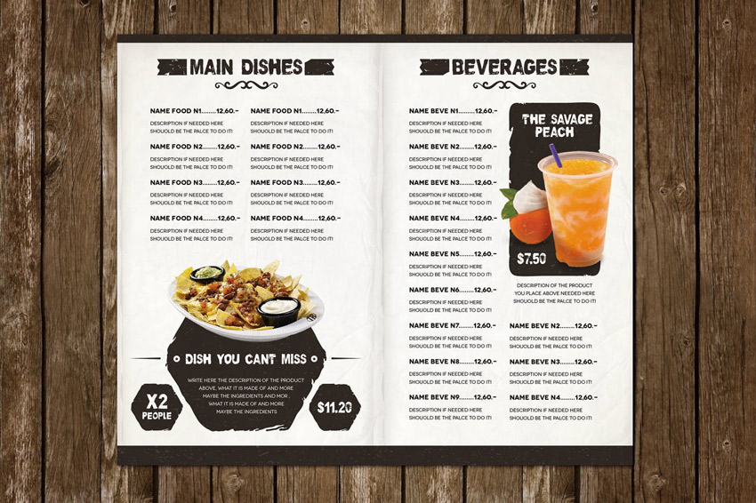
A classic burger menu, this download features print ready files at a resolution of 300 dpi. Choose from fun free fonts like Cardenio Modern, Wicked Grit, and Great Vibes to complete your menu. Or edit the text yourself using the fully editable text layers.

Burger Menu Template

Food Menu Template

Inspired by retro chalkboard illustrations, this template features a beautiful modern design we’re sure you’ll love! Download this file today to get access to several print formats available at 300 dpi for the best resolution possible.

Food Menu Template

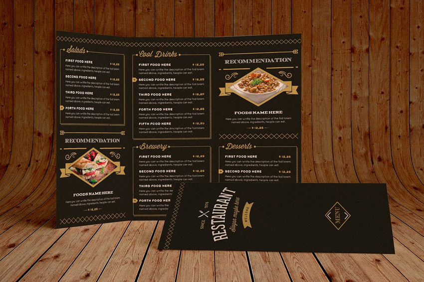
Elegant Food Menu 3 Illustrator Template

Need a menu fast? Then check out this elegant Illustrator template. This template includes a stunning black and yellow color palette, with print-ready files available in different sizes. Download this file today to get the bonus logo also included!

Elegant Food Menu 3 Illustrator Template

Coffee Menu Template

Wouldn’t you like to take a refreshing sip of a fresh warm brew from this cool menu? Boost sales with an exquisite chalkboard design inspired by retro illustrations. Get the most out of your menu with fully editable layers, free fonts, and bonus coffee doodles.

Coffee Menu Template

The Ristorante Food Menu Illustrator Template

Or try out a classic menu style like this one! This amazing download is jam-packed with wonderful additions. From a full eight-page menu to table tents and more, you’ll definitely want to add this cool template to the list. Just open Adobe Illustrator to get started right away!

The Ristorante Food Menu Illustrator Template

Trifold Minimalist Menu

If simple designs are more your style then check out this sleek and sophisticated trifold menu. This template includes two different menu sizes available in both Illustrator and Photoshop formats. Take advantage of the easy-to-use Smart Objects to update your photos in seconds!

Trifold Minimalist Menu

Ice Cream Menu Template

Help your customers seek relief from the sweltering hot sun with this awesome ice cream menu. Designed with vibrant colors and a unique vintage feel, this template features all free fonts, high-resolution graphics, and print-ready formats available for both Photoshop and Illustrator.

Ice Cream Menu Template

Christmas Menu Restaurant Template

Feeling festive? Then celebrate the holidays at your restaurant with a special Christmas-inspired theme. Download this file to get access to this colorful menu complete with high-resolution graphics, free fonts, and easy-to-follow guidelines.

Christmas Menu Restaurant Template

Rustic Sailor Food Menu

Ever wanted your own restaurant by the ocean? Make that dream happen with this rustic template. This template features a clean, nautical-inspired design with six full pages ready for your menu list. So sail onward to success with this stunning, modern menu!

Rustic Sailor Food Menu

Juice Bar Menu Template

Health equates to mental and physical wealth. And you can inspire your customers to eat better with this vibrant juice bar menu. This template features several convenient formats perfect for those familiar with Adobe Photoshop or Illustrator. Just update your menu with your favorite items to enjoy this template right away!

Juice Bar Menu Template

Japanese Bistro Menu

Open your next Japanese bistro with this inspiring menu design! Created with Adobe Photoshop, this template includes two Photoshop files, fully editable layers, and smart objects for your convenience. Feel free to take a glance at the handy help file for more instruction.

Japanese Bistro Menu

Classy Food Menu Illustrator Template

You can never go wrong with this classic food menu. Display your menu items with plenty of room for descriptions and prices, and even include a nifty section for chef recommendations. Included in this download are A3 and A4 menus compatible with Adobe InDesign.

Classy Food Menu Illustrator Template

Trifold Restaurant Menu Template

Have a large menu? Then try out this brilliant trifold template. This download comes complete with fully layered Photoshop files and completely editable text and graphics. A stunning template optimized for printing, it also includes free fonts you can easily update.

Trifold Restaurant Menu Template

Elegant Food Menu 5 Illustrator Template

Last but not least, we present you with this elegant layout. A minimalist design with a rustic, textured feel, this sophisticated template includes a seven-page menu, table tents, and so much more! Add your own text easily to personalize this template with information about your restaurant.

Elegant Food Menu 5 Illustrator Template

Conclusion

This list features exciting
resources for the avid designer
familiar with Adobe Illustrator, Photoshop, and InDesign. For
additional help with all your menu needs, enlist the skills of a
talented
professional by choosing one of the amazing designers from Envato Studio.

And with loads of restaurant and cafe menus available at your fingertips, chances are we’ve missed a few to add to your personal collection. Be sure to browse Envato Elements for more resources, and let us know your favorites in the comments below!

Livrarias Curitiba: Selfie, Photo, Music, Download

Post pobrano z: Livrarias Curitiba: Selfie, Photo, Music, Download
Print
Livrarias Curitiba

Who take a selfie in low quality lives in the past. The latest smartphones are here. Buy yours.

Who loses time waiting to post a photo lives in the past. The latest smartphones are here. Buy yours.

Who doesn’t listen to music on the go lives in the past. The latest smartphones are here. Buy yours.

Who doesn’t have space to download apps lives in the past. The latest smartphones are here. Buy yours.

Advertising Agency:Candy Shop, Curitiba, Brazil
Creative Director:Bruno Regalo
Art Director:Preto Murara
Copywriter:Zé Luís Schmitz

Latvian National Armed Forces: Soldier protects the family, the nation and the country. Be one of us, become a soldier!

Post pobrano z: Latvian National Armed Forces: Soldier protects the family, the nation and the country. Be one of us, become a soldier!

Film
Latvian National Armed Forces

Advertising Agency:Tribe, Riga, Latvia
Creative Director:Gatis Rozenfelds
Art Director:Martins Legzdins
Illustrator:Harry Grundmann
Animator:Marcis Lokis
Project Management:Santa Šenfelde

How to Create a Human Cyborg Photo Manipulation in Adobe Photoshop

Post pobrano z: How to Create a Human Cyborg Photo Manipulation in Adobe Photoshop

Final product image
What You’ll Be Creating

The future is near. Are you ready for a world of cybernetic organisms?

Learn how to transform your photos into cool cyborgs in the tutorial below. I’ll show you how to use techniques like Frequency Separation to remove skin imperfections before bringing our cyborg to life!

Find more great inspiration for sci-fi designs on GraphicRiver

Tutorial Assets

The following assets were used for the production of this tutorial:

1. How to Find Inspiration

Every great photo manipulation needs a collection of good stocks on deck as well as some inspiring reference art. For this cyborg, I was inspired by the popular style of manipulation seen in work from artists like Michael Oswald.

So to complete our cyborg, we’ll need to keep a few important notes in mind:

  • Cyborgs have clear, human features…
  • … though their bodies are usually broken down into several bionic components.
  • They’ll integrate modern technology into their design.
  • They can come in any race.
  • And they sometimes take over the world. Simple right?

Be deliberate about your stock choices. For our subject I’ve chosen this Woman Stock. Though the image is no longer available, you can find many incredible stocks like it on Envato Market.

Cyborg reference from photodune

The reason why I chose this stock is because of the woman’s intense gaze. So try to find images with commanding body language that you can easily manipulate down the line. Beauty and glamor photography work great for this, although you may have to deal with simple edits later (like removing skin cream from her face).

2. How to Airbrush Your Photo

The cyborgs we’ve come to know in the movies have smooth, perfect-looking skin, most likely because they’re made out of metals or other advanced materials. So to achieve this look in photography, we’ll turn to the
technique of Frequency Separation.

Step 1

Open your reference into Photoshop, changing the dpi to 300. Create a New Group named Retouching. Control-J to Duplicate your reference, placing the copy into the group.

Create a New Group

Step 2

Before we smooth out her skin, we’ll need to remove the white dots of skin cream on her face. So select the Polygonal Tool (L) and make a selection on the left side of her face.

Select the skin with the polygonal lasso tool

Copy and Paste that selection onto a New Layer, and Flip it by going to Edit > Transform Flip Horizontal. Place the skin copy over the white dots, using the Eraser Tool (E) to erase any harsh edges.

Cover the skin cream with skin

Merge the layers together. Clean up the skin with the Stamp Tool (S). First select the tool and hold Alt to source the skin, and then use the sourced skin at 30-50% Opacity to blend it into the skin area. We’ll clean up any other imperfections next.

Face After Hiding Skin Cream

Step 3

Now for the Frequency Separation. Learn more about this technique in this tutorial: Using Frequency Separation to Retouch Skin.

Control-J to Duplicate the revised stock. Name the top layer High Frequency and the bottom layer Low Frequency. Turn Off the Visibility of the High Frequency layer, and then select the Low Frequency layer and go to Filter > Blur > Gaussian Blur, setting the Radius to any number that blurs the details of your portrait. Here, I set mine to 7.

Blur the Portrait with Gaussian Blur - Frequency Separation

Turn the Visibility On for the High Frequency layer. With this layer selected, go to Image > Apply Image and enter the following settings:

Apply Image Settings - Frequency Separation

Make sure the Blending is set to Subtract and the Layer is set to Low Frequency. Then plug in the numbers above for the Scale and Offset. After you hit OK, set the Layer Blend Mode for the Low Frequency layer to Linear Light.

Frequency Separation Layers After Apply Image

Step 4

What we have done is separated the texture (high frequency) from the tones and colors (low frequency). Now we can airbrush the skin to make it look smoother.

With the High Frequency layer selected, grab the Polygonal Lasso Tool (L) and create a selection of the skin, making sure that the selection’s Feather is set to 25-30. Go to Filter > Blur > Gaussian Blur, and blur the skin. Continue doing this all around her face, changing the Radius each time depending on how much you want to soften the skin and lessen the look of pores.

Merge the frequency layers together when you’re finished.

Smooth the skin with gaussian blur and frequency separation

Here is the model with much smoother skin. We’ll continue to adjust it as we proceed.

Frequency separation result

3. How to Create the Cyborg Sketch

Step 1

Let’s move on to the sketch! It’s important to note that you’ll need a Graphics Tablet as we’ll be employing some important digital drawing/painting techniques later down the line.

Select the Brush Tool (B) and use a Hard Round Pressure Opacity Brush to begin drawing your cyborg details. Keep the Flow and Opacity set at 100% but make sure the Pen Pressure for Opacity option is checked.

Hard round brush settings

Draw simple gray lines over the model indicating the areas where you would like to break down her robotic components. Try to be cognizant of how the human body relates to certain parts moving or connecting together.

Study other cyborg references or look up robots for indications of where it might be a good idea to place these lines.

Draw the cyborg sketch over the reference

Step 2

Switch over to a much harder brush, with an Opacity and Hardness of 100%. Starting with the face and hand, make those lines much crisper.

Create Cleaner Lines and Details

Continue to push forward by making some of those lines thicker. This is when we begin to fully develop the model as an actual robot.

Darken the robot lines

The hands and neck, for instance, have components that are painted black to represent the spaces needed for those moving pieces. Try to understand the possible functions behind your details for a more believable result.

close up of the hand details

Use the Eraser Tool (E) to erase the parts of the gray sketch that are still showing through underneath. Concentrate on creating super clean lines to the best of your ability because this is a machine after all.

To create more of a robotic expression, fill in the eyes with some black as well, using the Brush Tool (B).

Here is the cyborg so far. Let’s move on to the background scene.

Cyborg progress with crisp black lines

4. How to Build the Cyborg Background

Step 1

Use the Magic Wand Tool (W) to select the white background of the original reference and hit Delete on your keyboard to remove it.

Delete the white background

Then Copy and Paste your Metal Texture onto a New Layer below the woman layer. Adjust the position so that the circular part fits behind the model’s head.

With the texture selected, go to Filter > Blur > Gaussian Blur and blur the background with a Radius of 5 pixels.

Blur the metal background

Step 2

Copy and Paste the Electric Circuit Stock onto a New Layer. Adjust the position so that the lines flow from behind her head, and set the Layer Blend Mode to Overlay.

Just like before, blur the circuit stock by going to Filter > Blur > Gaussian Blur, with a Radius of 5 pixels.

Add the Circuit Stock

5. How to Add Details and Color to the Cyborg

Step 1

For a more cohesive look, let’s get rid of her blonde hair. Create a New Layer and select the Brush Tool (B). Set the Hardness to 50-80% and start to paint black all over the hair using the same brush as before. Set the Layer Blend Mode to Color Burn and adjust the Opacity to 87%.

Paint the hair a darker color

Step 2

Let’s tackle the skin again. Create a New Layer and use a Soft Round Brush with 30-50% Opacity and 0% Hardness to soften her skin with more color. Hold the Alt key over her skin to set that color as your Foreground Color, and then begin painting with it in the nearby areas.

Continue to do this with the rest of her face and body. Imagine that her skin is made out of hard, reflective materials. Try to make her skin as silky as possible without losing too many details.

Paint the skin for a smoother effect

Step 3

Incorporate more technology. Use the Polygonal Lasso Tool (L) to cut out the USB port from its reference. Paste it onto the canvas on a New Layer and create two more copies. Position each port side by side and Merge the layers together.

Add the usb ports

Step 4

Let’s add color! Add a New Adjustment Layer of Color Lookup above all your other layers. Set the 3DLUT File to Crisp_Winter.look.

Add a color lookup adjustment layer

Next, add a Levels Adjustment Layer with the following settings for the RGB and Blue Channels to intensify the lighting and give a blue tint to the scene.

Add a levels adjustment layer

Add another Color Lookup Adjustment Layer. This time set the 3DLUT File to Crisp_Warm.look. Place it above the Levels layer for more contrast. Lower the Opacity to 70% and set the Blend Mode to Darken.

Things are getting pretty intense.

Add another color lookup adjustment layer

Step 5

Use the Rectangular Marquee Tool (M) to select an area of the Blue Gem Stock and Paste it onto a New Layer. Position the stone over the triangle and onto her forehead. Add a Layer Mask to the gem layer and paint black onto it to shape the stone into a triangle.

Add the gem stock

Set a New Layer as a Clipping Mask to the stone. Use a dark blue color #00197a to paint an inner shadow along the edges of the triangle.

Add shadow to the stone

Step 6

Fill in the rest of the metal details with solid color. Feel free to experiment with which colors you like best.

Fill in the metail details

6. How to Finish the Cyborg Manipulation

Step 1

This next series of steps involves a lot of painting, so a graphics tablet is necessary. Dedicate New Layers to highlights and shadows. 

Add highlights and shadows
Here’s a side-by-side look as the cyborg gets highlights and then shadows.

Step 2

Start using a Hard Round Brush with an Opacity of 80-100% to make your details crisper.

Paint more crisp details

Notice that I’ve added light tan highlights #ece6f0 around the black robotic components. This will help give them more volume and sheen. Continue to evolve the shading of your cyborg by paying attention to the edges of the skin surface.

Paint darker skin tones, #6a4f65 particularly within the dark spaces of her fingers, to make them look as if there’s real thickness in the material used to create her. Continue this effect with the rest of the body, especially with her chest and arm.

Paint the highlights and shadows on her hand

Step 3

Add more character with unique details. Create bolts for her forehead, make the stone more 3D, and even draw the symbols for the USB port.

Paint more details

Step 4

Add a New Adjustment Layer of Curves. Adjust the curves for the RGB and Blue Channels to bump up the intensity of the lighting.

Add an adjustment layer of curves

Let’s add some warmth. Follow up with a Color Lookup Adjustment Layer. Set the 3DLUT File to FallColors.look and lower the Opacity to 25%.

Add a color lookup adjustment layer

Step 5

Finish your manipulation by diving back into the details. Fix the neck and collar bone areas to give them more volume.

Fix the collar bone

Switch over to a Hard Round Brush with 100% Hardness to clean up the edges of your manipulation.

I also elaborated on the robotic details found in the black spaces of her neck and fingers. Sometimes you can make up components like this as long as they generally make sense.

Clean up the edges with a hard brush

Step 6

Finish with one more layer of highlight. Set a New Layer to Overlay and use a light pink color #cfc0e1 to paint soft highlights onto her chest, shoulders, and hand. The arrows indicate the areas that were affected the most.

Add one last layer of highlight

Check out the final result below!

Congratulations, You’ve Made It!

This tutorial requires you to put all your Photoshop knowledge to the test! By incorporating photo retouching, photo manipulation, and finally, digital painting techniques you can achieve an incredibly realistic human cyborg.

The key to this project is to stay patient so that you can fine tune the results as much as possible. Make your lines super sharp so that she appears more like a machine than a human.

I hope you’ve enjoyed this tutorial. Feel free to leave me any questions in the comments and post your results, no matter your skill level.

And tackle more exciting photo manipulations like this one by checking out some of my other tutorials below:

Human Cyborg Photo Manipulation Photoshop Tutorial by Melody Nieves

China’s New Large Solar-Powered Drone Reaches 20,000 Meters in Altitude

Post pobrano z: China’s New Large Solar-Powered Drone Reaches 20,000 Meters in Altitude


China’s first domestically designed large solar-powered unmanned plane reached above 20,000 meters in altitude on its test flight in the country’s northwest regions recently.

The drone was developed by the China Academy of Aerospace Aerodynamics (CAAA), it’s developers kept the exact size of the drone as a secret, but it is believed to be about 14 meters long with a 45 meter wingspan according to earlier prototypes.