When you think of the ugly architecture that thrived in Soviet-era Eastern Europe, “playful” is probably not the first word that comes to mind.
Zupagrafika decided that commie blocks could be fun, and released a book, “The Constructivist”, that lets you play with cutouts of Eastern blocks. The Polish design studio sells the book on its online shop.
A collection of great business cards that could inspire you when designing your next card.
1. Moxie Tuesday
A square-shaped business card with recycled paper and good use of textures. Designed by Jana Neil.
2. Handmade card
A folded business card that took a lot of time and effort. Totally worth it though. Design by Jorge Alvarez.
3. Wooden business cards
Business cards made with duplexed wood veneer + letterpressed metallic ink on paper with laser etching on both sides. Design by Mackey Saturday.
4. Tom Lane
Business cards that look like playing cards. Design by Tom Lane.
5. Busy Building Things
A nice card with a custom shape and a powerful message. Designed by Andrew Power.
6. Yoga Mat Business Card
A business card designed to look like the main item required to go do yoga in a gym. Designer unknown.
7. Football coach business card
A very creative business card for a football coach. One side of the card looks like a football field plan and allows to scribble some strategy. Design by Bravo Company.
8. Bag Tag
A cool business card designed to look like a bag tag. Designed for Promptt.
9. Typographic card
A businn card that mixes many fonts and does it well. Design by Nothing Something.
10. Longshots sports bar
What would be better than a beer shape for a sports bar business card?
I’ve long advocated SVG icon systems. Still do. To name a few benefits: vector-based icons look great in a high pixel density world, SVG offers lots of design control, and they are predictable and performant.
I’ve also often advocated for a SVG icon system that is based on <symbol>s (an „SVG sprite”) and the <use> element for placing them. I’ve changed my mind a little. I don’t think that is a bad way to go, really, but there is certainly a simpler (and perhaps a little better) way to go.
Just include the icons inline.
That’s it. Sorry if you were hoping for something fancier.
Like this:
<button>
  <svg class="icon icon-cart" viewBox="0 0 100 100" aria-hidden="true">
    <!-- all your hot svg action, like: -->
    <path d=" ... " />
  </svg>
  Add to Cart
</button>
Or perhaps more practically, with your server-side include of choice:
<button>
  <?php include("/icons/icon-cart.svg"); ?>
  Add to Cart
</button>
Like I said:
<?php include "icon.svg <% render "icon.svg" <Icon icon="icon" {% include "icon.svg"
Putting right into markup is a pretty 👍 icon system.
You need no fancy tooling to make this work. Your folder full of SVG icons remain a folder full of SVG icons. You’ll probably want to optimize them, but that’s about it.
Advantage #2: No Shadow DOM Weirdness
SVG icons included as a <use> reference have a shadow DOM boundary.
Showing the Shadow DOM boundry in Chrome DevTools
This can easily cause confusion. For example:
var playButton = document.querySelector("#play-button-shape");

playButton.addEventListener("click", function() {
  alert("test");
});
That’s not going to work. You’d be targetting the path in the <symbol>, which doesn’t really do anything, and the click handler is kinda lost in the cloning. You’d have to attach a handler like that to the parent , like #play-button.
Likewise, a CSS selector like:
.button #play-button-shape {

}
Will not select anything, as there is a Shadow DOM boundry between those two things.
When you just drop inline SVG right into place, there is no Shadow DOM boundry.
Advantage #3: Only the Icons You Need
With a <use>/<symbol> system, you have this SVG sprite that is likely included on every page, whether or not they are all used on any given page or not. When you just include inline SVG, the only icons on the page are the ones you are actually using.
I listed that as advantage, but it sorta could go either way. To be fair, it’s possible to cache an SVG sprite (e.g. Ajax for it and inject onto page), which could be pretty efficient.
That’s a bit of a trick question. <use> itself doesn’t have anything to do with caching, it’s about where the SVG is that the <use> is referencing. If the sprite is Ajax’d for, it could be cached. If the sprite is just part of the HTML already, that HTML can be cached. Or the <use> can point to an external file, and that can be cached. That’s pretty tempting, but…
Advantage #4: No cross-browser support concerns
No IE or Edge browser can do this:
<use xlink:href="/icons/sprite.svg#icon-cart" />
That is, link to the icon via a relative file path. The only way it works in Microsoft land is to reference an ID to SVG on the same page. There are work arounds for this, such as Ajaxing for the sprite and dumping it onto the page, or libraries like SVG for Everybody that detects browser support and Ajaxs for the bit of SVG it needs and injects it if necessary.
Minor Potential Downside: Bloat of HTML Cache
If you end up going the sprite route, as I said, it’s tempting to want to link to the sprite with a relative path to take advantage of caching. But Microsoft browsers kill that, so you have the choice between:
A JavaScript solution, like Ajaxing for the whole sprite and injecting it, or a polyfill.
Dumping the sprite into the HTML server-side.
I find myself doing #2 more often, because #1 ends up with async loading icons and that feels janky. But going with #2 means „bloated” HTML cache, meaning that you have this sprite being cached over and over and over on each unique HTML page, which isn’t very efficient.
The same can be said for directly inlining SVG.
Conclusion and TLDR: Because of the simplicity, advantages, and only minor downsides, I suspect directly inlining SVG icons will become the most popular way of handling an SVG icon system.
There’s never a better time to work in software. Developers and designers are among the most desired people on the market. Companies all over the world seem to have a never-ending thirst for software experts. In 2003 the U.S. Bureau of Labor Statistics estimated the number of software engineers working in the US to be 677,900 people. In 2016, this number increased over 5× to 3,870,000.
At the same time, design teams grew faster than software development. In the last 5 years, the design-developer ratio increased by an average of 2.5×. These changes put enormous pressure on designers and developers to take on more projects while delivering higher quality faster. But the challenge is that software development doesn’t scale easily.
Scaling through hiring, without first putting standards in place, doesn’t usually end well. With every new hire, the technical and design debt increases. New ideas for color palettes, typography, patterns, code standards or even frameworks appear in the product, increasing the inconsistency and maintenance cost.
Creating a design systems process is one of the best ways to prevent this problem.
The Era of Systems
For faster and more consistent product development, companies all over the world, including such giants as Salesforce, IBM, Airbnb or Microsoft, started to invest in Design Systems.
Unlike past approaches to setting up standards in software development (pattern libraries, style guides…), design systems are not a static deliverable created from months of work. In fact, design systems are not a deliverable at all – they’re a new process of building software.
What is a Design System?
A design system reflects the truth about the standard experience in a given organization. It’s both trustworthy documentation and a modular toolkit for designers and developers.
Design systems adapt naturally to changes in the product and sync design and code for an easier way to create consistent experiences.
The Toolset for the new Era
Over a year ago, the team at UXPin started our user research. After 40+ interviews with design and engineering leaders and a survey of 3,100+ designers and developers, we’ve concluded traditional design tools aren’t good enough to serve this new reality.
They’re too fragmented, disconnected, and unfocused. Design system tools must be a complete hub for design and development.
We’ve summed up the research with simple rules for our first release of UXPin Systems:
Dynamic environment, not static documentation
Actionable system, not a reference document
Connection between design and development, not just a library of design patterns
With these principles in mind, we released the first design system platform on June 13th 2017.
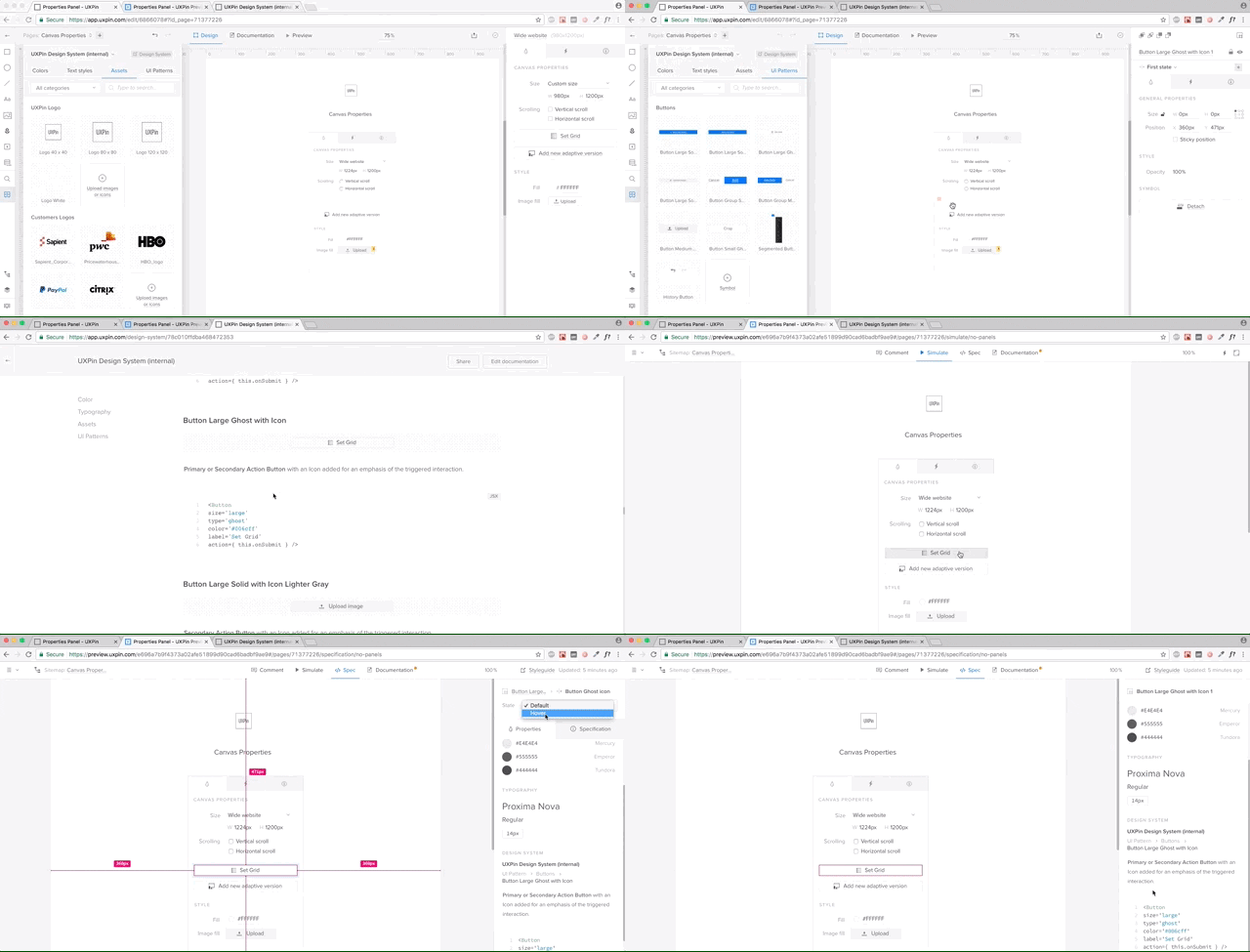
Step by Step in UXPin: Creating a Design System Process
Using our internal design system as an example, let’s explore how to create the foundation for your design system:
Color Palette and Text Styles
Assets (logos, icons)
Design Patterns
Development Documentation
Important disclaimer: All the following examples were created within UXPin only, but the UXPin Design Systems solution also supports Sketch.
1. Create an Actionable Library of Styles
Start with the most prevalent pieces of any design: text styles and a color palette.
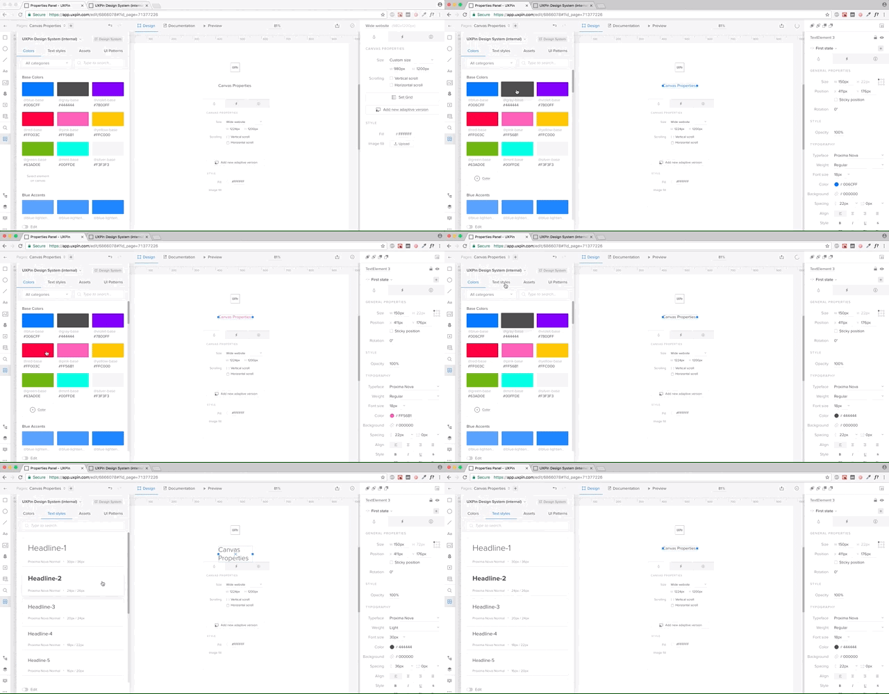
In UXPin, both color palette and text styles can be pulled directly from design projects and saved in a shared Design Systems library (an actionable toolkit that’s always synced with design system). Your entire team will always have access to approved styling, minimizing the temptation of introducing yet another typeface or shade of gray.
To add every color or text style, simply select layers in Sketch or UXPin and UXPin will pull the right styling and add it to the system.
All these styles always stay in sync with the library in UXPin or Sketch, which makes for a living system (not just static documentation).
2. Create an Actionable Library of Assets
Just like colors and text styles, you can save all your graphic design assets in UXPin Systems.
Think logos, approved stock photos, or icon libraries. You can save all these in the Design Systems Library, which stays in sync with the Design System and your entire team. One library, directly in your tools and always in sync.
3. Create an Actionable Library of Patterns
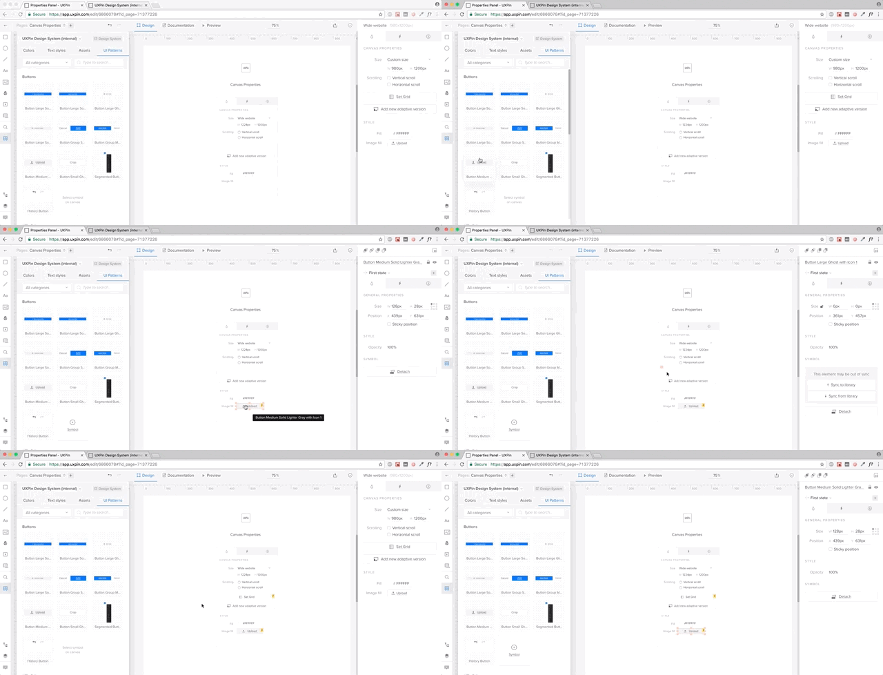
You can also save your design patterns in UXPin. All your symbols from UXPin and Sketch can be saved in a Design Systems Library. UXPin symbols can be interactive and animated, so you don’t have to recreate interactions every single time.
Symbols in both UXPin and Sketch have overriding abilities, so you don’t have to worry about your patterns being used in multiple places with different copy. UXPin allows you to adjust the copy however you want and sync everything with the library whenever you’re ready.
It’s a powerful tool to manage all your shared design patterns.
4. Generate a System and Keep it in Sync
Having a library of shared assets is great, but it’s definitely not enough to solve the problem of scaling software development.
Most solutions stop here and don’t move towards development. We’ve decided to go all the way.
In UXPin Systems all the colors, text styles, assets, and patterns become a living system with one click. Just go into the Design Systems tab in UXPin Dashboard, select your library, and it comes to life.
A new documentation page is automatically created and always stays in sync with your library. If you add a new pattern or a color, it automatically appears in your design system.
5. Add Documentation for Developers
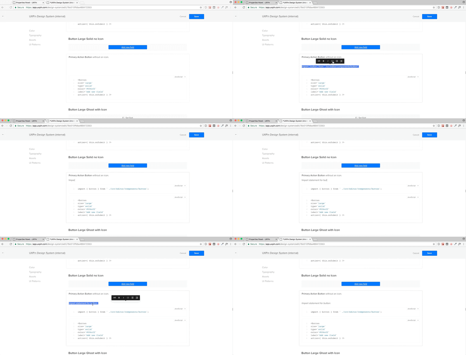
Once you’ve generated your system, you can add documentation, including code snippets to any element. The documentation editor makes it very straightforward to document your system.
Again, the documentation is immediately available to your team.
6. Make Documentation Actionable
Design system documentation shouldn’t just be a reference document. It needs to be where the action is: in the design projects themselves.
With UXPin, documentation from the design system follows the elements in any project.
If you’re working on yet another sign-up form, once you drop in the symbols from the library, UXPin automatically generates full documentation for developers – including all the information coming from the design system (full markup, information about imports, and names of JavaScript components, etc).
The First Complete Solution
Needless to say, I’m extremely proud of our focus on design systems as the heart of a better software development process. Of course, this is just a beginning.
If you’d like to try out UXPin for yourself, you can go ahead and start a free trial.
Most JavaScript form validation libraries are large, and often require other libraries like jQuery. For example, MailChimp’s embeddable form includes a 140kb validation file (minified). It includes the entire jQuery library, a third-party form validation plugin, and some custom MailChimp code. In fact, that setup is what inspired this new series about modern form validation. What new tools do we have these days for form validation? What is possible? What is still needed?
In this series, I’m going to show you two lightweight ways to validate forms on the front end. Both take advantage of newer web APIs. I’m also going to teach you how to push browser support for these APIs back to IE9 (which provides you with coverage for 99.6% of all web traffic worldwide).
Finally, we’ll take a look at MailChimp’s sign-up form, and provide the same experience with 28× (2,800%) less code.
It’s worth mentioning that front-end form validation can be bypassed. You should always validate your code on the server, too.
Alright, let’s get started!
Article Series:
Constraint Validation in HTML (You are here!)
The Constraint Validation API in JavaScript (Coming Soon!)
A Validity State API Polyfil (Coming Soon!)l
Validating the MailChimp Subscribe Form (Coming Soon!)
The Incredibly Easy Way: Constraint Validation
Through a combination of semantic input types (for example, <input type="email">) and validation attributes (such as required and pattern), browsers can natively validate form inputs and alert users when they’re doing it wrong.
Support for the various input types and attributes varies wildly from browser to browser, but I’ll provide some tricks and workarounds to maximize browser compatibility.
Basic Text Validation
Let’s say you have a text field that is required for a user to fill out before the form can be submitted. Add the required attribute, and supporting browsers will both alert users who don’t fill it out and refuse to let them submit the form.
<input type="text" required>
A required text input in Chrome.
Do you need the response to be a minimum or maximum number of characters? Use minlength and maxlength to enforce those rules. This example requires a value to be between 3 and 12 characters in length.
<input type="text" minlength="3" maxlength="12">
Error message for the wrong number of characters in Firefox.
The pattern attribute let’s you run regex validations against input values. If you, for example, required passwords to contain at least 1 uppercase character, 1 lowercase character, and 1 number, the browser can validate that for you.
Wrong format error message in Safari.Wrong format error message in Safari.
If you provide a title attribute with the pattern, the title value will be included with any error message if the pattern doesn’t match.
<input type="password" pattern="^(?=.*\d)(?=.*[a-z])(?=.*[A-Z])(?!.*\s).*$" title="Please include at least 1 uppercase character, 1 lowercase character, and 1 number." required>
Wrong format message in Opera, with title text explaining RegEx.
You can even combine it with minlength and (as seems to be the case with banks, maxlength) to enforce a minimum or maximum length.
<input type="password" minlength="8" pattern="^(?=.*\d)(?=.*[a-z])(?=.*[A-Z])(?!.*\s).*$" title="Please include at least 1 uppercase character, 1 lowercase character, and 1 number." required>
The number input type only accepts numbers. Browsers will either refuse to accept letters and other characters, or alert users if they use them. Browser support for input[type="number"] varies, but you can supply a pattern as a fallback.
<input type="number" pattern="[-+]?[0-9]">
By default, the number input type allows only whole numbers.
You can allow floats (numbers with decimals) with the step attribute. This tells the browser what numeric interval to accept. It can be any numeric value (example, 0.1 ), or any if you want to allow any number.
You should also modify your pattern to allow decimals.
If the numbers should value between a set of values, the browser can validate those with the min and max attributes. You should also modify your pattern to match. For example, if a number has to be between 3 and 42, you would do this:
The email input type will alert users if the supplied email address is invalid. Like with the number input type, you should supply a pattern for browsers that don’t support this input type.
Email validation regex patterns are a hotly debated issue. I tested a ton of them specifically looking for ones that met RFC822 specs. The one used below, by Richard Willis, was the best one I found.
One „gotcha” with the the email input type is that it allows email addresses without a TLD (the „example.com” part of „email@example.com”). This is because RFC822, the standard for email addresses, allows for localhost emails which don’t need one.
If you want to require a TLD (and you likely do), you can modify the pattern to force a domain extension like so:
<input type="email" title="The domain portion of the email address is invalid (the portion after the @)." pattern="^([^\x00-\x20\x22\x28\x29\x2c\x2e\x3a-\x3c\x3e\x40\x5b-\x5d\x7f-\xff]+|\x22([^\x0d\x22\x5c\x80-\xff]|\x5c[\x00-\x7f])*\x22)(\x2e([^\x00-\x20\x22\x28\x29\x2c\x2e\x3a-\x3c\x3e\x40\x5b-\x5d\x7f-\xff]+|\x22([^\x0d\x22\x5c\x80-\xff]|\x5c[\x00-\x7f])*\x22))*\x40([^\x00-\x20\x22\x28\x29\x2c\x2e\x3a-\x3c\x3e\x40\x5b-\x5d\x7f-\xff]+|\x5b([^\x0d\x5b-\x5d\x80-\xff]|\x5c[\x00-\x7f])*\x5d)(\x2e([^\x00-\x20\x22\x28\x29\x2c\x2e\x3a-\x3c\x3e\x40\x5b-\x5d\x7f-\xff]+|\x5b([^\x0d\x5b-\x5d\x80-\xff]|\x5c[\x00-\x7f])*\x5d))*(\.\w{2,})+$">
Similarly, the url input type will alert users if the supplied value is not a valid URL. Once again, you should supply a pattern for browsers that don’t support this input type. The one included below was adapted from a project by Diego Perini, and is the most robust I’ve encountered.
Like the email attribute, url does not require a TLD. If you don’t want to allow for localhost URLs, you can update the pattern to check for a TLD, like this.
<input type="url" title="The URL is a missing a TLD (for example, .com)." pattern="^(?:(?:https?|HTTPS?|ftp|FTP):\/\/)(?:\S+(?::\S*)?@)?(?:(?!(?:10|127)(?:\.\d{1,3}){3})(?!(?:169\.254|192\.168)(?:\.\d{1,3}){2})(?!172\.(?:1[6-9]|2\d|3[0-1])(?:\.\d{1,3}){2})(?:[1-9]\d?|1\d\d|2[01]\d|22[0-3])(?:\.(?:1?\d{1,2}|2[0-4]\d|25[0-5])){2}(?:\.(?:[1-9]\d?|1\d\d|2[0-4]\d|25[0-4]))|(?:(?:[a-zA-Z\u00a1-\uffff0-9]-*)*[a-zA-Z\u00a1-\uffff0-9]+)(?:\.(?:[a-zA-Z\u00a1-\uffff0-9]-*)*[a-zA-Z\u00a1-\uffff0-9]+)*(?:\.(?:[a-zA-Z\u00a1-\uffff]{2,}))\.?)(?::\d{2,5})?(?:[/?#]\S*)?$">
There are a few really awesome input types that not only validate dates but also provide native date pickers. Unfortunately, Chrome and Mobile Safari are the only two browsers that implement it. (I’ve been waiting years for Firefox to adopt this feature!) Other browsers just display it as a text field.
As always, we can provide a pattern to catch browsers that don’t support it.
The date input type is for standard day/month/year dates.
In supporting browsers, the selected date is displayed like this: MM/DD/YYYY. But the value is actually in this format: YYYY-MM-DD.
You should provide guidance to users of unsupported browsers about this format—something like, „Please use the YYYY-MM-DD format.” However, you don’t want people visiting with Chrome or Mobile Safari to see this since that’s not the format they’ll see, which is confusing.
We can write a simple feature test to check for support, though. We’ll create an input[type="date"] element, add a value that’s not a valid date, and then see if the browser sanitizes it or not. You can then hide the descriptive text for browsers that support the date input type.
<label for="date">Date <span class="description-date">YYYY-MM-DDD</span></label>
<input type="date" id="date" pattern="(?:19|20)[0-9]{2}-(?:(?:0[1-9]|1[0-2])-(?:0[1-9]|1[0-9]|2[0-9])|(?:(?!02)(?:0[1-9]|1[0-2])-(?:30))|(?:(?:0[13578]|1[02])-31))">

<script>
  var isDateSupported = function () {
      var input = document.createElement('input');
      var value = 'a';
      input.setAttribute('type', 'date');
      input.setAttribute('value', value);
      return (input.value !== value);
  };

  if (isDateSupported()) {
      document.documentElement.className += ' supports-date';
  }
</scipt>

<style>
  .supports-date .description-date {
      display: none;
  }
</style>
The time input type let’s visitors select a time, while the month input type let’s them choose from a month/year picker. Once again, we’ll include a pattern for non-supporting browsers.
The time input displays time in 12-hour am/pm format, but the value is 24-hour military time. The month input is displayed as May 2017 in supporting browsers, but the value is in YYYY-MM format.
Just like with input[type="date"], you should provide a pattern description that’s hidden in supporting browsers.
While the Constraint Validation API is easy and light-weight, it does have some drawbacks.
You can style fields that have errors on them with the :invalid pseudo-selector, but you can’t style the error messages themselves.
Behavior is also inconsistent across browsers. Chrome doesn’t display any errors until you try to submit the form. Firefox displays a red border when the field loses focus, but only displays error messages on hover (whereas WebKit browsers keep the errors persistent).
User studies from Christian Holst and Luke Wroblewski (separately) found that displaying an error when the user leaves a field, and keeping that error persistent until the issue is fixed, provided the best and fastest user experience. Bonus CSS tip: style invalid selectors only when they arern’t currently being edited with :not(:focus):invalid { }.
Unfortunately, none of the browsers behave exactly this way by default.
In the next article in this series, I’ll show you how to use the native Constraint Validation API to bolt-in our desired UX with some lightweight JavaScript. No third-party library required!
Article Series:
Constraint Validation in HTML (You are here!)
The Constraint Validation API in JavaScript (Coming Soon!)
A Validity State API Polyfil (Coming Soon!)l
Validating the MailChimp Subscribe Form (Coming Soon!)
Let’s learn how to use the Mesh Tool while creating a photo-realistic T-shirt!
Begin by drawing the shape of half of a shirt with the Pen Tool (P). Fill it in with #FDFDFD.
Create a copy of the shape! Put it aside—we will need it later.
Let’s start using a Mesh! Take the Mesh Tool (U) and start creating a Mesh grid on the object by placing nodes. Afterwards, select the nodes on the top left edge of the shirt and change their color to #D5D5D5.
Add some more nodes, as indicated in the screenshot below, and color the bottom two-thirds of the shirt with #F1F1F1.
Step 2
Continue similarly, now using these colors:
#DFDFDF
#B7B7B7
#7E7E7E
Step 3
Create more shadows and folds in this step, using these colors:
#7E7E7E
#B4B4B4
#C9C9C9
Step 4
Add some more Mesh nodes and apply the final colors:
#AAAAAA
#DADADA
#D1D1D1
Step 5
Add a final fold with #BCBCBC and now create a reflected copy of the object by right-clicking, and then choosing Transform > Reflect.
Choose Vertical reflection and click Copy instead of OK.
Put the two copies together as well as you can—make sure the mesh nodes in the middle line up. You can Group both objects (Control-G) for ease of use.
Step 6
Next, let’s draw the sleeves! Draw an outline and save a copy for later. Continue using the Mesh Tool (U) with these colors:
#DCDCDC
#949494
#FCFCFC
Step 7
Apply finishing touches to the sleeve with:
#F4F4F4
#606060
#FBFBFB
Step 8
Draw the inside of the shirt with these colors:
#A6A6A6
#676767
#8D8D8D
Save a copy of the outline of the shape!
Step 9
Draw some more folds with:
#898989
#919191
#B7B7B7
Step 10
Draw the outline of the shape and save a copy of it for later.
Finish off the shirt by coloring its collar using these:
#F4F4F4
#D0D0D0
#DDDDDD
#CECECE
Step 11
Now, put all the elements together! (Create the second sleeve by recreating Step 5).
Our shirt is done!
2. How to Apply a Pattern to the Shirt
Step 1
Draw a sample pattern made with red (#E81010) stripes on a white background. You can use any other pattern you want!
Step 2
Grab the copy of the outline we made back in Step 1, create a reflected copy and, using the Pathfinder panel, Unite both shapes into one.
Step 3
Place the pattern we made before over the top of the white shape. Select both and, after right-clicking, choose Make Clipping Mask.
Step 4
Grab the other copies of outlines we made in the previous section of the tutorial and add them to our shirt pattern. You can Group them.
Next, take the Mesh T-shirt and, in the Transparency panel, change the Transparency mode to Multiply. Place the Mesh T-shirt over the top of the pattern and it’s ready!
Step 5
Our T-shirt with the pattern is done! You can apply any other pattern you’d like in exactly the same fashion.
Every week, we’ll give you an overview of the best deals for designers, make sure you don’t miss any by subscribing to our deals feed. You can also follow the recently launched website Type Deals if you are looking for free fonts or font deals.
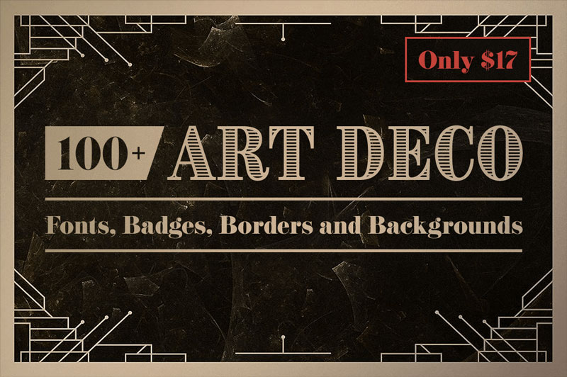
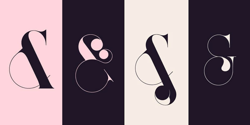
100+ Art Deco Fonts, Badges, Borders and Backgrounds
Give your latest design project a shot in the arm with this retro Art Deco Bundle! Themed around the Art Deco/Steampunk style, you’ll get yourself a bevvy of fonts, logo templates, borders, vectors and backgrounds. Basically everything you need to push the past forward!
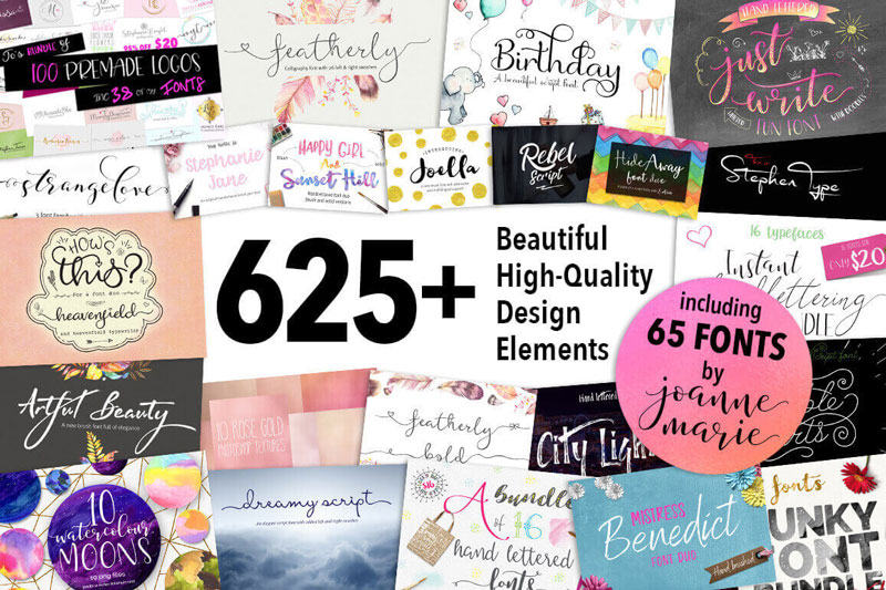
Bundle: 625+ Beautiful High-Quality Design Elements and Fonts
More than 600 unique design elements in 1 super-discounted deal. You’ll get everything you need to create gorgeous designs including logos, graphics, papers, fonts, backgrounds, Photoshop tools, marketing sets and more! It’s the perfect package for every project from wedding invitations to company branding.
Made up of 3 unique font families – Port, Port Vintage and Bohema – this luxury-themed font bundle sports 36 unique typefaces, more than 1000 glyphs and a wide array of OpenType Features to help make your latest projects luxurious.
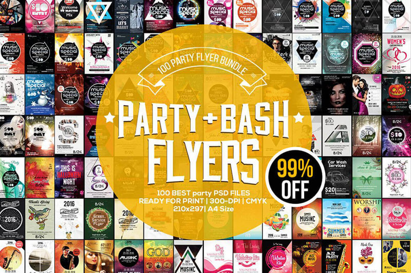
Get 100 high-quality party and event flyers covering everything from jazz concerts to worship services. Fully editable PSD files let you easily change up colors, text, images and more.
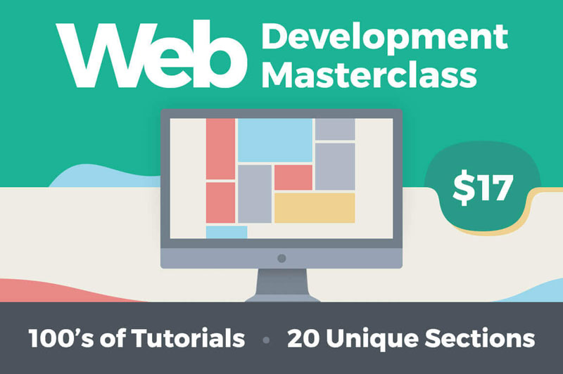
Web Development Masterclass: 100s of Tutorials, 20 Unique Sections
In 20 different sections, this online video tutorial covers everything from teaching you the latest scripting languages to walking you through the installation and administration of everything from LAMP stack to test servers. Best of all, you’ll learn at your own pace with a lifetime to soak it all in.
If you’re already an Elements subscriber, you’ll now see that, along with all the graphics, fonts, web templates, 3D models and everything else you’ve been used to downloading, you have unlimited access to over 240,000 high-quality stock images. Enjoy!
If you’re not an Elements subscriber, here’s how it works. For a single monthly subscription of US$29, you get unlimited downloads from a broad and highly curated selection of:
graphics (vectors, icons, patterns, textures, illustrations and more)
add-ons (think Photoshop and Illustrator actions, Lightroom presets, etc.)
web templates (landing pages, full websites, email newsletters, etc.)
CMS templates (Shopify, Magento, OpenCart, and a lot more)
3D models
Oh, and you also get free access to over 1,000 courses and 170 eBooks here on Envato Tuts+, as well as free AND CO membership to help you with invoicing and contracts.
And because all of that just wasn’t enough, now you get almost a quarter of a million stock photos too.
Of course, there are loads of stock photo sites out there already, both free and paid. So why should you bother with Envato Elements? Here are a few reasons:
1. Get Premium Quality
On some other stock photo sites, the emphasis is on quantity: thousands of people uploading millions of images, with little quality control. On Envato Elements, the collection is carefully curated to make sure you have access to the very best images, without having to wade through tons of mediocre ones.
No matter whether you’re using photos for a website, an artwork, a client project or a professional document, you need to know that you have the right to use those images and won’t get sued for copyright infringement. All the items on Envato Elements come with a simple, easy-to-understand commercial license, so that you can use them in your projects with confidence—and without having to squint at a mass of small print.
Elements offers some useful filters to help you find what you need quickly and effectively. You can search by subject, of course, but you can also filter for image orientation (landscape, portrait, or square) and for the predominant colours in the image. So you can find images that not only convey the right message, but also fit seamlessly with your overall design.
As I mentioned above, you get a ton of other useful things bundled with an Elements subscription. There are no usage limits, no credits to keep track of. You just use as many photos, templates, fonts and graphics as you need for the projects you’re working on. So whether you’re a web designer, a developer, an artist a businessperson or a freelancer in a number of creative fields, you’ll be able to get good value out of an Elements subscription.
To learn more about the new selection of photos, head over to Envato Elements. You can browse the full selection of items even if you don’t have an account, so take a look around to get an idea of what’s on offer and decide whether it would be useful for you.
Keep in mind that Envato Elements is expanding all the time, both in terms of the number of categories being offered and the number of items in each category. So this is a subscription that’s only going to get more valuable over time.
MailChimp’s marketing campaign, “Did You Mean MailChimp?”, was one of the three Cyber Grand Prix winners at Cannes International Festival of Creativity 2017, in recognition of an integrated multi-platform campaign. Launched in January 2017, the brand campaign was designed as an ecosystem of additive, artful and playful experiences connected with the mispronunciation of the email marketing platform name Mailchimp. MailChimp is the world’s leading marketing platform. Fifteen million customers, from small e-commerce businesses to major online retailers, use MailChimp to express themselves to the world and connect the right people with the right message, at the right time. As a company that has built itself on enabling small businesses to grow without compromise, the new campaign shows that MailChimp practices what it preaches: Being creative and true to yourself is good for business. For MailChimp, that meant having fun with its name in as many creative ways as possible, drawing on inspiration from its 2014 audio ad, popularized by cult podcast series Serial, in which people mispronounced MailChimp, ending with the now infamous “MailKimp?”. This inspired a collection of cultural activations, from creating hit singles and a new brand of potato chips, to starting fashion trends and making short films about singing sandwiches. MaleCrimp, MailShrimp, KaleLimp, FailChips, VeilHymn, SnailPrimp, JailBlimp, WhaleSynth and NailChamp all have one thing in common: They sound like “MailChimp.” The Did You Mean Mailchimp campaign, online at mailchimp.com/did-you-mean, was experienced in cinemas and has expressions on social media platforms such as YouTube, Twitter, Tumblr and Instagram.
Three “mood films”, MailShrimp, KaleLimp and JailBlimp, were released in USA cinemas early in the campaign before being released online with their own sites, YouTube channels and movie posters.
MailShrimp
Robert Vacha and Peter Klimes star in this short film featuring a singing shrimp sandwich in the mailroom. The film is supported by its own site, mailshrimpfilm.com and a movie poster.
KaleLimp
Zdenek Subr, Helena Jilkova, Boris Wilke are featured in the KaleLimp film, in which a dog made of wet kale releases leaves for diners in a restaurant. The film is supported by the website, kalelimpfilm.com, and a movie poster.
JailBlimp
Actors Rachel Podrazilova, Jan Vokrouhlecky, Filip Vu, Jiri Sieber are featured in the JailBlimp film, in which a birthday girl smashes her way into a jail blimp piñata. The film is supported by the website, jailblimpfilm.com, and a movie poster.
VeilHymn
VeilHymn, is a musical collaboration between Devonté Hynes and Bryndon Cook. Vistors to the site veilhymn.com interact with both the 4:35 minute music video, Hymn, and behind-the-scenes footage.
SnailPrimp
If you’re feeling like you want to take your face back in time, then maybe you should treat yourself to a SnailPrimp. It’s an anti-aging facial using snail secretions, featured online at snailprimp.com and instagram.com/snailprimp.
FailChips
The fake brand FailChips, online at failchips.com, features the small and crushed crisps found at the bottom of the packet.
WhaleSynth
whalesynth.com. The anchor gives users the chance to dive into the depths of the ocean to provide deeper tones. The chorus feature allows for the addition of whales. The species feature allows the sampling of three different whales.
NailChamp
Online at nailchamp.com, the NailChamp Tumblr site features contests between polished nails.
MailCrimp
Online at malecrimp.com, the MaleCrimp Tumblr site is dedicated to men who crimp their hair. Within days of launch the #Malecrimp trend was being picked up on social media channels, with Buzzfeed launching a story on eleven historic figures who could really have rocked a mailcrimp. A video on the Mailchimp Youtube channel demonstrates the move from manbun to malecrimp.
Did You Mean Mailchimp Credits
The Did You Mean Mailchimp campaign was developed at Droga5, New York, by creative chairman David Droga, chief creative officer Ted Royer, executive creative director Neil Heymann, group creative director Don Shelford, senior copywriter Julie Matheny, senior art director Matt Rogers, copywriter Ryan Snyder, art director Katie Willis, design director Devin Croda, senior designer Nate Moore, experience design director Daniel Perlin, junior experience designer James Garvey, chief creation officer Sally-Ann Dale, director of interactive production Niklas Lindstrom, associate director of interactive production Justin Durazzo, executive experiential producer Bo Djogo, senior interactive producer Leo Seeley, interactive producers Grace Wang and Morgan Mendel, integrated producer Riely Clough, director of art production Cliff Lewis, executive art producer Julia Menassa, art producers Nichole Katsikas and Frannie Schultz, co-directors of film production Jesse Brihn and Bryan Litman, senior film producer Anders Hedberg, associate film producer Isabella Lebovitz, music supervisors Ryan Barkan and Mike Ladman, senior editor Matt Badger, audio mixer Jesse Peterson, senior integrated production business managers Denise Klapp and Tom Vendittelli, director of print services Rob Lugo, senior print producer Alyssa Dolman, director of print services Rob Lugo, senior print producer Alyssa Dolman, retouching studio manager Michelle Leedy, graphics studio manager Virginia Vargas, quality control team Lisa Bishai and Susanne Johansson, retouching coordinator Michael Mockler, retouchers Pete Gibson, John Ciambriello, Mike Vorassi, Shari Alexander, Natasha Kaser, John Clendenen, chief strategy officer Jonny Bauer, co-head of strategy Colm Murphy, strategy director Katie Coane, senior strategist Justin Pak, strategist Midori McSwain, senior communications strategist Elsa Stahura, senior communications strategist Taylor Hines, data strategy directors Lily Ng and Bethany Bengtson, data strategist Kaveri Gautam, chief operating officer Susie Nam, executive group director Julian Cheevers, group account director Matt Ahumada, account director Pat Rowley, account supervisor Josh Freeland, associate account manager Camille Cheeks-Lomax, global head of PR Marianne Stefanowicz, PR manager Danny Hernandez, PR coordinator Ahrim Nam, head of project management Katia Billings, project managers Leslie Alexander, counsel Sarah Fox and associate counsel Zach Werner.
Media was handled at PHD by strategy director Ji Kim, marketing sciences director Phil D’Addio, associate strategy director Alex Arcuri, associate director digital investment Tina Qu.
PR was handled at RSquared by PR consultant Alison Voetsch.
Filming for JailBlimp, KaleLimp, and Mail Shrimp was shot by directing collective The Sacred Egg via Riff Raff Films and The Directors Bureau, with director of photography Ben Todd, 1st assistant director Eric Kaskens, producer Jane Tredget, wardrobe stylist Oscar Charpenter, makeup artist Jana Dopitova, production designer Petr Kunc at Unit+Sofa. Editor was Sam Mould at Big Chop. Post production was done at MPC by VFX supervisor Alex Lovejoy and producer Louise Unwin. Sound was mixed at Factory by Jon Clarke. Music for MailShrimp was by Five Mission More (Abla El-Sharnouby and Tom Simpson) via Ricall. Music for JailBlimp was Bimbi by Joy Boy, with additional arrangement by Found Objects. Music for KaleLimp was Plantasia by Mort Garson.
Film posters were produced at JUCO, represented at Art + Motion by managing director Billy Diesel.
The VeilHymn song and video were produced by Devonte Hynes and Bryndon Cook via Domino Records, with director Malia James, director of photography Jackson Hunt, editor Mandy Brown, Strangelove executive producers Melinda Nugent and Sara Greco, line producer Laure Salgon. Conform/VFX was produced at The Artery VFX. Colour was produced at MPC London by colourist Houmam. Cover art photography was by JUCO.
FailChips product was developed at MADE. Photography was by Paul McGeiver. The SnailPrimp event was produced at The Uprising Creative.
The MailChimp Inception mural was illustrated by Brosmind, represented by Liz Leavitt at Levine/Leavitt.
Photography in the FailChimps and MaleCrimp campaigns was by Paul McGeiver. Promotional photography in the NailChamp campaign was by JUCO.
Stickybits is a small JavaScript utility plugin. It’s goal is not to get in the way. It does one thing well: help with sticky elements. It is not dependent on other JavaScript Plugins, can be imported via npm, and approaches sticky elements in a very utility-oriented way.
Solving the sticky element problem can lead to sticky situations
When navigating sites, it is common to see HTML elements, like banners and navigations, sticking to the top and bottom of the browser. There are a couple of ways that can be done.
One, there is position: sticky, a native CSS feature. You might use it something like this:
Sticky positioning is a hybrid of relative and fixed positioning. The element is treated as relative positioned until it crosses a specified threshold, at which point it is treated as fixed positioned.
Two, you can essentially fake that behavior with JavaScript. You measure scroll positions and flip-flop the element between position: relative (or static or anything else) and position: fixed as needed.
I’d say that neither of these techniques are quite ideal.
By doing the flip-flopping yourself, there may be jumpiness when these elements go from fixed position to not. This issues is worsened in mobile device browsers.
With native CSS alone, you don’t have the ability to know when the element is in one state or the other.
Get the best of both worlds with StickyBits
Stickybits a lightweight (~2KB) alternative to position: sticky polyfills. It is an easy to set up plugin that is cross-compatible with any other plugins, libraries, or frameworks.
Installation with npm:
npm i stickybits --save-dev
Or, installation with Yarn:
yarn add stickybits --dev
Usage:
stickybits('[your-sticky-selector]');
With the out-of-the-box solution above, you now have set any element with your selector to be sticky. This will work for browsers that support .classList whether position: sticky is supported or not.
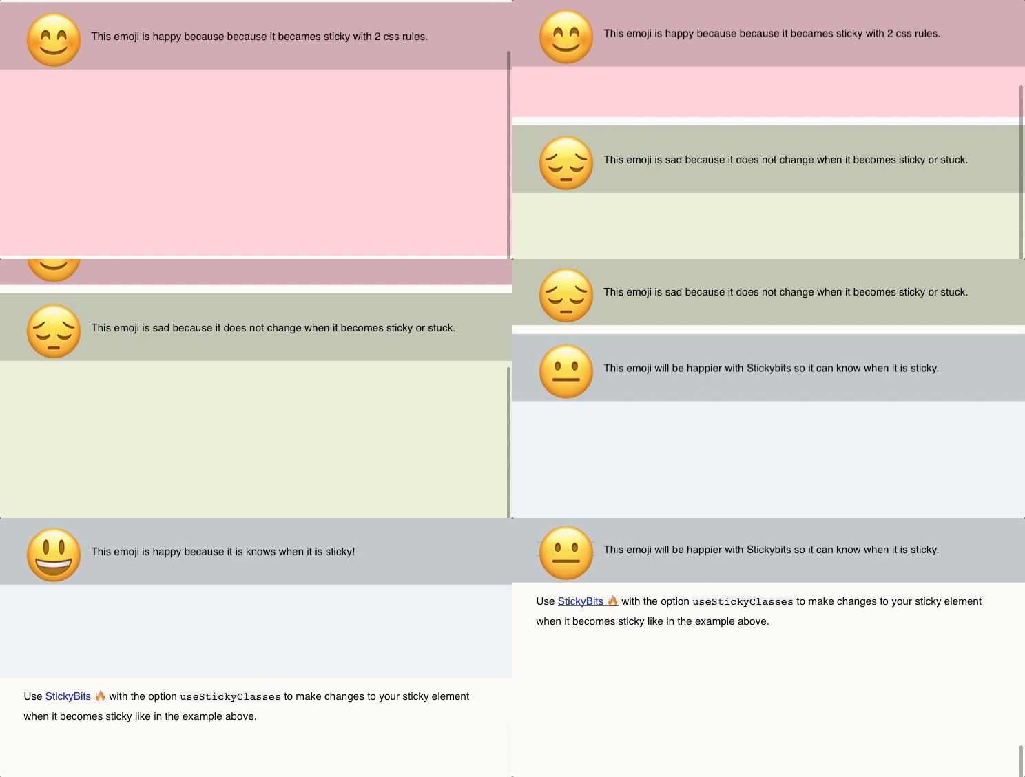
Stickybits, with the additional useStickyClasses: true property set will add sticky and stuck classes when elements become sticky or stuck. This makes it easy to hook up CSS styles based on when the selected element become static, sticky or stuck. This useful utility was added after Dave Rupert mentioned it on the Shop Talk Show Podcast.
Stickybits also supplies offset properties and a clean-up method hook to help better manage its sticky state.
Stickybits is a JavaScript Plugin for making an HTML element stick to the top or bottom of a browser window within its parent. With the varying implementations of position: fixed; and position: sticky; across browsers, making high quality sticky features is challenging. Stickybits solves this.






.jpg)
.jpg)