.com is not the only option when you shop for a domain anymore. For design professionals, the .design domain is THE new branding tool to improve your online presence. Creative and precise, .design has been adopted by some of the most innovative companies (see facebook.design, airbnb.design, kohler.design, atlassian.design) and thousands of individuals and agencies. Take the advantage and claim your free .design domain today. Offer also includes 1 year free email hosting (WHOIS privacy and SSL certs are always free!).
Diversify your marketing with a .design domain!
As a designer, you probably understand the need of diversity in marketing and communication better than most, and you would really stand out if you don’t only get a .design domain for yourself or your business, but also for your clients. In the era of design thinking, design is not only associated with creating pretty things (which was never the role of design by the way), but also with a thinking process and product-oriented thinking.
An offer you can’t refuse
Who refuses free stuff? Nobody! And that’s exactly what is offered here, a free .design domain for a year, so don’t miss the chance. Start thinking about domain names for your promotion now.
Every week, we’ll give you an overview of the best deals for designers, make sure you don’t miss any by subscribing to our deals feed. You can also follow the recently launched website Type Deals if you are looking for free fonts or font deals.
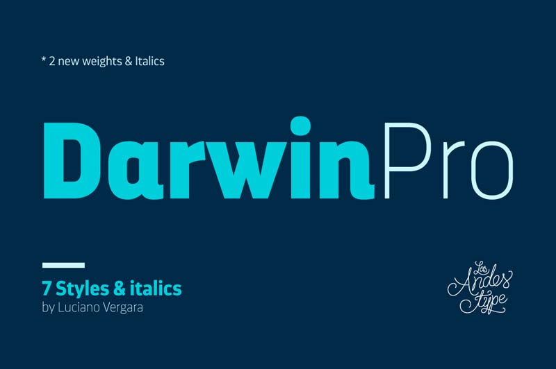
Darwin Pro Family from Latinotype
Darwin Pro comes in 7 weights plus italics and includes alternative characters available as an OpenType feature as well as oldstyle figures, numerators and denominators.
Or go for a full rebranding now, with huge availability in the .TECH domain world! And we’ve arranged a phenomenal deal for you to get your choice of a 1-year, 5-year or 7-year .TECH registration for a whoping 90% off, starting at just $2.99!
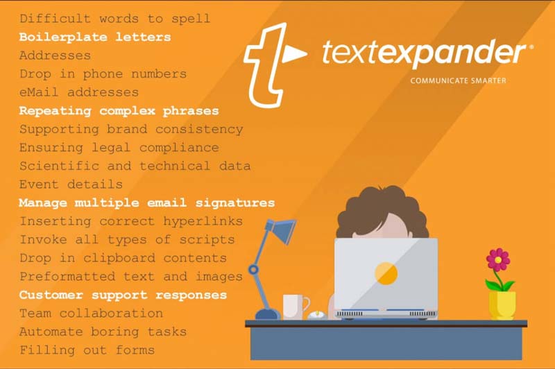
Multiply Your Productivity and Accuracy with TextExpander
This powerful tool creates a personal knowledge base for you to easily and quickly communicate across all of your devices! Simply save snippets (emails, signatures, sentences, blocks of code, etc.) and call them up with a quick keyboard shortcut, with all your snippets synchronized across all your devices!
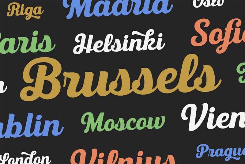
Made up of 3 unique weights, this professional script font also features a shadow layer for each, resulting in 6 total fonts. With loads of OpenType features, you’ll have the perfect typeface for everything from menus to logos.
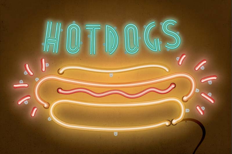
Add a little light to your latest project with this illuminating set of Adobe Illustrator brushes from Artifex Forge! You’ll get 28 flexible neon tube brushes that were sourced from real neon lights, to give your artwork a true-to-life feel. With multiple highlight options and a full-on walk-through guide, this deal is sure to brighten your day.
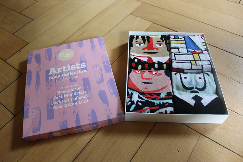
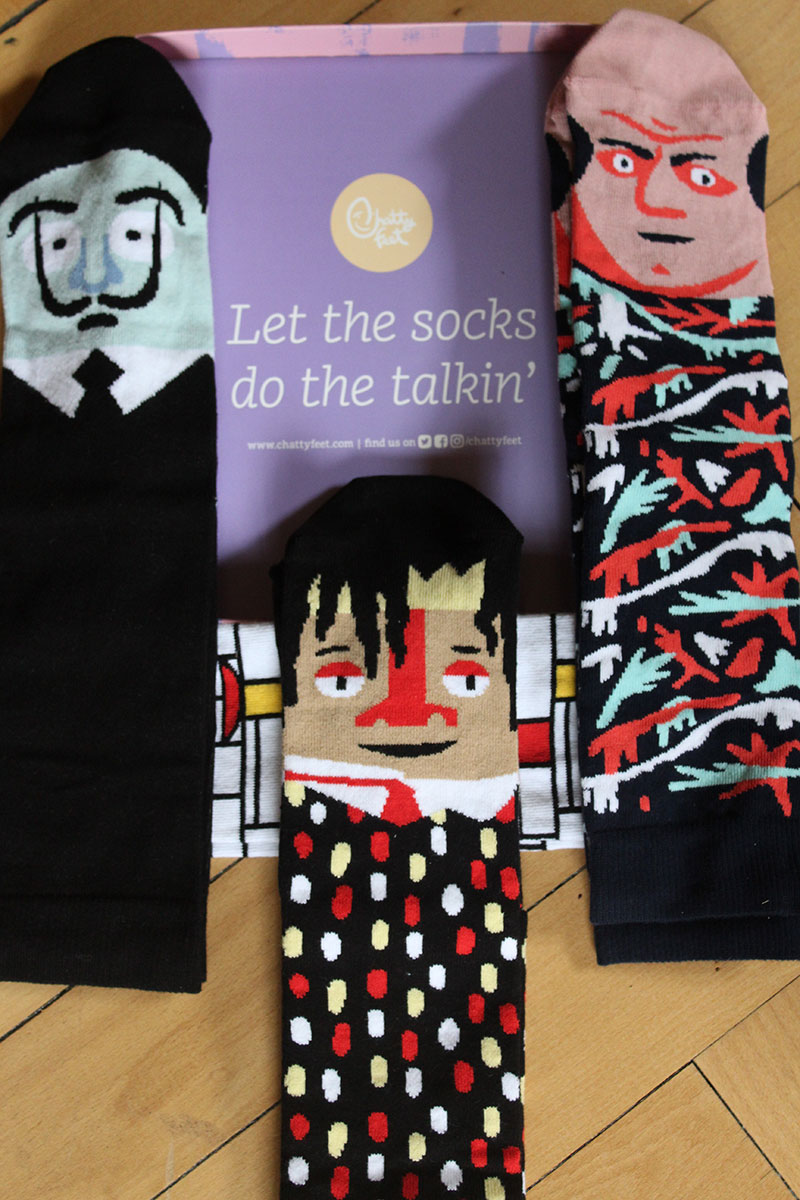
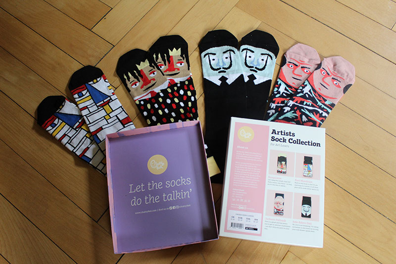
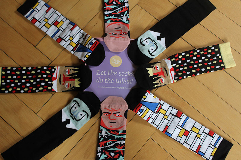
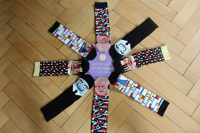
If you think socks are just something you wear for protecting your feet from the cold and from friction in your shoes, think again! Canadian Prime Minister Justin Trudeau has a long history of stealing the show by wearing shiny socks (while still wearing a suit), the New York Times even wrote an article on his “socks diplomacy“. Recently, it’s Leo Varadkar, Ireland’s Prime Minister, who grabbed everybody’s attention with his socks while meeting… Justin Trudeau!
Whether you want to start a political career or just like cool socks, Chatty Feet got you covered (or at least your feet). They regularly release new cool socks, and this artistic set is the latest example. Including Basquiatoe, Feet Mondrian, Jackson Pollsock, and Sole-Adore Dali, this box is everthing an art lover would dream of. Perfect for a gift to your artsy friends… or for a Canadian Prime Minister.
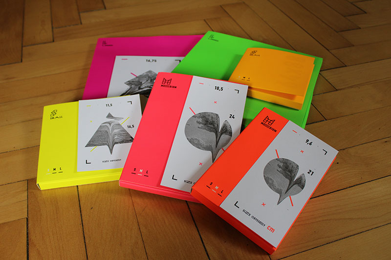
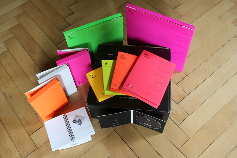
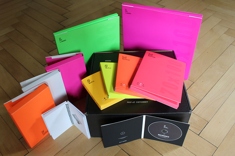
Being a graphic designer, it can be tedious to explain your clients how the work you are doing for them will be printed, folded, and binded. Even if you show them mockups or explain them in details, it’s not the same as seeing it in real.
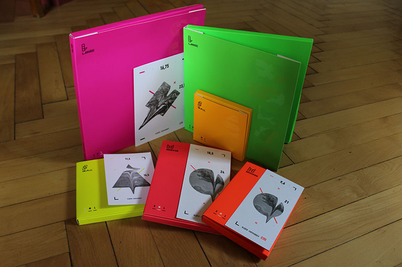
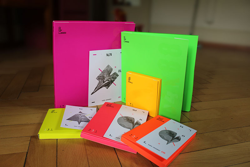
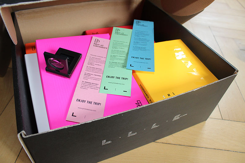
A Print Odyssey solves that problem, it provides you with plenty of the most common prints you may create for your clients, making your communication with them much easier. It comes in one big box that you can store convienently and take out for client meetings. The box comprises the following:
Size Odyssey: show off paper sizes with 70 waste free options (vector files included).
Folding Odyssey: show off paper foldings with 30 unique foldings (vector files included).
Special Finishing Odyssey: show off print finish with 35 after print finishing options.
Binding Odyssey: show off binding options with 6 binding techniques included.
We took a few photos of the box and its content, but you will see everything in the unboxing video.
If you feel ready to improve your workflow and relationship with customers, you can get your own copy of the box at a discounted price using the following coupon: designerdaily
I recently came across this Atlas of Makers by Vasilis van Gemert. Its fun and quirky appearance made me look under the hood and it was certainly worth it! What I discovered is that it was actually built making use of really cool features that so many articles and talks have been written about over the past few years, but somehow don’t get used that much in the wild – the likes of CSS Grid, custom properties, blend modes, and even SVG.
SVG was used in order to create the irregular images that appear as if they were glued onto the page with the pieces of neon sticky tape. This article is going to explain how to recreate that in the simplest possible manner, without ever needing to step outside the browser. Let’s get started!
The first thing we do is pick an image we start from, for example, this pawesome snow leopard:
The image we’ll be using: a fluffy snow leopard.
The next thing we do is get a rough polygon we can fit the cat in. For this, we use Bennett Feely’s Clippy. We’re not actually going to use CSSclip-path since it’s not cross-browser yet (but if you want it to be, please vote for it – no sign in required), it’s just to get the numbers for the polygon points really fast without needing to use an actual image editor with a ton of buttons and options that make you give up before even starting.
We set the custom URL for our image and set custom dimensions. Clippy limits these dimensions based on viewport size, but for us, in this case, the actual dimensions of the image don’t really matter (especially since the output is only going to be % values anyway), only the aspect ratio, which is 2:3 in the case of our cat picture.
Clippy: setting custom dimensions and URL.
We turn on the „Show outside clip-path” option on to make it easier to see what we’ll be doing.
Clippy: turning on the „Show outside clip-path” option.
We then choose to use a custom polygon for our clipping path, we select all the points, we close the path and then maybe tweak some of their positions.
Clippy: selecting the points of a custom polygon that very roughly approximates the shape of the cat.
This has generated the CSS clip-path code for us. We copy just the list of points (as % values), bring up the console and paste this list of points as a JavaScript string:
After that, we scale the coordinates we have to the dimensions of our image. We also round the values we get because we’re sure not to need decimals for a rough polygonal approximation of the cat in an image that big.
Now let’s move on to the pieces of sticky tape. In order to generate them, we use the same array of coordinates. Before doing anything else at this step, we read its length so that we can loop through it:
-// same as before
- var n = coords.length;

svg(viewBox=[0, 0, w, h].join(' '))
  -// same as before
  - for(var i = 0; i < n; i++) {

  - }
Next, within this loop, we have a random test to decide whether we have a strip of sticky tape from the current point to the next point:
However, this is because the default stroke is none. Making this stroke visible (by setting it to an hsl() value with a randomly generated hue) and thicker reveals our sticky tape:
Looks pretty good, but we still have a few problems here.
The first and most obvious one being that this isn’t cross-browser. mix-blend-mode doesn’t work in Edge (if you want it, don’t forget to vote for it). The way we can get a close enough effect is by making the stroke semitransparent just for Edge.
My initial idea here was to do this in a way that’s only supported in Edge for now: using a calc() value whose result isn’t an integer for the RGB components. The problem is that we have an hsl() value, not an rgb() one. But since we’re using Sass, we can extract the RGB components:
The last rule is the one that gets applied in Edge, but is discarded due to the calc() result in Chrome and simply due to the use of calc() in Firefox, so we get the result we want this way.
The second stroke rule seen as invalid in Chrome (left) and Firefox (right) dev tools.
However, this won’t be the case anymore if the other browsers catch up with Edge here.
The second problem is that we want our strips to expand a bit beyond their end points. Fortunately, this problem has a straightforward fix: setting stroke-linecap to square. This effectively makes our strips extend by half a stroke-width beyond each of their two ends.
The final problem is that our sticky strips get cut off at the edge of our SVG. Even if we set the overflow property to visible on the SVG, the container our SVG is in might cut it off anyway or an element coming right after might overlap it.
So what we can try to do is increase the viewBox space all around the image by an amount we’ll call p that’s just enough to fit our sticky tape strips.
-// same as before
- var w1 = w + 2*p, h1 = h + 2*p;

svg(viewBox=[-p, -p, w1, h1].join(' '))
  -// same as before
The question here is… how much is that p amount?
Well, in order to get that value, we need to take into account the fact that our stroke-width is a % value. In SVG, a % value for something like the stroke-width is computed relative to the diagonal of the SVG region. In our case, this SVG region is a rectangle of width w and height h. If we draw the diagonal of this rectangle, we see that we can compute it using Pythagora’s theorem in the yellow highlighted triangle.
The diagonal of the SVG rectangle can be computed from a right triangle where the catheti are the SVG viewBox width and height.
So our diagonal is:
- var d = Math.sqrt(w*w + h*h);
From here, we can compute the stroke-width as 5% of the diagonal. This is equivalent to multiplying the diagonal (d) with a .05 factor:
- var f = .05, sw = f*d;
Note that this is moving from a % value (5%) to a value in user units (.05*d). This is going to be convenient as, by increasing the viewBox dimensions we also increase the diagonal and, therefore, what 5% of this diagonal is.
The stroke of any path is drawn half inside, half outside the path line. However, we need to increase the viewBox space by more than half a stroke-width. We also need to take into account the fact that the stroke-linecap extends beyond the endpoints of the path by half a stroke-width:
The effect of stroke-width and stroke-linecap: square.
Now let’s consider the situation when a point of our clipping polygon is right on the edge of our original image. We only consider one of the polygonal edges that have an end at this point in order to simplify things (everything is just the same for the other one).
We take the particular case of a strip along a polygonal edge having one end E on the top edge of our original image (and of the SVG as well).
Highlighting a polygonal edge which has one endpoint on the top boundary of the original image.
We want to see by how much this strip can extend beyond the top edge of the image in the case when it’s created with a stroke and the stroke-linecap is set to square. This depends on the angle formed with the top edge and we’re interested in finding the maximum amount of extra space we need above this top boundary so that no part of our strip gets cut off by overflow.
In order to understand this better, the interactive demo below allows us to rotate the strip and get a feel for how far the outer corners of the stroke creating this strip (including the square linecap) can extend:
As the demo above illustrates by tracing the position of the outer corners of the strokeincluding the stroke-linecap, the maximum amount of extra space needed beyond the image boundary is when the line segment between the endpoint on the edge E and the outer corner of the stroke including the linecap at that endpoint (this outer corner being either A or B, depending on the angle) is vertical and this amount is equal to the length of the segment.
Given that the stroke extends by half a stroke-width beyond the end point, both in the tangent and in the normal direction, it results that the length of this line segment is the hypotenuse of a right isosceles triangle whose catheti each equal half a stroke-width:
The segment connecting the endpoint to the outer corner of the stroke including the linecap is the hypotenuse in a right isosceles triangle where the catheti are half a stroke-width.
Using Pythagora’s theorem in this triangle, we have:
- var hw = .5*sw;
- var p = Math.sqrt(hw*hw + hw*hw) = hw*Math.sqrt(2);
Putting it all together, our Pug code becomes:
/* same coordinates and initial dimensions as before */
- var f = .05, d = Math.sqrt(w*w + h*h);
- var sw = f*d, hw = .5*sw;
- var p = +(hw*Math.sqrt(2)).toFixed(2);
- var w1 = w + 2*p, h1 = h + 2*p;

svg(viewBox=[-p, -p, w1, h1].join(' ')
    style=`--sw: ${+sw.toFixed(2)}px`)
  /* same as before */
while in the CSS we’re left to tweak that stroke-width for the sticky strips:
stroke-width: var(--sw);
Note that we cannot make --sw a unitless value in order to then set the stroke-width to calc(var(--sw)*1px) – while in theory this should work, in practice Firefox and Edge don’t yet support using calc() values for stroke-* properties.
The final result can be seen in the following Pen:
In today’s tutorial we’re going to take an in-depth look at the
process of creating a transportation-themed icon pack, using some geometric
shapes and tools that you probably already work with on a daily basis.
Don’t forget, you can always expand the pack
by heading over to GraphicRiver where you’ll find a great selection of transportation icons just waiting to be snatched.
That being said, grab
a fresh cup of that yummy mocha latte and let’s get started!
1. How to Set Up a New Project File
Since I’m sure that you already
have Illustrator up and running in the background, bring it up and let’s set up
a New Document (File > New or Control-N)
using the following settings:
Number
of Artboards: 1
Width: 800
px
Height: 600
px
Units: Pixels
And from the Advanced tab:
Color
Mode: RGB
Raster
Effects: Screen (72ppi)
Preview Mode: Default
2. How to Set Up a Custom Grid
Since we’re going to be creating the icons
using a pixel-perfect workflow, we’ll want to set up a nice little Grid so that we can have full control
over our shapes.
Step 1
Go to the Edit > Preferences > Guides & Grid submenu, and adjust
the following settings:
Once we’ve set up our custom grid, all we
need to do in order to make sure our shapes look crisp is enable the Snap to Grid and Snap to Pixel options found under the View menu.
Now, if you’re new to
the whole “pixel-perfect workflow”, I strongly recommend you go through my How
to Create Pixel-Perfect Artwork tutorial, which will help you widen your
technical skills in no time.
3. How to Set Up the Layers
With the new document created, it would be
a good idea to structure our project using a couple of layers, since this way
we can maintain a steady workflow by focusing on one icon at a time.
That being said, bring up the Layers panel, and create a total of
four layers, which we will rename as follows:
layer
1: reference grids
layer
2: train
layer
3: bus
layer 4: tram
4. How to Create the Reference Grids
The reference grids (or base grids)
are a set of precisely delimited reference surfaces, which allow us to build
our icons by focusing on size and consistency.
Usually, the size of the grids determines
the size of the actual icons, and they should always be the first decision you
make once you start a new project, since you’ll always want to start from the
smallest possible size and build on that.
Now, in our case, we’re going to be
creating the icon pack using just one size, more exactly 128 x 128 px, which is a fairly large one.
Step 1
Start by locking all
but the “reference grids” layer, and then grab the Rectangle Tool (M) and create a 128 x 128 px orange (#F15A24) square, which will help define the
overall size of our icons.
Step 2
Add a smaller 120 x 120 px one (#FFFFFF) which we
will position on top of the previous shape, since it will act as our active
drawing area, thus giving us an all-around 4
px padding to work with.
Step 3
Select and group the
two squares together using the Control-G keyboard shortcut, center aligning them to the underlying Artboard
afterwards. Create the remaining grids using two copies (Control-C > Control-F) at a horizontal distance of 40 px from the original, locking
the current layer before moving on to the next section.
5. How to Create the Train Icon
Assuming you’ve successfully managed to
create the little reference grids, move on to the next layer (that would be the
second one), and let’s kick off the project by creating our first icon.
Step 1
Start by creating the
circular background using a 120 x 120 px circle, which we will color using #FF8D60 and then center align to the
first active drawing area.
Step 2
Create the upper section of the train using a 60 x 60 px square, which we will color using #CBF7EC and then
center align to the larger circle, positioning it 20 px from its top edge.
Step 3
Adjust the shape that we’ve just created by setting the Radius of its top corners to 20 px from within the Transform panel’s Rectangle Properties.
Step 4
Give the resulting shape an outline using the Stroke method, by creating a copy of it (Control-C), which we will paste in front (Control-F) and then adjust by first changing its color to #3F3330 and
then flipping its Fill with its Stroke (Shift-X). Set the resulting outline’s Weight to 4 px,
selecting and grouping the two shapes together afterwards using the Control-G keyboard shortcut.
Step 5
Create the little roof section using a 12 x 4 px rectangle (#3F3330) which we will position on top of the
larger outline, as seen in the reference image.
Step 6
Start working on the door using a 20
x 42 px rectangle (#55AA9A) which we will adjust by setting the Radius of its top corners to 4 px from within the Transform panel’s Rectangle Properties. Give the resulting shape a 4 px thick outline (#3F3330), grouping
(Control-G) and then aligning the
two to the center of the larger body’s bottom edge.
Step 7
Add the little window using an 8 x 10 px rounded rectangle (#3F3330)
with a 2 px Corner Radius, which we
will center align to the door, positioning it at a distance of 4 px from its top edge.
Step 8
Add the rectangular side insertions using two 4 x 8 px rectangles (#3F3330), which we will position at a distance
of 6 px from the door’s top edge.
Step 9
Create the little handle using a 4 x 4 px square (#3F3330), which we will position onto the left side of the door, right
underneath the window itself. Once you’re done, select and group (Control-G) all of the current section’s
composing shapes together before moving on to the next step.
Step 10
Start working on the protective string sections using three 2 x 4 px rectangles (#3F3330), which we
will vertically stack at a distance of 2
px from one another, grouping (Control-G)
and then positioning them at a distance of 2
px from the center of the door’s bottom edge.
Step 11
Turn on Pixel Preview
mode (Alt-Control-Y), and then use a 2 px thick Stroke with the color set to #3F3330 to draw the three rope sections.
Once you’re done, switch back to the Default
Preview mode (Alt-Control-Y),
selecting and grouping (Control-G)
them to the smaller insertion rectangles, doing the same for the entire door
afterwards.
Step 12
Create the left window using an 8
x 14 px rounded rectangle (#3F3330) with a 2 px Corner Radius, which we will position on the left side of
the door, making sure to bottom align it to the smaller center window.
Step 13
Add the small rectangular insertion using a 4 x 2 px rectangle (#3F3330), which we will position above the
window, at a distance of just 6 px.
Step 14
Create the circular lights using two 4 x 4 px circles (#3F3330) vertically stacked 2 px from one another, which we will
group (Control-G) and then position
below the left window, at a distance of 4
px.
Step 15
Start working on the left bumper by creating a 4 x 24 px rounded rectangle (#3F3330)
with a 2 px Corner Radius, which we
will align to the bottom of the larger body, positioning it at a
distance of just 2 px from its left
edge.
Step 16
Create two 6 x 4 px rectangles
(#3F3330), which we will vertically stack at a distance of 6 px, grouping (Control-G)
and then positioning them on top of the bumper, at a distance of 4 px from its top edge. Once you’re
done, select and group (Control-G)
all of the bumper’s composing shapes before moving on to the next step.
Step 17
Add the bottom rectangular insertion using a 6 x 4 px rectangle (#3F3330), which we will bottom align to the
train’s larger body. Once you’re done, select and group (Control-G) all of the details that we’ve added so far, since we
will use them to fill up the larger body’s right side.
Step 18
Create a copy (Control-C > Control-F) of the details that we’ve just finished working on, which we will vertically reflect (right click > Transform > Reflect
> Vertical) and then position onto the train’s opposite side. Once
you’re done, select and group (Control-G)
all of the train’s composing sections before moving on to the next step.
Step 19
Start working on the train’s bottom section by creating a 64 x 6 px rectangle (#55AA9A) with a 4 px thick outline (#3F3330), which we
will group (Control-G) and then
position below the train’s larger body.
Step 20
Next, create an 8 x 6 px rectangle
(#3F3330), which we will center align to the two shapes that we’ve just
grouped.
Step 21
Add the side pieces using two 4 x
6 px rectangles (#3F3330), which we will position onto the outer edges of
the wider section.
Step 22
Finish off the train’s bottom section by adding a 60 x 6 px rectangle (#3F3330) followed by a slightly smaller 24 x 4 px one (#3F3330), to the center
of its bottom edge. Once you’re done, select and group (Control-G) all of the current section’s composing shapes together,
doing the same for the entire train afterwards.
Step 23
Finish off the train, and with it the icon
itself, by drawing the small railroad section from underneath using a 4 px thick Stroke (#3F3330). Take your time and, once you’re done,
select and group (Control-G) all of
its composing sections together.
6. How to Create the Bus Icon
Assuming you’ve finished working on the
first icon, lock its layer and then move on up to the next one (that would be
the third one) where we’ll start working on the iconic New York bus.
Step 1
As we did with the
previous icon, start by creating the circular background using a 120 x 120 px circle, which we will
color using #FF8D60 and then center align to the second active drawing area.
Step 2
Create the vehicle’s roof section using a 70 x 12 px rounded rectangle (#55AA9A)
with a 6 px Corner Radius and a 4 px thick outline (#3F3330), which we
will group (Control-G) and then
center align to the larger circle, positioning them at a distance of 20 px from its top edge.
Step 3
Add the center detail piece using a 42 x 4 px rounded rectangle (#3F3330)
with a 2 px Corner Radius, which we
will center align to the shapes that we’ve just grouped.
Step 4
Create the circular front lights using two 4 x 4 px circles (#3F3330), which we will
position onto the sides of the larger center piece, at a distance of just 4 px from it.
Step 5
Add the bottom insertion using a 12
x 3 px rectangle (#3F3330), which we will center align to its bottom edge.
Step 6
Create the smaller insertions using two 4 x 3 px rectangles (#3F3330), which we
will position at a distance of 2 px from
the larger insertion’s side edges.
Step 7
Finish off the roof by creating a 50 x 6 px rectangle (#3F3330), which we
will adjust by individually selecting and pushing its top anchor points to the
inside by a distance of 4 px (right click > Transform > Move >
Horizontal > + / – 4 px depending on which side you start with). Once
you’re done, position the resulting shape on top of the larger shapes,
selecting and grouping (Control-G)
all of them together afterwards.
Step 8
Create the bus’s main body using a 66 x 44 px rectangle (#CBF7EC) with a 4 px thick outline (#3F3330), which we
will group (Control-G) and then
position below the roof that we’ve just finished working on.
Step 9
Create the windows using two 28 x 20 px rounded rectangles (#3F3330)
with a 4 px Corner Radius, which we
will horizontally distance at 2 px from
one another, which we will group (Control-G)
and then center align at a distance of 2
px from the larger body’s top edge.
Step 10
Add the horizontal divider line using a 74 x 2 px rectangle (#3F3330), which we
will position at a distance of just 2 px from the bus’s windows, making sure to center align it to
them before moving on to the next step.
Step 11
Create the smaller detail segments using fourteen 2 x 1 px rectangles (#3F3330), which we will place at a horizontal distance of 2 px from
one another, grouping (Control-G)
and then positioning them below the shape from the previous step.
Step 12
Add the smaller rectangular light using a 2 x 4 px rectangle (#3F3330), which we will position at a distance
of 2 px from the larger body’s
bottom-left corner.
Step 13
Create the larger light using a 12
x 4 px rectangle (#3F3330), which we will position at a distance of 2 px from the smaller one’s right edge.
Step 14
Add the circular light using a 2
x 2 px circle (#3F3330), which we will position above the gap created by
the two rectangular lights, at a distance of just 2 px.
Step 15
Star working on the left windshield wiper by creating the base using a 6 x 2 px rectangle (#3F3330), which we
will position above the larger rectangular light, at a distance of just 2 px from its top and right edges.
Step 16
Create the wiper’s end section using a 2 x 12 px rectangle (#3F3330), which we will position onto the
right side of the bus, at a distance of 8
px from its base.
Step 17
Finish off the wiper by drawing the diagonal body using a 2 px thick Stroke (#3F3330) starting from the center of the base all the way
up to the top of the end piece. Once you’re done, select and group all of the
current section’s composing shapes together using the Control-G keyboard shortcut.
Step 18
Select and group (Control-G)
all the left-sided details, and then use a copy (Control-C > Control-F) of them to add the right-sided ones, making sure to vertically reflect them once you have them in place (right click > Transform > Reflect
> Vertical).
Step 19
Add the side lights using two 4 x 4 px squares (#3F3330), which we
will position onto the outside of the bus’s larger body, so that they’re in line with the inner rectangular lights.
Step 20
Start working on the left side mirror by
creating its main body using a 6 x 12 px rectangle (#3F3330), which we will position at a distance of 2 px from the vehicle’s main body and 4 px from its roof.
Step 21
Finish off the mirror by adding an 8 x 2 px rectangle (#3F3330) on top of
it, followed by a smaller 4 x 2 px one
(#3F3330) towards its bottom. Once you’re done, select and group all three
shapes together using the Control-G
keyboard shortcut.
Step 22
Create the right mirror’s main body using a 6 x 8 px rectangle (#3F3330), which we
will position at a distance of 2 px from
the larger body and 10 px from its
roof.
Step 23
Add the support arms by positioning an 8 x 2 px rectangle (#3F3330) underneath
the mirror’s main body, followed by a smaller 4 x 2 px one (#3F3330) towards its top. Once you’re done, select
and group (Control-G) all of the
mirror’s composing shapes together, doing the same for the larger body
afterwards.
Step 24
Create the main shapes for the vehicle’s front
bumper using a 70 x 8 px rectangle
(#55AA9A) with a 4 px thick outline
(#3F3330), which we will group (Control-G)
and then position below its larger body so that their outlines end up
overlapping.
Step 25
Start adding details to the bumper by creating a 26 x 2 px rectangle (#3F3330), which
we will center align to its larger composing shapes.
Step 26
Add the vertical delimiters using two 4 x 8 px rectangles (#3F3330), which we
will position at a distance of 4 px from
the center piece’s side edges.
Step 27
Create the side insertions using two 8 x 2 px rectangles (#3F3330), which we will position in the center
of the space created by the bumper and the vertical delimiters.
Step 28
Add the bumper’s side sections using two 4 x 8 px rectangles (#3F3330), which we will position on the
outside of its main body.
Step 29
Create another larger 66 x 6 px rectangle,
which we will color using #3F3330 and then position below the bumper’s main
body.
Step 30
Add the wheels using two 12 x 8
px rounded rectangles (#3F3330) with a 2
px Corner Radius, which we will position as seen in the reference image, at
a distance of 4 px from its sides.
Step 31
Finish off the current section by adding an 18 x 2 px rectangle, which we will color using #3F3330 and then
position below the bumper’s bottom detail rectangle. Once you’re done, select
and group (Control-G) all of the
current section’s composing shapes together, doing the same for the entire bus
afterwards.
Step 32
Finish off the icon by adding the little road strip, using an 8 x 12 px rectangle (#3F3330), which we
will adjust by individually selecting and pushing its top anchor points to the
inside by a distance of 2 px (right click > Transform > Move >
Horizontal > + / – 2 px depending on which side you start with). Once
you’re done, position the resulting shape at a distance of 2 px from the bus’s bottom, selecting and grouping (Control-G) all its composing sections
together before moving on to the next icon.
7. How to Create the Tram Icon
We are now down to
our third and last icon, so without wasting any more time, make sure you’re on
the right layer (that would be the fourth one) and let’s finish this.
Step 1
Kick things off by creating the circular background using a 120 x 120 px circle, which we will
color using #FF8D60 and then center align to the third active drawing area.
Step 2
Start working on the vehicle’s pantograph by creating an 18 x 6 px rectangle (#55AA9A) with a 4 px thick outline (#3F3330), which we
will group (Control-G) and then
center align to the circular background, positioning them at a distance of 20 px from its top edge.
Step 3
Add the little rectangular insertion using a 6 x 3 px rectangle (#3F3330), which we will center align to the two
shapes’ bottom edge.
Step 4
Create another slightly larger 14
x 4 px rectangle, which we will color using #3F3330 and then position on
top of the roof section, making sure to center align it to the larger shapes.
Step 5
Take a couple of moments and draw the pantograph’s rail using a 2 px thick Stroke line (#3F3330), using the reference image as your main guide.
Once you’re done, select and group (Control-G)
all of the current section’s composing shapes together before moving on to the
next step.
Step 6
Create the tram’s roof using a 50 x 6 px rectangle (#CBF7EC) with a 4 px thick outline (#3F3330), and a 30 x 3 px rectangle (#3F3330) aligned
to their top edge, grouping and positioning all three shapes right underneath
the pantograph.
Step 7
Add the body’s upper section using a 42 x 26 px rectangle (#55AA9A) with a 4 px thick outline (#3F3330), which we will group (Control-G) and then position below its roof.
Step 8
Add the front windows using three 10
x 18 px rectangles (#3F3330) with a 4
px top CornerRadius and a 2 px bottom one, which we will horizontally stack 2 px from one another, grouping (Control-G) and then positioning them in the center of the larger rectangles. Once you’re done, select and group (Control-G) all of the current section’s
shapes as well before moving on to the next step.
Step 9
Create the tram’s bottom section using a 42 x 20 px rectangle (#CBF7EC) with a 4 px thick outline (#3F3330), which we will group (Control-G)
and then position below the previously grouped shapes.
Step 10
Add the smaller center section using a 12 x 20 px rectangle with a 4 px thick Stroke (#3F3330), which we will center align to the
shapes from the previous step.
Step 11
Add the center lights using two 4 x 4 px circles (#3F3330), vertically
stacked 2 px from one another,
which we will group (Control-G) and
then position at a distance of 2 px from
the center section’s top edge.
Step 12
Create the bottom rectangular insertion using a 4 x 4 px square (#3F3330), which we
will center align to the center section’s bottom edge.
Step 13
Add the side insertions using two 4 x 4 px squares (#3F3330), which we
will position on the outer edges of the center section, at a distance of just 2 px from its bottom edge.
Step 14
Create the left and right horizontal detail
lines using two sets of two 15 x 2 px rectangles
(#3F3330) vertically stacked 2 px from
one another, which we will group (Control-G)
and then position onto the sides, at a distance of just 2 px of the larger section’s top edge.
Step 15
Finish off the current section by adding the
smaller circular lights using two 2 x 2
px circles (#3F3330), which we will individually position at a distance of 2 px from the larger outline’s bottom
corners. Once you’re done, select and group (Control-G) all its composing shapes before moving on to the next
step.
Step 16
Start working on the bumper by creating a 50 x 8 px rectangle (#55AA9A) with a 4 px thick outline (#3F3330), which we
will group (Control-G) and then
position below the previous section.
Step 17
Add the center detail using an 18 x 2 px rectangle, which we will
color using #3F3330 and then center align to the shapes that we’ve just
grouped.
Step 18
Create the bumper’s bottom insertions using two 6 x 4 px rectangles (#3F3330), which we
will position at a distance of 2 px from
its outer edges.
Step 19
Add the bumper’s side pieces using two 4 x 8 px rectangles (#3F3330), which we
will position onto the outer edges of the larger rectangles, as seen in the
reference image.
Step 20
Move a few pixels towards the bottom and create
a 46 x 4 px rectangle (#3F3330),
which we will position below the bumper itself.
Step 21
Create another smaller 54 x 2 px rectangle, which we will color using #3F3330 and then
position below the one from the previous step.
Step 22
Finish off the current section by creating a 38 x 4 px rectangle (#3F3330) with a 2 px bottom corner Radius, which we will position below the tram’s bottom section.
Once you’re done, select and group (Control-G)
all its composing shapes before moving on to the next step.
Step 23
Create the left handrail using a 2 x 46 px rectangle (#3F3330), which we
will position onto the side of the tram, between its roof and front bumper.
Step 24
Add the handrail’s support arms using two 4 x 2 px rectangles (#3F3330), which we
will position onto its right side, at a distance of 6 px from its top and bottom edges. Once you’re done, select and
group all three shapes together using the Control-G
keyboard shortcut.
Step 25
Create the right handrail using a copy (Control-C > Control-F) of the one
that we’ve just finished working on, which we will vertically reflect (right click > Transform > Reflect
> Vertical) and then position on the opposite side of the tram’s body.
Once you’re done, select and group (Control-G)
all of the tram’s composing sections before moving on to the next step.
Step 26
Finish off the tram, and with it the icon itself,
by taking a couple of moments and drawing the three rail segments using a 4 px thick Stroke with the color set to #3F3330. Once you’re done, select and
group (Control-G) all of the icon’s
composing sections before saving the finished project.
It’s a Wrap!
There you have it, fellow icon lovers—a nice little pack created using
the most basic geometric shapes and tools that one can find within Illustrator.
As always, I hope you’ve enjoyed the tutorial and managed to learn something new
and useful along the way.
This tutorial was originally published in February 2009 as a Tuts+ Premium
tutorial. It is now available free to view. Although this tutorial does
not use the latest version of Adobe Photoshop, its techniques and
process are still relevant.
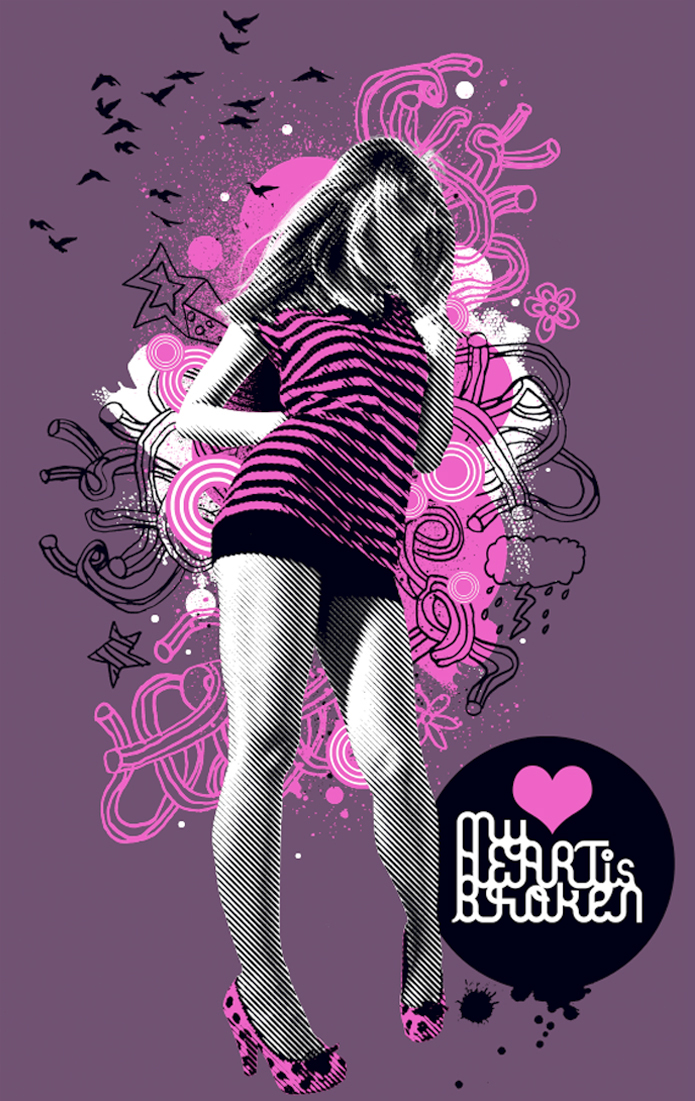
This tutorial shows step by step how to create separated artwork for a screen-printed T-shirt. Screen printing is regarded as the best method of printing onto apparel because of the quality it produces. It should not be confused with the inferior four-color heat transfer printing, which does not look as good or last as long.
The tutorial also demystifies how to manage special or spot colors using Photoshop’s channels.
To start off, you’ll assemble a CMYK illustration, and then create a convincing mockup on a T-shirt. You’ll then make full use of Photoshop’s selection tools to create the necessary channels for screen printing, and you’ll discover how certain colors will maintain their vivacity by under-printing with white. Finally, you’ll apply the often misunderstood concept of trapping to your artwork to counteract any slight misalignment that may occur on press.
Want to add cool effects to your images? Browse our incredible selection of Photoshop Actions from GraphicRiver and Envato Elements to add artistic effects like the ones below.
1. How to Edit the Initial Image
Step 1
Note: The images included with this tutorial are no longer available, so feel free to use your own stocks.
Open a girl image. You’ll be isolating the figure next, so trim the excess background with the Crop Tool (C) as shown.
Step 2
Choose the Pen Tool (P) with it set to the Paths option to carefully plot your paths around the girl—don’t sweat over the hair because you’ll fix that later. I’ve stroked the path with red for clarity in the screengrab. Now select the Subtract From Path Area option to create the inner path on her right arm.
Remember to use the Alt, Command and Shift modifier keys as you work. You can also fine-tune your path by holding the Command key to access the Direct Selection Tool to adjust the direction/anchor points.
Step 3
Now we’ll make a density mask for the hair. Switch to the Channels palette and cycle through each one in turn to determine which holds the most contrast for the hair—in this instance it’s the „Blue” one. Duplicate it by dragging its thumbnail onto the Create New Channel icon, and then hit Command-L to access the Levels dialogue box. Increase the contrast by setting the Midpoint to 0.25 and the Whitepoint to 235.
Step 4
Switch to the Paths palette and Command-click your path thumbnail to generate a selection. Now, back in your Channels palette, target the „Blue copy.” Ensure white is set as your Foreground Color, and hit Delete to fill the selection with black. Don’t deselect just yet.
It’s worth remembering that you can fill channel selections with white by switching the foreground color to black (press X) and hitting Delete.
Step 5
The mask is looking good apart from the right-hand shadow. Hit Shift-Command-I to Inverse the selection, and then enable the visibility of the top composite channel (you can also Double-click the channel thumbnail to adjust its opacity to suit). Use a large, white Hard Brush to Erase the right-hand shadow and hair.
Step 6
Zoom in and continue Erasing the hair using a smaller brush to create a clean edge. Remember to toggle the visibility of the composite channel as you work.
Step 7
Now go to Image > Adjustments > Black and White and use the drop-down menu to select the High Contrast Red Filter preset.
2. How to Create the Background
Switch to the Channels palette and Command-click the „Blue copy” thumbnail to generate a selection. Inverse, and then target the top composite channel and Copy it to the clipboard. Now use the Color Picker to select 63C, 76M, 38Y, and 22K as your background color. Create a New Document7.5″ wide x 12″ high, with a Resolution of 300 dpi (print resolution). Set the Color Mode to CMYK and the Background Contents to Background Color.
Now Paste your selection as a New Layer, and go to Layer > Matting > Defringe by 2 px to erase the white halo and Transform as shown. This purple background is only a visual representation of the T-shirt color.
3. How to Create the Halftone Effect
Step 1
Generate a Selection from the layer by Command-clicking its thumbnail, and then switch to the Channels palette. Click on the Create New Channel icon and then Fill the selection with white, labeling it „Girl Alpha.” It’s always a good idea to store commonly used selections as alpha channels, as you’ll see later.
Step 2
Screen inks tend to spread a little—this is one of the reasons why screen printing doesn’t do a very good job of printing fine halftones, at least compared to other printing methods. When dots increase in size, they cause the tints in the image to grow darker, which is technically known as dot gain.
To combat this, we’ll integrate a coarse line halftone to the girl as part of the design, but first we need to bump the contrast by adding a Levels Adjustment, setting the Blackpoint to 64, the Midpoint to 0.88, and the Whitepoint to 216.
Step 3
Add a white filled New Layer below the girl, highlight both layers, and hit Command-E to Merge them. We now need to make a bitmap halftone of the girl—the best way to achieve this is in a new document, so Select All and Copy to the clipboard.
Step 4
Create the New Document using the clipboard as the preset and setting the Color Mode to Greyscale. Paste your selection and Merge Down. Now go to Image > Mode > Bitmap, and under Method choose Halftone Screen. In the next dialogue box, use the following settings: Frequency: 22, Angle: 45, and Shape: Line.
4. How to Create the Line Art
Step 1
Select All and Copy > Paste into your working document and label it „Girl lineart.” Next, set the Blending Mode to Multiply and Delete the original girl layer.
Step 2
Make a Selection from the „Girl Alpha” channel, add a New Layer beneath the girl, and Fill the selection with white. Label the layer „White fill.” Now place the „Girl lineart” and „White fill” layers into a Group folder labelled „GIRL.”
Step 3
We’re now going to Fill the girl’s shirt and shoes with pink; first draw some closed paths (indicated in red on the screengrab) that extend outside the figure as shown—you’ll be using the extra channel to fix these areas next.
5. How to Add Color
Click on your Foreground Color to access the Color Picker, and select Color Libraries. In the next dialogue box, select PANTONE solid uncoated, then PANTONE 238—rather than using the slider, you can access it by typing 238 swiftly. We’ll be using this four-color equivalent to create the CMYK illustration before using the spot color channels in the final steps.
Generate a path-based Selection, add a New Layer above the „White fill”, and label it „Pink clothes.” Now Fill the selection with the Foreground Color. Next, make a Selection from the „Girl Alpha” channel, ensure the new layer is targeted, Inverse and hit Delete to trim away the excess.
6. How to Add Graphics
Step 1
Note: The images included with this tutorial are no longer available, so feel free to use your own stocks.
Open a brushstroke image and choose the Magic Wand Tool (W), setting the Tolerance to 44 and Unchecking the Contiguous option. Now click within the black area to generate a Selection, fill with white, and Copy to the clipboard. Close, but don’t save the file as you’ll be needing it later.
Add a New Group folder within your working document below the Girl and label it „WHITE GRAPHICS.” Paste the selection within the folder, label it „Paint 1”, and Transform as shown. Follow the same procedure using another brushstroke image, and then feel free to Duplicate/Transform and label accordingly.
You’ll be Pasting a lot of elements throughout this tutorial, so remember to use the Defringe command. A setting of 1-2 pixels is usually enough to remove any white halo.
Step 2
Add a New Group folder below the Girl and label it „PINK GRAPHICS.” Open a line-based graphic and convert to CMYK mode, and then use the same selection techniques to Fill with PANTONE 238.
Now Copy > Paste into the new group folder, Transform as shown and label it „Squiggle 1.”
Step 3
Paste the same graphic using the same method. Feel free to Duplicate and Transform as required. Next, open a spray image and use the same technique again, positioning it behind the figure. Remember to name your layers—this will make things much easier later.
Step 4
With PANTONE 238 as your Foreground Color, use the Custom Shape Tool (U) with the Ellipse and Fill Pixels options selected to add some circles behind the girl. When using the Fill Pixels option, you need to add a New Layer beforehand, so the shapes will be drawn on independent layers. This way they can be positioned and resized as required.
Step 5
Create a new 600 px by 600 px sized CMYK Document, with a Resolution of 300 dpi and the Background Contents set to Transparent. We now need to add some central guides; a quick way to do this is to work in Full Screen Mode, and then snap the Crop Tool (C) to the document bounds. Now drag in your guides, which will snap to the crop tool’s centre points, and then cancel the crop prompt.
Next, make sure PANTONE 238 is set as the Foreground Color. Select the Custom Shape Tool using the same Ellipse and Fill Pixels options as before. Use the drop-down menu to select Fixed Size and type 550 px in the Width and Height fields, and then check the From Center option. Now click in the centre of your canvas to create the shape.
Step 6
Switch your Foreground Color to white and add another circle set to 500 px by 500 px on the same layer. Continue adding alternating color circles, each one Decreasing in size by 50 px. When you’ve completed the last white circle, use the Magic Wand Tool (set to Contiguous) to select it and hit Delete.
Step 7
Drag and Drop the graphic at the top of the layer stack within the „PINK GRAPHICS” folder. Next, Duplicate, Resize and Position as required. Feel free to add variations of the circles (I created a version with a pink fill). When you’re happy, highlight their layer thumbnails and Merge. You can now label the resulting layer „Bullseyes.”
Step 8
Open the second brushstroke image again and Convert it to CMYK mode. Fill with PANTONE 238 and Copy > Paste at the top of the layer stack within the „PINK GRAPHICS” folder.
Step 9
Follow the same techniques with flower images and position as shown.
Step 10
Now open the line files again and use the same selection techniques to Copy > Paste into a New Group folder labelled „BLACK GRAPHICS.” Ensure this folder is positioned above the „PINK GRAPHICS” folder.
Step 11
Open the spray file again, make a Selection and Copy > Paste at the top of the stack within the „BLACK GRAPHICS” folder, and position it behind the girl as shown.
Step 12
Use the same method to add the remaining hand-drawn elements; they’ll include additional clouds and stars.
Step 13
Download and open the birds image, select the birds with the Magic Wand Tool (with Contiguous Unchecked), and Copy > Paste at the top of the layer stack within the „BLACK GRAPHICS” folder. Now resize and position to the left—also feel free to delete individual birds with the Eraser Tool (E).
Next, generate a Selection from the „Bullseyes” layer and, with the „BLACK GRAPHICS” folder targeted, go to Layer > Layer Mask > Hide Selection.
Step 14
Add a New Layer at the top in the „BLACK GRAPHICS” folder, and draw a black circle as shown with the Elliptical Custom Shape Tool (using Fill Pixels). Next, open a splash image and use the Magic Wand Tool (with Contiguous Unchecked) to select, Copy > Paste above the circle later, and then Transform and Merge Down.
7. How to Add Lettering
Create your own lettering and Drag/Drop above the circle. Then add a PANTONE 238 heart on a New Layer using the Custom Shape Tool (set to Fill pixels). Now’s the time to scrutinize your image and carry out any amendments: I added some small white circles on a new layer within the „WHITE GRAPHICS” folder. Once you’re happy, Save but don’t close it.
8. How to Create a T-Shirt Mockup
Step 1
Now we’ll mock the finished design onto a T-shirt. I drew inspiration from this Go Media tutorial.
Download and open the wood image, and then go to Image > Rotate Canvas > 90 Degrees CW. Next, create a new 300 dpi, RGB document10 cm by 10 cm, and then Drag/Drop the wood as a New Layer, Transform and Merge Down.
Step 2
Download and open the T-shirt image, and Crop it. Make a Selection and Copy > Paste as a new layer in your working document. Give it some depth by adding a Drop Shadow. I used the following settings: Blending Mode: Multiply, Opacity: 75, Angle: 50, Distance 6, and Size: 21.
Step 3
To alter the T-shirt color; click Create New Fill or Adjustment Layer and use the drop-down menu to select Color Fill, and then pick the same purple used in your CMYK illustration (63C, 76M, 38Y and 22K). Don’t worry about this altering the color of the wood—we’ll fix that later.
Step 4
Back in your CMYK illustration, access the History palette (Window > History) and use the pull-out menu to create a New Snapshot. Delete the purple background layer and target the „Girl lineart” layer.
Next, use the Magic Wand Tool (set to Contiguous) to select the white background (it’s there, just not visible because the layer’s Blending Mode is set to Multiply) and hit Delete. Finally, press Shift-Command-E to Merge Visible.
Step 5
Drag/Drop the resulting layer into your T-shirt document above the Color Fill, and label it „Illustration.” Resize to fit the T-shirt—this is best done in stages, adding small amounts of Smart Blur each time to retain the sharpness. Now switch to your CMYK illustration and click on the Snapshot you created in the previous step to restore its saved state.
Step 6
To make the print look realistic, Duplicate the T-shirt layer and position it at the top of the layer stack, and label it „T-shirt multiply.” Now set the Blending Mode to Multiply and drop the Opacity to 70%.
Step 7
Target the T-shirt multiply layer and Alt-click between the Illustration, Color fill and the original T-shirt layer icons to create a clipping group. This has now made the non-transparent areas of the uppermost layer serve as a Mask for the clipped layers. Because clipping groups use one mask, there is no edge interference from underlying layers.
Step 8
As a finishing touch, drop in the original illustration at full size above the „Wood” layer. Duplicate and position either edge of the canvas. Now set both layers’ Blending Mode to Soft Light so as not to overpower the illustration.
Step 9
That’s the T-shirt mockup complete. Remember it’s also very quick to visualize how your design will look on different colored material by simply adding Color Fill Adjustment Layers and toggling their Visibility. Your screen printer will also be able to supply various material swatches, so it’s just a case of matching them on-screen.
9. How to Set Up Your Art for Screen Printing
Step 1
In the final part of this tutorial you’ll be creating the artwork for screen printing. Revisit your CMYK illustration and hit Shift-Command-S to Save As, giving it a memorable name such as „Spot_col_artwork.”
The white ink will be printed first, followed by the pink and then the black. To optimize the pink ink, it’s best to add white beneath it. Sometimes your printer will add a double pass of white ink, depending on the darkness of the material being printed.
The thing to bear in mind is that you need to build in a certain amount of trapping to these white areas. This means contracting (choking) or expanding (spreading) areas to compensate for any slight shift which may occur when the T-shirt is printed. The diagram bottom left shows what may happen with no trapping—as you can see, the T-shirt material is showing through. You’ll learn more about this later.
Step 2
Disable the Visibility of all folders except for the „WHITE GRAPHICS” folder and the colored „Background” layer. With the „WHITE GRAPHICS” folder targeted, hit Command-E to Merge Group.
Step 3
Generate a Selection from the resulting layer and switch to the Channels palette. Use the fly-out menu to select New Spot Channel, label it „White”, and then click the Color Swatch to access the Color Picker. Now set the CMYK values to 0 and click OK—the active selection will now appear as black on the new channel.
You’ll notice that by toggling the visibility of the „CMYK” composite channel, the „White” channel appears either black or white, which is correct—all artwork on spot channels is represented in black, regardless of its actual printing color.
Step 4
Move the „Bullseyes” layer out of the „PINK GRAPHICS” folder so it sits beneath the „BLACK GRAPHICS” folder, and then Merge the „PINK GRAPHICS” folder. We now need to add this layer content to the „White” channel, but first we need to choke or shrink it. Most printers work in points, and I was given a trap value of half a point (0.5 pt), but different printers’ trap requirements will vary, so it’s vital to check beforehand.
Here’s a little equation to convert points into pixels: There are 72 points to an inch, so to find out how many half points there are to the inch, divide 72 by 0.5, which equals 144. Now divide the document resolution, (which is 300) by 144, which makes a trap value of 2.
Generate a Selection from the merged pink layer and go to Select > Modify > Contract by2 px. Now target the „White” channel and Fill the selection with black.
Step 5
Generate a Selection from the „Bullseyes” layer, Contract by 2 px, and then Fill the active selection with black on the „White” channel. Next, generate a Selection from the „Girl Alpha” channel and Fill with black on the „White” channel also.
Step 6
Make a Selection from the „Pink clothes” layer, Contract by 2 px, and then Inverse. Now pick a small, white Hard Brush and carefully paint out the outer shoe edges on the „White” channel.
Step 7
Generate a Selection from the „Lettering” layer and Expand by 2 px. Now fill this with black on the „White” channel. Do the same using an Expanded selection from the „Heart” layer. These areas are now spread, to run fractionally behind the black circle.
Step 8
Make a Selection from the merged „Pink graphics” layer, and then add another spot channel. Select PANTONE 238 as you did before and label it „PANTONE 238.” The active selection will now appear as black on the new channel—you can check this by disabling the visibility of the „White” channel.
Step 9
Generate a Selection from the „Bullseyes” layer and Fill with white on the „PANTONE 238” channel.
Step 10
Zoom in and use the Magic Wand Tool (with Contiguous Unchecked) to select just the pink areas from the „Bullseyes” layer. You’ll need to have the Visibility of the „Bullseyes” layer as well as the composite „CMYK” channel targeted to do this. Now Fill this selection with black on the „PANTONE 238” channel.
Step 11
Fill a Selection from the „Girl Alpha” channel with white on the „PANTONE 238” channel.
Step 12
Now Fill a Selection from the „Pink clothes” layer with black on the „PANTONE 238” channel.
Step 13
Generate a Selection from the „Heart” layer. This area needs spreading behind the black circle, so Expand by 2 px and Fill with black on the „PANTONE 238” channel.
Step 14
Merge the „BLACK GRAPHICS” folder and generate a Selection. Add another Spot Channel, label it „Black,” and click the Color Swatch to access the Color Picker. Set the CMYK values to 70c, 70m, 100k. Using a CMYK setting for spot black ink will not affect the ink color—it’s only an on-screen representation. As long as your channels are clearly labelled, that’s all that matters.
The active selection should now be filled with black on the new channel. Next, Fill the „Black” channel with white using a selection from the „Bullseyes” layer.
Step 15
Now Fill the „Black” channel with white using a selection from the „Girl Alpha” channel. As the black ink overprints print last, there’s no need to apply any trapping.
Step 16
Fill a Selection from the „Circle” layer with black on the „Black” channel. Now make a selection from the „Lettering” layer and fill with white. Repeat using a Selection from the „Heart” layer.
Step 17
Generate a Selection from the „Girl Alpha” channel, and then target the „Black” channel. Now use a white Hard Brush and paint within the selection to reveal her left leg.
Step 18
Now use the Magic Wand Tool (with Contiguous Unchecked) to make a Selection of the black areas on the „Girl lineart” layer. Now Fill with black on your „Black” channel.
Step 19
You can check the trapping by Enabling the Visibility of the three spot channels, and then Zooming in to 200%. Now generate Selections from your „White” and „PANTONE 238” channels in turn. The screengrab below shows a selection from the „White” channel—the white lettering and the base white (under the pink heart) have both been spread under the black.
Step 20
All you need to do now is Enable the „CMYK” composite channel and Delete all your layers apart from the background, which you can rename „T-shirt color.” Finally, Save, ensuring that you check the Spot Color option. That’s it—your PSD file is good to go.
Conclusion
I hope this tutorial has cleared up some common misconceptions a lot of designers have about using spot colors for screen printing, as well as how and when to apply trapping to your artwork. I would like to credit my daughter Chloe for drawing the doodles, as well as a big thanks to Steve at Advertees who always offers great technical support, and for casting his expert eye over my final artwork to ensure it was error-free!
If this has inspired you to make your own T-shirt designs, remember it’s good practice to involve your printer at the initial design stage to see what’s achievable. Have fun!
The final image is below. Or you can view the large version.
Halftone Effects From GraphicRiver
Want to create a cool halftone effect for your photo? Then download one of the amazing Halftone Photoshop Actions from GraphicRiver to jazz up your photos today. Check out one of our favorites below!
Create an awesome halftone effect in only a few seconds with this awesome Photoshop action. This action is fully editable and allows you to play with additional effects to add dots, lines, or swirls to your photo. Transform your photos with this super fun Photoshop action!
The zesty, green-yellow shade is fun and inviting, and has been received well by many designers. With a shift in focus towards healthier foods, and growing concerns over the environment, the vibrant green lends itself as a refreshing symbol of rebirth and new beginnings.
So what else is in store for this year? Let’s dive into some of the hottest trends currently hitting the industry.
Who knew there could be a more winning combination of color and texture than rose gold and marble? The simplicity of this light stone texture against the elegance of rose gold makes for one sublime team.
Back in its day, marble was the quintessential material used by sculptors during the Age of Enlightenment. Greco-Roman artists continued to use this luxurious stone as a cultural symbol of refined taste.
And of course, you can’t have luxury without a little gold! Going back several centuries, the value of gold remains a distinct reflection of extraordinary taste and style.
Not sure how to work with texture? Instructor Grace Fussell shows you how to apply lovely gold foiling to your print designs in the tutorial below.
One way to utilize this trend is for a modern set of business cards. This template, for example, showcases a stunning combination of marble and gold elements for a chic, minimalist vibe.
You can also create classy designs for your restaurant menu. The clean aesthetic of marble provides a great background accent for any project. Sprinkle in a few rose gold titles as a lovely accessory like this delightful menu design.
Or elevate your logos with a stunning rose gold text effect instead. With layer styles, you can achieve professional quality graphics in only a fraction of the time. This package, for instance, includes eight fully layered Photoshop files to transform any text or smart object.
Pair the rose gold text above with this set of marble textures for a brilliant result! Featuring six high-resolution images at 3000 x 2000 pixels, this pack contains several common marble textures for more variety.
Or why not just combine the two together? Go for bold design with this jaw-dropping texture pack featuring 12 gold marble textures. Perfect for labels, packaging, and brand identities, this awesome pack is one we’re sure you’ll love.
Kick off your summer design essentials by incorporating some tropical leaves into your work. This trend has recently popped up in many unique poster designs, highlighting the beauty of tropical plants.
The types of plant most commonly seen are birds of paradise, areca palms, or lovely philodendrons. These healthy plants provide exceptional, inspiring colors that add life to your creative projects.
Nature-based design always has a refreshing quality to it, and this tropical pattern is no different! Just imagine the lovely breeze as it shuffles through the vibrant green leaves. Need some project inspiration? This pattern works great for posters, websites, and more.
If you’d prefer to have the leaves as separate design elements instead, then check out this awesome pack! This pack includes a mix of watercolor tropical leaves to beautify any design. Designed in Adobe Illustrator, this file is already print ready for fast results.
Learn how to create a tropical pattern yourself in this tutorial by Yulia Sokolova.
Make a bold statement by mixing stunning typography with tropical elements. This exotic poster design features a tropical aesthetic that is definitely on trend, with two high-resolution Photoshop files for easy editing.
In this awesome bundle, you’ll get access to 30 seamless tropical patterns. Ideal for stationery and design projects, these patterns will help bring paradise to you!
Become the hero of summer! Throw a luau party your guests won’t forget! This sweet party invitation features a few tropical leaves alongside colorful fruit. Just switch out the text by clicking on the fully editable text holders.
Some of your favorite mythical creatures are also in full effect for 2017. Unicorns and mermaids are legendary creatures commonly known from ancient folklore. Even today, they captivate the imagination of designers around the world.
Unicorns symbolize purity and innocence. Try pairing them with a rainbow to show off their whimsical humor and overall bright energy.
Mermaids are seductive and charming. They help you create enticing designs with the help of allure and mystery.
Love mermaids too? Monika Zagrobelna shows you how to magically change any vacation selfie into a beautiful mermaid in this detailed Photoshop tutorial.
Launch your brand with an adorable mermaid character reminiscent of a delightful Disney movie. This design features a fully editable vector mermaid with several flat ocean elements in the background. It’s super trendy and insanely pretty!
Or add realistic scale textures to your work. With 100% vector files, you can resize these scales without any loss of quality. Use them as a great accessory to a mermaid-inspired design or feature them alone for a fantastic piece.
Show the strength of the unicorn symbol with a powerful logo. This exemplary design features bold lines and solid details. It’s great for any service-based business or official organization.
Unicorns plus rainbows equals awesome design, always. And you can satisfy all your whimsical needs with this delightful pack of seamless patterns. Follow this trend to create pretty designs that please your followers.
Or learn how to create a unicorn illustration in this tutorial by Nataliya Dolotko.
Make 2017 a memorable year with a fabulous unicorn celebration! This party invitation is great for many ages and features a fantastical rainbow design.
It was a time of funky colors and loud patterns, but the 90s will never die. Twenty years later, designers still find ways to honor this fun time with nostalgic designs.
So what are a few of the key characteristics of 90s revival design?
Chunky Text
Neon Colors
Abstract Shapes
Seamless Patterns
Minimalists love this style for its simple, clean lines and pleasing abstract shapes. Beginners to design can learn a lot by studying the simplicity of retro poster templates.
Feeling a little nostalgic? Test out your Photoshop skills with a 90s-inspired text effect!
Throw a rocking music festival this summer with an epic 90s poster template. This design features bold black and white lines with early MTV-esque colors. Create a real throwback Thursday with this awesome and fun design.
Creating individual abstract shapes can take a long time. Cut the time in half by opting for this abstract shape generator. This generator creates an infinite number of random shapes to apply to your designs. Try it out today!
Nothing says the 90s more than an awesome retro font. This Thunderstorm Typeface screams the style of an epic 1990s sitcom everyone loves. Throw back to a truly epic era with this wonderful typeface.
Keep in mind that some space graphics are often more conceptual than literal. This space flyer, for instance, has bursting 3D abstract shapes with stunning deep colors.
Create a compelling design with a galaxy background. This extraordinary bundle features beautiful bokeh effects and light flares. Use it to elevate any website or poster design.
Whenever a large brand makes a major change, the design industry usually follows suit. And with the boom of gradient colors across major platforms like Instagram and more, designers have fallen back in love with this vibrant transition.
When designing with gradients, consider the symbolic qualities of the colors you choose. Mix and match color arrangements and even experiment with different types of gradient styles (radial, linear, etc.).
Want to create a gradient icon similar to Instagram’s official logo? Then check out this awesome tutorial by Mary Winkler.
Match your social media across several networks with a set of flat gradient icons. Flat graphics are hugely popular because of their clean aesthetics and simplistic design.
Also on trend is the duotone look for Instagram filter-like aesthetics.
Gorgeous gradients are applied to your photos with the help of an amazing Photoshop action. This duotone action includes 50 total gradients with amazing combinations.
Love this effect? Learn how to create a pride rainbow overlay in this tutorial by Sharon Milne.
Sometimes you only need a little color to pack a punch. So try out a gradient magazine template to launch your new brand. Know when to incorporate bold colors for an elegant layout.
For the ultimate modern logo, consider adding a bold gradient. This diamond template, for example, features lovely purple hues that transition well into text. Create a smart logo that will stand out from the crowd.
This last resource includes 500 colorful gradients for your desktop backgrounds, websites, and more. Inspire yourself with the gorgeous color schemes that translate to inspiring, happy colors.
Boston, like many large cities, has a subway system. Commuters on it are accustomed to hearing regular public address announcements.
Riders simply tune out some announcements, such as the pre-recorded station stop names repeated over and over. Or public service announcements from local politicians and celebrities—again, kind of repetitive and not worth paying attention to after the first time. Most important are service alerts, which typically deliver direct and immediate information riders need to take action on.
An informal priority
A regular rider’s ear gets trained to listen for important announcements, passively, while fiddling around on a phone or zoning out after a hard day of work. It’s not a perfect system—occasionally I’ll find myself trapped on a train that’s been pressed into express service.
But we shouldn’t remove lower priority announcements. It’s unclear what kind of information will be important to whom: tourists, new residents, or visiting friends and family, to name a few.
A little thought experiment: Could this priority be more formalized via sound design? The idea would be to use different voices consistently or to prefix certain announcements with specific tones. I’ve noticed an emergent behavior from the train operators that kind of mimics this: Sometimes they’ll use a short blast of radio static to get riders’ attention before an announcement.
Opportunities
I’ve been wondering if this kind of thinking can be extended to craft better web experiences for everyone. After all, sound is enjoying a renaissance on the web: the Web Audio API has great support, and most major operating systems now ship with built-in narration tools. Digital assistants such as Siri are near-ubiquitous, and podcasts and audiobooks are a normal part of people’s media diet.
Deep in CSS’—ahem—labyrinthine documentation, are references to two Media Types that speak to the problem: aural and speech. The core idea is pretty simple: audio-oriented CSS tells a digitized voice how it should read content, the same as how regular CSS tells the browser how to visually display content. Of the two, aural has been deprecated. speech Media Type detection is also tricky, as a screen reader potentially may not communicate its presence to the browser.
code {
  background-color: #292a2b;
  color: #e6e6e6;
  font-family: monospace;
  speak: literal-punctuation; /* Reads all punctuation out loud in iOS VoiceOver */
}
Just because you can, doesn’t mean you should
In his book Building Accessible Websites, published in 2003, author/journalist/accessibility researcher Joe Clark outlines some solid reasons for never altering the way spoken audio is generated. Of note:
Support
Many browsers don’t honor the technology, so writing the code would be a waste of effort. Simple and direct.
Proficiency
Clark argues that developers shouldn’t mess with the way spoken content is read because they lack training to „craft computer voices, position them in three-dimensional space, and specify background music and tones for special components.”
This may be the case for some, but ours is an industry of polymaths. I’ve known plenty of engineers who develop enterprise-scale technical architecture by day and compose music by night. There’s also the fact that we’ve kind of already done it.
The point he’s driving at—crafting an all-consuming audio experience is an impossible task—is true. But the situation has changed. An entire audio universe doesn’t need to be created from whole cloth any more. Digitized voices are now supplied by most operating systems, and the number of inexpensive/free stock sound and sound editing resources is near-overwhelming.
Appropriateness
For users of screen readers, the reader’s voice is their interface for the web. As a result, users can be very passionate about their screen reader’s voice. In this light, Clark argues for not changing how a screen reader sounds out content that is not in its dictionary.
Screen readers have highly considered defaults for handling digital interfaces, and probably tackle content types many developers would not even think to consider. For example, certain screen readers use specialized sound cues to signal behaviors. NVDA uses a series of tones to communicate an active progress bar:
Altering screen reader behavior effectively alters the user’s expected experience. Sudden, unannounced changes can be highly disorienting and can be met with fear, anger, and confusion.
A good parallel would be if developers were to change how a mouse scrolls and clicks on a per-website basis. This type of unpredictability is not a case of annoying someone, it’s a case of inadvertently rendering content more difficult to understand or changing default operation to something unfamiliar.
My voice is not your voice
A screen reader’s voice is typically tied to the region and language preference set in the operating system.
For example, iOS contains a setting for not just for English, but for variations that include United Kingdom, Ireland, Singapore, New Zealand and five others. A user picking UK English will, among other things, find their Invert Colors feature renamed to „Invert Colours.”
However, a user’s language preference setting may not be their primary language, the language of their country of origin, or the language of the country they’re currently living in. My favorite example is my American friend who set the voice on his iPhone to UK English to make Siri sound more like a butler.
UK English is also an excellent reminder that regional differences are a point of consideration, y’all.
Also, the speed the voice reads out content may be too fast for some or too slow for others. Experienced screen reader operators may speed up the rate of speech, much as some users quickly scroll a page to locate information they need. A user new to screen readers, or a user reading about an unfamiliar topic may desire a slower speaking rate to keep from getting overwhelmed.
And yet
Clark admits that some of his objections exist only in the realm of the academic. He cites the case of a technologically savvy blind user who uses the power of CSS’ interoperability to make his reading experience pleasant.
According to my (passable) research skills, not much work has been done in asking screen reader users their preferences for this sort of technology in the fourteen years since the book was published. It’s also important to remember that screen reader users aren’t necessarily blind, nor are they necessarily technologically illiterate.
The idea here would be to treat CSS audio manipulation as something a user can opt into, either globally or on a per-site basis. Think web extensions like Greasemonkey/Tampermonkey, or when websites ask permission to send notifications. It could be as simple as the kinds of preference toggles users are already used to interacting with:
A fake screenshot simulating a preference in NVDA that would allow the user to enable or disable CSS audio manipulation.
There is already a precedent for this. Accessibility Engineer Léonie Watson notes that JAWS—another popular screen reader—“has a built in sound scheme that enables different voices for different parts of web pages. This suggests that perhaps there is some interest in enlivening the audio experience for screen reader users.”
Opt-in also supposes features such as whitelists to prevent potential abuses of CSS-manipulated speech. For example, a user could only allow certain sites with CSS-manipulated content to be read, or block things like unsavory ad networks who use less-than-scrupulous practices to get attention.
Opinions: I have a few
In certain situations a screen reader can’t know the context of content but can accept a human-authored suggestion on how to correctly parse it. For example, James Craig’s 2011 WWDC video outlines using speak-as values to make street names and code read accurately (starts at the 15:36 mark, requires Safari to view).
In programming, every symbol counts. Being able to confidently state the relationship between things in code is a foundational aspect of programming. The case of thisOne != thisOtherOne being read as „this one is equal to this other one” when the intent was „this one is not equal to this other one” is an especially compelling concern.
Off the top of my head, other examples where this kind of audio manipulation would be desirable are:
Creating a cloud-synced service that stores a user’s personal collection of voice preferences and pronunciation substitutions.
Ability to set a companion voice to read specialized content such as transcribed interviews or code examples.
Emoting. Until we get something approaching EmotionML support, this could be a good way to approximate the emotive intent of the author (No, emoji don’t count).
Spicing things up. If a user can’t view a website’s art direction, their experience relies on the skill of the writer or sound editor—on the internet this can sometimes leave a lot to be desired.
The reality of the situation
The CSS Speech Module document was last modified in March 2012. VoiceOver on iOS implements support using the following speak-as values for the speak property, as shown in this demo by accessibility consultant Paul J. Adam:
normal
digits
literal-punctuation
spell-out
Apparently, the iOS accessibility features Speak Selection and Speak Screen currently do not honor these properties.
Despite the fact that CSS 3 Speech Module has to be ratified (and therefore is still subject to change), VoiceOver support signals that a de facto standard has been established. The popularity of iOS—millions of devices, 76% of which run the latest version of iOS—makes implementation worth considering. For those who would benefit from the clarity provided by these declarations, it could potentially make a big difference.
Be inclusive, be explicit
Play to CSS’ strengths and make small, surgical tweaks to website content to enhance the overall user experience, regardless of device or usage context. Start with semantic markup and a Progressive Enhancement mindset. Don’t override pre-existing audio cues for the sake of vanity. Use iOS-supported speak-as values to provide clarity where VoiceOver’s defaults need an informed suggestion.
Writing small utility classes and applying them to semantically neutral span tags wrapped around troublesome content would be a good approach. Here’s a recording of VoiceOver reading this CodePen to demonstrate:
Take care to extensively test to make sure these tweaks don’t impair other screen reading software. If you’re not already testing with screen readers, there’s no time like the present to get started!
Unfortunately, current support for CSS speech is limited. But learning what it can and can’t do, and the situations in which it could be used is still vital for developers. Thoughtful and well-considered application of CSS is a key part of creating robust interfaces for all users, regardless of their ability or circumstance.