10 Essential Tools & Tips All Photoshop Beginners Should Learn

Post pobrano z: 10 Essential Tools & Tips All Photoshop Beginners Should Learn

Are you new to Photoshop? We’re here to help!

Learning Photoshop takes time, and there are so many things I wish I knew when I first started. So today, I’m bringing you ten helpful tips to make designing with Photoshop a whole lot easier! Learn about essential tools and tricks any beginner can master.

Begin your journey with a template! Sign up to Envato Elements to unlock thousands of premium templates, photos, and more.

1. Discover Your Favorite Tools

This is Photoshop’s Tools panel.

Toolbar Adobe Photoshop
Press on the double arrow to view the toolbar at one or two-rowed view.

Did you know you can customize it?

Though many of its greatest tools are in plain sight, if you only stay on the toolbar’s surface, you may miss out on the extras hidden beneath the lower right triangles.

So customize the toolbar as a helpful reminder to try out new tools!

Go to Edit > Toolbar to drag and drop your tools. Group them according to different priority levels dedicated to learning or actual use.

Photoshop custom toolbar
Don’t overload your panel with unused tools. Customize it with your favorites!

Establish Your Core Set

You won’t need every tool for every situation. So it’s important to build a strong foundation with a few flexible tools that work in a variety of scenarios.

Here are two different projects: a digital painting and a photo manipulation. Notice how the tools I used are similar?

Photoshop tools for different art types

While the first project is solely an illustration, the second still depends heavily on my illustrative skills. So don’t panic if you don’t know these tools yet! Your core set should reflect your own design, photo, or illustrative interests.

Keep in mind that many of Photoshop’s tools also serve more than one purpose. You can use the same Pen Tool to extract your friend from a photo that you would use for a vector illustration.

Using the Pen tool with photos and illustrations
Use the pen tool for a cute cat or a double exposure bird illustration.

There are other tools that you’ll need too, but think of them as secondary. The Pan and Move Tools, for instance, may not seem as creative as brushes, but they’re needed (often a lot more) for a better workflow.

What are your core tools?

In the beginning, you’ll always have a favorite. But as you progress, challenge yourself to try out new tools with creative experiments.

Learn more about Photoshop tools:

2. Get to Know the Layers Panel

Control-Shift-N to create a New Layer.

The Layers Panel in Photoshop

The Layers panel is efficient and helpful. It’ll change the way you
think about design by showing you endless results in Photoshop.

But how does it do it?

Well, the panel gives you control over several options. Opacity, Fill, and Color are just a few. You can use these settings to modify your layers for many awesome effects.

Text effects, for instance, often use brilliant Layer Styles to achieve their result.

3d Colorful text effect
How to Create a 3D Colorful Illuminated Text Effect in Adobe Photoshop

At first, you’ll probably use the Layers panel for its basic function, to hold your artwork in separate layers, but I really recommend studying it further. Explore the panel as much as you can and discover new ways to make detailed designs.

Having trouble with color? Study Layer Blend Modes.

Need a brighter result? Try an Adjustment Layer.

3. Save Time With Layer Masks

It’s time we had the talk—the talk about Layer Masks.

Though often confusing for beginners, layer masks are essential for smart editing.

To use a Layer Mask:

How to use Layer Masks
Here I painted a circle in the center of the mask to reveal the white background underneath.
  1. Go to the Layers panel and select a layer.
  2. Then click on the Layer Mask button.
  3. Using the tool of your choice, apply white or black to the layer mask to hide or reveal parts of that layer. In this case, I used the Selection and Paint Bucket Tools.

Use layer masks for any project! Incorporate them into your routine for non-destructive editing.

Most of the time, the struggle with this option comes from not understanding when to use it. Beginners will often reach for the Eraser Tool instead for a quick solution.

So learn the difference between the Layer Mask and the Eraser Tool:

You can also use masks to create an isolated object. Then insert them into your work. Learn how to create one with this quick video:

4. Control-S Properly

To Save or to Save As? That is the question.

Quality matters. So before you save and close, consider a few things first:

  • What do I need this file for?
  • Where can I store it?
  • Which format do I need it in?
  • How should I save it for the best quality?
Image quality comparison
Side-by-side comparison of different quality levels.  83% versus 1% quality. Image from Envato Elements.

What and Where

Whether or not your design will be used online is a huge part of the answer to the first question. Visuals for online posts can sacrifice some quality, while printed materials require high-resolution files. Research printing guidelines to understand important settings like Color Modes to learn how to navigate these scenarios.

Store your files in a location on your computer that you can access easily. Photoshop may
display an error if a file is missing certain elements (like fonts), so try your best to keep everything together.

Format and Quality

Now that you know what the design is needed for, you can proceed by saving it at the right format and size. Many designers will save their work in several formats for more flexibility.

To Save for Web:

Go to File > Export > Save for Web.

Save for web settings

Explore how your work looks under different compression settings. Avoid quality loss! Learn how to manage jpeg compression for social media posts:

5. Know Your Digital vs. Printing Guidelines

Will your designs print well?

Another big reason you should save your work in several formats is to understand print quality. If you paint, design, or edit with bright neon colors, for instance, you may be disappointed by the physical result.

Minimalist design is a huge trend, partly because of its versatility for
printing. Clean designs are often easier to print and therefore more
widely prevalent in the industry.

Business Card Template from Envato Elements
Business Card template from Envato Elements.

What looks great online doesn’t always look great on paper. There are many reasons for this, but one great factor is how the ink actually prints onto the paper. And knowing the difference between RGB and CYMK Color Modes will be crucial to this step.

Not sure where to begin? Learn more about Color Modes in this quick video:

Design for your situation. To access/change the Color Mode of your file, go to Edit > Color Settings.

Color Settings

Test out your designs by getting them professionally printed! Learn how to work with local printers for the best result.

Need a few beginner tutorials on print design? Check these out:

6. Presets! Presets! Presets!

In the real world, there are tight deadlines and frustrating creative blocks. So save valuable time by using one of Photoshop’s built-in presets!

Presets are available for brushes, shapes, patterns, and more. Add a quick filter to a photo, or create a brochure with abstract elements.

To view them all, go to Edit > Presets > Preset Manager.

Preset Manager Adobe Photoshop

Each category will display a new list of presets, but you can access even more by going to the drop-down option in the upper right corner.

Some of my favorite presets to use are the Brushes. Brush packs from your favorite artists are great too, but take advantage of the ones you already have!

These presets include varying textures, beautiful gradients, and more.

Preset Brushes
Here is an example of the Wet Media Brushes preset pack.

Use presets for incredible effects! They’re already organized for your convenience, so all you have to do is load them and go.

Need some inspiration? Try out these tutorials below:

7. Change Colors Easily With Adjustment Layers

Create magical lighting schemes with a few short clicks!

Adjustment Layers are perfect for beginners to Photoshop. They allow you to change so many visual aspects of your work without all the fuss.

Need to save the original photo? No problem. Non-destructive tools like Adjustment Layers and more help you create incredible effects without any quality loss.

To use a Color Lookup Adjustment Layer:

Go to Layer > New Adjustment Layer > Color Lookup. Select a preset from the drop-down list for the 3DLUT File. Click OK to enjoy the result.

Color Lookup Adjustment Layer
Woman stock from Envato Elements.

As one of my favorite tools, I love that adjustment layers work great for digital illustrations too!

Digital artists use these adjustments to try out different color palettes before committing to a final decision. Explore different lighting arrangements and more with incredible tools like Curves.

Learn more about Adjustment Layers with these tutorials:

8. Learn How to Arrange Your Workspace

Chefs love clean kitchens. It adds to their overall cleanliness and productivity. So why not create a clean workspace for yourself in Photoshop?

Organization is conducive to a healthy work environment. And even when it feels very artistic to be messy, an organized workspace can help improve your work.

First, close out of all those extra tabs!

Close out of tabs

After that, there are many ways you can make things even tidier. Dock and undock your favorite toolbars and panels to get started.

Then go to Window > Arrange.

Window Arrange Options

Choose from the different list options to help display your Photoshop documents neatly. Keep inspiration nearby for easier access.

The standard is to Consolidate All to Tabs, but you can also use options like 2-up Vertical to display references next to illustrations.

Need to reset your workspace? Go to Window > Workspace > Reset Essentials.

Default Workspace in Photoshop

Every artist’s workspace is different. Some may want to see more panels than others. I typically like less to minimize clutter. But no matter your preference, you can create the environment you need for successful design.

9. Conquer the Pen Tool

The Pen Tool (P) can be quite intimidating, but you can master it completely with time.

First, study the tool itself. The Path setting is great for creating selections while the Shape setting allows you to create custom shapes.

The Pen Toolbar

Then get to know the Path Operations, Alignment, and Arrangement options. Designers who are more experienced with Adobe Illustrator may have an easier time with this.

Path Operations tab

In fact, our very own Yulia Sokolova creates brilliant flat designs using this tool. Check out one of her tutorials below:

The best way to master anything is to experiment! Create tons of lines and swirls and play around with different settings under Blending Options. The possibilities are truly limitless! Remember to use the Pen Tool to create awesome text effects, illustrations, and more!

Create Awesome 3D Style Lettering in Photoshop

Got a minute? Learn more about the Pen Tool with this quick video:

10. Memorize Keyboard Shortcuts

Keyboard shortcuts aren’t new.

But designers still have trouble remembering them. Want to learn a quick trick to improve your memory of keyboard shortcuts?

Try this ancient mind trick to help think of the tools. When you think of a keyboard shortcut, think of a visual that explains what it is or how it’s used.

Hitting the letter B, for the Brush Tool, automatically makes me imagine this:

The Brush Tool

Memorize keyboard shortcuts according to priority level. Just like our first tip, it’s important to establish which shortcuts you’ll need the most. You’ll also need to memorize additional shortcuts pertaining to your favorite tools.

To increase Brush Size, for instance, hold the left or right brackets: [ or ].

Your favorite keyboard shortcuts will be easy to memorize because you’ll use them often, but you should also explore new options.

Want to create things a lot faster? Study these keyboard shortcuts to improve speed and creativity:

Need More Tips?

You won’t master Photoshop in a day―and that’s perfectly fine! I like to think of it as a creative journey that gets better with time.

Before you go, remember to:

  1. Establish your core tools.
  2. Get to know the Layers panel.
  3. Save time with Layer Masks.
  4. Save files properly.
  5. Know your digital vs. printing guidelines.
  6. Use presets…
  7. … and Adjustment Layers.
  8. Learn how to arrange your workspace.
  9. Conquer the Pen Tool.
  10. Memorize keyboard shortcuts.

Try out these tips and tools and let us know your favorites in the comments!

For more beginner Photoshop tutorials, check out these links below:

When Design Becomes Part of the Code Workflow

Post pobrano z: When Design Becomes Part of the Code Workflow

I recently did an experiment where I created the same vector illustration in three different applications, exported the illustration as SVG in each application, then wrote a post comparing the exported code.

While I loved the banter and insights that came in the comments, I was surprised that the bulk of conversation was centered on the file size of the compiled SVG.

I wasn’t surprised because performance and SVG do not go hand-in-hand or that performance isn’t the sort of thing we generally care about in the front-end community. I was surprised because my personal takeaway from the experiment was a reminder that SVG code is code at the end of the day and that the way we create SVG in applications is now more a part of the front-end workflow than perhaps it has been in the past.

I still believe that is the key point from the post and wanted to write a follow-up that not only more clearly articulates it, but also details how we may need to change the way we think about design deliverables for projects that use SVG.

The gap between design and code is getting narrower

We already know this and have extolled the virtues of designers who know how to code. However, what the SVG experiment revealed to me is that those virtues are no longer so much an ideal as much as they are a growing necessity.

If a project calls for SVG and a designer has been tasked with creating illustrations and providing design assets for development, then the designer is no longer handing over a static file, but a snippet of code and, depending on the scope of the project, that code may very well be inlined or injected directly into the HTML document.

Sure, we can intervene and check the code that is provided. We may even run it through a tool like SVGOMG or have automated tasks that help clean and optimize the code before it gets served to production. That is all great, but does not change the fact that what we were delivered in the first place was a piece of code and that there is now an additional consideration in our workflow to code review a design asset.

That’s a significant change. It’s not a bad change or even true in all scenarios, but it is a significant one for no reason more than it requires a change in how we think about, request, and handle design deliverables on a project.

A new era of design etiquette is upon us

I was one of many, many fans of the Photoshop Etiquette site when I learned about it. It not only struck about a dozen nerves that rang true to my own experiences working with other designers on web projects, but forced me to re-examine and improve my own design practices for the benefit of working within teams. Tips like nicely organized layers with a consistent naming convention make a world of difference when a file is handed off from one person to another, much like nicely documented CSS that uses consistent naming conventions and is generous with comments.

SVG makes these tips much more about necessity than etiquette. Again, now that we have a design deliverable that becomes code, the decisions a designer makes—from configuring an artboard to how the layers are grouped and named—all influence how the SVG code is compiled and ultimately used in production.

Perhaps it’s time for an offshoot of Photoshop Etiquette that is more squarely focused on SVG design deliverables using illustration applications.

Applications are super smart, but still need human intervention

My favorite comment from the previous post was a manually coded rendition of the SVG illustration. The code was much cleaner and way more efficient than any of the versions generated by the applications being compared.

Whether or not it was the point of the comment, what I love most about it is how it proves we cannot always take what applications give us for granted. It’s freaking amazing that an application like Sketch can take a series of shapes I draw on a screen and turn them into valid and working code, but is it the best code for the situation? It could be. Then again, the commenter proved that it could be done better if the goal was a smaller file size and more readable code.

All three of the applications I tested are remarkably smart, incredibly useful, and have unique strengths that make each one a legitimate and indispensable tool in anyone’s web development arsenal. The point here is not to distrust them or stay away from using them.

The point is that they are only as smart as the people using them. If we give them bad shapes and disorganized layers, then we can likely expect less-than-optimal code in return. I would go so far as to say that my method for creating the illustration in the experiment likely influenced the final output in all three cases and may not have given the applications the best shot for generating stellar code.

Either way, it took a human reviewing that generated code and optimizing it by hand to make the point.

Wrapping Up

I want to give a big ol’ thanks to everyone who commented on the previous post. What started as a simple personal curiosity became a more nuanced experiment and I was stoked to see it spark healthy debate and insightful ideas. It was those comments and some ensuing offline conversations that made me think deeper about about the the hand-off between design and development which ultimately wound up being the key takeaway from the entire exercise.


When Design Becomes Part of the Code Workflow is a post from CSS-Tricks

How to Create a Great Business Card in 10 Steps in Adobe InDesign

Post pobrano z: How to Create a Great Business Card in 10 Steps in Adobe InDesign

Final product image
What You’ll Be Creating

Whether clipped to the top of your resume or handed out at a networking event, the humble business card is an absolutely essential tool for reaching out to potential new clients. Compared to an email, a printed card is visible for longer, acting as a visual cue to the client to get in touch. With this in mind, the design of this tiny piece of paper needs to be spot-on—attention-grabbing, stylish, and instantly clear about what services you offer. 

Creating a gorgeous-looking business card can be really quick and simple. Here we’ll put together a flexible template in Adobe InDesign which you can customize with your own color, graphics, and text. We’ll also look at some cool ideas for adapting your design to your career, whether you’re a vector artist, coder, or graphic designer. 

We’ll look at the whole process of setting up the artwork for your cards in InDesign, how to customize your design, and finally how to export it ready for printing. Ready to get started? Awesome, let’s dive in…

1. How to Create Your Business Card in InDesign

Step 1

Open up Adobe InDesign and go to File > New > Document. 

Under Intent choose Print, set the Number of Pages to 1 and uncheck Facing Pages. From the Page Size menu, choose US Business Card*, or manually set the Width to 3.5 in and Height to 2 in. 

Add Margins of 0.1875 in, and a Bleed on all the edges of 0.125 in. 

Then head up and click OK.

new document indesign

* Here we’re setting up the card to a standard US size, 3.5 by 2 inches, but you can set up the card to a different size if you prefer.

Step 2

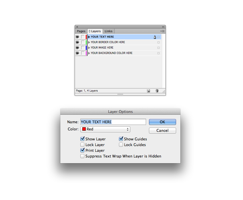
Expand the Layers panel (Window > Layers), and double-click on the default Layer 1 name in the panel to open up the Layer Options window. Rename the layer YOUR BACKGROUND COLOR HERE and click OK

Click on the Create New Layer button at the bottom of the panel to create a second new layer. Double-click to rename as YOUR IMAGE HERE.

Create a further two new layers, first YOUR BORDER COLOR HERE, and at the top of the pile, YOUR TEXT HERE.

layers panel

Click in the blank space to the left of each layer’s name to lock all the top layers, leaving only YOUR BACKGROUND COLOR HERE unlocked and active at the bottom. 

lock layers

Step 3

With your layers set up, you can now start to think about the color you’d like to use on your cards. Creating a simple two-color palette is a good place to start, and you can always tweak or switch up the colors as you work. 

Expand the Swatches panel (Window > Color > Swatches) and choose New Color Swatch from the panel’s drop-down menu (accessible at the top-right of the panel). To recreate the swatches used here, name the swatch Deep Yellow and set the CMYK levels to C=4 M=13 Y=91 K=0. Click Add and then OK

Repeat the process to create a second new swatch. Name it Salmon Pink and set the levels to C=0 M=41 Y=28 K=0. 

swatch options

Step 4

Remaining on the YOUR BACKGROUND COLOR HERE layer, take the Rectangle Tool (M) and drag across the page, extending it up to the edge of the bleed on all sides. 

From the Swatches panel, set the Fill of the rectangle to one of your new swatches, here Salmon Pink.

pink rectangle

Then lock YOUR BACKGROUND COLOR HERE, and unlock the layer above, YOUR IMAGE HERE. To make your card template flexible, we can add an image frame on this layer so you can swap plain color for a photo or illustration if you prefer. Select the Rectangle Frame Tool (F) and drag across the page, matching the dimensions of the colored rectangle on the layer below.

image frame

Step 5

Lock the YOUR IMAGE HERE layer and unlock the next layer up, YOUR BORDER COLOR HERE

Select the Rectangle Tool (M) and drag onto the page, nesting the rectangle shape against the margin line. From the Swatches panel, set the Stroke Color of the shape to your other swatch, here Deep Yellow, and set the Fill to [None].

Go to Window > Stroke. From here, you can adjust the thickness of the border by increasing or decreasing the Weight of the stroke. Here, I’ve set the Weight to 0.353 mm.

border

With the border selected, head up to Object > Corner Options. Choose Rounded for the Shape and set the Size to 0.01 in, to just very slightly soften the edges of the border. Then click OK to exit the window. 

corner options

Step 6

Lock the YOUR BORDER COLOR LAYER HERE layer and unlock the top layer, YOUR TEXT HERE.

Use the Type Tool (T) to create a text frame across the center of the card, typing in your name or the name of the business. 

From either the Controls panel running along the top of the workspace or the Character and Paragraph panels (Window > Type & Tables > Character or Paragraph), you can adjust the Font, Font Size, Tracking (space between characters, here it’s set to a generous 250), and Alignment (set the text to Align Center). Here I’ve used Portico as the font, a clean and stylish sans serif.

From the Swatches panel, you can set the Font Color to one of your two swatches, here Deep Yellow

title text

Step 7

Lock the YOUR TEXT HERE layer and unlock the bottom layer, YOUR BACKGROUND COLOR HERE.

Now it’s time to put together the reverse side of your card. To do this, go to the Pages panel (Window > Pages) and click on the Create New Page button at the bottom of the panel. 

new page

Working on Page 2 of the document, take the Rectangle Tool (M) and create a shape across the whole page, setting the Fill to one of your swatches, here Deep Yellow

yellow rectangle

Step 8

Lock YOUR BACKGROUND COLOR HERE and unlock YOUR BORDER COLOR HERE. 

Use the Rectangle Tool (M) to create a border along the margin lines, setting the Stroke Color to your other swatch and the Fill to [None].

border

In the Stroke panel, click on the Align Stroke to Outside button from the Align Stroke options. 

align stroke

Then head up to Object > Corner Options, setting the Size to 0.01 in and Shape to Rounded, before clicking OK

corner options

Then head back to the Stroke panel and increase the Weight of the stroke to 12 mm, pushing the border past the edge of the page and up to the edge of the bleed. 

stroke panel

Step 9

If you’ve used bright or unconventional colors for your card design so far, it can be a good idea to choose more standard or dark colors to set the text of your contact details, making them more legible for the reader. 

Here, I’ve created two new swatches: Charcoal, C=54 M=50 Y=54 K=47, and Putty, C=25 M=25 Y=46 K=26.

new swatches

Unlock the YOUR TEXT HERE layer and use the Type Tool (T) to create a series of text frames across the page. Keep the font and styling consistent for your name or the business name, to maintain a logo-like look. 

title text

For the rest of the text, choose an easy-to-read font which works well set at a small size. Simple sans serifs tend to work the best. Here I’ve used Pier Sans Regular.

Vary the Font Color through the text, setting the title in a slightly darker swatch, like Charcoal, and setting the other text in a related but slightly paler tone, such as Putty

body text

Step 10

The artwork for your business card is finished—great work! If you want to customize your card with a different pattern or image, read on to the next section to pick up some tips for how to make the design unique to you.

Otherwise, you’re ready to File > Save your artwork and export it for printing. Go to File > Export and choose Adobe PDF (Print) from the Format drop-down menu at the bottom of the window. Name your file and then click Save

In the window that opens, choose [Press Quality] from the Adobe PDF Preset menu at the top. 

press quality

Click on Marks and Bleeds in the left-hand menu, and check All Printer’s Marks. You may not need to include all marks, such as Color Bars and Registration Marks, so check with your printer to find out what they require. It is important to check Use Document Bleed Settings at the bottom of the window.

all printers marks

Go ahead and click Export to create your ready-to-print PDF!

exported pdf

2. How to Customize Your Business Card With an Image

A simple duo-color design can be slick and stylish, but you might want to add extra personality to your business card with an image or pattern that relates to your career or personal taste. This is super easy to do!

Step 1

Unlock the YOUR IMAGE HERE layer in your prepared template, and make sure all the other layers are locked. 

Click on the image frame sitting on this layer and go to File > Place. Choose an image you’ve downloaded from a stock site, such as PhotoDune or Envato Elements, and click Open. Click on the Fill Frame Proportionally button on the top Controls panel to allow the image to fill the frame completely. 

This tropical leaf image would be a great fit for an illustrator or fashion designer. 

tropical leaf card

Step 2

If you want to use a very busy image on your cards, which is making the title appear less clear to read, you can adjust the format of the border to suit it better.

Unlock the YOUR BORDER COLOR HERE layer and pull in the sides of the border until it sits close around the edge of the text. Switch the Stroke Color to [Paper] (white) and choose a contrasting color for the Fill

For this design, I’ve used an abstract paper background, which would work really well if you were a game developer. 

abstract paper card

Some Inspiration for Your Card Designs

Let’s look at a few other fun options for images and patterns depending on your career…

Looking to grab a few more clients for your web design business? A geometric low-poly background makes an abstract nod to your digital profession. 

geometric background
Low-poly geometric pattern pack

Love all things audio? This quirky dog with headphones will raise a smile.

dog
Dog with headphones

Is branding and logo design your thing? Including a product mock-up shot on your cards is a great advert for your services. 

cosmetic mock-up
Cosmetic packaging mock-up Photoshop template

Graphic designer? Show you know your Pantone from your CMYK with this color wheel photo.

color wheel
Color wheel photo

Love creating music? This 90s-inspired pattern will make a stylish nod to your passion. 

90s background
90s-inspired music pattern backgrounds

If you’re a photographer, a business card is the perfect opportunity to showcase some of your best work. Alternatively, opt for a simple portrait photo to make it clear what you do. 

camera vintage
Portrait of woman with vintage camera

If you’re a coding whizz, you can give your cards a touch of Matrix magic with a binary code background

code binary
Binary code background

Adore filming or editing video? This monochrome illustrated background makes a great backdrop for a bright pop of color. 

cinema doodles
Cinema doodles background

If you’re a vector artist or illustrator, a colorful geometric background is a simple but high-impact choice to turn heads. 

colorful background pattern
Colorful geometric background

Still searching for the perfect background image for your business cards? You can find a huge range of styles over on PhotoDune or Envato Elements.

final cards