Post pobrano z: Hypnoshine

Post pobrano z: Hypnoshine
Post pobrano z: How to Turn Day Into Night in Adobe Photoshop
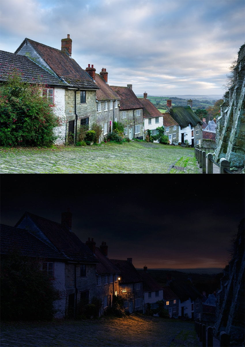
It’s not so easy to find a perfect photo for a photo manipulation we have in mind. Sometimes, for example, we want to create a night scene, but the available photos are either too dark or already heavily edited. What do to in such a case?
Well, you can always turn a day scene into a night scene with the power of Photoshop! In this tutorial I will show you how to play with the brightness of the scene, how to add stars to the sky, and how to add new light sources with convincing effects.
You can use any photo you need for this exercise. If you want to follow my steps directly, you can find the same photo I use here:
Open your photo in Photoshop. Take the Magic Wand Tool (W) and change its Tolerance to 100. Caution: such a high tolerance works best with a good contrast between the sky and the buildings.

Use the Magic Wand on the sky.

Go into Quick Mask Mode (Q) to see the selection better. Pick any brush to paint the areas that aren’t part of the sky (paint with black to select them as red).

Exit Quick Mask Mode (Q) and go to Select > Refine Edge to make sure the selection is perfect. Select a view that lets you see the effects the best.


Now check Smart Radius and increase its value. You can also play with other sliders to get a perfect result. When you’re done, click OK.


Go to Window > Adjustments. Select Hue/Saturation from the panel.

Clip the Adjustment Layer to the layer below (the sky). Then change the Lightness to make the sky very dark, but not black.


Every Adjustment Layer has a Layer Mask. You can learn how it works from this quick tutorial:
In short, when you paint on a mask, you define the transparency of the layer: black makes the layer transparent, white makes it opaque, and the shades of gray become the states in between.
Click the mask to make it active.

Take the Gradient Tool (G) and click the gradient in the upper panel.

Change the gradient to very bright gray-white.

Apply the gradient to the mask from top to bottom. This will make the upper part „white” (opaque), and the lower part „bright gray” (slightly transparent).


Click the background layer now. We need to darken it too! In the Adjustments panel, find Photo Filter.

Change the color to dark, desaturated blue.


Uncheck Preserve Luminosity…

… and make the effect very intense.


The sky could use some blue tint as well! Add the Photo Filter adjustment to it, too, this time using a brighter, more saturated shade.


Normally, the night sky is brighter than non-illuminated buildings below, so let’s darken that lower layer some more. Duplicate (Control-J) the Photo Filter adjustment and lower its Opacity to adjust the intensity.


Create a New Layer on top. Use the Paint Bucket Tool (G) to fill it with black. Then go to Filter > Noise > Add Noise. Add a maximum amount of black-and-white noise.

Now go to Filter > Filter Gallery and select Sketch > Stamp. Play with the settings to create an optimal effect. The sky is not perfectly clear, so we don’t want too many stars.

Use the Move Tool (V) to move the stars up, over the sky.

Right click the stars layer and select Blending Options. Drag the upper black marker to the middle, to make the dark part of the layer transparent.

Add a Layer Mask to this layer. Use a black-and-white gradient to make the lower part transparent, gradually turning opaque towards the top.


Let’s pick some windows in the background—the farther they are, the harder it will be to notice the little imperfections. Use the Polygonal Lasso Tool (L) to select the panes. Hold Shift to keep selecting after closing one selection.

Click the background layer and duplicate the selection (Control-J). Move the duplicated part to the top.

Right click the layer and select Blending Options. Check Color Overlay and change the color to bright orange.


Click the Blend Mode and scroll through it until you find the effect you like. I’ve decided to use Hue, as it adds the color without concealing the details.


Check Outer Glow.

Change its color to bright orange.

Play with the Blend Mode again…

… and adjust the sliders to the effect you want.

The effect should be quite subtle.

There’s something resembling a lantern on the side of one of the buildings. Let’s use it to add some interesting light to the scene! Use the Polygonal Lasso Tool (L) to select its shape.

Click the background layer, duplicate the selection (Control-J), and drag the new layer to the top.

Right click the layer and select Blending Options. Check Color Overlay and make it white.

Check Outer Glow and make it bright orange.


Experiment with the settings to get the best result.


Create a New Layer and drag it right below the lantern. Pick bright orange and use a soft brush to paint the light around the lantern. You can lower the Flow to make the brush even softer.


Go to the Blending Options and drag the lower black marker to the right to remove the bright orange from the shadows.


Hold Alt to split the marker to make the effect more transitional. If you want to learn more about this technique, check out this quick guide:


Scroll through the Blend Modes of this layer to find the best effect.

Add a Layer Mask to this layer and paint the shadows on it. Nothing detailed—just make sure the light doesn’t reach to the parts blocked from it. Use black to paint the shadows and white to remove them, until you are happy with the result.

Create a New Layer and take a bright orange again.

Subtly paint some highlights on the protruding elements of the building to keep them 3D.

Change the Blend Mode and add a Layer Mask to make the effect more subtle.


Finally, duplicate the glow (Control-J) and change its color to white.

Then remove it from the darker parts, leaving it only on the bright elements of the building. They should reflect more light and shouldn’t be so vividly colored.


Change the Blend Mode and lower the Opacity to adjust the intensity of this effect.

Let’s adjust the final brightness of the scene now, since we have it all together. Go to the top of the layers and add a new Adjustment Layer: Levels.

Drag the white marker to the left to increase the amount of bright shades in the scene.


Create a New Layer. Fill it with black, and then go to its Blending Options and add Gradient Overlay.

Give it the colors of a low sun.


Hold Control and click the sky layer to get its outline.


Click the gradient layer and add a Layer Mask. The selection will be automatically applied to the mask.

Paint on the mask to reveal the mountains in the background.

Duplicate the sky (Control-J) and drag it to the top. We’re going to add special effects to the clouds.

Add a Hue/Saturation adjustment.

Clip the Adjustment Layer to the duplicated sky, desaturate it, and make it slightly brighter.


Add a Levels adjustment, clip it, and add more contrast to the sky with it.


Select all three layers (the sky and its Adjustment Layers) and Merge them (Control-E). Then go to the Blending Options of this new layer and remove it from the bright parts of the sky using the lower white marker. Change its Blend Mode to Soft Light and lower the Opacity.


Duplicate (Control-J) the layer and play with its Blending Options too, this time removing it from the dark parts of the sky (the lower black marker). Change the Blend Mode to Soft Light as well, but leave the Opacity at 100%, adjusting it with a layer mask if needed.


Time for some final adjustments. Add an Exposure adjustment on top to play with the overall brightness.

I’ve also decided to drag the sky slightly down to make the change of the colors more gradual (you can do it with a smart use of Layer Masks).

The background seemed a little too bright, so I darkened it too using a Hue/Saturation adjustment with some masking.

When you’re done, merge all the layers (right click > Flatten Image) and go to Noise > Add Noise. This will add some realism of a photograph taken in low light.


If you liked this tutorial, you may also be interested in our other guides on photo manipulation:

You can also achieve a similar effect to the one in this tutorial with far less effort by using one of these actions on GraphicRiver:


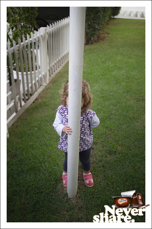
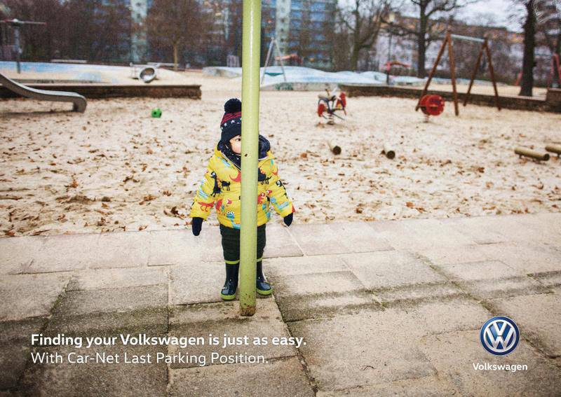
Post pobrano z: Not well hidden / Copie pas très bien cachée?
 |
 |
| THE ORIGINAL? Danette yogurt – 2014 “Never share” Source : Coloribus Agency : Y&R (Brazil) |
LESS ORIGINAL Volkswagen with Car-Net Last Parking Position – 2017 “Finding your Volkswagen is just as easy” Source : Cannes Lions Print BRONZE Agency : DDB (Germany) |
Post pobrano z: How to Set Up Grids in Affinity Designer
Grids are a useful feature in any design software. In this video from my course Affinity Designer Quick Start, you’ll learn how to set up grids in Affinity Designer. I’ll show you how to use the key features of both the standard grid and the isometric grid.
Affinity Designer has a versatile grid system with some really good tools for things like icon design, and it also has isometric grids for doing graphics for games.
We’ll start by showing the grid. So head up to the View menu, and then check the Show Grid submenu. That brings up the default grid.

Now, to change the way that this grid is laid out, go back up to the View menu and then go down to the Grid and Axis Manager.
By default, Use automatic grid will be checked. So if you want to change things around, you just need to uncheck that checkbox.

Let’s look at how you can set up a grid to create icons.
A pretty common size for icons is 64 pixels by 64 pixels. So in the same Grid and Axis Manager, you can go to First axis and set the Spacing to 64 pt. And then under Second axis, we can also set the Spacing to 64 pt. So now each one of our squares is the right size for an icon to fit inside it.

What we can also do is increase the amount of space between each of these grid cells. So increase the Gutter to 24 pt for both axes. And now we can fit exactly one icon into each one of these little grid squares.

And we can take that even further to help us work with our layout by increasing the number of divisions. So we can make smaller grids inside our grid.
So let’s say that we set the Divisions to 32. And now if we zoom in, we can see that we’ve got several lines that are breaking down each one of our grid cells even further. So when we’re trying to align all of the different nodes and points in our icons, we can snap to each one of these lines. And we can do the same thing horizontally, so that we’ve got a really nice little self-contained grid for each one of the icons that we produce.

That icon grid layout is just using the standard mode of grid. But you also have several other predetermined types of grids that you can work with.
For example, you might be working on graphics for an isometric video game. So you can head up to Mode and choose Isometric from the dropdown menu.

And now your grid will be converted into an isometric layer. So let’s just drop that Gutter back down to 0, and we’ll keep our grid divisions.

And now we’ve got a really nice framework that we can use to start plotting out isometric graphics, without having to worry that the angles and the perspective that we’re trying to lay out are incorrect in any way. Here’s a closeup showing the divisions:

In the full course, Affinity Designer Quick Start, you’ll get 34 more videos like this one, going through every aspect of this versatile design software. You’ll learn in detail about the various vector tools, interactions between shapes, using typography, and much more.
You can take this course straight away with a subscription to Envato Elements. For a single low monthly fee, you get access not only to this course, but also to our growing library of over 1,000 video courses and industry-leading eBooks on Envato Tuts+.
Plus you now get unlimited downloads from the huge Envato Elements library of 300,000+ photos and 34,000+ design assets and templates. Create with unique fonts, photos, graphics and templates, and deliver better projects faster.

Post pobrano z: Lozad.js: Performant Lazy Loading of Images
There are a few different „traditional” ways of lazy loading of images. They all require JavaScript needing to figure out if an image is currently visible within the browser’s viewport or not. Traditional approaches might be:
scroll and resize events on the windowsetIntervalBoth of these have performance problems.
Both of those approaches listed above are problematic because they work repeatedly and their function triggers **forced layout while calculating the position of the element with respect to the viewport, to check if the element is inside the viewport or not.
To combat these performance problems, some libraries throttle the function calls that do these things, limiting the number of times they are done.
Even then, repeated layout/reflow triggering operations consume precious time while a user interacts with the site and induces „junk” (that sluggish feeling when interacting with a site that nobody likes).
There is another approach we could use, that makes use of a new browser API designed specifically to help us with things like lazy loading: the Intersection Observer API.
That’s exactly what my own library, Lozad.js, uses.

Intersection Observers are the main ingredient. They allow registration of callback functions which get called when a monitored element enters or exits another element (or the viewport itself).
While Intersection Observers don’t provide the exact pixels which overlap, they allow listening to events that allow us to watch if elements enter other elements by X% (configurable), then the callback gets fired. That is exactly our use case when using Intersection Observers for lazy loading.
Install from npm:
yarn add lozador via CDN:
<script src="https://cdn.jsdelivr.net/npm/lozad"></script>In your HTML, add a class to any image you wish to lazy load. The class can be changed via configuration, but „lozad” is the default.
<img class="lozad" data-src="image.png">Also note we’ve removed the src attribute of the image and replaced it with data-src. This prevents the image from being loaded before the JavaScript executes and determines it should be. It’s up to you to consider the implications there. With this HTML, images won’t be shown at all until JavaScript executes. Nor will they be shown in contexts like RSS or other syndication. You may want to filter your HTML to only use this markup pattern when shown on your own website, and not elsewhere.
In JavaScript, initialize Lozad library with the options:
const observer = lozad(); // lazy loads elements with default selector as ".lozad"
observer.observe();
Read here about the complete list of options available in Lozad.js API.
See the Pen oGgxJr by Apoorv Saxena (@ApoorvSaxena) on CodePen.
Browser support is limited, as the feature is relatively new. Use the official IntersectionObserver polyfill to overcome the limited support of this API.
Lozad.js: Performant Lazy Loading of Images is a post from CSS-Tricks
Post pobrano z: How to Draw a Stack of Books and an E-Book Reader in Adobe Illustrator

In this simple tutorial, you will learn how to use the Mesh Tool in Adobe Illustrator to create a stack of books and an e-reader!
If you want to skip the tutorial and just use these books in your work, you can purchase the Stack of books and e-book from GraphicRiver!

We will begin by drawing the top cover of the red book using the Mesh Tool (U).
First, simply draw a rectangle and fill it with the #B9201F color. Next, move around its corner nodes so it looks like a cover of a book in perspective.
Now, grab the Mesh Tool (U) and continue by creating a Mesh grid on the cover by clicking in places you want nodes to be in. Follow the screenshot for reference.
Smooth out the bottom left corner, turning it from sharp to round.
There must be three Mesh lines close to each other on the sides and the bottom of the shape. Color the nodes on the middle lines with #EA4242 (nodes that are selected in the screenshot below).

Continue coloring the selected nodes in each part of the screenshot! You will need first #A91716, and then #D13130.

Draw a side for the cover by creating a narrow, #AB1817 rectangle, smoothing out the corners, and coloring its middle row of Mesh with #DC3838.

Attach the side to the cover as indicated in the screenshot below.

Start drawing the spine of the book!
Draw a narrow, #4E4142 rectangle. Then move to Effect > Warp > Arc and apply a 26% Bend to it.
Go to Object > Expand Appearance to turn the result into a regular path.

Create a copy of the shape we just made.
Then simply modify the original shape on its right side, dragging its nodes to create a curve.

Grab the copy we just made and color it with #CA2F2E.
Next, modify it with Mesh by simply dragging the nodes around and color its outer edges with #980605.

Move these two shapes next to each other, creating the spine of the book.

Let’s draw the paper part! Modify and color the rectangle as indicated by the nodes selected in the screenshot below.
You will need these colors:
#FEF7DE#A69980#F8ECD2
Now, to create an illusion of separate pages, draw a straight line, coloring its Stroke with #CEB789.
Proceed to create multiple copies of it with some intervals in between (I suggest moving the first line a bit down manually, pressing Control-D to create more copies automatically, and deleting the ones you don’t need).
After that, select all the lines and in the Stroke panel, apply Profile1 to them. Flip it if needed—the lines should be thicker on the left side.

Expand Appearance of the lines.
Next, grab the Warp Tool (Shift-R) and double-click on the canvas to bring up the options. You can use the options I did in the screenshot below or your own.
Next, bend the lines slightly to add a bit of realism to our „pages”.

Copy the outline of the Mesh shape we drew in Step 9.
Place it on top of the pages, select both and right-click, choosing Make Clipping Mask in the drop-down menu.

Change the Opacity of the result to 30% and its Transparency mode to Multiply.

Overlay the pages over the Mesh.

Draw the left side of the book using Mesh. You will need these colors:
#EEE3CA#AB9F86#CDC1A8#EADAC5
Draw the bottom part of the cover using Mesh. Use these colors:
#980605#CC2F2F
Assemble the book out of the parts we made!

Now that the most difficult part of this tutorial is done, we will be creating the stack of books by making a few color variants!
Create a copy of the red book and recolor it (only the red parts!) by choosing Edit > Edit Colors > Adjust Colors. Use these options to get a green book:
Of course, you can play with the percentages however you want to create your own color variants!

Create three copies of the light green book (aside from the original).
Recolor the first copy using these settings:

Grab the second copy and recolor it using these:

Create the final, cyan book out of the third copy with these settings:

Create an uneven stack out of the color variants!

We are going to revisit Mesh for a bit in the final parts of this tutorial.
Fill a rectangle with rounded edges with #000002, and then stretch it around a bit. Create a Mesh grid and color the bottom right part of the shape with #3F4246.

Draw a screen for the e-book by coloring the left top corner of a #EDEFEE rectangle with #999B9C.

Draw the sides of the e-book reader, coloring them with #313335, #383B3C, and #000002.

Put the sides together to create a frame.

Move the screen into the frame. The left side should be lined up perfectly, and the right side can be left with a gap.

Draw the outer frame by applying a thick, #3F4246 stroke to a line, and then Expanding Appearance and sharpening the edges.

Draw a button by creating a #0B0E10 ellipse, and adding three #3E4145 nodes in the middle of it.

Assemble the e-book reader: the black base should be on the bottom, with everything else on top of it.

Finally, draw shadows for the reader and the stack of books. Use #B3ADA5.

Change the Blending Mode of both shadows to Multiply.

Put everything together!

Thank you for following along, and please
feel welcome to post your result in the comments. I’ll be looking
forward to seeing it!
In this tutorial, you learned how to
create a stack of colorful books and an e-book reader using the Mesh Tool.
I
hope you’ve enjoyed this tutorial and learned how to use some useful
tools for the future! Check out some of my other vector tutorials on my instructor profile.
You can purchase Stack of books and e-book as well as other similar designs in my portfolio on GraphicRiver.