Ecommerce has been around for over twenty years, but things are just starting to heat up. Right now, the industry is seeing major growth as consumers are making more purchases online than ever before.
Not to mention that some of the key players, such as Amazon, are looking to take things to the next level with all sorts of futuristic innovations. Here are four global trends happening in ecommerce right now, and what they mean for vendors like you.
International Growth and the Rise of Mobile
According to a new forecast published by eMarketer; China – the world’s largest ecommerce market – is expected to reach $1.12 trillion in retail ecommerce sales in 2017. Mobile purchases are driving much of this growth: “By the end of 2018, more than 75 percent of ecommerce sales in China… will be transacted via a mobile device,” says eMarketer. This creates a huge opportunity for ecommerce vendors looking to break into the global market. It also prescribes a method for success; primarily to focus upon and improve mobile usability to widen your reach and increase sales.
Groceries Going Digital
By now you’ve probably heard Amazon agreed to buy Whole Foods for $13.4 billion. This will, without a doubt, transform both companies and could make it easier for consumers to purchase their groceries for home delivery.
While the ecommerce giant has sold food and drinks online for nearly a decade, they’ve struggled to capture a major share of the grocery market. By purchasing an upscale grocery chain with plenty of clout, Amazon has once again made a strategic move to shut out big name competitors like Walmart.
If Amazon succeeds, U.S. consumers may become more comfortable with ordering meat, fruits and vegetables online; which could drive more ecommerce SMBs to jump into the game by offering grocery bundles via a subscription service.
Lower Barriers to Entry
New entrants are joining the industry thanks to easy-to-use free ecommerce website builders like Shopify. Vendors wondering how to sell an ebook online or how to start their first e-store can access a simple template builder with all the features and functionality of a big-name site; thereby combining simplicity of use with tremendous power.
Rapid Fulfillment & Innovation
The prospect of drone has been the subject of much discussion. While the industry is still waiting on regulations from the Federal Aviation Administration, Amazon CEO Jeff Bezos expects delivery drones will eventually be “as common as mail trucks.”
Same-day delivery and in-person pickup locations are becoming more the norm for big ecommerce sites as well. Sure, right-away delivery might be expensive, but some customers are willing to pay the price for faster service. On the other hand, in-person pickup saves shoppers and businesses money. A win-win!
As big players in digital retail explore faster delivery options, smaller ecommerce vendors might struggle to keep pace. If you’re among the latter category, you’ll do well to explore expedited shipping or cheaper ‘no rush’ shipping options to keep you customers happy.
Increased Demand for Warehouses
As ecommerce grows, so will the demand for storage space. In fact, analysts at Jefferies estimate ecommerce vendors need three times as much warehouse space as brick-and-mortar retailers. However, the U.S. is severely lacking in warehouses and distribution centers. Even Amazon is struggling to keep the pace of supply chain build out in synch with growing demands.
One solution is to repurpose America’s shopping malls as warehouses for ecommerce businesses. This could also make it easier to distribute products in a timelier manner, as well as accommodating in-person pickup, thereby benefitting businesses and consumers.
It’s anybody’s guess where ecommerce goes from here, but one thing is certain – these global ecommerce trends hold a great deal of potential for the smart entrpreneur.
There is a natural connection between Data Visualization (dataviz) and SVG. SVG is a graphics format based on geometry and geometry is exactly what is needed to visually display data in compelling and accurate ways.
SVG has got the „visualization” part, but SVG is more declarative than programmatic. To write code that digests data and turns it into SVG visualizations, that’s well suited for JavaScript. Typically, that means D3.js („Data-Driven Documents”), which is great at pairing data and SVG.
You know what else is good at dealing with data? React.
The data that powers dataviz is commonly JSON, and „state” in React is JSON. Feed that JSON data to React component as state, and it will have access to all of it as it renders, and notably, will re-render when that state changes.
React + D3 + SVG = Pretty good for dataviz
I think that idea has been in the water the last few years. Fraser Xu was talking about it a few years ago:
I like using React because everything I use is a component, that can be any component writen by myself in the project or 3rd party by awesome people on NPM. When we want to use it, just import or require it, and then pass in the data, and we get the visualization result.
That components thing is a big deal. I’ve recently come across some really good libraries smooshing React + D3 together, in the form of components. So instead of you leveraging these libraries, but essentially still hand-rolling the actual dataviz components together, they provide a bunch of components that are ready to be fed data and rendered.
Victory is a set of modular charting components for React and React Native. Victory makes it easy to get started without sacrificing flexibility. Create one of a kind data visualizations with fully customizable styles and behaviors. Victory uses the same API for web and React Native applications for easy cross-platform charting.
Are you thinking about creating an online store? Then, these 25 awesome WooCommerce themes will definitely strike your eye and show you numerous features that a modern online store can have. It is hard to imagine, but, frankly speaking, you do not need to create a unique webpage out of nothing if you wish to run an online store. There are numerous ready-made templates, such as the ones created by TemplateMonster, that can suit your needs. Whether you want your store to be connected with fashion and beauty, or whether you want to sell medical or sports equipment, you can find a template to suit your needs.
Without any doubts, a custom webpage created especially for you will take into consideration your smallest requirements, so when you order a custom website you have a possibility to get everything that you imagine. At the same time, ready-made templates are developed by groups of professionals to suit specific needs, and you can have a look at the demo version of such templates, so you will definitely know what you are buying. While you will be waiting for a custom website to be created for you, you can spend this time for looking through different templates that can suit your needs and comparing their properties to choose the one you like most. As the work of developers and designers for creating your custom website takes considerable time, it should be paid for accordingly. In such a case, ready-made templates will save not only your time, but also your money.
Does choosing a ready-made template instead of ordering a custom webpage mean that you will not get a unique website? Of course, it doesn’t, because ready-made themes have numerous customization options. You can edit backgrounds and layouts, add or remove sidebars and widgets, change colors and fonts in order to adjust the theme to your needs and company’s style, creating unique looks of your website.
Furthermore, as online shopping is done using different devices, ready-made templates by TemplateMonster are responsive. They easily adjust to different screens and browsing ensuring the best performance for your customers. No matter what device or browser your visitors are using, your online store will look and function properly.
Another piece of good news is that ready-made templates don’t require much coding skills to be installed and launched, so you will be able to create your website in a couple of moments. If you happen to face any difficulties, there is always a 24/7 support team to answer your questions and solve your problems.
So, do not hesitate to look at the amazing collection of WooCommerce themes that will be suitable for various online stores.
Francy – Cosmetics and Perfume Store WooCommerce Template
This feminine and stylish theme is, in fact, built with power Drag-and-Drop builder to ensure the best productivity and customization options. You can choose not only from numerous layout options, content modules and widgets, but also from effective Cherry Plugins, such as Cherry Team Members, Testimonials, Sidebars, and others. Your customers will also love Quick View plugin that displays the characteristics of a product and allows people to view the item in a full size. Moreover, there are Wishlist and Compare plugins to make the functionality of your store better.
Supporting not only WooCommerce, but also Ecwid, the theme will be a universal solution for various online stores. The template can boast of numerous features to optimize your online store, such as Compare, Advanced Thumbnail Feature Hover, and Wishlist. Furthermore, it supports Megamenu and includes advanced headers management. You can be sure that your website will be optimized for mobile devices, as the theme is responsive and Retina ready, with a clear design for effective and intuitive using.
Organica – Organic Products Store WooCommerce Template
Equipped with an unlimited amount of features, this theme will be suitable for an online store that sells organic products, such as organic food, cosmetics, bio active nutrition and so on. Adding different product categories tabs, you will easily organize your products into logical and structured categories. Also, your customers will enjoy the possibility to sort goods within search results according to several criteria, to compare different products and to add them to their wishlist. Moreover, custom widgets will enrich your site’s functionality and help you with the ways to showcase your content.
Furniture Store and Interior Design WooCommerce Template
This contemporary-looking theme will impress you with the possibility to create a shop page with a Puzzle option; another practicable means of editing your store is using various blog styles, including standard, masonry or timeline blog layouts. You can easily create portfolios in different styles and add personal profiles of designers or partners to your website. In addition, you can maximize the theme’s functionality with powerful plugins and addons, managing the look of your headers, colors and page content.
Shopable – Wholesale Store Responsive WooCommerce Template
This theme will be appropriate for creating any kind of a store, as it is supplied with various widgets to make your business more effective. Present your goods in a variety of ways, adding posts carousels, sliders, or image grids to your page. Customize the look of your website changing layouts and fonts and adding various Cherry sidebars without any difficulties with Live Customizer. Built with Bootstrap, the theme guarantees full responsiveness and compatibility with all modern devices.
Craftstamp – Art and Accessories Store WooCommerce Template
If you want to create a webpage for an online store that deals with handmade art, this template will be a perfect choice. Including different content modules and an enormous set of Cherry plugins, such as Cherry Projects, Team Members, testimonials, Sidebars and others, the theme advances your site’s functionality and allows you to present various types of information on your website. With advanced banner grid management, product carousel, categories widget and on-page custom menus you will easily arrange the content the way you find most appropriate. Moreover, your clients will be attracted by the WooCommerce Quick View that gives details about the product and by Wishlist and Compare plugins that will provide them with time for making up their minds.
An awesome WooCommerce package included into this theme will let you present your products in a number of ways. In addition, due to Content Modules you will be able to add different types of posts to your webpage, including galleries, buttons, pricing tables, contact forms and many more. Customization of your website will be an enjoyable experience, because you can choose from multiple layout options and edit elements with powerful Drag-and-Drop builder. As a special bonus, you receive 15 topical images that will suit your website perfectly.
You will love this bright and elegant theme for an online flower store, because it includes categories tabs to make your website logically organized and structured. Moreover, your visitors will be able to use sorting options, which will facilitate the process of choosing goods. With various background and layout options you can experiment with the look of your website, making it even more personal with Google-integrated fonts.
Zirconia – Accessories and Jewelry Shop Responsive WooCommerce Template
This theme, built with a powerful Drag-and-Drop builder, will help you create a productive store that sells jewelry and accessories. It includes not only an ultimate pack of the best Cherry Plugins, such as Cherry Sidebars, Testimonials, Team Members, Projects, and others, but also a WooCommerce package that gives additional ways to present your goods. Your customers will be enchanted by the possibility to have a quick view at the products, to compare and add them to the wishlist for making their final choice later.
Hypernova – Multifunctional Store Responsive WooCommerce Template
Featuring a lot of built-in functions and customization options, this theme can be used for creating an online store for different purposes. Cherry Sidebars will help you present your products effectively, while WooCommerce package will enhance your website’s functionality. In addition, the theme can boast of a dropdown menu to make your goods organized, as well and of a calendar, a commenting system, and other social options to keep the ongoing communication with your clients.
Walden – Décor and Furniture Store WooCommerce Template
Optimized for online stores that deal with home décor and furnishing, this theme can be proud of such effective features as Ajax Shopping Cart, Compare, and Wishlist that make the process of online shopping a pleasant experience. Arrange numerous goods into a Dropdown menu to make your website organized and structured, captivate your visitors with different goods presented in a products carousel, and easily adjust the look of your website with Live Customizer to make a unique powerful online store.
Talisman – Gifts and Décor Shop Responsive WooCommerce Template
Choosing special gifts for various occasions can be quite a challenging task, so a powerful online store that deals with gifts will be helpful for customers, and this theme has got everything in order to become such a store. Your visitors will love the possibility to sort out the products according to different criteria instead of having to scroll through all product lists. To attract people’s attention, you can use carousel widget and showcase your goods, product categories, latest arrivals, products on sale or any other necessary news. With various social options that include Facebook Like Box and Instagram Board your clients will be able to share information about their dream gifts, thus promoting your store online.
Style Factory – Hair Styling Store and Salon WooCommerce Template
This magnificent theme with numerous layout options will be suitable both for an online store that deals with hair care and for a salon devoted to hair styling. Your online store will be equipped with such powerful options as wishlist and compare, which give your clients some time for thinking before making their final choice. As for a salon, a striking Appointment Manager and Timetable plugin will become useful both for clients who want to make an appointment directly on your website and for you as a manager, as you will be able to organize your schedule easily.
Agrilloc – Agricultural Products Store WooCommerce Template
Light and undemanding, this theme will be ideal for an online store that deals with agriculture products and natural farm foods. With Dropdown menu, a large assortment of goods will be arranged logically into different categories, and Wishlist and Compare options will facilitate the process of searching and making a choice. Social options embedded into the template will help your customers share information about your goods, and they will sell like hot cakes.
Fairy Style – Fashion Brand Store WooCommerce Template
An online brand store that deals with fashion definitely needs a stylish website to attract visitors, and this theme will be perfectly satisfactory for this purpose. Its design will let you showcase products in an unlimited number of ways, among which you will be enchanted by a carousel widget, and sort your goods into categories adding special tabs to them. Advanced theme options, integrated Google fonts, and Live Customizer will turn the process of adjusting your website to your needs into a delightful experience. As fashion has to be spread quickly, the theme features numerous social options, including a contact form, a newsletter subscription, Facebook Like Box, Instagram Board, and Twitter Feed.
Easy and intuitive with user-friendly interface, this theme will be especially convenient for creating an online store that sells food and wine. To facilitate the search process for clients, the theme includes sorting options that allow people to limit their search results by several criteria. You can be sure that your goods can be arranged into numerous logical categories with the help of product categories tabs. Moreover, various custom widgets, including Simple Slider, post carousel, and social media widgets, will advance your site’s functionality.
Fleek – City Fashion Boutique WooCommerce Template
Being fashionable means finding out about new tendencies and new collections quickly, so a good fashion store should present this information in an appropriate way to attract visitors, which is indeed quite easy with this theme. Due to numerous widgets and sliders you can showcase your latest collections, new arrivals, the most popular products, goods on sale, or whatever you want to tell your clients about. The process of finding necessary items will be easy for customers because of the product sorting options that allow them to choose several criteria to limit search results. Newsletter subscription and different social options will let your clients follow your news and stay updated all the time.
SportsLab – Sports Store and Club WooCommerce Template
This powerful theme will satisfy those who want to create an online store that sells products connected with sports, either sports equipment or sports nutrition. With multiple layout options and various content modules you are able to add posts of different formats and arrange them the way you like. Additionally, you can use product carousel and sliders to save the space on your page and add any sidebars to your page. Moreover, the theme is equipped with Appointment Manager and Timetable Plugin, so you can also run a fitness club and let your clients will see your timetable and book classes online quickly.
This theme will also be suitable for creating an online store connected with selling sports equipment or nutrition. Including numerous Cherry plugins, the template will let you present different information and enhance your site’s functionality. Wishlist and Compare options will surely become an attractive feature for your clients, as these options provide people with the possibility to think carefully and choose the most appropriate item. You can also enchant your visitors by the WooCommerce quick view that displays necessary information about a product in full size when needed.
Designed for creating an online store that deals with medical equipment, this theme will let you organize your goods into numerous logical categories using product tabs. Your customers will be fascinated by the sorting options that will let them filter search results according to different criteria and find the items they need. With Live Customizer, you will be able to edit your store easily and effectively, as you will see the changes that you make to your page without reloading the website.
If you want to run an online store that sells drones, this intuitive theme will be your perfect choice. It includes various layout options to make your site unique and it allows you to add posts of different types due to content modules. Furthermore, there is a WooCommerce Quick View that lets visitors find out all necessary information in a really fast way. The theme also includes Wishlist and Compare options that allow your visitors to add different goods to the list of desired items and compare their properties.
This effective theme appropriate for a fishing online store will amaze your visitors not only with Parallax effect, which gives the sense of full immersion into the site, but also with Lazy Load effect, which will make the page load faster. Also, Stick-to-top menu improves customers’ navigation, because they do not have to scroll the page when they need to come back to the top. Moreover, the functionality of the site is enhanced by the Product Zoom that lets your visitors enlarge items and scrutinize any details and by the Quick View button that allows people to find out properties of the goods instantly.
WeelFour – Bike Shop WooCommerce Responsive Template
In case you need a template to create an online store that sells bikes, this one can become a nice choice for you. With WooCommerce Package that contains advanced banner grid management, products carousel, categories widgets and on-page custom menus you will be able to showcase your goods in a number of ways. Multiple layout options will let you arrange your webpage the way you find most appropriate, while Content Modules will allow you to add posts of different types and formats. Additionally, Quick View, Wishlist and Compare plugins will attract visitors, because they efficiently present detailed information and give people a chance to think over their choice.
Willard – Instruments and Hardware WooCommerce Template
Designed for an online store that deals with tools and hardware, this theme is characterized by numerous options and plugins to improve your site’s functionality. It contains an ultimate pack of Cherry plugins, such as Cherry Projects, Services, Testimonials, and others, and an impressive WooCommerce package, including advanced banner management, product carousel, categories widget and many more, to improve the ways of presenting information on your website. Moreover, you can add a calendar, a commenting system, a newsletter popup, and other social options to promote your store.
SpareParts – Car Maintenance and Parts Store WooCommerce Template
This fully editable theme for online stores dealing with car parts allows for different custom post types and formats. Furthermore, it includes fantastic sliders and custom widgets, multiple color options and Google fonts to make your page suit your needs and style. The theme is also multilingual ready, so your store can function in different languages.
In case you have not found your perfect online store template, you can browse through other WooCommerce themes. To find out more about TemplateMonster, you are welcome to watch the video below.
Philip Walton suggests making two copies of your production JavaScript. Easy enough to do with a Babel-based build process.
<!-- Browsers with ES module support load this file. -->
<script type="module" src="main.js"></script>

<!-- Older browsers load this file (and module-supporting -->
<!-- browsers know *not* to load this file). -->
<script nomodule src="main-legacy.js"></script>
He put together a demo project for it all and you’re looking at 50% file size savings. I would think there would be other speed improvements as well, by using modern JavaScript methods directly.
Pepsi’s “Pepsi Light Iconic Moments” advertising campaign has won Gold at the Clio Awards for print, print technique (art direction and photography) and out of home (billboard). The three advertisements in the Pepsi Light Iconic Moments campaign, targeting young urban people, feature a skateboarder, parkour runner and a breakdancer wearing red, white and blue. Their stunning poses convey the lightness of Pepsi Light, and contain within them the Pepsi Light logo. The only text required: “Light”. The central Pepsi motif “Live for now” is conveyed in active, spontaneous, almost weightless moves and moments full of carefree joy.
The campaign also won two ADC Gold and five Silver Cubes in May.
Pepsi Light Iconic Moments Credits
The Pepsi Light Iconic Moments campaign was developed at BBDO Dusseldorf by chief creative officers Wolfgang Schneider and Darren Richardson, executive creative director Kristoffer Heilemann, creative director Michael Plueckhahn, art directors Tatjana Fischer-Genin and Bernd Rose, chief executive officer Dirk Bittermann, group account director Liselotte Schwenkert, account manager Julia Lueckerath and art buyer Eva à Wengen.
Photography by Wolfgang Zac with post producer Philipp Maubach and print producer Bernhard Burg.
From this tutorial, you’ll learn some new techniques and tricks. We’ll be using the Isometric Map Mockupproduct as an example and seeing in detail how it was created. At the end, you’ll have a fully workable action and confidence in building “transformation actions”.
Open up the test.psd file attached to this tutorial. I’ve created it for your convenience so that you don’t have to follow any long-winded steps about document creation.
Make sure you have set up your workspace properly. For this tutorial, we need some panels to be visible: the Actions, Layers, and Styles panels. If you don’t have these panels visible, then go to Window and enable the panels one by one by their names.
Then you need to make sure the Ruler Measures are pixels. If you don’t see the rulers, press Command-R to activate them, and then right click on the ruler itself and select Pixels.
2. How to Get Ready for the Recording
For now, since we’ve set up our work space as needed, we can start recording our action.
Step 1
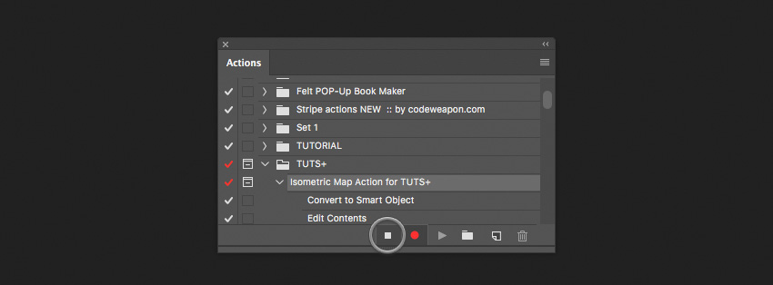
Go to the Actions panel and create a new Action Set. You can call it whatever you like.
Step 2
Inside the Action Set, create a New Action. Give it any name—for example, „Isometric Map Action„.
After that, press the Stop Recording button. That’s because, by default, after creating an action it automatically starts recording. We don’t want that to happen just yet.
Select the „main” layer, because we don’t want this step to be recorded. For us, it will be the step performed by a user. The user decides which layer to select.
Step 3
Now it’s time to click the Record button on our Actions panel. From this moment on, almost everything we’ll be doing within Photoshop will be recorded. After we are finished recording our action, we can run this action once again, to apply exactly the same working process on other images.
3. How to Prepare for the Transforms
Step 1
Here we have a task. We need to slice the „main” layer into three parts vertically, and also we need to record these steps.
Create a Smart Object from the „main” layer. To do this, right click on it, and choose Convert to Smart Object. We are doing this because we need a brand new space for our further steps.
After that, double-click on the Smart Object layer to Edit the content. You’ll be switched to a new document. Here is the place where we’ll be working with our image.
Step 2
Now we want to make more free space around our image by increasing the canvas size. Go to Image > Canvas Size, and in the dialog window, instead of „Pixels”, choose „Percent” and input 200% for both sides. It will increase the canvas size proportionally.
Step 3
Here we’ll quickly go over and create an alignment template. This layer will help us later to align some of our map parts to the center of the canvas.
Create a new layer. To do this, click on the little „sheet of paper” icon at the very bottom of the Layers panel. After creating it, the layer will stick up above the „main” layer.
Hold Command-[ to move our newly created layer under the „main” layer. Rename the layer „template”.
Fill this layer with any color you want by pressing Command-Backspace. For us, the color really doesn’t matter because the „template” layer is a temporary layer, and it will be deleted later.
Finally, we need to switch to the „main” layer, so that it will be selected. Press Option-] to switch to the „main” layer. When making actions, we need to make everything flexible, so that we can apply the process again in the future.
4. How to Slice and Transform the Map Parts
Step 1
To cut the „main” layer into three equal parts, we actually need to make two cuts. We’ll be splitting the „main” layer using the Selection Tool. Make a selection around our layer by holding Command and clicking on the layer’s thumbnail. Then go to Select > Transform Selection.
Now for a little bit of math. If we take 100% of our actual image size and divide it by 3, we get approximately 33.34%. So this is exactly the value we want to see in the Width input field. Put in the value you see in the picture below. It’s important not to forget about the Reference point location. This is a snap point for the transforms. Choose the center-left snap point.
After you have input everything correctly, press the Enter key.
Step 2
We are almost finished with this. Now we need to expand the current selection to the left a little bit, so that we’ll be 100% sure that we won’t cut any unexpected pixels around the cutting area. We do this because lurking pixels can cause problems in the future while transforming, and it is hard to identify them.
Go to Select > Transform Selection. The reference point must be center-right, and then enter these dimensions in the fields: W:110%; H:110%;
Press Enter.
Step 3
Before moving on, we need to do a little trick that I call „Clear Cut”. The whole idea of this trick is to cut the layer without transparent pixels on the edge of the cut. How do we do this? Go to Selection > Select and Mask. Then navigate to the right menu and enter the following values:
Radius: 0 px
Smooth:0
Feather: 0.0 px
Contrast: 100%
Shift Edge: 0%
Output To: Selection
Then click OK.
Right-click on the selection and from the drop-down menu choose Layer Via Cut.
Rename our newly cut layer and give it the name „1”. Press Option-[ to select the backward layer. Now the „main” layer is selected.
Step 4
Here we have two separate layers. Basically, in this step, we’ll be doing all the same things as we did previously. The only difference is that we’ll be shrinking down the selection by half.
Make sure the „main” layer is selected. Once again, make a selection around the current layer by holding Command and clicking on the layer’s thumbnail. Alright, now we’ve got the selection around the layer.
Next, go to Select > Transform Selection. Let’s shrink down the selection by half. Type in the value of 50% in the Width input field. Don’t forget about the Reference point location, which must be center-left.
Press the Enter key.
Step 5
As I promised, the steps are pretty similar. And for this instance, we also need to expand a selection around the left side. Take a look at how we did it previously.
Go and grab Select > Transform Selection (the Reference point must be center-right), and then enter these values in the fields: W:110% H:110%.
Press the Enter key.
For this part, also repeat the “Clear Cut” method as we did in Step 3 of the current section.
Right click on the selection and from the drop-down menu, choose Layer Via Cut. Rename our newly cut layer and give it the name „2”. Press Option-[ to switch to the layer below. Rename it „3”.
Step 6
We’ve now got three equal cut parts. Now, we are ready to transform two of them, namely “1” and “2”. What to do with the third one, you will know later. For now, let’s get into transforming.
Select layer “1”. Go to Edit > Transform and select Scale. Enter the following values:
W: 53.9%;
H: 74.2%;
<: 0.00;
H: 0.00°;
V: 45.5°;
The Reference point is bottom-right. Press Enter.
Step 7
Select layer “2”. Go toEdit > Transform and select Scale. Enter the following values:
W: 96.00%
H: 74.1%
<: 0.00°
H: 0.00°
V: 12.8
The Reference point is bottom-left. Press Enter.
5. How to Use the Align Tool
Step 1
As you might have noticed, now we have a problem. We can see the gap between the third untransformed layer and the rest of the layers. If we now transform the third layer, it won’t work for us.
In an ordinary situation, we would have transformed the third layer and then moved it to the left. But since we are recording the action, this method doesn’t work for us. So we need to make something more universal. This is to make sure that it will work for all kinds of image sizes.
Okay, now we need to make a multi-select. We are standing on layer “2”. We want to select both layers: layer „2” and layer „1”. Hold down the Command key and click on layer “1” to add it to the selection. Now you should see both layers selected.
Then we need to convert the selected layers into a Smart Object. Right-click on one of two layers—it really doesn’t matter on which one—and from the drop-down menu select Convert to Smart Object.
Step 2
We can’t align objects easily one after another when recording an action. Maybe you’ll say that it’s simple, considering the current example, but it’s not exactly. You can succeed in aligning for the current image, but it won’t work for another. Hence, we need a very flexible method that would work for all kinds of images.
Here’s a little trick. We need to align our smart object layer to the bottom left corner.
As we are continuing, we have our smart object layer already selected, and we need to add the “template” layer to this selection. Hold the Command key and click on the „template” layer.
Go and grab the Move Tool. Aligning in Photoshop goes about a layer that is bigger. Choose Align left edges—it will stick the Smart Object to the left side.
Next, click Align bottom edges. We placed it at the bottom of the canvas.
Step 3
It’s time to align the third part of our map.
Select the layer „3”. Then select the Marquee Selection Tool. Hold down the Command key and click on the Smart Object thumbnail to make the selection.
Select the Move Tool. Align layer „3” to the bottom side. Then align the layer to the leftside. Lastly, align the layer to the right.
Press Command-D to deselect the current selection.
Go to Edit > Transform and choose Scale. Set the Reference point to Right. Then Go to Edit > Transform and choose Flip Horizontal or in the Width input field enter the value of -100%.
The last step will be mirroring the layer back. Go to Edit > Transform and choose Flip Horizontal.
Step 4
Select layer “3”. Go toEdit > Transform and select Scale. Enter the following values:
W: 55.2%
H: 74.1%
<: 0.00°
H: 0.00°
V: 46.00
Set the Reference point to bottom-left. Press Enter.
Step 5
For now, we have our map in a weird position. We need to rotate it to the position we actually need.
Select layer “1”. Hold down the Command key and click on layer “2” so that both layers will be selected. Go to Edit > Transform and select Rotate.
Enter the following values:
W: 100%
H: 100%
<: 51.6%
H: 0.00°
V: 0.00°
Press Enter.
6. How to Release Parts Out of the Smart Object
Now we need to free up parts out of the smart object. We perform this step because we want to apply some shading styles to the middle part layer. So we want our parts to be separated.
Step 1
Select layer “1”. Right-click on the layer and from the drop-down menu, select New Smart Object via Copy.
Double click on the newly created layer to Edit the content
In the opened document, select layer “2”.
Press Delete (Backspace) to delete the layer “2”.
Close the current document and, while closing it, click the Save button.
Step 2
Next, rasterize the current layer we have just closed. Right-click on the layer and choose Rasterize layer. Rename it “1”. Press Option-[ to switch to the layer below.
For another Smart Object, the steps are pretty the same. Double-click on the current layer to Edit the contents.
In a newly opened document, select layer “1”. Press Backspace to delete layer “1”. Close the document and, while closing, click Save.
Rasterize the layer. Right-click on the layer and choose Rasterize layer. Rename it “2”.
7. Final Steps on the Map Surface
Step 1
In this short section, we are applying styles to the middle part of layer “2”. We want our map to look more realistic. So, we’ll add some shading to it.
Select layer “2”. Double click on it to call up the Layer Styles window. Select the Color Overlay section. In this section, bring down the Opacity to 35%. Choose the color #000000 (pure black).
Click OK.
Step 2
It’s time to center the map parts in the middle of our canvas.
Select layer “1”. Add to the selection layers “2” and „3”. Do this by holding the Command key and clicking on layer “2” andthen on layer „3”. We need all three layers to be selected.
Press Command-G to put all the selected layers into a group. Rename the group. Give it the name “All Parts”.
Notice that expanding groups is not a recordable feature in Photoshop.
Expand the group by clicking on the little triangle on the left side of the group. After that, select layer “1”.
This trick is particularly relevant in the automated mode because once we’ve done the group, we won’t be able to see layers anymore. But we still want to be able to pick up layers and to continue recording the action. So, when we click on layer „1”, we expand the group automatically, and Photoshop can see the layers again.
Select the „All Parts” group. By holding the Command key, add to the layer selection the „template” layer.
Select the Move Tool.
Step 3
In the menu, choose Align Vertical centers and then choose Align Horizontal Centers. Pay no attention if the „template” layer moves a little bit.
Select the „template” layer and delete it by pressing the Backspace key on your keyboard.
Go to Image > Trim. In the dialog, choose Based On > Transparent pixels, and in the Trim Away options, go with all directions: Top, Right, Left, Bottom.
Expand the canvas a little bit. Go to Image > Canvas Size. In the dialog window, instead of pixels, choose percentages and input 200% for both sides. It will increase the canvas size proportionally.
Step 4
We’ve got rid of the „template” layer. Now we need to create the background instead. Select layer “3”. Create a new layer. Click on the new layer icon at the very bottom of the Layers panel. Rename the layer “Background”.
Move the layer backward by pressing Command-[. Set the foreground color to gray #444444. Use the keyboard shortcut Option-Delete (Backspace) to fill in the layer with the gray color.
8. How to Create a 3D Volume for the Map Surface
Step 1
This will be a starting point for creating the volume for the map.
Hold the Command key and select multiple layers: „1”, „2”, and „3”. Press Command-E to merge the selected layers.
Now we need to copy the merged layer twice. To do this, press Command-J twice. You should now see three copies.
Step 2
In these steps, we’ll be creating a 3D surface for our map.
Switch to the layer below by pressing Option-[. The layer below will be selected. Group the current layer (Command-G). Rename the group “Volume”.Switch to the layer below (Option-[).
Now we need to add the 3D volume effect. Select the Move tool first. Hold down the Option-Command keys and at the same time press the Up Arrow key six times.
Then click and select the group “Volume”, and merge it (Command-E).
Set Layer styles for this layer. Select the Color Overlay section. Next, bring down the Opacity to 35%. Choose the color #000000 (pure black).
We need to move the face layer a little bit. Switch to the layer above: Option-]. Select the Move Tool and press the Up Arrow key seven times.
Rename the layer and call it „Face”.
Step 3
The last step will be creating the „Shadow” layer for our map. Select the „background” layer. Press Option-] to move it to the layer above.
Apply styles to it. Select Color Overlay. Set Opacity to 100%. Choose the color #000000. Click OK.
Rasterize this layer.
Take the Move Tool and, using your mouse, move the current shadow layer down a bit.
Go to the filter Blur > Gaussian Blur. Set the Radius to 35.0 Pixels.
Step 4
Congratulations! We are finished! Now we can click the Stop Recording button.
Awesome Work, You’re Done!
This was a demonstration of the workflow on how to work with transformation actions. It isn’t one of the hardest things to do, but it’s not easy either. If you did everything correctly, now you have a fully working action, and you can apply it to any other images.
The action building area is not as limited as you might think, so it’s definitely worth learning about if you have already started learning Photoshop. If you learn it, you’ll see how it will help you to save time in performing everyday tasks.
Feel free to ask me any questions down in the comments below. I wish you good luck with your experiments!
You’re a developer working on a „large JavaScript application” and you’ve noticed some issues on your project. New team members struggle to find where everything is located. Debugging issues is difficult when you have to load the entire app to test one component. There aren’t clean API boundaries between your components, so their implementation details bleed one into the next. Updating your dependencies seems like a scary task, so your app doesn’t take advantage of the latest upgrades available to you.
One of the key realizations we made at Bitovi was that „the secret to building large apps is to never build large apps.” When you break your app into smaller components, you can more easily test them and assemble them into your larger app. We follow what we call the „modlet” workflow, which promotes building each of your components as their own mini apps, with their own demos, documentation, and tests.
Article Series:
The Key to Building Large JavaScript Apps: The Modlet Workflow (You are here!)
Improve Your Development Workflow with StealJS (Coming soon!)
Following this pattern will:
Ease the on-boarding process for new developers
Help keep your components’ docs and tests updated
Improve your debugging and testing workflow
Enforce good API design and separation of concerns
Make upgrades and migrations easier
Let’s talk about each of these benefits one by one to see how the modlet workflow can help your development team be more effective.
Ease the onboarding process for new developers
When a new developer starts on your project, they might be intimidated by the amount of files in your app’s repository. If the files are organized by type (e.g. a CSS folder, a JS folder, etc.), then they’re going to be searching across multiple folders to find all the files related to a single component.
The first step to following the modlet workflow is to create folders for each of your components. Each folder, or modlet, should contain all of the files for that component so anyone on your team can find the files they need to understand and develop the component, without having to search the entire project.
Additionally, we build modlets as their own mini apps by including at least the following files in their folders:
The main source files (JavaScript, stylesheets, templates, etc.)
A test JavaScript file
A markdown or text file for docs (if they’re not inline with your code)
A test HTML page
A demo HTML page
Those last two files are crucial to following the modlet workflow. First, the test HTML page is for loading just the component’s tests in your browser; second, the demo HTML page lets you see just that component in your browser without loading the entire app.
Improve your debugging and testing workflow
Creating demo and test HTML pages for each component might seem like overkill, but they will bring some great improvements to your development workflow.
The demo HTML page:
Lets you quickly see just that component without loading the entire app
Gives you a starting place for reproducing bugs (and reduces the surface area)
Offers you an opportunity to demo the component in multiple scenarios
That last item can be leveraged in a couple ways. I’ve worked on projects where we’ve:
Had multiple instances of the same component on a single page so we could see how it behaved in a few key scenarios
Made the demo page dynamic so we could play with dozens of variables to test a component
Last but not least, debugging issues will be easier because the component is isolated from the rest of the app. If you can reproduce the issue on the component’s demo page, you can focus your attention and not have to consider unrelated parts of your app.
The test HTML page gives you similar benefits to the demo HTML page. When you can run just a single component’s tests, you:
Don’t need to litter your test code with .only statements that will inevitably be forgotten and missed during code review
Can make changes to the component and focus on just that component’s tests before running the app’s entire test suite
Enforce good API design and separation of concerns
The modlet workflow also promotes good API design. By using each component in at least two places (in your app and on the demo page), you will:
Consider exactly what’s required by your component’s API
Set clear boundaries between your components and the rest of your app
If your component’s API is intuitive and frictionless, it’ll be painless to create a demo page for your component. If too much „bootstrapping” is required to use the component, or there isn’t a clean separation between the component and how it’s used, then you might reconsider how it’s architected.
With your component’s API clearly defined, you set yourself up for being able to take your component out of its original repository and make it available in other applications. If you work in a large company, a shared component library is really helpful for being able to quickly develop projects. The modlet workflow encourages you to do that because each of your components already has its own demos, docs, and tests!
Help keep your components’ docs and tests updated
A common issue I’ve seen on projects that don’t follow the modlet workflow is that docs and tests don’t get updated when the main source files change. When a team follows the modlet workflow, everyone knows where to look for each component’s docs and tests: they’re in the same folder as the component’s source code!
This makes it easier to identify missing docs and tests. Additionally, the files being in the same folder serve as a reminder to every developer on the team to update them when making changes to that component.
This is also helpful during code review. Most tools list files by their name, so when you’re reviewing changes for a component, you’re reminded to make sure the docs and tests were updated too. Additionally, flipping between the implementation and tests is way easier because they’ll be close to each other.
Make upgrades and migrations easier
Last but not least, following the modlet workflow can help you upgrade your app to new versions of your dependencies. Let’s consider an example!
A new major version of your JavaScript framework of choice is released and you’re tasked with migrating your app to the new version. If you’re following the modlet workflow, you can start your migration by updating the components that don’t use any of your other components:
The individual demo and test pages are crucial to making this upgrade. You can start by making the tests pass for your component, then double check it visually with your demo page.
Once those components work, you can start upgrading the components that depend on those:
You can follow this process until you get all of your app’s components working. Then, all that’s left is to test the actual app, which will be far less daunting because you know the individual components are working.
Large-scale migrations are easier when components are contained and well defined. As we discussed in an earlier section, the modlet workflow encourages clear API boundaries and separation of concerns, which makes it easier to test your components in isolation, making an entire app upgrade less intimidating.
Start using the modlet workflow in your app today
You can get started with the modlet workflow today—first, if your team is still organizing files by type, start grouping them by component instead. Move the test files to your component folders and add some HTML pages for demoing and testing your component. It might take your team a little bit of effort to transition, but it’ll be worth it in the long run.
Some of the suggestions in this article might seem intimidating because of limitations in your tooling. For example, if you use a module loader & bundler that requires you to create a separate bundle for each individual page, adding two HTML pages per component would require an intimidating amount of build configuration.
In the next article in this series, we’ll discuss how you can use a module loader and bundler called StealJS to load the dependencies for each of your components without a separate build for each HTML page.
Let me know what you think in the comments! If you follow a similar organization technique, then let me know what’s worked well and what hasn’t worked for you.
Article Series:
The Key to Building Large JavaScript Apps: The Modlet Workflow (You are here!)
Improve Your Development Workflow with StealJS (Coming soon!)
A lot of (web) developers use a local .dev TLD for their own development. … In those cases, if you browse to http://site.dev, you’ll be redirect[ed] to https://site.dev, the HTTPS variant.
That means your local development machine needs to;
Be able to serve HTTPs
Have self-signed certificates in place to handle that
Have that self-signed certificate added to your local trust store (you can’t dismiss self-signed certificates with HSTS, they need to be 'trusted’ by your computer)
This is probably generally A Good Thing™, but it is a little obnoxious to be forced into it on Chrome. They knew exactly what they were doing when they snatched up the .dev TLD. Isn’t HSTS based on the entire domain though, not just the TLD?