Designers Angel Petkov and Blagovest Dimitrov, both from Bulgaria, recently released a cool project of Instaglasses. It is a concept project, so the glasses are not going to be produced, at least not in a near future, but the two designers invested a lot of time and effort to make it as realistic as possible.
They went far in the features explanations and took care of every small detail to make it look as realistic as possible. You can see a preview in the following images, and look at the video and more features on the project’s Behance page.
I believe commenting code is important. Most of all, I believe commenting is misunderstood. I tweeted out the other day that „I hear conflicting opinions on whether or not you should write comments. But I get thank you’s from junior devs for writing them so I’ll continue.” The responses I received were varied, but what caught my eye was that for every person agreeing that commenting was necessary, they all had different reasons for believing this.
Commenting is a more nuanced thing than we give it credit for. There is no nomenclature for commenting (not that there should be) but lumping all comments together is an oversimplification. The example in this comic that was tweeted in response is true:
From Abstrusegoose
This is where I think a lot of the misconceptions of comments lie. The book Clean Code by Robert C. Martin talks about this: that comments shouldn’t be necessary because code should be self-documenting. That if you feel a comment is necessary, you should rewrite it to be more legible. I both agree and disagree with this. In the process of writing a comment, you can often find things that could be written better, but it’s not an either/or. I might still be able to rewrite that code to be more self-documenting and also write a comment as well, for the following reason:
Code can describe how, but it cannot explain why.
This isn’t a new concept, but it’s a common theme I notice in helpful comments that I have come across. The ability to communicate something that the code cannot, or cannot concisely.
All of that said, there is just not one right way or one reason to write a comment. In order to better learn, let’s dig into some of the many beneficial types of comments that might all serve a different purpose, followed by patterns we might want to avoid.
Good comments
What is the Why
Many examples of good comments can be housed under this category. Code explains what you’d like the computer to take action on. You’ll hear people talk about declarative code because it describes the logic precisely but without describing all of the steps like a recipe. It lets the computer do the heavy lifting. We could also write our comments to be a bit more declarative
/*
  We had to write this function because the browser
  interprets that everything is a box
*/
This doesn’t describe what the code below it will do. It doesn’t describe the actions it will take. But if you found a more elegant way of rewriting this function, you could feel confident in doing so because your code is likely the solution to the same problem in a different way.
Because of this, less maintenance is required (we’ll dig more into this further on). If you found a better way to write this, you probably wouldn’t need to rewrite the comment. You could also quickly understand whether you could rewrite another section of code to make this function unnecessary without spending a long time parsing all the steps to make the whole.
Clarifying something that is not legible by regular human beings
When you look at a long line of regex, can you immediately grok what’s going on? If you can, you’re in the minority, and even if you can at this moment, you might not be able to next year. What about a browser hack? Have you ever seen this in your code?
.selector { [;property: value;]; }
what about
var isFF = /a/[-1]=='a';
The first one targets Chrome ≤ 28, Safari ≤ 7, Opera ≥ 14, the second one is Firefox versions 2-3. I have written code that needs something like this. In order to avoid another maintainer or a future me assuming I took some Salvia before heading to work that day, it’s great to tell people what the heck that’s for. Especially in preparation for a time when we don’t have to support that browser anymore, or the browser bug is fixed and we can remove it.
Something that is clear and legible to you is not necessarily clear to others
Who’s smart? We are! Who writes clean code? We do! We don’t have to comment, look how clear it is. The problem with this way of thinking is that we all have deeper knowledge in different areas. On small teams where people’s skillsets and expertise are more of a circle than a venn diagram, this is less of an issue than big groups that change teams or get junior devs or interns frequently. But I’d probably still make room for those newcomers or for future you. On bigger teams where there are junior engineers or even just engineers from all types of background, people might not outrightly tell you they need you to comment, but many of these people will also express gratitude when you do.
Comments like chapters of a book
If this very article was written as one big hunk rather than broken up into sections with whitespace and smaller headings, it would be harder to skim through. Maybe not all of what I’m saying applies to you. Commenting sections or pieces allows people to skip to a part most relevant to them. But alas! You say. We have functional programming, imports, and modules for this now.
It’s true! We break things down into smaller bits so that they are more manageable, and thank goodness for that. But even in smaller sections of code, you’ll necessarily come to a piece that has to be a bit longer. Being able quickly grasp what is relevant or a label for an area that’s a bit different can speed up productivity.
A guide to keep the logic straight while writing the code
This one is an interesting one! These are not the kind of comments you keep, and thus could also be found in the „bad patterns” section. Many times when I’m working on a bigger project with a lot of moving parts, breaking things up into the actions I’m going to take is extremely helpful. This could look like
// get the request from the server and give an error if it failed
// do x thing with that request
// format the data like so
Then I can easily focus on one thing at a time. But when left in your code as is, these comments can be screwy to read later. They’re so useful while you’re writing it but once you’re finished can merely be a duplication of what the code does, forcing the reader to read the same thing twice in two different ways. It doesn’t make them any less valuable to write, though.
My perfect-world suggestion would be to use these comments at the time of writing and then revisit them after. As you delete them, you could ask „does this do this in the most elegant and legible way possible?” „Is there another comment I might replace this with that will explain why this is necessary?” „What would I think is the most useful thing to express to future me or other from another mother?”
This is OK to refactor
Have you ever had a really aggressive product deadline? Perhaps you implemented a feature that you yourself disagreed with, or they told you it was „temporary” and „just an AB test so it doesn’t matter”. *Cue horror music* … and then it lived on… forever…
As embarrassing as it might be, writing comments like
// this isn't my best work, we had to get it in by the deadline
is rather helpful. As a maintainer, when I run across comments like this, I’ll save buckets of time trying to figure out what the heck is wrong with this person and envisioning ways I could sabotage their morning commute. I’ll immediately stop trying to figure out what parts of this code I should preserve and instead focus on what can be refactored. The only warning I’ll give is to try not to make this type of coding your fallback (we’ll discuss this in detail further on).
Commenting as a teaching tool
Are you a PHP shop that just was given a client that’s all Ruby? Maybe it’s totally standard Ruby but your team is in slightly over their heads. Are you writing a tutorial for someone? These are the limited examples for when writing out the how can be helpful. The person is literally learning on the spot and might not be able to just infer what it’s doing because they’ve never seen it before in their lives. Comment that sh*t. Learning is humbling enough without them having to ask you aloud what they could more easily learn on their own.
I StackOverflow’d the bejeezus outta this
Did you just copy paste a whole block of code from Stack Overflow and modify it to fit your needs? This isn’t a great practice but we’ve all been there. Something I’ve done that’s saved me in the past is to put the link to the post where I found it. But! Then we won’t get credit for that code! You might say. You’re optimizing for the wrong thing would be my answer.
Inevitably people have different coding styles and the author of the solution solved a problem in a different way than you would if you knew the area deeper. Why does this matter? Because later, you might be smarter. You might level up in this area and then you’ll spend less time scratching your head at why you wrote it that way, or learn from the other person’s approach. Plus, you can always look back at the post, and see if any new replies came in that shed more light on the subject. There might even be another, better answer later.
Bad Comments
Writing comments gets a bad wrap sometimes, and that’s because bad comments do indeed exist. Let’s talk about some things to avoid while writing them.
They just say what it’s already doing
John Papa made the accurate joke that this:
// if foo equals bar ...
If (foo === bar) {

} // end if
is a big pain. Why? Because you’re actually reading everything twice in two different ways. It gives no more information, in fact, it makes you have to process things in two different formats, which is mental overhead rather than helpful. We’ve all written comments like this. Perhaps because we didn’t understand it well enough ourselves or we were overly worried about reading it later. For whatever the reason, it’s always good to take a step back and try to look at the code and comment from the perspective of someone reading it rather than you as the author, if you can.
It wasn’t maintained
Bad documentation can be worse than no documentation. There’s nothing more frustrating than coming across a block of code where the comment says something completely different than what’s expressed below. Worse than time-wasting, it’s misleading.
One solution to this is making sure that whatever code you are updating, you’re maintaining the comments as well. And certainly having less and only more meaningful comments makes this upkeep less arduous. But commenting and maintaining comments are all part of an engineer’s job. The comment is in your code, it is your job to work on it, even if it means deleting it.
If your comments are of good quality to begin with, and express why and not the how, you may find that this problem takes care of itself. For instance, if I write
// we need to FLIP this animation to be more performant in every browser
and refactor this code later to go from using getBoundingClientRect() to getBBox(), the comment still applies. The function exists for the same reason, but the details of how are what has changed.
You could have used a better name
I’ve definitely seen people write code (or done this myself) where the variable or functions names are one letter, and then comment what the thing is. This is a waste. We all hate typing, but if you are using a variable or function name repeatedly, I don’t want to scan up the whole document where you explained what the name itself could do. I get it, naming is hard. But some comments take the place of something that could easily be written more precisely.
The comments are an excuse for not writing the code better to begin with
This is the crux of the issue for a lot of people. If you are writing code that is haphazard, and leaning back on your comments to clarify, this means the comments are holding back your programming. This is a horse-behind-the-cart kind of scenario. Unfortunately, even as the author it’s not so easy to determine which is which.
We lie to ourselves in myriad ways. We might spend the time writing a comment that could be better spent making the code cleaner to begin with. We might also tell ourselves we don’t need to comment our code because our code is well-written, even if other people might not agree.
There are lazy crutches in both directions. Just do your best. Try not to rely on just one correct way and instead write your code, and then read it. Try to envision you are both the author and maintainer, or how that code might look to a younger you. What information would you need to be as productive as possible?
People tend to, lately, get on one side or the other of „whether you should write comments”, but I would argue that that conversation is not nuanced enough. Hopefully opening the floor to a deeper conversation about how to write meaningful comments bridges the gap.
Even so, it can be a lot to parse. Haha get it? Anyways, I’ll leave you with some (better) humor. A while back there was a Stack Overflow post about the best comments people have written or seen. You can definitely waste some time in here. Pretty funny stuff.
Part of that discussion was about job titles. If there was a ubiquitously accepted and used job title that meant you were specifically skilled at HTML and CSS, and there was a market for that job title, there probably wouldn’t be any problem at all. There isn’t though. „Web developer” is too vague. „Front-end developer” maybe used to mean that, but has been largely co-opted by JavaScript.
In fact, you might say that none of us has an exactly perfect job title and the industry at large has trouble agreeing on a set of job titles.
Lara created a repo with the intent to think all this out and discuss it.
If there is already a spectrum between design and backend development, and front-end development is that place in between, perhaps front-end development, if we zoon in, is a spectrum as well:
I like the idea of spectrums, but I also agree with a comment by Sarah Drasner where she mentioned that this makes it seem like you can’t be good at both. If you’re a dot right in the middle in this specrum, you are, for example, not as good at JavaScript as someone on the right.
This could probably be fixed with some different dataviz (perhaps the size of the dot), or, heaven forbid, skill-level bars.
Last year, Geoff also started thinking about all our web jobs as a spectrum. We can break up our jobs into parts and map them onto those parts in differnet ways:
That can certainly help us understand our world a little bit, but doesn’t quite help with the job titles thing. It’s unlikely we’ll get people to write job descriptions that include a data visualization of what they are looking for.
Although those don’t quite feel like titles to me and converting them into something like „Front-end implementation developer” doesn’t seem like something that will catch on.
Cody Lindley’s Front-End Developer Handbook has a section on job titles. I won’t quote it in full, but they are:
Front-End Developer
Front-End Engineer (aka JavaScript Developer or Full-stack JavaScript Developer)
CSS/HTML Developer
Front-End Web Designer
Web/Front-End User Interface (aka UI) Developer/Engineer
In my experience, “full-stack developers” always translates to “programmers who can do frontend code because they have to and it’s ‘easy’.” It’s never the other way around.
Still, these largely feel pretty good to me. And yet weirdly, almost like there is both too many and too few. As in, while there is good coverage here, but if you are going to cover specialties, you might as well add in performance, copywriting, analytics, and more as well. The more you add, the further away we are to locking things down. Not to mention the harder it becomes when people crossover these disciplines, like they almost always do.
In the following steps you will learn how to create a simple set of sexuality icons in Adobe Illustrator.
For starters, you will learn how to set up a simple grid and how to create the male and female symbols using basic tools and vector shape building techniques along with the Rounded Corners effect. Using these two icons and the Rotate Tool, you will learn how to create the remaining ten icons. Finally, you will learn how to add some subtle shading and highlights.
For more inspiration on how to adjust or improve your final icons, you can find plenty of resources at GraphicRiver.
1. How to Create a New Document and Set Up a Grid
Hit Control-N to create a new document. Select Pixels from the Units drop-down menu, enter 850 in the width box and 1730 in the height box, and then click that More Settings button. Select RGB for the Color Mode, set the Raster Effects to Screen (72 ppi), and then click that Create Document button.
Enable the Grid (View > Show Grid) and the Snap to Grid (View > Snap to Grid). You will need a grid every 1 px, so simply go to Edit > Preferences > Guides & Grid, and enter 1 in the Gridline every box and 1 in the Subdivisions box. Try not to get discouraged by all that grid—it will make your work easier, and keep in mind that you can easily enable or disable it using the Control-„ keyboard shortcut.
You should also open the Info panel (Window > Info) for a live preview with the size and position of your shapes. Don’t forget to set the unit of measurement to pixels from Edit > Preferences > Units. All these options will significantly increase your work speed.
2. How to Create the Male and Female Symbol Icons
Step 1
Pick the Ellipse Tool (L) and focus on your Toolbar. Remove the color from the fill and then select the stroke and set its color to R=255 G=0 B=0. Move to your artboard and simply create a 76 px circle—the grid and the Snap to Grid should make this easier. Make sure that this new shape stays selected and open the Appearance panel (Window > Appearance).
First, click that Opacity piece of text to open the Transparency fly-out panel and lower the Opacity to about 50%. Keep focusing on the Appearance panel and this time click that Stroke piece of text to open the Stroke fly-out panel. Increase the Weight to 16 px and then check the Align Stroke to Inside button.
Step 2
Pick the Rectangle Tool (M) and hit Shift-X to invert the existing fill and stroke attributes. Create a 16 x 50 px shape and place it as shown in the following image. Lower its Opacity to about 50% and then go to Effect > Stylize > Rounded Corners. Enter an 8 px Radius and then click that OK button.
Step 3
Using the same tool and color attributes, create a 48 x 16 px shape and place it as shown in the following image. Make sure that it’s selected and go to Effect > Stylize > Rounded Corners. Enter an 8 px Radius and then click that OK button.
Step 4
Reselect your circle and simply duplicate it (Control-C > Control-V). Select this copy and replace the existing stroke color with R=41 G=171 B=226.
Step 5
Pick the Line Segment Tool (\), create a 36 px horizontal line, and place it exactly as shown in the first image. Add a blue stroke (R=41 G=171 B=226) for this path, lower its Opacity to about 50%, and then open that Stroke fly-out panel. Set the Weight to 16 px and don’t forget to check that Round Cap button.
Switch to the Direct Selection Tool (A), select the right anchor point, and simply drag it 36 px up.
Step 6
Pick the Rectangle Tool (M), create a 20 px square and place it as shown in the first image. Add the same blue stroke, lower its Opacity to 50% and then open that Stroke fly-out panel. Set the Weight to 16 px and then check those Round Cap and Round Join buttons.
Switch to the Direct Selection Tool (A), select the bottom left anchor point, and simply hit the Delete key on your keyboard to remove it. In the end, things should look like in the second image.
Step 7
Select all your red shapes and go to Object > Expand Appearance. Make sure that the resulting shapes are selected, open the Pathfinder panel (Window > Pathfinder), and click the Unite button. This will be your icon for the female symbol.
Repeat the same techniques with your blue shapes. This will be your icon for the male symbol.
3. How to Create the Other Ten Icons
Step 1
Duplicate your male and female icons and then place the copies as shown in the following image. This will be your icon for the hetero symbol.
Step 2
Make two copies of your male icon and place them as shown in the first image. Leave a 4 px spacing between those edges, as you did in the previous step.
Once you’re done, select the bottom copy and pick the Rotate Tool (R). Use a simple click to place the center point right in the center of that inner circle (as shown in the first image) and then rotate it manually 135 degrees. In the end, things should look like in the third image. This will be your icon for one of the gay symbols.
Step 3
Make two copies of your female icon and place them as shown in the first image. Once again, leave a 4 px spacing between those edges.
Once you’re done, select the top copy and pick the Rotate Tool (R). Be sure that you place the center point right in the center of that inner circle (as shown in the first image) and then rotate it manually 135 degrees. In the end, things should look like in the third image. This will be your icon for one of the lesbian symbols.
Step 4
Create some new copies of your male and female icons and use them to create the four icons shown in the following images. You have the second icons for the gay and lesbian symbols and two icons for the bisexual symbols.
Step 5
Duplicate your male and female icons and then place the copies on top of each other as shown in the first image. Select these copies and click the Unite button from the Pathfinder panel. This will be your icon for one of the transgender symbols.
Step 6
Duplicate your male and female icons and then place the copies on top of each other as you did in the previous step. Select only that male icon and go to Object > Transform > Reflect. Check the Vertical box and then click that Copy button. Select your flipped copy, drag it to the left and place it as shown in the first image.
Pick the Rectangle Tool (M) and create a 44 x 16 px shape. Place it exactly as shown in the second image and then go to Effect > Stylize > Rounded Corners. Enter an 8 px Radius and then click that OK button.
Step 7
Select your newly made rounded rectangle and pick the Rotate Tool (R). Place the center point right in the center of that inner circle and then rotate your shape 45 degrees. You can use the Ellipse Tool (L) to add a tiny circle in that center point which will make it easier for you to spot the center of that inner circle. Once you’re done, make sure that your rectangle is still selected and go to Object > Expand Appearance.
Step 8
Select all the shapes highlighted in the following image and click the Unite button from the Pathfinder panel. This will be your icon for the second transgender symbol.
Step 9
Pick the Ellipse Tool (L) and create a new, 76 px circle. Lower its Opacity to 50%, add a 16 px stroke and align it to inside, and then go to Object > Path > Outline Stroke. This will be your icon for the asexual symbols.
Step 10
Make sure that you have all 12 icons and spread them about as shown in the following image.
4. How to Add Color, Some Subtle Shading, and Highlights
Step 1
Using the Rectangle Tool (M), create a shape the size of your artboard, fill it with R=143 G=94 B=226, and send it to back (Shift-Control-[). Select all your icons and simply hit the D key on your keyboard to replace the existing Appearance attributes with the default ones (white fill and black stroke). Remove the black stroke and only keep that white fill.
Step 2
Focus on your heterosexual symbol. Using the Ellipse Tool (L), create a 44 px circle and place it exactly as shown in the first image. Make sure that there’s no color set for the fill and then select the stroke. Set the Weight to 4 px, align it to inside, and then go to Object > Path > Outline Stroke.
Switch to the Rectangle Tool (M), create a 30 px square, and place it as shown in the second image. Just make sure that this shape covers the surface of your grey shape that overlaps with the male symbol icon. Select both shapes made in this step and click the Intersect button from the Pathfinder panel.
Step 3
Select that male symbol shape and make a copy in front (Control-C > Control-F). Select it along with that red shape and click the Intersect button from the Pathfinder panel. Fill the resulting shape with R=190 G=200 B=200.
Step 4
Keep focusing on your heterosexual symbol. Using the Ellipse Tool (L), create a 76 px circle and place it exactly as shown in the first image. Make sure that there’s no color set for the fill and then select the stroke. Set the Weight to 4 px, align it to outside, and then go to Object > Path > Outline Stroke.
Switch to the Rectangle Tool (M), create a 40 px square, and place it as shown in the second image. Again, make sure that this shape covers the surface of your grey shape that overlaps with the female symbol icon. Select both shapes made in this step and click the Intersect button from the Pathfinder panel.
Step 5
Select that female symbol shape and make a copy in front (Control-C > Control-F). Select it along with that red shape and click the Intersect button from the Pathfinder panel. Fill the resulting shape with R=190 G=200 B=200.
Step 6
Keep focusing on your heterosexual symbol. Select the two white icons along with those tiny grey shapes and Group them (Control-G).
Step 7
Move to the other six symbols that have overlapping icons and add some subtle shading, as shown in the following images. Once you’re done with the shading, don’t forget to Group your shapes.
Step 8
Finally, select your groups and go to Effect > Stylize > Drop Shadow. Enter the attributes shown in the following image and then click that OK button.
Congratulations! You’re Done!
Here is how it should look. I hope you’ve enjoyed this tutorial and can apply these techniques in your future projects. Don’t hesitate to share your final result in the comments section.
Feel free to adjust the final design and make it your own. You can find some great sources of inspiration at GraphicRiver, with interesting solutions to improve your design.
In recent years it’s become trendy to discuss how we all apparently suffer from this imposter syndrome – an inability to internalize one’s accomplishments and a persistent fear of being exposed as a “fraud”.
I take two issues with this:
it minimizes the impact that this experience has on people that really do suffer from it.
we’re labelling what should be considered positive personality traits – humility, an acceptance that we can’t be right all the time, a desire to know more, as a “syndrome” that we need to “deal with”, “get over” or “get past”.
It’s not an officially recognized syndrome (yet?), but you can have medical diagnoses that are like imposter syndrome. A general feeling that you’re faking it or don’t know as much as you should isn’t it.
In this tutorial I’ll show you how to create a dark, sci-fi landscape photo manipulation in Adobe Photoshop.
First, we’ll build the base scene using two stock images. After that, we’ll import the stars and add planets. Later, we’ll add the misty mountains and a big rock to the middle of the background. We’ll use several adjustment layers to change the color and contrast of the whole scene. Finally, we’ll create the lighting effect.
If you’re looking for photo manipulation resources, including brushes, texture, 3D models and photos, you can find them all over on Envato Elements and Envato Market.
Tutorial Assets
The following assets were used during the production of this tutorial:
Create a new 1920 x 1080 px document and fill it with white:
Step 2
Open the landscape image and use the Magic Wand Tool (W) to isolate the
landscape only. Move it into the white canvas and place it at the bottom
using the Move Tool (V). Convert this layer to a Smart Object.
Step 3
There
are some unwanted details on the ground. To correct them, create a new
layer and set it as Clipping Mask. Use the Clone Tool (S) to remove the
indicated details.
Step 4
Go to Layer > New Adjustment Layer > Color Balance and change the Midtones settings:
Step 5
Use a Hue/Saturation adjustment layer and bring the Saturation value to -82:
Step 6
Make a Curves adjustment layer and decrease the lightness a lot. On this
layer mask, select a soft round brush with black color (soft black
brush) with a lowered opacity (about 10-15%) to reveal some visibility on
the middle of the ground.
Step 7
Create a new layer, change the mode to Overlay 100%, and fill with 50% gray:
Activate the Burn Tool (O) with Midtones Range, Exposure about 25% to
darken the left edge of the landscape. You can see how I did it with Normal mode and the result with Overlay mode.
Step 8
Open the sky image. Use the Rectangular Marquee Tool (M) to select the sky only and place it in the upper half of the main canvas. Set this
layer below the landscape group and reduce its opacity to 50%.
Step 9
Make a
Curves adjustment layer and decrease the lightness. On this layer mask,
use a soft black brush to erase the middle of the sky as we’re aiming to make
the light source there.
Step 10
Add another Curves adjustment layer to darken the left more as it’s a bit brighter than the right. Paint on the right and the middle to show some light.
Step 11
To make the left darker, create a new layer and use a soft brush with
the color #8f939d to paint on there. Change this layer mode to Multiply
100%.
Step 12
Use a Color Balance adjustment layer and alter the Midtones settings to make the sky more purple:
2. How to Add the Stars
Step 1
Place the star image over the main document and change its mode to Linear Dodge 100%.
Step 2
Add a Hue/Saturation adjustment layer to desaturate the effect.
Step 3
Use a Levels adjustment layer to decrease the effect’s brightness.
Step 4
Click the second icon at the bottom of the Layers panel to add a mask to
this layer. Use a soft black brush to clear the stars on the ground and
reduce the effect’s visibility in the sky’s area.
3. How to Import the Planets
Step 1
Open the planet texture. Check out this tutorial to know how to make a
planet. Drag the planet into the main canvas and place it onto the top
middle. Duplicate this layer twice and scale them down, and then arrange them on both sides of the big one.
Step 2
Add a mask to the two small planet layers and make them fade out into the sky.
Step 3
Double click the big planet layer, choose Inner Shadow and Outer Glow.
Set the color of shadow to #f4f5f6 and color of glow to white.
Step 4
Select these planet layers and hit Control-G to make a group for them.
Set this group’s mode to Normal 100% and use a Hue/Saturation adjustment
layer within the group to desaturate the planets.
Step 5
Make a Color Balance adjustment layer to change the planets’ color. On
the layer mask, use a soft black brush to reduce the magenta effect on
the small planets.
Step 6
Add a Curves adjustment layer to darken the planets. Paint on the lower parts of
the planets towards the middle light of the background.
Step 7
Use another Curves adjustment layer to bring more light to the lower of
the planets. Paint on the higher areas of the planets so they won’t be
affected by this adjustment layer.
Step 8
Create another Curves adjustment layer to make the planets, especially the big one, hazier and blended more into the sky.
4. How to Create the Background Mountains
Step 1
Isolate the mountains from the sky and add them to the left of the landscape. Lower the opacity of this layer to 70%.
Step 2
Duplicate this layer and flip it horizontally (Edit > Transform >
Flip Horizontal). Move it to the right side and change its opacity to 90%.
Step 3
Add a mask to each of these layers and use a soft black brush to remove
the areas on the ground and decrease the mountains’ opacity on the
background.
Step 4
Make a group for the mountain layers and use a Curves adjustment layer to change their lightness to match the landscape’s one.
5. How to Add the Rock
Step 1
Cut out the rock from the background and place it in the middle of the
background. Use a layer mask with a medium-soft black brush to erase the
bottom and blend the rock with the existing ground.
Step 2
Use a Hue/Saturation adjustment layer and reduce the Saturation value to -66.
Step 3
The rock looks too bright compared to the background, so add a Curves adjustment layer to darken it.
Step 4
Make a Color Balance adjustment layer and change the Midtones values:
Step 5
Create a new layer, change the mode to Overlay 100%, and fill with 50%
gray. Use the Dodge and Burn Tool to paint bright edges for the contour of the
rock where it should be illuminated by the background light, and also paint
more details for the rock.
Step 6
Use
another Curves adjustment layer to make the contour of the rock softer
and hazier. Paint on the rest to keep its contrast and shadow.
6. How to Do the Basic Adjustments
Step 1
Make a Gradient Map adjustment layer on top of the layers and pick the
colors #a58869 and #94ece5. Change this layer mode to Soft Light 90%.
Step 2
Add a Curves adjustment layer to make the edges of the landscape darker. Paint on the middle to make it brighter than the edges.
Step 3
Create a Photo Filter adjustment layer and pick the color #1200ec:
Step 4
Make a Color Balance adjustment layer and alter the Midtones and Highlights settings:
Step 5
Add another Curves adjustment layer to bring more light to the middle.
Paint on the edges so they won’t be affected by this adjustment layer.
Step 6
Make another Curves adjustment layer to increase the contrast for the
whole scene. The selected areas show where to paint on the layer mask.
7. How to Make the Light Effect
Step 1
First, create a new layer and use a soft brush with the color #b1c0d9 to
make a spot on the canvas. After that, change the brush color to #cddbf3 to make a smaller spot on the middle of the previous one.
Convert this layer to a Smart Object and use the Free Transform Tool
(Control-T) to make it longer and much thinner.
Add a mask to this layer to make the line fade into the rock and look like a gap.
Step 2
Make a new layer and use a soft brush with the color #f5f7fb to make a
light spot on the existing one. Use Control-T and a layer mask to make
the light spot appear like a subtle ray.
Step 3
On a new layer, use a soft brush with the color #cddbf3 to paint a
highlight in the middle. Change this layer mode to Overlay 100%.
Duplicate this layer to make the light stronger.
Step 4
To make a light flare, take the Rectangular Marquee Tool to grab a
square and set the Feather Radius to 2. Use a large soft brush with the
color #cddbf3 to spot on the right side.
Hit Control-D to deselect and use Control-T to make it much thinner (convert this layer to a Smart Object before transforming). Move it to the light gap area.
Use a layer mask to remove the top and bottom, making it mostly visible on the left of the light gap.
Step 5
Use a small brush with the color #ff89aa to paint along the light line. Set this layer mode to Hard Light 100%.
Step 6
Use the same brush to paint around the light gap. Change this layer mode
to Soft Light 100% and mask it off so the red effect appears very
subtle.
Step 7
Make a Vibrance adjustment layer on top of the layers to complete the final effect.
Congratulations, You’re Done!
I hope that you’ve enjoyed the tutorial and learned something new for
your own projects. Feel free to share your results or leave comments in
the box below. Enjoy Photoshopping!
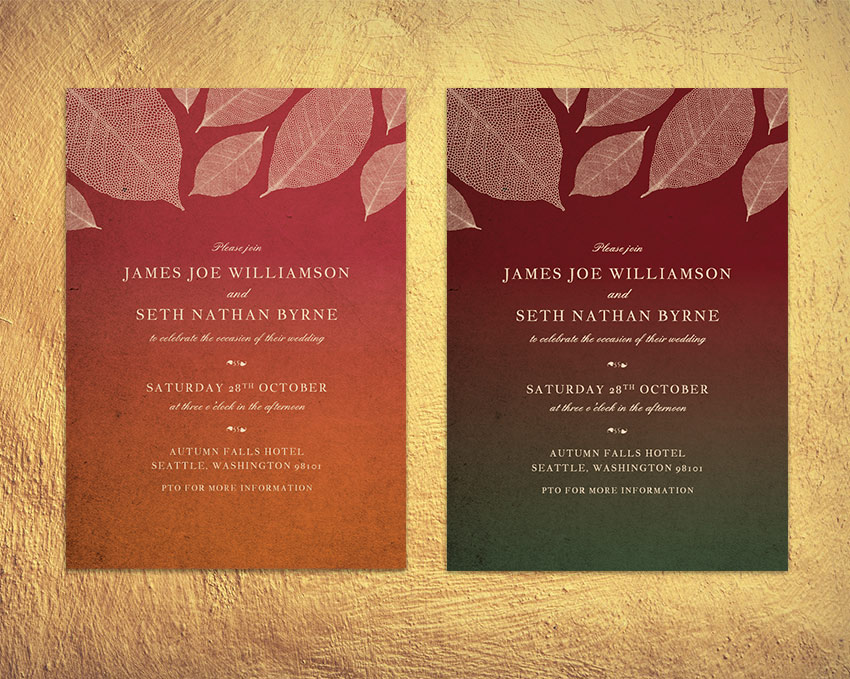
Fall is such a romantic and atmospheric time of year to get married. These autumnal invitations pay tribute to the earthy colors and falling leaves that lend the season its cosy mood.
The invites are quick and simple to create, and we’ll set up the cards in InDesign. Perfect for beginners to the software, this is a great all-round introduction to print design. You can also add optional metallic foiling to the cards, to give an extra touch of luxury to the design.
We’ll be using Adobe InDesign to set up the main layout, and dipping into Illustrator for editing the leaf graphics, so make sure you have access to both of these programs. You’ll also need to download a few fonts and graphics to give you a foundation for creating your invitation:
Save the images to a folder you can easily find, and install the fonts onto your computer.
One thing that many people forget about when they are trying to design their own wedding invitations is the envelope! Envelopes come in a variety of standard sizes, whereas invites can vary widely in size, so it’s always a good idea to pin down your envelope size first, before you size your invitation.
We’ll be setting up the invitation card at a standard size of 109 mm by 154 mm. To accommodate this, you’ll need to buy envelopes which are 4.75 in by 6.5 in when folded and closed. These are sometimes known as ‘6 Baronial’ envelopes.
1. How to Set Up the Invite in InDesign
Step 1
Open up InDesign and go to File > New > Document.
Keep the Intent set to Print and Number of Pages to 1. Uncheck the Facing Pages box.
Set the Width of the page to 109 mm and Height to 154 mm. Add Margins of 7 mm and a Bleed of 5 mm. Then head up and click OK.
Step 2
Expand the Layers panel (Window > Layers) and double-click on Layer 1 to open the Layer Options window. Rename the layer Background and click OK.
Choose New Layer from the panel’s drop-down menu (at top-right). Name this second layer Paper, and click OK.
Create a further two new layers, firstly Typography and finally Leaves at the top of the sequence.
Lock all the layers except Background, and click on this layer to activate it.
2. How to Create an Autumnal Backdrop for Your Invite
Step 1
You can create the gradient backdrop for your invite using any pairing of colors you wish. To create the colors as used in the invite example here, expand the Swatches panel (Window > Swatches) and choose New Color Swatch from the panel’s drop-down menu.
Name the swatch Cream and set the Type to Process and Mode to CMYK. Set the percentage levels to C=9 M=16 Y=30 K=0. Then click Add, and OK.
Create a further two new CMYK swatches:
Forest Green: C=75 M=45 Y=68 K=33
Burgundy: C=31 M=100 Y=76 K=46
Step 2
With the Background layer still active, take the Rectangle Tool (M) and drag across the whole page, extending the shape up to the edge of the bleed on all sides.
From the Swatches panel, set the Fill of the rectangle to Forest Green.
With the shape selected, head up to Object > Effects > Gradient Feather. Set the Angle to -90, and move the dark gradient stop about halfway along the slider.
Step 3
Select the shape and Edit > Copy, Edit > Paste. Then Right-click on the copy and choose Transform > Flip Vertical.
Position the flipped copy over the top of the original and switch its Fill to Burgundy.
Step 4
Lock the Background layer and unlock the next layer up, Paper.
Use the Rectangle Frame Tool (F) to drag across the whole page, and go to File > Place. Choose the paper background image you downloaded earlier, and click Open. Allow it to fill the whole frame.
Step 5
With the image frame selected, go to Object > Effects > Transparency. Set the Mode to Multiply and reduce the Opacity to 90%.
3. How to Format Elegant Typography for Your Invite
Step 1
With the rulers visible (View > Show Rulers), drag a guideline down from the top ruler to 52 mm.
Take the Type Tool (T) and drag to create a text frame that extends from the left-hand margin to the right-hand margin. Type in ‘Please Join’, and allow the baseline of the text to sit on the guideline.
From either the top Controls panel or the Character panel (Window > Type & Tables > Character), set the Font to England Hand, Size 11 pt and set the text to Align Center. Set the Font Color to Cream from the Swatches panel.
Step 2
Create a second text frame below the first, typing in ‘Name 1’ in uppercase letters, and setting the Font to Jacques Francois, Size 13 pt and increasing the Tracking (space between all characters) to 110. Set the Font Color to Cream, as before.
Copy and Paste this name text frame, moving it below with a gap in between and adjusting the text to read ‘Name 2’.
Set a text frame between the names reading ‘and’, setting the Font to England Hand.
Set another text frame below ‘Name 2’, reading ‘to celebrate the occasion of their wedding’ and set in England Hand, as before.
Step 3
Create a text frame below the previous. Place your type cursor in the frame and set the Font to IM FELL FLOWERS 2.
Then go to Window > Type & Tables > Glyphs, and select a decorative glyph from the panel, like the leaf style pictured. Double-click to insert it. You can insert two opposite-facing glyphs to create a balanced divider.
Step 4
Build up the second section of text, which will include the date (set in Jacques Francois) and the time (set in England Hand).
Then Copy and Paste the decorative divider text frame below.
Step 5
You can add a third section of text with details of the event location towards the bottom of the page, set in Jacques Francois.
Include a ‘PTO’ note at the bottom if you would want to include any more details on the reverse of the invite.
4. How to Add Autumnal Leaves to Your Invite
Step 1
Lock the Typography layer and unlock the top layer, Leaves.File > Save your InDesign document and minimize the window for a minute.
Open up the autumn leaves vector in Illustrator. Isolate one of the leaves in the illustration and set the Fill to a solid black swatch. Then Edit > Copy the leaf.
Return to InDesign and Edit > Paste the leaf vector directly onto the page. Rotate and scale it into roughly the position shown at the top-left of the page.
Adjust the Fill color of the leaf to Cream*.
*If you want to set up your cards for applying metallic foiling instead, skip forward to Step 3 below.
Step 2
Copy and Paste the cream leaf, rotating it and making it smaller. Position it to the bottom-right of the first leaf.
Build up other pasted leaf vectors in a sort of criss-cross pattern across the top of the invite…
…until the top of the card is filled with falling leaves.
Your invitation design is finished—great job! You can skip ahead to Section 5 below to find out how to export your design. However, if you want to add an extra touch of luxury to your cards, you may want to consider setting the leaves, text or both in metallic foil once printed. Here’s how…
Step 3
To do this, first identify which layer or layers you want to apply the foil design too. Let’s say you want to apply the foil to the leaves in the design, for example.
Unlock the layer, and then create a new swatch from the Swatches panel. Name the swatch FOIL SPOT, and set the Type to Spot. Set the levels below to 100% Magenta.
Apply this FOIL SPOT swatch to the elements you want to be pulled out in foil.
Then select all the foil elements and go to Window > Output > Attributes. Check the Overprint Fill box and/or Overprint Stroke.
And you’re done!
5. How to Export Your Invitation for Printing
Head up to File > Export, and choose Adobe PDF (Print) from the Format drop-down menu at the bottom of the Export window. Click Save.
In the window that opens, choose Press Quality from the Preset menu at the top.
Then click on Marks and Bleeds in the window’s left-hand menu. Check All Printer’s Marks and Use Document Bleed Settings, before clicking Export.
You can send your exported PDF straight off to the printers—awesome work!
Conclusion: Your Finished Invitation
You’ve created an elegant, autumnal-themed invitation that will be perfect for fall weddings. In this tutorial we’ve covered a broad range of print design skills, including:
How to set up an invitation template in InDesign, complete with a bleed and organized layers.
How to create a colorful, atmospheric backdrop for the layout.
How to format typography to an advanced level in InDesign.
How to bring in vector graphics to your work and edit them to create a unique design.
How to set up your design for optional foiling, and how to export your work for professional printing.
It sure is nice having a whole codebase that is perfectly compliant to a set of code style guidelines. All the files use the same indentation, the same quote style, the same spacing and line-break rules, heck, tiny things like the way zero’s in values are handled and how keyframes are named.
It seems like a tall order, but these days, it’s easier than ever. It seems to me it’s become a two-tool game:
A tool to automatically fix easy-to-fix problems
A tool to warn about harder-to-fix problems
Half the battle: Prettier
Otherwise known as „fix things for me, please”.
Best I can tell, Prettier is a fairly new project, only busting onto the scene in January 2017. Now in the last quarter of 2017, it seems like everybody and their sister is using it. They call it an Opinionated Code Formatter.
The big idea: upon save of a document, all kinds of code formatting happens automatically. It’s a glorious thing to behold. Indentation and spacing is corrected. Quotes are consistent-ified. Semi colons are added.
Run Prettier over your codebase once and gone are the muddy commits full of code formatting cruft. (You might consider making a temporary git user so one user doesn’t look like they’ve commited a bazillion lines of code more than another, if you care about that.) That alone is a damn nice benefit. It makes looking through commits a heck of a lot easier and saves a bunch of grunt work.
As this post suggest, Prettier is only half the battle though. You’ll notice that Prettier only supports a handful of options. In fact, I’m pretty sure when it launched it didn’t have any configuration at all. Opinionated indeed.
What it does support are things that are easy to fix, requiring zero human brainpower. Use double quotes accidentally (uggkch muscle memory) when your style guide is single quotes? Boom – changed on save.
There are other potential problems that aren’t as easy to fix. For example, you’ve used an invalid #HEX code. You probably wouldn’t want a computer guessing what you meant there. That’s better to just be visually marked as an error for you to fix.
That’s where this next part comes in.
The other half of the battle: Stylelint
Otherwise known as „let me know about problem, so I can fix them”.
Stylelint is exactly that. In fact, in that GIF above show Prettier do it’s thing, you saw some red dots and red outlines in my Sublime Text editor. That wasn’t Prettier showing me what it was going to fix (Prettier displays no errors, it just fixes what it can). That was Stylelint running it’s linting and showing me those errors.
Whereas Prettier supports 10ish rules, Stylelint supports 150ish. There is a standard configuration, but you can also get as fine-grained as you want there and configure how you please. David Clark wrote about it here on CSS-Tricks last year.
With these warnings so clearly visible, you can fix them up by hand quickly. It becomes rather second nature.
Getting it all going
These tools work in a wide variety of code editors.
These are the Prettier editor integrations. Between all these, that probably covers 96% webdevnerds.
It’s very easy to think „I’ll just install this into my code editor, and it will work!” That gets me every time. Getting these tools to work is again a two-part game.
Install code editor plugin.
Do the npm / yarn installation stuff. These are node-based tools. It doesn’t mean your project needs to have anything to do with node in production, this is a local development dependency.
These are intentionally separated things. The meat of these tools is the code that parses your code and figures out the problems it’s going to fix. That happens through APIs that other tools can call. That means these tools don’t have to be rewritten and ported to work in a new environment, instead, that new environment calls the same APIs everyone else does and does whatever it needs to do with the results.
Above is a barebones project in Sublime Text with both Prettier and Stylelint installed. Note the `package.json` shows we have our tools installed and I’m listing my „packages” so you can see I have the Sublime Text Plugin jsPrettier installed. You can also see the dotfiles there that configure the rules for both tools.
Don’t let the „js” part mislead you. You could use this setup on the CSS of your WordPress site. It really doesn’t matter what your project is.
Getting more exotic
There is certainly leveling up that can happen here. For example:
You might consider configuring Stylelint to ignore problems that Prettier fixes. They are going to be fixed anyway, so why bother looking at the errors.
You might consider updating your deployment process to stop if Stylelint problems are found. Sometimes Stylelint is showing you an error that will literally cause a problem, so it really shouldn’t go to production.
We mostly talked about CSS here, but JavaScript is arguably even more important to lint (and Prettier supports as well). ES Lint is probably the way to go here. There are also tools like Rubocop for Ruby, and I’m sure linters for about every language imaginable.