Choosing a CEO is serious stuff. It takes skill, responsibility and a lot of knowledge. The Diesel CEO’s chair is empty at the moment. Alessandro Bogliolo served as CEO for the Italian fashion brand from 2013 until July 2017 when he left to work with Tiffany. Until the official successor takes on the role, the company is searching for someone to temporarily occupy it: a Chair Executive Officer. With such a short amount of time available, there’s only one skill that anyone interested in the role must possess: to be ridiculously good at sitting in a chair. That’s why Renzo Rosso, Diesel’s founder, is asking people to showcase their best sitting technique on the brand’s Facebook page. Starting from 5th October, people will be able to showcase their sitting skills for 4 days by commenting with photos or videos on the post that launches the initiative. The new Chair Executive Officer will then fly to Italy, straight to Diesel headquarters, where he or she will become a brand ambassador, sitting on the brand’s most important chair for an entire week: the Diesel CEO Chair.
Diesel CEO Chair Credits
The Diesel CEO Chair campaign was developed at Publicis Italy, by worldwide chief creative officer Bruno Bertelli, executive creative director Cristiana Boccassini, digital creative directors Milos Obradovic and Mihnea Gheorghiu (Global), copywriters Matteo Gatto and Sara Rosset, art directors Andrea Raia and Cecilia Moro, creative supervisor Costanza Rossi, producers Isabella Guazzone, Silvia Cattaneo, project manager Vittorio Cafiero, social media manager Doina Tatu, account team Barbara Pusca, Camilla Poli, Giuseppe Esposito, working with Diesel global head of advertising, media and product marketing Giada Gheno, chief marketing officer Dario Gargiulo, head of advertising and e-commerce production Deborah Salbego, project manager Theodoros Mallas, creative director Nicola Formichetti
Filming was shot by director Tommaso Pitta via Bedeschi Film with executive producer Federico Salvi, producer Diana Passoni, stylists Anna Quacquarelli, Chiara Luna Mauri, offline editor Fabrizio Squeo.
Today we’re going to put our superhero capes on and hop into our secret
cave, where we’re going to observe and analyze each and every detail in order
to bring five of the most iconic crime fighters to life in a vector format. We’re
going to do all of this by relying on some basic geometric shapes combined with
the power of some simple-to-use tools in Adobe Illustrator.
Before we start, don’t forget that you can expand your project by heading over to GraphicRiver where you’ll find a great selection of superhero-themed vectors.
That being said, grab a cup of that crime-fighting juice and let’s get
started!
1. How to Set Up a New Project File
Assuming you already have Illustrator up
and running in the background, bring it up and let’s set up a New Document (File > New or Control-N)
using the following settings:
Number
of Artboards: 1
Width: 1000
px
Height: 600
px
Units: Pixels
And from the Advanced tab:
Color
Mode: RGB
Raster
Effects: Screen (72ppi)
Preview Mode: Default
2. How to Set Up a Custom Grid
Since we’re going to be creating the icons
using a pixel-perfect workflow, we’ll want to set up a nice little Grid so that we can have full control
over our shapes.
Step 1
Go to the Edit > Preferences > Guides & Grid submenu, and adjust
the following settings:
Once we’ve set up our custom grid, all we
need to do in order to make sure our shapes look crisp is enable the Snap to Grid and Snap to Pixel option found under the View menu, which will transform into Snap to Pixel each time you enter the Pixel Preview mode (if you’re using an older version of the
software).
Now, if you’re new to
the whole “pixel-perfect workflow”, I strongly recommend you go through my How
to Create Pixel-Perfect Artwork tutorial, which will help you widen your
technical skills in no time.
3. How to Set Up the Layers
Once we’ve set up our document, it would
be a good idea to structure our project using a few layers, since this
way we can maintain a steady workflow by focusing on one icon at a time.
That being said, bring up the Layers panel, and create a total of six
layers, which we will rename as follows:
layer
1: reference grids
layer
2: batman
layer
3: jubilee
layer
4: baby groot
layer
5: wonder woman
layer 6: luke cage
4. How to Create the Reference Grids
The reference grids (or base grids)
are a set of precisely delimited reference surfaces, which allow us to build
our icons by focusing on size and consistency.
Usually, the size of the grids determines
the size of the actual icons, and they should always be the first decision you
make once you start a new project, since you’ll always want to start from the
smallest possible size and build on that.
Now, in our case, we’re going to be creating
the icon pack using just one size, more exactly 128 x 128 px, which is a fairly large one.
Step 1
Start by locking all
but the “reference grids” layer, and then grab the Rectangle Tool (M) and create a 128 x 128 px orange (#F15A24) square, which will help define the
overall size of our icons.
Step 2
Add a smaller 120 x 120 px one (#FFFFFF) which we
will position on top of the previous shape, since it will act as our active
drawing area, thus giving us an all-around 4
px padding to work with.
Step 3
Select and group the
two squares together using the Control-G keyboard shortcut, center aligning them to the underlying Artboard
afterwards. Create the remaining grids using four copies (Control-C > Control-F) at a horizontal distance of 40 px from each other, locking
the current layer before moving on to the next section.
5. How to Create the Batman Emoji
Assuming you’ve successfully managed to
create the little reference grids, move on to the next layer (that would be the
second one), and let’s kick off the project by creating the dark knight.
Step 1
Start by creating the
character’s head using a 120 x 120 px circle,
which we will color using #FFDA66, and then center align to the first active
drawing area.
Step 2
Create a copy (Control-C > Control-F) of the
circle, which we will adjust by first changing its color to #2B3249, and then
cutting out a smaller 104 x 104 px one
(highlighted with red) from its center using Pathfinder’s Minus Front
Shape Mode.
Step 3
Start working on the
mask’s upper section by creating a 120 x
64 px rectangle (#2B3249), which we will center align to the active drawing
area’s top edge as seen in the reference image.
Step 4
Adjust the shape that
we’ve just created by first turning on Pixel
Preview mode (Alt-Control-Y) and
then adding two new anchor points at a distance of 14 px from the center of the rectangle’s bottom edge using the Add Anchor Point Tool (+).
Step 5
Select the two anchor
points that we’ve just created using the Direct
Selection Tool (A), and then push them to the bottom by a distance of 12 px using the Move Tool (right click >
Transform > Move > Vertical > 12 px).
Step 6
Add a second pair of
anchor points at a distance of just 2 px from the resulting shape’s bottom edge, selecting and pushing them to the
bottom by a distance of 8 px (right click > Transform > Move >
Vertical > 8 px). Once you’re done, turn off Pixel Preview mode (Alt-Control-Y)
and then move on to the next step.
Step 7
Create the subtle
shadow cast by the mask, using two copies (Control-C > Control-F twice) of the shape that we’ve just
finished adjusting, making sure to push the one from underneath to the bottom
by a distance of 8 px (right click > Transform > Move >
Vertical > 8 px). Use Pathfinder’s Minus Front Shape Mode to cut out the
upper copy from the bottom one, as seen in the reference image.
Step 8
Color the resulting
shape using #E89A54, and then make sure you position it behind the mask’s
circular cutout by right clicking >
Arrange > Send to Back. Once you’re done, select and group all three
shapes together using the Control-G
keyboard shortcut.
Step 9
Mask the shapes that
we’ve just grouped using a copy (Control-C)
of the underlying yellow circle, which we will paste in front (Control-F) and then use as a Clipping Mask (right click > Make Clipping Mask).
Step 10
Start working on Batman’s
left pointed ear, by creating a 40 x 120
px ellipse (#2B3249), which we will adjust by selecting its bottom anchor
points using the Direct Selection Tool
(A) and then removing it by pressing Delete.
Then, remove the shape’s right half, positioning the resulting ear onto the
active drawing area’s top-left corner, as seen in the reference image.
Step 11
Create the right ear
using a copy (Control-C > Control-F)
of the one we’ve just finished working on, which we will horizontally reflect (right click > Transform > Reflect
> Horizontal) and then position onto the opposite side of the active
drawing area.
Step 12
Take a couple of moments
and draw the eyes with the help of the Pen
Tool (P), using white (#FFFFFF) as your main Fill color. Position the resulting shapes as seen in the reference
image, selecting and grouping (Control-G)
them together before moving on to the next step.
Step 13
Create the mouth
using a 12 x 8 px rounded rectangle
(#2B3249) with a 4 px Corner Radius,
which we will position at a distance of 40
px from the active drawing area’s right edge and 26 px from its bottom one.
Step 14
Finish off the emoji
by adding the rough beard using a couple of 2 x 2 px circles (#2B3249) spaced both horizontally and
vertically 2 px from one another.
Take your time, and once you’re done, select and group (Control-G) each side of the beard, doing the same for the entire
icon afterwards.
6. How to Create the Jubilee Emoji
Assuming you’ve
finished working on the first superhero, lock its layer and then move on up to
the next one (that would be the third one), where we’ll start working on the pyrotechnic energy-blasting superhero.
Step 1
Create the character’s
head using a 120 x 120 px circle,
which we will color using #FFDA66 and then center align to our second active
drawing area.
Step 2
Create the upper section
of the hair using a 120 x 48 px rectangle
(#2B3249), which we will center align to the active drawing area’s top edge.
Step 3
Adjust the shape that
we’ve just created by adding three new anchor points 2 px from one another, which we
will position 24 px from
the larger shape’s right edge.
Step 4
Select the center
anchor point that we’ve just added, and the push it to the top by 8 px using the Move tool (right click >
Transform > Move > Vertical > -8 px).
Step 5
Add the subtle shadow
following the same process used for the first character, coloring the
resulting shape using #E89A54.
Step 6
Create the hair’s
side sections using two 8 x 72 px rectangles,
which we will color using #2B3249 and then bottom align to the active drawing
area’s side edges.
Step 7
Select and group (Control-G)all of the hair’s composing shapes, masking (right click > Make Clipping Mask) them afterwards using a copy (Control-C > Control-F) of the
underlying circle.
Step 8
Create the back
section of Jubilee’s hair, using a 96 x
12 px rectangle (#2B3249), which we will position 16 px from the active drawing area’s
bottom edge, making sure to send it to the back of all the other shapes (right click > Arrange > Send to Back).
Step 9
Start working on the
hair’s front-side
section, by creating an 8 x 44 px rectangle
(#2B3249), which we will position as seen in the reference image.
Step 10
Add another 8 x 16 px rectangle (#2B3249), which we
will adjust by selecting and removing its top-right anchor point. Position the
resulting shape onto the right side of the previous shape, at a distance of 16 px from its bottom edge, making sure
to group (Control-G) the two together
afterwards.
Step 11
Create the right section
of the character’s front hair using a copy (Control-C
> Control-F) of the shapes that we’ve just grouped, which we will
vertically reflect (right click >
Transform > Reflect > Vertical) and then position onto the opposite
side of the active drawing area.
Step 12
Start working on the
left eye by creating a 20 x 12 px rectangle
(#FFFFFF), which we will position underneath the shadow, at a distance of 22 px from the left hair section.
Step 13
Adjust the shape that
we’ve just created by setting the Radius
of its top-left corner to 4 px, its
top-right one to 12 px and its
bottom-left one to 8 px from within
the Transform panel’s Rectangle Properties.
Step 14
Add an 8 x 8 px circle (#2B3249) to the center
of the resulting shape, followed by a smaller 4 x 4 px one (#FFFFFF) which we will align to its top-right corner.
Once you’re done, select and group all three shapes together using the Control-G keyboard shortcut.
Step 15
Create the right eye
using a copy (Control-C > Control-F)
of the one that we’ve just finished working on, which we will vertically
reflect (right click > Transform >
Reflect > Vertical) and then position onto the opposite side of the
head. Once you’re done, select and group (Control-G)
both eyes together before moving on to the next step.
Step 16
Start working on the
mouth by creating the character’s lips using a 20 x 12 px ellipse (#F97F55) which we will adjust by pinching its
side anchor points using the Anchor
Point Tool (Shift-C). Once you’re done, center align the resulting shape to
the larger underlying circle, positioning it at a distance of 12 px from the eyes.
Step 17
Add the mouth using an 8 x 4 px ellipse (#2B3249), which we
will center align to the shape from the previous step.
Step 18
Add the visible section
of the teeth, using an 8 x 2 px rectangle
(#FFFFFF), which we will center align to the mouth’s top edge, masking (right click > Make Clipping Mask) it
afterwards using a copy (Control-C >
Control-F) of the underlying shape. Once you’re done, select and group (Control-G) all of the mouth’s composing
sections, before moving on to the next step.
Step 19
Create the blush spots
using two 16 x 12 px ellipses
(#FFB266), which we will position at a distance of 4 px from the character’s eyes and 12 px from its hair’s side sections. Once you’re done, select and
group (Control-G) all of the shapes
that we’ve created so far, before moving on to the next step.
Step 20
Start working on the
glasses by creating the upper section of the frame using a 104 x 8 px rectangle (#BDC9E5), which we will adjust by setting the Radius of its top corners to 4 px. Center align the resulting shape
to the underlying active drawing area, positioning it at a distance of 4 px from its top edge.
Step 21
Create the lens section
using a 104 x 28 px rectangle
(#F97F55), which we will adjust by setting the Radius of its bottom corners to 8 px, positioning the resulting shape below the frame.
Step 22
Adjust the shape by
adding a pair of new anchor points at a distance of 4 px from its center, followed by another one at a distance of 12 px. Once you have the anchors in
place, select the middle pair and push it to the top by 12 px (right click > Transform > Move > Vertical > -12 px).
Step 23
Start working on the
highlight by creating the first pair using a 4 x 20 px rectangle (#FFFFFF) followed by a narrower 2 x 20 px one (#FFFFFF) positioned just 2 px from the wider one. Adjust
the shapes by selecting and pushing their bottom anchor points to the left by 8 px (right click Transform > Move > Horizontal > -8 px), grouping (Control-G) and positioning the
resulting shapes as seen in the reference image.
Step 24
Finish off the glasses, and with them the emoji itself, by adding the second pair of highlights using a
copy (Control-C > Control-F) of
the ones that we’ve just finished working on, which we will position onto the opposite
side. Once you’re done, select and group (Control-G)
all of the glasses’ composing shapes, doing the same for all of the character’s
composing sections before moving on to the next one.
7. How to Create the Baby Groot Emoji
Assuming you’ve
finished working on the second emoji, lock its layer and then move on up to the
next one (that would be the fourth one), where we’ll create cute little Baby Groot.
Step 1
Start working on the
character’s head by creating its lower section using a 120 x 92 px rectangle (#B5725B), which we will adjust by setting
the Radius of its bottom corners to 60 px. Once you’re done, center align
the resulting shape to the active drawing area’s bottom edge.
Step 2
Create the head’s
upper section using a couple of varying width and height rectangles (#B5725B),
which we will adjust by setting the Radius
of some of their upper corners to 4 px.
Once you’re done, select and group (Control-G)
all of the head’s composing shapes, before moving on to the next step.
Step 3
Take a couple of
moments and add the grass sections, using #B6D65F as your main Fill color, moving on to the next step once
you’re done.
Step 4
Give the character some
texture, by adding a couple of rounded rectangles (#82453B) with a 1 px Corner Radius, which we will
position as seen in the reference image. Once you’re done, make sure you select
and group (Control-G) all of them
together, doing the same for all the head’s composing sections as well.
Step 5
Start working on Groot’s
eyes, by creating the main shape for its left one using a 16 x 16 px circle (#2B3249), which we will position at a distance
of 32 px from the active drawing
area’s left edge and 40 px from its
bottom one.
Step 6
Create a slightly wider 24 x 12 px ellipse (#B5725B), which
we will position onto the lower section of the previously created, making sure
to mask it afterwards using a copy (Control-C
> Control-F) of the smaller circle (right
click > Make Clipping Mask).
Step 7
Add the little highlight
using a 4 x 4 px circle (#FFFFFF),
which we will position at a distance of 4
px from the eye’s top and right edges. Once you’re done, select and group (Control-G) all three shapes together
before moving on to the next step.
Step 8
Create the right eye
using a copy (Control-C > Control-F)
of the one that we’ve just finished working on, which we will position onto the
opposite side of the head, making sure to select and group (Control-G) the two together once you’re
done.
Step 9
Add the character’s
mouth using an 8 x 8 px circle,
which we will color using #2B3249 and then position at a distance of 40 px from the active drawing area’s
right edge and 28 px from its bottom
one.
Step 10
Move a few pixels down
and add the blush spots using two 16 x
12 px ellipses (#A0604E), which we will position at a distance of 32 px from the active drawing area’s
bottom edge and 16 px from its side
ones.
Step 11
Create the left eyebrow,
using two 4 x 4 px circles (#82453B),
horizontally spaced 12 px from
one another. Push the right circle to the top by a distance of just 2 px (right click > Transform > Move > Vertical > -2 px), and
then connect the two using a diagonal rectangle, making sure to group (Control-G) and position the shapes as
seen in the reference image.
Step 12
Finish off Groot, by
adding the right eyebrow using a copy of the one that we’ve just created,
which we will vertically reflect (right
click > Transform > Reflect > Vertical) and then position onto
the opposite side of the head. Once you’re done, group (Control-G) the two together, doing the same for all of the emoji’s
composing sections, before moving on to the next one.
8. How to Create the Wonder Woman Emoji
Make sure you’ve
locked the previous layer, and then move on up to the next one (that would be
the fifth one) where we will start working on the Amazonian goddess.
Step 1
As we did with all the
other ones, start by creating the character’s head using a 120 x 120 px circle, which we will color using #FFDA66 and then center
align to our second active drawing area.
Step 2
Start working on the
hair by creating a 120 x 120 px square
(#2B3249), from the bottom of which we will cut out a smaller 88 x 72 px rectangle (highlighted with
red) using Pathfinder’s Minus Front Shape Mode.
Step 3
Mask the resulting shape
using a copy (Control-C) of the
underlying circle, which we will paste in front (Control-F) and then use as a Clipping
Mask (right click > Make Clipping
Mask).
Step 4
Start working on the
hair’s side sections by creating the main shape for its left one using a 16 x 40 px rectangle (#2B3249), which
we will align to the active drawing area’s left edge, positioning it at a
distance of 20 px from its bottom
edge.
Step 5
Next, we’re going to
go a little off the grid, by creating the curled section using a 32 x 32 px circle (#2B3249), which we
will adjust by cutting out another 32 x
32 px one (highlighted with red) from its top-left section. Once you’re
done, position the resulting shape as seen in the reference image, selecting
and grouping (Control-G) it and the
previously created rectangle together.
Step 6
Create the right hair
section using a copy (Control-C >
Control-F) of the one that we’ve just finished working on, which we will
vertically reflect (right click >
Transform > Reflect > Vertical) and then position onto the opposite
side of the head.
Step 7
Next, grab the Pen Tool (P) and draw the iconic crown,
using #FFB266 as your main Fill
color. Use the reference image as your main guide, moving on to the next step
once you’re done.
Step 8
Give the resulting shape
a pair of vertical highlights using a 4
x 36 px rectangle (#FFFFFF) positioned 2 px away horizontally from a narrower 2
x 36 px one (#FFFFFF), which we will group (Control-G) and then position at a distance of 20 px from the crown’s right edge. Once you’re done, mask the
highlights and then move on to the next step.
Step 9
Quickly draw the star
using #F97F55 as your main Fill color,
selecting and grouping all of the crown’s composing shapes afterwards using the Control-G keyboard shortcut.
Step 10
As we did with all the
other characters, add the subtle shadow (#E89A54), making sure to position it
behind the hair’s side sections (right click
> Arrange > Send Backward). Once you’re done, select and group all of
the current shapes together using the Control-G
keyboard shortcut.
Step 11
Start working on the
eyes, by creating the main shape for the left one using a 20 x 12 px ellipse (#FFFFFF), which we will adjust by pinching its
side anchor points using the Anchor
Point Tool (Shift-C). Position the resulting shape underneath the crown’s shadow,
at a distance of 14 px from the left
hair section.
Step 12
Continue adjusting
the eye, by selecting its top anchor point using the Direct Selection Tool (A), and then pushing it to the left by 2 px (right click > Transform > Move >
Horizontal > -2 px).
Step 13
Add the eye’s
remaining details using an 8 x 8 px circle
(#2B3249) which we will position in the center of the resulting shape, followed
by a smaller 4 x 4 px one (#FFFFFF)
in its top-right corner. Once you’re done, select and group (Control-G) all three shapes together,
before moving on to the next step.
Step 14
Create the right eye
using a copy (Control-C > Control-F)
of the one that we’ve just finished working on, which we will vertically
reflect (right click > Transform >
Reflect > Vertical) and then position onto the opposite side of the
head. Once you have the copy in place, select both it and the original and
group them together using the Control-G
keyboard shortcut.
Step 15
Start working on the
mouth by creating a 20 x 16 px ellipse
(#2B3249), which we will center align to the larger underlying circle,
positioning it at a distance of 8 px from
the character’s eyes.
Step 16
Add the teeth using a 20 x 6 px rectangle (#FFFFFF), and
the tongue using a 20 x 12 px ellipse
(#F97F55), which we will position as seen in the reference image, making sure
to group (Control-G) and mask them
afterwards. Once you’re done, select and group (Control-G) all of the mouth’s composing shapes before moving on to
the next step.
Step 17
Finish off the emoji,
by adding the blush spots using two 16 x
12 px ellipses (#FFB266), which we will position as seen in the reference
image. Take your time, and once you’re done, select and group (Control-G) the two together, doing the
same for the entire character afterwards.
9. How to Create
the Luke Cage Emoji
We are now down
to our fifth and last superhero, which is one of my all-time favorite Marvel characters.
That being said, take a quick sip of that second coffee, and let’s
jump into it!
Step 1
Start by creating the
character’s head using a 120 x 120 px circle,
which we will color using #B5725B and then center align to the last active
drawing area.
Step 2
Add the hair section
using a 96 x 24 px rectangle (#2B3249),
which we will center align to the circle’s top edge and then adjust by setting
the Radius of its top corners to 8 px.
Step 3
Grab the Pen Tool (P) and draw Luke’s headband
using #BDC9E5 as your Fill color.
Step 4
As we did with Wonder
Woman, give the band a set of vertical highlights (#FFFFFF) followed by the
subtle shadow (#8E5042), making sure to group (Control-G) and mask the shapes afterwards. Once you’re done, select
and group (Control-G) all of the
other composing sections as well.
Step 5
Start working on the
eyes by creating the main shape for the left one using a 16 x 16 px circle (#FFFFFF), which we will position at a distance
of 32 px from the active drawing
area’s left edge and 4 px from the
band’s shadow.
Step 6
Create the pupil using
an 8 x 8 px circle (#2B3249), onto
the top-right corner of which we will add a 4 x 4 px circular highlight (#FFFFFF).
Step 7
Create the eyelid
using a 24 x 12 px ellipse (#B5725B),
which we will position on the upper section of the eye so that its bottom
half overlaps it. Mask the shape (right
click > Make Clipping Mask) using a copy (Control-C > Control-F) of the underlying circle, selecting and
grouping all of the eye’s composing shapes together before moving on to the
next step.
Step 8
Create the right eye using
a copy (Control-C > Control-F) of
the one that we’ve just finished working on, which we will position on the
opposite side of the head. Once you have the copy in place, select both it and
the original and group them together using the Control-G keyboard shortcut.
Step 9
Create the beard using a 36 x 40 px rectangle (#2B3249),
which we will adjust by setting the Radius of its top corners to 12 px and
its bottom ones to 18 px. Once you’re done, center
align the resulting shape to the underlying head, positioning it at a distance
of 6 px from its bottom edge.
Step 10
Add the mouth cutout
using a 28 x 16 px rounded rectangle
(#B5725B) with an 8 px Corner Radius,
which we will center align to the beard, positioning it at a distance of 8 px from its top edge.
Step 11
Create the actual mouth
using a 12 x 8 px rounded rectangle
(#2B3249) with a 4 px Corner Radius,
which we will center align to the cutout, positioning it at a distance of 4 px from its right edge.
Step 12
Give the beard a small
inner facing segment using a 12 x 2 px rectangle
(#2B3249) which we will adjust by individually selecting and pushing its top
anchor points to the inside by a distance of 2 px (right click > Transform > Move > Horizontal > +
/ – 2 px depending on which side you start with). Position the resulting shape to
the center of the cutout’s bottom edge, selecting and grouping (Control-G) all of the mouth’s composing
shapes before moving on to the next step.
Step 13
Finish off the
character and with it the project itself, by adding the rough beard using a
couple of 2 x 2 px circles (#2B3249)
distanced both horizontally and vertically at 2 px from one another. Take your time, and once you’re done, select
and group (Control-G) each side of
the beard, doing the same for the entire icon afterwards.
Avengers
Assemble!
Great job! As always, I
hope you’ve managed to keep up with each and every step, and maybe learned a
trick or two along the way.
Every week, we’ll give you an overview of the best deals for designers, make sure you don’t miss any by subscribing to our deals feed. You can also follow the recently launched website Type Deals if you are looking for free fonts or font deals.
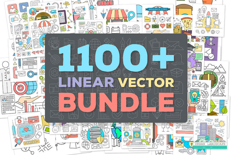
1100+ Premium Linear Vector Elements
No matter what project you’re working on, vector elements are sure to help! This fabulous bundle features over 1,100 premium linear vector elements, culled from over 100 different collections. Categories range from business to marketing to Web development, so you’re sure to find the perfect element for your current design.
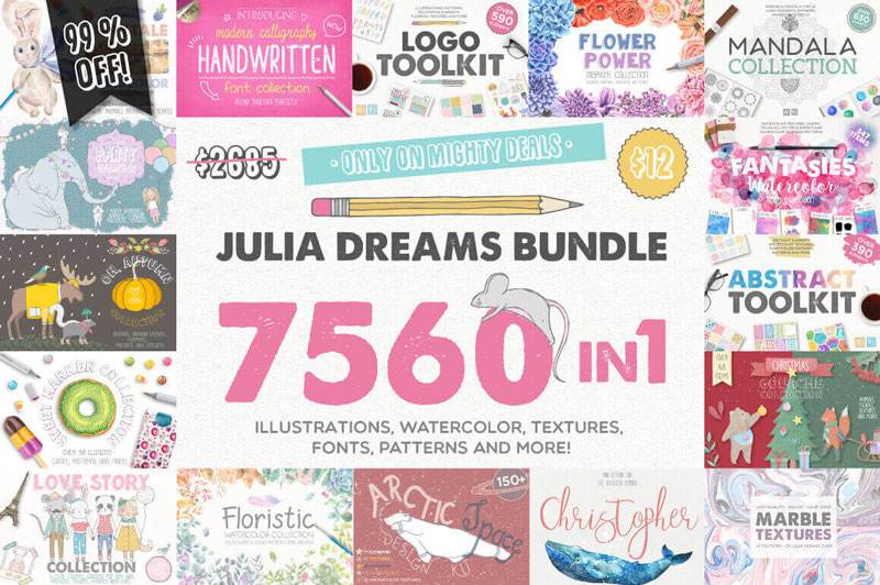
Julia Dreams Bundle of 7500+ Professional Graphics
Have we got an exclusive Mighty Deal for you! Act fast and you can take home the Julia Dreams Bundle at more than 99% off the regular price. That’s more than 7,500 different graphic elements including illustrations, watercolors, textures, fonts, patterns and more. From food to holidays, this bundle has you covered for whatever project you’re currently undertaking.
With a name like Cabinet of Curiosities, you just know there’s going to be something sweet in that bundle! And you’d be right. Culled together from 28 individual collections, you’ll get 336 gorgeous graphics full of rose gold, naturally textured and mixed with fabulous digital graphics inspired by the natural world. Suitable for print projects, this is one time you do want your curiosity to get the best of you.
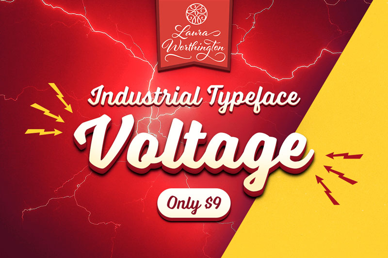
Reach back to the Industrial Age, full of big, bold words and cars! The Voltage Font Family by Laura Worthington offers up a practical typeface that’s both assertive yet down to earth. Loaded with hundreds of OpenType Features from swashes to ligatures, this is one charged-up font family that you won’t want to miss out on.
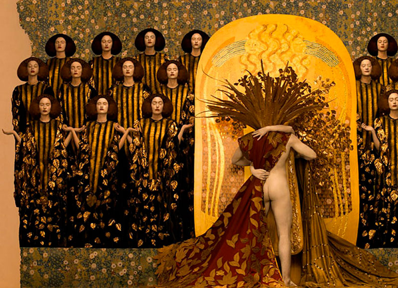
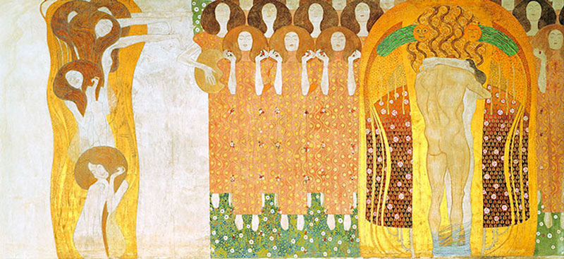
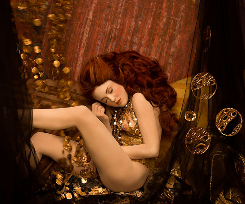
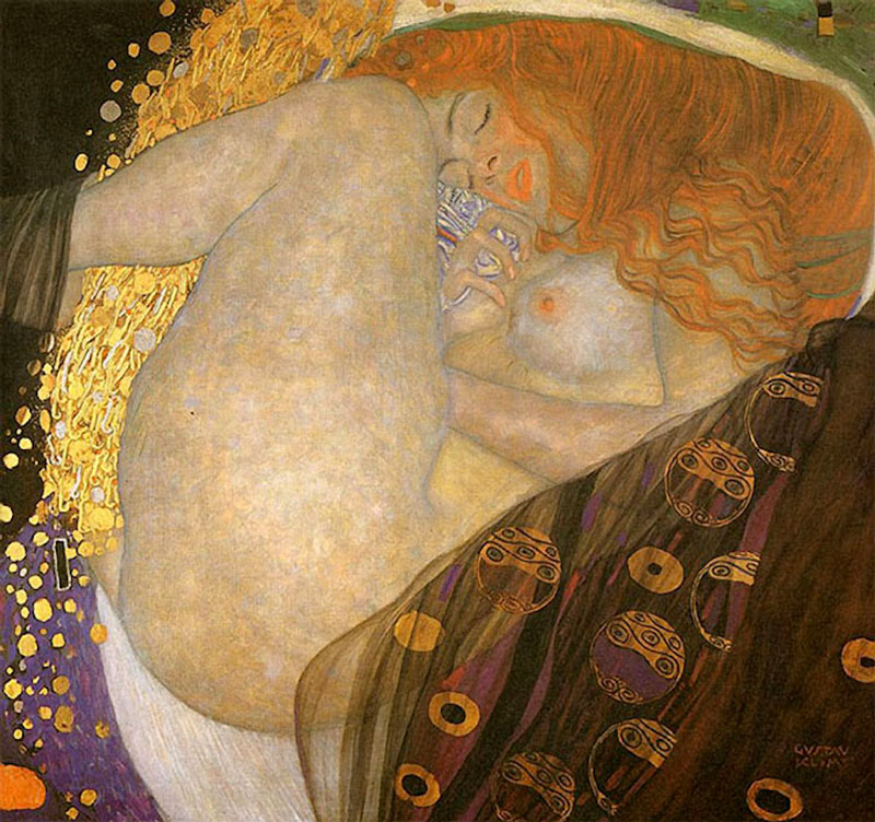
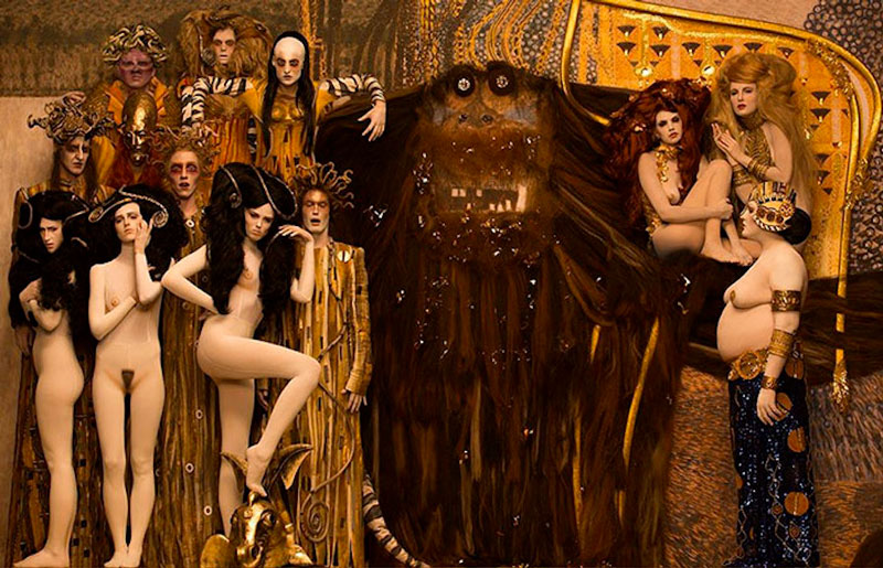
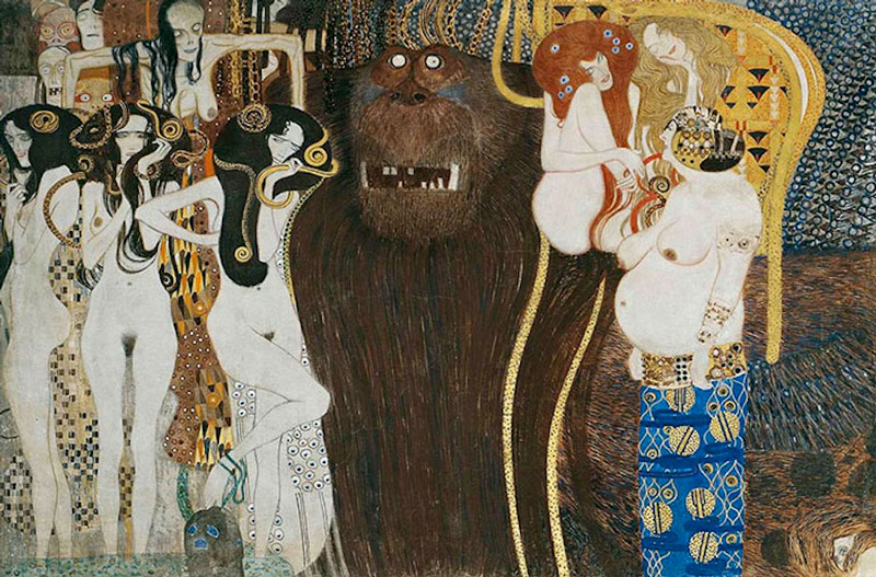
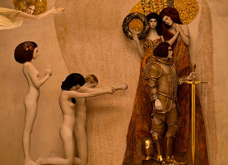
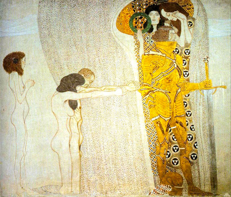
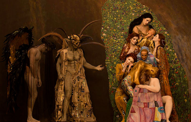
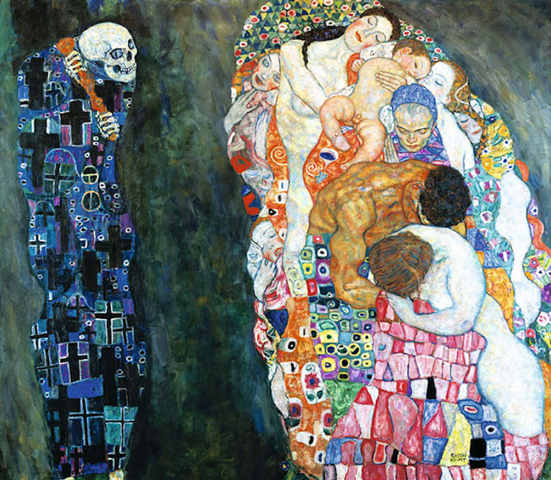
Inspired by famous Austrian painter, photographer Inge Prader took upon herself to recreate it by designing a scene and photographing it. The results are stunning, with more than just a copycat feeling, but a really new artistic perspective on Gustav Klimt’s most famous paintings.
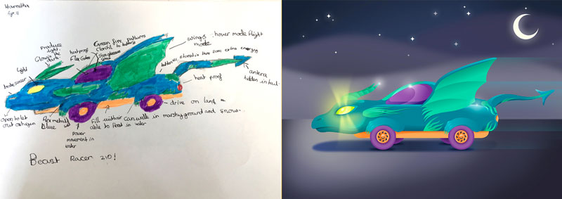
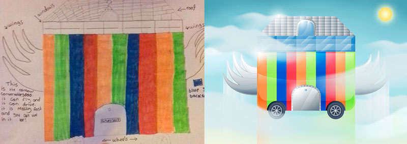
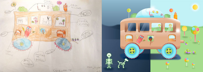
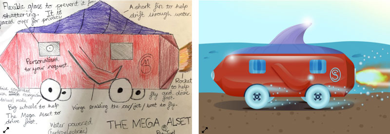
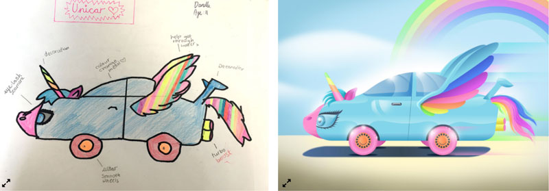
Car designers are incredible people. They imagine new solutions and implement new technologies on a regular basis, designing with a high-level of constraints. When they are not screaming too loud, children can be pretty cool human beings as well. They are not limited by the burden of knowledge and have no limits when it comes to imagine new things.
In the NextGen Cars project, kids were asked to imagine a new car. As you can see on the pictures in the post, they had some ideas that a car designer would not dare to express, and an interesting view on what the perfect car should be. Obviously, this will not trigger a car design revolution, but it gives a welcome unusual new perspective.
On some particularly heavy sites, the user needs to see a visual cue temporarily to indicate that resources and assets are still loading before they taking in a finished site. There are different kinds of approaches to solving for this kind of UX, from spinners to skeleton screens.
If we are using an out-of-the-box solution that provides us the current progress, like preloader package by Jam3 does, building a loading indicator becomes easier.
For this, we will make a ring/circle, style it, animate given a progress, and then wrap it in a component for development use.
Step 1: Let’s make an SVG ring
From the many ways available to draw a circle using just HTML and CSS, I’m choosing SVG since it’s possible to configure and style through attributes while preserving its resolution in all screens.
Inside an <svg> element we place a <circle> tag, where we declare the radius of the ring with the r attribute, its position from the center in the SVG viewBox with cx and cy and the width of the circle stroke.
You might have noticed the radius is 58 and not 60 which would seem correct. We need to subtract the stroke or the circle will overflow the SVG wrapper.
radius = (width / 2) - (strokeWidth * 2)
These means that if we increase the stroke to 4, then the radius should be 52.
52 = (120 / 2) - (4 * 2)
So it looks like a ring we need to set its fill to transparent and choose a stroke color for the circle.
The next step is to animate the length of the outer line of our ring to simulate visual progress.
We are going to use two CSS properties that you might not have heard of before since they are exclusive to SVG elements, stroke-dasharray and stroke-dashoffset.
stroke-dasharray
This property is like border-style: dashed but it lets you define the width of the dashes and the gap between them.
The second one allows you to move the starting point of this dash-gap sequence along the path of the SVG element.
Now, imagine if we passed the circle’s circumference to both stroke-dasharray values. Our shape would have one long dash occupying the whole length and a gap of the same length which wouldn’t be visible.
This will cause no change initially, but if we also set to the stroke-dashoffset the same length, then the long dash will move all the way and reveal the gap.
Decreasing stroke-dasharray would start to reveal our shape.
A few years ago, Jake Archibald explained this technique in this article, which also has a live example that will help you understand it better. You should go read his tutorial.
The circumference
What we need now is that length which can be calculated with the radius and this simple trigonometric formula.
circumference = radius * 2 * PI
Since we know 52 is the radius of our ring:
326.7256 ~= 52 * 2 * PI
We could also get this value by JavaScript if we want:
With this little trick, we know that assigning the circumference value to stroke-dashoffset will reflect the status of zero progress and the 0 value will indicate progress is complete.
Therefore, as the progress grows we need to reduce the offset like this:
One particular thing about stroke-dashoffset: its starting point is vertically centered and horizontally titled to the right. It’s necessary to negatively rotate the circle to get the desired effect.
Next, we add our SVG as a template. Notice that the easy part here is that Vue provides us with bindings, bringing JavaScript expressions inside attributes and styles.
The recipe for this solution is based on SVG shapes and styles, CSS transitions and a little of JavaScript to compute special attributes to simulate the drawing circumference.
Once we separate this little piece, we can port it to any modern library or framework and include it in our app, in this article we explored web components, Vue, and React.