Kelly Sutton writes about programming, working with teams and the relationship to the Greek word Mētis:
Mētis is typically translated into English as “cunning” or “cunning intelligence.” While not wrong, this translation fails to do justice to the range of knowledge and skills represented by mētis. Broadly understood, mētis represents a wide array of practical skills and acquired intelligence in responding to a constantly changing natural and human environment.
Kelly continues:
In some ways, mētis is at direct odds with processes that need a majority of the design up-front. Instead, it prefers an evolutionary design. This system of organization and building can be maddening to an organization looking to suss out structure. The question of “When will Project X ship?” seems to be always met with weasel words and hedges.
A more effective question—although equally infuriating to the non-engineering members of the company—would be “When will our understanding of the problem increase an order of magnitude, and when will that understanding be built into the product?”
I’ve only just been catching up with the news about Gutenberg, the name for a revamp of the WordPress editor. You can use it right now, as it’s being built as a plugin first, with the idea that eventually it goes into core. The repo has better information.
It seems to me this is the most major change to the WordPress editor in WordPress history. It also seems particularly relevant here as we were just talking about content blocks and how different CMS’s handle them. That’s exactly what Gutenberg is: a content block editor.
Rather than the content area being a glorified <textarea> (perhaps one of the most valid criticisms of WordPress), the content area becomes a wrapper for whatever different „blocks” you want to put there. Blocks are things like headings, text, lists, and images. They are also more elaborate things like galleries and embeds. Crucially, blocks are extensible and really could be anything. Like a [shortcode], I imagine.
As with any big software change, it’s controversial (even polarizing). I received an email from someone effectively warning me about it.
The consensus is this UI upgrade could either move WP into the future or alienate millions of WP site owners and kill WordPress.
I tend to think WordPress is 2-BIG-2-DIE, so probably the former.
I also think piecing together block types is a generic and smart abstraction for a CMS to make. Gutenberg seems to be handling it in a healthy way. The blocks are simply wrapped in specially formatted <!-- wp:core/text --> <!-- /wp:core/text --> to designate a block, so that the content highly compatible. A WordPress site without Gutenberg won’t have any trouble with it, nor porting it elsewhere.
Plus the content is still treated in templates as one big chunk:
To ensure we keep a key component of WordPress’ strength intact, the source of truth for the content should remain in post_content, where the bulk of the post data needs to be present in a way that is accessible and portable.
So regardless of how you structure it in the editor, it’s stored as a chunk in the database and barfed out in templates with one command. That makes it perhaps less flexible than you might want from a templating perspective, but scopes down this change to a paleteable level and remains very WordPress-y.
It seems a lot of the controversy stems from either who moved my cheese sentiments or what it does and doesn’t support at this second. I don’t put much stock in either, as people tend to find the cheese fairly quickly and this still under what seems to be heavy active development.
A big support worry is custom meta boxes. Joost de Valk:
Fact remains that, if you test Gutenberg right now, you’ll see that Yoast SEO is not on the page, anywhere. Nor, for that matter, are all the other plugins you might use like Advanced Custom Fields or CMB2. All of these plugins use so-called meta boxes, the boxes below and to the side of the current editor.
The fact that the Gutenberg team is considering changing meta boxes is, in our eyes, a big mistake. This would mean that many, many plugins would not work anymore the minute Gutenberg comes out. Lots and lots of custom built integrations would stop working. Hundreds of thousands of hours of development time would have to be, at least partly, redone. All of this while, for most sites, the current editor works just fine.
That does sound like a big deal. I wonder how easy baby stepping into Gutenberg will be. For example, enabling it for standard posts and pages while leaving it off for custom post types where you are more likely to need custom meta boxes (or some combination like that).
On this site, I make fairly heavy use of custom meta boxes (even just classic custom fields), as well as using my own HTML in the editor, so Gutenberg won’t be something I can hop on quickly. Which makes me wonder if there will always be a „classic” editor or if the new editor will be mandatory at a certain point release.
Yet more controversy came from the React licensing stuff. That went essentially like:
I’ve never heard of „framework-agnostic” block rendering, but apparently, it’s a thing. Or maybe it’s not? Omar Reiss:
With the new Gutenberg editor we’re changing the way the WordPress admin is being built. Where we now render the interface with PHP, we will start rendering more and more on the client side with JavaScript. After the editor, this is likely to become true for most of the admin. That means that if you want to integrate with the admin interface, you’ll have to integrate with the JavaScript that renders the interface. If WordPress chooses Vue, you’ll have to feed WordPress Vue components to render. If WordPress chooses React, you’ll have to feed WordPress React components to render. These things don’t go together. React doesn’t render Vue components or vice versa. There is no library that does both. If WordPress uses a particular framework, everyone will have to start using that framework in order to be able to integrate.
That’s a tricky situation right there. Before the React license change, I bet a nickel they’d go Vue. After, I suspect they’ll stick with React. Their own Calypso is all React in addition to what already exists for Gutenberg, so it seems like a continuity bonus.
This will be a fun tech story to follow! Sites like Post Status will likely be covering it closer than I’ll be able to.
Using minimal design and elegant shapes, designer Tamas Bozsik created an experimental furniture that’s an hybrid between a seat, a couch, and a bed. With this design, he explored the concept of seating and laying using only handmade and natural material.
This quick tutorial will show you how to create a letterpress-style effect to apply to any text. It’s a lovely vintage-inspired style that will give any layout a more hand-crafted look, but without the expense of letterpress printing!
We’ll be creating the effect in Adobe InDesign using the program’s Effects panel, and it only takes ten minutes to put together.
1. How to Create a Papery Background for Your Effect
Step 1
Open up InDesign and go to File > New > Document. You can create the type effect at any size you wish, but here I’m going to set up an A3 landscape page with the Intent set to Print.
Once you’ve set up the specs for your document, go ahead and click OK.
Expand the Layers panel (Window > Layers) and double-click on the Layer 1 name. In the Options window, change the name to Background and click OK.
Step 2
Select the Rectangle Frame Tool (F) and drag across the whole page. Go to File > Place, choose a paper texture image (here I’ve used this art paper photo), and click Open. Allow the paper to fill the whole frame.
Step 3
Expand the Swatches panel (Window > Color > Swatches) and create a new CMYK swatch. Name it Cream and set the levels to C=12 M=10 Y=18 K=0.
Take the Rectangle Tool (M) and create a shape that again extends across the whole page. From the Swatches panel, set the Fill to Cream.
With the rectangle still selected, head up to Object > Effects > Transparency. Set the Mode to Overlay and bring the Opacity down to 90%.
Click on Gradient Feather at the bottom of the panel’s left-hand menu. Choose Radial from the Type menu, and ensure the gradient extends outwards, getting more opaque towards the outer edges of the page.
Click OK to exit the window.
2. How to Build Up Your Letterpress Effect
Step 1
Lock the Background layer and create a new layer above, Typography.
Use the Type Tool (T) to create a text frame in the center of the page. Type in the word or words you would like to apply the effect to, and format this as you wish using either the top Controls panel or the Character panel (Window > Type & Tables > Character). Here I’ve set the text in Arvo Bold, increased the Font Size to 220 pt, and upped the Tracking to 20.
Once you’re completely happy with your text, first Edit > Copy, Edit > Paste a copy and set it aside on the pasteboard. This is because we’re going to outline the text to make formatting a little easier, but this will mean you will be unable to change details like font and tracking. So it’s always a good idea to have a spare copy to hand if you change your mind!
With the text frame selected, head up to Type > Create Outlines.
Step 2
Create three new CMYK swatches with the names and values listed below:
Off-Black: C=85 M=76 Y=61 K=93
Blue: C=0 M=95 Y=92 K=0
Red: C=70 M=15 Y=22 K=1
Apply the Off-Black swatch to the Stroke of your outlined text, setting the Fill to [None].
Step 3
Go to Object > Effects > Transparency and set the Mode to Multiply and Opacity to 35%.
Click on Outer Glow in the left-hand menu and set the Mode to Multiply, Effect Color to Cream and Opacity to about 40%. Increase the Spread to around 40%.
Finally, click on Bevel and Emboss. Choose Outer Bevel for the Style, and adjust the Size and Shadow Opacities until the text has a slightly lifted effect. When you’re happy, go ahead and click OK.
Step 4
Select the text and Edit > Copy, Edit > Paste, shuffling the copy down and to the right a little. Go to Object > Effects and remove any effects.
Then set the Fill of the copy to Red and the Stroke to [None].
Head back to the Effects window and adjust the Transparency to Multiply, 90% Opacity.
Click on Inner Glow. Choose Cream for the Effect Color, set the Opacity to 75%, and increase both the Choke and Noise to 100%. Click OK to exit the window.
Step 5
Select the red, grainy version of the text and Copy and Paste, moving it slightly further down and to the right. Adjust the Fill to Blue.
Step 6
Select the blue text and Copy and Paste, before getting rid of any effects applied to it. Move it upwards and to the left a little, as shown below. Adjust the Fill to Red.
Go to Object > Effects > Inner Glow. Set the Mode to Screen and Opacity to about 65%, and add about 50% Noise.
Click on Bevel and Emboss and add a Pillow Emboss effect, setting the Shadow to Multiply and the shadow’s color to Red. Play about with the percentage levels of the glow settings until you’ve given a nice flat, letterpress-style look to the text.
Step 7
Go to the Layers panel (Window > Layers) and click on the arrow symbol next to the Typography layer’s name to expand the layer. Identify the version of the text which has the Off-Black outline and no color fill, and click on the small square to the right of that element’s name to select it.
Drag the element up to the top of the layer sequence, setting it above all the other text items.
Conclusion: Your Finished Letterpress Effect
Your type effect’s looking fantastic—great job! You can now incorporate it into another layout, or simply enjoy it on its own.
You can’t miss this Games of Thrones-style type effect. Perfect for posters and social media, this effect is quick and easy to create in Adobe InDesign.
André Bergs is no stranger to animation. And the iPad is no stranger to digital comics. But André’s recently released “Protanopia” sports a unique look that begs users to pick up their device and dive into the story’s world. We asked André for details about the process behind his passion project — and why he’s… Read more »
I work on a large team with amazing people like Simona Cotin, John Papa, Jessie Frazelle, Burke Holland, and Paige Bailey. We all speak a lot, as it’s part of a developer advocate’s job, and we’re also frequently asked where we’ll be speaking. For the most part, we each manage our own sites where we list all of this speaking, but that’s not a very good experience for people trying to explore, so I made a demo that makes it easy to see who’s speaking, at which conferences, when, with links to all of this information. Just for fun, I made use of three.js so that you can quickly visualize how many places we’re all visiting.
In this tutorial, I’ll run through how we set up the globe by making use of a Serverless function that gets geolocation data from Google for all of our speaking locations. I’ll also run through how we’re going to use Vuex (which is basically Vue’s version of Redux) to store all of this data and output it to the table and globe, and how we’ll use computed properties in Vue to make sorting through that table super performant and slick.
Article Series:
Automatically Update GitHub Files With Serverless Functions (you are here!)
Filtering and Using the Data (coming soon!)
Serverless Functions
What the heck?
Recently I tweeted that „Serverless is an actually interesting thing with the most clickbaity title.” I’m going to stand by that here and say that the first thing anyone will tell you is that serverless is a misnomer because you’re actually still using servers. This is true. So why call it serverless? The promise of serverless is to spend less time setting up and maintaining a server. You’re essentially letting the service handle maintenance and scaling for you, and you boil what you need down to functions that state: when this request comes in, run this code. For this reason, sometimes people refer to them as functions as a service, or FaaS.
Is this useful? You bet! I love not having to babysit a server when it’s unnecessary, and the payment scales automatically as well, which means you’re not paying for anything you’re not using.
Is FaaS the right thing to use all the time? Eh, not exactly. It’s really useful if you’d like to manage small executions. Serverless functions can retrieve data, they can send email notifications, they can even do things like crop images on the fly. But for anything where you have processes that might hold up resources or a ton of computation, being able to communicate with a server as you normally do might actually be more efficient.
Our demo here is a good example of something we’d want to use serverless for, though. We’re mostly just maintaining and updating a single JSON file. We’ll have all of our initial speaker data, and we need to get geolocation data from Google to create our globe. We can have it all work triggered with GitHub commits, too. Let’s dig in.
Creating the Serverless Function
We’re going to start with a big JSON file that I outputted from a spreadsheet of my coworker’s speaking engagements. That file has everything I need in order to make the table, but for the globe I’m going to use this webgl-globe from Google data arts that I’ll modify. You can see in the readme that eventually I’ll format my data to extract the years, but I’ll also need the latitude and longitude of every location we’re visiting
Eventually, I’ll also have to reduce the duplicated instances per year to make the magnitude, but we’ll tackle that modification of our data within Vue in the second part of this series.
Inside, you’ll see a sidebar that has a lot of options. At the top it will say new. Click that.
Next, we’ll select function app from the list and fill in the new name of our function. This will give us some options. You can see that it will already pick up our resource group, subscription, and create a storage account. It will also use the location data from the resource group so, happily, it’s pretty easy to populate, as you can see in the GIF below.
The defaults are probably pretty good for your needs. As you can see in the GIF above, it will autofill most of the fields just from the App name. You may want to change your location based on where most of your traffic is coming from, or from a midpoint (i.e. if you have a lot of traffic both in San Francisco and New York), it might be best to choose a location in the middle of the United States.
The hosting plan can be Consumption (the default) or App Service Plan. I choose Consumption because resources are added or subtracted dynamically, which the magic of this whole serverless thing. If you’d like a higher level of control or detail, you’d probably want the App Service plan, but keep in mind that this means you’ll be manually scaling and adding resources, so it’s extra work on your part.
You’ll be taken to a screen that shows you a lot of information about your function. Check to see that everything is in order, and then click the functions plus sign on the sidebar.
From there you’ll be able to pick a template, we’re going to page down a bit and pick GitHub Webhook – JavaScript from the options given.
Selecting this will bring you to a page with an `index.js` file. You’ll be able to enter code if you like, but they give us some default code to run an initial test to see everything’s working properly. Before we create our function, let’s first test it out to see that everything looks ok.
We’ll hit the save and run buttons at the top, and here’s what we get back. You can see the output gives us a comment, we get a status of 200 OK in green, and we get some logs that validate our GitHub webhook successfully triggered.
Pretty nice! Now here’s the fun part: let’s write our own function.
Writing our First Serverless Function
In our case, we have the location data for all of the speeches, which we need for our table, but in order to make the JSON for our globe, we will need one more bit of data: we need latitude and longitude for all of the speaking events. The JSON file will be read by our Vuex central store, and we can pass out the parts that need to be read to each component.
The file that I used for the serverless function is stored in my github repo, you can explore the whole file here, but let’s also walk through it a bit:
The first thing I’ll mention is that I’ve populated these variables with config options for the purposes of this tutorial because I don’t want to give you all my private info. I mean, it’s great, we’re friends and all, but I just met you.
// GitHub configuration is read from process.env
let GH_USER = process.env.GH_USER;
let GH_KEY = process.env.GH_KEY;
let GH_REPO = process.env.GH_REPO;
let GH_FILE = process.env.GH_FILE;
In a real world scenario, I could just drop in the data:
// GitHub configuration is read from process.env
let GH_USER = sdras;
… and so on. In order to use these environment variables (in case you’d also like to store them and keep them private), you can use them like I did above, and go to your function in the dashboard. There you will see an area called Configured Features. Click application settings and you’ll be taken to a page with a table where you can enter this information.
Working with our dataset
First, we’ll retrieve the original JSON file from GitHub and decode/parse it. We’re going to use a method that gets the file from a GitHub response and base64 encodes it (more information on that here).
module.exports = function(context, data) {
 // Make the context available globally
 gContext = context;

 getGithubJson(githubFilename(), (data, err) => {
   if (!err) {
     // No error; base64 decode and JSON parse the data from the Github response
     let content = JSON.parse(
       new Buffer(data.content, 'base64').toString('ascii')
     );
Then we’ll retrieve the geo-information for each item in the original data, if it went well, we’ll push it back up to GitHub, otherwise, it will error. We’ll have two errors: one for a general error, and another for if we get a correct response but there is a geo error, so we can tell them apart. You’ll note that we’re using gContext.log to output to our portal console.
getGeo(makeIterator(content), (updatedContent, err) => {
       if (!err) {
         // we need to base64 encode the JSON to embed it into the PUT (dear god, why)
         let updatedContentB64 = new Buffer(
           JSON.stringify(updatedContent, null, 2)
         ).toString('base64');
         let pushData = {
           path: GH_FILE,
           message: 'Looked up locations, beep boop.',
           content: updatedContentB64,
           sha: data.sha
         };
         putGithubJson(githubFilename(), pushData, err => {
           context.log('All done!');
           context.done();
         });
       } else {
         gContext.log('All done with get Geo error: ' + err);
         context.done();
       }
     });
   } else {
     gContext.log('All done with error: ' + err);
     context.done();
   }
 });
};
Great! Now, given an array of entries (wrapped in an iterator), we’ll walk over each of them and populate the latitude and longitude, using Google Maps API. Note that we also cache locations to try and save some API calls.
function getGeo(itr, cb) {
 let curr = itr.next();
 if (curr.done) {
   // All done processing- pass the (now-populated) entries to the next callback
   cb(curr.data);
   return;
 }

 let location = curr.value.Location;
Now let’s check the cache to see if we’ve already looked up this location:
We’ve made use of some helper functions along the way that help get Google JSON, and get and put GitHub JSON.
Now if we run this function in the portal, we’ll see our output:
It works! Our serverless function updates our JSON file with all of the new data. I really like that I can work with backend services without stepping outside of JavaScript, which is familiar to me. We need only git pull and we can use this file as the state in our Vuex central store. This will allow us to populate the table, which we’ll tackle the next part of our series, and we’ll also use that to update our globe. If you’d like to play around with a serverless function and see it in action for yourself, you can create one with a free trial account.
Stay tuned for the next installment!
Article Series:
Automatically Update GitHub Files With Serverless Functions (you are here!)
Ben Heine is a Belgian visual artist and music producer born in 1983 in Abidjan, Ivory Coast, currently living and working in Brussels, Belgium.
He is best known for his original series „Pencil Vs Camera”, „Digital Circlism” and „Flesh and Acrylic”. He is a self-taught person in drawing, photography, and music.
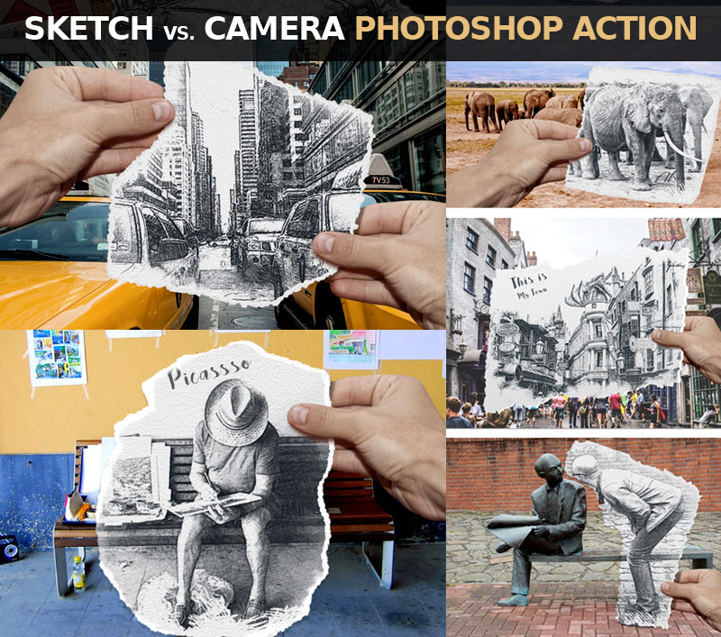
Pencil Vs Camera is an original visual concept invented and popularized by Ben Heine since April 2010. The images in this series usually show a surreal hand-drawn sketch held by the artist and placed over a real photograph to symbolize the connection between reality and imagination/creativity.
Create an 850 x 636 pxNew Document. You can, of course, use another size for your PSD file,but you have to proportionally adjust all the sizes used in this tutorial. Add the Girls stock image.
2. Add the Torn Paper
Step 1
I have attached a Torn Paper PNG image that you can use. But, if you want to create your own texture of a torn paper, it’s very easy to do. You can find a piece of thick paper or cardboard and tear it roughly in the shape that you want. Then place it on a flat surface, preferably of a contrasting color (e.g. black if the paper is white).
Take a photo using a camera or a mobile phone. Make sure that you take the picture from directly above the piece of paper so that the perspective matches what we need.
Step 2
Upload the photo to your computer and open it in Photoshop. Using the Magic Wand Tool, make a selection and remove the background.
Step 3
Download the Torn PaperPNG image and add it in a new layer.
Step 4
Press Control-T to rotate the Torn Paper and position it over the area that you want to turn into a sketch.
Step 5
Press Control-J twice, to make two copies of the Torn Paper layer, and call them Torn Paper 1 layer and Torn Paper 2 layer.
Step 6
Add a Drop Shadow layer style to the Torn Paper layer, using the color #000000.
3. Make Four Copies for the Girls Layer
Step 1
Press Control-J four times, to make four copies of the Girls layer, and call them Girls 1 layer, Girls 2 layer, Girls 3 layer, and Girls 4 layer.
Step 2
Keep the Control key pressed and select Girls 1 layer, Girls 2 layer, Girls 3 layer, and Girls 4 layer. Move them above the Torn paper layer.
4. Use the Graphic Pen and Motion Blur Filters in Photoshop
Step 1
Hide all the copy layers except the Girls 1 layer.
Set the Foreground Color to #000000 and the Background Color to #ffffff.
Step 2
For the Girls 1 layer, go to Filter > Sketch > Graphic Pen. For another image, you might have to adjust these settings.
Step 3
Go to Filter > Blur > Motion Blur.
5. Use the Graphic Pen and Noise Filters in Photoshop
Step 1
Make the Girls 2 layer visible and set the blend mode to Multiply, opacity 30%.
Step 2
Go to Filter > Sketch > Graphic Pen. For another image, you might have to adjust these settings.
Step 3
Go to Filter > Noise > Add Noise.
6. Use the Photocopy Filter in Photoshop
Step 1
Make the Girls 3 layer visible and set the blend mode to Multiply, opacity 100%.
Step 2
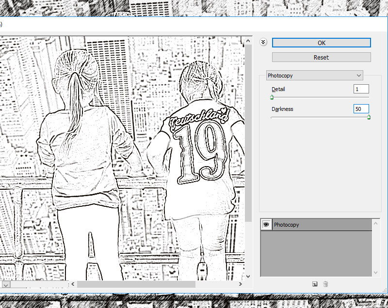
Go to Filter > Sketch > Photocopy.
7. Use the Watercolor Filter in Photoshop
Step 1
Make the Girls 4 layer visible and set the blend mode to Color, opacity 100%.
Step 2
Go to Filter > Artistic > Watercolor. You can hide the Girls 4 layer for now.
8. Create the Sketch Paper Piece With a Clipping Mask
Keep the Control key pressed and select the Girls 1 layer, Girls 2 layer, Girls 3 layer, and Girls 4 layer. Right click on the selected layers and choose Create Clipping Mask.
9. Create the Torn Paper Border
Step 1
Make the Torn Paper 1 layer visible and set the blend mode to Multiply, opacity 57%.
Step 2
Make the Torn Paper 2 layer visible. Click on the Add Layer Mask button from the Layers tab to add a mask for the Torn Paper 2 layer.
Step 3
Create a new layer just below the Torn Paper 2 layer and fill it with color #ffffff.
Step 4
Click on the Torn Paper 2 layer mask thumbnail. Go to Image > Apply Image.
Step 5
Go to Image > Adjustments > Levels and enter these settings.
You can use the Brush Tool and paint with color #ffffff inside the Torn Paper 2 layer if you want to add a more ripped edge effect.
Step 6
Delete the White Background layer to see the effect.
Step 7
Keep the Control key pressed and select the Torn Paper 1 layer and the Torn Paper 2 layer. Right click on the selected layers and choose Create Clipping Mask.
10. Move the Sketch Effect Very Easily
If you want another part of your image to be turned into a sketch, simply keep the Control key pressed and select the Torn Paper 1 layer, the Torn Paper 2 layer, and the Torn Paper layer.
Use the Move Tool to change the position of the torn paper piece.
Congratulations! You’re Done!
In this tutorial, you’ve learned how to create a Sketch vs. Camera effect in Photoshop using your photos, in just a few steps.
In this tutorial I will show you how to draw a realistic African elephant step by step from scratch. This tutorial is ideal for beginners. You’ll learn how to plan the pose, how to achieve the correct proportions, and how to add all the body parts and their details. It’s not as difficult as it seems!
1. How to Sketch an Elephant’s Pose
Step 1
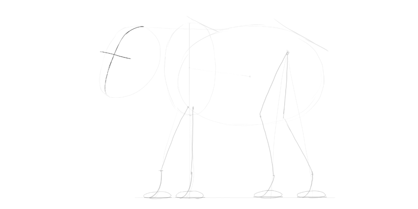
Sketch an oval. It doesn’t need to be perfect.
Step 2
Attach a vertical oval to it, slightly higher.
Step 3
Place two slanting lines on the shoulders and the hips.
Step 4
Draw the ground. It should be about the „shoulder” length long.
Step 5
Sketch the position of the legs without paying too much attention to their anatomy.
Step 6
Add the general shape of the head.
2. How to Draw a Simplified Skeleton of an Elephant
Step 1
Draw the width of the feet on the ground.
Step 2
Sketch the actual anatomy of the legs; the joints and the direction of the bones. Elephants have very straight legs, and they walk on their fingertips.
Step 3
Draw flat cushions under the feet.
Step 4
Draw a cross on the face, keeping in mind that it’s seen in perspective.
Step 5
Draw the eye sockets.
Step 6
Draw the forehead.
Step 7
Draw the cheekbone and the base of the ear.
Step 8
Draw the tusks.
Step 9
Draw the direction and length of the trunk.
Step 10
Draw the direction and length of the tail.
3. How to Draw an Elephant’s Body
Step 1
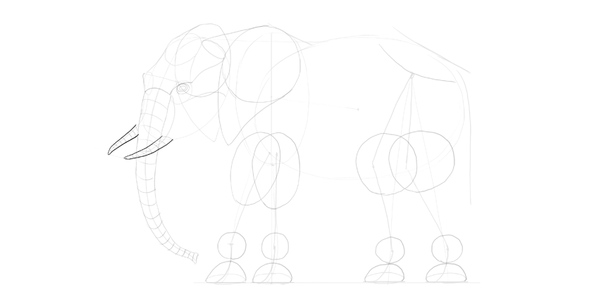
We have the basic skeleton, so now it’s time to add some body to it. Draw circles above the feet, in the place of wrists and ankles.
Step 2
Draw „cups” under them.
Step 3
Draw big muscle masses in the forearms and thighs.
Step 4
Sketch the position of the hips.
Step 5
Draw two mirrored '9’s for the ears. They can cover the shoulder.
Step 6
Close the shape of the ears.
Step 7
Draw ovals inside ovals to create the basic sketch of the eye.
Step 8
Sketch the brow.
Step 9
Draw the width of the trunk all along its length, and then outline it.
Step 10
Do the same with the tusks.
Step 11
Add more detailing shapes to the face.
Step 12
Sketch and outline the tail.
Step 13
Outline the legs, going around the defining shapes.
Step 14
Outline the whole body.
Step 15
Add the elbow.
4. How to Finish the Drawing of an Elephant
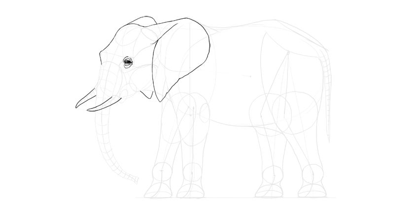
We’re going to draw the final lines now. If you’re drawing traditionally, use a darker tool for them, or put a new sheet of paper on top.
Step 1
Draw the little dark eye and the wrinkles around it.
Step 2
Outline the head and ears.
Step 3
Outline the tusks.
Step 4
Add details to the trunk.
Step 5
Add details to the face.
Step 6
Add the toenails. African elephants have four nails on the front feet and three on their back feet, but they’re not all seen in this view.
Step 7
Outline the body, drawing big wrinkles here and there to show how thick the skin is.
Step 8
Add more wrinkles all over the body to create a texture of the skin.
Step 9
If you want, you can shade the elephant with simple cross-hatching.
Good Job!
You did it! If you want to learn more about elephants, for example how to draw the Asian elephant, check out my detailed tutorial below:
Gravity Cat, the commercial for Playstation 4 game Gravity Rush 2 (known in Japan as Gravity Daze 2), has won a Grand Prix award at Spikes Asia. The commercial, commissioned by Sony Interactive Entertainment, was designed as a cat video demonstrating new laws of gravity outdoing Newton’s law of gravity. Although the game is animated, the Gravity Cat commercial is made as live action film in which two sisters and their cat run freely across the walls and ceiling of their unit, before being released to free fly through the sky. The commercial begins with a university student struggling with her thesis on laws of gravity. At the end she’s released to live outside of the box. The cat appears in the video in recognition of the sidekick cat character in the Playstation game. And, of course, cat videos are eminently shareable.
The production team explain that they tackled challenging visual expressions, including one-cut takes, POV filming, animal takes, and gravity changes. “We made it as realistic as possible to get viewers questioning/wondering how it was made, and to give it the wow factor.” See the making-of video below.
Gravity Rush, known in Japan as Gravity Daze [a], is an action-adventure video game developed by SCE Japan Studio and Project Siren, and published by Sony Computer Entertainment for the PlayStation Vita.[6] Directed by Keiichiro Toyama, the core mechanics of the game is the player’s ability to manipulate gravity, allowing unique movements and navigation.[7] The graphics are cel-shaded, which in Toyama’s opinion stand out from the western photorealistic trend.[8] A sequel titled Gravity Rush 2 was announced on Sony’s TGS 2015 press conference and was released in the United States on January 20, 2017 for the PlayStation 4.
Gravity Cat Credits
The Gravity Cat ad was develop at Hakuhodo Inc. Tokyo, by creative director Yuta Okuyama, creative team Yusuke Amagai, Yuki Yokoi, Keita Togawa, and Masumi Nishibori, account executives Kiyomi Wada and Maiko Hayashi.
Filming was shot by The Directors Guild director Show Yanagisawa and assistant director Masumi Nishibori, with Sturgeon cinematographer Ryoken Okamura, assistant cinematographer Shinji Kawai, lighting designer Atsutoshi Ueno, assistant lighting designer Kohsei Kobayashi, set designer Yukiko Kuribayashi, stylist Takeru Sakai, makeup artist Yuki Aika, Tohokushinsha Film Corporation producers Takashi Aso and Tatsuya Sunohara, production manager Takuya Omura, and assistant production manager Takuya Sugimoto.
Sound was produced by sound designer Erito Ayaki and sound effects producer Yoshio Nakamura. Music, “Mewton” feat. Haru (DIALUCK), was composed by Yuma Yamaguchi, with and produced by Kazuyoshi Tonami at Yuge Inc.
Agregator najlepszych postów o designie, webdesignie, cssie i Internecie