IKEA’S Cook This Page, an in-store promotion in Canada, has won a Grand Prix award at the Clio Awards. The IKEA Cook This Page campaign involved a set of printed recipe sheets distributed to IKEA stores to encourage use of IKEA kitchenware and food products. “The Cook This Page Parchment Paper Recipe Series,” a collection of easy-to-make recipes printed on cookable parchment paper. With step-by-step instructions and a list of ingredients precisely illustrated on the parchment paper to match actual proportions, the only thing one had to do was add food, roll it all up and bake it. The sheets are printed with food-safe ink. With the fill-in-the-blank directions, you can place the salmon, meatballs, shrimps, fruit crumble and other ingredients inside the printed layouts. Finally, roll up the paper with all the ingredients and get ready to cook your meal.
IKEA store managers created in-store events across Canada to show that cooking can be fun, simple and exploratory. Posters were offered to customers as they selected kitchen ware and ingredients. All 12,500 parchment paper recipes available in 18 locations were snatched up within hours.
IKEA Cook This Page Credits
The IKEA Cook This Page campaign was developed at Leo Burnett Toronto by chief creative officer Judy Johns, creative director Lisa Greenberg, group creative director/art director, designer and illustrator Anthony Chelvanathan, group creative director/copywriter Steve Persico, senior graphic artist Robin Osmond, executive producer Franca Piacente, agency producer Alexandra Postans, print producers Good Cathmoir, Anne Peck and Carly Price, group account director Allison Litzinger, account director Emily Robinson, account supervisor Rebecca Simon, chief strategy officer Brent Nelsen, VP group planning director Tahir Ahmad.
Tourism Ireland has won the Grand Prix at the Kinsale Shark Awards for the second year in a row, following on from the Doors of Thrones campaign to the Game of Thrones Tapestry. After seven years of production, Game of Thrones® has truly become a part of Northern Ireland’s heritage and culture. In order to celebrate this, Tourism Ireland have created the Northern Ireland Game of Thrones® Tapestry – a giant, 77 metre long medieval wall-hanging that brings to life the events, locations and story of the most popular television series of all time. Harking back to Northern Ireland’s rich heritage of textile and linen manufacture, the Northern Ireland Game of Thrones® Tapestry was hand-woven and hand-embroidered using linen sourced from one of the last surviving linen mills in Northern Ireland. Traditional medieval tapestries of a similar size have taken upwards of 20 years to complete. 66 metres of this tapestry were created in under 3 months, to be followed by a new section every week, following the release of each new episode of Game of Thrones® season 7. The full Northern Ireland Game of Thrones® Tapestry is currently on display at the Ulster Museum in Belfast, as well as online at Ireland.com.
As season 7 unfolded, new sections of the tapestry were revealed each week, using a mix of cinemagraphs, time-lapse videos of the weaving process, carousels and Instagram Stories. Each element of the campaign drives fans to an interactive “Northern Ireland Game of Thrones Tapestry” web app that allows fans to zoom in and explore the tapestry in full and share their favourite scenes with their friends via social media. The website also reveals the shows filming locations in Northern Ireland, and links to build an itinerary for their own trip.
Behind the Scenes
Before being woven and embroidered, each key scene and character from the show has to be painstakingly recreated and designed by artists and illustrators – condensing over 77 hours worth of storytelling into 77 metres of drawings. Once the hand illustrations are complete, designers recreate the drawings digitally, in order to map out the weaving guide and colour pallets befitting each individual scene. These are then hand-woven and brought to life by expert weavers, on a state-of-the-art Jacquard Loom. Each section of the tapestry comprises of Northern Irish linen, as well as the same fabrics and textiles used for the costumes and sets in the show. Once woven, hand-embroiderers then meticulously retouch every fine detail – from King Joffrey’s golden crown to Daenery’s shimmering hair.
Game of Thrones Tapestry Credits
The Game of Thrones Tapestry project was developed at Publicis London by executive creative director Dave Monk, creative director Dave Sullivan, copywriter/art director Josh Norbury, designer Duncan Rogers, account director Ben McKee, account manager Kathryn Mason, strategist Chris Turner, social media planner Radd Nadesananthan, business director Katie Edwards, agency producer Kal Parmar, working with Tourism Ireland head of marketing communication Brian Twomey, central marketing director Mark Henry.
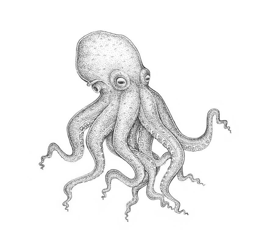
The theme of this tutorial is drawing an octopus; we’ll base it on the anatomy of this mollusc but also bring some stylization into our artwork.
I’ll show you an easy way to create a pencil sketch from scratch, and then we’ll explore the step-by-step process of drawing with ink liners. We’ll also learn to use dots and mix artistic techniques to our advantage!
What You Will Need
A sheet of drawing paper
A graphite pencil (I recommend using an HB type)
An eraser
An ink liner number 0.2
An ink liner number 0.1
An ink liner number 0.05
1. How to Draw an Octopus With a Graphite Pencil
Step 1
I draw a slightly curved core line; it will help us to mark the positioning of the figure.
Step 2
I outline the rough shape of the head. Then I add an oblong shape where the eyes are located.
According to this foreshortening, one side of the octopus is more visible to the viewer than another.
Step 3
I add the framework of the limbs. An octopus has eight arms that can be divided into four pairs.
Now I mark only the arms that are visible in the foreground, just to keep the process as simple as possible. We’ll add the hidden arms later.
Step 4
I draw the eyes. They are large, enclosed in a capsule, and have a slit-shaped pupil.
Step 5
I draw the fold of the aperture at the side of the head.
Step 6
I add the siphon; it resembles a funnel. An octopus uses a siphon for respiration and locomotion.
Now we are ready to proceed to drawing the tentacles, or the arms. This topic needs additional explanations, so I’ll see you in the next section!
2. How to Draw Tentacles
Step 1
It’s worth mentioning that, according to Wikipedia, the correct name for the limbs of an octopus is „arms”, not „tentacles”. But since it is a common appellation, I’ll be using „tentacles” now and then throughout the tutorial.
I draw the first pair of arms, keeping the lines smooth and soft.
Step 2
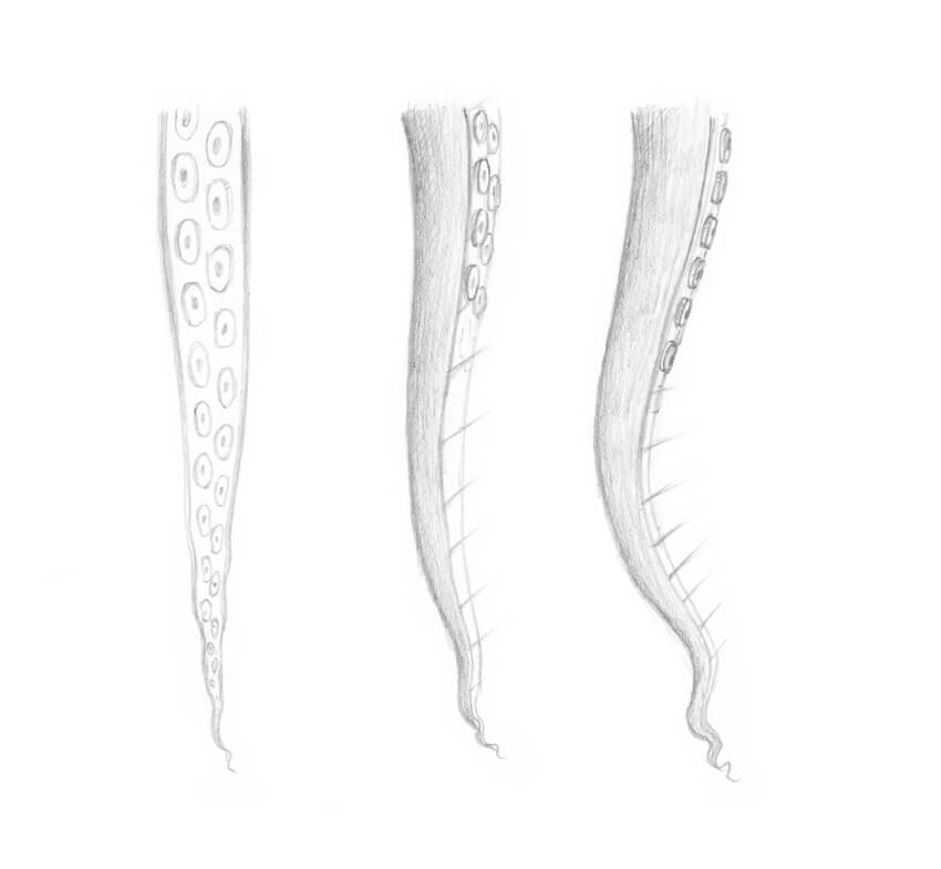
To draw the inner parts of the tentacles correctly, we need to keep in mind the principles of perspective.
The foreshortening defines how much of the interior surface we see; the image below illustrates this concept.
We’ll dwell upon drawing the suckers (the round elements that cover the interior surfaces of the arms) just in the next step.
I add the inner parts of the first pair of arms.
Step 3
The stylized form of a sucker resembles a bowl with a hollow central cavity.
The principles of perspective are applicable here, too: the point of view defines how we see the object. For example, if we have an overhead view of a sucker, we’ll see only the top plane with the cavity and no sides.
Each arm has two rows of suckers. Depending on the species, the suckers can be placed in a parallel or a staggered order.
I add the suckers to the first pair of the arms. The suckers get smaller towards the end of the limb, so just mark the smallest ones without adding many details.
Step 4
I draw the second pair of arms and then add the inner sides.
Step 5
I add the suckers to the second pair of arms.
Step 6
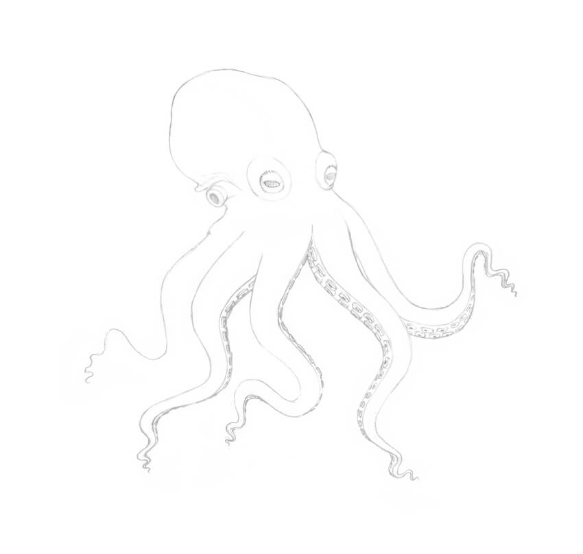
I draw the remaining tentacle of the third pair. Then I add the inner surface and the suckers, just as we did in the previous examples.
Step 7
I draw the second arm from the third pair; it is hidden behind one of the arms in the foreground.
Step 8
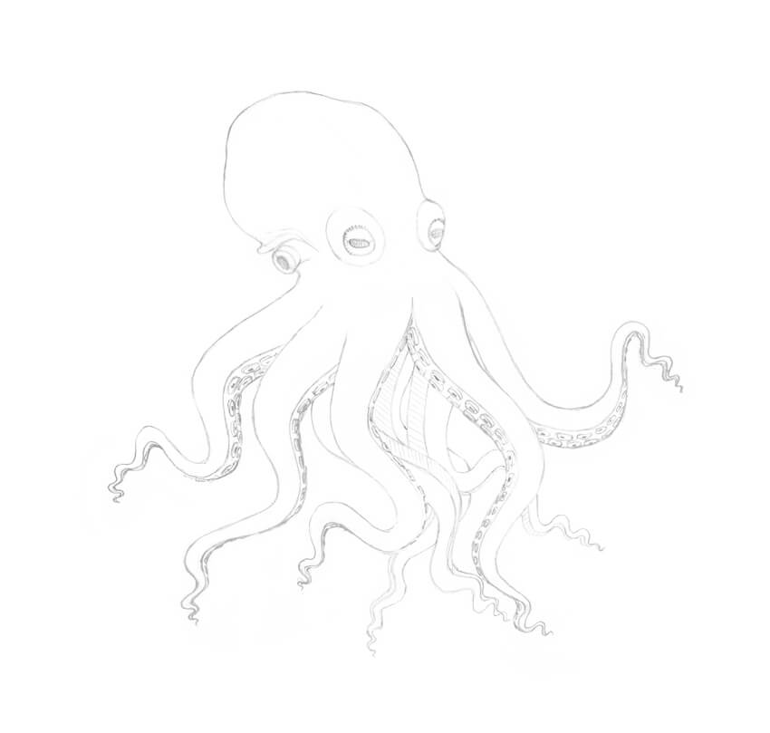
I add the fourth arm pair. Use your imagination and artistic flair to find the best direction for these arms; it’s important to keep the balance of the figure.
I applied light pencil hatching to the inner parts of the limbs just for your reference.
Step 9
As a final addition to this pencil sketch, I draw the suckers.
I clean my drawing with the eraser. It’s important to make sure that all unnecessary pencil lines are removed before proceeding to any additional artistic tool.
The sketch is ready for inking!
3. How to Draw With Ink Liners
Step 1
Before we begin inking our octopus drawing, let’s try some warm-up exercises and practice making dots on the paper.
Dotwork (also known as stippling) is a great artistic technique; it’s a perfect choice for creating beautiful textures.
Draw a sample of dotwork that consists of two parts. Use the 0.2 ink liner for the left one and the 0.1 liner for the right one.
Step 2
Create a line, using only dots. The speed of drawing influences the accuracy of the individual dots within the line.
The 0.2 ink liner is a great tool for this exercise.
Step 3
The goal of the next exercise is to make a gradation of value. With the 0.2 ink liner, create a sample with an increasing density of ink dots.
4. How to Draw an Octopus With Ink Liners
Step 1
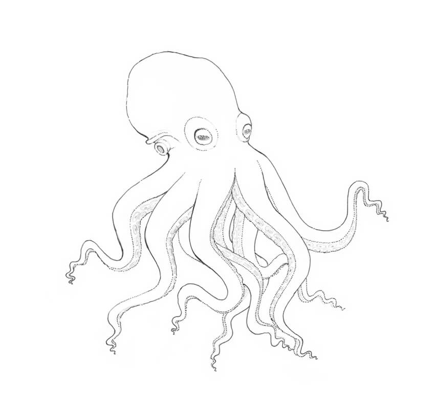
With the 0.2 ink liner, I create the main contours.
To make the drawing more interesting, I use a dotted line in addition to a traditional continuous outline.
Step 2
I add dots to the sides of the octopus, using the 0.2 ink liner. I also darken the pupils and mark the darker places of the figure.
Step 3
With the 0.1 ink liner, I add a layer of dots to the drawing.
Step 4
I add dots to the back arms of the octopus, using the 0.1 ink liner. To create the core shadows of the arms, you can place dots closer to each other.
Step 5
I outline the suckers, using the 0.05 liner, and also add dots to the eyes to make them more three-dimensional.
Step 6
With the 0.2 liner, I add another layer of dots to the sides of the octopus, giving the drawing more contrast and making it more three-dimensional.
I create a pattern of the skin, applying the groups of dots to the head and arms. Approximately five dots per group is the way to go.
Step 7
I make the contours of the drawing a bit thicker, using the 0.2 ink liner.
Step 8
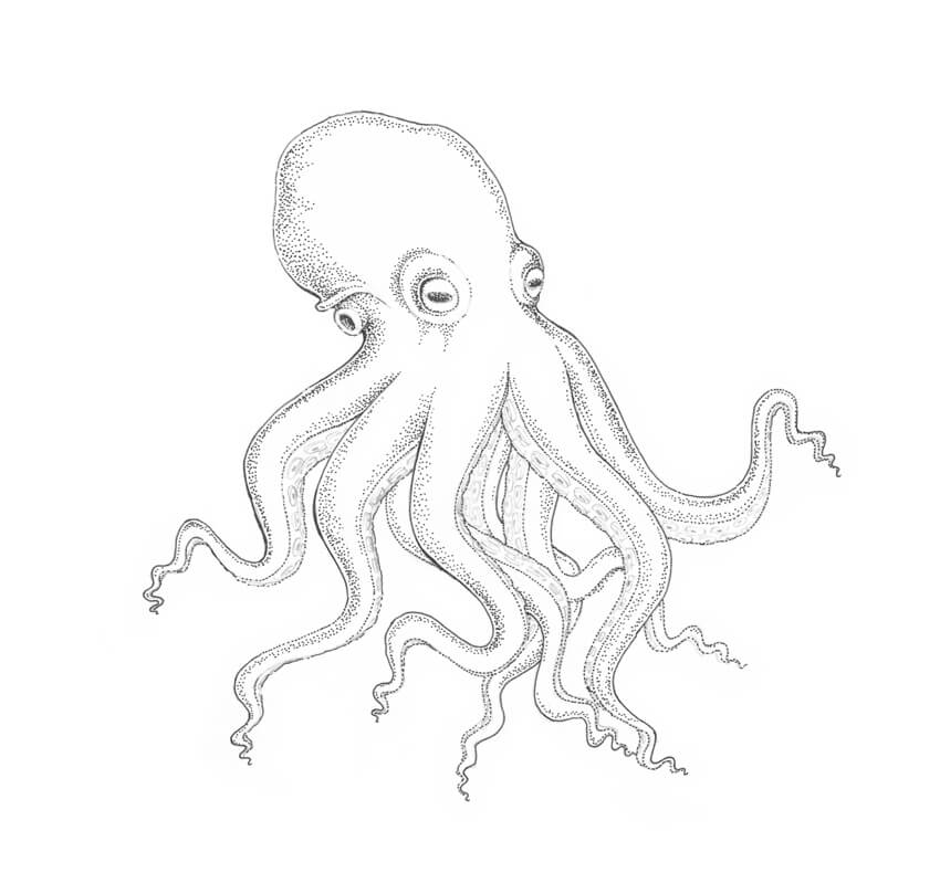
The ink drawing is complete!
As a finishing touch, I apply pencil hatches to the sides of the octopus, creating soft transitions from shadow to light. This combination of artistic techniques makes the drawing more unique and interesting.
Your Drawing Is Complete
Congratulations! You’ve created a beautiful artwork; I hope you enjoyed both the process and the result.
I wish you much success in drawing with pencils and ink. Have fun capturing the unique charm of the wonderful world of animals and nature!
Every week, we’ll give you an overview of the best deals for designers, make sure you don’t miss any by subscribing to our deals feed. You can also follow the recently launched website Type Deals if you are looking for free fonts or font deals.
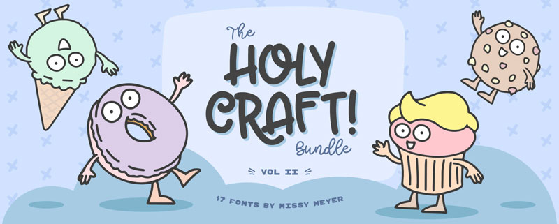
The Holy Craft Bundle Vol II
Continuing from the success of the 1st instalment, Missy Meyer releases her 2nd exclusive bundle and for a limited time ONLY you can grab some of her most popular products for 92% off the RRP.
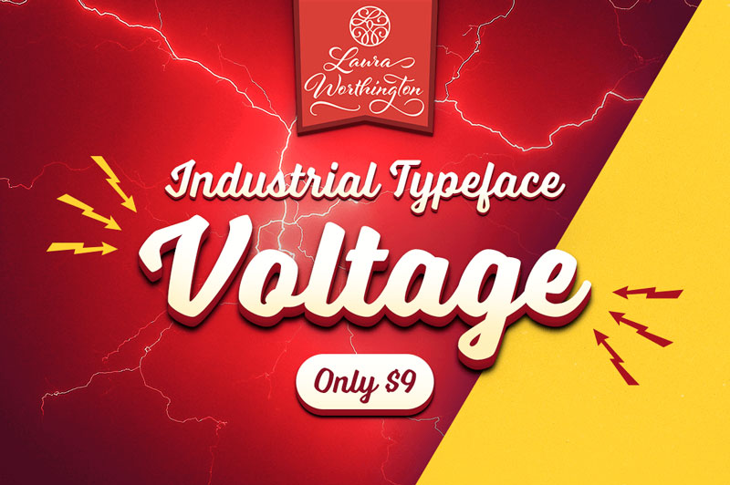
Reach back to the Industrial Age, full of big, bold words and cars! The Voltage Font Family by Laura Worthington offers up a practical typeface that’s both assertive yet down to earth. Loaded with hundreds of OpenType Features from swashes to ligatures, this is one charged-up font family that you won’t want to miss out on.
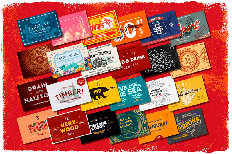
Looking to give your latest projects a bit of a boost? This Huge Graphic Pack is sure to please with more than 1500 professional design elements! You’ll get a wide variety of tools including backgrounds, logos, badges, textures, vintage illustrations and more from a slew of different themes ranging from arcs to food to nature.
109 Professional, Premium Fonts with Extended License
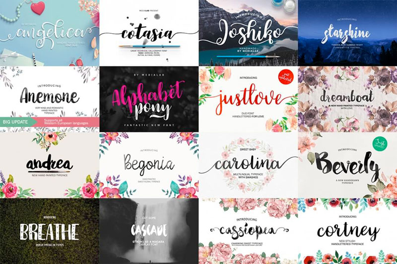
Your typeface toolbox is about to get a massive expansion. With this fabulous font bundle, you’ll get 109 typefaces in 75 unique font families, for 1 low price. With so much variety, you can work with virtually any client of yours, as well as pick up new ones. That means putting together everything from T-shirts to totes to invitations.
The logo is an important brand identity that represents the face of any brand. You should exercise great care in designing your brand logo since it gives the first impression about your company to your prospective customers. A logo is not merely a graphic design but a powerful asset and a meaningful visual representation of your brand.
A designer needs to be creative and experienced to come up with the perfect logo that matches the requirements of the customers. Here are some essential tips which need to be followed while designing your brand logo,
1. Preliminary Work and Brainstorming
Before you start doing the actual logo design, you should come up with some preliminary sketches and brainstorm different concepts which can illustrate the brand effectively. You can make vector based drafts using Illustrator or any other graphic design tools. You can also try traditional paper and pen drawings. You should first understand the brand and its values clearly and draw sketches that reflect the ideologies of the brand. You should sketch at least ten different ideas or concepts before you finalize something. Before you get started with preliminary work, you should do a thorough research about your client and their target audience so that you decide the appropriate design style.
2. Choose Meaningful Colours
When you design a logo, you should choose the colours very carefully since each colour has a unique meaning and implication. For instance, bold and bright colours will get the immediate attention of customers whereas muted tones or dull colours tend to be overlooked. There is an emotion associated with every colour, and it adds distinction to your logo. The psychological properties behind some commonly used colours are listed below:
Blue: Trustworthy, serene, professional, cool
Red: Bold and energetic
Yellow: Optimistic, sunny, creative
Green: Refreshment, balance, harmony
Pink: Feminine, love, sexy
Black: Sophistication, credible, security
Purple: Spiritual
White: Pure, Hygiene, Simple, Cleanliness
Brown: Seriousness, reliability, warmth
3. Focus on a Unique and Adaptable Design
You should come up with a simple and creative design which will appear good in all backgrounds and format. The design should be unique and not copied from any other brands. You should also remember the phrase “Keep It simple Stupid!” when designing your logo and try not to make it too complicated. Make sure the logo appears good in both multicolour and grayscale format as well. For example, if you consider the logo of tech giant Apple, it appears awesome in any format, irrespective of the colour scheme used. Also, you should make your design versatile such that it appears good on all branding materials whether its social media pages, t-shirts, posters etc. You should design the logo in such a way that it’s legible and appears beautiful at all sizes.
4. Dynamic and Flexible Design
Make sure your logo has a flexible and dynamic design so that it appeals to all categories of audiences and can be improved over time. If your design is rigid, then it means there is no scope of innovation or improvement at a later stage. Brands try to innovate and modernize their logo based on the current timeline which requires a dynamic design. Also, the design should be appealing to a diverse spectrum of customers with different tastes and preferences. Try to make your logo very simple and clear to the target audience. If your design is complicated, you will fail to engage your customers and make it difficult for them to identify your brand.
5. Come up with a Creative Story with a Unique Caption
Your logo should have a deeper meaning and a unique story to tell your target audience. A logo is not just a shallow piece of artwork, but it’s an insignia to symbolize the ideologies of your brand. A cool and mind-blowing logo should have an intriguing tagline that invokes a sense of curiosity about your brand to the target customers. Try to get inspirations from popular brands like Nike (“Just do it”) or Apple (“Think different”) and come up with short and catchy taglines.
6. Make use of Online Resources and Tools
There are many online tools available that make use of intelligent machine learning algorithms to design your brand’s logo instantly based on your requirements. Tailor Brands logo maker is a novel branding platform which can not only design your logo but also come up with all branding elements including social media pages, business cards and other promotional materials. Using an AI based Tailor Brands logo maker will help you minimize the cost and effort required for designing your brand’s logo. Tailor Brands platform can create unique and dynamic logos which present your brand in a meaningful way.
7. Use Custom Typography and fonts
Using customized fonts for your logo can give it a unique appeal. The logos of famous brands like “Coco-Cola” or “Disney” have stayed memorable in the minds of the people for so many years because of their unique and creative typography. As a professional designer, you can try creating custom hand-drawn fonts to add more beauty to your logo design. This will increase the brand’s appeal to the end users as they will be impressed with the unique design.
Consider the above tips to come up with a brilliant logo that can engage your target audience and represent your brand in a more meaningful way.
Agregator najlepszych postów o designie, webdesignie, cssie i Internecie