How to Create an 80s-Inspired Double Exposure Manipulation in Adobe Photoshop

Post pobrano z: How to Create an 80s-Inspired Double Exposure Manipulation in Adobe Photoshop
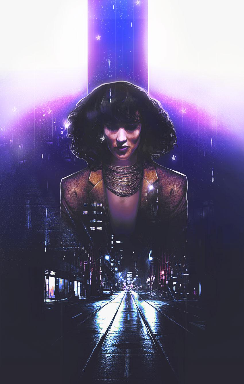
Final product image
What You’ll Be Creating

Here’s an ode to 80s power suits and supreme boss chicks. Learn how to create an epic 80s-inspired photo manipulation in Adobe Photoshop.

Today, I’ll cover how to style a person from scratch before adding cityscape images for an awesome double exposure effect.

Get inspired! Find more 80s-inspired effects on Envato Market.

Tutorial Assets

The following assets were used in the production of this tutorial:

Finding Retro Inspiration

Let’s take a look at the before and after. I love this part.

This manipulation combines a few of my favorite trends from the past
year. It mixes a double exposure effect with a 1980s vibe for a cool
movie-poster-like effect.

References and Inspiration

Pictures always shape the result! So make sure you pick photos that fit the vibe you’re trying to achieve. I was inspired by this simple Business Woman stock because she reminds of Jennifer Beals in the movie Flashdance.

And I just know we can do magic with that hair!

With that in mind, I’ve also gathered cityscape images to fit the retro 80s vibe because of their bright lights and neon colors. Always bookmark extra stocks for more variations.

Now for the tutorial! Let’s begin.

1. How to Style and Manipulate Your Subject

Step 1

Our subject seems a little distracted, so we’ll have to restyle the photo a bit for a fierce look. First, create a New Document at 1780 x 2800 pixels and 100 dpi.

Note: these dimensions are not traditional poster dimensions by any means (though it resembles a poster), so make sure you alter the numbers accordingly. 

Use the Magnetic Lasso Tool (L) to extract the subject from the photo. Copy and Paste it into your document, Free Transforming (Control-T) her body slightly to make it straighter.

Extract the subject

Step 2

For this next part, we want to create powerful, boss chick body language. Let’s make her shoulders more forward!

Fix her shoulders
  1. Use the Polygonal Lasso Tool (L) to create a selection around the right side of her suit. Since this side is the straighter of the two, we’ll use it to create stronger body language.
  2. Copy and Paste the right side of the suit onto its own New Layer. Then Control-J to Duplicate it. Flip the copy by going to Edit > Transform > Flip Horizontal.

Here is the result so far with the new shoulders in position.

Shoulder Result

Step 3

Continue to modify her suit and style.

Paint the skin
  1. Use the Rectangular Marquee Tool (M) to cut the top half of her body off, specifically the area right above her collar. We’ll need to insert a necklace here soon.
  2. Her
    blouse makes her look super corporate, so let’s add another realm of
    fierceness with some Grace Jones vibes! Create a New Layer below the suit layers and use a Hard Round Brush to paint tan #be9b84 below her neck. Use the Eraser Tool (E) at a low Opacity (10-20%) to erase the color for a subtle skin-like gradient.

Step 4

Let’s add that necklace!

Copy and Paste a selection of this Beaded Necklace onto the canvas.

Position it onto a New Layer above the skin before adding a Layer Mask. Mask away any remnants from the previous photo until there’s only the necklace left.

Don’t worry—we’ll fill any gaps left over later!

Mask the necklace

Step 5

Time for her curls!

Have fun with this step—it’ll add a lot of personality to the manipulation.

Make a selection of her hair using the Polygonal Lasso Tool (L). Copy and Paste this selection onto a New Layer. Resize her hair using the Free Transform Tool (Control-T).

Pull her hair wider and taller for voluminous 80s hair!

Resize the hair

For even more volume, consider using Liquify. Select the hair layer and go to Filter > Liquify. Use the Forward Warp Tool (W) to push her hair, stretching the curls out until it looks full and teased.

Liquify the hair

Here is the result when we’re through. Epic 80s hair!

Feel free to use a Layer Mask to feather out the edges.

Hair after liquify

Step 6

This next step is optional. So let me first say, there is nothing wrong with her face. I just want it to look more symmetrical.

To do this, we’ll first Copy and Paste a selection of the left side of her face onto a New Layer. Then Flip this side to mirror the other by going to Edit > Transform > Flip Horizontal. Use the Eraser Tool (E) to blend any harsh edges.

Flip the models face

2. How to Adjust the Skin

Step 1

Before we move on to the double exposure effect, let’s adjust the colors.

Create a New Layer and set it to Saturation. Use the Brush Tool (B) to paint a golden yellow color #b37f1a over the subject’s skin. This will make her appear more tanned. Lower the Opacity to 38%.

Tan the subject

Step 2

On another New Layer above the model, smooth out her skin with a Soft Round Brush.

Paint a light tan color #dd9364 over her skin to minimize the uneven light hitting her face.

Keep the brush Opacity low (15-30%) as well as the Hardness (0%) for the best result.

Smooth Her Skin Tone

3. How to Set Up the Graphic Elements

Step 1

Let’s start piecing together the rest of this scene!

Create a New Layer underneath the model.

Use the Rectangular Marquee Tool (M) to make a selection in the shape of a skinny rectangle above her head. Fill this section in with a light #959aa1 to medium gray #8b909a gradient using the Paint Bucket Tool (G).

This top bar will draw the focus to our subject for more drama.

Add the top bar

Step 2

Do the same for the bottom, this time creating a medium gray #383938 to dark gray #1c1e1d gradient.

Add the bottom bar

4. How to Create the Double Exposure Effect

Step 1

The magic of this manipulation is behind the double exposure look. We’ll be creating this by blending our two city photos together.

Let’s start with the first photo.

Add the first city
  1. Copy and Paste the City #1 stock onto a New Layer above all the others. 
  2. Set the Layer Blend Mode to Lighten. Add a Layer Mask to mask out the top portions with a Soft Round Brush.

Step 2

Control-J this layer to create a Duplicate. Set the Layer Blend Mode to Lighten.

Now turn it upside down. Go to Edit > Transform > Flip Vertical.

Position this copy layer (named „flip” below) higher than the other. Try to make some of the lights from the buildings blend into her hair. Adjust the Layer Mask accordingly.

Add the flipped city

Step 3

Now add the second city.

All we really need from this photo is a subtle hint of those bright red buildings.

So Copy and Paste the City #2 stock onto a New Layer above the others. Position it to align with the first city photo.

Set the Layer Blend Mode to Color Dodge, and then add a Layer Mask to mask out everything else besides the red buildings.

Add the second city photo

Continue experimenting with this method, add more bits of glittery city lights to her face as well as the top gray bar.

5. How to Blend All the Colors Together

I’ve tried to set up this tutorial in the order that would work best for this effect.

Some parts might look a little trippy at first, but these next steps will help bring all the colors of the manipulation together.

It’s a lot. But you’ll love it, I promise!

Step 1

Let’s start with the background.

Add the background colors
  1. Create a New Layer above the white background layer. Use the Gradient Tool (G) to create an upward-moving, gray #484847 to transparent Linear Gradient.
  2. Create another New Layer above the gradient. Use a Soft Round Brush to paint a blue #5674ae circle behind the model.

Step 2

Adjustment Layers are the best way to get cool results!

Add a New Adjustment Layer of Color Lookup above all the other layers in the panel.

Set the 3DLUT File to:

  • FoggyNight.3DL
Add a color lookup adjustment

Step 3

Create two New Layers above the Color Lookup layer.

Set the first one to Overlay. Create a white to transparent downward-moving Linear Gradient (30-50% Opacity).

On the layer above it, Fill it with purple #362f58 using the Paint Bucket Tool (G). Adjust the Opacity to 74% and set the Blend Mode to Lighten.

Adjust the colors with blend modes

Step 4

Time for more adjustments!

Add a New Adjustment Layer of Curves. Adjust the curves for the RGB, Blue, and Green Channels for a cool color effect. 

Curves adjustment layer

Step 5

Add a second Curves adjustment. This time, adjust the curves for the Blue and RGB Channels like the following ones below.

second curves adjustment

Follow up with a New Adjustment Layer for Levels.

Add the following values for the RGB and Blue Channels.

Blue Channel:

  • 0, 0.76, 162
  • 0, 255

RGB Channel:

  • 26, 0.84, 204
  • 21, 255
Levels adjustment

Here’s the result.

levels result

6. How to Add the Final Touches

Step 1

Ready to finish? Me too!

Create a New Layer above all the others. Set the Blend Mode to Hue and paint purple #1c083b across the top to recolor the yellow parts. 

This layer will also add some shadow to the bar, so play with the softness for more depth.

Paint purple for the top

Step 2

Add some color to the suit too! We’ll use Layer Styles.

Remember to keep some of your layers separated. Right-click the right suit layer and go to Blending Options. Add a yellow #ffbb35 Color Overlay and black Satin Effect with the following settings.

Add layer styles ot the suit

Recreate this easily on the left side! Simply Right-click the right suit layer and go to Copy Layer Style. Then Paste this style onto the left layer.

Here’s the result below.

Color the suit yellow

Step 3

Take some time to add crisp white highlights to the edges of the model and top bar.

Use a tapered Hard Round Brush to create the backlight, and then add some vertical lines in varying Opacities for a surreal look.

Add white highlights

Step 4

Continue the highlights onto her hair and suit.

I love adding texture! Use this Star Brush from our essential Photoshop Brush pack to create tiny areas of grainy white texture which blend into the rest of the composition.

Get creative! Draw some fun stars by hand for a cool graphic effect!

Draw stars and texture

Step 5

Almost there!

Add some beautiful glow to the manipulation.

Create a New Layer and set it to Overlay. Use a Soft Round Brush to paint soft yellow #e6d98f onto the model’s hair and suit. Paint some yellow onto the white background for a beautiful effect too!

Add glow to the composition

Finish with a New Adjustment Layer for Gradient Map.

Use the Gold-Copper preset, and then set the Layer Blend Mode to Luminosity and the Opacity to 40%.

Add a gold copper gradient map

Check out the final result below!

7. How to Add a Quick 80s Text Effect

Turn this look into an epic 80s movie poster with a quick text effect! Just download one of the many amazing premade text effects from Envato Elements.

Here, I used the third file from this 80s Text Effect Volume 1 package.

Extract the text effect

Merge only the text layers together before extracting and inserting your title into the manipulation.

Check out this alternate version below!

Alternate with text effect

All Done, Great Job!

Photo manipulations help us learn how to use Photoshop in new ways. Continue creating beautiful effects inspired by your favorite retro styles!

I hope you’ve enjoyed this tutorial! Feel free to add your comments and share your results with us below.

For more fun photo manipulations, check out these great tutorials:

80s Double Exposure Photoshop Manipulation by Melody Nieves

Fragmented HTML5 Video

Post pobrano z: Fragmented HTML5 Video

I have seen various implementations of the Voronoi Diagram. Perhaps you’ve seen one without knowing what it was. It almost looks like random stained glass:

Wikipedia:

In mathematics, a Voronoi diagram is a partitioning of a plane into regions based on distance to points in a specific subset of the plane.

It’s even possible to create a Voronoi diagram by hand, as eLVirus88 has documented.

I wanted to give it a try.

The Idea

My idea is to chop up a video into fragmented parts (called cells) and put them into 3D space on a slightly different z-axis. Then, by moving the mouse, you would rotate the whole experience so you would see the cells in different depths.

The Code

Building on top of Raymond Hill’s and Larix Kortbeek’s JavaScript implementation, the first thing I needed to was split up the cells.

I choose to use the <canvas> element, and put each of the cells on different canvas on a differnet 3D plane through CSS.

The Voronoi library takes care of computing all the sites to cells and creating objects with the vertices and edges for us to work with.

Cells to Canvases

First we create the canvases to match the number of Voronoi cells. These will be rendered to the DOM. The canvases and their respective contexts will be saved to an array.

var canv = document.createElement('canvas');
    
canv.id = 'mirror-'+i;
canv.width = canvasWidth;
canv.height = canvasHeight;

// Append to DOM
document.body.appendChild(canv);
document.getElementById('container-mirrors').appendChild(canv);

// Push to array
canvasArray.push(canv);
contextArray.push(canv.getContext('2d'));

Masking

All of the canvases are now a copy of the video.

The desired effect is to show one cell per canvas. The Voronoi library provides us with a compute function. When providing the sites with the bounds we get a detailed object where we extract all of the cells edges. These will be used to create a cut out to each section using the globalCompositeOperation.

// Compute
diagram = voronoi.compute(sites, bounds);

// Find cell
for (i=0;i<sites.length;i++) {
  if (!found) {
    cell = diagram.cells[i];
if (sites[j].voronoiId === cell.site.voronoiId) {
      found = 1;
    }
  }
}

// Create mask to only show the current cell
ctx.globalCompositeOperation = 'destination-in';
ctx.globalAlpha = 1;

ctx.beginPath();

var halfedges = cell.halfedges,
nHalfedges = halfedges.length,
v = halfedges[0].getStartpoint();

ctx.moveTo(v.x,v.y);

for (var iHalfedge=0; iHalfedge<nHalfedges; iHalfedge++) {
  v = halfedges[iHalfedge].getEndpoint();
  ctx.lineTo(v.x,v.y);
}

ctx.fillStyle = sites[j].c;
ctx.fill();

Adding Video

Displaying video to the canvas only takes a couple of lines of code. This will be executed on requestAnimationFrame:

v = document.getElementById('video');
ctx.drawImage(v,0,0,960,540);

It’s also possible to use a video input source (like a webcam), but I didn’t like the result as much for this demo. If you would like to know how to use the webcam to draw to canvas using the getUserMedia() method you can read about it here.

To optimise video drawing performance skip a few frames in between the requestAnimationFrame. Videos for the web are usually encoded with a frame rate not higher than 30 fps.

See the Pen Fragmented HTML5 Video – Demo 1 by virgilspruit (@Virgilspruit) on CodePen.

Conclusion

Demos like this are my favorite things to do. Seeing what’s out there and adding your own layer of interactivity to it. I’m looking forward to seeing what other people will be doing with this nice visual algorithm.

See the Pen Fragmented HTML5 Video – Demo 2 by virgilspruit (@Virgilspruit) on CodePen.

See the Pen Fragmented HTML5 Video – Demo 3 by virgilspruit (@Virgilspruit) on CodePen.

View Demos GitHub Repo


Fragmented HTML5 Video is a post from CSS-Tricks

Further working mode changes at WHATWG

Post pobrano z: Further working mode changes at WHATWG

The Web Hypertext Application Technology Working Group (WHATWG) announced that it has adopted a formal governance structure:

The WHATWG has operated successfully since 2004 with no formal governance structure, guided by a strong culture of pragmatism and collaboration. Although this has worked well for driving the web forward, we realized that we could get broader participation by being clear about what rights and responsibilities members of the community have. Concretely, this involves creating an IPR Policy and governance structure.

WHATWG was founded by folks at Apple, Mozilla and Opera. The new structure will be comprised of individuals from Apple, Google, Microsoft and Mozilla. The Big Four, you might say.

I find this interesting because we often think of the Web as a wild west where standards are always evolving and adopted at a different pace. This change largely keeps public contributions to the Living Standards in tact, but establishes a clearer line of communication between working groups and provides a path to appeal and resolve disputes over standards.

Living Standards are informed by input from contributors, driven by workstream participants, articulated by editors, and coordinated by the Steering Group. If necessary, controversies are resolved by the Steering Group with members appointed from the organizations that develop browser engines.

And, with representatives from leading browsers at the table, we may see more agreement with adoption. I’m speculating here, but it seems reasonable.
If you’re like me and are fuzzy on the differences between WHATWG and W3C, Bruce Lawson has a pretty simple explanation. It still kinda blows my mind that they’re both standards we often refer to but come from two completely different groups.
Direct Link to ArticlePermalink


Further working mode changes at WHATWG is a post from CSS-Tricks

Refactoring Your Way to a Design System

Post pobrano z: Refactoring Your Way to a Design System

Mina Markham on refactoring a large and complex codebase into an agile design system, slowly over time:

If you’re not lucky enough to be able to start a new design system from scratch, you can start small and work on a single feature or component. With each new project comes a new opportunity to flesh out a new part of the system, and another potential case study to secure buy-in and showcase its value. Make sure to carefully and thoroughly document each new portion of the system as it’s built. After a few projects, you’ll find yourself with a decent start to a design system.

As a side note, Mina’s point here also reminds me of an old blog post called „Things You Should Never Do” by Joel Spolsky where he talks about how all this work and all this code you feel you needs to be refactored is actually solving a problem. Deleting everything and starting from scratch is almost never a good idea:

When you throw away code and start from scratch, you are throwing away all that knowledge. All those collected bug fixes. Years of programming work.

I’m not entirely sure that Joel’s piece about programming fits snuggly with Mina’s point but I think it’s an interesting one to make nonetheless: new code doesn’t necessarily mean that it’s better.

Direct Link to ArticlePermalink


Refactoring Your Way to a Design System is a post from CSS-Tricks

Design deals for the week

Post pobrano z: Design deals for the week

Every week, we’ll give you an overview of the best deals for designers, make sure you don’t miss any by subscribing to our deals feed. You can also follow the recently launched website Type Deals if you are looking for free fonts or font deals.

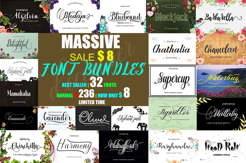
December massive font bundle

This package contains 32 Font Scripts,brush & font regular. Includes some best-selling fonts. Harmony Script, Lavender Script, Barbarella Script, Bluebonnet Script, Chameleon Script, Commando Dll Script & regular, with hundreds of glyphs, including alternates, ligatures, swashes, contextual alternatives and international language support. It can be accessed by using OpenType smart programs like Adobe Illustrator, Adobe InDesign, CorelDraw X6-X7, Microsoft Word.

$4 instead of $236 – Get it now!

Bulk Update Your Posts, Pages and Products with Just a Spreadsheet

Whether you run a WooCommerce website or have tons of posts on a WordPress platform, you know how frustratingly slow it can be to update information. What if prices change by 10%? What if you want to add the same text or photo to every single post? Well now you can do it all in a snap thanks to Sheet Editor! Easily create, customize and edit your posts, pages and product in bulk all through a simple spreadsheet.

$9 instead of $19.99 – Get it now!

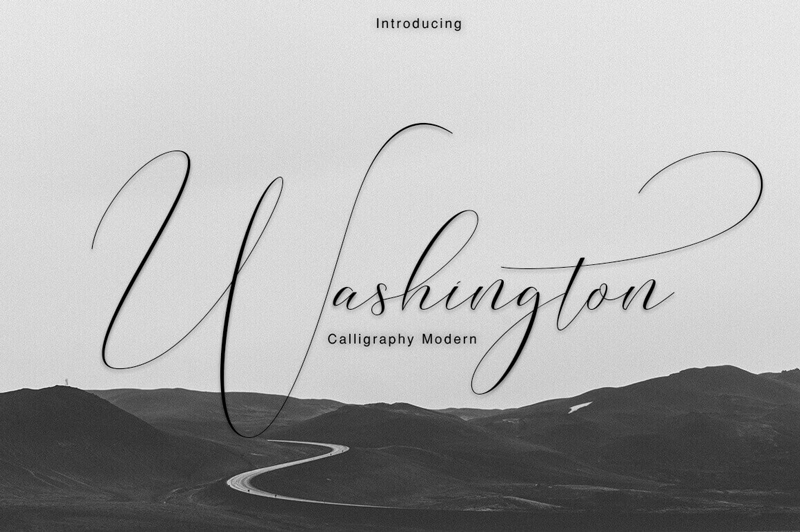
Professional Washington Calligraphy Modern with 450+ Glyphs

You don’t need to be a Founding Father to use this elegant and professional typeface. But you’ll certainly feel like one! The Washington Calligraphy Modern Typeface is an incredibly elegant font that practically flows off the end of a calligraphy pen. Packed with more than 450 glyphs, multi-lingual support and extras from swashes to ligatures, you can practically feel the power flowing out of this font.

$9 instead of $22 – Get it now!

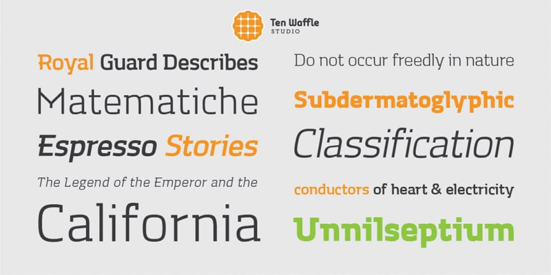
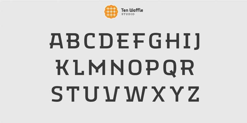
TWS Mora: A Modern Font Family

If you’re in need of a modern, display slab font family, you’ve come to the right place. The TWS Mora font family is as flexible as it is multifaceted, mixing up geometric shapes with humanistic strokes. It’s the perfect choice to use for projects centered around classical literature, music and other creativity.

$9 instead of $54.99 – Get it now!

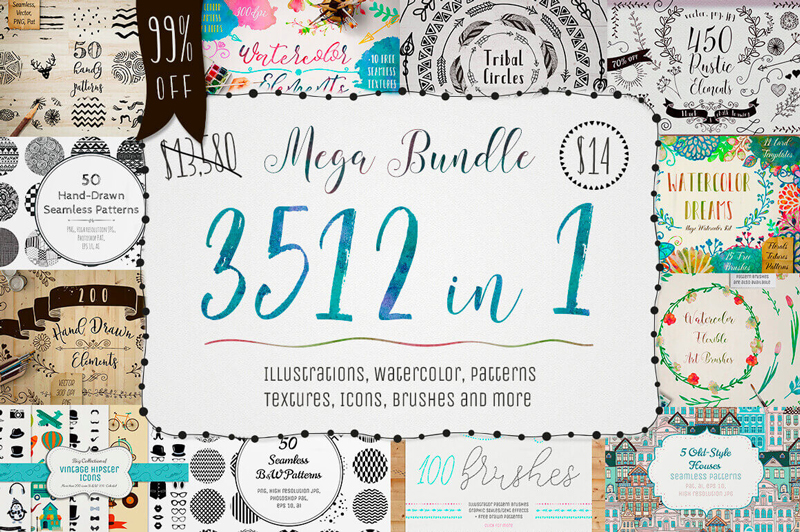
3500+ Textures, Brushes, Icons, Watercolors & More Graphic Elements

Designers are always looking for more. More graphics. More textures. More brushes. Well, with this Mega Bundle of a Mighty Deal, you’ll get all that and more! Packed with more than 3,500 professional graphic elements, you’ll get everything from patterns to textures to brushes to icons. No matter your latest project, you’re sure to find some new design elements in this bundle that fit the bill perfectly for you.

$14 instead of $13,580 – Get it now!

Photoshop in 60 Seconds: Brush Panel—A Look at the New 2018 Update

Post pobrano z: Photoshop in 60 Seconds: Brush Panel—A Look at the New 2018 Update

Get updated on the latest features to Adobe Photoshop. Check out the quick video below.

If you’re looking for amazing premium Photoshop brushes, head on over to GraphicRiver.

Photoshop in 60 Seconds: Brush Panel

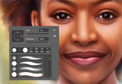
Adobe recently unveiled a suite of new additions to Creative Cloud for 2018. Today, we’ll go over a few of the latest updates dedicated to Photoshop’s Brush panel.

Check out this quick video below to see a few of the new features explained, like folders for custom brushes and so much more!

Photoshop’s Brush Panel Features for 2018

Here are a few of the new features now available for the Brush panel in Adobe Photoshop.

Brush Management and Setup

You can now drag and drop any brush preset to a new location. Easily toggle different views to understand which brush you’re using and see additional settings like the Brush Tip, Stroke, and Name for a better workflow.

Brush Management

Importing Brushes

Photoshop has also made it easier to download and install brushes! Choose the Get More Brushes option from the flyout menu to use awesome brushes from Adobe’s acquisition of illustrator Kyle Webster’s brush packs. Once you’ve downloaded a pack, just click on the ABR file while Photoshop is still running to use it right away.

Importing Brushes in Photoshop CC

Stroke Smoothing

Photoshop now has advanced Stroke Smoothing to help artists and designers avoid jittery strokes. Enable different modes by clicking the gear icon, and experiment with the Smoothing value for the best results.

Stroke Smoothing

Learn More With Our Tutorials!

Inspired to learn more about Photoshop brushes? Start with one of our
tutorials! Continue to grow your skills over time with easy to follow lessons.

Check out these tutorials to learn more from our experts:

How to Draw a Deer Step by Step

Post pobrano z: How to Draw a Deer Step by Step

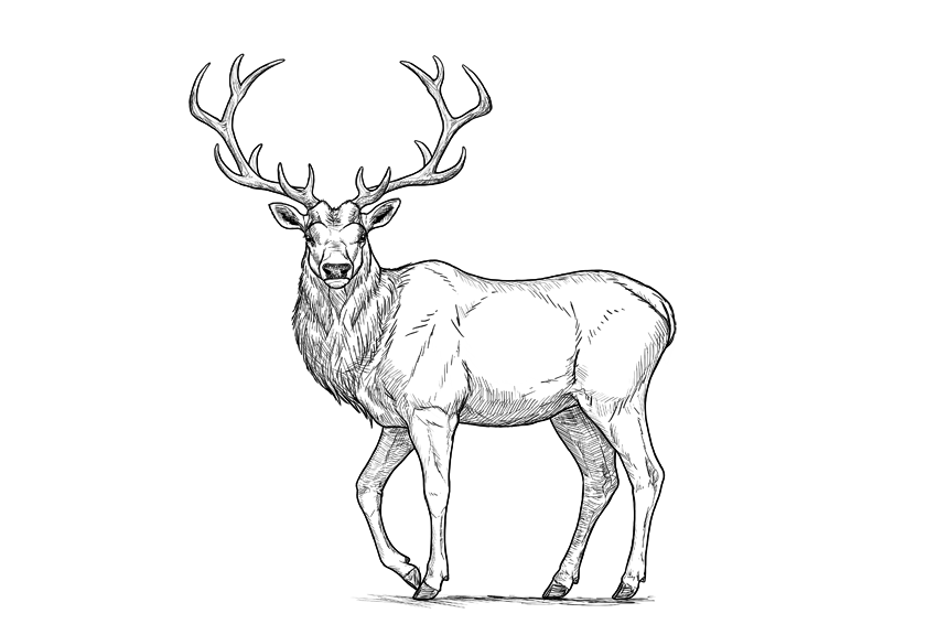
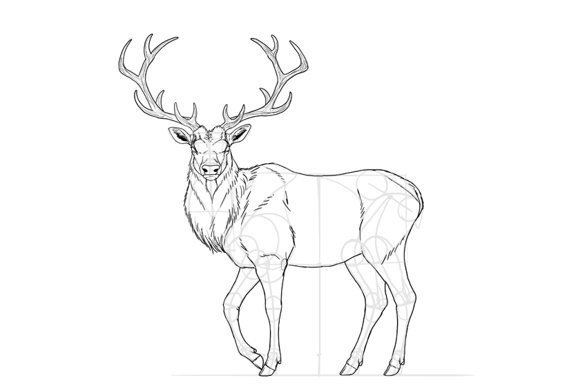
Final product image
What You’ll Be Creating

For me, a deer is the symbol of autumn—the time when the males of this timid species turn into the real kings of the forest, with a crown of antlers on their heads. Of all the deer species, my favorite is the red deer—not as big as a moose, but more regal looking. 

In this tutorial, I will show you how to draw such a deer step by step: from the sketch, torso, legs, and details of the head to a pair of beautiful antlers.

This is a simple tutorial about how to draw a deer. If you want to learn more about deer anatomy and various species, you’ll be interested in the tutorial below:

1. How to Sketch a Deer

The biggest problem with drawing real things is that it’s very easy to lose proportions. To avoid such a mistake, we need to plan the body before adding any details. Such a plan should be sketched lightly, so that you can fix anything after you finish it.

Step 1

Draw a rectangle. This will be the torso of our deer.

base body rectangle

Step 2

Measure the distance to the ground. It should be slightly longer than the width of the torso.

distance between bpdy and ground

Step 3

Find the points where the limbs start.

limbs slots in body

Step 4

Sketch the limbs.

simplified deer legs

Step 5

To add a realistic form of the chest, add a circle to the lower left corner of the rectangle.

simplified deer sternum

Step 6

Add an oval to the front of the rectangle. This is the simplified form of the rotated neck.

simplified deer neck rotated

Step 7

Sketch the neck.

deer neck length

Step 8

Add the head on top of the neck.

deer head simplified shape

Step 9

Add the muzzle to the head.

deer muzzle simplified shape

Step 10

Add the direction of the ears…

deer ears length and direction

… and their general shape.

deer ears simplified shape

Step 11

Sketch the antlers step by step:

deer antlers how to start
deer antlers basic shape
elk antlers how to draw
simplified deer antlers

2. How to Draw the Legs of a Deer

Once you have the sketch, take a good look at it and see if you got the proportions correct. If not, this is the last moment to fix them!

Step 1

The forequarters of many animals can be drawn with a „6” shape, which includes both the shoulder area and the shoulder blade. Draw it for both front legs.

deer forequarters
deer shoulders drawing

Step 2

Sketch the top of the shoulder blade.

deer shoulder blade

Step 3

Close the whole shoulder area.

deer shoulder area

Step 4

Sketch the hips.

deer simplified hips

Step 5

Add a circle in the knee area.

deer simplified knees

Step 6

The main muscle mass of the thigh can be created by outlining the knee, the hip joint, and the back of the hip.

deer thigh shape

Step 7

Add the rest of the thigh by connecting the big muscle mass to the other end of the hip.

deer complete thigh shape

Step 8

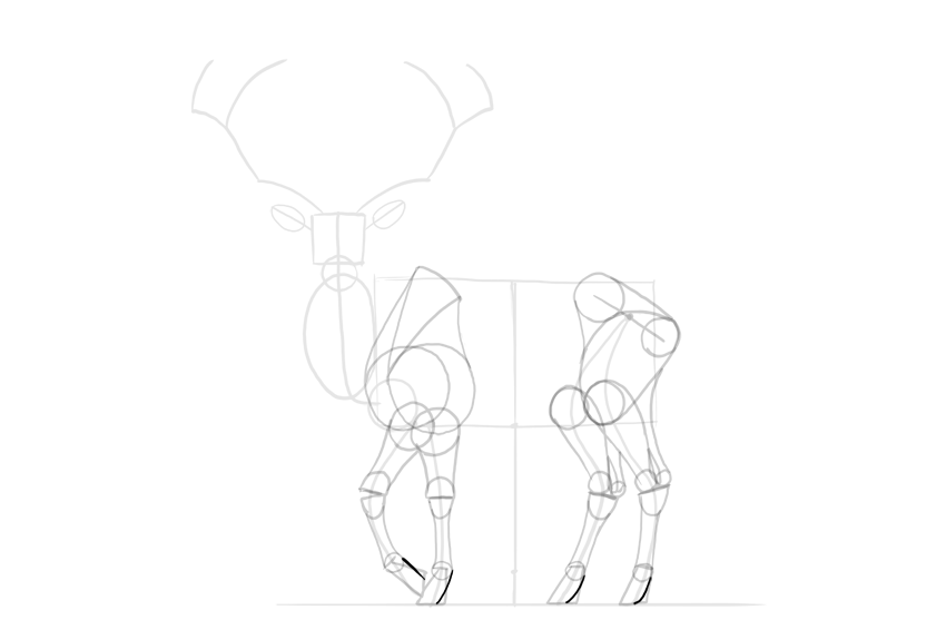
Mark the wrist/ankle area at around 60% of the limb’s length.

deer legs proportions

Step 9

Mark the hoof at about one-third of the length below the wrist/ankle.

deer hooves proportions

Step 10

Draw the circle in the joint right above each hoof. It should be quite small.

deer hooves base

Step 11

Sketch a general shape of the hoof. This trick can be useful for drawing horses as well.

deer simplified hooves

Step 12

Draw the simplified shapes of the joints. The lower legs of hoofed animals are not very muscular, so the form of the bones should be accentuated instead.

deer leg joints simplified

Step 13

Add muscle forms to the forearms and calves.

deer simplified muscle masses
deer simplified calves

Step 14

Draw the characteristic space under the Achilles tendon.

deer achilles tendon

Step 15

Outline the whole legs. Keep the parts below the wrist/ankle thinner than the ones above.

deer simplified leg outline

Step 16

Finish the shape of the hooves.

deer hooves detailed shape
deer hooves shape complete

Step 17

Deer are even-toed ungulates, and they have four toes—two make the actual hoof, and two are hanging in the back.

deer hooves four toes
deer back toes

3. How to Draw the Head and Antlers of a Deer

Step 1

Divide the head into thirds.

deer face proportions

Step 2

Attach two ovals to the sides, within the middle third.

deer eye sockets

Step 3

Draw a smaller oval inside, close to the outer edge of the bigger one.

deer eyes proportions

Step 4

Draw a line at about a third of the mouth.

deer mouth proportion

Step 5

Outline the chin and the nose.

deer chin
deer nose shape

Step 6

Add the nose holes.

deer nose holes

Step 7

Outline the whole head.

deer muzzle shape
deer jaw shape

Step 8

Draw two circles to create a base for the ears.

deer ear base

Step 9

Connect the ears to the head by outlining their base.

deer detailed ear shape

Step 10

Add circles for the base of the antlers.

deer antlers base

Step 11

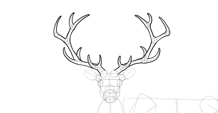
Mark all the points where you want the antlers to branch out.

deer antlers branching

Step 12

Sketch the „branches”.

deer antlers sketch

Step 13

Add a circle at every branching. This will help you achieve the right thickness of the antlers.

deer antlers thickness

Step 14

Outline the antlers.

deer antlers outline

4. How to Draw the Torso of a Deer

Step 1

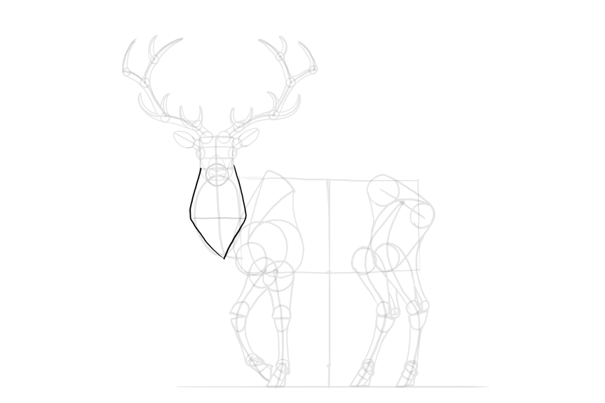
Cross the neck with a line to find its width.

deer neck width

Step 2

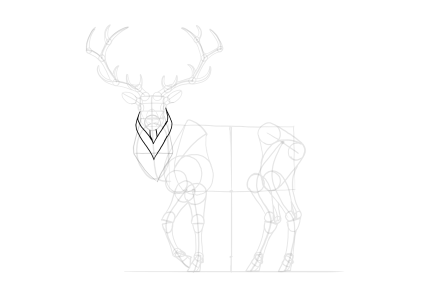
Outline the neck, creating a diamond shape for the mane.

deer neck mane

Step 3

Add more layers to the mane.

deer detailed mane

Step 4

The spine of the deer reaches higher than the shoulder blade. Sketch the characteristic „hump” made by it.

deer back hump

Step 5

Finish the neck.

deer detailed neck
deer detailed torso

Step 6

Outline the whole torso.

deer torso shape

Step 7

Add the details.

deer tail

5. How to Finish a Drawing of a Deer

The sketch is finished, so now we can add the final lines. If you’re drawing traditionally, it’s good to use a darker tool now (for example, an ink liner will nicely cover the pencil strokes), or to place a new sheet of paper on the sketch and draw the final lines on it.

Step 1

Sketch the bulging „eyebrows” of the deer.

deer grumpy face

Step 2

Draw the eyes with all the details.

how to draw deer eyes

Step 3

Draw the nose.

how to draw deer nose

Step 4

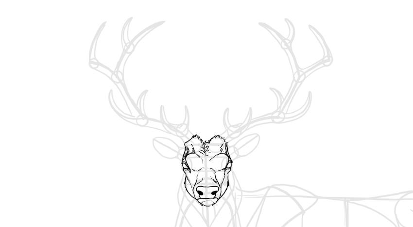
Outline the whole head. Not all lines should be outlined continuously—sketch them with short lines to simulate hair.

how to draw deer head

Step 5

Outline the ears. The darkness inside will make them look fluffy.

how to draw deer ears

Step 6

Outline the antlers and add some texture to them.

how to draw deer antlers

Step 7

Outline the mane.

how to draw deer mane

Step 8

Outline the whole body.

how to draw deer silhouette

Step 9

You can add some details to accentuate the anatomy of the deer.

how to draw deer body details

Step 10

Darken the eyes, nose, and hooves.

how to draw a detailed deer

Step 11

Finally, you can outline the whole animal with a darker stroke, and shade it in a simple way using hatching.

how to shade deer

Good Job!

Did you like this tutorial? You may also enjoy other animal-themed tutorials of ours:

Or you may want to check out other deer-related tutorials: