Every week, we’ll give you an overview of the best deals for designers, make sure you don’t miss any by subscribing to our deals feed. You can also follow the recently launched website Type Deals if you are looking for free fonts or font deals.
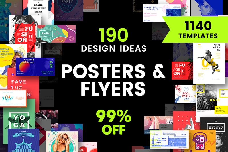
Poster and Flyer Design Templates Bundle
Too busy to design on your own? Use our templates bundle to choose a perfect design for poster or flyer. It contains 190 visual concepts, each with 2 poster and 4 flyer formats ‒ 1140 templates total.
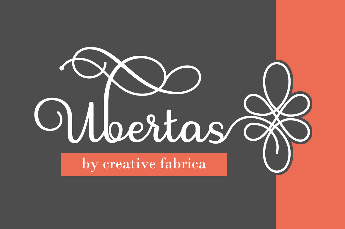
800+ Unique Characters in Stunning Ubertas Script Font
Let the fonts flow with this beautiful Mighty Deal featuring the stunning Ubertas Script font. With curves in all the right places, this terrific typeface includes more than 800 characters, plenty of alternates and offers a regular and italics version.
StockPop’s Mega Stock Bundle of 20,000+ Stock Photos, Videos, Audio & More
Cast aside your licensing fears! With this Mega Stock Bundle from StockPop, you’ll instantly have yourself a royalty and copyright free library packed with over 20,000 premium stock photos, videos, background audio and more. From food to flowers you’ll have a ridiculous amount of categories to search through in order to beef up your latest project.
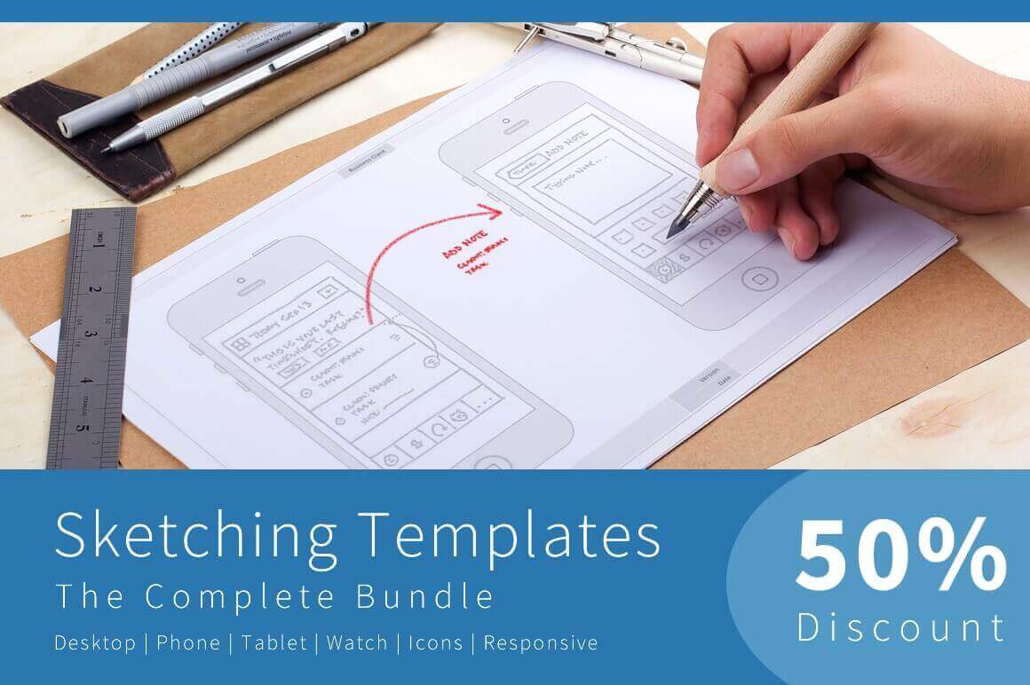
Sketching Templates Bundle of 8 Unique Design Contexts
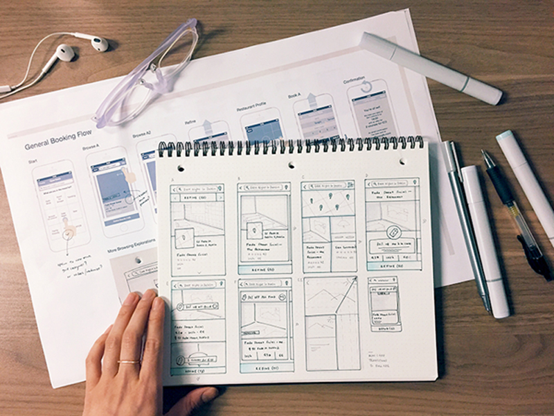
Sometimes you just need to sketch out your ideas. Now with this professional Sketching Templates Bundle, you can easily dive right in to start generating ideas for your newest app or website. Featuring multiple guide types, you can choose from 8 different designs that range from phones to tablets to watches, as you jot down your ideas. Stop wasting time drawing and redrawing the same device over and over again. Instead, just hit the ground running with your ideas!
Design can reach the peak of its efficiency when combined with excellent knowledge of psychology. Designers often rely on people’s reaction to different visual incentives in order to take the most of their designs.
As you can notice, the psychology applied is very basic and it doesn’t require you to be an expert in order to use its techniques. In fact, there are few basic guidelines and psychology principles which every designer should use to improve the effectiveness of his design.
Human reaction to visual stimuli is significantly more connected to the subconscious thoughts than it is to the conscious ones. Interestingly enough, it is very predictable. Designers should understand people’s perception and to anticipate the reactions they might have.
Still, don’t worry if you don’t have the appropriate psychology or human factors training. With practice and experience, you will soon be able to distinguish which is the best design and to become a professional interface designer.
We suggest some outstanding examples for improving user experience, applicable for both software and hardware.
Contemplative Listening
Contemplative listening may as well be the most applied psychological principle in UX. It is a straightforward but gradual process of reflective attention, where designers focus on the needs of their customers and they reflect them back to prove they’ve understood them.
Observed from a psychological aspect, the procedure builds empathy, where the listener is focused on clarifying what has been said, while the orator starts feeling validated and free from any judgmental interruption.
With the improvement of their interaction, parties invest more and more trust into each other and they develop meaningful conclusions, which could not be reached otherwise.
Human Reaction
Reactions are emotional products which are created in the central nervous system. They originate subconsciously, and they influence our actions in a manner which can hardly be controlled.
As self-aware and concentrated as you may think you are, you are still a human being. It is also time to let go of that cognition prejudice that there is a ‘higher force’ that can control and plan all of our actions and reactions.
According to modern psychology, a large part of our behavior is dominated by the so-called ‘old brain’, namely our survival instincts. This part of our mind is faster than any logical or conscious thinking and it takes the lead in every basic need we might have (food, reproduction, danger). In such situations, the brain triggers our ‘visceral reactions’ and we react in a fast and unexpected manner.
An overview of costs and benefits
We might be far ahead than our nomadic ancestors in many aspects, but we reflect a large part of their behavior. Even when our mind is dealing with a completely normal task, we are subconsciously calculating the energy we would need to perform it, the time or the worthiness of its results.
In the online world, this means that energy-inefficient or low-reward tasks are quite unlikely to be performed. Take the example of form and its meaning: large forms take time and energy, while short ones are easy to fulfill.
In order to fulfill the long form and to do it properly, users would expect a valuable reward. Even if the reward is the actual information they were looking for, users may not find it valuable enough and they may turn to another site where the procedure is simpler.
The role of Hick’s law in design for human behavior
Hick’s Law must be applied when talking about costs and benefits. Firstly, if you give your users larger lists of possibilities to choose from (pages, images, texts, etc), you are automatically wasting more of their energy.
That energy waste grows and grows to a point where a user cannot really estimate the benefit of complying with your requirements.
Psychology can solve this problem too-you can apply simple psychology principles and you will estimate how people will react to every aspect of your design.
Device inertia
As we already explained, the reason for users’ apathy towards an item/service is that their cost will be higher than their benefit.
Switching devices is a very good example which can explain this-replacing your current screen with a bigger one may seem a good idea at first (larger pictures, better comparisons), but at the same time you would have to approach a different device, do a navigation to the desired site, and do the same search all over again.
Yes, it sounds like a waste of time. This is exactly when users start experiencing device inertia.
Assuming that the user did a detailed calculation between energy and time expenditure, and the ones he would have saved, and the result would be standing in favor of the optimal device with better quality, he would move and he would use it for a longer time.
However, the calculation would most probably stand in support of the current device, and he would stay had there been only one more interaction.
The reason is that people are prone to short-term planning. Their tendency is to go step by step, avoiding the risk of taking more than a single step ahead.
Behavior and the feeling of power
Let me use a personal example to explain this connection – I have a friend who is very intelligent and never lazy. Still, she holds tight to suboptimal online methods that she had established herself, and she is not willing to change them. Here is why:
She was the one to discover the methods first.
It hasn’t crossed her mind that there is software which can make the accomplishment of her tasks easier and simpler.
She is satisfied with her methods and she thinks they are good enough.
Psychology calls this state momentum behavior. It usually occurs when people decide to stick to a familiar option, instead of looking for something new that could actually help them. Down that road, they become used and loyal to those methods and they deny any other interface element.
‘Picky’ attention
Face it – not every element you put on the screen will be noticed. In fact, due to the design type, the particular situation or the user’s preferences, most of the elements will be ignored.
But is this good or bad for your user? Firstly, picky attention is a result of our cost/benefit calculations and it is directly dictated by our nature and the process of evolution. When people are overwhelmed with incentives, they are mentally unable to pay equal attention to all of them.
Take a Manhattan street as an example – if you could pay the same attention to stylish people’s outfits, or the unpleasant smell of garbage containers as you pay to traffic, you’d probably end up under the wheels of some rushing car.
People are ‘programmed’ in a way to pay attention to the most important incentives and to ignore those which are less interesting or menacing to their wellbeing.
Design for human behavior: Solutions
It is a designer’s obligation to help his users to stay focused and to derogate from device inertia, momentum behavior or picky attention. These are the strategies that could help:
Choose the important tasks and the important devices and focus on them. If you don’t know which ones, search for the most commonly used.
Don’t expect your users to switch devices in order to perform a specific task.
Make sure that your users have no problems when syncing information throughout various platforms. Make it really easy for them to resume or restore the work done on a particular device when they start using another one.
Take behavioral research seriously. Analyze the way in which people perform tasks and make sure to implement the most reliable/usable one.
Refrain from you think is an important UI element. You might be considering including advertisements or similar content, but you need to make sure it is not exactly the thing your users would ignore.
Most of all, avoid blaming your ‘lazy’ users for the failure of your design solutions. If they are not applying it, it may not be as good as you thought.
The way people think nowadays is a product of long evolution, and users are not very likely to change their mental resources just because your app requires them to act differently. Learn the basics of designing apps and start from there.
The effect of expectations
The moment when you are introducing a new product to a particular target group is the moment when people will be most susceptible in terms of being convinced to go for it. Therefore, you have to ‘touch’ their needs and emotions with clear illustrations and credibility statements.
Looking at the iPad and its first releases, the producers were faced with extreme levels of expectations and they still managed to communicate properly and to release products which were clearly synchronized with those expectations.
You may be really convinced of the quality of your product, but checking their videos and rethinking your persuasion methods may still help you.
The mental model
Interface design and improving user experience consist of two separate models: Systematic models (explaining the system’s operation) and interaction models (explaining the way in which people interact with that system).
United, these models create the so-called mental model which ought to be ‘absorbed’ by the users. The user can either approve or refuse the model, using his previous experience with digital products. What you need to ensure is that your model will comply with their interpretation of your design.
Long story short, the model needs to be an effective combination of system and interaction, which looks like something efficient, which could satisfy the needs of users.
Preference or performance?
The most common mistake of designers and businessmen is that they believe that users’ affection to a certain product automatically means that the product is efficient and ensures excellent performance.
People are not really able to distinguish between the product they want to purchase and the product that could really improve their abilities by using it. Unfortunately, they often make poor choices of products that are not really helpful. The main problem is that they remain unable to compare and to understand their mistake.
The most appropriate tactic to determine whether a user is really satisfied with a product is to observe the way he is using it. Obviously, you are not supposed to make surveys and interviews, but to remain on the side and to monitor the interaction.
You should pay attention to their results, rather than their approach, and to decide how your product could benefit from it. As simple as it sounds, this is a tactic employed by the best products and outstanding producers-they made a solid, well-informed decision.
Final thoughts
What could be more useful for a successful design than a proper understanding of its potential users?
Each psychology principle shouldn’t be implemented in web design, but the proper understanding of a set of important concepts could be the shortcut to outstanding results.
Therefore, keep users’ mind in your mind. Make sure there is a balance between your product and their mindset and learn everything about it.
Chile is building a brand new solar power plant that has some exciting outcome on the future. The plant is expected to provide energy on day and night as well as throughout inclement weather, to power up to 13,000 homes annually. This project will make Chile one of the top solar energy spots in the world.
It is a clear sign that energy storage on large scale projects is developing further with a range of large batteries networks being developed this year within California and Australia. Clean energy expects truly value the energy storage industry and expect it to become even more significant as further renewable energy sites are constructed worldwide.
This presentation by Miriam at DjangoCon US last summer is not only well done, but an insightful look at the current and future direction of CSS layout tools.
Many of us are familiar with Susy, the roll-your-own Grid system Miriam developed. We published a deep-dive on Susy a few years back to illustrate how easy it makes defining custom grid lines without the same pre-defined measures included in other CSS frameworks, like Foundation or Bootstrap. It really was (and is) a nice tool.
To watch Miriam give a talk that discourages using frameworks—even her very own—is a massive endorsement of more recent CSS developments, like Flexbox and Grid. Her talk feels even more relevant today than it was a few months ago in light of Eric Meyer’s recent post on the declining complexity of CSS.
Yes, today’s CSS toolkit feels more robust and the pace of development seems to have increased in recent years. But with it come new standards that replace the hacks we’ve grown accustomed to and, as a result, our beloved language becomes less complicated and less reliant on dependencies to make it do what we want.
Popular image file formats such as JPG, PNG, and GIF have been around for a long time. They are relatively efficient and web developers have introduced many optimization solutions to further compress their size. However, the era of JPGs, PNGs, and GIFs may be coming to an end as newer, more efficient image file formats aim to take their place.
We’re going to explore these newer file formats in this post along with an analysis of how they stack up against one another and the previous formats. We will also cover optimization techniques to improve the delivery of your images.
Why do we need new image formats at all?
Aside from image quality, the most noticeable difference between older and newer image formats is file size. New formats use algorithms that are more efficient at compressing data, so the file sizes can be much smaller. In the context of web development, smaller files mean faster load times, which translates into lower bounce rates, more traffic, and more conversions. All good things that weoftenpreach.
As with most technological innovations, the rollout of new image formats will be gradual as browsers consider and adopt their standards. In the meantime, we as web developers will have to accommodate users with varying levels of support. Thankfully, Can I Use is already on top of that and reporting on browser support for specific image formats.
The New Stuff
As we wander into a new frontier of image file formats, we’ll have lots of format choices. Here are a few candidates that are already popping up and making cases to replace the existing standard bearers.
WebP
WebP was developed by Google as an alternative to JPG and can be up to 80 percent smaller than JPEGs containing the same image.
WebP browser support is improving all the time. Opera and Chrome currently support it. Firefox announced plans to implement it. For now, Internet Explorer and Safari are the holdouts. Large companies with tons of influence like Google and Facebook are currently experimenting with the format and it already makes up about 95 percent of the images on eBay’s homepage. YouTube also uses WebP for large thumbnails.
If you’re using a CMS like WordPress or Joomla, there are extensions to help you easily implement support for WebP, such as Optimus and Cache Enabler for WordPress and Joomla’s own supported extension. These will not break your website for browsers that don’t support the format so long as you provide PNG or JPG fallbacks. As a result, browsers that support the newer formats will see a performance boost while others get the standard experience. Considering that browser support for WebP is growing, it’s a great opportunity to save on latency.
This browser support data is from Caniuse, which has more detail. A number indicates that browser supports the feature at that version and up.
Desktop
Chrome
Opera
Firefox
IE
Edge
Safari
23
12
No
No
No
No
Mobile / Tablet
iOS Safari
Opera Mobile
Opera Mini
Android
Android Chrome
Android Firefox
No
11.1
all
4.2-4.3
62
No
HEIF
High efficiency image files (or HEIF) actually bear the extension HEIC (.heic), which stands for high efficiency image container, but the two acronyms are being used interchangeably. Earlier this year, Apple announced that its newest line of products will support HEIF format by default.
On top of smaller file sizes, HEIF offers more versatility than other formats since it can support both still images and image sequences. Therefore, it’s possible to store burst photos, focal stacks, exposure stacks, images captured from video and other image collections in a single file. HEIF also supports transparency, 3D, and 4K.
In addition to images, HEIF files can hold image properties, thumbnails, metadata and auxiliary data such as depth maps and audio. Image derivations can be stored as well thanks to non-destructive editing operations. That means cropping, rotations, and other alterations can be undone at any time. Imagine all of your image variations contained in a single file!
Apple is doing everything it can to make the transition as seamless as possible. For example, when users share HEIF files with apps that do not support the format, Apple will automatically convert the image to a more compatible format such as JPG.
There is no browser support for HEIF at the time of this writing.
This browser support data is from Caniuse, which has more detail. A number indicates that browser supports the feature at that version and up.
Desktop
Chrome
Opera
Firefox
IE
Edge
Safari
No
No
No
No
No
No
Mobile / Tablet
iOS Safari
Opera Mobile
Opera Mini
Android
Android Chrome
Android Firefox
No
No
No
No
No
No
That being said, the file format offers impressive file savings for both video and images. This is becoming increasingly important as our devices become stronger and are able to take higher quality images and videos, thus resulting in a greater need for efficient media files.
FLIF
Free Lossless Image Format (or FLIF) uses a compression algorithm that results in files that are 14-74 percent smaller than older formats without sacrificing quality (i.e. lossless). Therefore, FLIF is a great fit for any type image or animation.
The FLIF homepage claims that FLIF files are 43% percent smaller on average than typical PNG files. The graph below illustrates how FILF compares to other formats in this regard.
FLIF often winds up being the most efficient format in tests.
FLIF takes advantage of something called meta-adaptive near-zero integer arithmetic coding, or (appropriately) MANIAC. FLIF also supports progressive interlacing so that images appear whole as soon as they begin downloading, which is another feature that has shown to reduce web page bounce rates.
The potential of FLIF is very exciting, but there is no browser support at the moment nor does it look like any browsers are currently considering adding it. While creators of the format are working hard on achieving native support for popular web browsers and image editing tools, developers can access the FLIF source code and snag a polyfill solution to test it out.
The Existing Stuff
As mentioned earlier, we’re likely still years away from the new formats completely taking over. In some cases, it might be better to stick with the tried and true. Let’s review what formats we’re talking about and discuss how they’ve stuck around for so long.
JPG
As the ruling standard for most digital cameras and photo sharing devices, JPG is the most frequently used image format on the internet. W3Techs reports that nearly three-quarters of all websites use JPG files. Similarly, most popular photo editing software save images as JPG files by default.
JPG is named after Joint Photographic Experts Group, the organization that developed the technology; hence why JPG is alternatively called JPEG. You may see these acronyms used interchangeably.
The format dates all the way back to 1992, and was created to facilitate lossy compression of bitmap images. Lossy compression is an irreversible process that relies on inexact approximations. The idea was to allow developers to adjust compression ratios to achieve their desired balance between file size and image quality.
The JPG format is terrific for captured photos; however, as the name implies, lossy compression comes with a reduction in image quality. Quality degrades further each time an image is edited and re-saved, which is why developers are taught to refrain from resizing images multiple times.
GIF
GIF is short for graphics interchange format. It depends on a compression algorithm called LZW, which doesn’t degrade image quality. The GIF format lacks the color support of JPG and PNG, but it has stuck around nonetheless thanks to its ability to render animations by bundling multiple images into a single file. Images stored inside a GIF file can render in succession to create a short movie-like effect. GIFs can be configured to display image sequences a set number of times or loop infinitely.
Image courtesy of Giphy.com
PNG
The good old portable network graphic (PNG) was originally conceptualized as the successor to the GIF format and debuted in 1996. It was designed specifically for representing images on the web. In terms of popularity, PNG is a close runner-up to JPG. W3Techs claims that 72 percent of websites use this format. Unlike JPG, PNG images are capable of lossless compression (meaning no image quality is lost).
Another advantage over JPG is that PNG supports transparency and opacity. Since large photos tend to look superior in the JPG format, the PNG format is typically used for non-complex graphics and illustrations.
Comparing the transparency support of JPG (left) and PNG (right).
Ways to Improve Image Optimization and Delivery
There are a few vital things to consider when optimizing images for the web because any file format—including the new ones—can end up adding yet another layer of complexity. Images typically account for the bulk of the bytes on a web page, so image optimization is considered low-hanging fruit for improving a website’s performance. The Google Dev Guide has a comprehensive article on the topic, but here is a condensed list of tips for speeding up your image delivery.
Implement Support for New Image Formats
Since newer formats like WebP aren’t yet universally supported, you must configure your applications so that they serve up the appropriate resources to your users.
You must be able to detect which formats the client supports and deliver the best option. In the case of WebP, there are a few ways to do this.
Invest in a CDN
A content delivery network (CDN) accelerates the delivery of images by caching them on their network of edge servers. Therefore, when visitors come to your website, they get routed to the nearest edge server instead of the origin server. This can produce massive time savings especially if your users are far from your origin server.
We have a whole post on the topic to help understand how CDNs work and how to leverage them for your projects.
Use CSS Instead of Images
Because older browsers didn’t support image shadows and rounded corners, veteran web developers are used to displaying certain elements like buttons as images. Remember the days when displaying a custom font required making images for headlines? These practices are still out in the wild, but are terribly inefficient approaches. Instead, use CSS whenever you can.
Check Your Image Cache Settings
For image files that don’t change very often, you can utilize HTTP caching directives to improve load times for your regular visitors. That way, when someone visits your website for the first time, their browser will cache the image so that it doesn’t have to be downloaded again on subsequent visits. This practice can also save you money by reducing bandwidth costs.
Of course, improper caching can cause problems. Adding a fingerprint, such as a timestamp, to your images can help prevent caching conflicts. Fortunately, most web development platforms do this automatically.
Resize Images for Different Devices
Figuring out how to best accommodate mobile devices with inferior screen resolutions is an ongoing process. Some developers don’t even bother and simply offer the same image files for all users, but this approach wastes your bandwidth and your mobile visitors’ time. Consider using srcset so that the browser determines which image size it should deliver based on the client’s size dimensions.
Image Compression Tests
It’s always interesting to see the size differences each image format provides. In the case of this article, we’re comparing lossless and lossy image formats together. Of course, that’s not common practice as many times lossy will be smaller in size than lossless as the quality of the image suffers in order to produce a smaller image size.
In any case, choosing between lossless and lossy image formats should be based on how image intensive your site is and how fast it already runs. For example, an e-commerce shop may be comfortable with a slightly degraded image in exchange for faster load times while a photographer website is likely the opposite in order to showcase talent.
To compare the sizes of each of the six image formats mentioned in this article, we began with three JPG images and converted them into each of the other formats. Here are the performance results.
As previously mentioned, the results below vary significantly due to lossless/lossy image formats. For instance, PNG and FLIF images are both lossless, therefore resulting in larger image files.
Image 1 Size
Image 2 Size
Image 3 Size
WebP
1.8 MB
293 KB
1.6 MB
HEIF
1.2 MB
342 KB
1.1 MB
FLIF
7.4 MB
2.5 MB
6.6 MB
JPG
3.9 MB
1.3 MB
3.5 MB
GIF
6.3 MB
3.9 MB
6.7 MB
PNG
13.2 MB
5 MB
12.5 MB
According to the results above, HEIF images were smaller overall than any other format. However, due to their lack of support, it currently isn’t possible to integrate the HEIF format into web applications. WebP came in at a fairly close second and does offer ways to work around the less-than-ideal amount of browser support. For users who are using Chrome or Opera, WebP images will certainly help accelerate delivery.
As for the lossless image formats, PNG is significantly larger than it’s lossy JPG counterpart. However, when optimized with FLIF, savings of about 50 percent were realized. This makes FLIF a great alternative for those who require high-quality images at a smaller file size. That said FLIF currently isn’t supported by another web browsers yet, similar to HEIF.
Conclusion
The old image formats will likely still be around for many years to come, but more developers will embrace the newer formats once they realize the size-saving benefits.
Cameras, mobile devices and many gadgets, in general, are becoming more and more sophisticated meaning that the images and videos taken are of higher quality and taking up more space. New formats must be adopted to mitigate this and it looks like we have some extremely promising options to look forward to, even if it will take some time to see them officially adopted.
Follow this tutorial step-by-step to create a low poly tree model that you can use in video games, graphic design and illustration projects whilst learning Cinema 4D quickly.
Some of the skills you’ll learn in this tutorial include creating basic 3D shapes, extrusion techniques, basic rendering techniques and how to colour 3D objects.
1. How to Create a Cube
Step 1
Open Cinema 4D and take a look at the top menu bar of the screen. You’ll find almost all the tools that you will need to create the floating island.
Select a new project in Cinema 4D and enter Perspective Mode by selecting it with the mouse.
Step 2
Navigate the mouse to the top of the screen and click on the Add Cube Object button in the top menu bar.
Primary-Click and Hold on the blue Add Cube Object button. This reveals a sub menu where you can click to create more objects. This will come in handy later on in the project. Create the Cubetool by clicking on it.
Step 3
Make sure that the cube is selected and then click on the Make Editable button in the menu bar on the left of the screen.
2. How to Extrude Polygons from a Cube
Step 1
Select the Polygons button on the left side of the screen. This allows you to select the polygons on the cube.
Step 2
Click the polygon that you would like to extrude. The polygon will appear highlighted in yellow. Hold the Control Button on the keyboard and use the mouse to hover over the direction you want to move the polygons to. For this example we will use the y axis (green arrow).
The mouse cursor should change shape, indicating that you can move the polygons. Whilst holding the Control Button, click and drag the arrow to extrude the polygons.
Step 3
Choose from any of the polygons sides in order to extrude the object to the shape that you want.
3. How to create the Tree Trunk
Step 1
Use the Scale Tool to create a tapered look to the tree trunk. Make sure to select the top polygon first using the Polygons button.
Step 2
Click and drag the axis using the scale tool to taper the top of the cube.
Step 3
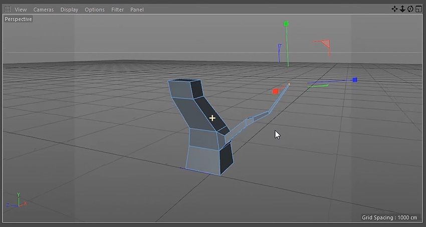
Extrude the polygons and use the Move Tool to change the direction of the tree trunk to give it an interesting shape.
Step 4
Remember to taper the top polygon by using the Scale Tool.
Step 5
Repeat the previous steps a few more times, using the Scale Tool and the Move Tool, until you are happy with the shape of the tree trunk.
4. How to create Tree Branches
Step 1
To create the branches select the polygon for it’s point of origin using the Polygons button.
Once you have a polygon selected, secondary-click the mouse to bring up a menu and select Bevel from the list of options.
Step 2
Click and drag on the selected polygon until you are happy with the shape of the bevel.
Step 3
Use the Move Tool to extrude the branch out. Hold the Control Button on the keyboard whilst using the mouse to click and drag the selected polygon.
Step 4
Taper the branch using the same techniques used to taper the tree trunk. Play around using the Move Tool and the Scale Tool to get the best results.
Step 5
Keep extruding and tapering the branch out until you are happy with the overall shape. Remember to use the Move Tool to send the branch out into different directions.
Step 6
Choose another polygon on the branch and extrude another shape out.
Step 7
Repeat the steps above to create a second and third branch. Make sure to view the tree from different angles in the viewport. This will give you the most interesting shapes for the tree.
5. How to create Low Poly Leaves
Step 1
Navigate to the top menu and click and hold on the Cube Button. This reveals a menu with options to create more shapes. Select the Sphere. This will spawn a sphere in the scene.
Step 2
Navigate to the top menu and click and hold the Bend Button. This will reveal another set of options. Select Polygon Reduction.
Step 3
Drag the Polygon Reduction into the Sphere. This will reduce the amount of polygons in the sphere.
Step 4
Make sure Polygon Reduction is still selected. In the bottom window change the Reduction Strength until you are satisfied with the results.
Step 5
Navigate to the top menu and click and hold the Bend Button again.This reveals another set of options. This time select Displacer.
Step 6
Drag the Displacer into the Sphere. This changes the shape of the sphere and add more options.
Step 7
With the Displacer still selected, navigate to the bottom of the screen where the Displacer options are located. Select the Shading tab and click the arrow button next to Shader. Select Noise from the drop down menu.
Step 8
Select the Object tab and adjust the Height until you are happy with the way the sphere looks.
Step 9
Select the Sphere then select the Scale Tool. Make sure that the Model button is selected and use the Scale Tool to adjust the shape of the sphere until you are happy with it’s shape.
Step 10
Use the Move Tool to position the sphere correctly on the tree. Using all four views in the viewport can help with this. To do this, click on the middle button on the mouse.
Step 11
Duplicate the Sphere by holding the Control Button and clicking and dragging the Sphere Object.
Step 12
Move the new sphere to another position on the tree using the Move Tool. Adjust the look of the new sphere by selecting the Displacer and using the options as outlined in the previous steps.
Step 13
Continue to duplicate and position new spheres to create a look that you are happy with.
Step 14
Repeat the steps to create leaves for the other branches of the tree.
6. How to Group Objects
Step 1
Select all the Sphere Objects that belong to a group of leaves. Group objects by holding the Shift Key on the keyboard and selecting objects with the mouse.
Step 2
With the objects selected press Alt-N to create a new group.
Step 3
Use the mouse to select the Null Group and rename the group with a suitable name.
Step 4
Repeat the steps for each sphere group.
7. How to Colour Objects
Step 1
At the bottom of the screen click on the Create Button and select New Material.
Step 2
Double click on the Material and a new window will appear. Untick Reflectance.
Step 3
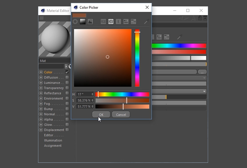
Select Colour and double click on the box at the top of the window.
Step 4
Select a suitable colour for the tree trunk and then click the OK button.
Step 5
Apply the material to the tree trunk by clicking and dragging it to the object using the mouse.
Step 6
Repeat the steps to create several different coloured materials for the leaves.
Step 7
Apply the materials to the grouped objects.
8. How to add Light to the Scene
Step 1
Choose a suitable angle in the viewport by navigating around the scene. Click on the Camera button at the top to create a camera.
Step 2
To set up the basic lighting, you’ll want to go to the Floor button located in the top menu bar. Left Click-Hold and then select Physical Sky from the menu.
Step 3
Ensuring that Physical Sky is selected in the menu on the right, a new menu will appear on the bottom right of the screen. Select the Time and Location tab and choose a time using the left and right arrow keys. This will change the lighting of the scene. Choose a suitable time to light up the scene.
Step 4
To add additional lighting to the scene, select the Add Light button in the top menu bar at the top of the screen.
Step 5
This will create a Light Object which you can move around the scene. Move the light object using the Move Tool to a suitable position.
Step 6
To customise the lighting further, experiment with the light object options in the bottom right of the screen. Here you can adjust the Intensity, Light Type and even Colour.
9. How to Render the Scene
Step 1
Click on the Render Settings button on the top menu bar.
Step 2
Choose the resolution, height and width of the image. This tutorial uses the settings 1920×1200 72dpi.
Step 3
Choose where you’d like to save the file and the file name. You may wish to tick Alpha Channel on, if you want to continue editing the image in another program such as Adobe Photoshop.
Step 4
Go to the Effect button at the bottom left and select both Ambient Occlusion and Global Illumination from the drop down menu. This will add these options to the render.
Step 5
Click the Render button and wait for the render to finish.
Conclusion
And with that, the 3D Low Poly Tree is complete. Feel free to share the own creations below. Explore different camera angles, lighting set ups and colours to find out what works best for the illustration.
You can also export the image to Adobe Photoshop to enhance it further or to use it as part of a larger scene or illustration.