Who are these men in white costume? Where is this place? What’s going to happen? The Indoor Skydivers featured in this movie are instructors at FlyStation Japan. Enjoy the magnificence, the art, and beauty in the “Mystery of Life”.
This movie is an expression of the tremendous power of the wind speed in FlyStation’s “Wind Tunnel”. You will be “blown away” with the maximum wind speed of 360km/h created by one of the most advanced wind tunnel technologies available.
Showing a sumo wrestler’s flight, this movie highlights the thrill of riding on winds with a maximum speed of 360km/h. Could this really happen? Enjoy the expression of “body ripples” never seen before, No CG was used!
This tutorial will show you how to use Photoshop’s brush settings, layer styles, and adjustment layers to create a fun, bright glazed cookies text effect. Let’s get started!
1. How to Create a Gradient Background and Text Layers
Step 1
Create a new 1000 x 800px document, and click the Create new fill or adjustment layer icon at the bottom of the Layers panel to add a Gradient layer.
Create the gradient fill using the Colors#e8d2d6 to the left and #ddbcc0 to the right, and change the Angle to 107.
Step 2
Create the text in All Caps using the font Sniglet, and set the Size to 250 pt.
You can create the whole word at once, or, if you want a more dynamic result, create each letter on a separate layer.
If you are creating the letters separately, make sure to place each one’s layer in a group with the letter’s name.
2. How to Create and Save a Stroke Brush Tip
Step 1
Pick the Brush Tool and open the Brush panel. Choose a hard round tip and use these settings:
Brush Tip Shape
Shape Dynamics
Step 2
Click the Create new brush icon in the bottom right corner of the panel, change the Name to Cookie Stroke, and click OK.
3. How to Create and Stroke a Work Path
Step 1
Right-click the text layer and choose Create Work Path.
Step 2
Create a new layer on top of the text layer, name it Stroke, make sure that the Brush Tool is still active, and hit the Return key to stroke the path.
Pick the Direct Selection Tool (A), and hit the Return key again to get rid of the work path.
Step 3
Put both the text and Stroke layers in a group and name it Text and Stroke.
4. How to Style a Layer Group
Double-click the Text and Stroke group to apply the following layer style:
Step 1
Add a Bevel and Emboss with these settings:
Size: 7
Check the Anti-aliased box
Highlight Mode:
Color: #b08965
Shadow Mode:
Color: #d3a35e
Opacity: 35%
Step 2
Add a Contour with these settings:
Contour: Half Round
Check the Anti-aliased box.
Step 3
Add a Drop Shadow with these settings:
Color: #762b3d
Opacity: 38%
Distance: 3
Size: 5
Step 4
Add another Drop Shadow effect instance with these settings:
Color: #7d3848
Opacity: 50%
Distance: 15
Size: 25
This will style the main cookie shape.
5. How to Add a Texture Image
Step 1
Open the Biscuits image, and pick the Elliptical Marquee Tool to select one of the cookies in the image. You can select only the part you want to use as well.
Go to Edit > Copy to copy the selected part.
Step 2
Go back to the original document and go to Edit > Paste to paste the copied biscuit texture.
Place the pasted layer inside the letter’s group on top of the Text and Stroke group. Then, right-click the biscuit texture layer, and choose Create Clipping Mask.
Press Command-T to enter Free Transform Mode, and resize and rotate the texture until you like how it looks.
Hit Return to commit the changes.
6. How to Contract a Selection
Step 1
Command-click the text layer’s thumbnail to create a selection.
Step 2
Go to Select > Modify > Contract, and change the ContractBy value to 5.
Step 3
Create a new layer at the top of the letter’s group and name it Glaze 01.
Fill the selection with White, and press Command-D to deselect.
Step 4
Duplicate the Glaze 01 layer and name the copy Glaze 02, and change the copy’s Fill value to 0.
Step 5
Place both glaze layers in a group and name it Glaze.
7. How to Create a Smooth Glaze Style
Double-click the Glaze 01 layer to apply the following layer style:
Step 1
Add a Bevel and Emboss with these settings:
Size: 9
Soften: 9
Check the Anti-aliased box
Highlight Mode: Soft Light
Color: #b08965
Shadow Mode:
Color: #b69c5e
Opacity: 35%
Step 2
Add a Contour with these settings:
Contour: Half Round
Check the Anti-aliased box.
Step 3
Add a Texture with these settings:
Pattern: Clouds
Depth: 25%
Step 4
Add an Inner Shadow with these settings:
Color: #d3d1c8
Opacity: 35%
Distance: 3
Size: 7
Step 5
Add a Color Overlay with these settings:
Color: #f1efde
Step 6
Add a Drop Shadow with these settings:
Blend Mode: Linear Burn
Color: #2c1c0b
Opacity: 15%
Distance: 3
Size: 3
This will create a soft glaze style.
8. How to Create a Textured Glaze Style
Double-click the Glaze 02 layer to apply the following layer style:
Step 1
Add a Bevel and Emboss with these settings:
Size: 7
Soften: 7
Uncheck the Use Global Light box
Angle: 85
Altitude: 26
Check the Anti-aliased box
Highlight Mode: Vivid Light
Color: #ffffff
Shadow Mode: Linear Burn
Color: #b1997c
Opacity: 28%
Step 2
Add a Contour with these settings:
Contour: Half Round
Check the Anti-aliased box.
Step 3
Add a Texture with these settings:
Pattern: Satin
Depth: 26%
This will create a more textured glaze.
9. How to Create More Letters
Repeat the same steps to create any more letters you need.
Use the Free Transform Mode to rotate the letters and place them however you like.
You don’t need to re-apply all the layer styles for each layer. Instead, you can right-click the styled layer, choose Copy Layer Style, right-click the new layer you want to apply the same layer style to, and choose Paste Layer Style.
Once you’re done, place all the letter groups in another group and name it Text.
10. How to Create a Sprinkles Brush Tip
Pick the Brush Tool and open the Brush panel.
Choose a hard round tip and use these settings:
Brush Tip Shape
Shape Dynamics
Scattering
11. How to Create a Sprinkles Style
Step 1
Create a new layer on top of the Text group, and place it in a group with the name Sprinkles.
Double-click the new layer to apply the following layer style:
Step 2
Add a Bevel and Emboss with these settings:
Size: 6
Uncheck the Use Global Light box
Angle: 98
Altitude: 53
Check the Anti-aliased box
Highlight Mode: Vivid Light
Opacity: 5%
Shadow Mode: Color Burn
Step 3
Add a Contour with these settings:
Contour: Rounded Steps
Check the Anti-aliased box.
Range: 59%
Step 4
Add a Color Overlay with these settings:
Color: #f88dc7
This is where you can choose the color of the sprinkles on the styled layer, so you can choose any color you like.
Step 5
Add a Drop Shadow with these settings:
Color: #2a2826
Opacity: 20%
Distance: 2
Size: 3
12. How to Add Sprinkles
Step 1
Rename the styled layer to the color you chose for the Color Overlay effect, and copy its layer style.
Click-drag slightly over the letters to add the sprinkles. You can change the brush tip’s Spacing and Scattering values as needed to create an effect you like.
Step 2
Create new layers, name each one with the color you want its sprinkles to be, and paste the layer style to it.
All you need to do to change the sprinkles’ color is double-click the sprinkles layer, and choose a new Color value for the Color Overlay effect.
Step 3
You can add as many sprinkle layers and colors as you like to fill the text with.
13. How to Add Global Adjustments
Step 1
Once you’re done adding the sprinkles, put the Text and Sprinkles groups in another new group and name it Cookies.
Step 2
Add a Levels adjustments layer and clip it to the Cookies group.
Then, change the Highlights value to 6, the Gamma to 0.90, and the Shadows to 248.
Step 3
Add a Vibrance adjustments layer and clip it to the Cookies group, and change the Vibrance value to 20.
Step 4
Add a Brightness/Contrast adjustments layer and clip it to the Cookies group, and change the Contrast value to 15.
Step 5
Place the Cement texture image on top of the Gradient fill layer, resize it to fit within the document, and rename its layer to Texture Overlay.
Change the Texture Overlay layer’s Blend Mode to Linear Burn and its Opacity to 50%.
Congratulations! You’re Done!
In this tutorial, we created a gradient background and text layers.
Then, we created a simple brush tip, used it to stroke the text, and styled the text and stroke layers to create the main cookie shape.
After that, we created and styled glaze layers, and created a sprinkles brush tip that we added on top of the glazed cookies and styled with different colors.
Finally, we used a couple of adjustment layers to add global adjustments to the effect.
Please feel free to leave your comments, suggestions, and outcomes below.
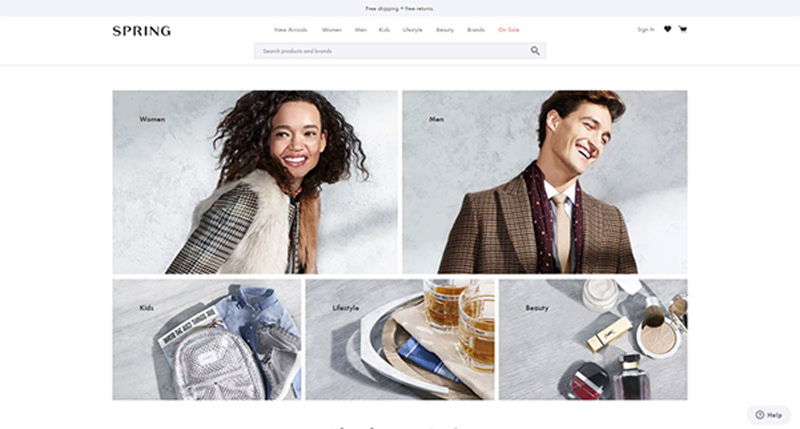
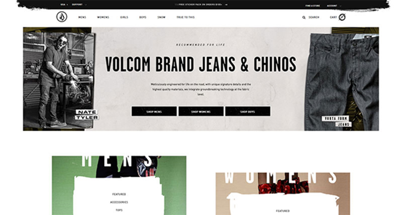
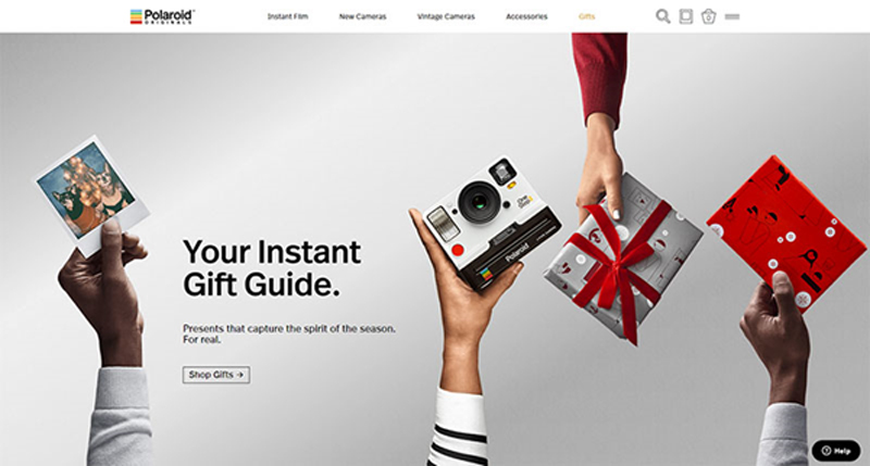
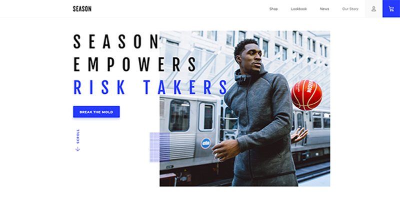
Do you remember the last time you had to contact support to help you check out? Odds are good you can’t, as a site that led you to a deal will also likely make the process smooth.
The high card abandonment rates that go beyond 50% are mostly recorded before initiating checkout, as it is at that point that customers decide whether they trust you or not.
While we can’t speak of universal customer retention rules in eCommerce, we can still share a couple of tips and fundamentals that can help designers build successful sites. Some of them are pretty self-explanatory, but with so many sites burning out in their attempt to attract attention, they shouldn’t be taken for granted.
Functional and simple navigation
It’s not exactly rocket science, isn’t it? Begin with your own examples: Would you purchase a piece you can get in 2 minutes, or scroll through tenths of options until you find what you need?
Conversions and complexity simply don’t go together. Shoppers find unrelenting categorization and excess menus and clicks fairly annoying, and they prefer an intuitive, no-brainer navigation.
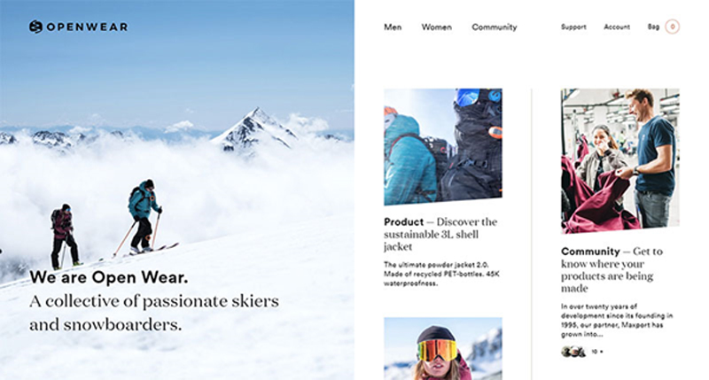
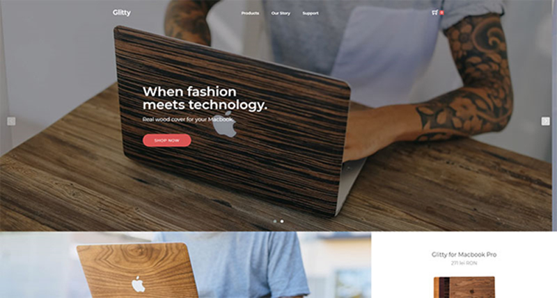
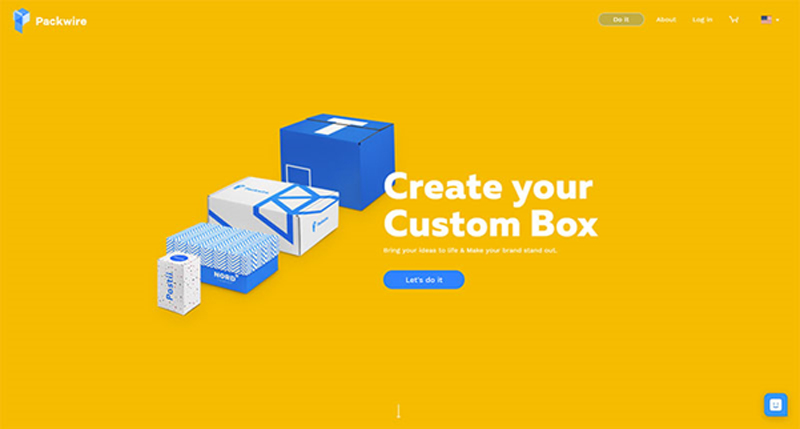
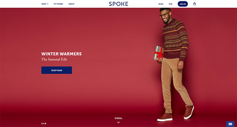
Speaking of which, we’re not insinuating that you should create an overly simple website. A menu, for instance, is an absolute must, and so are the basic headers and subtitles that help understand the hierarchy of the website.
Quantity is not the only thing you should worry about – what matters is also whether the options are clear, for the sake of which you should use one- to two-word headers. The tone should be transparent and direct, ideally combined with fun and engaging wording that is still on point.
For instance, it may sound like a great idea to label the categories of apparel eCommerce websites as ‘Kicks’ or ‘Threads’, but not everyone in its audience would be able to understand them. Plain and straightforward titles have 9x bigger chances to retain more clients.
Familiarity is another thing people appreciate while shopping online. An arrow pointing to the left is expected to lead to the previous page, the same way a pointing finger should enable them to click on a link.
To make your clients’ shopping experience even friendlier, stick to symbols they can understand.
Before the site goes online, check whether all your navigation options are functional. The last thing you want is that your client will navigate for ages through your intricate and confusing sections, only to discover a 404 error or another inconvenient problem.
Also, I know you want to create cool websites, but remember that those that are popular are also cool because they’re functional at the same time. Don’t sacrifice usefulness for the sake of creating something that only you like.
Using the right font and palette, retail sites manage to attract and convince thousands of users to check their promotions and to buy their products. Here is how they do it:
Is it readable?
Typography leaves enough room for many engaging experiments, and designers adore it. They shape, twist, and contour letters, and transform words into skillful and beautiful works of art.
Yet, you must keep in mind that not all visitors come with a refined taste in art, and they may not understand what you’re trying to sell them. Your message should always be readable, up front, and at point, so that it will bring you the answer you expect.
Fun copy is an alternative you should definitely consider.
Consistent types
Make sure that the headers on your site are consistent with the sub-headers and body copies.
This, however, is only a small portion of coming up with a well-defined style for your website, a mission that requires you to be very patient, and one that will never be entirely accomplished. You should think of your website’s style as a living document, and work on it each time your brand undergoes a change.
Customers do recognize uniqueness as they see it, and it is your task to make that happen. To do so, you can always learn from best performing styles in your industry, and try to incorporate their practices on your own website.
Depending on how complex your offer is, you can divide this document into two distinct parts: a guide on creativity and style, and a guide on copy style, and build up the perfect website step by step.
Familiarizing with your brand and your audience
Will 10 seconds be enough for you to describe what your eCommerce website is selling? Could your customers or employees describe it in the same way? If the answer is no, you should take some time to analyze your brand and its current position on the market.
Once you have all details, it will be much easier to take the right steps to position it among competitors, and build up the right style to attract more customers.
Those working with a popular and established brand have a huge advantage, and they should keep up the good work and make customers even happier.
Another important task is to analyze your audience. What can be done to target even more buyers and to boost your revenue? In most cases, designers lack the proper identification of targeted demographics, and end up creating a site that doesn’t feel too comfortable to its visitors.
In cases like these, websites are risking losing the trust factor. Given that there is no salesperson to lead customers to checkout, you must make sure they understand the sales funnel and that they trust your brand.
Balance between form and function
eCommerce websites are not only supposed to be functional, but eye-catchy as well. This is the reason they are entrusted to creative people who know exactly how to attract traffic.
Yet, the quality of your design should not overcome the quality of your products, but rather answer the common questions of customers, and address their needs.
To ensure your customers are motivated to purchase your product, promote it using the services of a professional and experienced web designer.
Automated search
A search feature is compulsory for any eCommerce website, and there are no exceptions to this rule. It would be overly ambitious to believe that all customers browse randomly to discover a piece they like – in fact, most of them arrive with defined expectations, and want to locate the product in few seconds.
To improve their experience, you can take the search feature to a whole new level, and enhance it with an auto-complete functionality.
This means that users will receive automated suggestions before they’ve typed in the entire word, which aims to help foremost horizontal sellers targeting a well-defined audience.
Ending thoughts
Commerce businesses of today rely heavily on quality websites to close more deals. As a matter of fact, for certain retailers, websites are the only interaction portals for their customers, and they do their best to provide them a great shopping experience.
With competition being as harsh as it is, surfers are becoming intolerant to poorly designed websites, meaning that it takes a masterpiece to attract their attention, and to maximize your chances of success.
Système U stores in France are running a Christmas marketing campaign with a television commercial highlighting one of the founding values of the company : proximity. U’s merchants come from the region where their store is located. Their commitments in local life, taken independently, are daily embodied in the actions of their stores – both socially and economically. U is naturally close to its customers and is committed to taking care of them – and what better time than Christmas to reassert this link? U and TBWA\Paris brought to life a touching Christmas tale conveying the idea that we can all take care of each other as well as we take care of those we love. The commercial, “Chez U, NoëlEnsemble”, presents a store manager’s generous gift of time and fun for a lonely pensioner (and a lucky lobster).
Système U Christmas Credits
The Système U Christmas campaign was developed at TBWA\Paris by executive creative directors Benjamin Marchal and Faustin Claverie, head of TV Maxime Boiron, TV producer Amer Zoghbi, account management team Luc Bourgery, Philippe Senejoux, Delphine Abou, Eva Mellul, working with U marketing team Sandrine Burgat, Laurène de Demandolx, Céline Guérin.
Sound was produced at TBWA\Else by head of music and sound Olivier Lefebvre, sound and music team Ferdinand Huet, Thomas Jacquet et Eliot Just. Music is “Prisoner” by Har Mar Superstar.
Yeah, we see browser updates all the time these days and you may have already caught this one. Aside from slick new JavaScript features, there is one new CSS update in Chrome 63 that is easy to overlook but worth calling out:
Chrome 63 now supports the CSS overscroll-behavior property, making it easy to override the browser’s default overflow scroll behavior.
The property is interesting because it natively supports the pull to refresh UI that we often see in native and web apps, defines scrolling regions that are handy for popovers and slide-out menus, and provides a method to control the rubber-banding effect on some touch devices so that a page does a hard stop at the top and bottom of the viewport.
For now, overscroll-behavior is not a W3C standard (here’s the WICG proposed draft). It’s currently only supported by Chrome (63, of course) which also means it’s in Opera (version 50). Chrome Platform Status reports that it is currently in development for Firefox and has public support from Edge.
Learn how to create a cute reindeer character that will put you into the winter holiday spirit, using Adobe Illustrator.
For
the reindeer’s head, body, and legs, you’ll use effects to add texture
and brushes to add details. After that, you’ll create a cute face
for this little guy along with the classic red nose, draw the horns, and decorate them with a bauble and ribbon curls. By the end of this
tutorial, you will be able to apply these techniques to create other
cartoon characters in the future. Let’s start the fun!
Launch Illustrator and
go to File
> New to
open a blank document. Type a name for your file, set up the
dimensions, and then select Pixels as Units and RGB as Color
Mode.
Make sure that Align
New Objects to Pixel Grid is
not checked.
Next,
go to Edit
> Preferences > General and
set the Keyboard
Increment to 1
px and
while there, go to Units to
make sure they are set as in the following image. I usually work with
these settings, and they will help you throughout the drawing process.
2. How
to Create the Head of the Reindeer
Step
1
First,
take the Ellipse Tool (L) and draw a 90 x 219 px ellipse on your
artboard (1). Use the Add Anchor Point Tool (+) to add extra points
on the path, and now distort the ellipse by moving these points and
also adjust their handles to get the shape of the head (2). Rotate
the head about 30 degrees and give it a light brown fill (3).
Step
2
While
the head shape stays selected, go to Effect > Stylize > Inner
Glow and apply the settings shown (1); then go back and apply this
effect again using different settings (2).
Step
3
Let’s
add some texture. With the head shape still selected, add a New Fill above the first and use the same color; then go to Effect > Sketch
> Note Paper and apply the settings shown (1). Set the Blending
Mode to Multiply and reduce the Opacity to 12% (2).
Step
4
Use
the Pen Tool (P) to draw three paths on the sides and at the bottom
of the head. Give them a 2 pt black Stroke and use the Dry Brush 6
Art Brush from the Brush Libraries Menu > Artistic >
Artistic_Paintbrush (1).
Next, go to Effect > Blur > Gaussian
Blur and apply a Radius of 6 px (2), and then set them to Blending
Mode Overlay and 35% Opacity (3).
Step
5
Select
the head shape and then Copy and Paste in Place (Shift-Control-V) in
order to make a copy of it in front of everything. Remove all
existing appearances for this copy. Now, select all the shapes on
your artboard and go to Object > Clipping Mask > Make
(Control-7). You can see the result in the image below, and at this
point the head is ready (2).
3. How
to Create the Ears of the Reindeer
Step
1
Use
the Pen Tool (P) to draw the two ear shapes and give them a light
brown color (1). Next, apply the Inner Glow effect twice, as you did
for the head, but use the settings shown below (2).
Step
2
Draw
a similar but smaller shape on top, filled with light pink (2), and
then draw the second shape even smaller, filled with the same pink
(2). The third shape is the smallest; use the linear gradient
shown to fill it (3).
Now,
select only the second pink shape along with the smallest purple
shape and go to Object > Blend > Blend Options. Choose 20
Specified Steps, hit OK, and then go back to Object > Blend >
Make (Alt-Control-B) (4).
Step
3
Using
the Pen Tool (P), draw a curved path at the top of the pink ear shape
(1). Give it a 2 pt brown Stroke and use the Black Blend Brush 100×3 (info below). Group (Control-G) all the shapes that make up the left
ear to keep things organized in the Layers panel (2).
Follow
the same techniques to draw the other ear of the reindeer, or to make
things easier, you could just reflect vertically the first one (Object
> Transform > Reflect) (3).
I
have an entire tutorial dedicated to Blend
Art Brushes and
how useful they are. I use them in my drawings all the time. You can
find more information on the Black
Blend Art Brush 100×3 that
we are using today in How
to Create a Set of Multi-Use Blend Brushes in Adobe Illustrator.
4. How
to Create the Body of the Reindeer
Step
1
Take
the Pen Tool (P) and draw a shape like in the next image as the body
(1). Use the same color, effects, and settings as for the head of the
reindeer earlier in the tutorial (2).
Step
2
Select
the body shape and then Copy and Paste in Place (Shift-Control-V) in
order to make a copy of it in front of everything. Remove all
existing appearances for this copy (1).
Now,
select the body shape along with the copy and go to Object >
Clipping Mask > Make (Control-7). As a result, you will get smooth, clean edges (2).
Step
3
To
create the belly, draw an ellipse on the body (1) and fill it with
the radial gradient shown. After that, go to Effect > Stylize >
Feather and apply a Radius of 5 px to make the edges a bit smoother
(2).
5. How
to Create the Legs and Hooves of the Reindeer
Step
1
Draw
with the Pen Tool (P) the shape of the leg (1) and use the same
color, effects, and settings as for the head and the body of the
reindeer. For the Inner Glow effects, use a smaller Radius value
because the shape of the leg is much smaller. You can see the result
in the image below (2).
You
can create a mask using a copy of the leg shape to get clean edges, just as you did earlier in the tutorial for the body.
Step
2
The
hoof is made of two shapes as shown in the following image (1), so draw
the two halves with the Pen Tool (P) and fill them with dark brown
(2). Next, draw two similar but smaller shapes in the middle filled
with a medium brown (3).
Now,
select the dark brown shape on the left side along with the smaller
shape on top of it and blend them using 20 Specified Steps. Do the
same thing for the right side of the hoof (4).
Step
3
Draw
with the Pen Tool (P) two paths on the hoof (1); give them a 1 pt
light brown Stroke and also use the Black Blend Art Brush. As a
result, you will get two highlights on the hoof (2).
Group
(Control-G) all the shapes that make up the hoof to keep things
organized in the Layers panel.
Step
4
Make
a copy of the first leg and the hoof and arrange them on the left
side of the body as the “arm”. Move these two behind the body in
the Layers panel (1).
Make two other copies and arrange them as the right leg and the right
“arm”. These two should be in front of the body. Take the Pen
Tool (P) and draw a slightly curved path at the base of the leg and
the “arm” (2); give them a 1.5 pt Stroke and use the Black Blend
Art Brush again. This will create a small shadow at the base (3).
6. How
to Create the Collar of the Reindeer
Step
1
Draw
a rectangle-like shape on the neck of the reindeer and use the linear
gradient shown to fill it (1). Copy and Paste in Back (Control-B)
this shape and move it 1-2 px downward by pressing the Down Arrow key
on your keyboard. Change the fill color to dark red (2).
Step
2
Go
to the Symbols panel, open the Symbol Libraries menu > Web Buttons
and Bars and find the Bullet 6-Orange symbol. Drag it into your
artboard and go to Object > Expand (1). Select the bigger circle
and delete it.
Now,
select the outer circle and set the Angle of the gradient to -90
degrees so the white is at the top and the gray at the bottom. Also
set the Blending Mode to Multiply (2).
Select the new button (3), go
to Object > Transform > Scale, and type 22% in the Scale field.
Move the tiny button (4) on the collar and make two or three more copies.
7. How
to Create the Eyes of the Reindeer
Step
1
Use
the Ellipse Tool (L) to draw two ellipses as the eyes (1). Fill them
with a very light gray and then apply the Inner Glow effect using the
settings shown (2).
Step
2
Draw
a smaller ellipse on each eye as the iris (1). Fill them with a dark
yellow and apply the Inner Glow effect (2).
Step
3
Draw
two even smaller ellipses filled with black as the pupils (1). To add
some sparkles, draw two new ellipses on the pupils as shown in the image
below (2). Fill all of them with a basic black to white radial
gradient and set the Blending Mode to Screen (3).
Step
4
Use
the Pen Tool (P) to draw two curved paths above the eyes as the
eyebrows and two paths following the bottom edge of the eyes for the
shadows (1). Give all of them a 2 pt brown Stroke and use the Black
Blend Art Brush (2).
Step
5
Draw
other two paths under the eyes, as shown in the next image (1). Give them
a 2 pt brown Stroke and use the Black Blend Art Brush again (2).
8. How
to Create the Mouth of the Reindeer
Step
1
Grab
the Pen Tool (P) and draw a big mouth shape like in the following
image (1). Use the same color and effects as for the ears of
the reindeer (2).
Now, Copy and Paste in Back (Control-B) the mouth
shape, remove all existing appearances, and select just a brown fill
color. Move this copy 2 px downwards by pressing the Down Arrow key
on your keyboard twice (3).
Step
2
While
the mouth shape stays selected, go to Object > Path > Offset
Path and apply an Offset of -5 px (1). Fill the smaller shape
obtained with red and apply the Inner Glow effect (2).
Step
3
Draw
the shapes of the teeth, four on each side. They don’t have to be
identical or perfectly round (1). Fill the teeth with pale
yellow and after that, draw a similar but smaller shape filled with
white on each tooth (2).
Select
only one tooth along with the smaller white shape on top of it and Blend them using 12 Specified Steps. Repeat the same thing for the
rest of the teeth (2).
Step
4
Zoom
on the teeth and draw with the Pen Tool (P) two paths right between
them (1). Give them a 0.5 pt Stroke using gray and the Black Blend
Art Brush (2).
Step
5
Let’s
add a small highlight on the gums. Use the Pen Tool (P) or the Pencil
Tool (N) to draw a short path on the left side of the teeth (1). Give
it a 1.5 pt Stroke using white and also the Black Blend Art Brush.
Since the Colorization is set to Tints, the brush becomes white as
well regardless of its name. Reduce the Opacity to 50% (2).
9. How
to Create the Nose of the Reindeer
Step
1
Use
the Ellipse Tool (L) to draw two ellipses like in the next image
filled with red and dark red (1). While both shapes stay selected, Blend them using 12 Specified Steps (2). Now, select the resulting
blend group, go to Effect > Stylize > Drop Shadow and apply the
settings shown below (3).
Step
2
Draw
a new ellipse on the nose filled with a basic black to white radial
gradient (1). Apply a 2 px Gaussian Blur; then set it to Blending
Mode Screen and 75% Opacity (2).
Step 3
Use
the Pen Tool (P) to draw a path on the lower left side of the nose
(1). Give it a 2 pt Stroke using white and the Black Blend Art Brush.
Set the Blending Mode to Overlay and the Opacity to 75% (2).
Use
the Direct Selection Tool (A) to select only the bigger ellipse of
the nose and then Copy and Paste in Place (Shift-Control-V) to make a
copy of it in front of everything. Set this copy to stroke-none and
fill-none. Now, select the stroked path along with the nose copy (3)
and go to Object > Clipping Mask > Make (Control-7). You can
see the result in the image below (4).
Step
4
At
this point the red nose is ready and you can Group (Control-G) all
the shapes that compose it to keep things organized in the Layers
panel.
This cute reindeer is just missing his horns now.
10. How
to Create the Horns of the Reindeer
Step
1
Grab
the Pen Tool (P) or the Pencil Tool (N) and draw four paths to define
the shape of the horns. Give them an 11 pt Stroke and press the Round
Cap option in the Stroke panel (1). While the paths stay selected, go
to Object > Expand and then press Unite in the Pathfinder panel.
As a result, you will get the shape of the left horn (2).
Now,
you can make extra adjustments like making the top ends wider and
rounder or fix other areas that don’t look smooth enough (3).
Step
2
Repeat
the previous step and create the right horn (1) or you could just
reflect vertically the first one (Object > Transform >
Reflect). Fill both horns with brown; then go to Effect > Stylize
> Inner Glow and apply the settings shown (2).
Step
3
Use
the Pen Tool (P) or the Pencil Tool (N) to draw a few short paths on
the horns where you want the highlights to be (1). For the green
paths select a 2 pt Stroke, for the orange paths select a 1 pt Stroke, and also use the Black Blend Art Brush.
With
all the paths still selected, go to Effect > Blur > Gaussian
Blur and apply a Radius of 2 px (2).
11. How
to Create the Bauble and Ribbons
Step
1
Take
the Ellipse Tool (L) and draw a 53 x 53 px circle filled with a golden
radial gradient (1). Draw a new circle on the upper right side of
the bauble filled with a basic black to white radial gradient and
after that, apply a 2 px Gaussian Blur. Set the Blending Mode to Screen and the Opacity to 75% (2).
Continue
with another ellipse on the lower left side of the bauble filled with
a basic white to black radial gradient and apply a 2 px Gaussian Blur again. Set the Blending Mode to Multiply and the Opacity to 15% this
time (3).
Let’s
create a mask now. Select the bauble shape and then Copy and Paste in
Place (Shift-Control-V) to make a copy of it in front of everything.
Remove the existing appearances for this copy. Now, drag a selection
over the bauble to select all the shapes and go to Object >
Clipping Mask > Make (Control-7) (4).
Step
2
To
create the hanging piece, first draw a rectangle-like shape at the
top of the bauble filled with the linear gradient shown (1). Next,
draw a circle having a 0.75 pt Stroke and after that, go to Object >
Expand (2). Fill the resulting ring shape with the same golden
gradient (3).
Step
3
To
add a shadow under the hanging piece, draw a path following the top
edge of the bauble (1). Give it a 0.5 pt brown Stroke and use the Black Blend Art Brush (2). At this point, the bauble is ready, and you
can Group (Control-G) all the shapes (3).
Step
4
From
the bauble up to the horns, draw a thin rectangle slightly rounded at
the ends as the hanging ribbon (1).
To create the ribbon curls, follow the sequence of
images and draw one segment at a time (2). There are no shortcuts
here.
Step
5
You
can add a second ribbon curl or as many as you want.
To create the
small bow above the bauble, follow the sequence of images and draw it
with the Pen Tool (P).
Step
6
The
golden curls are just a much thinner version of the red ribbon curls.
You can decorate the horns with as many as you want.
I’ve
used these ribbons in another tutorial of mine a while back, Create
a Set of Realistic Christmas Baubles. Have a look and learn more about how to create vector baubles in Illustrator.
Step
7
This
cute guy is ready for Christmas now.
Congratulations!
You’re Done!
I
hope this tutorial was fun for you and put you into the winter
holiday spirit. Cartoon characters are my favorite to draw because
they put my imagination to the test, so if you decide to recreate this
cute reindeer, please share an image. I would love to see your work.
After a year of collaborating with some great designers and experimenting to achieve some pretty cool visual effects, it is beginning to feel like it is. A quick search of „SVG” on CodePen will attest to this. From lettering, shapes, sprites, animations, and image manipulation, everything is better with the aid of SVG. So when a new visual trend hit the web last year, it was no surprise that SVG came to the rescue to allow us to implement it.
The spark of a trend
Creatives everywhere welcomed the 2016 new year with the spark of a colorizing technique popularized by Spotify’s 2015 Year in Music website (here is last year’s) which introduced bold, duotone images to their brand identity.
The Spotify 2015 Year in Music site demonstrates the duotone image technique.
This technique is a halftone reproduction of an image by superimposing one color (traditionally black) with another. In other words, the darker tone will be mapped to the shadows of the image, and the lighter tone, mapped to the highlights.
We can achieve the duotone technique in Photoshop by applying a gradient map (Layer > New Adjustment Layer > Gradient Map) of two colors over an image.
Choose the desired color combination for the gradient mapA comparison of the original image (left) and when the gradient map is applied (right)
Right click (or alt + click) the adjustment layer and create a clipping mask to apply the gradient map to just the image layer directly below it instead of the applying to all layers.
It used to take finessing the <canvas> element to calculate the color mapping and paint the result to the DOM or utilize CSS blend-modes to come close to the desired color effect. Well, thanks to the potentially life-saving powers of SVG, we can create these Photoshop-like “adjustment layers” with SVG filters.
Let’s get SaVinG!
Breaking down the SVG
We are already familiar with the vectorful greatness of SVG. In addition to producing sharp, flexible, and small graphics, SVGs also support over 20 filter effects that allow us to blur, morph, and do so much more to our SVG files. For this duotone effect, we will use two filters to construct our gradient map.
feColorMatrix (optional)
The feColorMatrix effect allows us to manipulate the colors of an image based on a matrix of rbga channels. Una Kravets details color manipulation with feColorMatrix in this deep dive and it’s a highly recommended read.
Depending on your image, it may be worth balancing the colors in the image by setting it to grayscale with the color matrix. You can adjust the rbga channels as you’d like for the desired grayscale effect.
Next is to map the two colors over the highlights and shadows of our grayscale image with the feComponentTransfer filter effect. There are specific element attributes to keep in mind for this filter.
Attribute
What it Does
Value to Use
color-interpolation-filters (required)
Specifies the color space for gradient interpolations, color animations, and alpha compositing.
sRGB
result (optional)
Assigns a name to this filter effect and can be used/referenced by another filter primitive with the in attribute.
duotone
While the result attribute is optional, I like to include it to give additional context to each filter (and as a handy note for future reference).
The feComponent filter handles the color mapping based on transfer functions of each rbga component specified as child elements of the parent feComponentTransfer: feFuncR feFuncG feFuncB feFuncA. We use these rbga functions to calculate the values of the two colors in the gradient map.
Here’s an example:
The Peachy Pink gradient map in the screenshots above uses a magenta color (#bd0b91) , with values of R(189) G(11) B(145).
Divide each RGB value by 255 to get the values of the first color in the matrix. The RGB values of the second column result in #fcbb0d (gold). Similar to in our Photoshop gradient map, the first color (left to right) gets mapped to the shadows, and the second to the highlights.
With the SVG filter complete, we can now apply it to an image by using the CSS filter property and setting the url() filter function to the ID of the SVG filter.
It’s worth noting that the SVG containing the filter can just be a hidden element sitting right in your HTML. That way it loads and is availble for use, but does not render on the screen.
You’re probably interested in how well supported this technique is, right? Well, SVG filters have good browser support.
This browser support data is from Caniuse, which has more detail. A number indicates that browser supports the feature at that version and up.
Desktop
Chrome
Opera
Firefox
IE
Edge
Safari
8
9
3
10
12
6
Mobile / Tablet
iOS Safari
Opera Mobile
Opera Mini
Android
Android Chrome
Android Firefox
6.0-6.1
10
all
4.4
62
57
That said, CSS filters are not as widely supported. That means some graceful degradation considerations will be needed.
This browser support data is from Caniuse, which has more detail. A number indicates that browser supports the feature at that version and up.
Desktop
Chrome
Opera
Firefox
IE
Edge
Safari
18*
15*
35
No
17
6*
Mobile / Tablet
iOS Safari
Opera Mobile
Opera Mini
Android
Android Chrome
Android Firefox
6.0-6.1*
37*
No
4.4*
62
57
For example, Internet Explorer (IE) does not support the CSS Filter url() function, nor does it support CSS background-blend-modes, the next best route to achieving the duotone effect. As a result, a fallback for IE can be an absolutely positioned CSS gradient overlay on the image to mimic the filter.
In addition, I did have issues in Firefox when accessing the filter itself based on the path for the SVG filter when I initially implemented this approach on a project. Firefox seemed to work only if the filter was referenced with the full path to the SVG file instead of the filter ID alone. This does not seem to be the case anymore but is worth keeping in mind.
At the last count there were something in the order of 10,000 WordPress themes available, so it is understandable that if you are building a site or blog, particularly for the first time, you can feel a little overawed.
Of course, you want a theme that is in keeping with the subject matter on your site, and that conveys the right image, but there is more to it than just choosing something that looks nice.
To help you along, here are five questions you need to ask yourself when narrowing down a shortlist of possible themes.
1. Is it mobile friendly?
In 2015, Google confirmed that mobile had overtaken desktop as the browsing platform of choice for searches, so anyone who tells you that mobile internet is the future is living in the past. A mobile friendly theme is not a “nice to have” anymore, it is an absolute prerequisite. If you buy the best WordPress blog themes, you can be sure they will be mobile responsive, but be cautious about free themes, as there is no telling what you might get.
2. Does it work across different browsers?
As well as being mobile friendly, the theme needs to work across the range of browsers that people use these days, such as Chrome, Explorer, Firefox, Safari and so on. Again, if you are sourcing your theme from a reputable provider, this should be explicitly stated, but if in doubt, you can always check it for yourself.
3. Is it multilingual / ¿es multilingüe?
The world wide web is so called for a reason. It is a big old world out there, and online, every corner of it is right on your doorstep. If you hadn’t thought about creating a multilingual WordPress site, maybe now is the time to give it some consideration. At the very least, it makes sense to ensure your theme is translation ready and able to support multilingual plugins, so you will be ready for anything.
4. Is it SEO friendly?
Optimising a theme for SEO is not a simple matter. It goes beyond looking good and depends to a large extent on the html coding that lies at its heart. For the layman this can be enough to send your head into a spin. There are tools like WC3 that will check it for you, but you need to understand what you are looking at, as this will flag all sorts of warnings that are perfectly normal, but will send the uninitiated into a blind panic. This is another reason to buy a premium theme, where you will get explicit confirmation from the developers that it is SEO optimised.
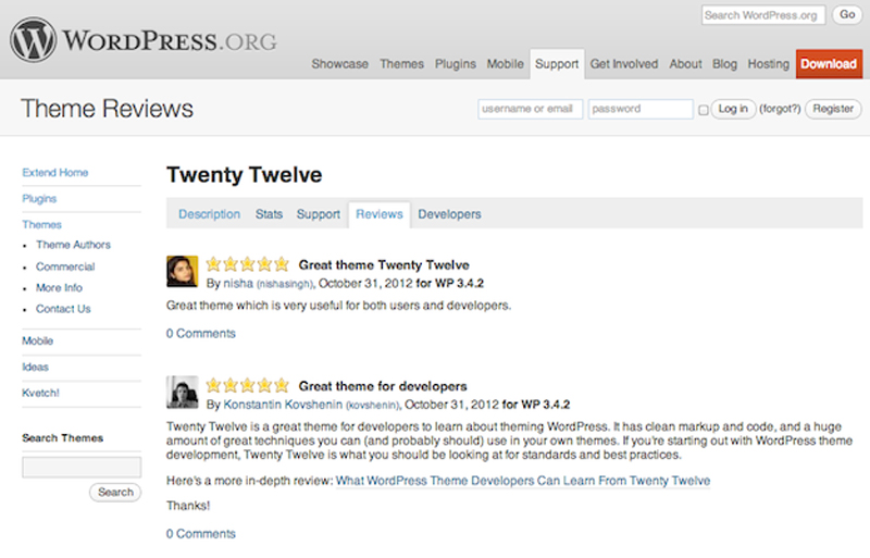
5. What do other people think?
Finally, check out the reviews. These days, everyone is an expert and an influencer, so it makes sense to canvass opinions. If you are taken with a theme that has a heap of 1-star ratings, by all means dig around to find out why, but ultimately, it is probably best to walk away.