The 90s are making a comeback all over design! Let’s find out why in this article below!
Trend Watch: Retro 90s Design
Jean vests, baggy overalls, and funky flannels were just a few of the highlights of the 90s. And whether you love it or hate it, nostalgic retro design is making a comeback now more than ever.
Nostalgia has a way of inviting happy memories of times long forgotten. So designers are paying homage to their favorite TV shows and fashionable styles with the popular retro 90s trend.
Who doesn’t love the 90s!? Here are just a few key features from this era:
Bold colors. Pink, yellow, blue—you name it, we wore it. Integrate these vibrant colors with funky patterns and black outlines for a classic 90s aesthetic.
Fun fashion statements. The 90s were all about expression. From grunge fashion to popular flannel patterns, you can incorporate your favorite fashionable styles by looking at their patterns and textures.
Abstract Shapes. Geometry was huge in the 90s! Polka-dot patterns and bold abstract shapes were a standard among 90s-themed graphics. Mix and match shapes with bold colors for a clever effect!
Inspiring Musical Themes. From grunge songs to your favorite hip-hop jams and more, the 90s were a special time in music. Integrate retro boomboxes into your work for an epic twist!
Nostalgic 90s-Inspired Lessons
Relive your favorite shows and more with these 90s tutorials. Learn how to create professional party flyers, patterns, and even photo effects from our experts!
There’s
no party like a 90s themed party! So get all your friends together and
put on your best retro fashion for a fun night out. Download this clean
flyer template complete with free fonts and vector graphics. Celebrate your favorite 90s moments!
This trendy DJ flyer is one of the classic ways we’re starting to see this theme play out. It features bold pastel colors and simple triangular shapes. Add a photo with the same theme to really help this flyer pop! Enjoy this template!
Your business cards should feature a design you’re happy to pass out! This Memphis business card template is not only stylish but also super cool! The print-ready file is fully customizable with high-resolution elements. Let us know how you like it!
Whether you love pop or punk music, you’ll definitely love this creative music flyer. This pack features six Illustrator and Photoshop files that are 100% vector. Update it with your event details to use it right away!
The music of the 90s was like no other. And you can show off your stylish fashionable side with this awesome hip-hop illustration pack. A vector EPS file with 14 total illustrations, these graphics can be used for icons and more!
Create
a bold title like your favorite retro TV shows with this funky 3D text
effect. Included are 10 well-organized Photoshop files with editable elements you can customize fast. Choose from several bold color
schemes and even unique textures!
This epic design duo features not only a 90s revival flyer but also a GIF Photoshop action. Turn your flyers into an exciting animation ready for any social media profile or website. Download it today to get access to fully editable elements.
Another great set you should definitely download is this vintage 90s element pack. With around 20 party-themed elements, you’ll be able to incorporate these vector pieces into any nostalgic design. Mash them up for the ultimate 90s graphic!
Keeping along with the theme is this 90s music festival flyer. A great option for beginners to design, this pack includes several Photoshop files and easily editable layers. You’ll adore the classic 90s vibe for your next musical event!
From cassette tapes to retro boomboxes and more, this party flyer is completely packed with 90s nostalgia! Some of the fonts featured include accessible options like Bebas Neue, along with print-ready files for your convenience. Try it out!
Become the star of your next event with this pop disco flyer template. A new spin on a classic design, this template features abstract shapes and a bold pink color scheme. Just swap out the model’s photo for one of your best glam shots!
Welcome back the 90s in style! Created with both horizontal and vertical versions, this retro flyer template is both bold and striking! Show all your friends a night of fun with incredible music and good company. You’ll love this design!
The modern world has left behind these vintage storage items, but we can still remember them in spirit! Make your retro graphics complete with this vintage set of storage icons made with Adobe Illustrator. Get 10 total icons available in several formats.
Add a grunge text effect to your party flyer or typography poster in only minutes! This awesome mockup set includes six vintage-inspired text mockups with classic styles you’ll love. Easily change the colors and backgrounds to customize it fast!
Open up any party with your favorite 90s tunes and this vintage party flyer! Featuring a mixture of grunge design and bold colors for that old-school vibe, this template is simple and easy to use. The model images aren’t included, though, so just replace them with your own!
One
way to show off your love of 90s grunge is with an epic Photoshop
action. And this action can transform your photos with just a few simple
clicks! Follow along with the attached video tutorial for more tips to achieve the perfect effect!
Or rock out with this wicked grunge core concert flyer. It’s designed with incredibly realistic grunge texture and chunky letters, and you’ll be able to swap out the main photo for one of your own. Also included are 10 different color schemes to try out!
This awesome pack of retro text effects includes cool 90s-themed options you’ll definitely want! Get access to so many styles that can be used in a variety of design scenarios. A convenient help file is also included for more information.
Thunderstorm has a familiar Saved By the Bell vibe that is hard to miss. This font is a handmade typeface inspired by several classic periods like the 80s, the 90s, and beyond. Use it for amazing quotes, apparel, or even logos.
Make sure to invite your favorite Photoshop instructor to a fun 90s-themed house party. This cool template features a creative typographic design with plenty of room for your party details. Enjoy the print-ready design complete with editable fonts and text.
Show Us Your 90s Designs!
If you’re as fond of this retro trend as we are, then show us your
work! Post a result showing how you work with the vintage 90s theme and let us know your favorite styles in the comments below.
This has been a collection of tutorials and premium resources perfect for the avid designer. For more trendy retro 90s designs, check out Envato Market and Envato Elements. Happy designing!
In this tutorial I’ll show you how to use Adobe Photoshop to create a vintage collage featuring a beautiful woman. I will also teach you how to retouch the artwork in Adobe Lightroom.
First, we’ll isolate the model from the background. After that, we’ll add our background. Later, we will cut out the model’s eyes and create some faux sunglasses with a desert picture. Then, we will add additional elements such as the crow, the UFO, the jewelry, and some tribal marks. Finally, we will adjust the contrast, vibration, and saturation using Adobe Lightroom. Let’s get started.
Tutorial Assets
The following assets were used during the production of this tutorial:
1. How to Isolate the Model and Prepare the Base Background
Step 1
Create a new 2500 by 2000 pixels document in Photoshop with the given settings:
Step 2
Open the model image in Photoshop. Cut out the image using the Pen Tool (P). Find a spot on the main image to start drawing the outline. As we’re drawing, we want to zoom in closer to the subject. This is accomplished using the Zoom Tool by pressing Control and the + or – keys.
Step 3
Now that we have drawn the outline, we want to soften the edges of the hair before removing the background. Right-click, make selection, and then select the Marquee Tool (M). Once the option bar pops up, select Select Inverse and click on Select and Mask. This will open the Select and Mask Workspace.
Step 4
Then, activate the Refine Edge Brush Tool (R). Brush over any detailed hair areas that are missing from your selection with this tool (we can change the brush size and hardness from the brush drop-down in the top left). This will select the detailed hair areas and remove the contrasting background. When you are done,click OK.
Step 5
Now we want to remove the background. Select the Marquee Tool (M). Right-click and Select Inverse. Then hit Delete.
2. How to Bring the Image Into the Main Canvas
Drag the image into the main canvas using the Move Tool (V).Then, resize by pressing Control-T. This will bring up the transformation tools you want. We do not want the image to deform or stretch, so press Shift while resizing. Then press Enter.
3. How to Create the Background
Step 1
Bring the background image into the canvas, and then place the layer under the model’s layer. We want the image to fill the canvas. Press Control-T, and drag the corners to make it bigger. Press Shift while resizing. Then press Enter.
Now that we have resized the background image, we want to center the circle. Select the Move Tool (V) and move the image to the right side to center the circle.
Step 2
Next, we want to make the background more colorful. Press Shift-Control-A to open the camera raw filter workspace, and then bring the Clarity up to +83 and the Vibrance up to +68. Click OK.
4. How to Import the UFO and the Crow
Step 1
Drag the UFO picture into Photoshop. We need to remove the background. Cut out the image using the Pen Tool (P). Find a spot on the main image, and click on a point to start drawing the outline. To finish, we have to click from the last point to the first one we did. Press Control-(+) to zoom in and Control-(-) to zoom out during the process.
Step 2
Now we want to import the UFO into the main file. Select the UFO layer, use your Move Tool (V), and drag the image into the main canvas, and then resize it to make it fit on the model’s head. To resize, press Control-T,holding the Shift key while resizing the UFO image. Next, we want to delete the extra hair around the UFO. Select the Model’s layer, activate the Eraser Tool (E), and remove the hair on the edges.
Step 3
Now we need to add the crow. Drag the image into Photoshop, and use the Pen Tool (P) to draw the crow’s outline. Click on the Marquee Tool (M), and then Right-click and Select Inverse. Click Select Selection, and then press Delete.
Step 4
Drag the crow image on the main file. Resize the image. Press Control-T, holding Shift while resizing. Use the Move Tool (V) and bring the crow onto the model’s left shoulder.
5. How to Add the Jewelry and Tribal Marks
Step 1
Open the mirror picture in Photoshop. Use the Pen Tool (P) to cut the crown and remove the background. Drag the jewelry into the main file on top of the model’s neck. Press Control-T, holding Shift while resizing the image. We want the image under the UFO. Bring the layer under the UFO’s layer.
Step 2
Press Control-J to duplicate the jewelry’s layer and place it on the model’s neck. Lower the Opacity to 50%, and activate the Pen Tool (P) to remove the extra part on the edges. Follow the body shape, and then bring back the Opacity to 100%.
Step 3
Now we want to add some tribal marks. Use the Ellipse Tool (U) to draw a small circle, making sure the fill color is white. Duplicate the layer nine times by pressing Control-J, and then use the Move Tool (V) to redistribute the circles on the cheeks and arms.
6. How to Create Desert Sunglasses
Step 1
Open the desert picture in Photoshop, and then activate the Rectangle Marquee Tool (M) and draw a rectangle on the image.
Step 2
Then use the Move Tool (V) and drag the rectangle into the main canvas. Place the rectangle on the model’s eyes.
Step 3
Next, lower the image’s Opacity to 50%, and then use the Pen Tool (P) to draw a round shape in the middle of the nose area. Cut out the sides like the following shape.
7. How to Create a Vintage Retouch to the Artwork in Adobe Lightroom
Step 1
Export the photo as a Jpeg from Photoshop. Import the picture into Lightroom. Then click Develop. Bring the Temperature to +14, Highlights to -100, Shadows to +100, Blacks to -57, Clarity +100, and Vibrance to +24.
Step 2
Next, we want to add some vignette to create more of a vintage mood. Scroll down the toolbar to Post-Crop Vignetting and bring down the Amount to -29. Then add some Grain. Bring up the Amount to +75, size 24, roughness 50.
Step 3
Now, scroll down to camera calibration and bring the Green primary to -38
8. How to Export the Final Artwork From Adobe Lightroom
Now that we are finished, we want to export our artwork as a JPEG. Click File, then Export. Select in which folder we want to save our image. Then click Export.
Congratulations, You Made It!
I hope that you’ve enjoyed the tutorial and learned something new for your own projects. Feel free to share your results or leave comments in the box below. Keep creating!
In today’s tutorial, we’re going to explore
the process of creating an instant snapshot of a busy city, using nothing more
than the basic shapes and tools that we work with on a daily basis.
You can always expand your project by heading over to GraphicRiver, where you’ll find a great selection of vector assets to choose from.
That being said, quickly grab a fresh cup of coffee to keep you energized, and let’s jump
straight into it!
1. How to Set Up a New Project File
Assuming you already have Illustrator up
and running in the background, bring it up and let’s set up a New Document (File > New or Control-N)
for our project using the following settings:
Number
of Artboards: 1
Width: 800
px
Height: 600
px
Units: Pixels
And from the Advanced tab:
Color
Mode: RGB
Raster
Effects: Screen (72ppi)
Preview Mode: Default
2. How to Set Up a Custom Grid
Even though today’s project is not an icon-based one, we’ll still want to create the illustration using a pixel-perfect
workflow, so let’s set up a nice little grid so that we can have full control
over our shapes.
Step 1
Go to the Edit > Preferences > Guides & Grid submenu, and adjust
the following settings:
Once we’ve set up our custom grid, all we
need to do in order to make sure our shapes look crisp is enable the Snap to Grid option found under the View menu (that’s if you’re using an
older version of Illustrator).
Now, if you’re new to
the whole “pixel-perfect workflow”, I strongly recommend you go through my How
to Create Pixel-Perfect Artwork tutorial, which will help you widen your
technical skills in no time.
3. How to Set Up the Layers
Once we’ve finished setting up our project
file, it would be a good idea to structure our document using a couple of
layers, since this way we can maintain a steady workflow by focusing on one
section of the illustration at a time.
That being said, bring up the Layers panel and create a total of three
layers, which we will rename as follows:
layer
1: background
layer
2: photo stack
layer 3: city illustration
Quick tip: I’ve colored all of my layers using the same
green value, since it’s the easiest one to view when used to highlight your
selected shapes (whether they’re closed or open paths).
4. How to Create
the Background
As soon as we’ve
layered our document, we can start working on the project by creating the light
background, so make sure you position yourself on the first layer, and let’s
jump straight into it.
Step 1
Create an 800 x 600 px rectangle,
which we will color using #FFF8F0 and then center align to the underlying
Artboard using the Align panel’s Horizontal
and Vertical Align Center options.
Step 2
Apply a subtle
texture to the shape that we’ve just created by making a copy (Control-C > Control-F) of it, which
we will adjust by setting its color to #808080. Then, simply go to Effect > Photoshop Effects > Texture
> Grain and set the Intensity to 40, the Contrast to 50, and the Grain Type to Stippled.
Step 3
Adjust the resulting
texture by setting its Blending Mode to Soft Light, selecting and grouping
the two rectangles together afterwards using the Control-G keyboard shortcut.
Step 4
Lock the current layer using the Layers panel, and then move on up to the next one (that would be the second one)
where we’ll gradually build our composition.
5. How to Create the Polaroid Instant Film
Stack
Assuming you’ve positioned yourself on the next layer (that would be the second one), let’s start working on the next
section of our illustration, which will house the city itself.
Step 1
Create the main shape
for the bottom polaroid using a 360 x
460 px rectangle, which we will color using #E8D4BF and then position in the center of the Artboard.
Step 2
Adjust the shape that
we’ve just created by rotating it clockwise by an angle of 8º using the Rotate tool
(right click > Transform > Rotate
> -8 px).
Step 3
Give the resulting
shape a subtle, grainy texture following the same process and values used
for the background, only this time color the copy using #666666, lowering its Opacity to 40%.
Step 4
Add a secondary
texture that will act as a shadow cast by the top polaroid, using a 380 x 480 px rectangle (#333333) which
we will position in the center of the Artboard, setting its Blending Mode to Soft Light and its Opacity
to 64%.
Step 5
Select and group (Control-G) both textures together,
masking them afterwards by creating a copy (Control-C) of the underlying shape (highlighted with red), which we
will paste in front (Control-F) and
then simply right click > Make
Clipping Mask.
Step 6
Add the front
polaroid using a 360 x 460 px rectangle,
which we will color using #FFEED9 and then center align to the underlying
Artboard. Once you’re done, select and group all of the current layer’s shapes
together using the Control-G
keyboard shortcut, making sure to lock it before moving on to the next section
of the illustration.
6. How to Create the Buildings on the Right Side
As soon as we’ve finished working on the
polaroid film stack, we can move on to the third and last layer, where we will gradually
build our little city.
Step 1
Start by creating the
background using a 280 x 340 px rectangle, onto which we will apply a linear gradient using #F9C958 for the left color
stop and #F97E58 for the right one. Set the Angle to 90º, positioning
the resulting shape as seen in the reference image.
Step 2
Zoom in on the
gradient that we’ve just created and add the sun using a 112 x 112 px circle, which we will color using #FFD18D and then
position at a distance of 16 px from
the center of the larger shape’s bottom edge.
Step 3
Start working on the buildings by creating the main shape for the bottom one using a 108 x 112 px rectangle, which we will
color using #E87D60 and then align to the gradient’s bottom-right corner.
Step 4
Add the windows using
seven rows of five 12 x 8 px rectangles
(#BA473C), spacing them 8 px from one another horizontally and vertically. Then group them (Control-G) and position them on the building as seen in
the reference image.
Step 5
Create the roof using
a 112 x 12 px rectangle (#FFEDD7) on
top of which we will add two 112 x 2 px horizontal
detail lines (#BA473C) vertically stacked 2 px from one another and from the larger shape’s top edge. Select and
group (Control-G) all three shapes
together, positioning them on top of the current building.
Step 6
Get creative and add the
antenna/roof assembly using a couple of #BA473C colored rectangles, which we
will group (Control-G) and then
position on top of the previously created shapes. Take your time, and once you’re done, select and
group (Control-G) all of the
building’s composing shapes before moving on to the next one.
Step 7
Start working on the
next building by creating its main body using a 68 x 104 px rectangle, which we will color using #FFE5C0 and then
position on top of the one from the previous step.
Step 8
Add the windows using
twelve 68 x 4 px rectangles (#BA473C),
which we will vertically stack 4 px from
one another, grouping (Control-G)
and then aligning them to the bottom of the larger rectangle.
Step 9
Once you have the shapes
in place, select and group (Control-G)
them and the building’s larger body together, making sure to position them underneath the
bottom one’s antenna (right click >
Arrange > Send Backward), before moving on to the next step.
Step 10
Start working on the
smaller side building using a 20 x 52 px rectangle, which we will color using #CCCCCC and then position as seen in
the reference image.
Step 11
Add the hard shadow
cast by the right building using an 8
x 52 px rectangle, which we will color using #BA473C and then position onto
the current one’s right edge.
Step 12
Create the windows
using six 12 x 4 px rectangles (#BA473C),
which we will vertically stack 4 px from
one another, grouping (Control-G)
and then aligning them to the bottom edge of the building.
Step 13
Finish off the
current building by adding the antenna assembly using two #BA473C colored
rectangles, which we will position as seen in the reference image. Once you’re
done, select and group (Control-G) all of its composing shapes before moving on to the next
one.
Step 14
Create the main shape
for the top building using a 52 x 56 px rectangle,
which we will color using #DDD4C8 and then position on top of the taller one.
Step 15
Give the building a
hard shadow using a 12 x 56 px rectangle
(#BA473C), which we will align to the center of its right edge.
Step 16
Add the windows using
four 4 x 56 px rectangles (#BA473C),
which we will horizontally space 4
px from one another, grouping (Control-G)
and then positioning them at a distance of 4
px from the shadow that we’ve just created.
Step 17
Add the antenna
assembly using a couple of #BA473C colored rectangles. Take your time, and once
you’re done, select and group (Control-G)
all of its composing shapes together, doing the same for the entire building
afterwards.
Step 18
Finish off the
current section of the city by quickly creating the crane using a few #BA473C
colored rectangles. Once you’re done, select and group (Control-G) all of its composing shapes together, doing the same for
all of the buildings afterwards.
7. How to Create the Buildings on the Left Side
Once we’ve finished working on the right
side of the city, we can shift our focus over to the left one and start adding
the buildings one step at a time.
Step 1
Create the main shape
for the bottom building using a 172 x 36
px rectangle, which we will color using #FFE5C0 and then position as seen
in the reference image.
Step 2
Add the hard-shadow
using a 12 x 36 px rectangle, which
we will color using #BA473C and then center align to the larger shape’s right
edge.
Step 3
Create the windows using
four 160 x 4 px rectangles (#BA473C),
which we will vertically stack 4 px from
one another, grouping (Control-G)
and then positioning them onto the bottom-left corner of the building. Once you’re done, select and
group all of the shapes together using the Control-G
keyboard shortcut.
Step 4
Add the upper section
of the building by creating a 96 x 16 px rectangle (#FFEDD7), on top of which we will add three 96 x 2 px rectangles (#BA473C) vertically stacked 2 px from one another. Group (Control-G) and position the shapes on
top of the lower body, doing the same for the entire building afterwards.
Step 5
Start working on the
center building by creating a 76 x 140
px rectangle, which we will color using #CADDCF and then position on top of
the one that we’ve just finished.
Step 6
Add the windows using
16 rows of six 8 x 4 px rectangles
(#BA473C), horizontally and vertically spaced 4 px from one another, which we will group (Control-G) and then position as seen in the reference image.
Step 7
Finish off the
current building by adding the horizontal detail lines using two 76 x 2 px rectangles (#BA473C)
vertically stacked 2 px from one
another, which we will group (Control-G)
and then position at a distance of 2 px from
its top edge. Take your time, and once you’re done, select and group (Control-G) all of its composing shapes, making
sure to position it underneath the bottom one (right click > Transform > Arrange > Send Backward).
Step 8
Create the main shape
for the smaller side building using a 32
x 88 px rectangle, which we will color using #CCCCCC and then position as
seen in the reference image.
Step 9
Add the hard-shadow
using a 10 x 88 px rectangle, which
we will color using #BA473C and then center align to the building’s left edge.
Step 10
Create the windows
using three 4 x 88 px rectangles (#BA473C),
horizontally spaced 2 px from
one another, which we will group (Control-G)
and then position at a distance of 2 px from
the shadow.
Step 11
Add the antenna
assembly using a couple of #BA473C colored rectangles, selecting and grouping
all of them together using the Control-G
keyboard shortcut. Take your time, and once you’re done, do the same for the
entire building.
Step 12
Start working on the
taller building by creating its lower body using a 56 x 100 px rectangle (#E87D60), which we will adjust by selecting
and pushing its top-right corner to the bottom by 10 px (right click > Transform > Move > Vertical > 10 px).
Step 13
Add the windows using
ten 56 x 4 px rectangles (#BA473C)
vertically stacked 4 px from one
another, which we will group (Control-G)
and then position at a distance of 4 px from
the previous shape’s bottom edge.
Step 14
Create the building’s
upper body using a 48 x 20 px rectangle
(#BA473C), which we will position as seen in the reference image, making sure
to arrange it behind the larger one (right
click > Arrange > Send Backward).
Step 15
Add the antenna
assembly using a couple of #BA473C colored rectangles. Take your time, and once
you’re done, select and group (Control-G)
all of the resulting shapes together, doing the same for the entire building
afterwards.
Step 16
Finish off the
current section of the city by quickly creating the water tower using a couple
of #BA473C colored shapes. Once you’re done, make sure to select and group (Control-G) all of its composing shapes
together, doing the same for the entire section afterwards.
8. How to Create the Bridge
Once we’ve finished working on the buildings,
we can shift our focus to the center of our illustration, where we will create
the bridge.
Step 1
Start by creating the
support towers using two 4 x 24 px rectangles
(#BA473C), which we will horizontally space 18 px from one another, grouping (Control-G) and then positioning them in the center of the city as
seen in the reference image.
Step 2
Add the deck using a 64 x 4 px rectangle (#BA473C), which we
will position on top of the shapes that we’ve just created.
Step 3
Create the horizontal
support section using a smaller 64 x 2
px rectangle (#BA473C), which we will position below the deck, at a
distance of just 2 px.
Step 4
Add the suspension
cables using two 64 x 48 px ellipses
with a 4 px thick Stroke (#BA473C), which we will
position as seen in the reference image and then adjust by selecting and
removing their top and outer anchor points, uniting their center ones using the Control-J keyboard shortcut.
Step 5
Create the center pylon
using a 4 x 34 px rectangle (#BA473C),
which we will center align to the top edge of the cables.
Step 6
Add the suspenders using
six 2 px wide rectangles (#BA473C), spaced 8
px from one another, positioning them as seen in the reference image. Once
you’re done, select and
group all of the bridge’s composing shapes using the Control-G keyboard shortcut.
Step 7
Create the little cars
using a couple of 4 x 1 px rectangles
(#BA473C), which we will position onto the deck as seen in the reference image.
Take your time, and once you’re done, select and group (Control-G) all of the current section’s composing shapes before
moving on to the next one.
9. How to Create
the Clouds
Since we’re
pretty much done working on the city, we can shift our focus to the upper
section of the horizon and start filling it up using a couple of clouds.
Step 1
Using the Rounded Rectangle Tool, create a couple
of 4 px tall shapes (#FFFFFF) with a 2 px Corner Radius, which we will
position as seen in the reference image, making sure to group (Control-G) and arrange them beneath the
buildings (right click > Arrange >
Send Backward).
Step 2
Add the little airplane
using a couple of #BA473C rectangles which we will adjust and position as seen
in the reference image. Once you’re done, select and group (Control-G) all of its composing shapes
together, doing the same for the entire city afterwards.
10. How to Add the Finishing Touches
Once we’ve added the clouds and the
airplane, our illustration is almost done. All we need to do now is add the
grainy texture.
Step 1
Create a 360 x 460 px rectangle (#666666), which
we will turn into a texture following the same process and values used
for the previous ones, positioning it in the center of the underlying Artboard
afterwards.
Step 2
Adjust the resulting shape
by setting its Blending Mode to Soft Light and its Opacity to 30%. Once you’re
done, select and group (Control-G)
all of the current layer’s composing shapes together before finally hitting that Save button.
Great Job!
So we started out laying some simple
shapes but ended up creating a beautiful instance of a living, breathing city by
following an in-depth, step-by-step process.
I truly hope you’ve
managed to learn something new and useful that you can apply to some if not all
of your future projects.
As always, if you
have any questions, post them within the comments area and I’ll get back to you
as soon as I can!
Join us for a free live stream, where experienced Envato Tuts+ instructor Dan White will share 15 time-saving tips and shortcuts to help you in your next Adobe XD project. From working with text on paths and understanding layout grids, to learning about publishing options and masking; we’ll cover all these shortcuts and more. So download the starter files, join in the live chat, and enjoy the livestream!
The course will be free for everyone who joins live, so don’t miss out on your chance to follow along and ask questions. Envato Elements subscribers will be able to access the recorded version of the course on Tuts+ once it is published.
When Chris wrote his idea for a Boilerform, I had already been thinking about starting a new project. I’d just decided to put my front-end boilerplate to bed, and wanted something new to think about. Chris’ idea struck a chord with me immediately, so I got enthusiastically involved in the comments like an excitable puppy. That excitement led me to go ahead and build out the initial version of Boilerform, which you can check out here.
The reason for my initial excitement was that I have a guilty pleasure for forms. In various jobs, I’ve worked with forms at a pretty intense level and have learned a lot about them. This has ranged from building dynamic form builders to high-level spam protection for a Harley-Davidson® website platform. Each different project has given me a look at the front-end and back-end of the process. Each of these projects has also picked away at my tolerance for quick, lazy implementations of forms, because I’ve seen the drastic implementations of this at scale.
But hey, we’re not bad people. Forms are a nightmare to work with. Although better now: each browser treats them slightly differently. For example, check out these select menus from a selection of browsers and OSs. Not one of them looks the same.
These are just the tip of the inconsistency iceberg.
Because of these inconsistencies, it’s easy to see why developers bail out of digging too deep or just spin up a copy of Bootstrap and be done with it. Also, in my experience, the design of minor forms, such as a contact form are left until later in the project when most of the positive momentum has already gone. I’ve even been guilty of building contact forms a day before a website’s launch. 😬
There’s clearly an opportunity to make the process of working with forms—on the front-end, at least—better and I couldn’t resist the temptation to make it!
The Planning
I sat and thought about what pain-points there are when working with forms and what annoys me as a user of forms. I decided that as a developer, I hate styling forms. As a user, poorly implemented form fields annoy me.
An example of the latter is email fields. Now, if you try to fill in an email field on an iOS device, you get that annoying trait of the first letter being capitalized by the browser, because it treats it like a sentence. All you have to do to stop that behaviour is add autocapitalize="none" to your field and this stops. I know this isn’t commonly known because I rarely see it in place, but it’s such a quick win to have a positive impact on your users.
I wanted to bake these little tricks right into Boilerform to help developers make a user’s life easier. Creating a front-end boilerplate or framework is about so much more than styling and aesthetics. It’s about sharing your gained experience with others to make the landscape better as a whole.
The Specification
I needed to think about what I wanted Boilerform to do as a minimum viable product, at initial launch. I came up with the following rules:
It had to be compatible with most front-ends
It had to be well documented
It had to be lightweight
Someone should be able to drop a CDN link to their <head> and have it just work
Someone should also be able to expand on the source for their own projects
It shouldn’t be too opinionated
To achieve these points, I had some technology decisions to make. I decided to go for a low barrier-to-entry setup. This was:
Sass powered CSS
BEM
Plain ol’ HTML
A basic compilation setup
I also focused my attention on samples. CodePen was the natural fit for this because they embed really well. Users can also fork them and play with them themselves.
The last decision was to roll out a pattern library to break up components into little pieces. This helped me in a couple of ways. It helped with organization mainly—but it also helped me build Boilerform in a bitty, sporadic nature as I was working on it in the evenings.
I had my plan and my stack, so got cracking.
Keeping it simple
It’s easy for a project like this to get out of hand, so it’s useful to create some points about what Boilerform will be and also what it won’t be.
What Boilerform will be:
It’ll always be a boilerplate to get you off to a good start with your project
It’ll provide high-level help with HTML, CSS and JavaScript to make both developers’ and users’ lives easier
It’ll aim to be super lightweight, so it doesn’t become a heavy burden
It’ll offer configurable options that make it flexible and easy to mould into most web projects
What Boilerform won’t be:
It won’t be a silver bullet for your forms—it’ll still need some work
It won’t be a framework like Bootstrap or Foundation, because it’ll always be a starting point
It won’t be overly opinionated with its CSS and JavaScript
It’ll never be aimed at one particular framework or web technology
The Specifics
I know y’all like to dive in to the specifics of how things work, so let me give you a whistle-stop tour!
Namespacing the CSS
The first thing I got sorted was namespacing. I’ve worked on a multitude of different sites and setups and they all share something when it comes to CSS: conflicts. With this in mind, I wrote a @mixin that wrapped all the CSS in a .boilerform namespace.
// Source Sass
.c-button {
  @include namespace() {
    background: gray;
  }
}

// This compiles to this with Sass:
.boilerform .c-button { background: gray; }
The mixin is basic right now, but it gives us flexibility to scale. If we wanted to make the namespacing optional down-the-line, we only have to update this mixin. I love that sort of modularity.
Right now, what it does give us is safety. Nothing leaks out of Boilerform and hopefully, whatever leaks in will be handled by the namespaced resets and rules.
BEM With a Garnish of Prefixes
I love BEM. It’s been core to my CSS and markup for a few years now. One thing I love about BEM is that it helps you build small, encapsulated components. This is perfect for a project like Boilerform.
I could probably target naked elements safely because of the namespacing, but BEM is about more than just putting classes on everything. It gives me and others the freedom to write whatever markup structure we want. It’s also really easy for someone to pickup the code and understand what’s related to what, in both HTML and CSS.
Another thing I added to this setup was a component prefix. Instead of an .input-field component, we’ve got a .c-input-field component. I hope little things like that will help a new contributor see what’s a component right off the bat.
Horror Inputs Get Some Cool Styling
As mentioned above, select menus are awful to style. So are radio buttons and checkboxes.
A trick I’ve been using for a while now is abstracting the styling to other friendlier HTML elements. For example, with <select> elements, I wrap them in a .c-select-field component and use siblings to add a consistent caret.
For checkboxes and radio buttons, I visually-hide the main input and use adjacent <label> elements to display state change. Using this approach makes working with these controls so much easier. Importantly, we maintain accessibility and native events too.
Base Attributes to Make Fields Easier to Use
I touched on it above with my example about email fields and capitalization, but that wasn’t the only addition of useful attributes.
Search fields have autocorrect="off" on them to prevent browsers trying to fix spelling. I strongly recommend that you add this to inputs that a user inserts their name into as well.
Number fields have min, max and step attributes set to help with validation. It’s also great for keyboard users.
All fields have blank name and id attributes to hopefully speed up the wiring-up process
I’m certainly keen for this to be expanded on, because little tweaks like this are great for user experience.
Going Forward. Can You Help?
Boilerform is in a good place right now, but it has real potential to be useful. Some ideas I’ve had for its ongoing development are:
Introducing multiple JavaScript library integrations, such as React, Vue, and Angular
As you can see, that’s a lot of work, so it would be awesome if we can get some contributors into the project to make something truly useful for our community. Pulling in contributors with different areas of expertise and backgrounds will help us make it useful for as many people as possible, from end-users to back-end developers.
Are you thinking about style guides lately? It seems to me it couldn’t be a hotter topic these days. I’m delighted to see it, as someone who was trying to think and build this way when the prevailing wisdom was nice thought, but these never work. I suspect it’s threefold why style guides and design systems have taken off:
Component-based front-end architectures becoming very popular
Styling philosophies that scope styles becoming very popular
A shift in community attitude that style guides work
That last one feels akin to cryptocurrency to me. If everyone believes in the value, it works. If people stop believing in the value, it dies.
Anyway, in my typical Coffee-and-RSS mornings, I’ve come across quite a few recently written articles on style guides, so I figured I’d round them up for your enjoyment.
As a small team working on B2B enterprise software, we were diving into creating a design system with limited time, budget and resources … Where do you start when you don’t have enough resources, time or budget?
I’ll often have teams stand up the style guide website on Day 1 of their design system initiative. A style guide serves as the storefront that showcases all of the design system’s ingredients and serves as a tangible center of mass for the whole endeavor.
This Also published their style guide (Here’s 100’s of others, if you like peaking at other people’s take on this kind of thing).
What is notable about this to me is that it’s the closest to the meaning of style guide to me (as opposed to a pattern library or design system that are more about design instructions for building out parts of the website). They only include the three things that are most important to their brand: typography, writing, and identity. Smart.
Everything you write should be easy to understand. Clarity of writing usually follows clarity of thought. Take time to think about what you’re going to say, then say it as simply as possible. Keep these rules in mind whenever you’re writing on behalf of the studio.
I use the term ‘foundations’ as part of a hierarchy for design systems and thinking. Think of the foundations as digital brand guidelines. They inspire and dovetail into our design systems, guiding all our digital products.
At a brand level they cover things like values, identity, tone of voice, photography, illustration, colours and typography.
At a digital level they cover things like formatting, localization, calls to action, responsive design and accessibility.
And in design systems they are the basis of, and cover the application of, things like text styles, form inputs, buttons and responsive grids.
Again a step back and wider view. Yes, a design system, but one that works alongside brand values.
Similar to a standard style guide, a living style guide provides a set of standards for the use and creation of styles for an application. In the case of a standard style guide, the purpose is to maintain brand cohesiveness and prevent the misuse of graphics and design elements. In the same way LSGs are used to maintain consistency in an application and to guide their implementation. But what makes a LSG different and more powerful is that much of its information comes right from the source code
An easy first reaction might be: Of course our style guide is „living”, we aren’t setting out to build a dead style guide. But I think it’s an interesting distinction to make. Style guides can sit in your development process in different places, as I wrote a few years back.
It’s all to easy to make a style guide that sits on the sidelines or is „the exhaust” of the process. It’s different entirely to place your style guide smack in the middle of a development workflow and not allow any sidestepping.
You can’t expect your employees to perform well if all communications and data are scattered over Gmail, Skype, Slack, and God knows what else.
This is why you need a centralized project management system where people could communicate with each other and find all the relevant data.
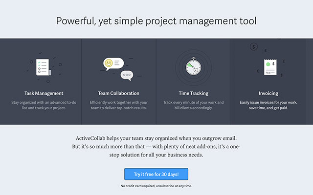
ActiveCollab is that system. It’s a tool that allows you to manage tasks, collaborate with your team, track time, and more. Most importantly, it ensures that everything is in one place. No more miscommunications and misunderstandings!
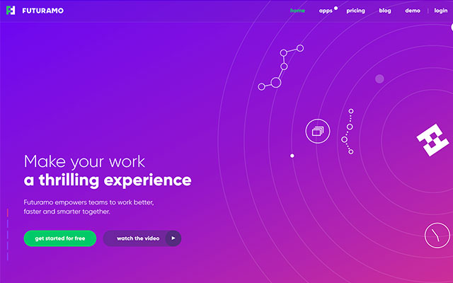
Futuramo is a sophisticated collaboration platform that was built with creative teams in mind. It allows you communicate with both your team and your clients, track time, create visual tickets, and more. It even has a bug & issue tracking app!
Futuramo will definitely make working on creative projects much easier!
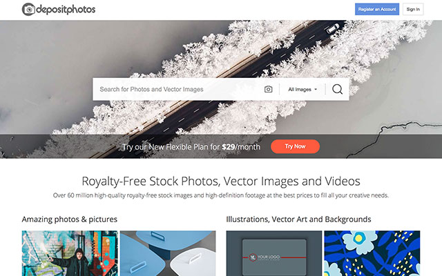
Okay, so what can you do when you need photos for your business, your iPhone snapshots won’t cut it, and you don’t have money for hiring a professional photographer?
A leading stock photography website called DepositPhotos can help you here. Subscribe, pick the photos you like, and use them any way you see fit. These photos are royalty-free, so there are no restrictions on their usage.
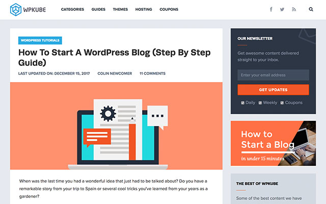
Do you have WordPress questions? It’s okay. We have all been there. It can be really confusing at times.
WPKube is an excellent resource that probably has answers to your most pressing questions. There, you’ll find everything, from advice on choosing your domain name to tips on WordPress security. It should be your go-to resource whenever you need some WordPress guidance!
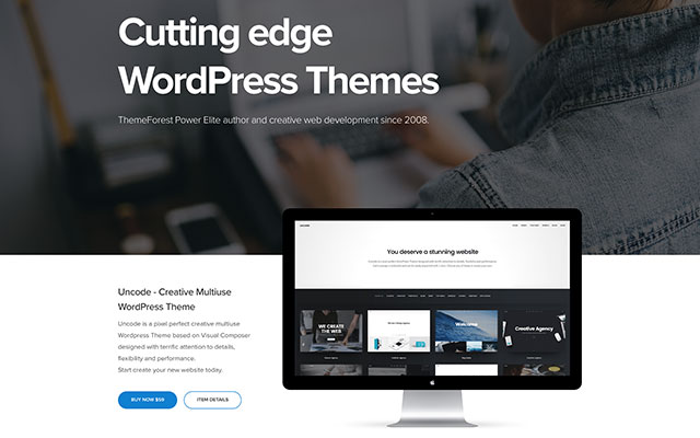
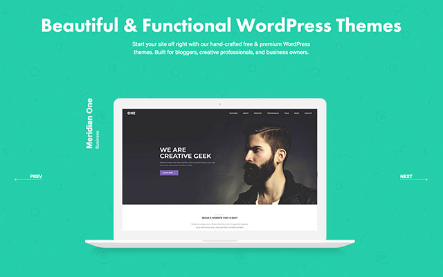
MeridianThemes offer a bunch of beautiful, easily customizable WordPress themes in a very affordable range of $49 – $59. Just pick one and go with it. They are all gorgeous, so you can’t really go wrong there!
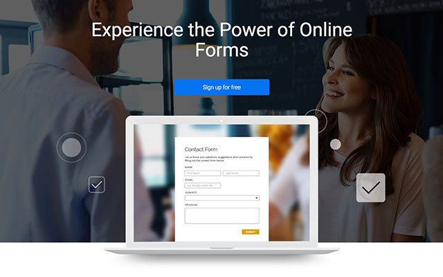
Okay, so you need to build a form for your website, but you have no idea how. What now? Should you try and learn to code one from scratch yourself? Or maybe you should hire a developer?
Thankfully, there’s an easier solution, and it’s called 123FormBuilder. It’s an app that allows you to create all kinds of online forms, from contact forms to event confirmation forms, all by yourself, without any coding skills! It will save you quite a bit of time and money!
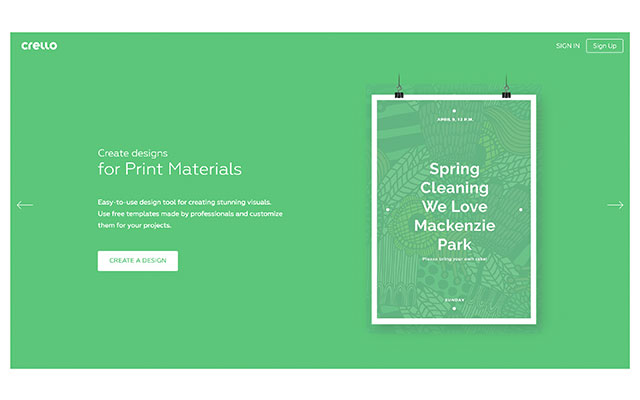
Now, what about situations where you need some graphic design thing done, but you aren’t exactly artistically inclined yourself? Hiring a designer for something small seems a bit silly. But what are the other options?
Well, believe it or not, you can do graphic design yourself, with a little bit of help from Crello. Crello offers a three step process for creating stunning designs. First, choose a format. Then, choose a template. Then, customize it all. Sounds easy? It is!
Are you struggling with social media marketing? You are not alone. It can be hard to stay on top of things when there are so many networks that you need to keep up with.
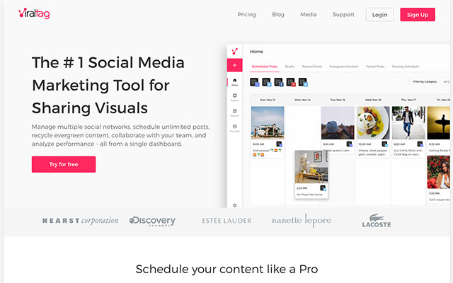
Viraltag can make your life a lot easier, though. It’s a social media marketing app that allows you to share visuals on a bunch of different networks. It also let’s you schedule posts, recycle evergreen content, and more… All from a single dashboard!
Instagram is a major social network and if you aren’t active on it, you are missing out. But how can you stand out in such a crowded place?
Instagrowth Ninja can help you do that. It’s a monthly organic Instagram marketing service. What does that mean?
They will identify your target audience and interact with them 24/7 to build up interest around your brand. Believe me, with Instagrowth Ninja your Instagram profile will grow faster than ever before. It pays off to leave your Instagram marketing to professionals!
As I have said in the introduction, money is the lifeblood of every business… And where does the money come from? Sales!
So how well are you managing your sales process? You could probably use a customer relationship management system like Salesmate if you aren’t using it already. It will help you tighten up your sales pipeline, optimize the process, and build great relationships with your clients… And, of course, make more money!
Conclusion
As you can see, having the right tools can save you a lot of time and money, be it by helping you optimize your processes, empowering you to do small design and development tasks yourself, or improving your social media marketing.
So don’t be stingy when it comes to these tools. Get them now. They will all pay for themselves in the long run!
MLA (Meat & Livestock Australia) is running “Lamb Side Story”, an advertising campaign encouraging Australians to put aside their differences and embrace a summer ‘Lambnesty’. The commercial at the heart of the campaign provides a song and dance homage to the West Side Story musical. A modern day lamb barbecue set in a suburban cul de sac is momentarily threatened by a showdown between the right wing (in blues and greens) and left wing (in reds and pinks), recreating a scene from the Jets and Sharks. With the stage set, Australia’s diverse opinions go head to head, before ultimately showing that lamb is the one thing that brings everyone together.
Lamb Side Story Integration
The Lamb Side Story commercial is being shown acoss digital, social, TV and cinema channels. Nova Network’s Fitzy & Whippa spearheaded the mission, with listeners offered Lambnesty barbeque boxes, as well as a seat to Australia’s first Lambnesty barbecue where people with differing opinions will unite over the ultimate lamb feast. Broadcast partner Channel Nine has integrated the campaign into the channel’s news, sport and social platforms, with on air features with TODAY, Nine News Now and the Cricket One Day International series. In-store, product-focused point-of-sale will deliver lamb barbeque inspiration, focusing on the variety of different cuts and cuisines. Recipes developed by Darren Robertson, Head Chef at Three Blue Ducks and Rocker, will underpin the campaign by inspiring young Aussies to get cooking with lamb this summer.
Scott Nowell, co-founder and Chief Creative Officer at The Monkeys, says “Lamb Side Story proves that both extremes of global political views can be fun – there’s nothing like lamb and dancing to bring people with various levels of outrage together.”
Lisa Sharp, Chief Marketing Officer at MLA says, “Lamb as a brand stands for unity and this latest campaign shines a light on what unites us rather than divides us. In true Aussie spirit we are celebrating our nation’s ability to put aside our differences and join together over our love of lamb, the meat that brings everyone to the table.”
Lamb Side Story Credits
The Lamb Side Story campaign was developed at The Monkeys by executive creative director Scott Nowell, creative director Scott Dettrick, art director Scott Zuliani, copywriter Tim Pashen, head of planning Michael Hogg, planner Charlotte Marshall, head of production Thea Carone, senior producer Jade Rodriguez, group content director Humphrey Taylor, senior content director Katie Wong-Hee, content manager Victoria Zourkas, content executive Will Davies, working with MLA chief marketing officer Lisa Sharp, brand manager Anna Sharp, acting brand manager Rebecca Tearle and assistant brand manager Jasmin Koch.
Filming was shot by director Paul Middleditch via Plaza Films with director of photography Daniel Ardilley, executive producer Peter Masterton and producer Alex Taussig.
Sound and music were produced at Song Zu by music director Ramesh Sathiah and composer Gerard Fitzgerald.
Media was handled at UM by group director Mike Worden, senior client director Tim Rogers, Sydney strategy director Chris Colter, strategy director David Toussaint, partnerships manager Jessica Ngu and partnership trader Emily Ng.

 PatternsHow to Create a 90s Geometric Pattern Using Basic Shapes in Adobe PhotoshopMohammad Jeprie
 Photo EffectsHow to Create a 90s Graphical Photo Effect in Adobe PhotoshopMelody Nieves
 FlyersHow to Create a 90s Style Event Flyer in Adobe InDesignGrace Fussell
 IllustrationHow to Create a 90s Radio in Adobe IllustratorHector Heredia
 GrungeHow to Create a Retro 90s Grunge Photo Effect in Adobe PhotoshopMelody Nieves
 Text EffectsHow to Create a Retro 'Saved by the Bell’ Inspired Text Effect in Adobe PhotoshopRose


 (1).jpg)


.jpg)
.jpg)
.jpg)