How to Be Better at Designing Vectors

Post pobrano z: How to Be Better at Designing Vectors

Vectors are an effective way of creating online illustrations which can be blown up to large sizes without losing quality.  If you’ve ever looked at an image and believed it would look great as a vector, but wondered where to start, these helpful tips are for you.

When working with a vector program, your first job is to get to know your drawing program.  After this, taking a design down to its foundations will enable you to create an effective illustration.

Seek out the basic structure of your drawing
 

Seek out the core areas of your design.  Based on the flat shapes in front of you, you’ll get an idea of the composition of the page.

Next, seek out the essential elements.  How can you create focus by reducing the elements on the page?  This will give your drawing focus.

As you develop base shapes for the elements of your page, such as the laptop, table, coffee cup and glass, you’ll see your rendering begin to take form.  These shapes might feel flat, but you’ll begin to get a sense of your layout.

Add texture and patterns

Now that you have your layout, start to look at where you can add texture or pattern.  You could look at the surface of the table and add just enough texture to show that it is made of wood.

Adding some grain will achieve this effect.  Focus carefully on where you’d like to add texture so that you don’t complicate your page.

Repeat Elements
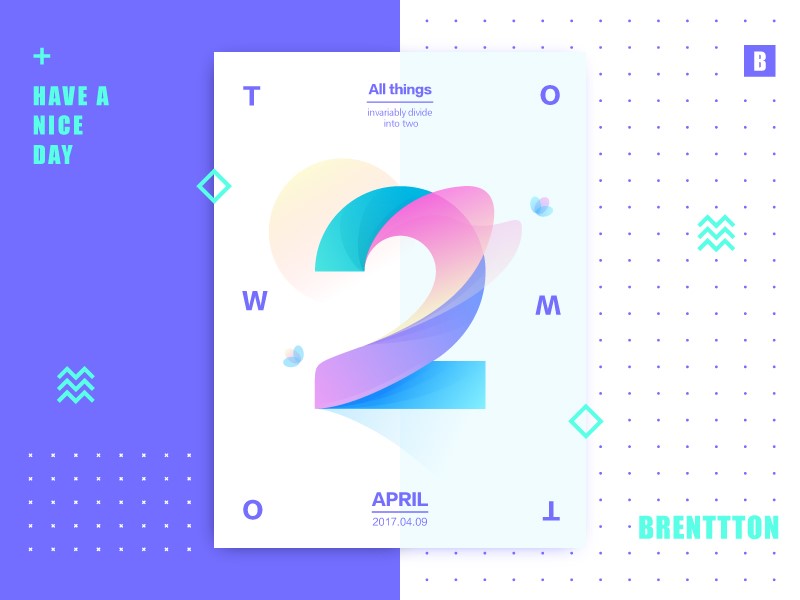
If you have repeat shapes such as window frames or coffee cups, you can repeat these images, adding some new details such as different blind lengths or patterns in order to create a unique image.

Take creative shortcuts

If you’d like to add interesting details to your drawing, such as shadows of trees framed against a night sky, you can use Image Trace.

This way you do not have to draw every detail, but you’ll still be able to add texture or background to your illustration.

Start with simple shapes

When you’re starting your drawing, begin with basic geometric shapes such as rectangles, triangles, squares or trapeziums.

From here, you can use the warp function to alter your shape.  When you’re working from stock images, sketches or even your own imagination, begin by breaking the image down into basic shapes and work from there.

Consult your client

When you are about to hand over the final image to your client, find out the format they require.  This way you can supply them with the file they want most.

If the client wants an Illustrator file, and you have a great many layers that you don’t want to move over one by one, simply draw a rectangle over your image, control, and right click, and ‘create clipping mask’.

This will give you the shape of your artwork that you are now able to present to your client.

Use Bezier Curves

When you are drawing with a Wacom pad and pen, you could use Bezier Tools to create smooth curves.

Bezier curves might take time to learn but they will give you the smooth lines or shapes you want.  Learning keyboard shortcuts will help you to work quickly and efficiently with this tool.

Consider your medium
Your medium will determine your approach to your design.  If you are designing for a magazine or a billboard, the end result will be different than a design you would like to spray onto a wall.  Choice of shapes, color, texture, and complexity will all depend on the end goal.

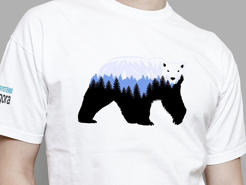
If you are designing a T-Shirt artwork, for example, you should look first at how others are creating them. Also, frame your design in a blank T-shirt template, so that you will present it better to your client.

Experiment

Feel free to play and experiment when working on your design.  Create simple shapes, lines or curves, move them about, erase some of the details and then add new elements.

Allowing yourself to play with your design gives you space for spontaneity, and to allow the process to evolve.  Even though you might plan your design carefully, allowing experimentation creates space for new ideas to flow.

Develop your own style

When working with vectors, try to find your own unique style.  This is possible with Adobe Illustrator, which offers unlimited ways of working.  After experimenting with the program, allow your own style to emerge.  Below are some opportunities for experimentation:

When working with a pen, use the least number of anchor points and draw on curves so that your design looks clean and smooth.

Calligraphic brushes used alongside your tablet will give your illustration a hand-drawn feel.

In Illustrator, close off all the shapes you don’t need, and experiment with using the pencil tool.  You can draw basic shapes, expand on them and use color to add life to your work.

If you are using line art, play with the lightness or thickness of your strokes.  This will add texture and depth to your work.

Using layer folders

When you are creating complex artworks, it is often helpful to work in layers, an option provided by Illustrator.  Layers are like clear folders which manage all the different elements of your artwork.

You can place them together, change their stacking order or delete aspects of your work that you no longer like.  Shifting and playing with layers gives you the opportunity to experiment with your design without losing the original concept.

Color opacity and transparent gradients

The gradient palate is a very effective feature on Illustrator.  Transparent gradients give you the opportunity to fade out a color in different areas of your page, providing different levels of opacity.  Using transparent gradients will also give you a watercolor effect.

Store your work

Once you have created shapes or drawing, you can store them, giving you a collection of drawings or ideas to play with while working on a new project.

These shapes will be able to provide you with foundations for new projects which will feel easy and natural to use.

Use your imagination

When using Adobe Photoshop, creating new forms or shapes means imagining how they will look in 3D.

Working with multiple layers which add color, light, and shadow will create a three-dimensional effect.  You can adjust these shapes or layers later on to suit your needs.

Which software is most helpful when drawing vector icons?

When Drawing Shapes

When creating icons, you can achieve incredible results simply by combining basic shapes and sizes.  All drawing apps have tools for basic shapes, but when you’re choosing which product you’d like to work with, it’s worth thinking about how easy each program is to use, and the flexibility offered.

Photoshop is not so easy to use because it isn’t made for vector drawing, and so isn’t as smooth or intuitive as Illustrator or Sketch when it comes to drawing.  You may also struggle with editing shapes such as polygons or stars, and this might limit your flexibility.

Illustrator is great for creating basic shapes, and it has a Live Corners feature which can smooth out corners.  However, Illustrator (like Photoshop) can limit you when it comes to polygons or stars, which can’t be adjusted.  Sketch allows you to edit all shapes, including polygons and stars and will let you round all corners, which gives you a greater degree of flexibility.

When using Pathfinder or Boolean Operations

You can use the Pathfinder panel to create new shape combinations.  This allows you to add complexity to your vector illustrations.  The panel gives you 4 options to create new shapes:

  • Unite/Add: combines and merges selected shapes
  • Minus/Subtract: Uses a cookie cutter to subtract top shapes from bottom ones.
  • Intersect deletes shapes that do not overlap.
  • Exclude: deletes everything that does overlap

Photoshop has non-destructive operations on Pathfinder (and so they won’t make permanent changes to your shapes), and these can be flattened if you need this.  However, you will need to merge layers together as Photoshop can only perform pathfinders on single layer vectors.

Illustrator has a far wider range of Pathfinder options.  These extra options increase the flexibility of your vector drawings.  However, they are destructive, so they will make permanent changes to your shapes.

Sketch has non-destructive Pathfinder operations which can be modified within the various layers.  You can also flatten your combined shapes to create permanent changes.  Sketch is a very helpful program when it comes to Pathfinder options.

When exporting to SVG

SVG creates scalable vector graphics and is a standard format used by the World Wide Web Consortium.  SVG is the best way to share vector illustrations as it is supported by browsers, drawing applications, and image viewers.

Photoshop enables you to export multiple SVG files by either using individual artboards or creating a .svg suffix for layers or group files.  There is, therefore, no need to create an artboard for each icon.  This sets Photoshop apart.  It can be helpful when you are working with large numbers of icons or layers.  You can also overlap layers in Photoshop using the same artboard.

Illustrator has a range of SVG export options which enables you to create font preferences, CSS properties, and image embedding.  You can export multiple SVG files simultaneously.  However, there is a limit of 100 artboards per Illustrator document.

Sketch allows you to export SVG files using Slices.  However, this process can be buggier than Photoshop and Illustrator and can be a drawback when using Sketch.

Ending thoughts

Little tips can be effective to turn your work around, or allow your thoughts or ideas to ‘click’.  Going through the foundations, although this may seem like common knowledge, might give you a simple solution to any problem you might be having.  Good luck with your vector drawings.

New flexbox guides on MDN

Post pobrano z: New flexbox guides on MDN

MDN released a comprehensive guide to Flexbox with new and updated materials by Rachel Andrew. The guide includes 11 posts demonstrating layouts, use cases and everything you could possibly want or need to know on the topic. All of the related Flexbox properties are nicely and conveniently attached to the table of contents, making this extremely easy to use.

In this post, Rachel adds helpful thoughts and context about Flexbox. Her comment on Flexbox initially being treated as a silver bullet solution for all our layout issues struck me:

Prior to Grid shipping, Flexbox was seen as the spec to solve all of our layout problems, yet a lot of the difficulty in using Flexbox is when we try to use it to create the kind of two-dimensional layouts that Grid is designed for. Once again, we find ourselves fighting to persuade a layout method to do things it wasn’t designed to do.

Guilty as charged. I remember being so eager to ditch floats and learn a new syntax that I treated Flexbox as a square peg trying to be fit into a round hole. That definitely bit me on at least one project.

Most importantly about this guide is that it forms a sort of trifecta of reference materials on layout specifications provided by CSS: Flexbox, Grid and other Box Alignment properties.

Oh, and while we’re on the topic, we have Flexbox and Grid guides right here on CSS-Tricks. You can never learn too much, right?

Direct Link to ArticlePermalink


New flexbox guides on MDN is a post from CSS-Tricks

Third-Party Scripts

Post pobrano z: Third-Party Scripts

Trent Walton:

My latest realization is that delivering a performant, accessible, responsive, scalable website isn’t enough: I also need to consider the impact of third-party scripts. No matter how solid I think my prototype is, it doesn’t absolve me from paying attention to what happens during implementation, specifically when it comes to the addition of these third-party scripts.

I recently had a conversation with a friend working on quite a high profile e-commerce site. They were hired to develop the site, but particularly with performance in mind. They were going the PWA route, but were immediately hamstrung by third-party scripts. One of them, apparently unavoidably, couldn’t be HTTPS, meaning the site was immediately disqualified from being a PWA. They could still do a good job in many other areas, but right and left their great performance work was slaughtered by third-party scripts. I don’t envy being in that position.

It’s often the fault of „tag managers.” There are a bunch of them out there. Here’s a marketing pitch for one of them:

Marketers want tag management that’s simple, reliable, and integrates easily with existing systems … You’ll launch programs faster, so you can make swifter decisions.

In other words, „Give your marketing team the ability to add whatever third-party JavaScript they want quickly without having to go through your normal deployment process.” I can understand why they are needed in some organizations, but it still sends chills up my spine.

Third-party scripts could conceivably be a part of a design style guide. Right alongside your buttons and modals could be a list of the third-party scripts in place on a site. Brad Frost:

The idea is that someone (or as Trent points out, some *thing*) could hypothetically crawl through all the included scripts on a site, and display them in the in style guide alongside all the color swatches, icons, UI components, etc. After all, they affect the end user experience just as much (if not more) than all those other design elements. You can visually weight them based on how gnarly they are and thus have thoughtful conversations with your team — especially those folks are carelessly chucking in all these performance-damning scripts — about the pros and cons of each script that gets included.

Third-party scripts are probably the #1 cause of poor performance and bad UX on the web. It’s no wonder things like AMP exist. The fact that it disallows third-party scripts is probably the largest contributor to it making sites fast. Controversial as hell, though, in its other choices.

As fate would have it, third-party JavaScript is even more dangerous than it ever has been, thanks to Spectre and Meltdown. Jorgé:

Q: Is JavaScript vulnerable in my browser?
A: Yes, browsing a web can give access to third parties to your machine’s memory beyond the browser.

😳

More on Third-Party JavaScript

If you, like Trent, are planning to bone up on your third-party JavaScript chops, here’s a bunch of stuff from other developers in the past few years digging into it all. Some of this is targeted at you being the deliverer of the third-party JavaScript.

Third Party JavaScript (In the Third Person) Slides by Alex Sexton

Presentation slide

View Presentation


On Third-Party Javascript – The Principles by Gergely Nemeth

When serving third-party JavaScript applications the size of it and the cache policy are crucial, as both not just affect the time your users have to wait to see the application, but also your monthly bills.

See also: Writing third-party Javascript the integration part in a nutshell.

Read Post


Third-Party Javascript by Ben Vinegar and Anton Kovalyov


Things to Know (and Potential Dangers) with Third-Party Scripts by Yaphi Berhanu

The web is full of third-party scripts. Sites use them for ads, analytics, retargeting, and more. But this isn’t always the whole story. Scripts can track your behavior, your preferences, and other information.

Read Post


I’m harvesting credit card numbers and passwords from your site. Here’s how. by David Gilbertson

My goal is simply to point out that any site that includes third party code is alarmingly vulnerable, in a completely undetectable way.

Read Post


Ain’t No Party Like A Third-Party JS Party by Rebecca Murphey

You thought you had the hang of this whole JavaScript thing, but now you’re in the world of third-party JavaScript, where all you control is a single script tag and where it’s all but impossible to dream up every hostile environment in which your code will be expected to work. „It works on my machine” has never rung quite so hollow. In this talk, we’ll take a look at some of the delightful bugs we’ve had to solve at Bazaarvoice while working on the third-party JavaScript app that collects and displays ratings and reviews for some of the world’s largest retailers.

Watch Video

(Subscription required)


3rd Party Javascript Management Cheat Sheet

The invocation of 3rd party JS code in a web application requires consideration for 3 risks in particular:

  1. The loss of control over changes to the client application,
  2. The execution of arbitrary code on client systems,
  3. The disclosure or leakage of sensitive information to 3rd parties.

Read Post


Third-Party Scripts is a post from CSS-Tricks

Small Tweaks That Can Make a Huge Impact on Your Website’s Accessibility

Post pobrano z: Small Tweaks That Can Make a Huge Impact on Your Website’s Accessibility

For a beginner, accessibility can be daunting. With all of the best intentions in the world, the learning curve to developing compliant, fully accessible websites and apps is huge. It’s also hard to find the right advice, because it’s an ever-changing and increasingly crowded landscape.

I’ve written this post to give you some tips on small things that can make a big difference, while hopefully not affecting your development process too much.

Let’s dive in!

Document Structure and Semantics

It probably doesn’t come as much of a surprise that structuring your HTML in an organized, semantic way will make a big difference. Screen readers rely on a well-structured document in order to follow a coherent narrative, so make sure that you’re using the elements that the HTML5 spec provides responsively and effectively.

If you’re unsure about how to markup your work correctly, check out resources such as HTML5 Doctor, Code Academy and of course, CSS-Tricks. You can also check out articles like “Writing HTML with accessibility in mind” and “Semantic Structure” to get you going in the right direction.

Let’s look at three specific things that can help ensure a well-structured and semantic document.

Use a Single <main> Element

A good example of building a responsible, semantic document structure is only using one <main> element. This should serve as a signpost for the most important content of the page for your user.

Add an ID to it and offer a skip link in your main <header> like so:

<header role="banner">
  <h1>Your main page title</h1>
    <a href="#main-content">Skip to the main content</a>
 </header>
    
<!-- Further down the document -->
<main id="main-content">
  <!-- Put your main body of content in here and other really important stuff -->
</main>

This little trick should help your screen reader users out in a big way, because they can go ahead and skip the fancy bits and dive right into your important content. It’s also great for keyboard users for the same reason.

Another nice touch is to add a :focus style to the skip link that makes it visible. Try pressing your tab key on GitHub.com. Pretty neat, right?

Use Elements Appropriately

So, <button> elements are a pain in the butt to style right? That doesn’t mean you should attach your JavaScript events to a <div> or an <a href="#"> though. You see, when you use a <button>, you get keyboard events for free. You’re also helping screen reader users out because it’ll announce the element correctly. Check out this example:

document.getElementsByTagName('button')[0].addEventListener('click', evt => {
  alert('Oh, hey there!');
});

If a user focused on that button and hit the enter key, that event would fire. That makes both yours and the users’ lives a bit easier. Well worth it, right?

See the Pen Button click example by Andy Bell (@hankchizljaw) on CodePen.

Get Your Heading Hierarchy Locked-Down

It’s really common for screen reader users to navigate a page by using the heading structure. That means we should help them out and create a nice hierarchy for them. Let’s take a look at a standard blog post:

<main id="main-content">
  <article>
      <!-- The page title is up in the main <header> in this instance -->
      <h2>My awesome blog post</h2>
      <p>Vestibulum id ligula porta felis euismod semper.</p>
      <p>Vestibulum id ligula porta felis euismod semper.</p>

      <h3>A sub-section of this post</h3>
      <p>Vestibulum id ligula porta felis euismod semper.</p>

      <h4>A sub-section of the sub-section</h4>
      <p>Vestibulum id ligula porta felis euismod semper.</p>
  </article>
</main>

With that sample, the user can navigate to the start of „My awesome blog post” and then have the ability to skip to sub-sections and nested sub-sections easily. They can also skip back up. It’s just a nice way of helping them consume the content you’ve produced as easily as possible.

It can be recommended that a page has a single <h1> element, even though the W3C HTML5 spec says you can have many. I personally agree with the use of a single <h1>, but you can have many, as long as you follow a nice structure and hierarchy. That’s the key here.

Get Your Color Contrast Right

To be WCAG 2.0 AA compliant, you need to have a contrast ratio of 4.5:1 for normal text. This is your paragraphs, buttons, navigation, etc. You need to go for a ratio of 3:1 for larger text, such as headings. I’d say this should be your minimum as it’s incredibly achievable with tools such as Tota11y, Contrast and the WebAim contrast checker. You can still get plenty of color balance and variation in your design too.

The reason that contrast is so important is because there’s so much variation in environment that you probably don’t even consider, such as bright sunlight and poor quality displays. Add this to a visual impairment or, say, a migraine and you’re potentially causing problems for your users.

Getting the contrast right will have a huge, positive effect across a wide spectrum of your users.

Responsible Text Labels

We’ve all built out a list of items with a non-descriptive, but visually appealing „More” button, right? More what though? We need to be more responsible with this and provide some context.

One way to achieve this is by visually hiding descriptive text with CSS and hiding the non-descriptive text from screen readers. It’s tempting to use display: none;, but screen readers can ignore elements with that set, so we need to be more creative. I use something like this little helper:

.visually-hidden { 
  display: block;
  height: 1px;
  width: 1px;
  overflow: hidden;
  clip: rect(1px 1px 1px 1px);
  clip: rect(1px, 1px, 1px, 1px);
  clip-path: inset(1px);
  visibility: hidden;
  white-space: nowrap;
  position: absolute;
}

With this CSS in place, we can do something like this:

<a href="/link-to-your-page">
  <!-- This is hidden from a screen reader, but visible visually -->
  <span aria-hidden="true">More</span>

  <!-- This is visible to a screen reader, but visually hidden -->
  <span class="visually-hidden">Continue reading: "Your post title here"</span>
</a>

A sighted user will only see “More” and a screen reader user will hear “Continue reading: 'Your post title here.'” Both sets of users are happy.

You can also achieve the above by using an aria-label on the <a> tag. This will override the text within for a screen-reader:

<a href="/link-to-your-page" aria-label="Continue reading: 'Your post title here'">
  More
</a>

Small Typography Tweaks With a Big Impact

It’s always worth remembering that people with a visual impairment or learning difficulty could be trying to read your content, so some small tweaks to your typography can go a long way.

A body of content such as an article should be sized at 16px (or equivalent unit) at a minimum. It’s also worth increasing your line-height to around 1.5 too. Space between lines can help readers with dyslexia to understand your content better. The combination of size and space is also great for older people and/or short-of-sight people. Even small summaries and aside content should be at least 12px (or equivalent unit). Anything smaller than that will alienate users who struggle to read.

Another trick is to highlight key words and phrases if your content is quite complex. This not only benefits users who are slightly slower at processing content but it also helps people who like to scan over an article, like I do.

Lastly on this section, I’d advise you to be careful with your font choices. Fonts with complex ligatures and decorative elements can be really distracting, so maybe limit the usage of those to key, large headings only. It’s also been advised that sans-serif fonts are better for readers with dyslexia. Check out this article for more on that and other text formatting tips.

Enhance Keyboard Support

There are a few little tweaks you can do to help users who primarily use their keyboard to navigate your website.

Say you’ve got a little button that shows a dialogue when you click it. You should attach an event to the escape key that hides it. Here’s a sample snippet:

document.addEventListener('keyup', (evt) => {
  if(evt.keyCode === 27) {
    // Run whatever code hides your dialogue
  }
});

See the Pen Escape key demo by Andy Bell (@hankchizljaw) on CodePen.

Another tweak you can do for our keyboard-navigating buddies is not hiding focus from them. Browsers give us focus states for free with outline. I know it can look ugly, but hot-damn it’s useful for keyboard users. If you want to get rid of that blue glow, I get it—just please use the :focus pseudo selector to add an obvious state change to it instead. Here’s a sample:

.your-element {
  background: red;
}

.your-element:focus {
  outline: none; /* Reset the default */
  box-shadow: 0 0 0 3px black; /* A very obvious state change */
}

Don’t Rely on Color Alone to Communicate State Changes

Let’s end on a really important one. Color shouldn’t be relied upon alone to communicate state changes. Take this scenario as an example:

You’ve got a button that posts a form. You wrote some neat JavaScript that makes it go grey while it sends the data. It then either turns green or red, depending on what the status is.

For a colorblind user, this is a nightmare. To them, the button may have barely changed enough for them to notice, so they may just keep clicking and clicking while getting really frustrated. This isn’t ideal.

So, instead of relying on color, let’s enhance that with a status message that supports the button’s state on response.

See the Pen Enhanced state change communication demo by Andy Bell (@hankchizljaw) on CodePen.

That sample is a great way to quickly communicate to the user that something has changed and the use of color, text and iconography clearly communicates that change. Disabling the button whilst the response is processed is also a great help to the user.

Wrapping Up

These little tips should make a big difference to your users, and I hope you dive into your projects and implement some of them.

You should also keep learning about accessibility. I recommend following people such as Heydon Pickering, Scott O’Hara, Laura Kalbag, and Rob Dobson on Twitter. I also recommend that you check out resources such as Inclusive Components and the A11y Project.

The greater your knowledge gets, the better your websites and products will be for a much wider audience. That can only be a good thing, right?


Small Tweaks That Can Make a Huge Impact on Your Website’s Accessibility is a post from CSS-Tricks

​Incapsula’s Global DDoS Threat Landscape Report

Post pobrano z: ​Incapsula’s Global DDoS Threat Landscape Report

(This is a sponsored post.)

The newly released Q3 2017 Global DDoS Threat Landscape Report features insights on attacks and mitigation. These are some of the key findings:

  • Bitcoin was one of the most targeted industries
  • High packet rate attacks grew more common
  • A third of network layer attacks were highly persistent
  • Botnet activity out of India and Turkey continued to climb

Learn about the top attacked countries, industries, and vectors here and how to protect your site with Incapsula.

Direct Link to ArticlePermalink


​Incapsula’s Global DDoS Threat Landscape Report is a post from CSS-Tricks

How to Create a Promotion Vector Badge in Adobe Illustrator

Post pobrano z: How to Create a Promotion Vector Badge in Adobe Illustrator

Final product image
What You’ll Be Creating

In the following steps, you will learn how to create a promotion vector badge in Adobe Illustrator. 

For starters, you will learn how to set up a simple grid. Next, using basic tools and some aligning techniques, you will learn how to create a set of concentric circles. Moving on, you will learn how to create a stylized ribbon and how to easily bend it using some Warp effects. Finally, you will learn how to add some text on a path and a subtle texture for the entire design.

For more inspiration on how to adjust or improve your final badge, you can find plenty of resources at GraphicRiver.

1. How to Create a New Document and Set Up Grid

Hit Control-N to create a new document. Select Pixels from the Units drop-down menu, enter 850 in the width and height boxes, and then click that More Settings button. Select RGB for the Color Mode, set the Raster Effects to Screen (72 ppi), and then click Create Document.

Enable the Grid (View > Show Grid) and the Snap to Grid (View > Snap to Grid). You will need a grid every 5 px, so simply go to Edit > Preferences > Guides & Grid, and enter 5 in the Gridline every box and 1 in the Subdivisions box. Try not to get discouraged by all that grid—it will make your work easier, and keep in mind that you can easily enable or disable it using the Control-„ keyboard shortcut.

You can learn more about Illustrator’s grid system in this short tutorial from Andrei Stefan: Understanding Adobe Illustrator’s Grid System.

You should also open the Info panel (Window > Info) for a live preview with the size and position of your shapes. Don’t forget to set the unit of measurement to pixels from Edit > Preferences > Units. All these options will significantly increase your work speed.

setup grid

2. How to Create a Set of Concentric Circles

Step 1

Pick the Ellipse Tool (L) and focus on your Toolbar. Remove the color from the stroke and then select the fill and set its color to R=73 G=35 B=84. Move to your artboard and create a 300 px grid—the grid and the Snap to Grid should make it easier.

Make sure that your shape stays selected and open the Align panel (Window > Align). Simply click the Horizontal Align Center and Vertical Align Center buttons to bring your selection to the center of the artboard.

ellipse tool

Step 2

Make sure that your shape is still selected and go to Effect > Distort & Transform > Zig Zag. Enter the attributes shown below and click OK.

zig zag

Step 3

Using the Ellipse Tool (L), create a 260 px circle. Fill this new shape with R=228 G=242 B=255 and center it.

circle

Step 4

Using the Ellipse Tool (L), create a 240 px circle. Fill this new shape with R=73 G=35 B=84 and center it.

circle

Step 5

Using the Ellipse Tool (L), create a 220 px circle. Fill this new shape with R=228 G=242 B=255 and center it.

circle

Step 6

Using the Ellipse Tool (L), create a 150 px circle. Fill this new shape with R=73 G=35 B=84 and center it.

circle

Step 7

Using the Ellipse Tool (L), create a 130 px circle. Fill this new shape with R=228 G=242 B=255 and center it.

circle

Step 8

Using the Ellipse Tool (L), create a 110 px circle. Fill this new shape with R=73 G=35 B=84 and center it.

circle

3. How to Create the Ribbon

Step 1

Using the Rectangle Tool (M), create a 310 x 70 px shape and fill it with R=228 G=242 B=255. Center this new shape, make sure that it stays selected, and focus on the Appearance panel (Window > Appearance).

Select the stroke and set its color to R=73 G=35 B=84, and then open that Stroke fly-out panel. Set the Weight to 10 px and don’t forget to check that Round Join button.

rectangle tool

Step 2

Using the Rectangle Tool (M), create an 80 x 70 px shape and fill it with R=198 G=212 B=255. Place this new shape as shown in the first image, make sure that it stays selected, and focus on the Appearance panel. Select the stroke and set its color to R=73 G=35 B=84, and then open that Stroke fly-out panel. Set the Weight to 10 px and don’t forget to check that Round Join button.

Make sure that this rectangle stays selected and pick the Add Anchor Point Tool (+). Use a simple click to add a new anchor point as shown in the second image.

add anchor point

Step 3

Make sure that the rectangle made in the previous step is still selected and pick the Direct Selection Tool (A). First, select the top-right anchor point and drag it 30 px to the left, and then select the middle-left anchor point and drag it 30 px to the right. In the end, your shape should look like in the second image.

direct selection tool

Step 4

Pick the Pen Tool (P) and create a simple shape as shown in the following image. Fill it with R=73 G=35 B=84 and add a 10 px stroke of a similar color. Don’t forget to check the Round Join button for the stroke, and then lower the Opacity of your entire selection to 30%.

appearance panel

Step 5

Using the Pen Tool (P), create a simple triangle as shown in the following image. Fill it with R=73 G=35 B=84 and add a 10 px stroke of a similar color. Don’t forget to check the Round Join button for this stroke.

round join

Step 6

Select the three shapes highlighted in the first image and Group them (Control-G). Make sure that your group is selected and go to Effect > Distort & Transform > Transform. Enter the attributes shown in the following image and then click OK.

group

Step 7

Using the Pen Tool (P), create the two triangle shapes shown in the following images. Fill both shapes with a random yellow, for now.

triangles

Step 8

Select the bottom yellow shape and focus on the Appearance panel. Replace the fill color with R=73 G=35 B=84 and add a 10 px stroke with a similar color. Remember to check the Round Join button for this stroke and then select the entire path (simply click that „Path” piece of text from the Appearance panel). First, lower the Opacity to 30% and then go to Effect > Warp > Arc Lower. Enter the attributes shown below and click OK.

Move to the top yellow shape and apply the same Appearance attributes, but replace the Arc Lower effect with the Arc Upper effect shown in the second image.

opacity

Step 9

Select your 310 x 70 px rectangle and bring it to front using the Shift-Control-] keyboard shortcut.

Pick the Pen Tool (P) and create the tiny horizontal paths shown in the second image. Add a 10 px stroke for these new paths, set its color to R=73 G=35 B=84, and don’t forget to check that Round Join button.

round cap

4. How to Add Some Text

Step 1

Pick the Type Tool (T) and open the Character panel (Window > Type > Character). Select the Insaniburger font, set the size to 30 px, and increase the tracking to 22.

Simply click on your artboard and add the „PROMOTION” piece of text. Place it as shown in the following image and set the color to R=73 G=35 B=84.

type tool

Step 2

Select all the shapes highlighted in the first image, Group them (Control-G), and then go to Effect > Warp > Flag. Enter the attributes shown below and click OK.

warp flag

Step 3

Pick the Ellipse Tool (L) and create a 200 px circle. Fill this new shape with a random yellow and center it.

Make sure that this new shape stays selected, pick the Type on a Path Tool, and simply click on the edge of your selected shape. This will allow you to add text along your path.

Add the „BEST DEALS” piece of text, set the color to R=73 G=35 B=84 and focus on the Character panel. Select the Insaniburger font, and set the size to 22 px and the tracking to 0. Next, you need to adjust the position of your text. Switch to the Direct Selection Tool (A) and simply drag that middle bracket from the outside to the inside of your circle. This should move your text inside the circle. Use that same bracket to move your text along the path as shown in the following image.

type on path

Step 4

Pick the Ellipse Tool (L) and create a 170 px circle. Fill this new shape with a random yellow and center it.

Make sure that your yellow circle stays selected, pick the Type on a Path Tool, and simply click on the edge of your selection.

Add the „SPECIAL OFFER” piece of text, set the color to R=73 G=35 B=84, and focus on the Character panel. Apply the attributes shown in the following image and use that bracket to move your text along the path as shown below.

type on path

5. How to Create the Background and Add a Subtle Texture

Step 1

Pick the Rectangle Tool (M) and create an 860 px square. Fill this new shape with R=228 G=242 B=255, send it to back using the Shift-Control-[ keyboard shortcut, and don’t forget to center it.

background

Step 2

Finally, let’s add a subtle texture. Download this set of Grunge Abstract Backgrounds from Envato Elements and drag the first image inside your document.

Resize it a little, make sure that it covers your entire artboard, and then change its Blending Mode to Soft Light.

texture

Congratulations! You’re Done!

Here is how it should look. I hope you’ve enjoyed this tutorial and can apply these techniques in your future projects. Don’t hesitate to share your final result in the comments section.

Feel free to adjust the final design and make it your own. You can find some great sources of inspiration at GraphicRiver, with interesting solutions to improve your design.

final product

Some Advice on Using Illustrations When Designing Websites

Post pobrano z: Some Advice on Using Illustrations When Designing Websites

An illustration is a versatile means of expressing a message.  Used in web design, illustration helps to provide a visual representation or example of what is being shared, making it a message clear.  It also offers an attractive or aesthetic element to a website.

If you’re using illustration to add to your website, using it to its full potential means creating an attractive or decorative message.  This will help you get the most out of illustration.  Let’s explore what it means to use illustration in website design, and what can be done to use illustration to its full potential.

Branding

Branding is used to create an emotional message which transcends the product and gives it a meaning.  When you create a website, you want the design to give visual representation to a business.  A website needs to give a visual feel to a client’s brand.

This means creating a visual impact.  When viewers land on a site, it should be memorable.

Illustration helps to create a memorable site because it gives a site uniqueness.  Whether you use eye-catching graphics or vector designs, your site will stand out from the competition.

Visual Appeal

When a site uses illustration, it will have an instant visual appeal.  Many companies use stock photos to add a graphic element to their sites.  However, stock photos are not unique, and not created in accordance with your brand.  As a result, your site may fade into the background.  Illustration fits in with your brand, adding an element which instantly identifies your company and makes it stand out.

An example of a site which uses fun illustrations to create a unique and exciting brand story is Luhse Tea.  This tea stands out from the competition and identifies itself as a unique but delicious and memorable brand.

Illustrations tell a story

In addition to creating an interesting and unique appeal, illustration helps to tell a story.  Some sites use illustration storyboards or slideshows to put across a message in a way which is appealing to clients or viewers.

When illustration tells a story, it can share how a brand is able to add to people’s lives, offer service or meet a need.  An original and very human story helps to connect with viewers.

An example of this is the WWF Website, which uses colorful images in the form of a slide show.   Instead of using words and statistics, WWF gives customers a clear message using an illustration.

Illustrations add interest

Long and involved messages can be hard to understand, and numbers and charts are often confusing.  Very often, viewers may feel overwhelmed or even bored by stats.

However, you can add zest to your message by using an illustration.  If you don’t have an illustrator to add unique images to your site, you can learn Adobe Illustrator by following a few simple tutorials.

Use different styles

Websites rely on hierarchy in order to communicate important messages.  Using different styles of illustration can enable you to draw attention to navigation buttons or calls to action.  These are the elements of your site that you would like to stand out.

Creating contrast often helps a design element to stand out.  If your illustrations are heavy and rough, you could create a user interface which uses sharp edges.  If illustrations are monochromatic, use design to create brightly colored navigation buttons or calls to action.

Illustrations can be used to create themes

Illustrations can be used to create a theme for a website.  This might mean using images of mountains and lakes for a nature-based company or using architectural blueprints for a building and design company.

An illustration may also be used to identify a company’s location.  In other words, a company can use illustration to identify a company.  Illustration becomes the most prominent feature on a site, and this helps to create a unique image for a company.

Mascots

Mascots provide a friendly and approachable character for a brand.  The Kellogg’s Rice Krispie characters Snap, Crackle, and Pop provide images of friendly mascots who help to define a brand.

Mascots help to identify and give personality to a site.  Using a character provides a face for the company which is able to talk to your customers.  This gives your brand a ‘human’ element and helps to make it memorable.

Illustrative Decoration

This means that illustration is used to decorate a site, offering an underlying framework or style.

However, the goal is not to represent a person, product or place, but simply to offer a sense of style or structure.  This style helps the site to connect with an audience.  Very often simple drawings and well-chosen colors add an aesthetic appeal to the site.

Illustrated Text

Creating text out of hand renderings is an opportunity to create a unique design or style for a site.  This is a great way to put your art school experience to work in order to create a distinctly individual element to your site.

Hand rendered type can be used to demonstrate a purpose.  A creative website can use illustrated text to demonstrate talent in the arts, careful craftsmanship or the uniqueness of a product.

Keep it simple

Simple illustrations help create an attractive image which informs your readers but doesn’t overwhelm them.

Keep illustrations informative

Aesthetic illustrations keep your site looking good, and this is important.  However, using illustration can help your site to share a message with your viewer.

Illustration can be used purposefully.  When designing your site, ask yourself why you would need to add to add illustrations, and how they will contribute to the goals of your site.  This will help with conceptualizing your illustrations.

Plan your designs before incorporating them into the website.  You can use pen and paper or a whiteboard to map out your designs.  This will help you to create an abundance of ideas before venturing into the digital realm.

You can then draw on similar ideas and find inspirational images.  Explore graphic design galleries and take notes on how the designers have brought their designs to fruition.  How are they similar or different to what you would like to achieve?  How would you like to use color?  How does illustration relate to content?

Ending thoughts

Illustrations add uniqueness to your site, adding personality and a sense of warmth.  Your goal as a web designer is to ensure it is used with purpose, communicating a message to your audience.

This means ensuring that there is a clear distinction between elements which share a message and those which encourage your audience to interact.  This will enable your viewers to navigate your site clearly, and take actions such as signing up for a newsletter.

It also means assisting viewers with understanding a product or service, ensuring that the site is not only beautiful but meaningful for viewers.