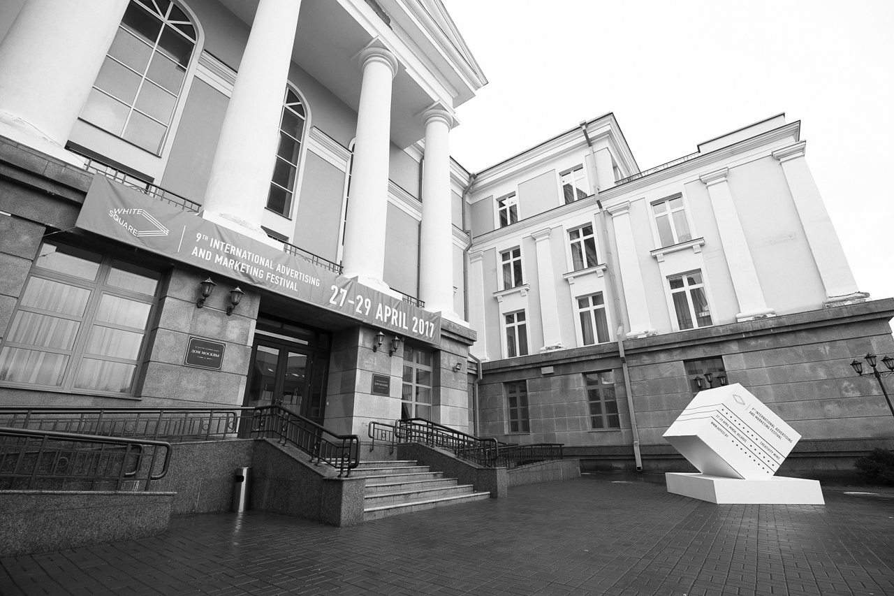
Being a moderator of avant-garde ideas since the times of Kazimir Malevich and Marc Chagall and even containing the word “white” in the very name of the country, Belarus has become the motherland of International advertising festival WHITE SQUARE – one of the leading creative festivals in Eastern Europe annually welcoming over 1000 entries and 700 delegates from 30 countries of the world.
High level of Festival’s organization, jury team, entries and awards has been many times recognized by brightest representatives of professional community, including global creativity ranking The Gunn Report.
Promoting creative solutions worldwide WHITE SQUARE has been included into new global creativity ranking AdForum Business Creative Report that will help the players of ad market all around the world to track top agencies and best projects in sector of services.
On April 19-21 in Minsk WHITE SQUARE will celebrate its tenth anniversary. Call for entries is open on official website adfest.by under the slogan CAUSE WE CAN inviting communications, marketing, branding, digital agencies from all around the world to show the level of their creativity.
Entries are accepted into 6 contests consisting of 17 nominations. The entries will be judged offline by five teams of international jury consisting of recognized leaders of European communications industry.
Early birds are provided with discounts till February 28.
WHITE SQUARE is organized by Association of Communications and Marketing Agencies of Belarus ACMA, member of EACA National Associations Council.
For more detailed information please go to adfest.by or contact the Directorate of the Festival via konkurs@adfest.by.
It’s that time of the year again, applications for A’ Design Awards are open, so if you plan on getting more exposure and maybe awards, you should register here.
A’ Design Awards is a major international event for the world of design. The competition, which takes place every year in the wonderful city of Como, Italy, aims to attract the attention of the medias and designers world-wide. The competition takes great designers and promotes them both online and offline. It provides a fair and ethical platform for all designers and studios.
If you are not familiar with the awards, you may want to check out the categories of the competition. Here are my personal favorite:
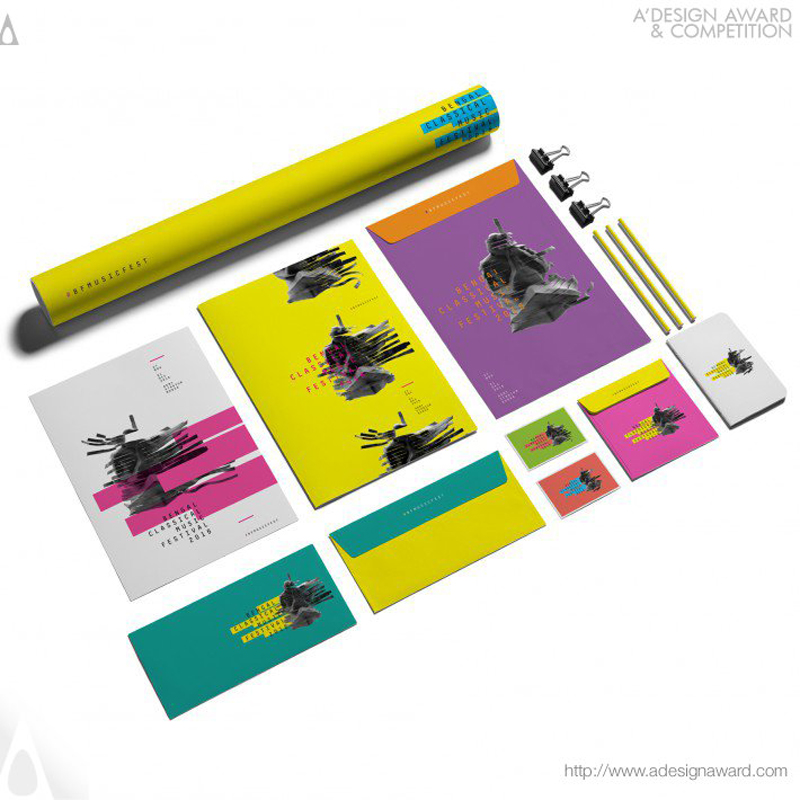
Graphic design, web design, and many other design categories are part of this communication design category. The best place to submit your work if you are a graphic designer.
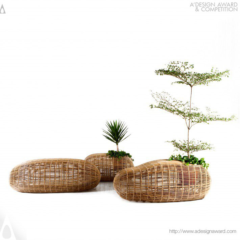
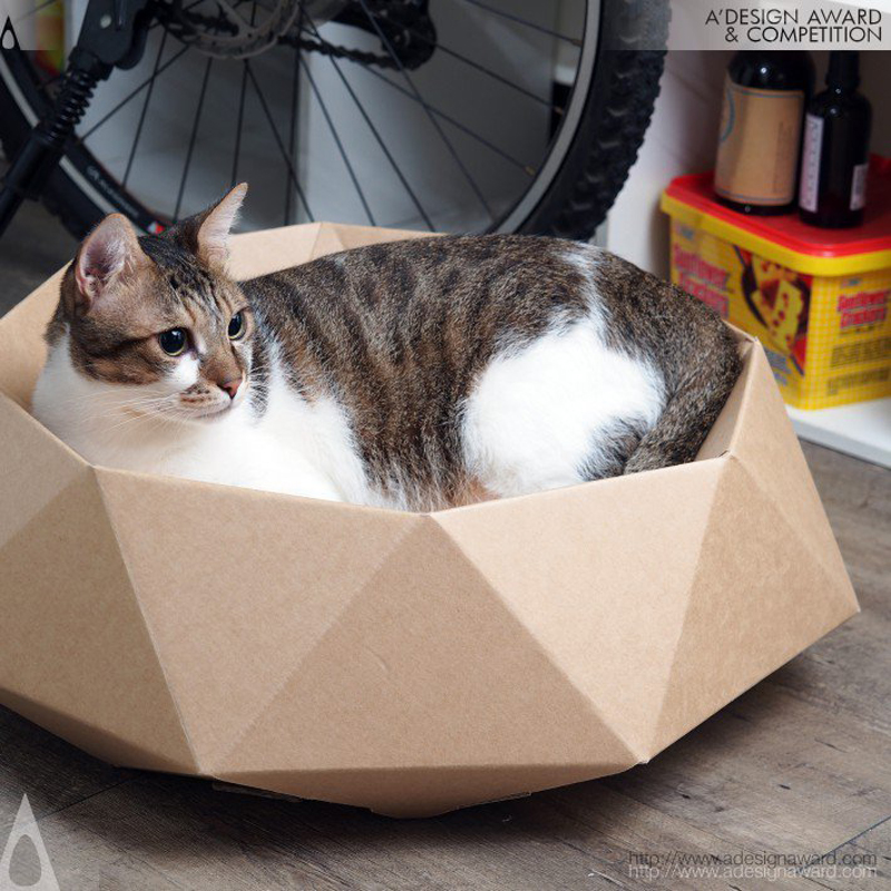
Whether it’s beverages, pet supplies, or disposable products, product design is everywhere and often unseen because we aren’t paying attention. This category share the best of product design.
Yes, there are many more categories to register in the competition, just take a look for yourself.
There are a lot of benefits to taking part in the awards, such as taking part in the international exhibitions, being in the yearbook, benefiting from the PR, or inclusion in the world design rankings, among others. Oh! Did I mention the design prizes?
The Jury
Before entering any competition, it’s good to know a little about the jury and the selection process. A’ Design Awards is very transparent regarding this, just look at the jury and process here.
Ready to enter?
If you are convinced that your company or yourself could benefit from entering the competition, just register here. The deadline for registration is February 28, 2018, and the results will be announced on A’ Design Awards and on Designer Daily on April 15.
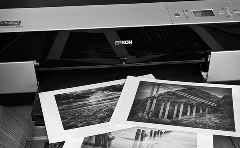
If you’re new to photography it’s a little difficult to know where to start when it comes to printing your work. You have to think about paper quality, weight, finish, size, the lot. And with so many options out there it can be tough to get it right first time.
You’ve also got to think what is your work to be used for and where is it going? Naturally, many different options will have many different costs, so whether you’re printing for a business or purely for yourself, it’s worth costing up first.
You’ll find a number of price comparison and review sites to compare different brands. You can read here to find out more about those, but for the meantime, these are the factors you need to think about when it comes to printing your photographs…
Inkjet v Laser Paper
Most people will generally stick with Inkjet these days as the quality is much higher but laser will give you a speedier print and will be a little bit cheaper.
The quality won’t be anywhere near that of Inkjet however, with the levels of print less accurate and therefore lessening the definition of an image.
If you’re wanting high quality, which we’d think you are, Inkjet is most certainly the place to begin.
The Finish of Paper
The finish of the paper you buy is one of the most important things to consider when printing your photographs. There are a number of different types you can get, the most common being matt, glossy or satin.
Matt: This will have no gloss to it at all and is one of the cheaper types to buy. You’ll regularly see it in brochures and mass-produced flyers for that very reason. There’s nothing wrong with that and if you’re printing in bulk it’s probably one of the more cost-effective papers.
If you’re printing in black and white it’s a wise choice too as glossy can sometimes make an image look a little tacky and lack that bit of quality.
Glossy: Glossy prints are the most common out there and the chemical coat helps protect the image as well helping the smaller details really stand out. Do be aware though, if you’re planning on showing the images in anywhere which might have glare, the shine off them could make them difficult to see.
Satin: You’ll get a really nice finish on a satin image and sits halfway between a matt and gloss paper.
It’s a happy medium and is a little more subtle than a glossy finish, making it a good option for black and white images. If you’re not sure on whether to go matt or glossy, satin is probably a safe bet for you.
Quality of Paper
Budget will largely dictate this and it goes without saying the better quality papers will cost more. Your standard paper will have a cast coated receiving layer, which will produce less quality images than micro and nano pores receiving layers, used by professional photographers.
These will produce the best results as the ink dries instantly producing the perfect image. It’s worth paying the extra money if you plan on showcasing your photographs. If they are for your own personal collection however, there’s no reason why you can’t use standard cast coated receiving layer paper.
The same applies to paper weight. Paper is measured in GSM and the higher the GSM the weightier the paper will be. In some cases this can be really useful, for example if you’re displaying your work, but it’s not worth getting overly hung up on.
It may not have any effect on the quality of image, unless you opted for really thin paper, but it will increase the images durability which can be important. It’s probably best to think of it like this. A brochure will get thrown away at the end of a season or set period. A portfolio of work will need to last a lifetime.
A modest JavaScript framework for the HTML you already have.
This will appeal to anyone who is apprehensive about JavaScript being required to generate HTML, yet wants a modern framework to help with modern problems, like state management.
I wonder if this would be a good answer for things like WordPress or CraftCMS themes that are designed to be server side but, like any site, could benefit from client-side JavaScript enhancements. Stimulus isn’t really built to handle SPAs, but instead pair with Turbolinks. That way, you’re still changing out page content with JavaScript, but all the routing and HTML generation is server side. Kinda old school meets new school.
A clever idea from Michael Donohoe: pit websites against each other in a performance battle! Donohoe is a long-time newsroom guy, so this is specifically about article pages for major publications.
Lets state the obvious, this is an imperfect and evolving measure and the goal is to foster discussion and rivalry in making our pages better, faster, and lighter. Bear in mind this was built as an internal tool at Hearst Newspapers to track changes as we rollout our new Article template on mobile for SFGate and eventually all sites (SF Chronicle, Houston Chronicle, Times Union, etc).
Developers, designers, and product need to talk more on how to achieve this. A 1,700 word article might weigh 10KB but by the time you load HTML, JS, CSS, images, 3rd-parties, and ads, it can range between 2MB to 8MB depending on the web site. Bear in mind, the first Harry Potter ebook is 1.1MB and that includes cover art.
Forever I’ve used the macOS Command-Shift-4 screenshot utility to measure things. Pressing it gets you a little crosshairs cursor which you can click-and-drag to take a screenshot but, crucially, has little numbers that tell you the width/height of the selection in pixels. It’s crude, but ever so useful.
See those teeny-tiny numbers in the bottom-right? So useful, even if they are tough to read.
PixelSnap is one of those apps that, once you see it, you’re like OMG that’s the best idea ever. It’s the same kind of interaction (key command, then mouse around), but it’s drawing lines between obvious measurement points in any window at all. Plus it has this drag around and area and snap to edges thing that’s just as brilliant. Instant purchase for me.
The Product Hunt newsletter said:
Two teenage makers launched PixelSnap, a powerful design tool to measure every pixel on your screen. Hit #1 on Product Hunt, and over $5,000 in sales within 24 hours of their launch. 📝✨
Hey, even cooler!
A couple people pointed out xScope, which also has this feature. Fifty bucks, but also has a ton of other features. Tempting.
This is a particular design trick that never fails to catch people’s eye! I don’t know the exact history of who-thought-of-what first and all that, but I know I have seen a number of implementations of it over the years. I figured I’d round a few of them up here.
The detection here is done by tracking the mouse position on mouseover and mouseout and calculating which side was crossed. It’s a small amount of clever JavaScript, the meat of which is figuring out that direction:
var getDirection = function (ev, obj) {
    var w = obj.offsetWidth,
        h = obj.offsetHeight,
        x = (ev.pageX - obj.offsetLeft - (w / 2) * (w > h ? (h / w) : 1)),
        y = (ev.pageY - obj.offsetTop - (h / 2) * (h > w ? (w / h) : 1)),
        d = Math.round( Math.atan2(y, x) / 1.57079633 + 5 ) % 4;

    return d;
};
Then class names are applied depending on that direction to trigger the directional CSS animations.
Fabrice uses just pure CSS here. They don’t detect the outgoing direction, but they do detect the incoming direction by way of four hidden hoverable boxes, each rotated to cover a triangle. Like this:
_getDir: function (coordinates) {
    // the width and height of the current div
    var w = this.$el.width(),
        h = this.$el.height(),
        // calculate the x and y to get an angle to the center of the div from that x and y.
        // gets the x value relative to the center of the DIV and "normalize" it
        x = (coordinates.x - this.$el.offset().left - (w / 2)) * (w > h ? (h / w) : 1),
        y = (coordinates.y - this.$el.offset().top - (h / 2)) * (h > w ? (w / h) : 1),
        // the angle and the direction from where the mouse came in/went out clockwise (TRBL=0123);
        // first calculate the angle of the point,
        // add 180 deg to get rid of the negative values
        // divide by 90 to get the quadrant
        // add 3 and do a modulo by 4 to shift the quadrants to a proper clockwise TRBL (top/right/bottom/left) **/
        direction = Math.round((((Math.atan2(y, x) * (180 / Math.PI)) + 180) / 90) + 3) % 4;
    return direction;
},
It’s technically CSS doing the animation though, as inline styles are applied as needed to the elements.
John leaned on Greensock to do all the detection and animation work here. Like all the examples, it has its own homegrown geometric math to calculate the direction in which the elements were hovered.
// Detect Closest Edge
function closestEdge(x,y,w,h) {
    var topEdgeDist = distMetric(x,y,w/2,0);
    var bottomEdgeDist = distMetric(x,y,w/2,h);
    var leftEdgeDist = distMetric(x,y,0,h/2);
    var rightEdgeDist = distMetric(x,y,w,h/2);
    var min = Math.min(topEdgeDist,bottomEdgeDist,leftEdgeDist,rightEdgeDist);
    switch (min) {
        case leftEdgeDist:
            return "left";
        case rightEdgeDist:
            return "right";
        case topEdgeDist:
            return "top";
        case bottomEdgeDist:
            return "bottom";
    }
}

// Distance Formula
function distMetric(x,y,x2,y2) {
    var xDiff = x - x2;
    var yDiff = y - y2;
    return (xDiff * xDiff) + (yDiff * yDiff);
}
Gabrielle gets it done entirely in CSS by positioning four hoverable child elements which trigger the animation on a sibling element (the cube) depending on which one was hovered. There is some tricky stuff here involving clip-path and transforms that I admit I don’t fully understand. The hoverable areas don’t appear to be triangular like you might expect, but rectangles covering half the area. It seems like they would overlap ineffectively, but they don’t seem to. I think it might be that they hang off the edges slightly giving a hover area that allows each edge full edge coverage.
Elmer is also using clip-path here, but the four hoverable elements are clipped into triangles. You can see how each of them has a point at 50% 50%, the center of the square, and has two other corner points.
Raw JavaScript powers Nigel’s demo here, which is all modernized to work with npm and modules and all that. It’s familiar calculations though:
const _getDirection = function (e, item) {
  // Width and height of current item
  let w = item.offsetWidth;
  let h = item.offsetHeight;
  let position = _getPosition(item);

  // Calculate the x/y value of the pointer entering/exiting, relative to the center of the item.
  let x = (e.pageX - position.x - (w / 2) * (w > h ? (h / w) : 1));
  let y = (e.pageY - position.y - (h / 2) * (h > w ? (w / h) : 1));

  // Calculate the angle the pointer entered/exited and convert to clockwise format (top/right/bottom/left = 0/1/2/3).  See https://stackoverflow.com/a/3647634 for a full explanation.
  let d = Math.round(Math.atan2(y, x) / 1.57079633 + 5) % 4;

  // console.table([x, y, w, h, e.pageX, e.pageY, item.offsetLeft, item.offsetTop, position.x, position.y]);

  return d;
};
Do you remember those color-by-numbers pages you used to play with as a child? You were provided with the outlines, and your job was to fill them with colors as they showed, to create an artwork the author had planned for you. It was fun without any stress!
Today, I’d like you to try something similar, but more interesting for an adult: draw-by-numbers with a complex end result. If you follow my instructions, you’ll create a beautiful, intricate artwork—safely, without any stress or fear of failure.
This tutorial is part of the Art Therapy series. It teaches you how to
use art for relaxation and fun, without putting too much pressure on
yourself.
Look to the right: there’s an attachment you need to download to start. In it, you’ll find three versions of the template. Pick one and print it.
template-numbers: the template with faded numbers (easy)
template-no-numbers: the template with the lines only, if you want to keep it clean (medium)
template-clear: faded template with no numbers; use it to draw all the lines on your own (hard)
You will also need a tool. It must be something black, thick, and precise at the same time. It can be any marker/ink liner (at least 0.5), even the cheapest one. You can also have a thicker one, for filling big areas and for drawing the final lines (make sure both tools have the same shade of black).
Although the whole piece can be finished very quickly, it will have a higher therapeutic value if you do it slowly. Draw the lines carefully, trying to stay within the outline. Pay attention to every little line, drawing each one in a measured way. There’s no hurry—the artwork will be finished either way, but if you do it slowly, you’ll enjoy the process more. It’s all about the journey, not the destination!
1. Fill Area A
Area A will be filled with vertical lines:
Step 1
Fill A1. Keep it symmetrical and radial.
Step 2
Fill A2. If you start with a „V” in the middle, you’ll achieve an interesting effect.
Step 3
Fill A3.
Step 4
Fill A4. This direction will accentuate the 3D form of the muzzle.
Step 5
Fill A5. Tightly placed lines will make the nose look dark without filling it completely.
Step 6
Fill A6, the whisker area.
Step 7
Fill A7–A10, changing the direction gradually to accentuate the 3D form of the cheek-bone.
The patterns are all filled in, but the whole thing may look quite confusing to the eyes of the viewer. Let’s accentuate some lines to make the tiger’s head clearer. You can use the thicker tool for this. If you only have a thin tool, first draw the outline of a thick line and then fill it.
Your beautiful artwork is finished! You can now treat it as a coloring page and fill it with fantastic colors, or leave it as it is and hang it up on your wall—even looking at it will give you a therapeutic effect, as the intricate patterns keep your brain busy. You can also print the template once again and fill it with any patterns you like, now that you know the rules!
If you enjoyed this tutorial, you may also like the others from the Art Therapy series: