giffgaff is a very special British mobile network. Special because it’s run by the users. If you help the company, the company helps you. This philosophy it’s called: mutual giving (giffgaff in gaelic) They wanted to thank all giffgaffers for their support and we decided to create Mutual Giving Lessons inside the app. Because we know the phone can screw relationships, but with giffgaff you will have the best makeups.
If I write the words “cryptocurrency wallet”, you will probably think of something digital like an app, but not of a physical product. This is because most wallets are software-based, but not all, their are also some hardware-wallets out there.
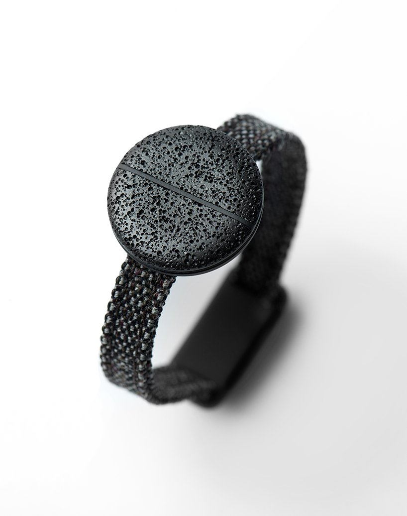
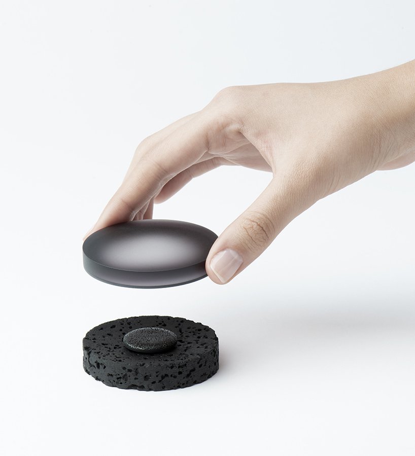
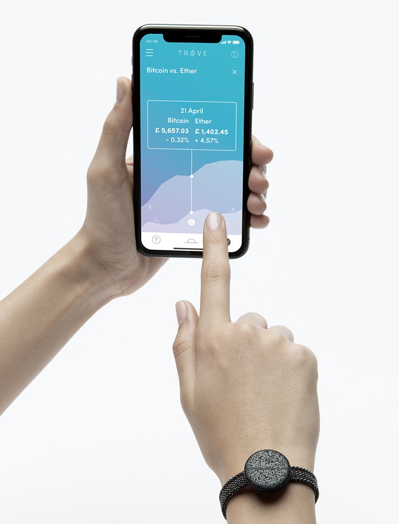
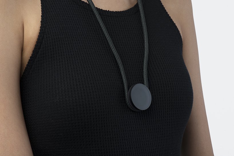
Benjamin Hubert, a designer at the Layer Agency, recently launched his own hardware wallet. However, unlike most of these physical wallets, he added a design touch to it. Although still at prototype stage, Trove, a cryptocurrency wallet in the form of a storage coin, is pretty impressive. It is claimed that the coin is unloseable and unhackable. The storage goes with a smartphone app that makes transactions safe and easy.
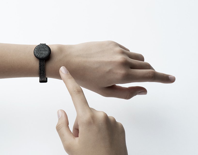
However, the most stunning feature is the wearable part. The device that goes with the storage coin has a key feature that makes it much more secure: it comes with an electrocardiogram sensor that will open access to the device (or not) when you press it against your skin.
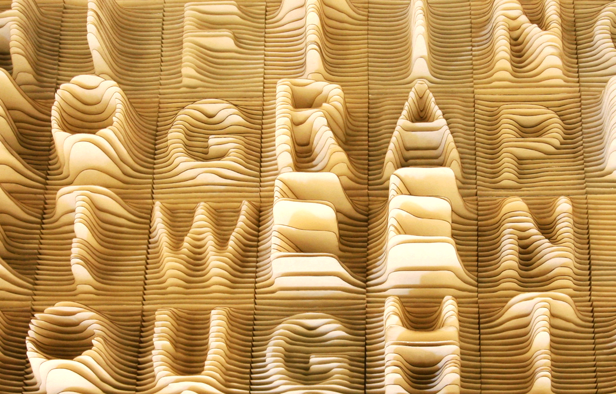
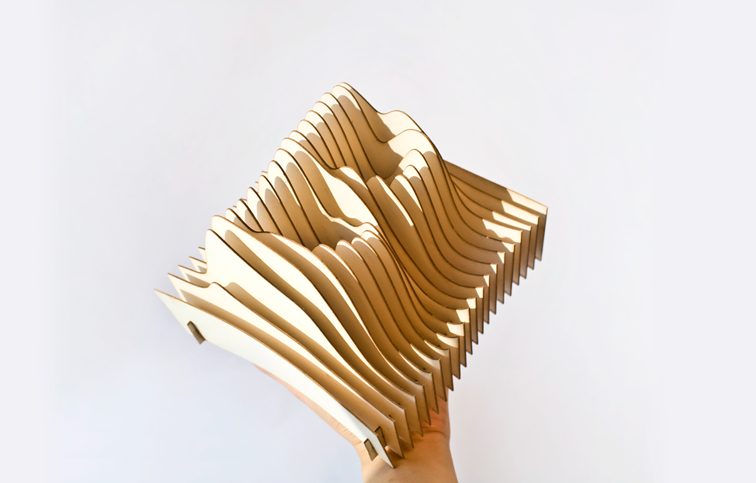
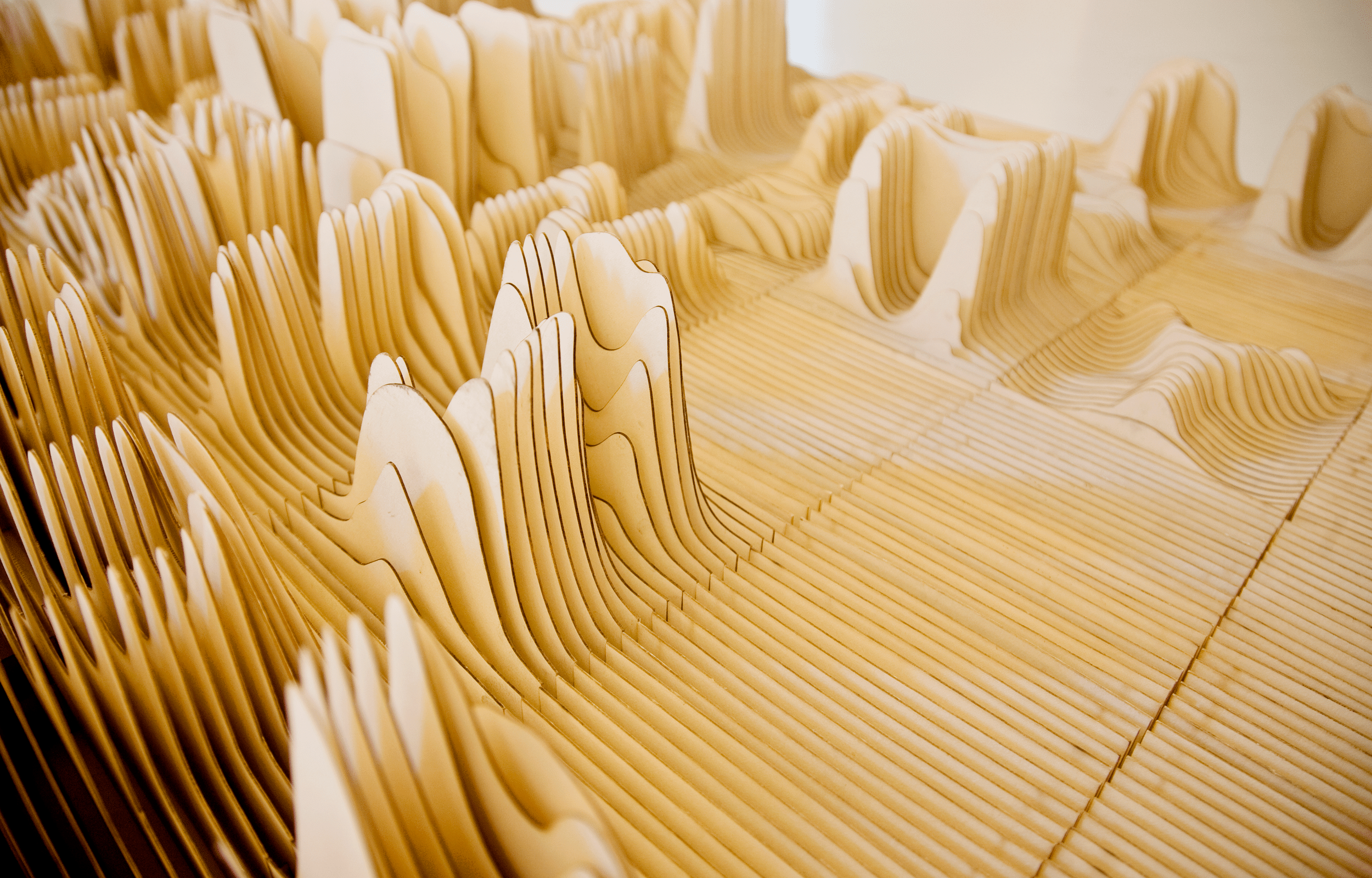
Synoptic Office has released a creative font that was built using topographic-like lines to make each letter come out. It’s already pretty cool in terms of craft and visual results, but the project is more than just an artsy stunt.
For each letter, the elevation of the topographic lines varies according to the number of time the letter is statistically used in the English language. This gives you a typographic and topographic landscape of the English alphabet, an interesting and artistic example of data visualization done right.
Whether you are an employee who occasionally works from home, a stay-at-home freelancer, or you just work on your train rides to your office, you probably have been confronted often to the challenge of remote work. Actually, with the tools available nowadays, remote working is not so much of a challenge as it used to be.
On the organisational side, you need to be disciplined and focused to be able to work remotely, but you also need the tools for it. Here is a quick overview of the tools that will help you to be productive away from the office.
Messaging
Skype
You probably already use this messaging and video conference app, but it’s still worth a mention in this post as an unmissable communication tool. Lesser known great features are the ability to share your screen, which is pretty cool when working remotely, and the possibility to set a timer on calls for support-related work. You can download it from the official site if you didn’t install it yet.
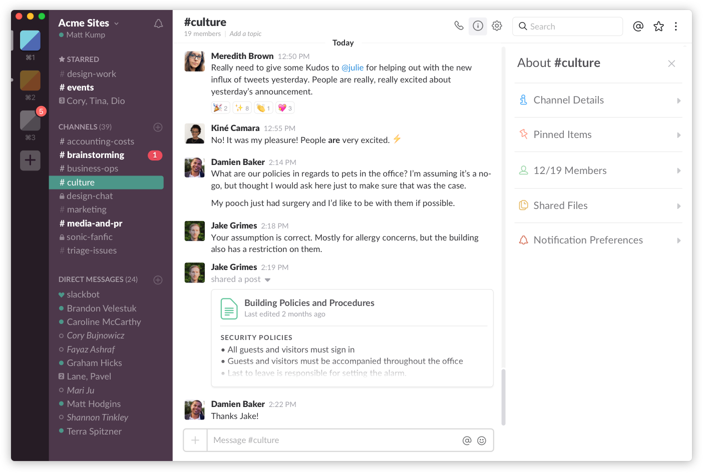
Slack
Often described as an advanced group chat app, Slack is actually much more than this. It makes teamwork possible and improves your workflows tremendously. Download it here.
Workplace
Workplace by Facebook has been pushed by the social media giant, the app is a kind of group version of Messenger, with some features specifically designed for work. It has the big advantage on using an interface and tools that most users will already be familiar with for file sharing or calling. Try it here.
Project management & Notes
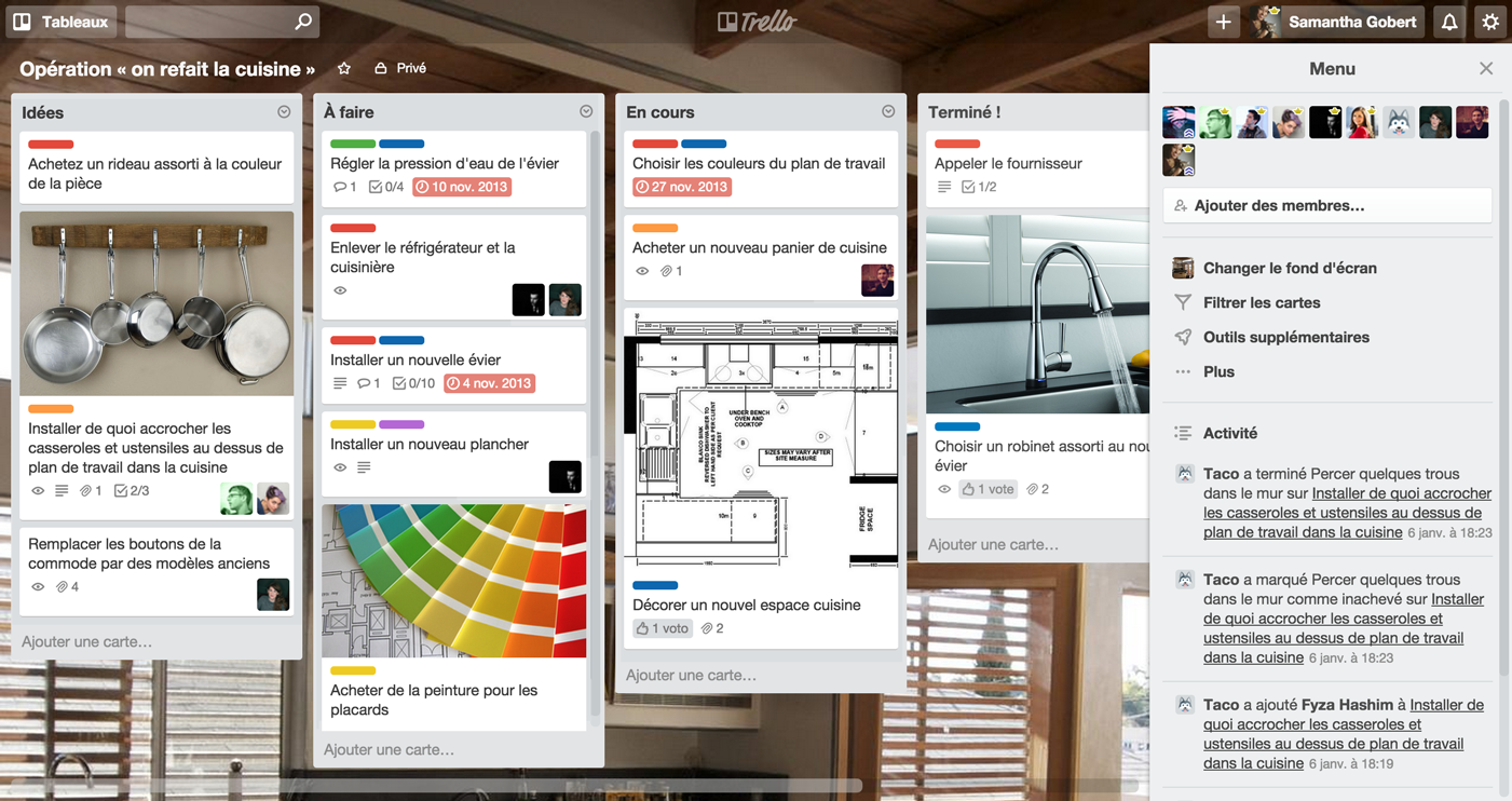
Trello
Trello is an online project management tool that will simplify your life by keeping everything your team needs in one place, as well as giving you the big picture on your project, or allowing you to get into details on a specific point. It’s extremely user-friendly with a drag-and-drop interface, and the least you could say is that it’s feature-rich with the possibility to add checklists, tags, images, videos, limit dates, and so on… You should definitively give it a try.
Evernote
Evernote is an online note taking app that gives you tremendous powers and allows you to focus better on your projects. Although this app is more known for its single user features, it has some cool business functionalities that allow for better group work. Check it out here.
Productivity & Collaboration
Dropbox
Everybody already knows Dropbox, this folder that syncs in the cloud and allows for very easy large files sharing. Dropbox is useful for remote work in two ways: for one, it gives you the possibility to share folders and files with your team, for two, it allows for syncing your files accross several computers. If you are not using it yet, you should try it.
Google Drive
Google Drive is a bit like Dropbox, but more oriented to collaboration on documents. Whether you need to work on text files, spreadsheets or presentations, you can do so by intervening directly into the document. Every change will be attributed to its author, so it’s very easy to see who changed what and approve it or not. It also includes useful commenting features. If you have a Google Account, you can start using it right away here.
CodePen
This tool targets specifically developers and designers. Codepen is a social development app to share code and show off your work. You can also use the version of the app for team and enjoy cool features that will make your shared dev easier. Try it here.
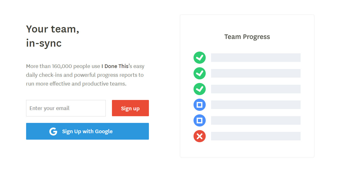
i done this
This online app is a to-do list for teams that greatly improves productivity. It provides daily check-ins and powerful progress reports (probably the most useful feature). Check it out here.
Security
ExpressVPN
I’ve mostly used ExpressVPN when I was working in China, but some company require that you use a VPN when connecting to the company server (and they are right to require that). If the VPN is not imposed by the company and you can choose the one you’d like to work with, I’d suggest ExpressVPN.
Passbolt
Passbolt is a free and open-source group password management tool. Free is if you choose to use the community edition, for a cloud version, you’ll have to pay a fee. It is well worth it if your company values security, as it is extensible and built on open security standards. Try it now for free.
Looking for a summer fix? This pastel poster evokes long, hot days eating ice cream in the park. It’s also super simple to create in Adobe InDesign and is a great way of picking up some new techniques for creating print layouts.
Ready to bring the sunshine in? Let’s get started!
What You’ll Need to Create Your Poster
You’ll need access to Adobe InDesign to create the main layout of your poster. We’ll also dip into Adobe Illustrator to briefly edit some vector graphics. You can use alternative vector software, such as Inkscape or CorelDRAW, for this step.
You’ll also need to download the following image and font files from Elements:
Install the fonts on your computer, and you’re ready to start putting your poster together.
1. How to Create a Pastel Color Palette for Your Poster
Step 1
Open InDesign and go to File > New > Document.
Choose Print for the Intent from the top of the window, and select A3 for the Page Size. Add a Bleed of 5 mm to all edges of the document. Then click Create.
Step 2
Expand the Layers panel (Window > Layers), and double-click on the Layer 1 name. Rename it as Background and click OK.
Choose New Layer from the panel’s drop-down menu, at top-right, and name it Type.
Create two more new layers: Sparks and then Texture at the top of the sequence.
Then lock all layers except Background, which we’ll work on first.
Step 3
Expand the Swatches panel (Window > Color > Swatches), and choose New Color Swatch from the panel’s menu.
With the Color Type set to Process and Mode to CMYK, set the levels below to C=2 M=5 Y=29 K=0. Click Add and then OK.
Repeat the process to create a further six new CMYK swatches, with the following values:
C=29 M=49 Y=65 K=7
C=23 M=0 Y=25 K=0
C=0 M=40 Y=9 K=0
C=6 M=21 Y=14 K=0
C=7 M=0 Y=43 K=0
C=2 M=0 Y=3 K=0
2. How to Build Up Typography on Your Poster
Step 1
Take the Rectangle Tool (M) and drag across the whole page, extending it up to the edge of the bleed on all sides.
From the Swatches panel, set the Fill Color of the shape to your new pink swatch, C=0 M=40 Y=9 K=0.
Step 2
Lock the Background layer and unlock the Type layer above it.
Switch to the Line Tool (\), and drag to create a shallow diagonal line across the top-right section of the page, as shown below.
Step 3
Select the Type on a Path Tool (Shift-T), and click once onto the left side of the line, to transform it into a text path.
Type in ‘Ice’. From either the top Controls panel or the Character panel (Window > Type & Tables > Character), set the Font to Author Type and the Font Size to around 260 pt.
Switch to the Selection Tool (V, Escape) to select the line, not the text sitting on it. From the Swatches panel, adjust the Stroke Color of the line to [None] to make it invisible.
Step 4
Select the line and Edit > Copy, Edit > Paste it, moving it below the first text line.
Edit the text to read ‘Cream’, and reduce the Font Size to around 210 pt. Maneuver the text line into a snug position below ‘Ice’.
Edit > Paste the text line again, adjusting the text to read ‘always’. Change the Font Size to 220 pt, and maneuver the line into position below ‘Cream’.
Paste in three more text lines, setting the first to read ‘good’, the second to ‘idea’, and the final one to an exclamation mark. Move them into roughly the same position as shown below.
Step 5
Paste another text line, moving it over to the left side of ‘always’. Type in ‘IS’ and set the Font to Burtons, 80 pt.
Copy and Paste this text line, moving the second to the left of ‘good’ and editing the text to ‘A’.
Step 6
Select the top text line, ‘Ice’, and click on the ‘T’ icon at the top-left corner of the Swatches panel, to be able to edit the Font Color.
Switch the Font Color to your brown swatch, C=29 M=49 Y=65 K=7.
Set ‘Cream’ in C=2 M=5 Y=29 K=0.
Apply C=23 M=0 Y=25 K=0 to ‘always’.
Set ‘good’ in C=2 M=5 Y=29 K=0, ‘idea’ in C=29 M=49 Y=65 K=7, and the exclamation mark in C=23 M=0 Y=25 K=0. Finally set ‘IS’ and ‘A’ in the palest new swatch, C=2 M=0 Y=3 K=0.
Step 7
Select all the text lines except the small ‘IS’ and ‘A’, and go to Object on the top main menu. Go to Effects > Drop Shadow.
Click on the colored square to the right of the Mode menu to open the Effect Color window. Choose the pink swatch, C=0 M=40 Y=9 K=0, and click OK.
Back in the Effects window, increase the Opacity of the shadow to 100%, Distance to 5 mm, Angle to around 140, Size to 1 mm, Spread to 100%, and Noise to about 30%.
Click OK to exit the window.
Step 8
Select the two small text lines containing ‘IS’ and ‘A’, and go to Effects > Drop Shadow, as before.
Repeat the same settings as before (Opacity 100%, Distance 5 mm, Angle 140, Size 1 mm, Spread 100% and Noise 30%), but this time choose your yellow swatch, C=7 M=0 Y=43 K=0, for the Effect Color.
3. How to Add Framing Elements and Texture to Your Poster
Select the circular sparks illustration pictured below, and Edit > Copy it.
Minimize the Illustrator window and head back to your InDesign document.
Step 2
Lock the Type layer and unlock the Sparks layer.
Edit > Paste the sparks vector directly onto the layer. Then Right-Click > Ungroup the vector.
Step 3
Delete about two-thirds of the vector shape, and move the remaining third into position to the right of the ‘e’ in ‘Ice’.
Copy and Paste this shape, and move the second over the top of ‘C’.
Paste two more shapes, moving one next to the ‘i’ in ‘idea’ and the second to the bottom-right of the exclamation mark.
Step 4
Adjust the Fill Color of the top shape to C=29 M=49 Y=65 K=7, to match the brown color of ‘Ice’.
Then adjust the colors of the other shapes to match the letters they are nearest to.
Step 5
Lock the Sparks layer and unlock the top layer, Texture.
Use the Rectangle Frame Tool (F) to create an image frame across the whole page. Go to File > Place, and navigate to the vintage grit textures images you downloaded earlier.
Go into the PNG folder and choose the second texture, ‘Grit02-byGhostlyPixels.png’, before clicking Open, and allowing it to fill the image frame.
Step 6
With the image frame selected, go to Object > Effects > Transparency. Choose Screen for the Mode, and bring the Opacity down to 70%.
Click OK to exit the window.
4. How to Export Your Poster
Your poster is finished—great job! If you want to share your poster online, you can simply go to File > Export and choose JPEG or PNG from the Format menu.
If you want to get your poster printed professionally, read on to find out how to make a press-ready file.
Step 1
Go to File > Export. Choose Adobe PDF (Print) from the Format menu, name the file and click Save.
In the Export Adobe PDF window that opens, choose [Press Quality] from the Adobe PDF Preset menu at the top.
Step 2
Click on Marks and Bleeds in the window’s left-hand menu. Check both All Printer’s Marks and Use Document Bleed Settings, before clicking Export.
And there we have it! Your poster is exported, and this PDF file is ready for sending straight off to be printed.
Conclusion: Your Finished Ice-Cream Poster
Your poster is finished—great job!
In this tutorial, we’ve covered several techniques for creating print designs in InDesign, including how to set up a flyer layout and format typography. We’ve also looked at how to use fonts, textures, and colors to bring a vintage, mid-century vibe to your design.
I was recently mentoring someone who had trouble with the .reduce() method in JavaScript. Namely, how you get from this:
const nums = [1, 2, 3]
let value = 0

for (let i = 0; i < nums.length; i++) {
  value += nums[i]
}
…to this:
const nums = [1, 2, 3]
const value = nums.reduce((ac, next) => ac + next, 0)
They are functionally equivalent and they both sum up all the numbers in the array, but there is a bit of paradigm shift between them. Let’s explore reducers for a moment because they’re powerful, and important to have in your programming toolbox. There are literally hundreds of other articles on reducers out there, and I’ll link up some of my favorites at the end.
What is a reducer?
The first and most important thing to understand about a reducer is that it will always only return one value. The job of a reducer is to reduce. That one value can be a number, a string, an array or an object, but it will always only be one. Reducers are really great for a lot of things, but they’re especially useful for applying a bit of logic to a group of values and ending up with another single result.
That’s the other thing to mention: reducers will not, by their nature, mutate your initial value; rather they return something else. Let’s walk over that first example so you can see what’s happening here. The video below explains:
It might be helpful to watch the video to see how the progression occurs, but here’s the code we’re looking at:
const nums = [1, 2, 3]
let value = 0

for (let i = 0; i < nums.length; i++) {
  value += nums[i]
}
We have our array (1, 2, 3) and the first value each number in the array will be added to (0). We walk through the amount of the array and add them to the initial value.
Now we have the same array, but this time we’re not mutating that first value. Instead, we have an initialValue that will only be used at the start. Next, we can make a function that takes an accumulator and an item. The accumulator is the collected value returned in the last invocation that informs the function what the next value will be added to. In this case of addition, you can think of it as a snowball rolling down a mountain that eats up each value in its path as it grows in size by every eaten value.
We’ll use .reduce() to apply the function and start from that initial value. This can be shortened with an arrow function:
An accumulator can be an intimidating term, so you can think of it like the current state of the array as we’re applying the logic on the callback’s invocations.
The Call Stack
In case it’s not clear what’s happening, let’s log out what’s going on for each iteration. The reduce is using a callback function that will run for each item in the array. IThe following demo will help to make this more clear. I’ve also used a different array ([1, 3, 6]) because having the numbers be the same as the index could be confusing.
It shows that the accumulator is starting at our initial value, 0
Then we have the first item, which is 1, so our return value is 1 (0 + 1 = 1)
1 becomes the accumulator on the next invocation
Now we have 1 as the accumulator and 3 is the item aince it is next in the array.
The returned value becomes 4 (1 + 3 = 4)
That, in turn, becomes the accumulator and the next item at invocation is 6
That results in 10 (4 + 6 = 10) and is our final value since 6 is the last number in the array
Simple Examples
Now that we’ve got that under our belt, let’s look at some common and useful things reducers can do.
How many of X do we have?
Let’s say you have an array of numbers and you want to return an object that reports the number of times those numbers occur in the array. Note that this could just as easily apply to strings.
Initially, we have an array and the object we’re going to put its contents into. In our reducer, we ask: does this item exist? If so, let’s increment it. If not, add it and set it to 1. At the end, please return the tally count of each item. Then, we run the reduce function, passing in both the reducer and the initial value.
Take an array and turn it into an object that shows some conditions
Let’s say we have an array and we want to create an object based on a set of conditions. Reduce can be great for this! Here, we want to create an object out of any instance of a number contained in the array and show both an odd and even version of this number. If the number is already even or odd, then that’s what we’ll have in the object.
const nums = [3, 5, 6, 82, 1, 4, 3, 5, 82]

// we're going to make an object from an even and odd
// version of each instance of a number
const result = nums.reduce((acc, item) => {
  acc[item] = {
    odd: item % 2 ? item : item - 1,
    even: item % 2 ? item + 1 : item
  }
  return acc
}, {})

console.log(result)
As we’re going through every item in the array, we create a property for even and odd, and based on an inline condition with a modulus operator, we’ll either store the number or increment it by 1. The modulus operator is really good for this because it can quickly check for even or odd — if it’s divisible by two, it’s even, if not, it’s odd.
Other resources
At the top, I mentioned other posts out there that are handy resources to get more familiar with the role of reducers. Here are a few of my favorites:
The MDN documentation is wonderful for this. Seriously, it’s one of their best posts, IMO. They also describe in a bit more detail what happens if you don’t provide an initial value, which we didn’t cover in this post.
Daniel Shiffman is always amazing at explaining things on Coding Train.
Any photo you want to use for this manipulation. You can find some free photos on Unsplash and Pixabay or buy high-quality photos on PhotoDune. I chose this photo from Unsplash.
1. How to Prepare the Document
Step 1
Use Control-N to create a new document and use the following settings: 1080 x 1080 px; 300 dpi.
Step 2
Go to File > Place and put your image inside the document.
Step 3
Now we need to convert our image to a smart object. Right Click on the layer, and then select Convert to Smart Object.
Step 4
After that, let’s create a duplicate of the smart object: Right Click > Duplicate layer.
Step 5
Create four more duplicates of the smart object as we did before. After that, you can easily change the image in all the smart objects just by replacing the photo in the first smart object.
Step 6
Now let’s create the shapes for our template. Hit U to create a Rectangle Shape and use the following settings: Width: 432; Height: 432.
Step 7
After that, create the second shape with the following settings: Width: 594; Height: 594; No Fill; Stroke: 81 px.
Step 8
Create the third shape with the following settings: Width: 756; Height: 756; No Fill; Stroke: 81 px.
Step 9
Create the fourth shape with the following settings: Width: 918; Height: 918; No Fill; Stroke: 81 px.
Step 10
For the last shape, let’s use these settings: Width: 1080; Height: 1080; No Fill; Stroke: 81 px.
Step 11
Hit V and select all the shape layers, and then click Align Horizontal Center and Align Vertical Center.
Step 12
Now we need to move each shape below each smart object.
Step 13
Make the main smart object and the background layer invisible.
Step 14
Now select the first smart object and Right Click > Create Clipping Mask.
Step 15
Create a clipping mask for each smart object using the same method as before.
Step 16
To make it easier for us to work with our layers, we need to create groups of layers. Select each smart object and shape and then hit the Make a Group icon.
2. How to Create Color Effects
Step 1
To create a black and white filter, we will use a gradient map. Select the first smart object and go to Layer > New Adjustment Layer > Gradient Map.
Step 2
After that, Right Click > Create Clipping Mask.
Step 3
Now create another gradient map above, but use the following colors: #21382e; #3d3b6d; #fd605b.
Step 4
Select the gradient map layer and create another clipping mask.
Step 5
Create another gradient map with the clipping mask in the second group with the following colors: #31444b; #843332.
Step 6
Now let’s create another gradient map with a clipping mask as we did before, but for the third group of the layers. For this one, let’s use the following colors: #16172b; #df7136.
Step 7
For the next group of layers, use a gradient map with the following colors: #dd0a00; #fe7f32.
Step 8
For the last group of layers, use a gradient map with the following colors: #5b673f; #a23c2d.
Step 9
Now we need to make our image look a bit faded. Go to Layer > New Adjustment Layer > Exposure and use the following settings: Offset: +0.0200.
3. How to Create an Animation From a Static Image
Step 1
To start creating the animation, go to Window > Timeline and then hit Create Video Timeline.
Step 2
Select the smart object in the first group of the layers, press Control-T, and rotate the image -180° while holding Shift.
Step 3
Select the smart object in the second group of the layers, and then press Control-T and rotate the image -90° while holding Shift.
Step 4
Select next smart object in and then press Control-T and rotate the image -180° while holding Shift.
Step 5
Select the smart object in the fourth group of the layers, and then press Control-T and rotate the image 90° while holding Shift.
Step 6
Select the last smart object, and then press Control-T and rotate the image -180° while holding Shift.
Step 7
Open the first smart object in the Timeline panel and move the Time Indicator to 0:00:00:00. After that, click on the Timer icon near the Transform to create the first Keyframe.
Step 8
Move the Time Indicator to 0:00:02:00,and then rotate the smart object 180° while holding Shift.
Step 9
Open the second smart object in the Timeline paneland create the first Keyframe at 0:00:00:00. Move the Time Indicator to 0:00:02:00 and rotate the smart object 90° while holding Shift.
Step 10
Open the next smart object in the Timeline panel and create the first Keyframe at 0:00:00:00. Move the Time Indicator to 0:00:02:00 and rotate the smart object 180° while holding Shift.
Step 11
Open the fourth smart object in the Timeline paneland create the first Keyframe at 0:00:00:00. Move the Time Indicator to 0:00:02:00 and rotate the smart object -90° while holding Shift.
Step 12
Open the last smart object in the Timeline panel and create the first Keyframe at 0:00:00:00. Move the Time Indicator to 0:00:02:00 and rotate the smart object 180° while holding Shift.
This is how the animation should look after the manipulations listed above.
Step 13
Now we need to create an animation for the color effects. Open the black&white filter in the Timeline panel and move the Time Indicator to 0:00:00:00. After that, click on the Timer icon near the Opacity to create the first Keyframe.
Step 14
Move the Time Indicator to 0:00:04:00 and change the Opacity of the layer to 0% in the Layers panel.
Step 15
Duplicate this layer four times using Right Click > Duplicate and place each duplicate of the filter above each smart object. The animation of this layer is copied along with the layer.
Step 16
Select the gradient map in the first group of layers and then move the Time Indicator to 0:00:00:00. After that, click on the Timer icon near the Opacity to create the first Keyframe.
Step 17
Move the Time Indicator to 0:00:02:00 and change the Opacity of the layer to 0% in the Layers panel.
Step 18
Now we need to copy the keyframes. Select two Keyframes while holding Control, and then hit Copy.
Step 19
Open the gradient map in the next group of layers. After that, click the Timer icon near the Opacity in the Timeline panel, andRight Click > Paste.
Step 20
Now let’s create copies of the keyframes for all gradient maps, as we did before.
4. How to Render the Animation for Instagram
Step 1
To save your animation for Instagram, you need to click on the icon in the upper right corner and select Render Video.
Step 2
Set the following settings in the Render Video panel: Format: H.264; Size: Document Size; Range: All Frames.
5. How to Replace the Image Used in the Template
Step 1
If you want to change the image used for your animation, Right Click > Edit Contents on the smart object which we created first.
Step 2
Place your new image above the old one, press Alt-F4 to closethe placeholder, and then select Save.
Awesome Work, You’re Now Done!
In this way, we can create an animated template in Adobe Photoshop using smart objects.
Part of the job of being a front-end developer is applying different techniques and technologies to pull of the desired UI and UX. Perhaps you work with a design team and implement their designs. I know when I look at a design (heck, even if I know I’m not going to be building it), my front-end brain starts triggering all sorts of things I know will be related to the task.
It’s a very appealing design, and there is loads in there to think about from a front-end web design and development standpoint.
We’re going to mostly be talking about design pattern choices and HTML/CSS tech choices. There is much more to the job of front-end development. Accessibility! Performance! Semantics! Design systems! All important stuff as well.
Multi-line padded text
Ah yes, that look where text has a background that follows the length of the lines of text. We’ve called that Multi-Line Padded Text in the past and looked at a number of ways to do it. The easiest and most modern way to handle it is with box-decoration-break.
That header area is just begging for flexbox. It’s a single-direction layout with elements of different sizes and different space between them. Expressing that in flexbox is going to be easier than any other method and not require any fixed sizing or magic numbers — not to mention flexible!
Grid layout
The overall page layout here could be expressed nicely with CSS grid. Remember that flexbox and grid are not at odds. An element placed in a grid cell can be flexbox! Like the header above, that makes perfect sense. The main content area and footer, as grid cells, could probably go either way.
Looks like we have some truncation going on here. General performance-wise, we’d probably be wanting the data being sent only be a few lines long. But the front end can help with this too, if it has to. Three lines of text are shown here with ellipsis at the end. Perhaps the design really needs the copy to always be a maximum of three lines. That’s called line clamping.
Like most sites these days, this design is coated in custom web fonts. With a design this striking, I’d be very careful about my font loading technique. My gut tells me I’d be more into FOIT than FOUT here, and ideally I’d cache that font file as hard as I could so that we’d have neither as often as possible.
Text over images
That text „Dinner Menu” is squarely over some busy photographic imagery below. It’s still readable though, largely because of the bright white of the text over a darkened image. We’ve covered thinking this through in the past in detail. White text over a darkened image is generally the way to go, and darkened enough such that just about any image will be OK. There are other options though, like gradients and blurring (which is also in use here in the footer)
Those star ratings are probably SVG territory as well. Here’s a good collection of options. Progressively enhancing from radio buttons always seems like a smart way to go:
It might seem a little superfluous on a large screen design like this, especially as there is navigation already visible. But hey, it’s hard to avoid these days and there is something to be said about training users where site navigation can happen regardless of where you’re looking at the site.